全球設計風向感謝來自 於強室內設計師事務所 的辦公空間項目案例分享:
簡單是複雜的最高境界。
Simplicity is the ultimate form of sophistication.
設計的作用在於尋找功能和社會間的接點,在功能足以說明一切的前提下,裝飾成分是可以節製的,如何把握節製的度是考驗一個設計師是否成熟的標尺。
The role of design is to find the connection between function and society. On the premise that the function is sufficient to explain everything, the decorative components can be controlled, which is a test of the maturity of a designer.
深圳,從進入大眾視野開始,就站在時代的浪潮尖端之上。源源不斷的前浪不斷推動著發展的邊界,新興的創業者走在這趨勢前沿,也迫切需要一個開放、多元的環境,來融聚每個人的凝聚力,共同創造出秩序統一、撫慰人心的辦公環境。
Since Shenzhen entered the public’s field of vision, it has stayed on the frontier of the times. The constant wave of frontiers continues to push the boundaries of development. The innovative entrepreneurs are at the forefront of this trend. They also eager for an open and diverse environment to gather everyone’s cohesion to jointly create an orderly and comforting office environment.
招商中心作為傳遞項目價值的載體,需要滿足營銷活動的功能。設計師充分平衡辦公與展示的空間,完美融合Work&Live&Exhibition的多種需求,設置了展示區、洽談區、辦公區、休閑區等,真實詮釋了現代智慧辦公的品牌理念,打造理想商務生活標杆。
As a carrier of project value, Luohu Zhonghai Commercial Center needs to meet the functions of marketing activities. The designer fully balances the space for office and display, and perfectly integrates the various needs of Work&Live&Exhibition, setting up exhibition areas, negotiation areas, office areas, leisure areas, etc., which truly interpret the brand concept of modernly smart office and create an ideal business life benchmark.
01.直線象征無限 Straight Line Symbolizes Infinite
每一種線條都有它的性格。直線是邏輯的,穩定的,剛硬的。線的粗細、長短、聚散等排列構成對比。
Every line has its own characters. The straight line is logical, stable, and rigid. The line’s thickness, length, convergence and divergence constitute a contrast.
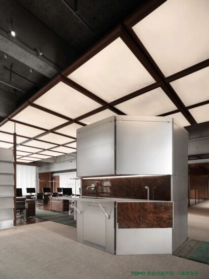
設計師通過對空間氣質的分析,優先考慮將“直線”形態列為貫穿始末的特征元素,來強調辦公空間的專業度,極簡的直線元素表達著空間序列的美感。
Through the analysis of the spatial temperament, the designer prioritizes the straight line form as a characteristic element that runs through the beginning and the end to emphasize the professionalism of the office space. The minimalist linear elements express the beauty of the spatial sequence.
∇ 區位分析
直線象征著思維的延展、無限。設計師在此基礎上,延伸出另一個更為全麵、豐富的表現形式——陣列。
The straight line symbolizes the extension and infinity of thinking. On this basis, the designer extended a more comprehensive and rich form of expression-array.
這裏作為空間第一印象的“導航式”存在,我們更多考慮的是其代表的形式感,將貫穿全局的直線線條以一種充滿建築體量感的形式出現,層次漸出。
As the navigational existence of the first impression of space, we are more concerned with its representative sense of form. The straight lines that run through the whole project, appearing in a form which is full of architectural volume, and sense of hierarchy gradually emerge.
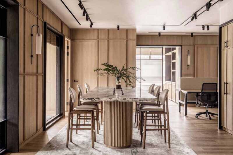
工作空間在空間中占了很大的比重。這裏采用中性線條感進行簡單的鋪陳,桌椅組合呈現出的陣列感讓人無法忽視,突顯出年輕人嚴肅而豐富的工作氛圍。
Work space occupies a large proportion of this project. Neutral lines are used for simple layout, and the array of tables and chairs can not be ignored, highlighting the serious and rich working atmosphere of young people.
02.空間秩序之美 Rational Art of Space
∇ 功能分析
∇ 立麵分析
這是一個兼具寫字樓與公寓產品的綜合性城市更新項目,經過前期的調研,設計師將客群劃分為四大類,主要為商貿物流、科技創新、文化創意及現代服務。根據企業入駐的類型占比,將空間的調性定義為理性與藝術的交融。
This is a comprehensive project of urban renewal containing office buildings and apartment. After preliminary research, the designer divided the customer group into four main categories: commerce logistics, technological innovation, cultural creativity and modern services. According to the proportion of the types of enterprises settled in, the tonality of space is defined as the blend of reason and art.
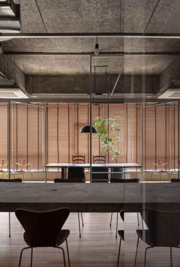
設計師利用理性的線性元素分割空間,以空間構造及尺度引導行動流線。我們對於空間邊界的設定,並非簡單的摧毀截停,而是用另一種線條進行模糊與填充,讓其充滿柔和的情感過渡。
The designer uses rational linear elements to divide the space, and guide the flow of action by spatial structure and scale. Our setting of the space boundary is not simply to destroy and stop, but to fill it with a soft emotional transition by another kind of line to blur and fill in.
空間內有這樣一種“功能模糊”的地帶,一直被賦予著“情感載體”的寓意。身在其中,可與空間交融,放鬆療愈;亦可在此棲息,與人建立共鳴。
There is such a functional ambiguity zone in the space, which has always been given the meaning of “emotional carrier”. Being in it, you can blend into this space and relax and heal; you can also live here and build resonance with other people.
03.開啟智慧辦公 Key to Smart Office
線性的細節形成了原始的設計構思,穿插的變奏簡潔而抑揚頓挫,引導人類去構建一個“商務辦公”的日常情境。
The linear details form the original design concept. The interspersed variations are concise and mellow, guiding humans to construct a daily situation of business office.
設計師利用精致的線性細節設計元素強調商務辦公的設計背景,搭配簡約經典的品牌家具,點綴當代藝術飾品,營造一個精致細膩的頂級商務空間。
The designer uses the elements of exquisite linear detail to emphasize the design background of the business office, with simple and classic brand furniture, embellished with contemporary art accessories, to create an exquisite and delicate business space.
∇ 通電玻璃智能調光 Lighting Control
04.藝術氛圍營造 Creating Art Atmosphere
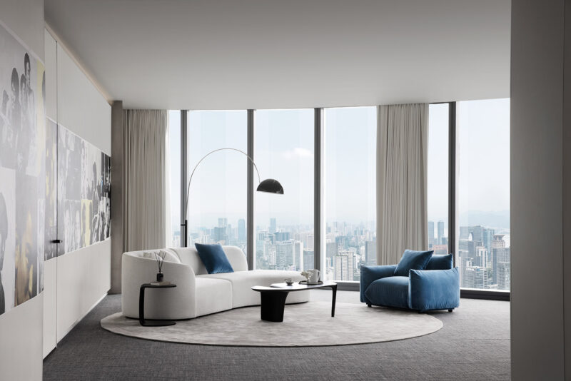
整體空間舒適柔和,簡練幹淨。人文的細節構思,藝術化的氛圍表達,讓空間更靈動而變化。
The overall space is comfortable and soft, simple and clean. Humanistic details and artistic atmosphere expression make the space more flexible and changeable.
坐擁這樣一座海岸線都市、碧海藍天、山脈起伏的旖旎風光,折射射著這座城市永不疲憊的豁達與精力。
Sitting on such a beautiful scenery of coastline city, blue sea and sky, as well as undulating mountains, reflects the never-tired open-mindedness and energy of this city.
∇ 平麵圖
項目信息
工程名稱:羅湖中海慧智大廈招商中心
建築設計:於強室內設計師事務所
室內設計:於強室內設計師事務所
軟裝設計:沃屋陳設
項目完工:2020年4月
項目麵積:662㎡
項目地點:廣東深圳
項目攝影:黃早慧、薑得強
Project Name: Luohu Zhonghai Commercial Center
Architectural Design: YuQiang & Partners
Interior Design: YuQiang & Partners
Furnishing Design: Wow Deco
Project Completion Date: April,2020
Project Area: 662㎡
Project Location: Shenzhen, Guangdong Province,China
Photography: Huang Zao Hui, Jiang Deqiang


