全球設計風向感謝來自 創本設計 CB DESIGN 的商業空間項目案例分享:
肅穆的門診,冰冷的長凳,生硬的服務,這些都是我們過去對傳統醫院的記憶。然而,這一切現在默默在改變。設計師正是關注到這樣社會現象的變革,隨著社會的發展,人們從物質生活的滿足衍生到精神層麵的慰藉,晶奇口腔項目是設計師和業主對患者的精神需求的嗬護。設計師在分析行業背景和客戶的心理需求後,提出“友好親切”“清晰專業”的設計理念。
The snooze clinics, the cold benches, the hard service, these are our memories of the traditional hospitals. However, all this is now quietly changing. Designers are concerned about the change of such social phenomena, with the development of society, people from the material life of the satisfaction derived from the spiritual level of comfort, Jingqi oral project is the designer and owners of the patient’s spiritual needs of care. After analyzing the industry background and the psychological needs of customers, the designer put forward the design concept of “friendly and friendly” and “clear and professional”.
友好
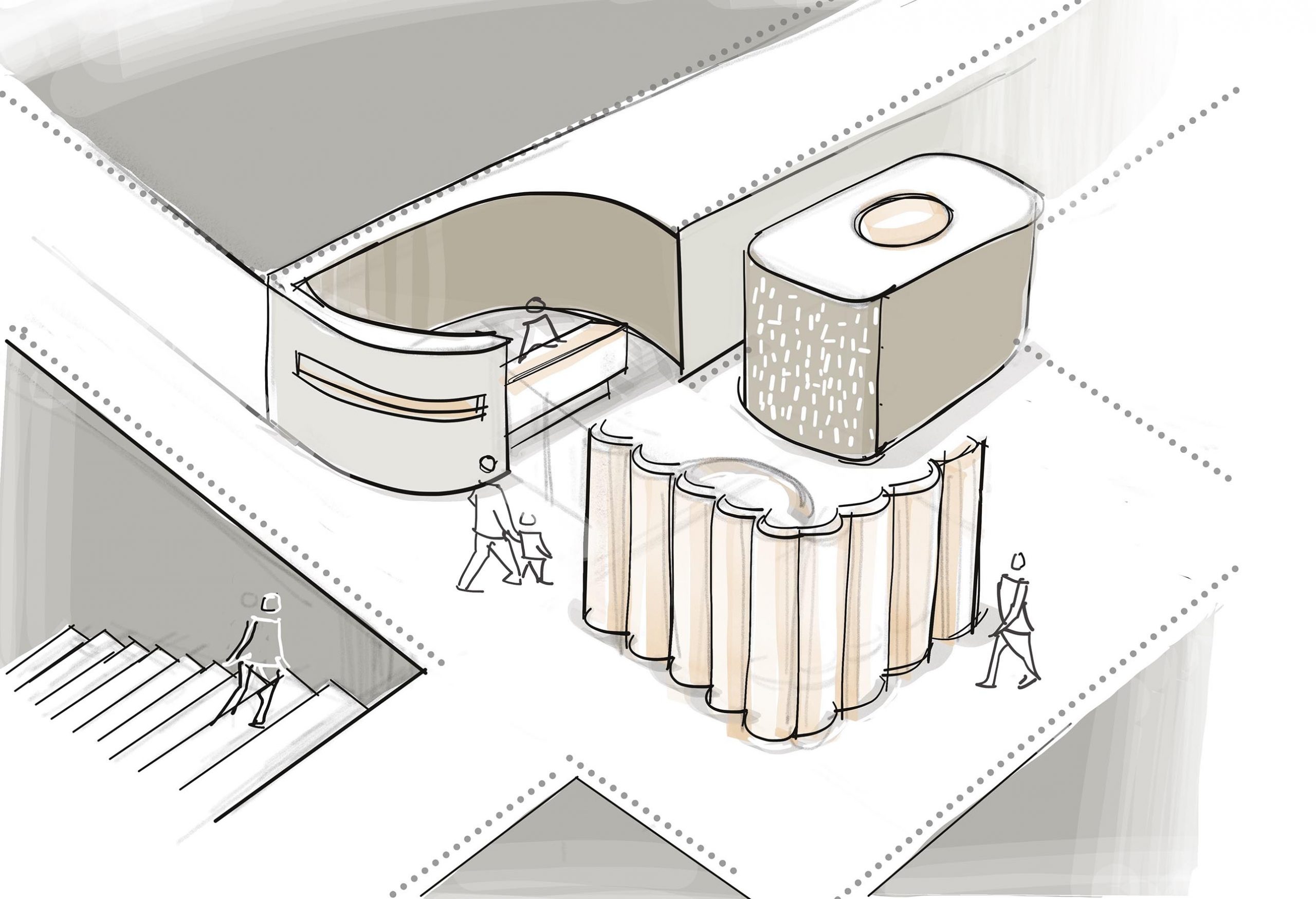
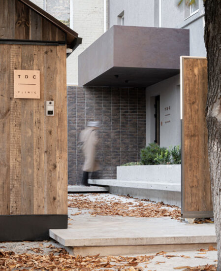
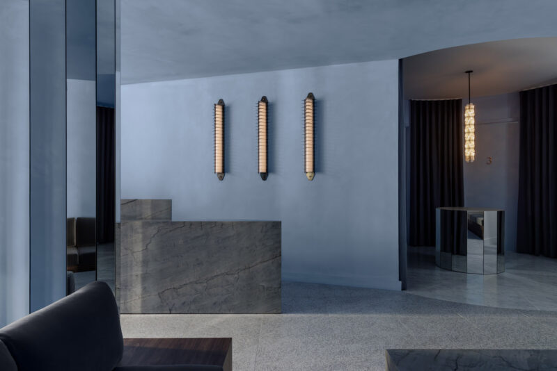
門廳入口恰如其分的弧度不僅僅是為了導流,也凸顯了友好歡迎的姿態。牆麵鏤空使在前台的員工提前預見到來往的客人,也讓厚實的體塊變得輕盈起來,同時也起到借景的作用。
The fitting arc of the entrance to the foyer is not only for the diversion, but also highlights the gesture of friendly welcome. The hollowwalls of the walls make the staff at the front desk anticipate the guests in advance, and also make the thick body blocks become light, but also play the role of borrowing.
純粹
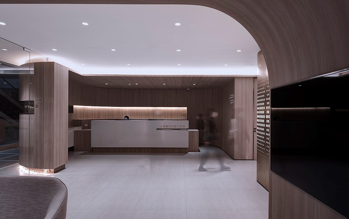
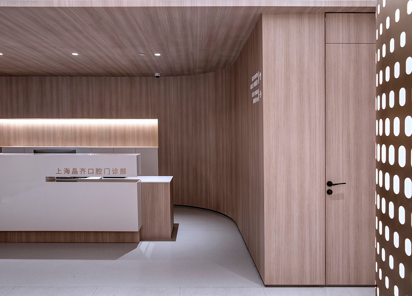
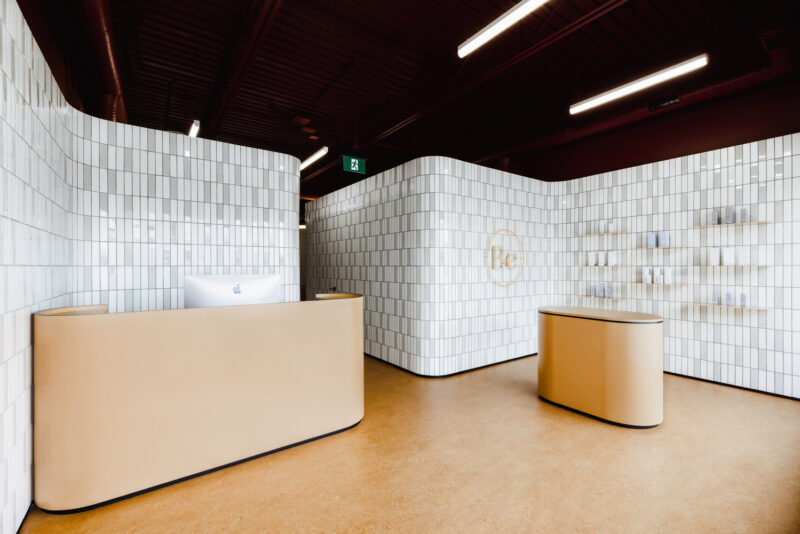
前台接待幹淨清晰有力,創本設計一直堅持純粹給人帶來的美感,通過材質和空間的結合讓接待區的心理空間呈現接納的氛圍,同時牆麵木飾麵的延伸把醫患的動線指引的非常清晰,牆麵的弧形燈光和整體呼應,提示了接待台的主體意義,同時營造會所般的溫馨氛圍。
The front desk reception clean clear and powerful, the design has always adhered to the pure lying aesthetic, through the combination of materials and space to make the reception area of the psychological space to present an acceptable atmosphere, while the extension of the wall wood finished to the doctor-patient line guide is very clear, the curved lighting of the wall and the overall echo, prompting the main meaning of the reception desk, while creating a warm atmosphere like the clubhouse.
體量
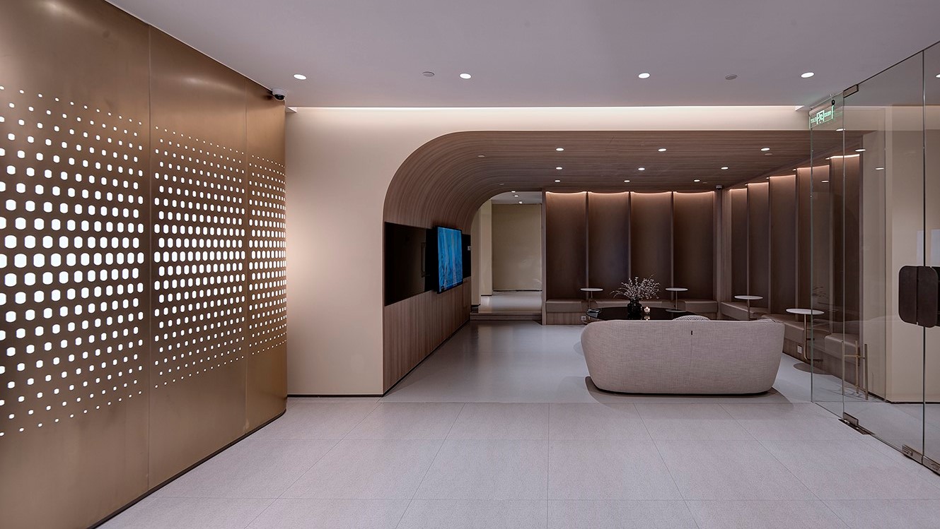
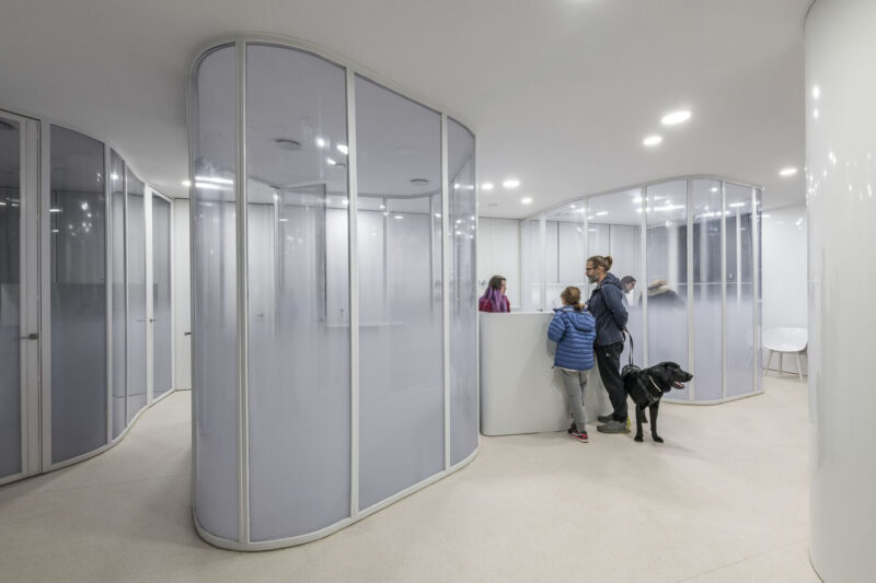
體積就是力量。衝孔鋁板圍合的兒童活動區,把通道和等候區分割開來,讓每一個空間具有獨立的體量。我們希望把這種能量傳遞給醫患,讓每一個心理空間獨立而又清晰,再也不會出現混亂的視覺體驗。
Volume is power. The punched aluminum plate scalls the children’s activity area, separating the passage way from the waiting area, so that each space has its own mass. We want to pass this energy on to doctors and patients so that every psychological space is independent and clear, and there will be no more chaotic visual experiences.
關懷
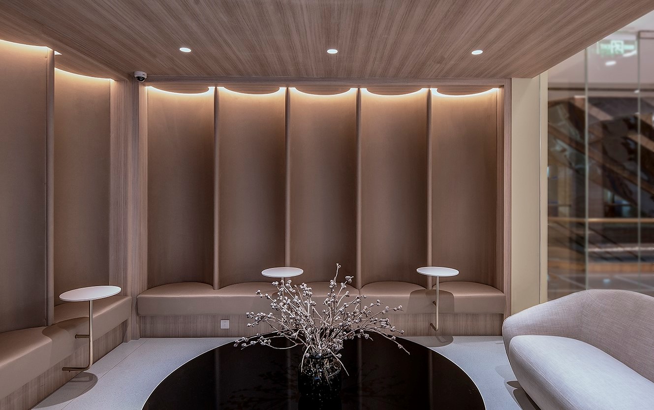
等候區如同被空間的手掌包圍,溫馨而私密。座位的設計靈感來源於牙齒的造型,讓醫患相對獨立而又相互關聯。
The waiting area is like being surrounded by the palm of the space, warm and private. The design of the seat is inspired by the shape of the teeth, which makes the doctor and patient relatively independent and interconnected.
趣味
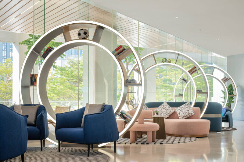
兒童活動區為兒童打造一個玩樂的空間,圓形的發光燈膜。處處圓角的設計,不僅考慮到安全性,同時也消除兒童對治療的恐懼感。
The children’s activity area creates a playful space for children with a round light film. The fillet design not only takes into account safety, but also eliminates the fear of treatment in children.
清晰
整個設計中設計師都在刻意營造清晰的視覺形象。為了使品牌能夠傳達專業而透明的VI形象,如同過道的設計,把患者的治療空間和醫生的後場空間用不同材質區分。這樣做不僅僅是為了美觀,而是讓運營更加便捷實用,同時頂麵的光帶起到了明確的動線指引作用。
Throughout the design designers are deliberately creating a clear visual image. In order for the brand to convey a professional and transparent VI image, like the aisle design, the patient’s treatment space and the doctor’s backfield space are distinguished by different materials. This is not just for aesthetics, but for operations to be more convenient and practical, while the top light band serves as a clear line guide.
專業
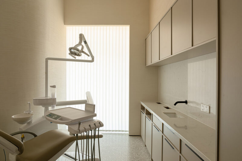
診室的設計幹淨明亮,這裏主要體現了醫療行業的專業性,幹淨而易於清潔的牆麵,無影燈明亮而柔和,讓醫患都能集中精神關注到治療之中。
The design of the clinic is clean and bright, here mainly reflects the professionalism of the medical industry, clean and easy to clean the wall, shadowless lights bright and soft, so that doctors and patients can focus on treatment.
衛生
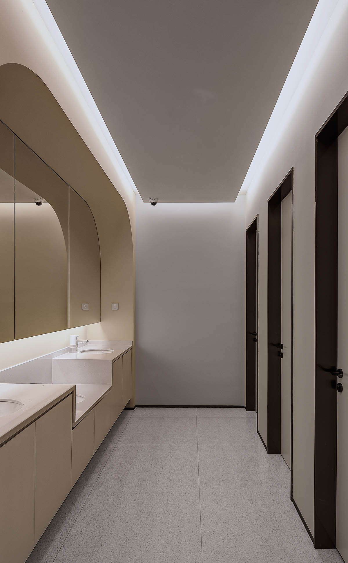
衛生是醫療機構最令人關心的問題,在衛生間的設計上最需要體現幹淨衛生,鏡麵弧形牆的處理和整體元素呼應,台盆的高度考慮到成人和兒童的功能需求,牆麵塗料采用環保的納米材料,整個空間幹淨而溫馨,讓患者在治療的間隙得到了精神的舒緩。
Health is the most important concern of medical institutions, in the bathroom design most need to reflect clean and hygienic, mirror arc wall treatment and overall elements echo, the height of the basin takes into account the functional needs of adults and children, wall paint using environmentally friendly nanomaterials, the whole space clean and warm, so that patients in the treatment gap has been spiritual relief.
項目信息
項目名稱:晶奇口腔空間設計
設計機構:創本設計 CB DESIGN
公司網址:https://cbdesign-group.com/cn/
聯係郵箱:cbidesign@163.com
項目設計 & 完成年份:2019
參與設計:施再勇、陳盈
項目地點:中國·上海
項目麵積:1000 m²
項目攝影:Leo Zhu


