全球設計風向感謝來自 離宅半米0.5m studio 的辦公空間項目案例分享:
2.88m寬的場地 2.88m-width
作為一個小型建築工作室團隊,考慮到租金及成本,去年下半年我們為自己找到了30平米大小的一個空間作為我們未來3-5年內辦公場地,滿足這幾年內可能產生的辦公需求。
第一次來到場地,就一眼看中了這間小房子,開間2.88米,進深8.7米,高度6米,狹長、高、南北兩麵通風采光。在這小小的空間裏,我們試想是不是有一些不一樣的事情能在裏麵發生。
In consideration of the rent and cost as a small architectural studio team, we found a space with an area of about 30 square meters for ourselves in the second half of last year as our office site in the next 3-5 years, so as to meet the possible office needs in these years.
I was keen on the small house at my first visit there. It was 2.88 meters wide, 8.7 meters deep, and 6 meters high, which appears narrow, long, high, and ventilated and well-lighted on both the north and south sides. We can imagine whether something indifferent will happen in this small space.
作為這個項目自己的甲方,我們根據需求給自己列了這樣一份任務書。
- 8人左右的固定辦公人員
- 4人左右臨時辦公人員
- 溝通及彙報方案的場地
- 可舉辦容納15人左右的小型沙龍、講座、交流會
- 不影響其它辦公人員的討論獨立空間
- 容納1人臨時住宿的空間
- 帶有水槽的茶水間
- 切割手工模型的開闊桌麵
- 儲物空間
- 獨處思考的空間
- 與綠植共處
As the Party A of the project, we have listed such a design brief for ourselves according to the demand.
- About 8 permanent office staff
- About 4 temporary office workers
- Site for communication and reporting
- Space for holding small salons, lectures and exchange meetings for about 15 people
- With not influence to the discussion space of other office staff
- Space for temporary accommodation for 1 person
- Tea room with sink
- Open desktop for cutting handmade models
- storage space
- Space for thinking alone
- Living with green plants
如何在這30平裏的空間裏整合這些功能?但又不顯擁擠和壓抑?
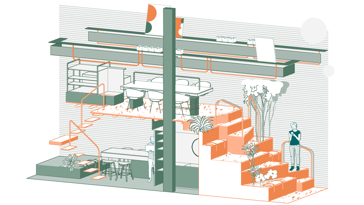
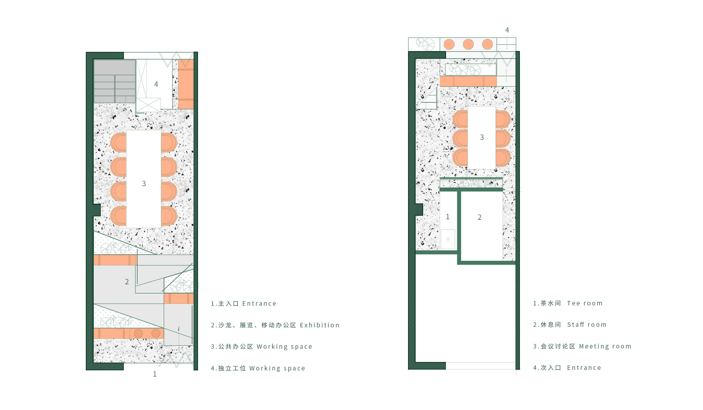
根據任務書需求,容納8人的公共辦公空間占據麵積相對較大,先將這部分功能布局。將長達8.7米的空間前後分成兩個部分,後半部分作為公共辦公空間.
在麵積所限的情況下需要滿足這麼多功能。隻能在場地富餘的垂直高度上展開思考,做一局部夾層。因為夾層的存在,需要在空間裏放置一樓梯,完成垂直高度上的向上過程。在平麵布局的過程中,我們一直嚐試將樓梯的麵積盡可能的減小,但是無論如何都會在這30平裏占據一定麵積。是否我們可以將思維轉換一下,嚐試將樓梯縮小這一動作轉化為將向上攀登的過程鋪展開來。
How to integrate these functions in the space only with 30 m2? But without the sense of crowding and depressing?
According to the requirements of the design brief, the public office space for 8 people occupies a relatively large area. Therefore, this part of functions shall be arranged firstly. The 8.7-meter-long space is divided into two parts, the second half being taken as public office space
In order to satisfy so many functions in such a limited area, a local interlayer is the only way on the base of the vertical height of the site. Because of the existence of interlayer, it is necessary to place a staircase in the space to complete the upward process from the perspective of vertical height. In the process of graphic layout, we have been trying to minimum the area of stairs as much as possible, but anyway, a certain area will be occupied among the 30 square meters. So, shall we change our thinking and try to turn the staircase shrinking into the process of climbing upward.
腳邊的自然 Nature
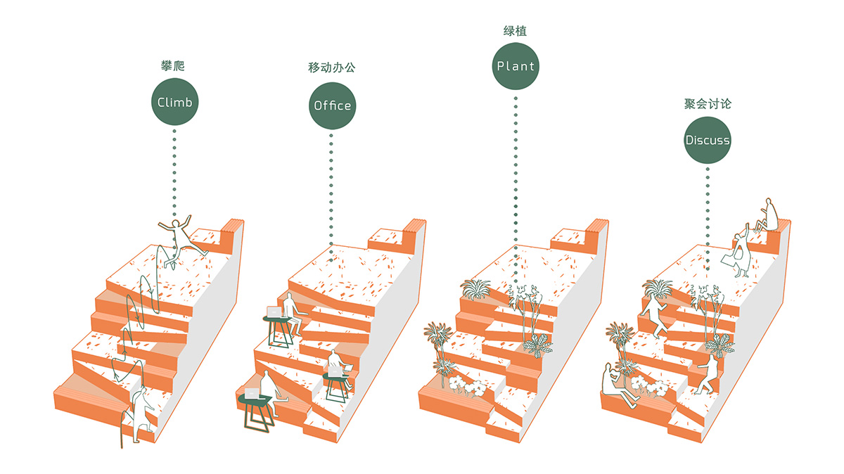
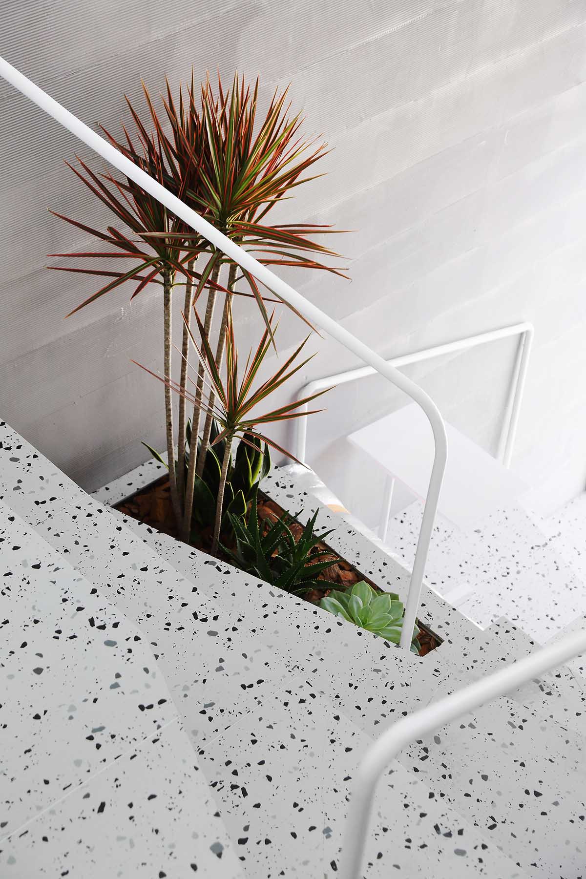
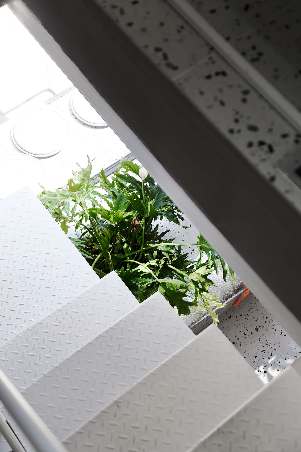
就如我們在自然環境中的“向上攀登”,可以路過綠植,倆倆坐在岩石上歇腳,爬不動時可以扶一下路邊的樹幹,最終到達一開闊的平台。
此時的樓梯已經不僅僅是向上的工具,將高度控製在300mm是台階,450mm是歇腳的座位,下沉350mm是種植綠植的槽。
It is just like our “climbing up” in the natural environment, we can pass by the green plants, sit on the rocks in pairs, and rest against the trunk when we’re exhausted, thus finally reaching an open site.
At this time, the stairs act not only as upward tools. The height is controlled to be step at 300 mm, the seat for resting at 450 mm, and the groove for planting green plants at 350 mm.
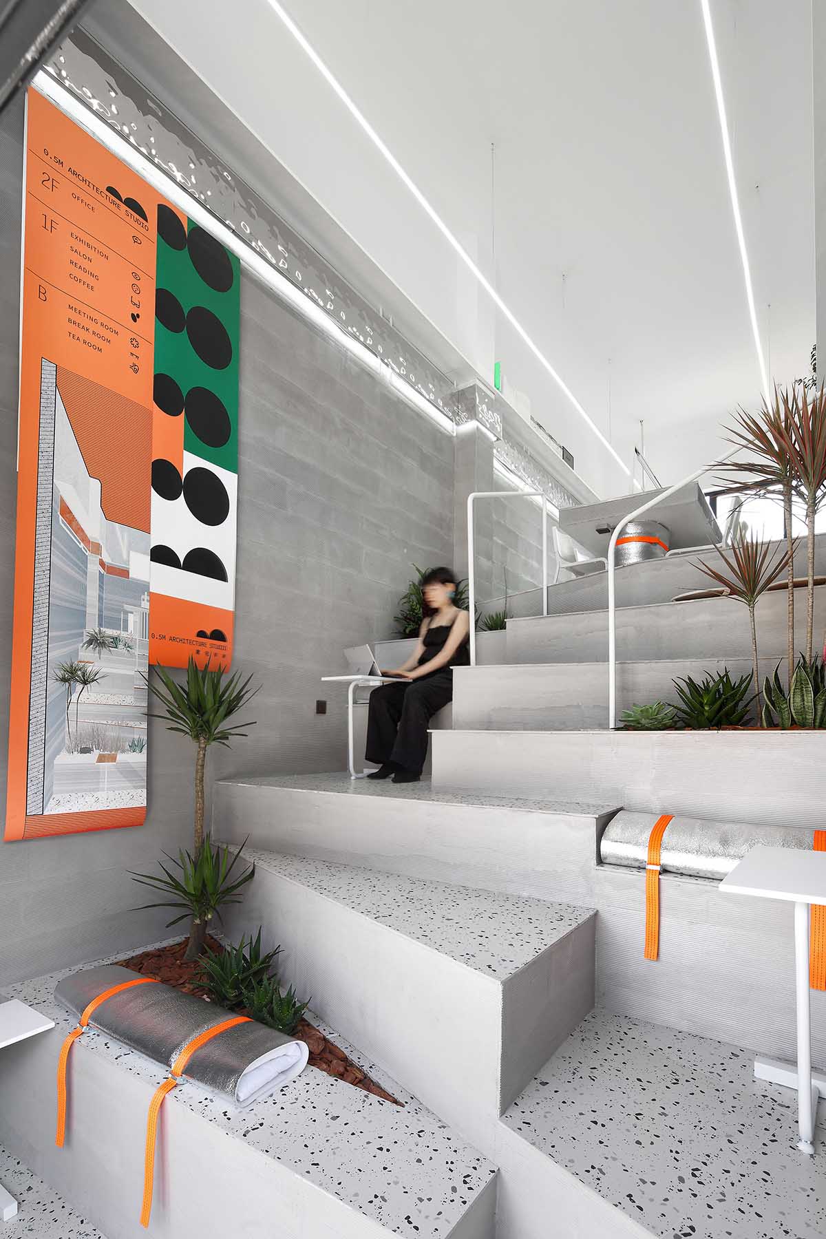
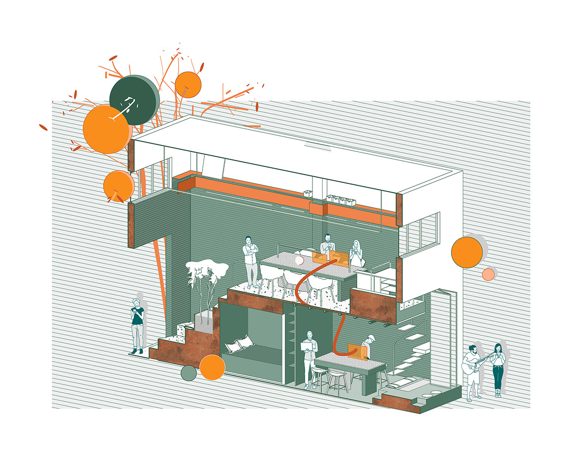
∇ 這樣變換的過程中,臨時辦公,討論空間,小型沙龍、講座空間全部安置在了這一放大的樓梯中
In this way, temporary office, discussion space, small salon, lecture space are all placed in this enlarged staircase during the process of the transformation
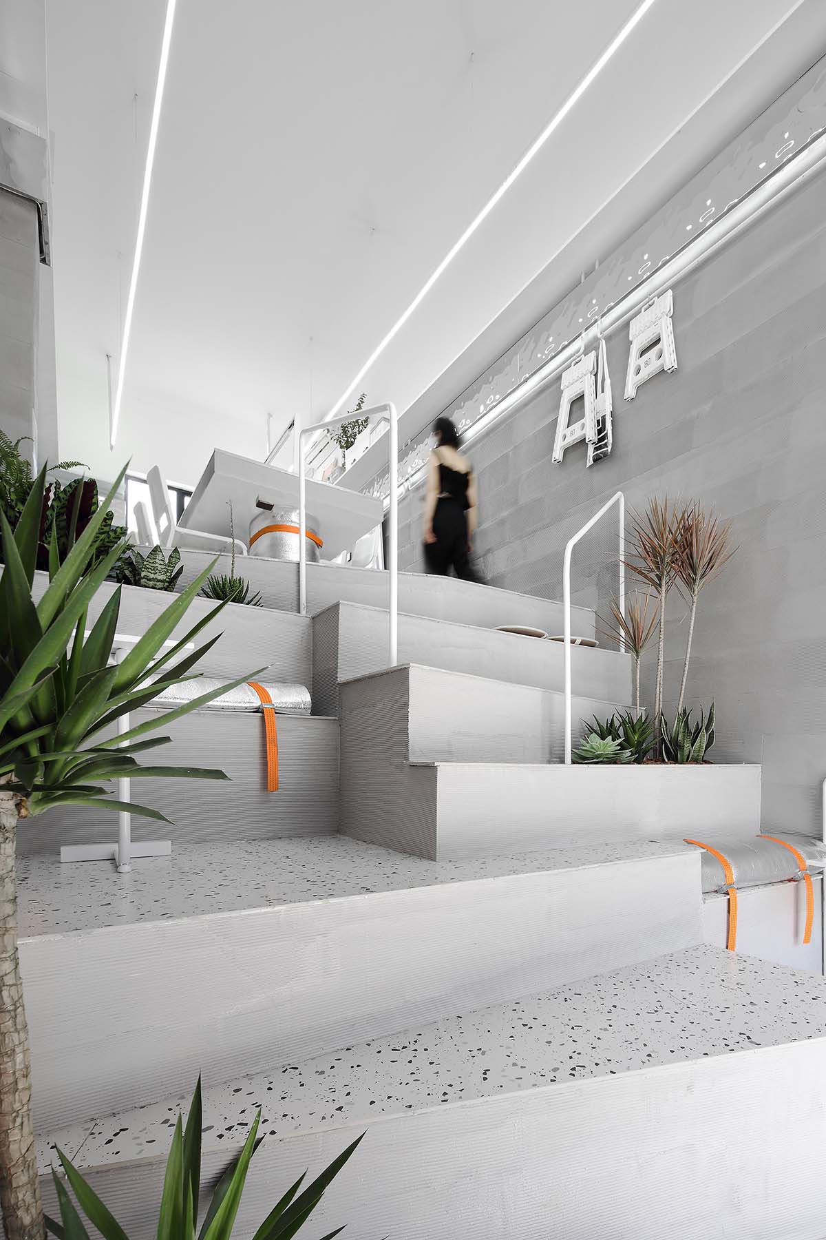
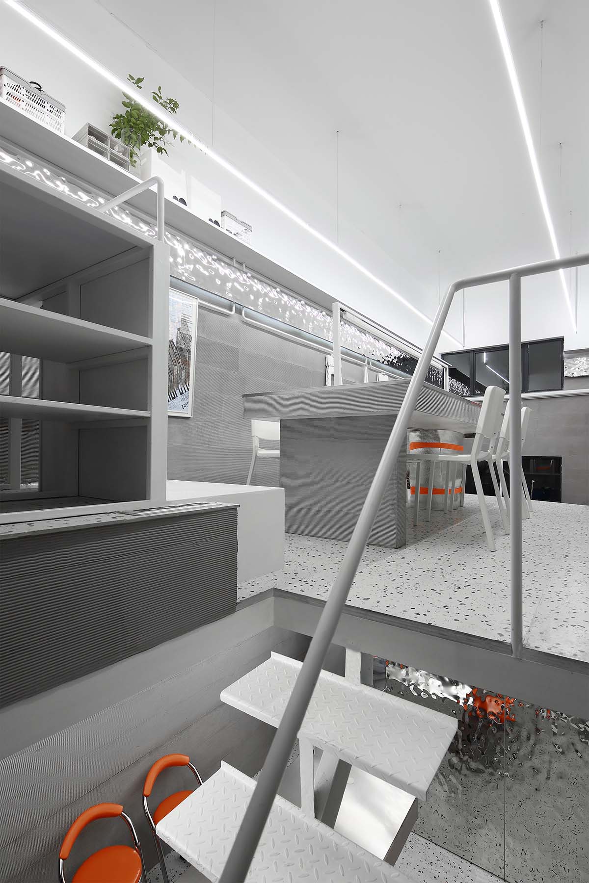
∇ “向上攀登”,最終達到公共辦公區區域 The process of “Climbing up” to finally reach the public office area
∇ 向上過程中的休息節點 Rest spot during the process upward
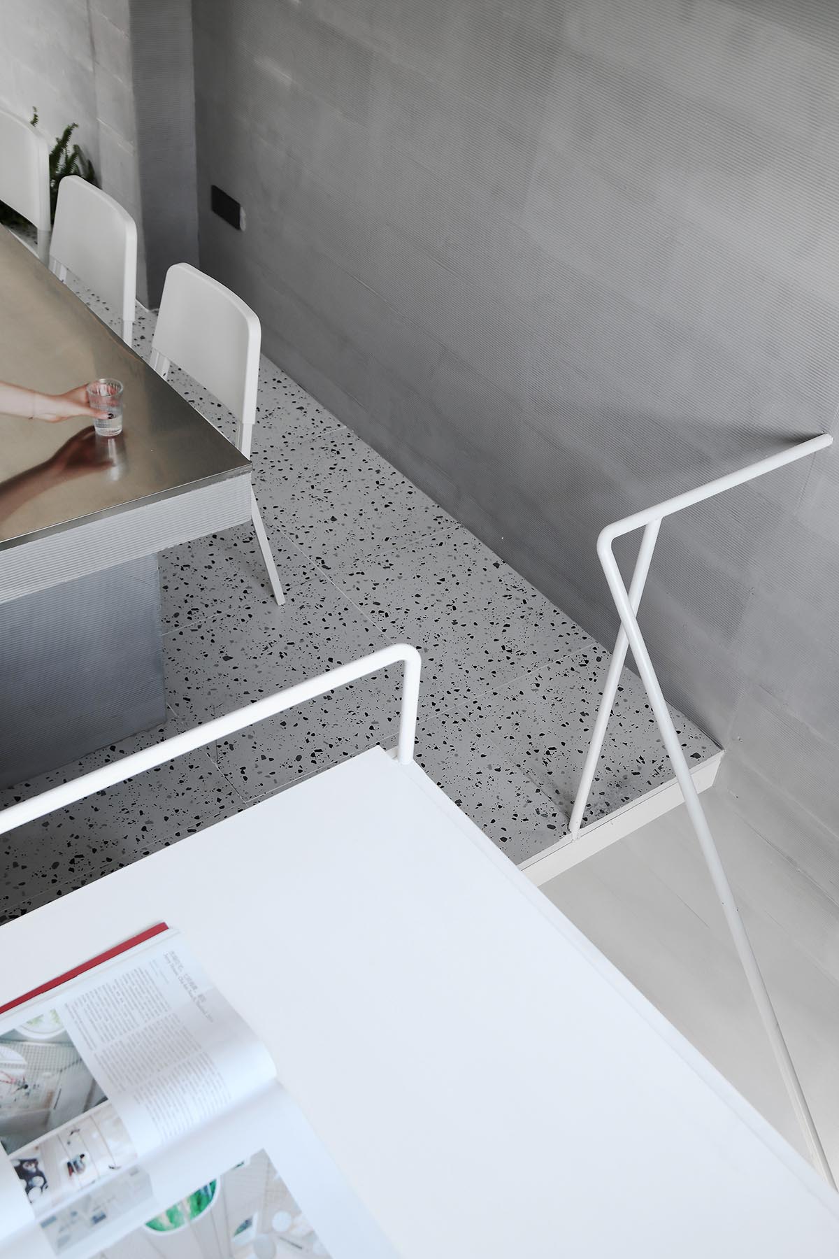
∇ 拾級而上的過程中我們設置了逐級上升的扶手,便於行走
In the process of ascending the stairs, we set up the step-by-step climbing handrail to facilitate walking
∇ “攀登”過程的休息平台也是臨時辦公空間 The rest spot for climbing can also be treated as a temporary office space
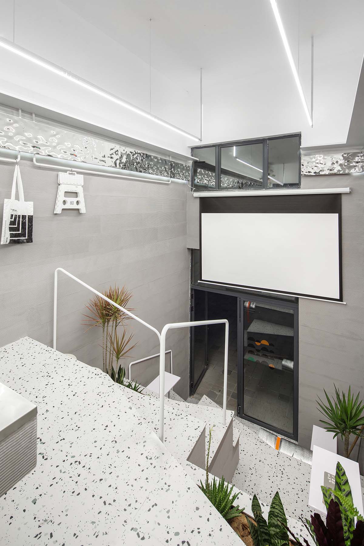
∇ 電動幕布下降後,台階部分可以錯落坐下,作為彙報、沙龍、討論空間
After the electric curtain is lowered, the steps can be staggered to sit down as a space for reporting, salon and discussion
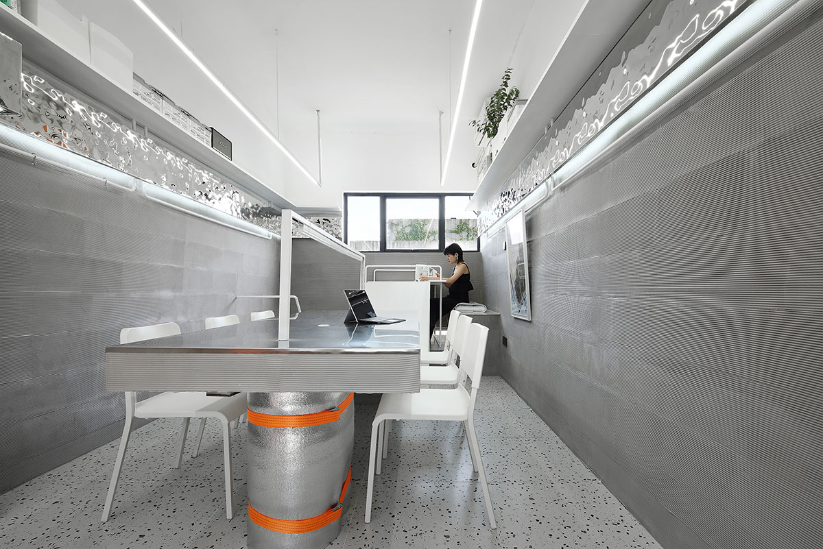
∇ 在固定6人位辦公桌的後側,順應前麵的台階的趨勢向上抬高一級,作為一獨立的辦公區,整合打印機位及收納的功能
The space at the back of the fixed 6-person desk acts as an independent office area, which integrates the functions of printer position and storage, through raising by one level along the front steps
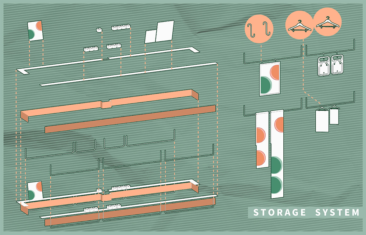
牆麵的置物體係 Storage system at the wall
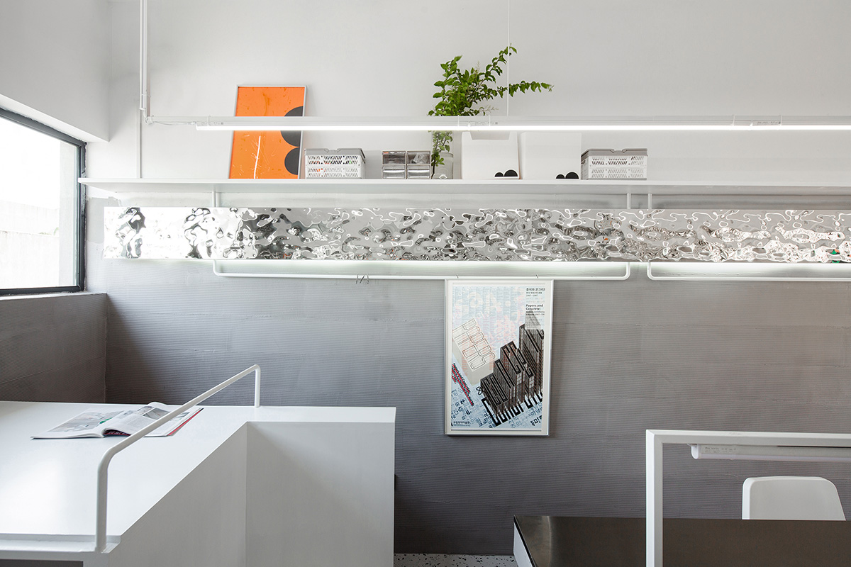
因為麵積的限製,我們將置物空間依附在了牆麵上,圍繞整體空間一周做了一圈置物體係。置物體係分為上下兩個部分,上部分衍生出深度280MM的擱架,可以放置書本,收納箱,植物等物品。
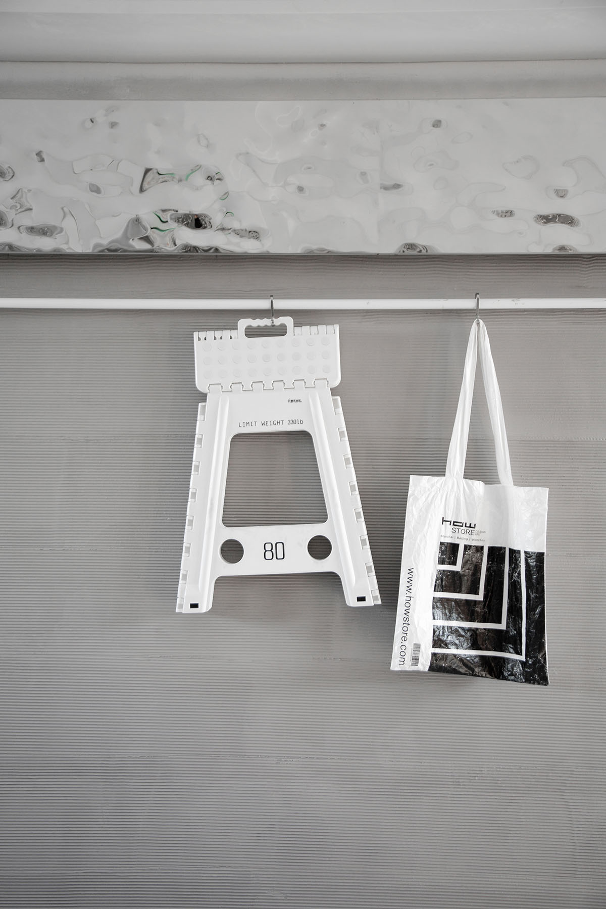
置物架下方為一圈吊杆,吊杆既是辦公室臨時作為展覽空間懸吊畫麵之用,平時也可以通過掛鉤收納展示折疊椅、畫框、辦公人員的包和衣服等。白色吊杆可以通過S型掛鉤、衣架、穿越吊掛三種方式懸吊不同物品。
Limited by the area, we attached the space to the wall and made a storage system around the whole space, which is divided into two parts. And the upper part derived from the depth of 280mm shelf to place books, store boxes, plants, etc.
Under the shelf is a circle of suspenders, which is not only used for hanging pictures in the exhibition space temporarily, but also can be used to store and display folding chairs, picture frames, bags and clothes of office workers through hooks. And the white suspender can be used to suspend different objects by S-shaped hook, coat hanger and crossing hanger.
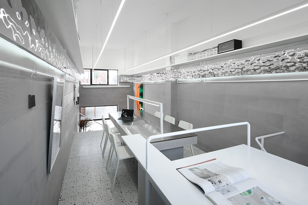
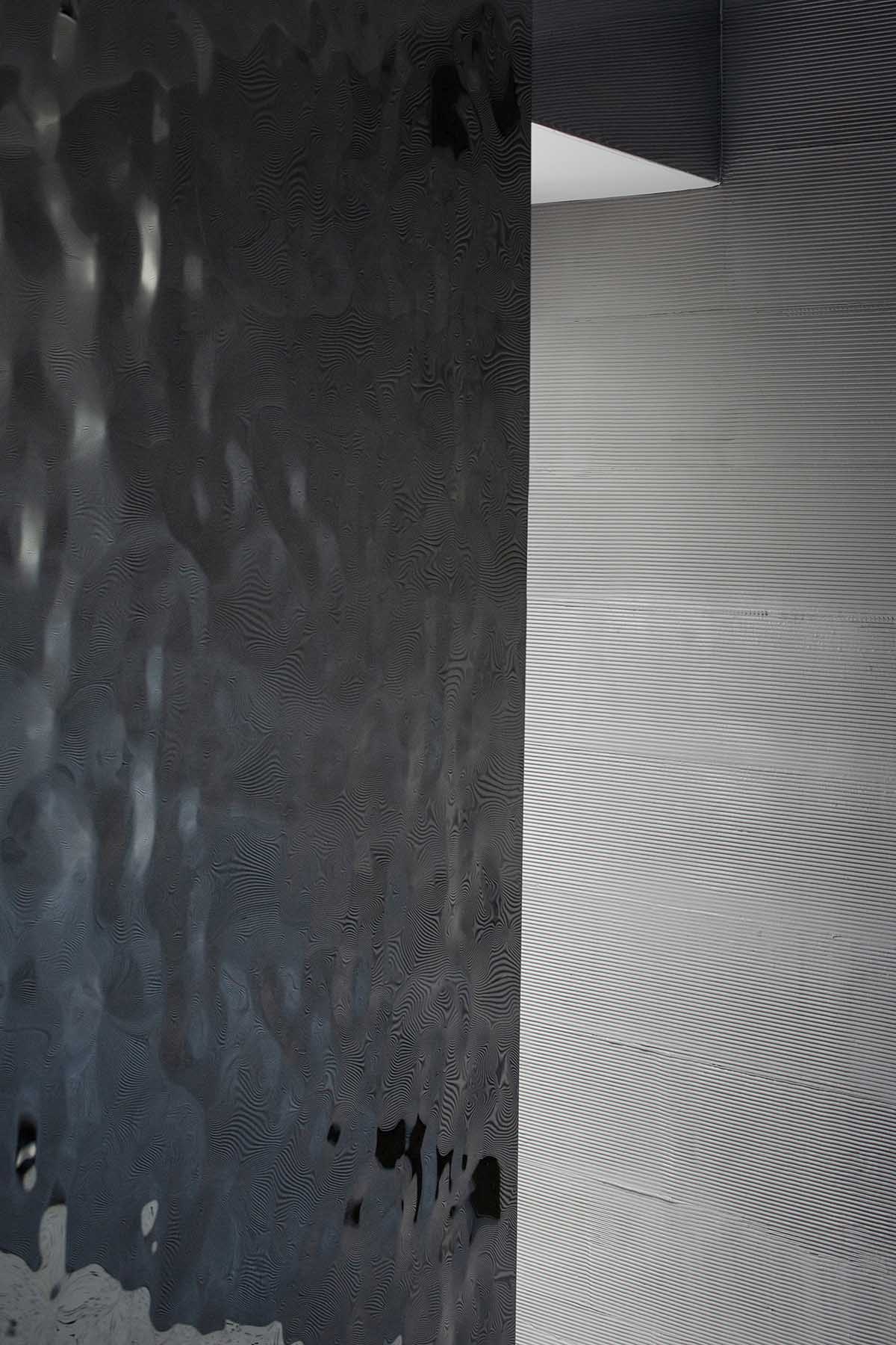
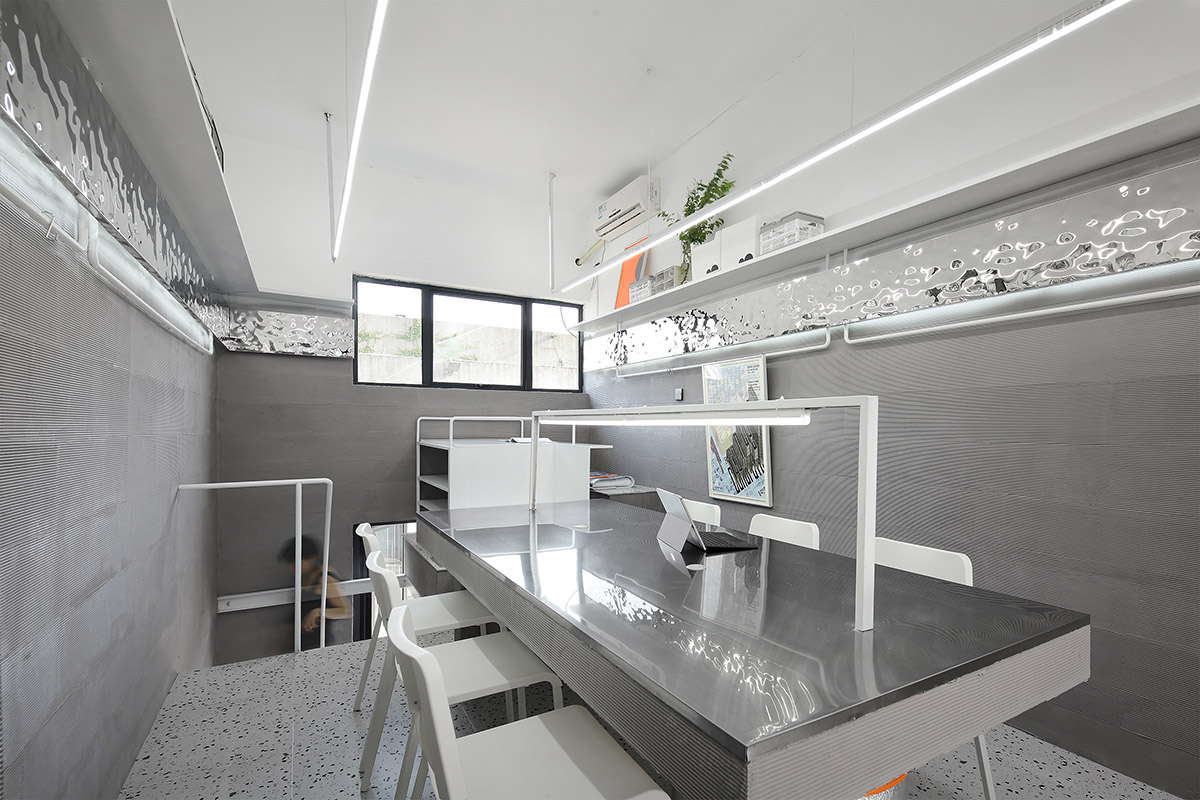
∇ 兩個置物體係中間,通過鏡麵的銀色金屬波紋板銜接,與下麵的橫條粗糙矽藻泥牆麵形成材質的鮮明對比
The center parts of the two storage systems are connected by the silver metal corrugated plate of the mirror, forming a sharp contrast with the rough diatom mud wall below
∇ 便於隨手一掛包袋、折疊椅的吊杆 The suspender is convenient for hanging bags and folding chairs
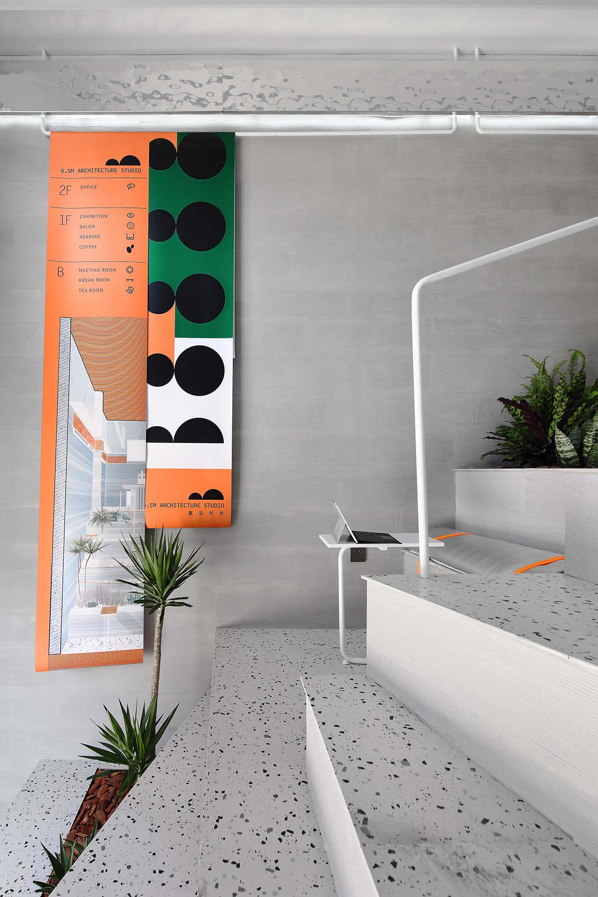
∇ 入口的台階部分也可切換成一個臨時的展覽空間,在下垂的白色圓形吊杆上懸吊畫麵,在拾級而上的過程中瀏覽畫麵
The step section of the entrance can also be transformed into a temporary exhibition space, where pictures can be suspended on the hanging white round suspenders, and can be viewed during the process of ascending the stairs
∇ 置物架的高度剛好是高度1米8左右的男生伸手能夠到的高度,女生則通過椅子或移動台階踩踏取放物品
The height of the shelf is exactly the height of about 1.8 meters, which can be reached by the boys with hands, while on which articles can be placed by the girls with the help of chairs or moving steps
小空間裏的共處 Getting along in the small space
∇ 後段夾層下為避開公共辦公區的訪客討論空間和手工模型製作空間,一人位休息室,茶水間
The visitors’ discussion space, manual-model making space, a one-person lounge and a tea room separated from the public office area are placed under the back section of the interlayer
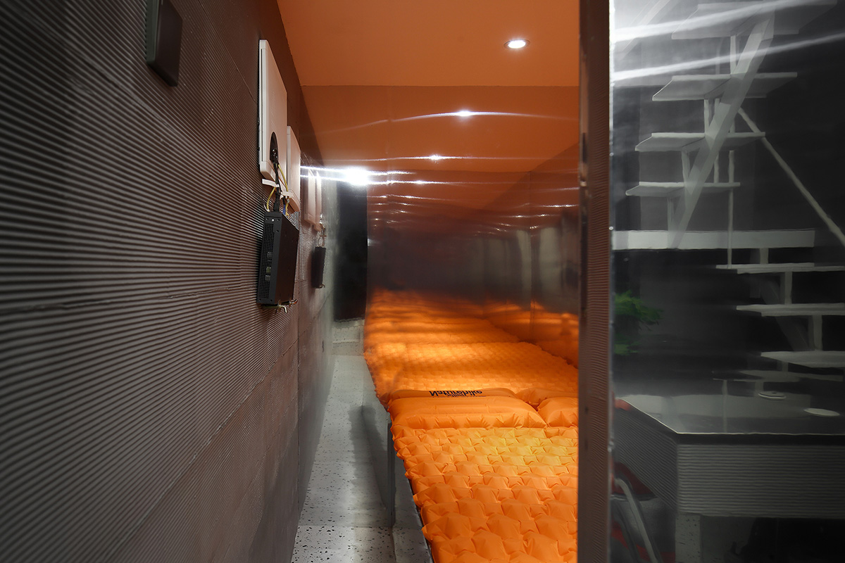
∇ 休息室內嵌了一張1.2*2M的床,可以容納1人的臨時居住需求
A 1.2 * 2m bed is embedded in the rest room, which can accommodate the temporary living needs of one person
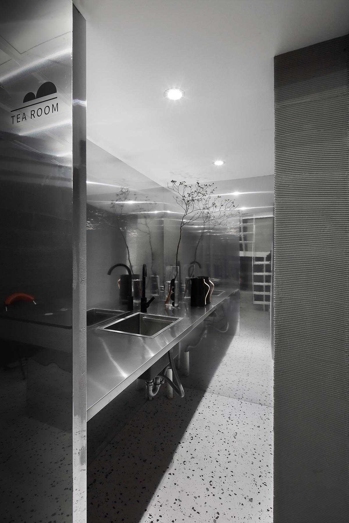
∇ 茶水間采用鏡麵不鏽鋼材質,減少小空間裏的壓迫感
The tea room applies silver metal material to reduce the sense of oppression stemming from the small space
∇ 茶水間和休息室通過一牆分隔,外麵有一推門,左右移動,滿足臨時的密閉需求
The tea room and the rest room are separated by a wall, with a sliding door outside, which moves left and right to meet the temporary requirements for personal space
∇ 因為夾層空間的存在,上下層的人們互不幹擾,各自活動
Because of the existence of the mezzanine space, people on the upper and lower layers do not interfere with each other, and perform each activity
原本的建築為前門後窗,為了保持前後的流線的貫通,我們改造後麵的窗為門。並采用了單扇可開啟關閉的折疊門的形式,可以根據需要部分或全部展開。
The original building adopts the front door and rear window. But we transformed the rear window into a door in order to keep the streamline of the front and rear. In addition, the form of a single folding door which can be opened and closed is applied, which can be partially or completely unfolded according to the needs.
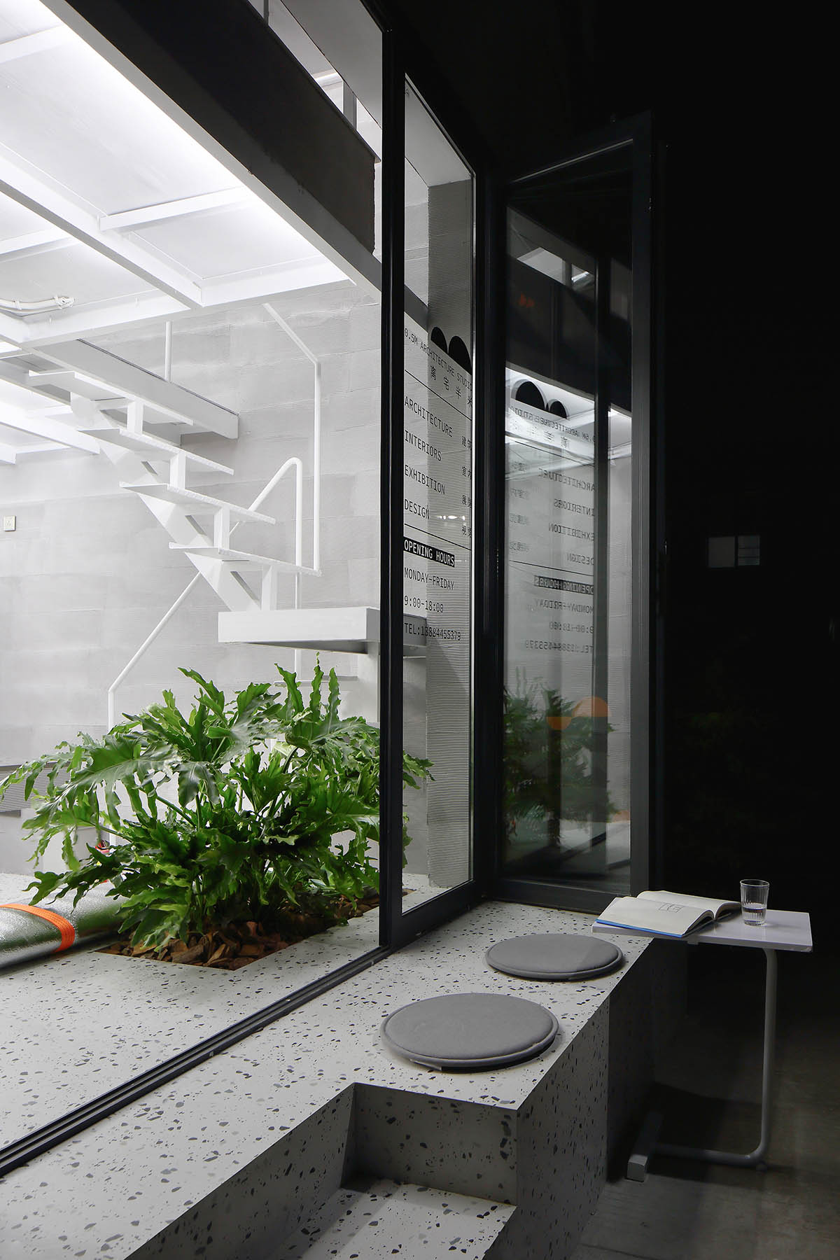
∇ 從室內開始,抬高450MM的高度作為座椅,插入樹壇並向外延伸出去成為室外的座椅。放置一臨時的小桌子,夏天的晚上,三五夥伴也可以在此聊天交談
The space 450mm raised starting from the interior is taken as a seat, which is inserted into the tree altar and extended outward to become an outdoor seat. A temporary small table is set, around which three or five friends can chat on summer nights.
∇ 室內和室外的空間因為植物的存在相互貫通著,而又有所分隔
Because of the existence of plants, the indoor and outdoor spaces are connected while separated with each other
材質的碰撞 Material collision
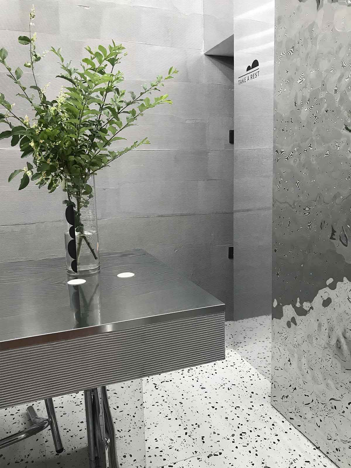
因空間較為狹小,主要用了整體灰銀色調,提高整體空間的明亮度。粗糙的橫紋矽藻泥肌理與銀色水波紋不鏽鋼兩種質感反差極大的材質在空間裏碰撞、重疊,增加了層次感和衝突感。
Because the space is relatively narrow, the overall gray silver tone is mainly applied to improve the brightness of the overall space. The contrast between the rough texture of diatom mud and the silver water ripple stainless steel, which forms great contrast, collide and overlap in space, increases the sense of gradation and conflict.
∇ 材質 Material
原始層高較高,根據功能,通過材質在垂直高度上的切割劃分,我們將整個體塊在垂直高度上分成兩個部分。通過立麵上材質和顏色的分割,消減了高度使人產生的壓迫。
As the original layer is relatively high, the whole block is divided into two parts by the material cutting in the vertical height in accordance with the function. Through the division of material and color on the facade, the oppression stemmed from height is weakened.
∇ 置物架之上與頂麵連成一片用白色的塗料使其消隱,置物架下則是粗糙的灰色的橫紋泥肌理
The space above the shelf is connected with the top surface to form a whole by the white paint. While under the shelf, the coarse gray cross texture of grain mud is used
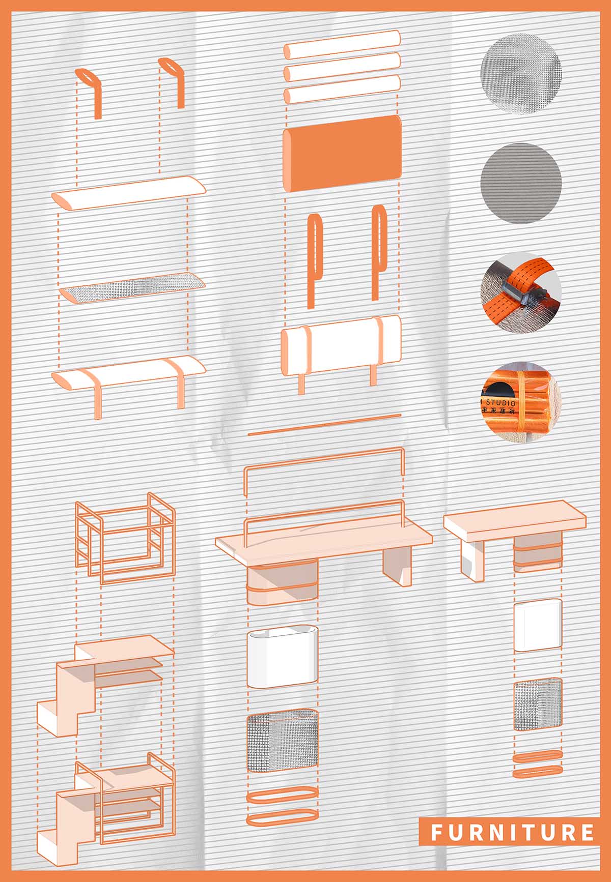
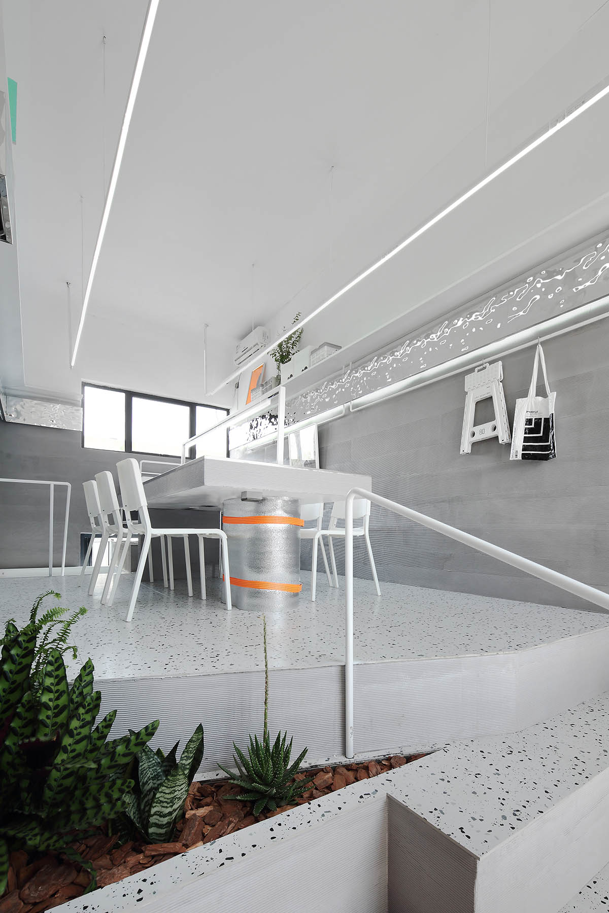
∇ 現場的桌麵、扶手等家具都根據統一的元素衍生、運用了橫紋矽藻泥肌理及白色圓管
The furniture such as tabletop and handrails all apply the texture of cross grain diatom mud and white round tube derived from the same elements
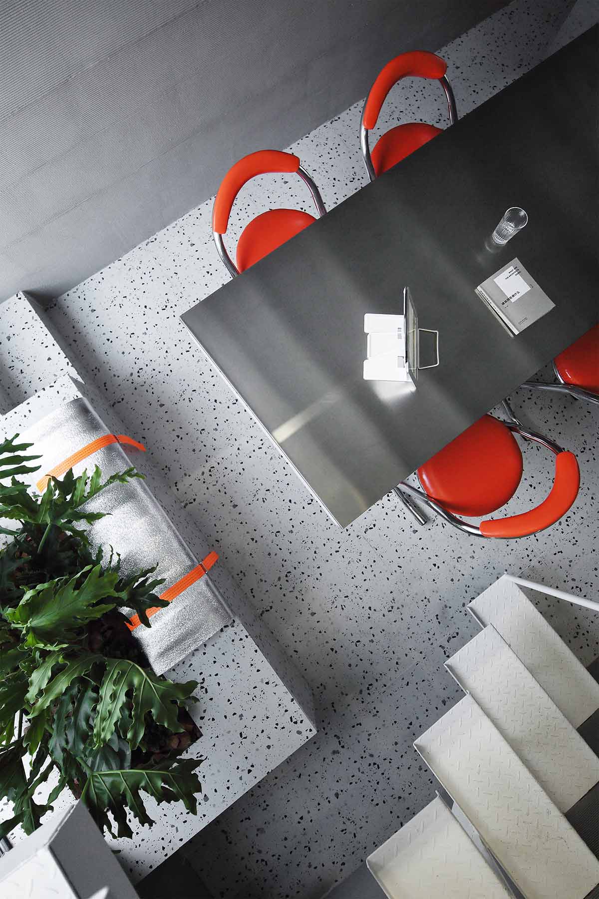
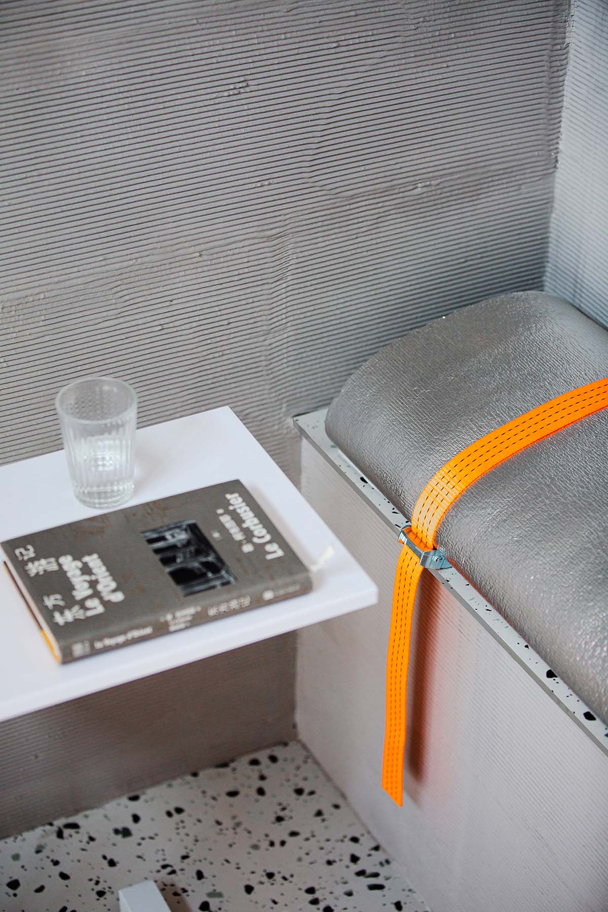
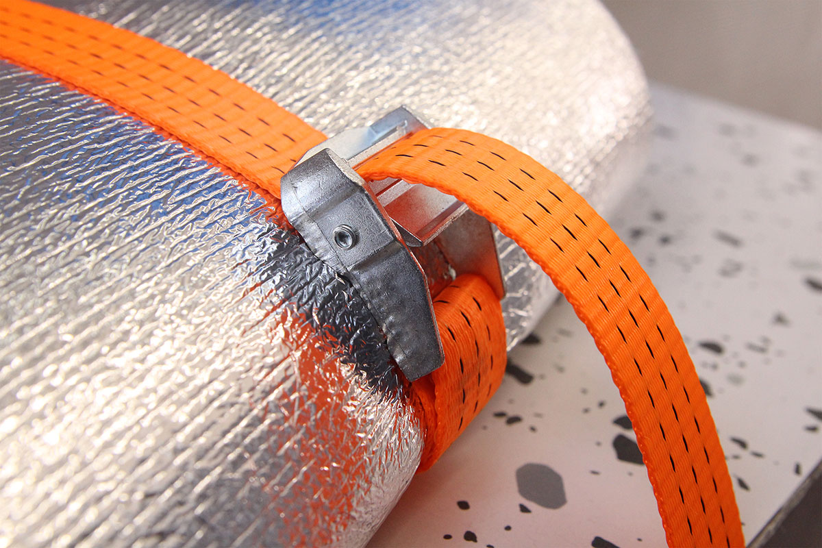
為了盡可能的減少建造成本,原本使用鏡麵不鏽鋼包裹的桌腿、用皮質軟包製作的坐墊,後期在不斷地嚐試下,通過利用閑置的海綿、壓扣捆綁帶、鋁箔珍珠棉自製了坐墊、包裹桌腿。
In order to minimum the construction cost as much as possible, the original use of table legs wrapped by mirror stainless steel and leather upholstery made of cushion was changed into self-made cushion and wrapped table leg made from idle sponge, truck strap, aluminum foil pearl cotton through constant attempt later.
∇ 因為捆綁帶的可抽拉性,可以根據需要調整坐墊的高度,並根據溫度變化更換表麵的材料
Because of the drawability of the binding belt, the height of the cushion can be adjusted according to the needs, and the surface material can be replaced according to the temperature change
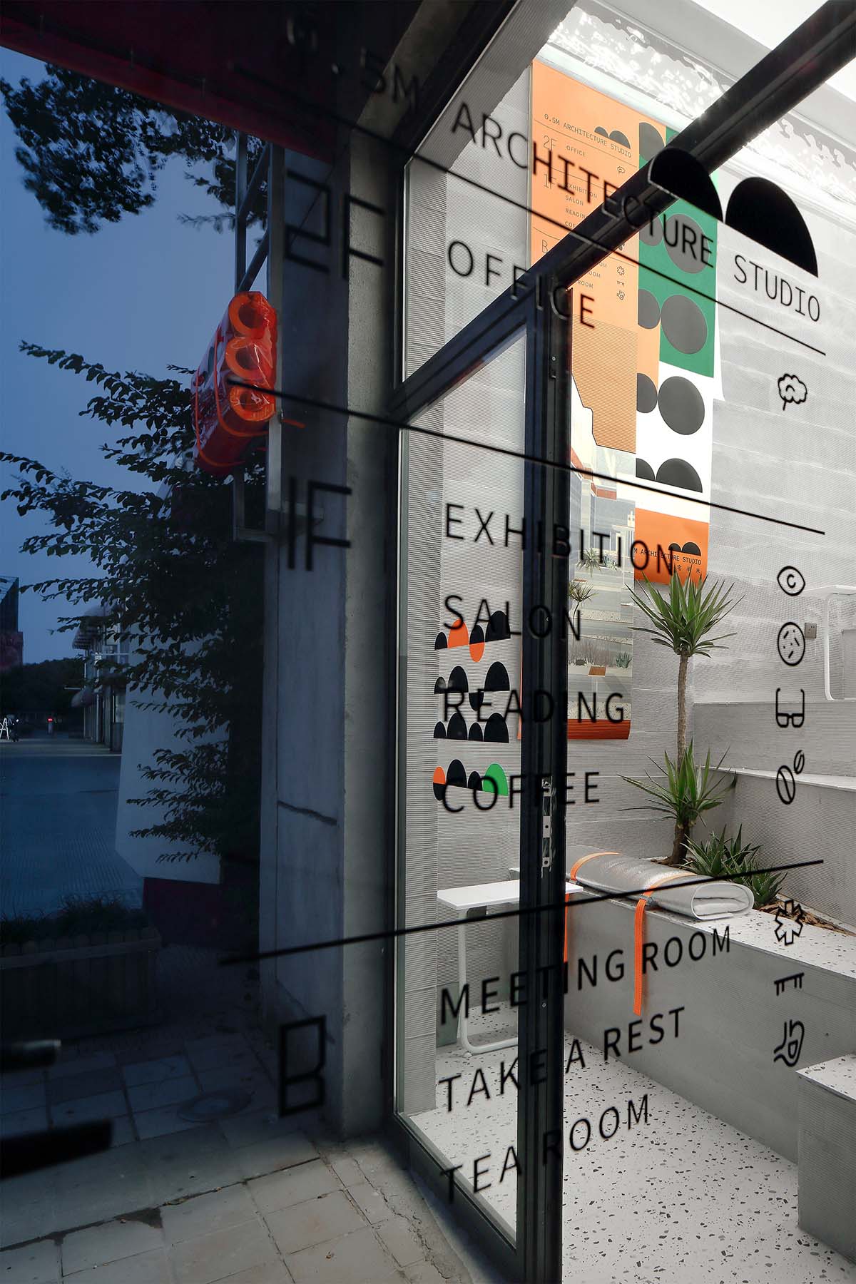
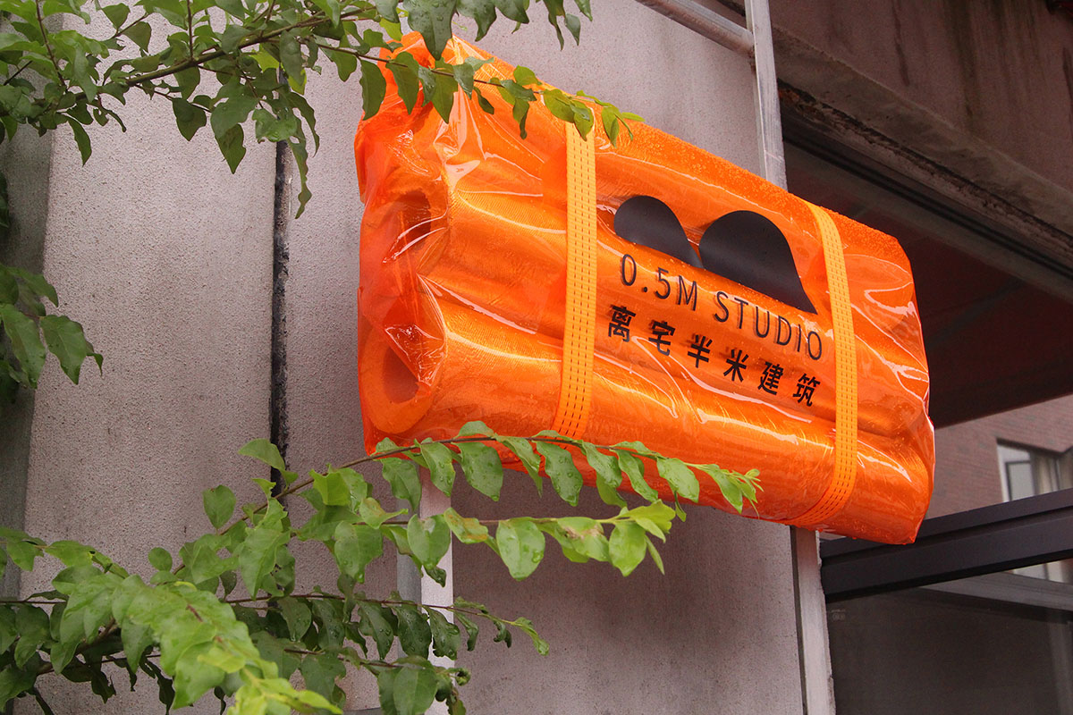
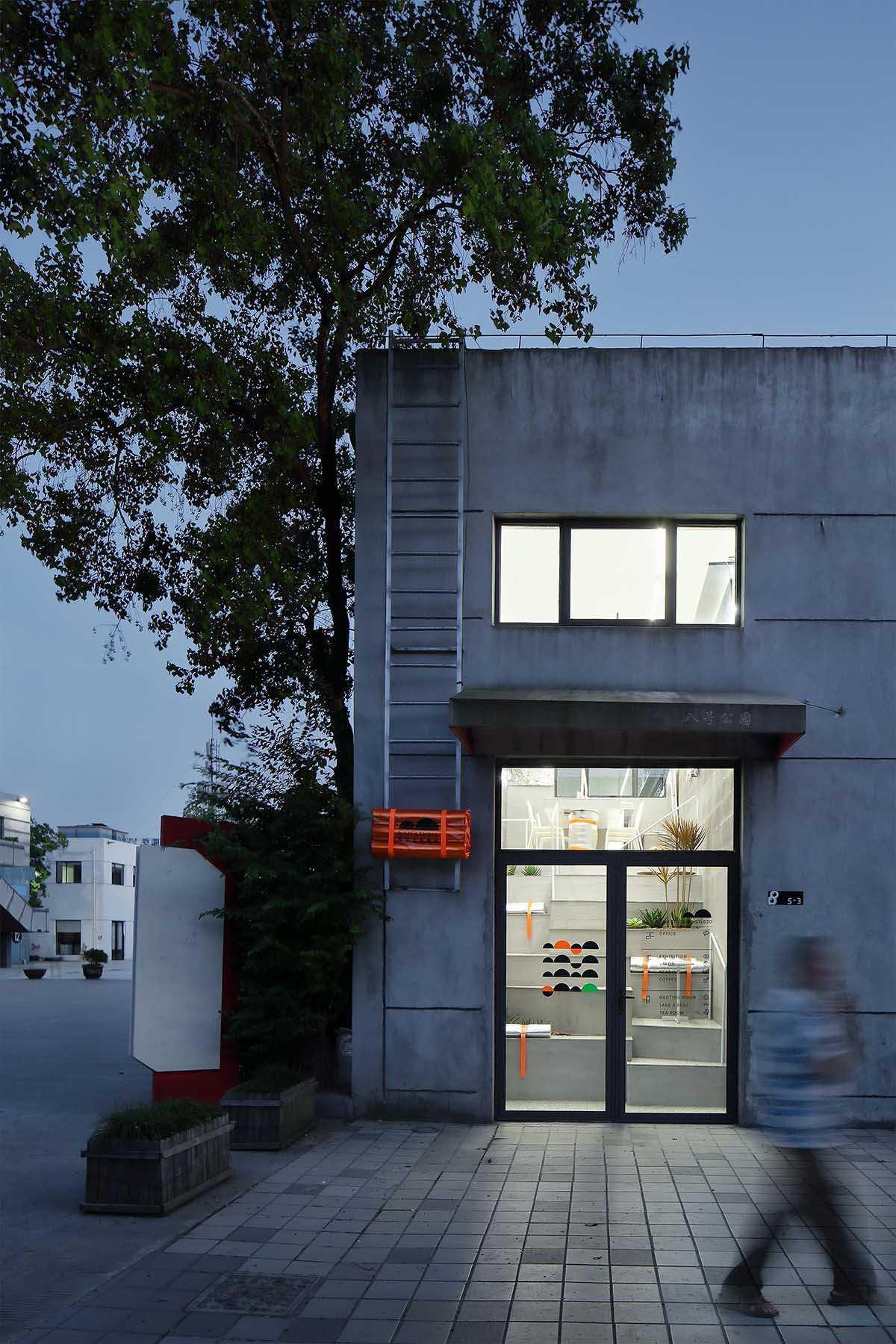
∇ 入口的門牌也同樣運用了鋁箔水管保溫棉、橘色PVC軟膜、壓扣捆綁帶組合
The entrance doorplate also uses the combination of water-pipe insulation cotton of aluminum foil, orange PVC soft film, pressure buckle binding belt
∇ 空間整體狹長,為了順應空間的狹長的感受,頂部運用了連貫的兩條燈管,形成有縱深感的兩條光帶,形成均勻的辦公照明。桌麵升起構架,用紮帶捆綁燈管固定,作為辦公輔助燈光
As the whole space is narrow and long, two coherent light tubes are used to form two light bands with longitudinal feeling, in order to adapt to the narrow and long feeling of the space and form uniform office lighting. The raised frame of the desktop is applied, and the lamp tube is fixed with tie strap, which is used as office auxiliary light
結語 Epilogue
園區的晚上反而是最熱鬧的時候,很多周邊居民來此納涼散步。來來往往間,望見這個台階上的辦公室,也探進頭來張望,好奇的邁上幾級。
Unexpectedly, the park’s evening is the liveliest time. Many residents around come here to enjoy the cool and take a walk. From time to time, they also probed their head to look around, and stepped up several steps curiously at the glimpse of the office on this step.
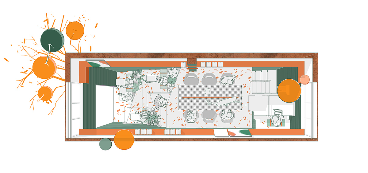
∇ 平麵圖 Plane graphic
項目信息
項目名稱:離宅半米辦公空間設計
設計方:離宅半米0.5m studio
聯係郵箱:421871017@qq.com
項目設計 & 完成年份:11/ 2019 & 04/2020
主創:王嬌兒
項目地址:浙江 寧波 8號公園
建築麵積: 40㎡
攝影版權:樸言
材質:矽藻泥、水波紋不鏽鋼、鏡麵不鏽鋼、鋁箔珍珠棉
Project Name: Design of 0.5m studio
Designer: 0.5m studio
Email:421871017@qq.com
Project design & completion year:11/ 2019 & 04/2020
Leader designer & Team:Wang Jiaoer
Project address: No.8 Park, Ningbo, Zhejiang Province
Construction area: 40 ㎡
Photo Copyright: PuYan
Main materials: diatom mud, stainless steel of water ripple, mirror stainless steel, aluminum foil pearl cotton


