全球設計風向感謝來自 多棵設計的展廳空間項目案例分享:
延鋒是國際領先的汽車零部件供應商,專注於汽車內外飾、汽車座椅、座艙電子及被動安全領域。這次延鋒邀請我們為其新研發的XiM21智能座艙概念展車的發布設計一個展示空間,旨在麵向他們長久以來的合作客戶,創造一個展示及交流的場所。承接這個項目,我們首先麵臨的問題是時間限製。因為考慮新車發布的時間,我們整體設計與施工周期為兩個半月。同時,此次新概念展車的發布僅僅會使用約三個月,就將轉移到國外車展展出,所以也需考慮經濟實用。在時間造價都緊張的情況下,去呈現的品牌及其新概念展車XiM21的設計,同時也為遠來觀展的客戶帶來歡迎與舒適的體驗,是我們這次麵臨的主要挑戰。
Yanfeng is an internationally leading automotive component supplier, focusing on interior, exterior, seating, electronics and safety. They invited us to design a showroom for their newly developed XiM21 Smart Cabin, to create a showcase and communication place to their customers with long-term cooperation.
To undertake this project, the first problem we face is the time limit. Considering the launch time of the new concept car, our overall design and construction period is two and a half months. Meanwhile, the launch of the new concept car will only be in use for about three months, and will be transferred to foreign auto shows, so economy considerations should also be considered. In the face of both time and cost constraints, the main challenge we faced this time was to present the brand and the design of the XiM21 new concept vehicle, as well as to bring a welcome and comfortable experience to the visitors.
我們的場地是在其原有的展廳基礎上做翻新設計。原來的空間較為昏暗,展板隔斷將空間分為一個個小型的主題展區。我們認為以前展陳的設計雖然劃分明確,但展覽流線單一,空間小且閉塞,不能呈現延鋒的品牌高度以及產品質素,同時給客戶帶來的觀展體驗也不佳。所以,我們將原有的吊頂以及隔斷全部拆除,在L 型的場地上,重新規劃。
Our site is a renovation based on the existing showroom. The existing space is relatively dark, the partitions divided the space into a few small theme areas. In our opinion, although the previous exhibition space was clearly divided, the exhibition circulation was one-way, the space was small and closed, which could not present the brand and product quality, and at the same time, the exhibition experience brought to customers was not good. Therefore, we removed the all the existing ceiling and partitions, and re-planned on the L-shaped site.
1.路線的生成 The generation of route
非線性展覽流線,主次雙向展廳。
Nonlinear exhibition circulation, primary and secondary two-way showroom.
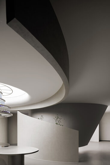
我們希望參觀者可以自主選擇路線,同時對產品的認知體驗過程卻不為路線所隔斷。為此我們在選擇設計方式時,就開始思考去表達空間的多義性和不確定性。首先牆體隔斷上使用半透明亞克力管牆麵以及垂簾,“軟隔斷”限定路線但不打斷視線;其次半高地台既可以形成適合發布的圍合空間,而人的視線也可以通過上方瞥見概念車的一角。在曲線帶來柔和與動感的路線之上,從次展廳內的“部件” 到主展廳內的“車體”,訪客可以有序且完整地體驗延鋒此次XiM21新款概念車的設計。
We hope that visitors can choose their own route, and at the same time, the process of cognition and experience of the product is not separated by the routes. Therefore, when we choose the way of design, we begin to think about expressing the ambiguity and uncertainty of space. First of all, translucent acrylic pipe and curtain are used for partitions, “soft partition” defines the route but does not interrupt the sight. Secondly, the semi-highland platform can form an enclosed launch event space, and the line of sight of people can also glimpse a corner of the concept car through the upper part. On the line of curves that bring softness and movement, from the “parts” in the secondary exhibition zone to the “body” in the main exhibition zone, visitors can experience the design of the XiM21 concept car in an orderly and complete way.
2.材質的獲得 The acquisition of Materials
舒適與科技是智能車給我們的第一認知,我們希望這種認知能始於訪客進入空間伊始,且不終於觀展路線的結束。舒適,科技是整個空間氛圍彌漫的身體感受。
Comfort and technology are the first recognition given to us by intelligent cars, which we hope will start at the beginning of visitors’ entry into the space and will not end at the end of the exhibition route. Comfortable, the technology is the whole space atmosphere pervades the body feeling.
牆體底端柔和的燈光隨著透明的亞克力管漫射到整個空間,管體上半部分則通過頂麵的LED燈打亮,每一根亞克力管都呈現透明的光澤。而亞克力管上下則通過拉絲不鏽鋼固定。流轉的亞克力圓管牆麵烘托了展品,而彌漫的柔和光線則帶給人舒適的觀展體驗。
The soft light at the bottom of the wall diffuses into the whole space along with the transparent acrylic pipe. The upper part of the pipe is lit by the LED light at the top, and each acrylic pipe presents transparent luster. The acrylic pipe is fixed up and down by brushed stainless steel. The walls of the flowing acrylic tubes foil the exhibits, while the diffuse soft light brings people a comfortable exhibition experience.
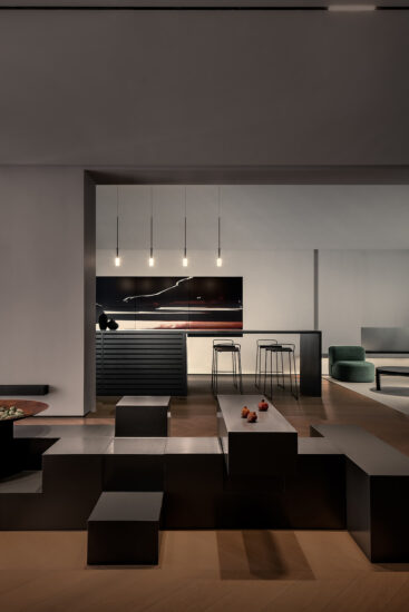
與其它展廳不同的是,我們的空間不僅用於展覽,也是發布之後客戶休息交流的場所。整個開放的空間可以自由的行走休息。台階座位,吧台座椅,沙發卡座為不同人群提供休息交流的空間。在觀展,發布之後,我們可以將發布區及展區之間的垂簾打開,使空間不受路線的限製,整個開敞。這時地毯與木材的質感又令空間呈現咖啡吧的氣質。展區之間安置有吧台,座椅與植物,客戶可以舒適地在其間交談,同時也是對展品的二次感受。
Unlike other showroom, our space is not only used for exhibitions, but also a place for customers to rest and communicate after the event. The whole open space is free to walk and rest. Step seats, bar seats and sofa seats provide space for different groups of people to rest and communicate. After the launch event, we can open the curtain between the event area and the exhibition area, so that the space is not restricted by the route, and the whole space is open. At this moment the sense of carpet and wood floor makes the space presents like a coffee shop. There is a bar between the exhibition area, seats and plants, in which customers can comfortably talk, and a second experience of the exhibited products.
這次我們從空間的流線與體驗感兩個方麵同時著手設計,通過兩者的互相表達,完成了客戶最初的願景。“互聯”“透明”的路線設計,有序完整地體現了XiM21概念展車的設計成果。具有科技感和柔和舒適的材質選擇搭配為客戶創造了一個親切的環境,將XiM21新款概念車給人的體感,從車內延展到車外。
This time, we started to design from the two aspects of space circulation and the material experience. Through the mutual expression of the two, the original vision was completed. The design of “interconnection” and “transparency” embodies the design results of XiM21 concept car in an orderly and complete way. The selection of materials with a sense of technology and comfortable materials created a friendly environment for the visitors, to extend the XiM21 concept car experience from inside the car to the outside of the car.
∇ 平麵圖
項目信息
項目名稱:延鋒創新展廳項目
客 戶:延鋒
室內設計:多棵設計
設計團隊:陳曦,李蓉,藍蘭,莊皓淶,姚廣國
項目設計師:李蓉
機電設計:李目
施工團隊:上海路遠建築裝飾工程有限公司
項目地址:中國上海市徐彙區欽州北路1001號
項目類型:室內設計-汽車展廳
項目麵積:600㎡
完成時間:2020.06
攝 影 師:存在建築
材料及品牌:美利肯地毯,瑪拉蒂家具
Project Name: Yanfeng Creative Showroom
Client:Yanfeng
Interior Designer:Studio DOTCOF
Design Team:Xi Chen,Rong Li,Lan Lan, Haolai Zhuang, Guangguo Yao
Project Designer: Rong Li
MEP Designer: Mu Li
Contractor: Shanghai Luyuan Construction Decoration Engineering Co. Ltd.
Address:No.1001 North Qinzhou Rd,Shanghai, China
Category: Interior Design – Car Showroom
GFA:600㎡
Completion Time:2020.06
Photographer:Arch-Exist
Materials and brands:Milliken Carpet, Maratti Furniture


