全球設計風向感謝來自 AD ARCHITECTURE∣艾克建築設計(http://www.arch-ad.com/)的展廳空間項目案例分享:
設計思考 Design thinking
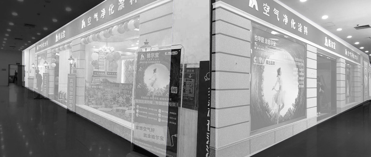
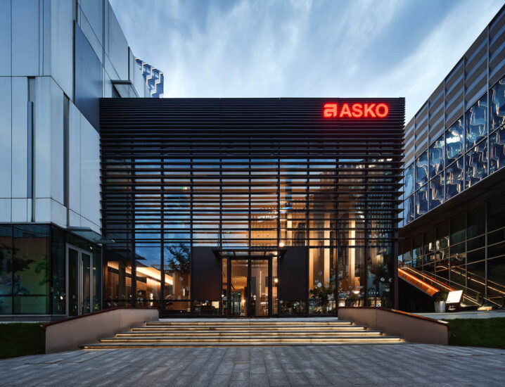
“一個缺失的位置,項目位於商場的邊角,一個商業氣息最差的位置,感覺是一個被遺忘的角落。如何改變這個結果是設計策略一個重要的組成部分。”
The project is located at a mall’s corner, which seems like a forgotten area because of its low person flow. Therefore, changing this situation is a very important part of the design strategy.
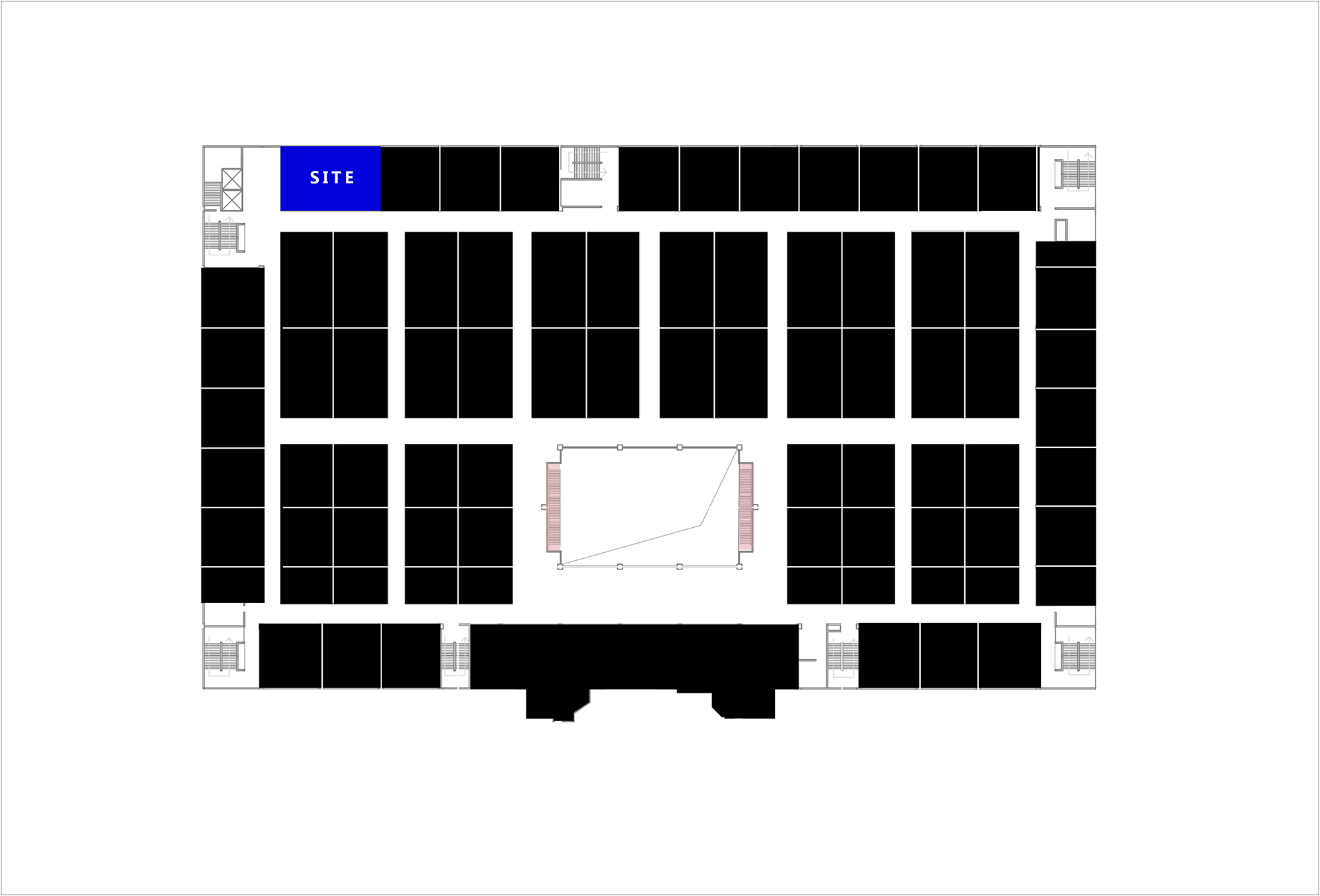
∇ 展廳區位
∇ 場地原狀
Novacolor是源自意大利藝術塗料,始於研製一些曆史悠久石膏類天然礦物質塗料。如何讓200種漆麵的質感與色彩展示在一個180㎡的空間中處於和諧的位置,同時通過視覺與體驗給帶來商業引流,這是我們骨子裏的動機,為了達到一個結果而不是一個目的。
Novacolor was established in Italy, and originated from developing some natural mineral paints that have a long history. The design team aims to display 200 paints’ textures and colors harmoniously in a 180-square-meter space, and attract more customers through eye-catching exhibition and wonderful experience.
∇ 空間概念
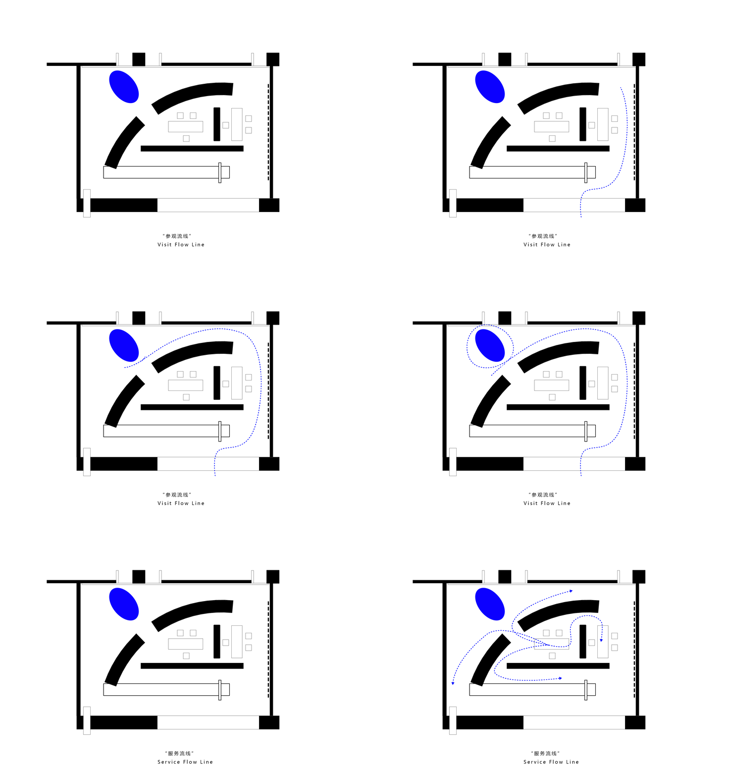
自由平麵 Free plane
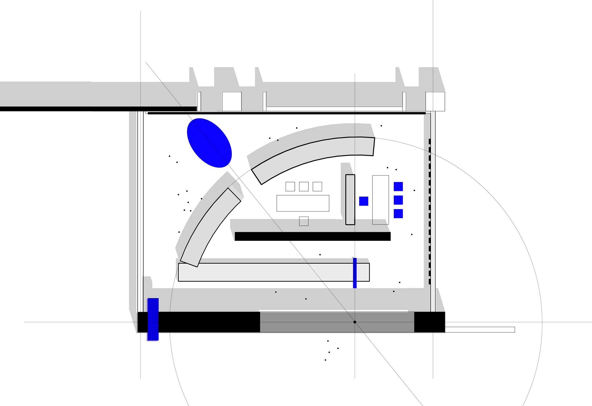
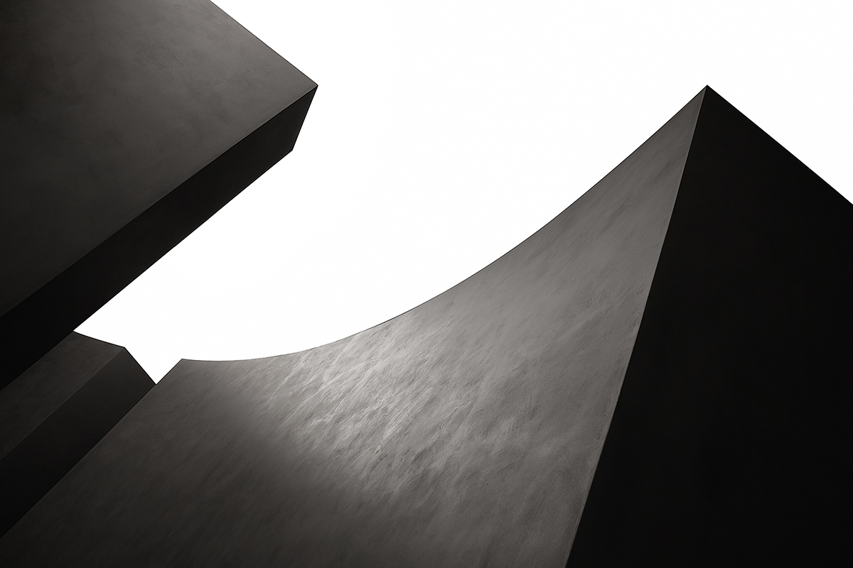
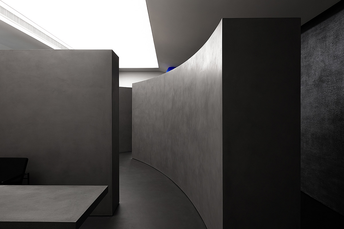
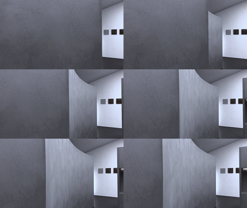
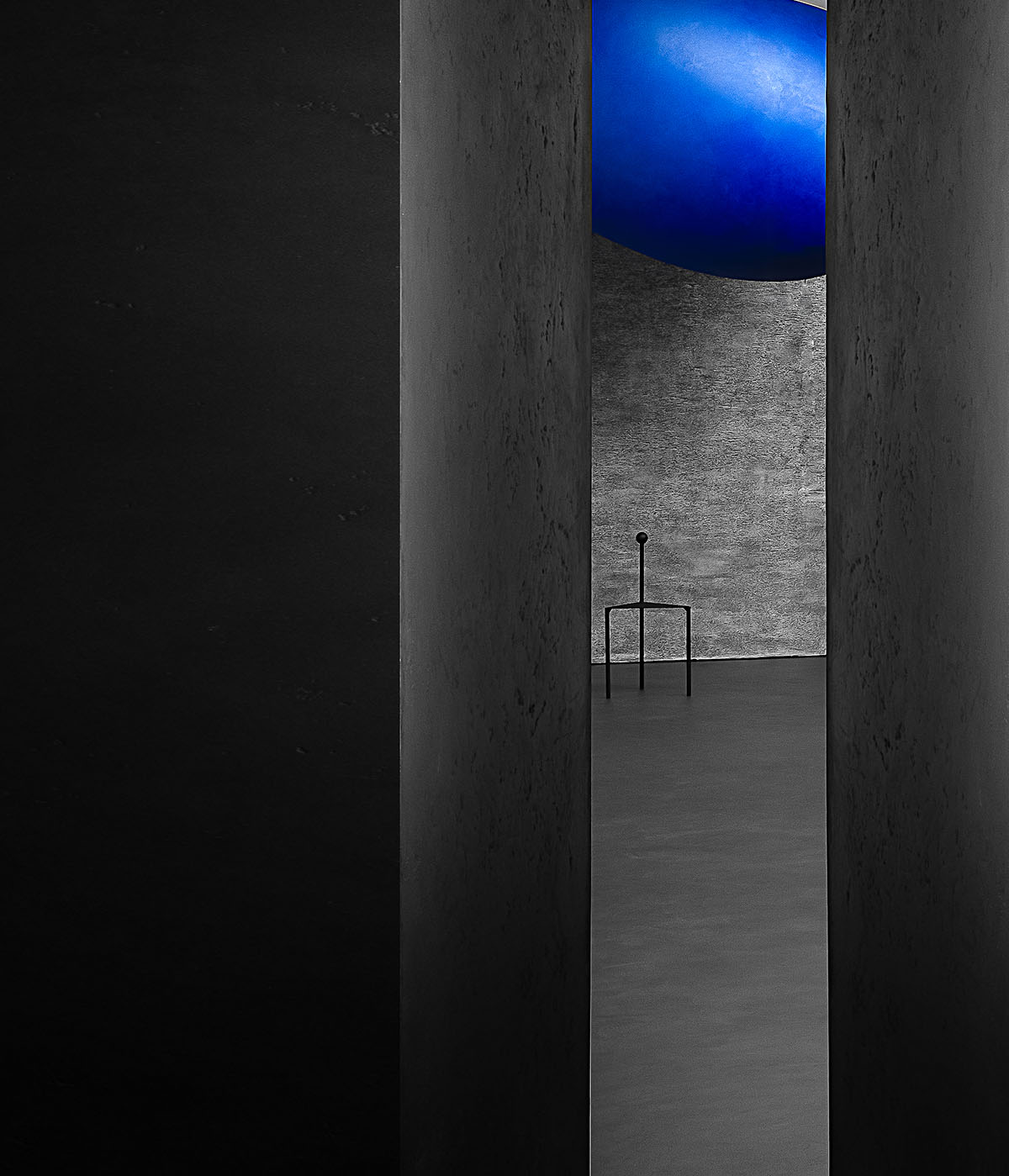
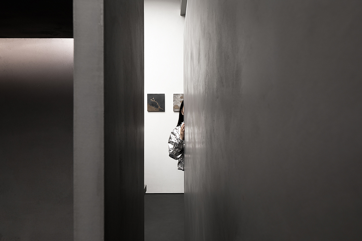
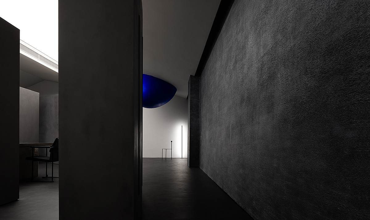
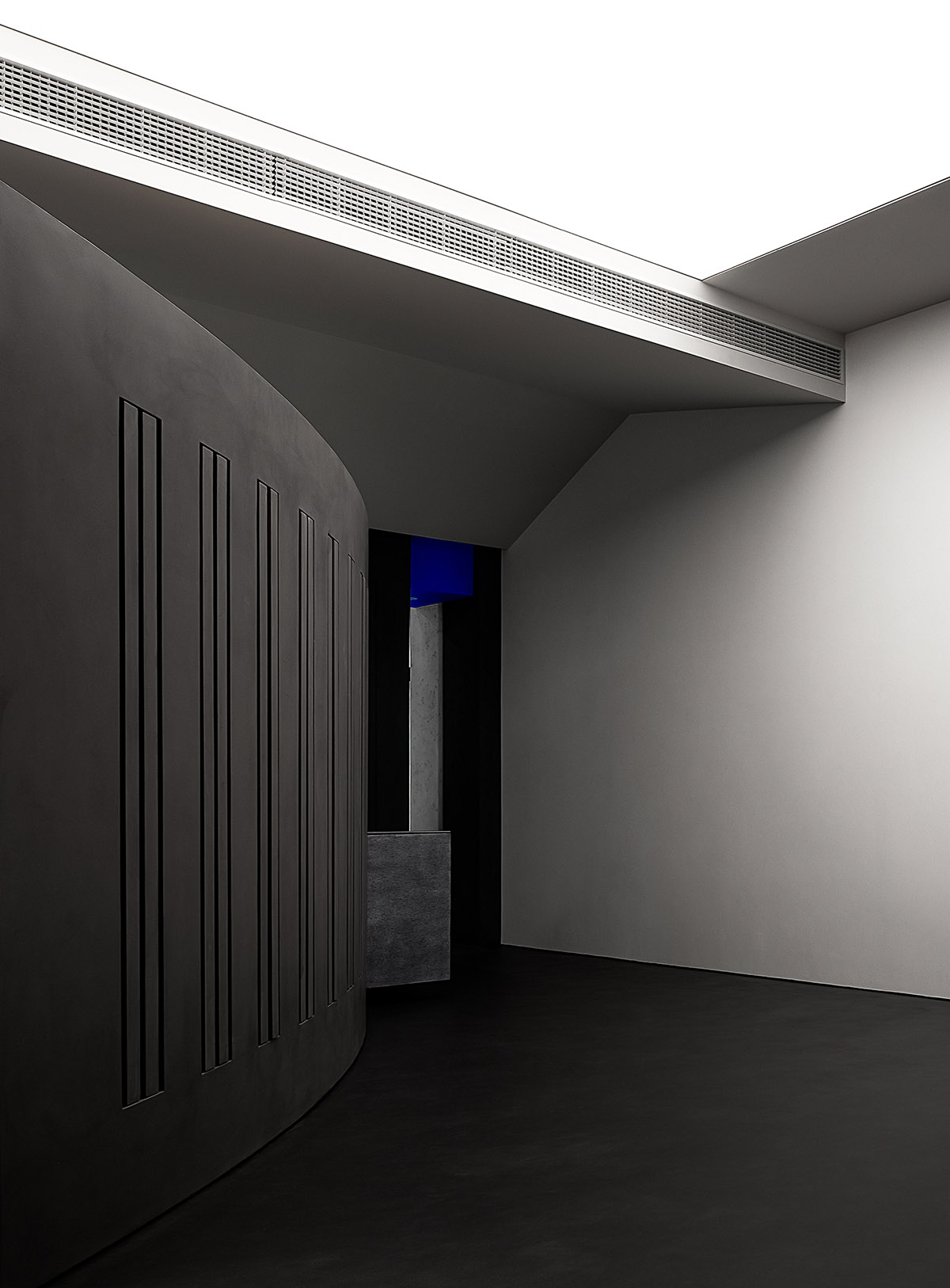
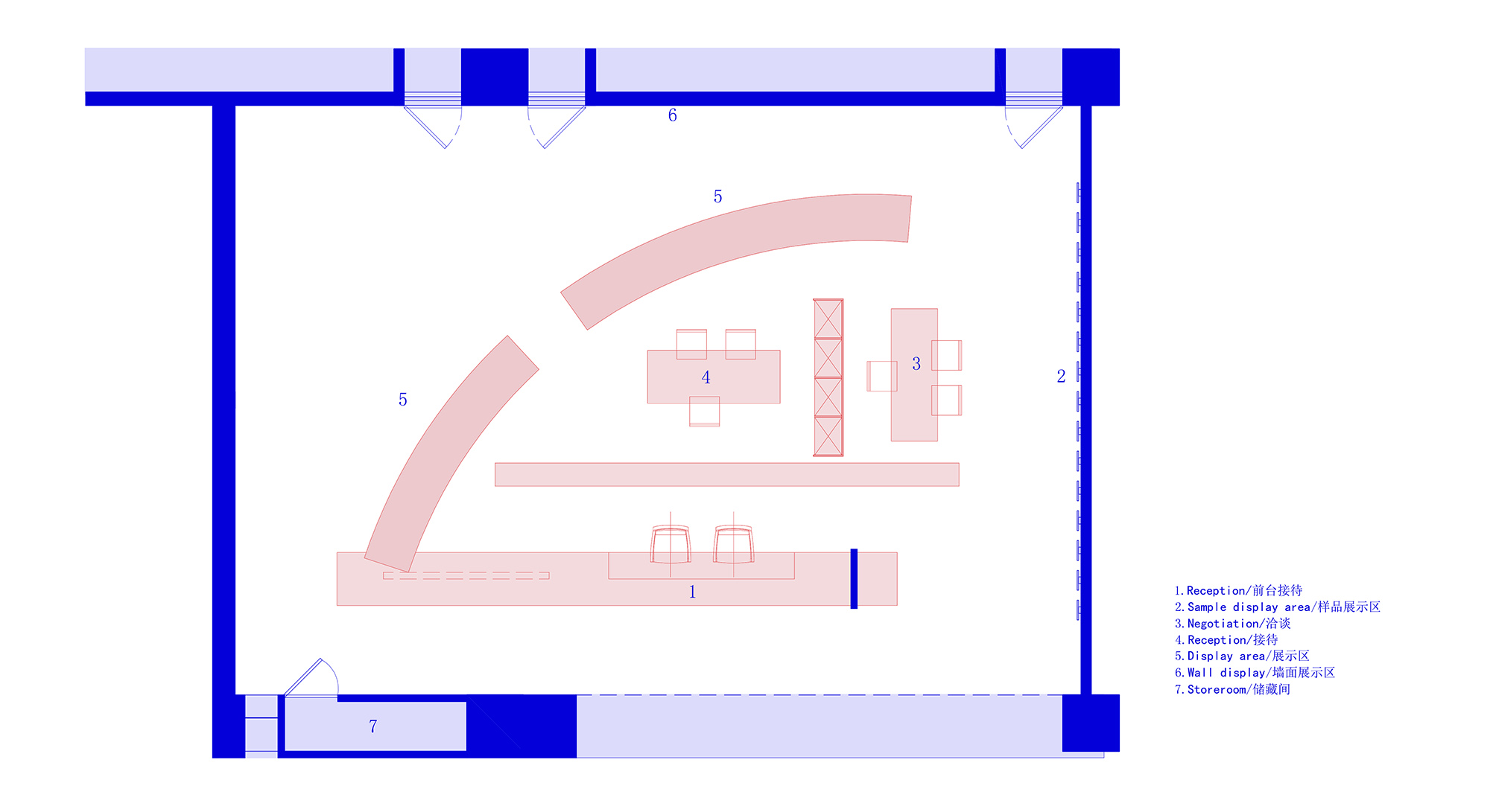
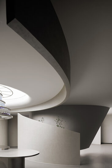
不規則的幾何線條互相交織/分離,一個散而聚的矛盾體構成了一個自由開放的幾何平麵,為通透開放,自由流動的空間性格奠定了基礎,簡單的幾何體量,無裝飾的立麵造型,縫隙窺視的既視感,為空間闡述著一種新的氛圍,以小見大。
Irregular geometric lines are intertwined or separated. These contradictory lines constitute a free and open geometric plane, laying the foundation for a smooth and freely flowing space. The simple geometric volume, non-decorative elevation and the mystery of peeping through the gap present a new atmosphere for the space. The whole spatial pattern can be imagined from small details.
∇ 平麵構成
呼吸 Breath
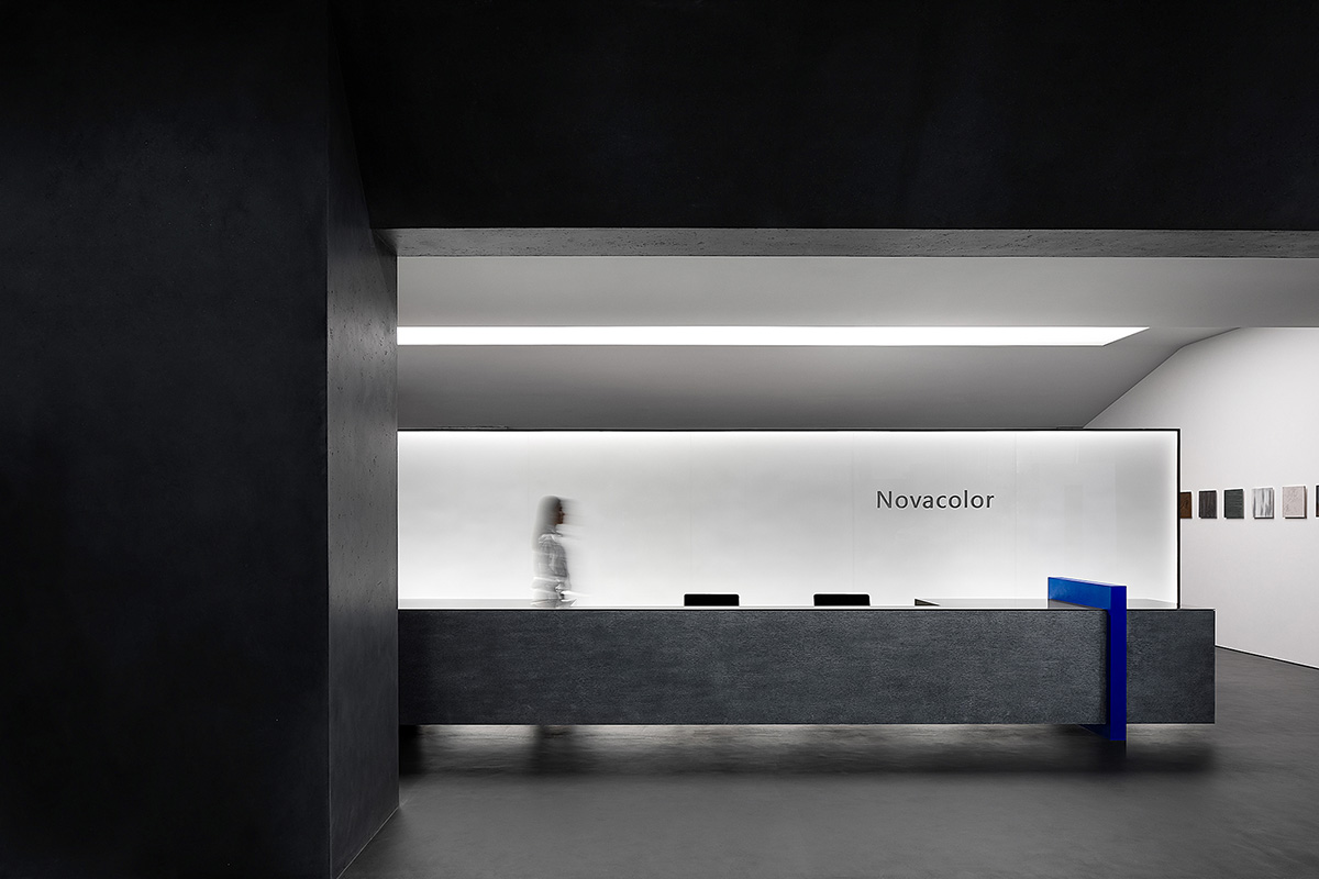
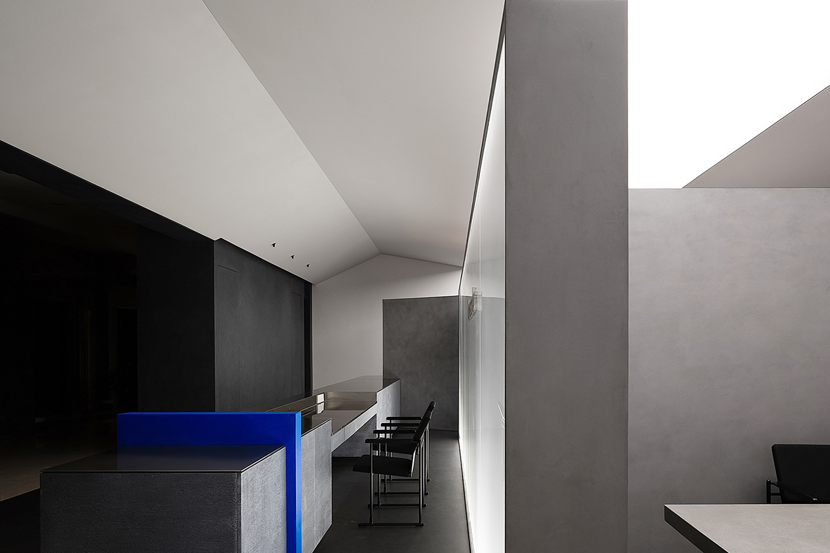
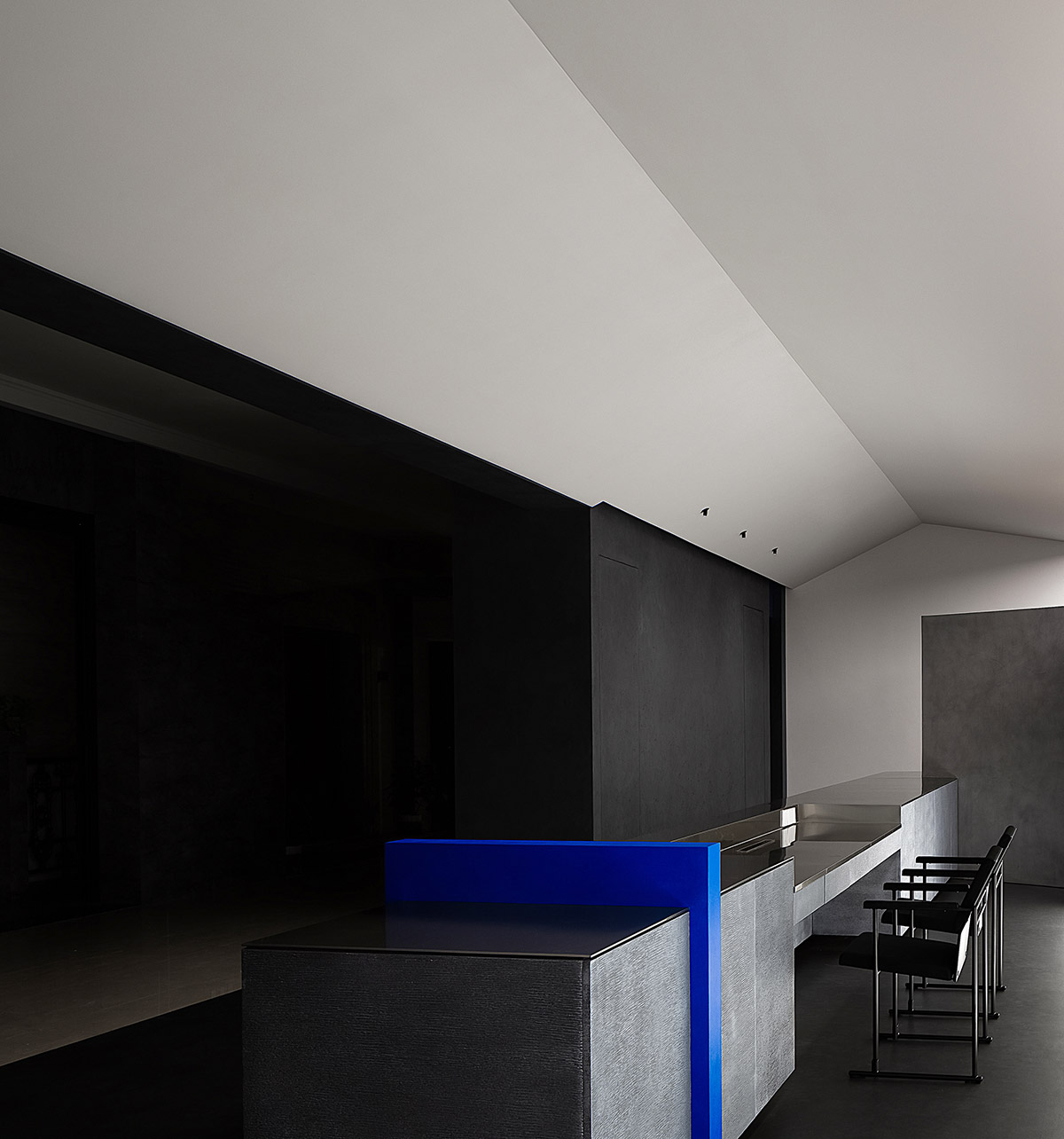
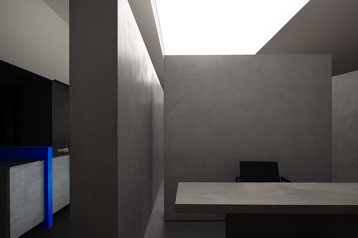
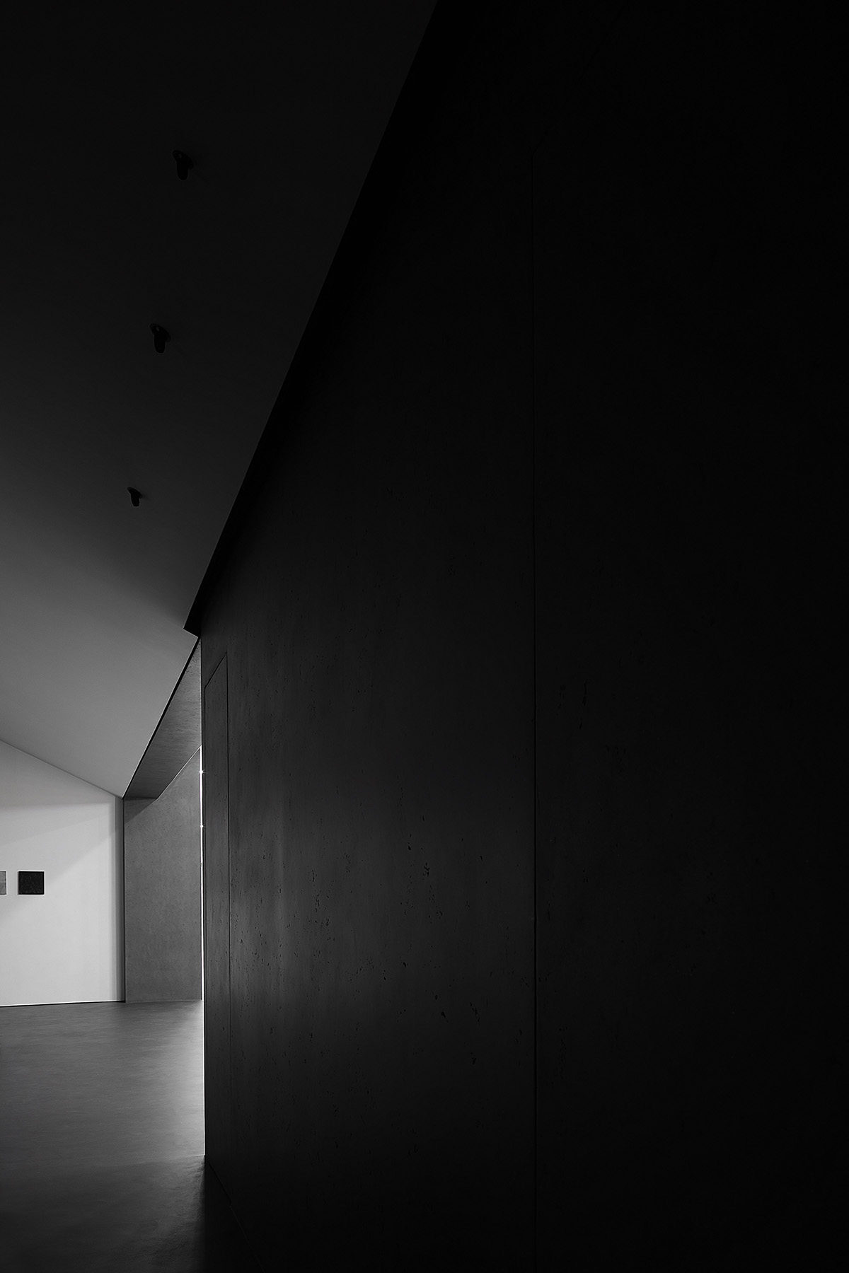
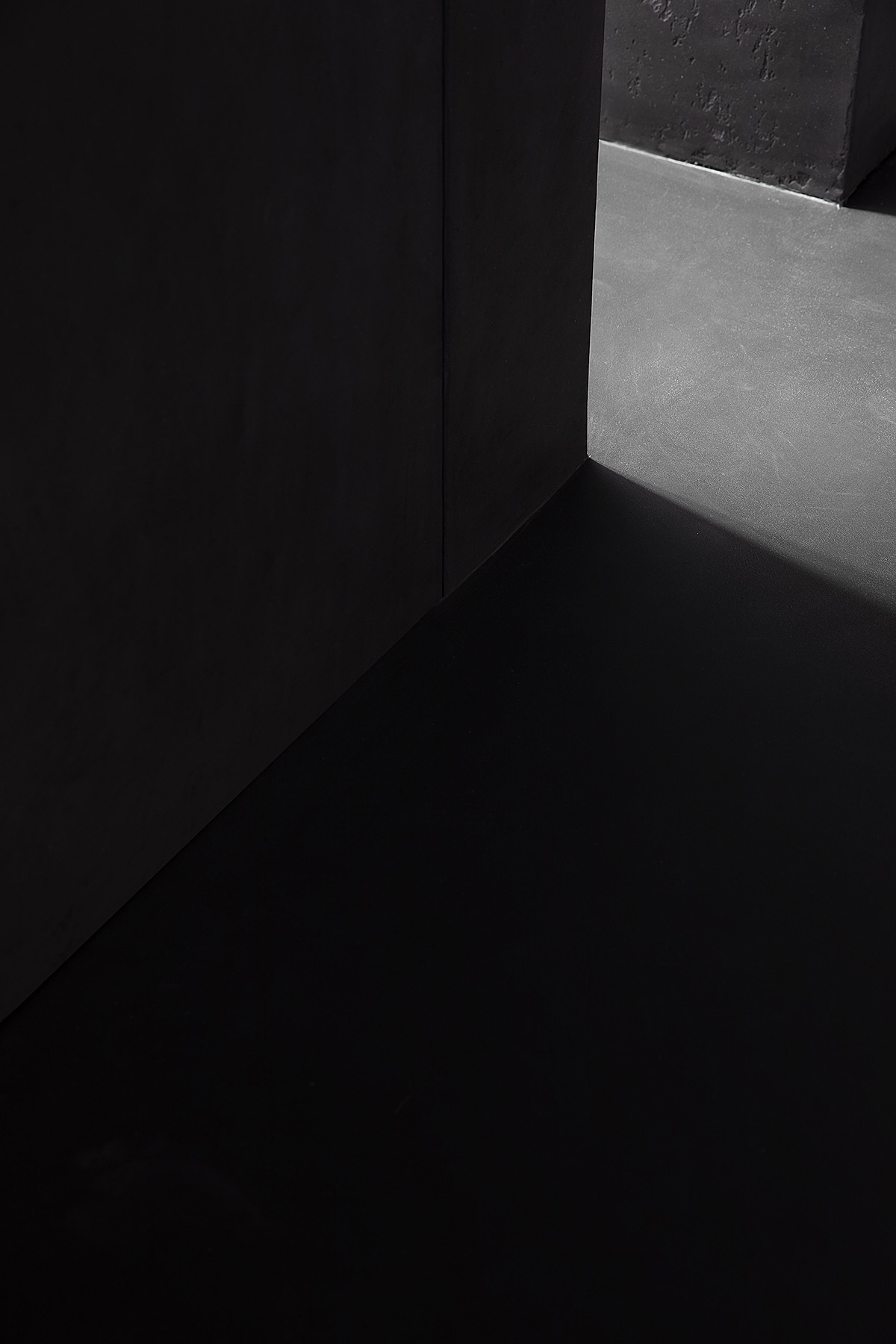
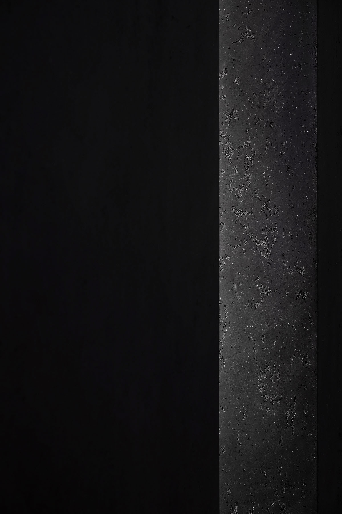
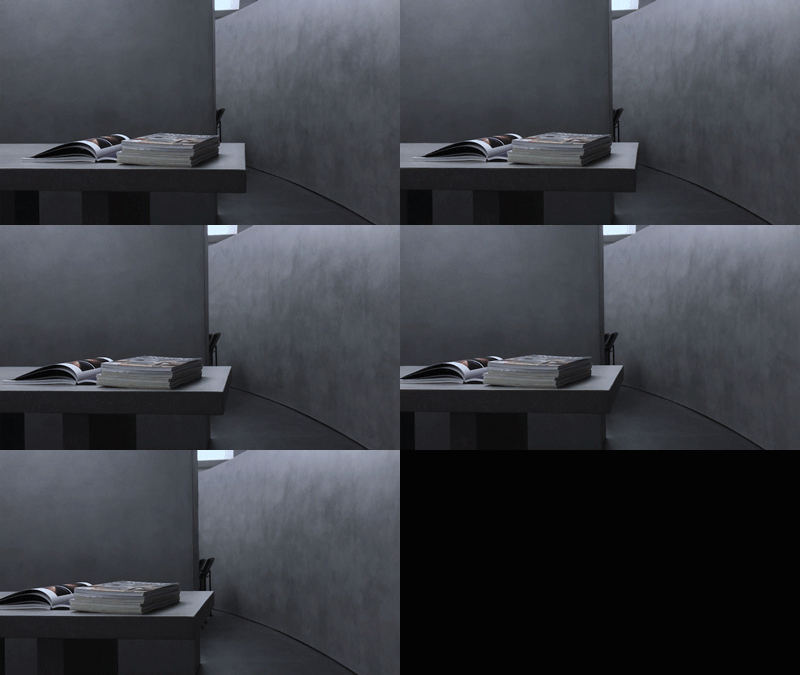
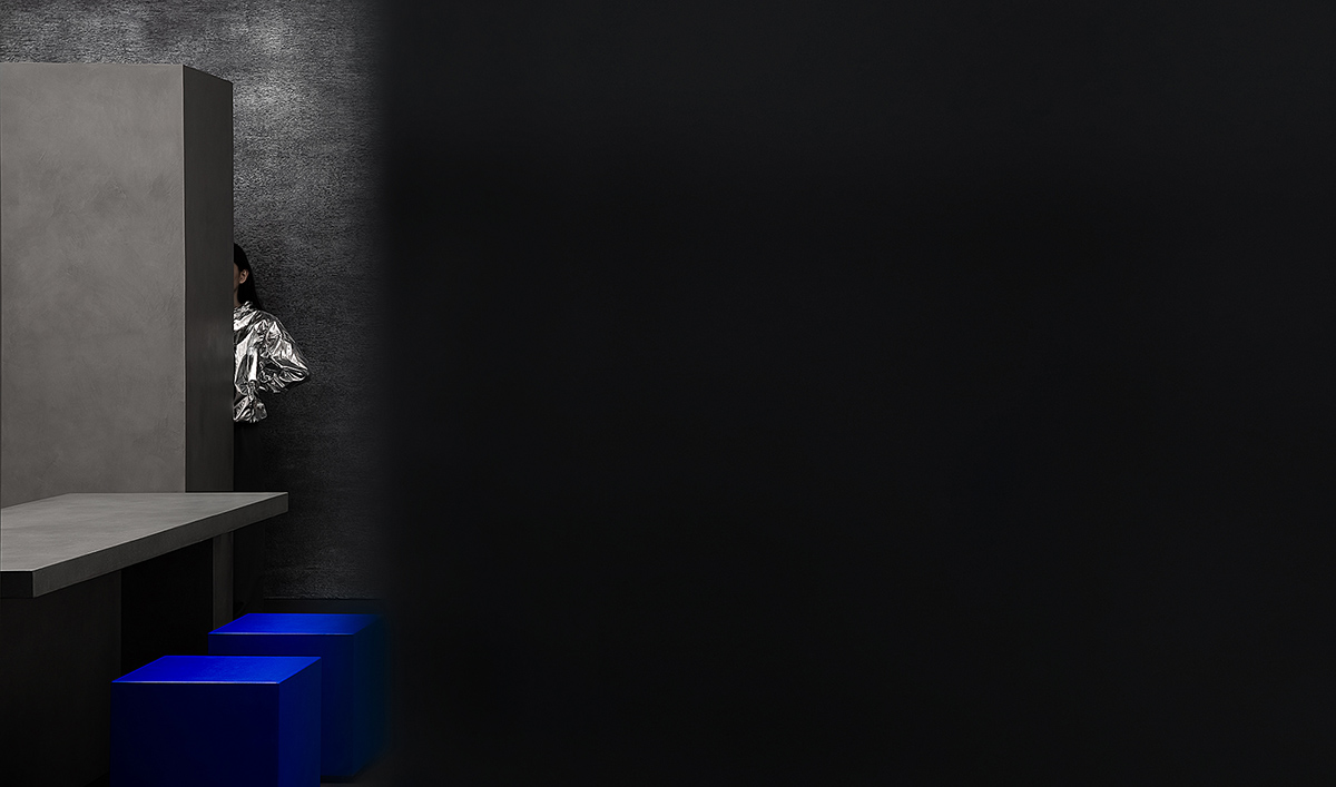
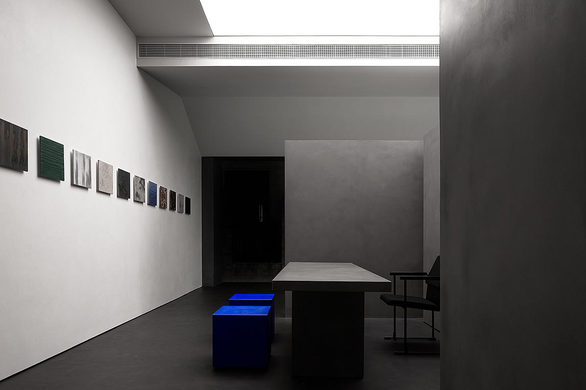
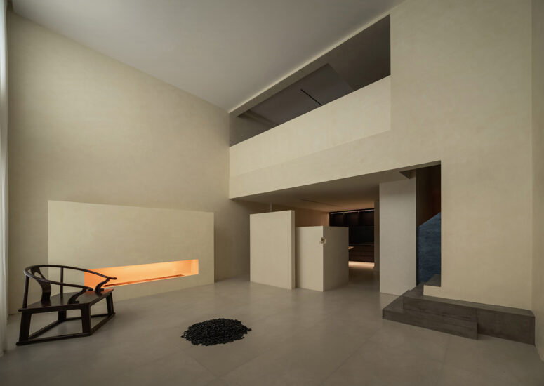
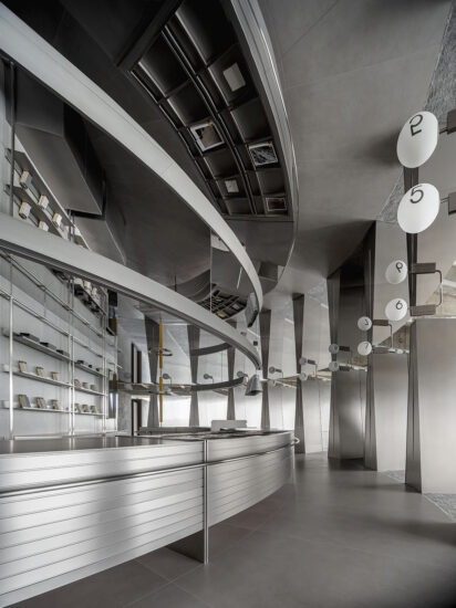
一次不一樣的思考,通常是比例,形體,材料,光線,細節來支撐空間,而這次是空間反過來支撐材料,材料才是這個空間的主體,需要表現與被表現的。空間為材料退讓,把空間留給人,為人提供大量的交流和互動的機會。自然的白色、灰色水泥質感與銀色金屬漆牆麵與入口的黑色洞石質感牆體,幾種不同感受的質感有機的融合在空間裏。
Generally, a space is enhanced by proportions, shapes, material, light and details, but this time, the focus of the space is material, which needs to be exhibited. The space provides people with more opportunities to communicate and interact. The natural white color, gray cement texture, silver metallic paint wall and the black travertine wall of the entrance are organically integrated in the space.
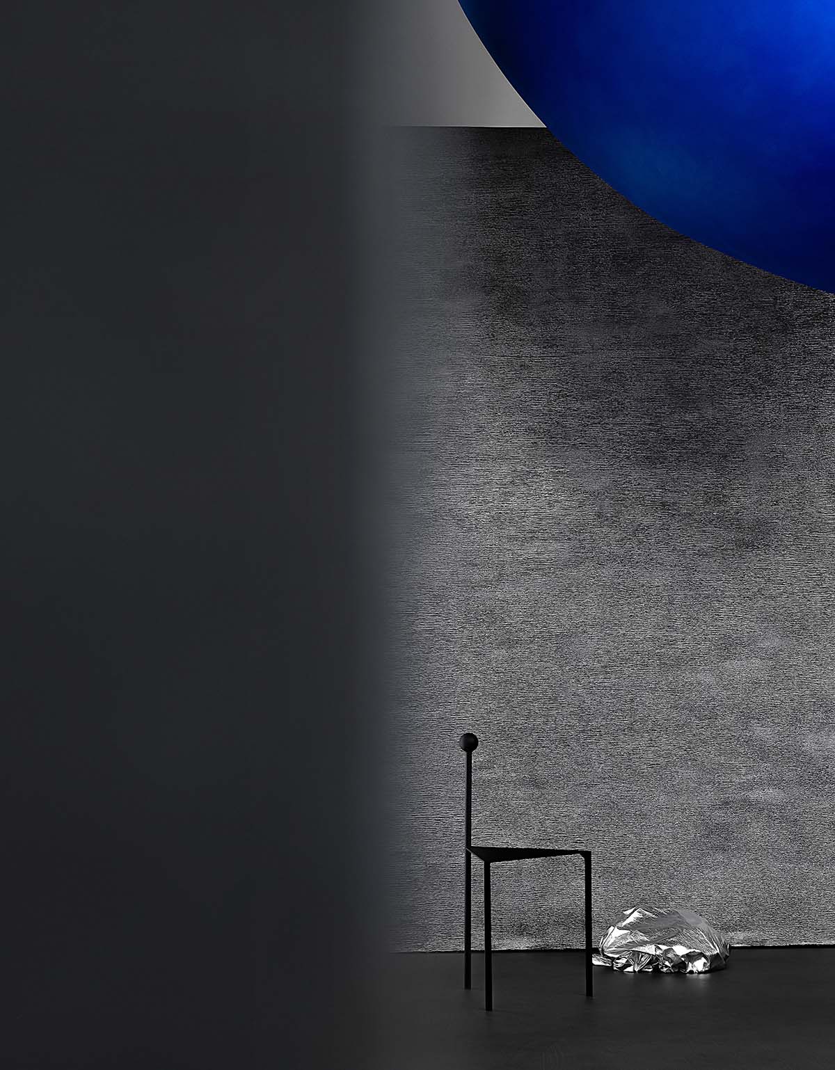
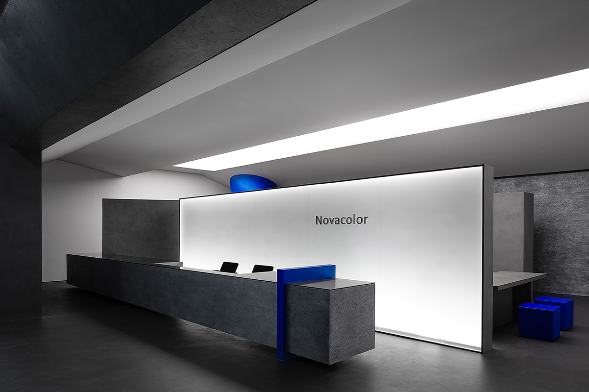
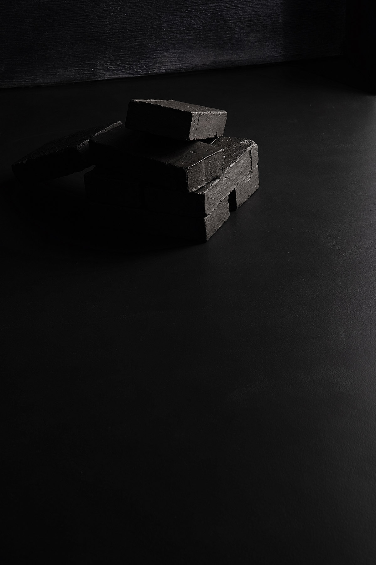
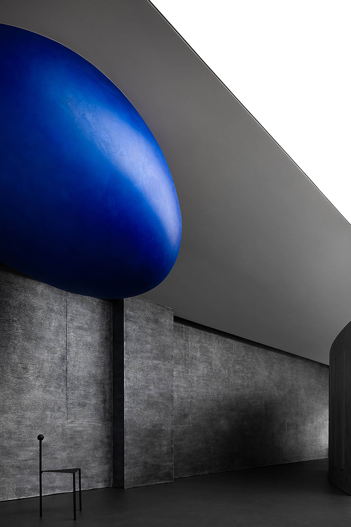
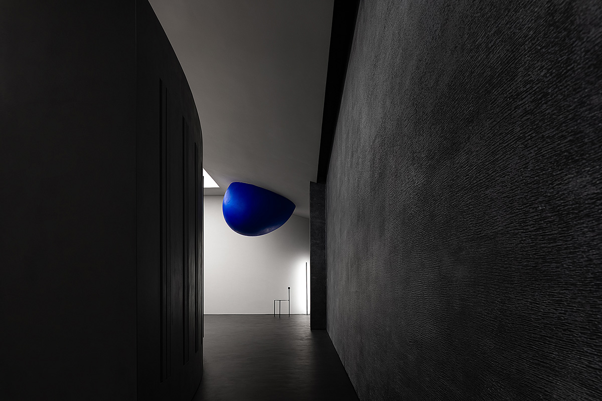
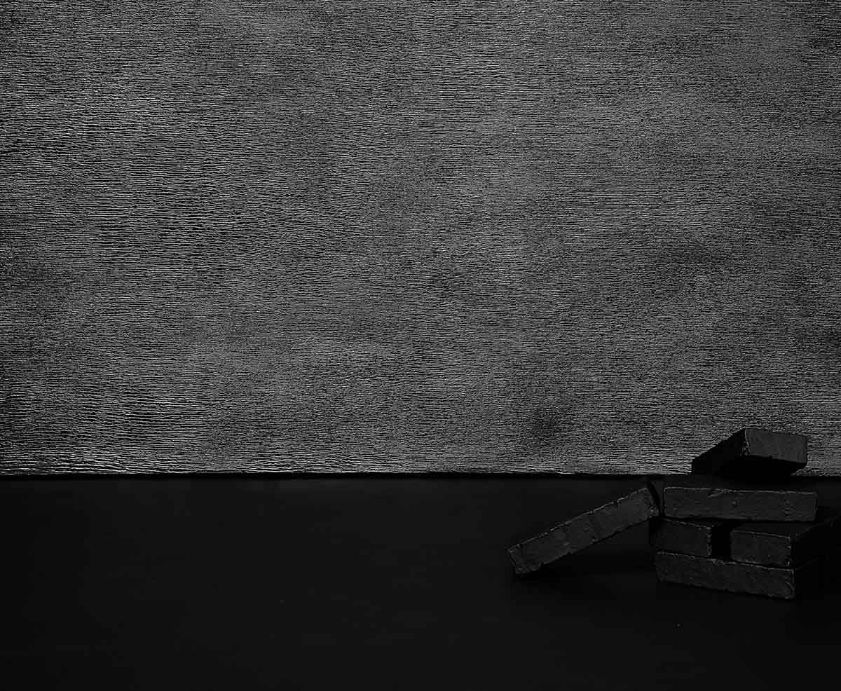
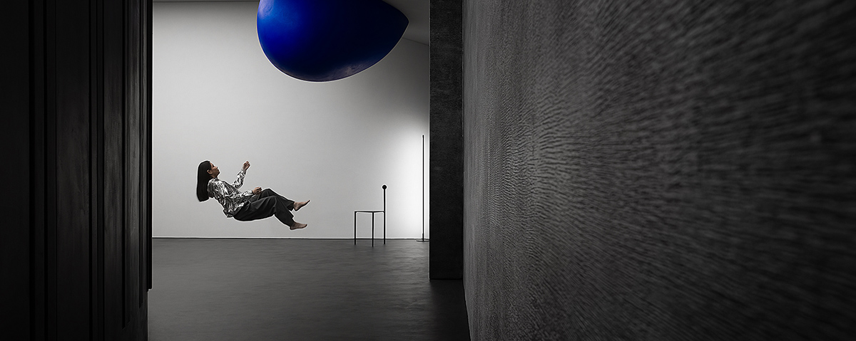
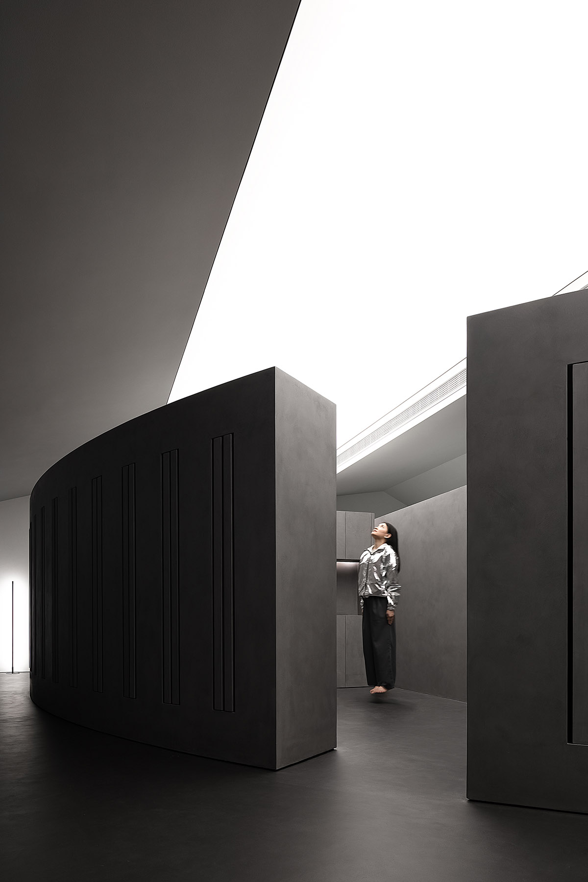
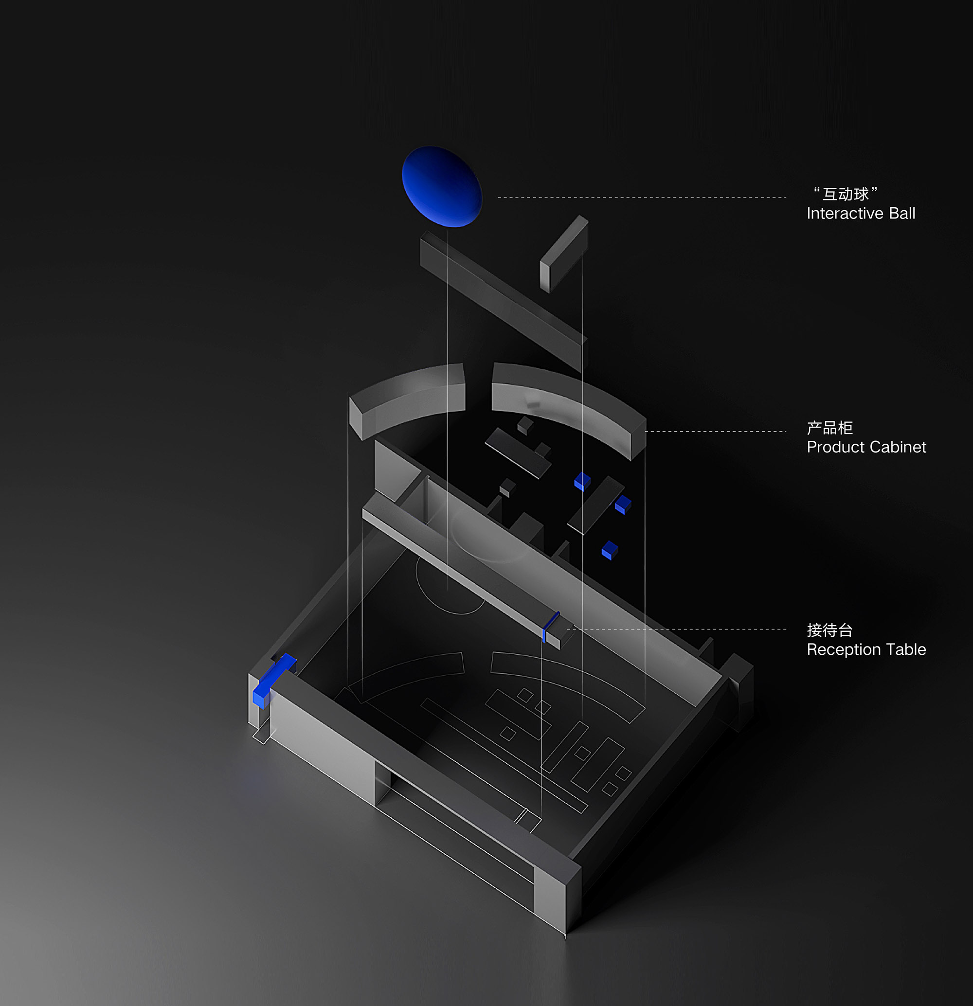
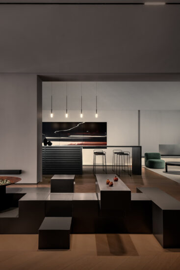
展示櫃體成為分割空間唯一物質,與頂部分離,這種空間的延續處理,藍色的小巨蛋存在角落的最高點,與人活動的過程都可以若隱若現的對話,更好的強調空間神秘與趣味的精神。地板堆疊的長方體磚塊,是黑色金屬漆在粗糙質感下的一次嚐試,意圖表現漆的多樣性與可以表達各種情緒。讓人可以感受空間與材料在呼吸。
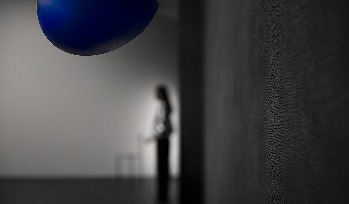
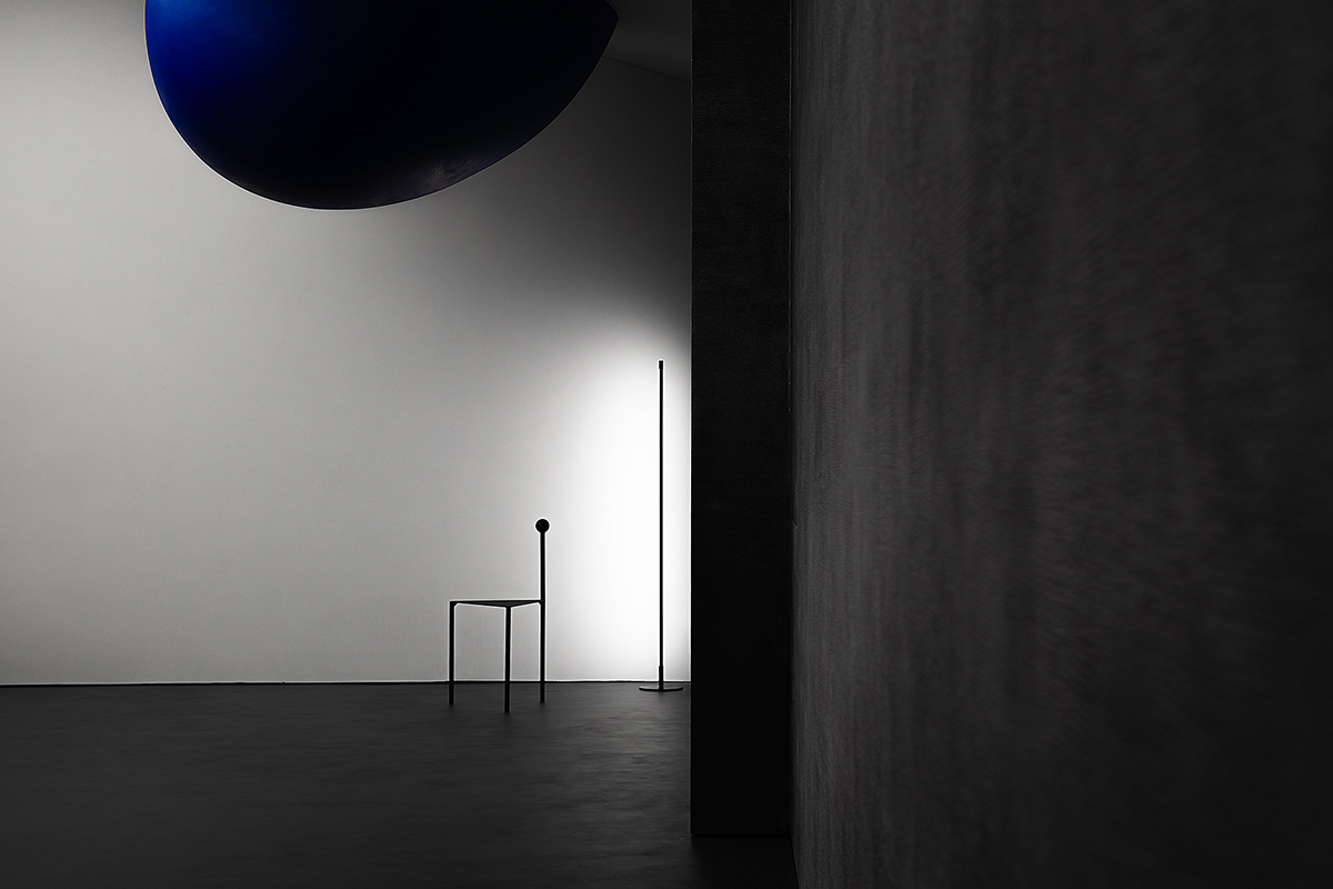
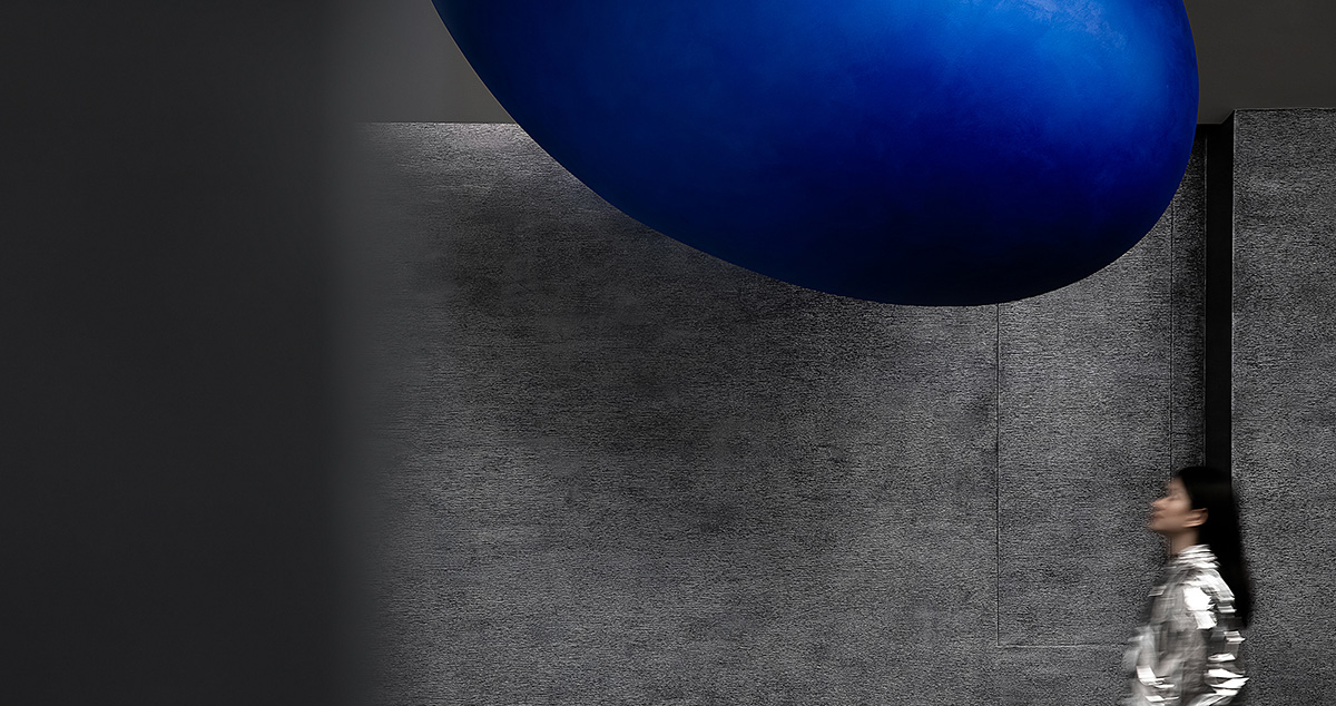
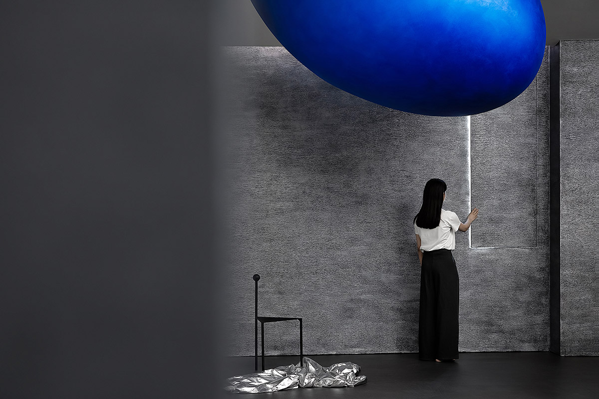
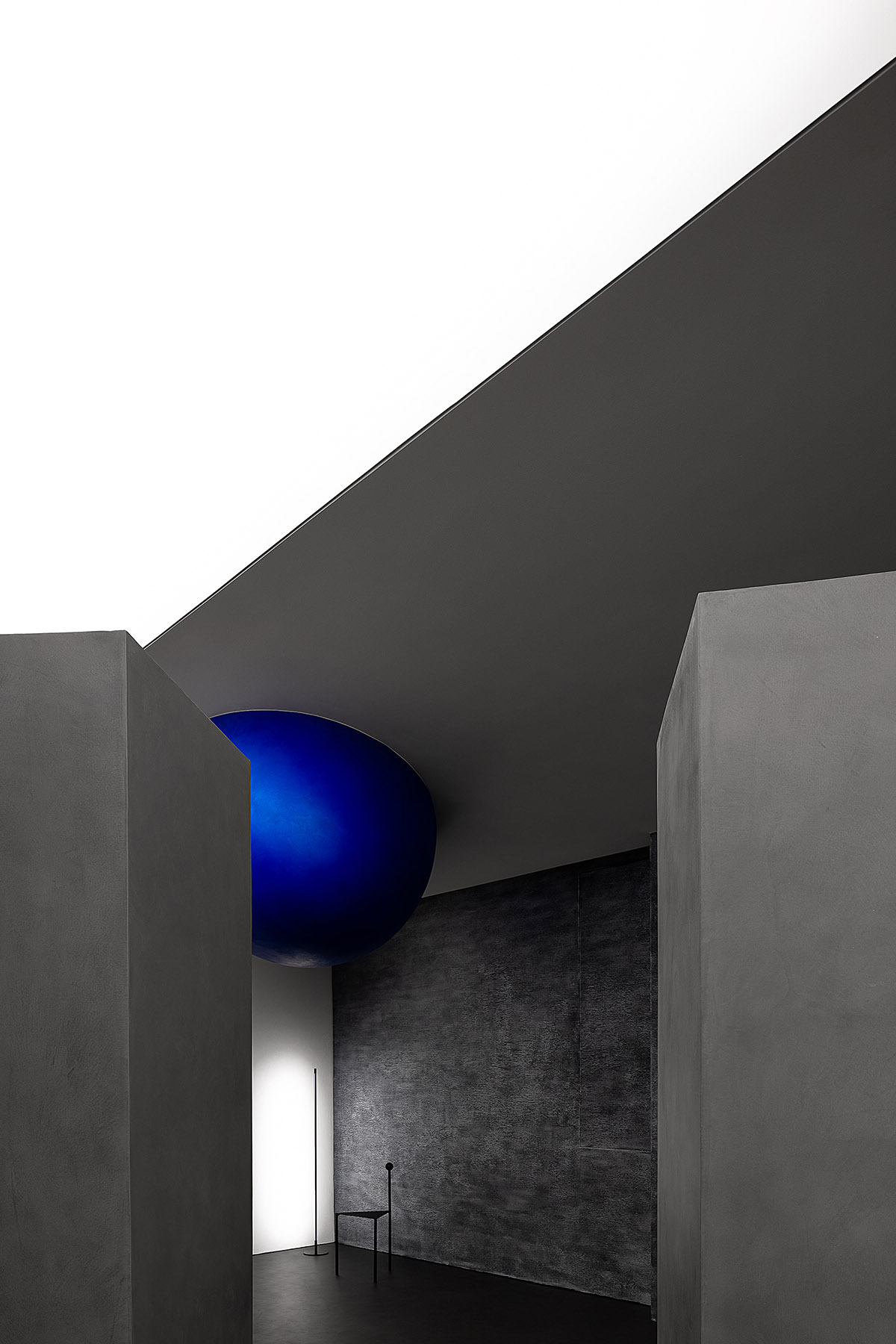
The display cabinet separated from the top is the only element that divides the space. The small blue ellipsoid is set at the highest point of the corner and able to create fascinating interactions with visitors, which emphasizes the mystery and fun spirit of the space greatly. The stacked rectangular bricks on the floor attempt to show the black metallic paint with rough texture, intending to express the diversity of paint and various emotions. In this way, people can really feel the space and materials are breathing.
一次視覺策劃 Visual planning
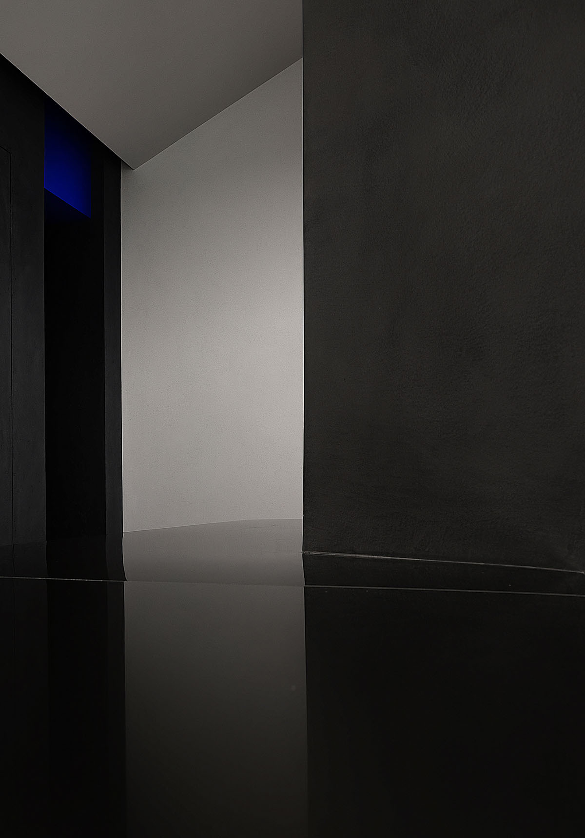
有計劃的將空間轉折的入口尺度縮小,提示你進入不同情緒與味道的世界,小的口會讓你對後麵的事情產生興趣與想象力,藍色的小巨蛋形幾何體從天而降,與平麵的曲線相呼應,且產生強烈的力量感。
The transitional space’s opening is specifically downsized, which is a clue to enter a world of different emotions and styles. A small opening can stimulate people’s interest and imagination. The small blue ellipsoid hung on the top echoes with the curve of the plane and generates a strong sense of power.
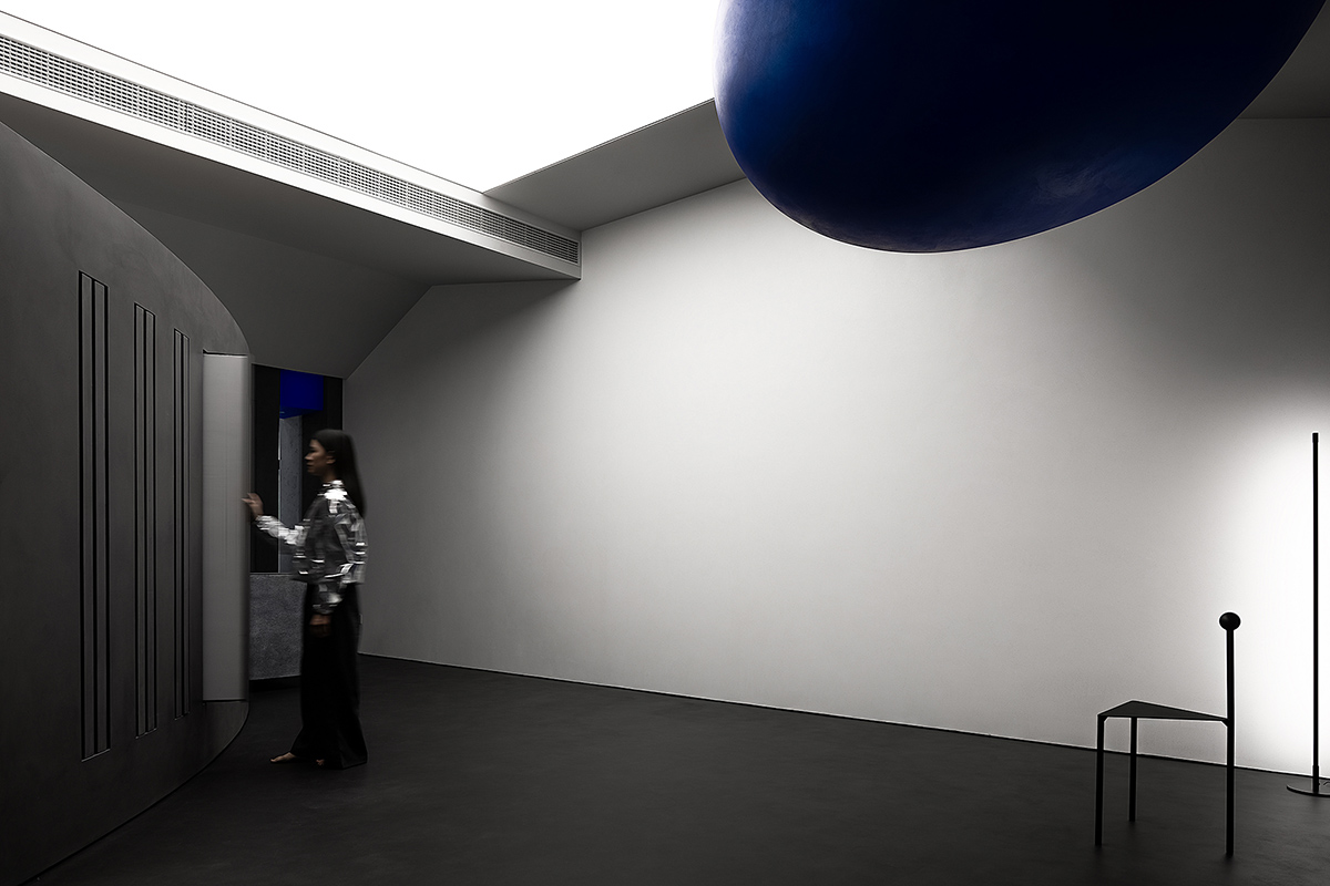
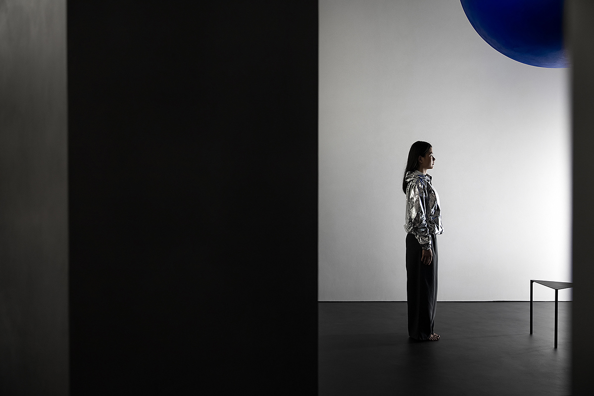
空間通過球體劃分了一個彈性的空間,這個場域人是空間的主體,沒有被圍合卻擁有最強場所感的區域,一個人與空間能交流的場所,自由的空間。藍色與前台的藍色相互平衡,讓兩者有一種孤獨的對話的情緒。用嚴謹的幾何秩序來構建感性的場域,矛盾與協調的構築。
A flexible space is divided by a sphere. In the space, people are the focus. This is an open area with strong spirit, in which people can communicate with the space. The blue ellipsoid and the blue plate embedded in the reception desk are like two loners whispering to each other, forming a balanced feeling. The perceptual area is created through the meticulous geometric order. It’s a place of contradiction and coordination.
低調與張揚的表情 Contradiction
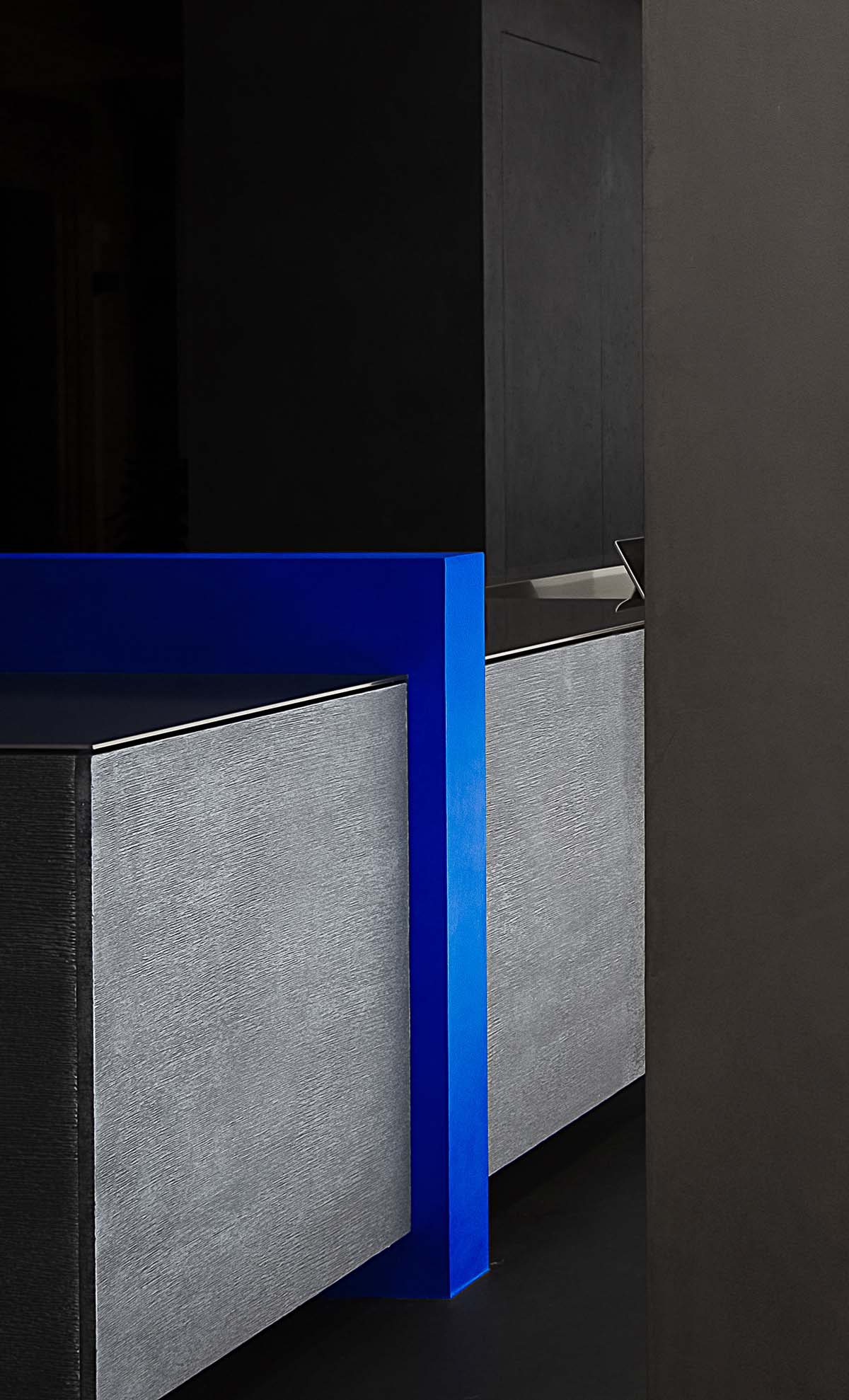
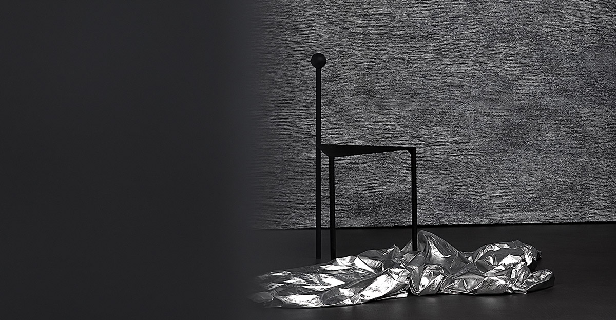
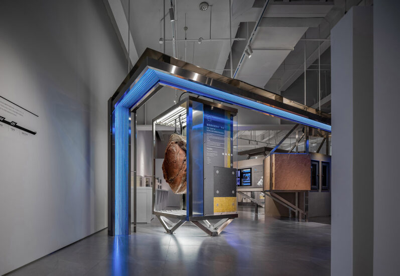
在材料的設計上,我們將自然沙麵質感/凹凸金屬質感與藍色的羊皮質感進行碰撞,體現材料本身的張力,同時又將200多種豐富的材料樣板做了隱藏,從而低調的渲染材料在空間中簡潔的表現力,用矛盾來闡述一個關於漆的藝術展廳。
In terms of material, the natural concave-convex metallic texture and the blue sheepskin texture create a contrast. Meanwhile, more than 200 material templates are employed in a low-key way to demonstrate their conciseness in the space. An artistic paint showroom is presented through contradiction.
電影性與戲劇化的光與影/安靜與躁動 Cinematic and dramatic light and shadow
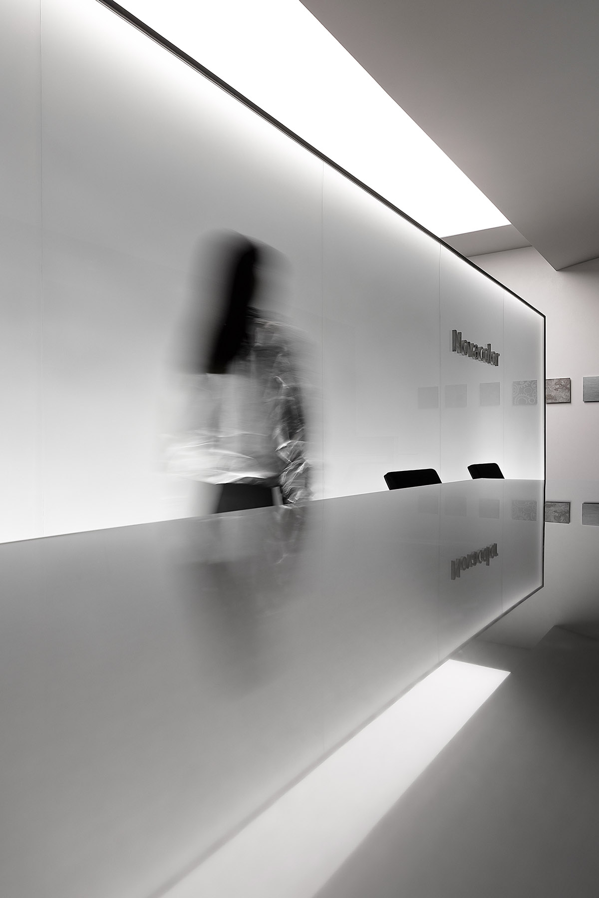
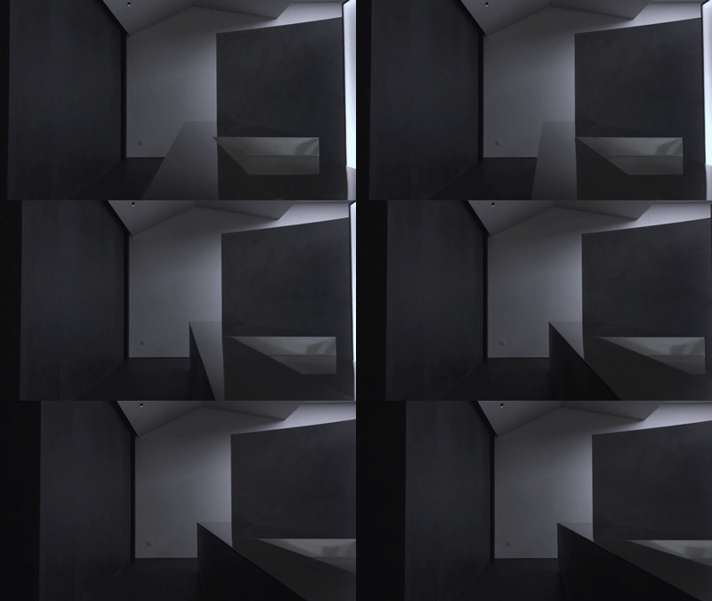
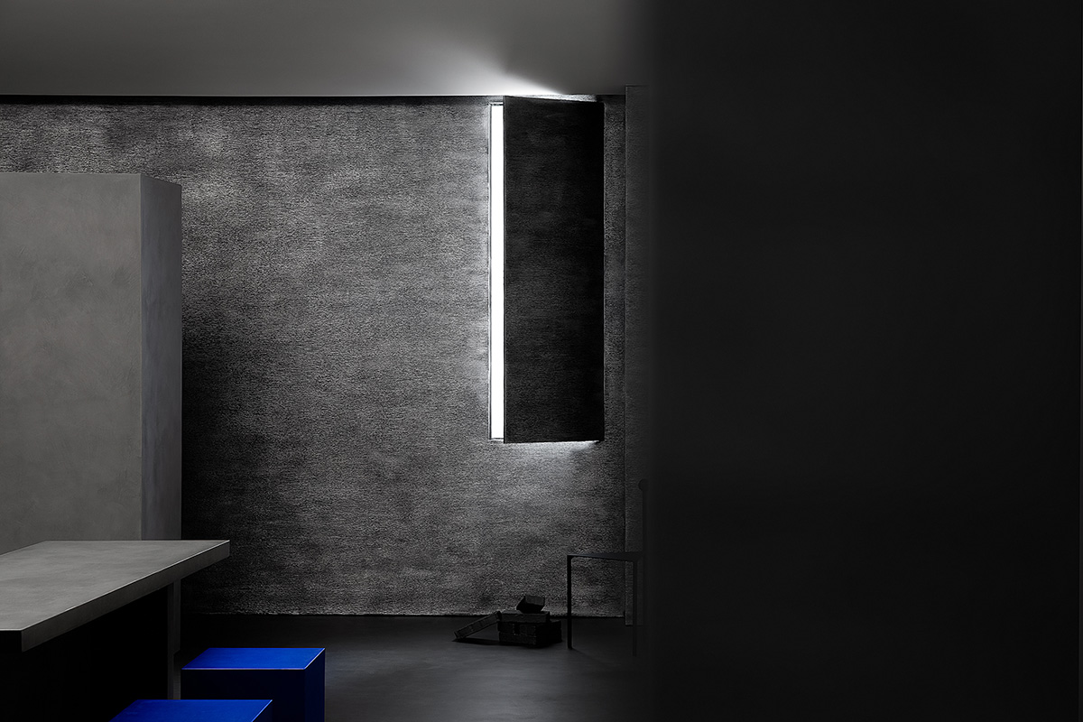
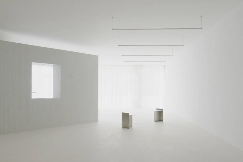
光是表現空間情緒的重要介質,光影互相依存,空間中大麵積大拉膜,強調光線的柔美均衡,一方麵感好的服務於空間中產品的照明,在情感上弱化了影的存在,營造一種戲劇化的安靜,局部強化光影,表現材料質感的同時感受空間的躁動,一種壓抑著的力量準備爆發。
Light is an important medium for expressing the emotion of a space. Tesioned membrane structure is applied in a large area to emphasize the softness of light. On the one hand, the structure enhances the products’ lighting effect and weakens the shadow emotionally, which forms a kind of dramatic silence. On the other hand, the light and shadow are partially intensified to express the texture of the material and the restless feeling of the space. A repressive power is likely to be released.
這一次把空間簡單的變成美學問題,做一些觸動神經的事情。
This time, the team regarded the design as an aesthetic practice, and tried to do something heart -touching.
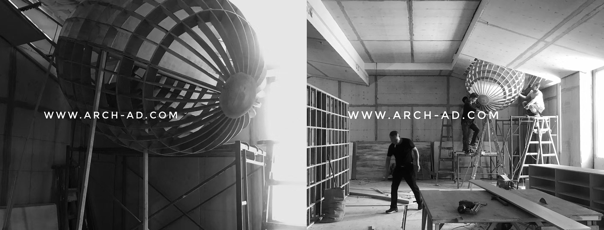
∇ 施工過程
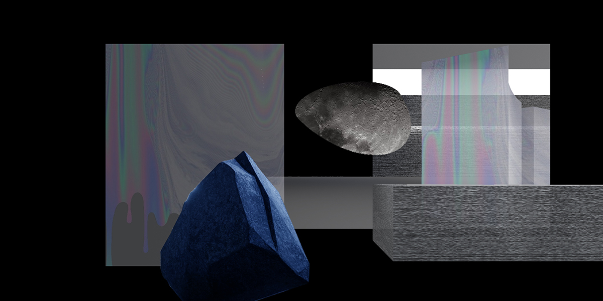
∇ 形體構成
∇ 平麵圖
項目信息
項目名稱:Novacolor 藝術漆展廳
設計機構:AD ARCHITECTURE∣艾克建築設計(http://www.arch-ad.com/)
總設計師:謝培河
設計團隊:艾克建築
項目地點:廣東汕頭
建築麵積:180平方米
主要材料:Novacolor藝術漆、不鏽鋼、微水泥、透光膜、霧化玻璃
設計時間:2020年3月
竣工時間:2020年7月
攝影師:歐陽雲
Project name: Novacolor Paint Showroom
Design firm: AD ARCHITECTURE (http://www.arch-ad.com/)
Chief designer: Xie Peihe
Design team: AD ARCHITECTURE
Location: Shantou, Guangdong Province, China
Area: 180m2
Main materials: Stainless steel, paint, microciment, transparent film, switchable glass
Design time: March 2020
Completion time: July 2020
Photographer: Ouyang Yun








評論(1)
真的太棒了,從空間的動線到空間的氣質,以及對於產品的表現都很好,比例、色彩都是經過設計師認真推敲,棒