全球設計風向感謝來自 時象空間設計T1D 的辦公空間項目案例分享:
如今,人們對科技公司的印象似乎繞不開一種冷色調的“科技藍”,理性卻稍顯冷酷。如何在理性中加入人文主義的溫情,突破科技公司的刻板印象,是艾為電子試圖傳達的全新企業形象。
Cerulean is unknowingly anchored in public awareness to be a referent to tech companies, which is thought to be a symbol of rationalism and calmness. However, Awinic Shanghai, designed by T1 Design, shrugged off the rigid yardstick of being a lifeless tech company. As it reckons, it is turning the first sod in a bid to imbue the quality of being humane with cold rationalism.
艾為電子位於上海的辦公室由時象設計擔綱,設計師希望在變化中體現一種麵向未來的張力,在功能之外,締造科技與浪漫並存的企業理想之國。
T1 Design is longing to create a Res Publica of a Tech-paradise and a Romanticism-paradise, therefore an office is not only an embodiment of utilitarianism but also of a craving for futurism.
「01」“進入” ENTER
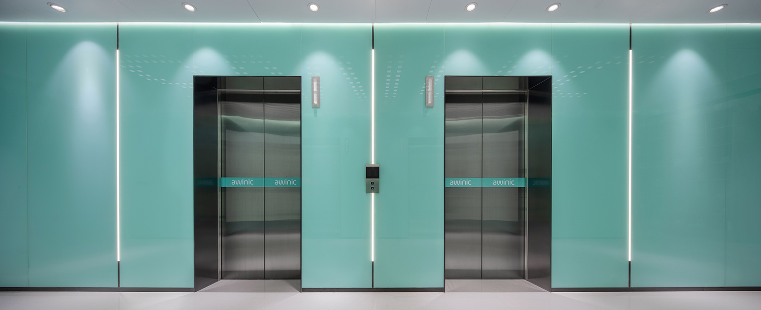
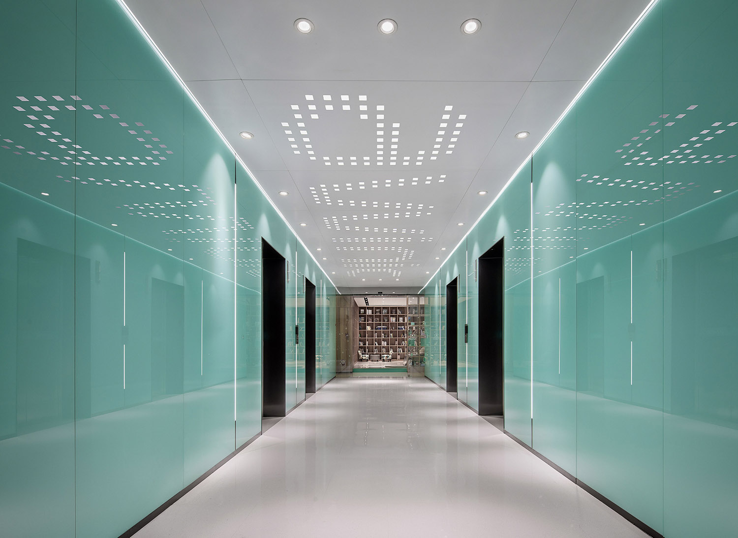
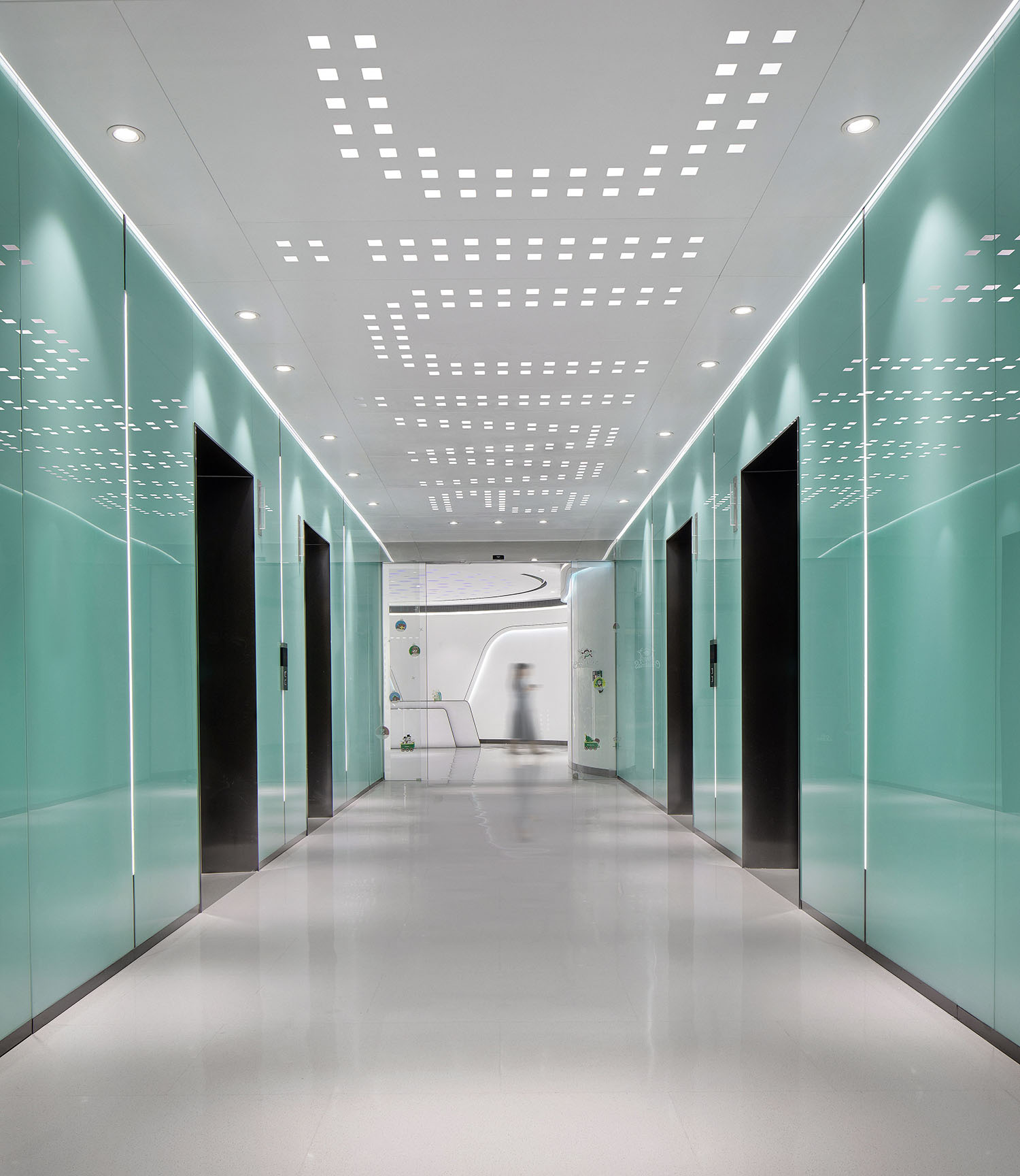
“艾為藍”是這家IC芯片企業視覺形象給人的第一印象,也成為串聯整個空間的標誌性色彩。電梯廳直觀的大麵積色塊衝擊,給人以充滿驚喜的感官洗禮。
Awinic Blue is an iconic colour utilised in the elevator lobby to leave a stunned impression on people.
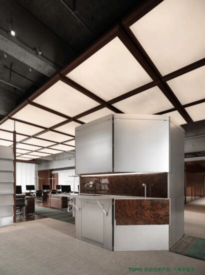
在效率和節奏感之外,如今辦公文化更需要一種舒緩和放鬆的氛圍。電梯廳照明以別出心裁的鋁板鏤空雕刻,將艾為電子(awinic)的企業logo嵌入整體結構中。
AWINIC, the block capitals of Awinic, is punched out through an aluminum ceiling, which gives the leeway to the light radiating out from these cubes. The design is soulful. The light is vibrant. If you are lingering in a colourless rectangular ‘metal box’ waiting for the elevator, what a bummer to feel bored and dull!
時象設計正是用這種充滿想象力的進入方式,開啟了科技和人性化設計融為一體的辦公體驗前奏。
The elevator lobby is an intriguing prelude leading to a sequence of humane rhyme.
「02」“ 空格” TAB
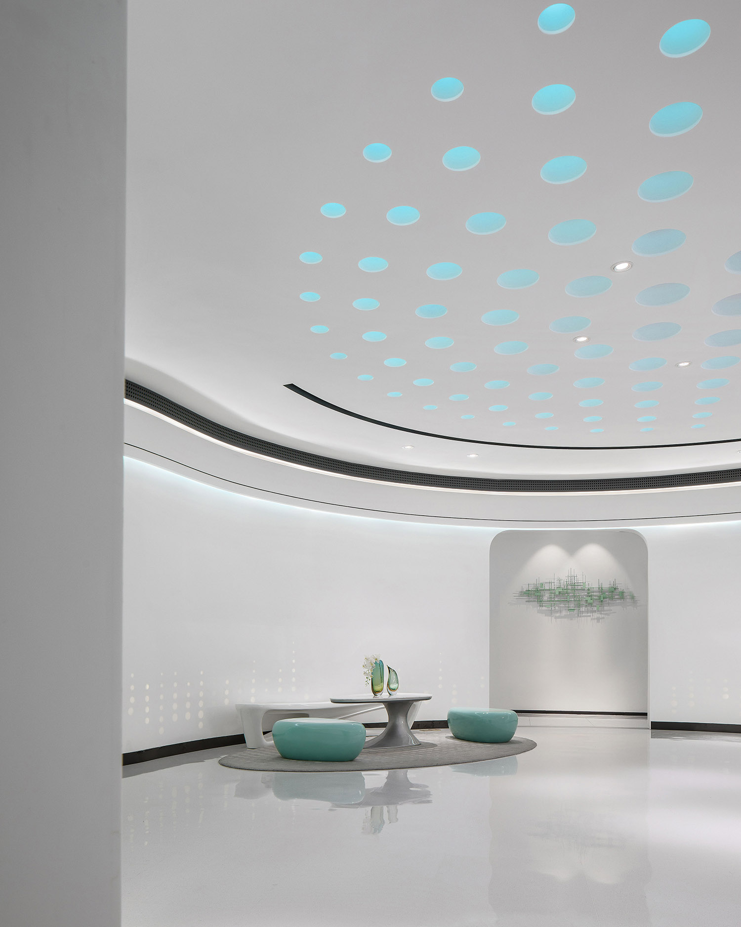
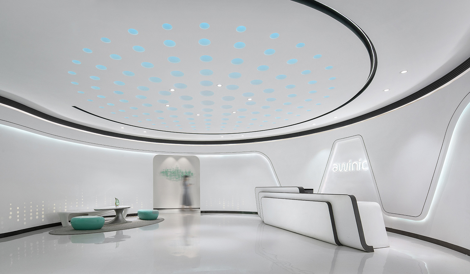
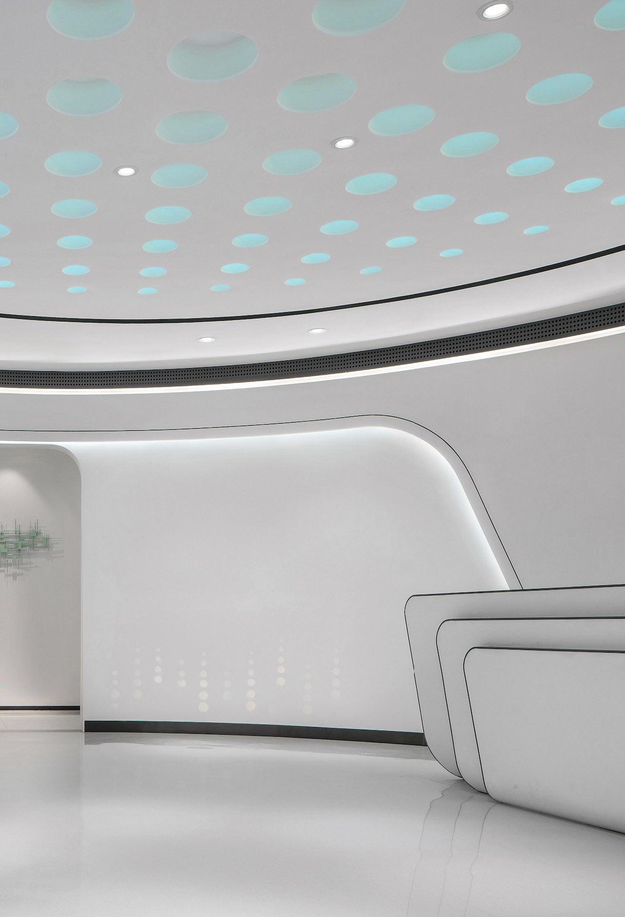
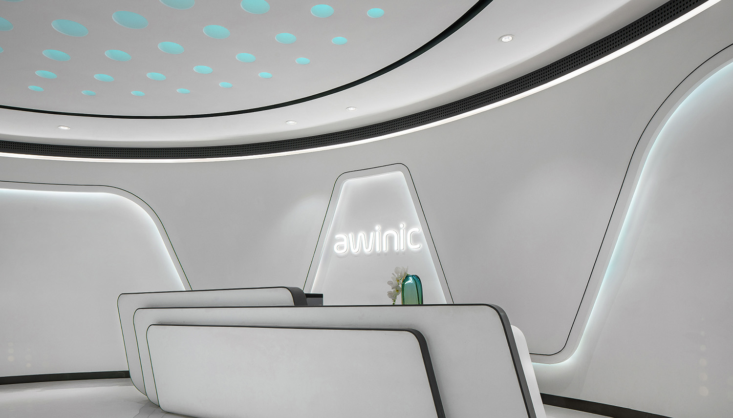
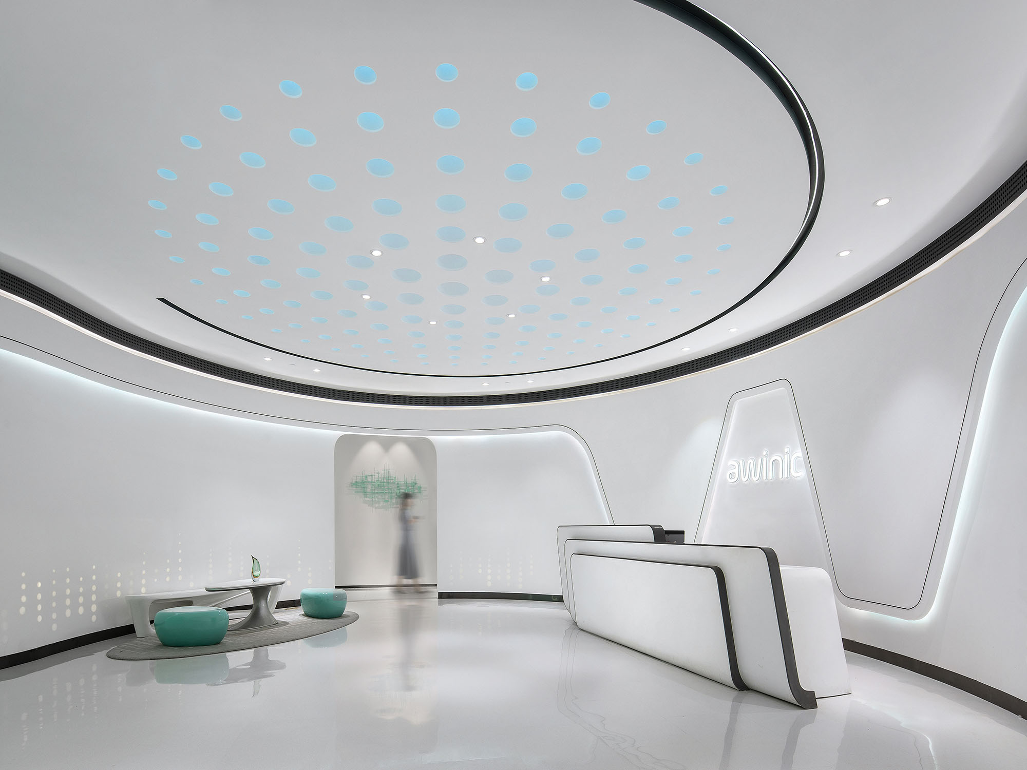
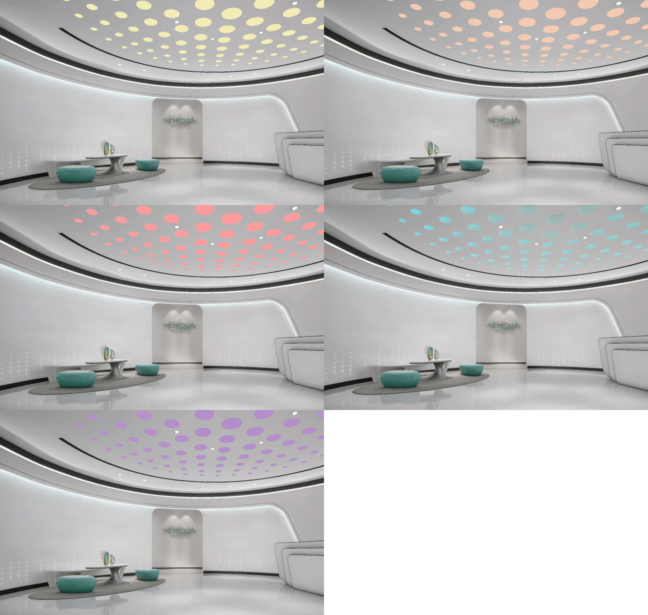
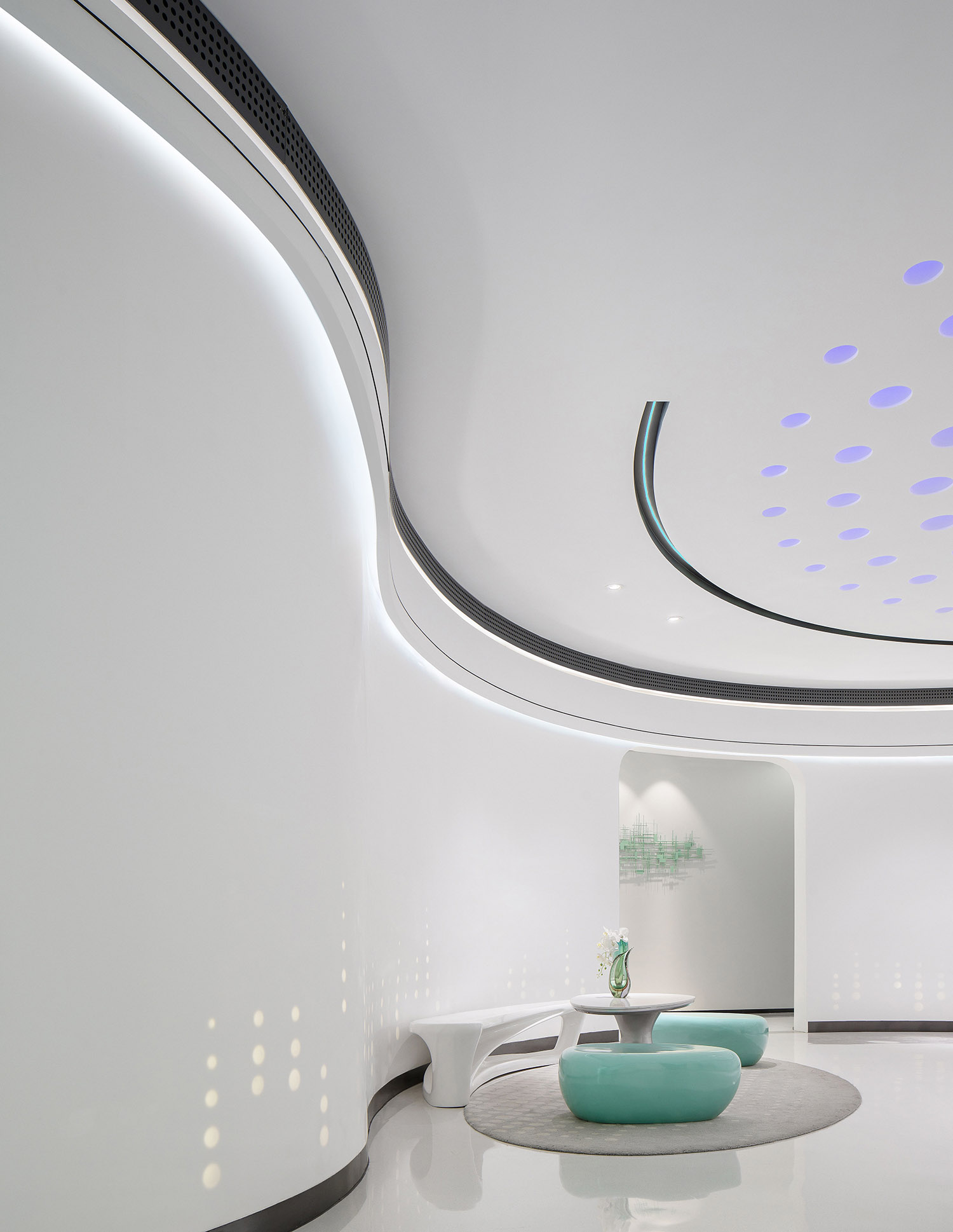
步入接待前廳,純粹的幾何構成的空間用“一小段的停頓”營造出奇妙的空白效果。背景牆從awinic的首寫字母“aw”中提取出生命體一般的曲線,接待台則模擬了電路板的流暢造型。
The foyer is a white-twist of awinic blue. T1 Design believes that the proper use of colours will not be lulling people to sleep. With respect to the curves and straight lines, the ‘aw’ in the walls is distilled from ‘awinic’, which is enlarged to accentuate its cursive-ness and fluency, and the shape of the reception desk is a ‘caricature’ of a circuit board. Curves and straights will come to be bound up in modern experience if they are balanced well.
如今智能設備已經極大地改變了世界的麵貌,生活中的每一個環節都被科技點亮。科技不但是理性的化身還是場景情緒的操作者,時象設計通過其獨特的語言凸顯了艾為電子的企業屬性。
Motionless technology should not be Emotionless. If technology is standing in the high hill, its clinical detachment will leave itself alone there. T1 Design would love to trigger the lightbulb moment for technologies to make them a ‘Human Pleaser’.
白色烤漆版打薄後模仿出呼吸燈的效果,嵌入星空般的自由弧線中。設計師將艾為電子為華為供應的一款呼吸燈的產品特性,通過大尺度空間進行創意性展示。
That a bespoke Led breathing light for Huawei produced by Awinic sparks the inspiration for T1 Design so that they paint a thin layer of stoving varnish onto the wall, somewhere dim somewhere brightened, as if the whole space were in a stable breathing rate.
「03」“把控” CONTROL
科技體係是一種現代社會組織,必須以一種現代精神原則作為動力。企業的價值來自於員工對企業發展方向的理解和對細節的把控。
The scientific and technological system is a modern social organization and must be driven by a modern spiritual principle. The value of an enterprise comes from employees’ understanding of the direction of the company’s development and control over details.
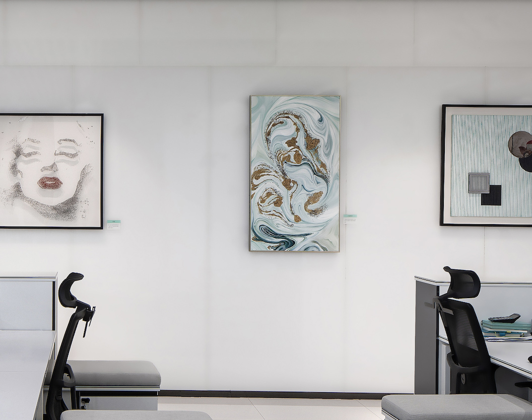
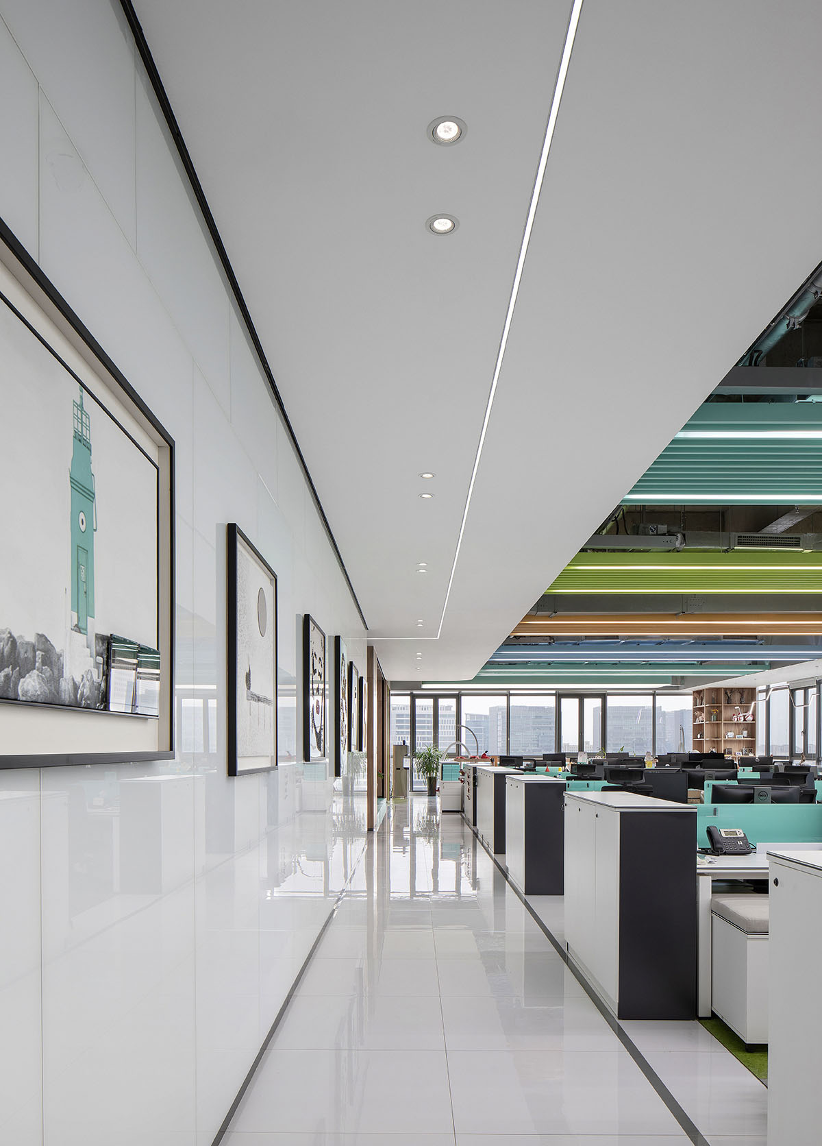
辦公區過道的背景牆上懸掛著六幅以艾為核心產品為寓意的裝置立體畫,讓企業文化成為員工切身可感的藝術形式。
T1 Design intends on immersing employees in an aesthetic atmosphere by hanging artworks on the wall.
「04」 “選擇” OPTION
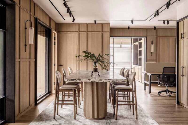
時象設計深挖每一個品牌背後的故事,意在為艾為打造出有溫度的會議空間。企業的產品線、專有的技術和商標以形象化的空間表達融入會議空間的設計元素中。
T1 Design is enthusiastic about setting up a stage for the history of a brand, so the meeting room is expected to be that stage to bring forth a satisfying end result. The design, which is like a storyteller, in the meeting room encapsulates an abstract form of product lines and brands.
Smart Meeting Room
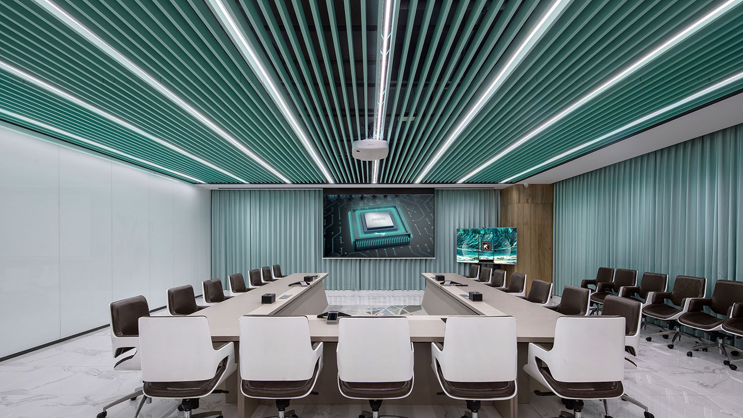
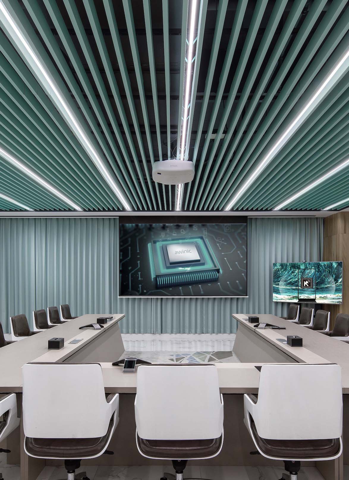
Smart Meeting Room是公司決定重要決策的場所,設計師將芯片的特有造型,創造性的演繹為木柵格的形態。深棕色真皮座椅搭配幾何形狀圖案的消音地毯,令功能和美學並舉。
T1 Design cast a spell on Smart Meeting Room, to make every detailing a metaphor to the structures of integrated circuits magically. The grids atop are a transformation of silicon wafers.
射 Meeting Room
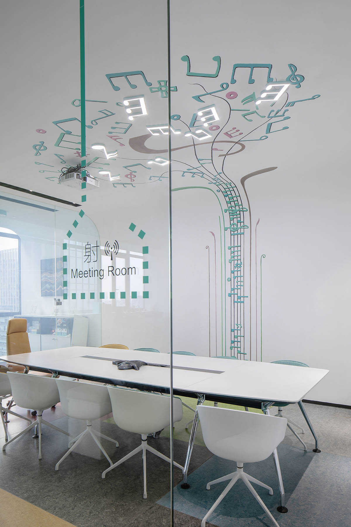
“射Meeting Room”的小型會議室取自艾為五大產品線“聲、光、射、電、手”中的“射”,會議室背景牆上的圖畫以“電路、音符”為設計靈感,打造了與企業產品密切相關的會議空間。
Due to the fact that Awinic products has their core product range focus upon audio, Led driver, power arrangement, RF device, and Touch & Haptic, T1 Design determines to make a stronger bond between the room and the product. The origin of ‘射Meeting Room’ , as its name indicates, stems from the sign of RF device. Moreover, the mural illustrates that the RF device and the meeting room are pair-bond.
「05」“ 轉換” SHIFT
閱讀區 Reading Area
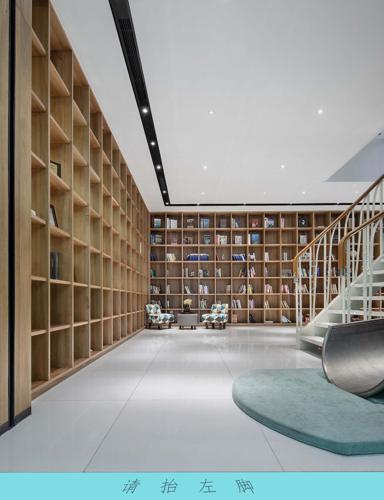
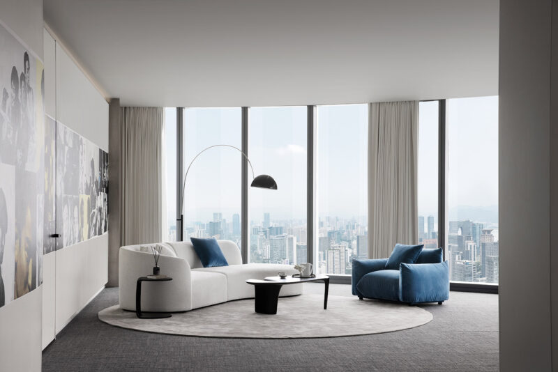
在辦公環境裏麵如何把人與人的關係考慮進來,在設計美感之外,滿足人性的關懷?“灰空間”的設計即扮演了重要的情緒轉換的功能。工作間隙,閱讀區提供了難得的讓精神放鬆、滋養身心的場地。
Reading area is a transitional space, to use Kisho Kurokawa’s words, it should be called as a Haīro Kukan Space, whose atmosphere could calm your nerves and sooth your mind.
“灰空間”打破了空間之間的界限,工作區和娛樂區自然銜接,在心理上也產生了一個轉換的過渡,交流與互動因此變得更加順暢。
The transitional space, in its universal acceptation, succeeds in blurring the boundary of different spaces, accelerating interactions between human and spaces.
弧形樓梯和滑梯 Spiral Staricase & Slide
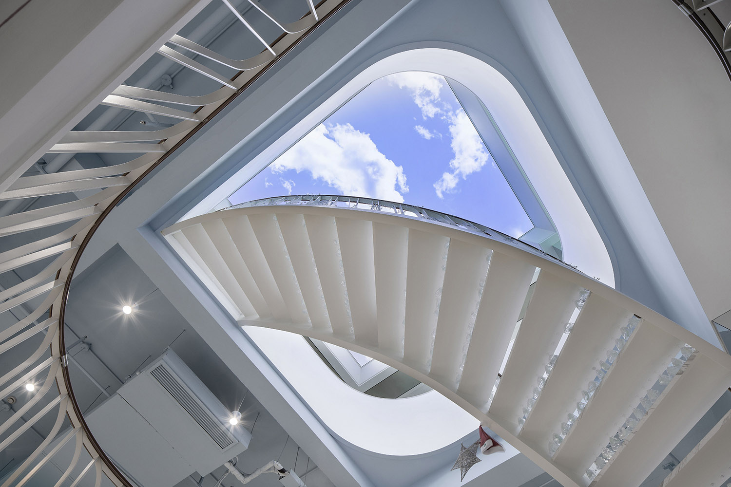
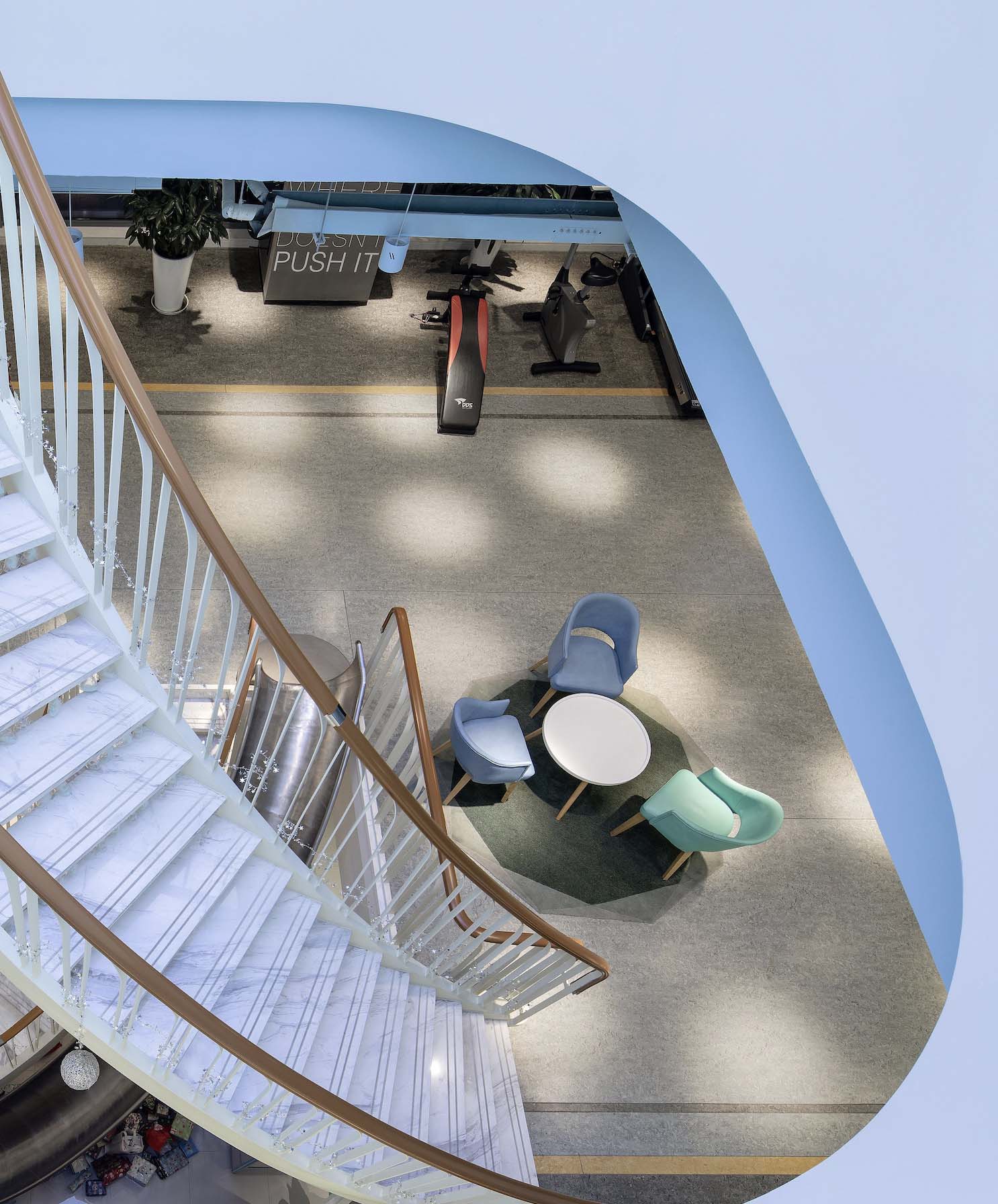
弧形樓梯連接一層到三層,如同中流砥柱一路貫穿起各個工作樓層,緊密相連的同時又確保各區域的獨立性。緊鄰樓梯邊的滑梯則為人們玩耍的天性提供了一種釋放的可能。
From the ground floor to the second floor, the spiral staircase generate a sense of consistency between them without any amount of disruption of the individuality of different spaces. In addition, the slide make the whole space playful for children, simply because all works and no play make Jack a dull boy.
「06」“ 率領” COMMAND
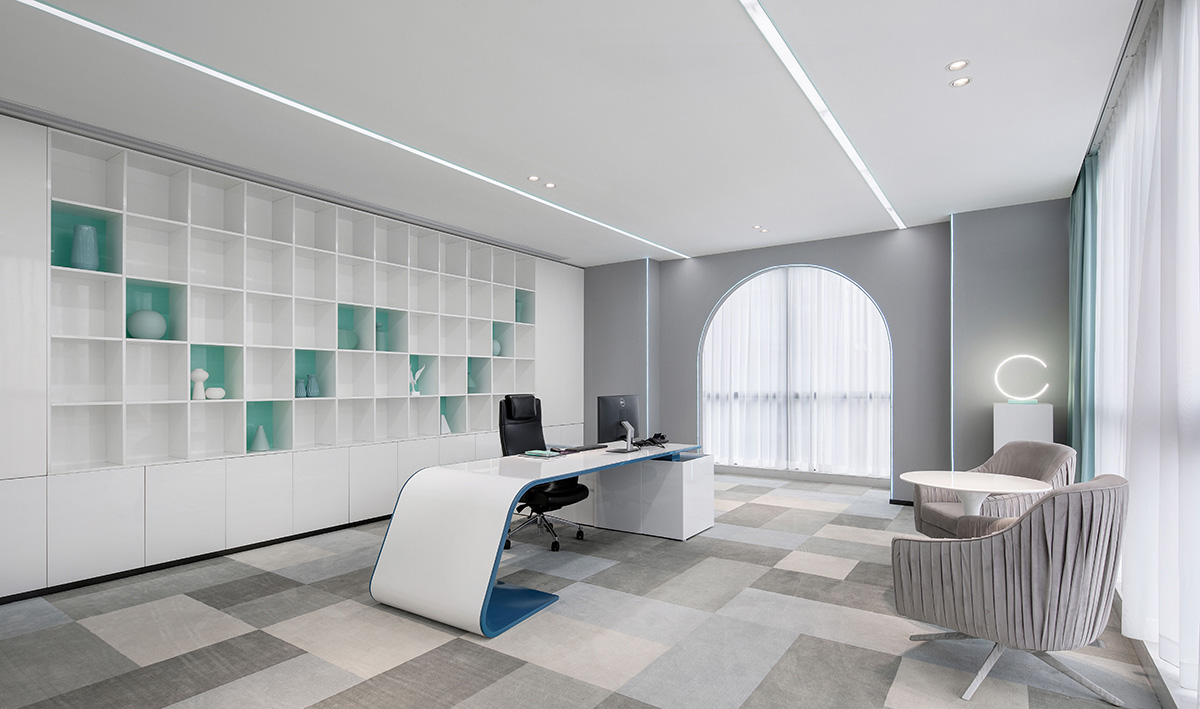
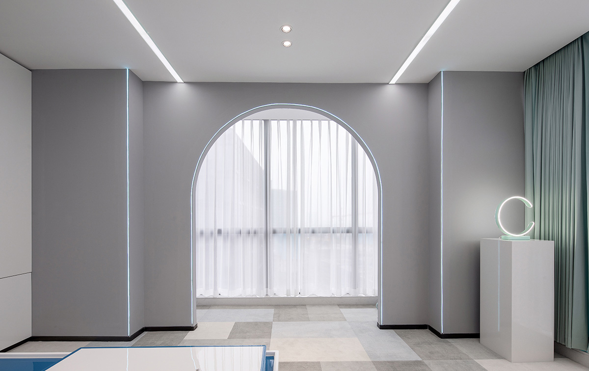
副總裁辦公室 Office of the Vice President
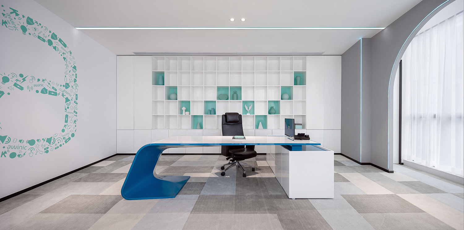
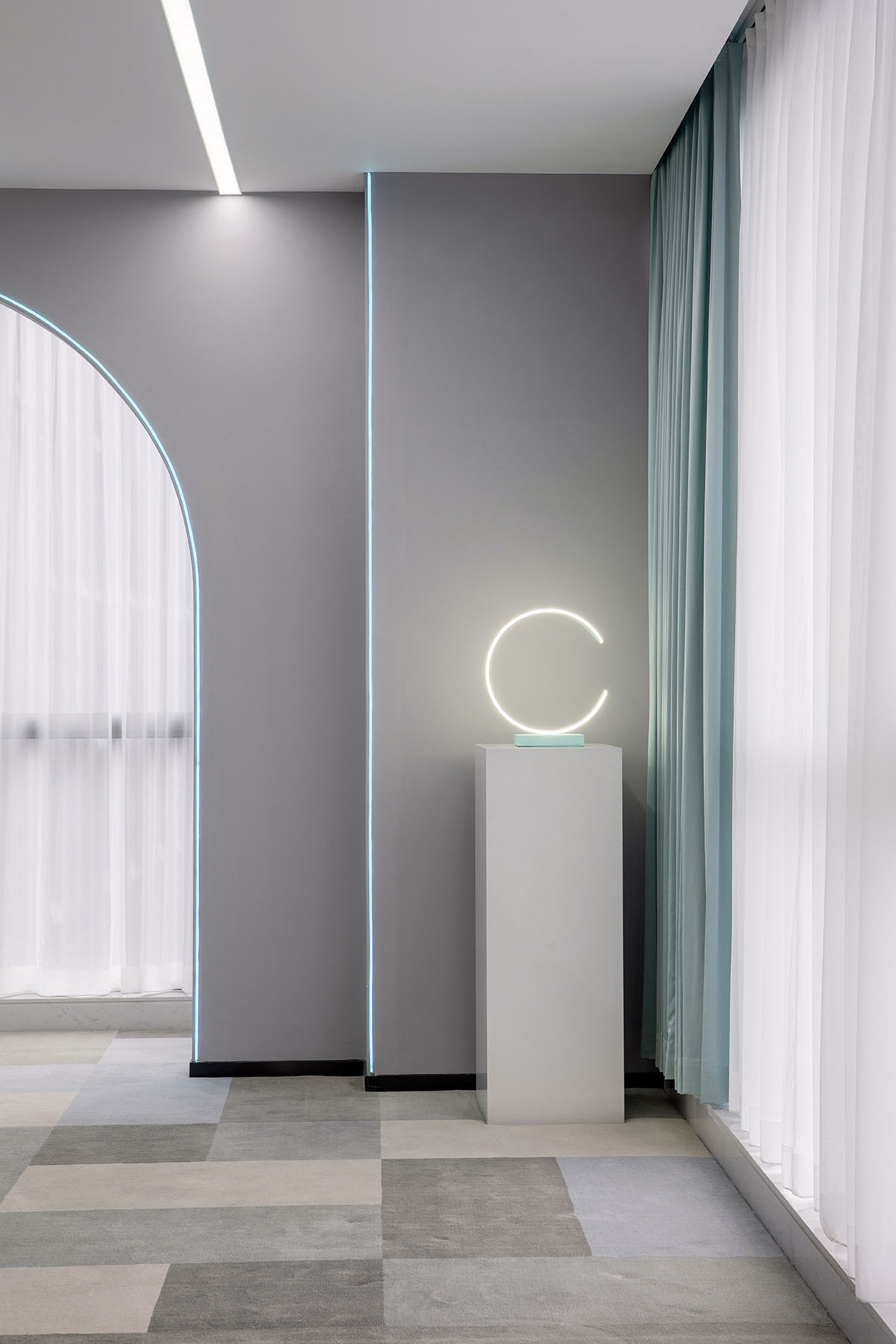
副總裁辦公室的弧線設計優美簡潔,充滿靈動感,以awinic的五個字母為設計元素融入整個立麵空間,凸顯企業品牌文化。
The office of the vice president is chanting a hymn to curviness and simplistic designs.
德國極簡主義大師Dieter Rams提出好設計的十大準則有:美感、易用性、有限度、忠實、持久、細節、環保以及越少越好。艾為辦公室的設計正是如上價值的體現。
he office can be regarded as a good design, by Dieter Ram’s definition. According to Dieter Rams, good design should be innovative, making a product useful, aesthetic, making a product understandable, unobtrusive, honest, long-lasting, thorough down to the last detail, environmentally friendly, and involving as little design as possible.
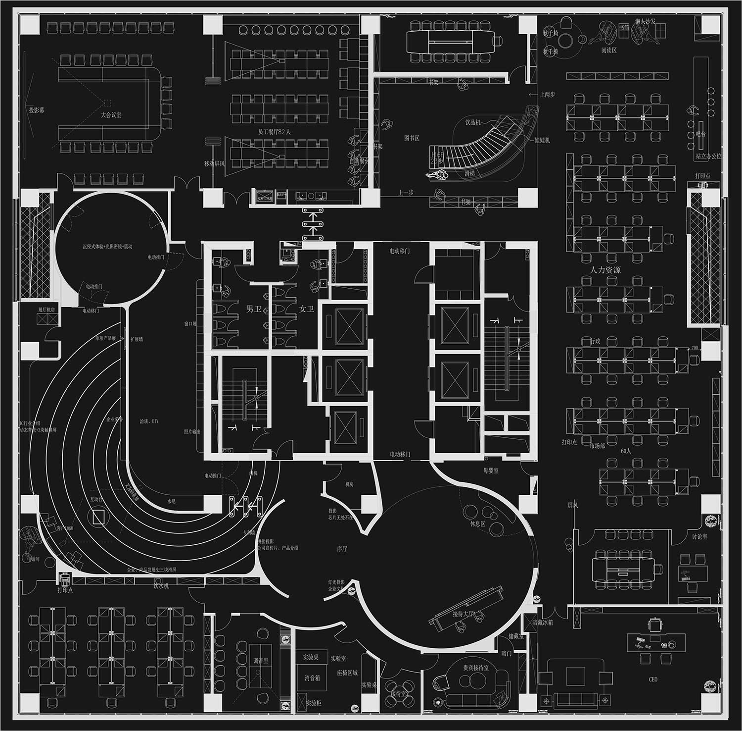
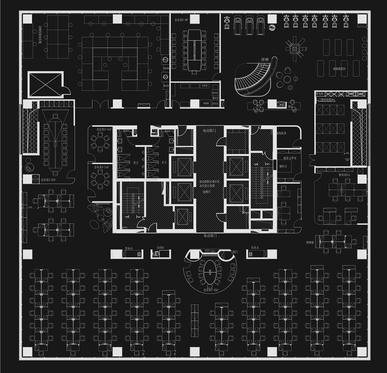
∇ 平麵圖
項目信息
項目名稱:艾為電子總部辦公設計
設計範圍:辦公空間
設計公司:時象空間設計T1D
項目地點:上海莘莊CBD
項目麵積:4500㎡
主案設計師:許有亮
項目標簽:科技、極致、品質、夢想、唯一
Project info:
Project name: Awinic Headquarter
Design area: Office
Interior Design: T1 Design
Project site: Shenzhuang CBD in Shanghai
Site area: 4500m2
Designer-in-chief: Xu Youliang


