全球設計風向感謝來自 元致設計 的商業空間項目案例分享:
∇ 商鋪位置 ©元致設計 Shop location Yuanzhi design
項目背景:上海浦東新區華潤時代廣場,是一個老商場改造,主持改造的是日本設計師佐藤大,輕盈、時尚簡潔的日係風是整個商場環境氣質。
Project background: China Resources Times Square in Pudong New Area, Shanghai, is an old shopping mall renovation, presided over by Japanese designer Sato da. The light, fashionable and concise Japanese style is the environmental quality of the whole shopping mall.
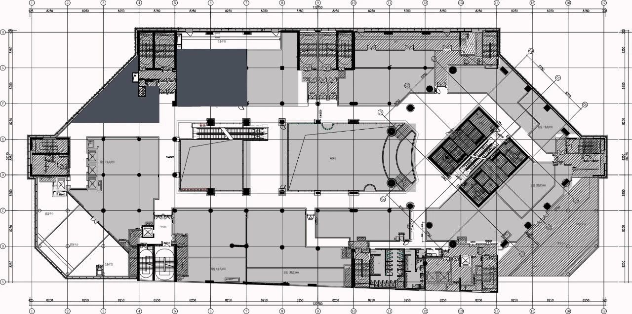
區域狀況:由消防疏散通道連接的一個三角形和一個接近正方形的兩個獨立區塊,單塊麵積不足兩百個方。
Regional situation: A triangle and a square-like area which connected by a fire evacuation passageway have a single area of less than 200 square meters.
對兩塊區域業主也很糾結,擔心將來給人造成兩家店的錯覺。
The owners of the two areas are also very tangled, worried about the illusion of two stores in the future.
設計策略 Design strategy
用“加法” Using “addition”
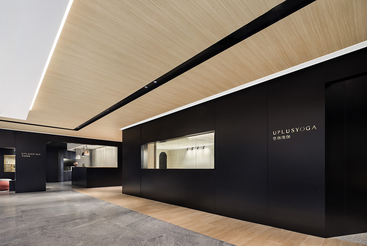
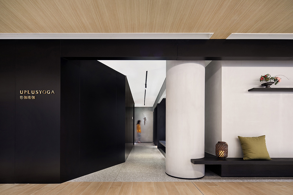
由於是兩塊區域,和商場走廊臨界立麵加起來有四十多米,用“加法”把兩塊區域的臨界立麵“加”到一起,雖說借用了商場一部分公共走廊,但是把立麵放入左右鄰居的大立麵裏來看,無論體量還是視覺效果上來看都足夠起到一個很好的心裏暗示(一個整體空間)。
Because they are two areas, and the critical elevation of the shopping mall corridor is more than 40 meters, the critical elevation of the two areas is “added” by “addition”. Although some public corridors of the shopping mall are borrowed, the facade is put into the large facade of the left and right neighbors. In terms of volume and visual effect, it is enough to give a good psychological hint (an overall space) .
用“減法” Using subtraction
考慮到瑜伽的習練者女士居多,女士的著裝絢麗多彩,把這些色彩放到未來空間的使用場景裏,也是設計考慮的一部分。
Considering that the majority of yoga practitioners are women, and the women’s clothes are gorgeous and colorful, putting these colors into the future space use scene is also a part of the design consideration.
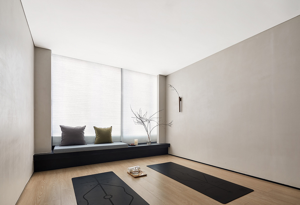
瑜伽的習練多是練習呼吸和靜心冥想居多,同時業主也希望未來的習練者不隻是練瑜伽、修形體,也可以在這裏修習心境。
Yoga practice is mostly breathing and meditation. At the same time, the owners also hope that future practitioners can not only practice yoga and body, but also practice mood here.
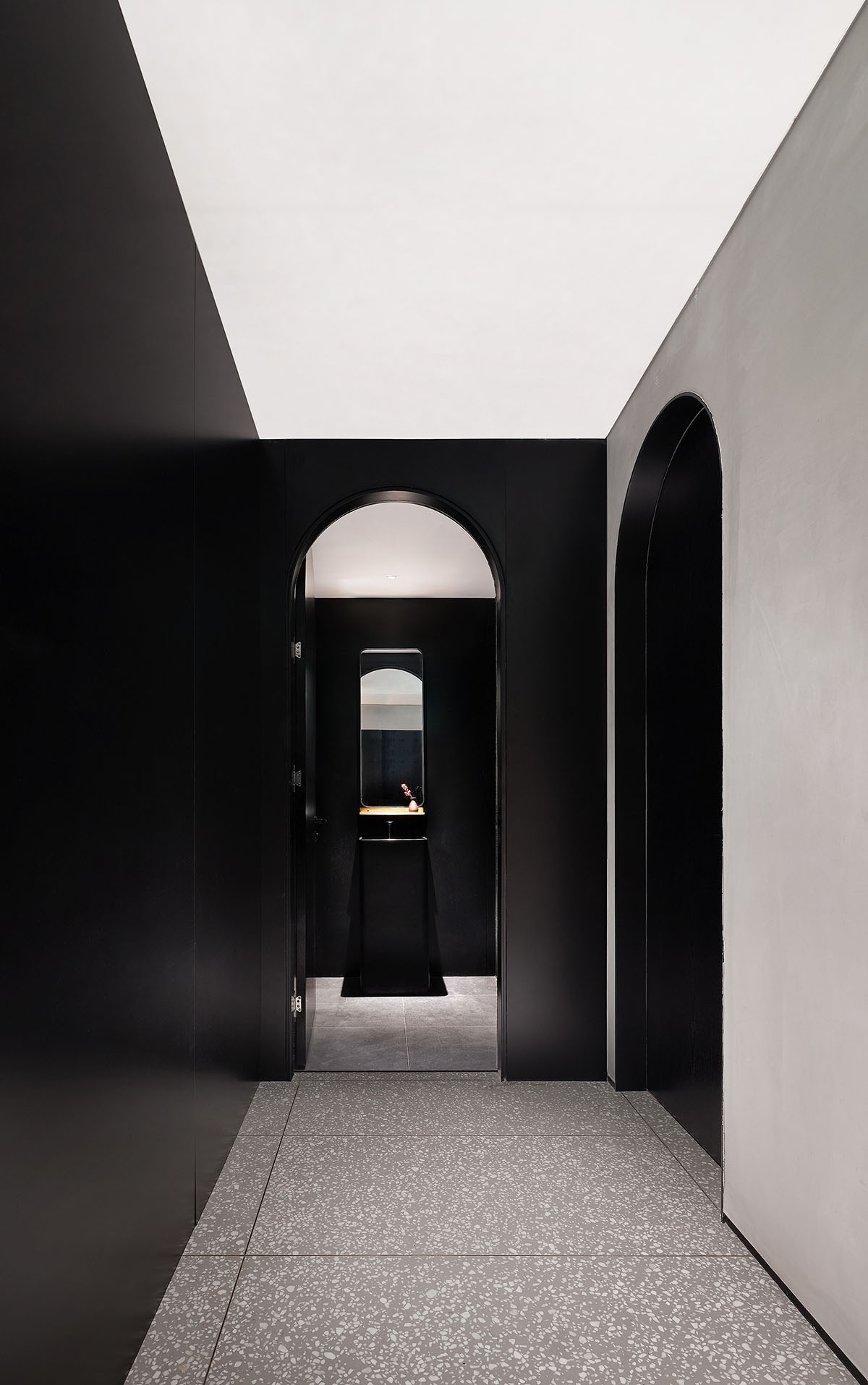
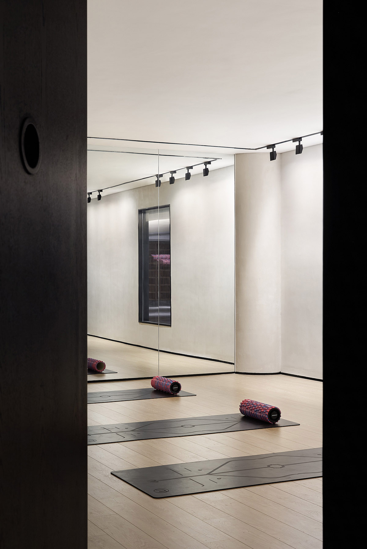
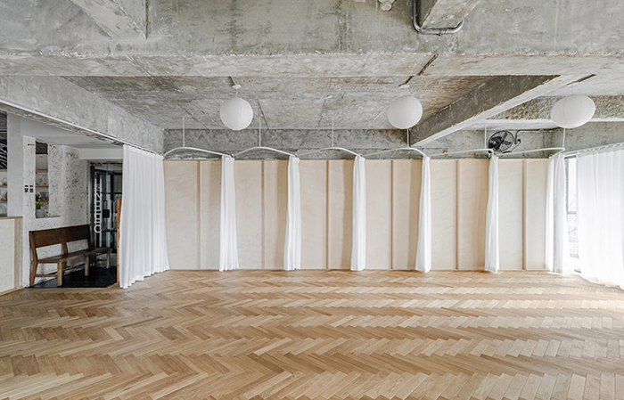
所以在物理空間形態上,我們用“減法”來思考,減去多餘的形式和色彩,盡量消減空間的個性,還原空間的本質,營造一個模糊曖昧的空間大容器。
So in the physical space form, we use “subtraction” to think, subtract the redundant form and color, try to reduce the personality of space, restore the essence of space, and create a vague space container.
∇ 從加法到減法-空間生成圖解 ©元致設計 From addition to subtraction space generation diagram Yuanzhi design
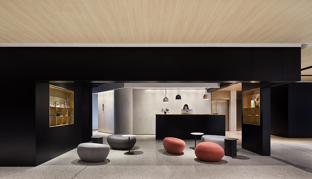
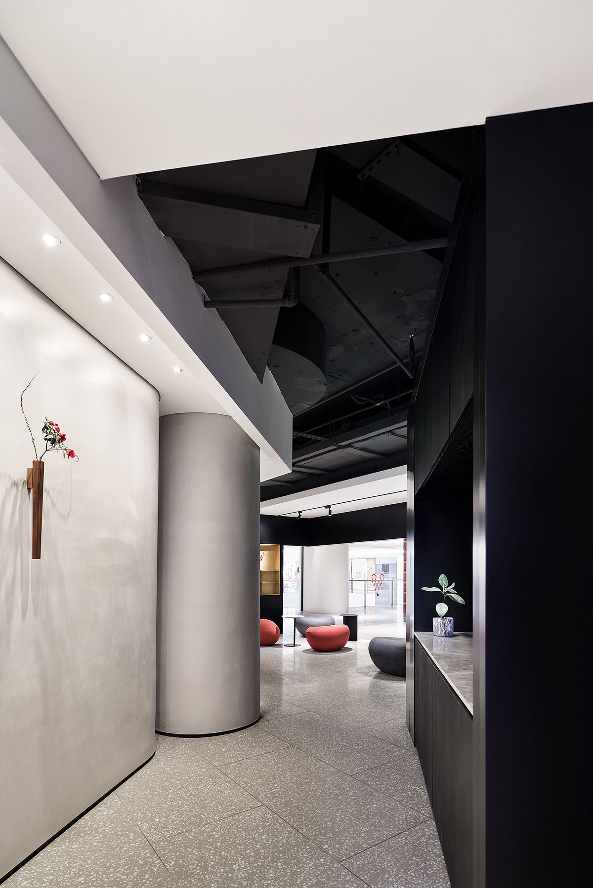
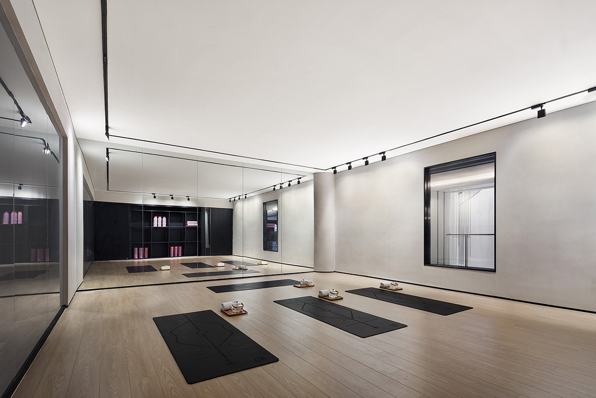
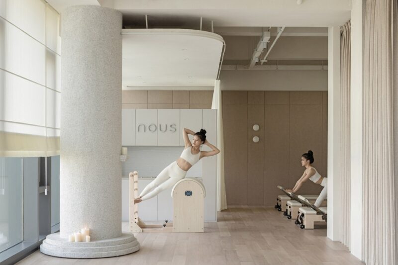
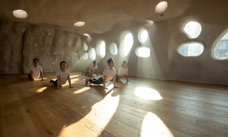
∇ 改造後效果 Effect after transformation
用“容器”來作為未來空間的關鍵字。
Use “container” as the keyword of future space..
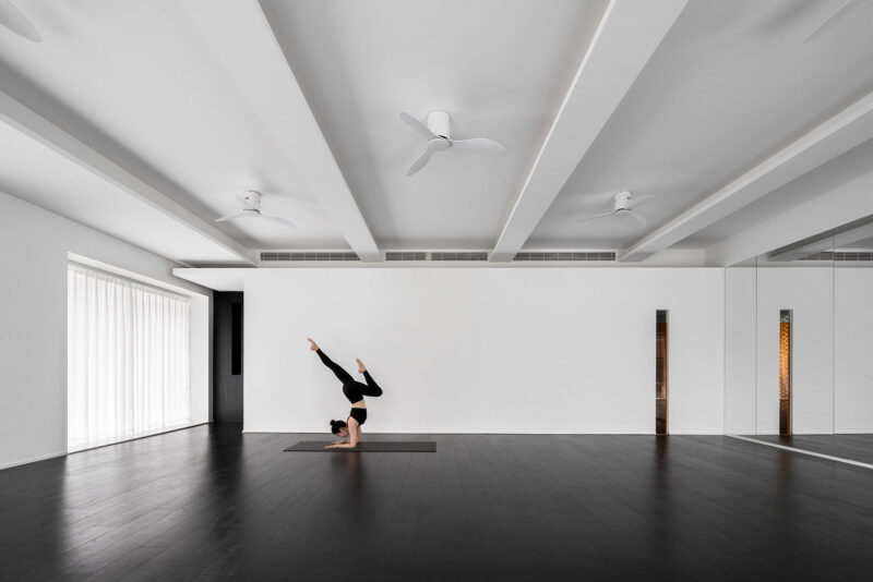
用黑白灰來調配基調,如果把“這個場所”來比喻一幅畫,我希望空間是背景,活動在裏麵的人才是畫的內容,那樣每天都會出現不同的畫,這樣不是更有意思嗎?
Using black and white to mix the tone, if “this place” is compared to a painting, I hope that the space is the background, and the talents who are active in it are the content of the painting. In that way, different paintings will appear every day. Isn’t it more interesting?
空間功能組織 Spatial function organization
入口動線用開放的形式回應逛街的“逛”、希望逛著逛著在下意識的情況下“誤入藕花深處”。
The entrance moving line responds to the “stroll” of shopping in an open form, hoping to “enter the lotus root deep place” subconsciously.
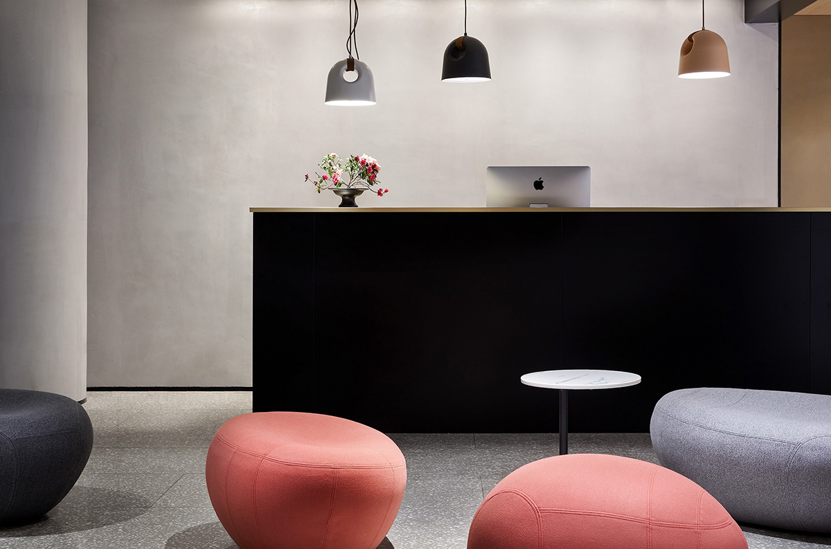
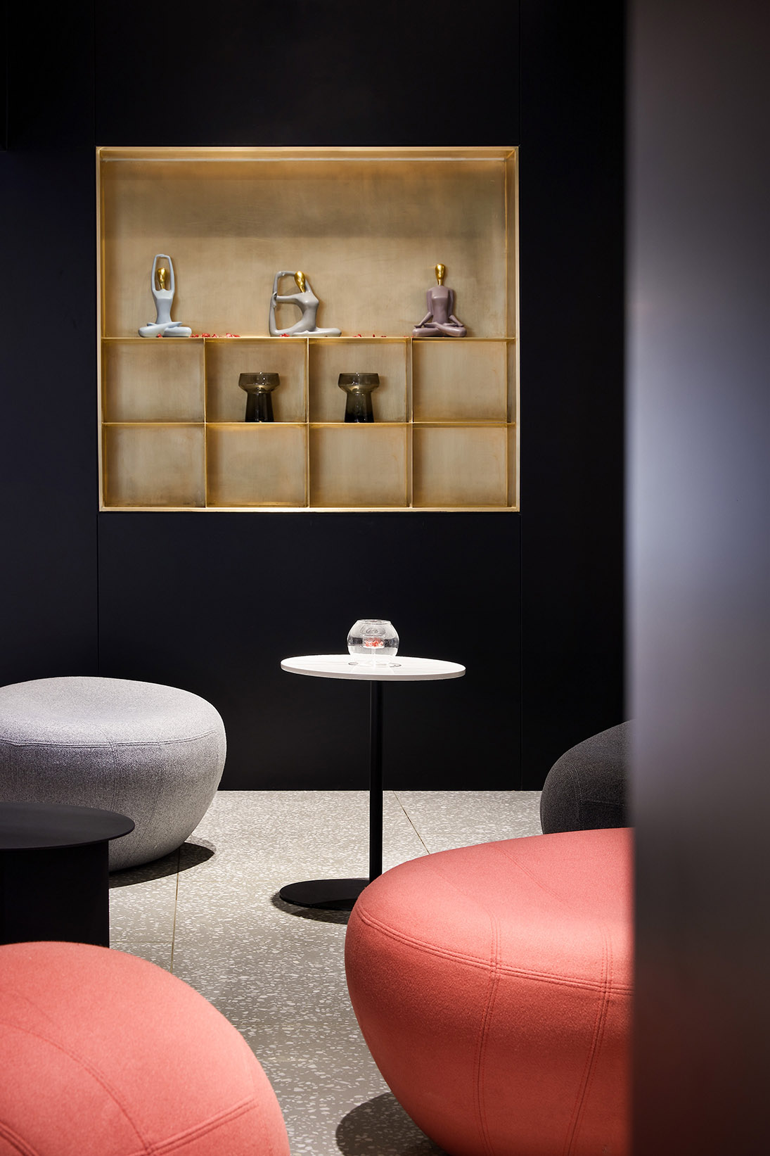
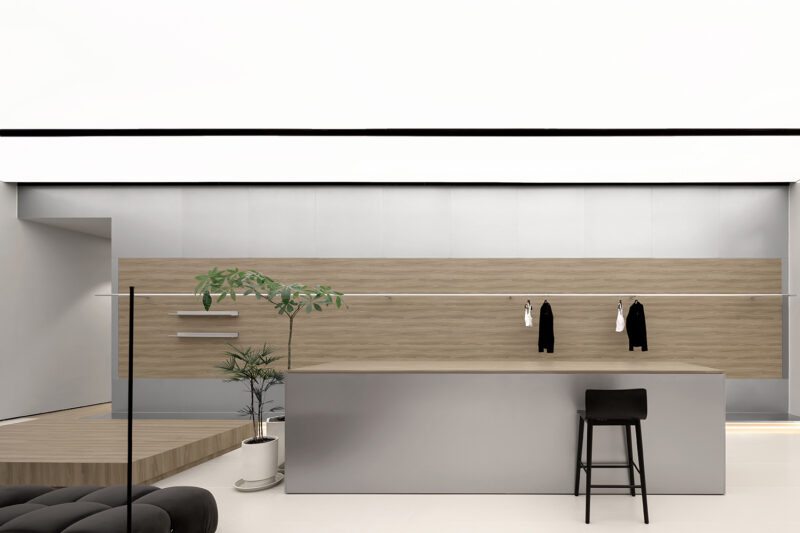
表現形式上:我們在走廊臨界處設計了卡座,在前台接待處也設計了開放式的座椅組合,椅子的最大本質就是吸引人來坐。吸引人不就是商業活動的一部分嗎?讓逛累的人在這裏休息,在下意識的情況下瑜伽悄然無聲地沒準就走進了她的生活。
Form of expression: we have designed the booth at the critical position of the corridor, and also designed the open type seat combination in the front desk reception desk. The biggest essence of the chair is to attract people to sit. Isn’t attraction part of business? Let the tired people rest here. Under the subconscious situation, yoga may enter her life quietly.
在臨界的瑜伽大教室理也做了適當的開洞,希望在未來的運營中形成“看與被看”,一次無意的回首沒準成就了一個邂逅的愛情故事……
In the critical Yoga classroom, we have also made appropriate openings, hoping to form “seeing and being seen” in the future operation. An unintentional looking back may lead to an encounter love story…
其實這樣也有一個弊端:缺少邏輯性很強的流線。接待起來有點麻煩。
In fact, there is also a drawback: the lack of logical streamline. It’s a bit of a hassle to receive.
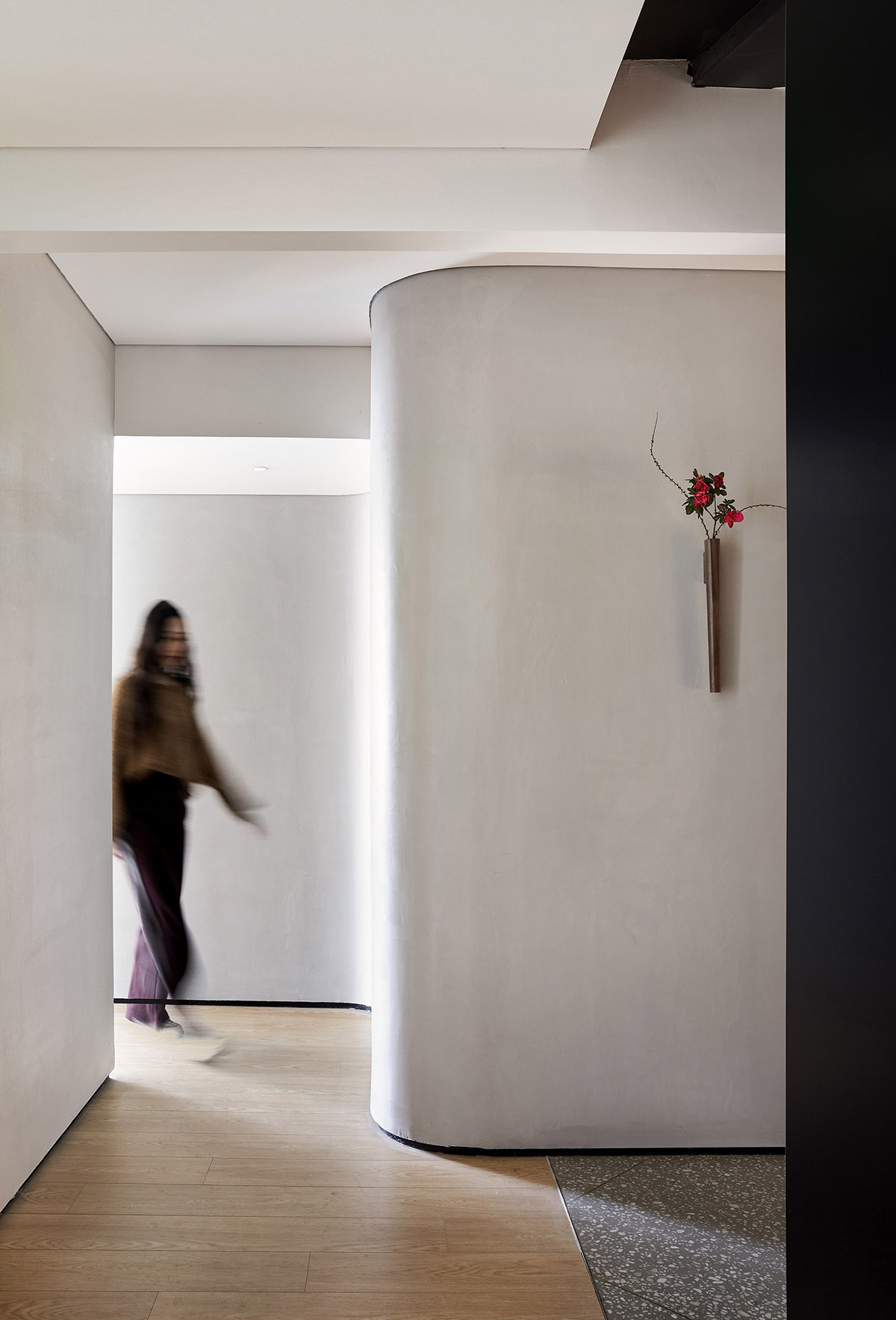
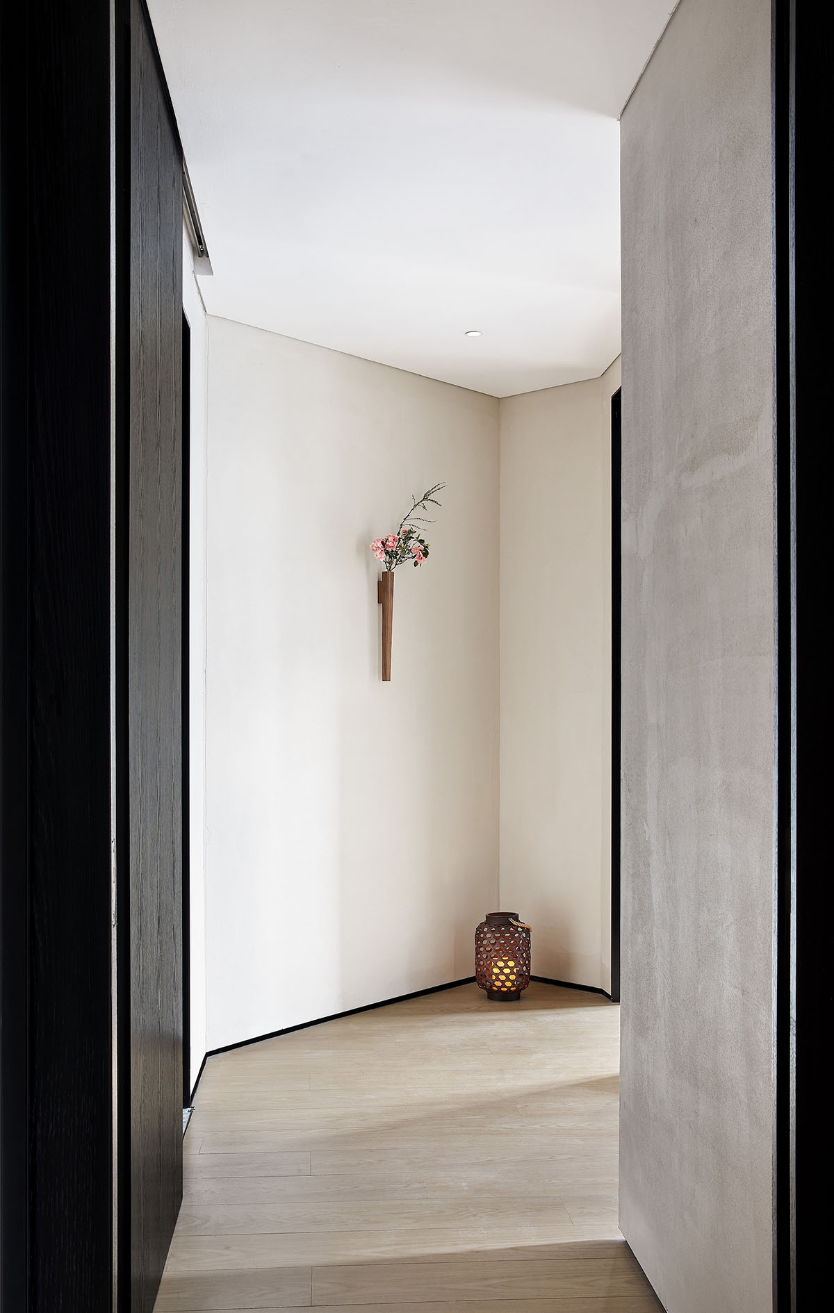
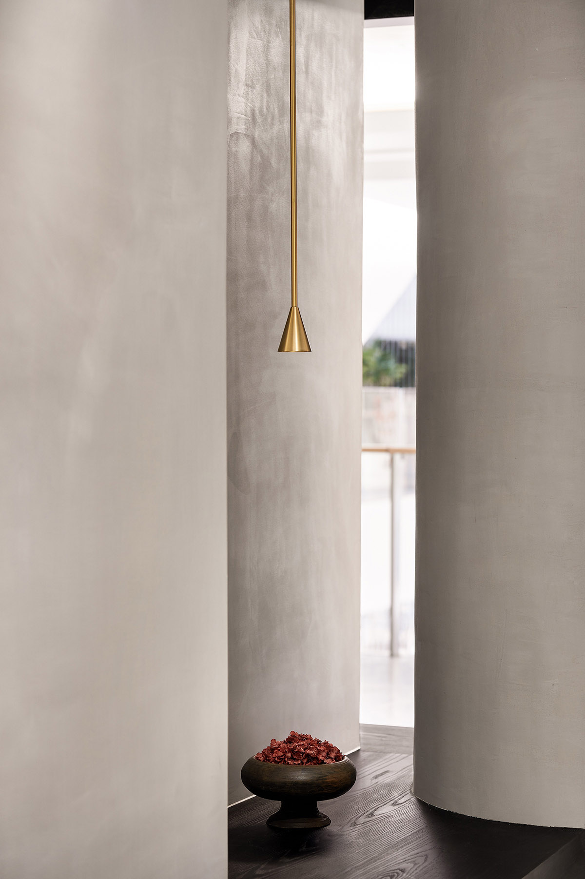
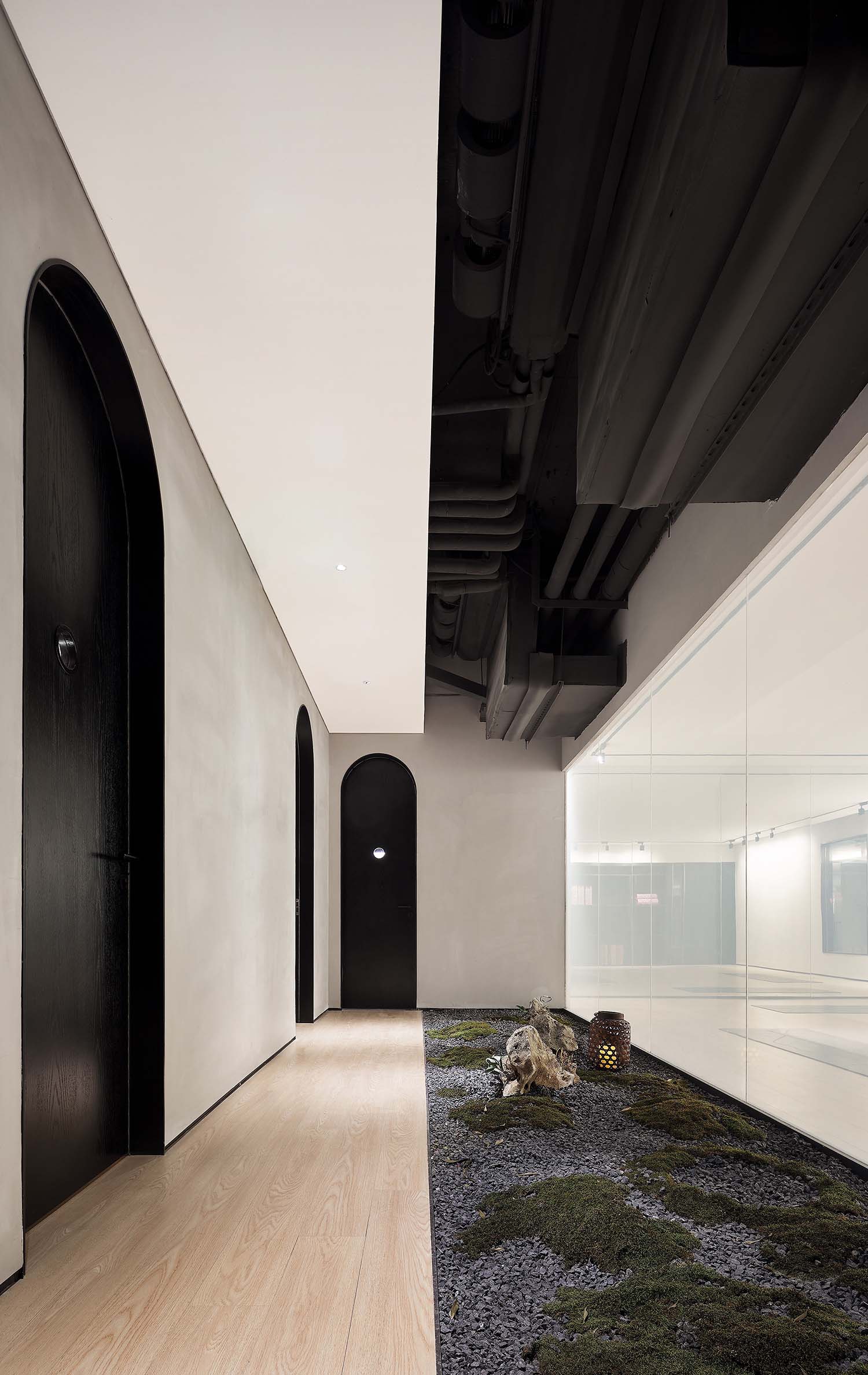
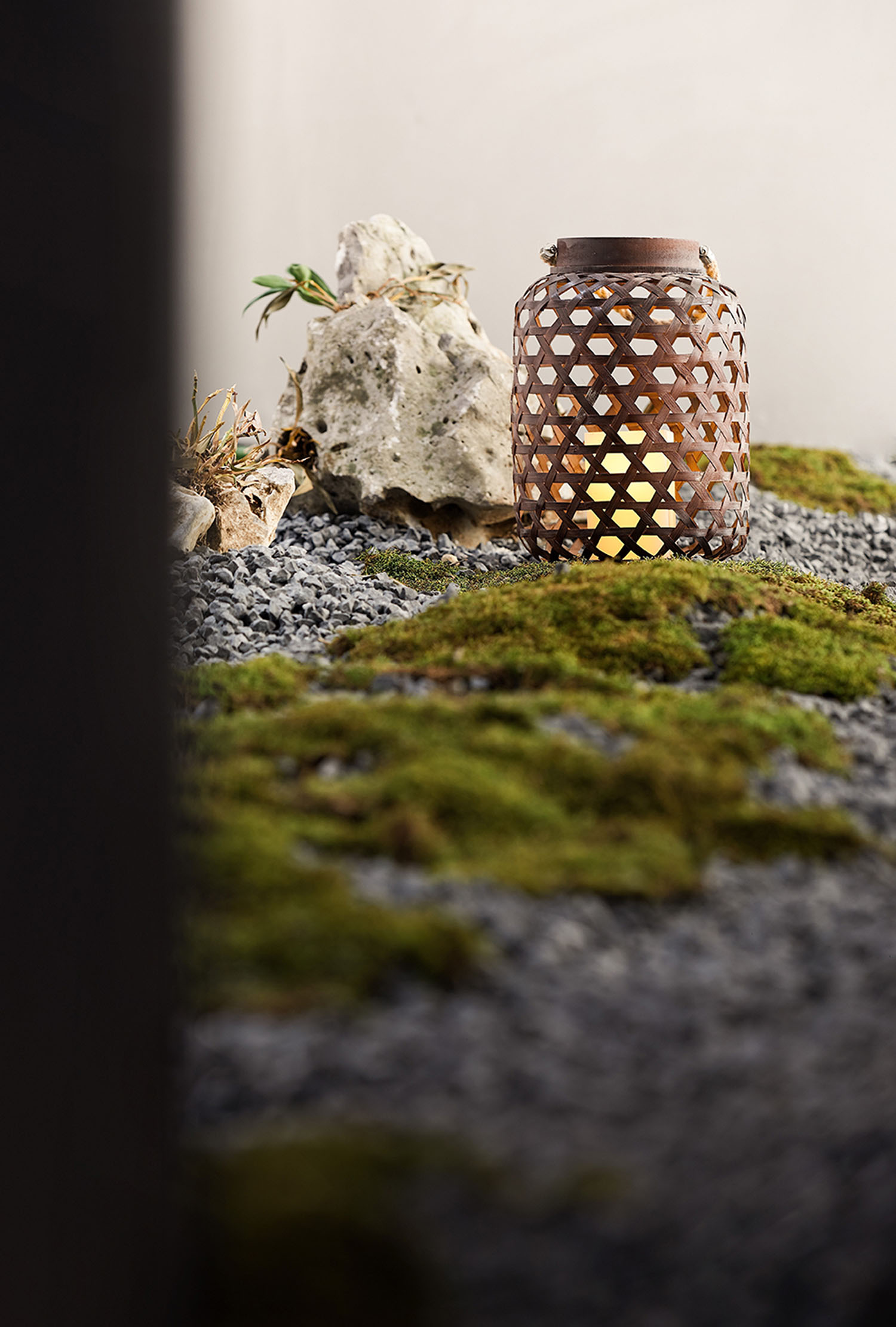
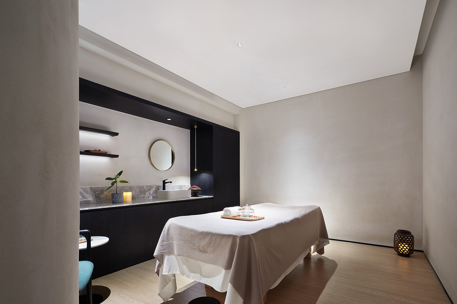
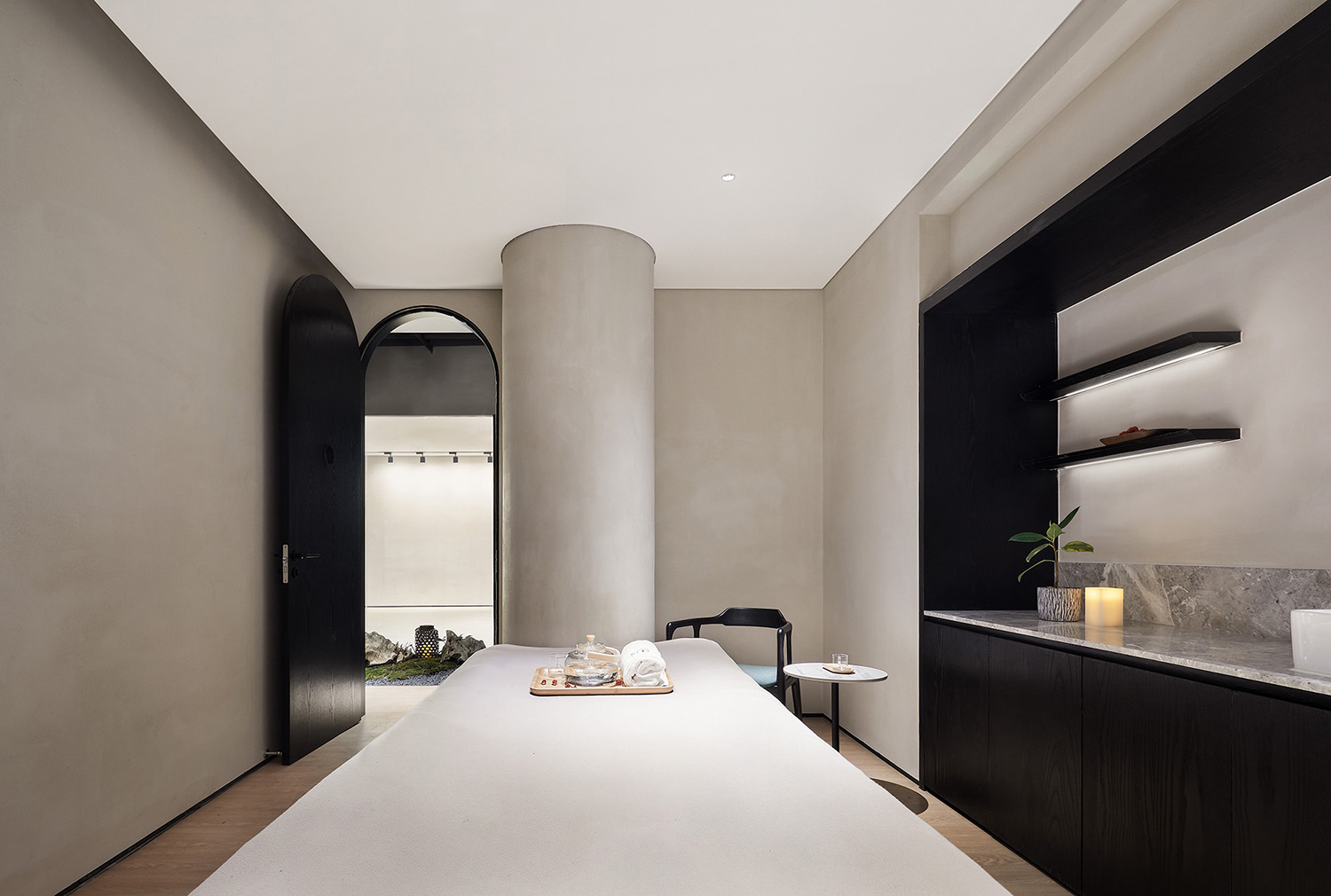
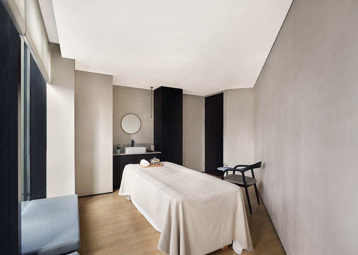
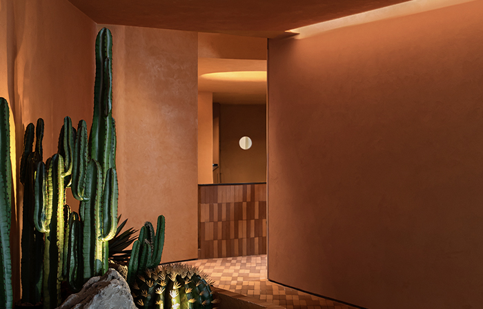
在靜謐私密的“SPA護理 ”區,通過一個閉合的走廊和置入一個內向的小庭院,來轉換空間的屬性。在走廊裏刻意營造一個香煙繚繞,燭火搖曳,光影斑斕的陰翳空間來鋪墊引導。
In the quiet and private “spa care” area, a closed corridor and a small inward courtyard are placed to transform the spatial attributes. In the corridor, deliberately create a smoke wrapped, candle flickering, light and shadow colorful shade space to pave and guide.
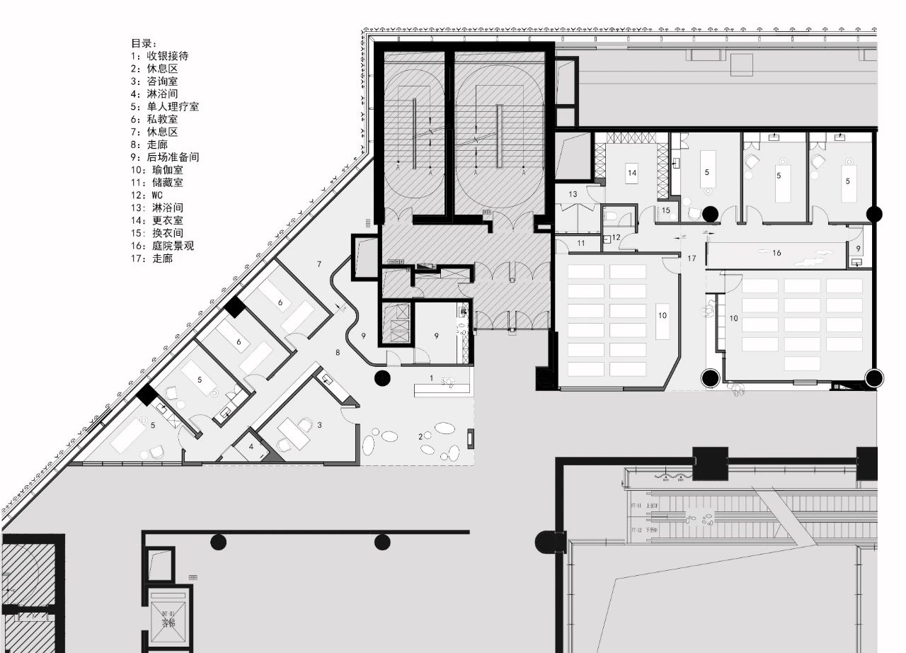
∇ 平麵圖
∇ 剖麵圖
項目信息
設計單位:元致設計
項目地點:上海浦東新區
建造周期:2019.8-2019.11
建築麵積:380㎡
攝影:三像攝
Design company: Yuanzhi design
Project location: Pudong New Area, Shanghai
Construction period: August to November, 2019
Area:380㎡
Photograph: Threeimages


