全球設計風向感謝來自 佛山市拓維室內設計有限公司 的瓷磚展廳空間項目案例分享:
I.T CERAMICHE一個源自意大利的瓷磚品牌,崇尚自由、個性、時尚、新潮。力圖將自然舒適、藝術品位,極致輕奢的意式生活美學融入到東方語境,並將東方意蘊和意式美學進行交融疊加,使品牌散發出獨特的浪漫觀感和藝術氣質。在功能上將一二樓作為品牌總部的產品展示空間、接待空間、及公共休閑空間,三四樓則為品牌辦公空間及後勤空間。
I.T CERAMICHE is an Italian ceramic tile brand that pursues freedom, individuality, fashion and novelty. The project is the headquarters & exhibition hall of the brand. The design intends to blend Italian living aesthetics that features natural comfortableness, artistic taste and affordable luxury into oriental context, to endow the brand with unique romantic and artistic charm. 1F and 2Ffunction as product display, reception and leisure spaces, while 3F and 4F are used for working and logistics purposes.
任意旋轉的立方體塊 Freely rotating cube-shaped blocks
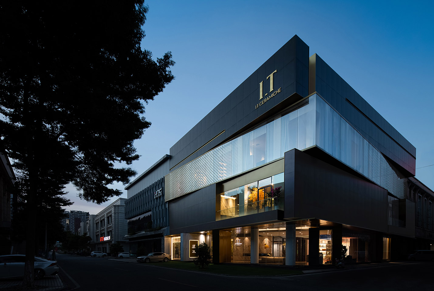
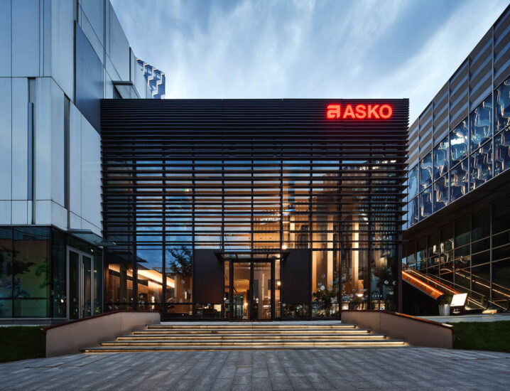
建築外觀是一座四層高的結構體,設計師從生活中喜聞樂見的“魔方”獲取創意靈感,將每一層盒子交互旋轉,在建築形態上呈現出看似矛盾又相互依存的扭動形態,凸顯建築體塊的力學美感,並使用質樸厚重的深色水泥磚和輕盈通透的玻璃盒子產生強烈的視覺反差,使實體盒子猶如懸浮於空中。黑與白,輕與重,虛與實,運用自由平麵與自由立麵的設計手法,使外觀具有豐富的結構變化,黃銅金屬和深灰色水磨石相互穿插,彩色有機玻璃和大理石相互並存,人工合成材質和傳統自然材質相輔相成,宛若光束劃破冷峻夜空,表達了品牌的輕奢調性、極致工藝和美學觀點。
The building is a four-storey construction. The architectural appearance is inspired by the popular “Rubik’s Cube”. Each floor is a box, which interactively rotates, together creating a twisting form that shows contradictory yet interdependent visual effects and highlights the mechanical beauty of the building blocks. Plain, heavy and dark cement bricks offer a strong visual contrast to the light transparent glass box, making the building “boxes” appear suspended in the air. The contrast between black and white, lightness and heaviness, void and solidness, together with the free plane and facade design, contributes to producing changes to the architectural form. The harmonious combination of brass metal and dark gray terrazzo, colored acrylic glass and marbles, as well as artificial synthetic materials and traditional natural materials, perfectly demonstrates the brand’s sense of affordable luxury, ultimate craftsmanship and aesthetic concept.
沉浸水下的一方天地 A world under water
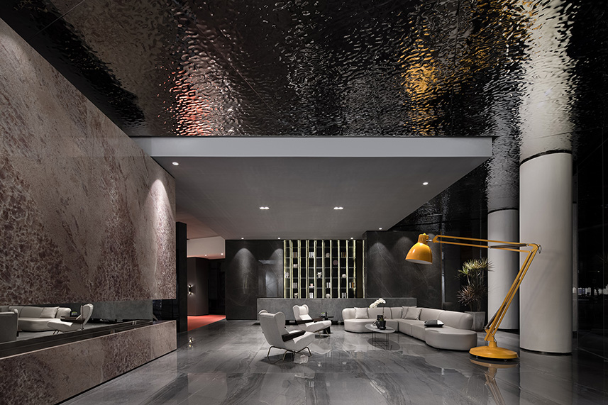
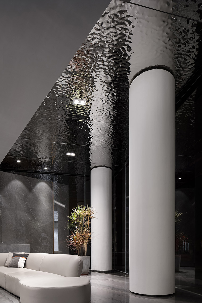
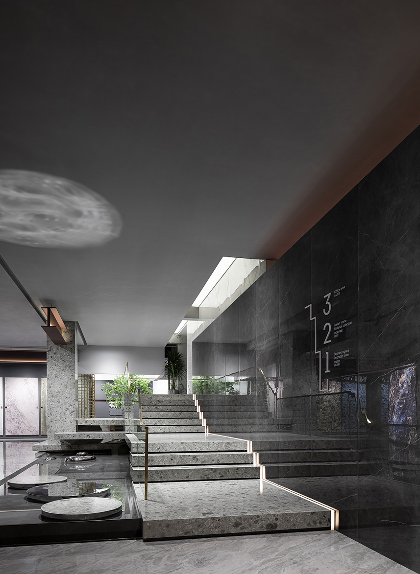
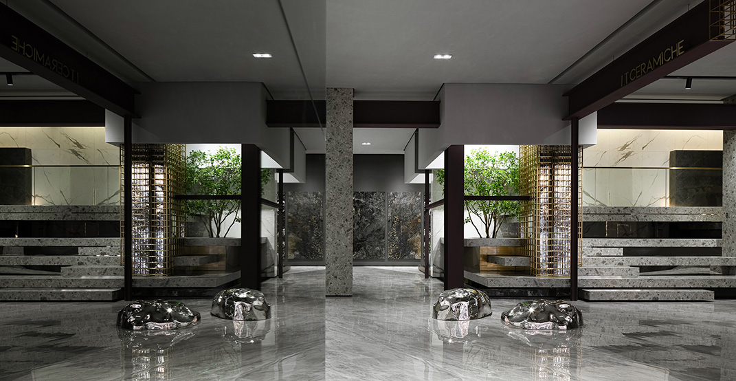
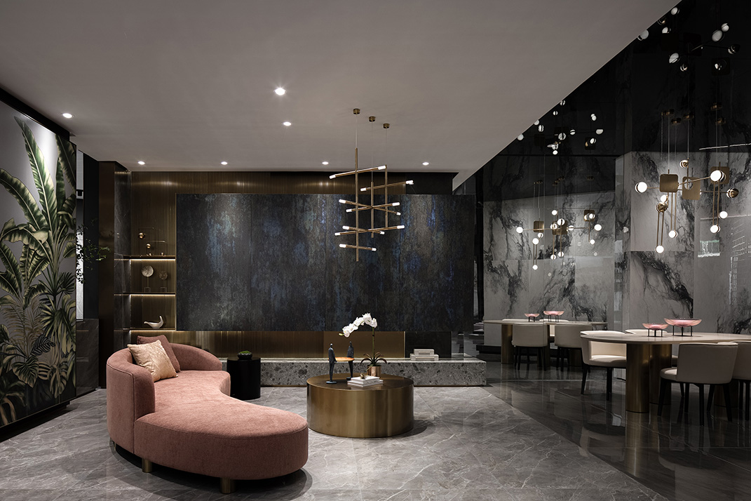
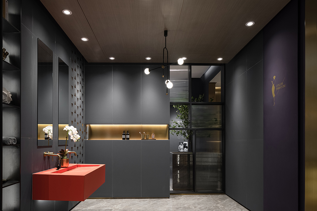
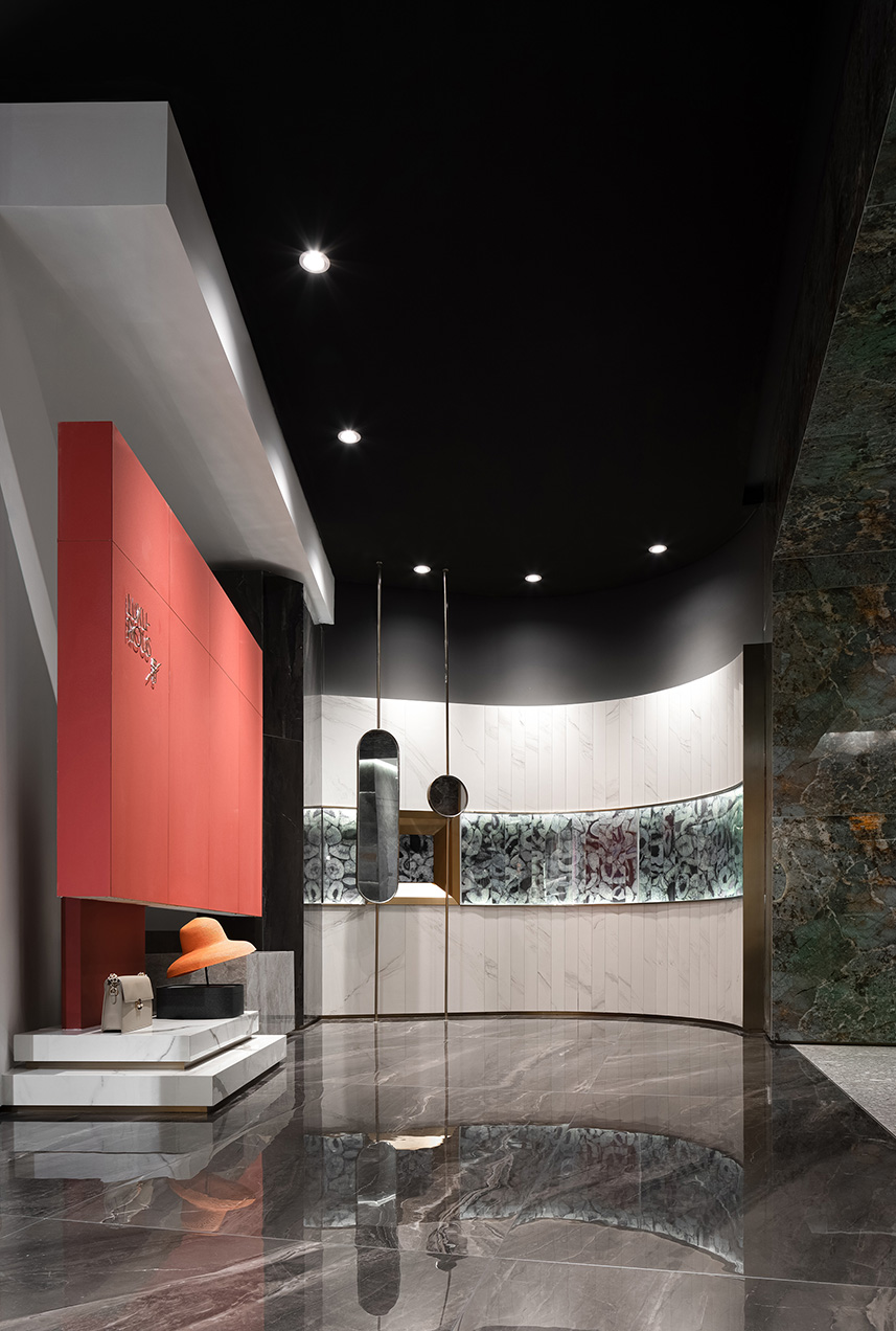
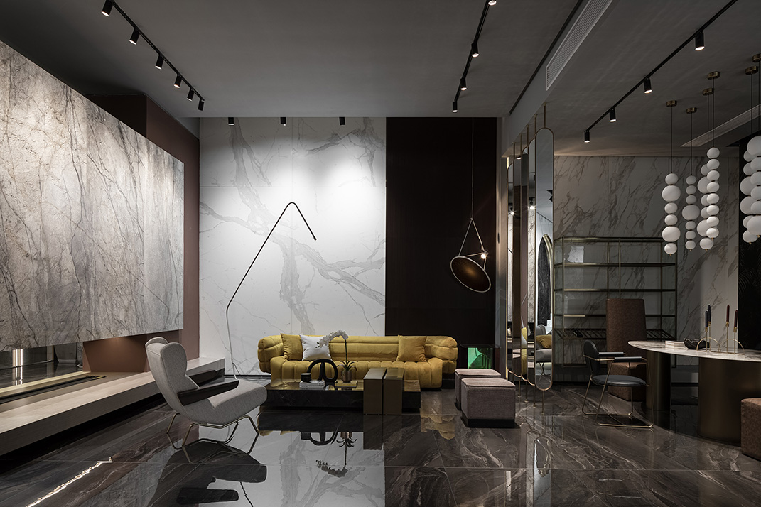
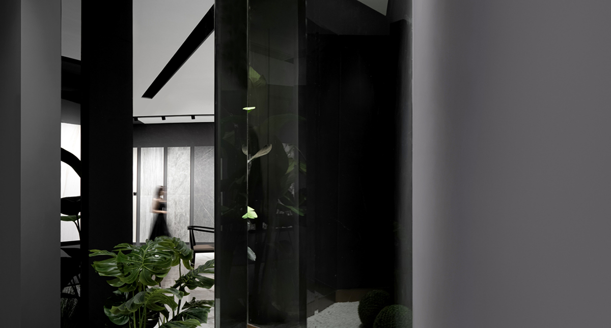
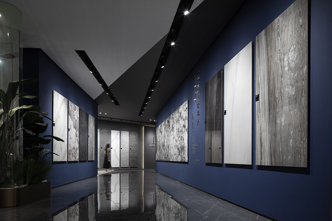
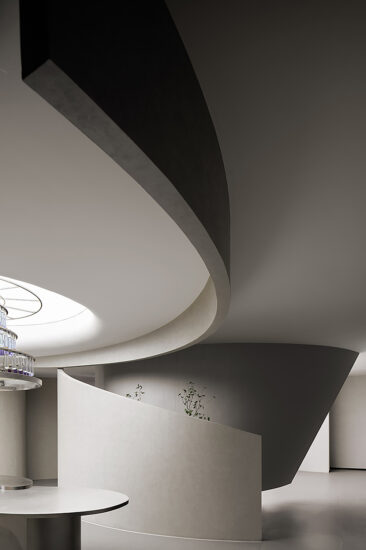
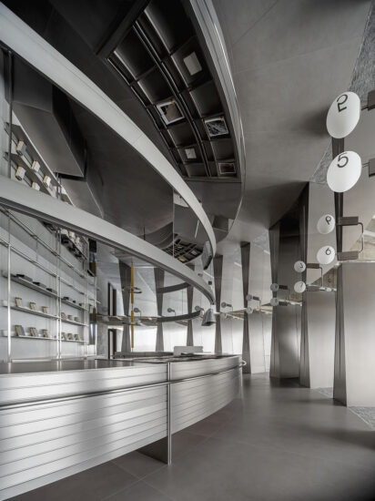
室內空間將旋轉的“魔方”概念繼續延伸,使空間形態更具自由對立特征,大堂空間天花運用水紋不鏽鋼材質,仿佛置身水底的觀感,轉動的牆麵和天花通過體塊搭接和穿插,賦予空間強烈的建築體塊屬性。粉色奢石和水泥質感的地麵相互對比,凸顯各自的質感特點,空間起承轉折,一步一景,讓觀者的視線的行走方式被空間吸引著前行,自由空間的核心不應該限製人的行為,而是自然引導人在空間中行走,穿行於水波瀲灩中,詩意的傳達以建築的方式發展到一種與自然之物心靈唱和的更複雜、更精致的狀態。
The concept of “Cube” is extended to the interior design, which creates free yet contrasting spatial forms. At the lobby, the ceiling is finished with a stainless steel panel featuring rippling patterns, which create a feeling of being underwater. The rotating wall and ceiling are connected and interpenetrated via blocks, giving the space a strong sense of architectural blocks. The luxurious pink stone and the cement-like flooring form a sharp contrast, while accentuating their own unique textures. Visitors can appreciate different views at each step along the circulation route. The core of this free space is that it never restricts people’s behaviors. Instead, it guides them to walk and explore under the “rippling water”. The poetic design language enables the architectural space to resonate with inner mind.
大麵積落地玻璃窗將自然光引進空間,提高整體空間的氛圍感,金屬的回旋似乎源於水的漩渦,石頭的鋸齒可能來自木匠的榫卯,但它不是漩渦,也不是榫卯。一種特質、一種韻律,把表現的與被表現的聯係起來,而這種聯係又隻體現為單純的形式語言。這是一種詩意的抽象。形狀不再帶有任何內涵或延伸的意義,它隻代表它本身,它隻代表美。
Large areas of French glass windows bring in natural light and enhance the overall interior atmosphere. The “vortexes” on the metal plate echoes water whirlpools, and the serration of stones is a reminder of mortise-and-tenon joints. Those forms evoke associations, feature abstract poetry, and stand for beauty.
通往未來的漂浮天梯 Floating stairs leading to future
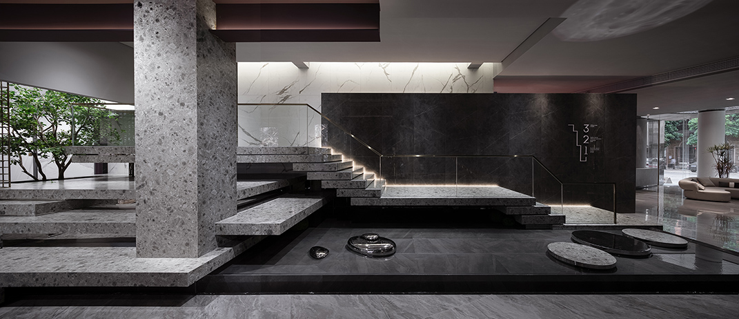
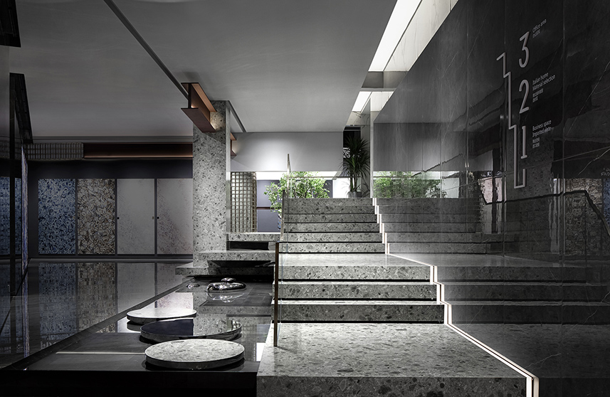
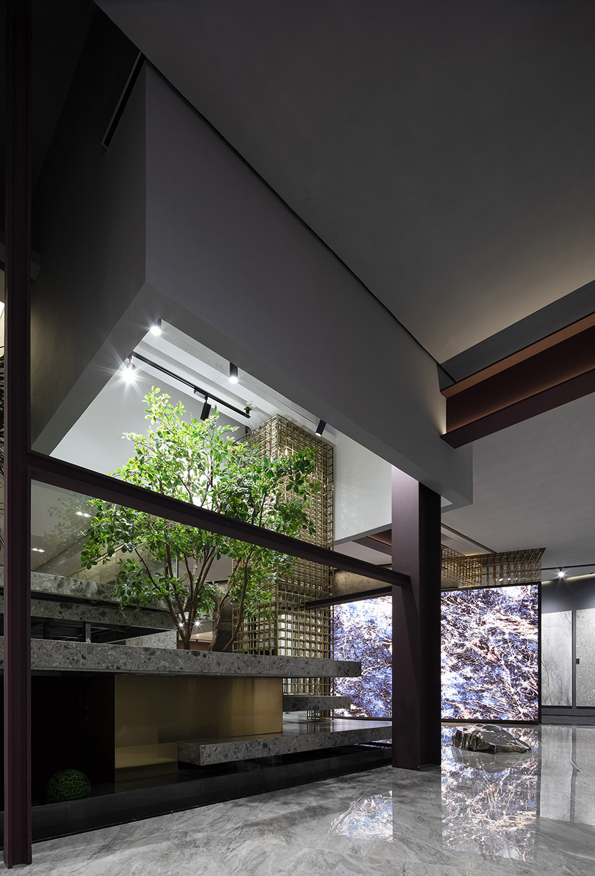
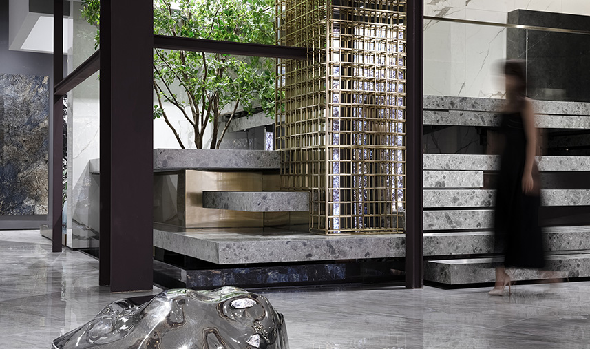
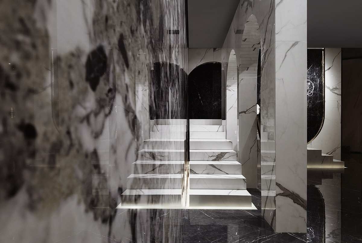
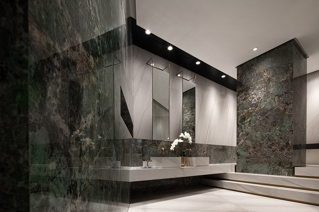
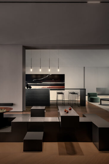
以水磨石質感的階梯通過建築手段營造使其漂浮於水麵之上,這種看似違背自然規律的方式將引發更多聯想,由石塊構建成的台階,引領觀者緩步而上,猶如通往未知世界的天梯,分離的體塊,體塊之間的縫隙,縫隙之間的光帶,讓厚重的台階變得輕盈起來,意大利建築大師斯卡帕認為每一個形體都應該是獨立而又相互關聯的,由此而衍生出“分離主義”的建築觀點,這些來自建築界的理論無疑影響到了空間設計領域。
The terrazzo staircase looks like floating above water through architectural approaches. Although the design seems contrary to the laws of nature, it helps to stimulate imagination. Visitors are guided by the stairs as if they are led to an unknown world. Separated blocks, gaps between the blocks, and light belts inside the gaps, all make the originally heavy stairs appear more lightweight. Carlo Scarpa believes that each form or shape should be independent yet interrelated, which is how the architectural idea of “separatism” derived from. Undoubtedly, these architectural theories have affected the field of spatial design.
多元向度裏的分離重構 Separation and reconstruction in multiple dimensions
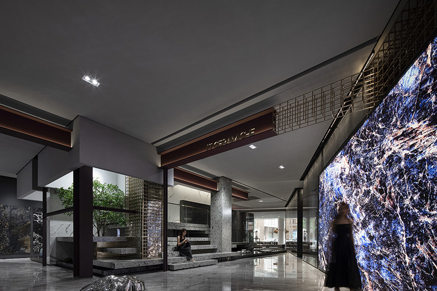
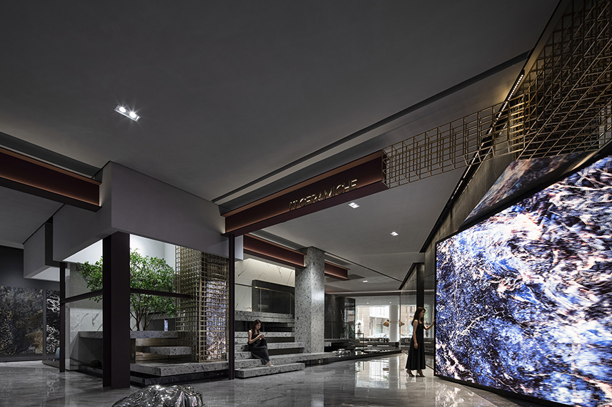
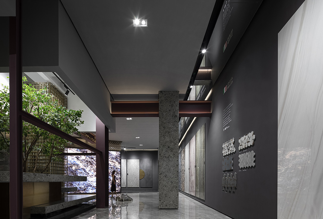
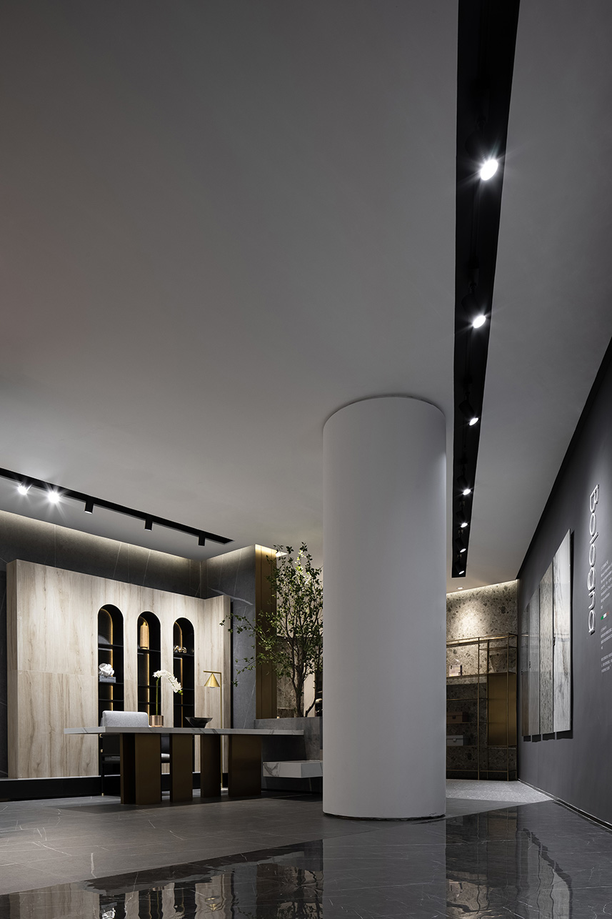
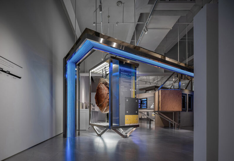
柯布的自由立麵理論擺脫了結構柱對建築立麵的限製,同時也認為建築結構不應該被掩飾起來,它們在空間裏本身就具有獨立美感,設計師在此空間不但保留結構的原始美感,甚至去強化這種建築結構本身的美感,裸露的工字鋼結構和鋼筋網架在梁柱之間自然穿插,間架結構的組合中亦虛亦實,表達出對工業時代的建築架構形態的讚美。讓外露的建築結構自帶的美感成為空間中的裝飾元素,讓體塊和線條在上下左右的多元向度裏,拉出立體層次感。
Le Corbusier’s free facade theory advocates that building facade should get rid of the limitations of structural columns, and building structures should not be concealed because they own independent and unique charm. Therefore, the design team not only retained the original beauty of the structures, but also further strengthened it. The exposed universal beam structure and the steel grid are naturally interpenetrated, which pays tribute to the architectural structure at industrial age. With a unique aesthetic, the exposed architectural structures become decorative elements in the space. The blocks and lines in multiple dimensions produce a sense of layering.
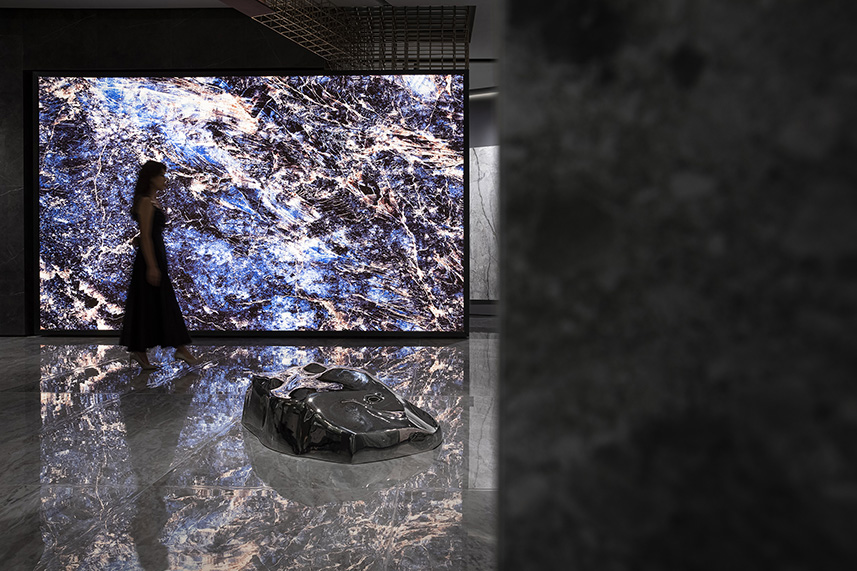
設計師在此共享空間中置入4米高的LED旋轉屏幕模塊,放大自然石紋的肌理和色彩魅力,用於呈現產品本質的視覺觀感。水滴形的不鏽鋼藝術裝置慵懶地匍匐在地上,如夢遊者般的沉重、緩慢、遊離…..自然景觀半掩於盒子裏,給空間增添不少生動,設計團隊把自然的事物轉變為某種建築和城市的構建元素,引人無限遐想。
The designers brought a four-meter-high rotating LED screen to the shared space, to maximize the charm of natural stone textures and color while presenting the essential visual effects of products. The water drop-shaped stainless steel art installation “crawls” on the ground, heavy, slow and like a sleepwalker. The natural landscape is half hidden in the box, adding a lot of vitality to the space. The design team turned natural things into architectural and urban construction elements, which evoke endless imagination.
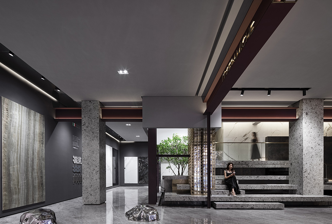
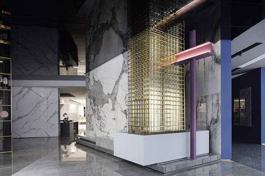
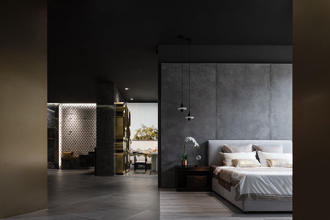
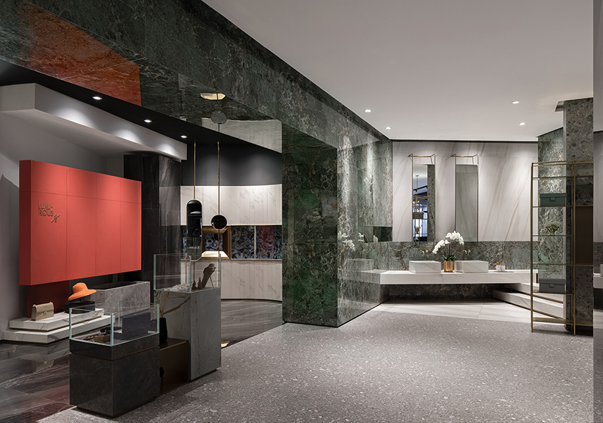
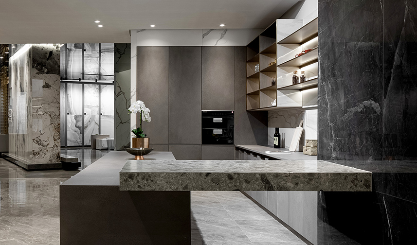
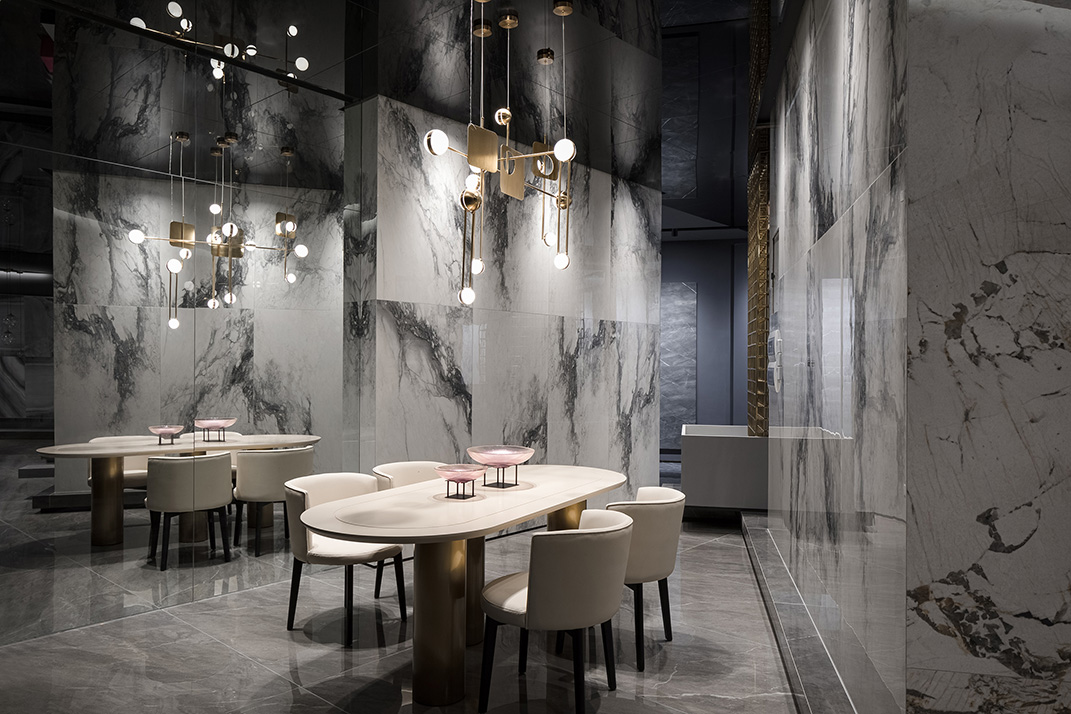
一個空間中三個不同形態的柱子,似乎是在向觀者逐層剝開建築的外在包裹物,形成強烈的視覺衝擊感,引人陷入哲思,真正的完美是什麼?強調不同材料特征之間的碰撞,打磨拋光的水磨石、精致奢華的大理石、腐蝕生鏽的工字鋼金屬,光滑與粗糙,冷峻與溫潤,用對比、類推、共生、重複、秩序等方式來構成空間。中部的柱子用金屬結構、鋁材、玻璃等技術結合起來構築成了一種新的建築結構元素和視覺元素,這種組合既是對可持續材料的探索也是對現代主義的承襲,設計不單單是一種表麵裝飾,更是要發掘和思考各種內在可能性帶來的重構。交接是裝飾之源。斯卡帕考慮的不僅是平麵的交接,而是立體的、結構的交接。交接發生在不同功能、不同部件、不同材料之間,優美的交接細部設計表現出它們之間優美的關係。這種優美的關係便是清晰。
The three columns of different sizes in the space seem to gradually peel off the coverings of the building, creating strong visual effects and leading people into philosophical thinking: What is real perfection? The design emphasizes the collision among materials of different textures. Polished terrazzo, exquisite marbles and rusting universal beams, either smooth or rough, cool or warm, are applied to constructing the space by means of contrast, analogy, symbiosis, repetition and order, etc. The column at the center is integrated with metal, aluminum and glass to form a new architectural and visual element. Such combination embodies an exploration of sustainable materials and an inheritance of modernism. Design is more than superficial decoration, but more importantly should explore and bring more possibilities of internal reconstruction. Joining is the source of decoration. Carlo Scarpa pays attention to the joining of planes and also three-dimensional structures. Joining occur in different functions, components and materials. Fine joining of details reveals the beautiful relationship between them. Such beautiful relationship is called clarity.
古今對話中的東西美學 Dialogues between oriental and western aesthetics, past and present
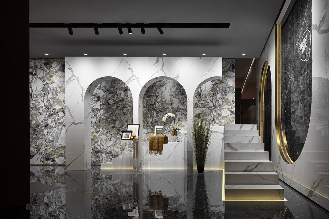
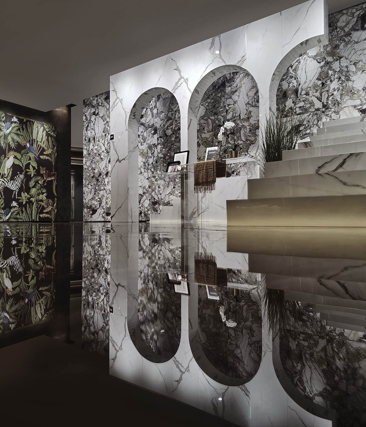
拱形門既是西方也是東方的建築語言,利用向上的拱形與向下的拱形並置,產生東西方美學的共鳴和衝撞,同時又被賦予產品的展示功能;巧妙地運用透明亞克力板這種現代材料與古老的原始的石材形態進行組合,瓷質台階從拱形裏延伸出來。這種拱形的形態來源於過去的曆史建築元素,卻運用現代抽象的設計語言與最基礎的建築形態來表達,使之抽出、混合、拚接。利用曆史符號來豐富建築麵貌,這是後現代主義大師羅伯特·文丘裏的理論主張,這種做法豐富了現代建築的審美性和娛樂性。
Arched doors embody both oriental and western architectural languages. The paralleled upward and downward arches in the space create resonance and collision of oriental and western aesthetics, and are endowed with product display function. Modern transparent acrylic boards are cunningly combined with natural stones, with ceramic-tile-paved steps extending from the arches. Arch, which is derived from historical architectural elements, is presented by modern abstract design language and the most fundamental architectural form. Prominent postmodernist Robert Venturi advocates using historical symbols to enliven architectural form. Such practice has enriched the aesthetics and entertainment of contemporary architecture.
後現代主義的另一個代表人物邁克·格雷夫斯表示,他設計“象征性的建築”這類型建築的動機就是要表現建築與自然、古典傳統之間的關係。因此這種設計具有明確的意義:對曆史主義的象征性表現。這種折衷處理是建立在現代主義設計的構造基礎之上的。其靈感來源是歐洲古老的曆史象征,而表現形式又是當代的,采用折衷的、戲謔的、輕鬆的方式,形成一種特殊的語言,聯通古今與中西,引人思考,從而進行意義的傳達,這也是本項目一直堅守傳承的設計思想。
Michael Graves, another influential representative of Postmodernism, explained that his motivation of designing architecture, “a symbolic gesture”, is to establish connection among architecture, nature and tradition. Therefore, this type of design is evident in meaning that it is a symbolic interpretation of historicism. This kind of eclectic approach is built upon the structure basis of modernist design. It is inspired by ancient historical symbolism but expressed in a contemporary manner. A unique design language is correspondingly formed in an eclectic, ironic and relaxed way to convey meaning. It’s thought-provoking, and connects the past and present as well as the oriental and western world. It is the design ideology that the project adheres to.
溫潤質樸的心靈觸動 Gentle spiritual touch
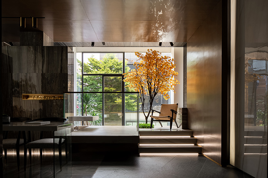
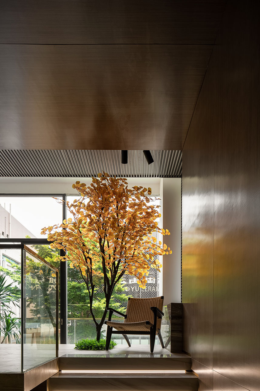
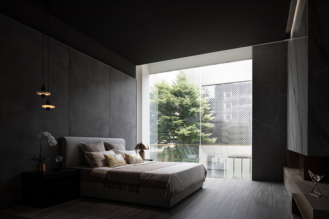
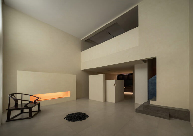
室內空間是建築的延伸,挑空的陽台和落地玻璃窗為室內空間提供了必要的空間屬性,抬高的陽台,園林氛圍的書房,寧靜自然的臥室,這裏是一方享受自然陽光的天地。陽台上楓樹,陽光透過金黃的葉子撒進室內,猶如在講述著一個秋天的浪漫童話,更似乎是朱麗葉的窗台,窗台的綠植和戶外的自然景觀形成一個很美的過渡空間,設計師刻意營造出一種轉角一霎那遇見自然的驚喜,試圖重啟一種人與建築融入自然事物的“齊物”建築觀。光影在樹葉的間隙中流動,在室內留下自己的敘事語言。
As the extension of the building, the interior space is given essential spatial features by the void balcony and French glass windows. Raised balcony, garden-like study and tranquil bedroom create a private realm to enjoy nature and sunshine. Sunlight passes through the golden leaves of the maple tree on the balcony and filters into the interior space, as if the scene is telling a romantic fairy tale in fall. It seems more like Juliet’s windowsill, on which the green plants embrace the outdoor landscape to form a beautiful transition space. The designers created such surprise at the corner purposely, with a view to reigniting the architectural concept of “seeing things as equal” that man and architecture are integrated into natural things. Light flows through the leaves, leaving its narrative language in the interior.
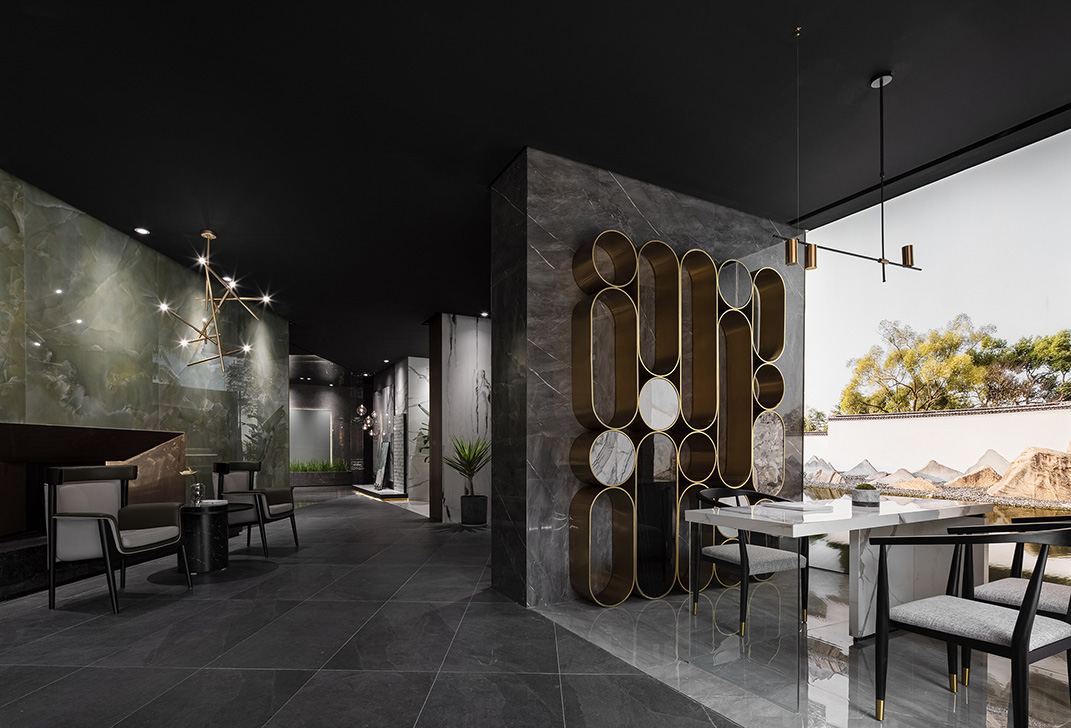
用虛擬手段打造的蘇州園林白牆和山影打破了這靜穆,使封閉空間變得通透和悠然自得,塑造出一種羽毛般輕盈的空間質感。
The virtually crafted white walls and mountain views that draw on Suzhou classical gardens break the tranquility, making the enclosed space transparent and pleasant with a spatial impression as light as a feather.
回歸自然的素雅生活 A simple life returning to nature
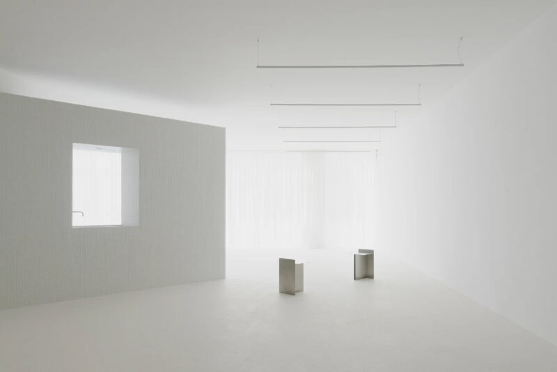
空間的本質是回歸自然,混凝土質感的產品在光線的渲染下更顯寧靜本色,質樸的空間氛圍使觀者的內心拋去浮躁,回歸寧靜。延續了一樓的設計元素,上下層互相呼應。用最自在的方式,詮釋最純淨的白色。
The essence of the space is to return to nature. Rendered by light, the products with concrete texture appear to be more serene. The tranquil spatial atmosphere calms visitors’ mind. The virtually crafted white walls and mountain views that draw on Suzhou classical gardens break the tranquility, making the enclosed space transparent and pleasant with a spatial impression as light as a feather. 2F continues the first floor’s design elements, hence achieving harmony of the two storeys. The purest white is interpreted in a most natural way.
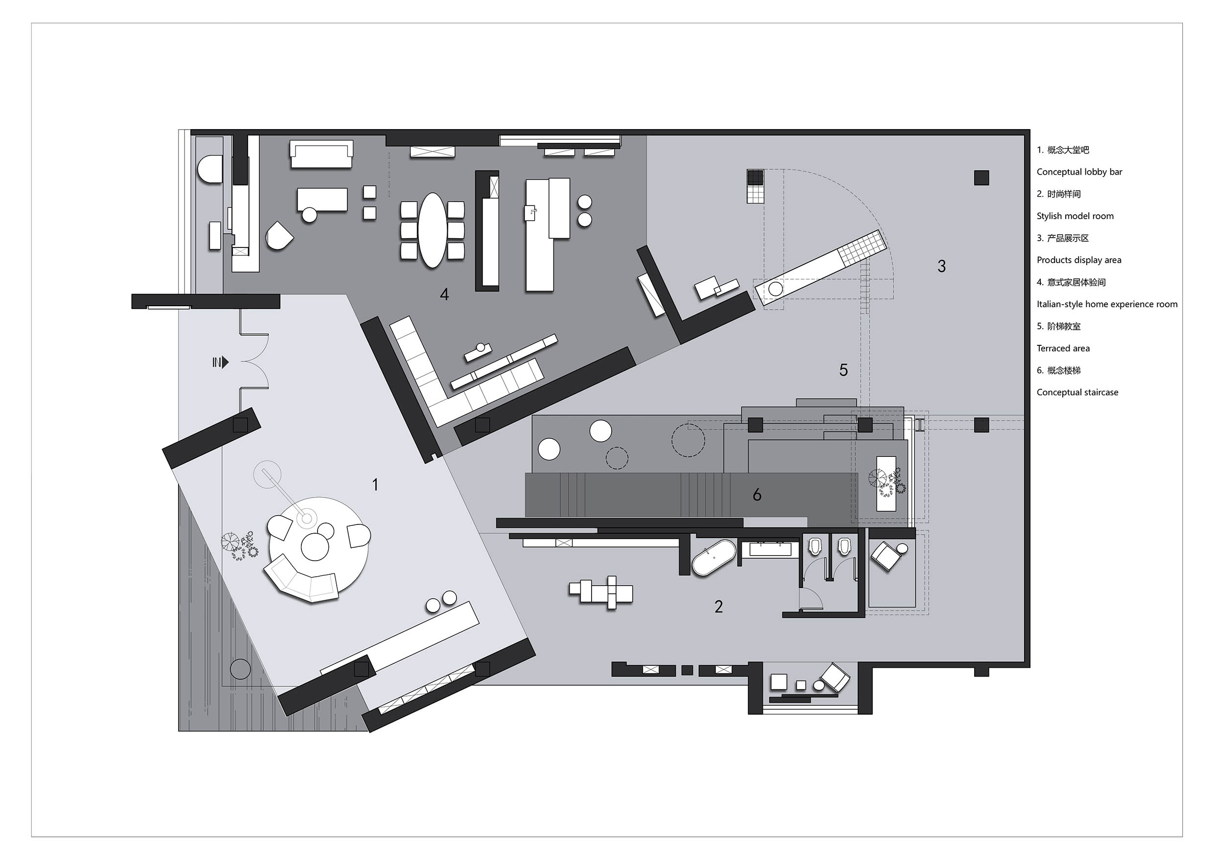
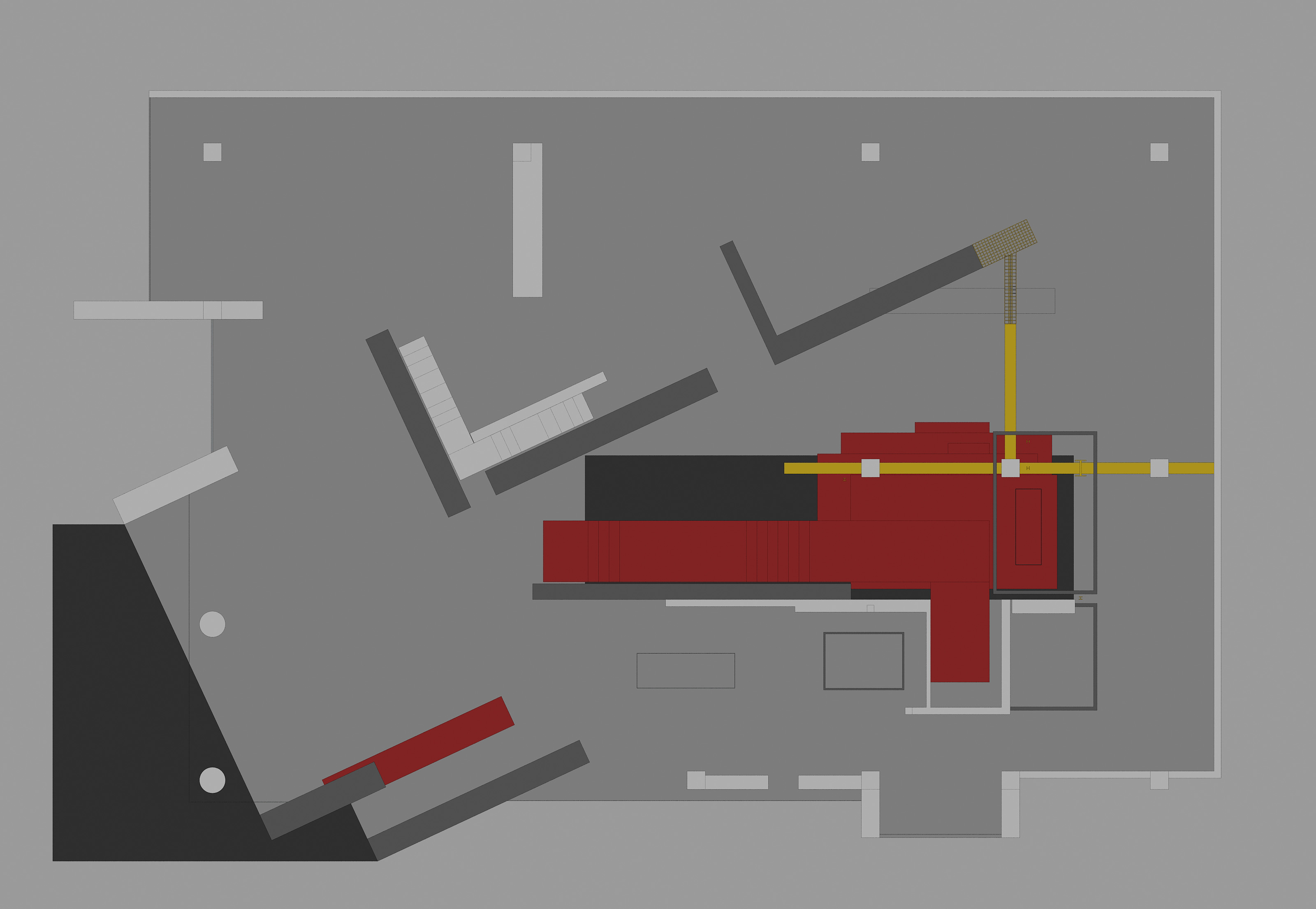
∇ 一層平麵圖
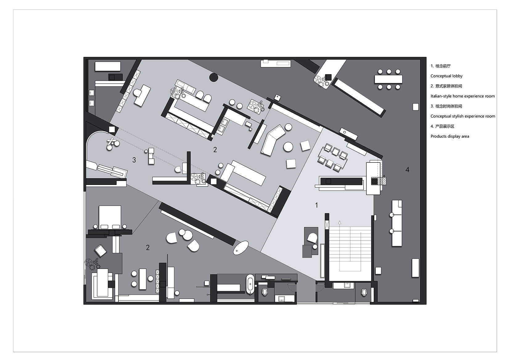
∇ 二層平麵圖
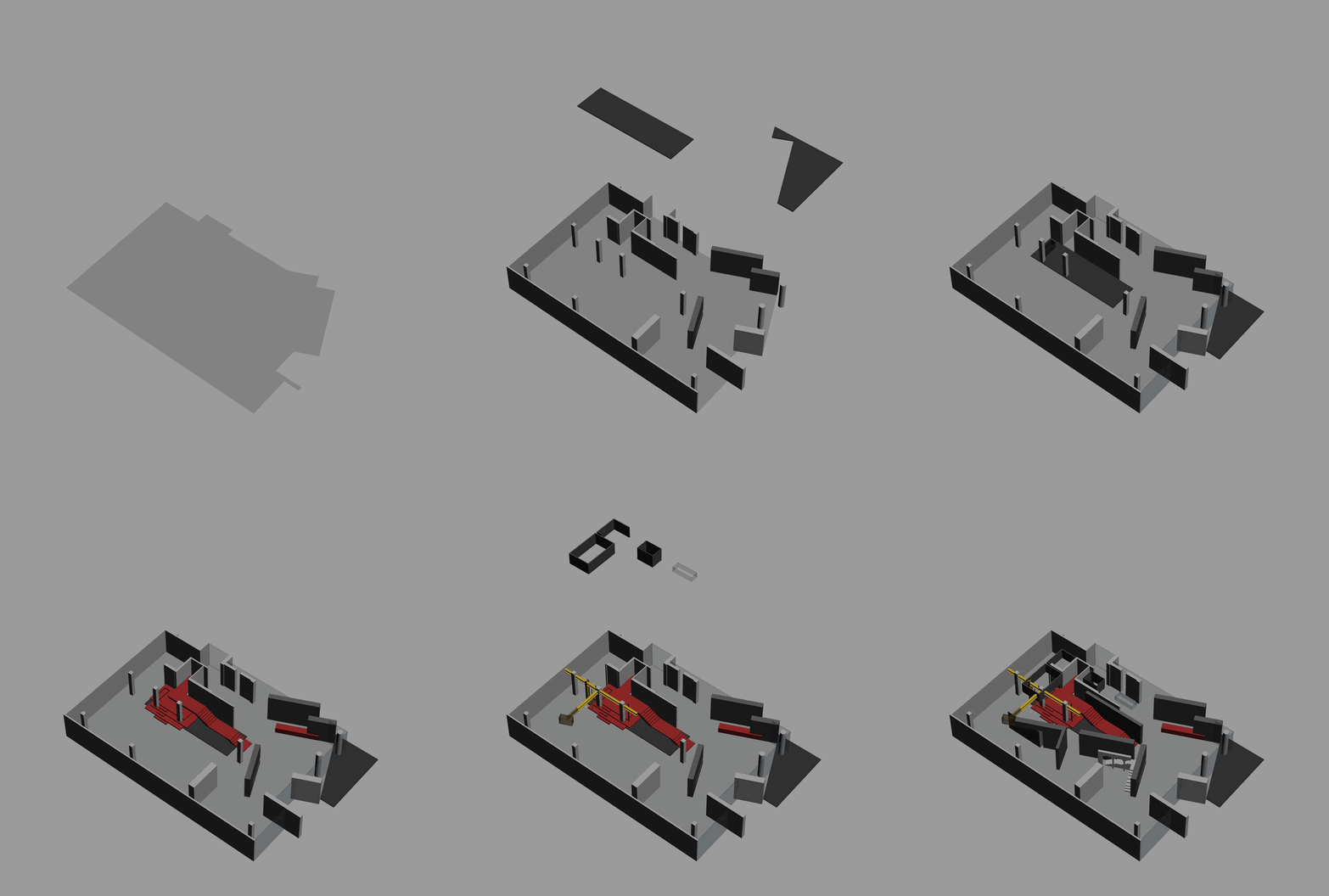
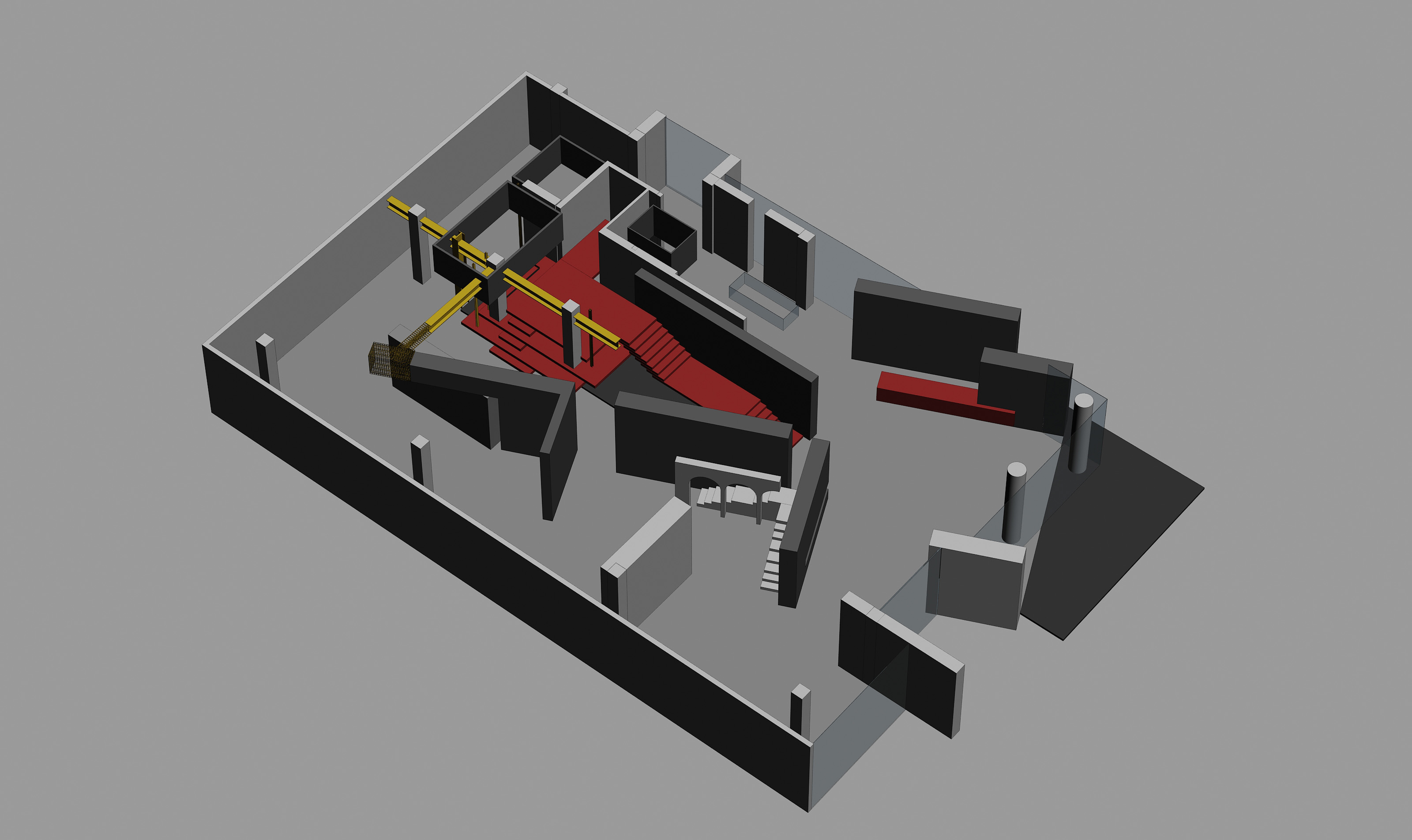
∇ 場景解剖圖
項目信息
項目名稱:意大利I.T CERAMICHE總部展廳
項目地址:佛山市華夏陶瓷博覽城
設計公司:佛山市拓維室內設計有限公司
設計主創:汪誌科&李小水
設計團隊:盧仲文、李念華、邱文峰、蘭菁薇、呂傑超、冼柳青、黃健賀、賴玉琴等
軟裝設計:楊仕威
麵積:1800平方米
設計時間:2019年10月
竣工時間:2020年05月
業主:佛山市鎧恩斯陶瓷有限公司
攝影:歐陽雲
文案:江曉麗
Project name: I.T CERAMICHE Headquarters & Exhibition Hall
Location: Huaxia Ceramics Exposition City, Foshan, China
Design Firm: FOSHAN TOPWAY DESIGN
Chief designers: Wang Zhike & Li Xiaoshui
Design team: Lu Zhongwen, Li Nianhua, Qiu Wenfeng, Lan Jingwei, Lv Jiechao, Xian Liuqing, Huang Jianhe, Lai Yuqin, etc.
Decoration design: Yang Shiwei
Area: 1,800 m2
Start time: October 2019
Completion time: May 2020
Client: Foshan Kai Ensi Ceramics Co., Ltd.
Photographer: Ouyang Yun
Text: Jiang Xiaoli


