全球設計風向感謝來自 海浪創物設計事務所的辦公空間項目案例分享:
團隊忙碌了一個多月,終於搬進新辦公室了,趁這個機會分享一點心得。
The team has been busy for more than a month, and finally moved into the new office. Take this opportunity to share some experiences.
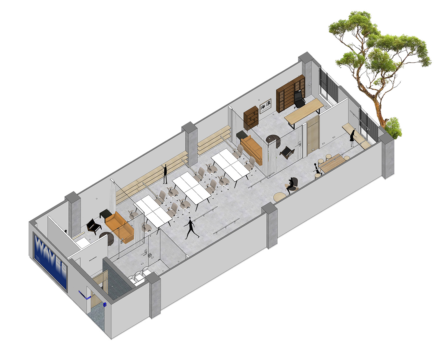
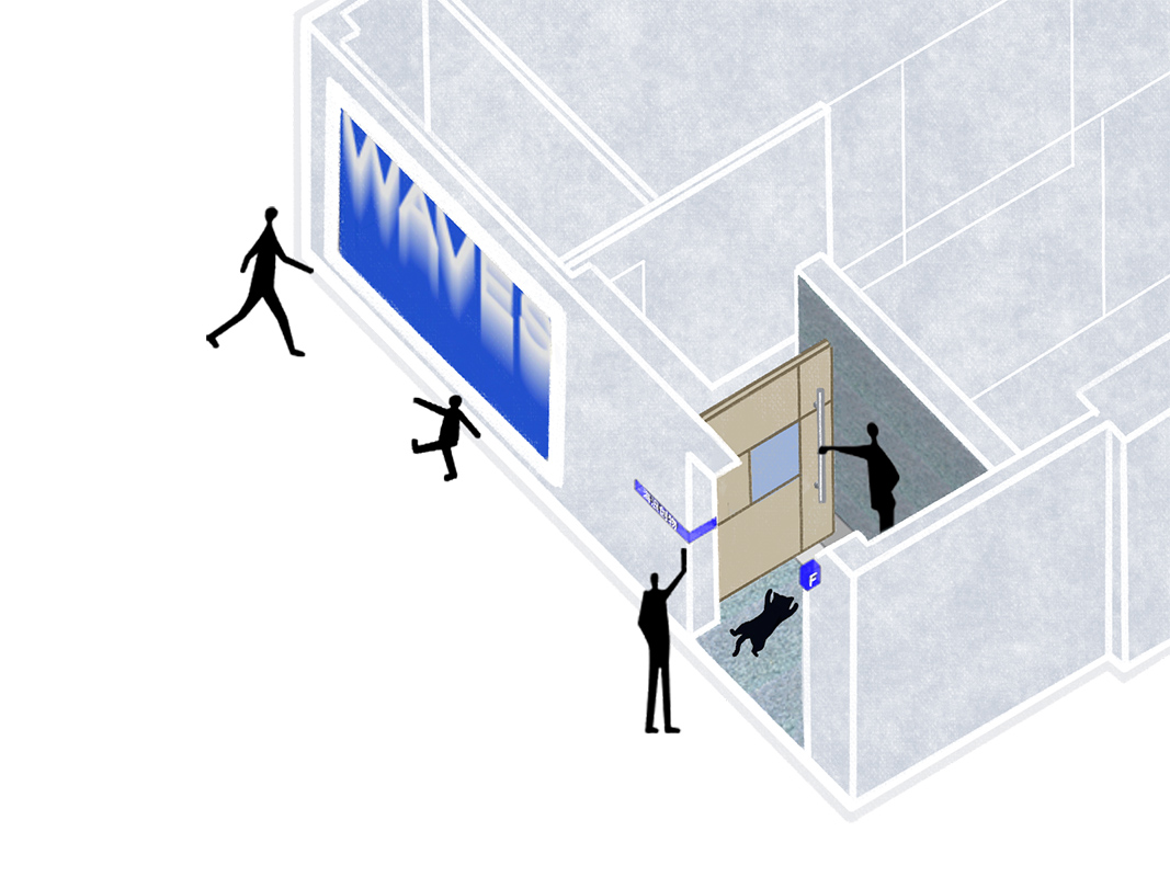
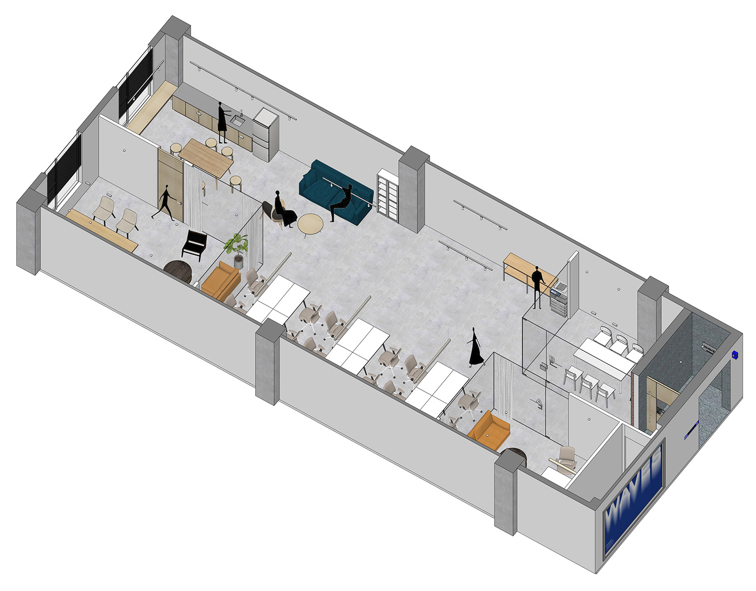
∇ 照片01,軸測圖,Axonometric drawing,©海浪創物
01 TRANSFORM 改造
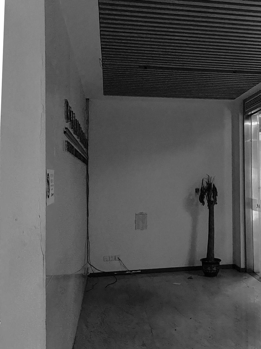
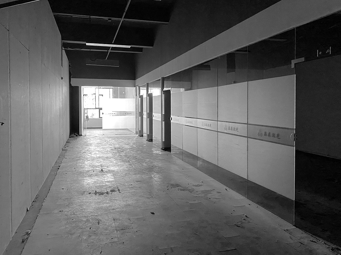
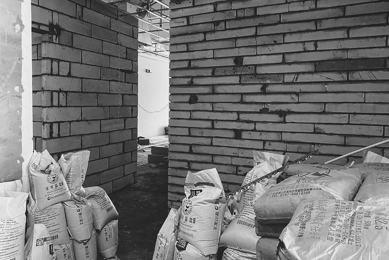
最初拿到這個空間最吸引我們的是四米多的層高,以及窗外的風景。原先的租戶並沒有很好地利用整個空間,多餘的裝飾及不合理的隔斷遮擋了整個空間的光線。
What initially attracted us to this space was the height of more than four meters and the view from the window. The original tenant did not make good use of the whole space, and the superfluous decoration and unreasonable partition blocked the light of the whole space.
∇ 照片02,舊空間模樣,Pattern of old space,©海浪創物
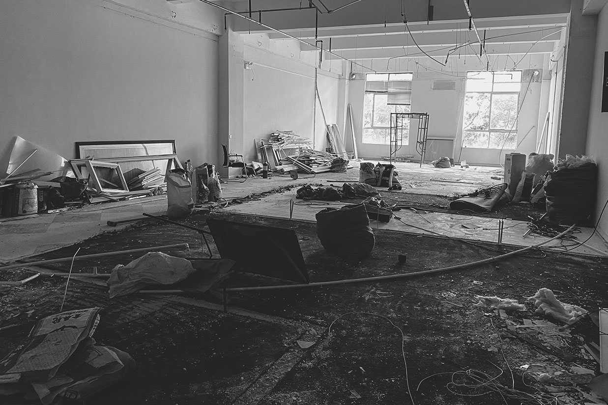
∇ 照片03,舊裝拆除,Old outfit to dismantle,©海浪創物
02 PURENESS & FREEDOM 純粹 自由
在找到這處場地的時候,舊辦公室租期僅剩下一個月留給我們設計及施工的時間非常緊張。在工期及預算受限的條件下,我們謹慎梳理並羅列出團隊的需求,用最簡單的材質:木、磚、混泥土、玻璃,從最根本的功能出發進行設計。
When we found the site, we had only one month left in the old office lease, which left us a lot of time for design and construction. Under the constraints of time limit and budget, we carefully sorted out and listed the needs of the team, using the simplest materials: wood, brick, concrete, glass, and designed from the most fundamental function.
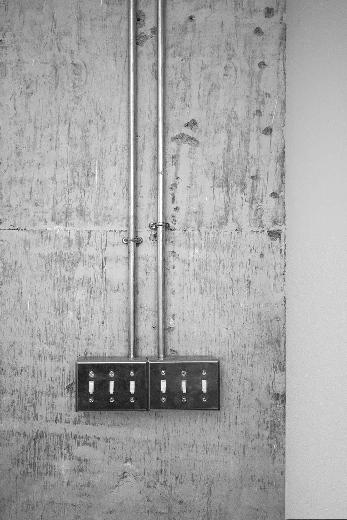
∇ 照片04,混泥土柱子,Concrete column,©海浪創物
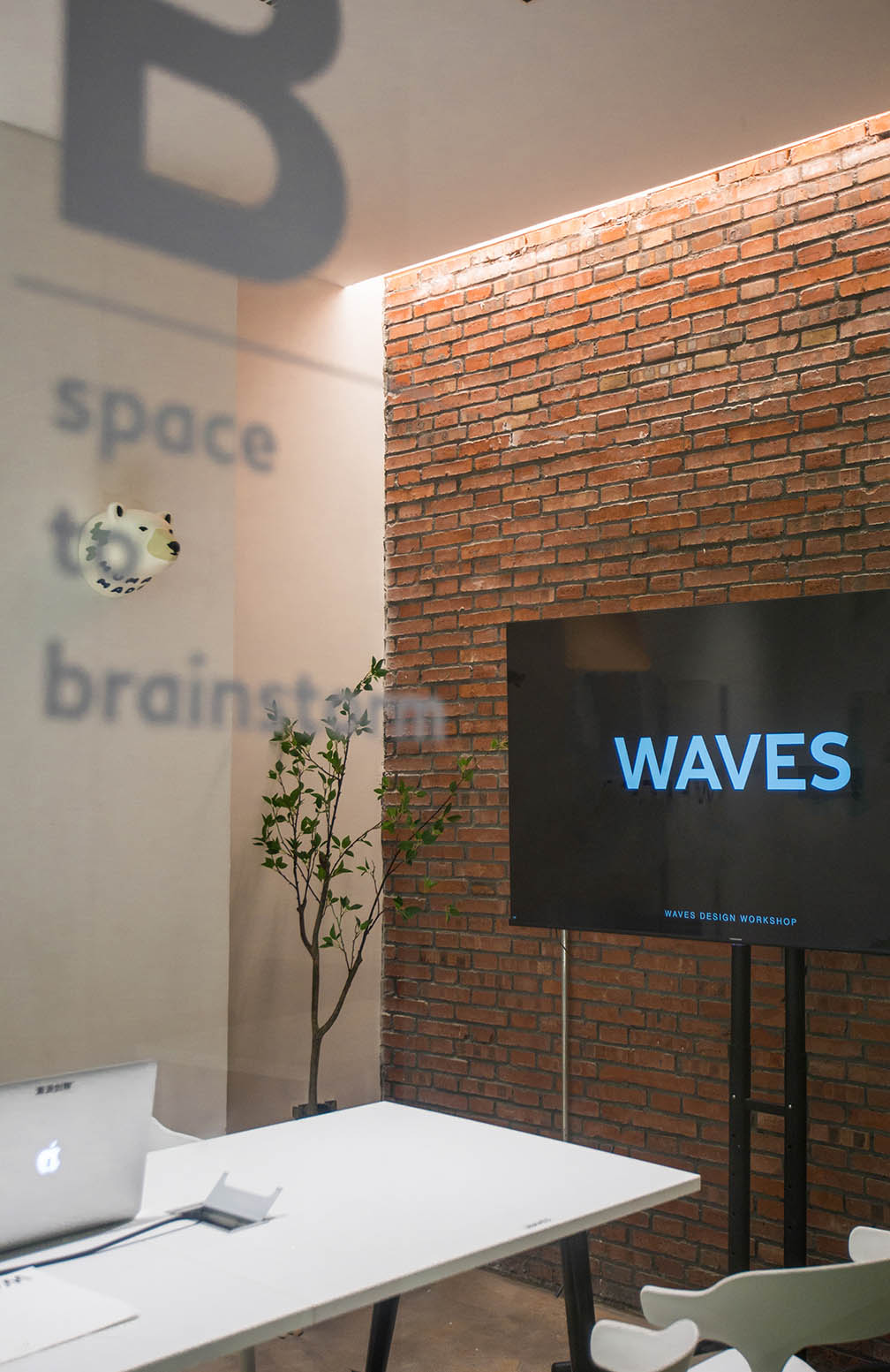
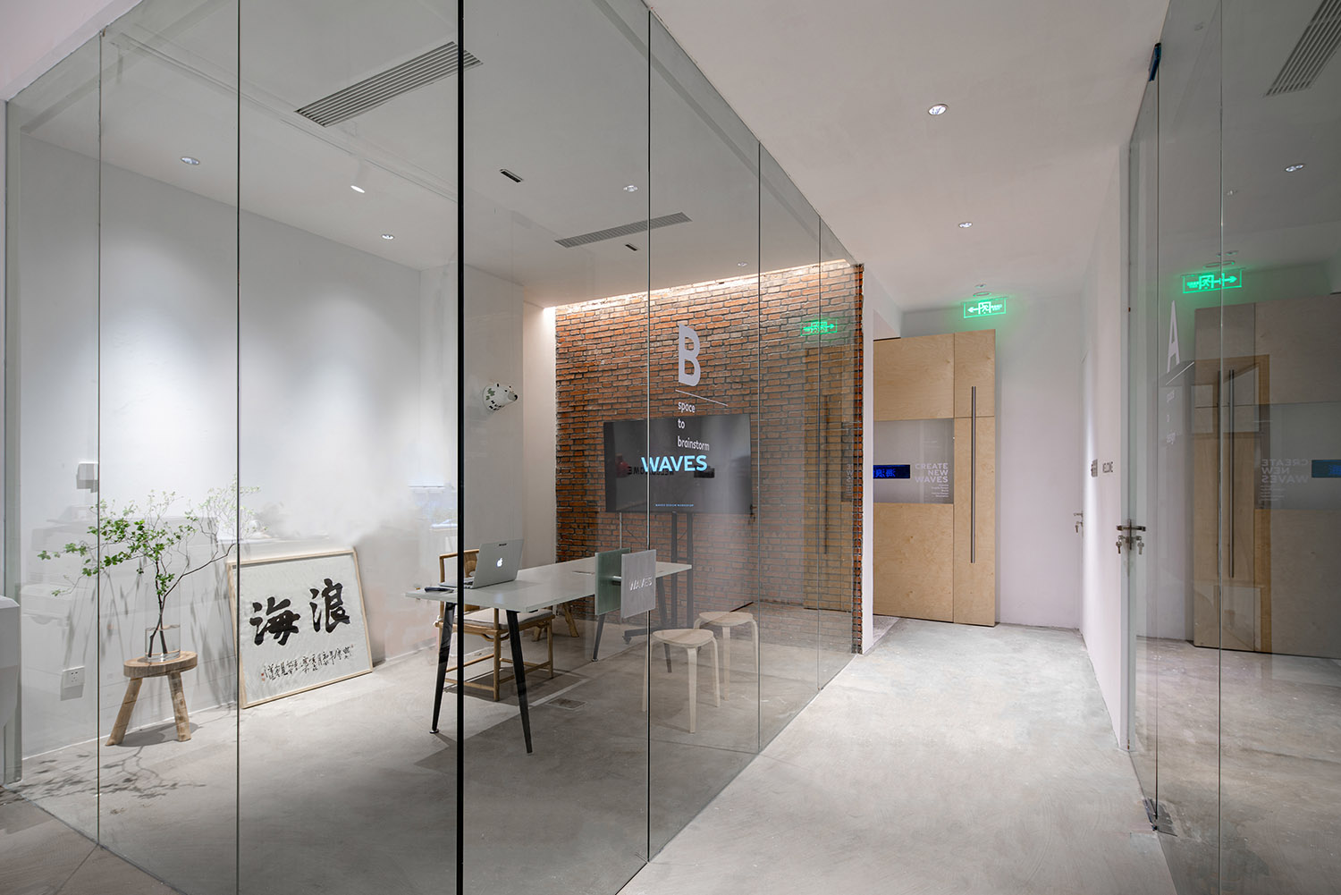
∇ 照片05,紅磚牆會議室,Red brick conference room,©海浪創物
03 INSIDE & OUTSIDE 裏 外
“工作再忙,也要記得按時吃飯。”
“No matter how busy you are at work, remember to eat on time.”
作為一家設計公司工期再趕我們也想嚐試去做出些不一樣的東西。
As a design company, we also want to try to make something different.
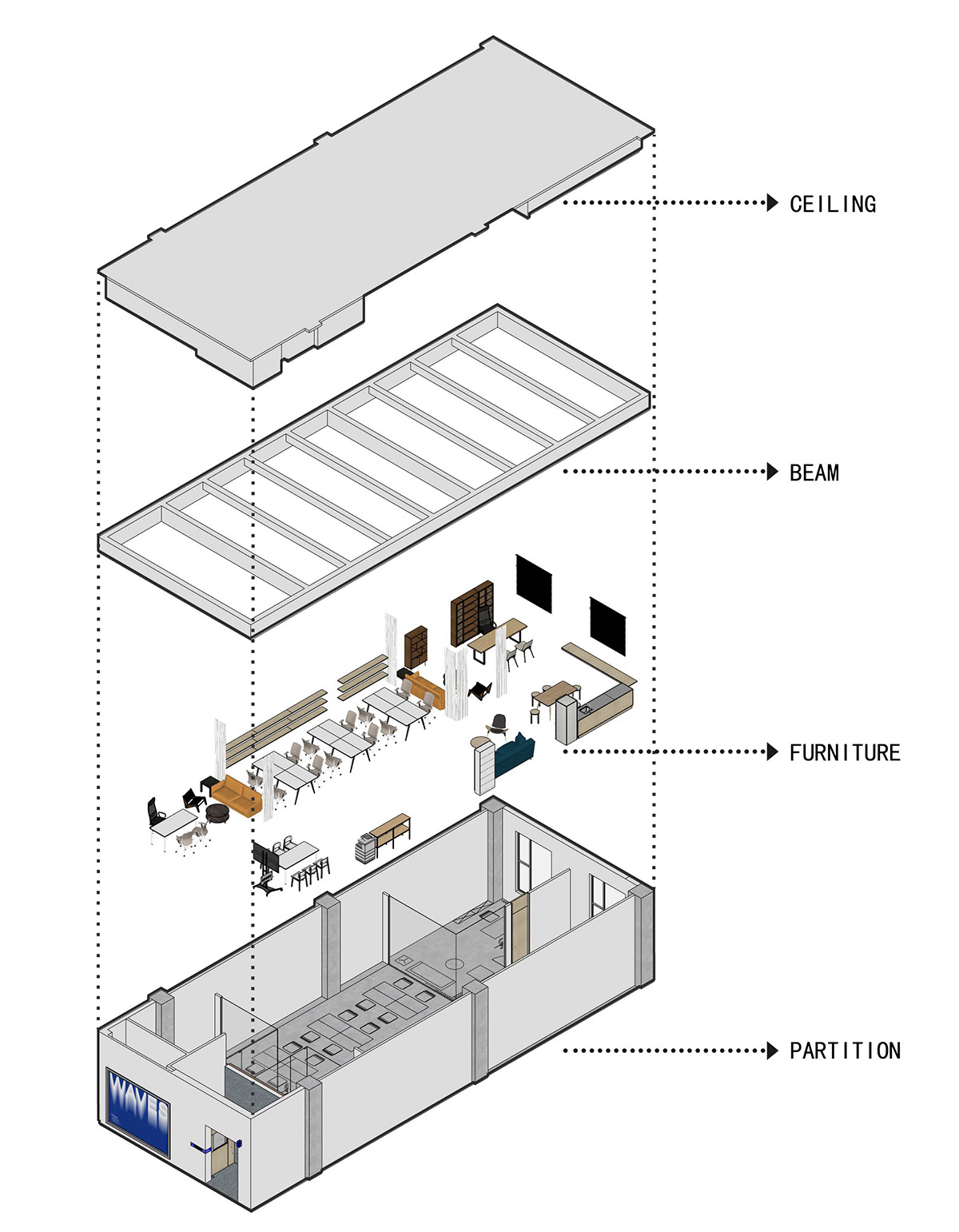
∇ 照片06,空間拆解圖,Spatial disassembly diagram,©海浪創物
我們想重新定義辦公空間的“裏”與“外”。關於“外”,首先是作為空間第一印象的“導航式”存在。辦公室處在一棟工廠改造的辦公樓中。我們期望在這樣一個死氣沉沉的環境裏營造出一點戶外的自然感受。
We want to redefine the “inside” and the “outside” of an office space. About “outside”, it is the existence of “navigation type” as the first impression of space first. The office is in a converted factory building. We wanted to create a natural feeling of being outdoors in such a dead environment.
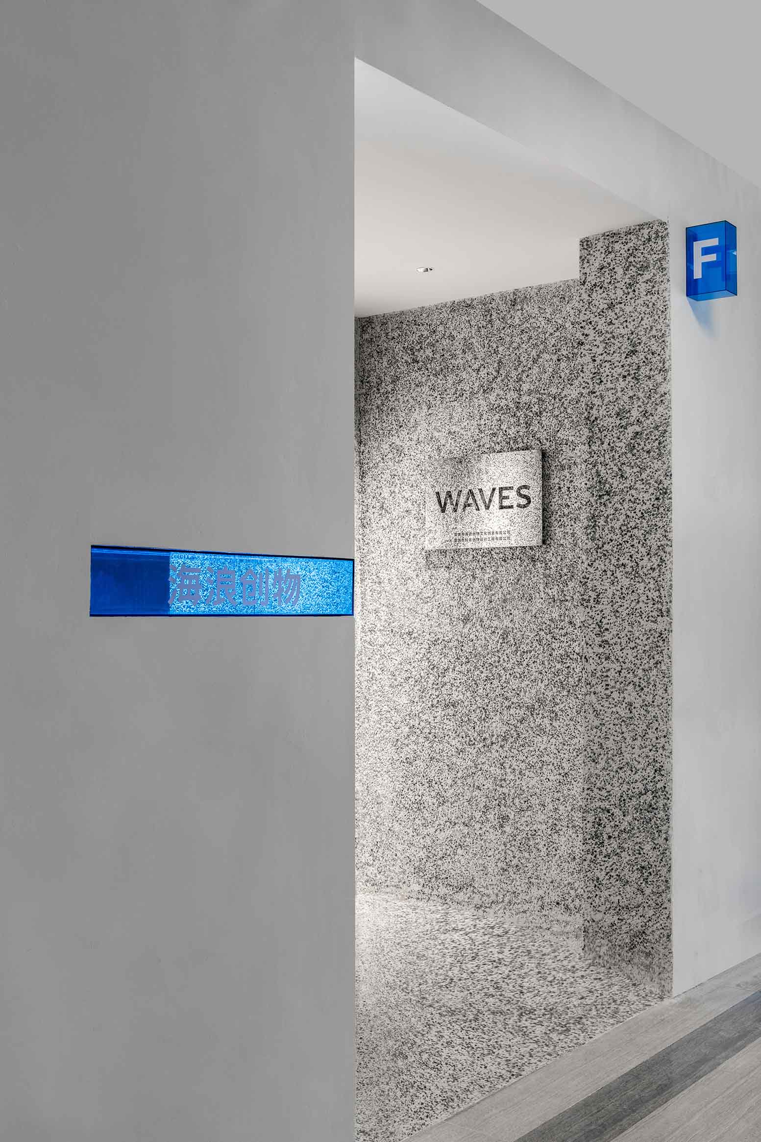
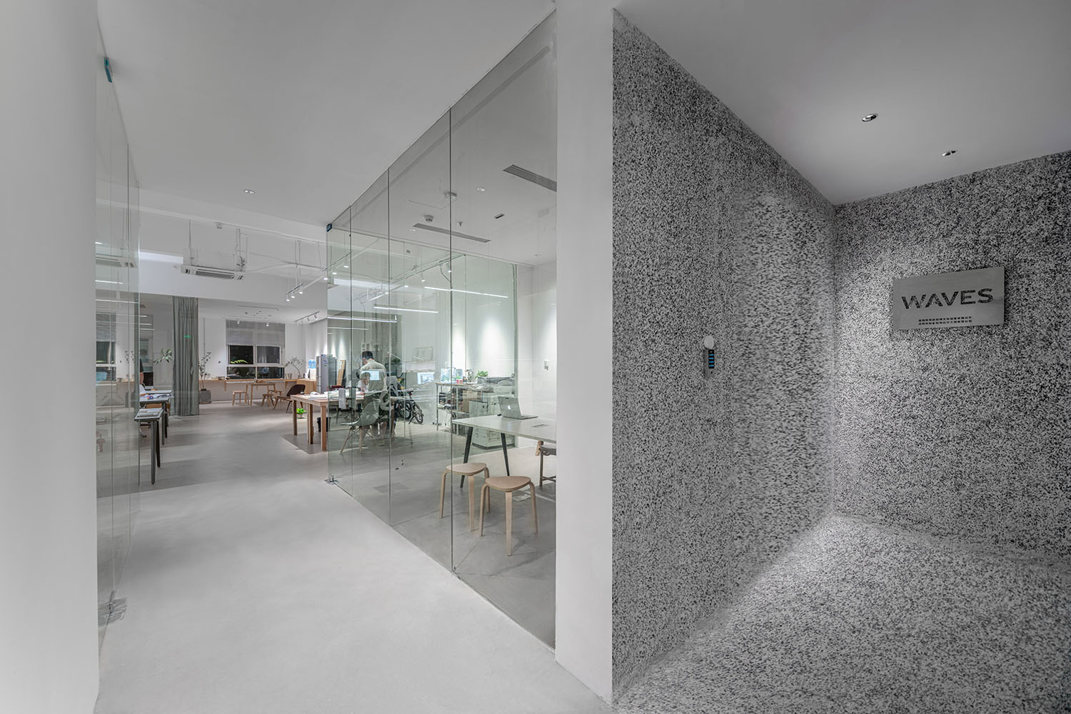
區別於常見辦公樓內呆板的入口背景牆設計,我們用了洗水石裝飾入口牆麵,以及樺木板原材質的大門。
Different from the dull entrance background wall design in common office buildings, we used the washing-stone to decorate the entrance wall and the birch wood door.
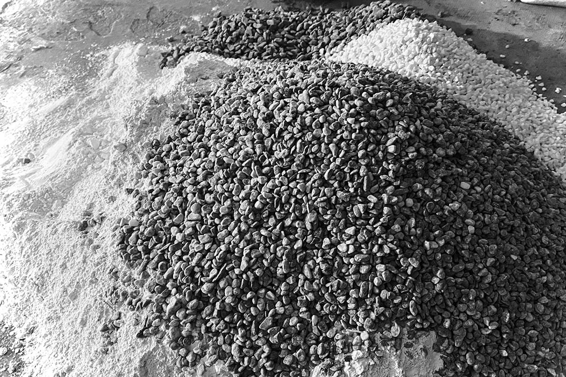
∇ 照片07,水洗石原料,Washed stone raw material,©海浪創物
∇ 照片08,拆除空間大門,Demolish the space gate,©海浪創物
∇ 照片09,空間大門場景,The scene of the space gate,©海浪創物
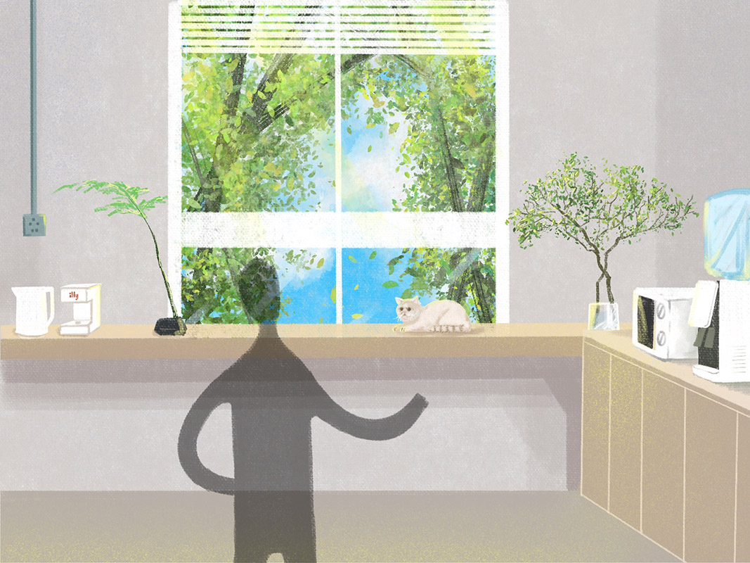
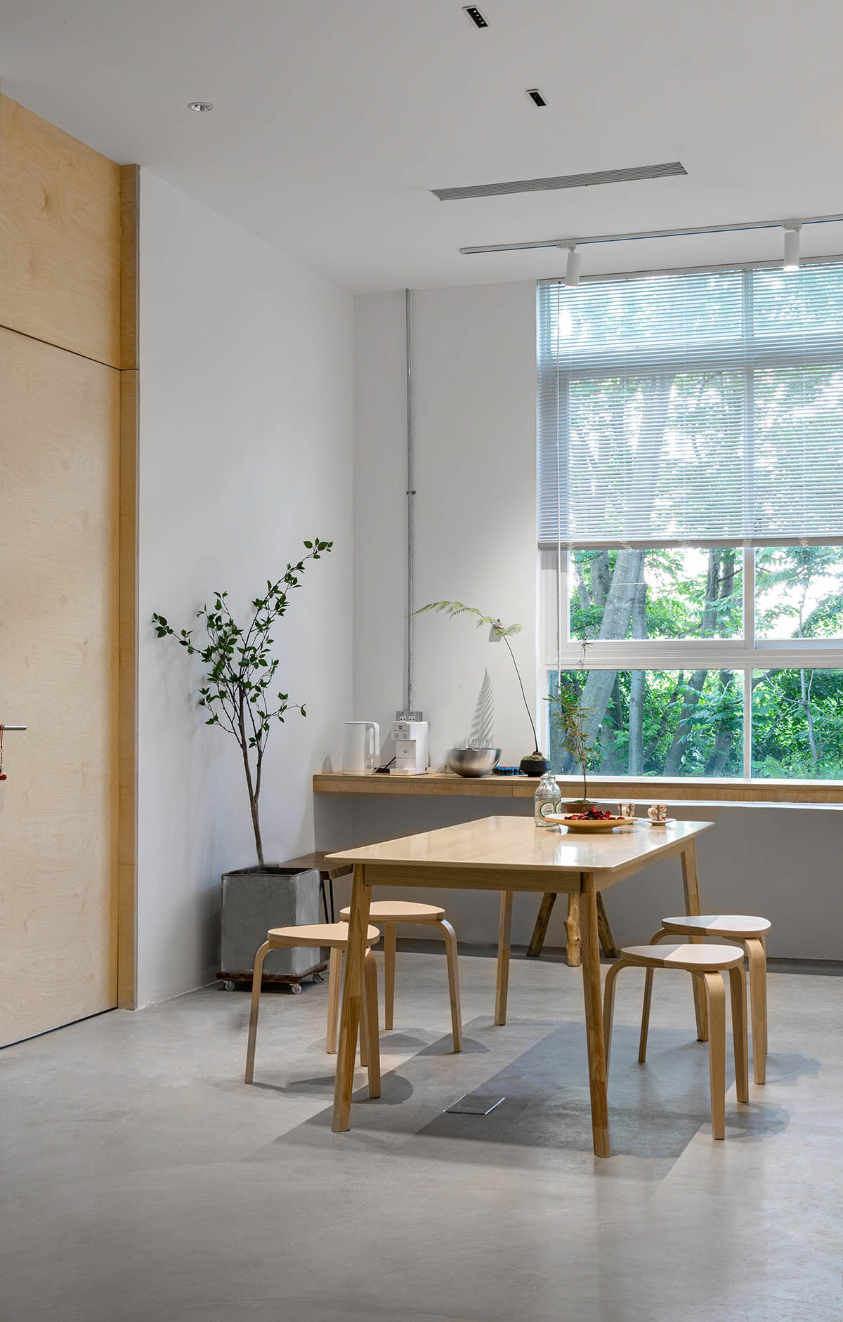
關於“裏”,空間裏最深處有兩扇窗。外部的植物很大程度隔離了冰冷的城市建築群和急躁的車流,讓空間內部多了一份閑適和自然。
About “inside”, there are two Windows in the deepest part of the space. The plants on the outside are largely separated from the cold urban buildings and the impatient traffic, making the space more leisurely and natural.
∇ 照片10,空間休息區場景,The scene of the rest area of the space,©海浪創物
04 DETAIL 細節
在構建出大的框架結構及功能分區後,我們也嚐試在有限的工期及預算內增加些不太一樣的“內容”,一些有新鮮感和趣味性的內容。
After building a large frame structure and functional zoning, we also tried to add something different, something fresh and interesting, within a limited period of time and budget.
我們在空間的局部增加了許多亞克力材質。這種有機玻璃的材質擁有很強的可塑性、亮麗的色彩以及非常高的性價比。這非常符合我們這個年輕團隊的性格和氣質。
We added a lot of acrylic materials to the space. This plexiglass material has strong plasticity, bright color and very high cost performance. This fits well with the character and temperament of our young team.
入口側麵掛著精巧的鏡麵不鏽鋼招牌,映射出牆麵被燈光洗禮的強烈質感。我們在亞克力招牌內部預留了光源,使之更加通透。
The side of the entrance is hung with exquisite mirrored stainless steel signboard, which reflects the strong texture of the wall baptized by the light. We reserved a light source inside the acrylic signboard to make it more transparent.
∇ 照片11,空間入口,Space entrance,©紅旗
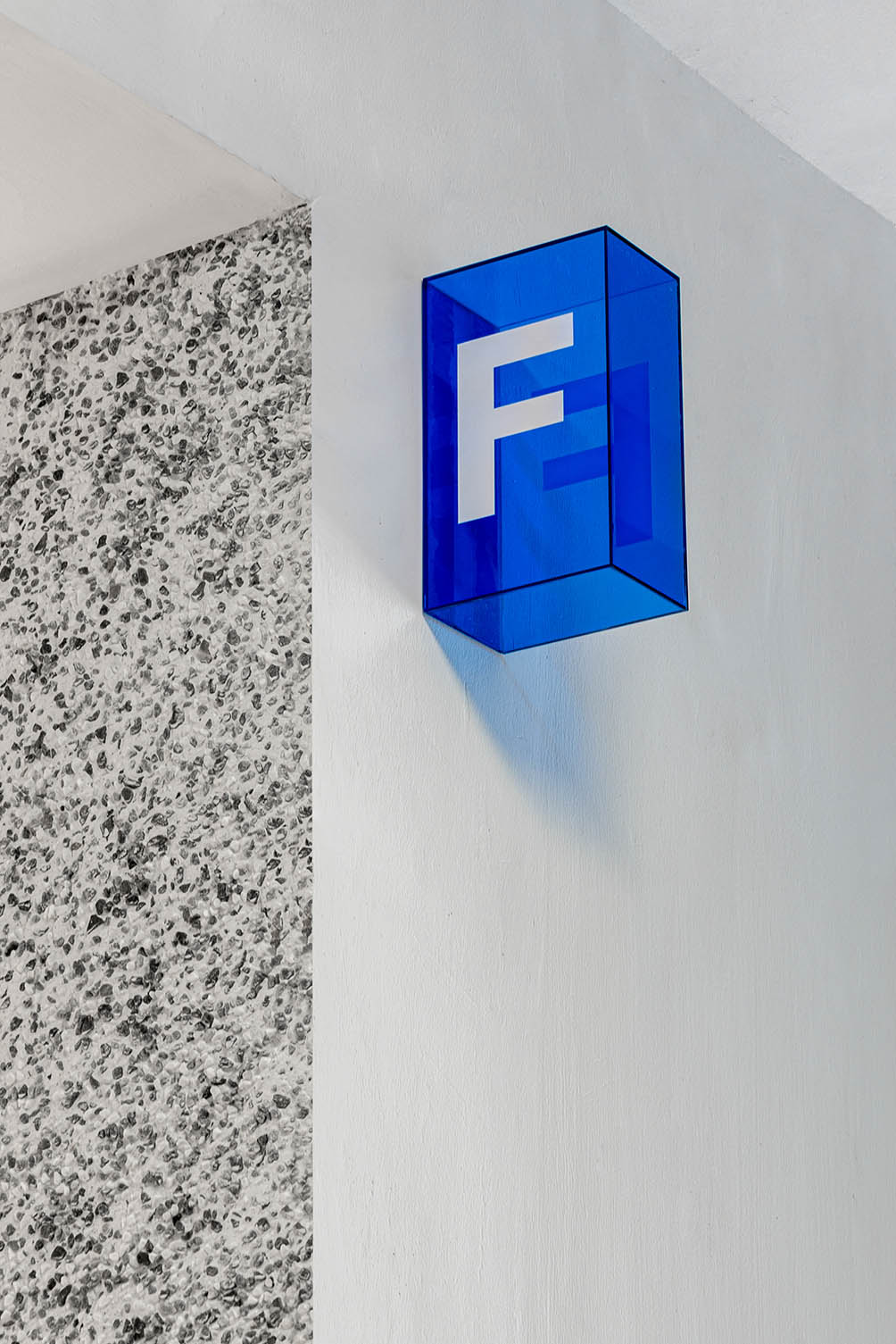
我們拆除了舊的樓層導視也統一采用了更加透明的亞克力材質讓門口視覺上更加統一。
We removed the old floor guide and adopted a more transparent acrylic material to make the doorway more unified visually.
∇ 照片12,樓層導視牌,Floor guide board,©紅旗
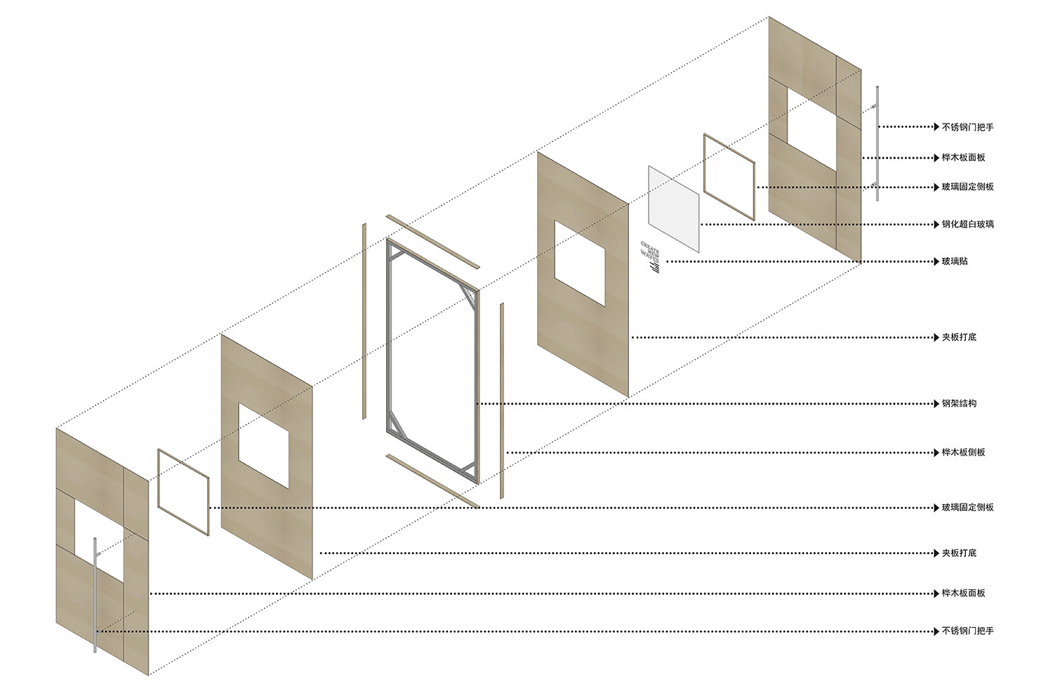
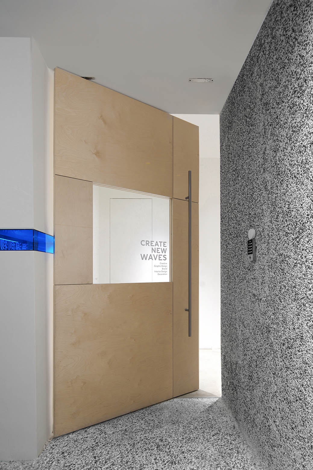
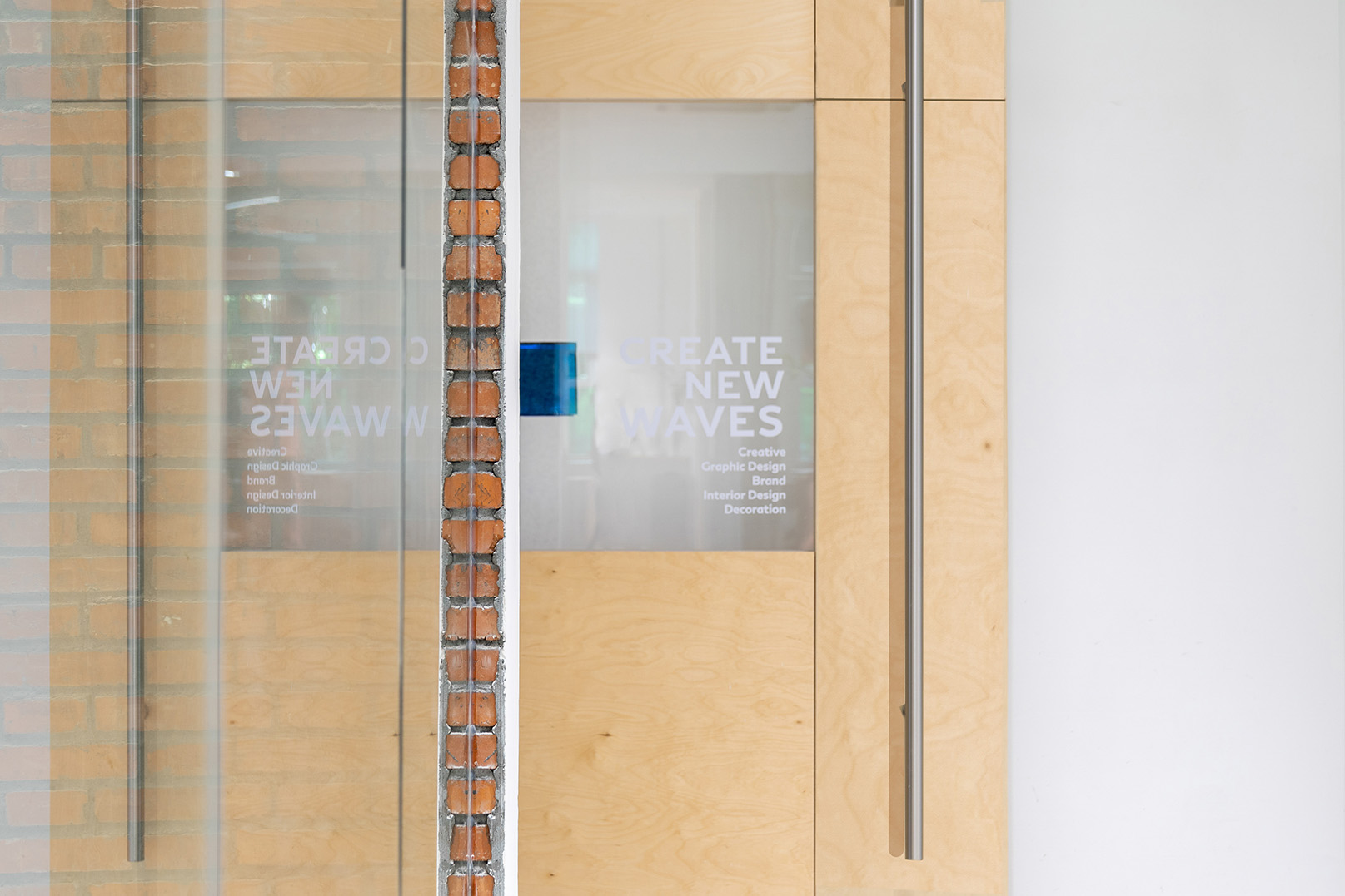
我們在整個空間運用大量樺木板來做一些趣味性實驗。比如在改變了原來的入門方向之後,我們在現場用樺木板拚接製作了一扇大門。門中間選用為 800mm*800mm 的超白玻璃,尋求達到裏外一些通透感、互動感。
We used a lot of birch planks throughout the space to do some interesting experiments. For example, after changing the orientation of the entrance, we made a gate on site with birch planks. The super white glass of 800mm*800mm is selected in the middle of the door, seeking to achieve a sense of transparency and interaction inside and outside.
∇ 照片13,大門結構分解,Decomposition of gate structure,©海浪創物
∇ 照片14,入口大門,The entrance door,©紅旗
∇ 照片15,出口大門,The exit door,©紅旗
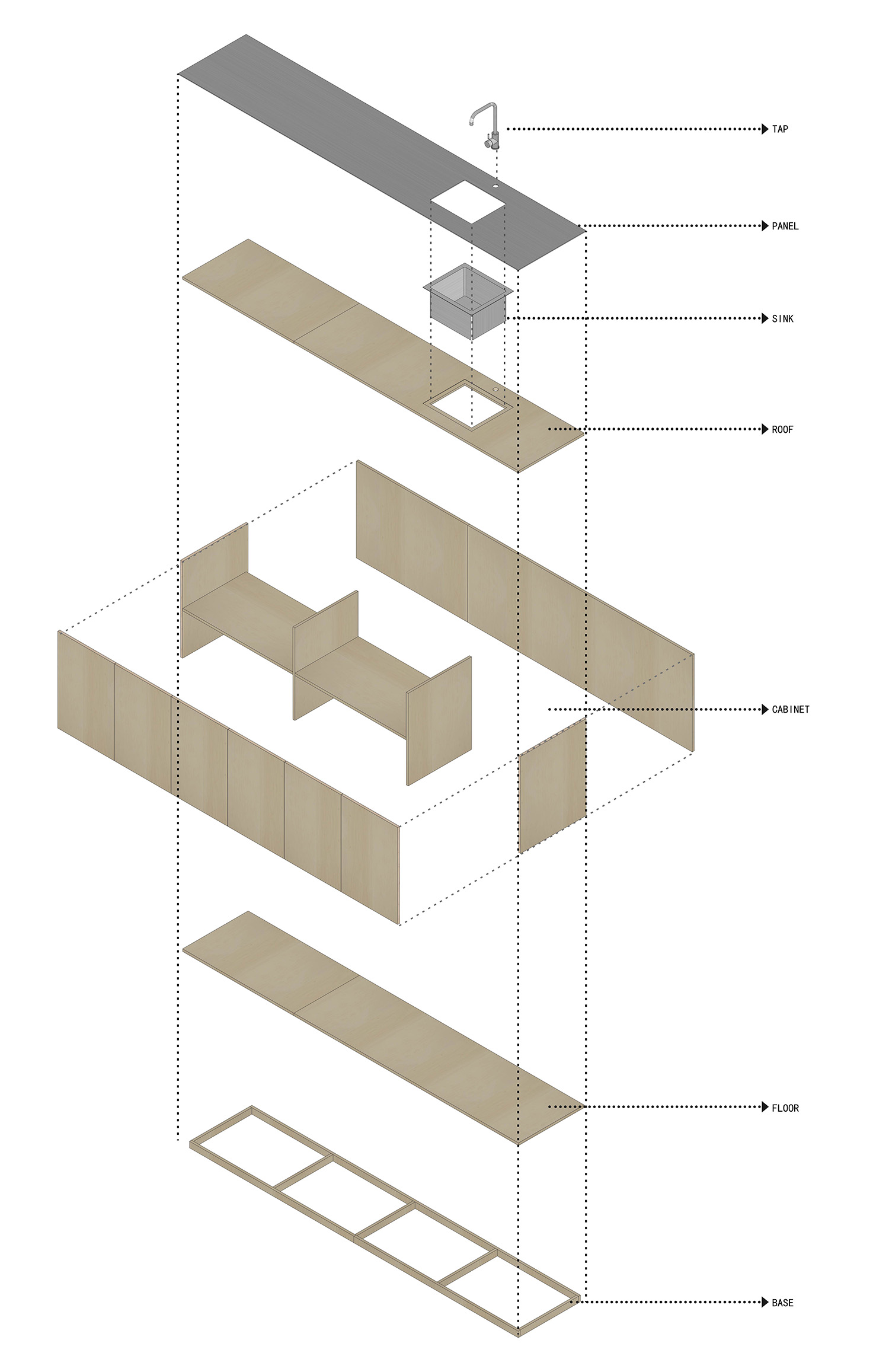
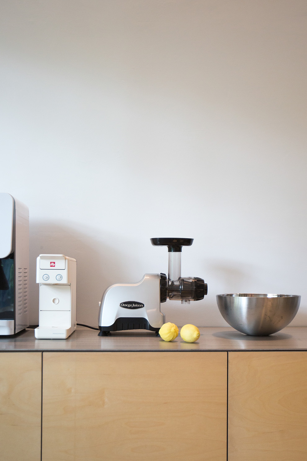
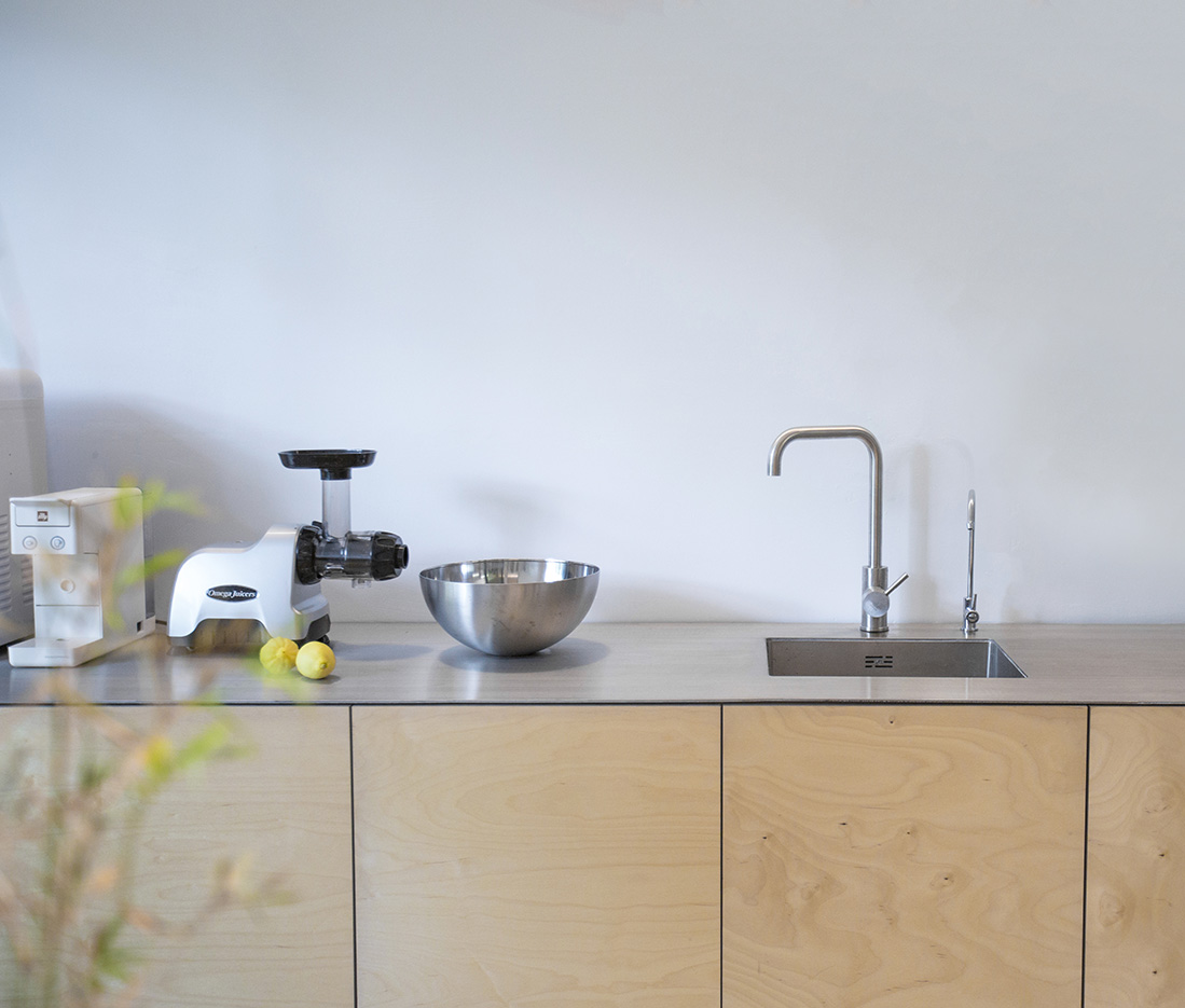
在休息區,我們用樺木板和不鏽鋼做了一個水吧櫃。
In the lounge area, we made a water bar cabinet out of birch wood and stainless steel.
∇ 照片16,水吧櫃結構分解,The structural decomposition of the bar counter,©海浪創物
∇ 照片17,金屬台麵,Metal mesa,©海浪創物
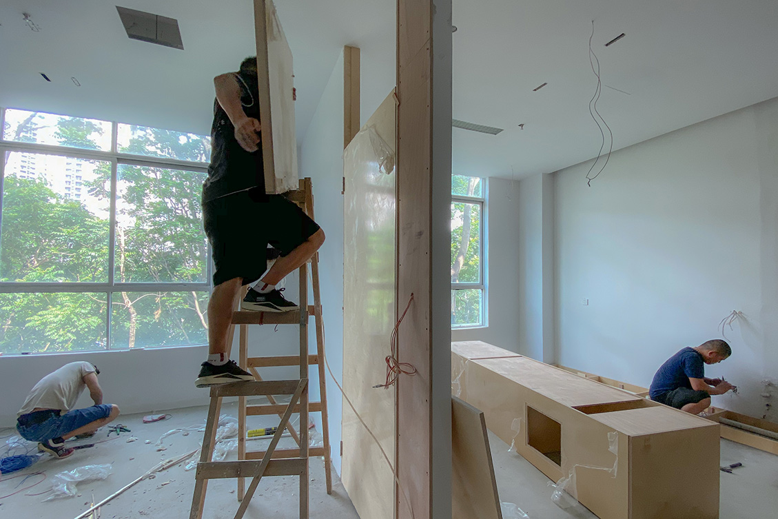
空間設計了一個半獨立的辦公室,沿用樺木製作了一扇門。讓它與窗外純樸的自然氣息相呼應。
The space is designed as a semi-detached office with a door made of birch wood. Let it echo with the simple natural atmosphere outside the window.
∇ 照片18,半獨立辦公室門製作,The production of semi-independent office doors,©海浪創物
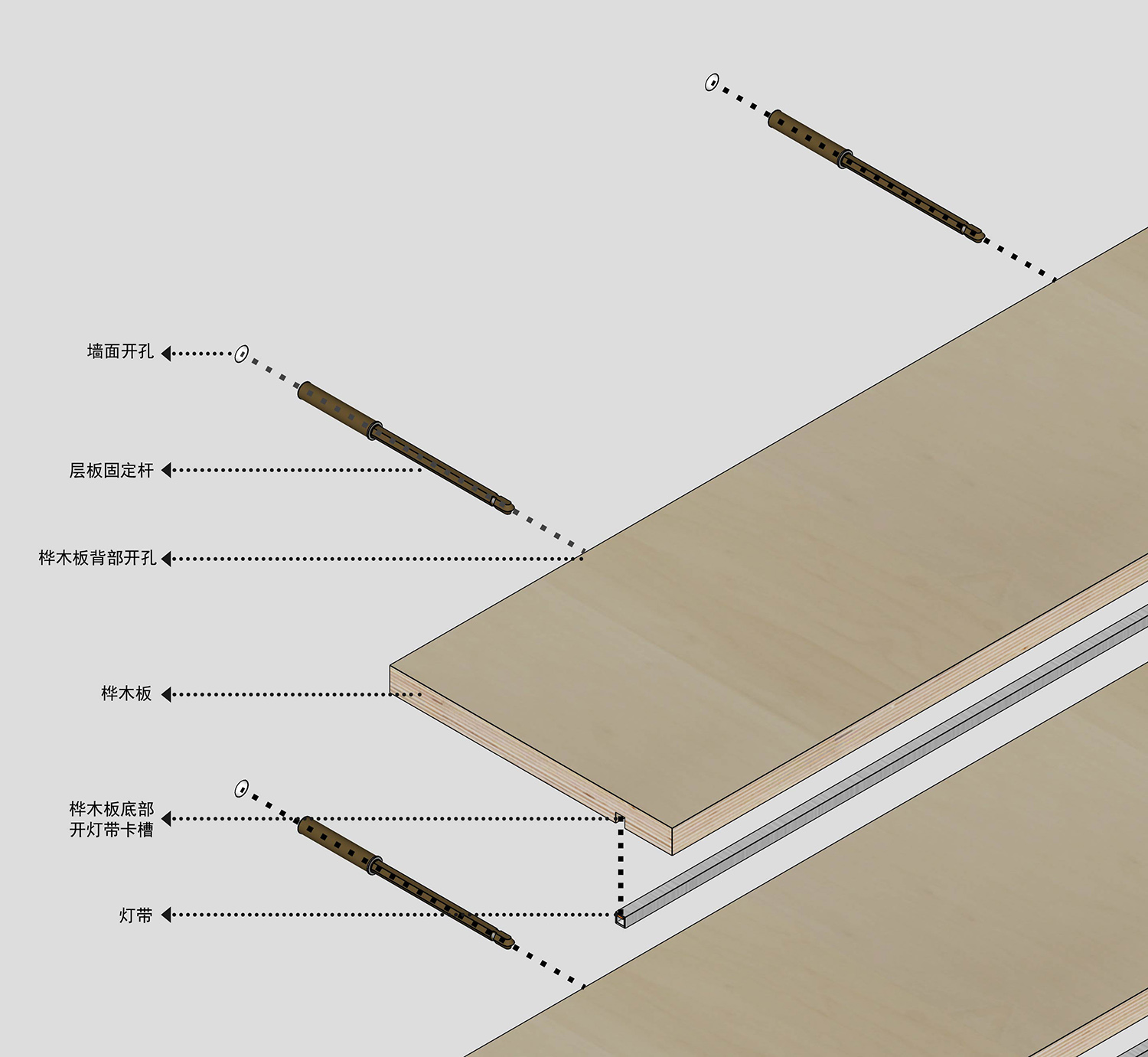
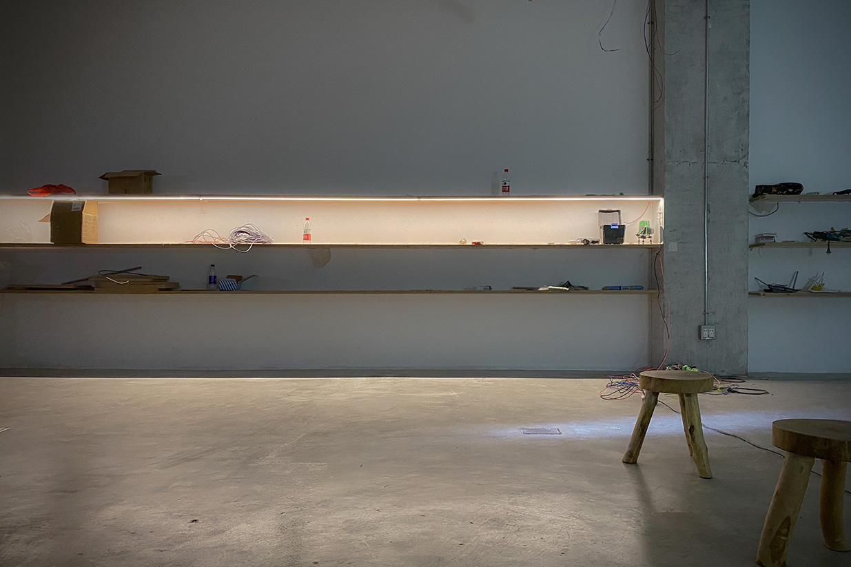
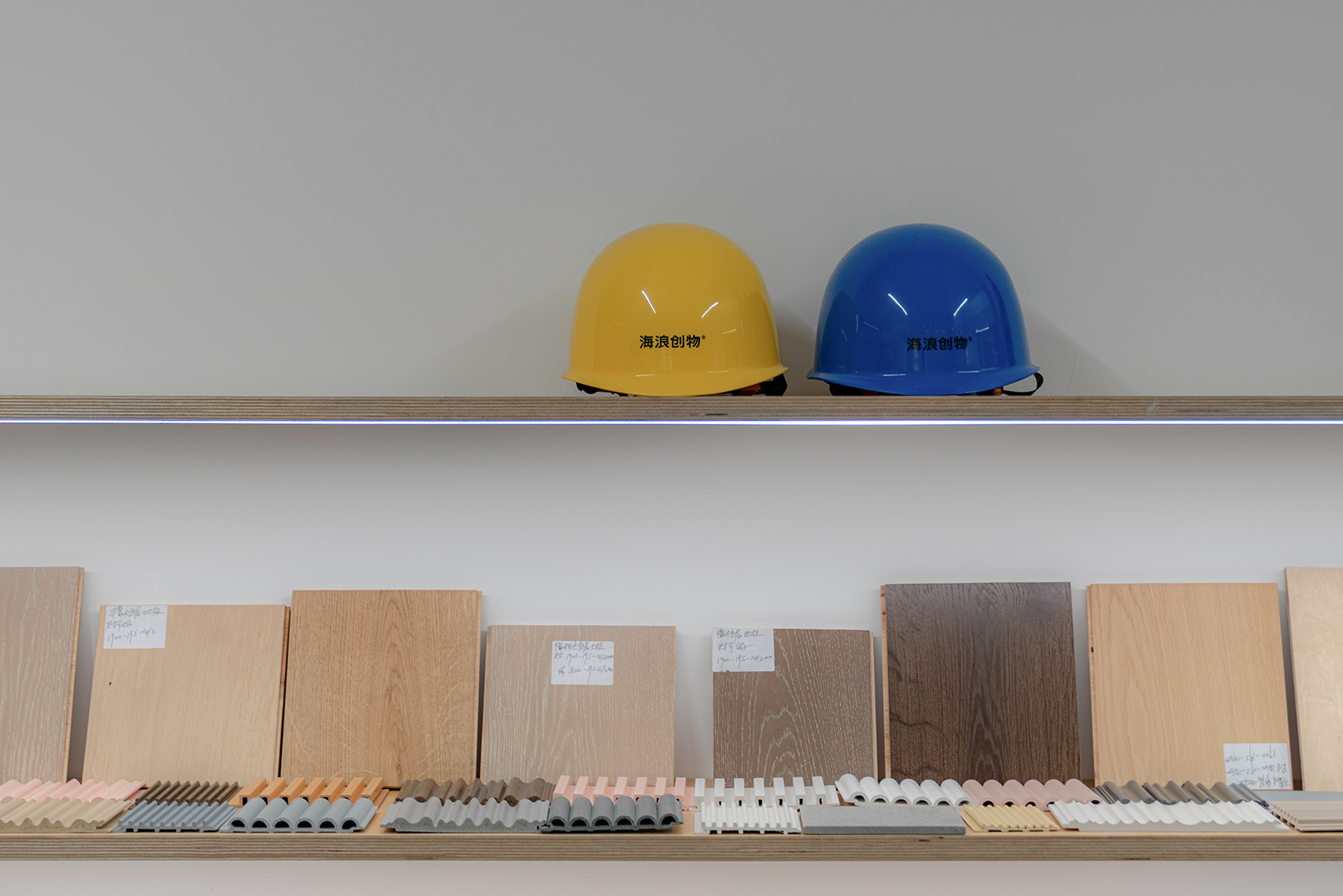
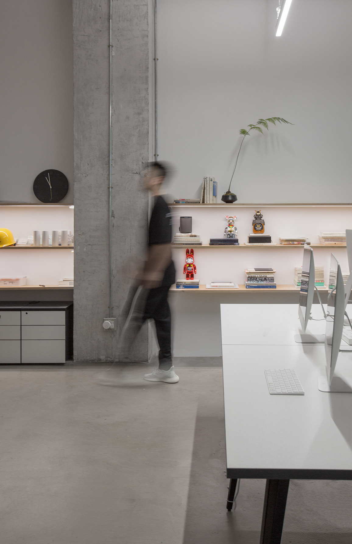
關於陳列區,我們用超過十二米長的樺木板做了三層懸挑固定的材料展示層板。
As for the display area, we made three layers of cantilevered and fixed material display panels with birch boards over 12 meters long.
∇ 照片19,展示板的結構分解,Structural decomposition of display board,©海浪創物
∇ 照片20,展示板第一次開燈,First light on display board,©海浪創物
∇ 照片21,材料展示,Materials show,©紅旗
05 FINAL 最終呈現
好的設計是具有普遍性的,它與人有所共鳴並且讓他們感到舒適。
Good design is universal, it resonates with people and makes them feel comfortable.
∇ 照片22,軸測圖,Axonometric drawing,©海浪創物
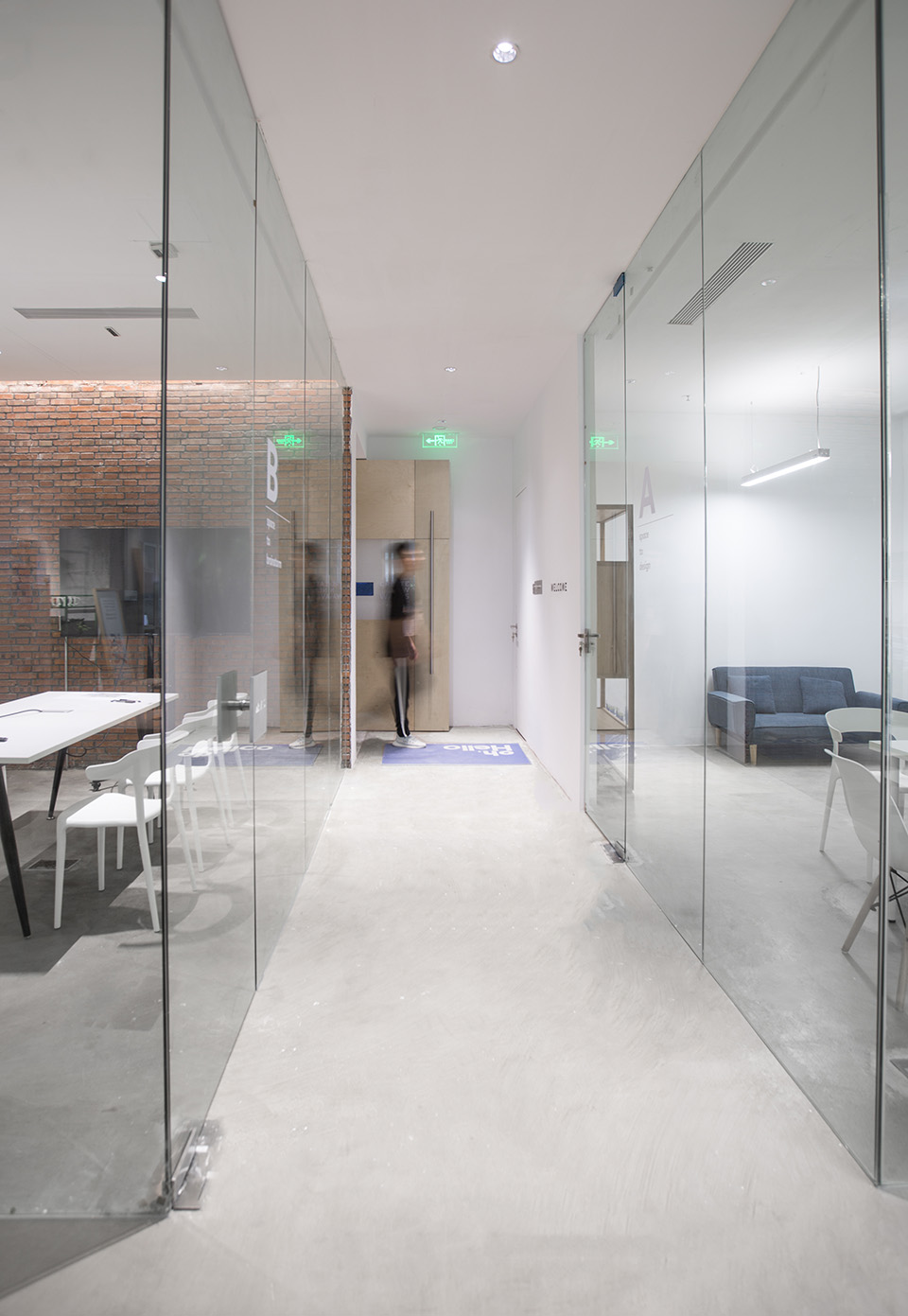
∇ 照片23,入門全覽,Introductory overview,©紅旗
∇ 照片24,會議室,The meeting room,©紅旗
∇ 照片25,會議室與辦公室,The meeting room and office,©海浪創物
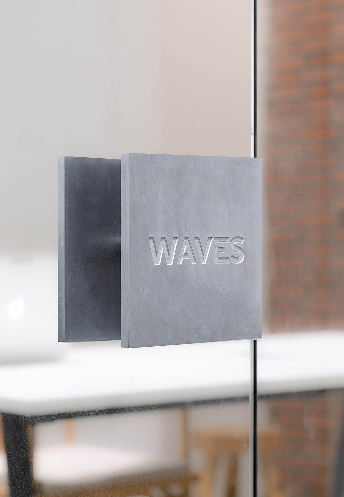
∇ 照片26,會議室一體成型的把手,One piece handle,©紅旗
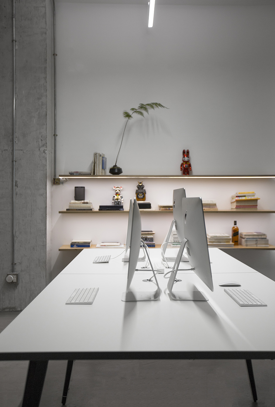
∇ 照片27,辦公區,Office area,©海浪創物
∇ 照片28,展示板的局部,Part of the display board,©海浪創物
∇ 照片29,休息區的一角,A corner of the sitting area,©紅旗
∇ 照片30,水吧台,The water bar,©海浪創物
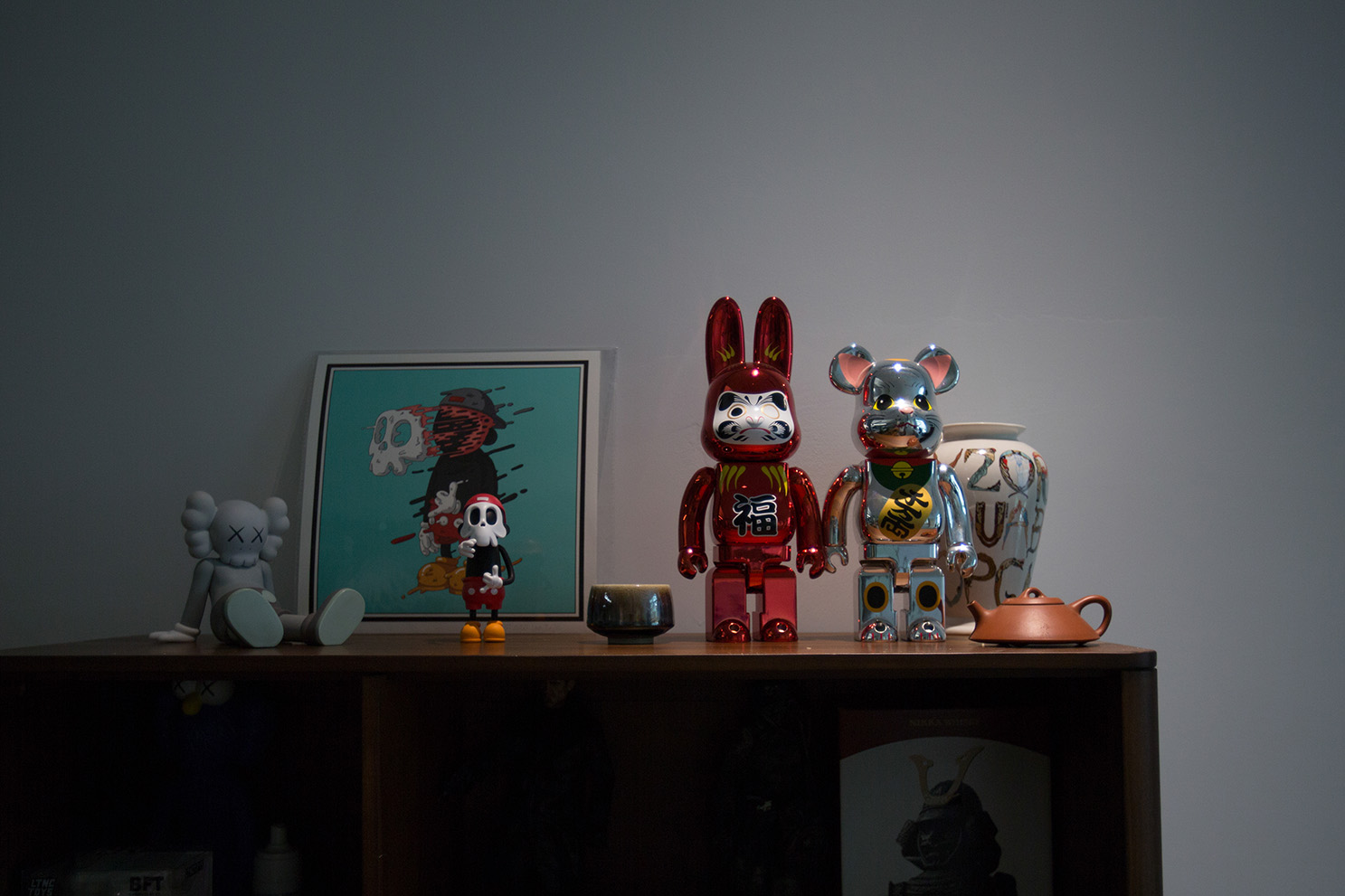
∇ 照片31,一些有趣的物件,Something interesting,©海浪創物
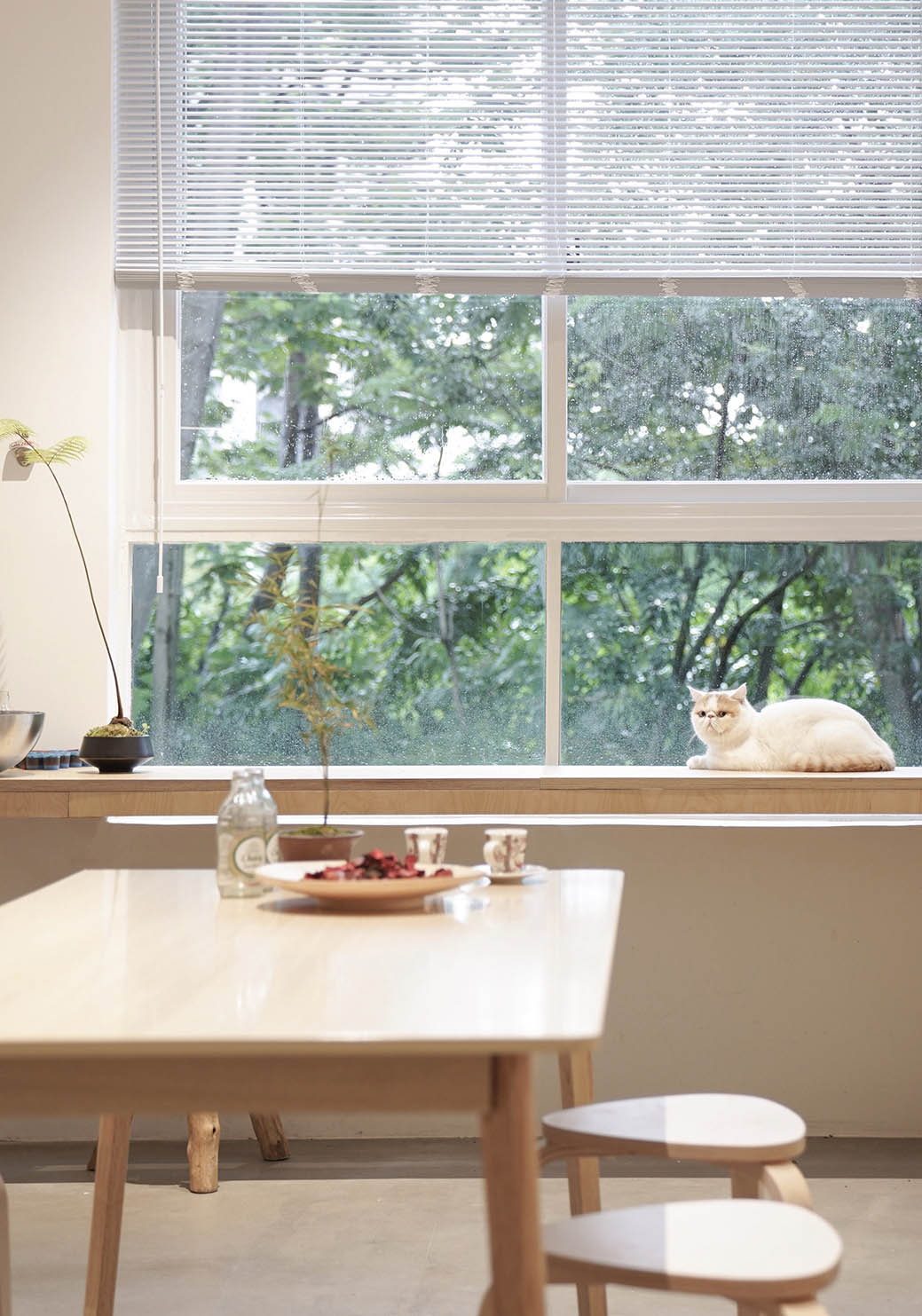
∇ 照片32,新成員“包子”, New member “Baozi”,©紅旗
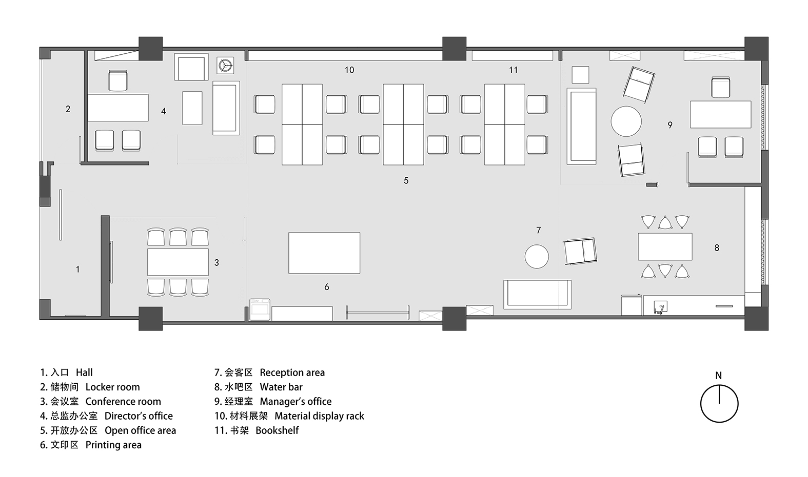
∇ 平麵圖
項目信息
項目名稱:海浪創物辦公空間
項目地點: 廣東 · 深圳南山
項目麵積:252 ㎡
設計公司:海浪創物
設計團隊:吳建鋒、趙一川、譚向政、何嘉權、範家銓
燈光設備:庫奧照明、西頓照明
空間攝影:紅旗
Project Name:Waves Space
Project Location:Shenzhen Nanshan
Project Area:252 ㎡
Design Team:Waves Design
Lighting equipment:KA Lighting、CDN LIGHT
Space photography:RED FLAG


