全球設計風向感謝來自 YFYS空間設計 的商業空間項目案例分享:
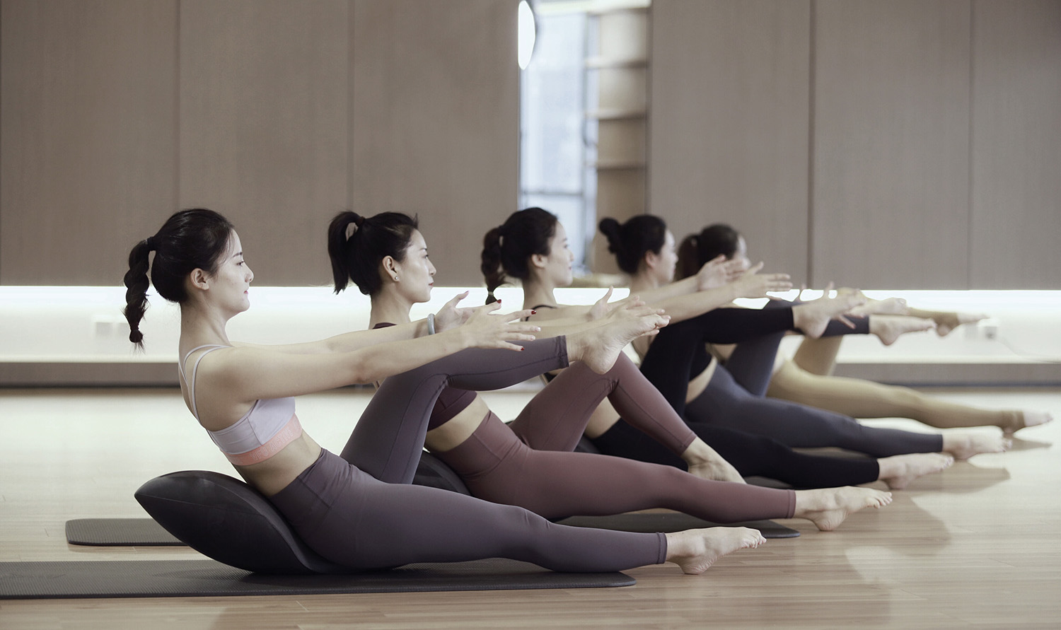
建築的新功能是提供普拉提服務的私人工作室,設計需要兼顧私密性及高品質的雙重需求。
The building’s new feature is a private studio offering Pilates services, designed to accommodate both privacy and high quality requirements.
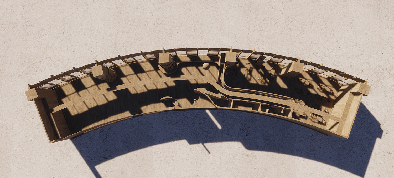
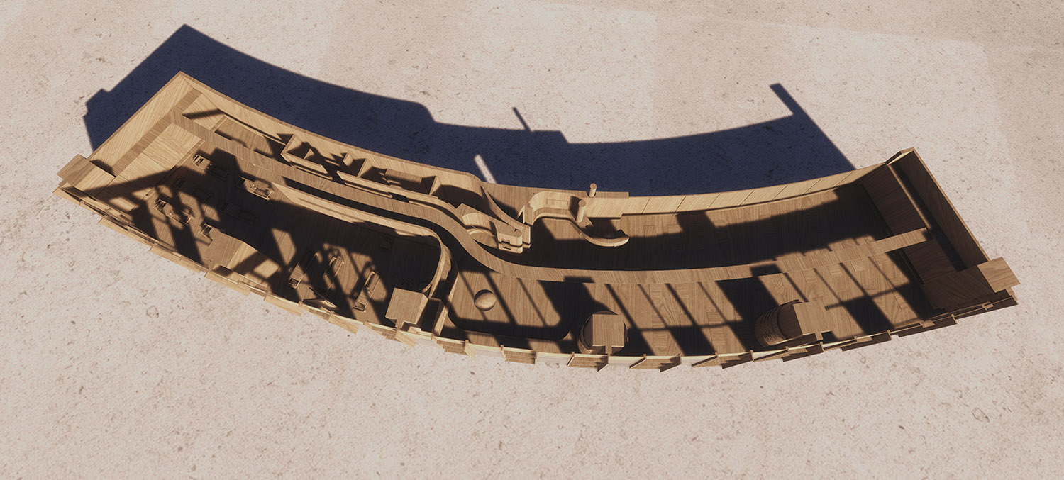
設計希望通過“空間再造”與“色彩營造”的方式,在保持原有空間特色和空間邏輯的同時,對空間進行重新分割與塑造。營造出普拉提所需的舒適、靜謐的空間氛圍。
Through space reconstruction and color construction, the design hopes to maintain the original spatial characteristics and spatial logic, and at the same time, to re-divide and shape the space to create the comfortable and quiet space atmosphere needed by Pilates.
我們深知對人感知空間產生直接影響的要素是 形,光,色,質在這四種介質中,形式對空間影響最大,也最為關鍵,因此我們側重於形式對空間限定方麵的探討,同時也關注光線,色彩,質感要素對空間的影響。
We know very well that the elements that have a direct impact on people’s perception of space are form, light, color and quality. In these four media, form has the greatest impact on space and is also the most critical. Therefore, we focus on the discussion of form on the limitation of space, and also pay attention to the impact of light, color and texture elements on space.
單一空間是構成所有其它空間的基礎,是複雜的組合空間的單元細胞,也是空間基本原理的重點。空間是由水平,垂直,水平和垂直組合要素共同構成。
A single space is the basis of all other Spaces, is the unit cell of a complex combination space, and is also the focal point of the fundamental principles of space. A space is made up of horizontal, vertical, horizontal and vertical combination elements.
水平要素的限定 The limitation of the horizontal element
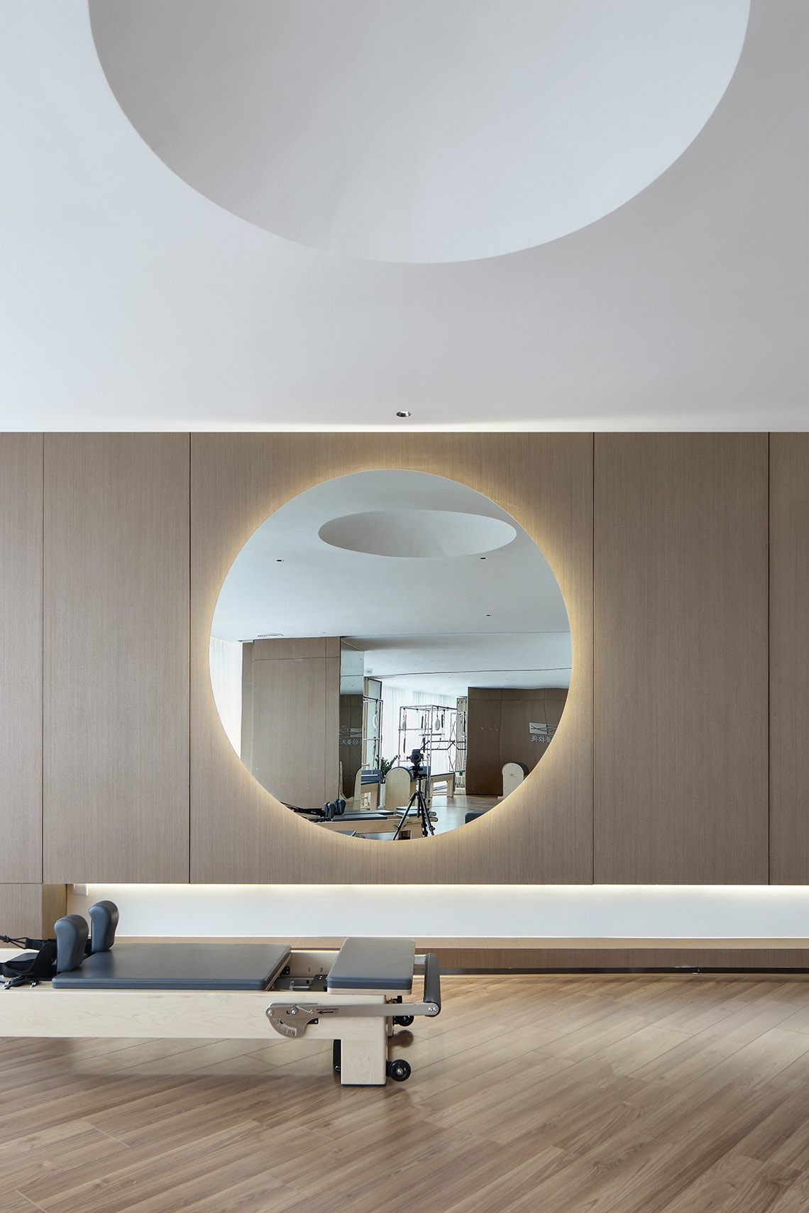
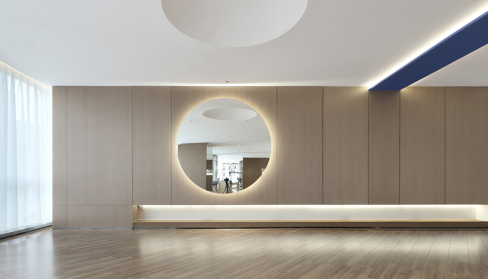
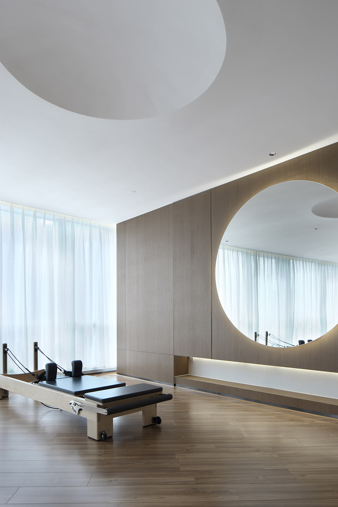
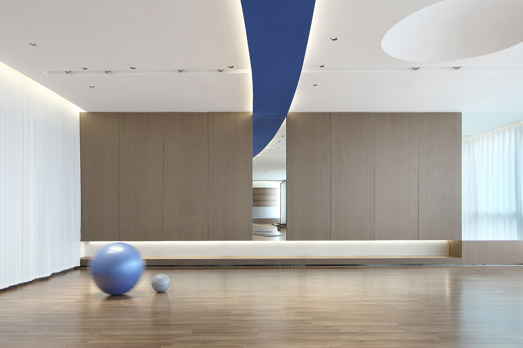
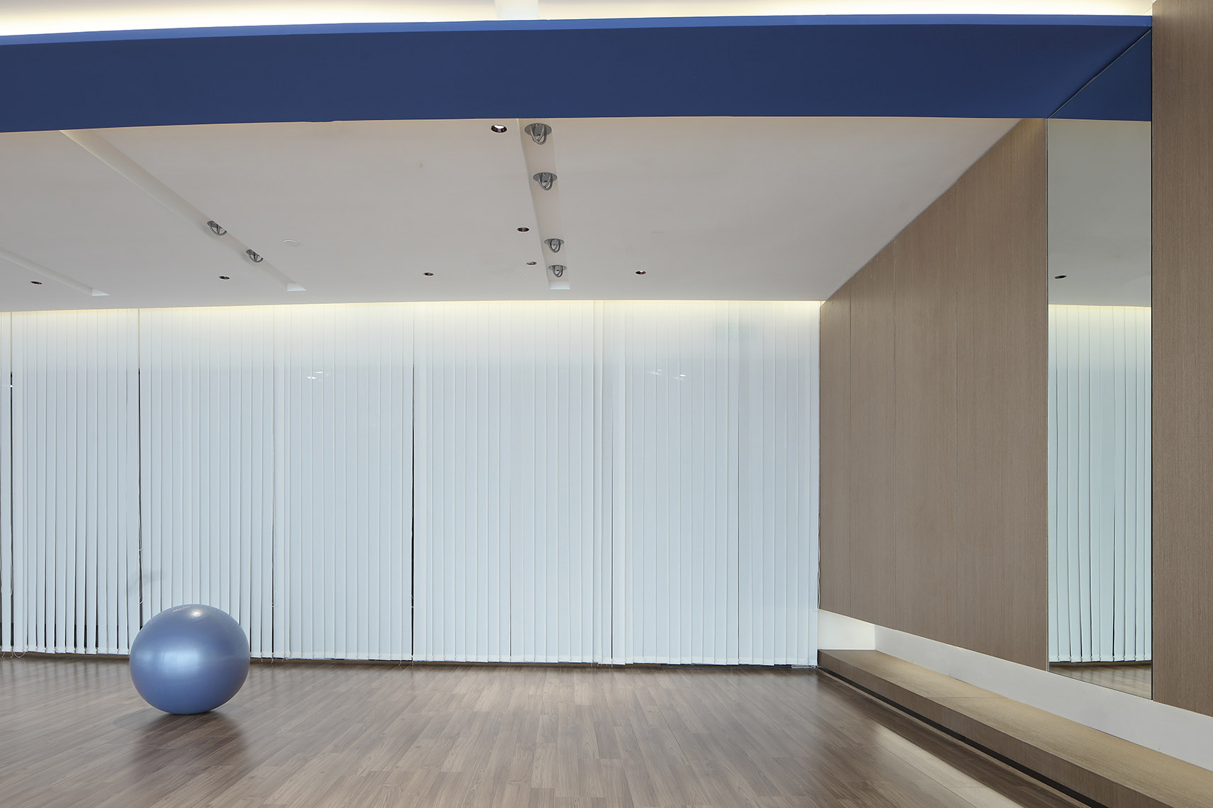
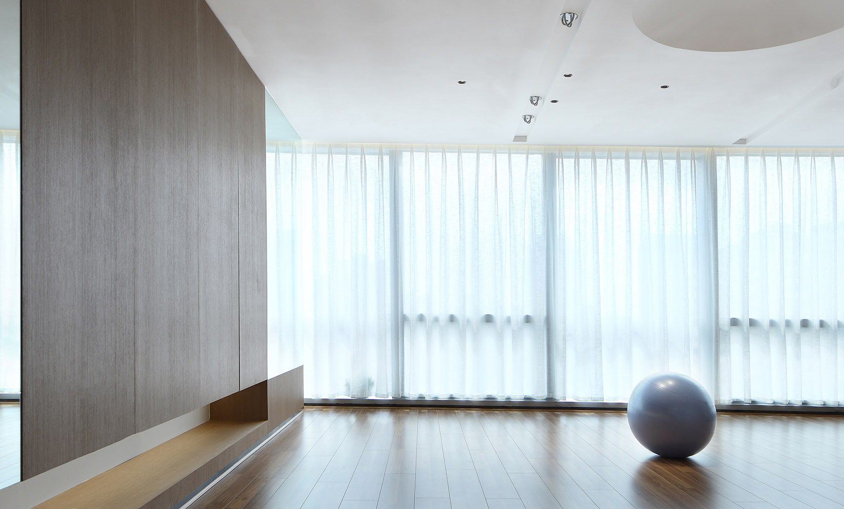
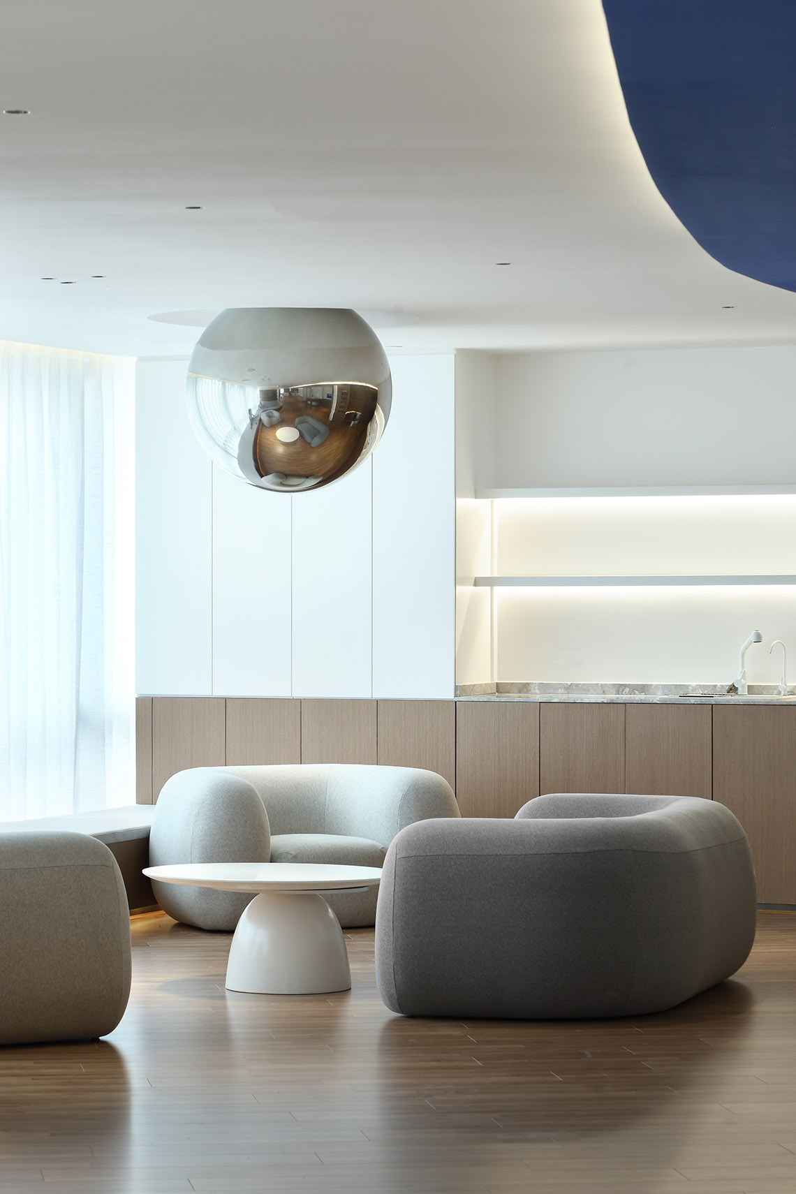
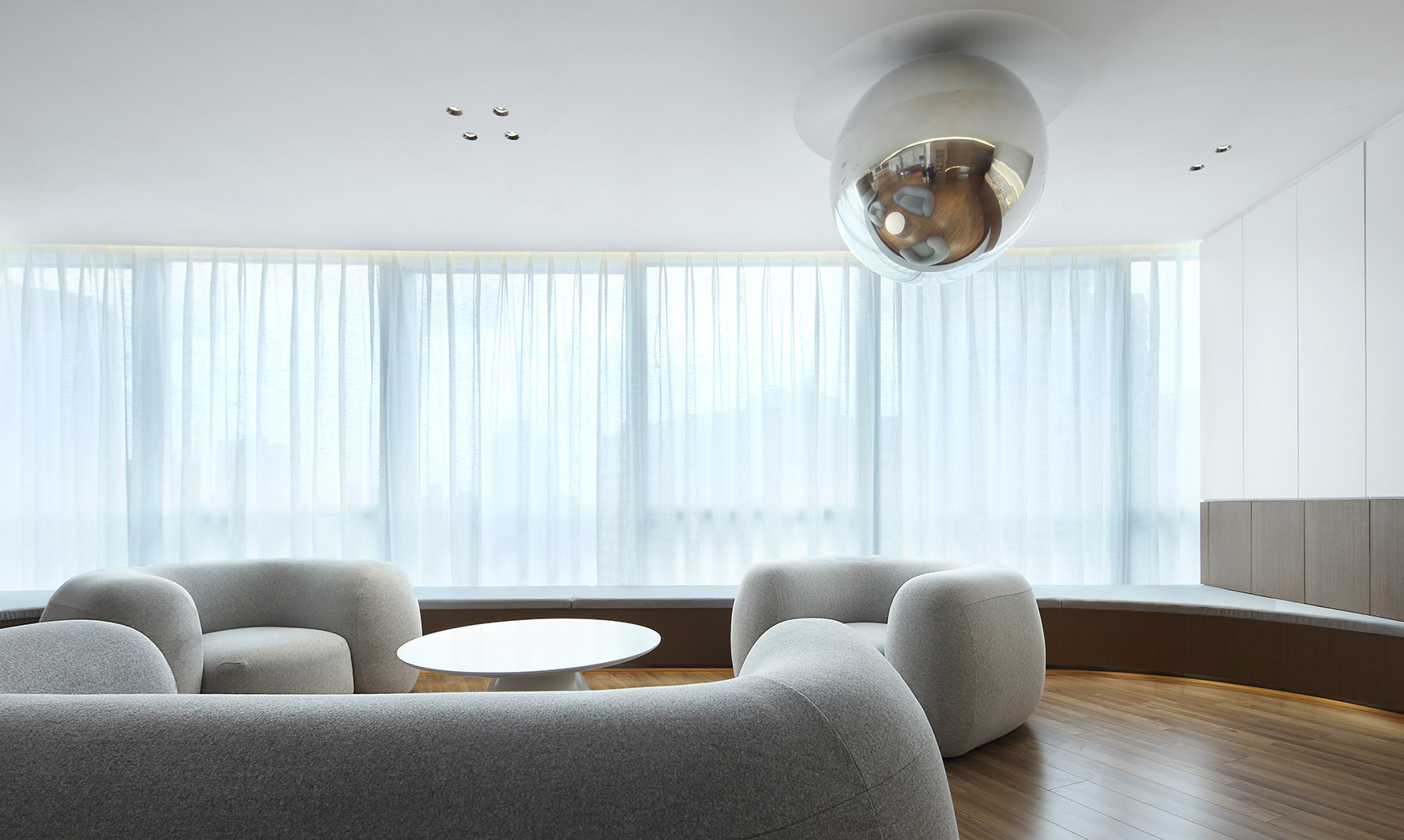
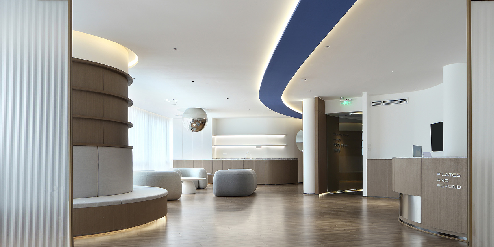
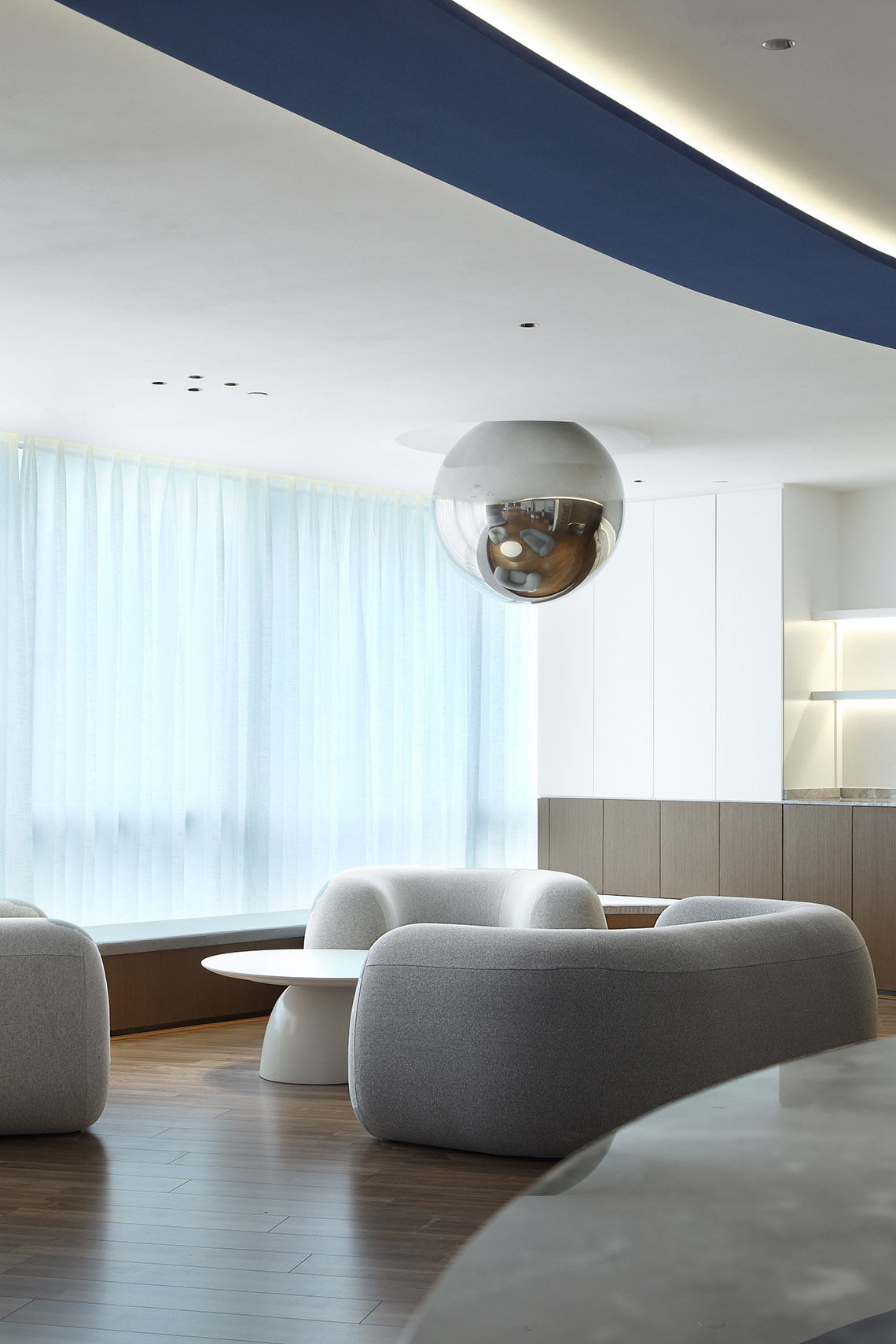
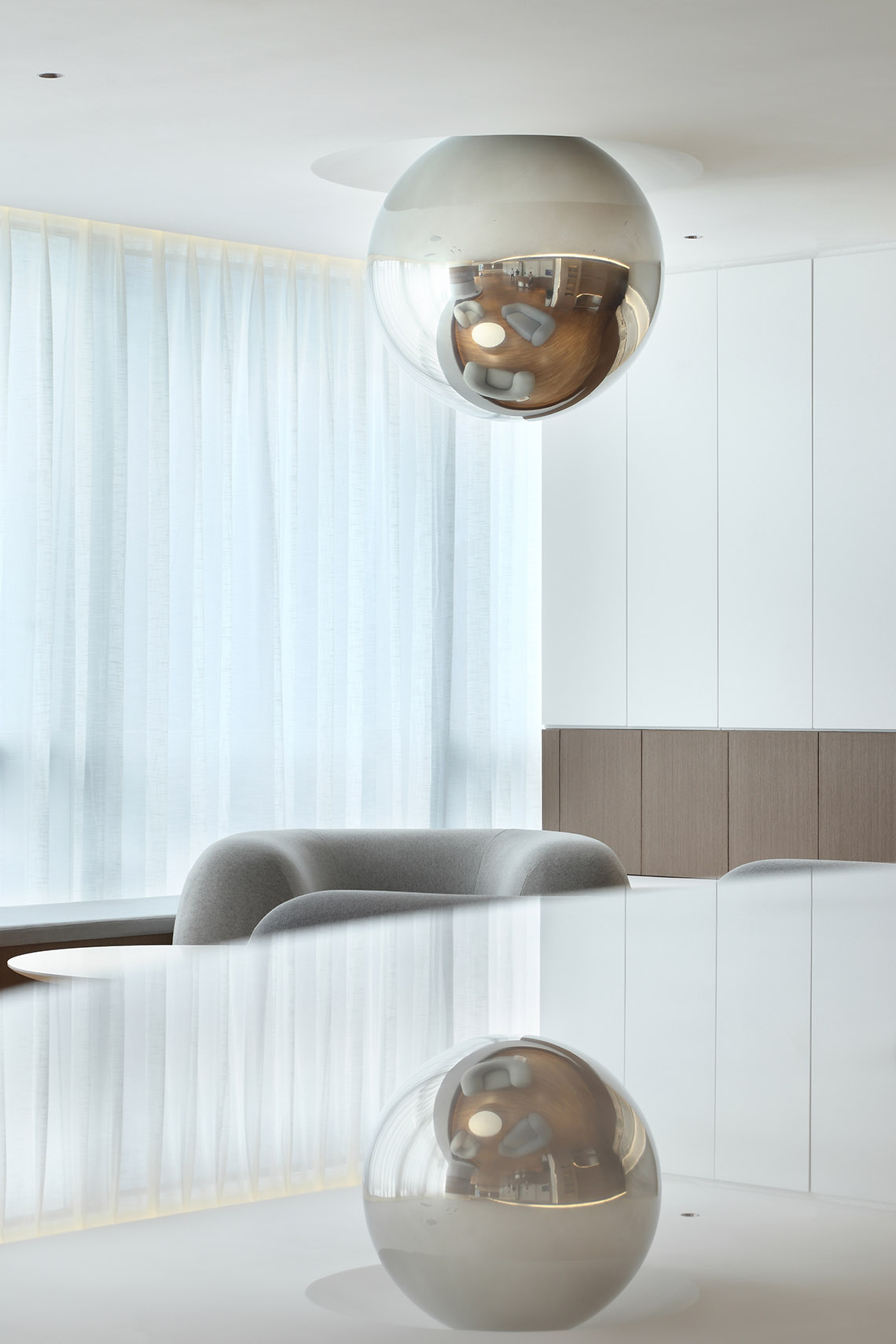
我們減弱地麵水平要素的限定,以保護體驗者在空間暢遊。增強頂麵水平要素限定,通過平整的頂麵和球體元素的切割形成“負”形,帶來不一樣的空間感受和視覺衝擊。
We weaken the limitation of ground level elements to protect the experiencer in space and enhance the limitation of top level elements. Through the flat top and the cut of sphere elements, the negative shape is formed, bringing different spatial experience and visual impact.
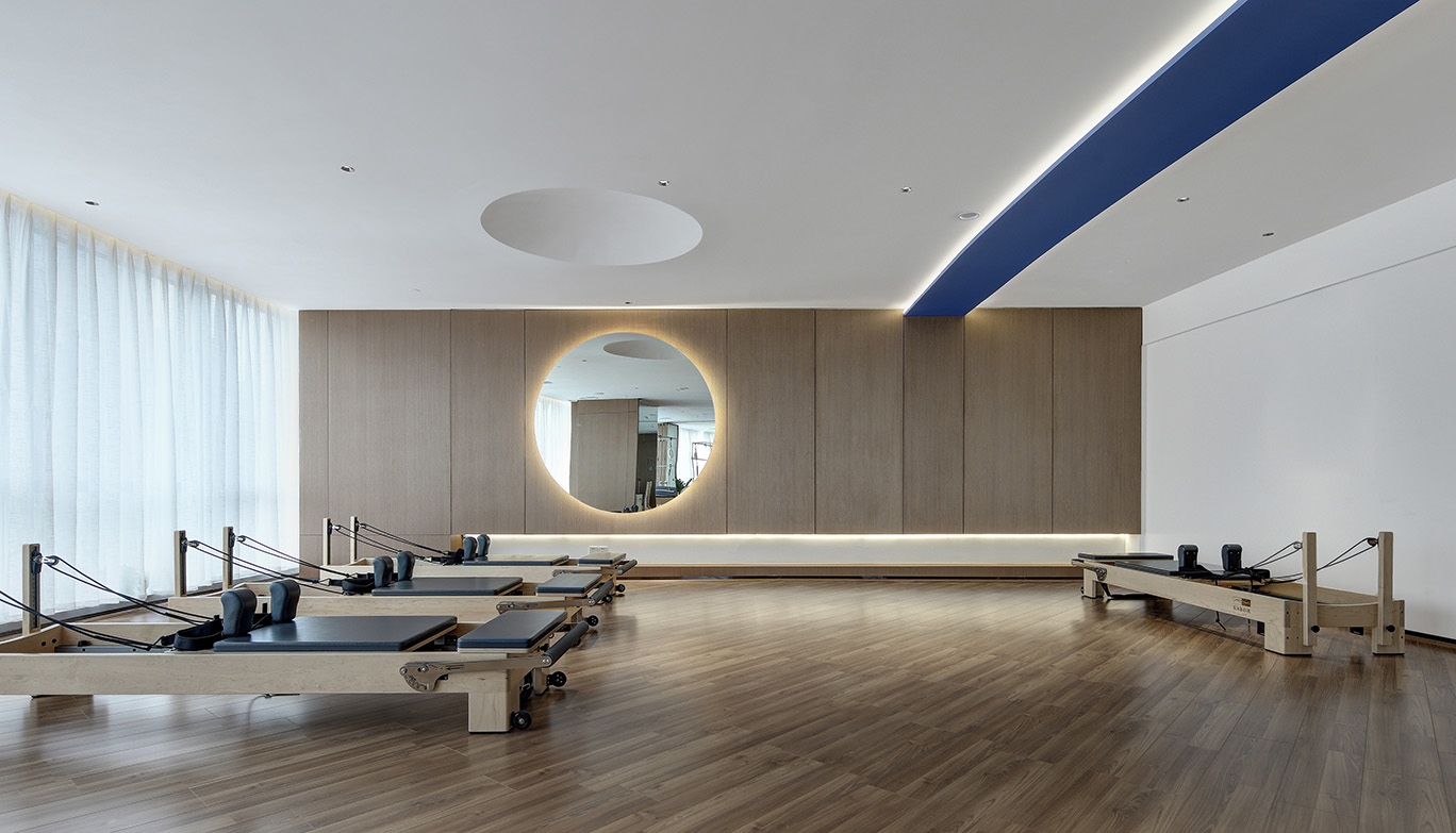
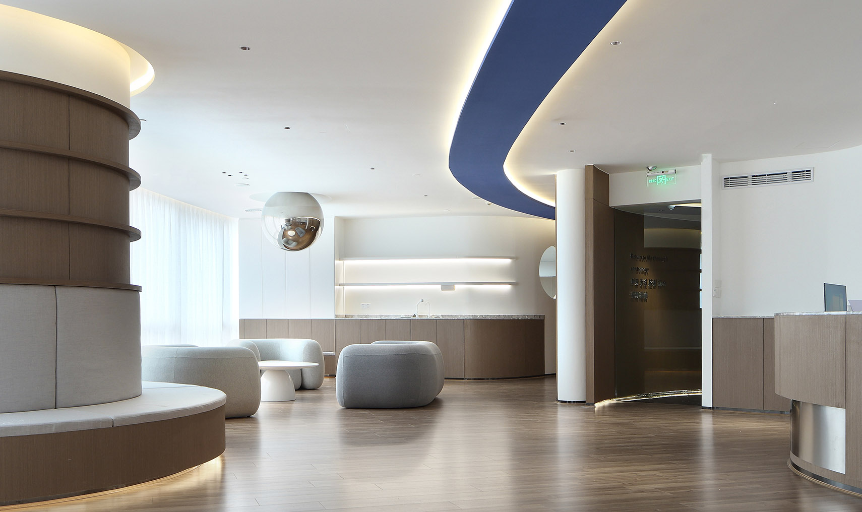
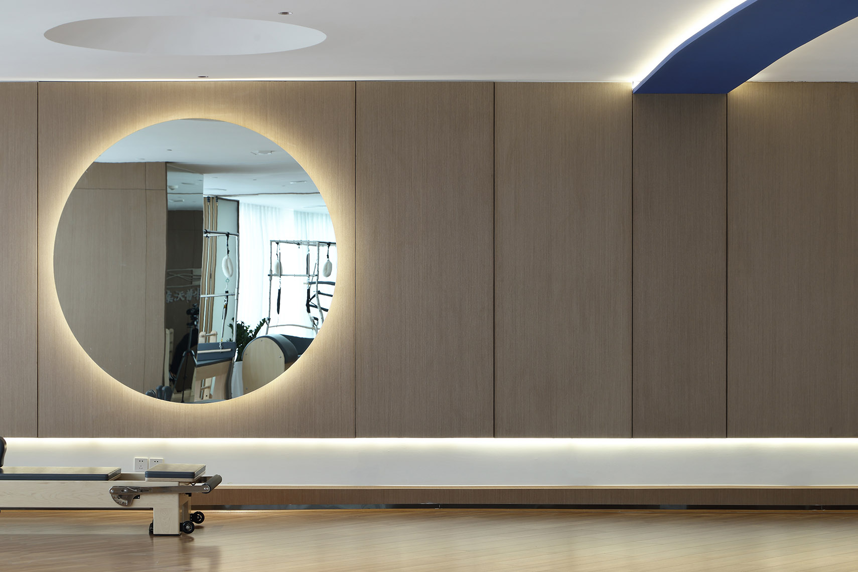
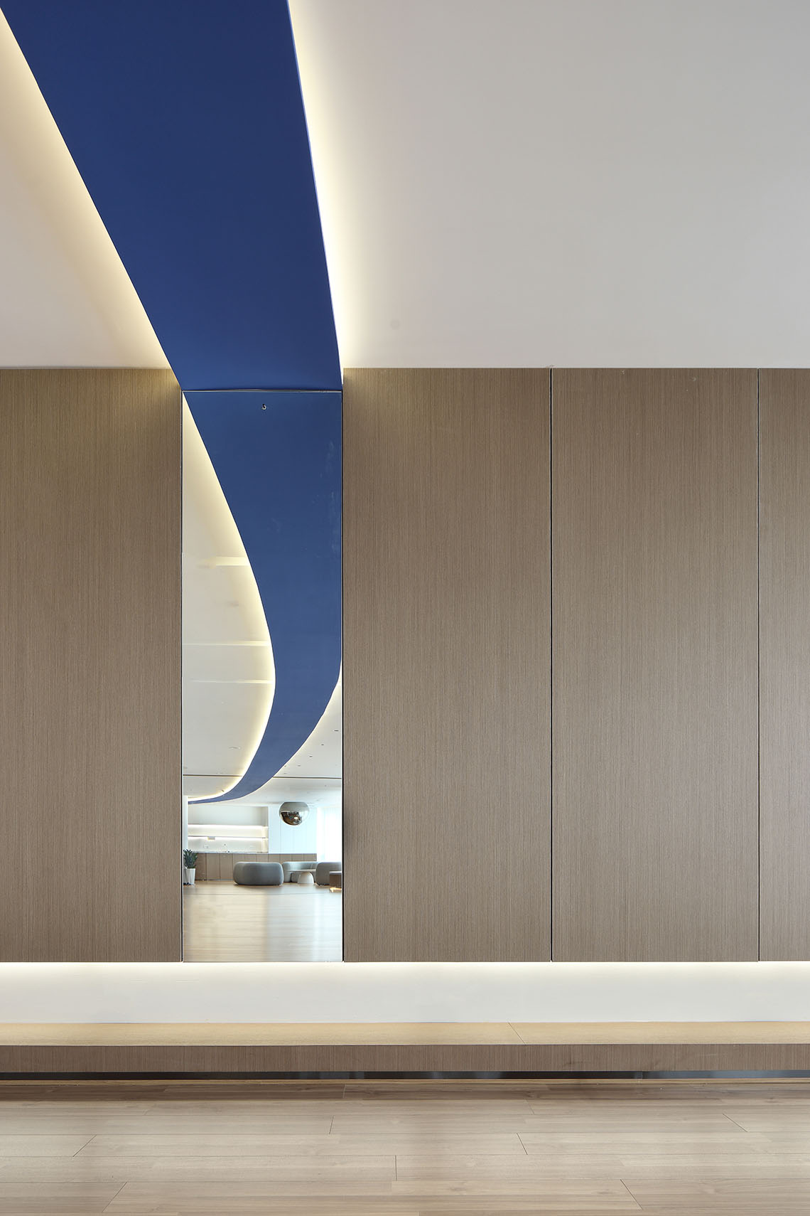
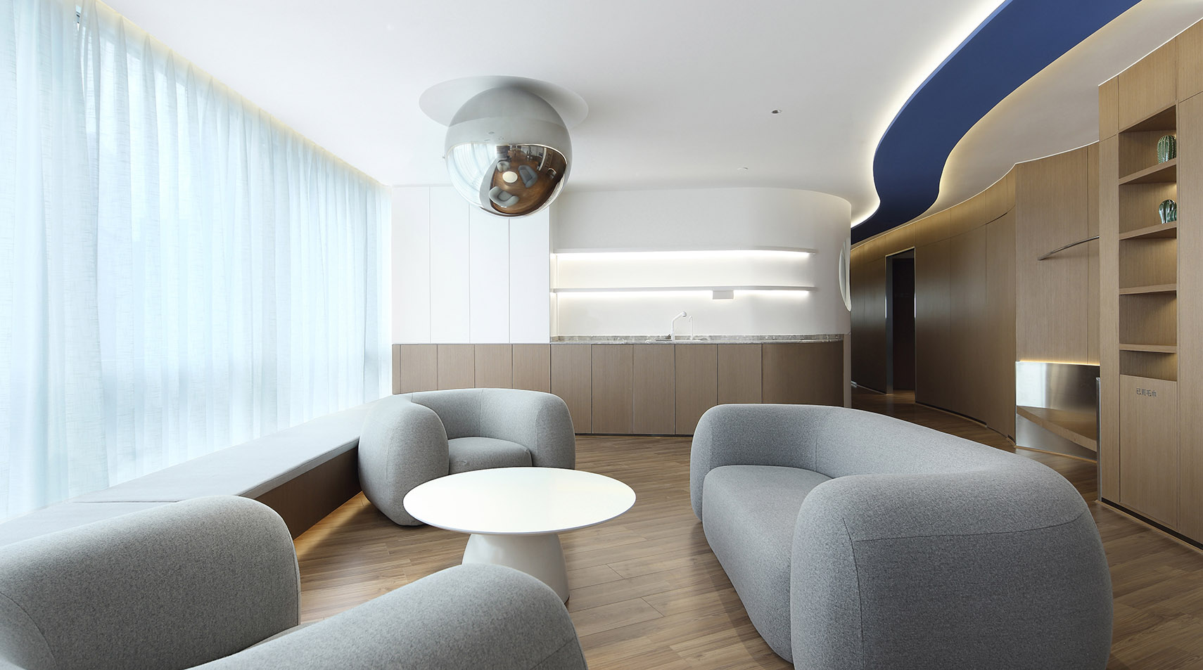
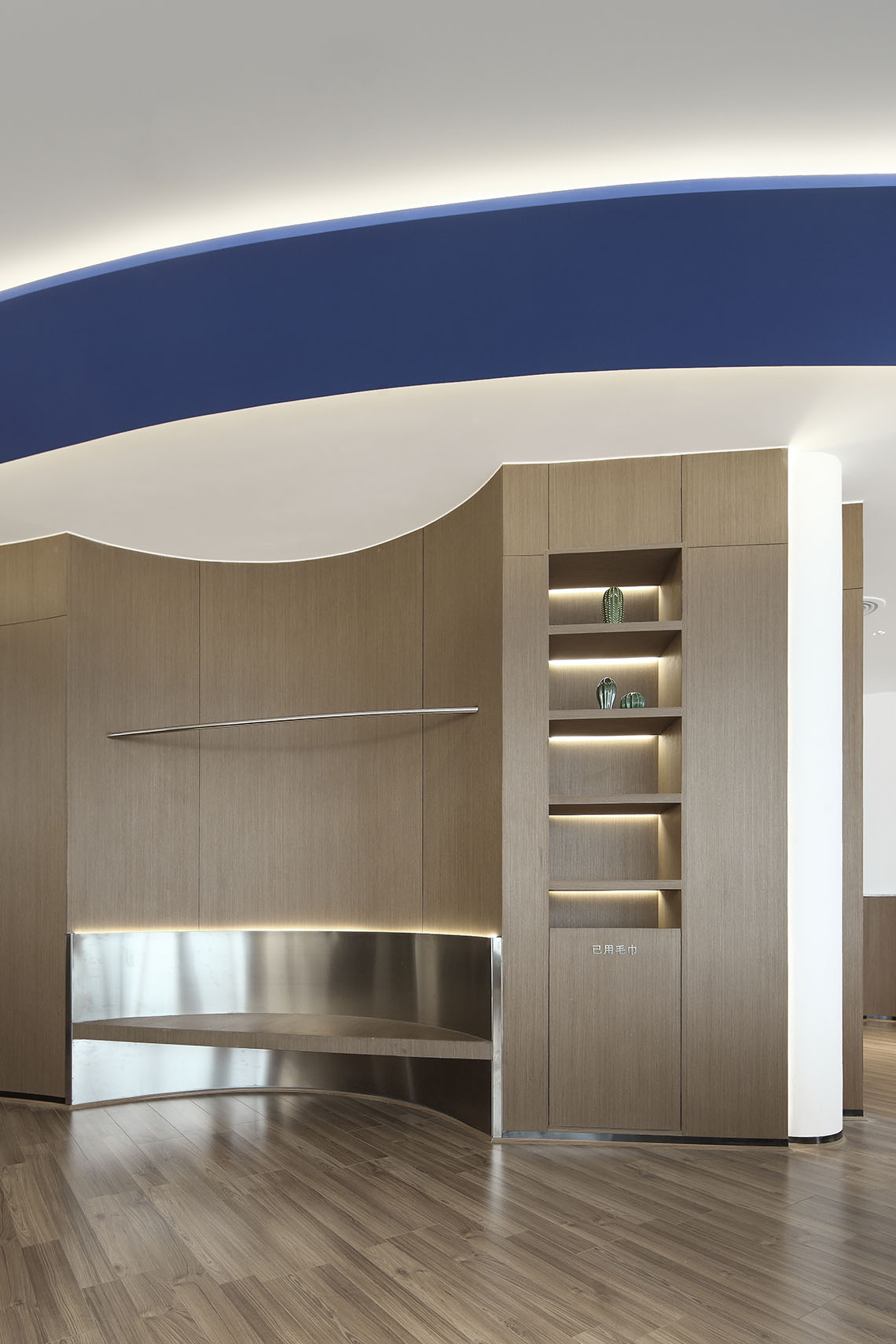
設計結合Bodywords品牌主色調“藍色”在頂麵置入藍色的“飄帶”,創造在建築中穿行、停留的空間序列。
The design combines Bodywords’ main blue color with a blue ribbon placed on the top surface to create a spatial sequence of moving through the building.
垂直要素的限定 The definition of a vertical element
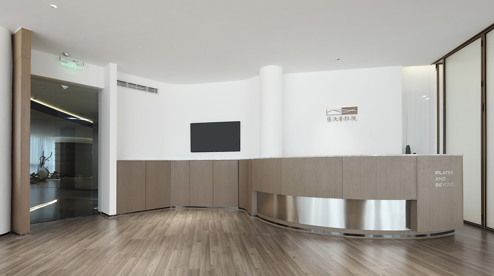
換鞋區和接待區通過“垂直柱子”來模糊兩者的界限,以保護體驗者和工作者的私密性。
The shoe-changing area and the reception area are blurred by vertical columns to protect the privacy of the experiencer and the worker.
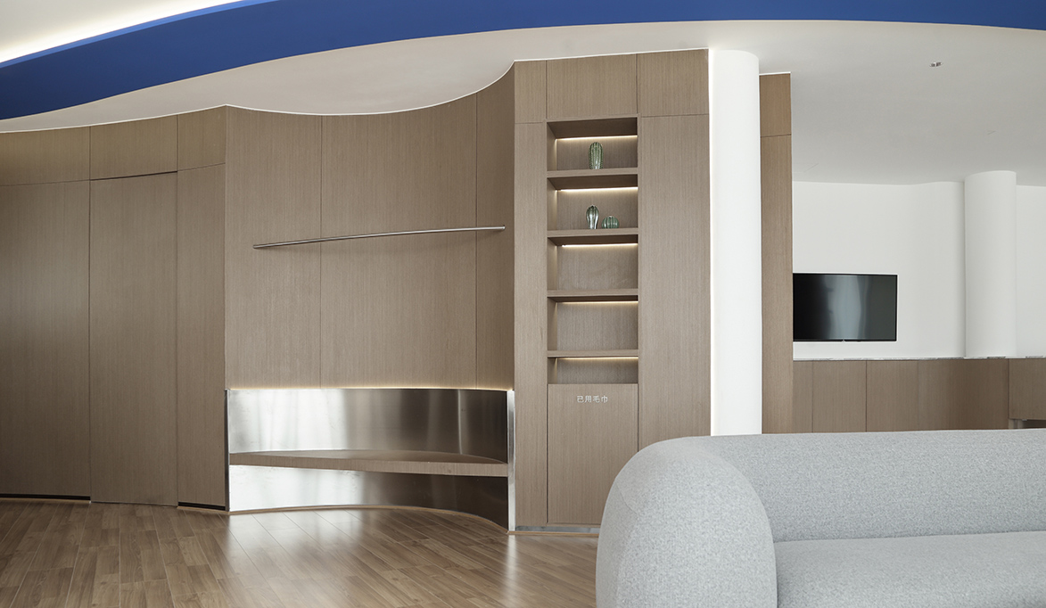
訓練區在原有柱子的基礎上進行在“造”,通過分色及組合增強三維空間的聯係。
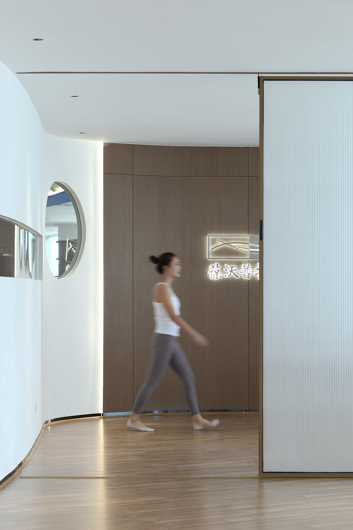
並在過道牆麵低於視線高度設置弧形水平長窗,避免兩側視線幹擾的同時,做到了空間的分而不隔,營造出空間之間的聯係和人與空間的互動。
The training area is built on the basis of the original columns. Through color separation and combination, the connection of three-dimensional space is enhanced, and arc-shaped horizontal Windows are set on the wall of the corridor below the line of sight. While avoiding the interference of the line of sight on both sides, the space is divided but not separated, creating the connection between Spaces and the interaction between people and space.
水平要素與垂直要素的組合與合並 Combination and combination of horizontal and vertical elements
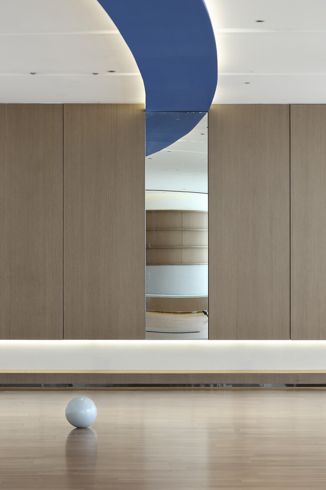
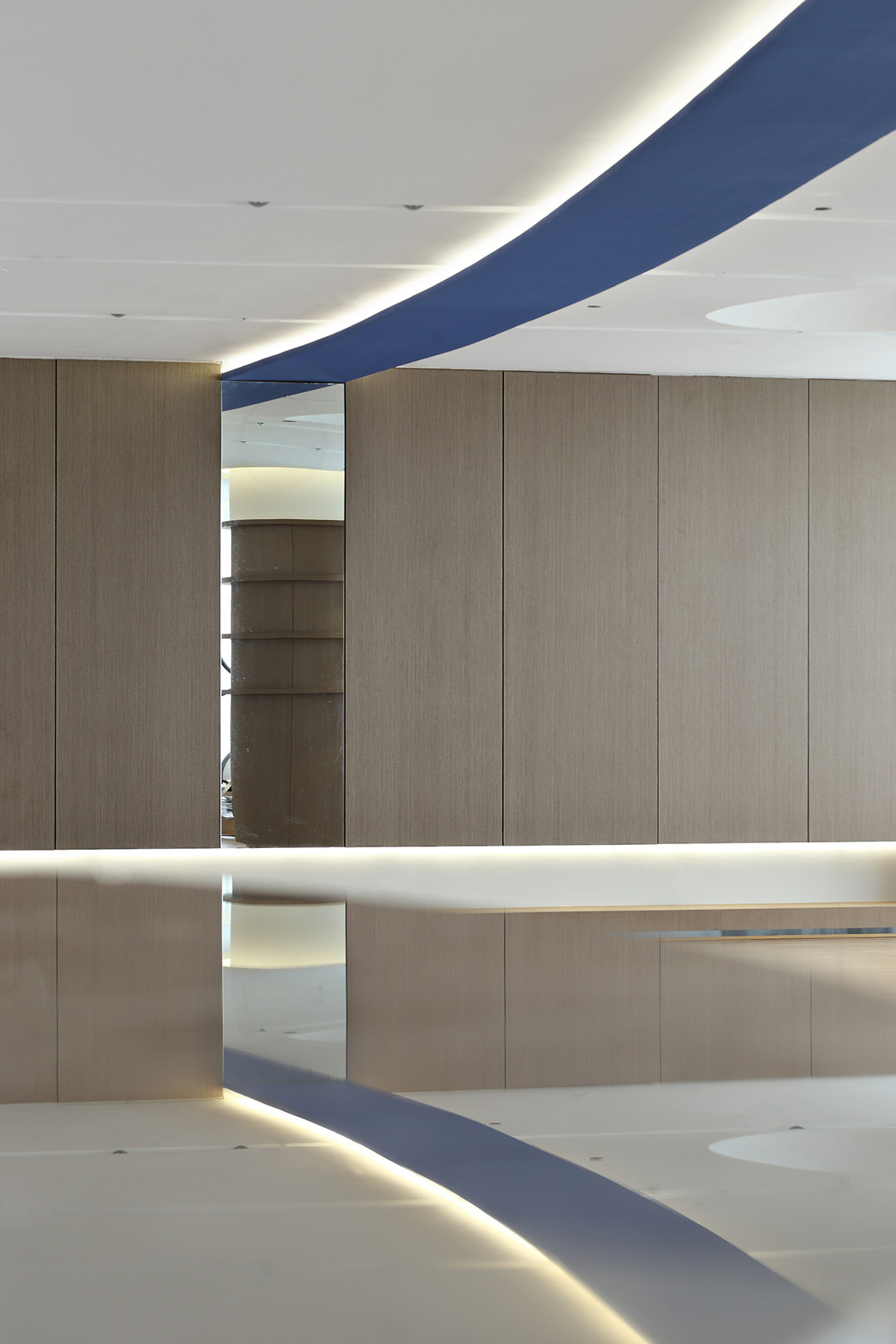
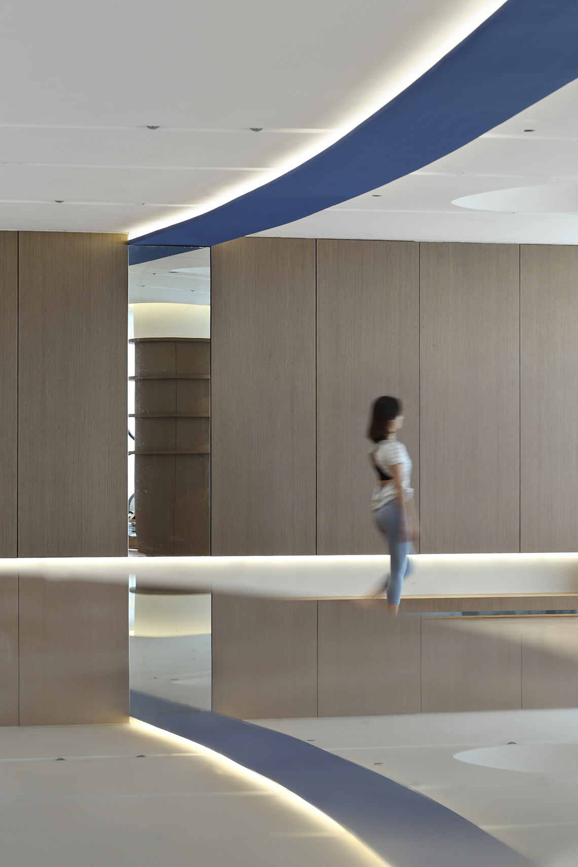
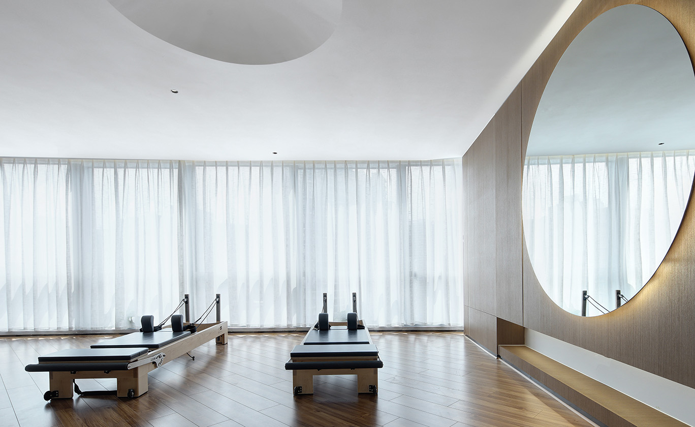
頂麵藍色飄帶和牆麵鏡子形成水平和垂直的交接,通過鏡麵材質的特性使得藍色飄帶無限延長。
The blue ribbon on the top and the mirror on the wall form a horizontal and vertical interface, which extends the blue ribbon indefinitely through the characteristics of the mirror material.
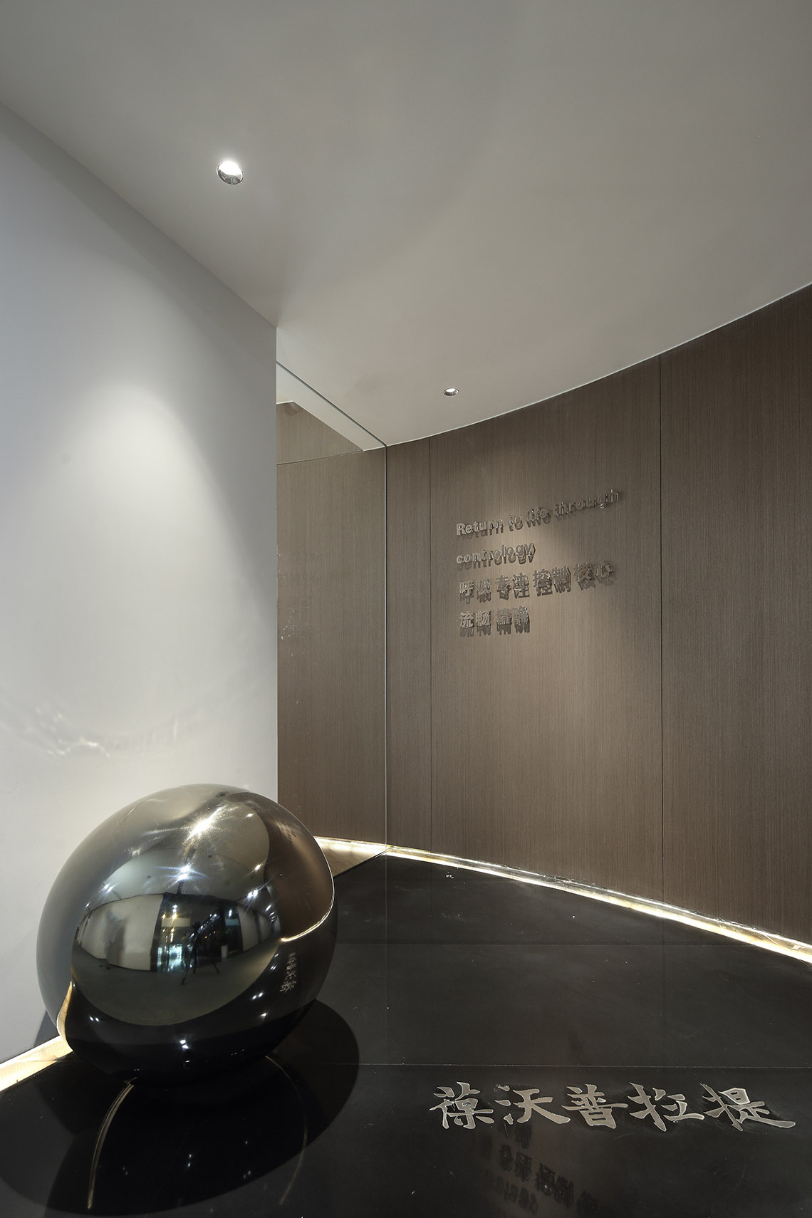
頂麵和球體元素的切割形成“負”形在結合垂直而下的不鏽鋼球體,增強空間的聯係。
The top and sphere elements are cut to form negative stainless steel spheres that combine vertically down to enhance the spatial connection.
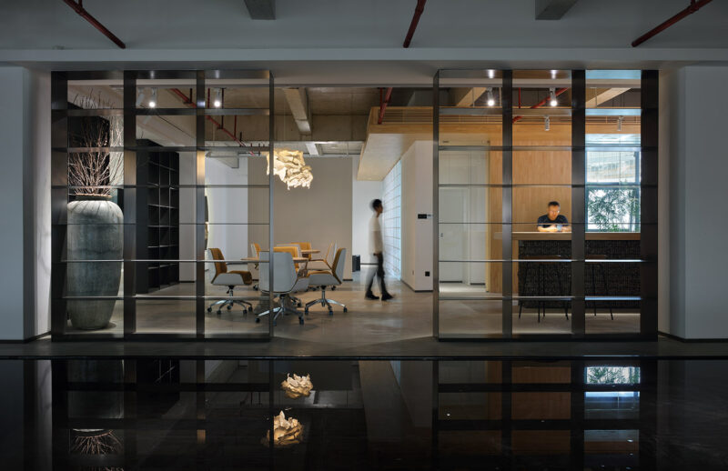
隧道式的入口及半反射黑色石材材質吸引著客人繼續向前探索。
The tunnel-style entrance and semi-reflective black stone material invite guests to explore further.
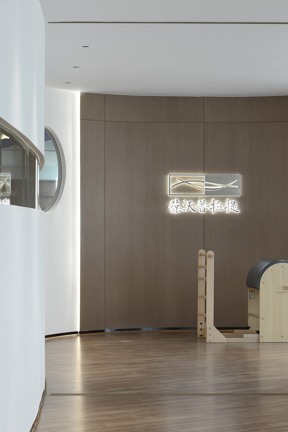
空間以白色和木色作為空間的主體色,營造出舒適、安靜的空間環境。空間通過分割重組,區分了入口、休息區和普拉提訓練室。
White and wood colors are used as the main colors of the space to create a comfortable and quiet space environment. The space is divided and reorganized to distinguish the entrance lounge area and Pilates training room.
項目信息
項目名稱:Bodywords普拉提
項目設計 & 完成年份 2020年7月 & 2020年10月
主創及設計團隊:YFYS 空間設計
主創:嶽崢嶸
設計團隊:陳銀,劉維強
項目地址:成都市明宇金融廣場M-06號
項目麵積:400㎡
客戶:涵靜
攝影版權:良
Project Complete: Oct.2019
Leader designer & Team:YFYS space design
Design in charge: :Moon
Space Design Chen:ying ,Liu wei qiang
Project location:M-06 Mingyu Financial Plaza, Chengdu, China
Gross Built Area(square meters):400㎡Area:165sqm
Clients: jing Han
Photographer:Liang


