全球設計風向感謝來自 MOC DESIGN OFFICE 的商業店鋪項目案例分享:
汽車銷售空間的再定義
Redefining the Automotive Salesroom
NIO SPACE 蔚來空間 2.0 形象升級 – 北京中糧祥雲店
NIO Space 2.0 Rebranding at Beijing Shine Hills
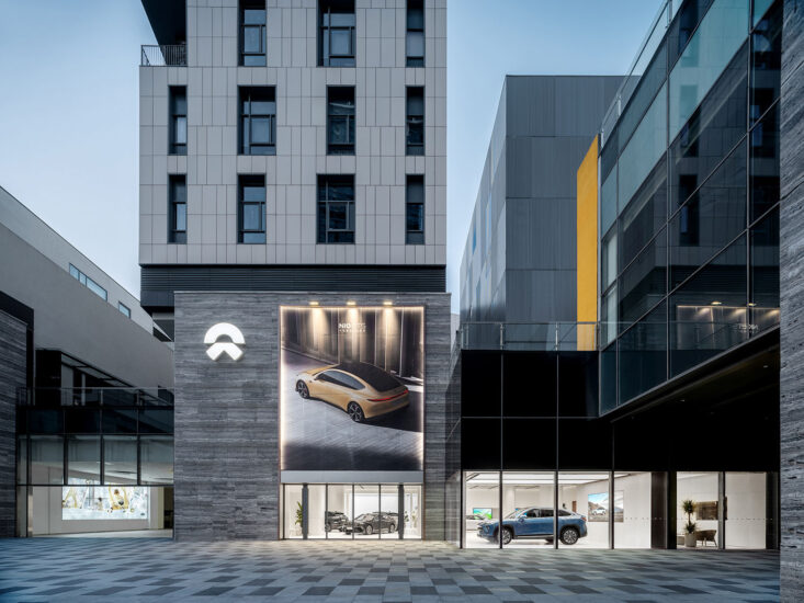
▼ 位於街區中的NIO SPACE蔚來空間
▼ NIO Space located in the urban community
傳統印象中遠離城市社區的汽車售賣店,專為有明確購買需求的人提供,存在一定的局限性。全球領先的智能電動汽車公司NIO蔚來汽車此次聯合MOC DESIGN,共同打造新一代的“NIO Space蔚來空間”,以兼具精致和溫暖的科技質感設計,在城市之中為周邊社區用戶營造出一個愉悅的生活方式空間。
A car dealership is conventionally located far from the urban community since its target group has specific intention of purchase, yet which brings certain limits.
The world’s leading smart electric car company NIO joins hands with MOC Design to create the new generation of “NIO Space”. With exquisite and warm high-tech design, it builds a pleasant lifestyle space for the surrounding communities in the city.
以現代思考重構汽車銷售模式, “NIO Space 蔚來空間”企圖在呈現專業的同時讓進入者感受到溫度,不僅僅是汽車展廳,更是用戶家庭休閑的第三空間。
The automotive sales model is reconstructed by modern thinking. NIO Space attempts to demonstrate its professionalism while communicating its warmth to visitors. It is not just a car showroom, but also the third space for users to enjoy family leisure.
▼ 室內休息區與戶外草坪互相看通,強調了該項目的社區屬性
▼ The lawn is seen through the windows from the lounge, which underlines the community attribute of the project.
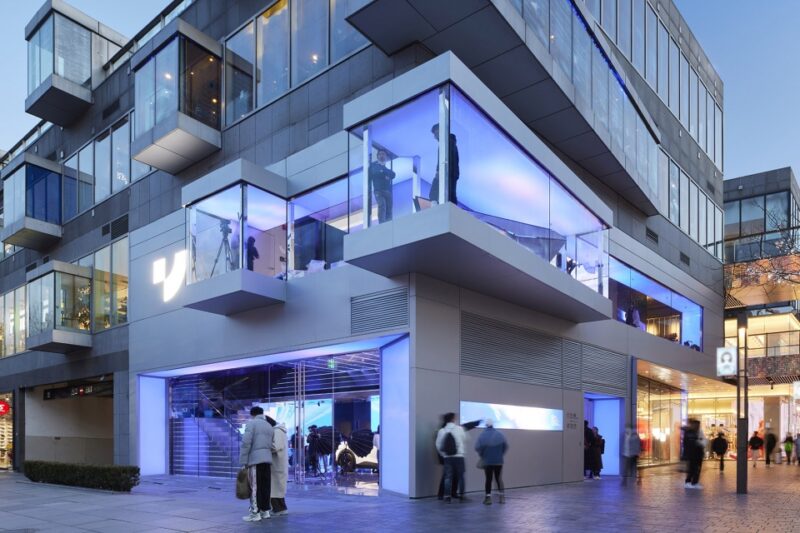
項目外立麵設計以銀色鋁板包裹,透過立麵櫥窗可以隱約望見室內場景,猶如一個未來感十足的“空間盒子”。
The façade of the building is made from silver aluminum panels. The interior can be dimly seen through the windows as if it is a futuristic “space box”.
▼ 外立麵
▼ Façade
轉角處的圓環造型燈貫通室內外,構建出立體式的視覺效果,與戶外草坪呼應,富有獨特藝術感的造型燈同時豐富了立麵的趣味性。
The circular light at the corner runs around indoors and outdoors, creating a dimensional visual effect and echoing the outdoor lawn. The unique and artistic lighting enriches the playfulness of the façade.
▼ 貫通室內外的圓環造型燈帶來豐富的立麵趣味
▼The circular light linking the indoors and outdoors enriches the playfulness of the façade.
▼ 貫通室內外的圓環造型燈
▼Circular light running around indoors and outdoors.
轉角櫥窗隱約顯現室內用於休閑、社交和活動的“第三空間”,同時與品牌標誌疊加形成縱向融合。
The French windows dimly reveals the “third space” for leisure, socializing and activities. It also overlays with the brand logo to forms a vertical integration.
▼ 軸測說明
▼ Axon Drawing
室內在開放式格局下交融汽車展示、科技體驗、生活休閑和美學空間多重需求的一體化展現,並低調的劃分出Gallery、NIO Cafe、NIO Life等多個功能模塊。簡潔的白色主導空間視覺畫麵,利用不同類型的燈光環繞空間線條,營造通透純粹的場景氛圍。
The open layout integrates car display, high-tech experience, living and leisure, as well as aesthetics to meet multiple needs. It’s subtly divided into several functional modules, including gallery, NIO café, and NIO life. The simple white color dominates the visual image of the space. Different types of lighting are used to run around the space to create a translucent and pure scenario.
▼ 室內展車區
▼ Indoor showroom
與傳統汽車售賣店不同的是,由於購物中心的麵積限製,室內展示區將被更為高效的利用:除了陳列2台實體展車之外,設計師在一側的牆麵上內置了一個5米長2.4米寬的窗口,顧客可透過該窗口看到品牌的更多車型,窗口內部呈現的畫麵以人的視角進行1:1的模擬,為顧客提供更為直觀的感受,同時也滿足了品牌在有限麵積下展出更多車型的需求。
Different from the conventional auto showrooms, NIO space has a limited area in the shopping center and its display area has to be efficiently used. In addition to the display of two models, designers also set up a display window, which is 5 meters long and 2.4 meters wide. Customers may learn more models through this window. The window exhibits the car in its actual size. It provides a more intuitive experience to customers while also meets the need to show more models in a limited space.
▼ 室內展示窗口
▼ Indoor display window
▼ 效果圖模擬
▼ Car rendering in its actual size
▼ 四周不同角度可見內飾選配及充電配件展示,協助用戶提升用車體驗
▼ Interior options and accessories are displayed from different angles to improve the car experience.
▼ 實木雕刻的門拉手,低調的傳達出品牌的調性和質感
▼ Carved wood door handles understate the brand’s tone and quality.
利用空間中兩個承重柱之間的範圍鋪敘休閑洽談區,巧妙地營造了或隱或現的交流場景。洽談區位於轉角櫥窗處,NIO LIFE 展示區則被規劃在靠近櫥窗一側,該區域通過貫通室內外的圓環燈自然的將顧客的目光引向室外,戶外鋪設的木地板和草坪為整個空間引入自然舒適的氣息,消解了傳統汽車銷售展廳冰冷的氣質,為用戶提供一個溫暖而閑適的休閑場景。
結合品牌“以車為原點,多維度鏈接生活方式”的精神,NIO LIFE展示區規劃與休閑洽談區相鄰,使洽談區的單一的交流功能為之轉變——NIO LIFE的融入增加了生活感和精致感,圍繞汽車生活開發的周邊產品,為用戶構建了一個愉悅的生活方式場景。
The space between two load-bearing columns serves as a leisure lounge for communication, subtly hidden and visible. The lounge is at the window corner while NIO Life is on the other side of the window. The circular light linking the indoors and outdoors draws customers attention to the outside area. Meanwhile, the wooden floor and lawn introduce natural and comfortable vibe into the overall interior. It’s a way to dissolve the cold temperament of conventional auto showrooms. Instead, a warm and relaxing leisure scene is provided to users.
Combining with the brand spirit of “car as the origin point to connect lifestyles in multiple dimensions”, NIO Life is arranged next to the leisure lounge to switch its original exchange function. NIO Life adds a sense of life and sophistication. The peripheral products developed around cars and life depict a pleasant lifestyle scenario for users.
▼ 利用空間中兩個承重柱之間的範圍鋪敘休閑洽談區,巧妙地營造了或隱或現的交流場景
▼The leisure lounge for communication unfolds between two load-bearing columns, subtly hidden and visible.
▼ 細節
▼ Details
▼貫通室內外的圓環燈自然的將顧客的目光引向室外,戶外鋪設的木地板和草坪為整個空間引入自然舒適的氣息,消解了傳統汽車銷售展廳冰冷的氣質
▼ The circular light linking the indoors and outdoors draws customers attention to the outside area. Meanwhile, the wooden floor and lawn introduce natural and comfortable vibe into the overall interior. It’s a way to dissolve the cold temperament of conventional auto showrooms.
▼圓環燈細節
▼ Details of the circular light
基於用戶體驗布局多功能用戶專區,試圖成為品牌用戶除了工作、生活之外的第三空間,為用戶提供咖啡品鑒、休閑社交、品牌活動等多樣化的生活休閑場景。親和力的木色與柔和的光線構造舒適、自然的氣息,品牌產品細節的手繪圖則賦予空間藝術風格的同時低調的傳達出品牌的工匠精神。
Based on the user experience, the multifunctional user zone seeks a role of the third space outside work and life. It provides users with diverse life and leisure scenarios, such as coffee tasting, leisure and socializing and brand activities. The friendly wood colors and soft light give out a comfortable and natural atmosphere. The hand drawings of the products add an artistic style to the space while understate the craftsmanship of the brand.
▼ 多功能用戶區
▼ Multifunction user zone
“NIO Space蔚來空間”以突破傳統的銷售認知轉變顧客的入店體驗,讓空間中情感共鳴的營造幫助提升場景的趣味性和用戶對於品牌的認同感,最終達成為用戶創造愉悅的生活方式的品牌願景。
NIO Space transforms the customers’ store experience by going beyond the traditional perception of sales. It allows emotional resonance in the space to increase the fun of scenarios and users’ brand recognition. Ultimately, it is to achieve the brand’s vision to create a pleasant lifestyle for users.
▼ 平麵圖
▼ Plan
項目名稱: 蔚來汽車NIO SPACE -北京中糧祥雲店
設計單位: MOC DESIGN OFFICE (www.moc-office.com )
主創設計師:梁寧森,吳岫微
設計周期:2020.4-2020.6
竣工:2020.8
項目地址:北京市中糧祥雲小鎮南區S11-108
麵積:235㎡
主材:噴砂不鏽鋼,木飾麵板,仿水磨石地磚
業主:蔚來
攝影:直譯建築攝影,蔚來
Project Name: NIO Space at Beijing Shine Hills
Design Company: MOC DESIGN OFFICE (www.moc-office.com )
Chief Designers: Vivi Wu, Sam Liang
Design Phase: April – June 2020
Completion: August 2020
Location: S11-108, South Area, Shine Hills Shopping Center, Beijing
Area: 235 ㎡
Materials: Sandblasting Stainless Steel, Wood Veneer, Imitation Terrazzo Tile
Client: NIO
Photography: Archi Translator, NIO


