全球設計風向感謝來自 LUKSTUDIO 的複合型商業空間項目案例分享:
作為“快生活”的衍生品,超市自上世紀30年代在美國誕生便迅速風靡全球。中國零售業70年代開始引入超市概念,卻沒有對本土市集文化進行很好的融合、延續與創新。芝作室受長沙本土新零售品牌“福來食集”委托為其設計了超市首店,借由傳統市集文化的有機融入,打造可供市民深度體驗的複合型公共空間。
The concept of supermarket was born as a by-product of the fast-paced lifestyle in the United States back in the 1930s. Most supermarkets in China adopt the conventional spatial model based on efficiency but often lack a memorable character. Commissioned by Fresh Mart, a new brand established in Changsha, to design its store identity, Lukstudio has reinterpreted elements from common Chinese markets and street booths, giving the familiar typology an unfamiliar facelift.
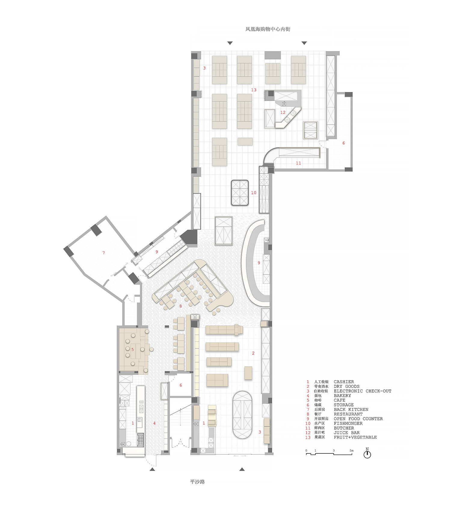
∇ floor plan / 平麵圖
∇ exploded axonometric diagram / 空間軸測圖
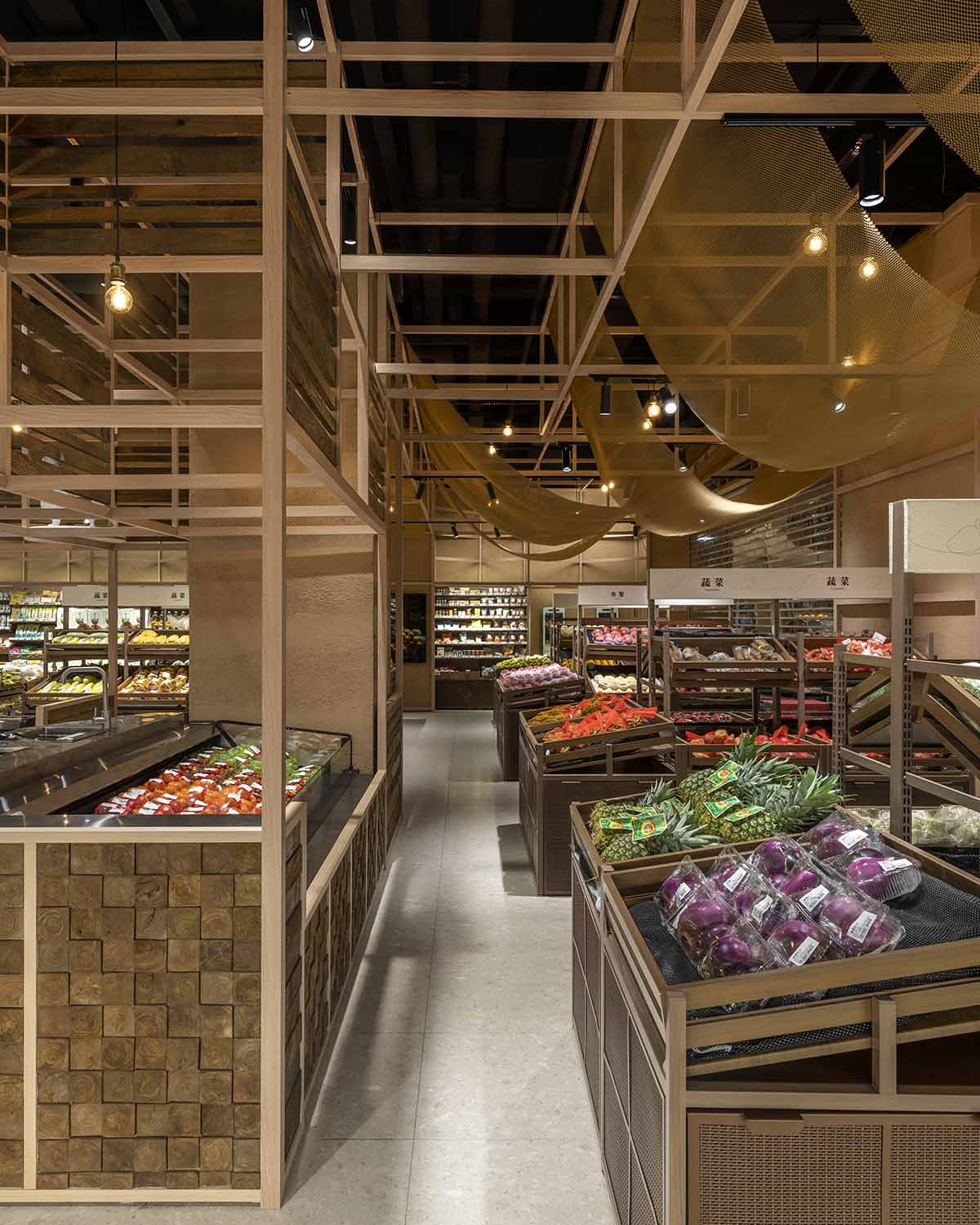
項目位於長沙市新區北辰三角洲,周邊住宅林立,超市南入口正對平沙路,北入口連通鳳凰海購物公園內街。從傳統市集貨架提取的木框元素,既作為基礎結構串連起超市各功能分區,也通過不同的變化組合來營造差異化視覺效果,烘托各區主題。
Located next to several residential compounds in the new CBD of Changsha, the given irregular site comes with two entrances, one facing the Pingsha street and the other connecting to the Hi Park Mall. Throughout the supermarket, a wooden frame is used as an infrastructure that ties all the different sections: fresh vegetables, fishmonger, butchery, dry goods, restaurant, cafe and bakery. Each section is then characterized by an assembly of relevant features or textures.
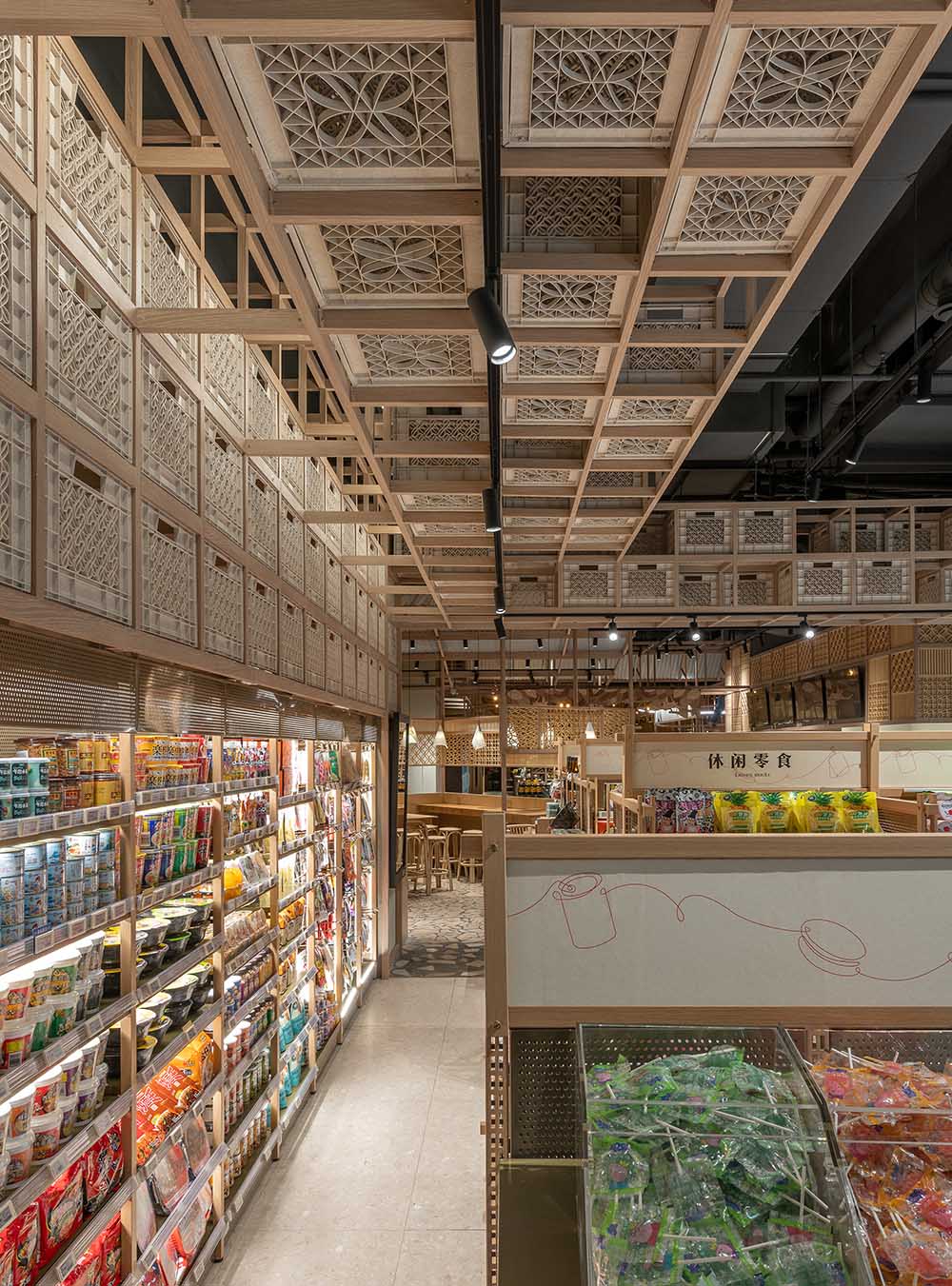
∇ dry goods section / 零食酒水區
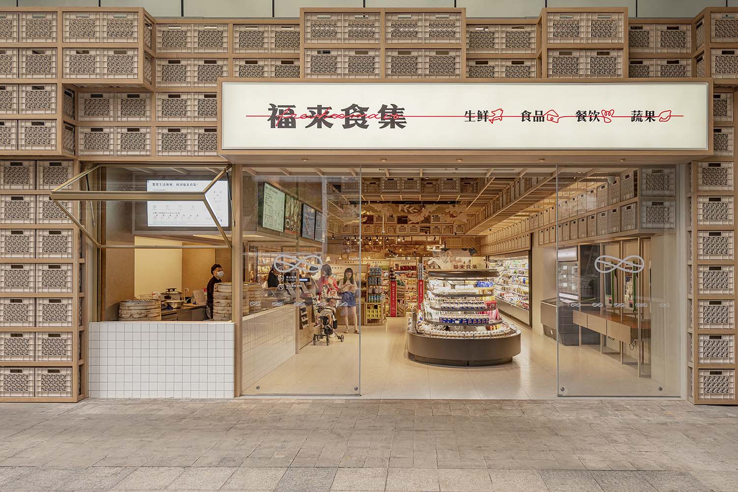
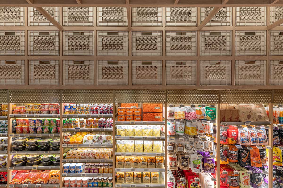
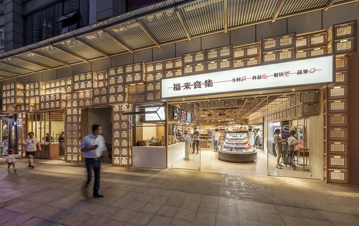
堆疊的牛奶箱自沿街外立麵延伸到室內零食酒水區,傳達空間屬性與秩序感,還兼具店招及照明功能。
The street facade and the nearby dry goods section are marked by stacking milk crates which convey a sense of order among the busy racks and double as spectacular lanterns at night.
∇ fruit & vegetable area / 果蔬區
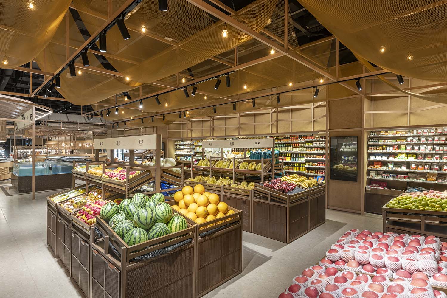
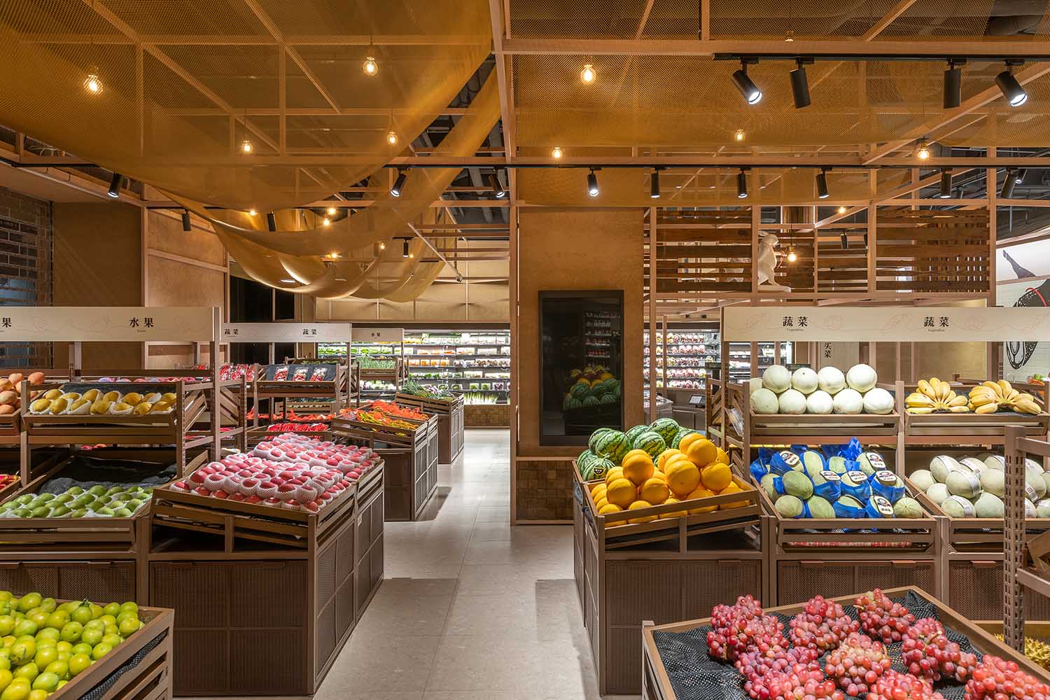
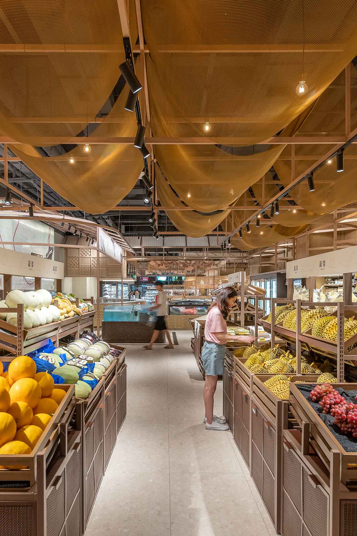
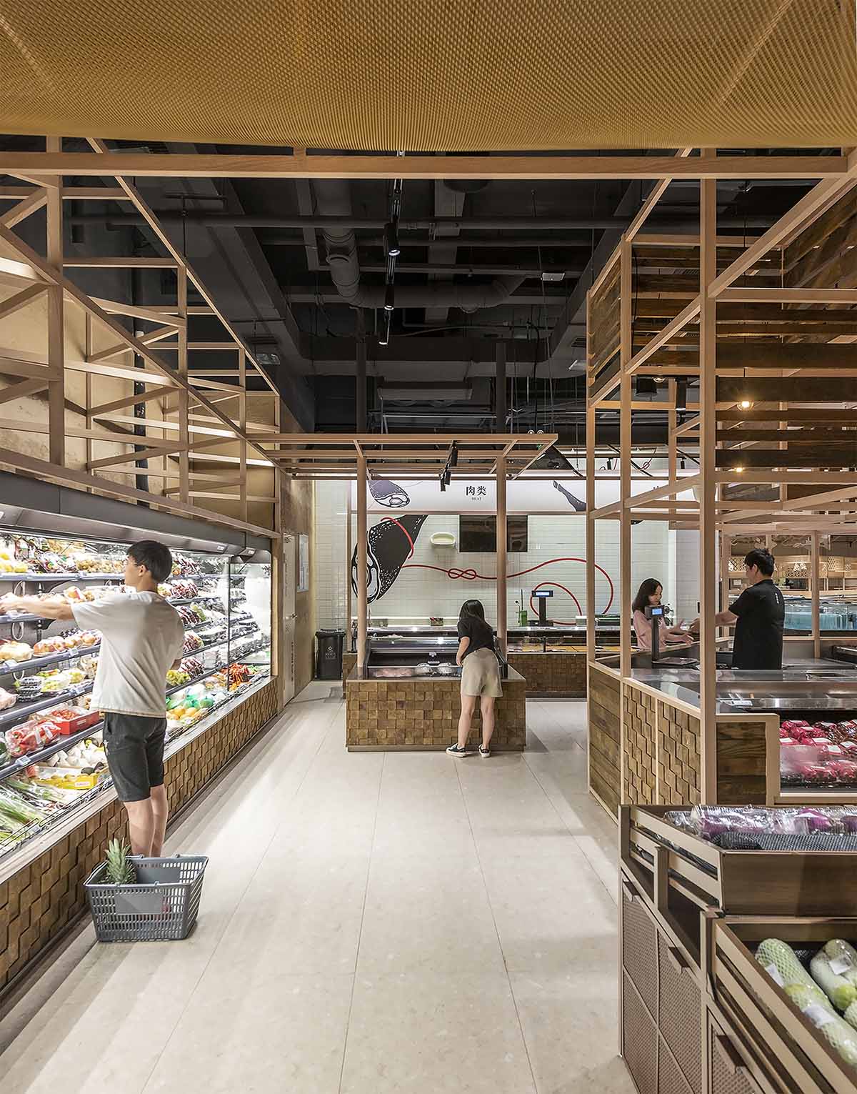
果蔬區以起伏的金屬網簷和木框貨架來營造氛圍,帶顧客重拾在露天市場挑果擇菜的趣味體驗。
At the fruit and vegetable section, the idea is to create the experience of walking down the aisles in a local Chinese outdoor market, a series of metal mesh canopies mimicking tarpaulin is the key feature.
∇ fish and meat area / 鮮肉水產區
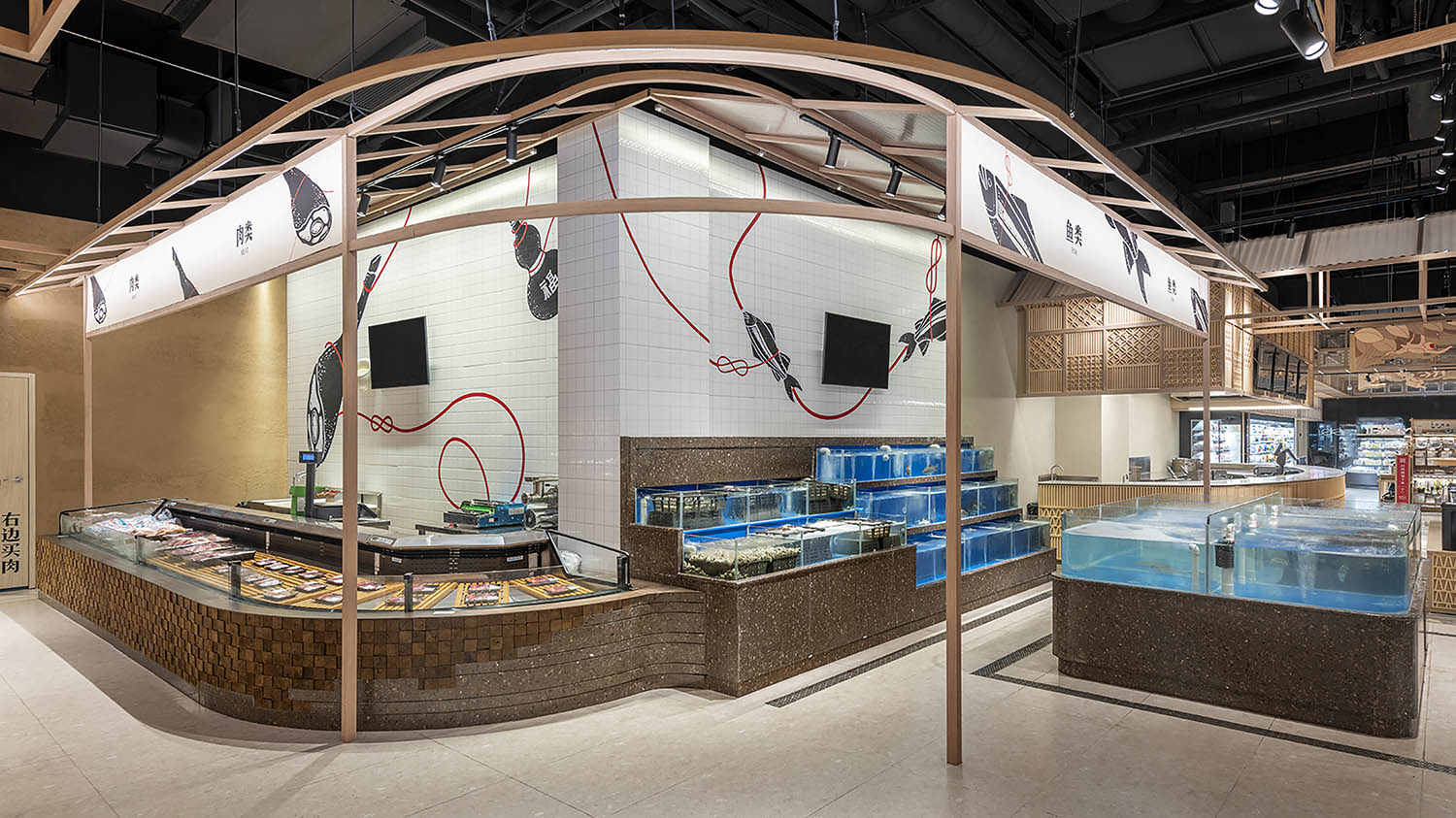
轉角處鮮肉水產區的設計則受傳統砧板的啟發,案台用深淺木塊拚接的像素圖案向自選魚缸基座的防水石材漸變過渡,加上背景牆一縷紅繩串起的“魚”“肉”圖像,兩片區域自然銜接,生動有趣。
At the corner where the butchery turns into the fishmonger, apart from a lively wall graphic linking the sections, a material gradation along the counter intends to smooth the transition. Inspired by the sturdy chopping board often used by butchers, wooden blocks of different depths line the meat section and gradually change into waterproof stone finish surrounding the self-serviced fish tanks.
∇ restaurant / 餐廳
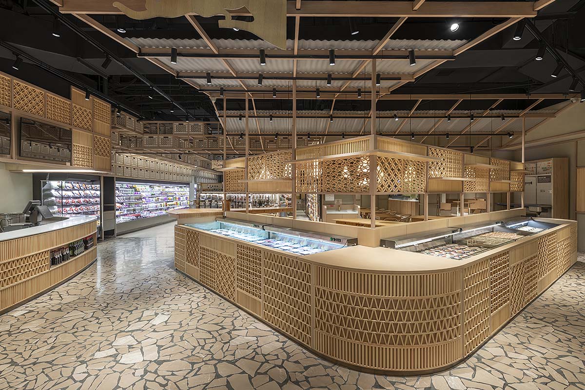
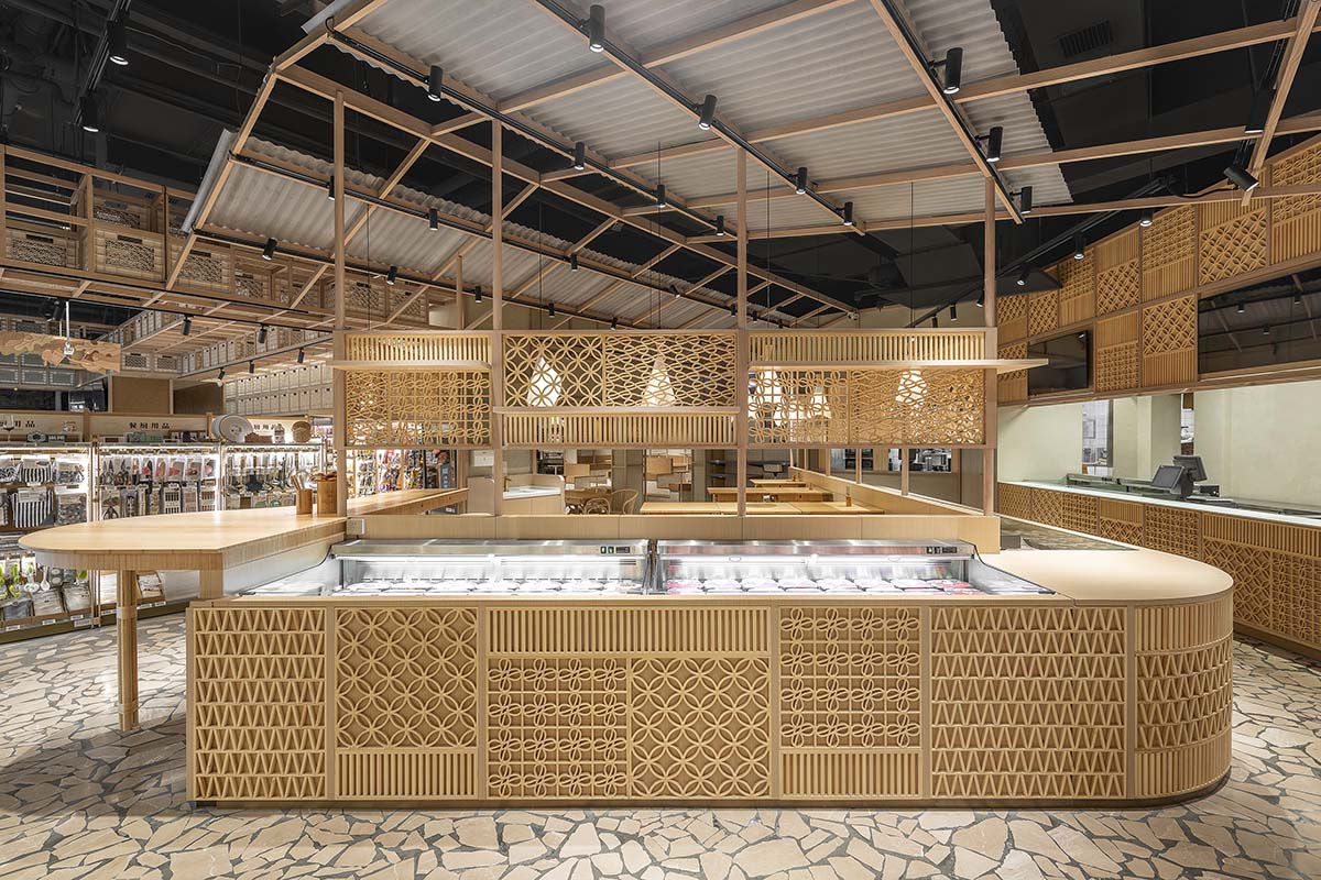
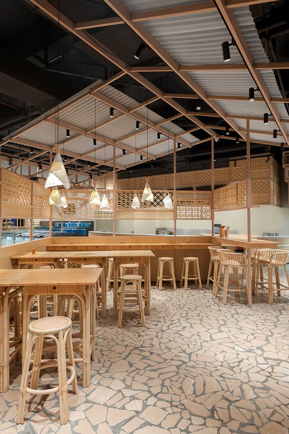
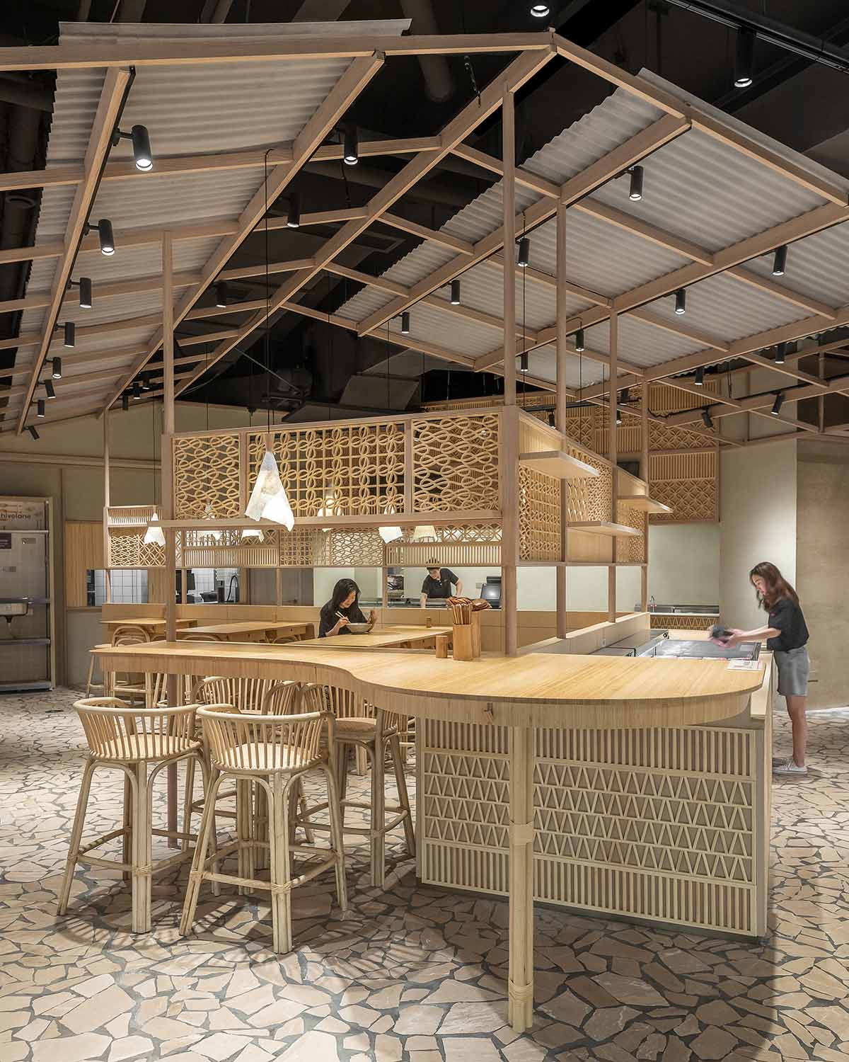
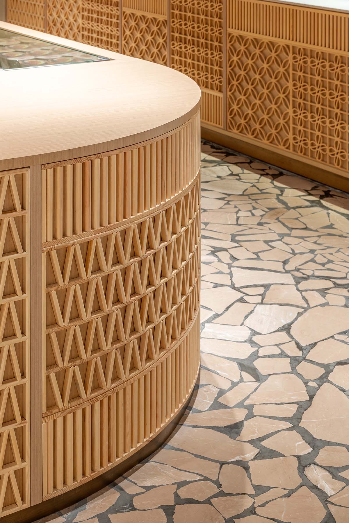
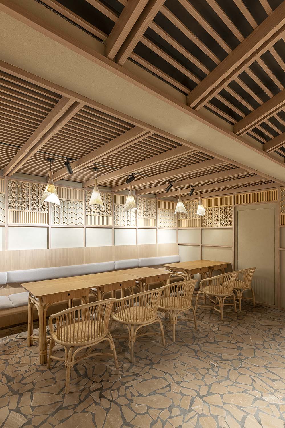
用餐區依照露天小吃攤的意象進行設計,木框結構與波紋板撐起一片高挑的斜頂。半透格子屏風被用以分隔餐廳與售賣區,屏上的花格元素還應用於周邊櫃台和設備的圍檔裝飾,空間的視覺連續性與統一性得以保障。手作藤椅、竹桌與石板路再現了一種中式語境,猶如在當地老店享用地道美食的熟悉體驗。
The restaurant is conceived as an open-air street food stall. Hovering over an array of refrigerated goods and seating, the wooden frame structure here transforms into an ad-hoc pitched roof with the addition of corrugated panels. Lattice screens are used as a visually permeable barrier between dining and shopping, but also a unifying texture wrapping around counters and equipment. Bamboo tables, rattan chairs and flagstone pavers together compose a Chinese vernacular, recalling the memory of having humble yet authentic dishes at an outdoor local joint.
∇ bakery area / 麵包區
∇ café area / 咖啡區
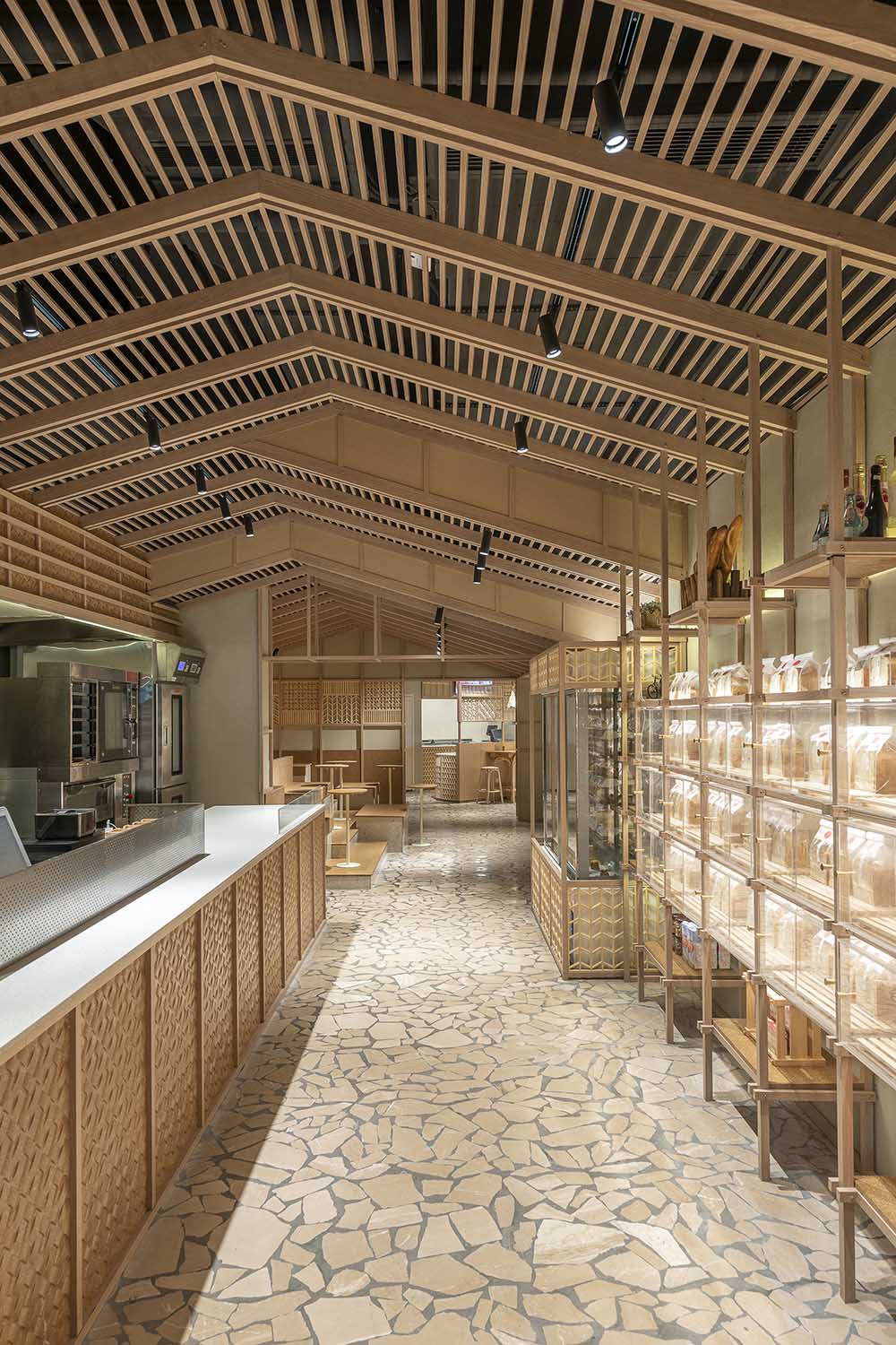
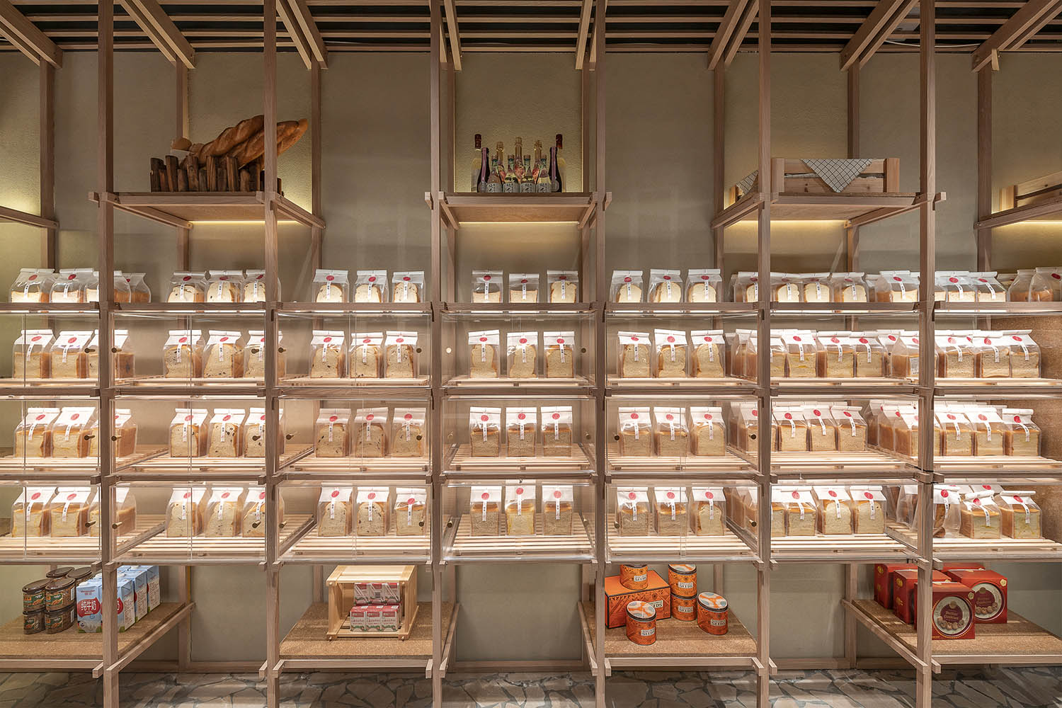
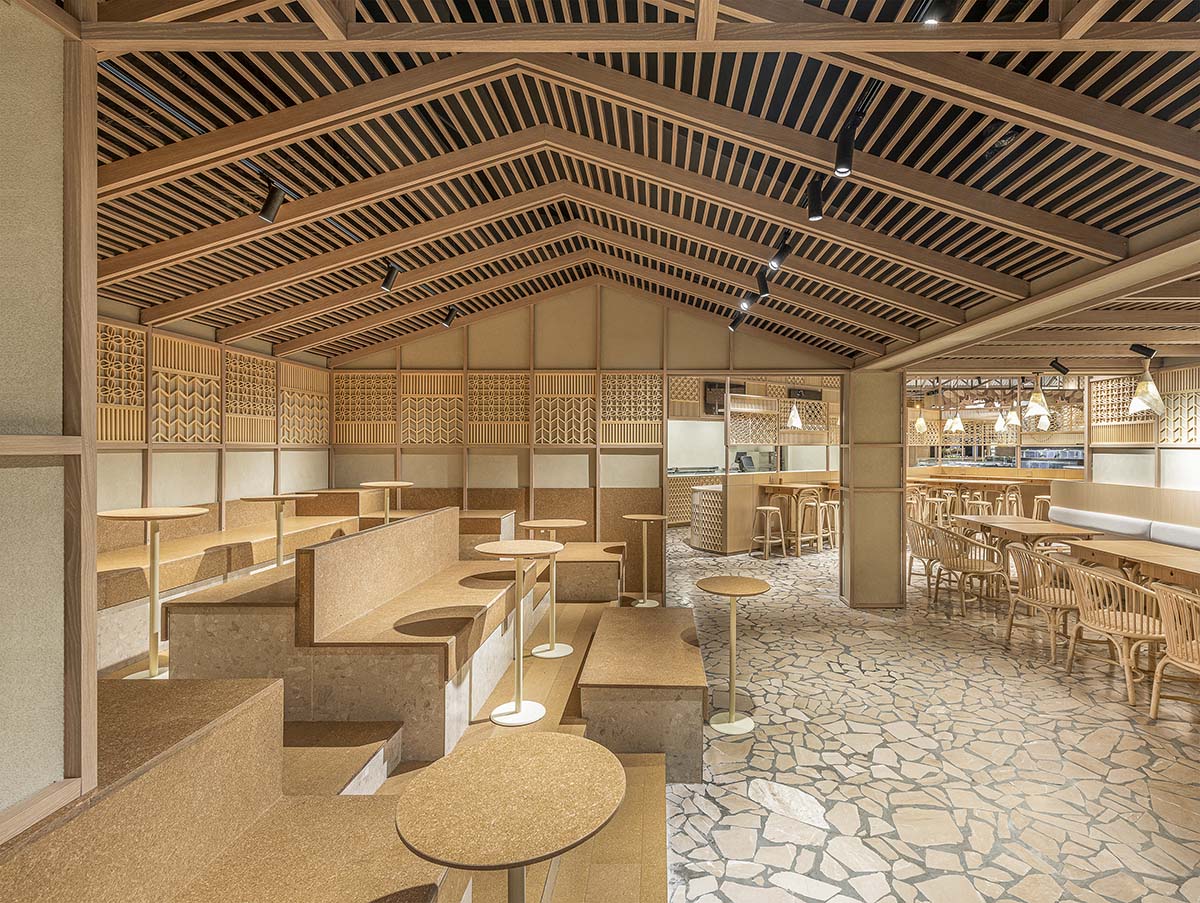
沿著石板路穿過“露天”食品攤,顧客將到達相對私密的麵包區與咖啡區。芝作室用檁條結構搭出山形屋頂,使咖啡區原場地落差較大的頂麵更具序列美感,卡座與階梯座位的搭配讓市民在此聚會或小憩都更加自由與舒適。立柱從屋麵檁條延伸而下,化身有序的麵包展架。與麵包區相連的結賬區,用帶有草編紋理的模壓板鋪飾櫃台外沿與菜單牆,借助溫暖色調與自然質感營造溫馨的氛圍。
Following the flagstone pavement, the “open-air” food stall leads to a more intimate bakery and café area. By replacing corrugated panels into purlin structure, the wooden frame gives form to a gable-roof cabin, optimizing the original low-ceiling space into a cozy hangout with terraced seating. At the bakery cabin, a grid extends from the gable-roof structure and becomes the framework of an orderly bread display. At the check-out area, molded strawboard with a weaving profile is used to line the counter front and the menu above. Its natural warm tone and rich texture help compose the overall welcoming ambience.
隨著電商行業的蓬勃發展,國人網購零食生鮮已逐步常態化。實體超市的便利性不再突出,體驗過程才是其探索轉型的方向。希望以此為理念進行設計的福來食集,可以成為一個供顧客學習食材常識與配餐技巧的平台,一個便於長輩向晚輩傳授生活經驗的社區,一個幫助人們進行日常社交的場所,將更具體驗感和煙火味的生活方式帶給市民們。
With the proliferation of e-commerce, ordering online grocery has become a norm in China. The purpose of a physical supermarket therefore is no longer about providing convenience but experience. It should be a platform where customers learn about new knowledge on food and preparation; it could grow a community where the elders pass on lifestyle tips to the youths; it is simply a place to be social and meet others. By creating vernacular ambience in a modern supermarket, Lukstudio wishes to reinforce the collective memory of a vivid Chinese marketplace.
項目信息
地點: 長沙市開福區北辰三角洲鳳凰海購物公園沿街一層
室內麵積: 670平方米
室內設計團隊: LUKSTUDIO
設計總監:陸穎芝
項目團隊: 丁怡人、杜雪、高永、李墨、王海鑫、餘煒鋒
設計內容:外立麵、室內設計、家具和燈光設計
主要材料:覆膜鋁合金 (PIVOT 標榜)、不鏽鋼金屬、金屬網、自開模聚丙烯混合30%稻殼塑料框、亞克力波紋板、秸稈板、實木雕花、老木頭、木飾麵、石板地鋪(D&A SPACE璞石)
設計期: 2019.12 -2020.04
施工期: 2020.03- 2020.06
施工團隊:湖南森度裝飾設計工程有限公司
貨架製作:佛山市興達貨架有限公司
活動家具:上海頤騰家具有限公司
燈具:中山市力音燈飾照明有限公司
品牌形象顧問:上海一融設計谘詢有限公司
攝影: Dirk Weiblen Photography
Location: LG, Hi Park, Kaifu District, Changsha
Net Area: 670㎡
Architecture and Interior Design: LUKSTUDIO
Director: Christina Luk
Design Team: Yiren Ding, Vivi Du, Coca Gao, Edoardo Nieri, Haixin Wang, Weifeng Yu
Scope: Facade, Interior, Furniture & Lighting Design
Key Materials:coated aluminum, stainless steel, metal mesh, molded PP plastic with 30% rice husk, acrylic corrugated panel, molded strawboard, wooden lattice, recycled wood block, wood veneer, flagstone pavement
Design Period: 2019.12 -2020.04
Construction Period: 2020.03- 2020.06
General Contractor: Sendu Construction and Decoration Co., Ltd.
Display Furniture:Foshan Xingda Shelf Co., Ltd.
Loose Furniture: Woteng Furniture
Lighting:LiyinLED
VI:Shanghai RONG Design and Consulting Company
Photography: Dirk Weiblen Photography


