全球設計風向感謝來自 AD ARCHITECTURE∣艾克建築設 的展廳空間項目案例分享:
本案是一個以意大利TULLIO塗料產品展示的展廳。位於當地一個最集中的材料商場次入口附近,周圍店麵設計以廣告位,金屬不鏽鋼,大理石,玻璃等為構成要素,充斥著濃烈與過去式的商業氣息。
ANBONG HOME is a showroom for Italian paint brand TULLIO, situated within a building materials mall in Shantou, China. It’s next to the secondary entrance of the mall. The design of its surrounding stores features many common elements such as signboard, stainless steel, marble and glass, and shows an old-fashioned style and strong commercial atmosphere.
項目還沒開始就遇到了一個讓業主很糾結的問題:兩個不同品牌,不同的業主要將這個場地一分為二,合租一個店麵,各自經營,而我們的甲方也是隻能選處於內部視線比較差的位置,這嚴格來講不是一個店麵,而是半個店麵,而且是剩餘下來的部分。這個無疑是給設計丟來了一個大大的難題,也是業主一直猶豫要不要去租下店麵的原因。如何引流與打破原空間的缺點是我們設計需要解決的問題與挑戰。
Before the launch of the project, the client was hesitating about renting the site, which is a shop space shared by two tenants. The half space available for the client is at the more inner area, which offers poor visibility. This posed a great challenge to the design – that’s why the client wavered over whether to rent the space or not. For the design team, the challenge was to figure out how to break the restrictions of the original space and attract customers.
與周邊環境的關係
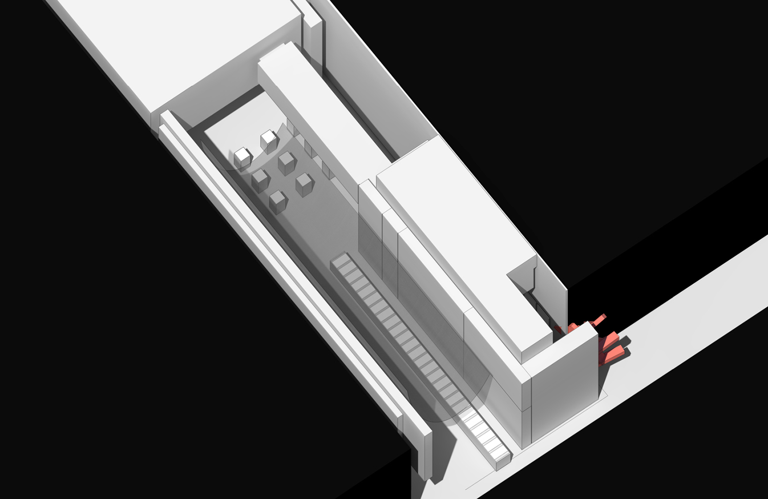
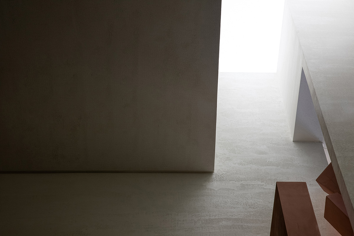
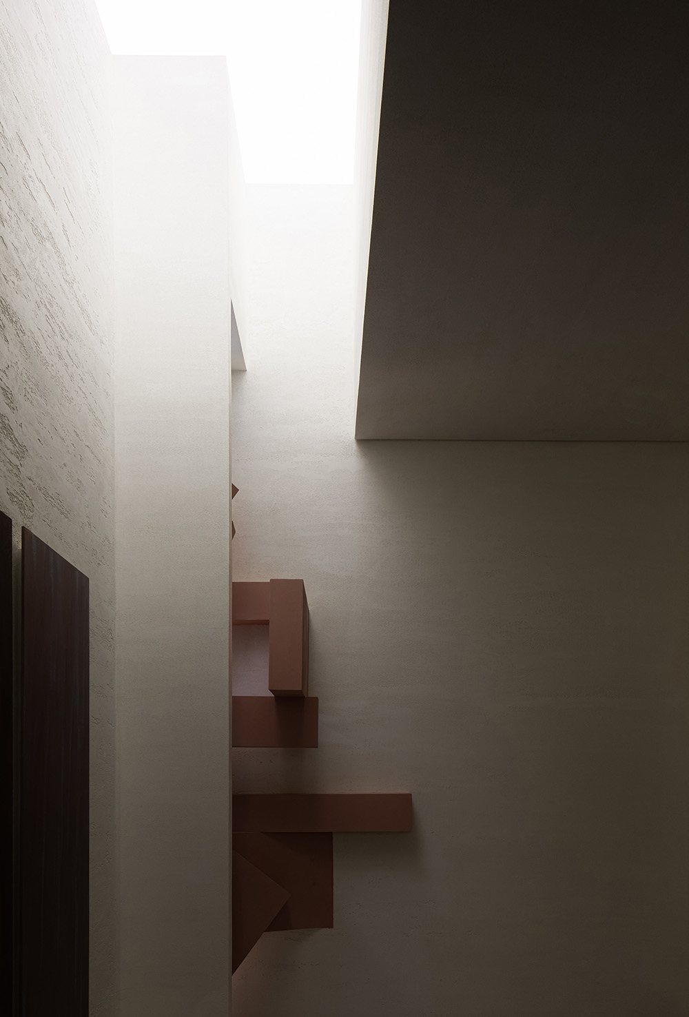
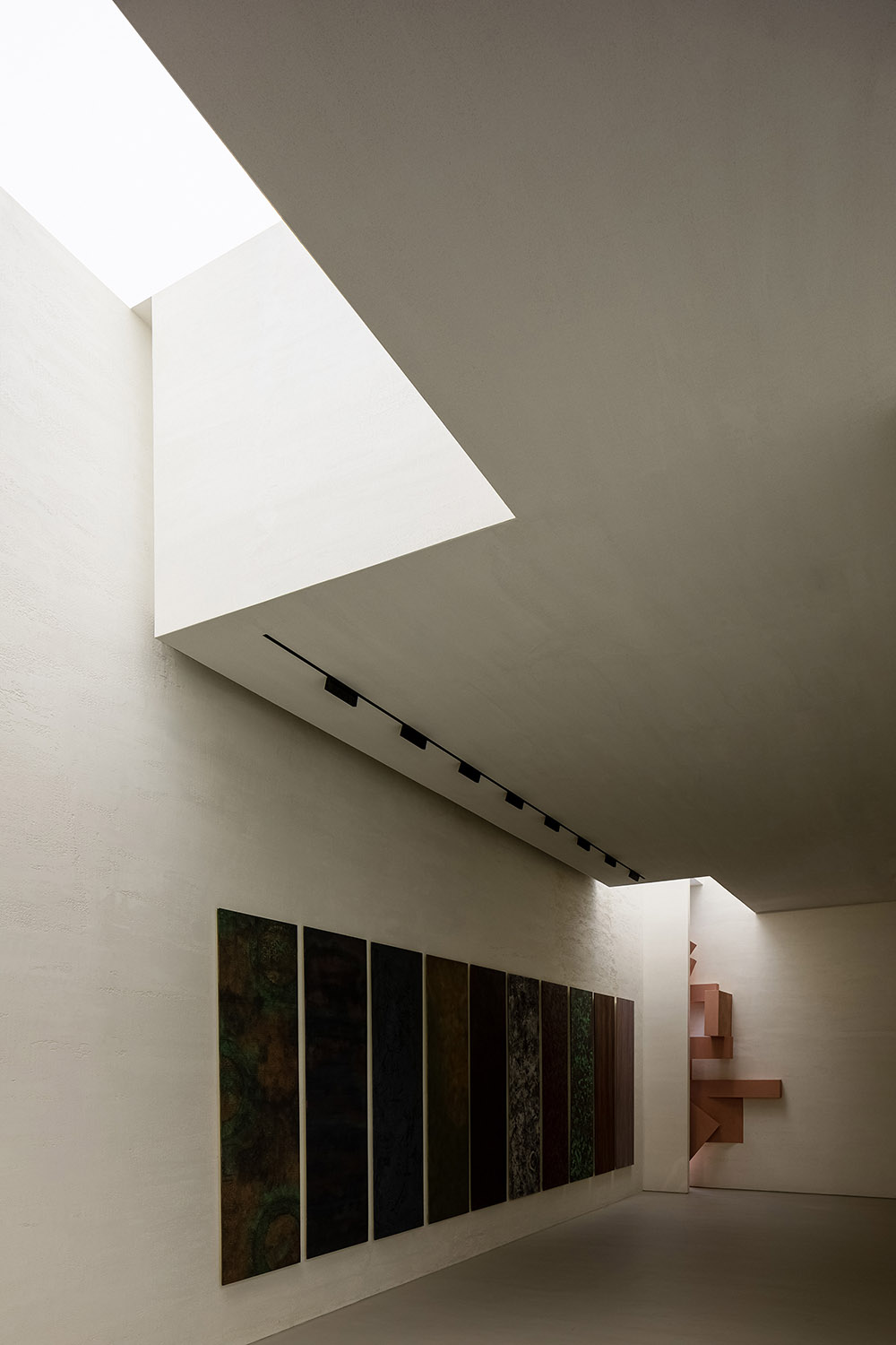
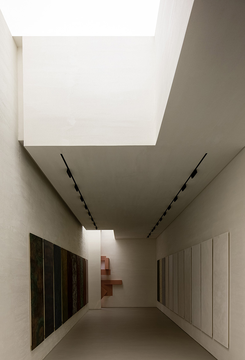
由於位置條件的缺失,我們的業主與共同承租店麵的另外一個品牌的業主進行商討,通過讓其退讓的方式讓我們的店麵給進入商場的人可以第一時間看到,給我們留出了立體的區域,在設計上我們采用了粉色的形體讓人產生強烈的視覺磁場,以彌補位置的缺失。
To tackle with the unfavorable position, the client communicated with the other tenant, who finally gave in and leaved an area, which opens up the view to the inner showroom. AD ARCHITECTURE adopted pink structures in this area, to produce strong visual effects and attract sight lines of customers.
人總是能在跳出習慣的時刻獲得驚喜,而這種驚喜的差異化是我們一手策劃的···
As conceiving ANBONG HOME, the designers tried to break with conventions and create the unexpected.
人從大門進從次入口出,經過了這些前麵的店後,我們需要給人透氣的空間,讓人經過前方舊商業氣息的轟炸後有一個新的發現,這種感覺就像一個人穿梭在都市中,眼前突然出現一片沒有盡頭的草原,會產生興奮的狀態。
Customers enter the mall through the main entrance and walk out via the secondary entrance, which is close to the project site. After they passed through plenty of old-fashioned stores, they will encounter with ANBONG HOME, which is a big surprise. It feels like that someone suddenly meets an endless and exciting prairie after a long journey in the city.
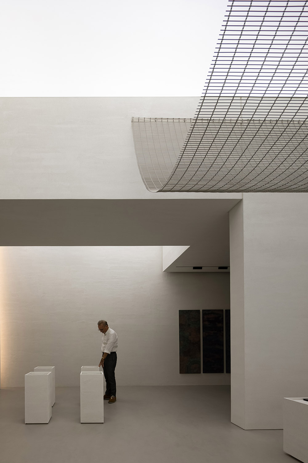
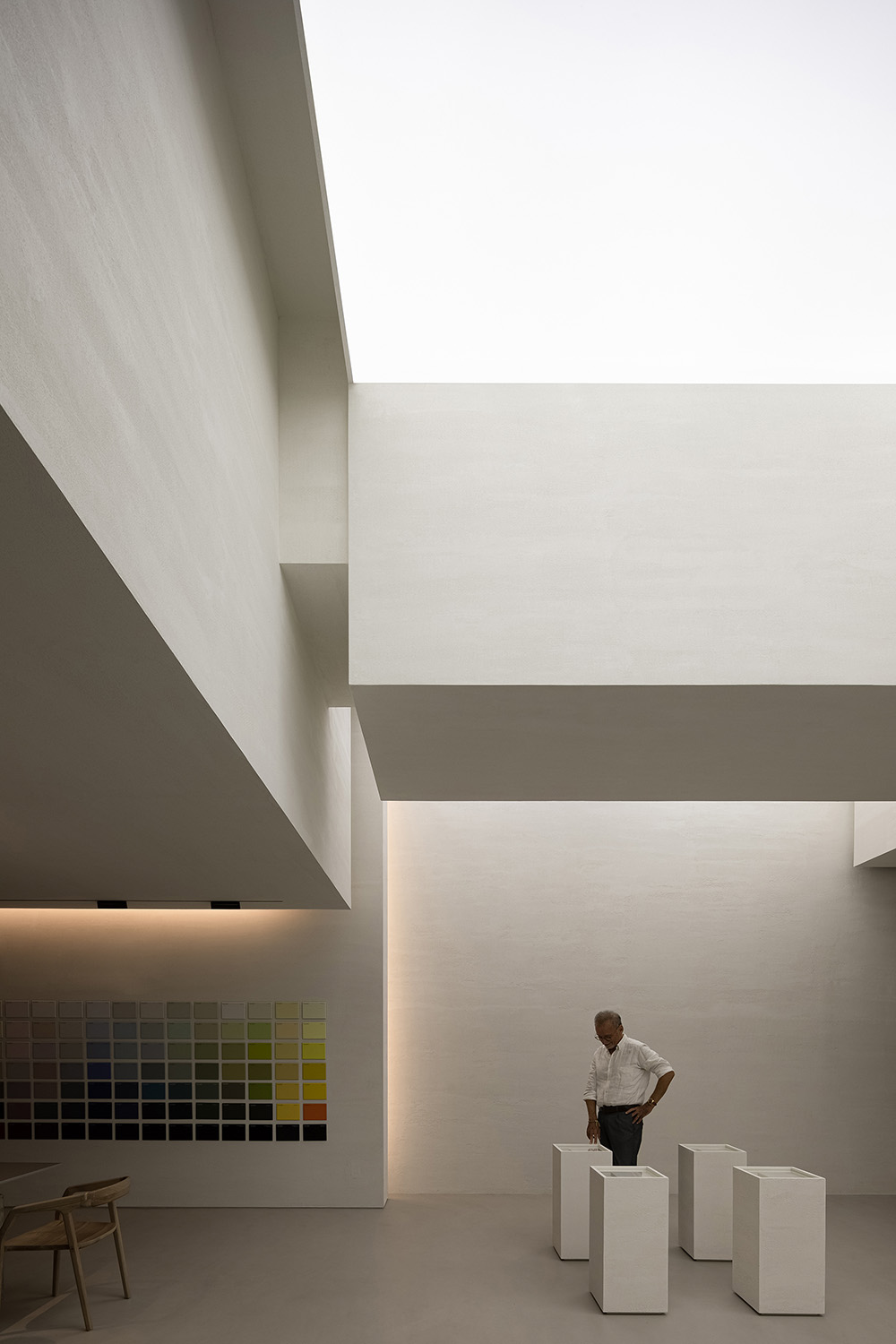
這是在審美上給人一種異軌,如美術館般的展廳,更好的烘托產品的藝術性與品質的同時強調材料本身與空間的高度融合。
The showroom offers a unique aesthetic, looking like an art gallery. The spatial design highlights the artistry and quality of the space, while also accentuating the close fusion of materials and space.
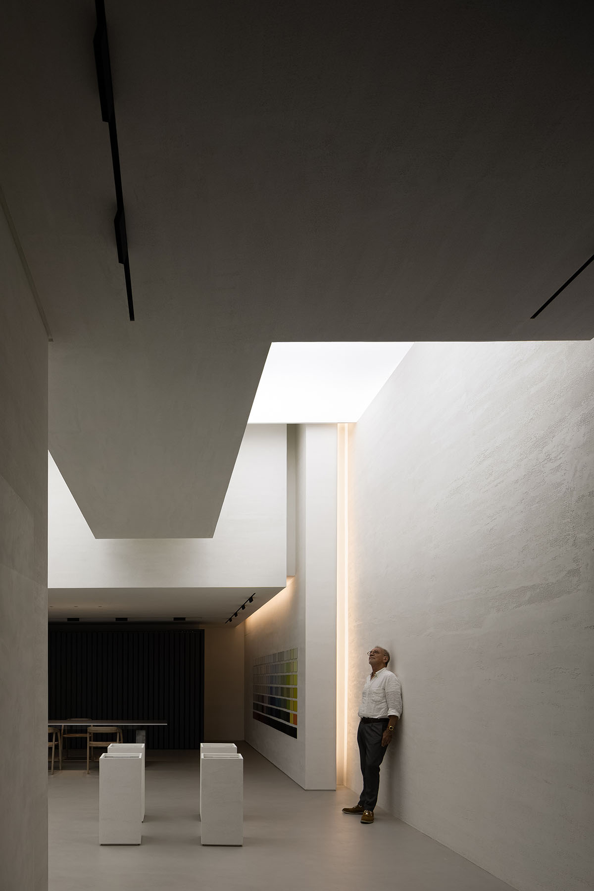
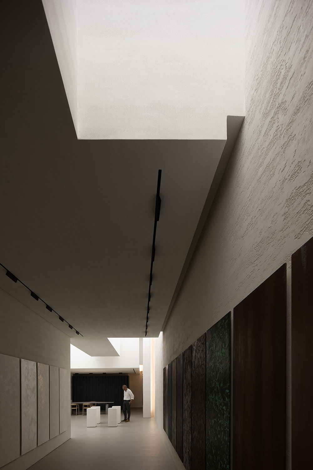
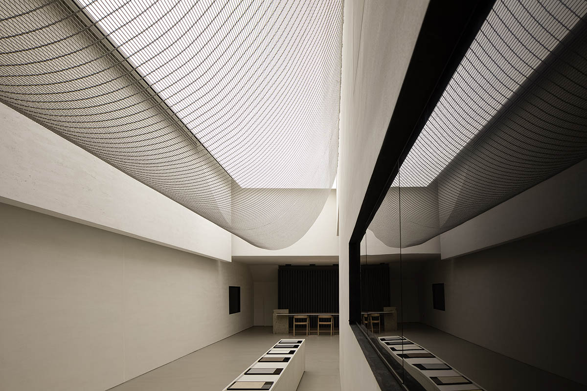
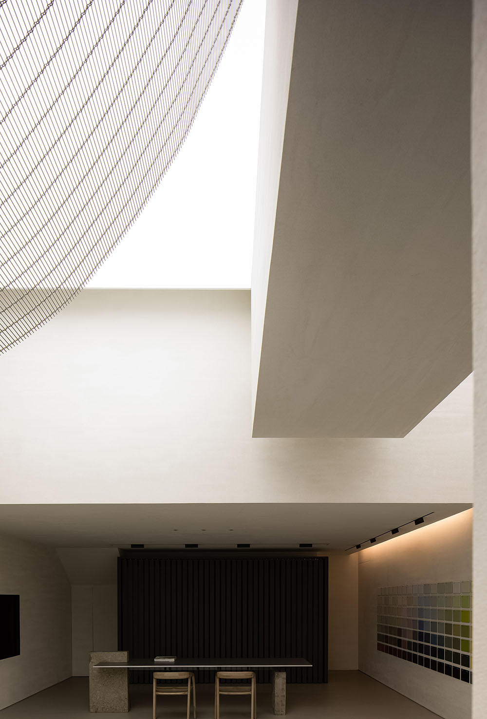
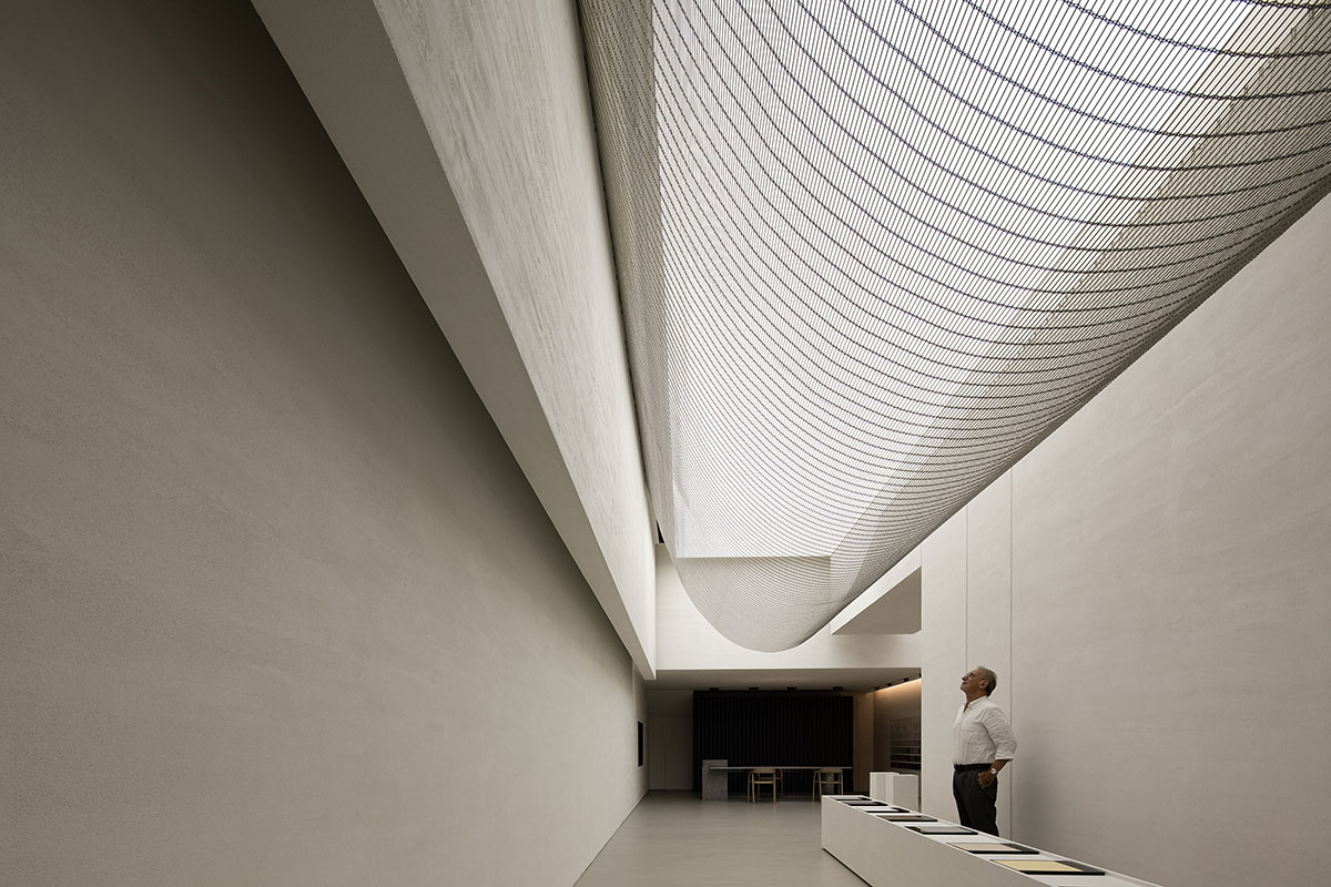
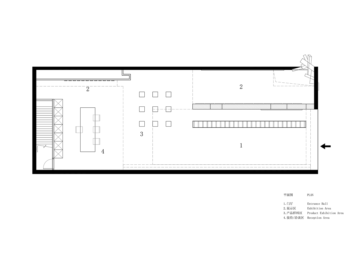
本次改造空間的主要挑戰是:基於場地的條件如何進行破冰,讓原來深邃場地的壓抑感地變得透氣舒展。基於原場地細長的特點,我們將前半部分切分成二,目的是為了製造以小見大的空間效果,先抑後揚。創造了內向型的空間和開放的擴展。
The main challenge of spatial transformation was how to break the limitations of the site, eliminate the oppressive feeling and create a breathing space. Based on the linear plane of the space, the design team divided the front part into two sections, in order to create an introverted space that gradually opens up the view and expands towards the inside.
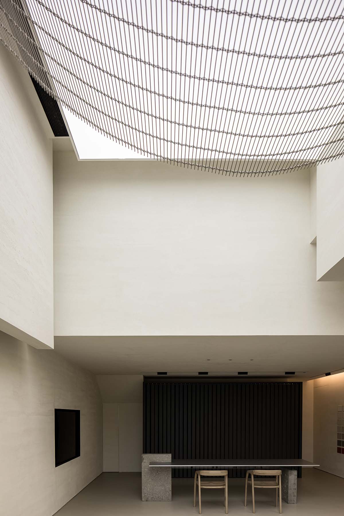
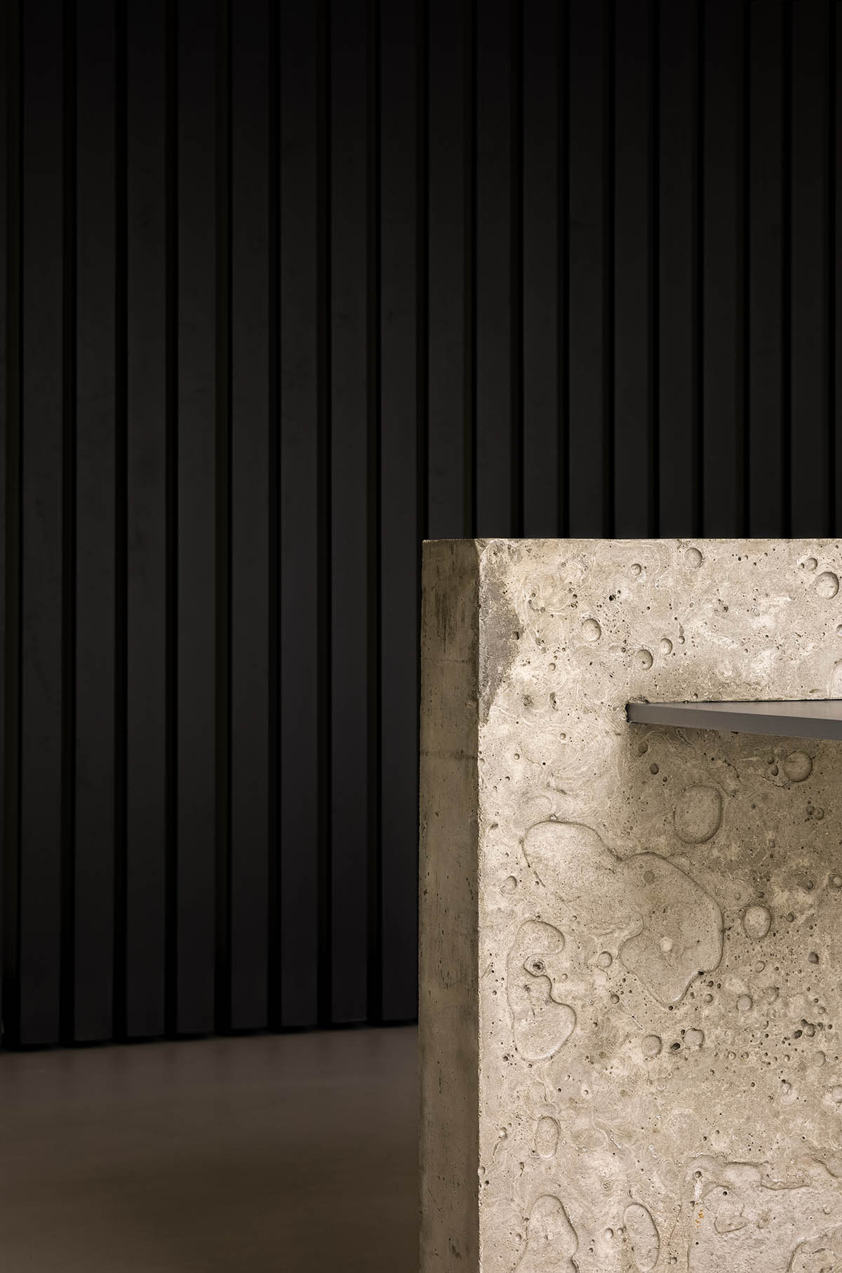
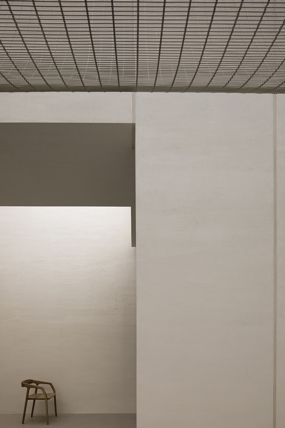
去接待台的設計也是我們在商業領域的一次大膽的嚐試,而這樣的嚐試也是因為當代商業的收銀方式在產生變化。空間中無裝飾性軟裝的處理手法更是一個大膽的嚐試,我們試圖讓人更多的去感受空間/材料與燈光帶來的情緒,接待區唯一的家具采用混凝土與模擬鋁材的漆進行碰撞,更好的讓人感受材料本身的靈活性。
The reception and cashier desk is a bold attempt, which responds to the changing ways of payment in commercial field. The space was made simplistic and free of adornment, in order to encourage visitors to feel materiality, lighting and the space itself. The only furniture at the reception area showcases the contrast between concrete and aluminum-like paint finish, and highlights flexible, diverse material textures.
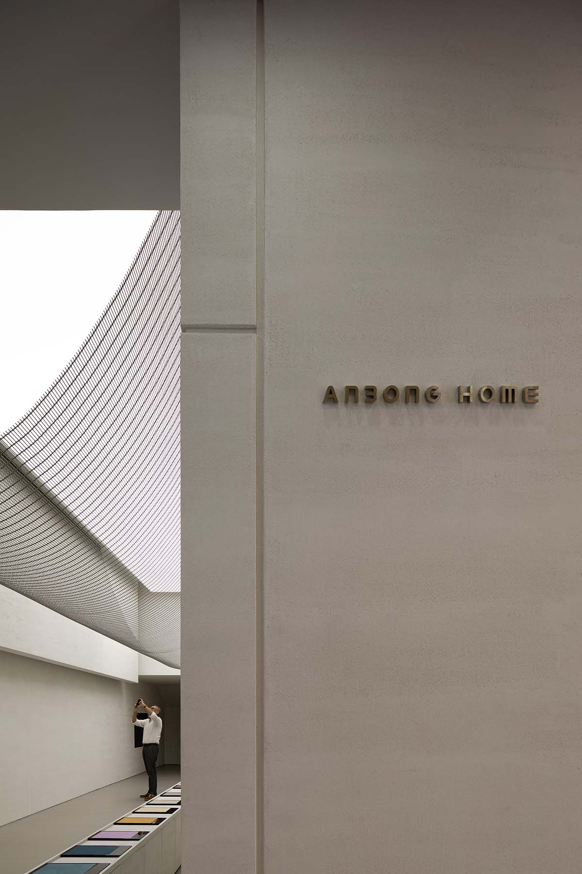
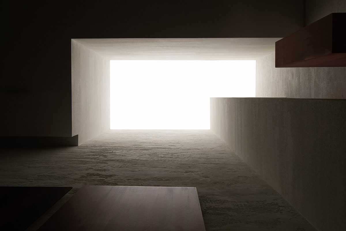
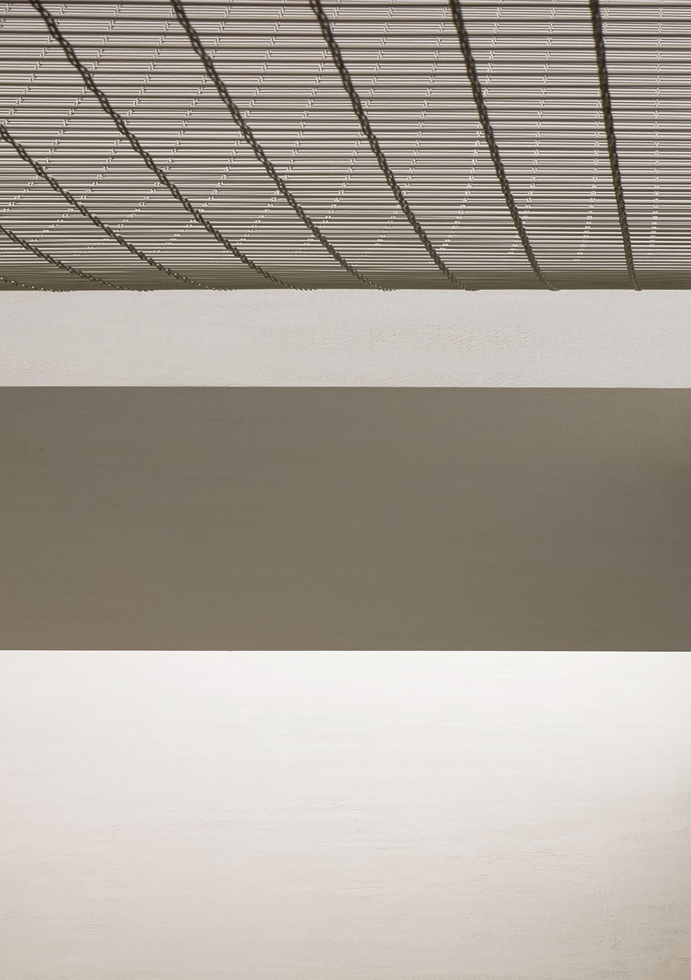
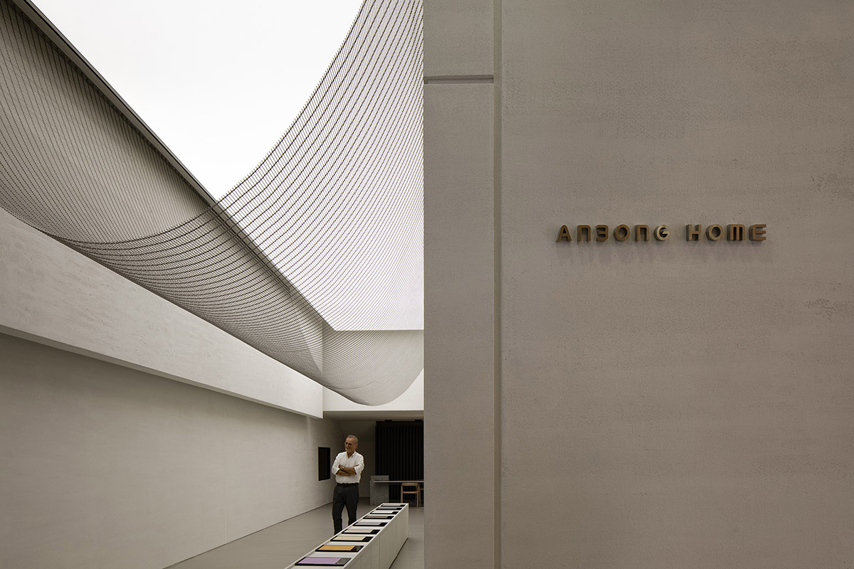
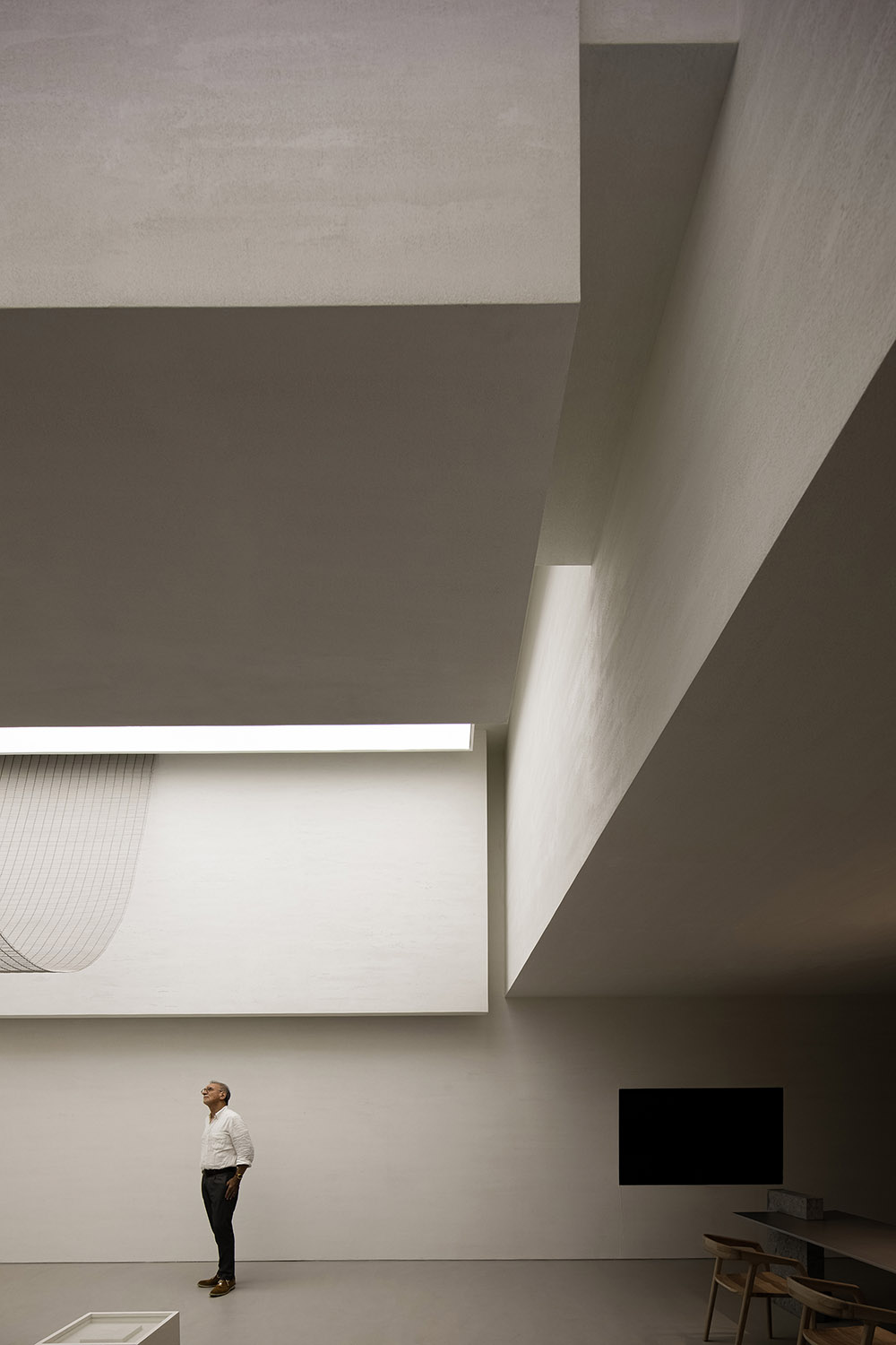
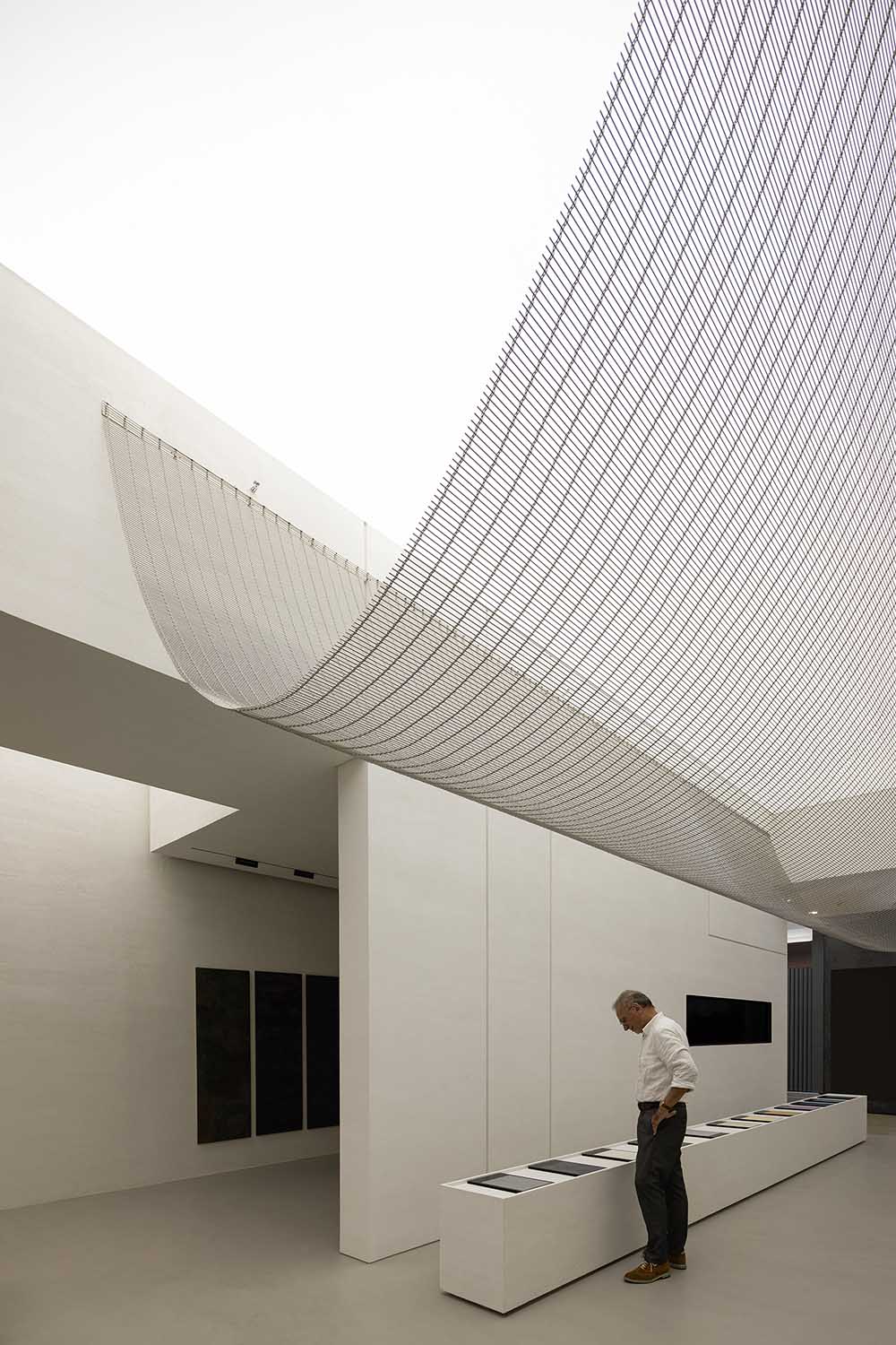
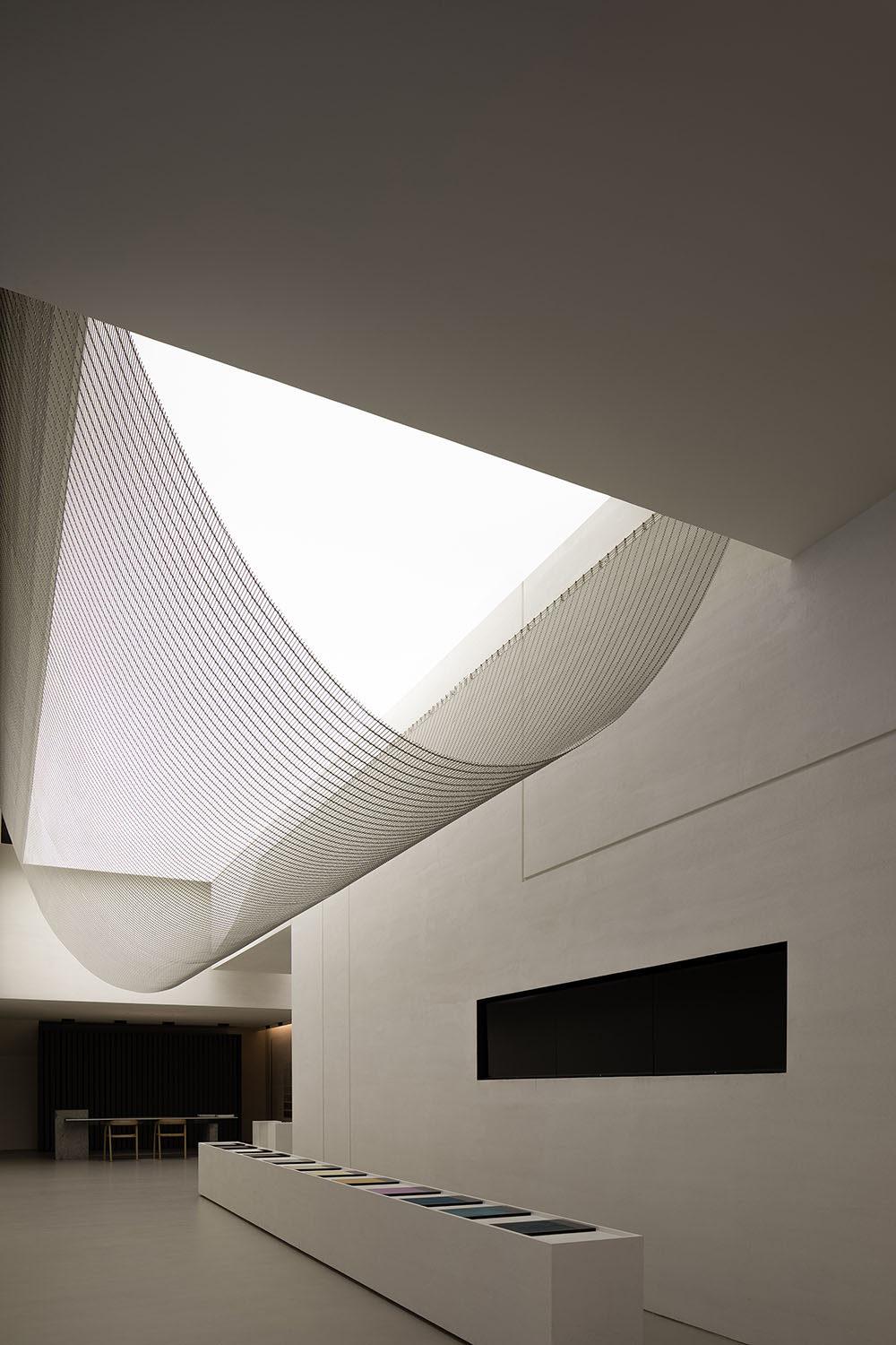
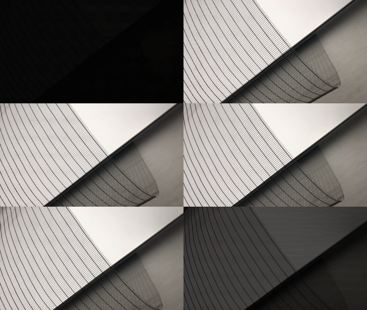
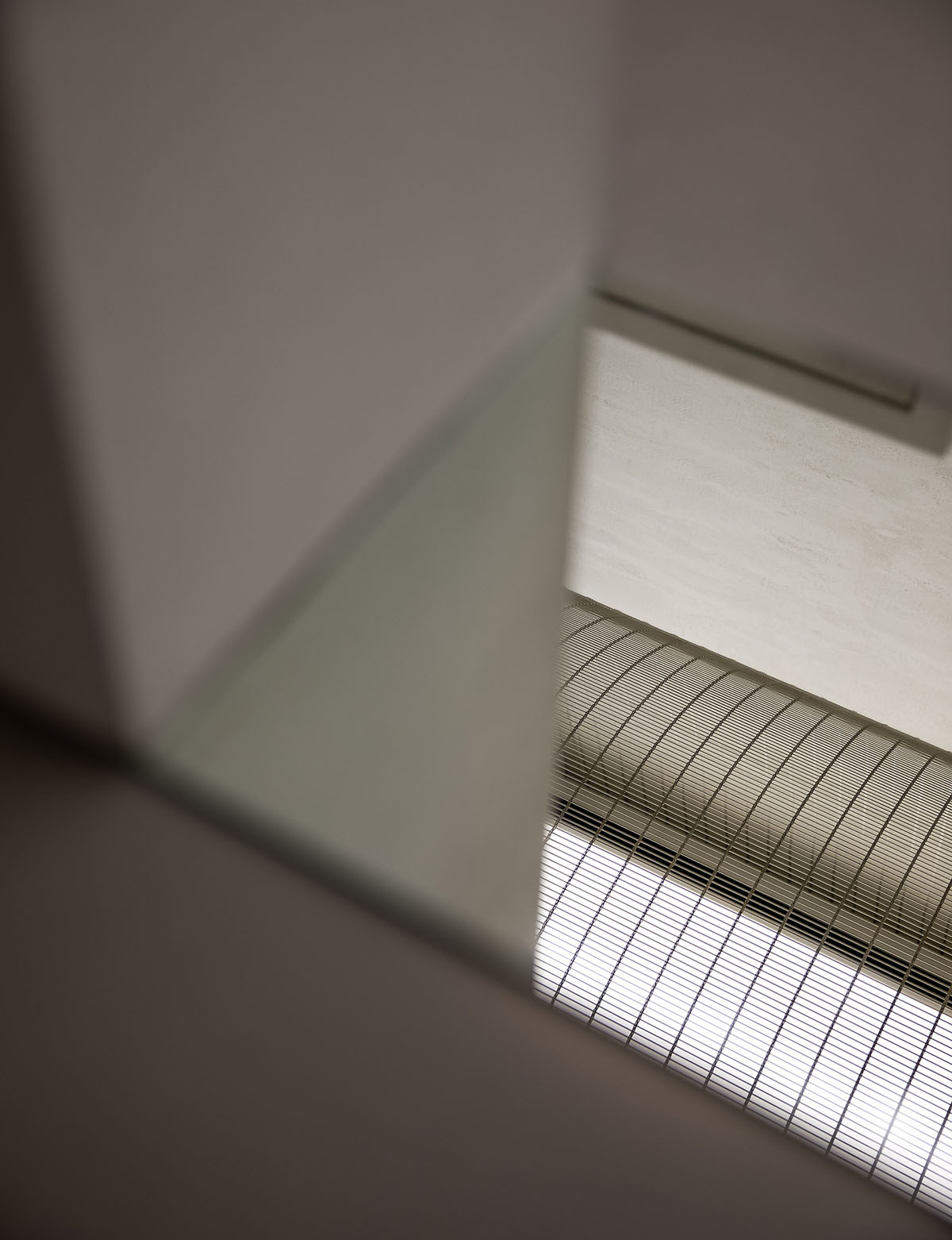
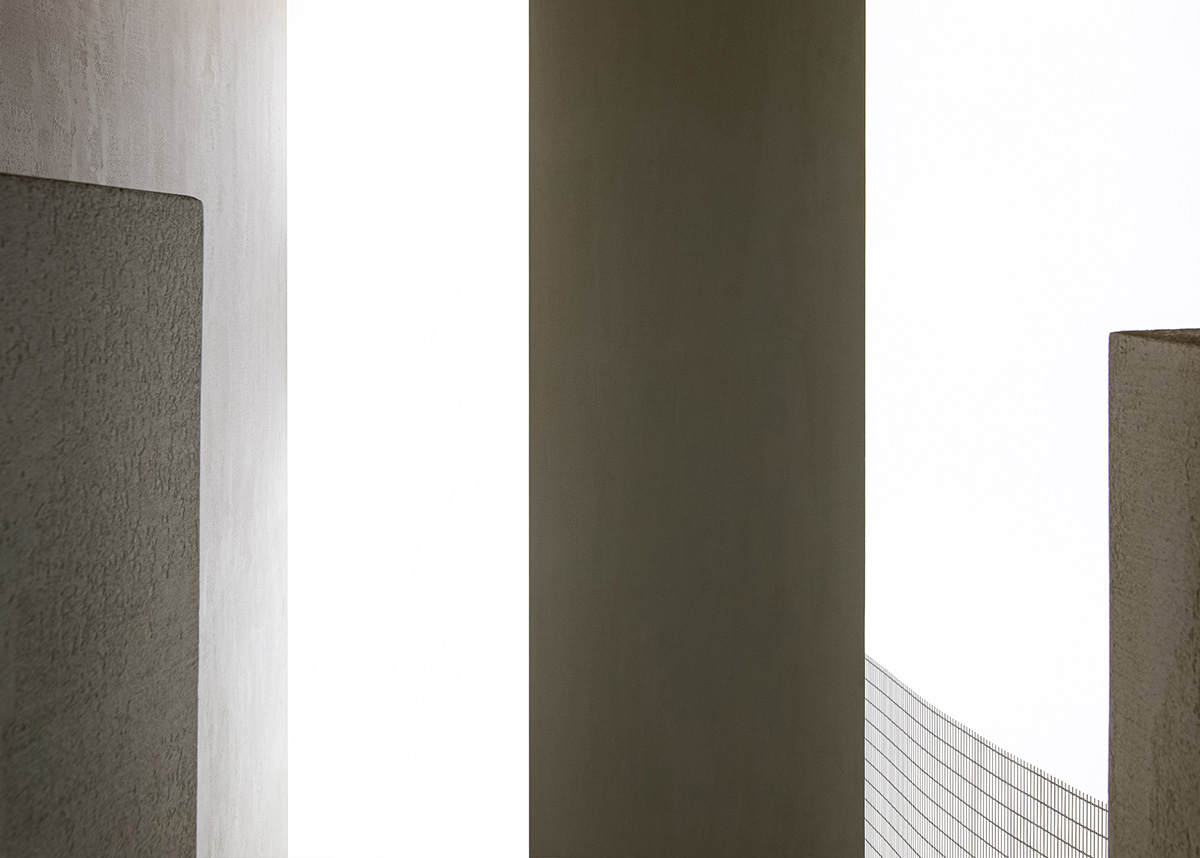
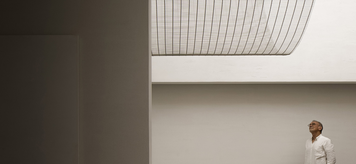
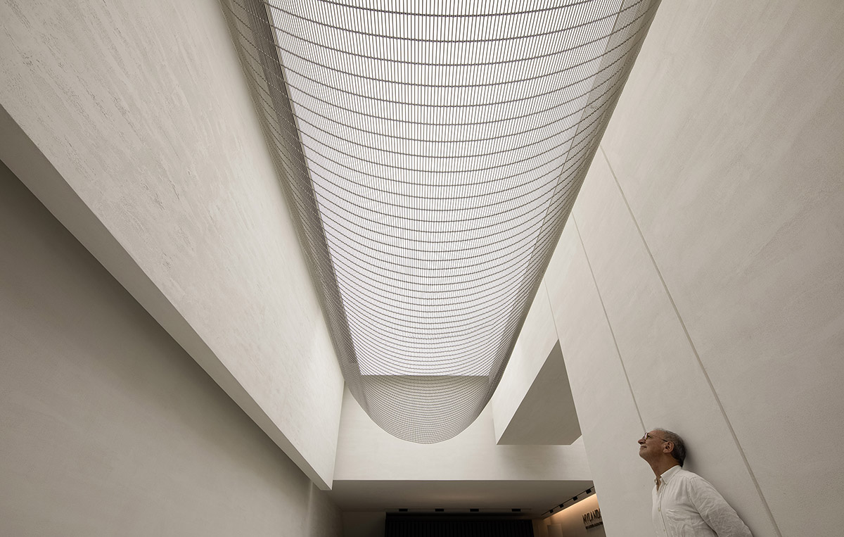
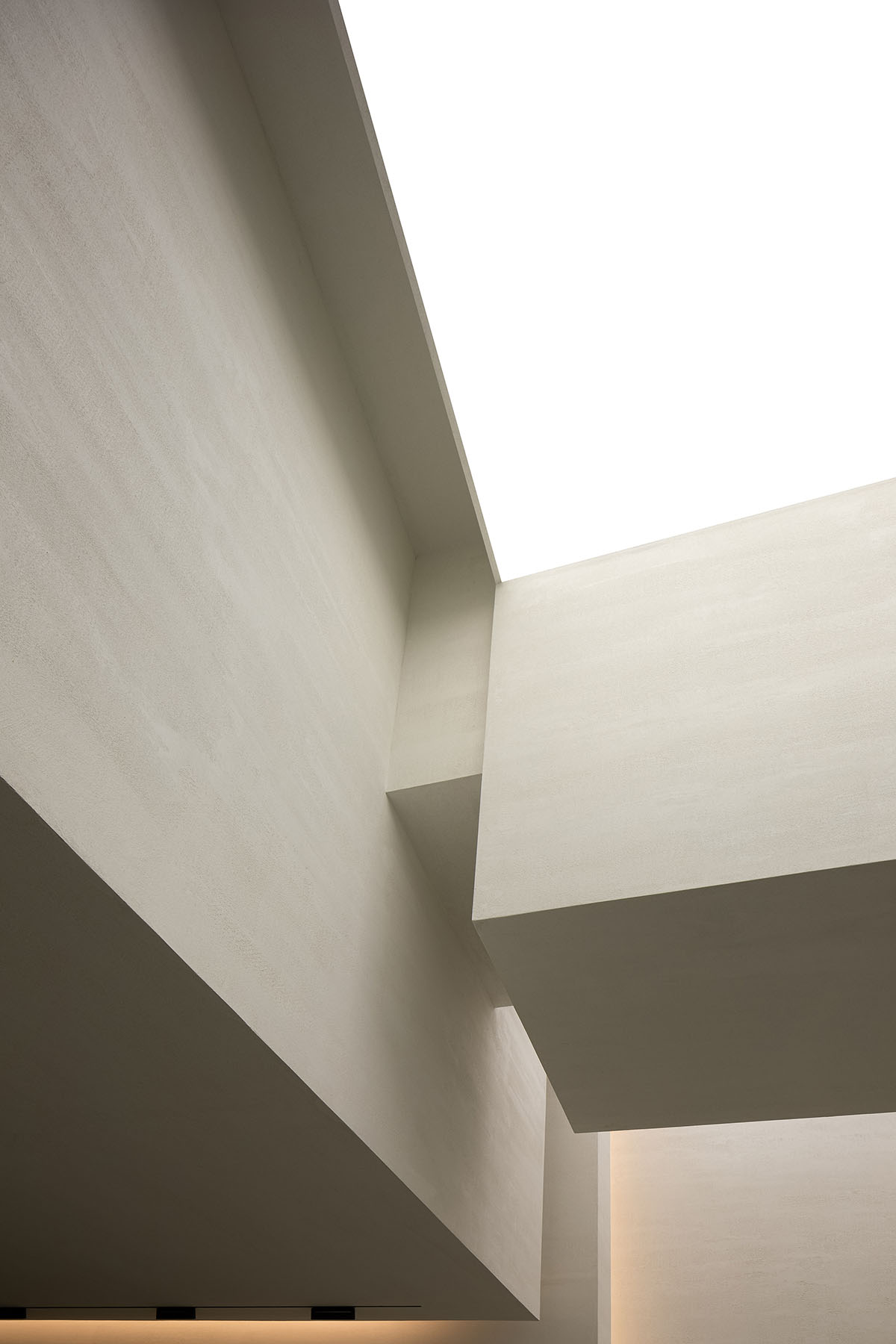
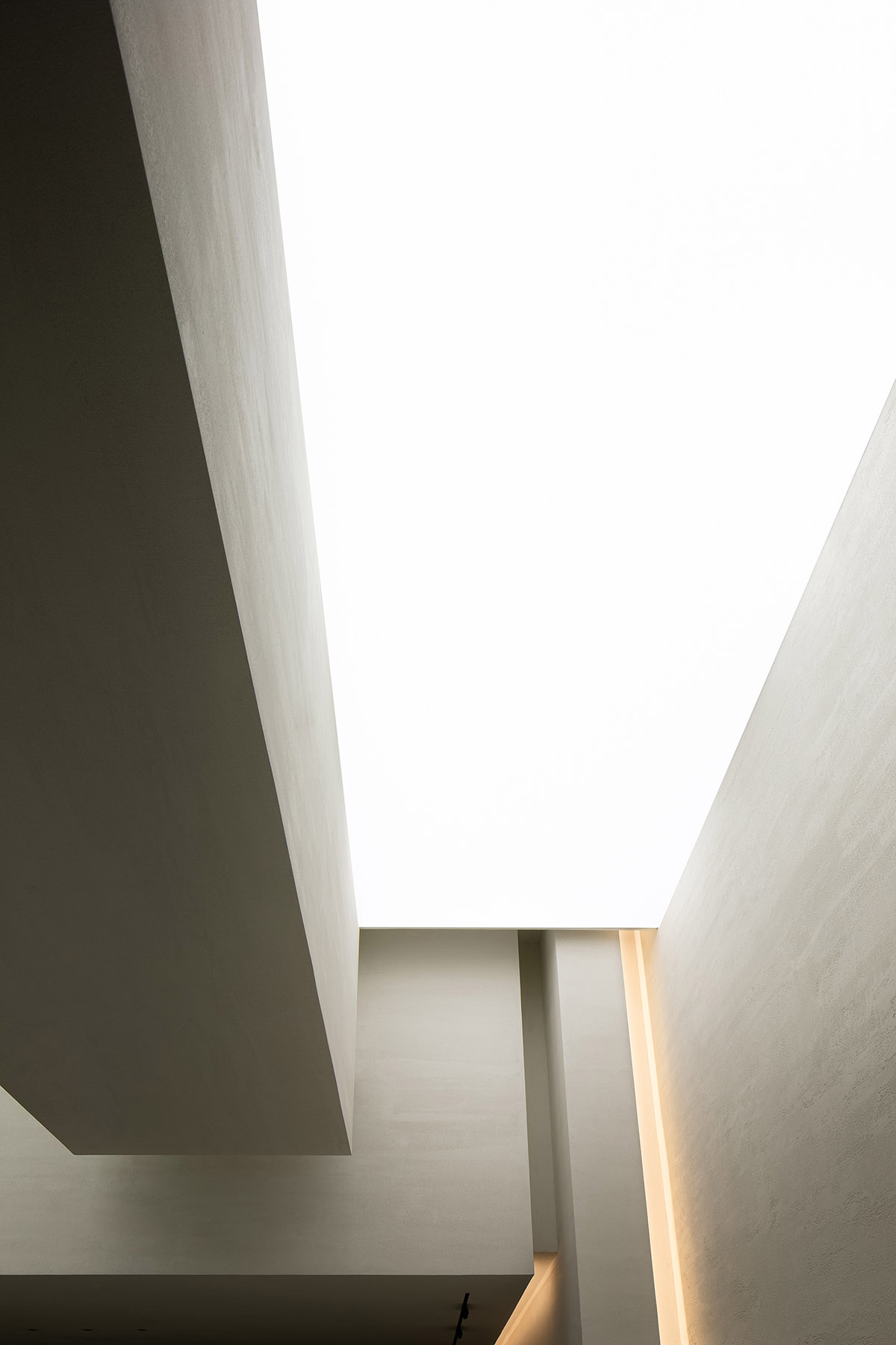
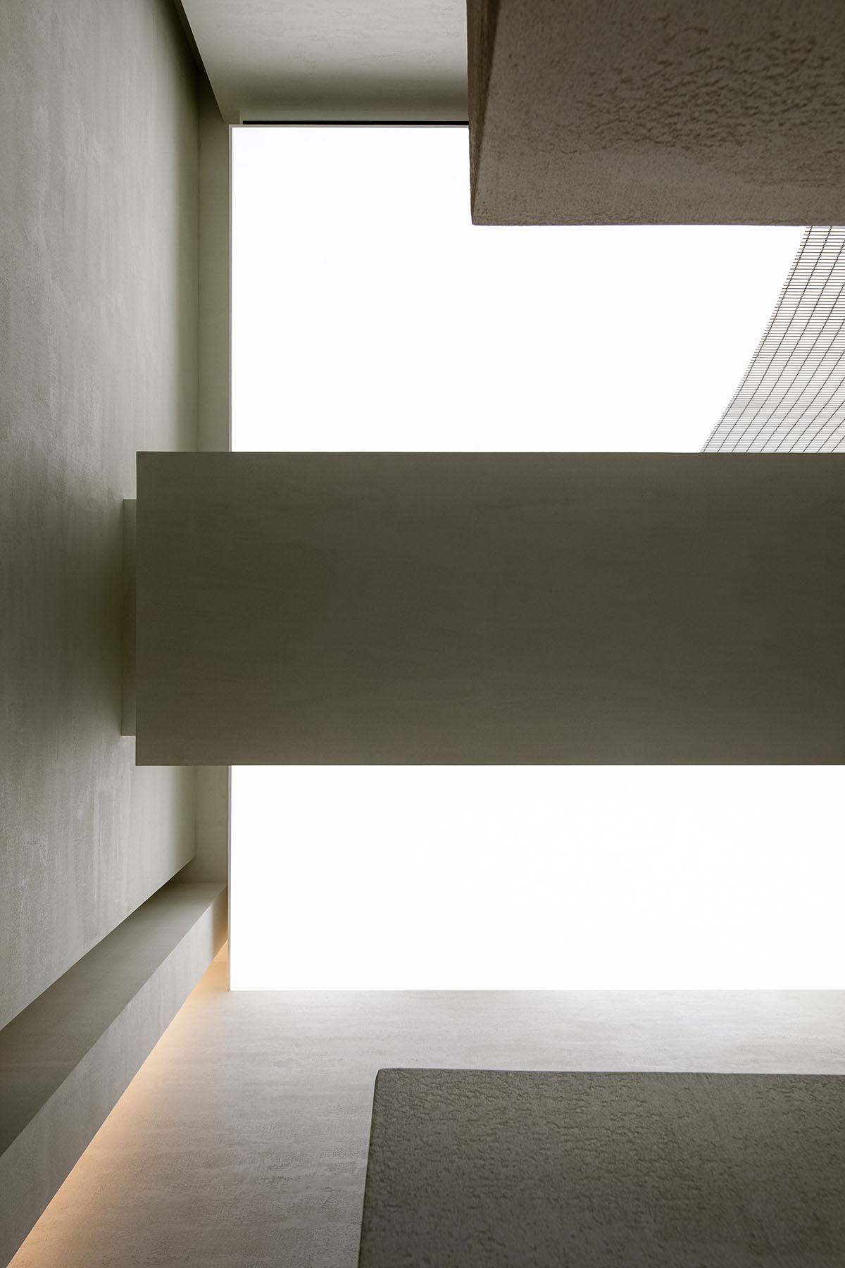
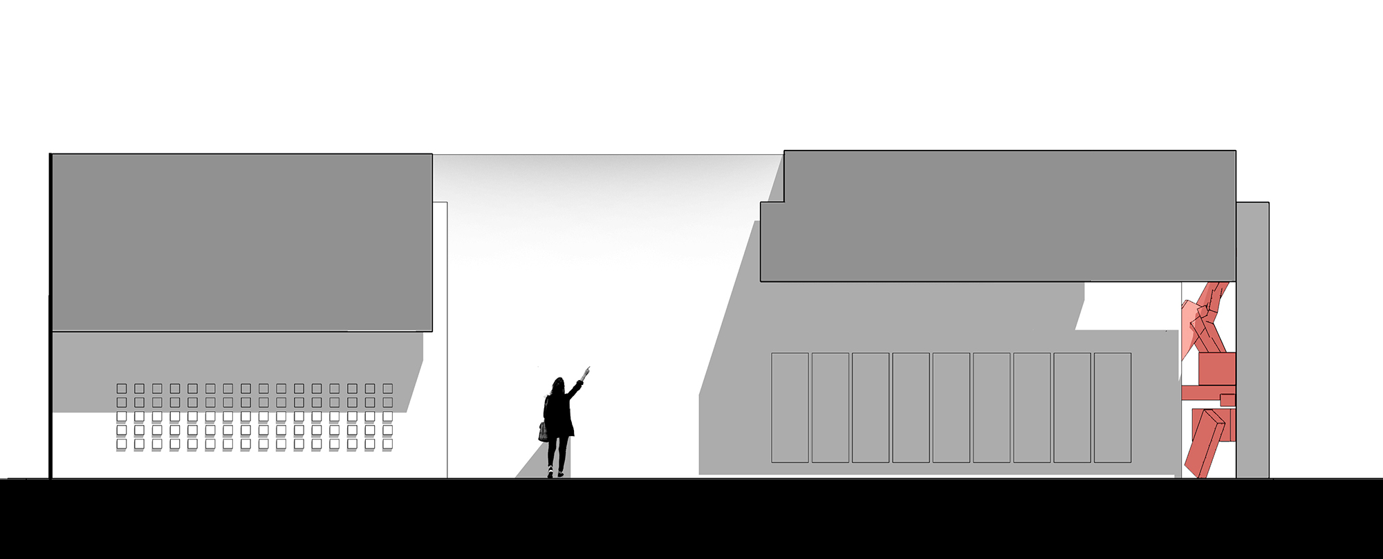
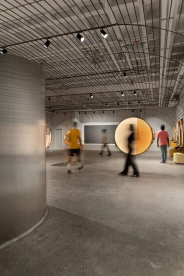
天花中的形體結構結合管線,以嚴謹的姿態,獲得了該商場最高舉架的店麵,扭轉了原本極度惡劣的空間感,這是一種極為巧妙的思考。空間以一種高挑向上的狀態展示在我們麵前,而入口垂釣的弧形金屬網,在天花的拉膜與立麵的形體之間形成了一片介質,豐富了光與空間的關係。讓人產生強烈的好奇與探索的欲望。
The transformation of the ceiling was based on full consideration of structures and pipelines. In this way, the design team produced a high ceiling, which makes the space appears lofty. The curved metal net hanging in the air and the stretch ceiling above together enrich the relationship between light and space, and evoke visitors’ curiosity and desire to explore it.
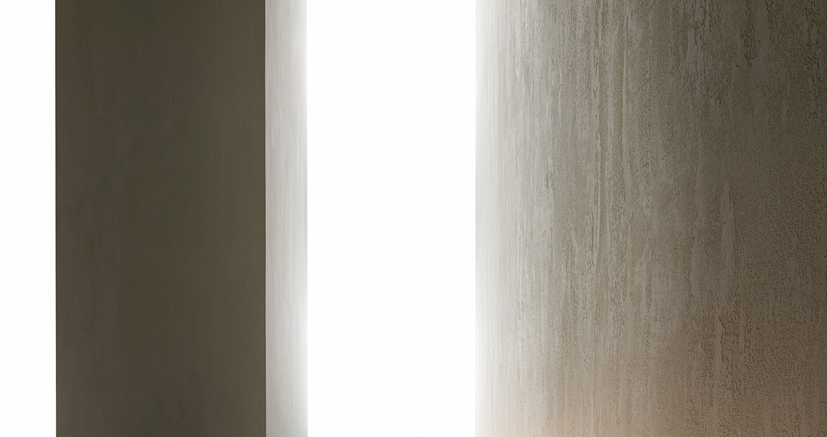
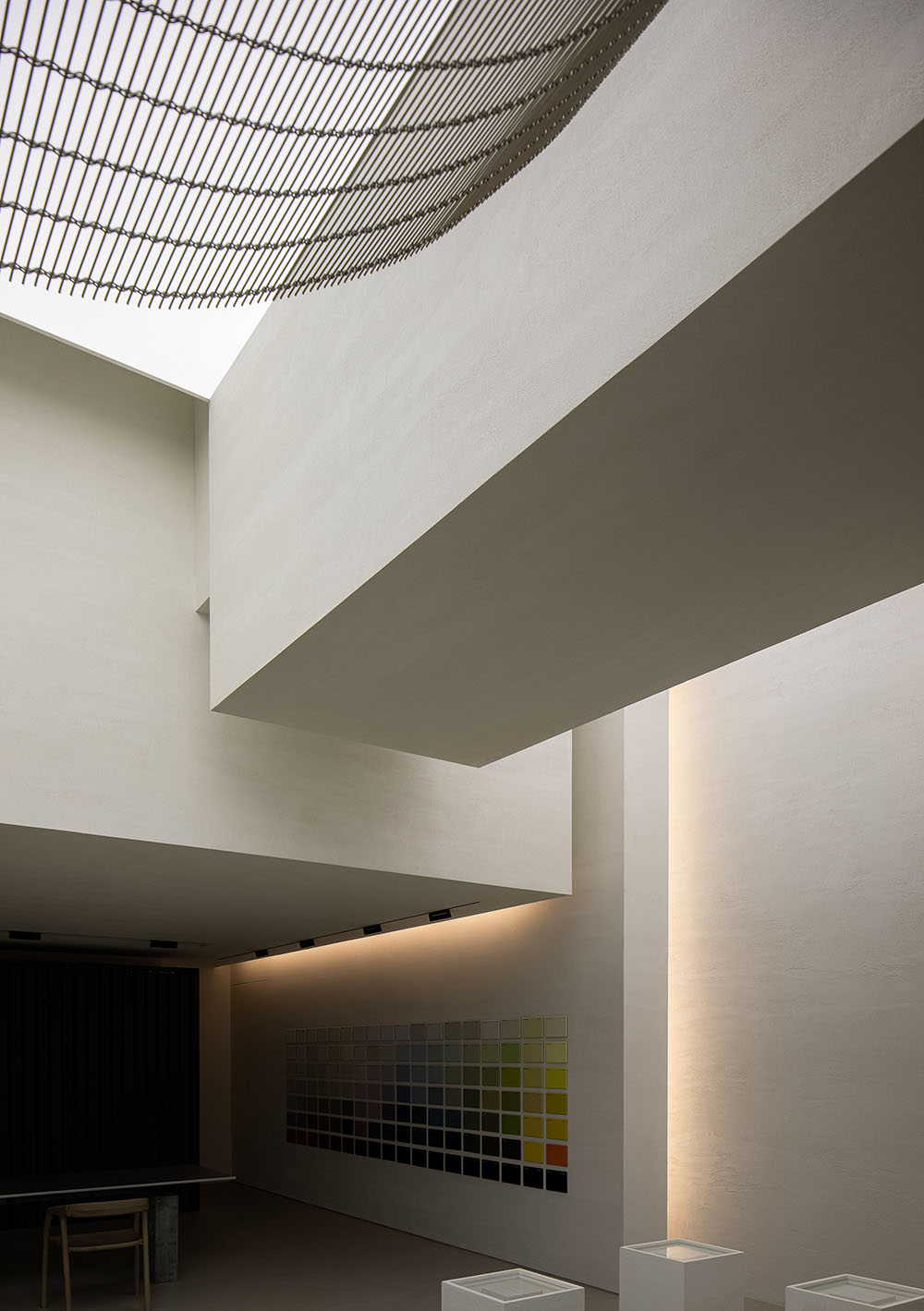
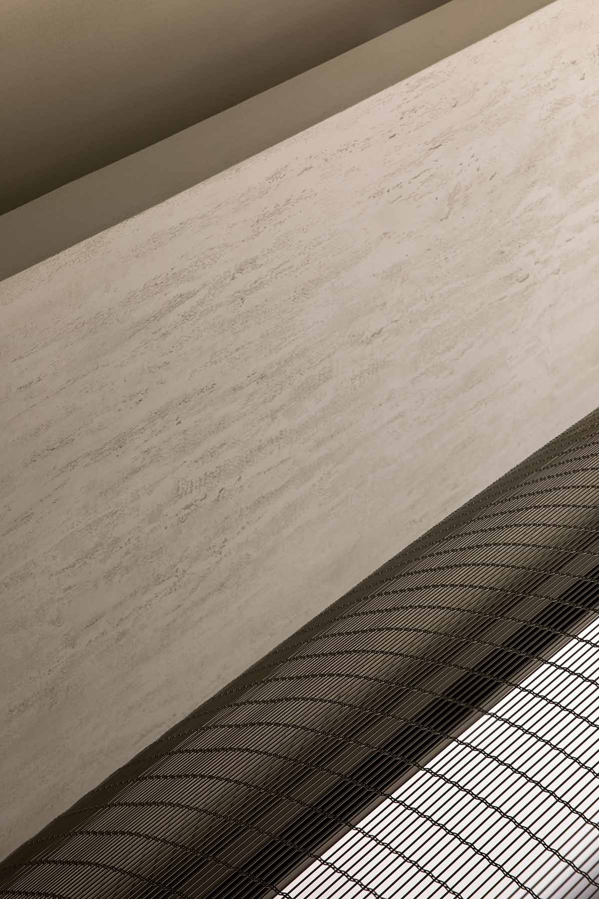
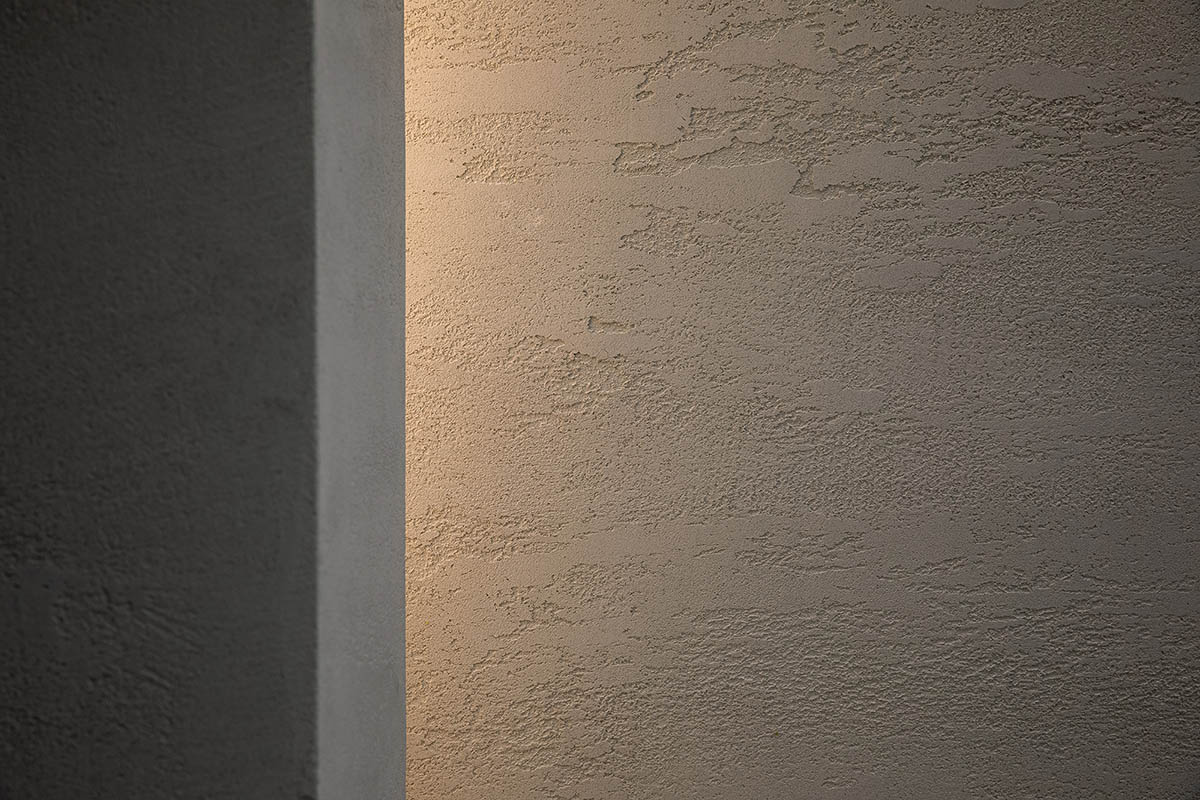
空間本身是一個容器,而我們試圖探索手工塗料本身的表情。在平靜的空間中感受時間的啟發,先關注空間與產品在空間中質感的魅力再去解讀產品本身。
The space is a container, and the design team tried to explore the expressions of handmade paint products. Customers are encouraged to feel the space and the charm that products exude in it, and then to read the products in detail.
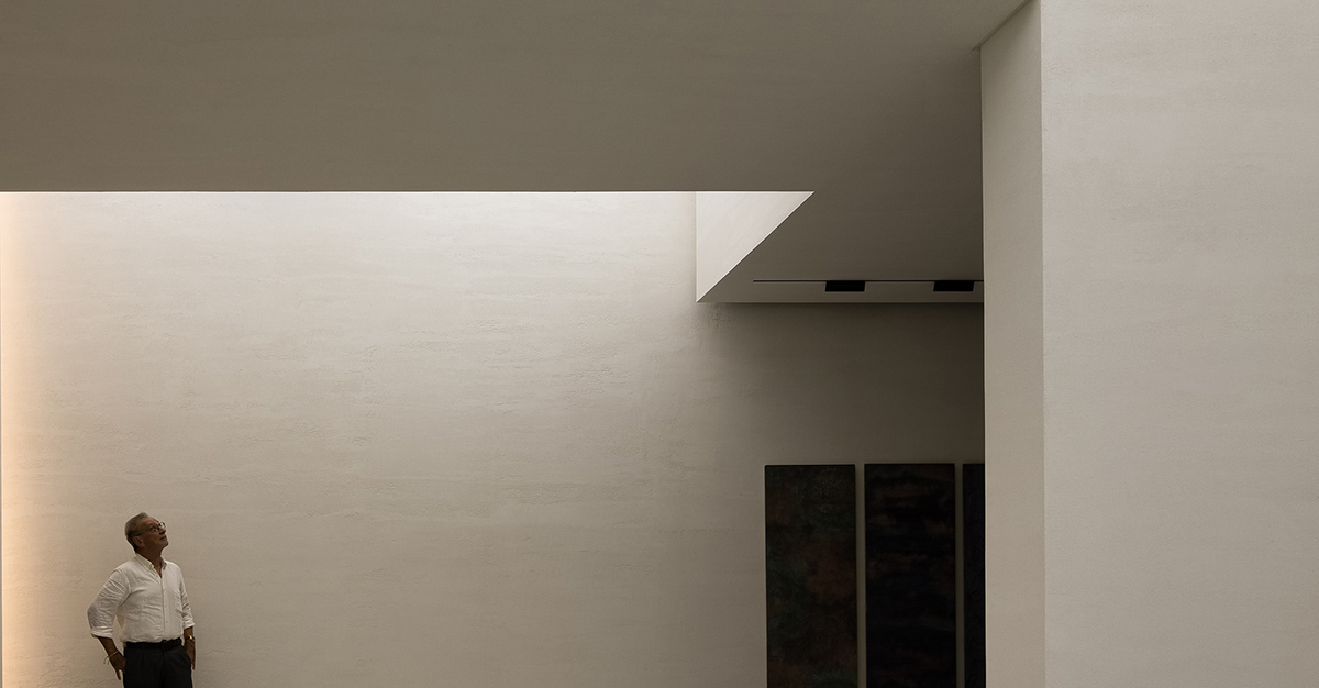
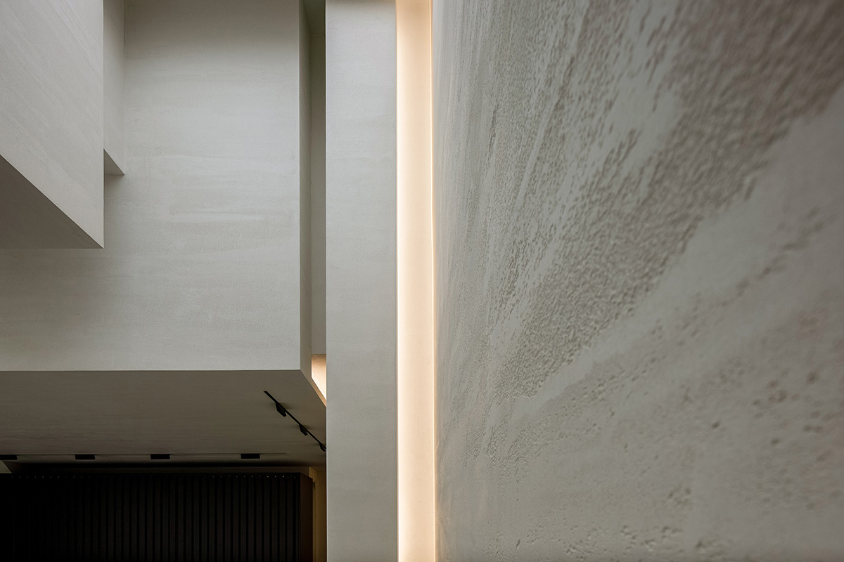
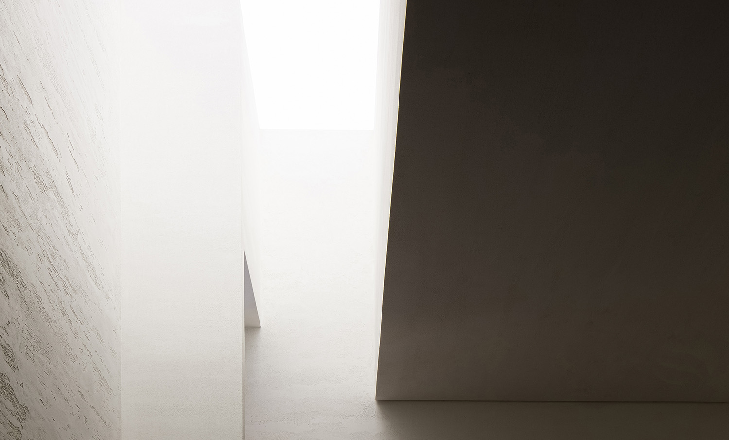
寬敞明亮的空間感,以自然的質感,自然的光給空間最真實的反饋。空間與人的互交在我們的設計中特別的被重視。極大地改變了現有建築的空間和組成關係,有利於空間結構、材料和色彩的選擇與調和,並在建築和場所之間建立了一種新的流動。
The space features an expansive and bright feeling, natural textures and light. The designers emphasized the interaction between space and people, greatly changed the original spatial structures, coordinated materials, structures and colors, and created new fluidity between architecture and space.
空間找到形狀,並通過優雅樸素的幾何形狀變得可觸摸,感受透氣的質感。讓空間在一個懸浮的感受中自由流動。
Geometric shapes in the space are elegant, simple and touchable, creating a floating and free ambience.
這是艾克建築設計團隊在用西方的設計秩序來建樹東方的空間情緒與哲學再一次實踐。
Through this project, AD ARCHITECTURE attempted to accentuate Oriental spatial emotions and philosophy via Western design logic.
∇ 平麵圖
∇ 剖麵圖
項目信息
項目名稱:ANBONG HOME 塗料展廳
業主:Mauro Malfatti
設計機構:AD ARCHITECTURE∣艾克建築設計(http://www.arch-ad.com/)
官方郵箱:office@arch-ad.com
總設計師:謝培河
設計團隊:艾克建築
項目地點:廣東汕頭
建築麵積:200 m2
主要材料:手工塗料、微水泥、金屬網、混凝土、透光膜
設計時間:2020年7月
竣工時間:2020年11月
攝影師:歐陽雲
Project name: ANBONG HOME
Client: Mauro Malfatti
Design firm: AD ARCHITECTURE (http://www.arch-ad.com/)
Email: office@arch-ad.com
Chief designer: Xie Peihe
Location: Shantou, Guangdong, China
Area: 200 m2
Main materials: handmade paint, micro-cement, metal mesh, concrete, membrane
Start time: July 2020
Completion time: November 2020
Photography: Ouyang Yun









![[4K] 2.1G 虛空之美-100個日式庭院](http://www.online4teile.com/wp-content/uploads/2023/09/1_202309111611111-8-414x550.jpg)
