全球設計風向感謝來自 羽築設計 的住宅空間項目案例分享:
【羽築設計 徐汎羽】深煉透實異色基底 空間肌理自然浮現
在大平數的空間裏,住著三口之家,
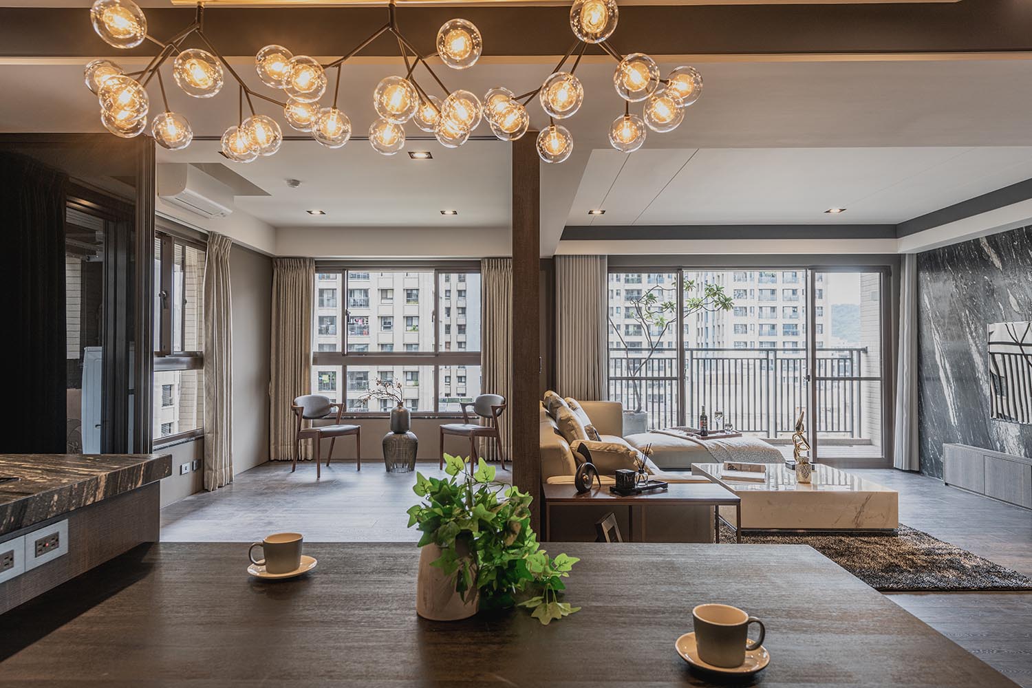
奠基於開放式的場域需求,與現代簡約調性的向往,
我們摒除所有隔間牆,僅利用櫃體及拉門作為分界。
而因應案場原有的三麵采光優勢,
在整體色調上我們選以沉穩基底,
利用黑白木皮的交錯,鑲嵌鐵件、鍍鈦與石材,
透過深淺有致的韻律,將典雅大氣鋪陳一室。
如何在一致的色相中,調配相異的視覺呈現,
是 羽築設計 徐汎羽 設計總監 在本案中思索的重點;
而這樣的差異,則呈顯在質材肌理與線條變化上,
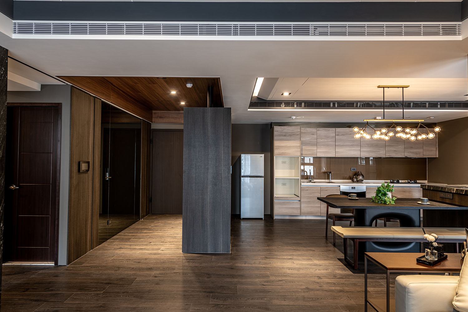
如客、餐廳天花板皆以垂板跳色處理,呼應場域主色;
透過細微的組構,讓家的協調性得以彰顯,
不做過多的裝飾,僅訴說空間的純粹本質。
There’s the family of three living in a large-scale house. As to meet the requirement of an open space of modern simplicity feature, we get rid of all compartments; merely make use of the cabinets and sliding doors as the demarcations.
Taking the advantage of natural lighting, and chose profound hue as the foundation. By way of the interlacing of black and white veneer, inlaid iron pieces, titanium coating and stones, thence lay out the elegant and noble atmosphere via the rhythm of light and shadow.
How to present varied visual perception of matched hue is the major challenge of this project. Accordingly, Feather Design design director Hsu Fan-Yu tries to show up by using the material texture and lineal changes.
For example, the ceiling of the living and dining areas are with color-skip processing, which echo the main hue of the space; by way of delicate layout, bring about the harmonious homey feature, without excessive decoration, simply pave the nature quality of the space.
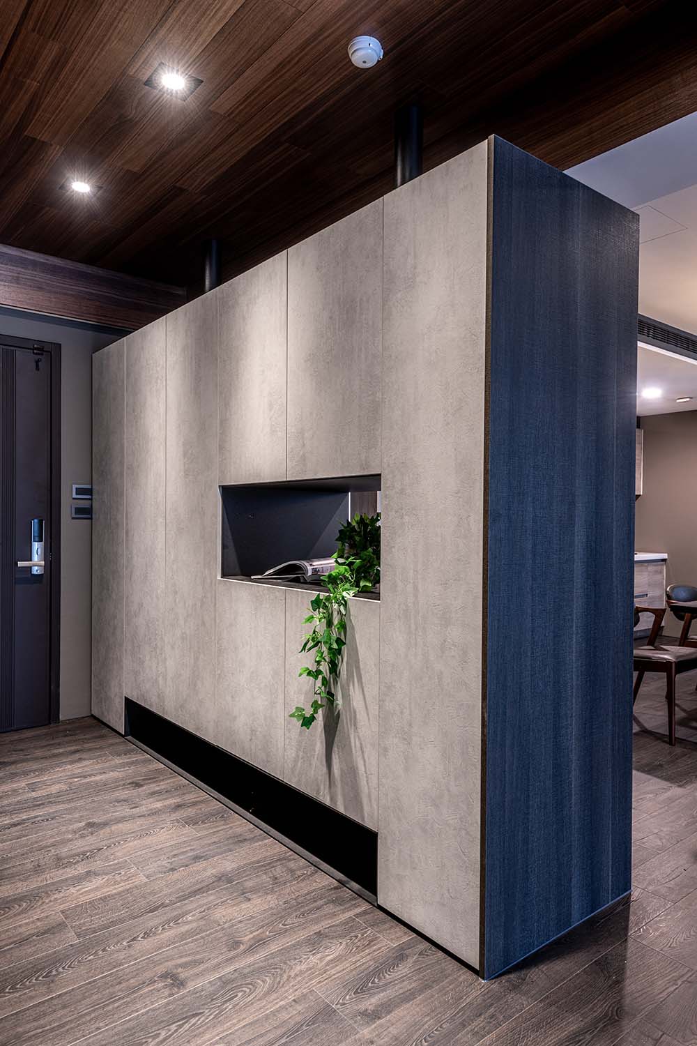
玄關The foyer
玄關櫃體拓寬深度,結合鞋櫃與臨時衣櫃,
以進口係統板材結合鐵件,
悄悄地劃分客、餐廳動線。
並特別將中間挖空,
使場域視野形成串連,
也作為放置收納的區塊。
天花板亦不做到頂,
而是采保留退縮,
不僅為視覺增添變化,
更呼應空間整體的穿透本質。
The cabinet of the foyer is broaden in depth, which with the function of shoe cabinet and a temporary wardrobe. The imported system panels combined with iron parts that slightly divide the flow of the living area and dining area. In particular, the middle part is hollowed out to bring out the penetrate vision; at the same time it is a nice place for displaying collections.
Leave space to frame the ceiling of interesting charm, furthermore to respond the transparent spatial feature.
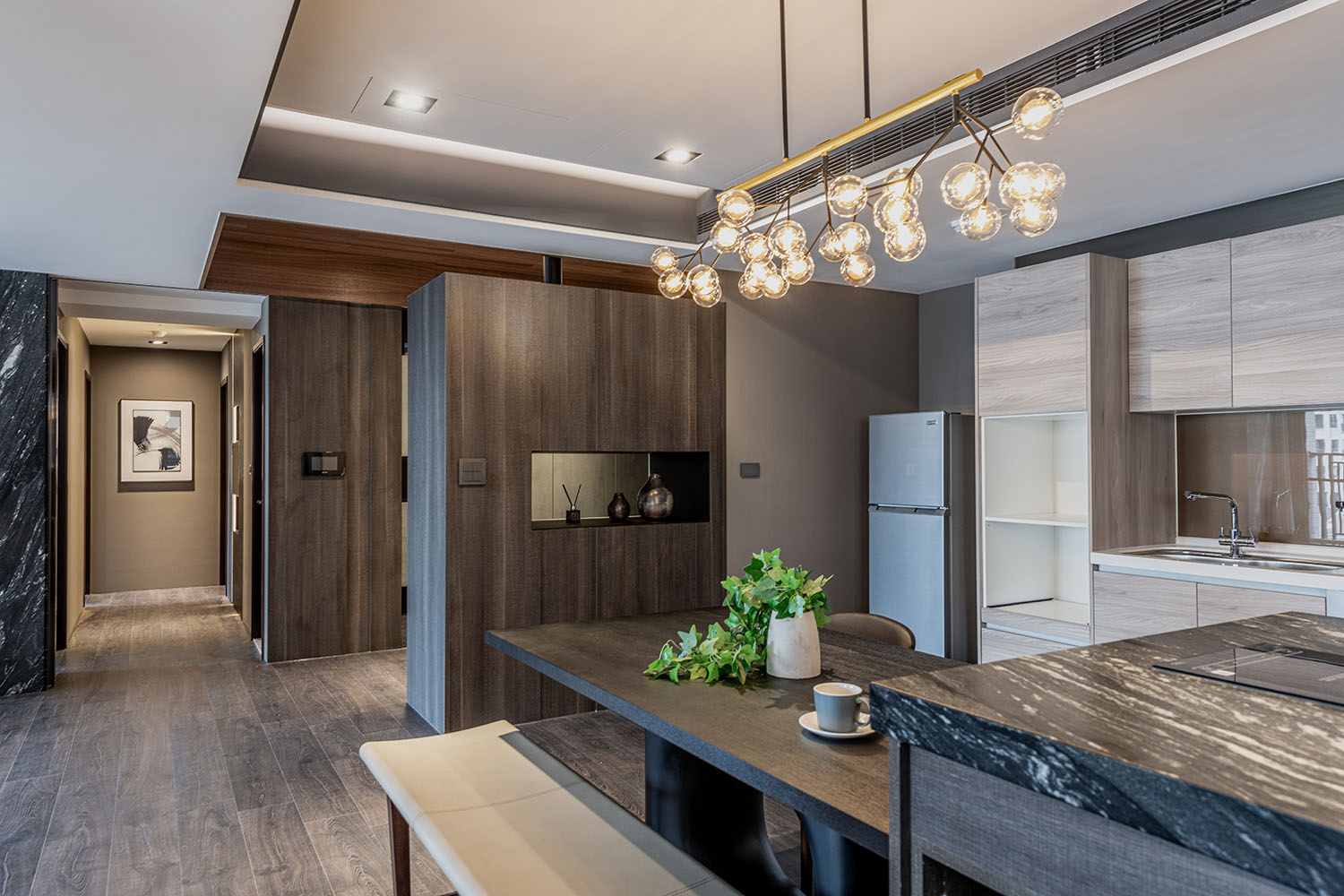
餐廚區域 The kitchen and dining area
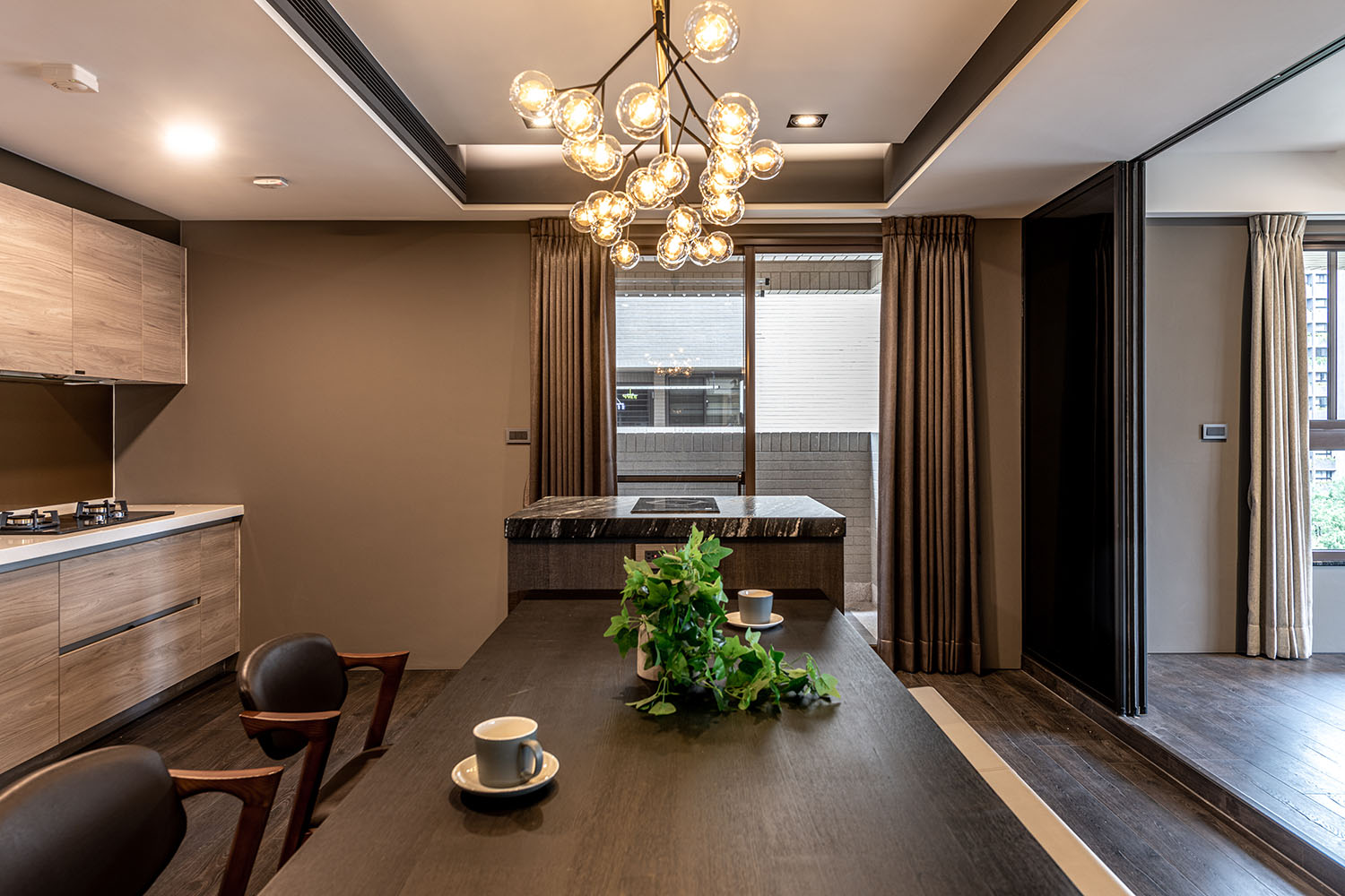
餐區櫃麵以淺色配置,凸顯餐桌的沉靜色調,寓示不同區域的機能劃分;
亦不另外設計隔牆拉門,借此拉近人與人之間的情感聯係,
讓互動對話隨著開放式的動線互通有無。
餐桌柱體以中空形式呈現,呼應空間的通透主調;
輕薄桌麵連接至中島吧台,兩側嵌以書報架,中間做收納櫃,
三個麵向皆適得其所,也讓空間整體幹淨俐落。
The built-in cabinets of light color that highlight the calm tinge of the dining table, thence indicate the functional division of different areas.
In addition, abandon the partition design of sliding door; adjust to the open flow layout, so as to make the connection of family affection closer.
The central part of the dining table support is hollowed, which echoes the penetrating scheme of the space, and the lightweight tabletop connected to the kitchen island. The island is well planned with book and newspaper rack on both sides, as well as a storage cabinet in the middle. Besides the perfect function, at the same time create a concise and neat image of the overall space.
兒童室 The playroom
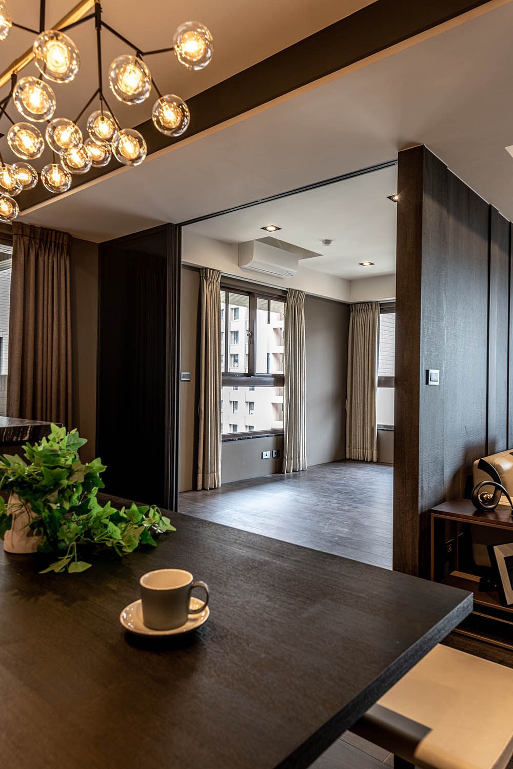
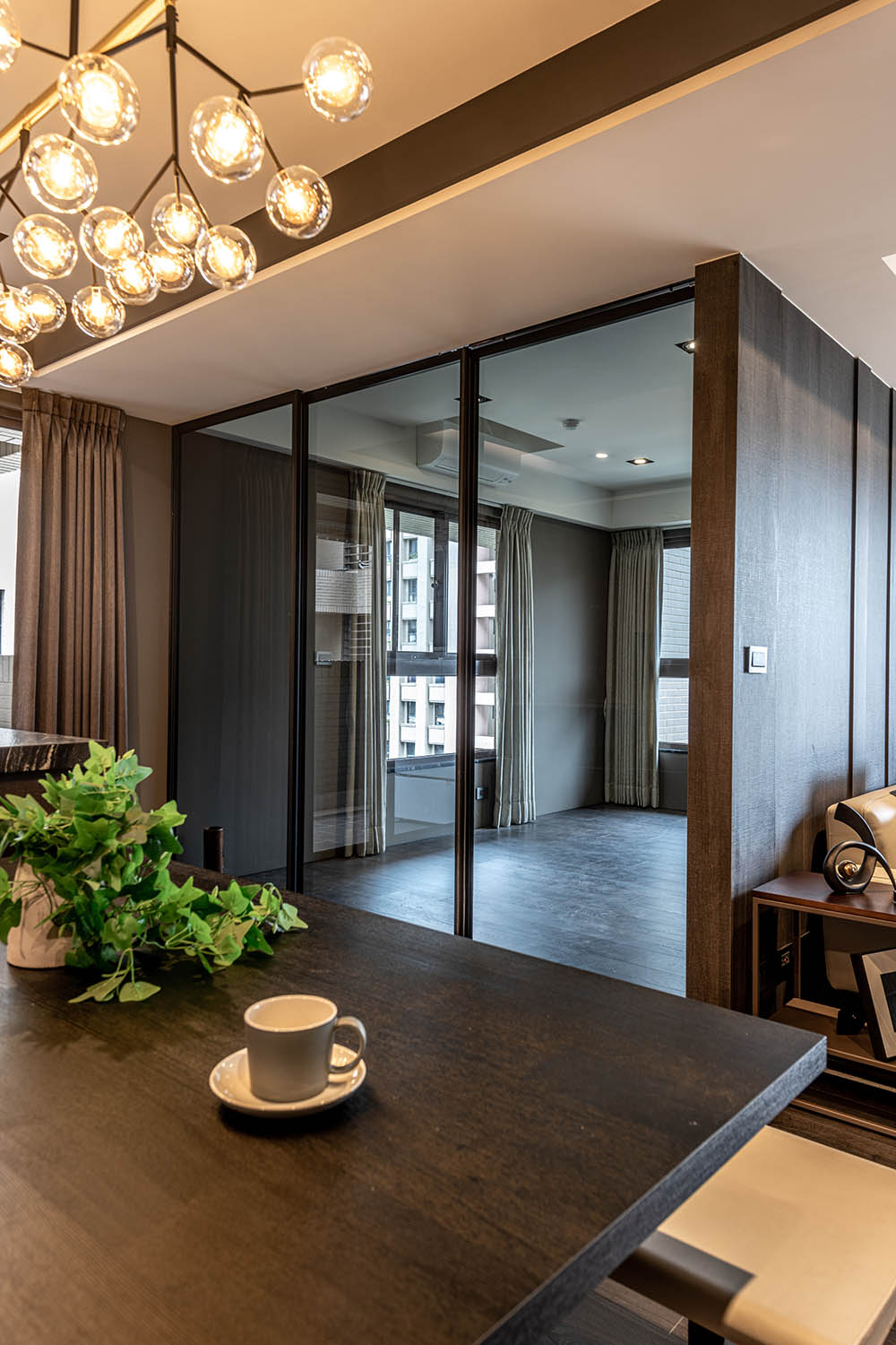
兒童室以三片拉門,建構空間的彈性運用,
業主夫婦也能照看孩子的活動,確保其安全性。
通透的玻璃門片,使視野毫無阻隔,
延伸至窗邊,盡享戶外風光。
The playroom is equipped with three sliding doors to construct flexible usage of the space, and the owner-couple can also ensure the safety while children are doing activities.
The transparent glass doors bring clear vision that extends to the window, so as to enjoy the outdoor scenery.
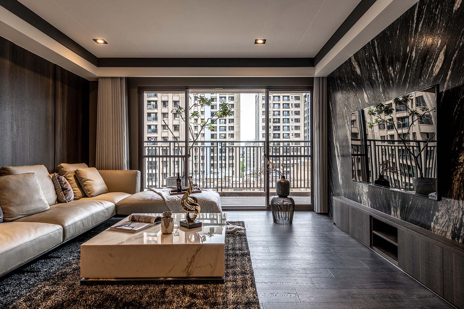
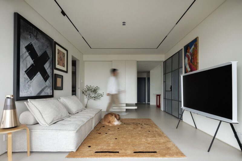
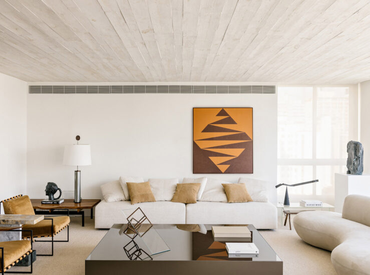
客廳 The living area
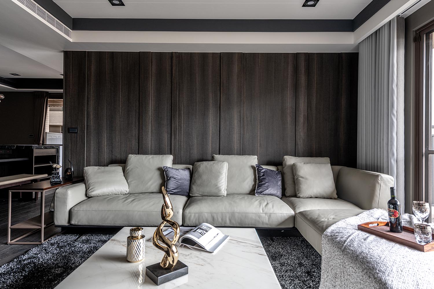
客廳背牆選用進口係統板材,
以深淺對比的線條拚接搭組,
呈現立麵視覺的立體感。
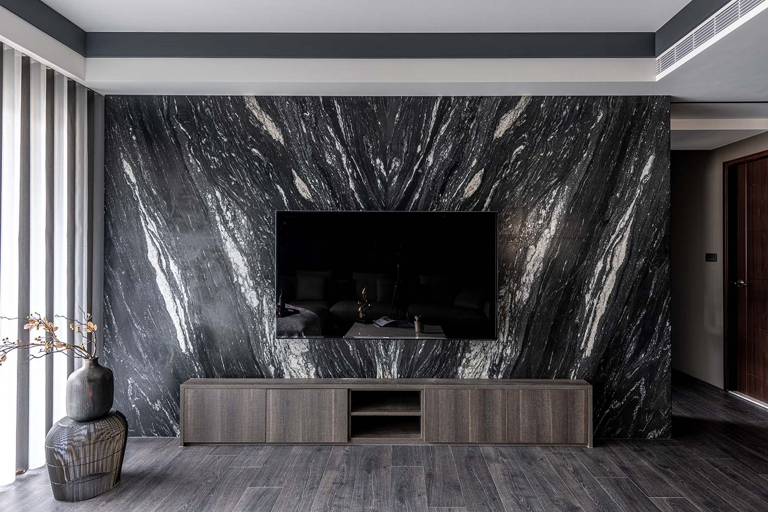
電視牆則有別於一般亮麵石材,
選以仿皮革麵的大片紋理,
加深對比色澤,強調觸摸質感,
搭襯米白色沙發軟件,
形構一處充滿韻致的起居空間。
The back wall of the living area is made of imported system panels, which are spliced and set up of contrast shadow lines, thence present the stereoscopic vision.
The TV wall is distinguished from the ordinary bright stone. It adopts the imitation leather texture to deepen the contrast color, emphasize the tactile feeling, moreover, furnishing with creaming-white sofa to lay out a charm living circumstance.
廊道 The passage
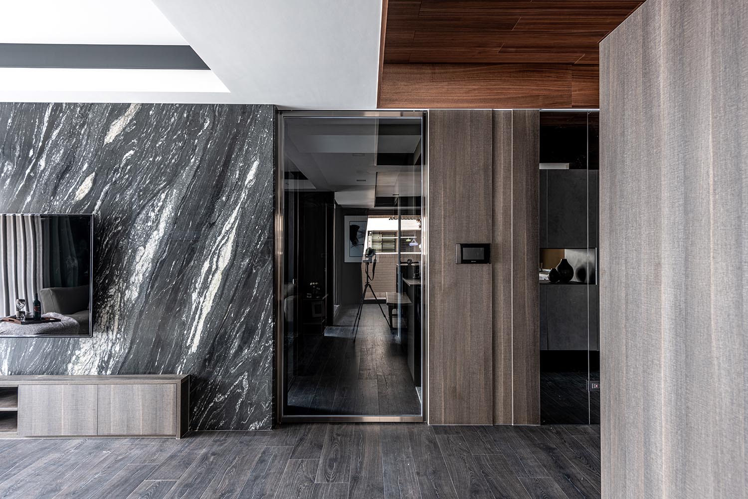
廊道門片以灰玻搭配黑色鏡麵的鍍鈦框邊,
增添場域華麗度,一席低調輕奢氣息緩緩流淌。
佇立於此,天地壁的材質色階對比立現,
陳述空間中的各種變化與可能。
The passage door is made of gray glass with titanium edge of black mirror, which adds magnificent feature of the space, as well brings a slight low-key yet luxury touching. While standing here, instantly reveal the contrast of the material and color scales of the ceiling, floor and the wall, hence stating various changes and possibilities of the space.
主臥 The master bedroom
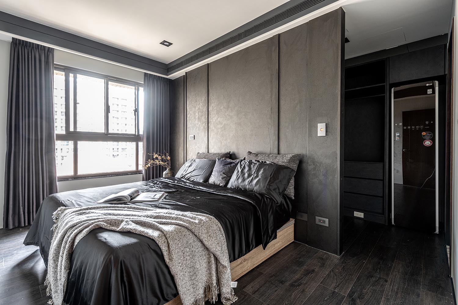
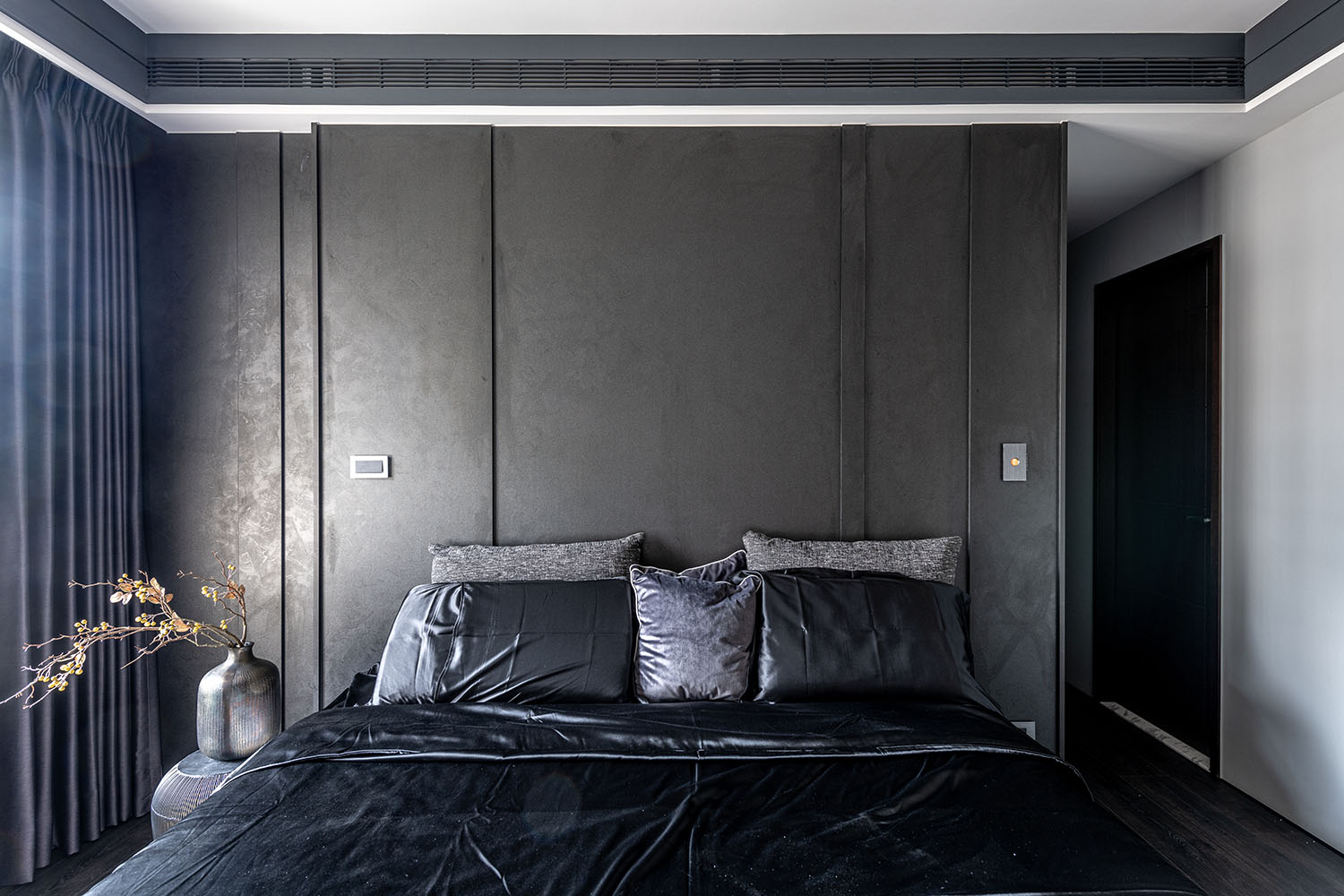
主臥回歸休憩功能,
簡約而不單調,
沉穩而不沉重。
立麵線條設計同樣運用於此,
床頭背板透過拚接層疊,
形塑一麵景框,迎納光影變化。
The master bedroom is a place to unwind, plain but not monotonous, calm but not dull.
The design of the headboard takes the same concept, which by way of spliced and laminated treatment, so as forming a side view of various light and shadow.
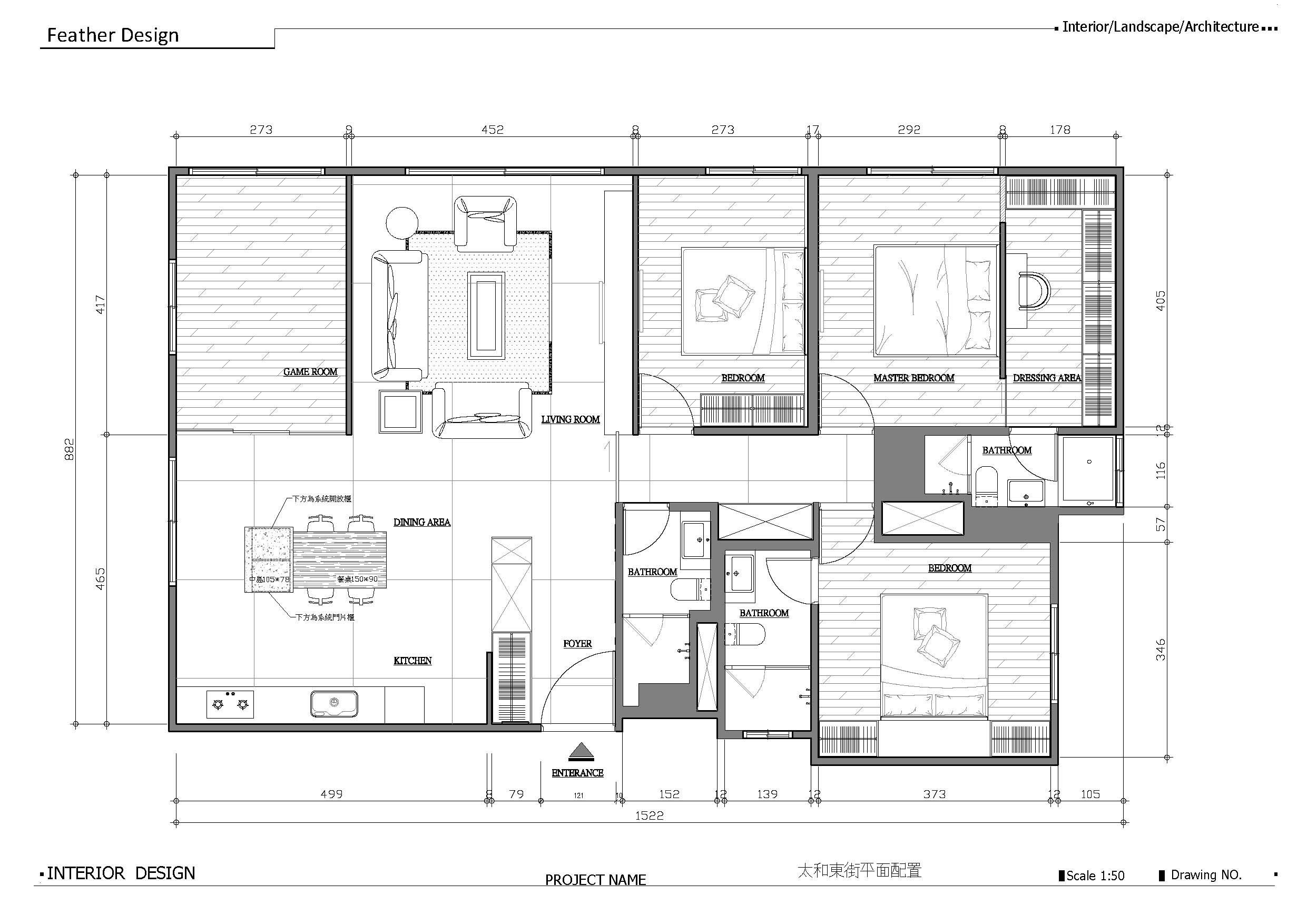
∇ 平麵圖
項目信息
案名:原・靜
項目類型:住宅空間
項目地址:中國台灣台中
設計團隊:羽築設計
項目坪數:195㎡
主要建材:鐵件、大理石、木皮、係統板、超耐磨木地板、鍍鈦拉門、LED燈條、ICI乳膠漆


