全球設計風向感謝來自 內境空間設計 的教育空間項目案例分享:
想象力比知識更為重要,因為知識是有限的!
Imagination is more important than knowledge, because knowledge is limited!
對於愛因斯坦這句話感觸很深,如果沒有他的超強想象力,沒有他的思想實驗,就不可能改變人類對宇宙和自然的“常識性”觀念。那我們希望空間能啟發孩子們的想象力。
I have a deep feeling for Einstein’s words. Without his super imagination and his thought experiment, it is impossible to change the “common sense” concept of the universe and nature. Then we hope that space can inspire children’s imagination.
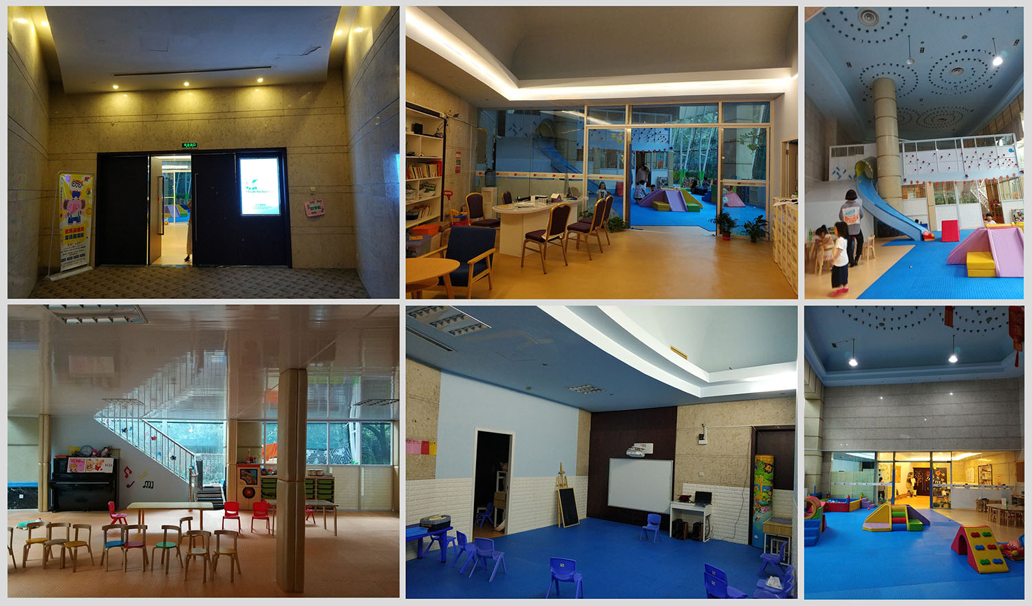
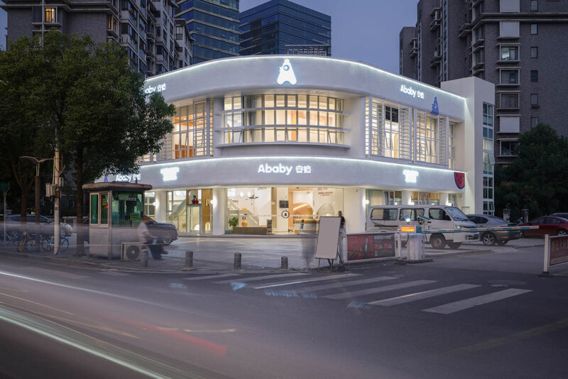
安彼國際兒童成長中心是一家專業、專注、專心的嬰幼兒教育機構。項目位於東方潤園會所內,是二次改造的項目。是早期PAL設計事務所設計的一座會所,之前有一家兒童機構入駐,裝修的非常粗糙,安全隱患比較大,所以我們全部重新設計改造。本次設計構思基於當時第一現場情景的感受,想創造一個快樂、趣味並且具有一定想象力的空間。
Anbi International Children’s growth center is a professional, dedicated and dedicated infant education institution. The project is located in Dongfang Runyuan club, which is a secondary reconstruction project. It is a club designed by pal design firm in the early stage. Before that, there was a children’s institution. The decoration was very rough and there was a big potential safety hazard. Therefore, we redesigned all the clubs. This design idea is based on the feeling of the first scene at that time, and wants to create a happy, interesting and imaginative space.
∇ 改造前現狀,Status quo before transformation
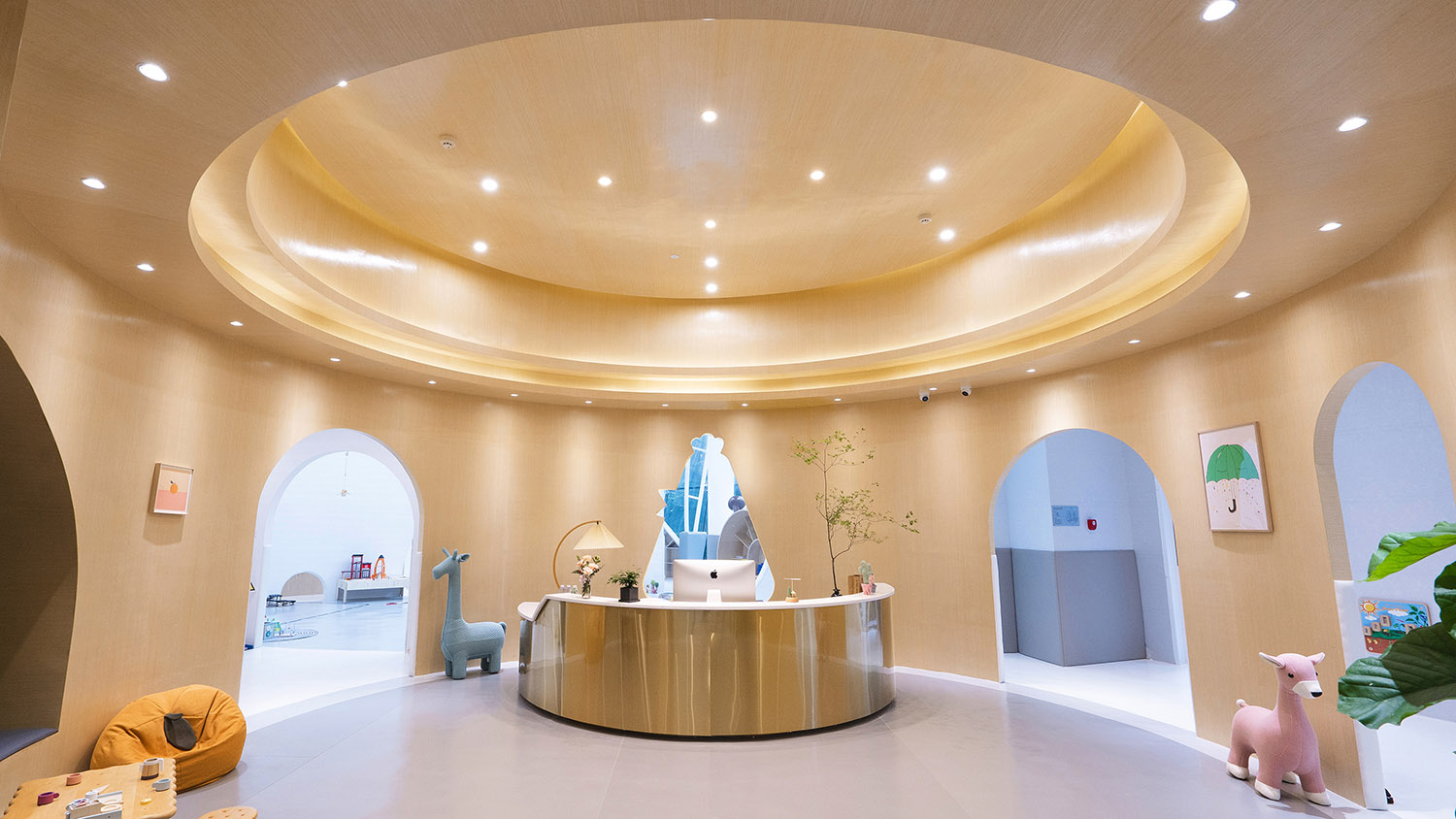
∇ 前廳區域,Front office area
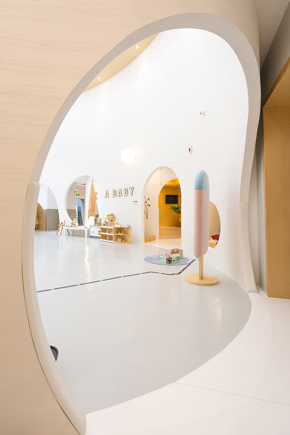
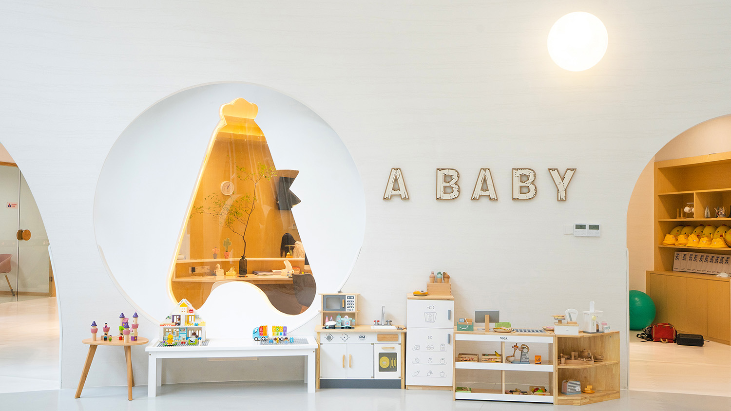
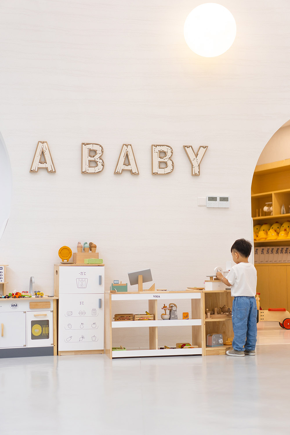
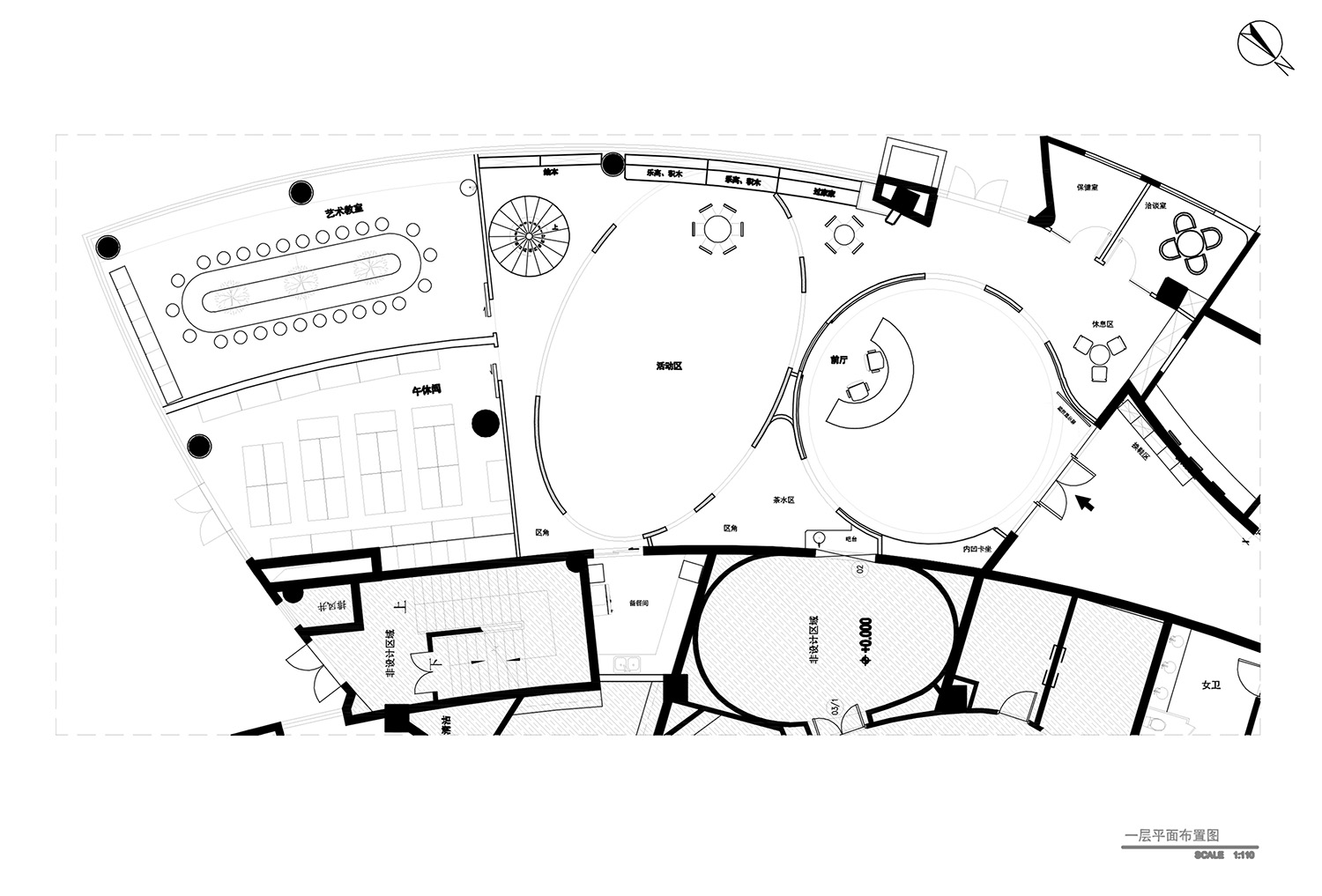
環形的前廳布局把各個功能空間串聯在一起。前廳用橡木木飾麵搭配4000K的燈光整體營造出溫馨舒適的氛圍,周邊過道和活動區刻意用白色的基調,和前廳形成基調上的對比,空間更具層次感。從前廳到活動區兩種基調的轉換,人的情緒會有微妙的變化。前廳圓弧形牆上鏤空造型為品牌LOGO呈現,把LOGO放大和牆體融合,改變常規掛上LOGO加字體的表現方式,透過LOGO還能看到活動區域遊樂的場景,視覺上有一定的延伸。
The circular layout of the front hall connects the functional spaces. The front hall is decorated with oak veneer and 4000K light to create a warm and comfortable atmosphere. The surrounding aisles and activity areas are deliberately in white tone, which forms a contrast with the front hall in terms of tone. The space is more layered. From the front hall to the activity area of the two tone conversion, people’s mood will have subtle changes. The hollowed out shape on the circular arc-shaped wall of the front hall is presented as the brand logo. The logo is enlarged and integrated with the wall, and the expression mode of hanging logo and font is changed. Through the logo, you can see the scene of amusement in the activity area, which has a certain visual extension.
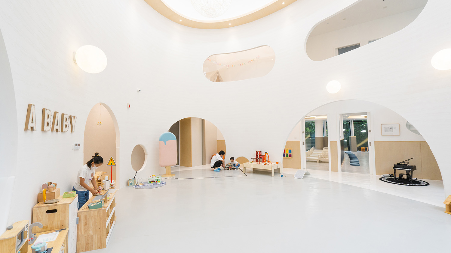
∇ 活動區和區角,Active area and corner
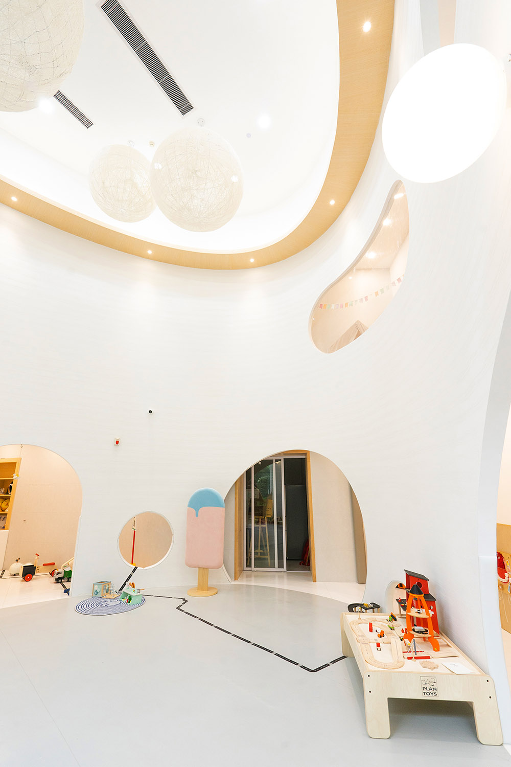
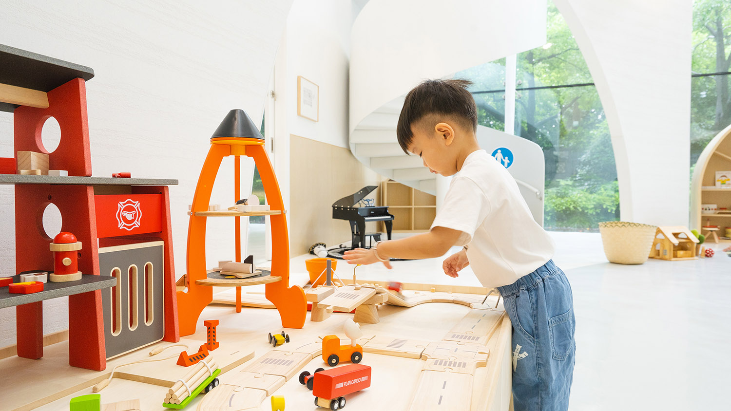
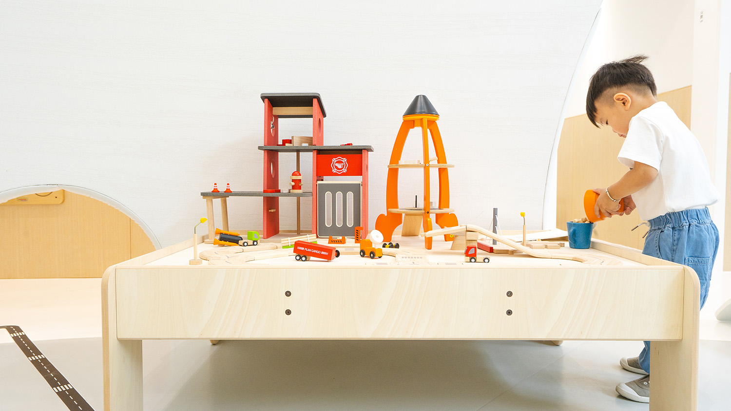
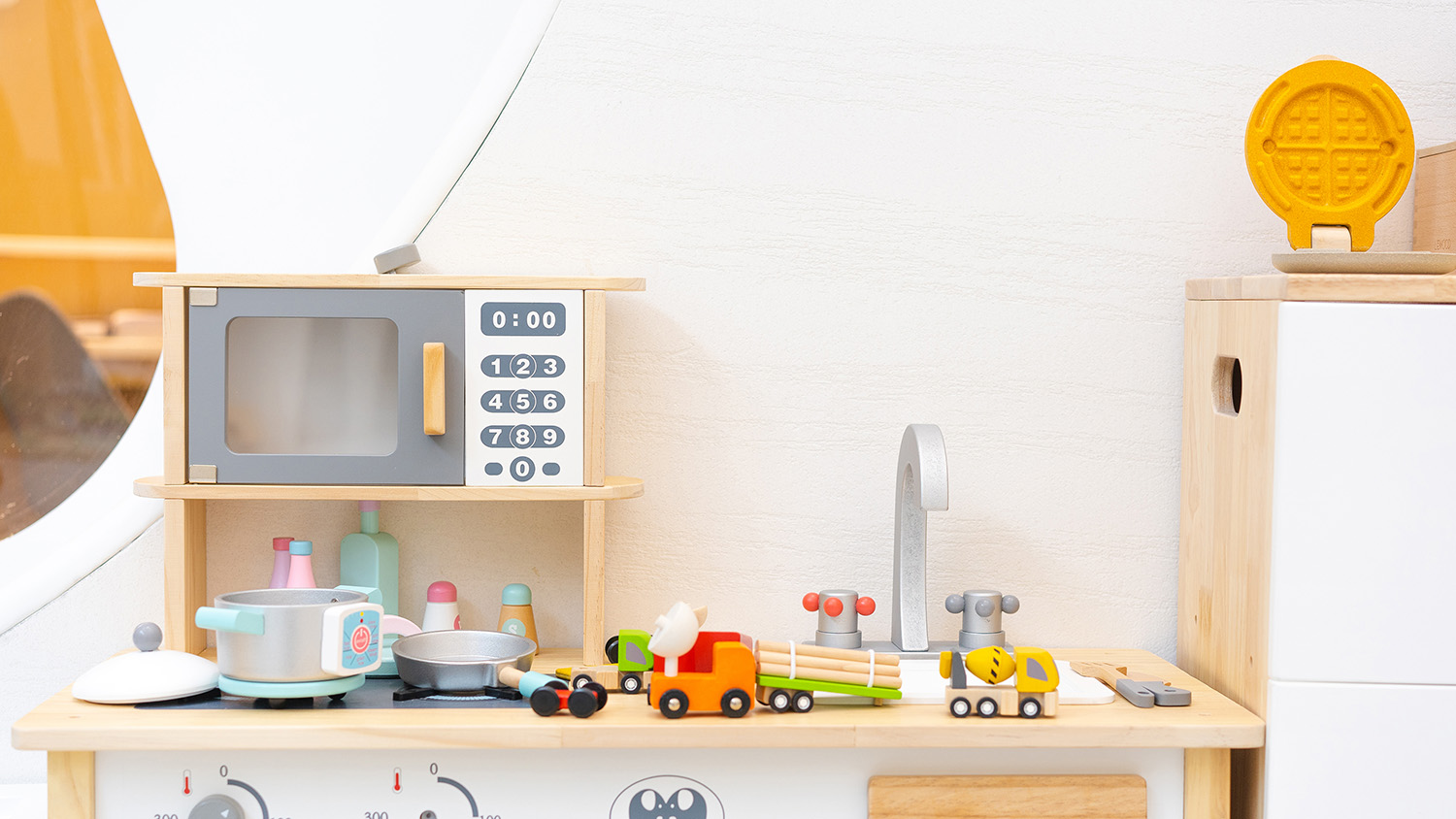
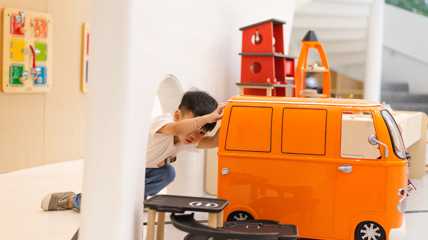
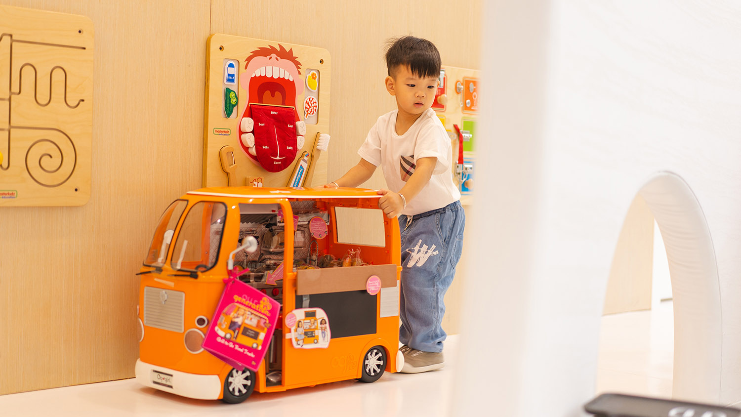
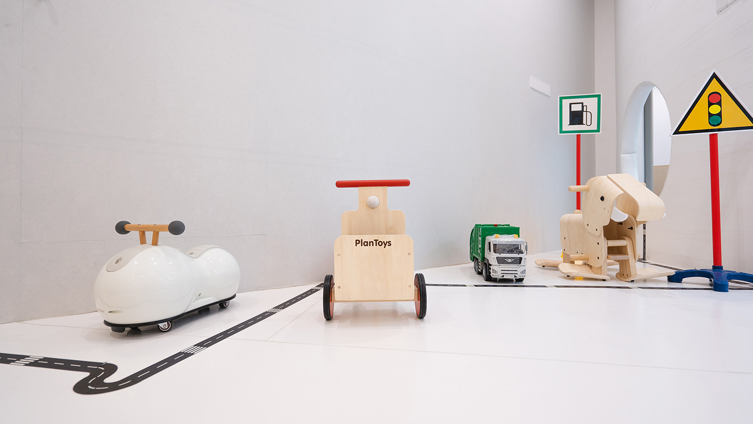
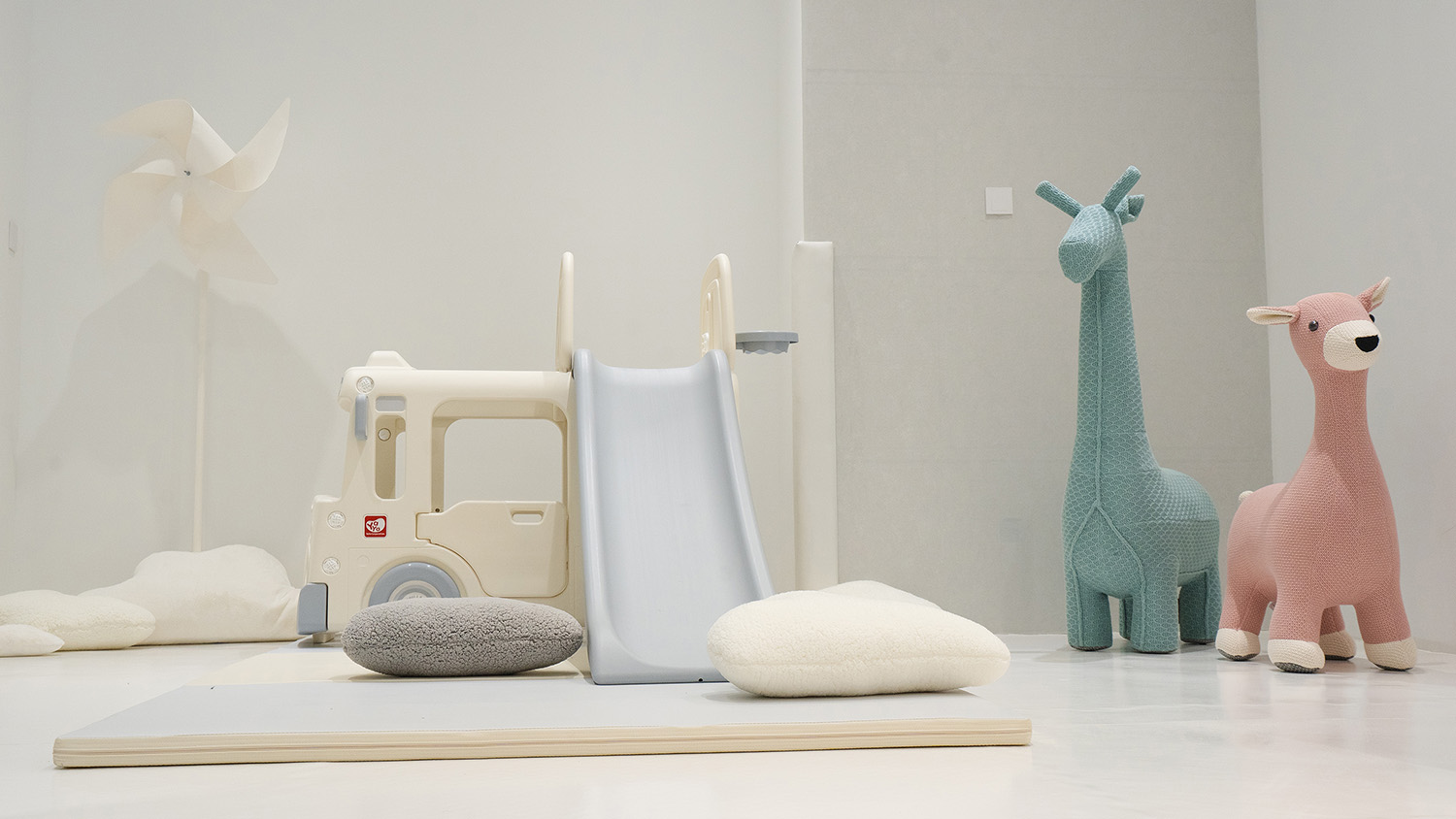
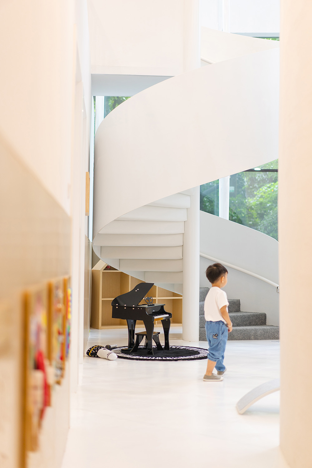
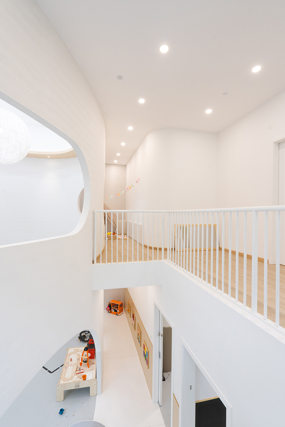
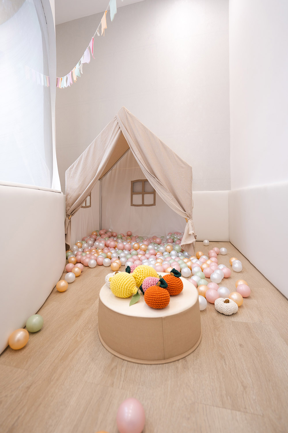
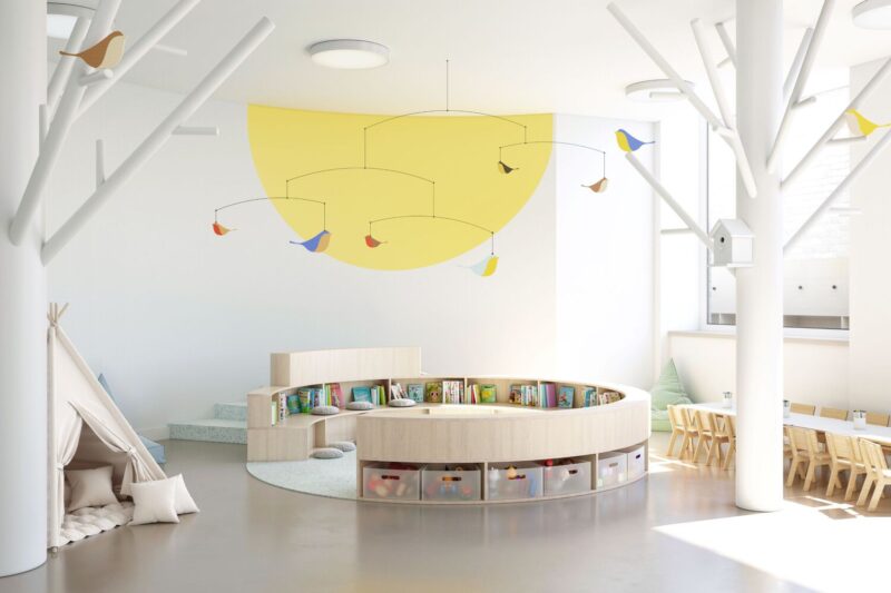
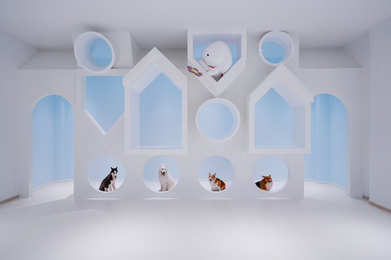
高7.7米的活動區形態為四周環抱的橢圓形,區域四周為玩趣角落。讓孩子們在快樂玩耍的過程中去發現去想象,從小埋下想象力的種子,這是本項目我們想要表達的一些想法。整個場地的地麵我們用厚地墊打底,上麵再鋪設一層環保地膠板,保證孩子們的安全性,腳感也是非常的舒適。
The 7.7-meter-high activity area is an oval shape surrounded by fun corners. Let children discover and imagine in the process of happy play, and plant the seeds of imagination from childhood. These are some ideas we want to express in this project. The ground of the whole site is bottomed with thick mat, and then a layer of environmental protection rubber plate is laid on it to ensure the safety of children and the foot feeling is very comfortable.
∇ 教室,classroom
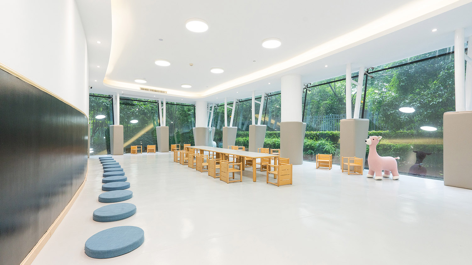
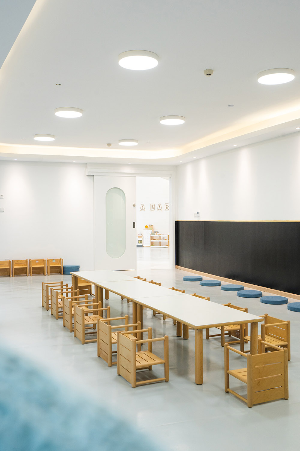
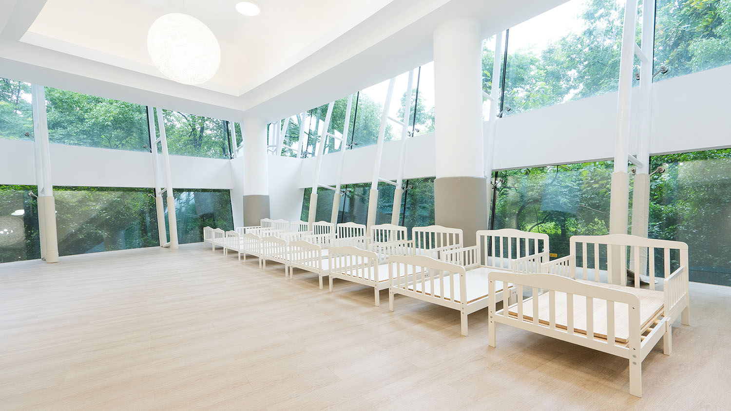
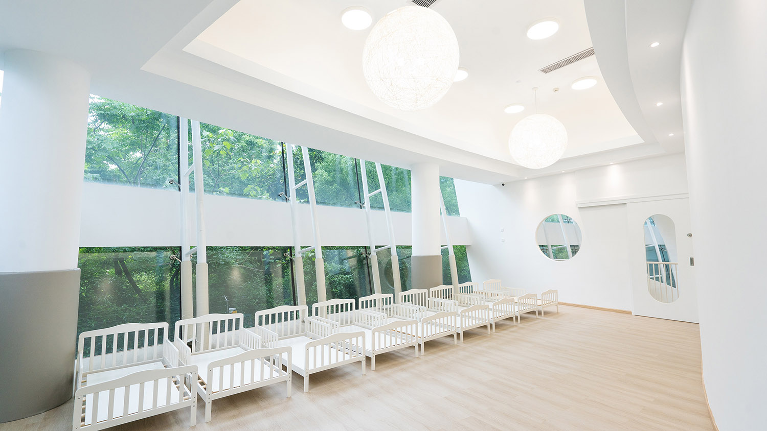
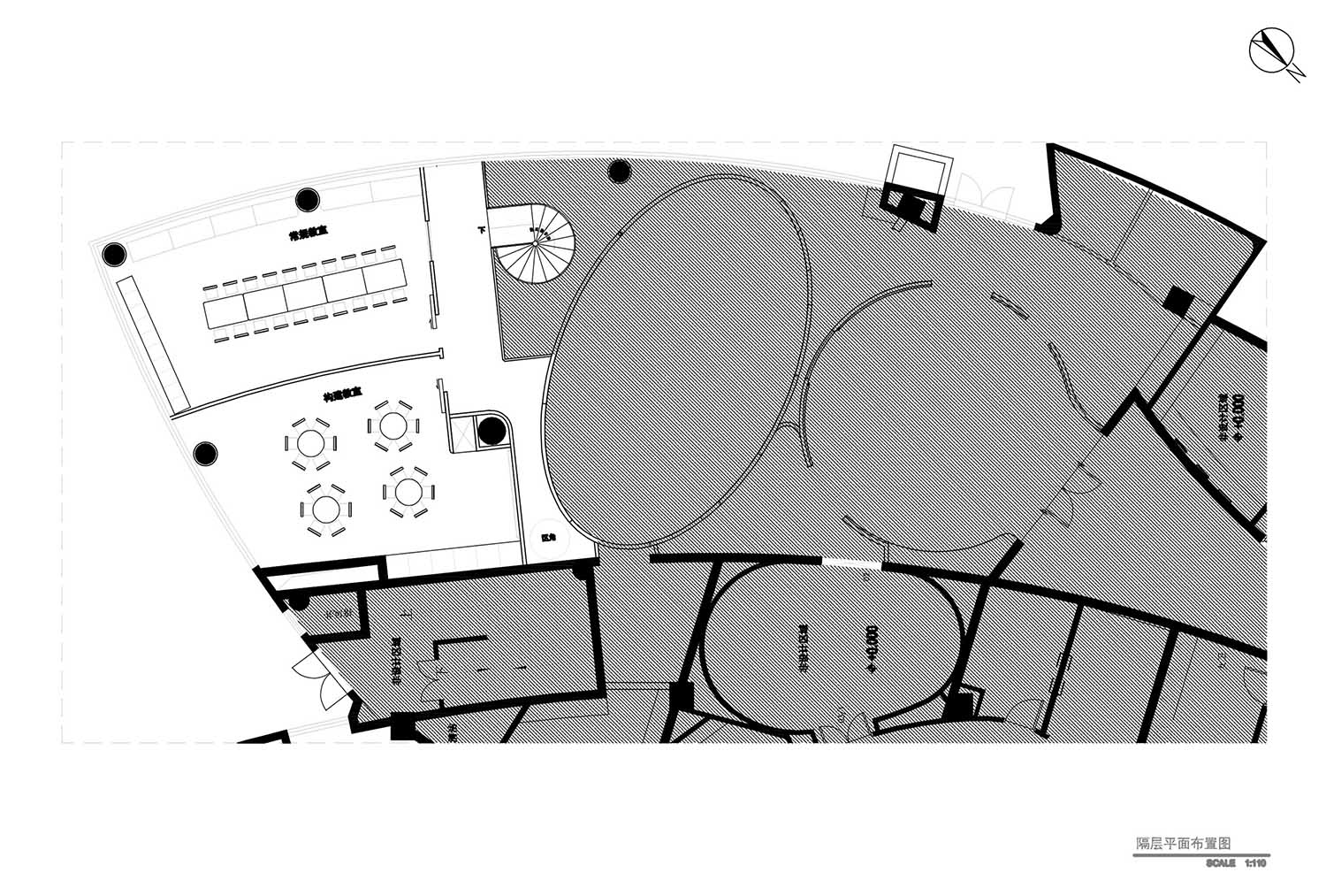
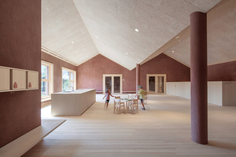
教室在原有建築構建上全部軟包安全處理,一麵塗畫牆供孩子們天馬行空的塗畫發揮。室外綠意盎然的綠植景象為教室增添了無限的生機和活力,室內和室外的邊界變的比較模糊。隔層教室暫未開放使用,家具軟裝還未進行布置,床具隻是暫時放置。
Classroom in the original building on all soft package security treatment, a painting wall for children to paint freely play. The green plant scene outside adds infinite vitality and vitality to the classroom, and the boundary between indoor and outdoor becomes more blurred. The separated classroom is not open for use, the furniture and soft decoration have not been arranged, and the bedding is only temporarily placed.
∇ 隔層區域,Compartment area
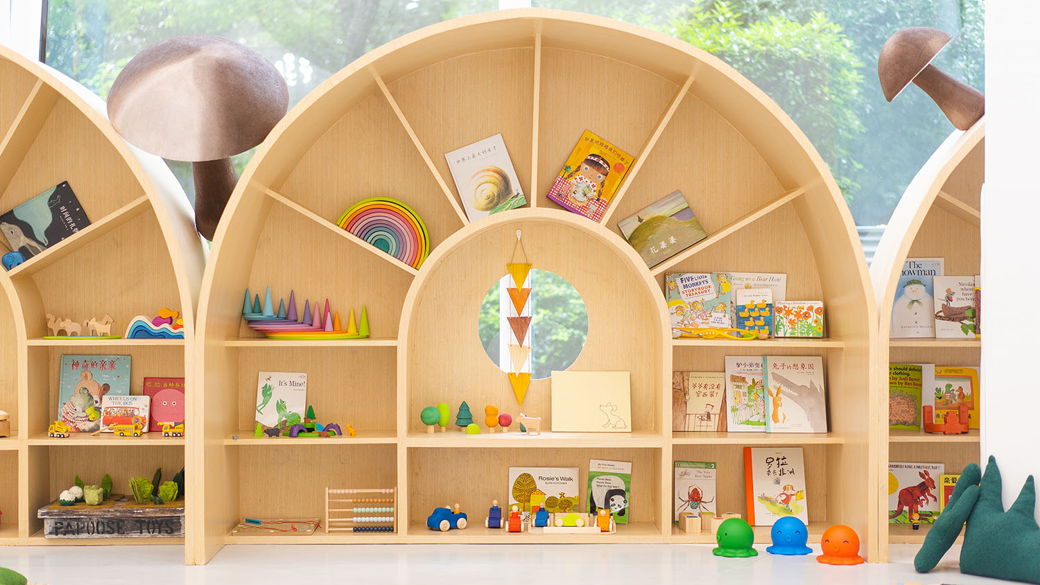
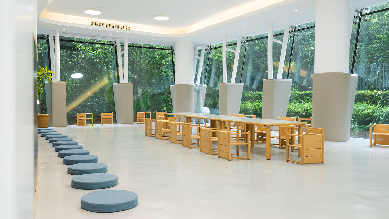
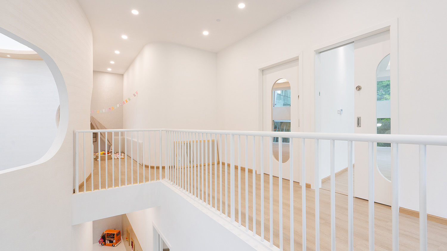
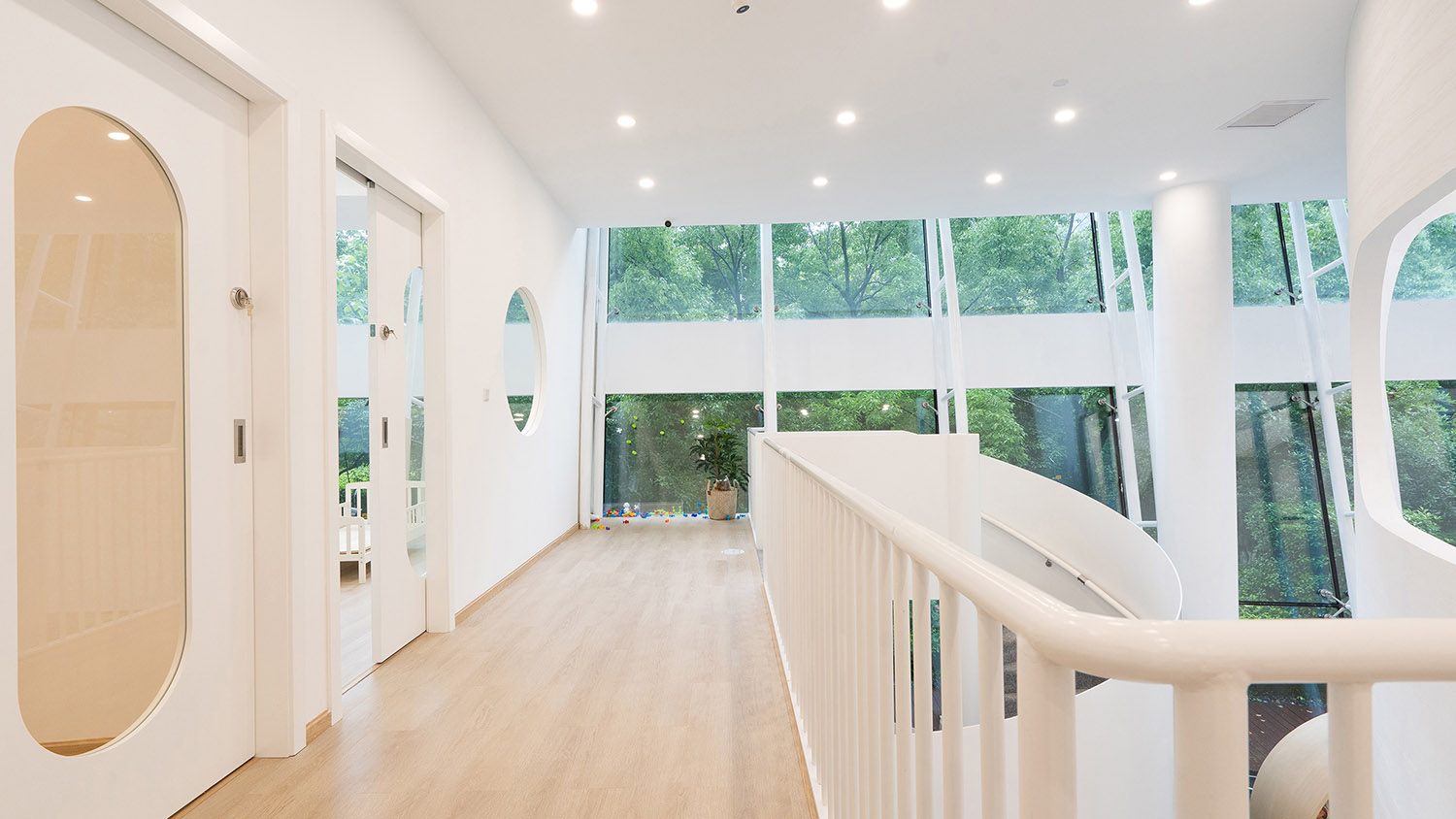
大麵積的建築幕牆把室外綠植景觀引入室內,室內變的更為豐富,不隻是裝飾上的潤色。因為綠植是動態的會有各種天氣景象表情:陽光、雨天、下雪,及時反饋到室內,室內的表情也變得更為豐富,人的情緒感受隨之變化。整個場地乳膠漆牆麵1.2米以下用了環保耐髒油漆,在整麵牆顏色統一的情況下保證1.2米以下牆麵有一定的抗汙耐髒性。
The large area of building curtain wall introduces the outdoor green plant landscape into the interior, and the interior becomes more abundant, not just the embellishment on the decoration. Because green plants are dynamic, there will be a variety of weather scene expression: sunshine, rain, snow, timely feedback to the indoor, indoor expression has become more rich, people’s emotional feelings will change. Environment friendly and dirt resistant paint is used for emulsion paint wall below 1.2m in the whole site. Under the condition of uniform color of the whole wall, the wall below 1.2m has certain anti pollution and dirt resistance.
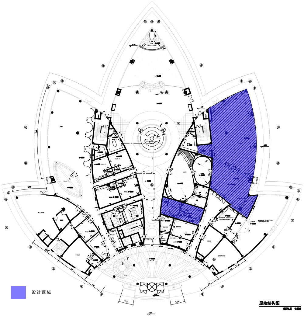
∇ 原始結構圖,Original structure diagram
∇ 平麵圖,plan
項目信息
項目名稱:安彼東方潤園館
設計方:內境空間設計
聯係郵箱:neijingdesign@qq.com
項目設計:2019年
完成年份:2020年
設計主創:羅俊清、林曉峰
設計團隊:李夢媛、談霄、張震
項目地址:杭州東方潤園會所
建築麵積:490m²
項目攝影:王大樹
客戶:安彼國際兒童成長中心
主要材料:橡木木飾麵、肌理漆、亞克力、PVC地板、木地板
合作方: 舒爾茨、飛利浦、箭牌衛浴
Project Name:Ababy Dongfang Runyuan
Design:NEIJING SPACE DESIGN
Contact e-mail:neijingdesign@qq.com
Design year:2019
Completion Year:2020
Chief designer: Jason J、Lin Xiaofeng
Design team:Li Mengyuan、TanXiao、ZhangZhen
Project location:Hangzhou Oriental Runyuan Club
Project area:380m²
Project photography:Wang Dashu
Clients:Ababy International growth center
Main materials: Oak veneer、Texture paint、Acrylic、PVC floor、Wood floor
Partner:Schulz、Philips、ARROW


