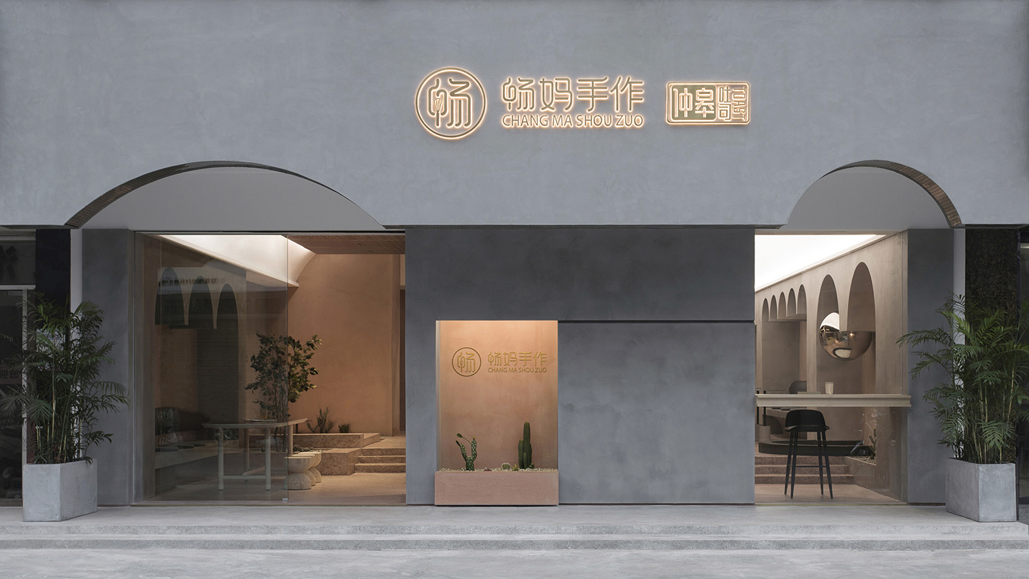
全球設計風向感謝來自 PADSTUDIO 質感建築設計 的餐飲空間項目案例分享:
讓你放慢腳步的麵包飲品店
The perfect bakery and beverage store for relaxing and unwinding
真正的平靜,不是避開車馬喧囂,而是在心中修籬種菊。-林徽因
True peace is not to get away from the worldly hustle and bustle, but to inwardly repair the fence and plant chrysanthemums. – by Lin Huiyin
遊園的概念 The Concept of Garden Tour
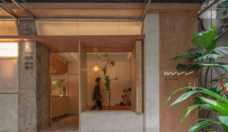
暢媽手作是一家獨具本土特色,堅守純手工製作理念的特色麵包飲品店。圍繞業主的經營理念,我們提出“慢”的思路。我們希望這個空間不隻是提供一份食物的店鋪,更多是希望創造一個空間,讓顧客從喧囂的街區進入這個空間後切換到另一種狀態。我們嚐試用類似“遊園”的動線形式來規劃這個空間,讓進來的人慢下來,遊走間去感知和發現空間的美。而這種“慢”的行為體驗也與業主的純手工製作理念產生共鳴。
Mother Chang’s Handmade Bakery is a bakery and beverage store with unique local characteristics, that adheres to the concept of handmade bakery. Based on the proprietor’s business philosophy, we put forward the concept of “slow”. We expected it to not only provide food, but even more so a space where visitors can switch to another state right after passing through the front door from the noisy block. So we made an attempt to design this space into a dynamic “Garden Tour” layout, to unwind those who enter, enabling them to perceive and discover the beauty of the space on each footstep. Moreover, that kind of “slow” experience also resonates with the owner’s operation philosophy of purely handmade bakery.
∇ 場地原狀圖
遊走的動線 The Dynamic Route Design
如何在隻有100平方米的空間裏讓顧客體驗到“遊園”的感受呢?
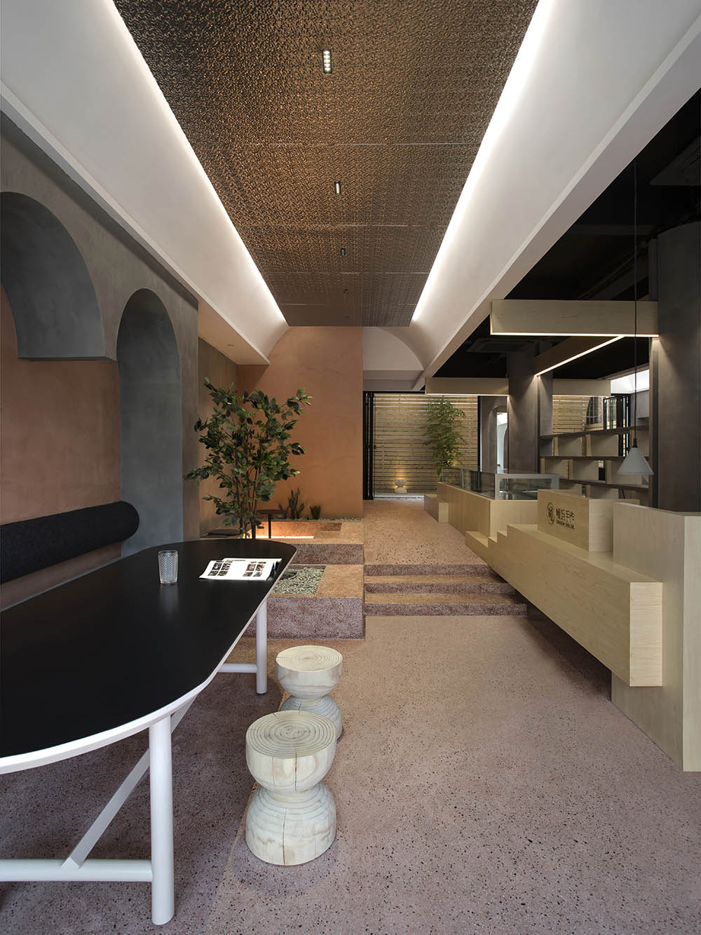
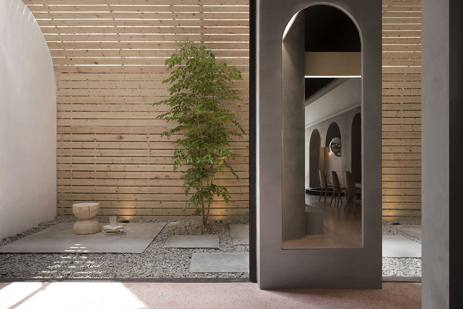
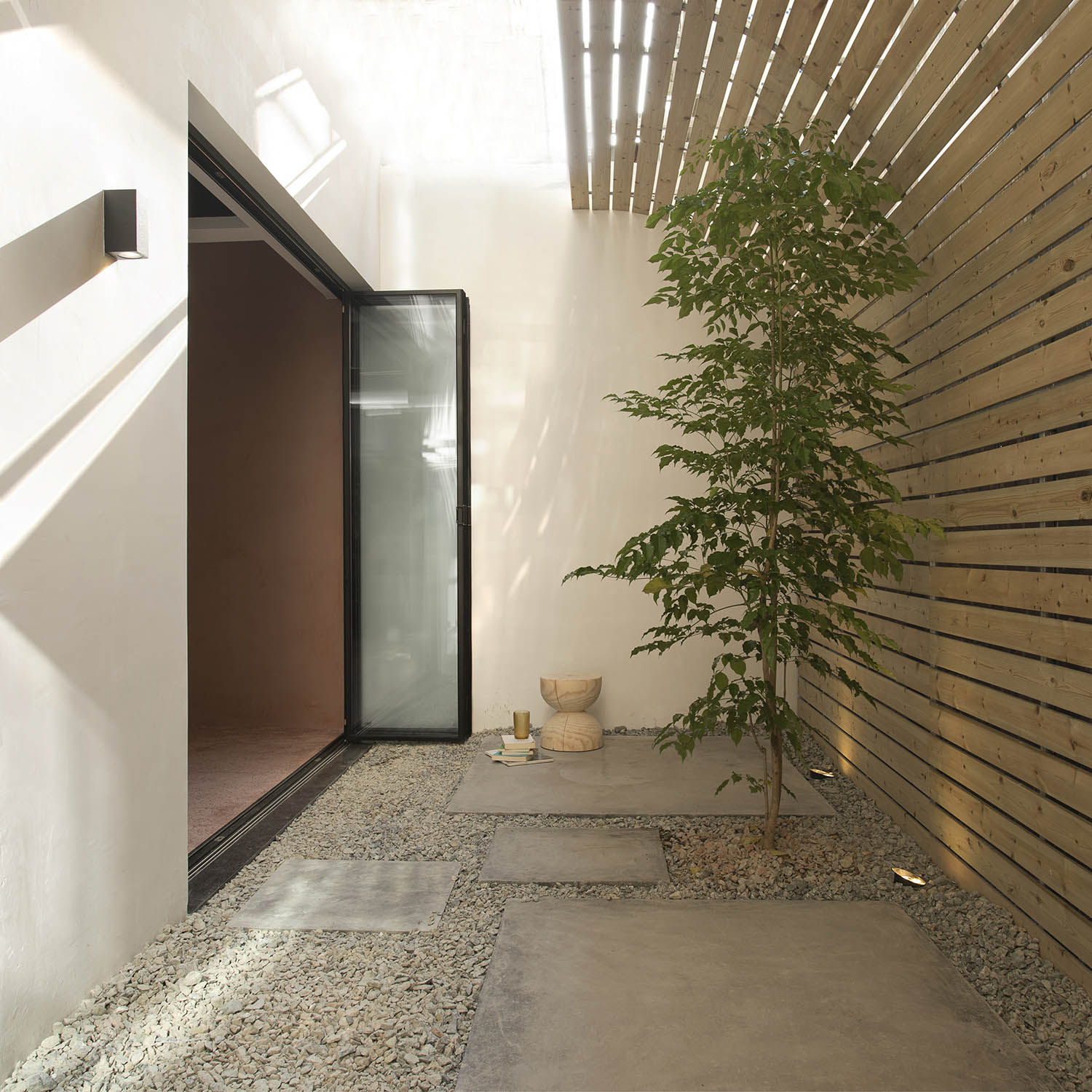
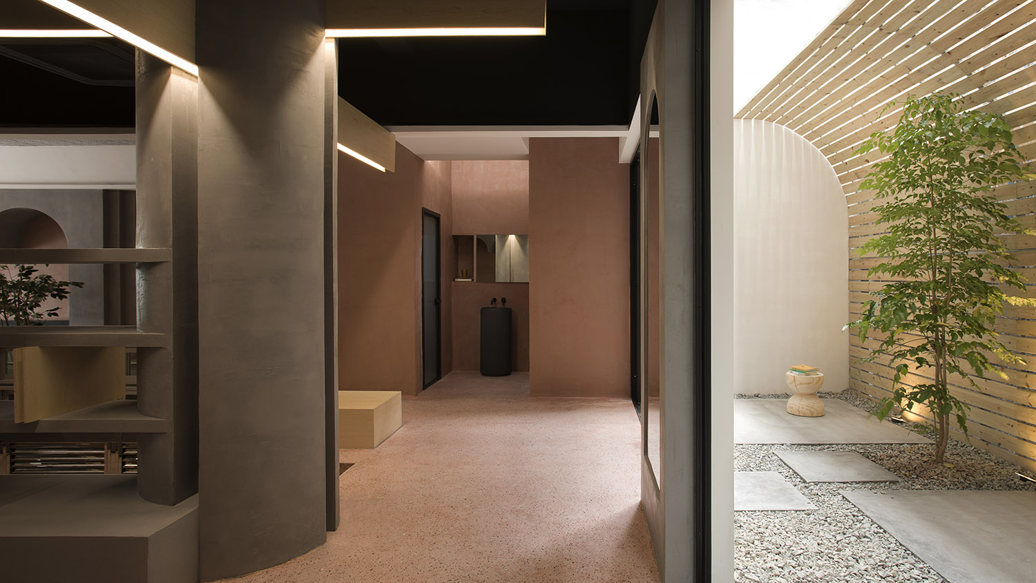
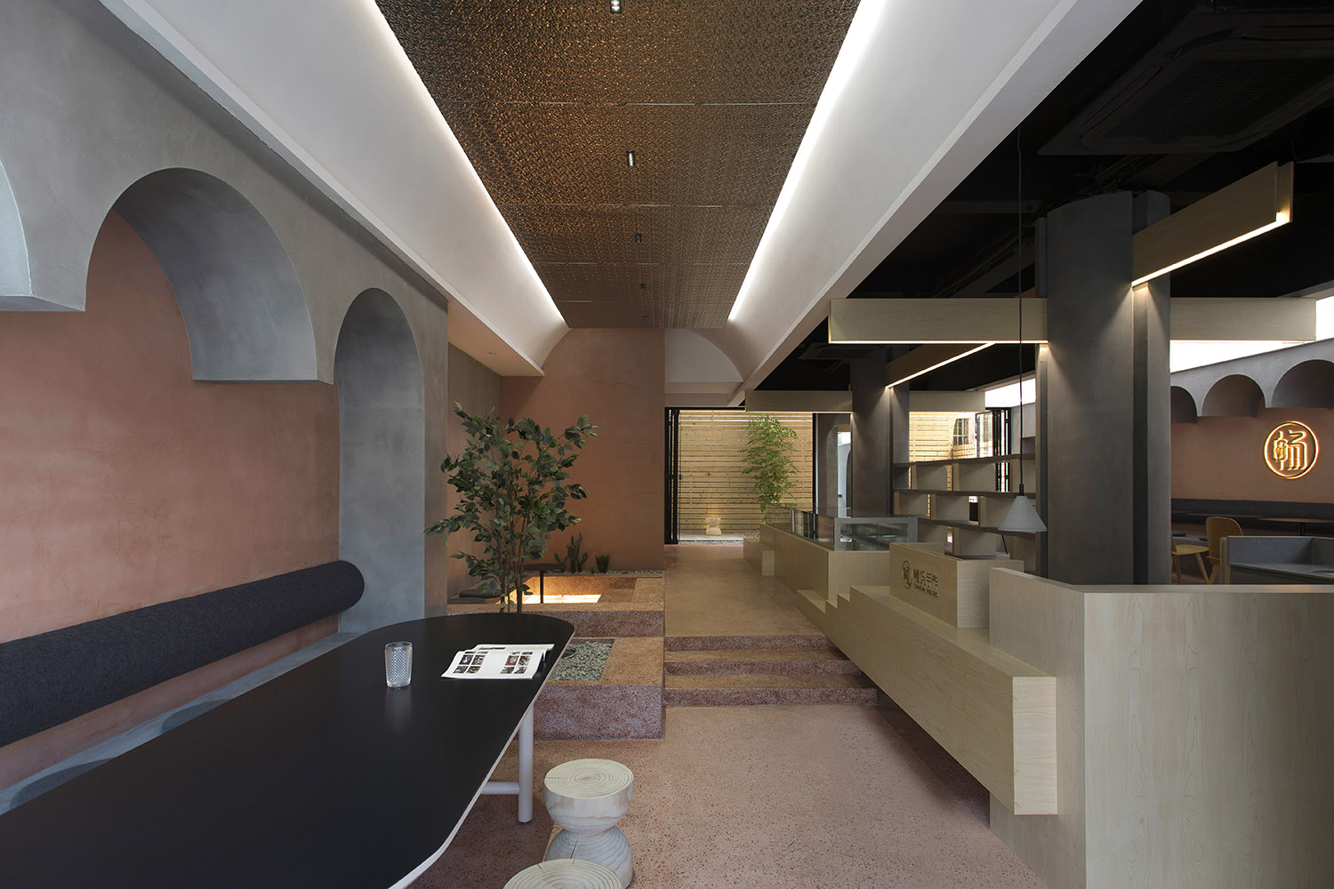
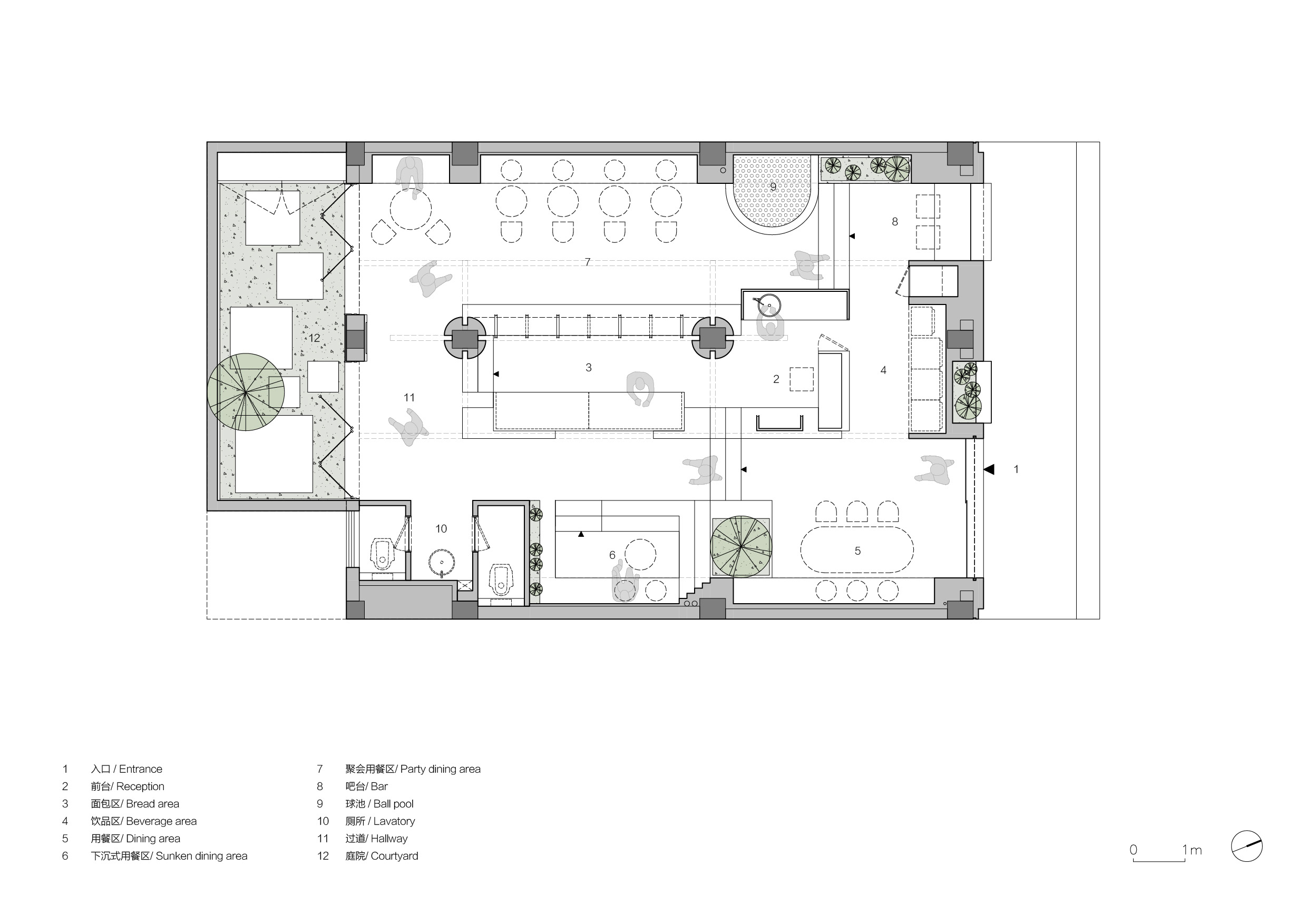
我們把前台及產品陳列等服務功能規劃在整個空間的中心位置,圍繞這個中心區域將不同用餐空間分布在四周,形成回行的空間布局。無形中便拉長了空間的動線,沿著這個動線布置了幾種不同的用餐體驗空間和穿插其間的小景以及一個戶外庭院,漫步其間,猶如遊走於一個微型公園之中。
How to immerse customers in the “Garden Tour” experience using only 100 ㎡?
We planned to set the reception and product display and other service functional areas in the center of the space, and distributed different dining spaces around this central area, forming a circular spatial layout, which invisibly lengthens the dynamic route of the space. Along the route, we set several different dining experience spaces and small sceneries interspersed in between, as well as an outdoor courtyard that feels like a micropark.
空間的營造 Space Creation
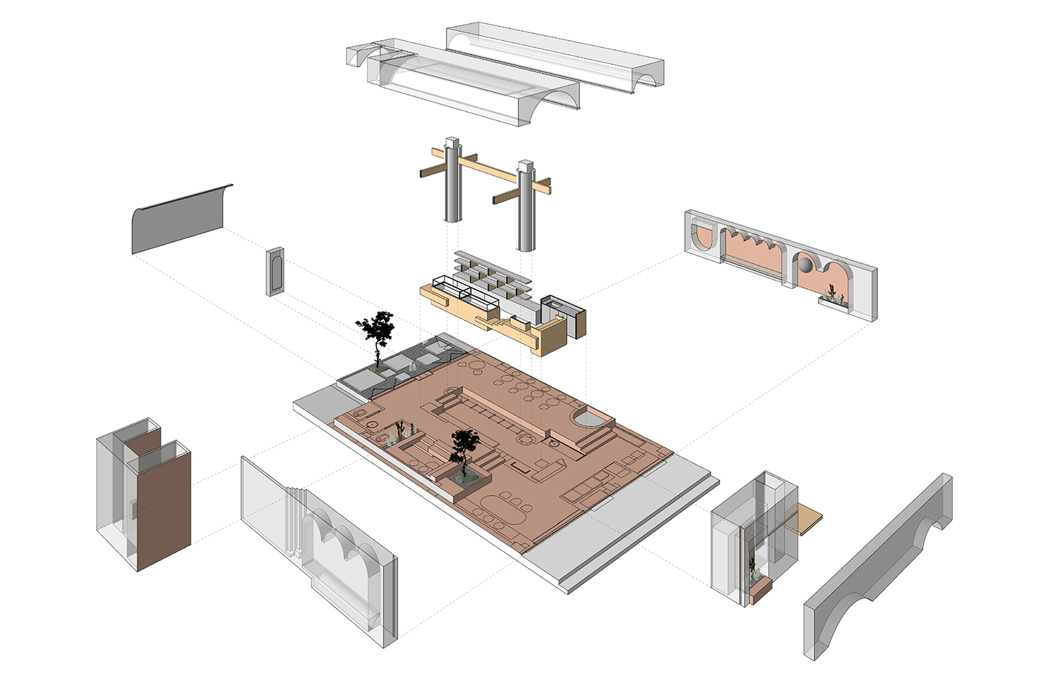
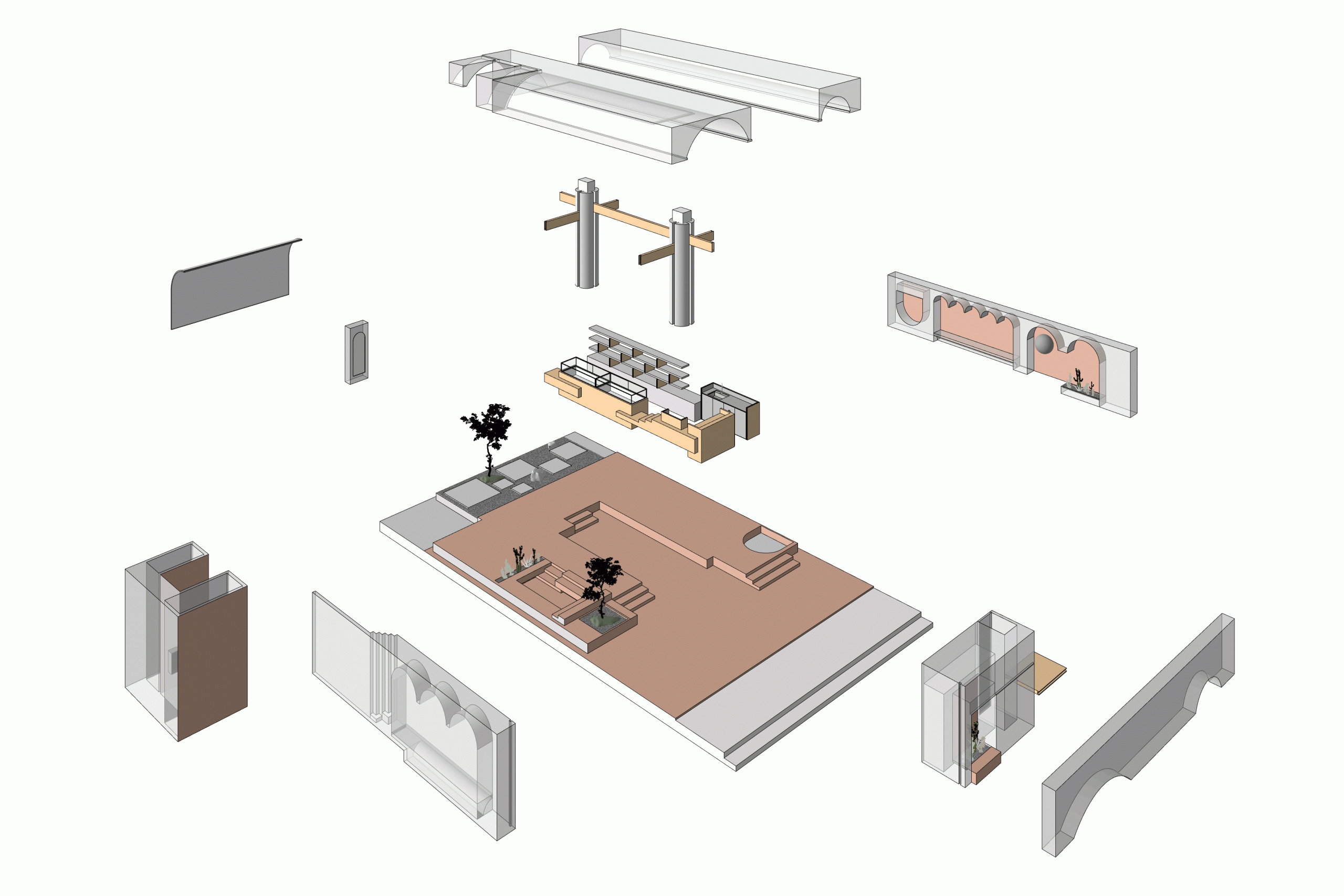
∇ 爆炸動態圖
高差 Height Differences
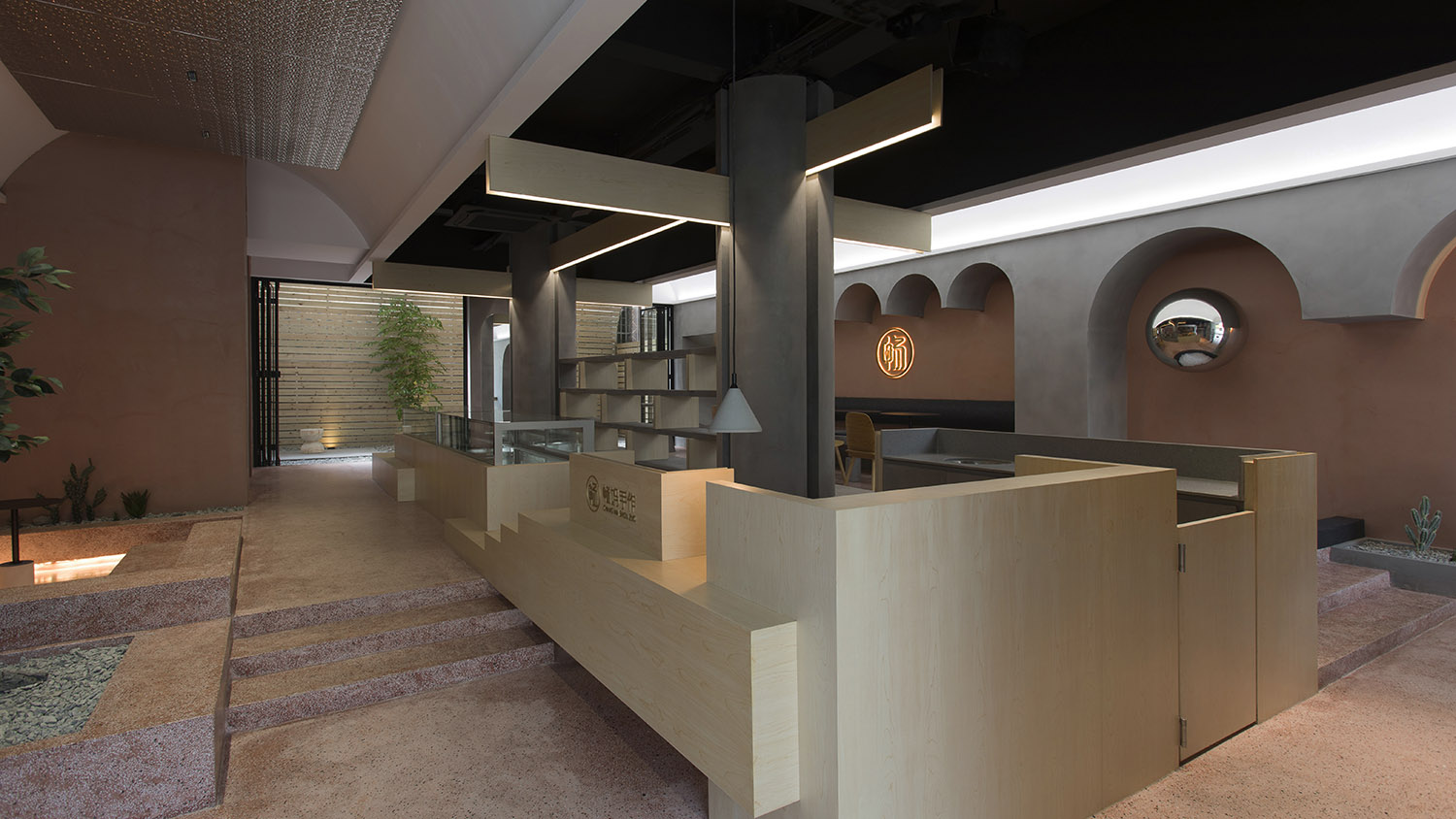
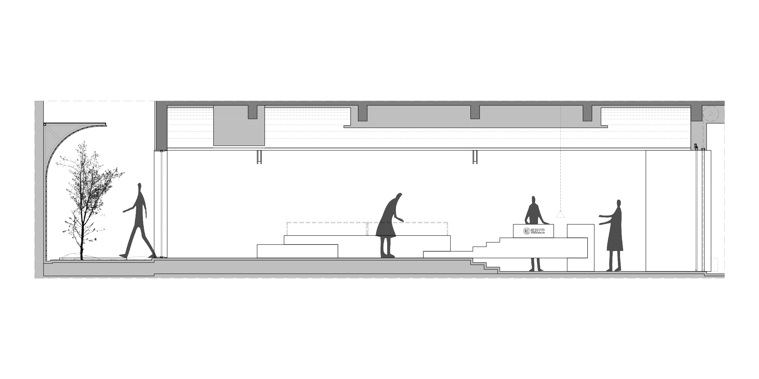
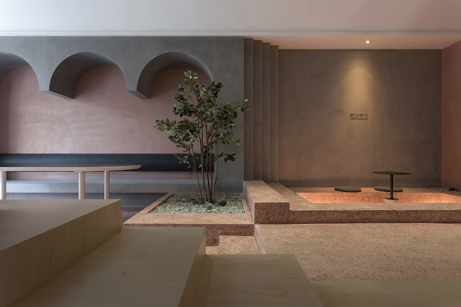
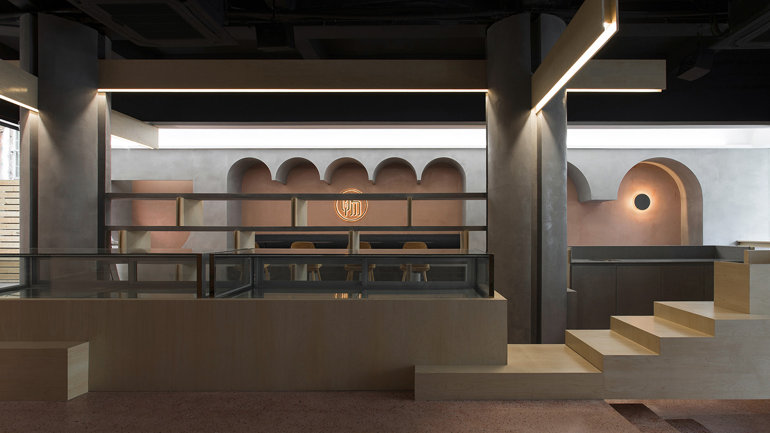
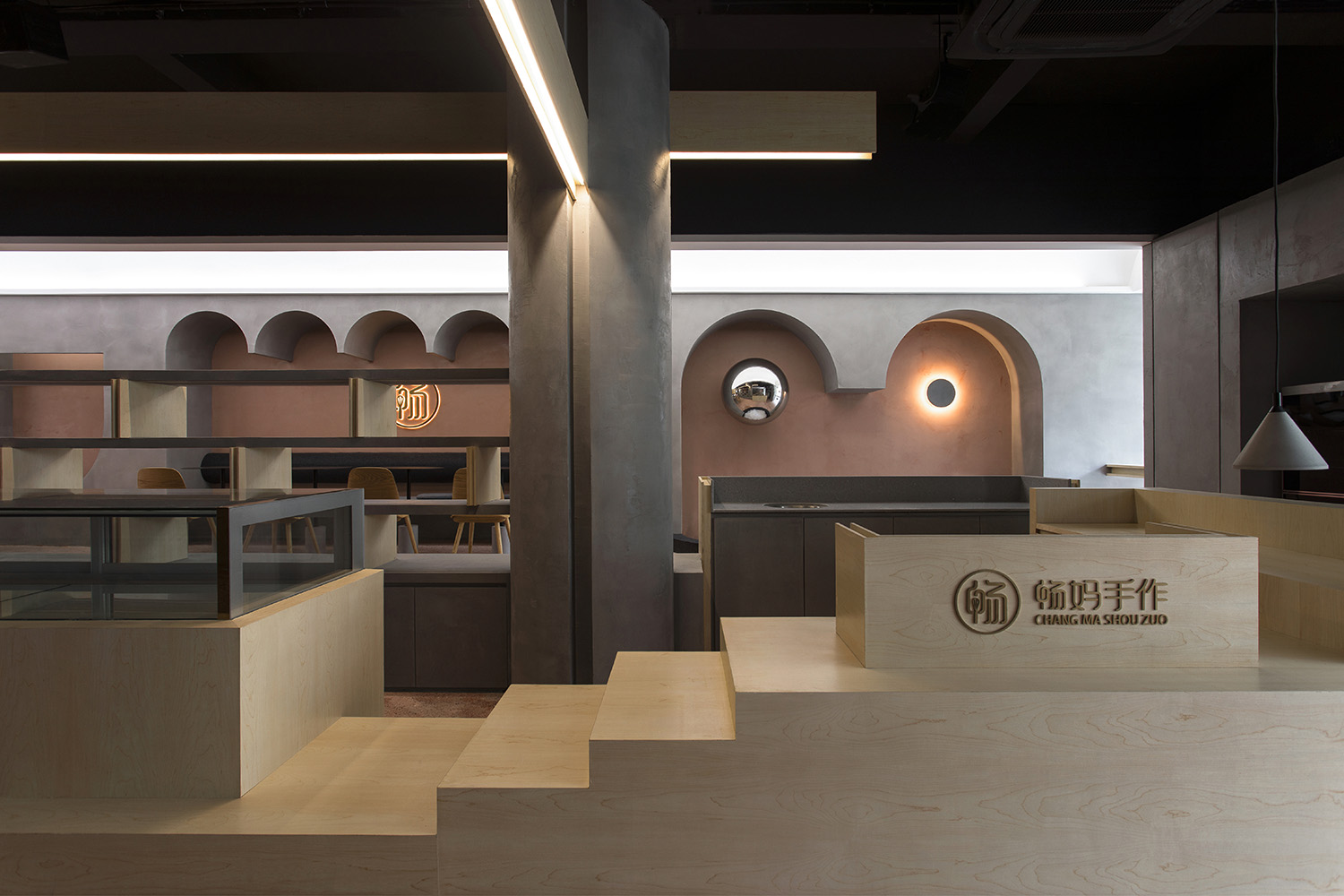
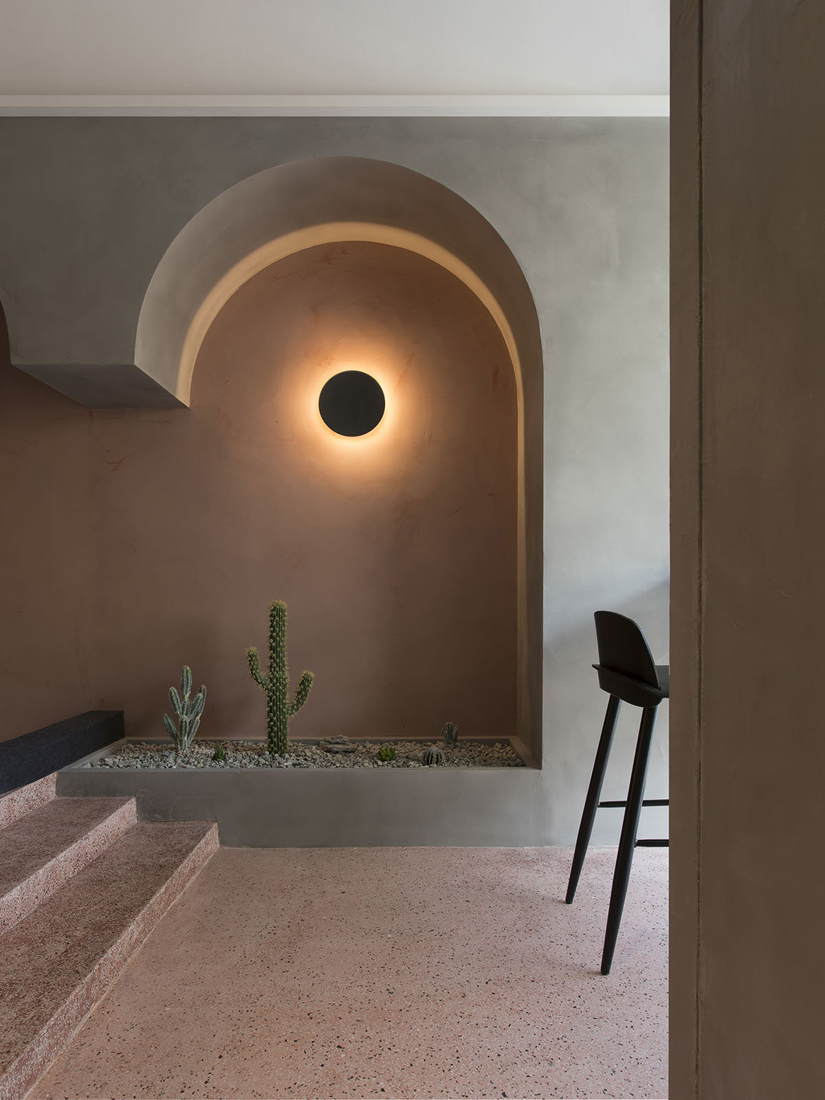
我們將整個空間的後半部分抬高30公分,現場澆築的水磨石地麵構建出層次分明的平台,塑造出大小不一的花池和錯落的台階,營造出“園”的意象。這樣的高差變化為用餐空間提供了不同的體驗,也形成了顧客和店員之間有趣的視角關係。
By covering the space with terrazzo tiles on site, we raised the rear half of the space by 30 cm, constructed a well-defined platform, and built flower ponds of different sizes as well as scattered stairs, creating the image of a “garden”. This altitude contrasts provides different dining experience and also forms interesting perspectives between customers and our staff.
∇ 立麵分析圖
鬥拱 Bracket System
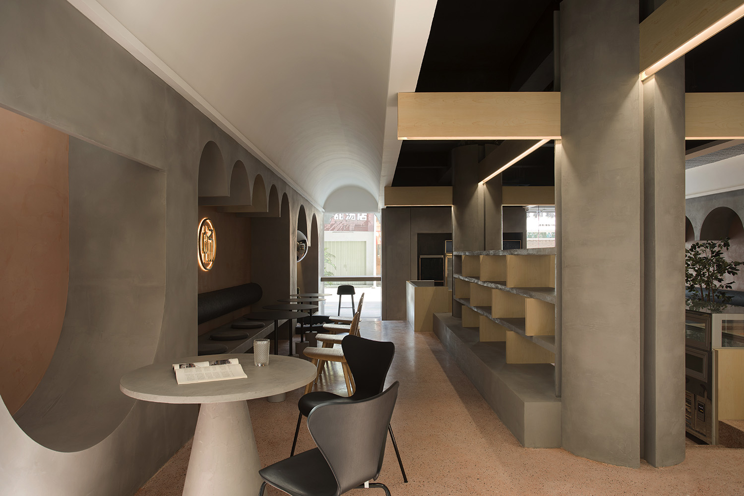
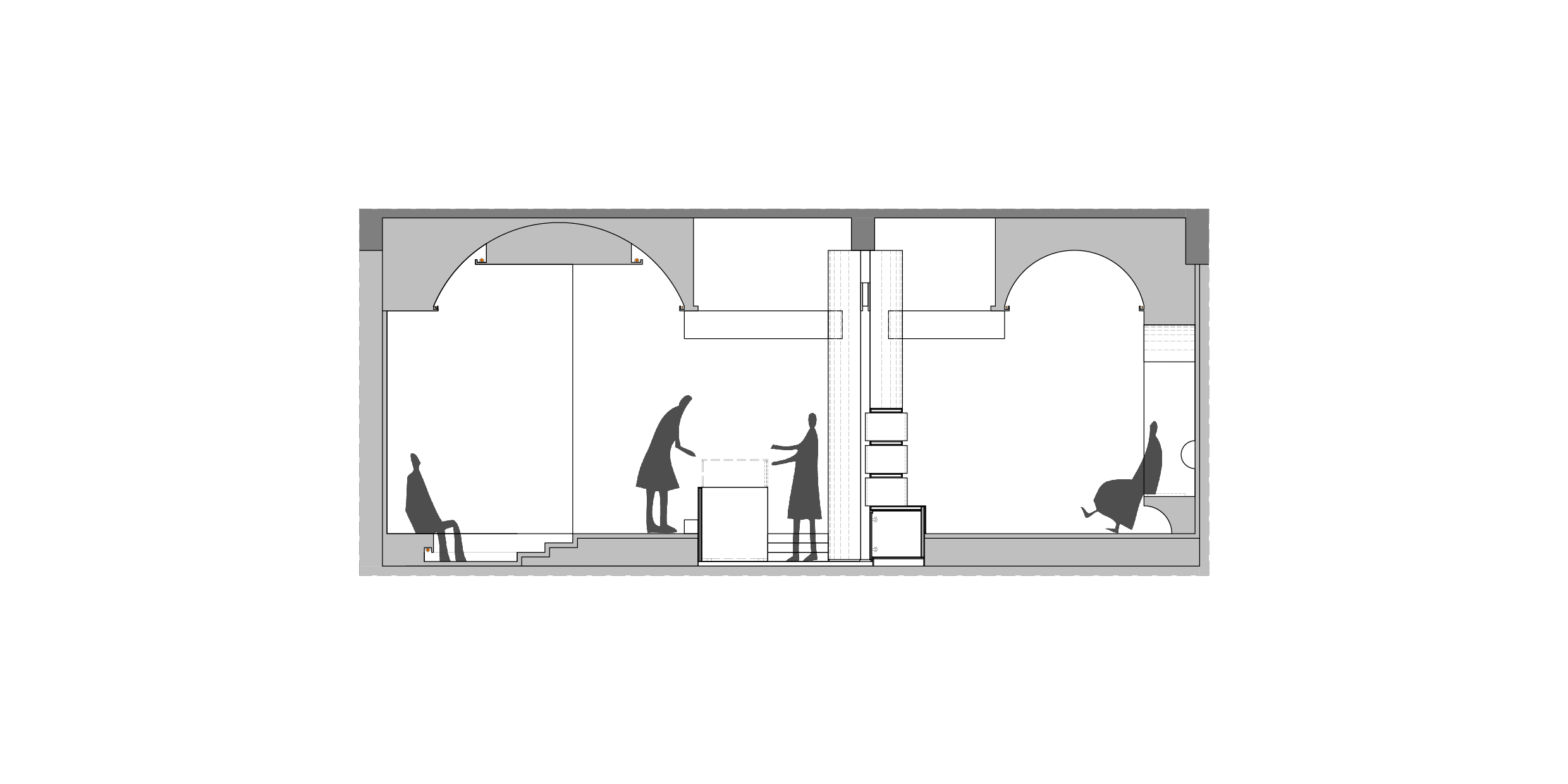
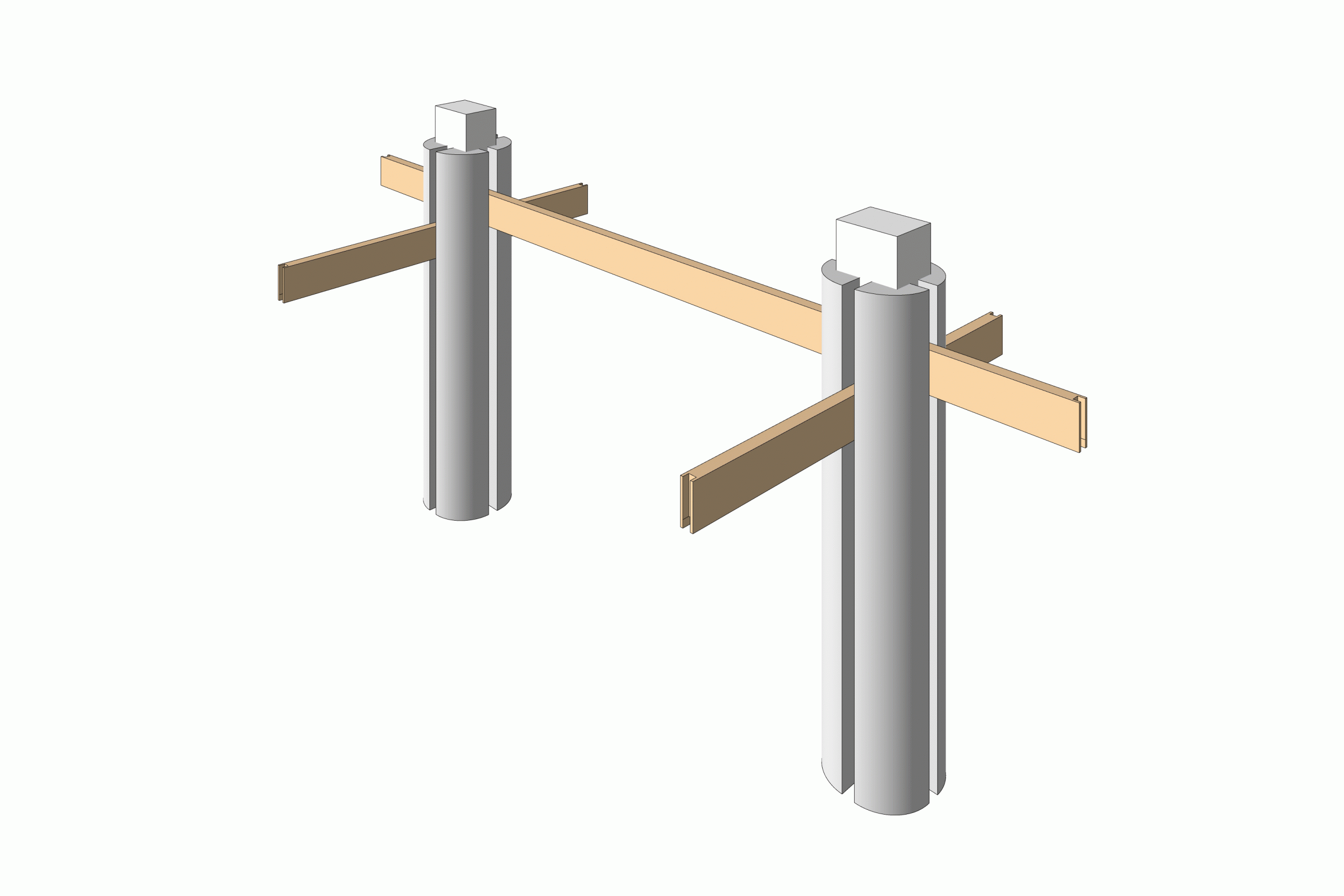
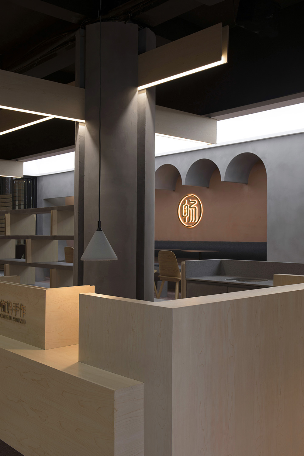
分裂成四部分的圓柱形式代替了中心區域原有的兩根混凝土方柱,分裂的圓柱在平麵上具有“十”字型二向性,增加了結構在空間中的視覺權重。三根簡化的木梁以搭接的方式貫穿分裂的圓柱,正交臥搭,延伸搭接於兩側的拱頂,形成一個新的空間結構體係。這也是對中國建築鬥拱結構的演變和新的詮釋。
The integrated four-part column replaces the previous two concrete square columns in the central area. The split column has a cross-shaped bidirectionality on the plane, increasing the visual weight of the structural design in the space. Three simplified wooden beams run through the split columns with overlap joint, and the orthogonal lying overlapping extends the vaults overlapped on both sides, forming a new spatial structure system. It can also be regarded as an evolution and new interpretation of the bucket arch structure of Chinese architecture.
∇ 鬥拱分解圖
拱券 Arch
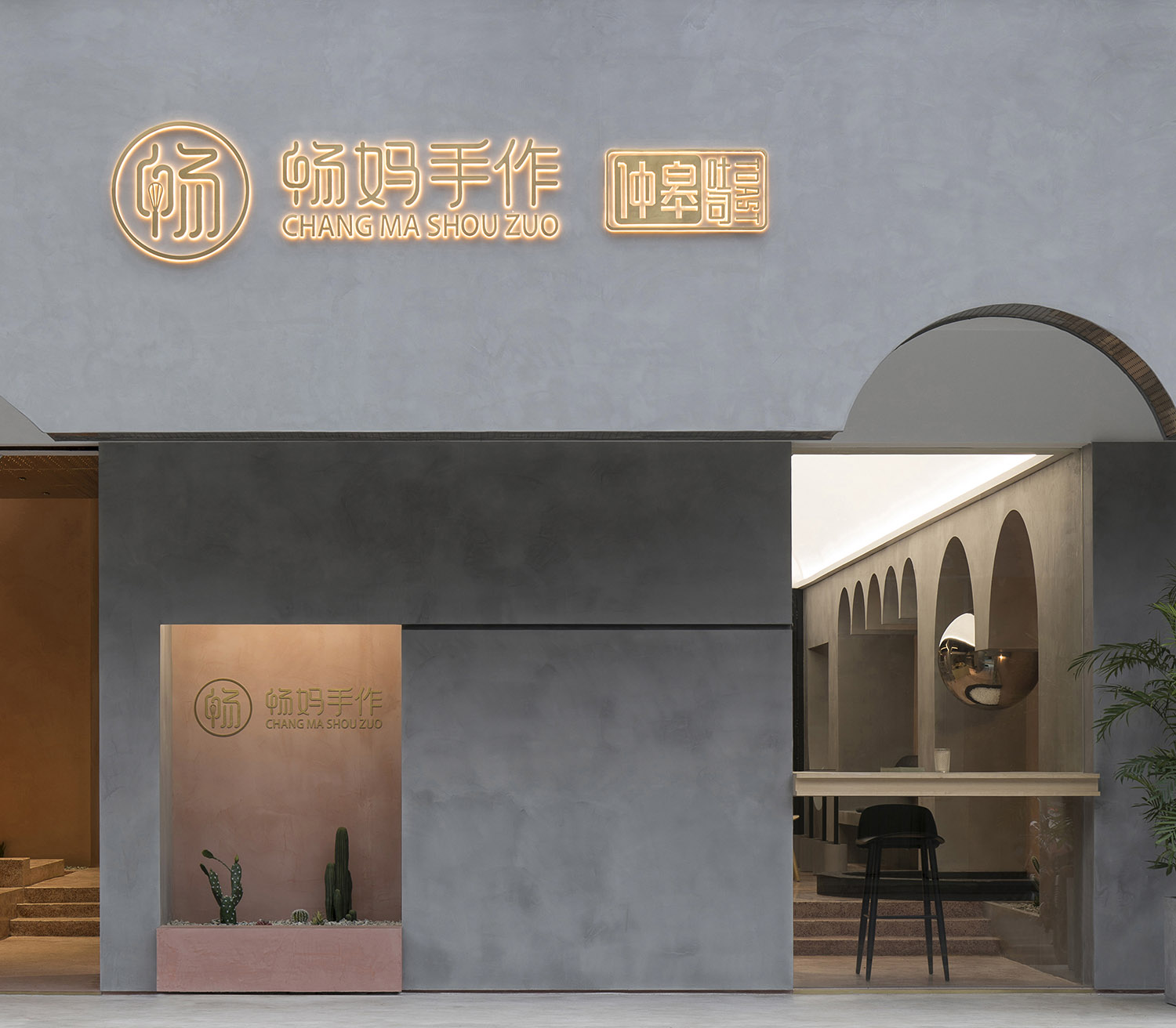
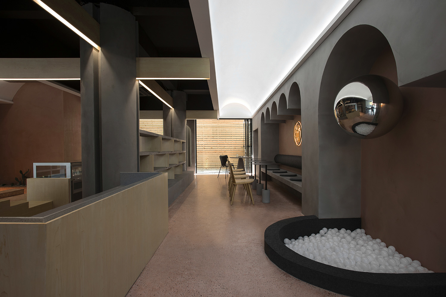
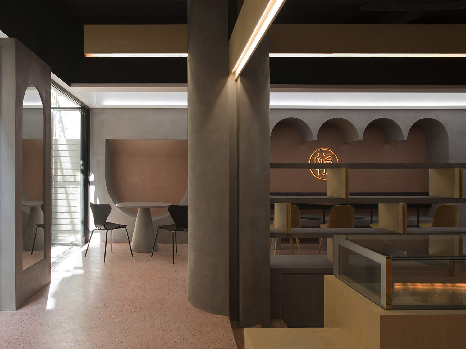
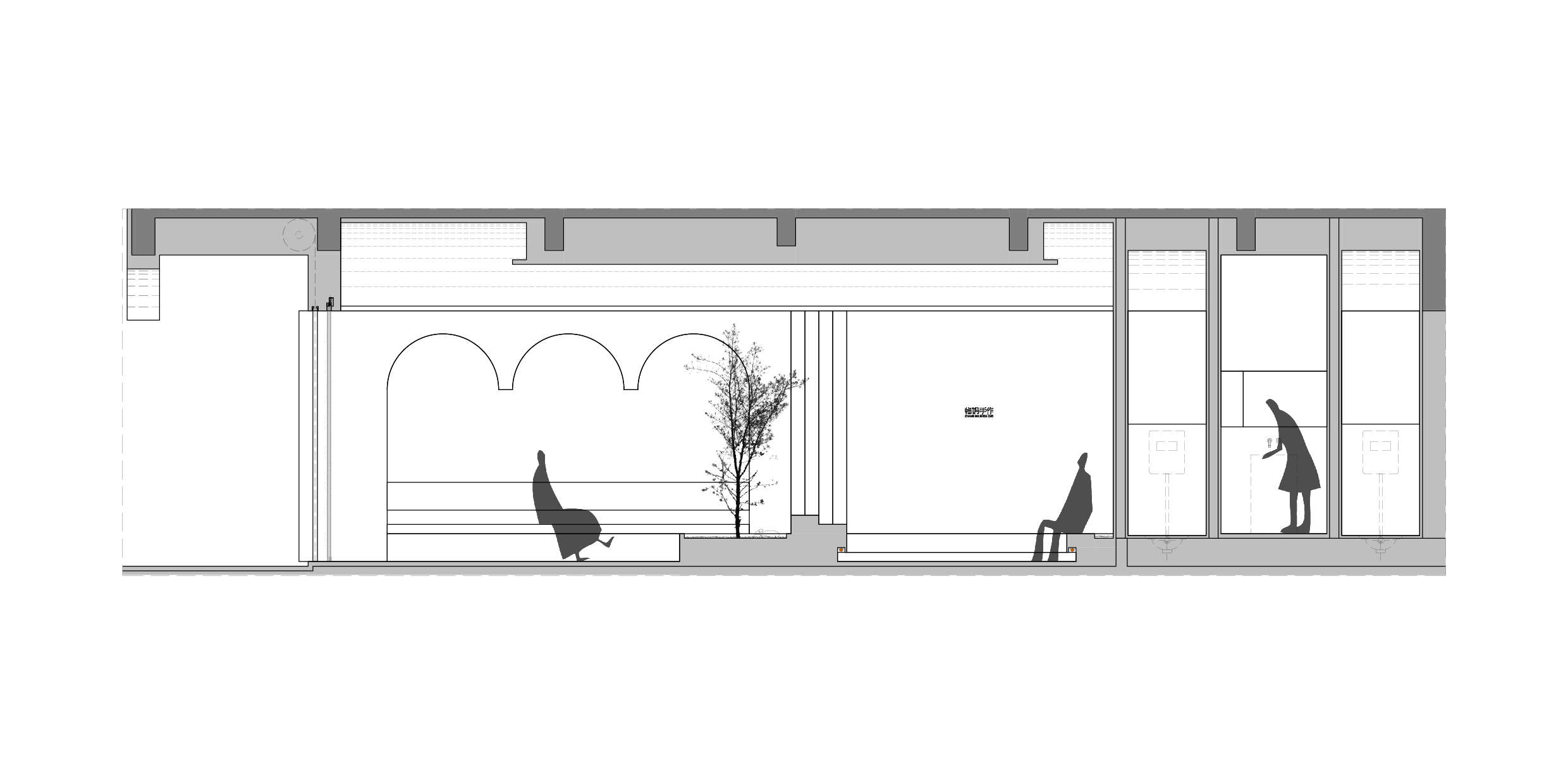
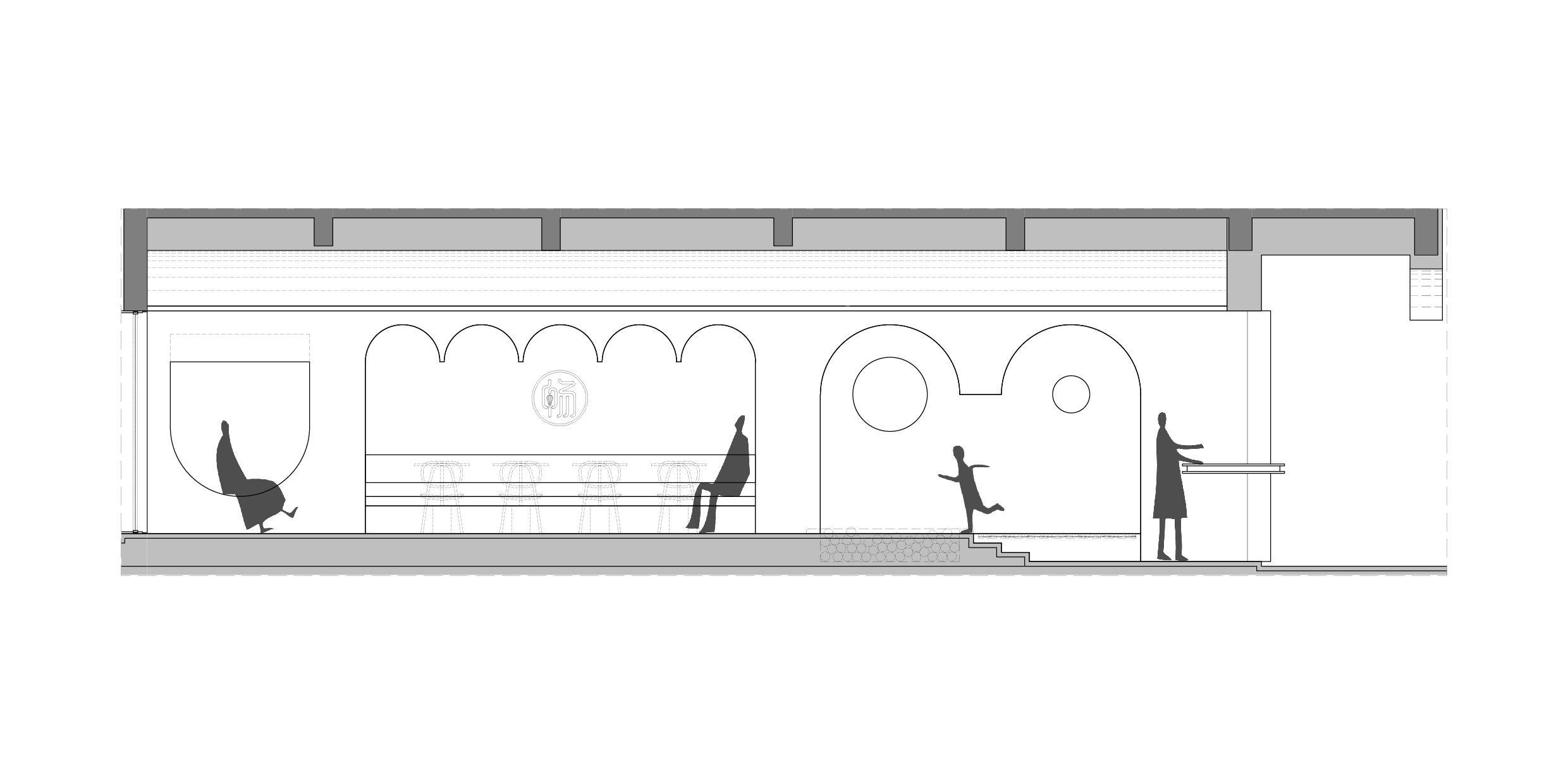
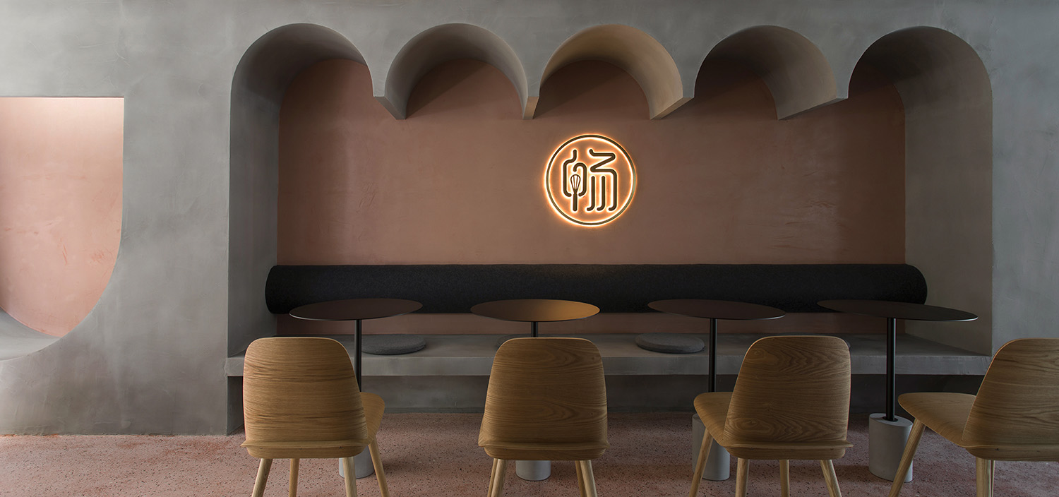
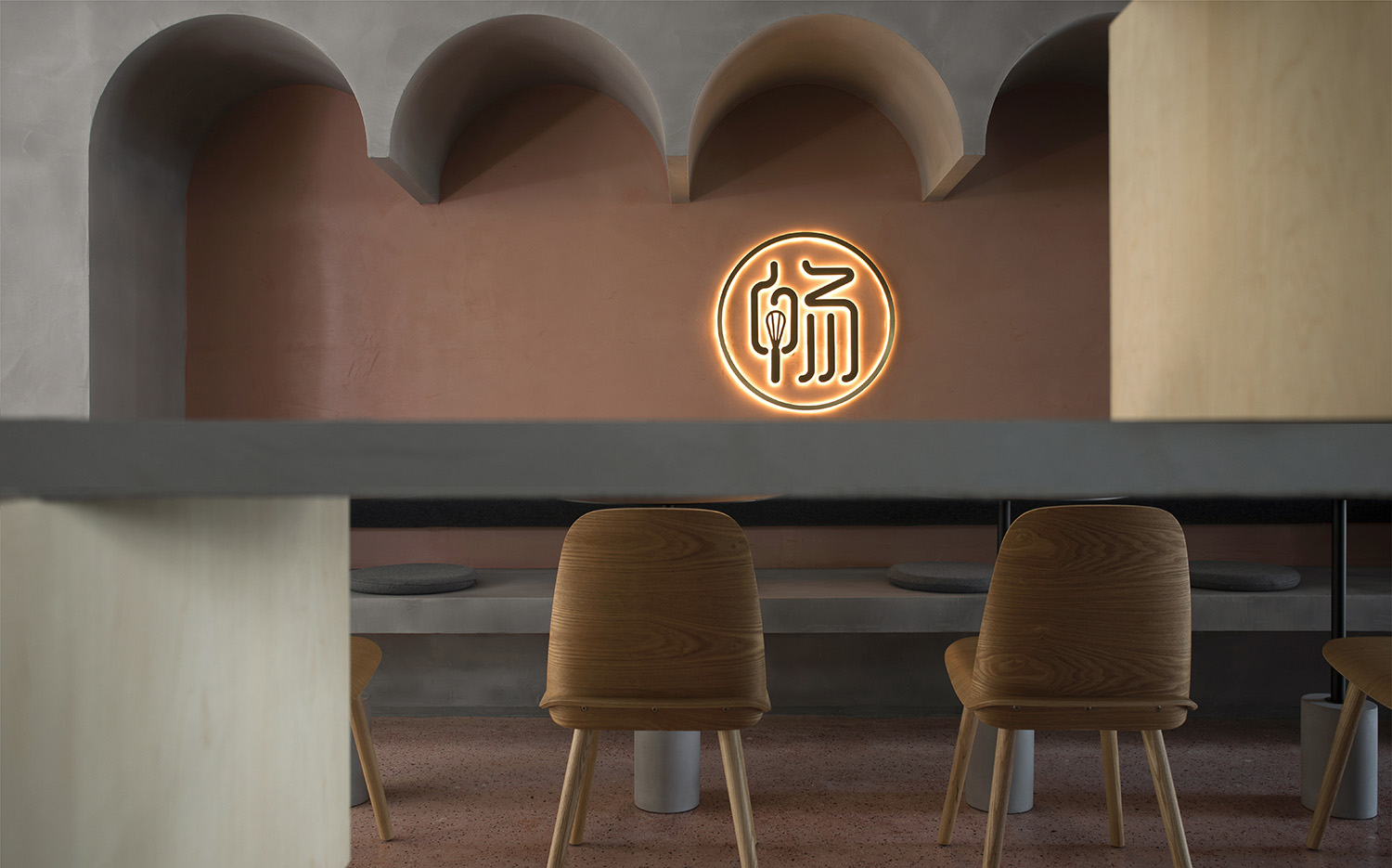
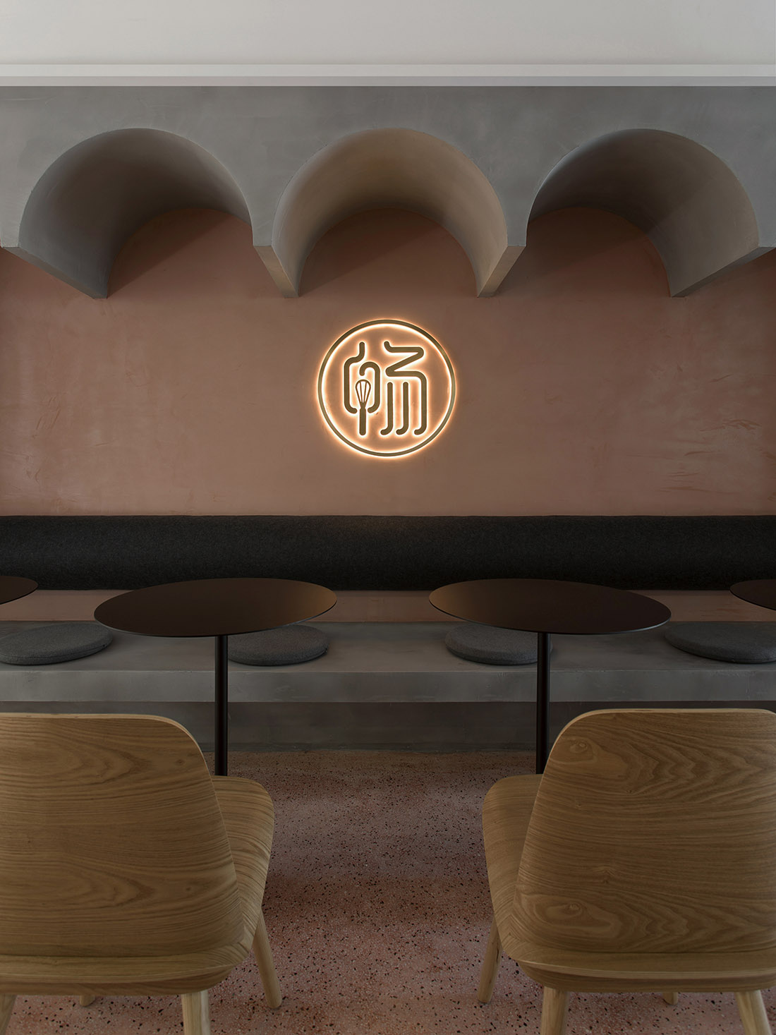
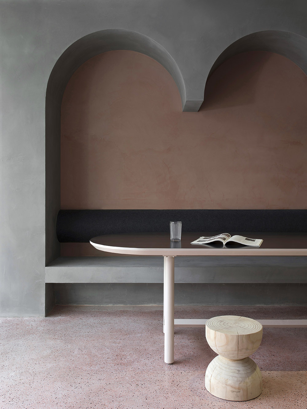
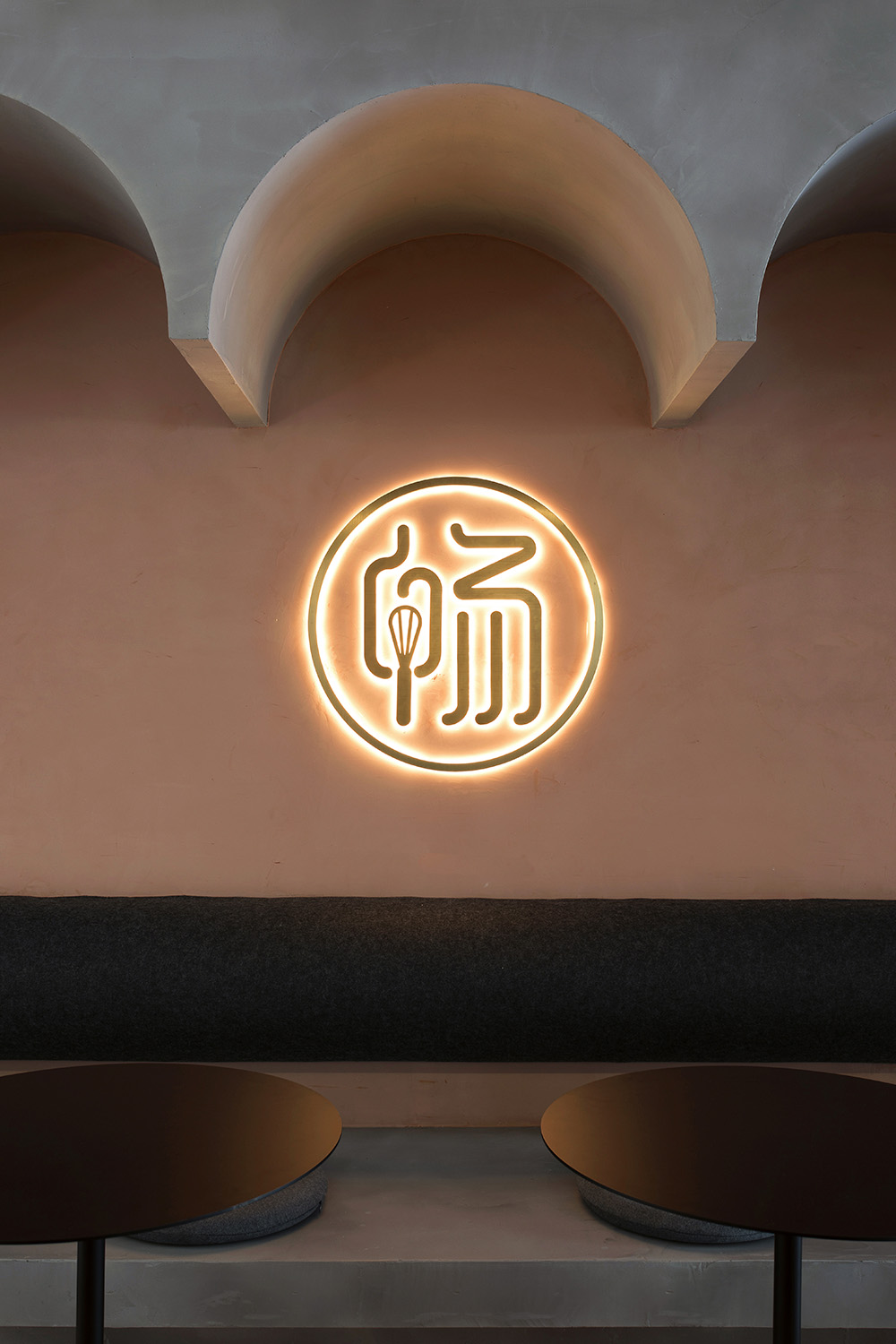
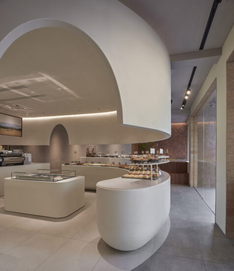
空間兩側牆麵連續拱券的體塊,連接天花的拱頂,營造出一條回行拱券廊道的空間意象。增強了空間的層次感和視覺上的延伸感,從而弱化了空間的界限。
On both sides of the space, the continuous vaulted volume on the wall connects the vault of the ceiling, creating a spatial image of a circular vaulted corridor. It enhances the sense of hierarchy and visual extension of the space, thereby weakening the boundaries of the space.
∇ 立麵分析圖
材質 Material
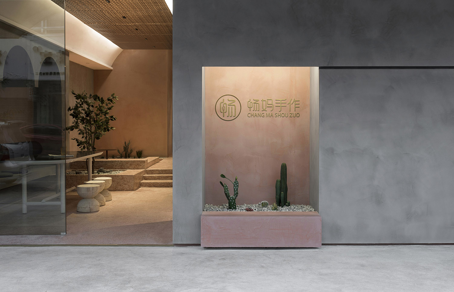
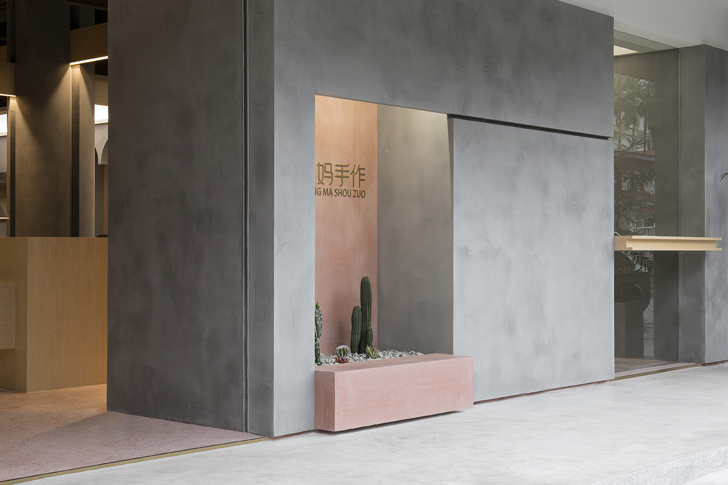
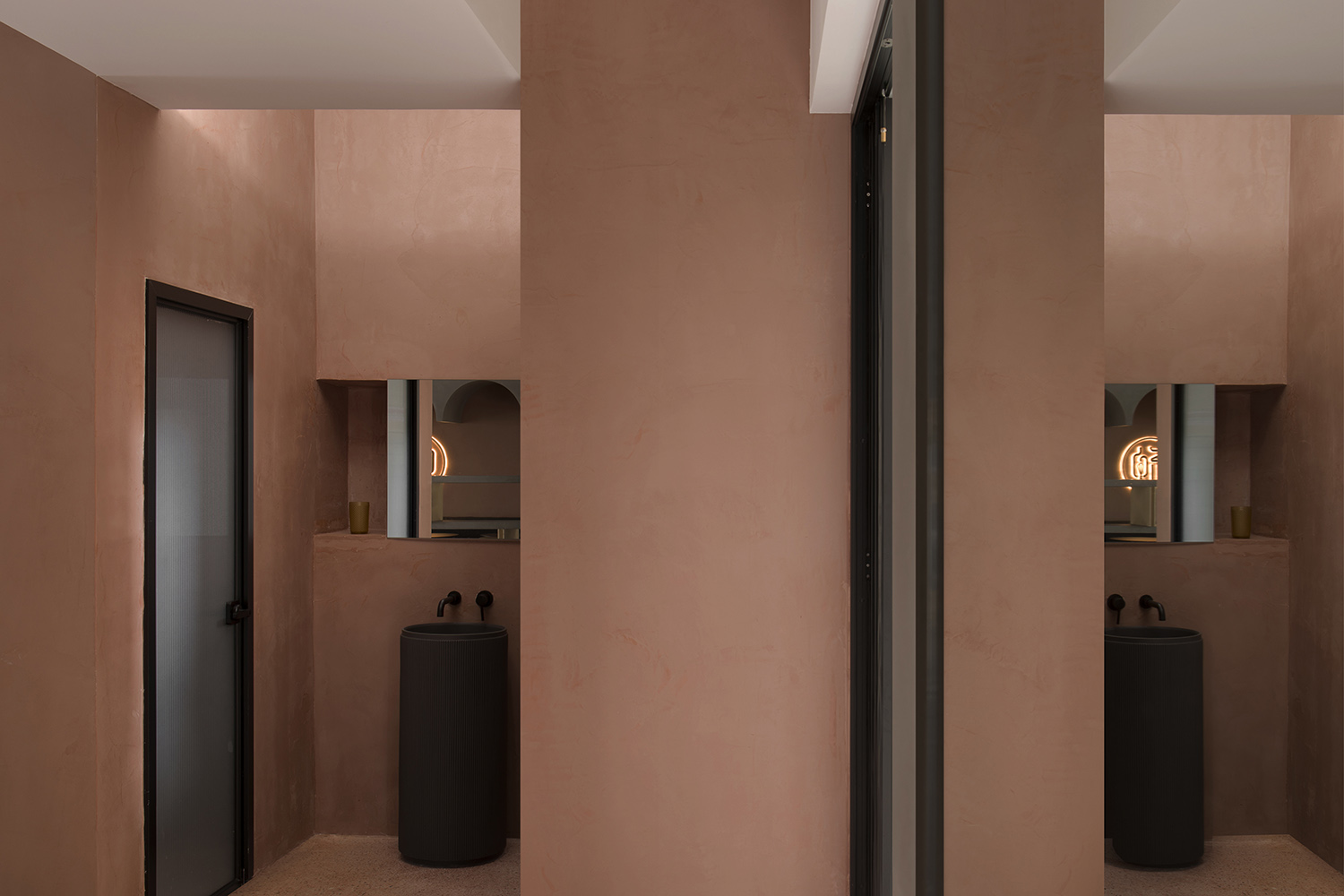
為了營造“園”的氛圍,我們選用了現場澆築的陶土紅水磨石作為地麵材質,牆麵則運用了水泥灰和陶土紅的手工漆。水磨石和手工漆能很好地塑造了空間的體塊感,手作的方式也與業主的經營理念契合。
In order to create a “garden” atmosphere, we cover the floor on site with clay red terrazzo tiles, and painted the wall with hand-painted paint of cement gray and clay red. With the terrazzo flooring and hand-painted wall, it well shapes the sense of volume and block of the space, and the hand-made method is also in line with the proprietor’s business philosophy.
我們的理念 Our Philosophy
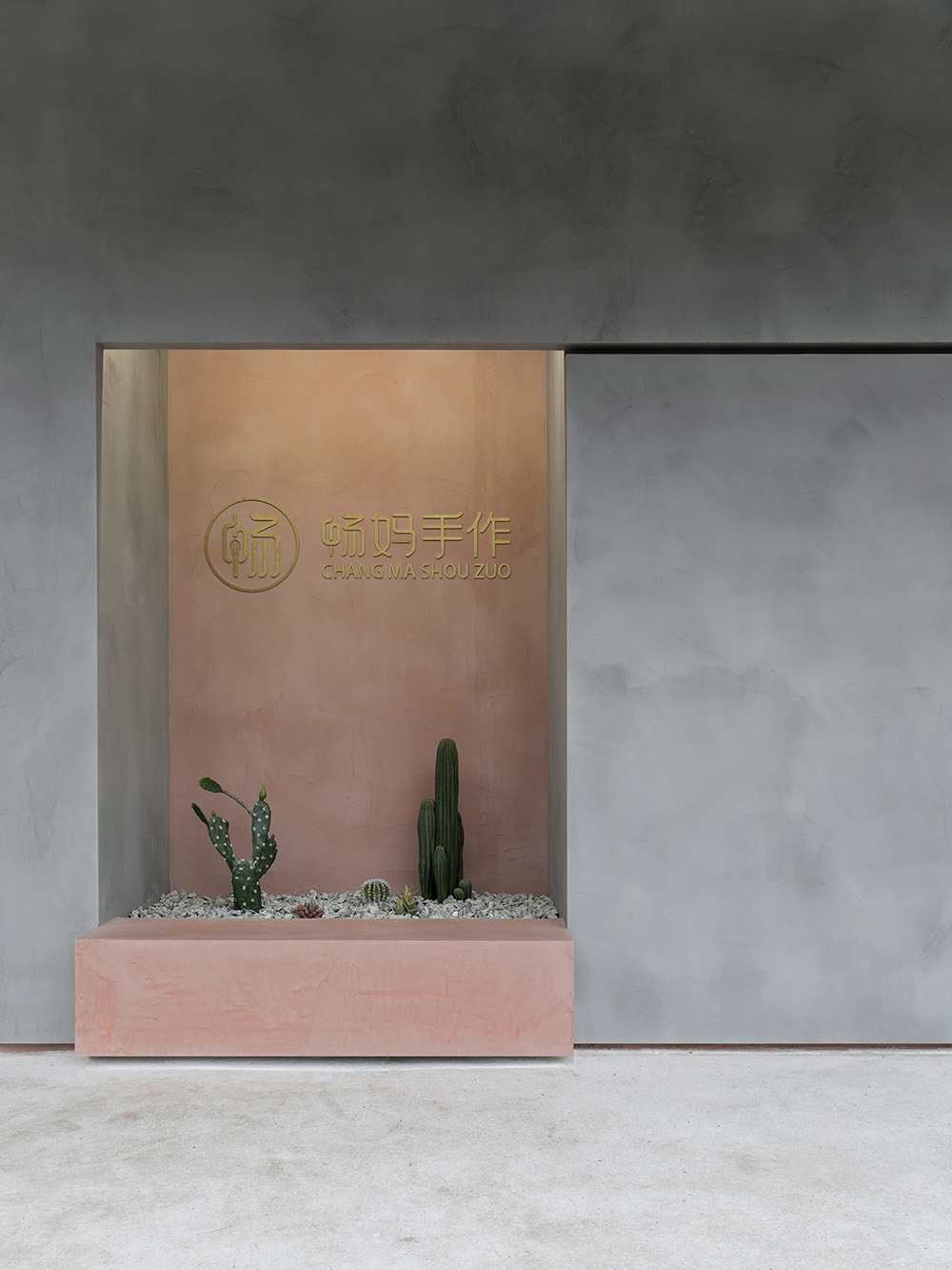
如何將自然元素融入建築空間中,模糊室內外空間界限,一直是我們工作室在建築空間設計上思考的一個命題。這個項目也是我們設計理念上的一次實踐,我們想通過這樣的實踐為商業空間創造更多的可能性,也借此表達我們在建築空間上的見解以及對城市街區麵貌的願景。
How to integrate natural elements into the architectural space and blur the boundaries of indoor and outdoor spaces has always been a proposition that our studio explores in architectural space design. This project is also a practice of our design philosophy. Through this practice, we look forward to creating more possibilities for commercial space, as well as expressing our insights on architectural space and vision for the appearance of urban blocks.
∇ 施工過程圖
∇ 平麵布置圖
項目信息
項目名稱:遊園-暢媽手作
設計機構:PADSTUDIO 質感建築設計
主創及設計團隊:馬學鑫、馬宏鋒、馬佳濤
項目地點:廣東汕頭
建築麵積:100平方米
主要材料:水磨石、手工漆、木皮、波紋板
設計時間:2020年6月
竣工時間:2020年9月
施工單位:金手藝施工
空間攝影:陳榮坤
Project name: Garden Tour-Mother Chang’s handmade
Design firm: PADSTUDIO
Leader designer & Team: Ma Xuexin, Ma Hongfeng, Ma Jiatao
Project location: Shantou, Guangdong, China
Gross Built Area: 100sq. m
Main materials: terrazzo, handmade paint, wood veneer, corrugated plate
Start time: June 2020
Completion time: September 2020
Construction Side: JINSHOUYI Construction
Photographer: RK.Chen


