全球設計風向感謝來自 CCDI悉地國際北京室內設計中心 的辦公室空間項目案例分享:
∇ 設計概覽 design overview
本次設計服務的對象 —— 新思科技,是全球排名第一的電子設計自動化(EDA) 解決方案提供商以及芯片接口IP供應商,同時也是信息安全和軟件質量的全球領導者。
SYNOPSYS is the party of this design service, which is the world’s number one electronic design automation (EDA) solution provider and chip interface IP supplier, and it is also a global leader in information security and software quality.
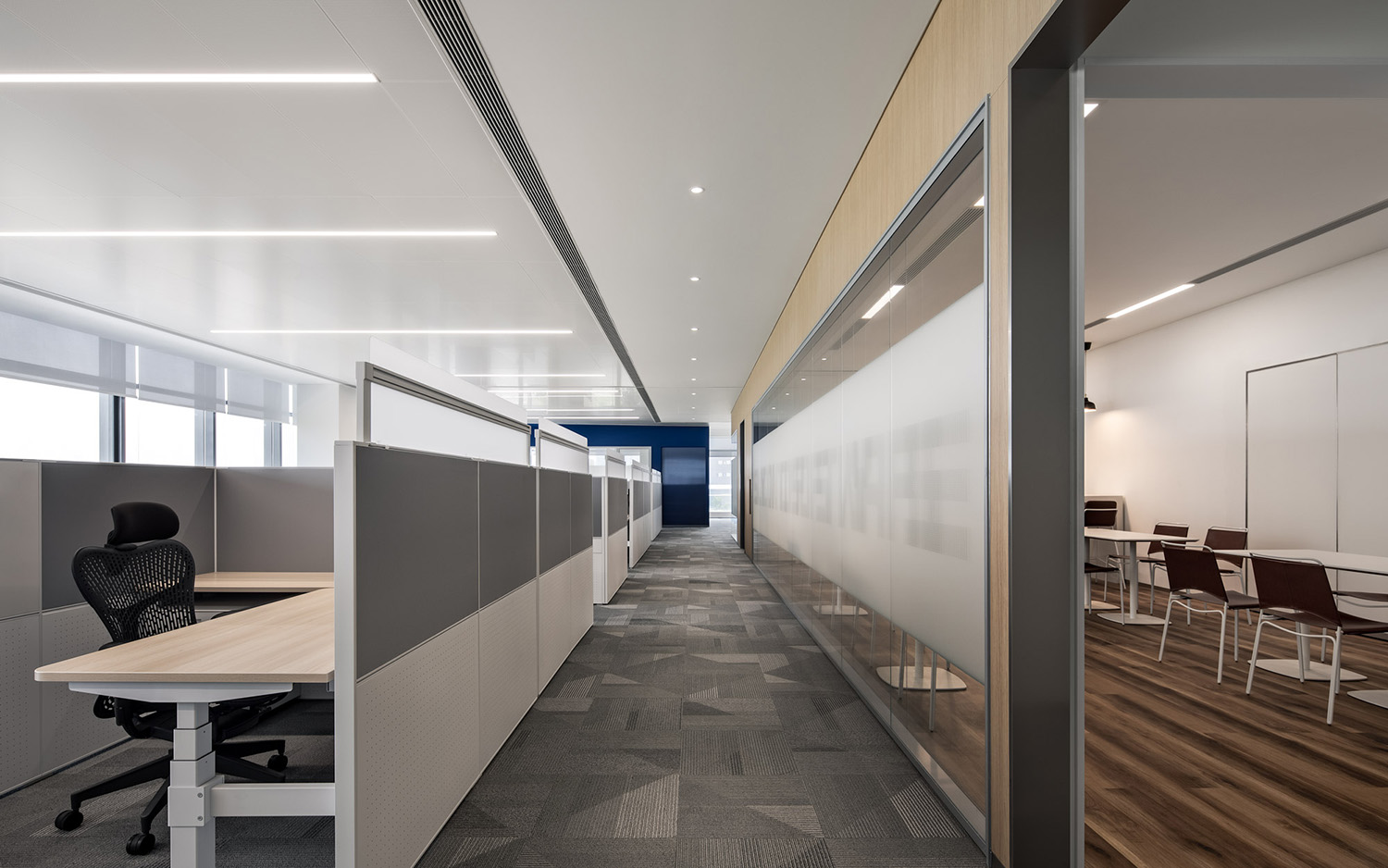
在設計之初,我們麵臨了業主基於使用者角度所提出的各種“限製”——工位是2m*2m寬,1.1m高的方盒子以保證員工私密性;工位要有連續性,不能被實體牆麵打斷;要動靜分離,保證能夠專注工作的空間…這樣一係列的條件,與當下最流行的靈活辦公方式幾乎背道而馳。
At the beginning of the design, we faced various “restrictions” proposed by the owner based on the user’s perspective – the workstation is a square box with a width of 2m * 2m and a height of 1.1m to ensure the privacy of employees; the workstation must have continuity, It cannot be interrupted by the solid wall; the “chat” area must be separated from the “work” area to ensure a space that the staff could focus on their work… Such a set of conditions is almost the opposite of the most popular way of working flexibly.
∇ 建築外觀 Building Exterior
對於新思科技來說,“科技”不再是未來、酷感的代名詞,而是為當下生活提供安全便利的基礎條件。基於這樣的企業特點,我們在設計中摒棄了科技公司慣用的黑白灰色調、科技線條等經典元素,以”芯片盒子”為設計理念,將芯片元素進行解構、重組,用豐富的顏色、不同的拚接方式,打造出一個溫馨、靈活並具備文化厚度的辦公環境。
For Synopsys, “technology” is not only the sign of future and, but also the basic conditions for safety and convenience for current life. Based on the characteristics of this enterprise, we discarded the classic elements such as black, white and gray tones and technological lines commonly used by technology companies in the design. With the design concept of “chip box”, we deconstructed and reorganized the chip elements, using rich colors and different splicing method to create a warm, flexible and culturally thick office environment.
∇ 以芯片盒子為主線,串聯空間 Use chip box as the main line to connect the space
01丨創造盒子 —— 空間構成 CREATE THE BOX —— SPATIAL COMPOSITION
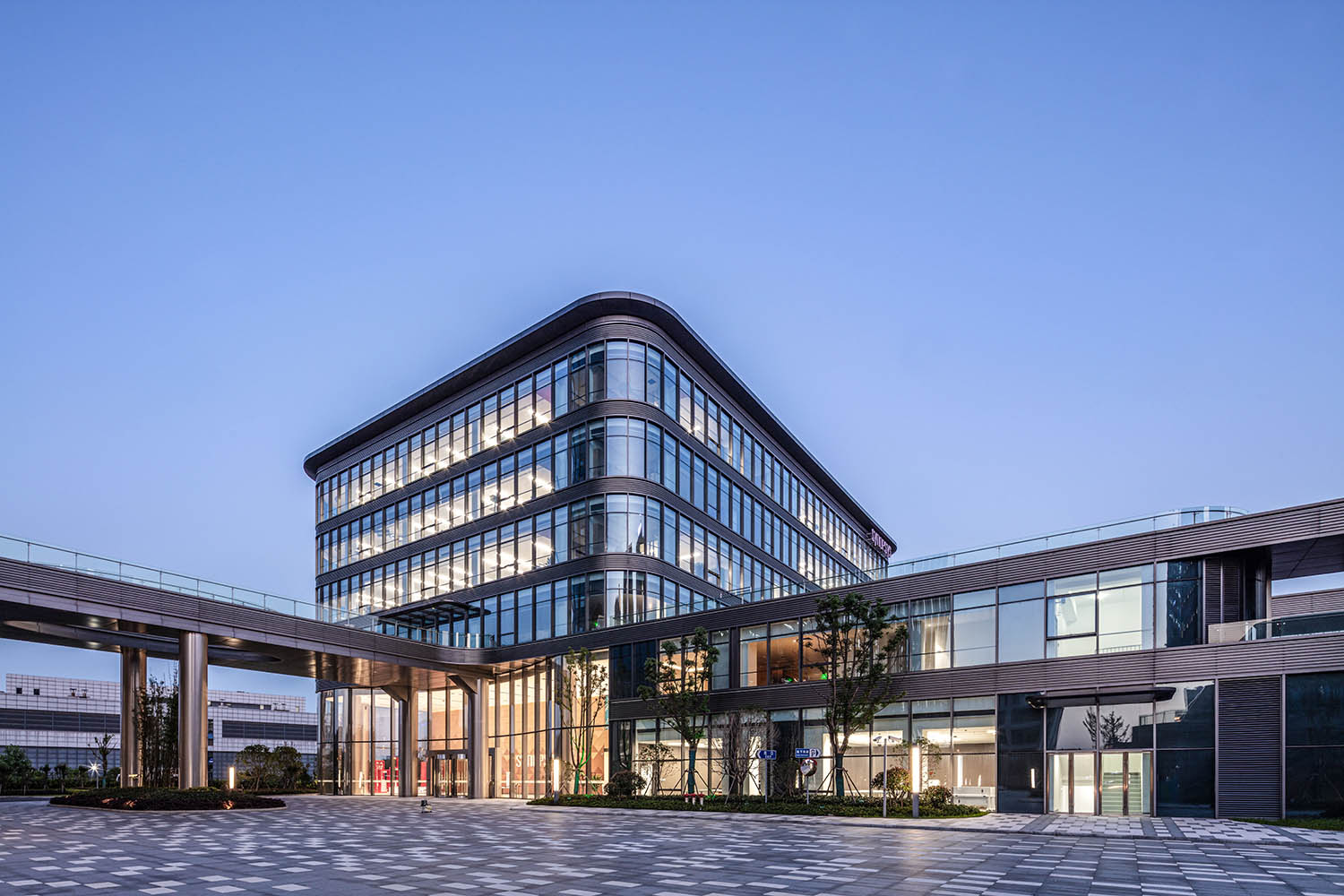
建築豎向疊加共有6層,在空間功能劃分上,根據業主需求及空間特點,我們將企業用於對外接待的會議、培訓、文化展廳等功能放置於1層;2層除辦公空間之外,結合室外花園平台設置休閑健身區;3-6層則作為以辦公功能為主的標準層。
The building has 6 floors. In terms of space function division, according to the needs of the owner and the characteristics of the space, we arranged the functions of the company for external reception such as meetings, training, and cultural exhibition halls on the first floor. Except for the office place, the leisure and fitness center was also set on the second floor. 3-6 floors are used as standard floors with mainly office functions.
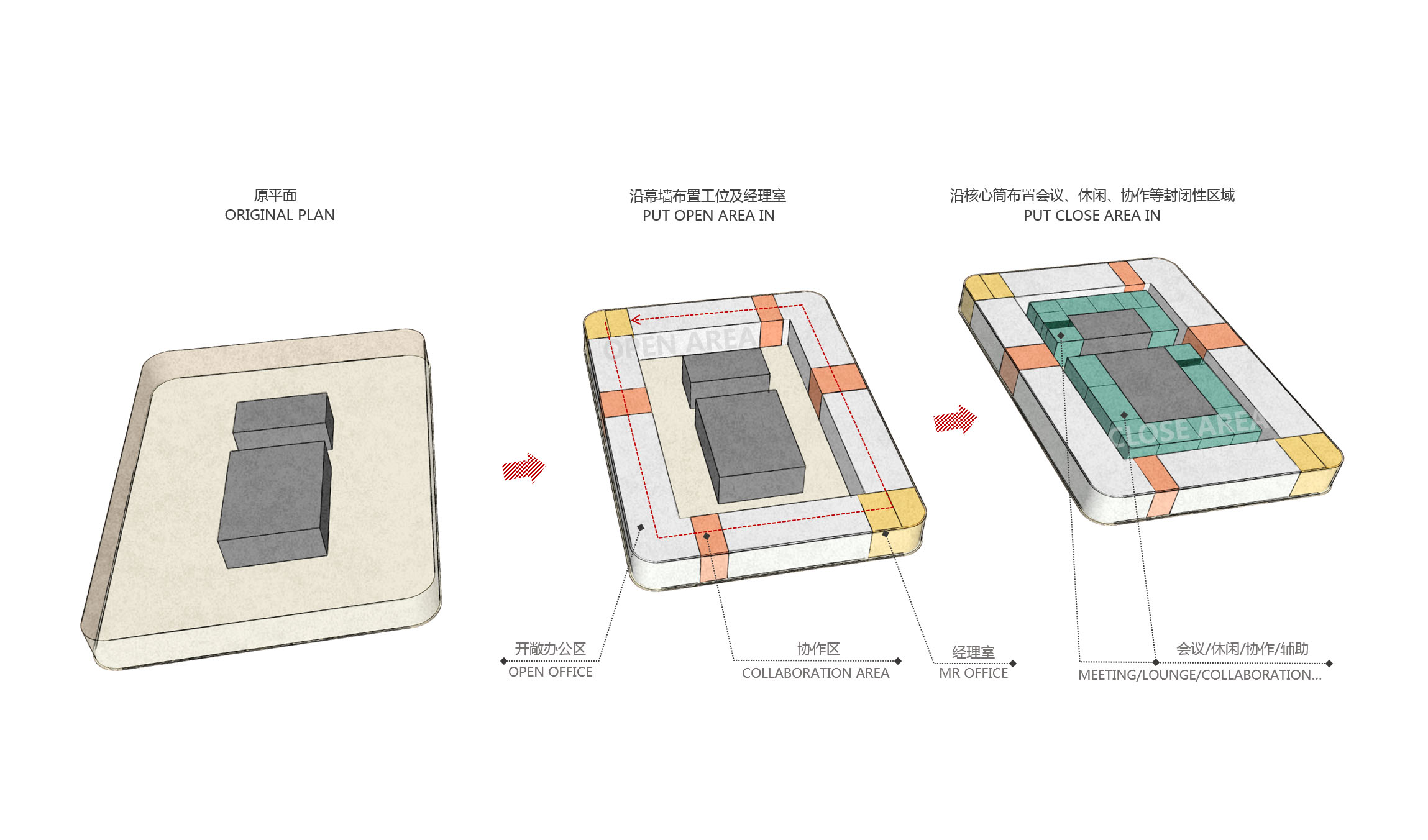
∇ 標準層功能分區圖 standard layer functional zoning diagram
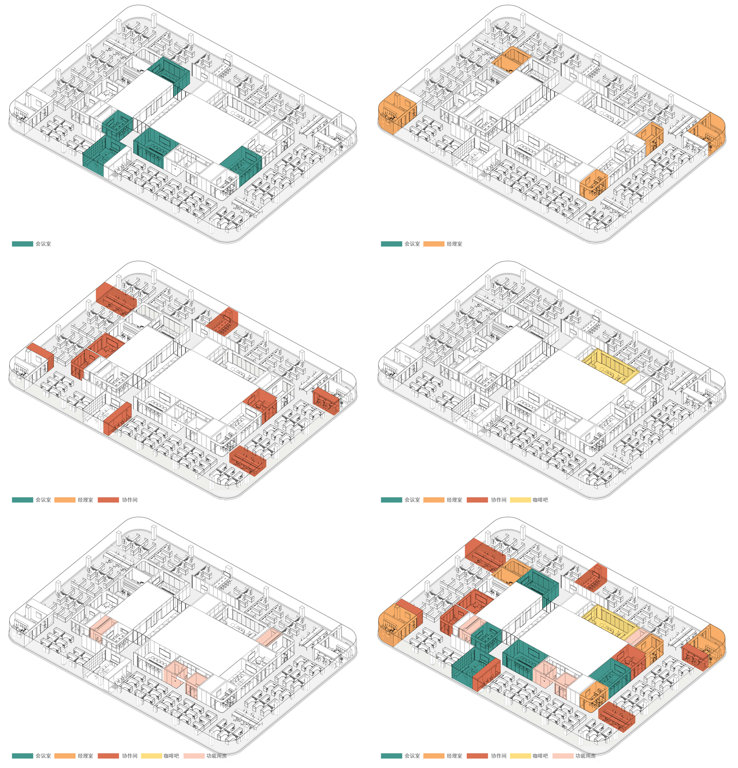
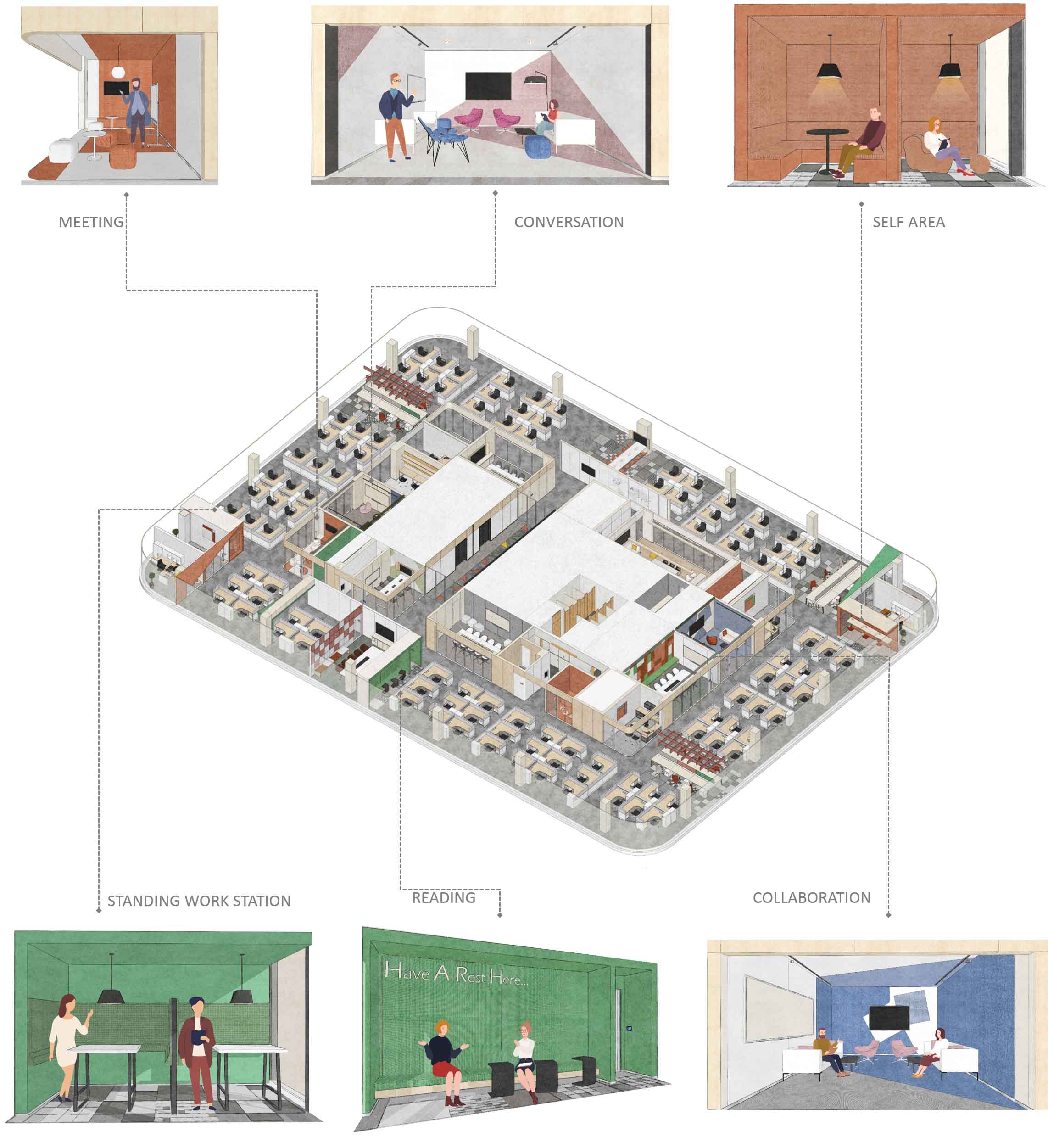
橫向布局中,基於業主對於辦公環境”動靜分離”的考量,設計將開敞辦公區及經理室臨窗布置,以給予員工更明亮的工作環境以及更開闊的視野;圍繞核心筒依次設置會議室、咖啡吧、協作區、打印間等封閉的功能性空間,使得辦公區與公共區域的活動可以互不幹擾。
In the horizontal layout, based on the owner’s consideration of the “dynamic – static separation” of the office environment, we arranged the open office area and manager room by the window to give employees a brighter working environment and a wider view. Closed functional spaces were arranged around the core tube, such as meeting rooms, coffee bar, collaboration area, printing room, etc., so that the office area and public area activities can not interfere with each other.
∇ 標準層功能分區圖(動圖)Standard layer functional zoning diagram
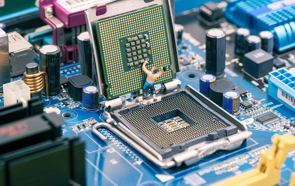
回字形的平麵像芯片主板一般,將各個不同功能的“元件”進行排列組合,看似錯落的平麵布置實則暗藏邏輯,如同運行程序一樣,驅動著整個企業的正常運轉。
The back-shaped plane is like a chip motherboard, which divides and combines various “components” with different functions. The seemingly scattered layout actually hides logic. Like running programs, it drives the normal operation of the entire enterprise.
02丨打開盒子 —— 一層大堂 OPEN THE BOX —— LOBBY
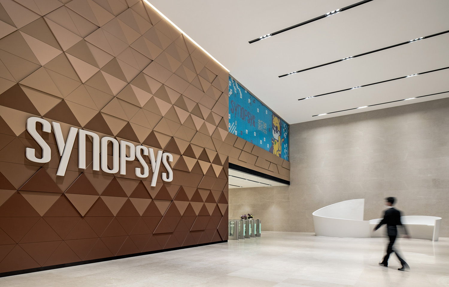
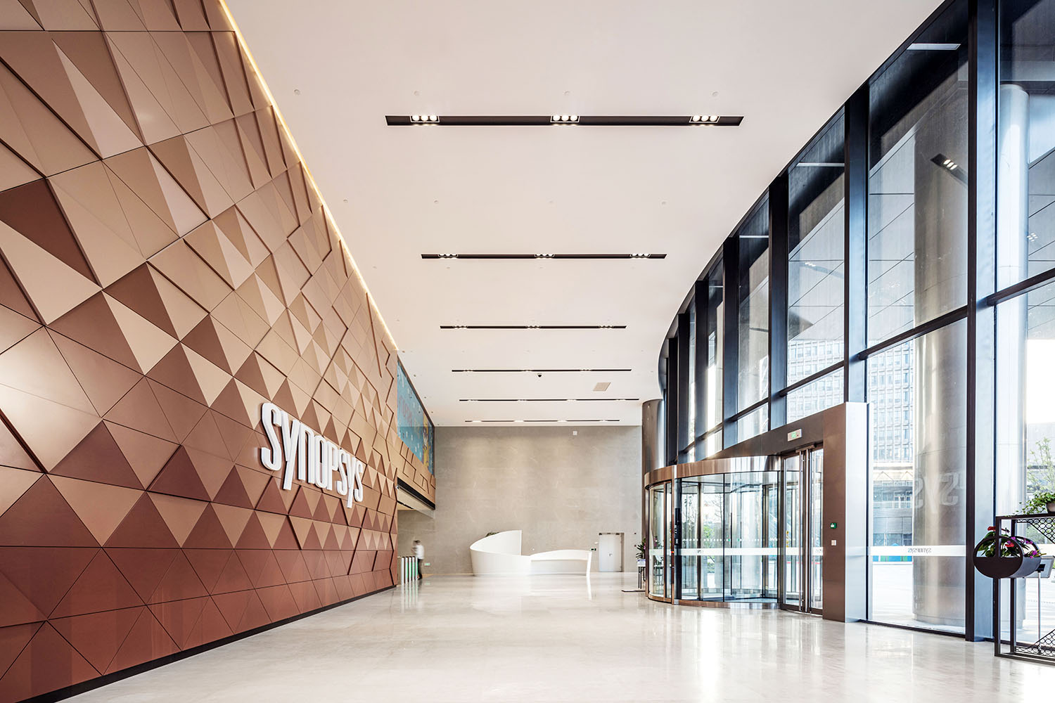
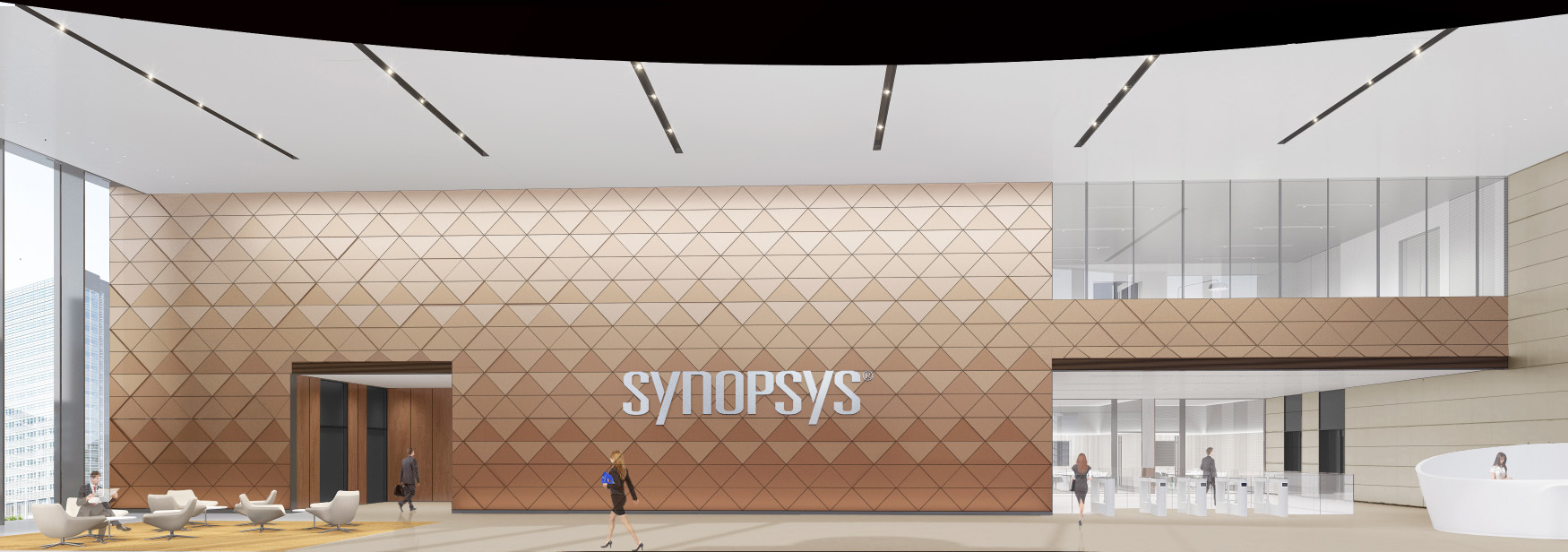
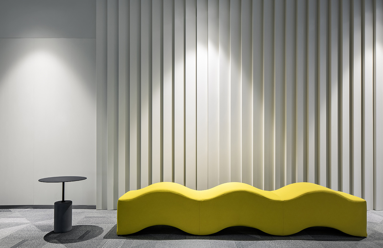
作為故事開場的一層空間,考慮到空間本身的多重作用,視覺塑造更多來源於企業自身。設計以沉穩為主調,彰顯科技帶來的先鋒和現代感的印象,將芯片進行抽象元素的提取,有序不規則融入牆麵,為即將踏入的空間營造感官鋪墊。
As the first impression of the enterprise, considering the multiple roles of the space itself, visual shaping more replaces the enterprise itself. The design is based on calmness, highlighting the impression of pioneer and modernity brought by technology, extracting abstract elements from the chip, and merging the walls in an orderly and irregular manner, creating a sense of pavement for the space to be entered.
∇ 大堂東側看向服務台 The east side of the lobby looks toward the service desk
∇ 大堂立麵分析 Elevation analysis
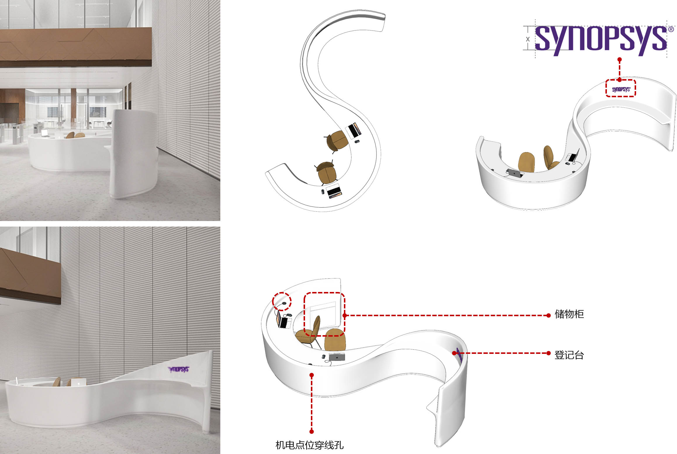
值得一提的是大堂接待台的設計,它既是新思科技(SYNOPSYS)英文首字母“S”的形狀提煉,也以流暢圓潤的曲線體現了新思科技開放包容的企業文化。
What is worth mentioning is the design of the lobby reception desk. It is not only a refinement of the shape “S” which is the initial letter of SYNOPSYS, but also a smooth and rounded curve that reflects the open and inclusive corporate culture of the company.
∇ 接待台細節 Details of the reception desk
03丨探索盒子 —— 標準辦公層 SEARCHT THE BOX – STANDARD FLOORS
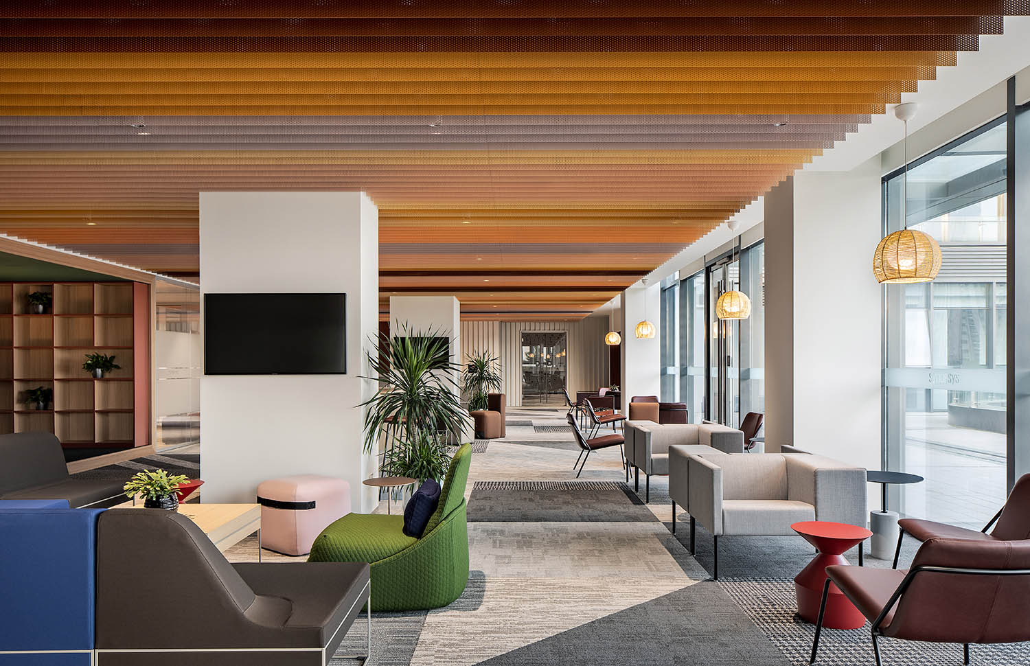
對於其它樓層的詮釋,在延續核心芯片元素的運用之外,考慮到企業是以90後員工為主的科技公司,我們在設計上為空間賦予了更多顏色及元素的變化。
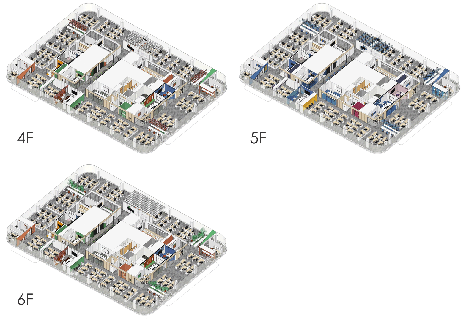
標準層采用統一的平麵布置,方便團隊在各樓層之間無障礙的切換辦公場地。各層之間通過主題色及元素進行區分,增加空間探索樂趣。
For the interpretation of other floors, in addition to continuing the use of core chip elements, considering that the company is a technology company dominated by post-90s employees, we have given the space more color and element changes in the design. The standard floor adopts a uniform layout, which is convenient for the team to switch office spaces between floors without obstacles. Each layer is distinguished by theme colors and elements to increase the fun of space exploration.
∇ 標準層軸測圖 Standard layer axonometric drawing
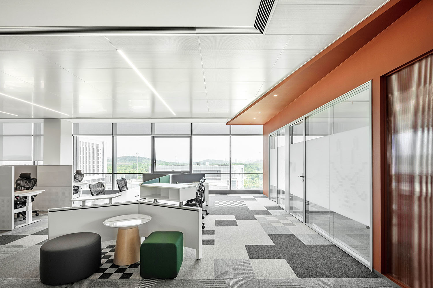
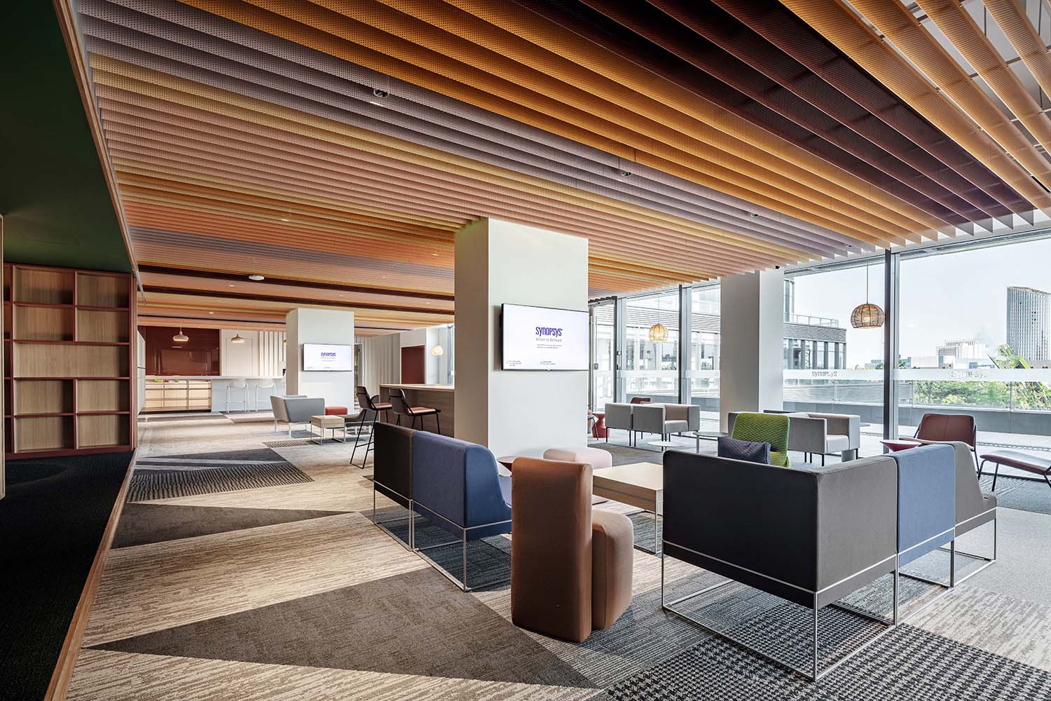
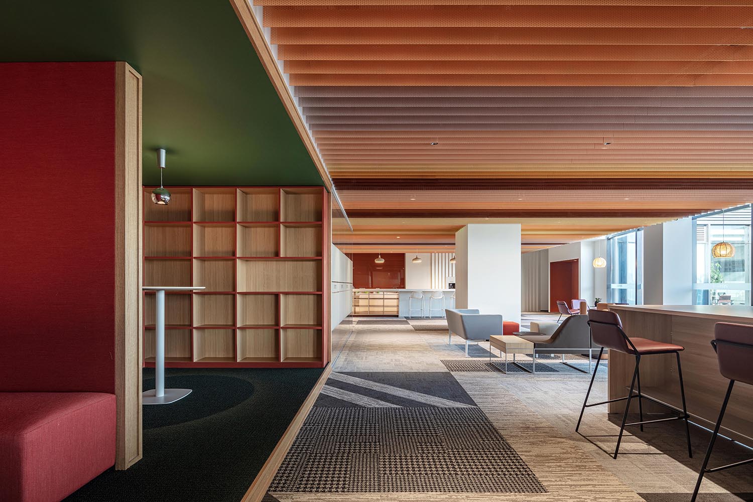
其中,二、四、六層以“橙、綠”色為主題色係,“方形”為基礎元素,用芯片中看似不規則的圖案拚接方式對空間內不同區域進行創意性演繹,增加建築趣味性與空間張力。
According to the logic, we use “orange, green” as the theme color for the 2nd, 4th, and 6th floor, and “square” as the basic element. The seemingly irregular pattern of the chip was used to creatively interpret different areas of the space which increased the building Interesting and spatial tension.
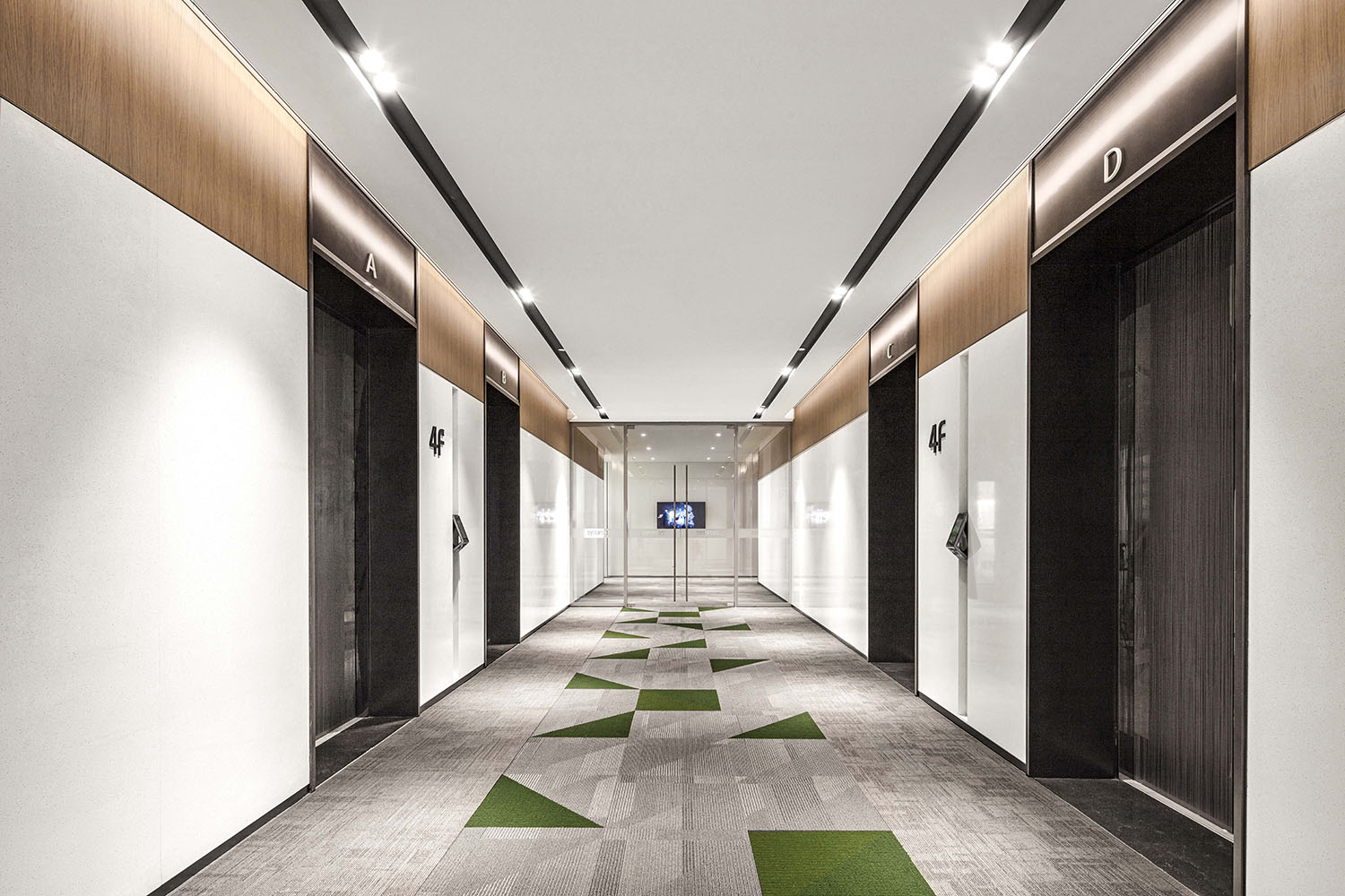
∇ 電梯廳,以不同的地麵跳色作為樓側區分 The elevator hall is distinguished by different ground colors
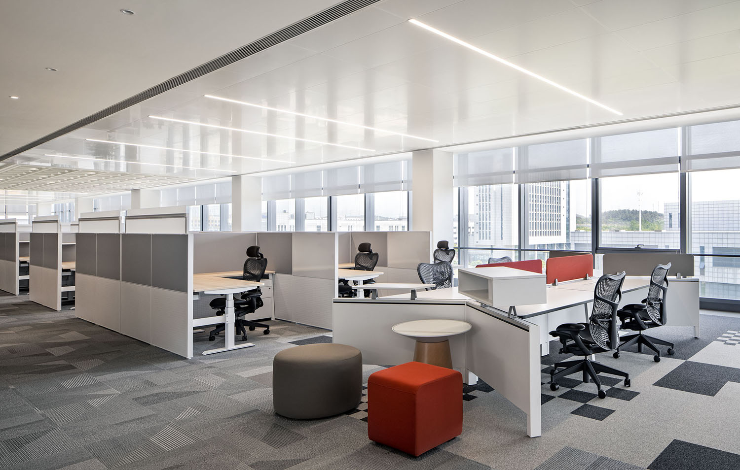
∇ 開敞辦公區 open office
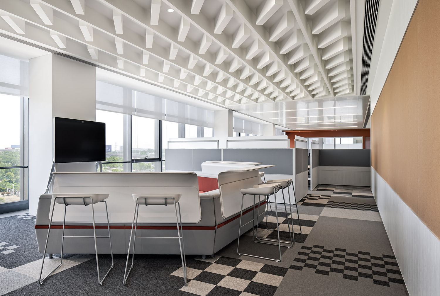
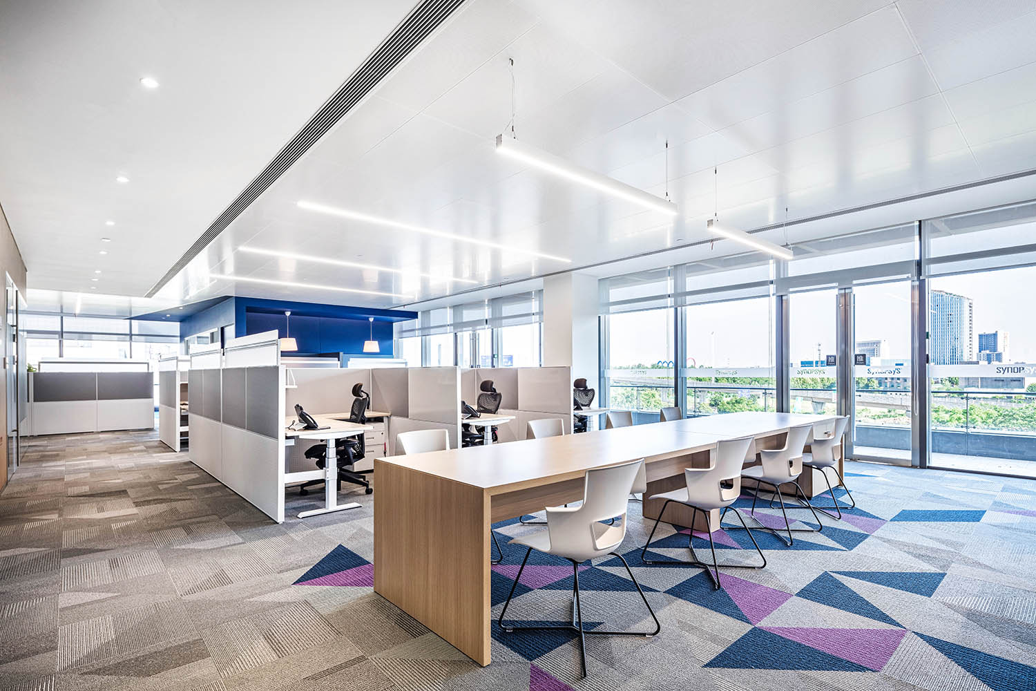
工位組團間,以開敞協作桌作為間隔,用地鋪和天花造型作為軟式隔斷對其進行劃分,強調空間屬性。
Open collaboration tables were setting among the work station groups. Floor and ceiling shapes were used as soft partitions for division, which highlighting the spatial attributes.
∇ 協作討論區 collaboration area
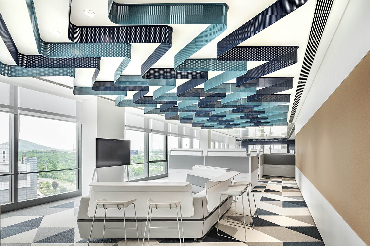
∇ 協作區作為工位組團之間軟質間隔,用地鋪和天花造型強調空間屬性
The collaboration area serves as a soft space between the workstation groups, and the floor and ceiling shapes emphasize the spatial attributes
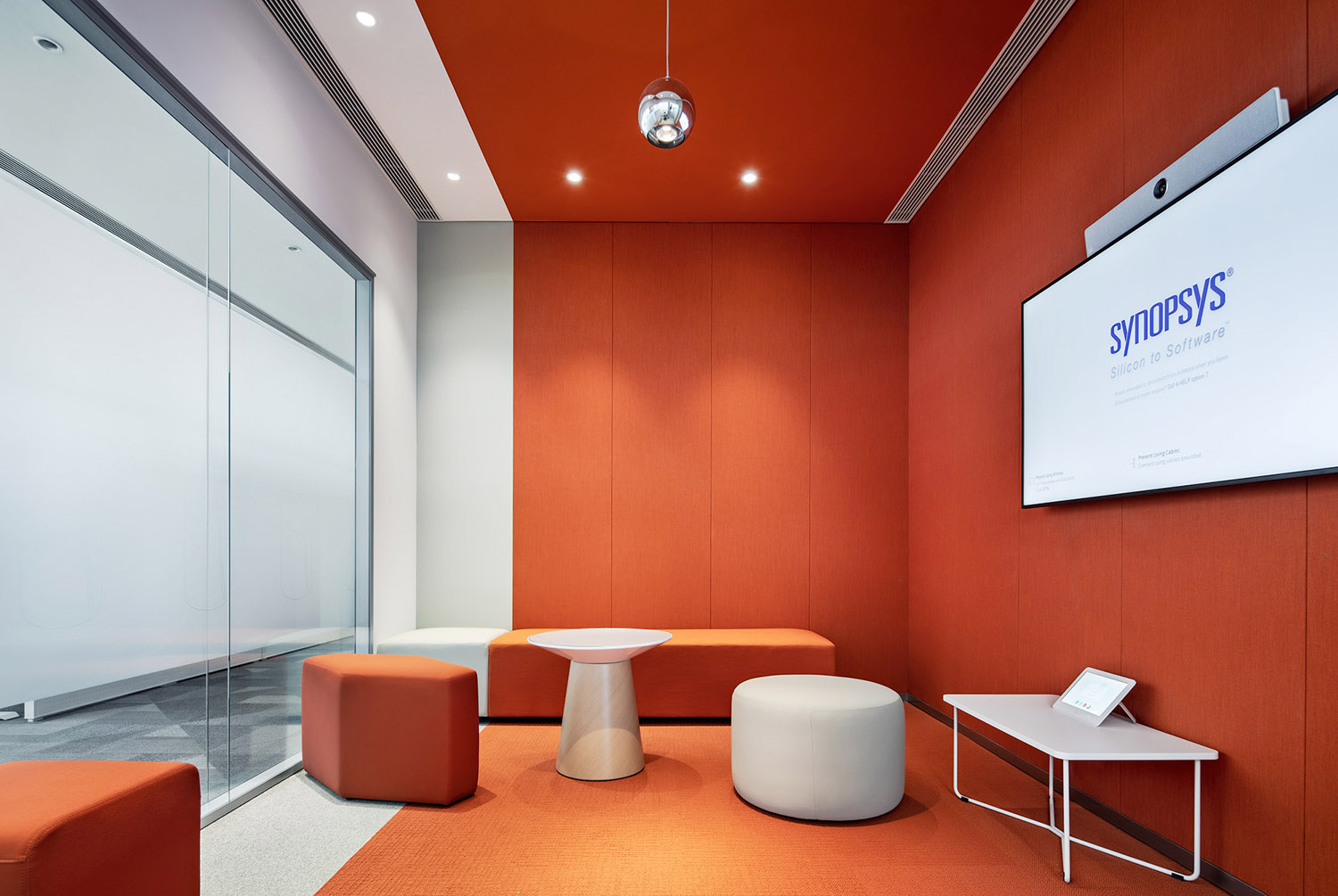
出於對不同協作形式的考慮以及辦公空間靈活性的要求,除工位間的協作桌之外,圍繞核心筒設置開敞、半開敞、封閉等協作會議空間,以創造更加自由、靈活的辦公環境,激發員工創意和工作熱情。
For the consideration of different collaboration forms and flexibility requirements of the office design, in addition to the collaboration tables between the workstations, open, semi-open, and closed collaborative meeting spaces were set around the core tube to create a free and flexible office environment that could stimulate the creativity and enthusiasm of employees.
∇ 協作討論間 Collaboration room
∇ 小會議室 Small meeting room
∇ 空間內不同的協作形式 Different collaboration forms
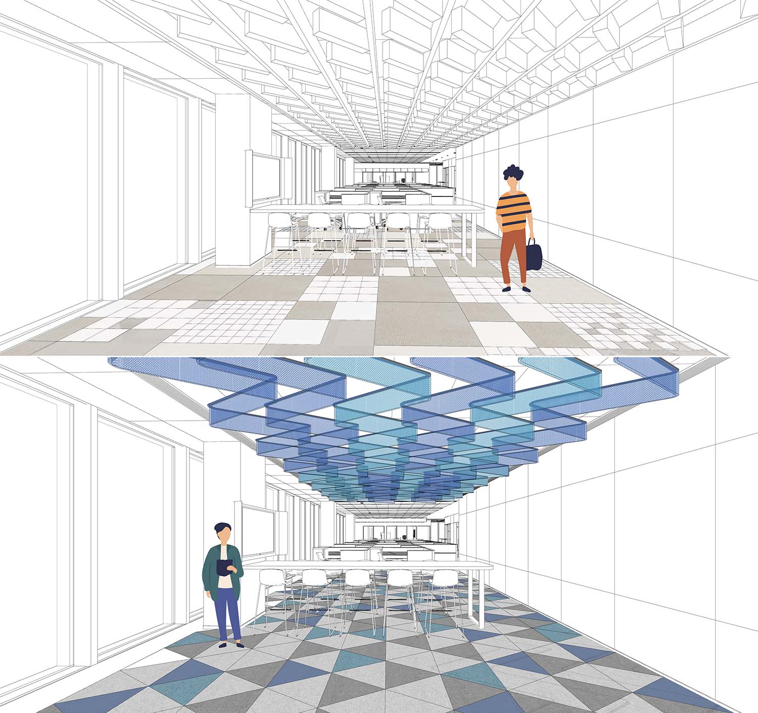
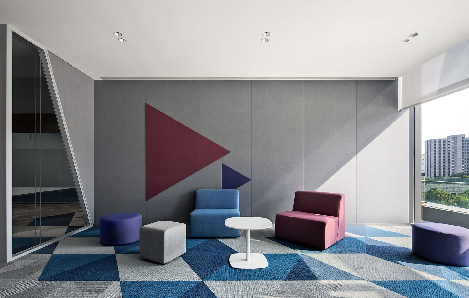
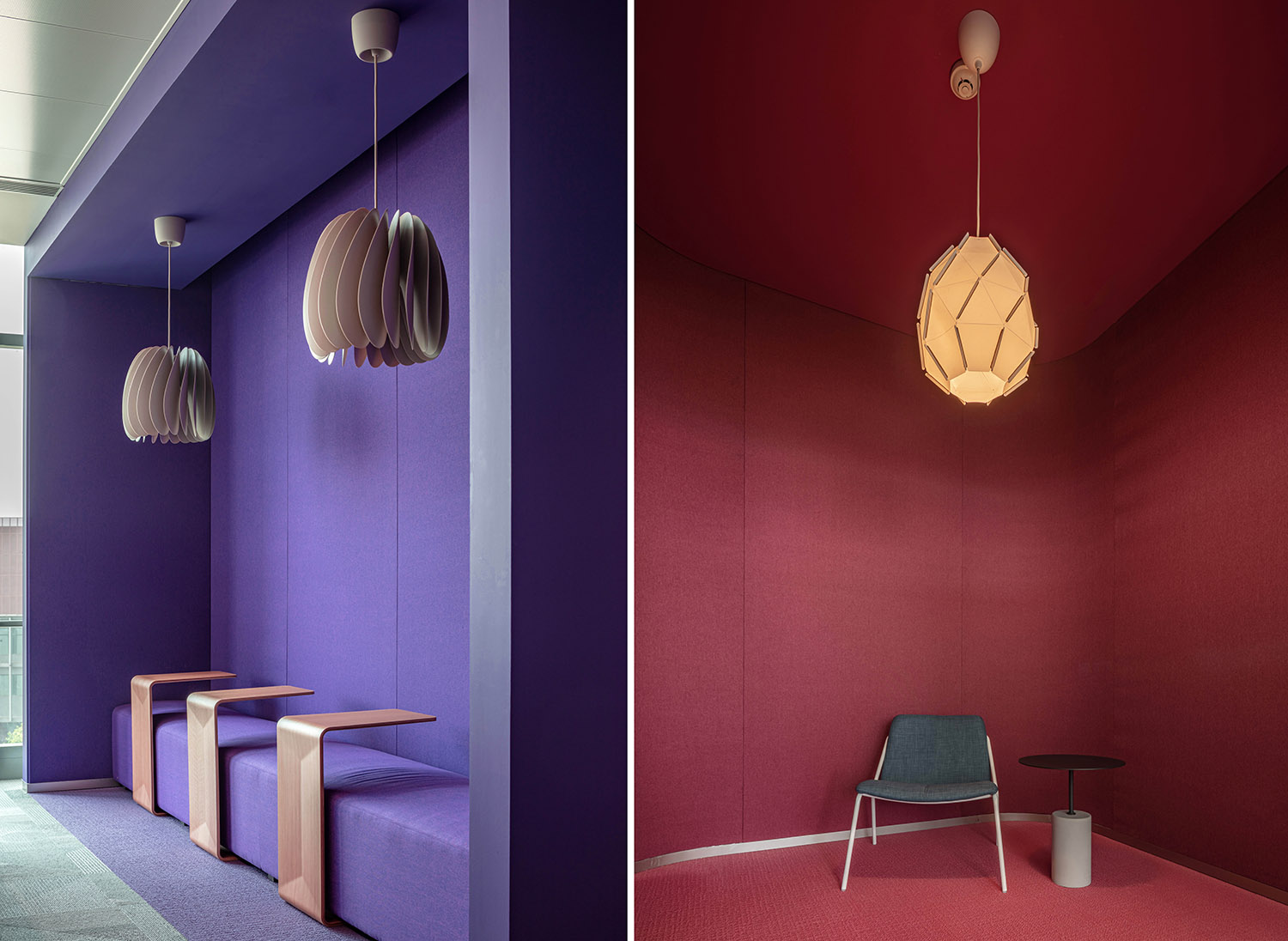
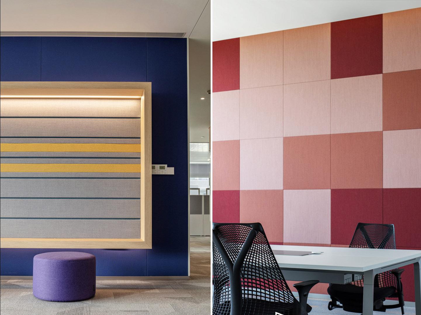
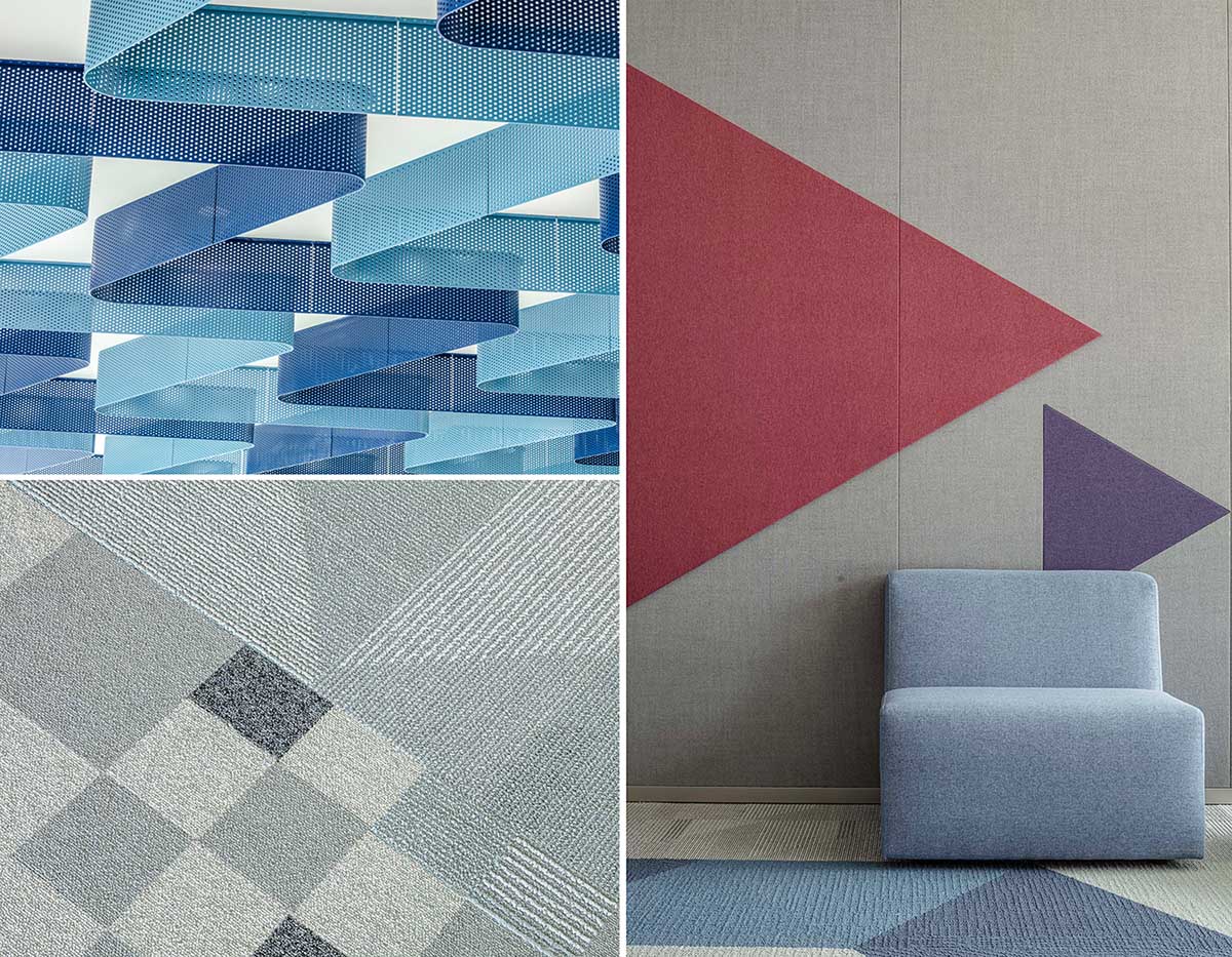
三、五層的主題色係為”藍紫”色,源於企業logo的顏色提取,使其更具備識別性;基礎元素為“三角”同樣來自於芯片圖案的演變,三角圖案具備更多的可變性,可轉化為折線、塊麵等形式運用於空間設計中。
The theme color of the 3rd and 5th layers is “blue and purple”, which is derived from the color of the corporate logo, making it more recognizable. The basic element of “triangle” also comes from the evolution of the chip pattern, which has more variability that can be transformed into polylines, block surfaces and other.
∇ 折線及三角元素勾勒3層5層空間形態 Polylines and triangle elements outline the 3-layer 5-layer spatial form
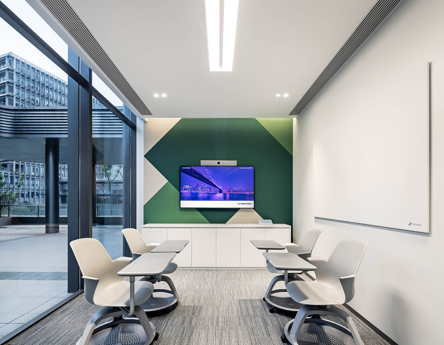
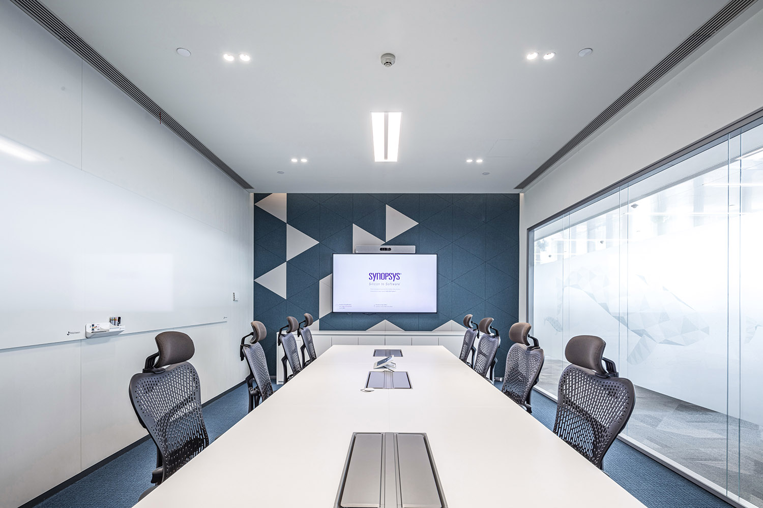
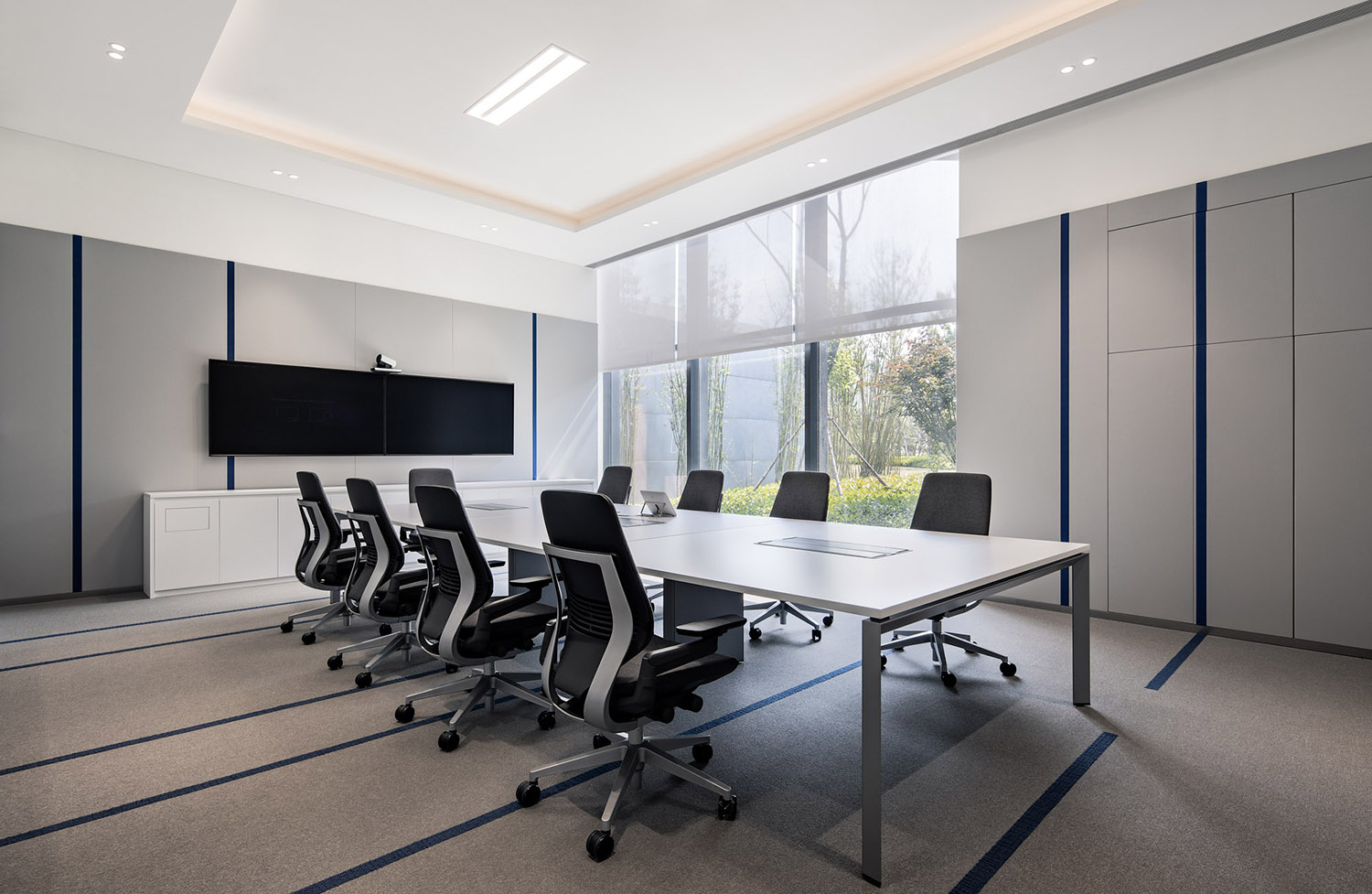
會議室、協作區等封閉空間繼續運用“三角”元素做拚接設計,營造不同的視覺感受,對比整個空間區別又統一。
Enclosed spaces such as conference rooms and collaboration areas continue to use “triangular” elements for splicing design to create different visual feelings, combined the difference and unity of the entire space.
∇ 會議室用不同的三角拚接方式進行區分 The meeting rooms are distinguished by different triangular patterns.
04丨娛樂盒子 —— 休閑健身區 ENTERTAINMENT BOX – LEISURE AND FITNESS AREA
位於二層西側的休閑健身區做為獨立的區域,連接二層露台,與日常辦公區分開來,完善空間使用率的同時使整個空間定位一目了然,從區域劃分對辦公的時間進行合理分配。
The leisure and fitness area on the west side of the second floor is used as an independent area that connected to the second floor terrace and separated from the daily office area. Improved the space utilization rate, the entire space positioning is clear at a glance, and the office time is allocated reasonably from the division of areas.
作為企業集中休閑娛樂的空間,區別於辦公區的克製,芯片所屬的靈活、變化在這裏被運用到極致,濃烈的色彩與拚接圖案的碰撞,不斷激發創意和工作熱情,呈現出一個更為靈活、舒適、自由的活動環境。
As a space for leisure and entertainment, its decoration is different from the restrained office area. The flexibility and change of the “chip” are used to the extreme. The collision of strong colors and splicing patterns continuously stimulates creativity and work enthusiasm, presenting a more flexible , comfortable and free environment.
∇ 二層休閑健身區,連接室外露台 Leisure and fitness area on the second floor, connected to the outdoor terrace
這裏不僅是全樓最大的休閑區域,還規劃了健身房、瑜伽室、遊戲室等活動空間,旨在通過增加公共空間來創造凝聚和互動場景,達成聚合狀態,增強辦公空間中的社交屬性。
This is not only the largest leisure area in the building, but also planned activity spaces such as gymnasiums, yoga rooms, game rooms, etc., aiming to create cohesive and interactive scenes by increasing public spaces, achieve a state of aggregation, and enhance the social attributes of the office space.
05丨裝飾盒子 —— 環境圖形 DOCORATION BOX – ENVIRONMENT GRAPHICS
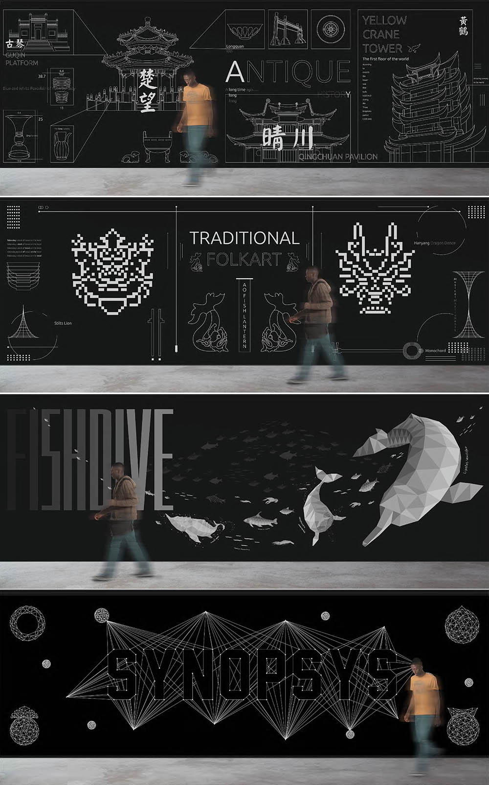
除了顏色及芯片元素在空間中的反複運用之外,因新思科技國際公司的屬性,空間還需具備本土特色。
In addition to the repeated use of colors and chip elements in the space, due to its identity of International corporation, the space also needs to have local characteristics.
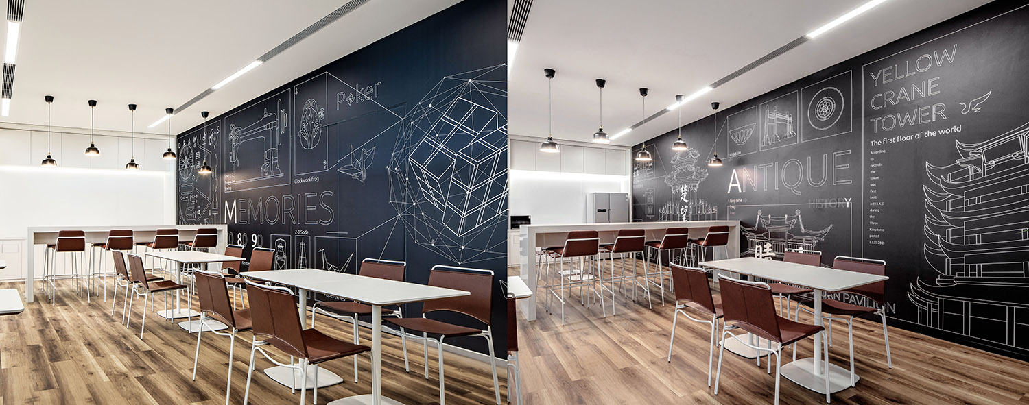
設計提取城市本身元素進行概念提煉鋪陳展示,分別將武漢的本土古建遺址,風味飲食,傳世技藝,自然生態,曆史文物作為切入點進行環境圖形的內容設計,演變為統一的平麵圖案,分布於空間之中,使其融入當地文化,強調空間歸屬。
The design extracts the elements of the city itself for conceptual refining and display, using Wuhan’s local ancient construction sites, flavor food, handed down techniques, natural ecology, and historical cultural relics as points to design the content of environmental graphics, evolving into a unified graphic pattern that distributed in the space. it integrates the local culture, and emphasizes the space belongings.
∇ 環境圖形 — 古建遺址 Environment graphics – Ancient ruins
這些精心設計的圖案最終以牆麵和玻璃膜為載體,分布於各個樓層內,為空間增加當地屬性同時也形成了一定的差異化設計。
These carefully designed patterns are finally distributed on each floor, adding local attributes to the space and forming a certain differentiated design.
∇ 環境圖形在空間中的運用 The use of environmental graphics in space
∇ 細節展示 Details
∇ 地麵、天花及牆麵細節 Floor, ceiling and wall details
關於”設計”的本身,其實是給空間使用者帶去更好的用戶體驗,而疫情的到來,在改變辦公習慣的同時,也加深著我們對於設計中“以人為本”的認知。項目非常具有前瞻性的申請了國際LEED金認證,加強了對於設計中的綠建標準,保證良好的辦公環境。
Regarding the “design” itself, it is actually to bring a better user experience to the space users, and the arrival of the epidemic will not only change office habits, but also deepen our understanding of the “people-oriented” in design. The project is very forward-looking and applied for the international LEED gold certification, which strengthened the green building standards in the design and ensured a good office environment.
項目信息
項目名稱:新思科技武漢總部辦公
設計單位:CCDI悉地國際
設計甲方單位:新思科技
管理公司:戴德梁行
施工單位: 中藝建築裝飾
公司網站:www.ccdi.com.cn
聯係郵箱:GWdesign@yeah.net
項目設計 & 竣工時間:2018/03—2019/12
主創及設計團隊 主創:李秩宇設計團隊:浦玉珍、曾薈凡、王歡、孫陽、馬一鳴、趙小宇、孫瑞雪、萬霞、李海濤、張瑩、楊彥鈴、狄亭亭
項目地址:湖北省/武漢市
項目麵積:14,000㎡
主要用材:布藝、仿木紋3M貼膜、拚花地毯、彩色無機塗料、白色防火板
Project name:Interior Design of Synopsys Office
Designed by CCDI
Cooperative Party A Synopsys
Management Company DTZ
Construction unit China Arts Construction
Website:www.ccdi.com.cn
Contact e-mail:GWdesign@yeah.net
Design year & Completion Year:2018/03—2019/12
Leader designer & Team Leader designer: Li ZhiyuTeam: Pu Yuzhen, Zeng Huifan, Wang Huan, Sun Yang, Ma Yiming, Zhao Xiaoyu, Sun Ruixue, Wan Xia, Li Haitao, Zhang Ying, Yang Yanling, Di Tingting
Project location:Wuhan, Hubei
Gross Built Area (square meters):14,000㎡
Materials used in the project:Cloth art, wood-like 3M film, parquet carpet, colored inorganic paint, white fireproof board







評論(1)
不知道說什麼好,還是祝疫情早點結束吧!