全球設計風向感謝來自 平介設計 的商業空間項目案例分享:
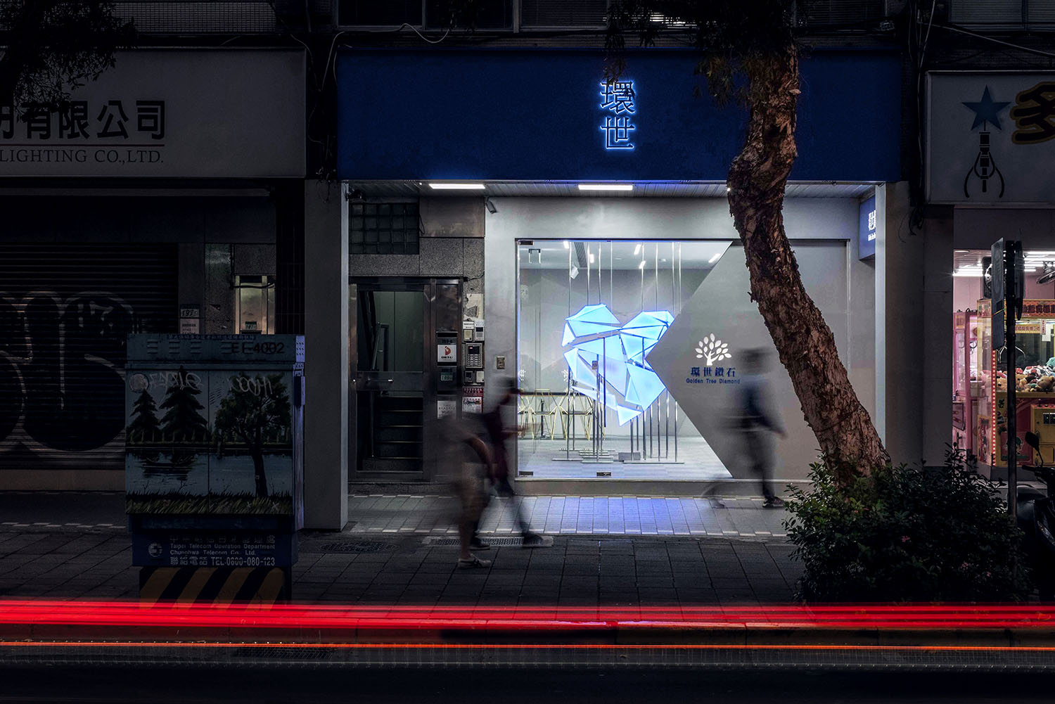
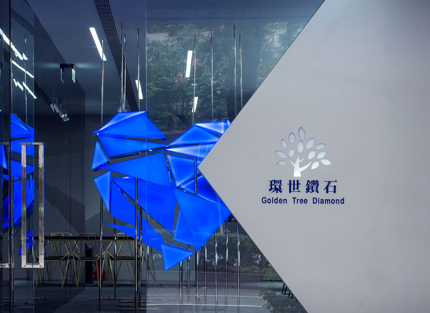
∇ 臨街夜景 Storefront in the night © Zhaojun Gong
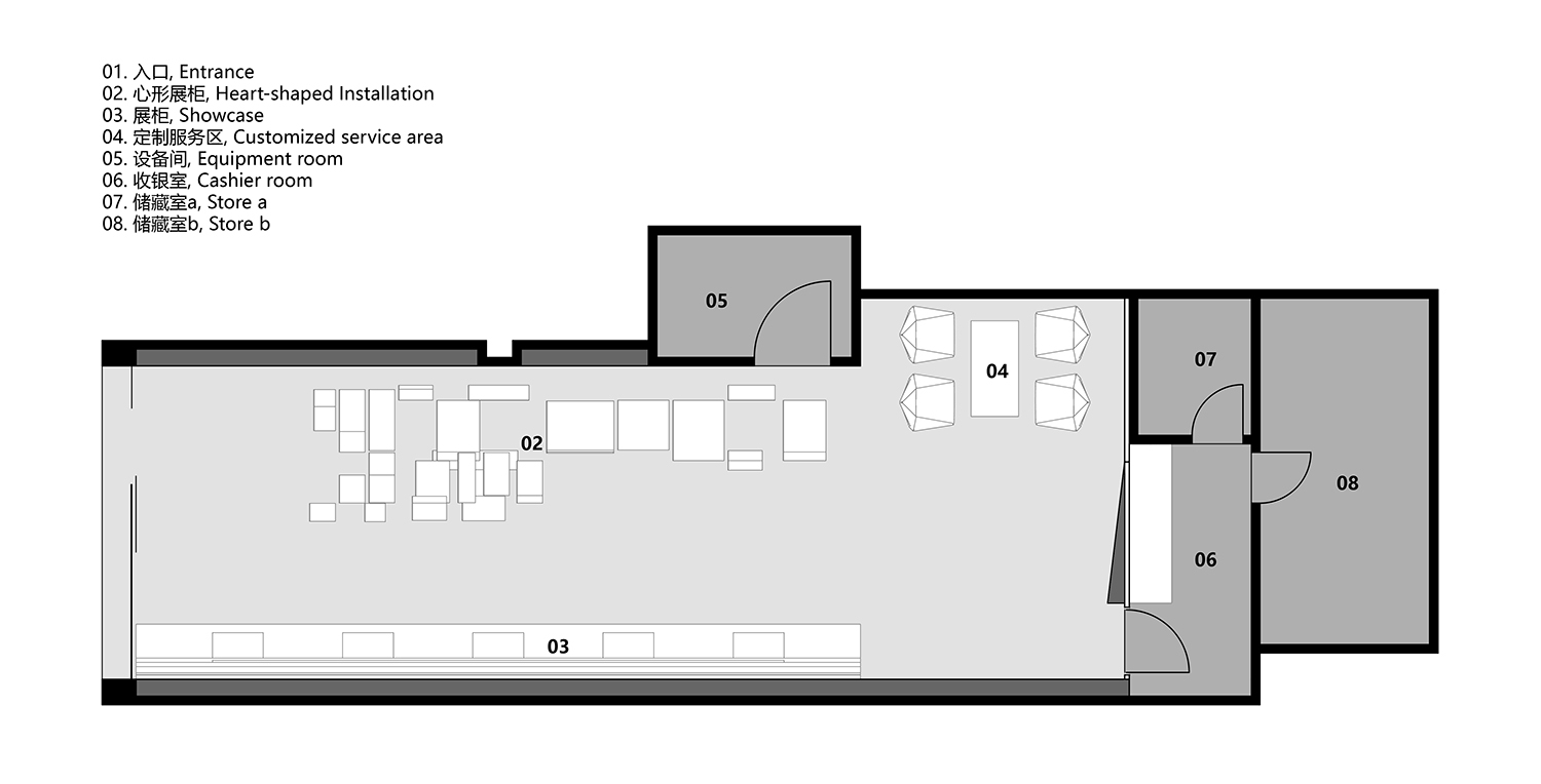
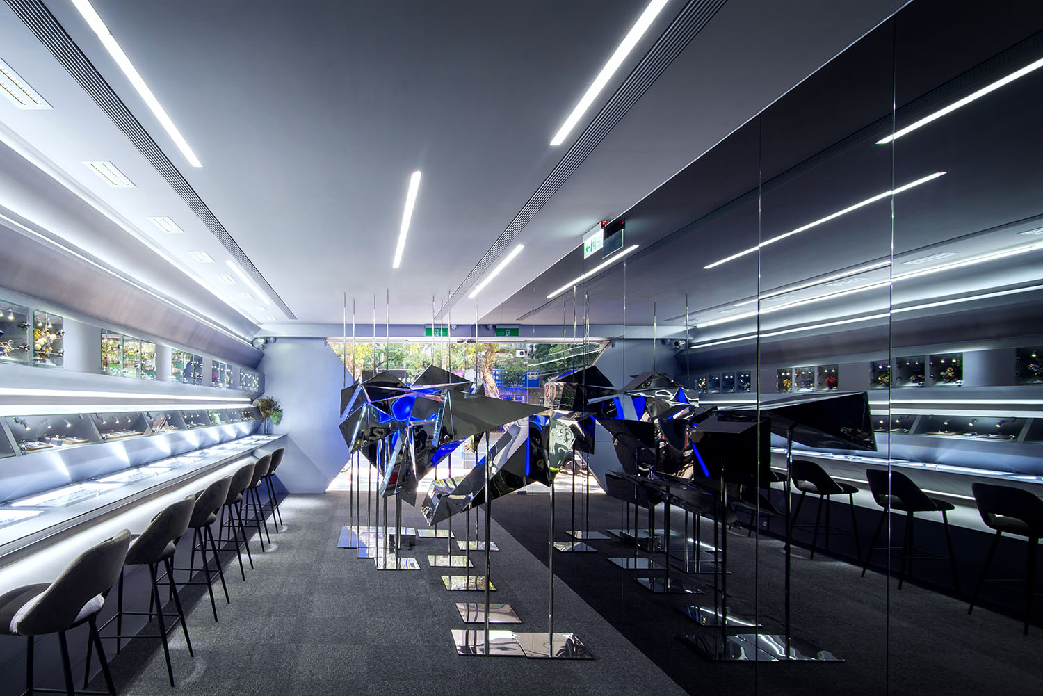
項目位於台北市大安區忠孝東路,一條充滿煙火氣息的商業街中,門店寬僅4.1m進深14m,淨層高2.7米。總麵積約為64㎡。空間內原為一家診所,改造為珠寶店後需要滿足接待、小型互動展覽、倉庫、售賣等空間功能。設計師以心型裝置創造成為視覺焦點的展陳空間。室內打通原本有牆體,在有限的狹長場地中打造藝術化線性空間。
The project is located in a commercial street full of worldly atmosphere, Zhongxiao East Road, Da’an District, Taipei. The store is 4.1m wide and 14m deep, with the height of only 2.7 meters. The total area is about 64 square meters. The site, which was originally a clinic, should be redesigned to meet the the client need for reception, small interactive exhibition, warehouse, and sale. The designer turned down all the walls in the original space with a heart-shaped installation in the store, as the eye-catching function, creating an artistic narrative linear space in the limited narrow site.
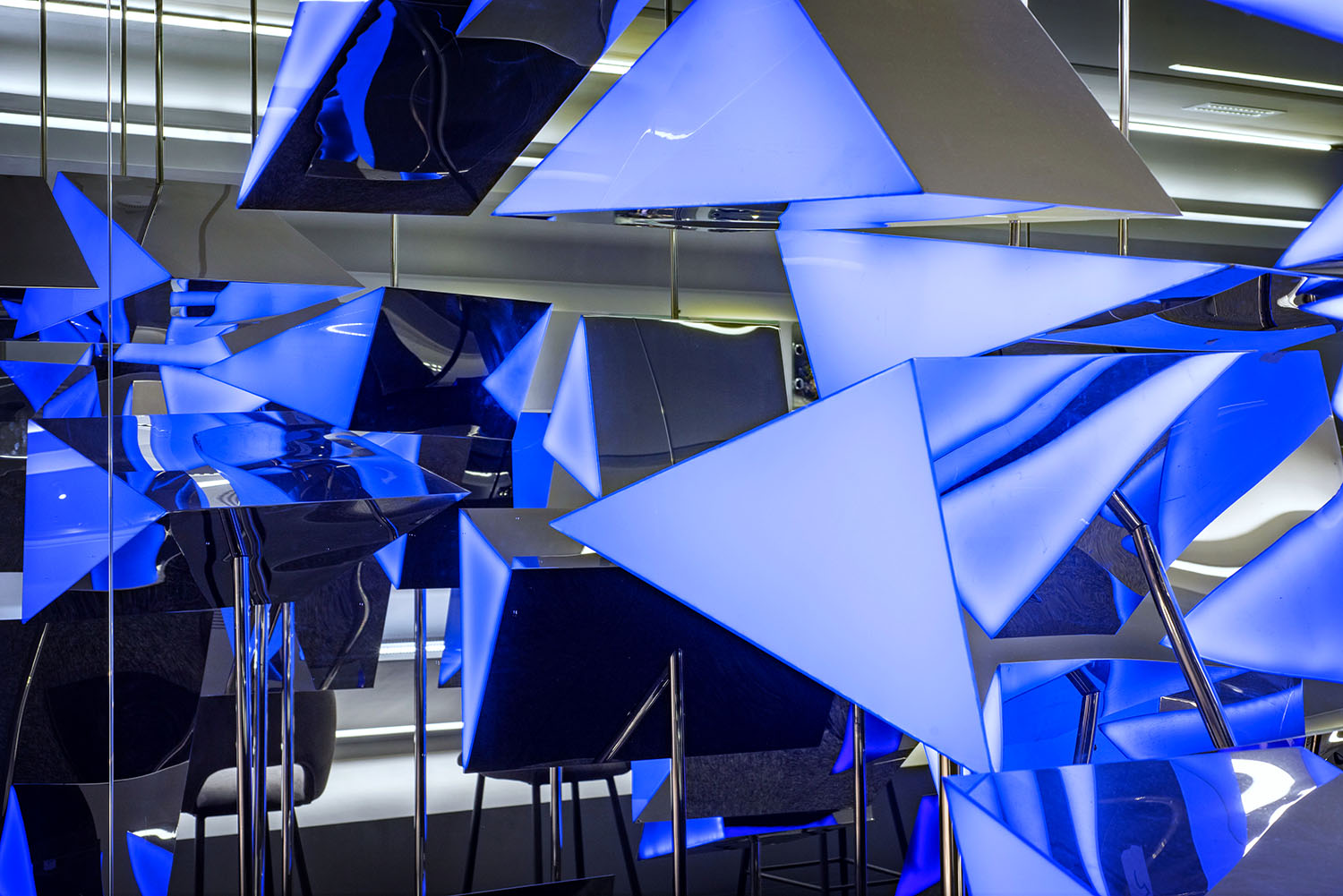
從空間結構、品牌內涵與藝術性三個層麵出發。鑽石作為該珠寶品牌下的定製產品,設計師提取未經過加工的天然礦石切麵,在二維形態語言中通過變形與重組形成多麵體,從心出發,將愛的具象化符號轉換為三維世界中的愛的呈現。不規則的LED透光設計隱喻原石打磨後所呈現的鑽石光澤,用視覺上最直接的方式引發路人的好奇,入店一探究竟。堅硬的外形與熠熠的藍光,詮釋環世品牌高級定製的設計理念,傳遞一份細膩與神秘。
Based on three aspects of the space structure, brand concept and art, the whole design revolves around the love contained in the brand. Diamond, as the custom product of the jewelry brand, is extracted by the designer into unprocessed natural ore slices. The design which origins from the heart, transform the concrete symbol of love into three-dimensional context, the presentation of love in the world, to be exact. The design of irregular LED translucent metaphors the diamond luster after which the rough stone is polished. This light-emitting device is not only functional but also an artistic. The most direct way is aimed to arouse the curiosity of passers-by and find out. The hard shape and shining light interpret the design concept of global brand high-end customization, conveying a delicate and mysterious.
∇ 平麵圖 Floor plan
∇ 店鋪外觀 a Store front a © Zhaojun Gong
全店以灰色與藍色創造平衡,耕植品牌本身的形象,蘊釀出鑽石背後,關於愛的多麵情感。
The whole store in gray and blue creates a balance, cultivates the image of the brand itself, and brew the mufti-facet emotion of love behind the diamond.
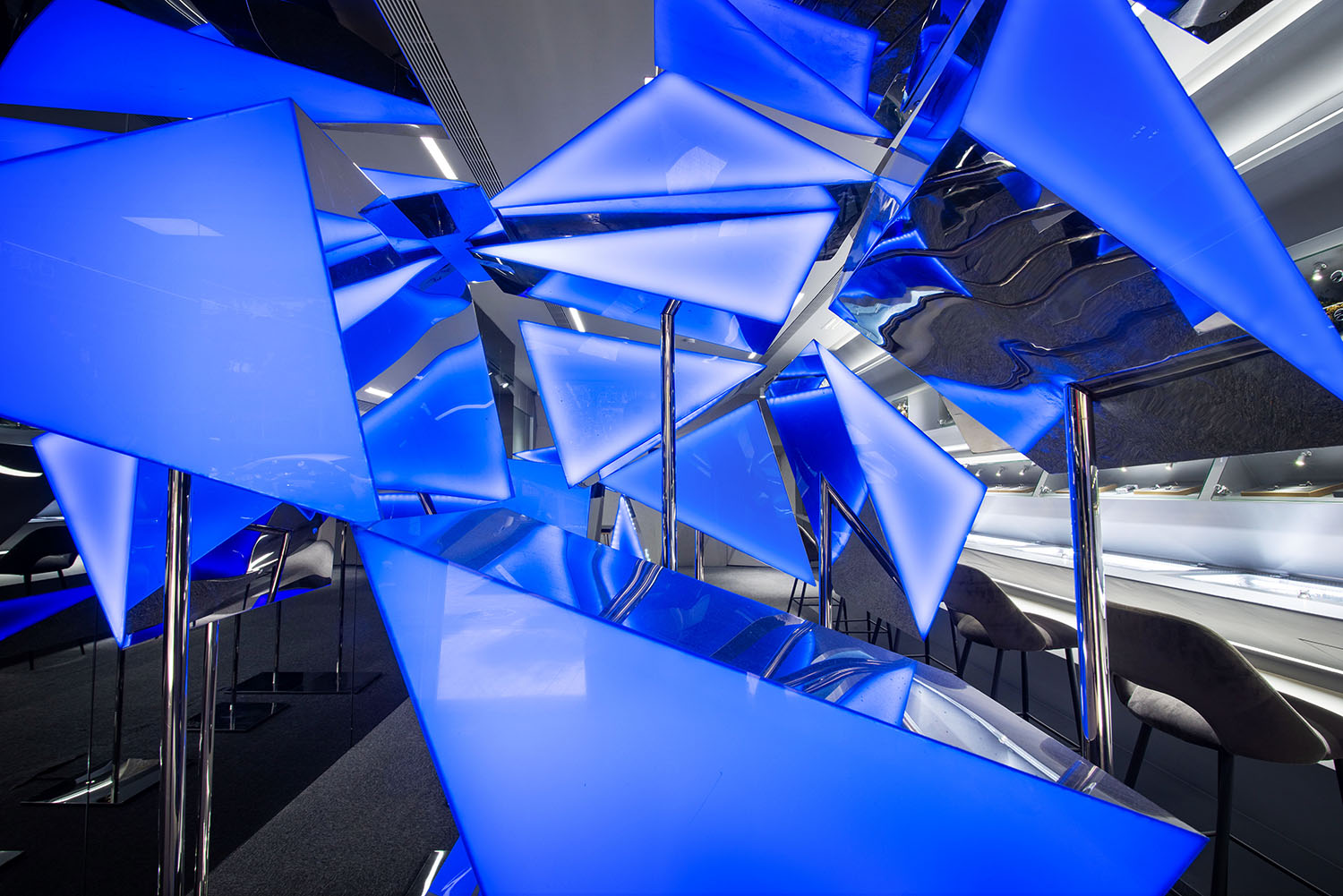
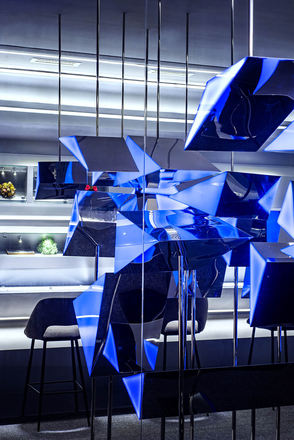
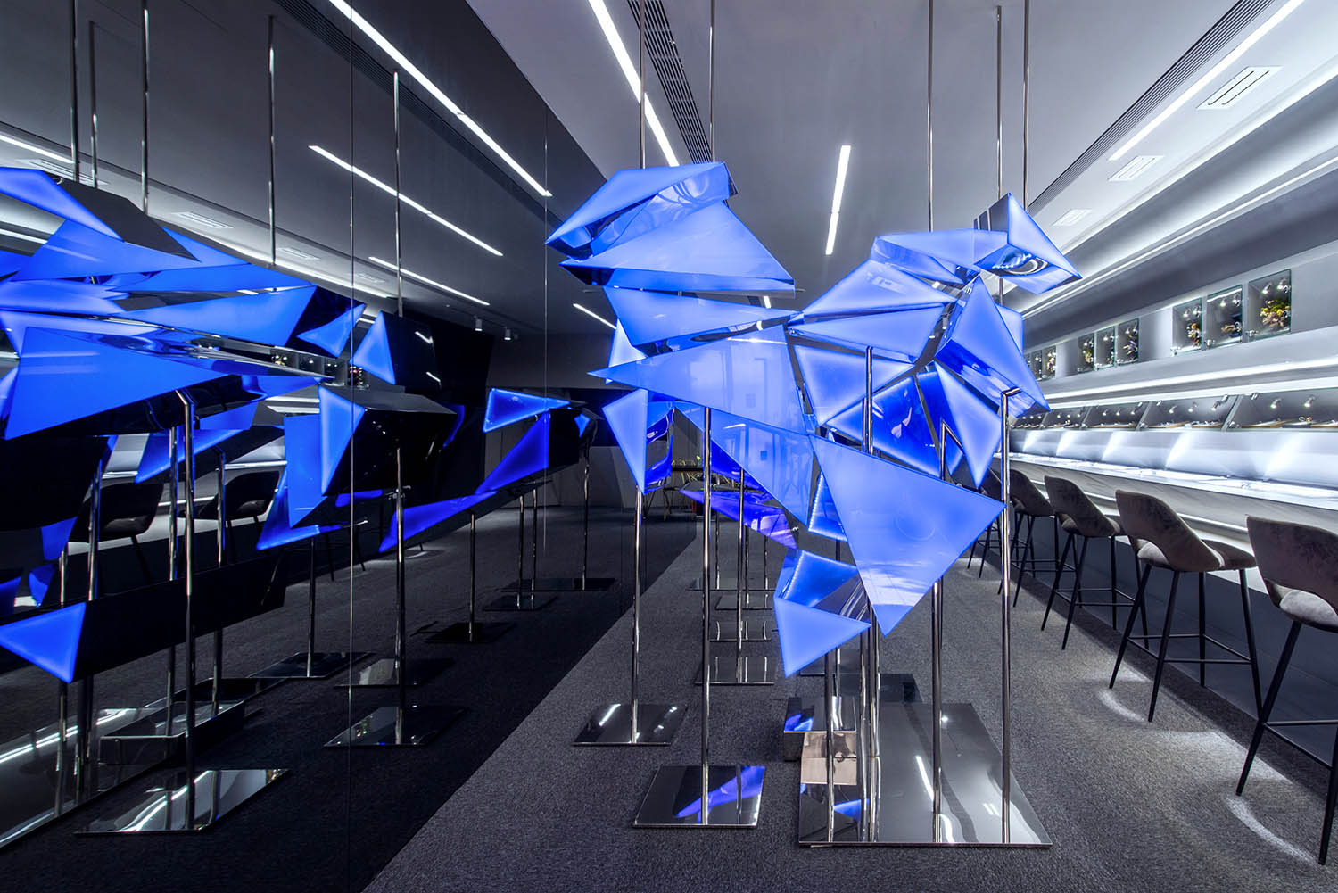
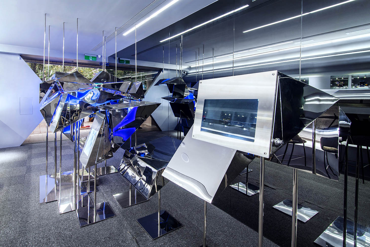
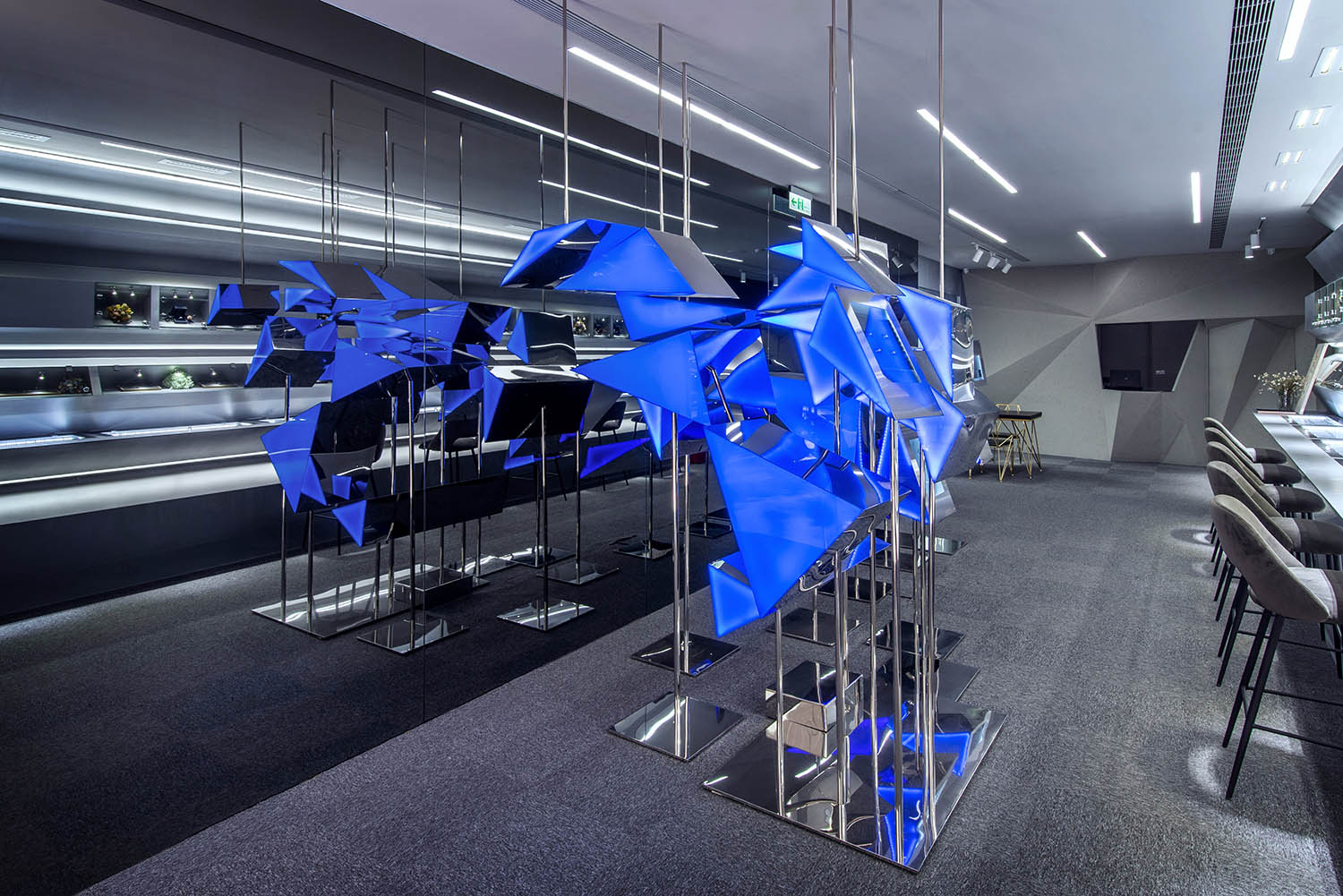
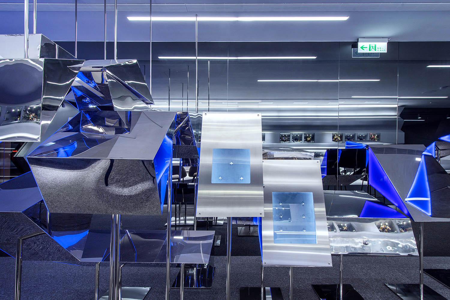
中心的藍色愛心裝置是空間中匠心的開始,以銀色拉絲不鏽鋼材質作為包裹,不規則的造型組合成心的形狀,並隨著體驗者位置與視角的移動,產生不同空間畫麵。在不同空間層次的形態語言中,藍色愛心在純淨的銀色空間基調中愈發奪目,隱約之間折射光芒;線性燈帶延伸空間,使視覺界麵無限蔓延;用一顆浮誇的心形語言點亮整個灰空間,以定格的即將爆炸的心形表現動感,配以深色的家具陳列細節,讓空間聚焦於中央心形裝置,每個展櫃都等待著顧客采擷其最動人的一麵。
A blue heart-shaped installation in the center of the sight is the beginning of the ingenuity in the space. The low-key luminous block is wrapped in silver brushed stainless steel. With the movement of the position and perspective of the customers, different perspectives of images are generated. In the morphological language of different spatial levels, the blue heart becomes more eye-catching in the pure silver tone, faintly refracting light; the linear light strip extends the space, allowing the visual interface to spread infinitely; the use of an exaggerated heart-shaped installation brighten the entire gray space, expressing the dynamics with the frozen heart shape about to explode; with dark furniture displaying details, it allows the customers to focus on the central heart-shaped design. Each showcase is waiting for customers to pick up its most moving side.
∇ 心形展櫃動態圖 Heart-shaped showcase dynamic drawing
∇ 心形展櫃 Heart-shaped Installation © Zhaojun Gong
發光的藍紫色呼應品牌原本視覺形象,喚起消費者的購買欲。
The luminous blue and purple elements are aimed to response the original visual image of the brand and arouse consumers’ desire to buy.
∇ 店麵b Storefront b © Zhaojun Gong
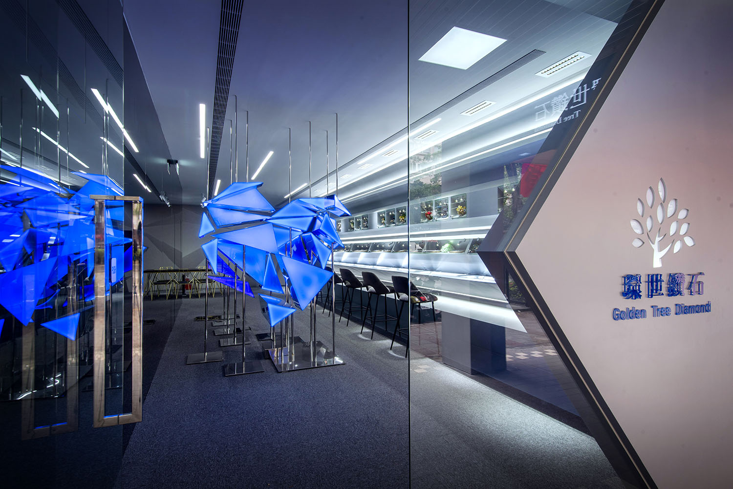
∇ 充滿折射與反射的展示空間 Exhibition space full of refraction © Zhaojun Gong
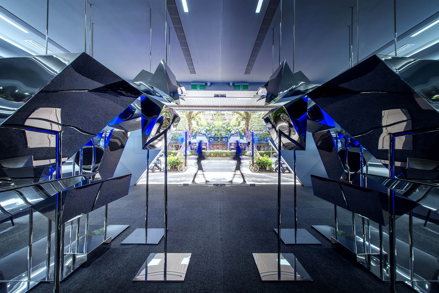
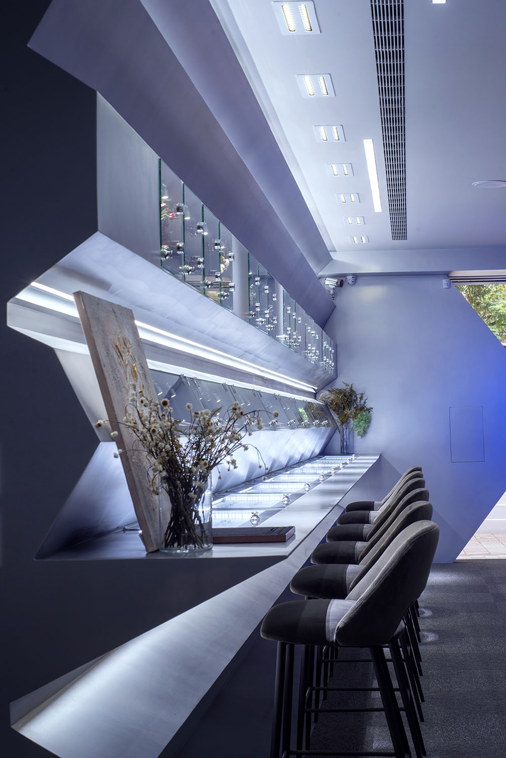
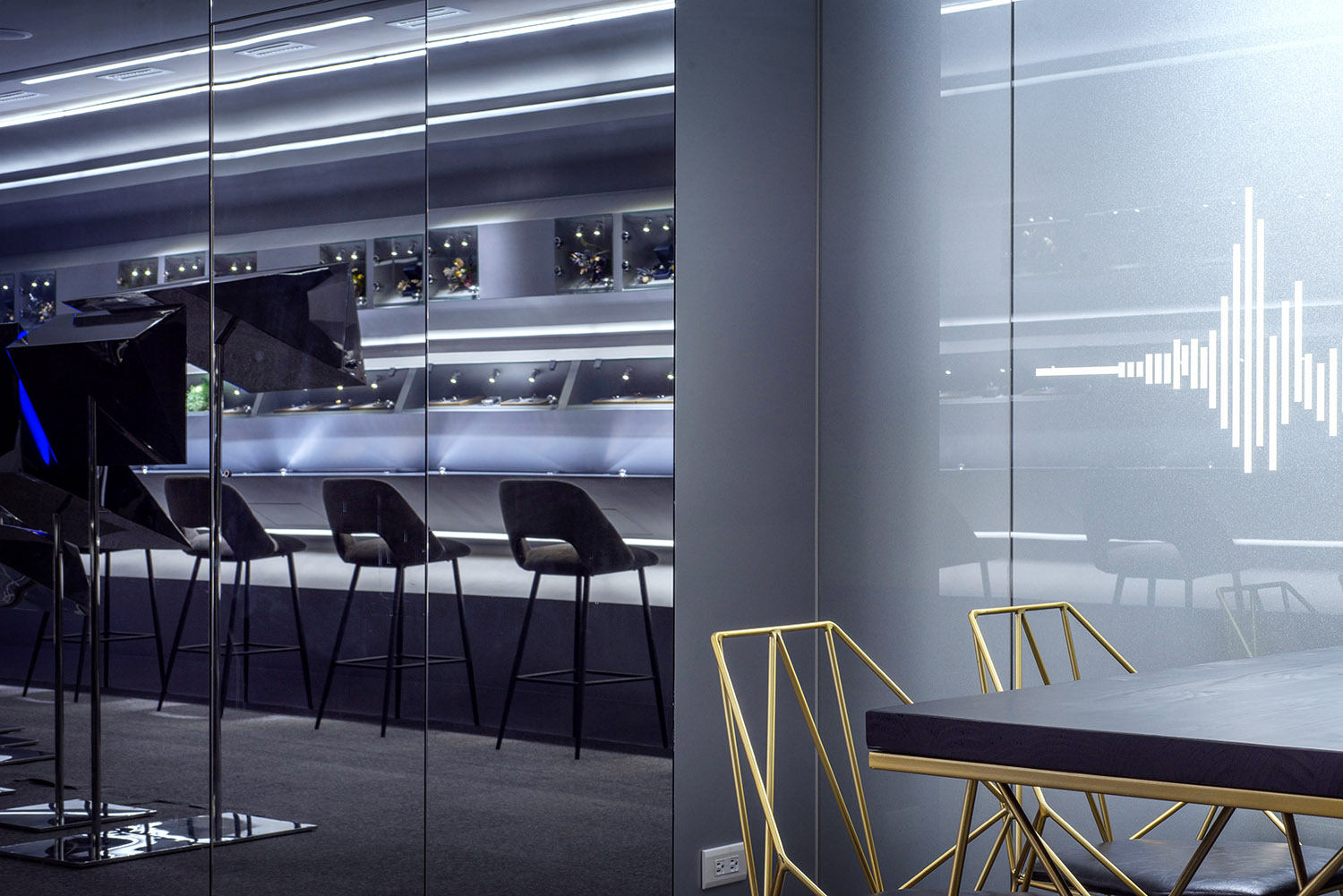
鏡麵與不鏽鋼材質的包裹,延伸的展櫃,讓顧客穿行其中,沿狹長空間的行走動線設計出現麵向不同角度的獨立展櫃,在光線的各種反射之下,步移景異。
The mirror and stainless steel material allows everyone to feel the love that belongs to him and her in the diamond. Through the extended display cabinets, when customers walk through the space, independent display cabinets facing different angles are designed along the walking motion line of the narrow space. Under the various reflections of light, the scenery changes step by step.
∇ 拔地而起的藍色裝置櫃成為純灰空間中的亮點
The blue installations rising from the ground become the bright spot in the pure gray space © Zhaojun Gong
∇ 售賣與展示結合的空間 the space with the function of selling and exhibiting © Zhaojun Gong
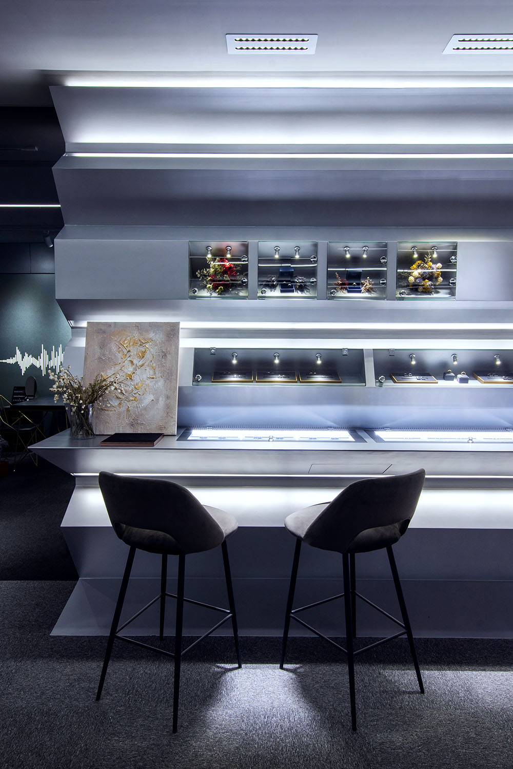
折線形鑽石展櫃以其密集的平行線造型強化了空間進深感,與心型展櫃一同反射於一側的鏡麵牆中,一定程度上豐富了視覺層次的同時使空間整體顯得不至於過多狹長局促。
On one side is the heart-shaped display area, and on the other is the diamond display area. Both is integrated in the connection of mirror materials. The story of love is born in this world.
∇ 視覺效果呈現隨視角變化而不同 Flexible viewing angles in different height © Zhaojun Gong
部分單體作為首飾展示功能,展現該品牌的收藏及概念產品,另一些展櫃內可不停更換當季新品。展櫃的內凹壁龕空間依然是拉絲不鏽鋼,結合溫暖的天鵝絨襯布,呼應品牌高級定製的產品定位。
Some monomers are used as jewelry display functions to show the brand’s permanent collection, and others can be constantly replaced with new products of every season, leaving space with unlimited possibilities. The recessed niche space of the showcase is still brushed stainless steel, combined with the warm velvet underside as the jewelry background, commensurate with the overall tailor atmosphere.
∇ 璀璨奪目的材料即是耀眼的存在 The dazzling materials itself is a eye-catching existence. © Zhaojun Gong
若幹組平行模塊,相互連接,相互獨立,形成容納展示與收藏的盒子組成的展示整體。單體在空間中拉伸成似動態化表現,這些平行模塊由激光切割電鍍不鏽鋼板與亞克力板構成,內配置彩色led發光燈體,所有構件都在疫情期間於上海工廠預製加工,運送至台北,現場吊裝焊接或鉸接連接。數控加工保證了安裝構件的製作精度,預製模塊組裝安裝的方式,極大節約了現場施工的人力與時間成本,並且這些營造裝置使用的主要材料都可被拆卸更換展示地點。
Several groups of parallel modules are connected and independent of each other to form a display unit consisting of a box containing display and collection. The independent monomers are stretched into a dynamic expression in the space. These parallel modules are composed of laser-cut electroplated stainless steel plates and acrylic plates, and are equipped with colorful LED light-emitting lamps. All components are prefabricated and processed in the Shanghai factory during the epidemic. To Taipei, on-site hoisting welding or hinged connection. Numerical control processing ensures the precision of the installation components. The method of assembly and installation of prefabricated modules greatly saves the labor and time cost of on-site construction. Moreover, the main materials used in these construction devices can be disassembled to replace the display site.
∇ 展示與售賣結合的空間 The space mixed with exhibiting and selling. © Zhaojun Gong
∇ 平麵心形語言本身的運動關係與空間的互動關係
the relationship between the movement of the plane heart language itself and the interaction of space © Zhaojun Gong
∇ 新型裝置的碎片作為產品展櫃b Flexible heart-shaped installation b © Zhaojun Gong
空間的動態感是這個項目重要的部分:傳統金屬和線性照明係統。空間陳列完整呈現於橫向展開的玻璃內,同時,展覽與陳列區域中的通道為顧客張開雙臂,引人向前探索。
The dynamic sense of the space is an important part of this project with traditional metal and linear lighting system. The space display is completely presented in the horizontally expanded glass. At the same time, the passages in the exhibition and display areas open their arms for customers to explore forward.
∇ 不同灰度的金屬及鏡麵,在不同角度給消費者心裏營造神秘感
Metals and mirrors with different gray levels are used to create a sense of mystery in the hearts of consumers from different angles © Zhaojun Gong
∇ 展櫃的折線形剖麵 Section of the showcase © Zhaojun Gong
定製區域在空間最深處的環境中為顧客提供舒適而私密度的保護。促膝而談,找到適合自己的鑽石,覓到自己記憶碎片中的那份內心深處的寶藏。
The customized area provides customers with comfort and privacy protection in the deepest environment of the space. Follow your heart, come here, sit shoulder to shoulder, talk with your knees, find the diamond that suits you, and find the deep treasure in your memory fragments.
與無限反射的展覽與陳列區形成對比,利用led燈管營造溫暖氛圍,玻璃材質與仿古銅的桌搭配古典圓椅,為在空間漫步與探索的消費者提供休憩之地。
In contrast with the infinitely reflective exhibition and display area, the use of LED lamps to create a warm atmosphere, glass and metal tables and classic round chairs, provide a resting place for consumers who stroll and explore the space.
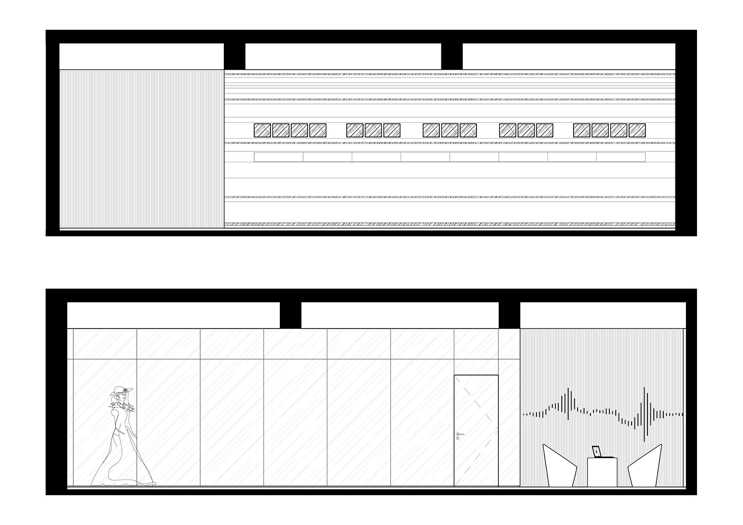
∇ 立麵圖 Elevations
∇ 定製服務區 Customized service area © Zhaojun Gong
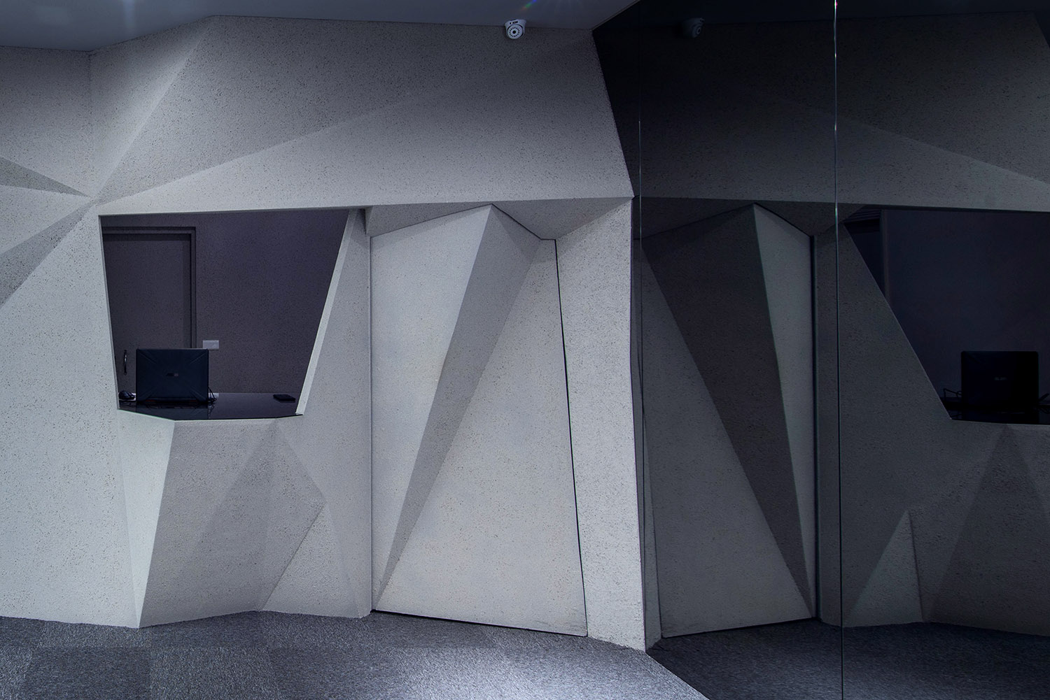
由不規則多邊形切割組成的收銀區中,延續整體空間的多麵切割形態,將平麵語言翻折,隱藏傳統的收銀台,減小顧客對收銀區本能的回避。造型牆麵與整體空間融為一體,臨近洽談休息區,將收銀、維修、員工休息等功能集於空間敘事的盡端。
In the cashier area composed of irregular polygonal elements, the multi-faceted cutting form of the overall space is continued, the plane language is turned over, the traditional cashier is hidden, and customers instinctively avoid the cashier area. The modeling wall is integrated with the overall space, adjacent to the negotiation rest area, which integrates the functions of cash register, maintenance, and staff rest in the final space narrative.
∇ 收銀區域 Cashier area © Zhaojun Gong
項目信息
項目名稱:澳門環世鑽石台北店
設計方:平介設計
公司網站:parallect-design.com
聯係郵箱: di.huang@parallect-design.com
項目設計&完成年份:2020
主創及設計團隊:董豔,黃迪,肖明峰,楊楠
項目地址:台北忠孝東路3段199號
建築麵積:64m2
攝影版權:龔照竣
合作方:蘇州再造設計
客戶:澳門環世鑽石
Project Name: Golden Tree Diamond Taipei Store
Designer: Parallect Design
Website: parallect-design.com
E-mail: di.huang@parallect-design.com
Time of Design & Accomplishment: 2020
Main Designer and Design Team: Yan Dong, Di Huang, Mingfeng Xiao, Nan Yang
Address: No. 199, Zhongxiao East Road, Taipei city
Covered Area: 64m2
Copyright of Photography: Zhaojun Gong
Partners: Suzhou Re-design Studio
Client: Golden Tree Diamond


