全球設計風向感謝來自 COLORFULL 昱景設計 的辦公室項目案例分享:
01 項目概況 Project Overview
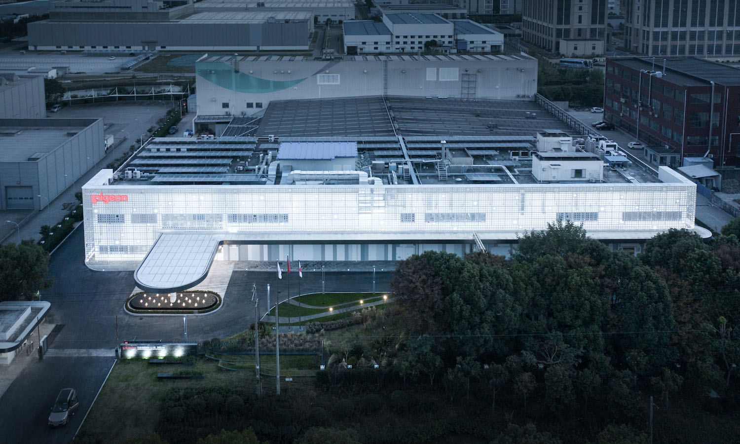
全球知名的母嬰用品品牌“Pigeon貝親”,在世界各地設有子公司。本次項目是貝親公司在上海的辦公、研發、生產基地,我們對原有建築進行了室內外裝修的整體規劃和升級。該建築位於中國上海青浦,從投入使用至今,一直作為貝親主要的生產基地,改造升級後也將作為未來市場擴張和產品研發的創新中心。
目前的建築為多層建築,工廠特有的外觀,由簡單的超長矩形立麵構成,是以生產安全、人本精神和綠色生態為理念的高效產業基地。
Pigeon, the world-renowned brand of baby & mother care products, has subsidiaries all around the world. This project is the office, R&D and production base of Pigeon in Shanghai, and we have planned and upgraded the interior and exterior of the original building. The building, located in Qingpu, Shanghai, has been used as Pigeon’s main production base since it was put into use, and will also serve as an innovation center for future market expansion and product development after the renovation.
The current building is a multi-story building with a factory-specific appearance, consisting of a simple, extra-long rectangular facade, and is a highly efficient industrial base with the concept of production safety, human spirit and green ecology.
02 外立麵 Facade
體驗是企業品牌中尤為重要的組成部分。正如使用貝親產品的客戶一樣,貝親的員工們在每天到訪的生產現場,也會受到建築和空間行為的影響。
我們相信通過這次的設計,能讓貝親所有員工,對作為全球化公司的貝親品牌印象產生共鳴,讓他們每一位都參與到企業文化的創造中來。
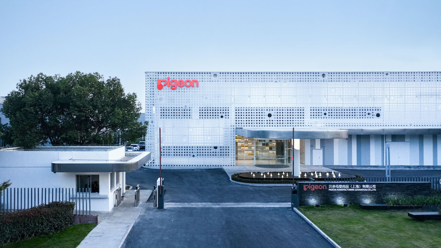
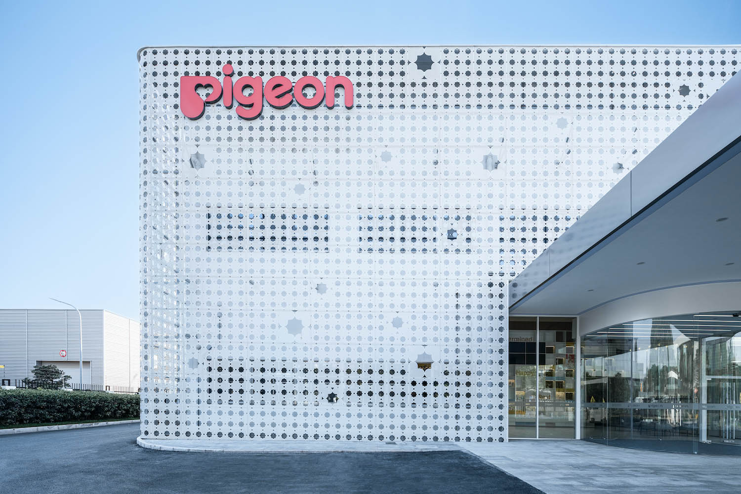
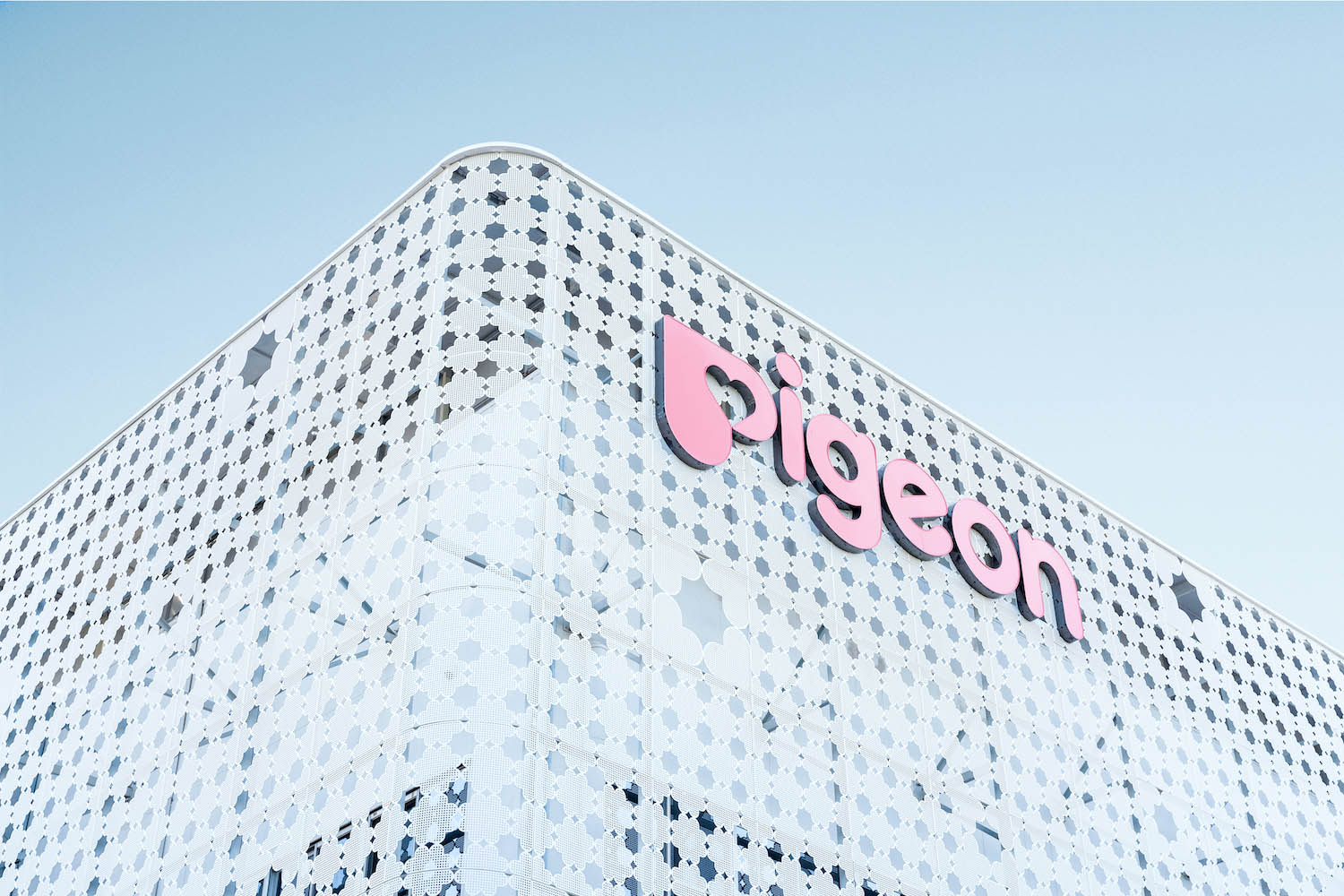
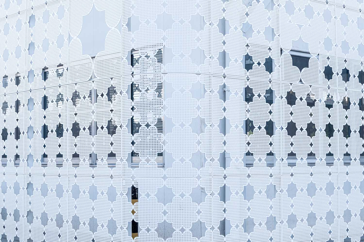
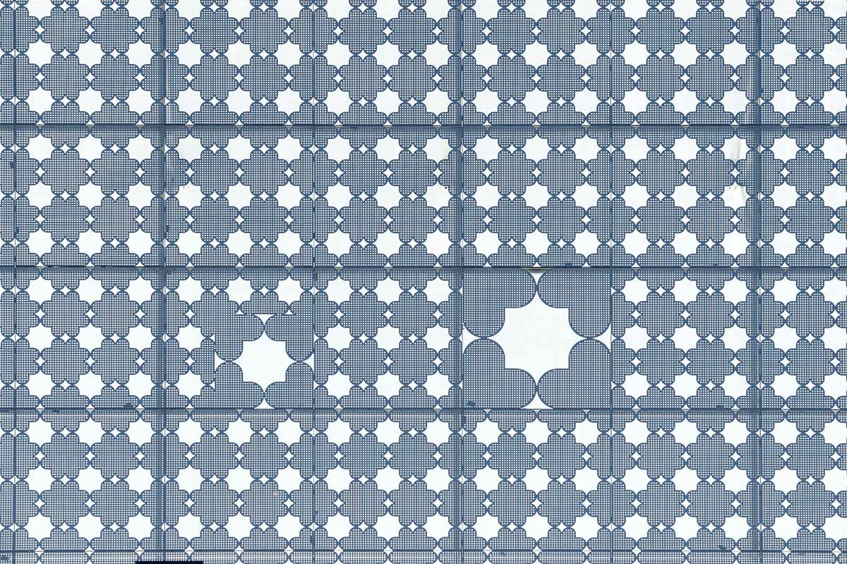
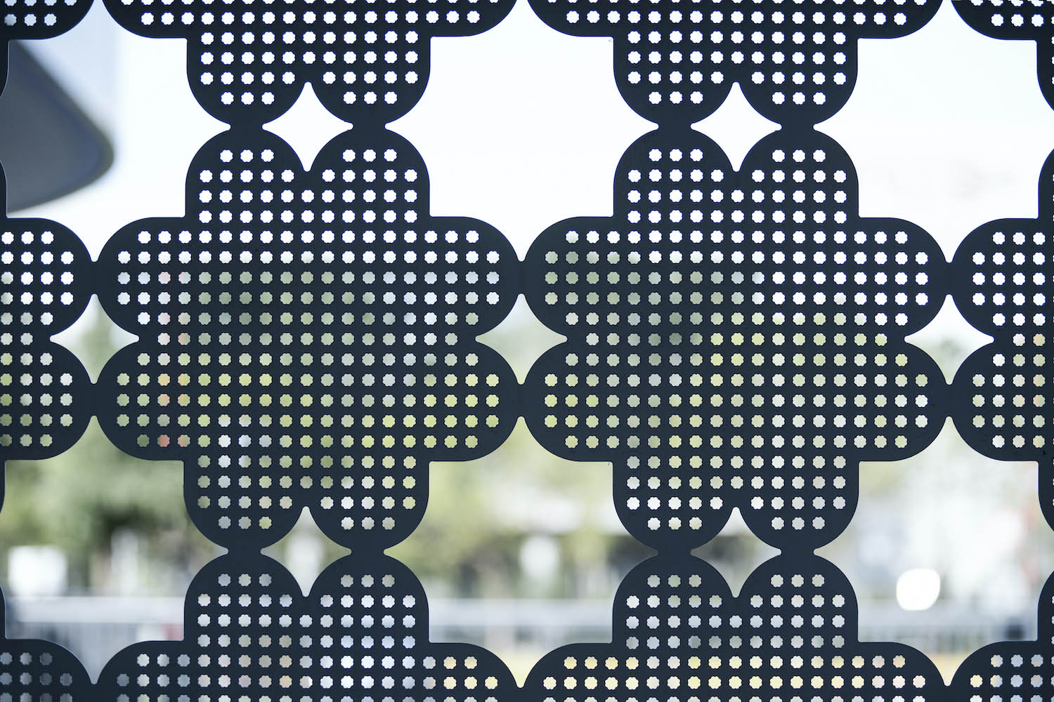
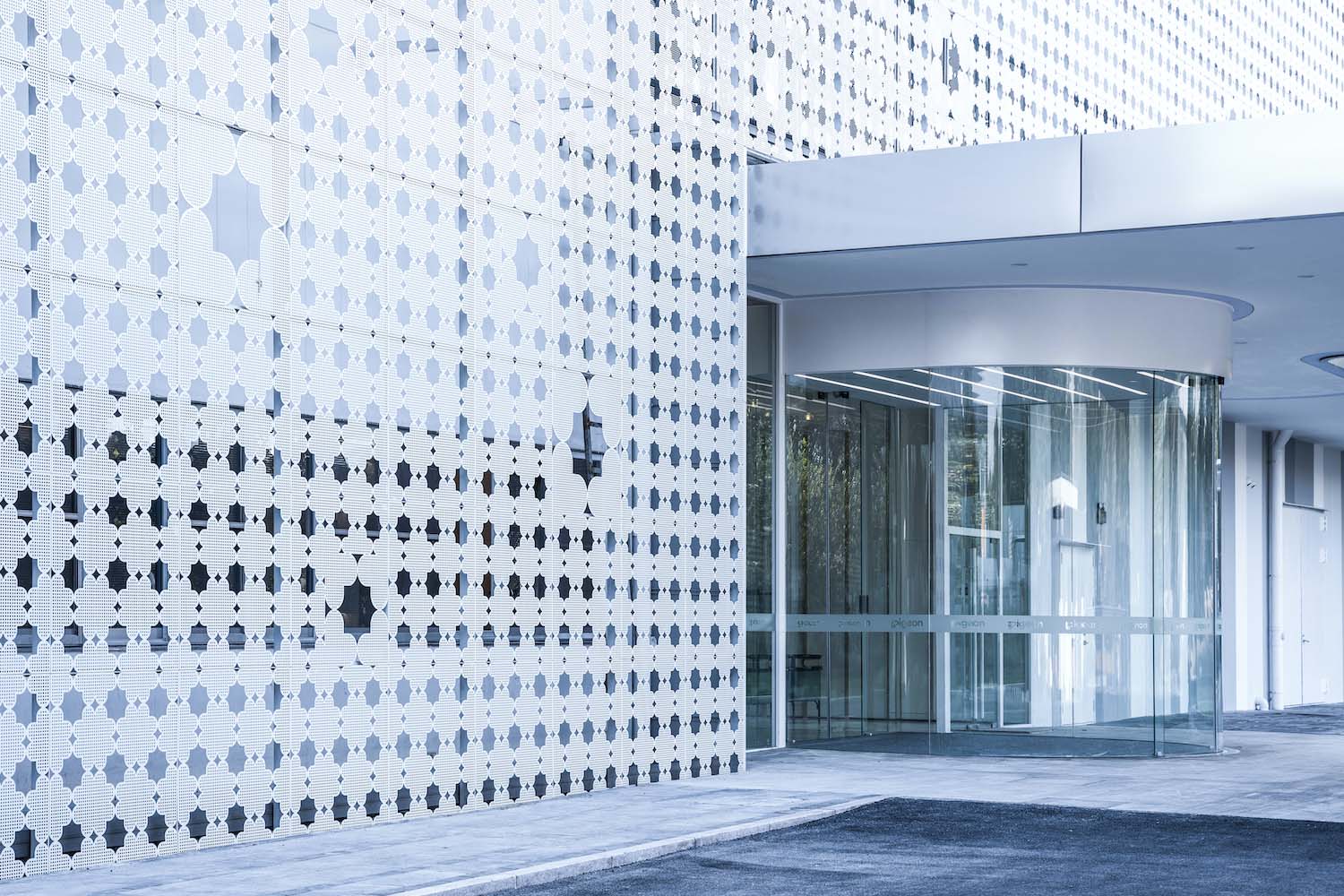
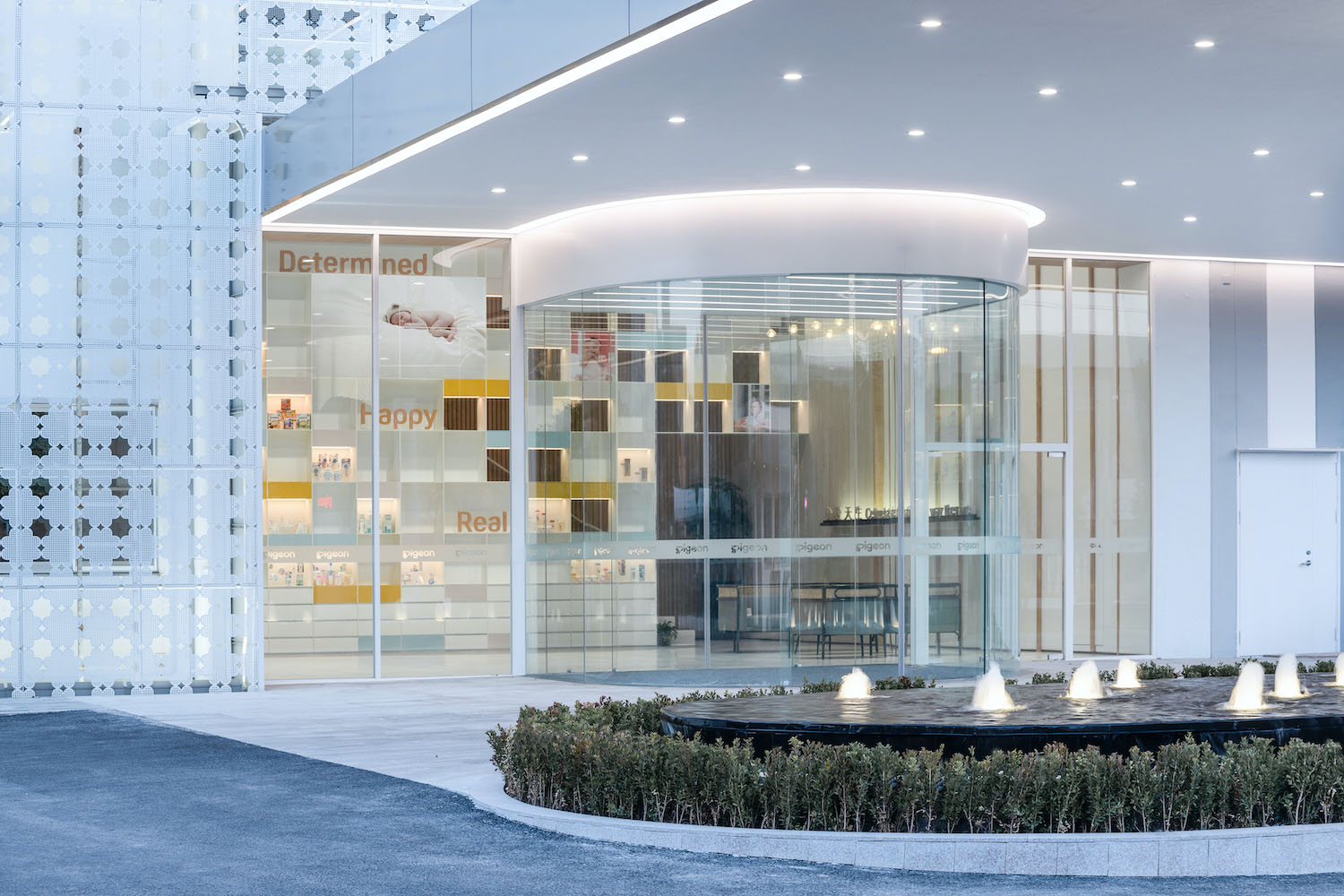
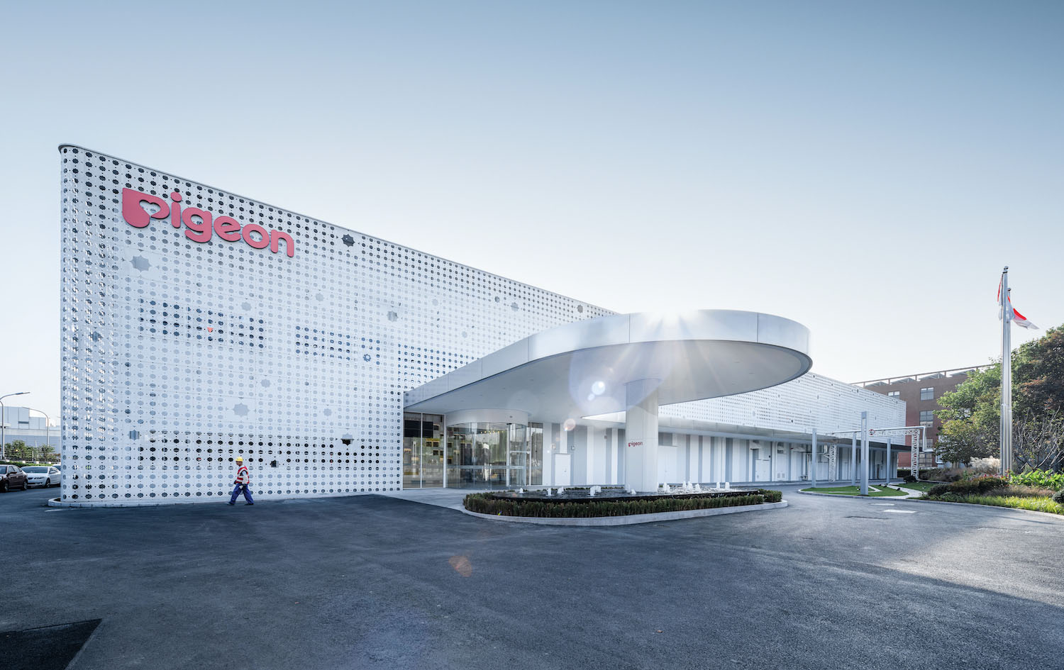
為了讓來訪者第一眼就能夠感受到企業品牌的視覺衝擊,我們以公司Logo的“心”形為元素進行組合創新,設計出覆蓋外立麵的鏤空鋁板,其最小單位的衝孔圖案也十分精巧。放眼望去,整個外立麵仿佛被一層柔軟的紗幔覆蓋著;近距離觀看,每一個心形圖案都仿佛漂浮在立麵上。外立麵整體作為一個融入企業文化和身份的標誌,給人留下既獨特又深刻的印象。
User experience is a particularly important component of a brand. Just like the customers who use Pigeon’s products, Pigeon’s employees are influenced by the architecture and space at the production sites they visit every day.
We believe that through our design, all Pigeon’s employees will resonate with the brand impression of Pigeon as a global company, and take part in the creation of corporate culture.
In order to let visitors feel the visual impact of the corporate brand at first glance, we used the “heart” shape of the company’s logo as an element of combination innovation, and designed the hollow aluminum plate covering the facade, and the smallest unit of its punch pattern is also delicate. From a distance, the whole facade seems to be covered by a soft veil; at a close distance, each heart-shaped pattern seems to float on the facade. The whole facade, as a symbol of corporate culture and identity, leaves visitors a unique and deep impression.
03 入口大廳 Entrance Hall
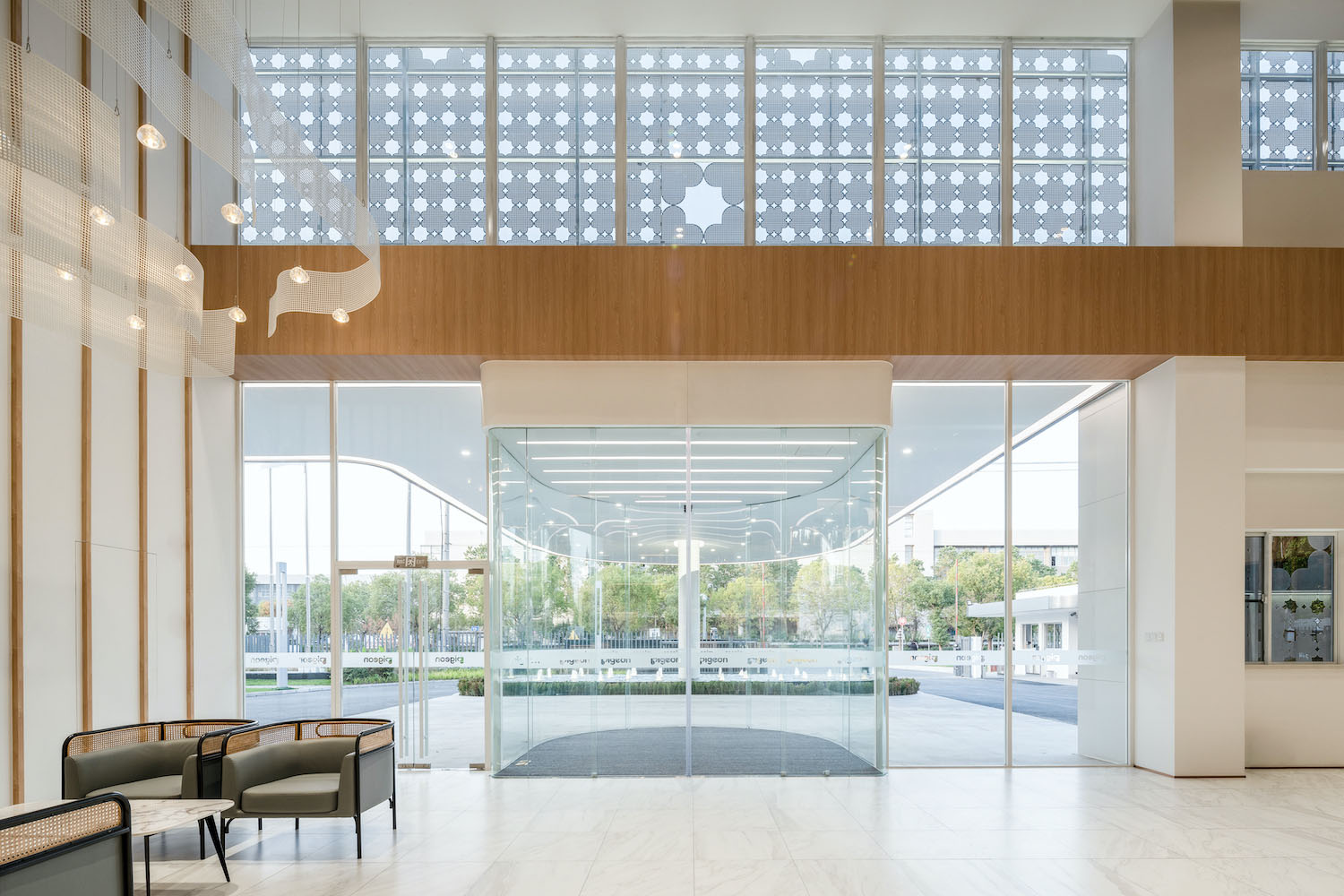
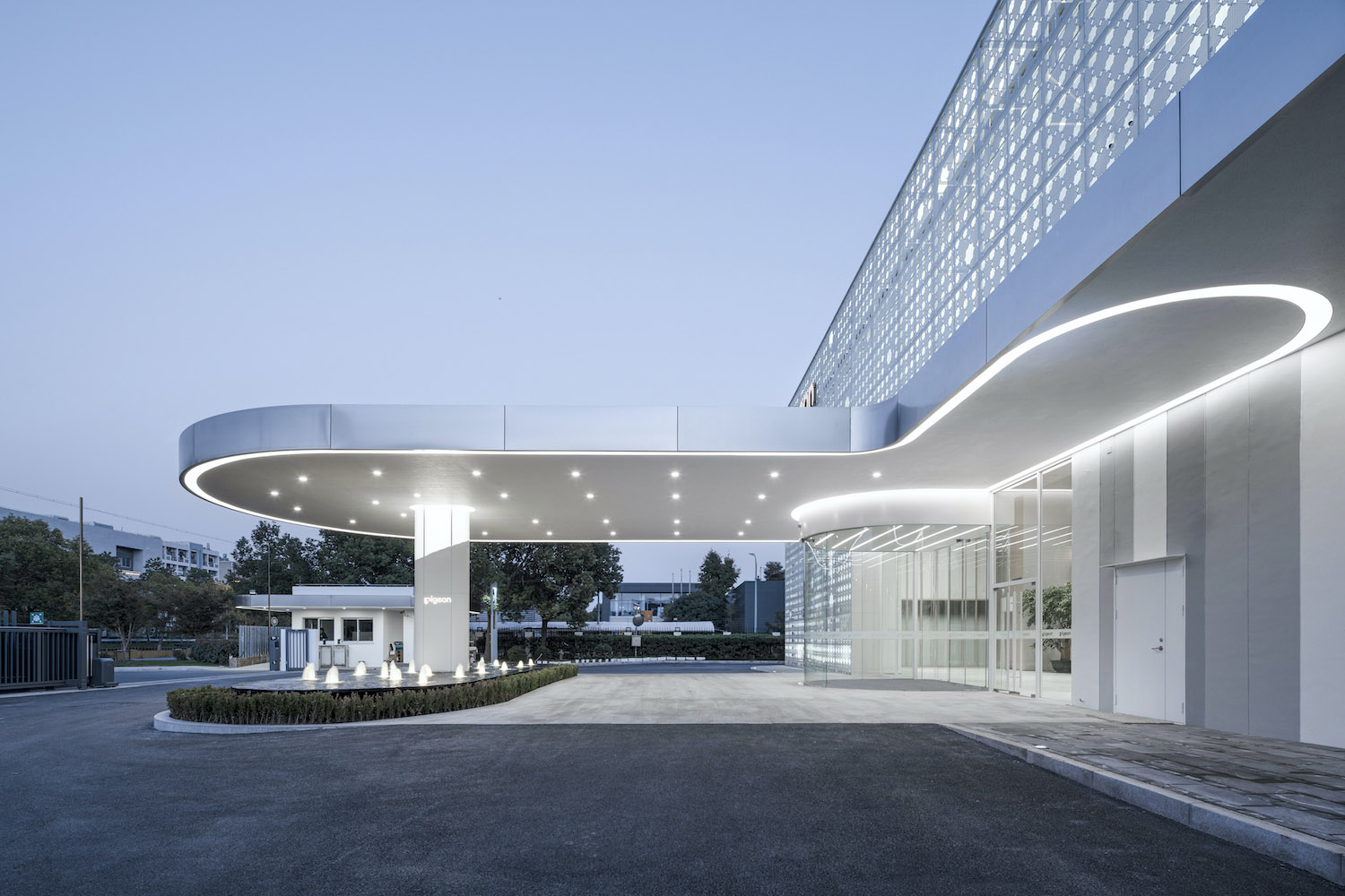
入口雨棚利用象征品牌形象的柔和曲線,表現出柔美的印象。另外,與外立麵的主題重疊在一起,能夠激發參觀者的靈感,並由此傳達出企業文化。
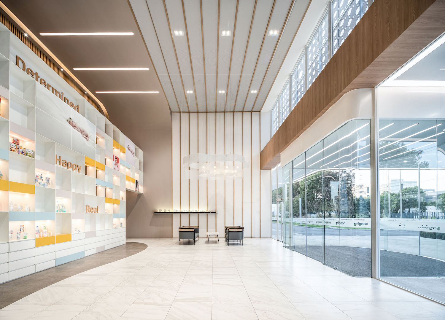
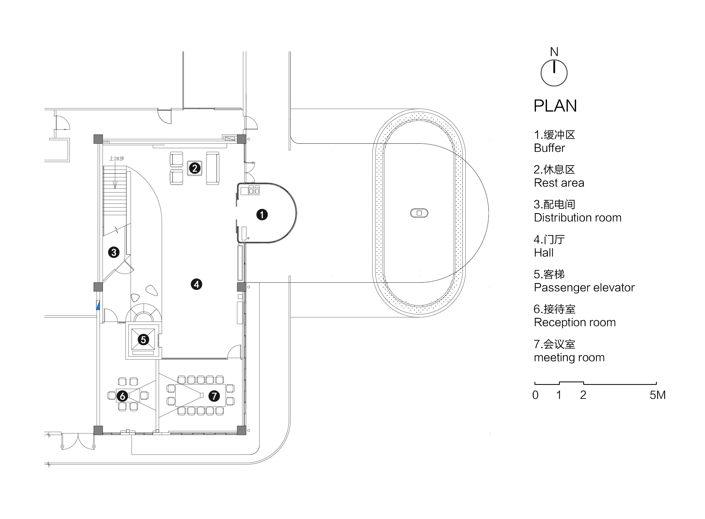
接待大廳量身定製了一個“集合式展示空間”,包含了谘詢接待、商務會議、產品展示、數字媒體、企業文化及曆史沿革等多重功能。
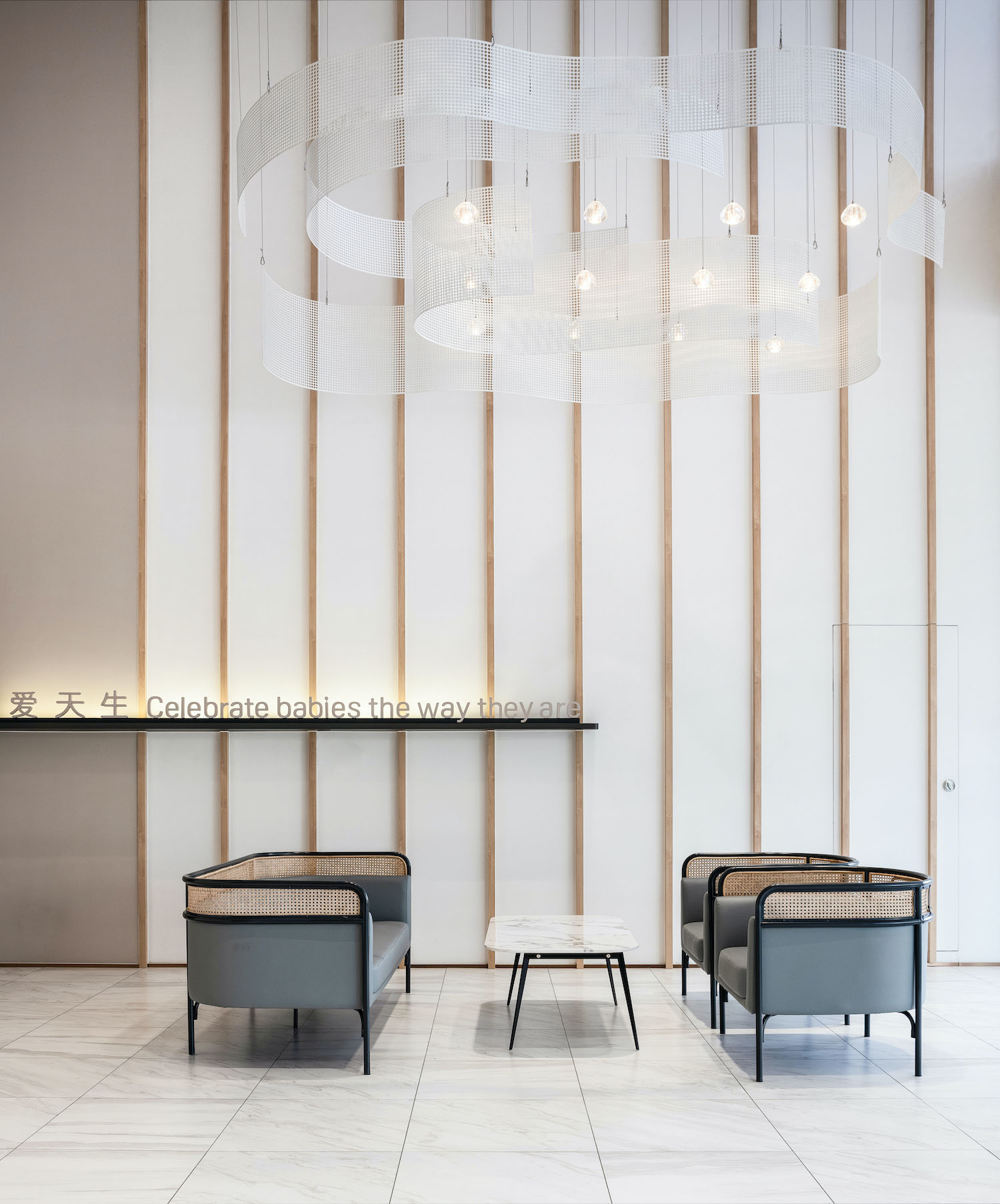
當曲線在三維空間組合的時候,“柔”往往更觸動人心。家具邊緣的“柔”,蔓延展開的燈具的“柔”,漸變燈光的“柔”,與展架立麵形成“迎”式的曲線,契合貝親SI係統的設計元素,為整個場域提供了重要的主視覺形象。
所有的素材與色調,均以在搖籃或子宮內溫柔地包裹著嬰兒的氛圍為概念,沒有任何的棱角,溫和的配色亦以品牌色為基調,為來訪賓客展現積極明亮的開敞空間,在流動形態中感受母嬰品牌形象的柔和美。
The entrance canopy utilizes the soft curves that symbolize the brand image to express softness and beauty. In addition, the canopy overlaps with the facade theme to inspire visitors and thus convey the corporate culture.
The reception hall is tailored to be a compound exhibition space, containing multiple functions such as consultation reception, business conference, product display, digital media, corporate culture and history display.
When curves are combined in three-dimensional space, “softness” tends to be more touching. The “softness” of the edges of the furniture, of the spreading lamps, and of the gradient lighting, forms a “welcoming” curve with the facade of the display rack, which fits the design elements of Pigeon’s SI system and provides a main visual image for the whole space.
All materials and tones are based on the concept of a baby tenderly wrapped in a cradle or womb, without any corner angle, and the gentle color scheme is also based on Pigeon’s brand colors, showing a positive and bright open space for visitors, and feeling the soft beauty of the mother and baby brand image in the flowing form.
沿革牆樓梯過道 History Display Wall
在拾階而上的過程中閱覽百年企業的發展曆程——從創立之初到未來不斷的延續,結合產品展示出深厚的企業文化底蘊。
While climbing up the stairs, visitors can read the development history of a century-old company — from its foundation to the continuation into the future, which shows the deep corporate cultural heritage.
象征性建築 Symbolic Architecture
設計師在建築外立麵融入了企業文化,同時在室內營造出了柔和舒緩的曲線空間,這是一次關乎情感、碰觸心靈的設計體驗。我們希望項目作為企業向未來發展、向未來傳遞信息的生產基地,同時也成為生產者、參觀者都可以觸摸、體驗和享受貝親文化的地方。
The designers incorporated the corporate culture in the building facade, while creating a soft and soothing curved space in the interior, which is a heart-touching design experience. We hope the project serve as a production base for the company to develop and deliver information to the future, and also as a place where both producers and visitors can touch, experience and enjoy the culture of Pigeon.
04 願景 Vision
產品研發辦公已不再隻是單純的“辦公生產空間”,在這個空間內承載著人與物與社會之間的重要連接——生活與社交,責任與使命,對工藝精益求精,將愛永續傳承。
The product development office is no longer simply a space for working and producing, but also a space that carries an important connection between people and society — life and social contact, responsibility and mission, excellence in craftsmanship, and the perpetual transmission of love.
∇ 平麵圖 Plan
∇ 立麵圖 Elevations
項目信息
項目名稱:貝親辦公改造
項目地址:上海市青浦工業園區北盈路405號
設計方:COLORFULL 昱景設計
建築麵積:15,000㎡
公司網站:http://www.colorfull-design.com/
聯係郵箱:cf@colorfull-design.com
項目設計 & 完成年份:2020
設計指導:趙宗陽、小野良介
建築設計深化:張凡星、張顥
室內方案設計:孫秀雲、蔣瑜桑、李立群、莊宏玲
室內設計深化:李立群、張阿平、蔣瑜桑
攝影版權:何煉
客戶:貝親母嬰用品(上海)有限公司
材料:仿雅士白地磚、灰色編織紋地磚、木紋貼膜、地毯
Project name:Pigeon Office Renovation
Project location:405 Beiying Road, Qingpu Industrial Park, Shanghai
Design:COLORFULL YUJING DESIGN
Gross Built Area (square meters):15,000㎡
Website:http://www.colorfull-design.com/
Contact e-mail:cf@colorfull-design.com
Design year & Completion Year:2020
Design Guidance:Sunny Zhao, Ryo Ono
Deepening of architectural design:Fanxing Zhang, Hao Zhang
Interior Design:Sylvia Sun, Yusang Jiang, Lily, Honey Zhuang
Deepening of interior design:Lily, Aping Zhang, Yusang Jiang
Photo credits:Lian He
Clients:PIGEON(SHANGHAI)CO.,LTD.
Brands / Products used in the project:Imitated white floor tiles, gray woven floor tiles, wood grain film, carpet


