全球設計風向感謝來自 深圳 MOC DESIGN OFFICE 的電影院項目案例分享:
電影世界的黑白印象
Black and White Impressions of the Film World
黑白陰陽,相映而生,光影交彙,演繹極致印象。踏入編織的故事場景中,所有的漸進鋪敘隻為完整這一場早已擁有姓名的電影之旅。
Black and white, Yin and Yang. They were born for each other. The light and shadow cast the ultimate impression. Stepping into the woven scenes of the story, one will see all the progressive narratives unfolded, which completes the journey of film with the name written.
∇ 空間概覽,Space overview
讓空間基底定格視覺色彩的主基調,本案將黑白反差由淺入深運用到極致,正應和了蘇軾所言:“其實不是平淡,絢爛之極也。”
This project fully employs the contrast of black and white and makes it the main tone for the space. It echoes the great poet Su Shi’s words “it is not in fact insipid, but the most splendid.”
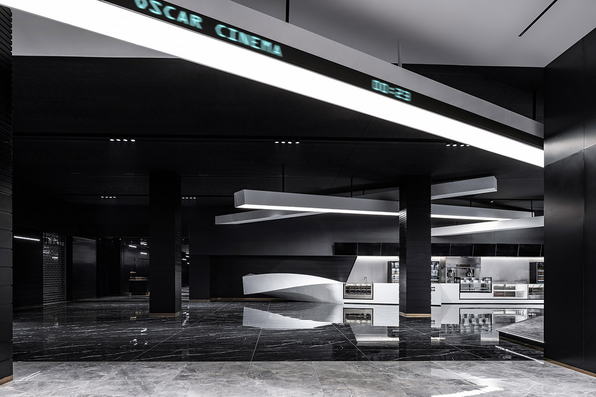
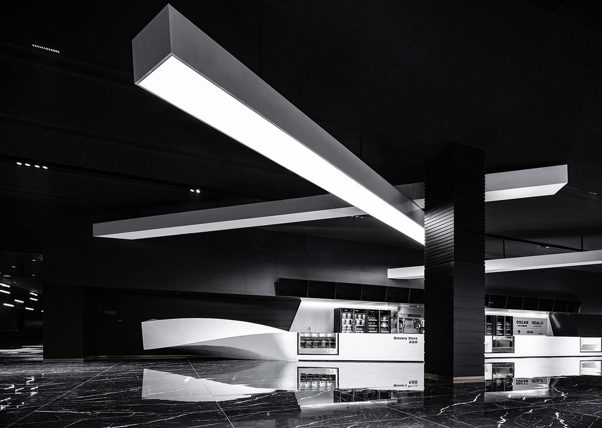
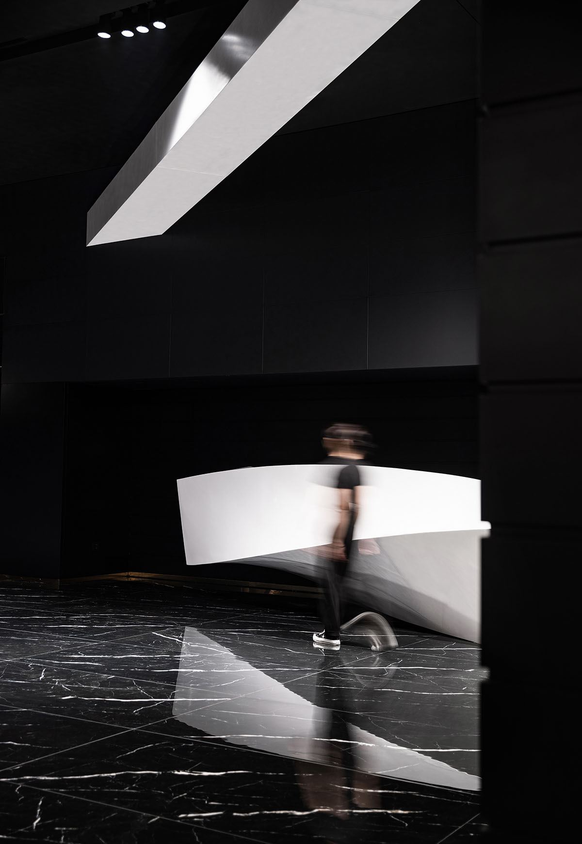
∇ 傾斜的白色幾何體引導人們進入影院大堂,材質和色調的變化帶來情緒的轉變
The slanting white geometries lead people into the lobby of the cinema while the change of materials and tones brings about a shift in mood.
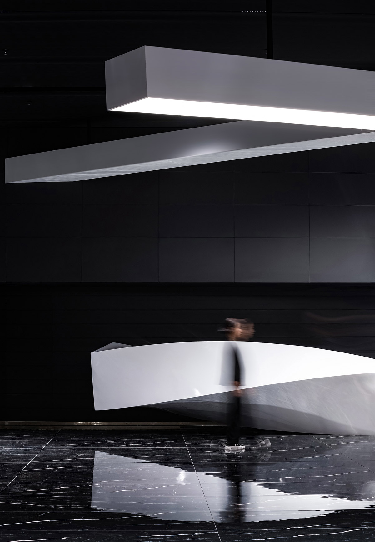
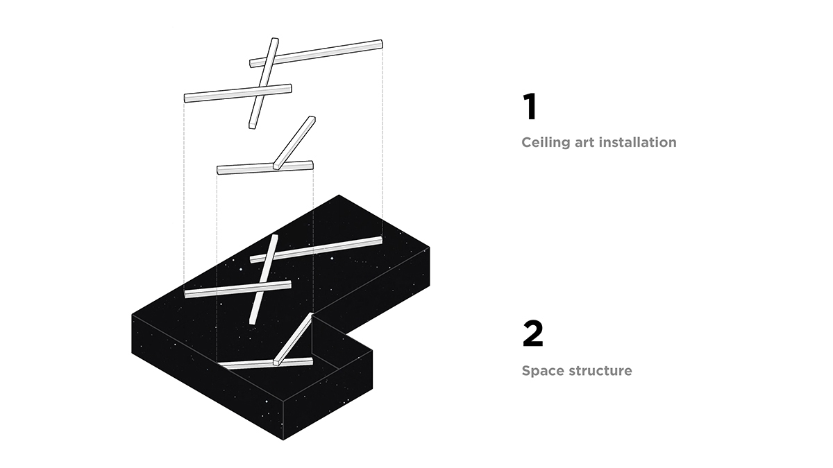
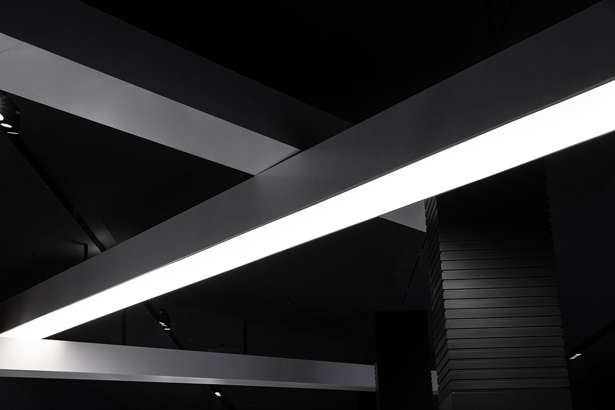
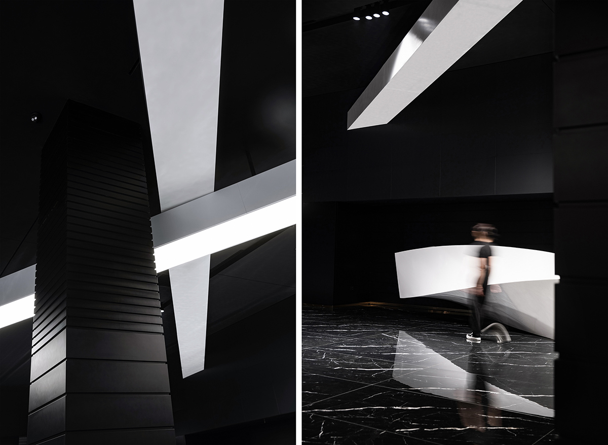
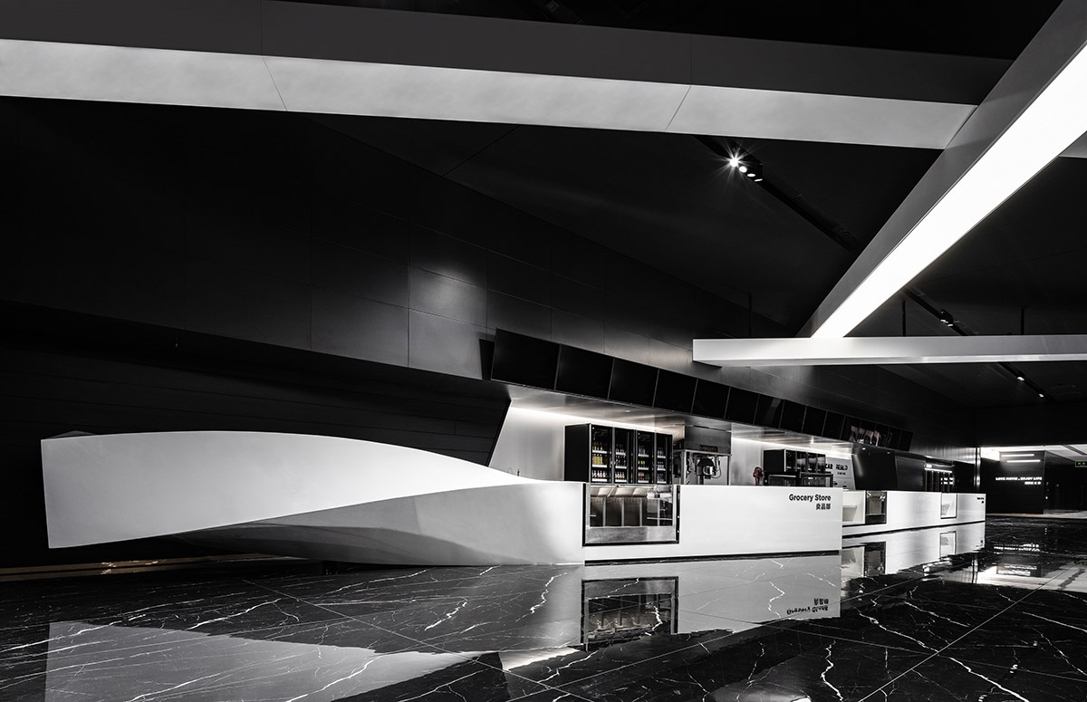
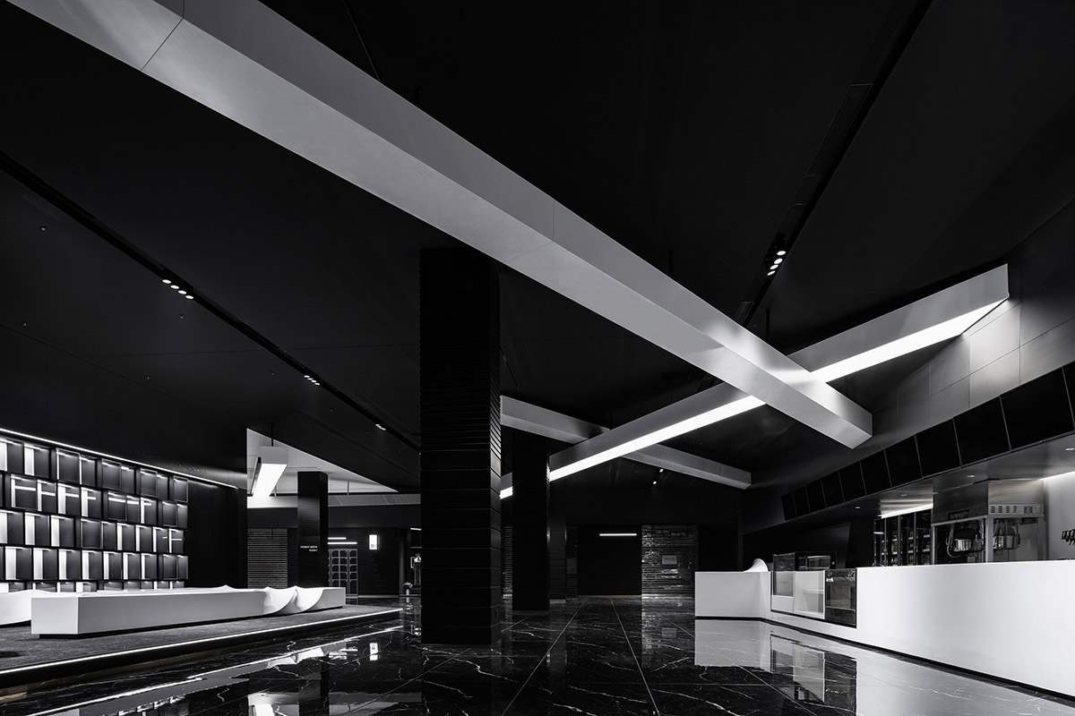
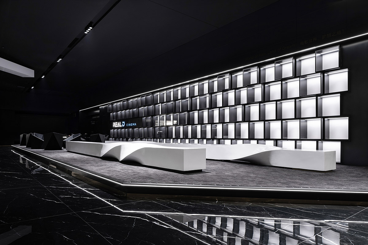
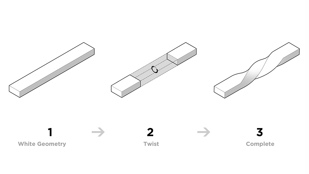
傾斜交錯的白色幾何體被置於於大堂空間中,或交疊、或穿插、有些甚至以扭曲的姿態呈現,仿佛電影故事中起伏婉轉的情節走向。
The white geometric forms are placed in the lobby space in an overlapping and interlocking pattern, some even twisting, as if the ebb and flow of the film story.
∇ 白色的幾何體在空間中交疊、穿插、扭曲
The white geometries are overlapped, interspersed and twisted in the space.
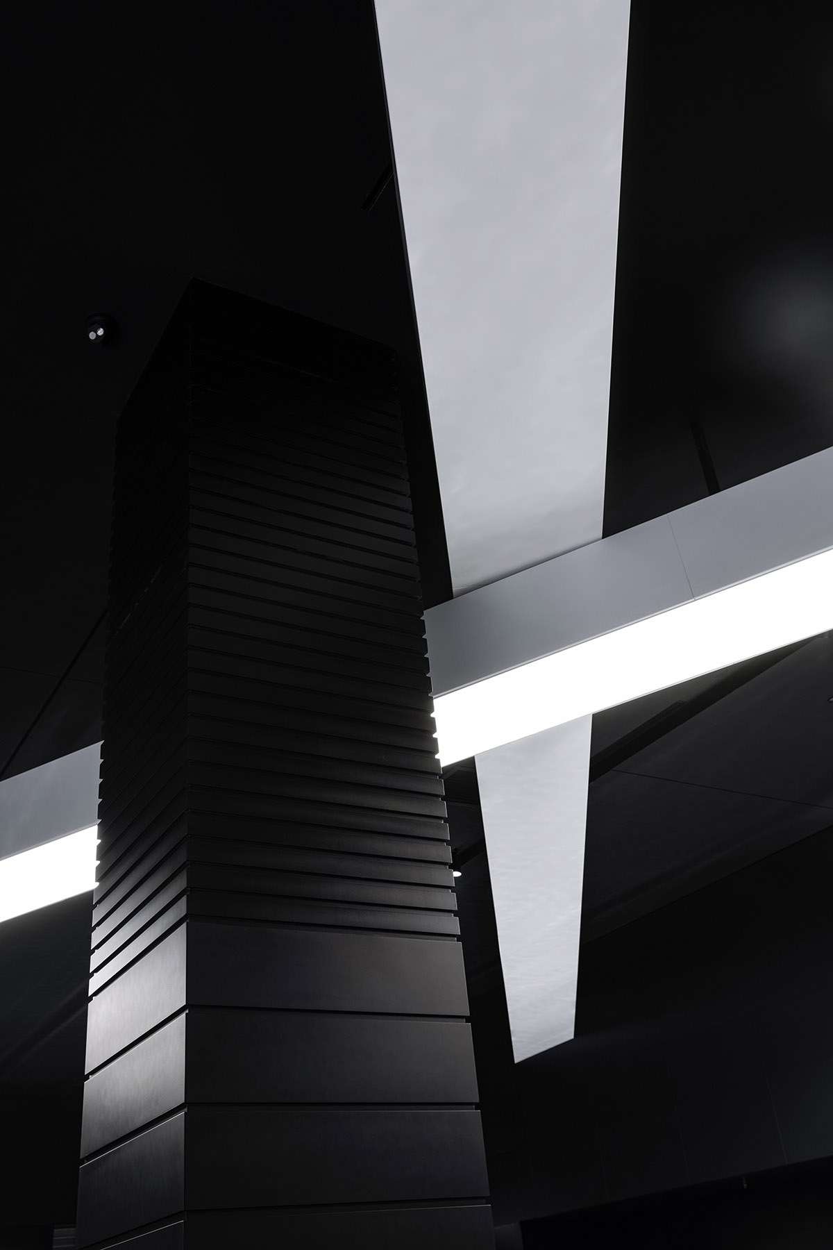
黑白根大理石與黑色橫紋鋁板的獨特肌理在立體空間中蔓延生長,給予觀影大廳行徑動線豐富的變化,同時帶領人們深入這虛幻的時光中。
The distinctive textures of Nero Marquina marble and black cross-grained aluminum panels spread across the three-dimensional space, giving the cinema hall a rich variation of paths and leading people into the unreal time.
∇ 整體的黑色基底上結合了不同的材質和肌理
Different materials and textures are combined on an overall black base.
色彩與形態交融下的美學張力,劃破了沉靜的黑色時空,讓凝固的時光從轉折處開始流動。
在這裏光線的營造決定了陰影的呈現,在黑與白的色彩組合下它隱隱約約地浮現。
The aesthetic tension under the fusion of colors and forms cut s through the silent black space, allowing the frozen time to flow from the turning point. The creation of light determines the appearance of shadows, which emerges faintly under the combination of black and white.
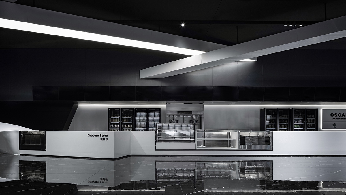
∇ 從大堂入口處看向售票台
Looking from the lobby entrance to the ticket counter.
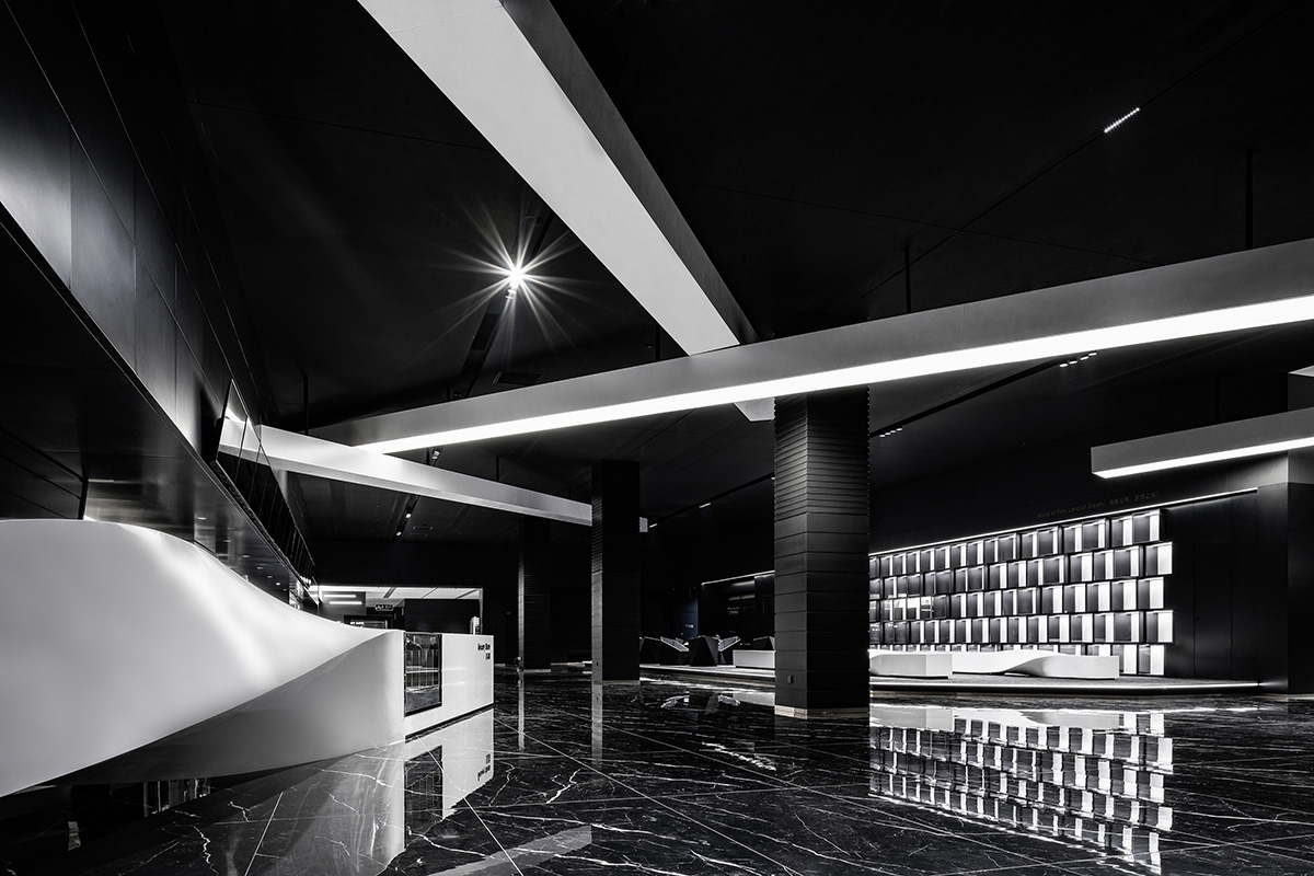
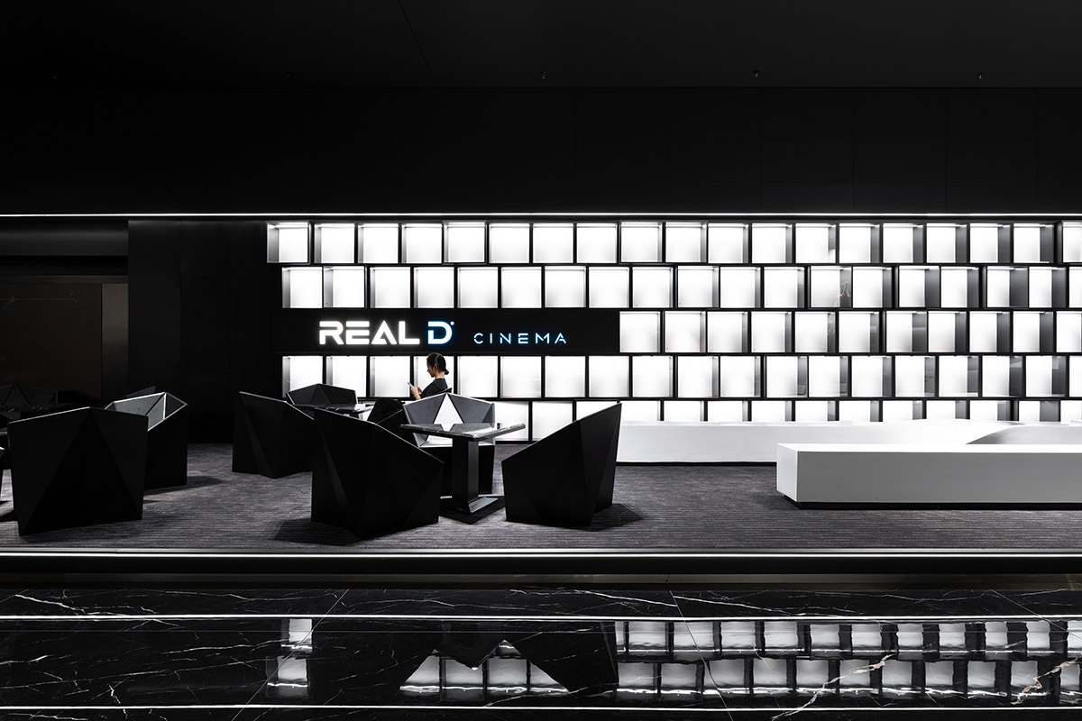
∇ 從等候區看向售票台
Looking into the ticket counter from the waiting area.
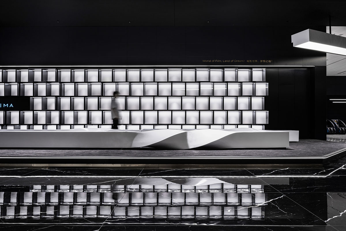
利用清晰的對比強調區域場景的焦點,等候區裝飾的序列方格狀展示櫃體,為空間整體增添了神秘、時尚與未來的氣質。
Clear contrast is used to emphasize the focal point of the scenes in the area. The waiting area is decorated with a sequence of cube-shaped display cabinets, which adds mystery, fashion and futuristic qualities to the space as a whole.
∇ 錯層的櫃體與扭轉的長凳回應了空間的概念
Staggered cabinets and twisted benches respond to the concept of space.
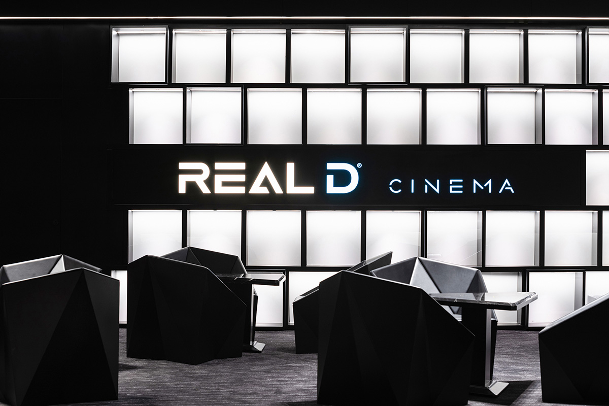
∇ 座椅形態分析,Morphological analysis
∇ 針對該空間定製的休息區家具 Lounge furniture is tailored to the space.
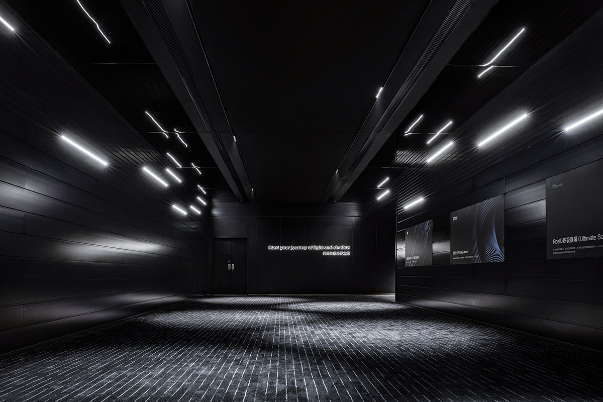
走進觀影主通道,好似流星般的光線安放在兩側牆壁,天花的黑色鏡麵反射拓展了空間,在暗色的映襯下仿佛充盈未來感的時光隧道。地麵上強烈的方向性紋理延伸至盡頭,為觀影者帶來視覺上的動態體驗,同時引導觀影者不斷前行。
Into the main hallway, lights installed on both sides of the walls are like meteors. The ceiling made from black mirrors expands the space with the reflection, which appears to be a futuristic time tunnel in the dark background. The strong directional lines on the floor extend to the end, providing the viewers with a visually dynamic experience while guiding them along the way.
∇ 觀影主通道 The main hallway down to the viewing halls.
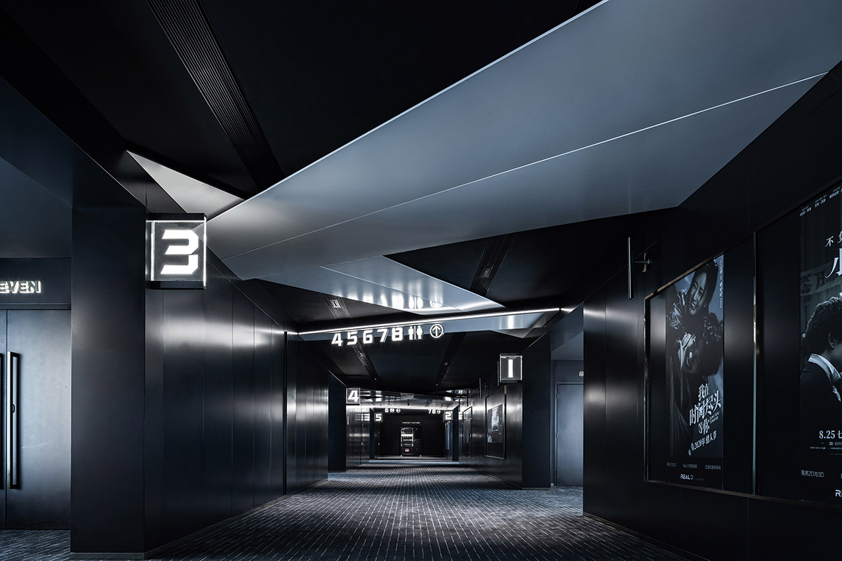
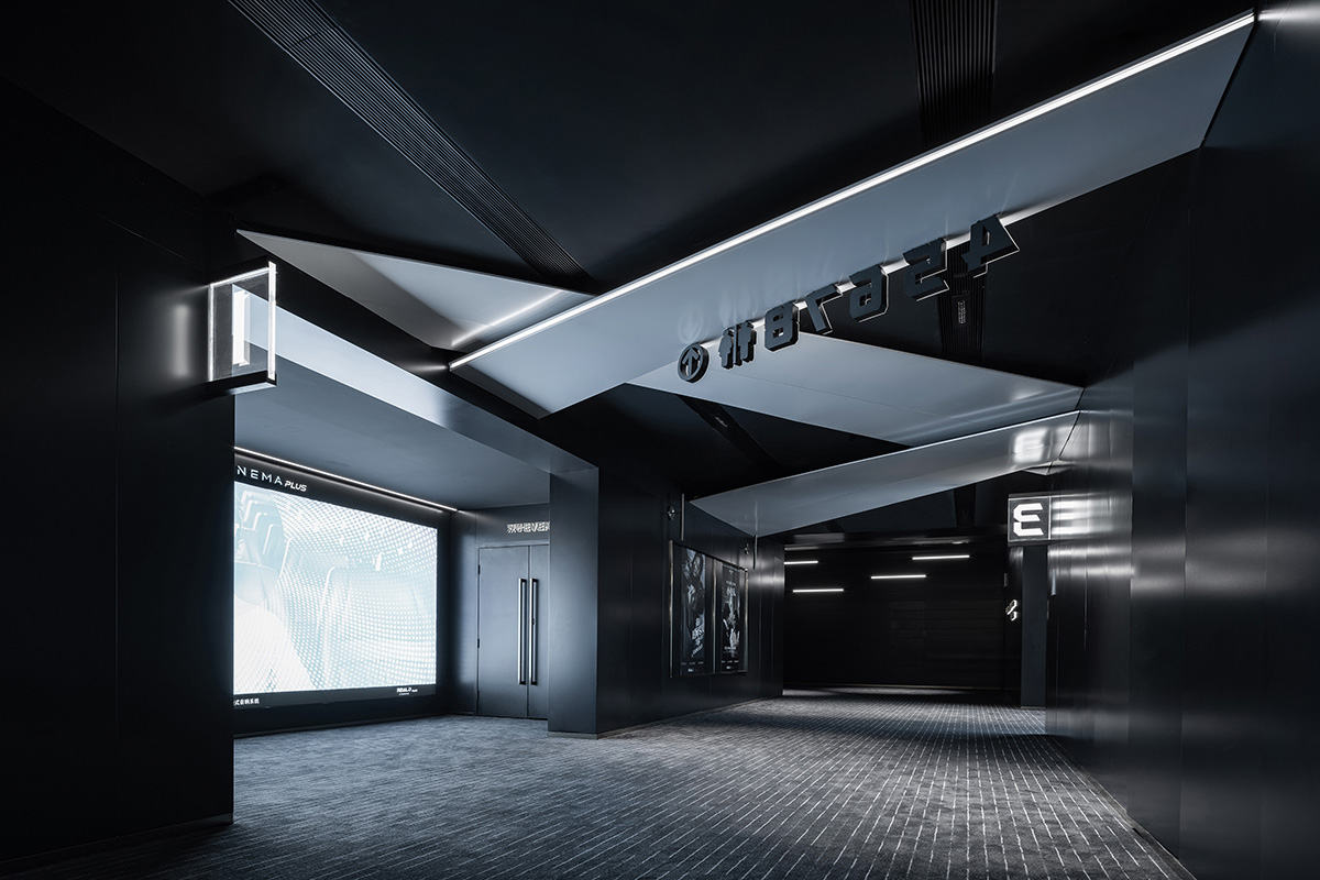
汲取大廳主元素中的幾何體放置於觀影通道中,結合縱向空間尺度進行演變。而觀影通道除去引導觀影者找到影廳入口和指示各類功能空間方向的功能之外,還承接和過渡了空間風格的變化。
The geometric elements of the lobby are also combined in the hallway, which evolve in conjunction with the vertical spatial scale. In addition to its function of guiding the viewers to the entrance of the theater and directing the various functional spaces, the hallway also provides the transition of spatial style.
∇ 大廳的幾何體元素結合觀影通道的空間尺度進行形式演變
The geometric elements of the lobby evolve in relation to the spatial scale of the hallway.
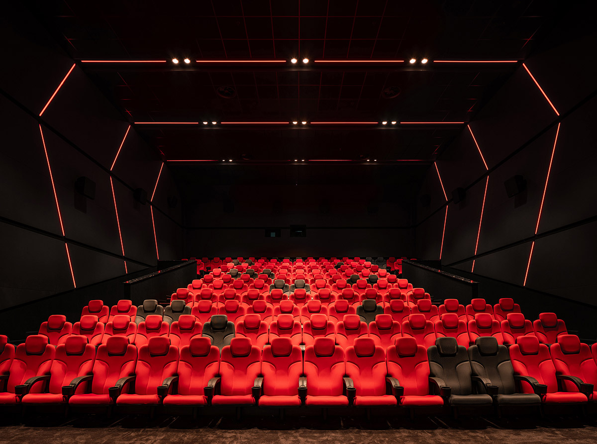
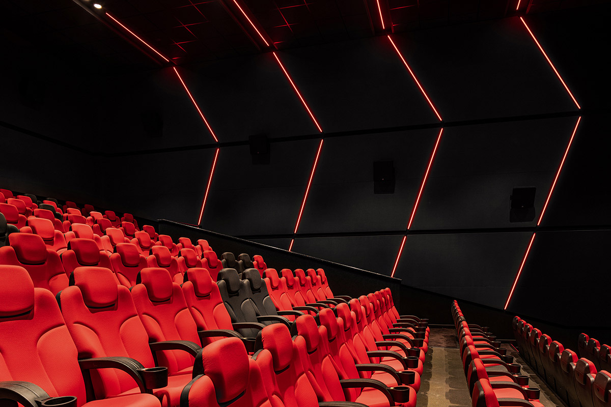
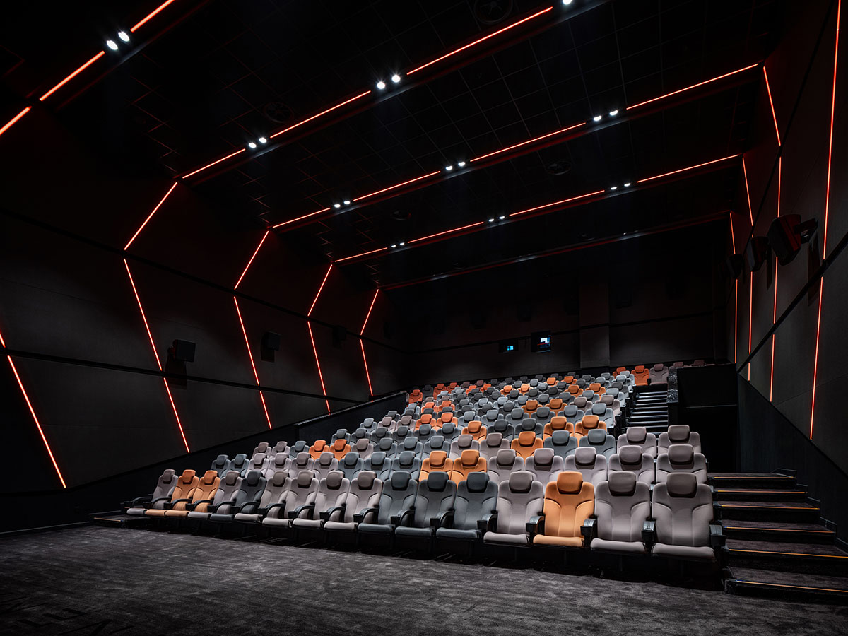
為了契合視覺與聽覺相融的電影場景,讓觀影者擁有完全沉浸式的觀影效果,在影廳內部打造完整貫穿空間三麵的環抱式對稱造型,並以燈光強化外框線條,最終形成現代科技與藝術結合的場景。
In order to create a cinema environment that blends the visual and aural senses, and to provide a fully immersive viewing effect, the interior of the theater hall has a complete ring in symmetrical shape running through three sides of the space, and lighting is used to strengthen the lines of the outer frame, resulting in a scene that combines modern technology and art.
∇ 影廳,Theater
以不同的色彩主題彰顯觀影廳的特質,一個又一個的故事在這裏如期上演,存放那些在真實世界中無法安放的情緒,盡情地跟隨電影故事哭泣與歡笑。電影的終極魅力讓我們重拾生活的美好,治愈破碎的心靈。
A variety of color themes highlights the qualities of the cinema hall, where one story after another plays out as it’s scheduled. It’s a place for the emotions that can’t be released in the real world. Views cry and laugh as the film story unfolds. The ultimate charm of cinema is to bring back the beauty of life and heal the broken heart.
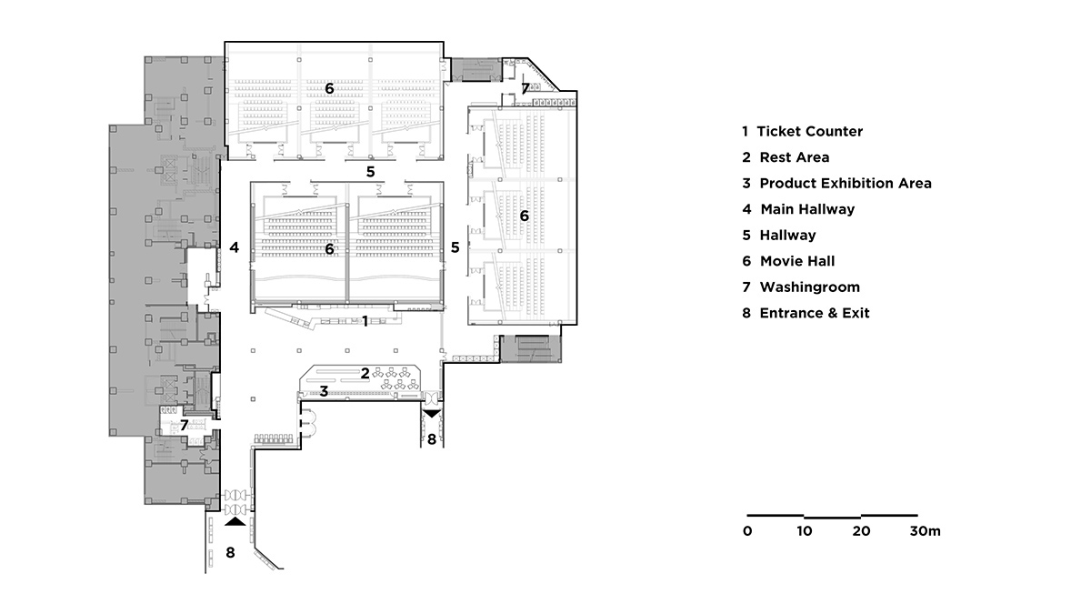
∇ 平麵圖,Plan
項目名稱: 奧斯卡影城-鄭州升龍國際中心店
設計單位: MOC DESIGN OFFICE
主創設計師:梁寧森,吳岫微
設計周期:2019.10-2020.1
竣工:2020.10
項目地址:中國鄭州
麵積:3800㎡
主材:黑色噴塗鋁板,黑白根大理石地磚,深灰色條紋地毯
業主:奧斯卡升龍國際影城
攝影:直譯建築攝影
Project Name: Oscar Cinema – Shenglong International Center, Zhengzhou
Design Company: MOC DESIGN OFFICE
Leading Designers: Liang Ningsen, Wu Xiuwei
Design Phase: Oct. 2019 – Jan. 2020
Completion: Oct. 2020
Location: Zhengzhou, China
Area: 3,800㎡
Materials: Black painted aluminums, Nero Marquina marble tiles, dark grey striped carpets
Client: Oscar Shenglong International Cinema
Photography: Archi Translator


