全球設計風向感謝來自 奈時設計 的商業空間項目案例分享:
茶,是人類文化的一種載體。茶中蘊藏的悠久智慧,和醇厚淨亮的美,已跨越東西方的認知而為世所共通。茶兼有健康屬性和社交屬性,新的時代背景之下,這雙重屬性亦被賦予更加豐富多元的表達,使之契合當代都市人群的生活方式。
Tea embodies humanity and culture. Its inherent ancient wisdom as well as its pure and clean beauty have surpassed an awareness of East and West to gain universal acceptance. This beverage is healthy and suitable for social interactions. In the context of a new era, tea’s dual advantages express it in more enriched and diverse ways, making it a suitable aspect of modern urban residents’ lifestyles.
茶妝品牌Cosmetea,顛覆美妝以往定義,將傳統的Tea與潮流的Cosmetics創新融合,運用“Tea Beauty Science”,衍生自然主義的東方情愫為當代時尚美學。Nax Architects奈時設計為Cosmetea打造線下體驗店,從空間設計和品牌策劃的維度,構築藝術化和沉浸式的場景體驗,探索自然與人造之間,既有環境與未來建築之間的關係哲學,也將品牌引向創意與可續的進化之道。
The tea cosmetics brand Cosmetea subverts the previous definition of cosmetics by innovatively integrating tea with trendy cosmetics. It uses Tea Beauty Science to create modern fashion aesthetics based on natural Eastern sentiments.
Nax Architects was entrusted to conceive a store for the brand in Shanghai. Based on the dimensions of spatial design and brand planning, construction of art and an immersive scenario experience, as well as an exploration of differences between natural and artificial realms, the pop-up represents the philosophy of relationships between existing environments and future architecture. Moreover, it promotes the brand’s creative and sustainable evolution.
老城區裏的時尚自留地 A fashion destination in old neighborhood
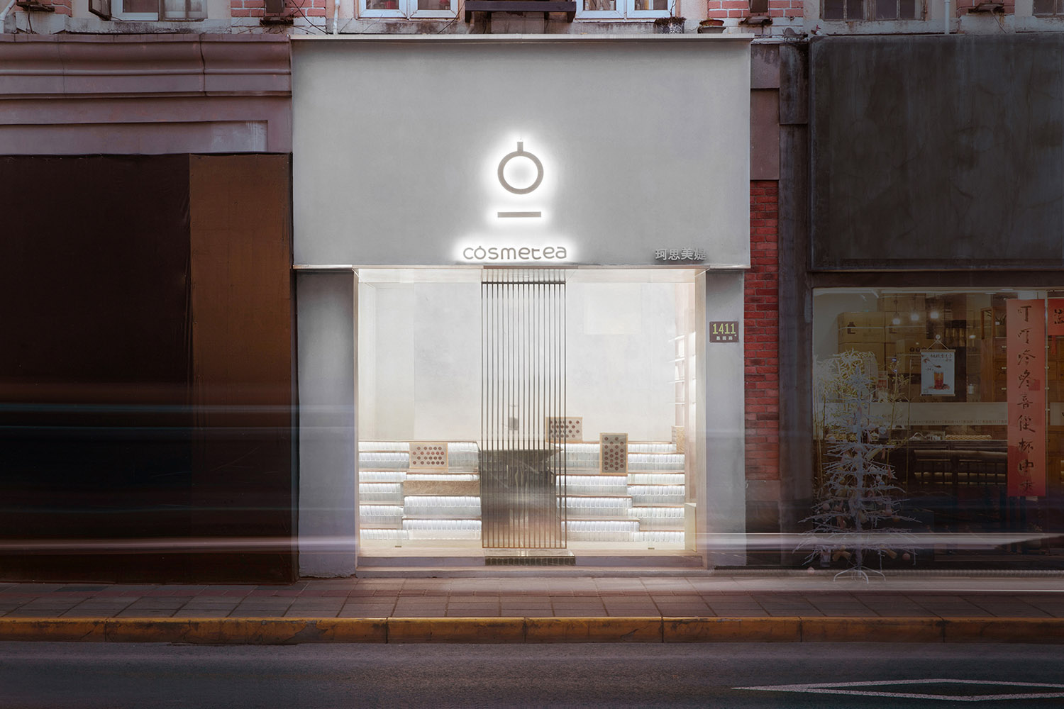
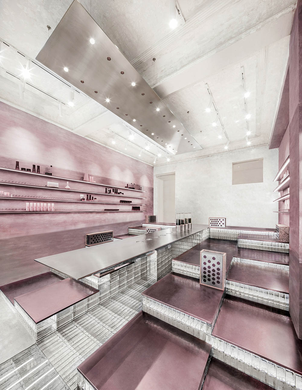
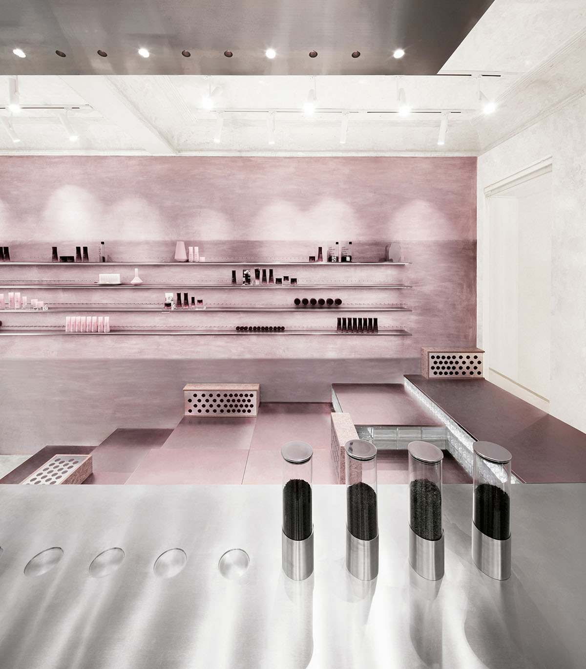
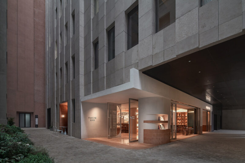
項目位於愚園路,一條曆經百年滄桑的馬路,凝刻著上海的曆史與文脈精華。基地夾雜在愚園路鱗次櫛比的老式建築群中,我們圍繞“Taste a beautea”的概念原型展開創作發想,取層疊錯落的山巒之型與閑適恬淡的待客之境為設計語彙,用75平方米創造新語境下的美妝零售及社交與體驗空間——漂浮山間的茶室。
This project is located on Yuyuan Road, a hundred-year-old road that has undergone many changes and represents the essence of Shanghai’s history and culture. The site is surrounded by dense rows of old buildings. We drew on the brand’s conceptual prototype of ‘taste a beautea’ to develop new ideas, and chose the form of layered and irregular mountain ranges as well as a leisurely, quiet and welcoming atmosphere as design languages. Within an area of 75-square-meter, we created a cosmetics retailing, socializing and experiential space, which was conceptualized as a “tea house floating in the mountains”.
光影流轉的超現實意趣 Surreal scenes & lighting effects
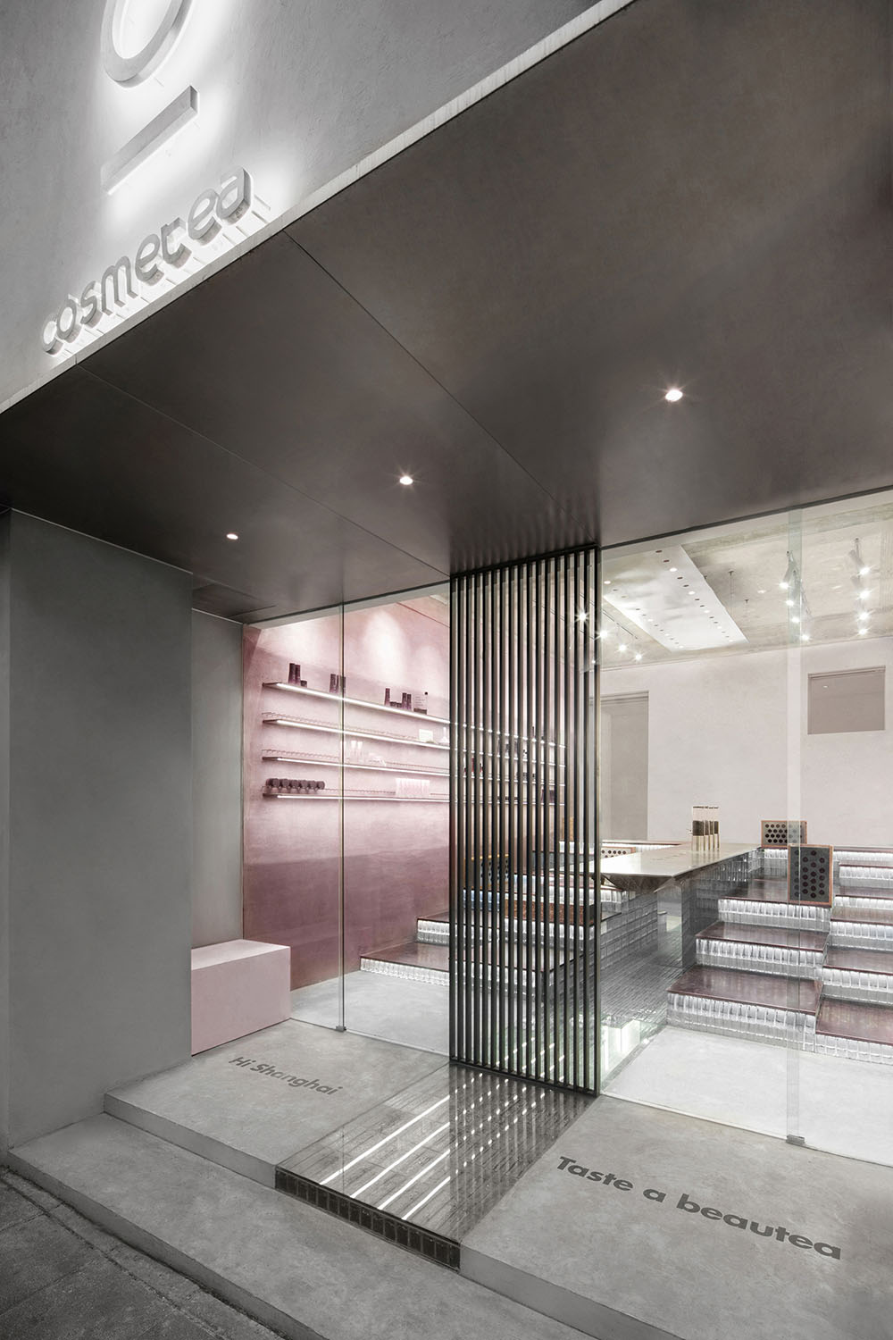
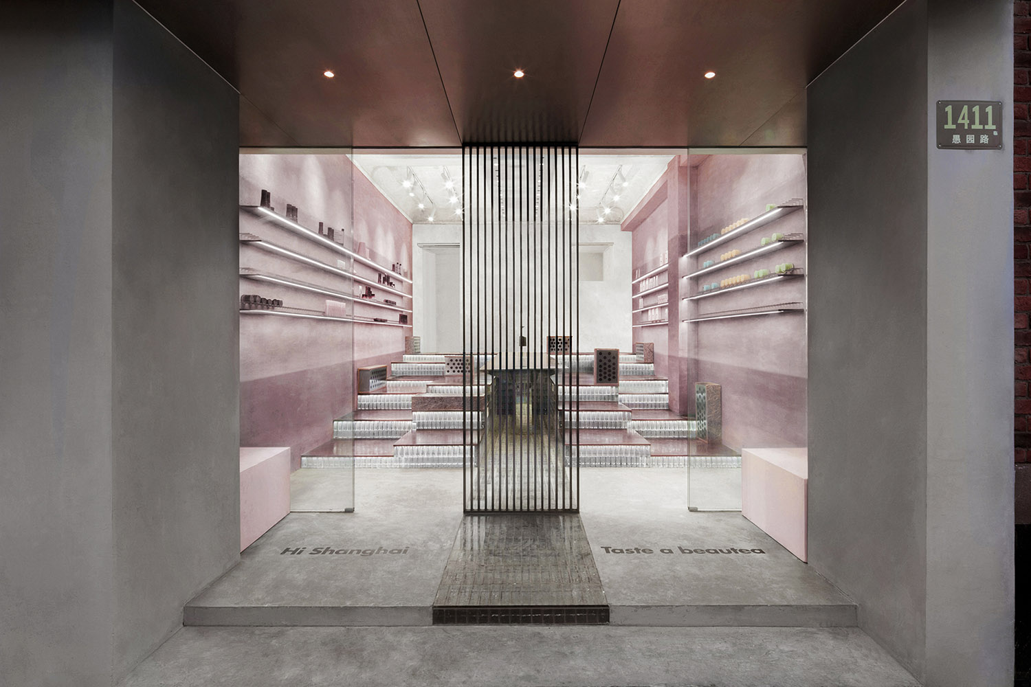
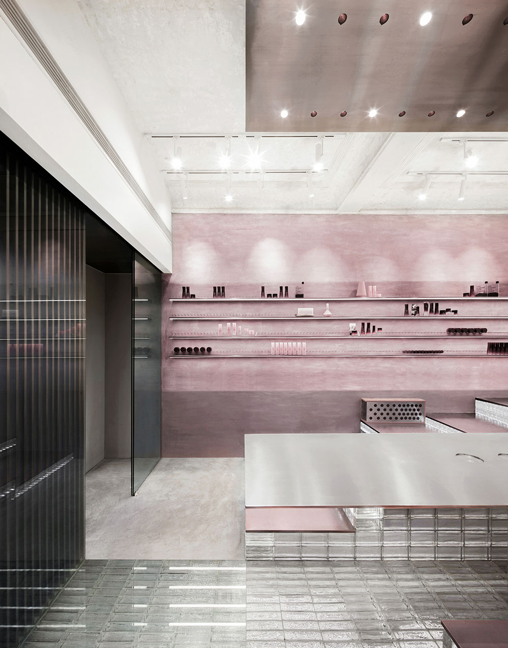
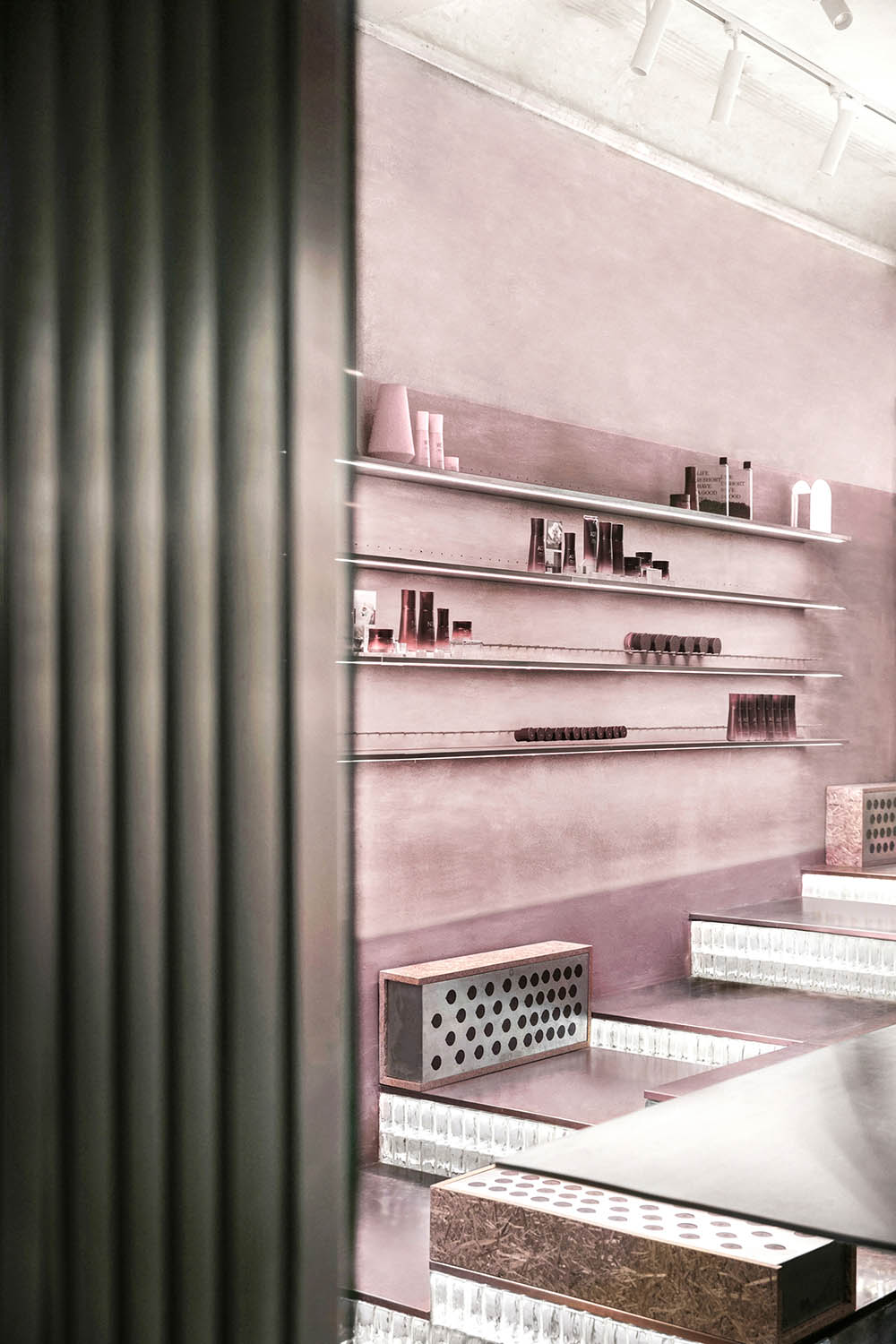
借鑒東方園林的框景手法,在入口處引入現代極簡的不鏽鋼屏風,平添朦朧韻律的同時,暗示傳統茶室的蛻變,也構成極具辨識度的品牌性格,吸引著行人駐足光臨。
Taking inspiration from the “view framing” techniques in Chinese classical garden design, we set a modern minimalist stainless steel screen at the entrance. This adds a hazy rhythm while hinting at the “tea house” concept. It also forms a readily recognizable brand personality, which attracts pedestrians to stop and visit.
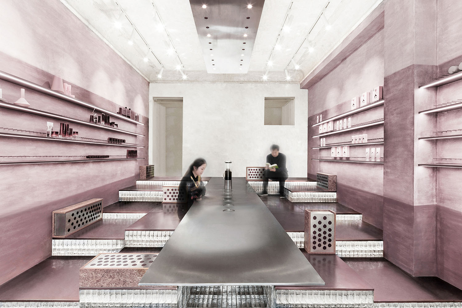
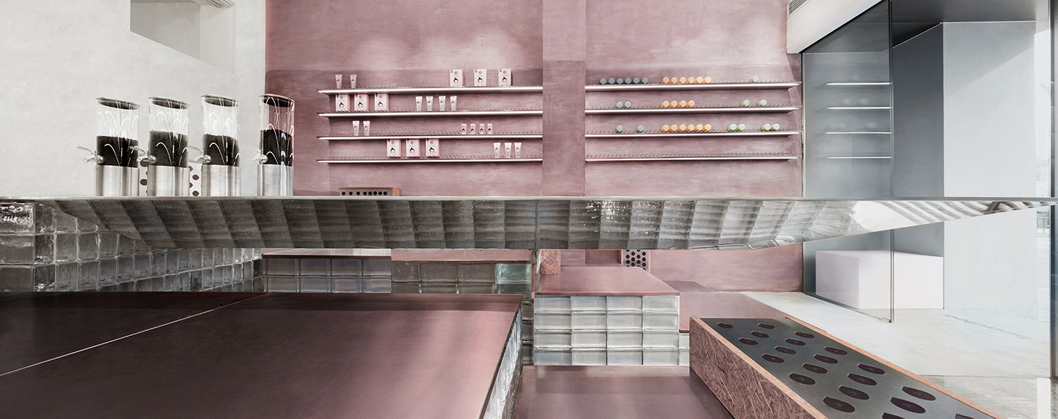
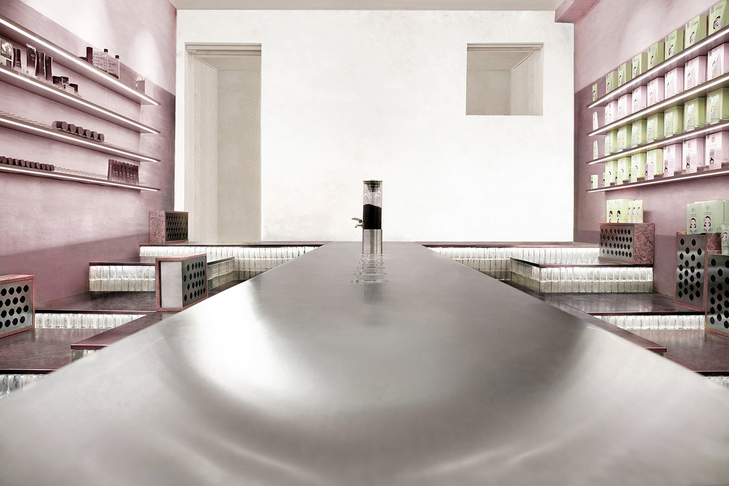
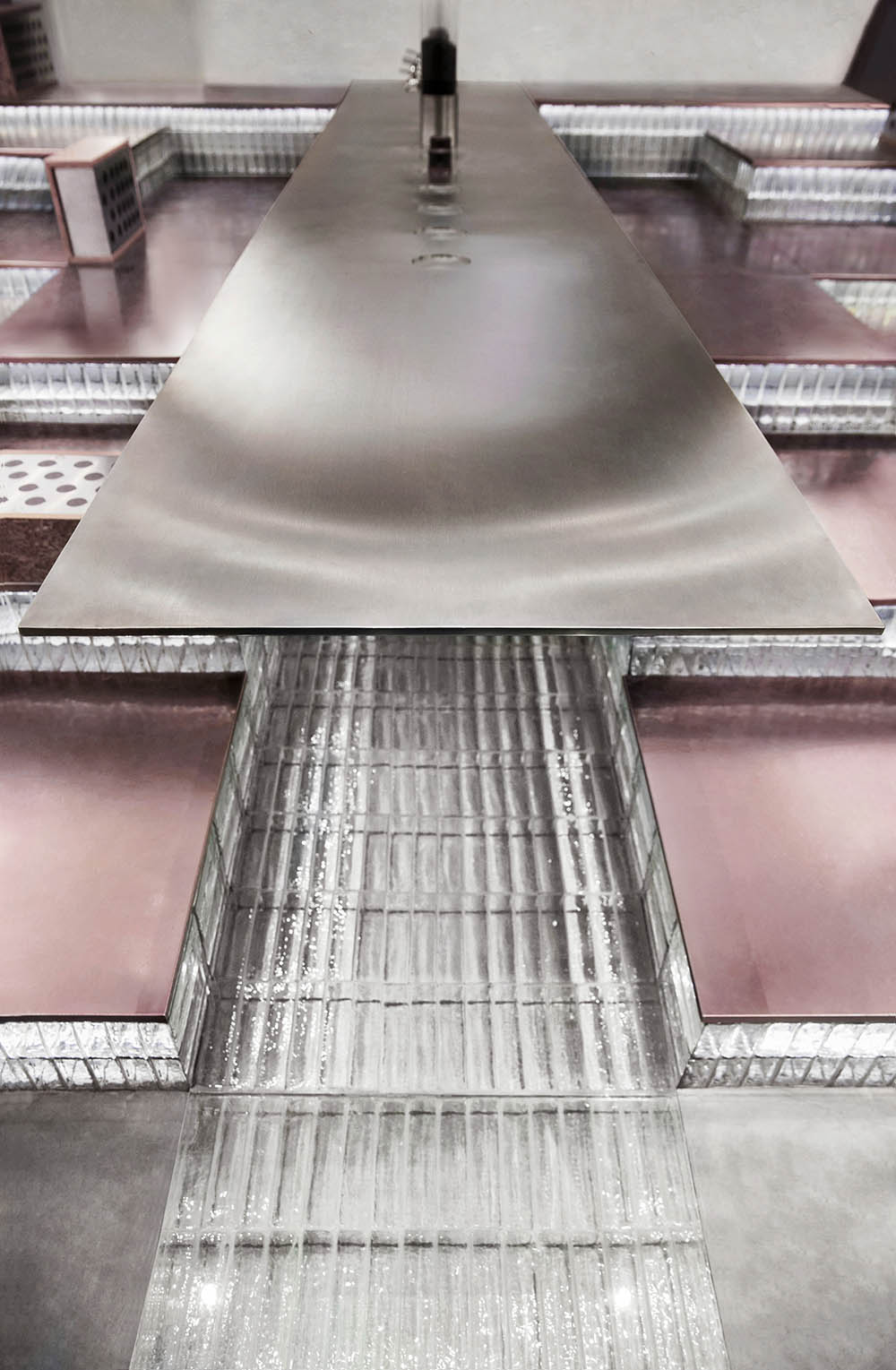
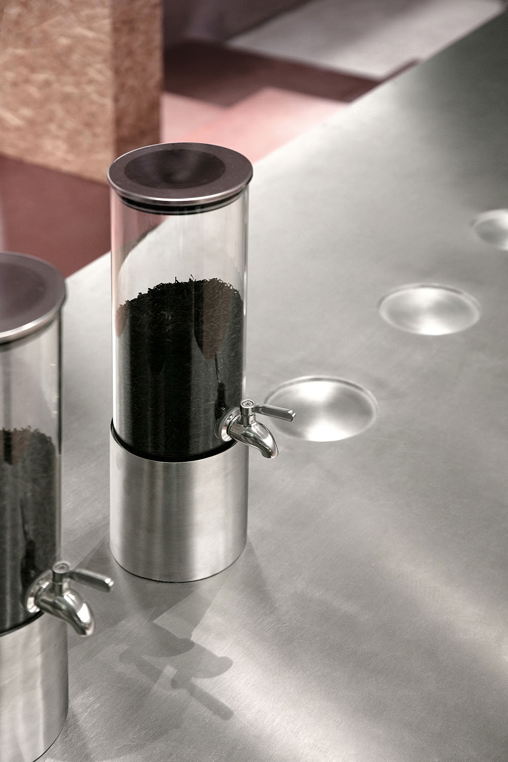
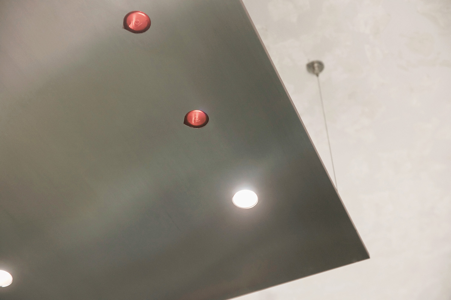
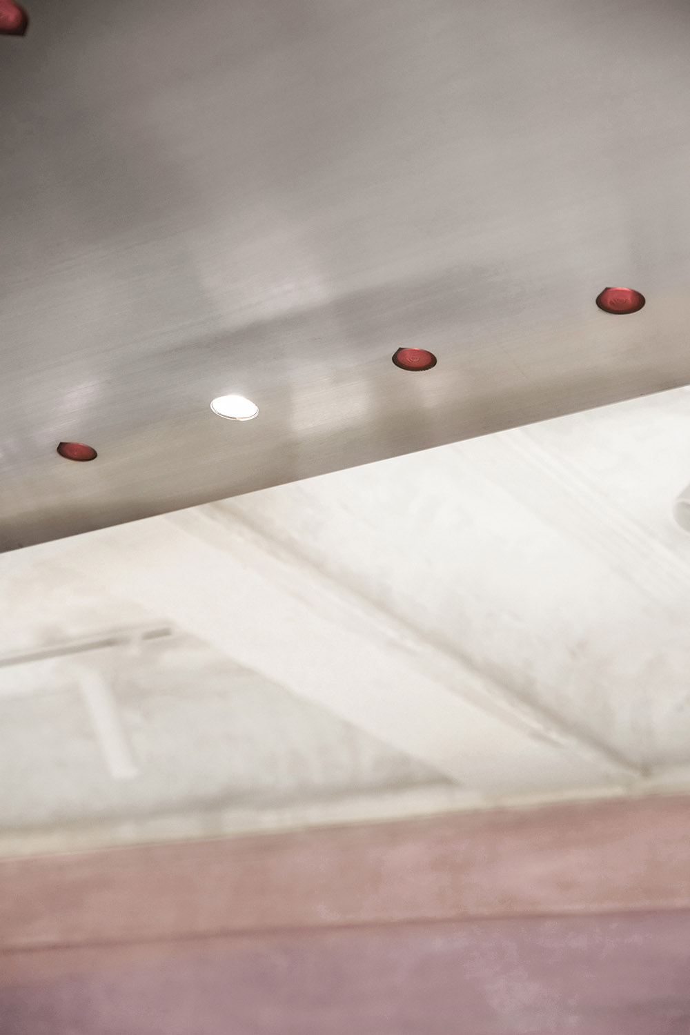
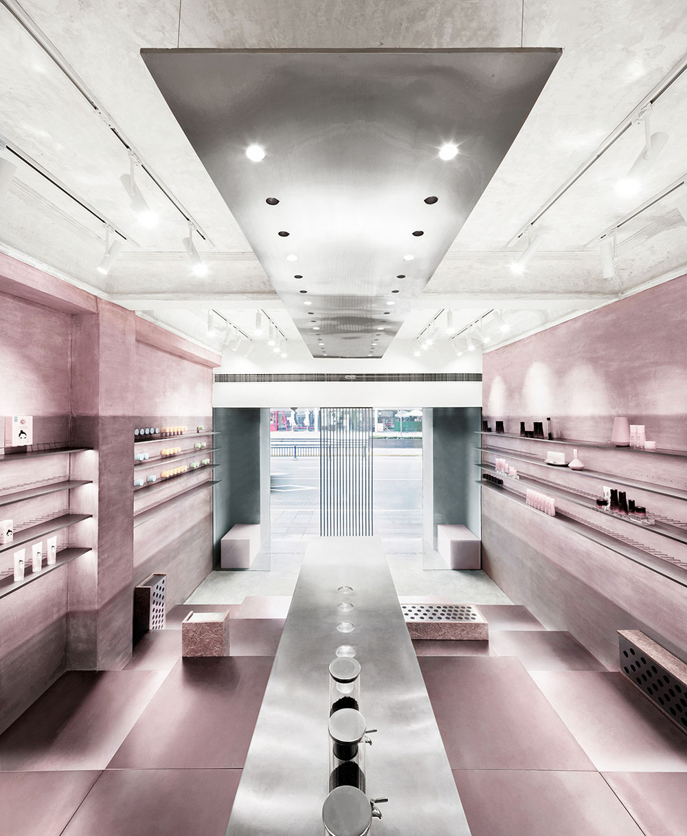
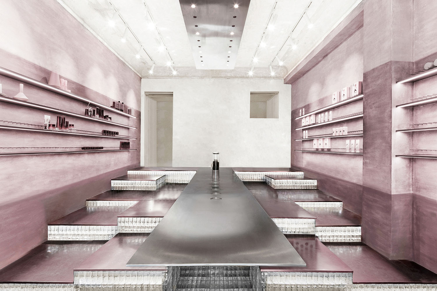
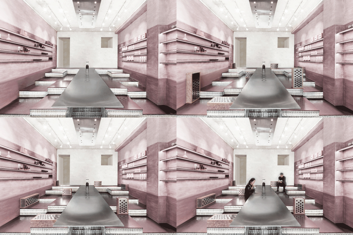
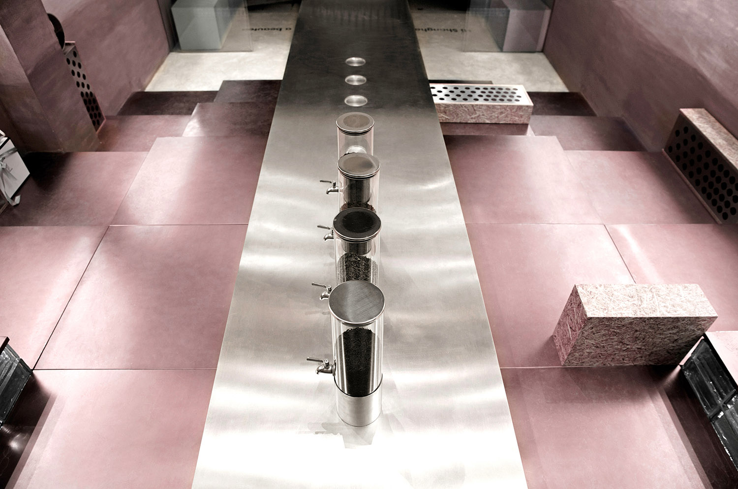
漸入室內,與立麵不鏽鋼屏風相呼應的是置於場地中央的不鏽鋼懸挑長桌,以及混凝土舊屋頂下方的“漂浮燈”裝置,配以玻璃磚的新穎光效,演繹曲水流觴的生色光影。
When gradually entering the store, customers will encounter a long suspended stainless steel table set in the middle of the space, which matches with the stainless steel screen. Moreover, the floating lighting fixtures installed under the old concrete ceiling, along with the unique lighting effects of glass bricks, generate surreal scenes and interplay of light and shadows.
中性而柔和的色彩肌理 Soft hues & tactile textures
在空間基調上,萃取普洱的紅豔湯色,將之調和為飽和度較低的暗粉,既詮釋了美妝產品與茶文化的融合,也為現代生活壓力帶來一種親和的撫慰。
The overall spatial tone is based on an extract of Pu’er tea’s brilliant red color, which is blended into low-saturation pink hues. The pink color palette explains the integration of cosmetics products and tea culture, whilst creating a soothing environment for modern people.
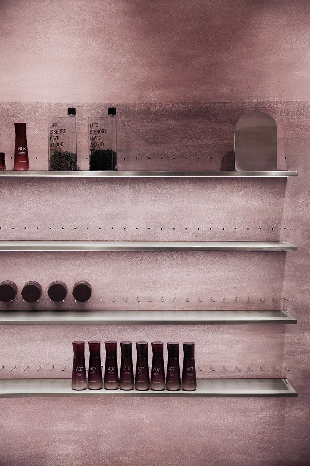
漸變矽藻泥牆體在間接光源的暈染下,鋪陳出留白與想象的東方水墨畫卷,牆體表麵立體觸感的紋理給人予回歸自然的生命氣息。
The indirect light source’s smudging gradually results in the diatom mud walls displaying a blank and imaginary Chinese ink wash painting. Moreover, the wall surface’s three-dimensional tactile texture makes people feel that they are experiencing nature’s vitality.
靈活可變的空間“魔方” A flexible and variable “magic cube”
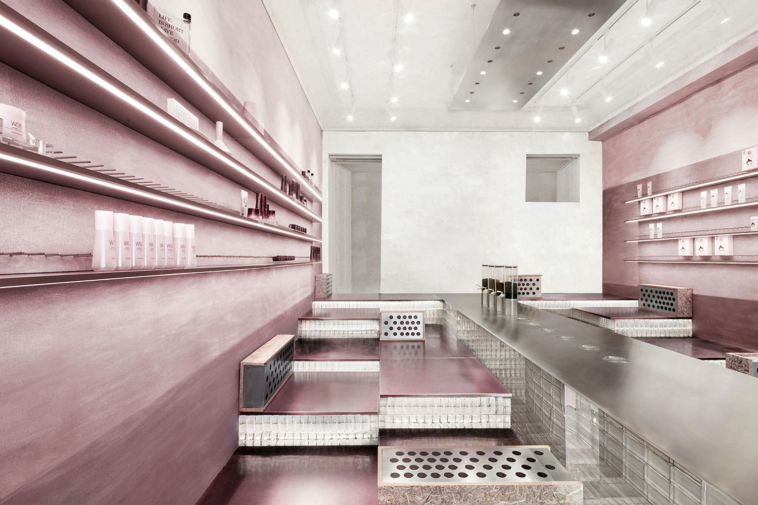
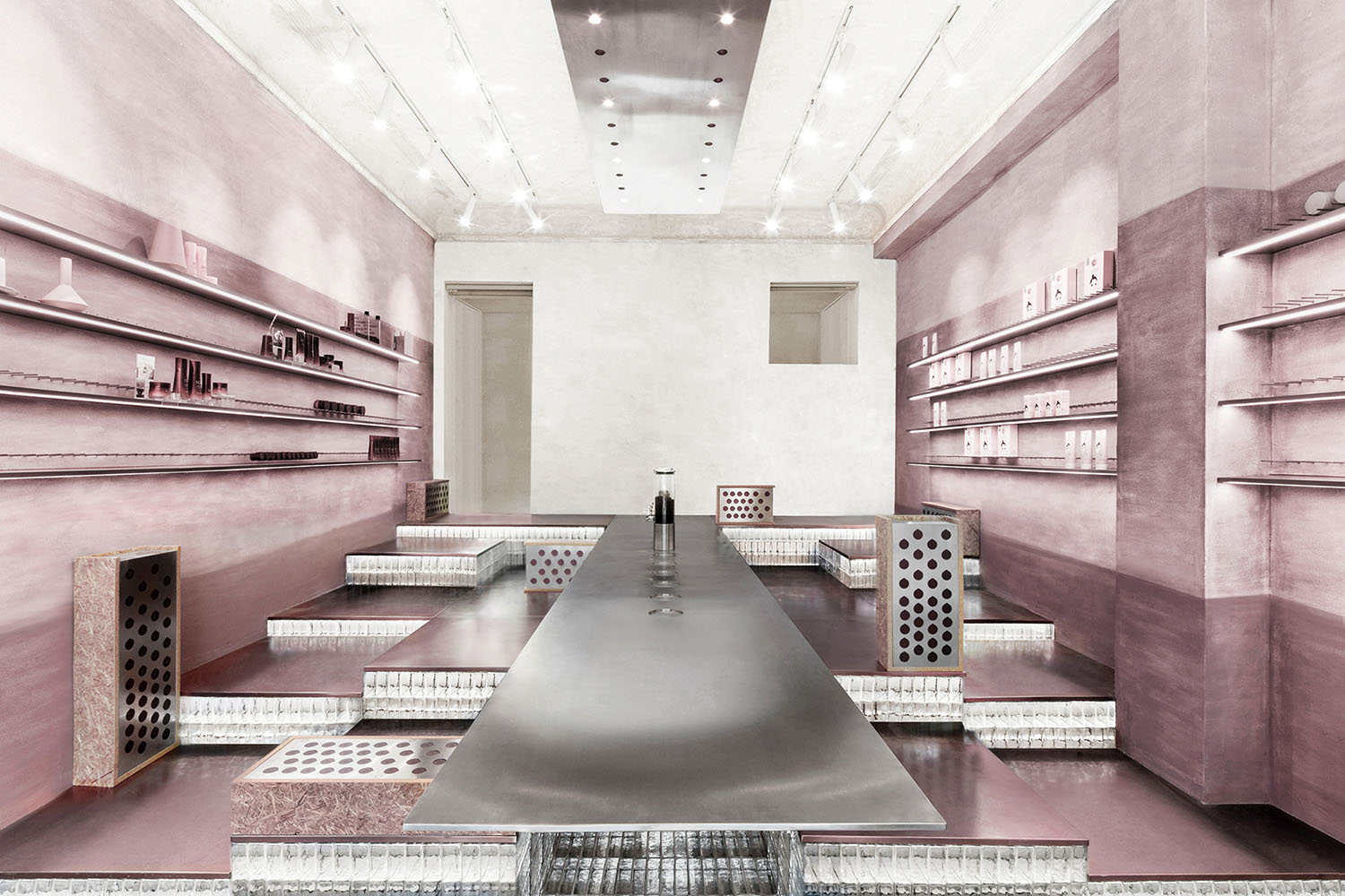
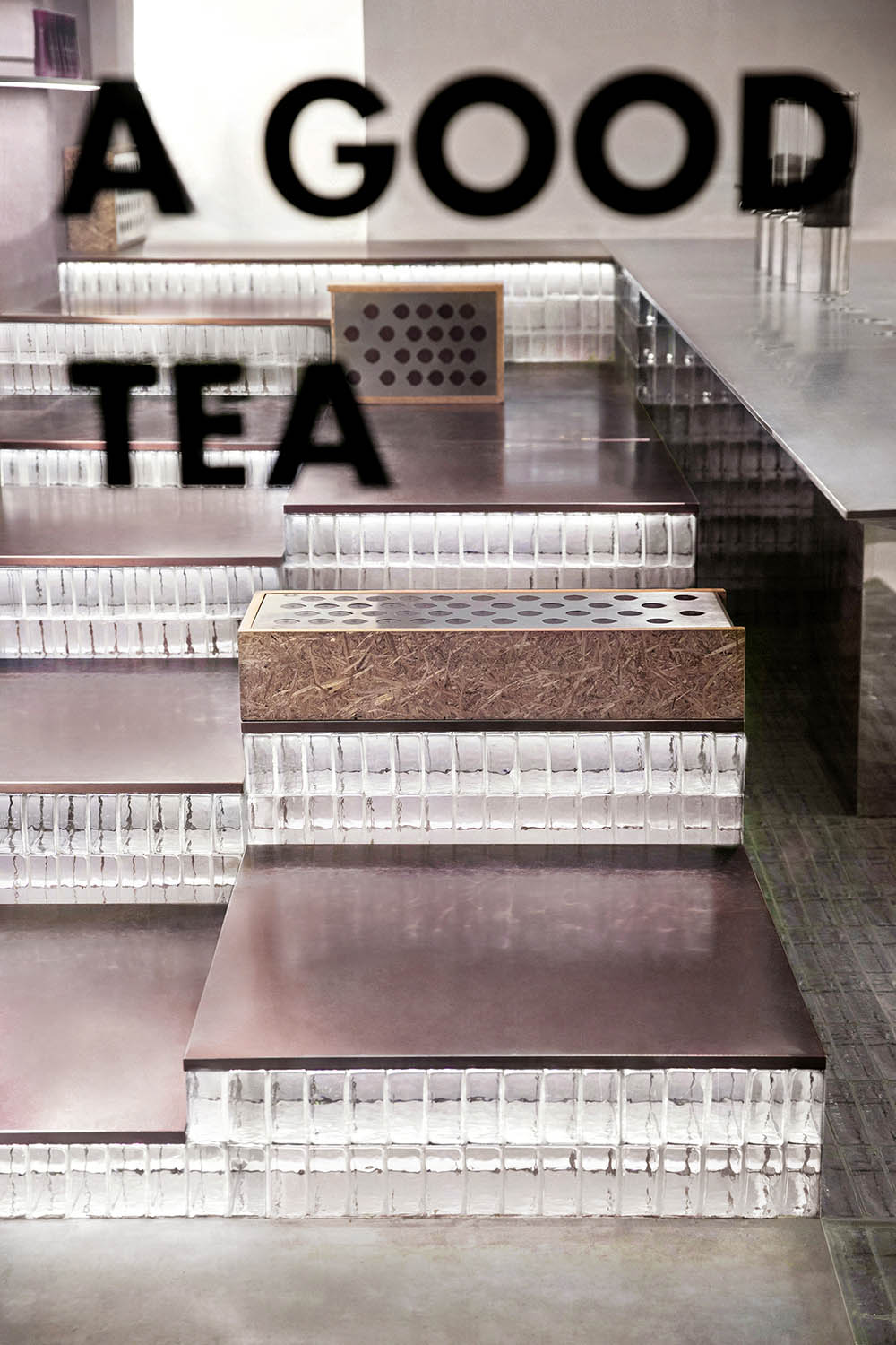
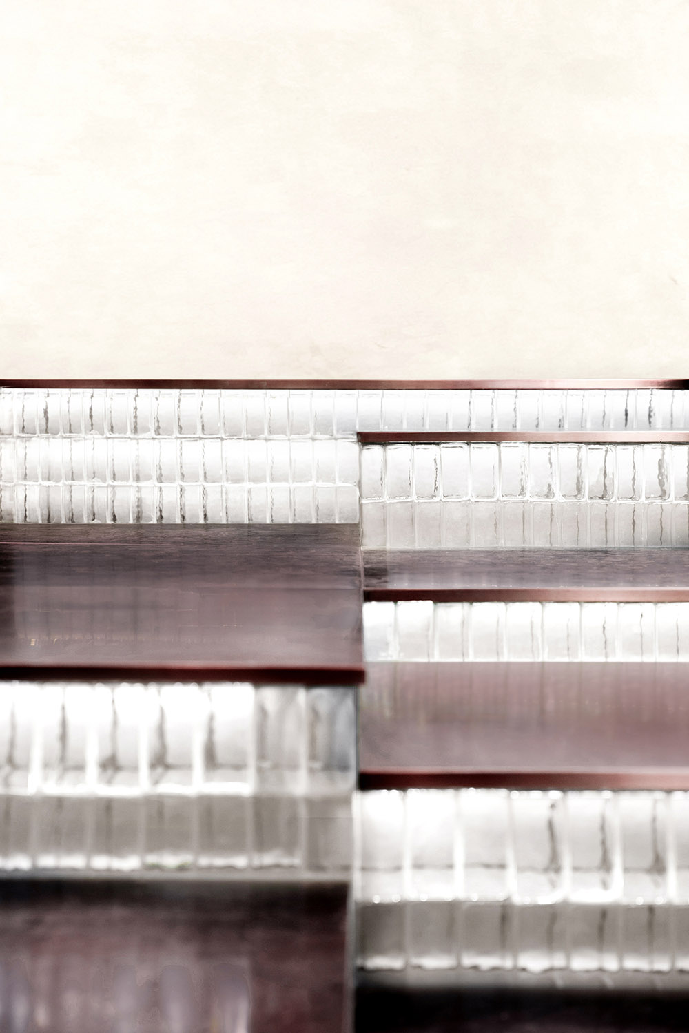
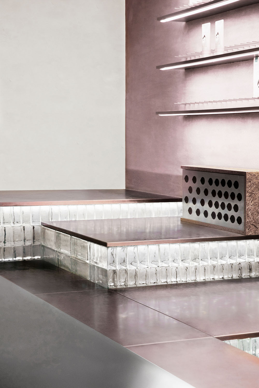
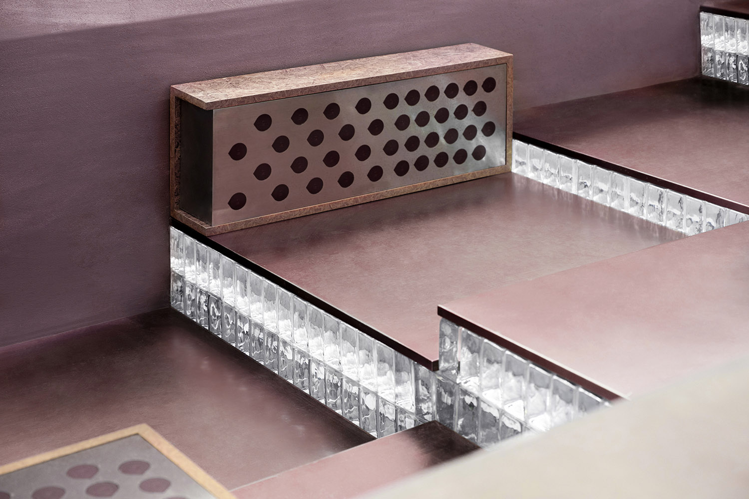
玻璃磚與金屬結合而成的固定台階,以輕盈與厚重之間的平衡美感,引導客人拾級而上,自由落座。通透的材質不止打破沉悶,為多層次空間注入“漂浮感”,也可視作一種激發潛能的邀請,讓他們在店內自由探索。
The fixed steps composed of glass bricks and metal provide an esthetic that balances lightness and heaviness, and guide customers to slowly walk upwards and freely sit down. The transparent materials enliven the atmosphere, infuses the multilevel space with a “sense of floating”, and invites customers to freely explore inside the store.
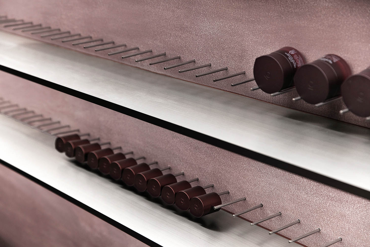
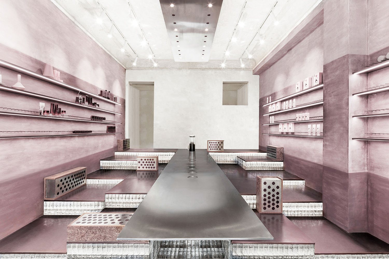
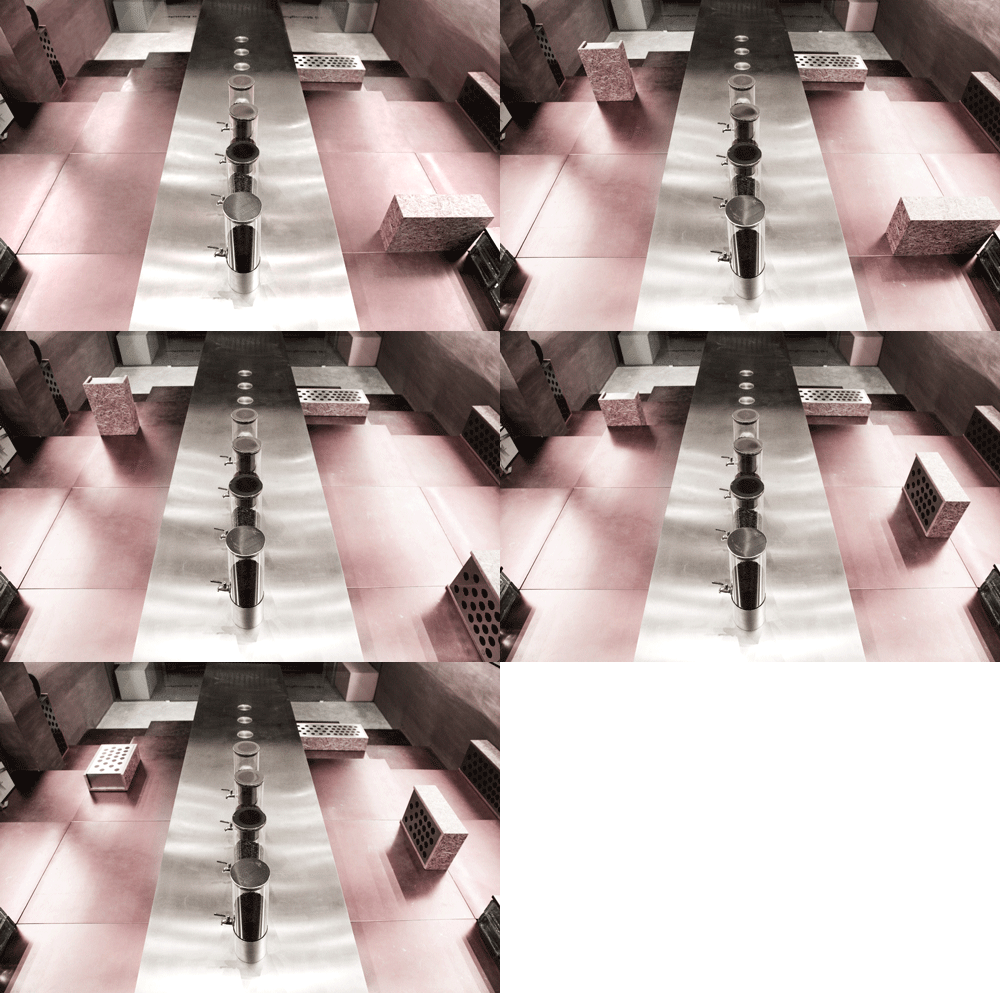
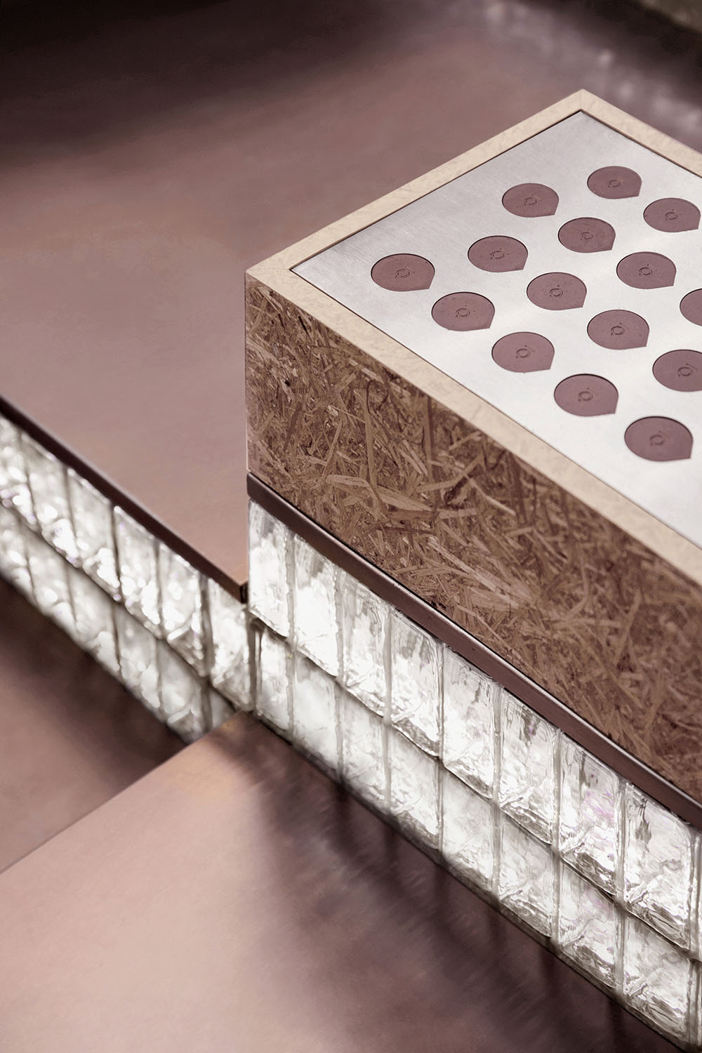
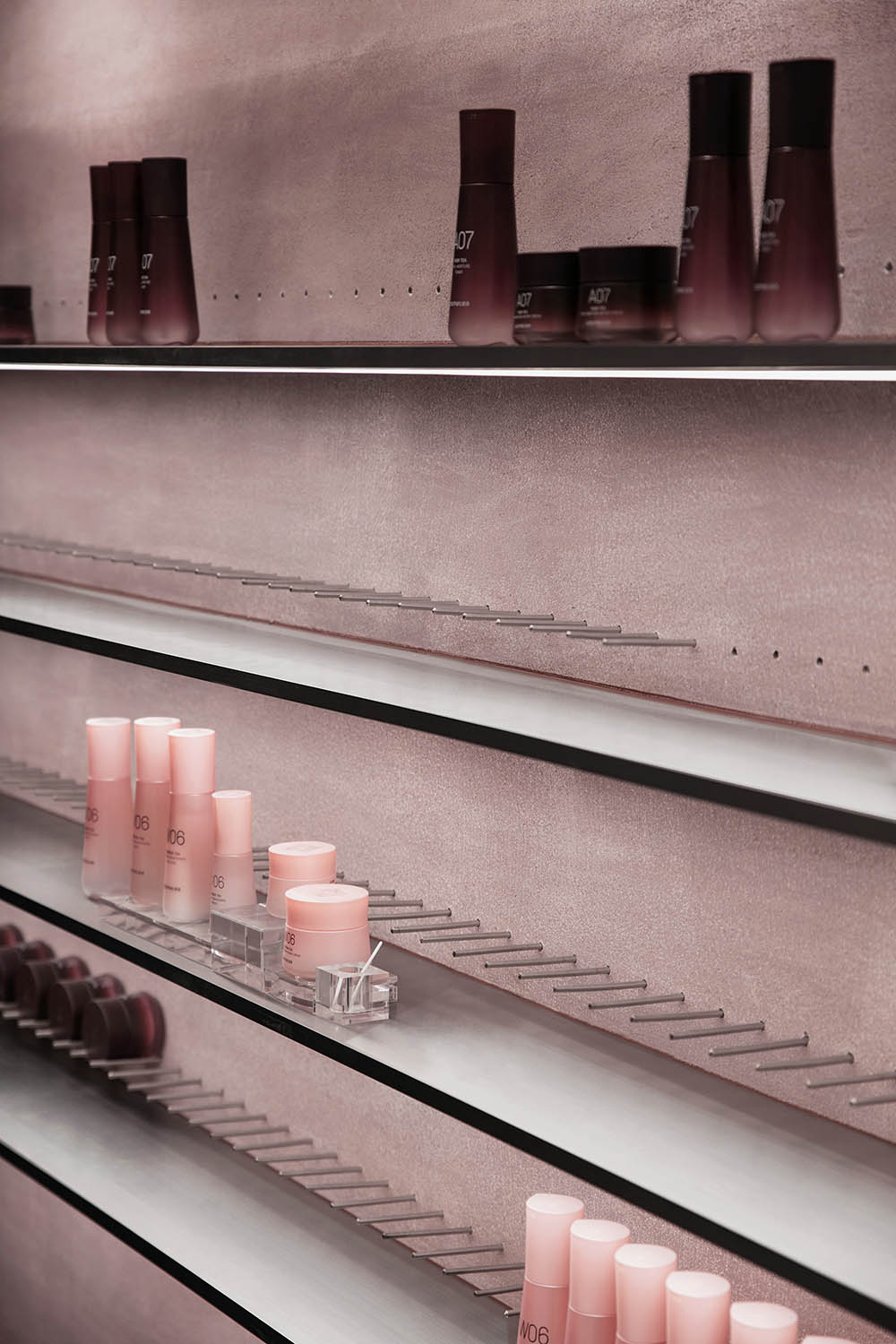
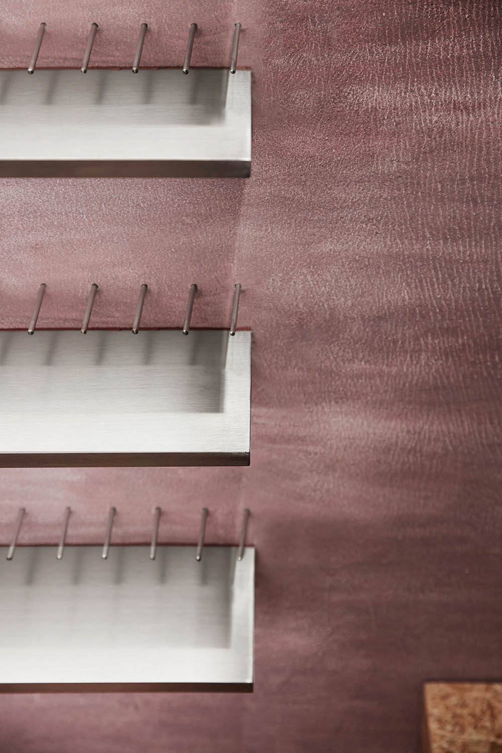
空間形態與功能的靈活性還體現於:可插拔的陳列架,給予產品陳列以更多可能;歐鬆板和金屬穿孔製成的移動台階,內嵌Cosmetea產品瓶蓋,透過照明顯現品牌logo,回收材料因此升華為可持續的藝術表達。
The flexibility of spatial configuration and functions is embodied in the pluggable display rack that creates more possibilities for exhibiting products, and the mobile steps made of OSB paneling and perforated metal. The movable stairs are inlaid with Cosmetea product bottle caps, and the brand logo on the caps are highlighted by lighting, which turns the recycled materials into sustainable expressions of art.
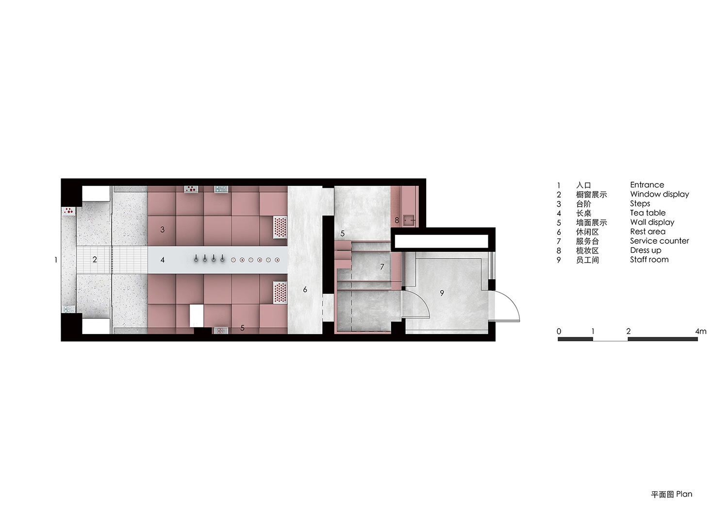
∇ 平麵圖
項目信息
項目名稱:Cosmetea 新型美妝茶文化品牌店
項目地點:上海愚園路
項目麵積: 75平方米
完工時間:2019年底
設計公司:奈時設計(www.nax.group)
主創設計師:Lina Chan、Yiting Ma、Jo Jiao
攝影師:Raitt Liu
業主:上美集團/韓束妝業韓國分公司HONDO紅道
Project Name: Cosmetea Store
Project Location: Yuyuan Road, Shanghai, China
Area: 75 Square Meters
Completion Time: 2019
Design Firm: Nax Architects (www.nax.group)
Design Team: Lina Chan, Yiting Ma, Jo Jiao
Photographer: Raitt Liu
Client: SHANGHAI CHICMAX COSMETICS CO., LTD


