全球設計風向感謝來自 傑瑪室內設計有限公司 的餐廳空間項目案例分享:
食 漾 錦 Dining Splendor
嚐項上之⼀臠,嚼霜前之兩螯。
爛櫻珠之煎蜜,滃杏酪之蒸羔。
蛤半熟⽽含酒,蟹微⽣⽽帶糟。
蓋聚物之夭美,以養吾之老饕。
——蘇軾《老饕賦》
起,內探核⼼|極品饕客,溯源宋代⽂豪與上古神獸
五千年的泱泱中華⽂化史,有⼀位奇⼈,逸懷浩氣,別具慧眼,能於糟糠⾒珠⽟,在野菜裏覓美食,趾⾼氣揚地⾃稱「老饕」,要仿效饕餮吞食天地萬物以為佳肴。
In the history of Chinese culture of five thousand years, there was an extraordinary man, who had majestic vision, was gifted with unique taste in aesthetics and foods, and could discover the delicacies from simple food. He proudly called himself the “gourmet”, and his dream was to try all delicious foods on earth.
他是蘇軾,唐宋八⼤家之⼀,亦是史上第⼀美食家。
His name was Su Dongpo (蘇軾), one of the Eight Giants of Tang and Song Prose. He was also the first gourmet historically known.
吉品,極品。
是我們最深層的設計意念。將宋代⽂豪蘇東坡的饕客精神,挹注於吉品創意粵菜的新品牌,比擬東坡居⼠的饕客格局,豁達、豪邁、超逸,連結亦奠定品牌「納天下之珍稀,成料理之⼤氣」的美味底氣。
The gourmet spirit of Su Dongpo (蘇軾), the literary giant in Song Dynasty, is infused into the new brand of creative Cantonese cuisine of Ji Pin (吉品). We associate Su’s characteristics as a gourmet with generosity, boldness, and gracefulness. This is foundation of the brand in the field of delicacies.
依蘇軾《老饕賦》,我們循著了上古神獸饕餮,依明朝楊慎《升庵外集》所撰,饕餮為龍之五⼦:「俗傳龍⽣九⼦不成龍各有所好,……五曰饕餮好飲食故立於鼎蓋……。」,縱使殷商鼎上的饕餮紋獰厲威猛、名聲凶惡貪食,蘇軾卻為饕餮扭轉了形象;曹禺《北京⼈》也以饕餮比喻美食家:「⽽且他最講究吃,他是個有名的饕餮,精於品味食物的美惡。」在⽂學家的筆下,遠古凶獸饕餮獲得新的形象。
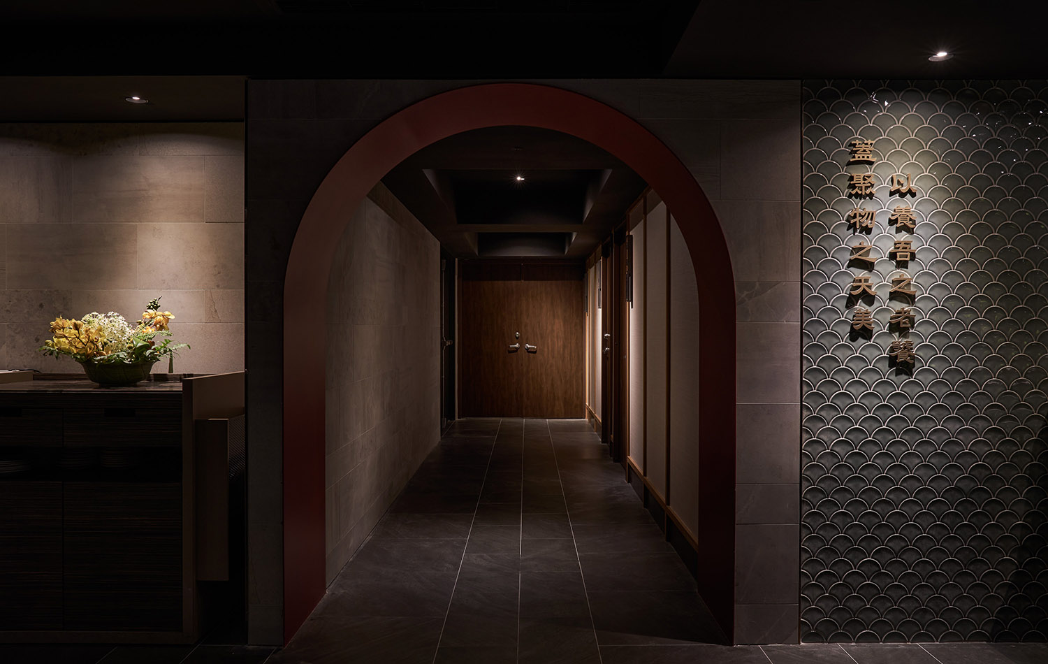
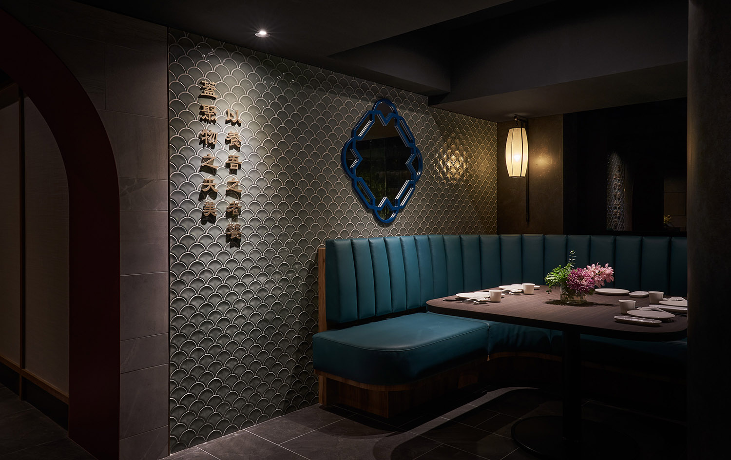
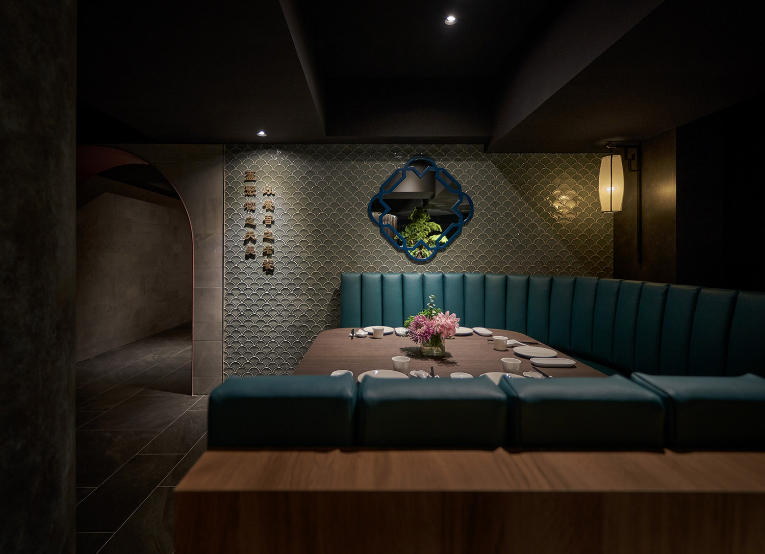
故迎賓⼤廳的端景我們以神獸為景(饕餮、龍虎、貔貅),便是引饕客之遠古意涵,也重現商周時代,青銅器上饕餮紋所象征的王權神秘與威嚴。從神獸延伸,我們將龍獸鱗片化作牆⾯,放上蘇軾《老饕賦》中的經典名句,特別選在廊道終點的客席邊上,凸顯此處位於⼗字路⼝交會點的獨特位置,腳下⾞輛川流不息,邊牆上的古典詞賦餘⾳繞梁,品味珍饈也咀嚼古往今來的情感滋味。
The lobby is decorated with statues of mythological creatures (Taotie, Dragon, Tiger and Pixiu) which symbolize an ancient reference of gourmet. They also represent the mystery and prestige of royal power on Taotie pattern of bronze ware in Shang and Zhou Dynasties. Deriving from the mythological creatures, the scales of dragons are used for wall decoration. The classical sentences of Su Dongpo (蘇軾) are presented at the end of the corridor and besides the seats of the clients. This is a special position as it is an intersection. The guests would be watching the bustling traffic by their feet, appreciating the classical proses and poems on the wall, and tasting the best Chinese delicacies, which together present a unique experience.
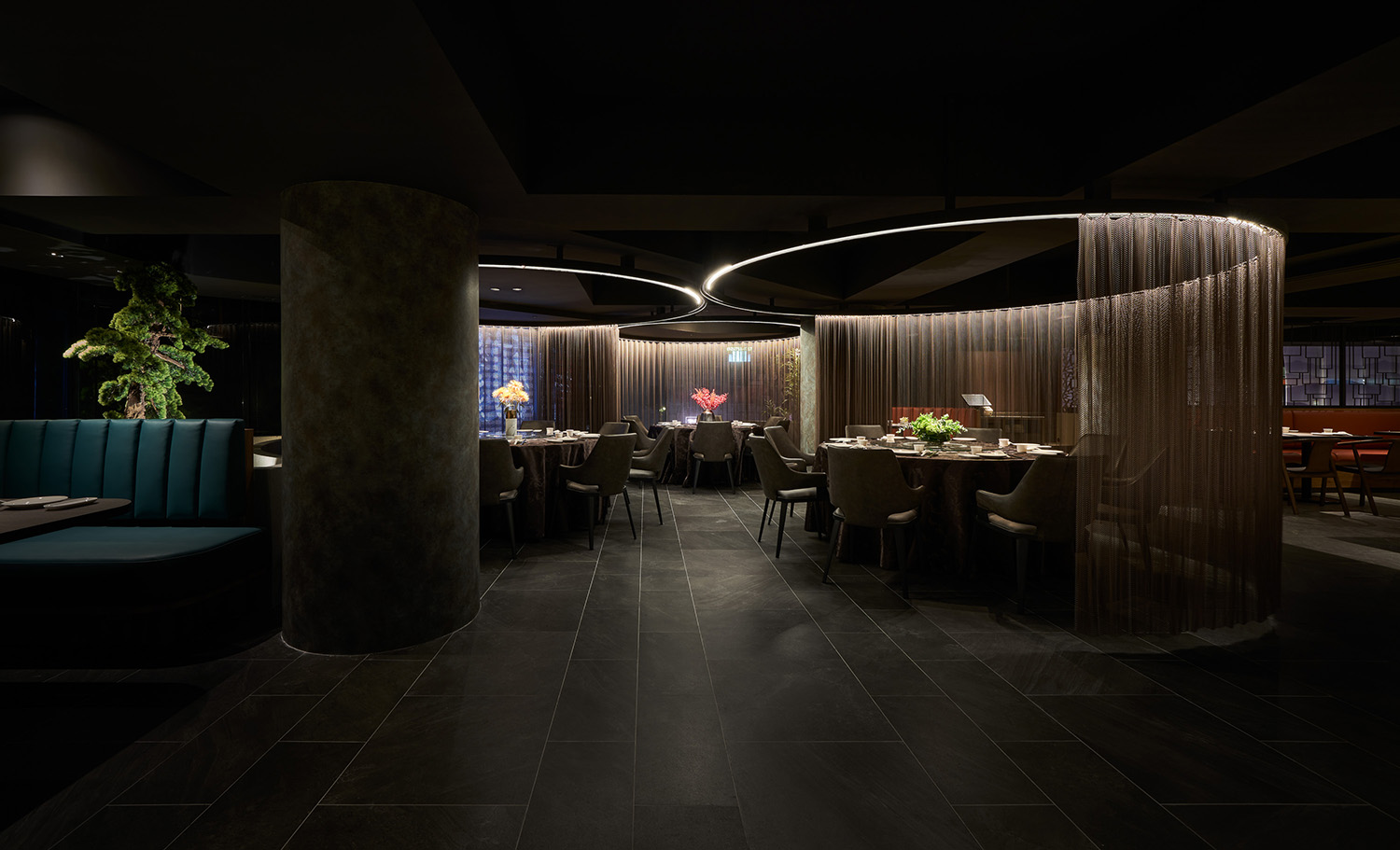
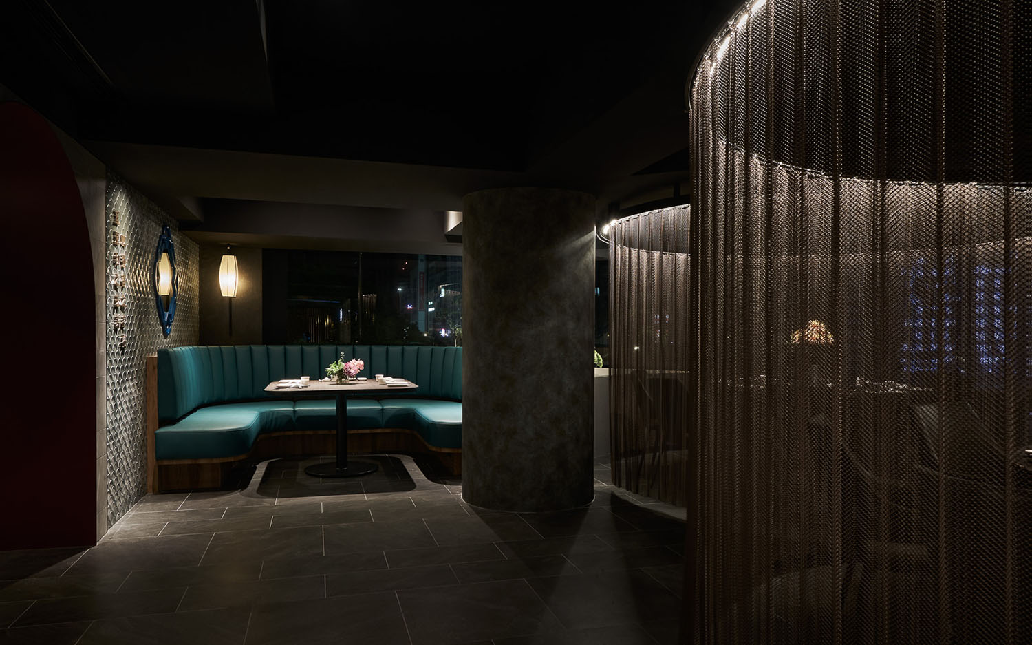
同時我們也在空間中的結構圓柱以綠青⾊著⾊,模擬氧化後的青銅樣貌,空間中的立柱成為最具存在意識的裝置藝術,響應饕餮紋的時代背景,也凸顯青銅⽂明的啟蒙意義。
The columns set in the space are in indigo color to simulate the oxidized and archaic Chinese bronze, so as to be viewed as the installation art in the space. Such design echoes with the time of Taotie pattern, and highlights the significance of the enlightenment of bronze civilization.
承,意象連結|中式園林建築,移步換景的動線與布局
Image|Circulation and Arrangement of Chinese Garden Layout
腹有詩書氣⾃華,東坡居⼠出塵灑脫,⾃古⽂⼈墨客迷醉於⼭⽔園林,我們以中國園林式的構築與造境,貼合其風骨。
Since ancient time, literati have been obsessed in Chinese gardens. The interior design is based on the essence of the structures and landscape of Chinese gardens, which characteristics reflect the characters of Chinese literati.
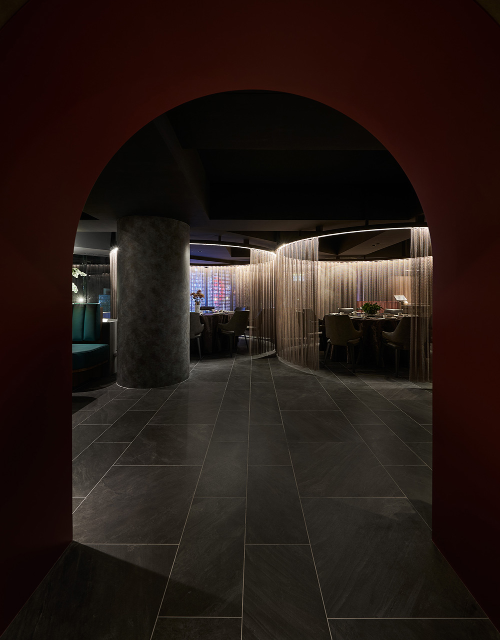
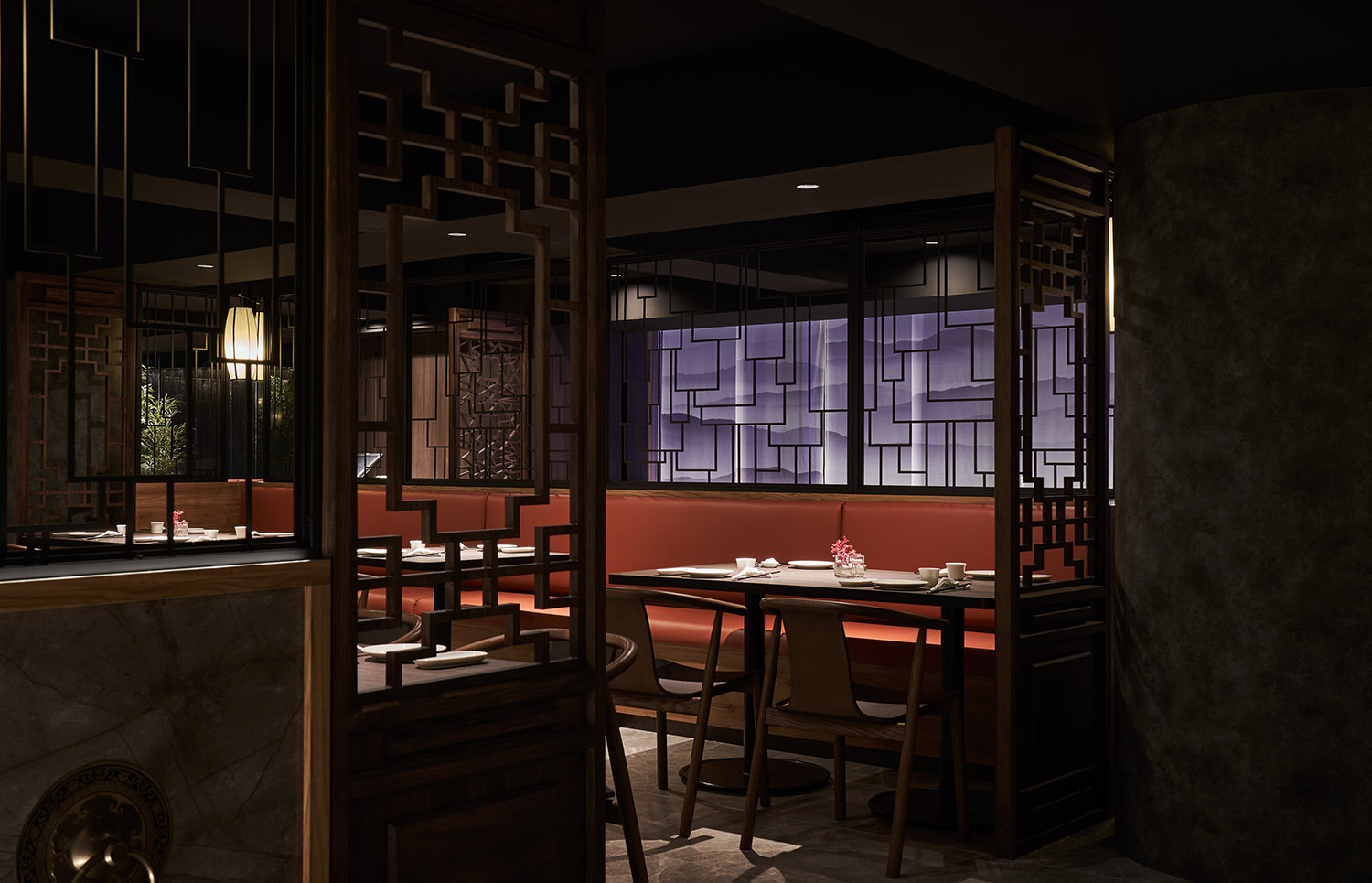
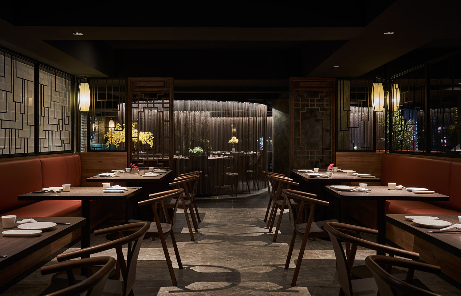
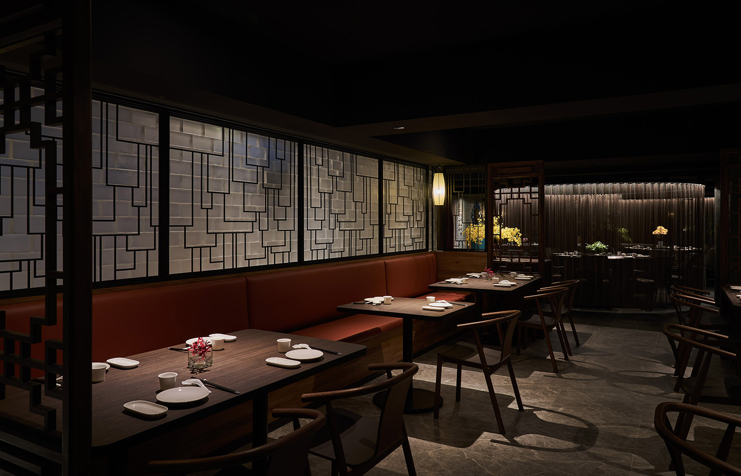
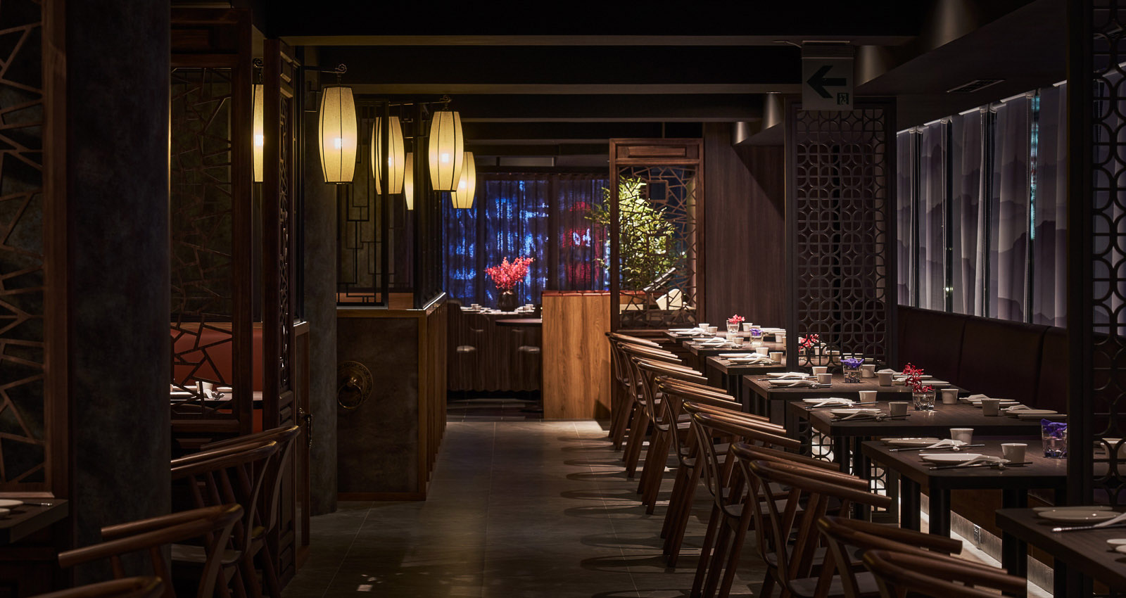
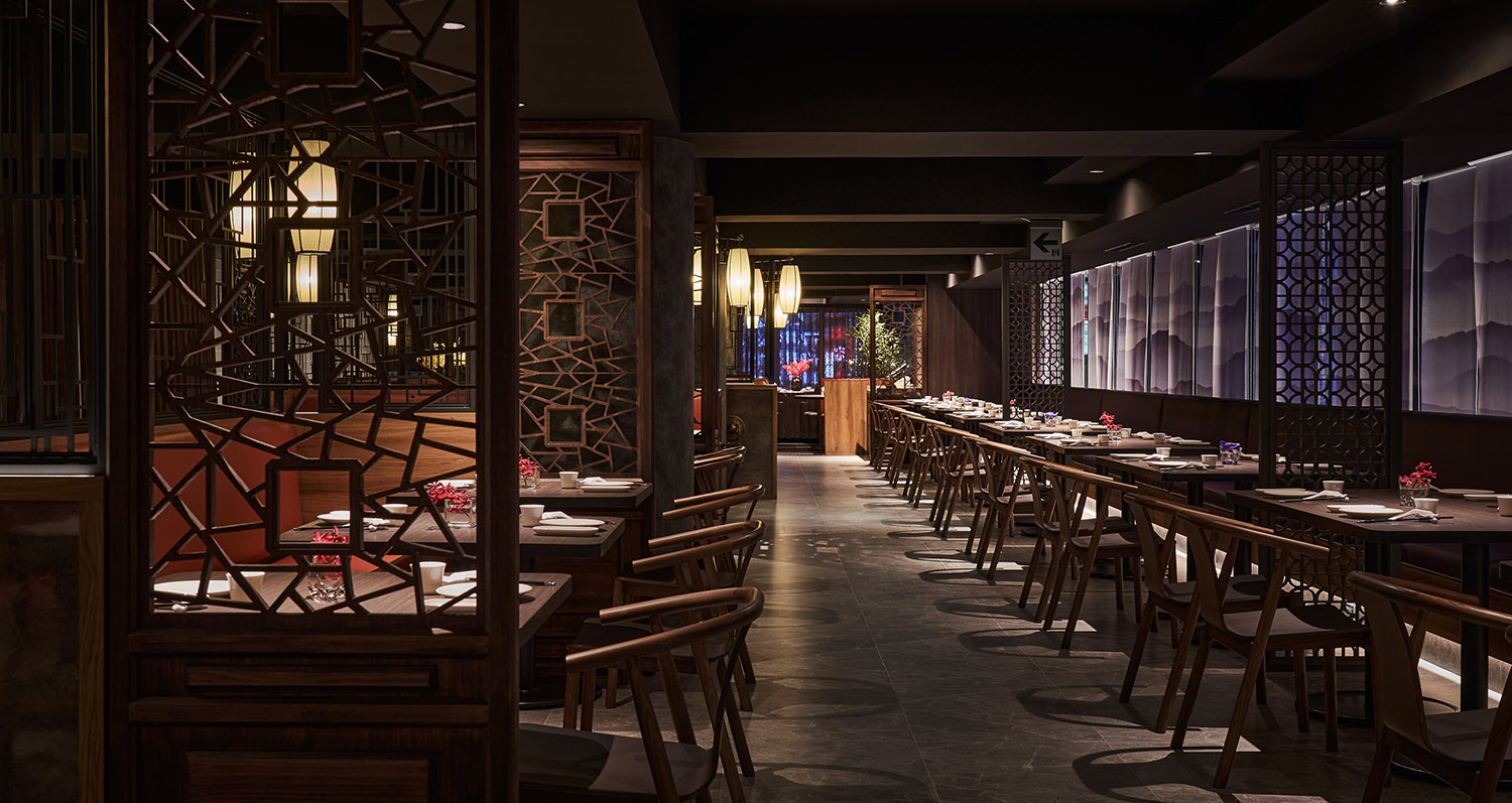
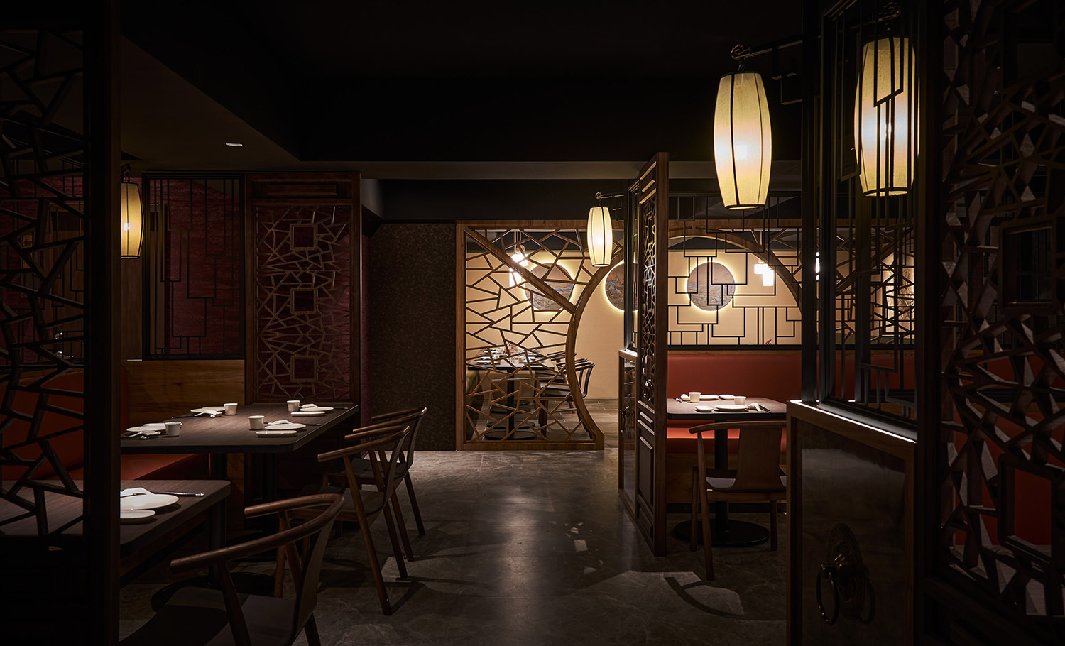
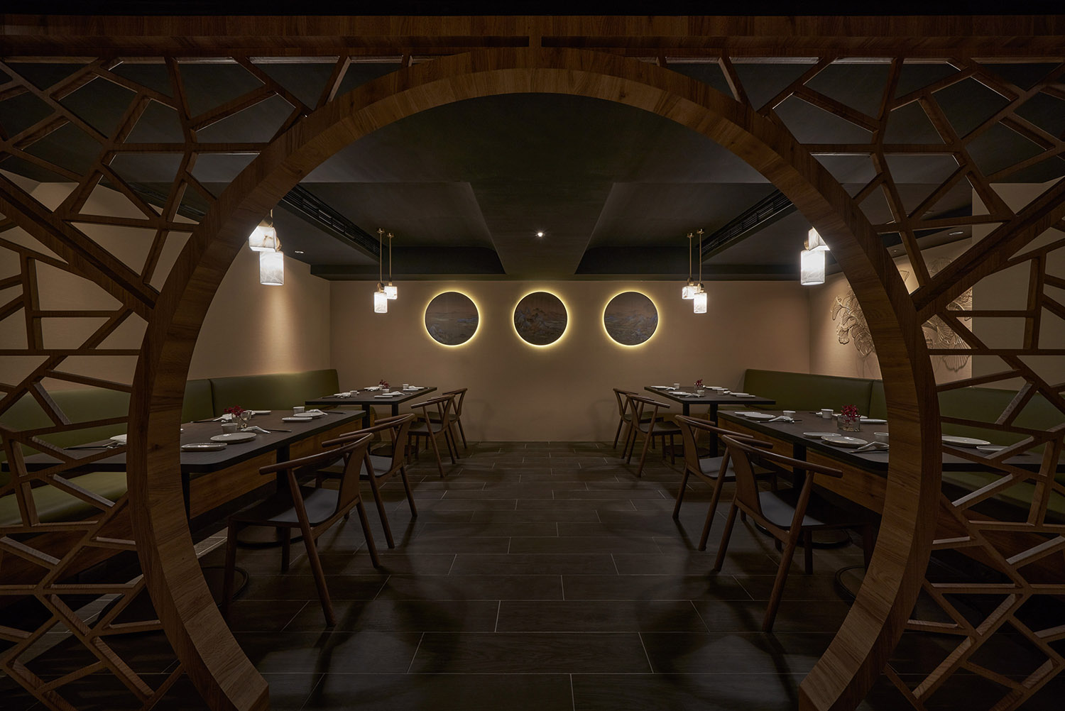
空間布局以園林建築為輪廓,融合移步換景、曲徑通幽與⼭⽔潑墨的悠揚意蘊,采取「⼀阻、⼆引、三通」的動線策略,第⼆道玻璃磚牆的⼆進式入⼝適度阻絕,亦營造柳暗花明⼜⼀村的期待,在動線設計上考慮取景、曲折與合理,帶入⼭⽔景牆、⽉洞⾨窗、⾨亭回廊的建築⼿法,加深庭院的優雅從容與園林詩情。
The spatial layout is outlined with garden design. The architectural technique of changing scenery of Chinese garden design is incorporated on the winding corridors to showcase the sense of tranquility in Chinese splash-ink paintings. The route of the corridor is based on the design of “block, lead and reveal”. The second glass wall of the two-door entrance is moderately blocked, so as to create a sense of anticipation towards the following views. Presenting a scenic, winding, and reasonable path, the corridor takes the guests to appreciate the landscaped wall, patterned doorways and windows, and pavilions, which bring feelings of elegance and peacefulness as if they were in a Chinese garden.
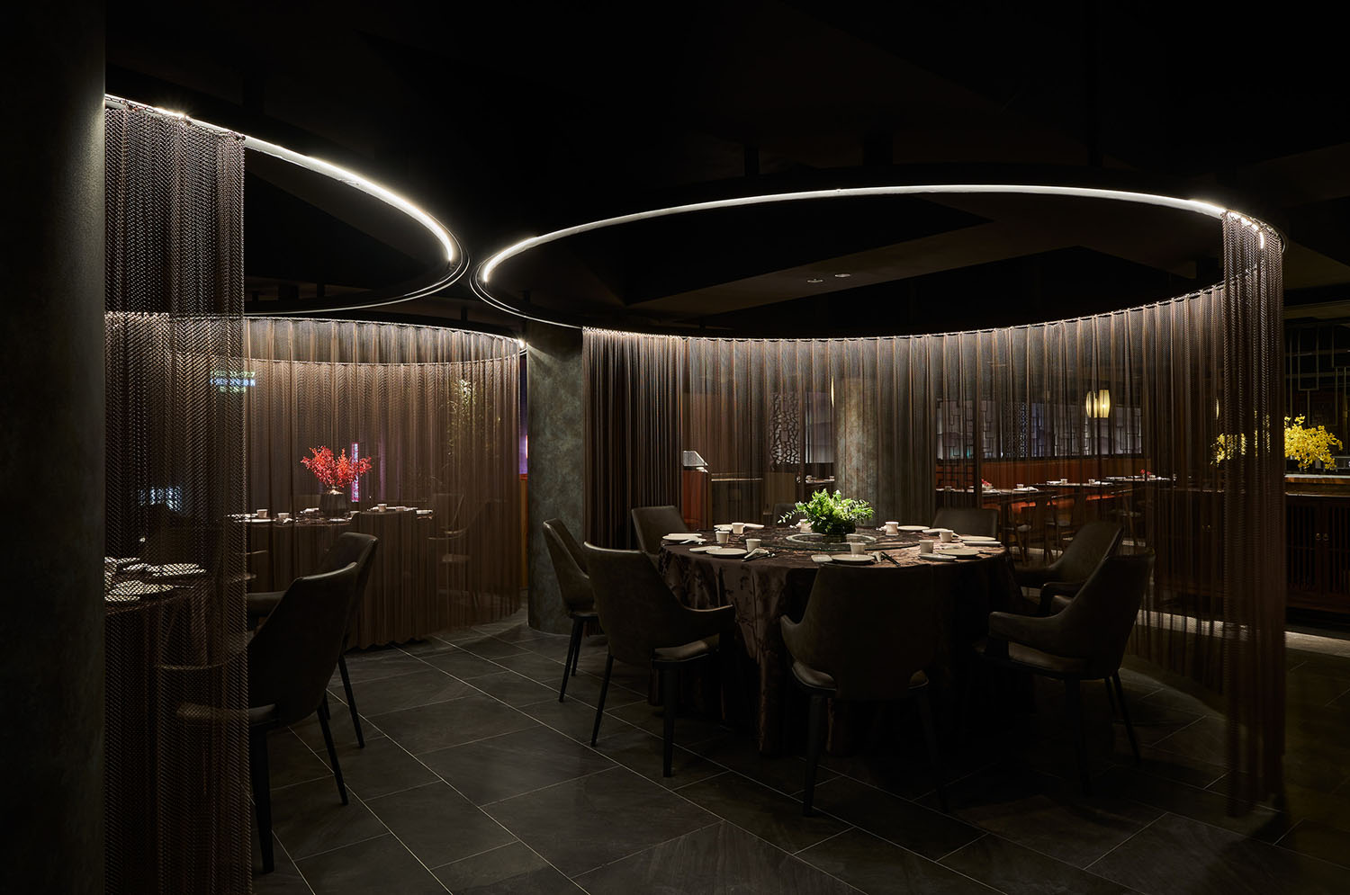
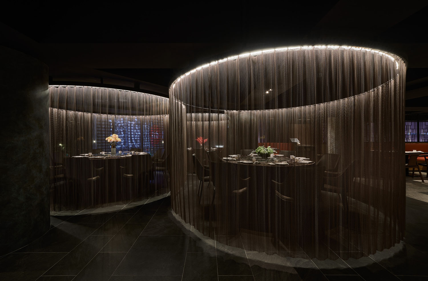
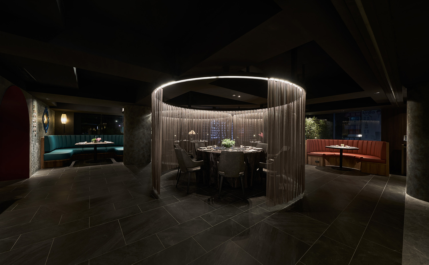
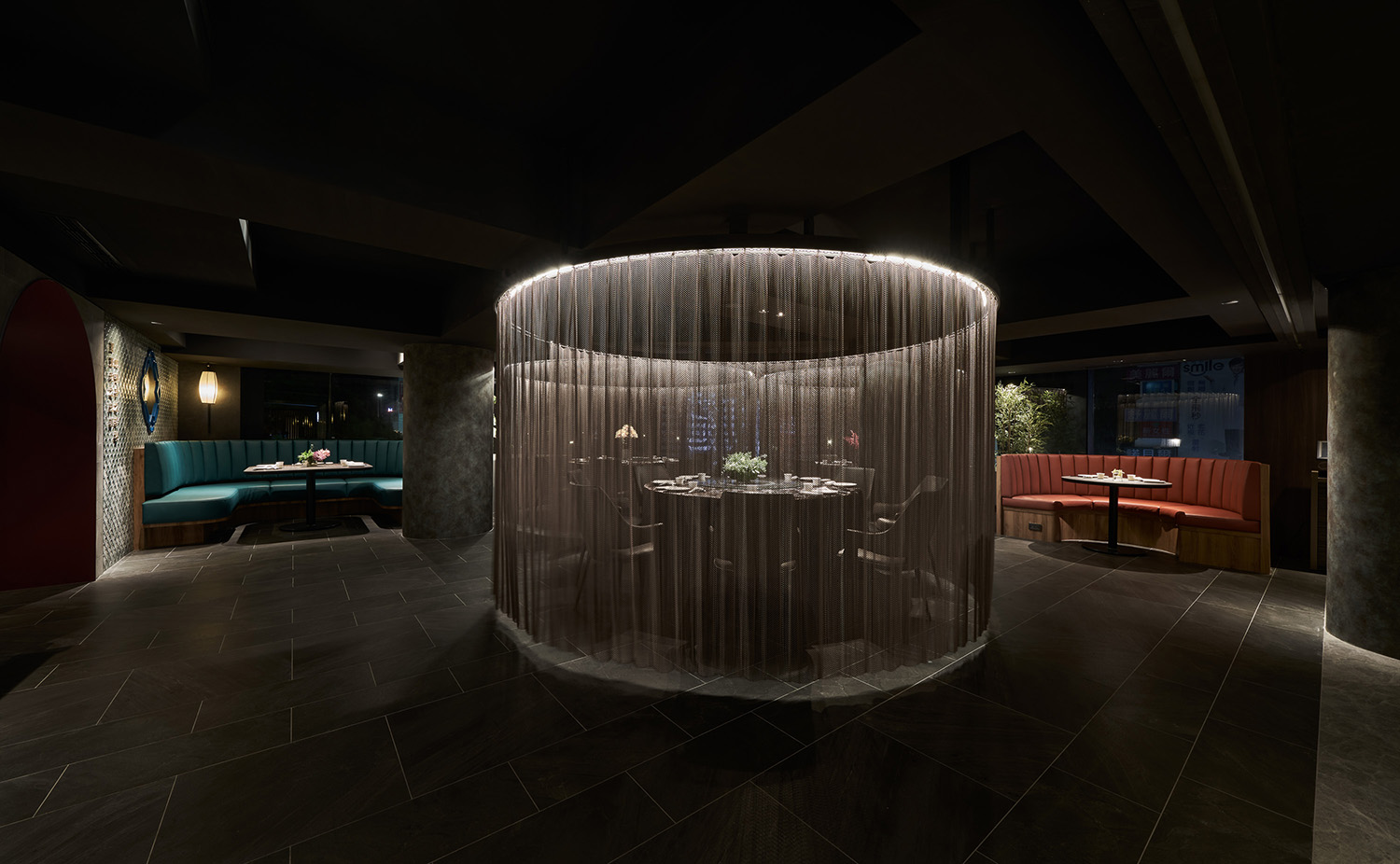
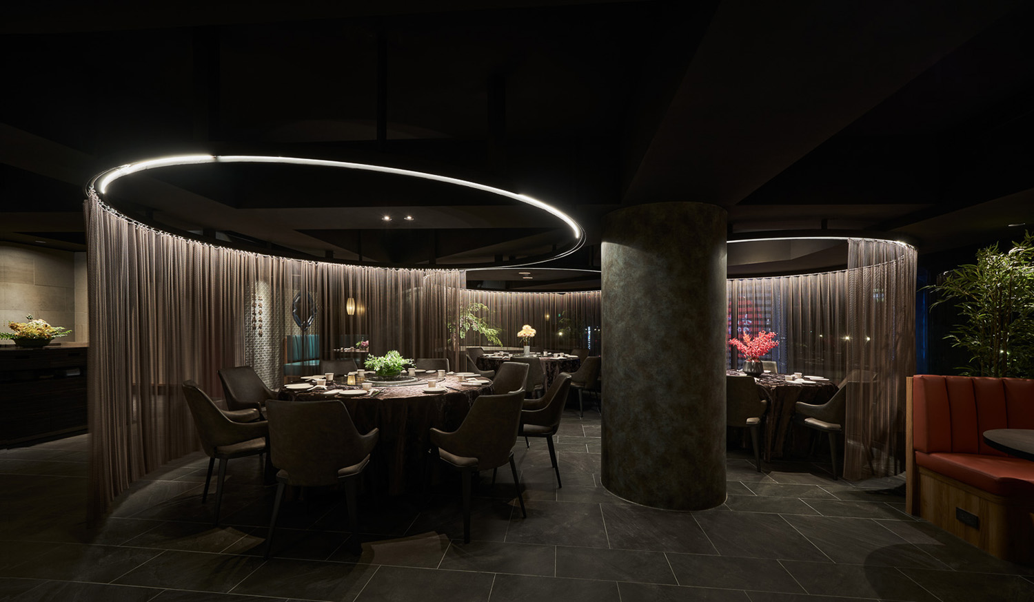
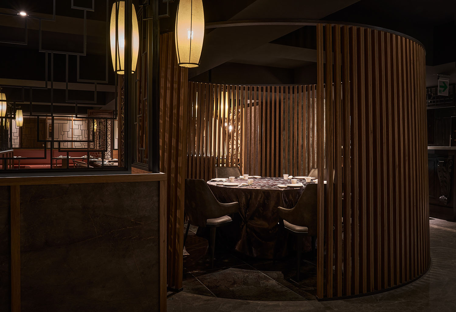
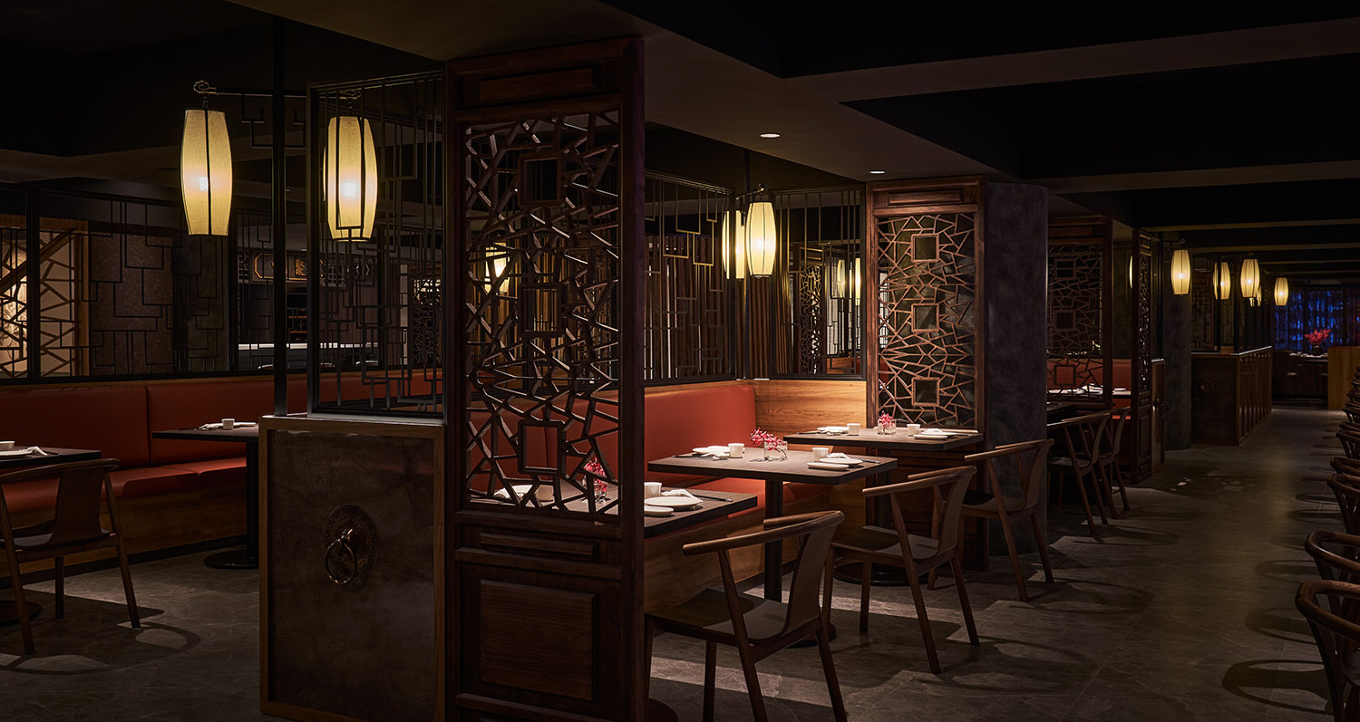
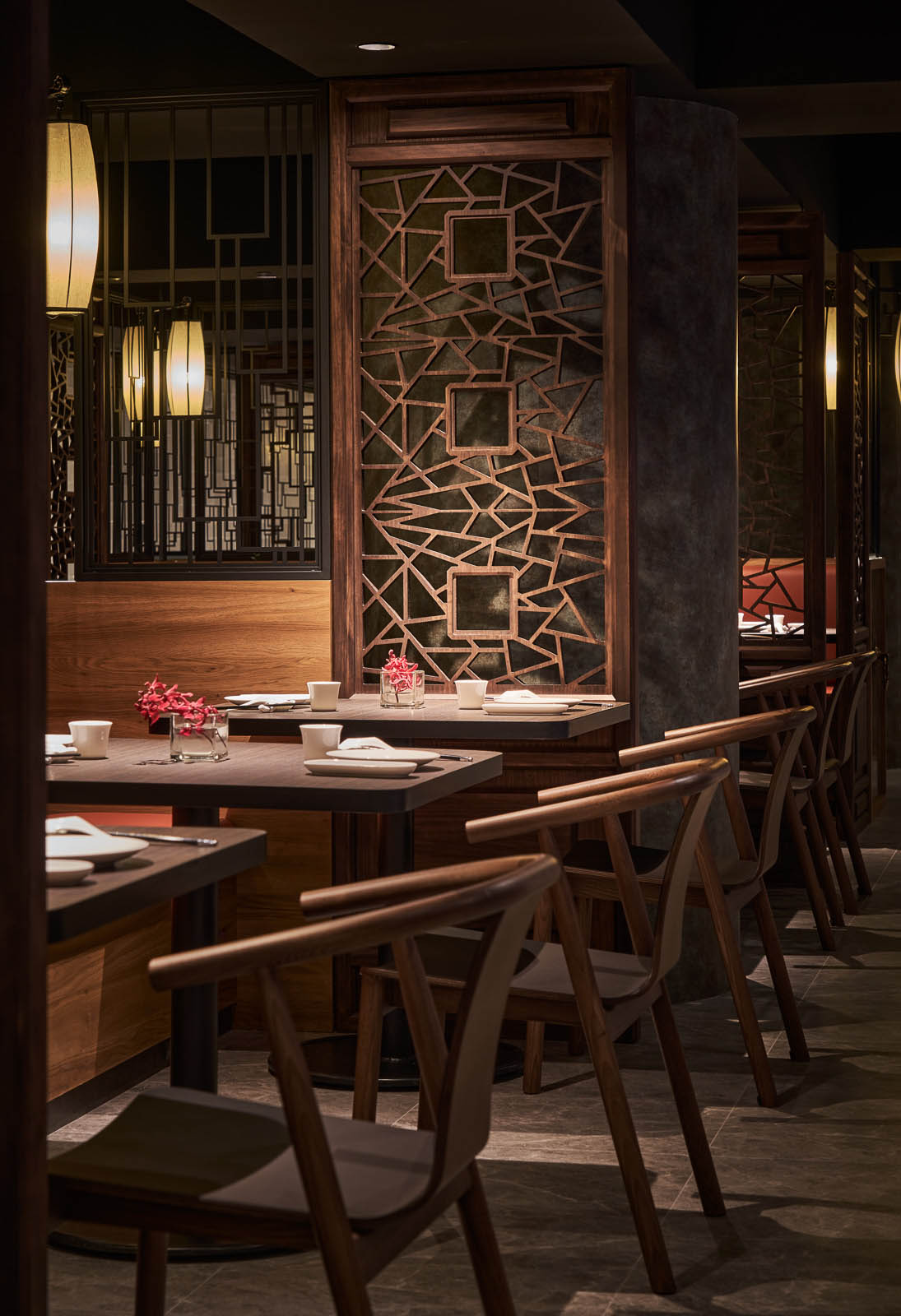
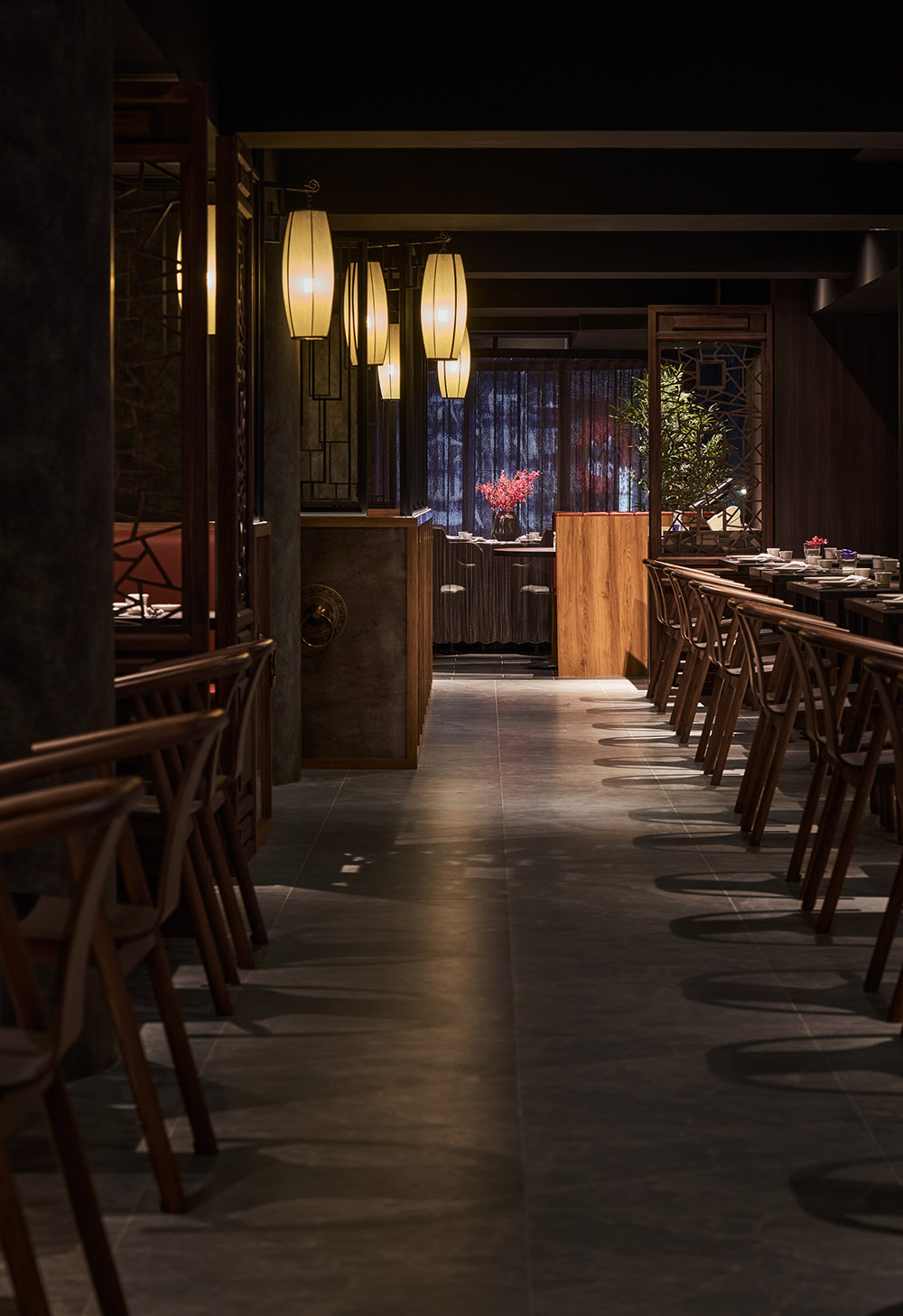
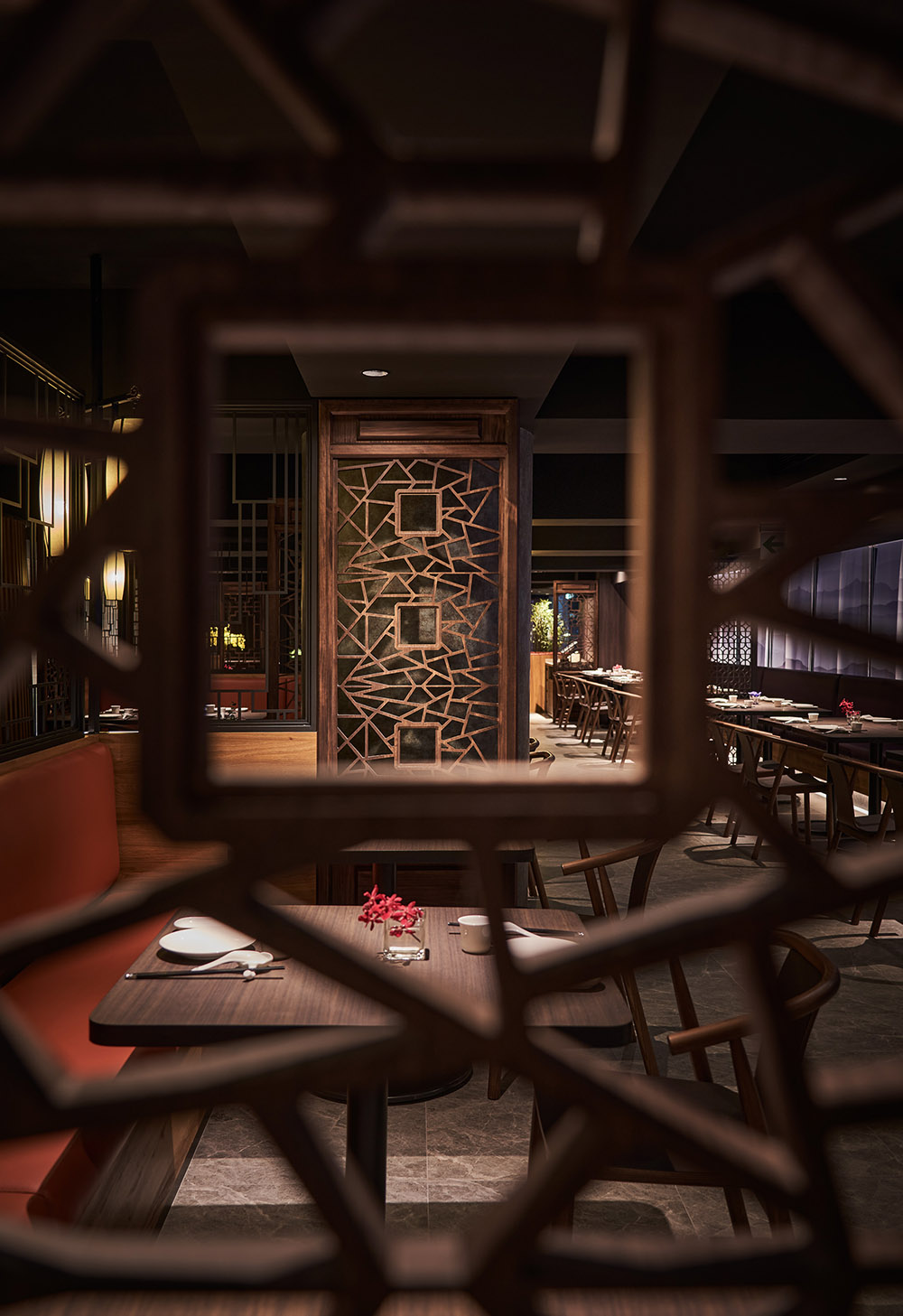
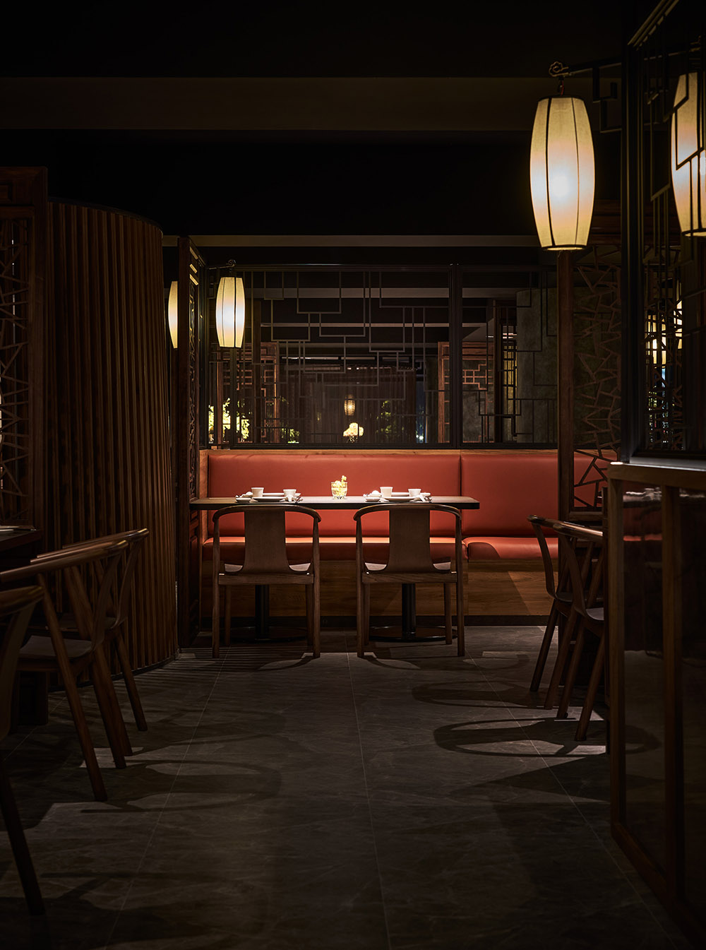
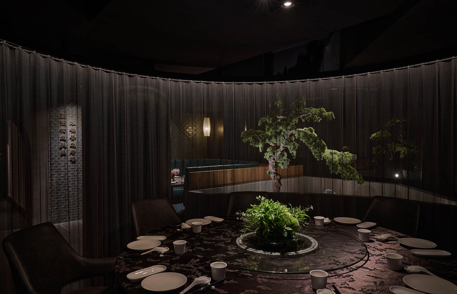
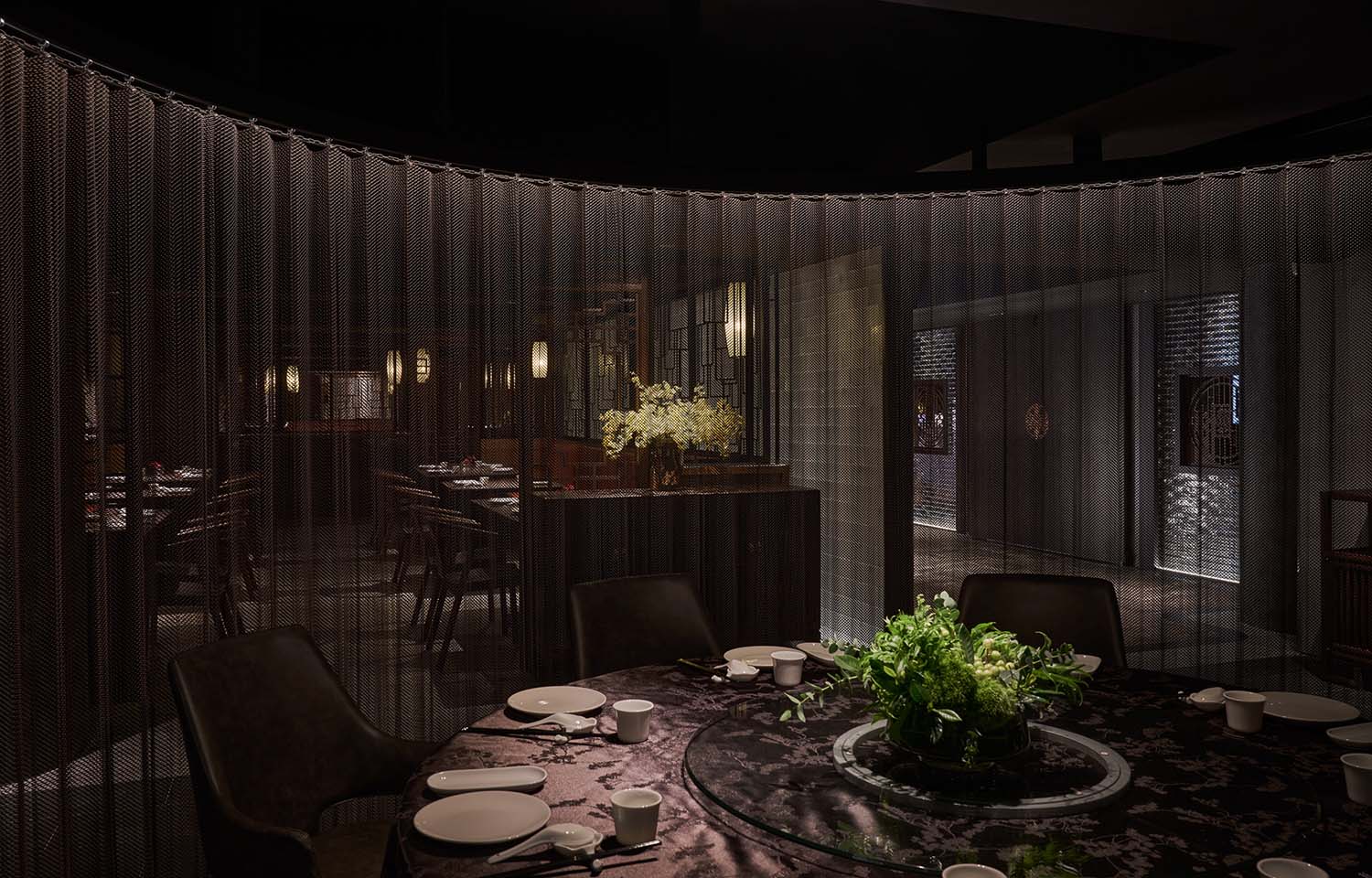
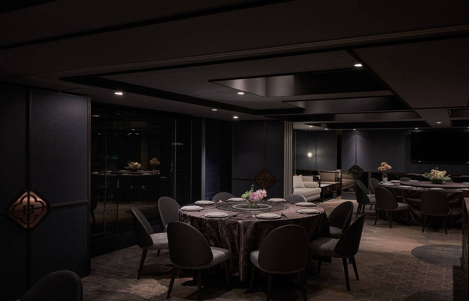
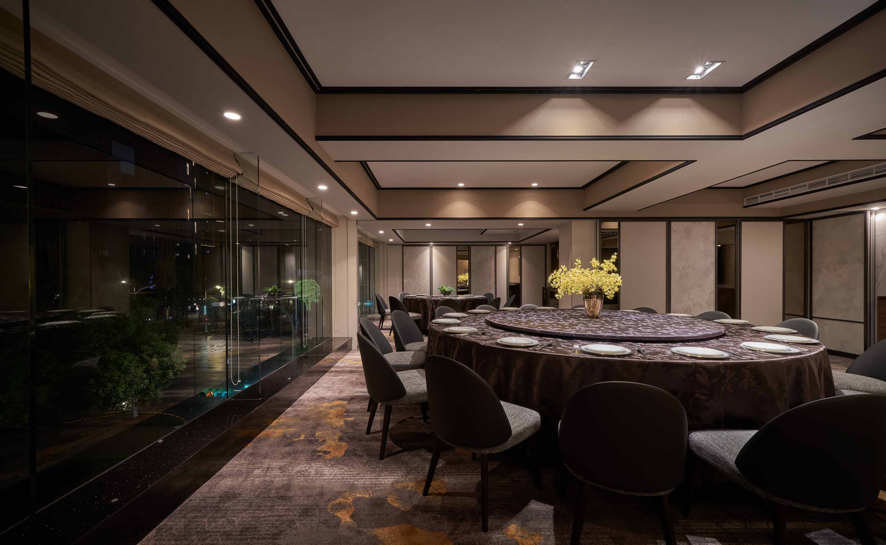
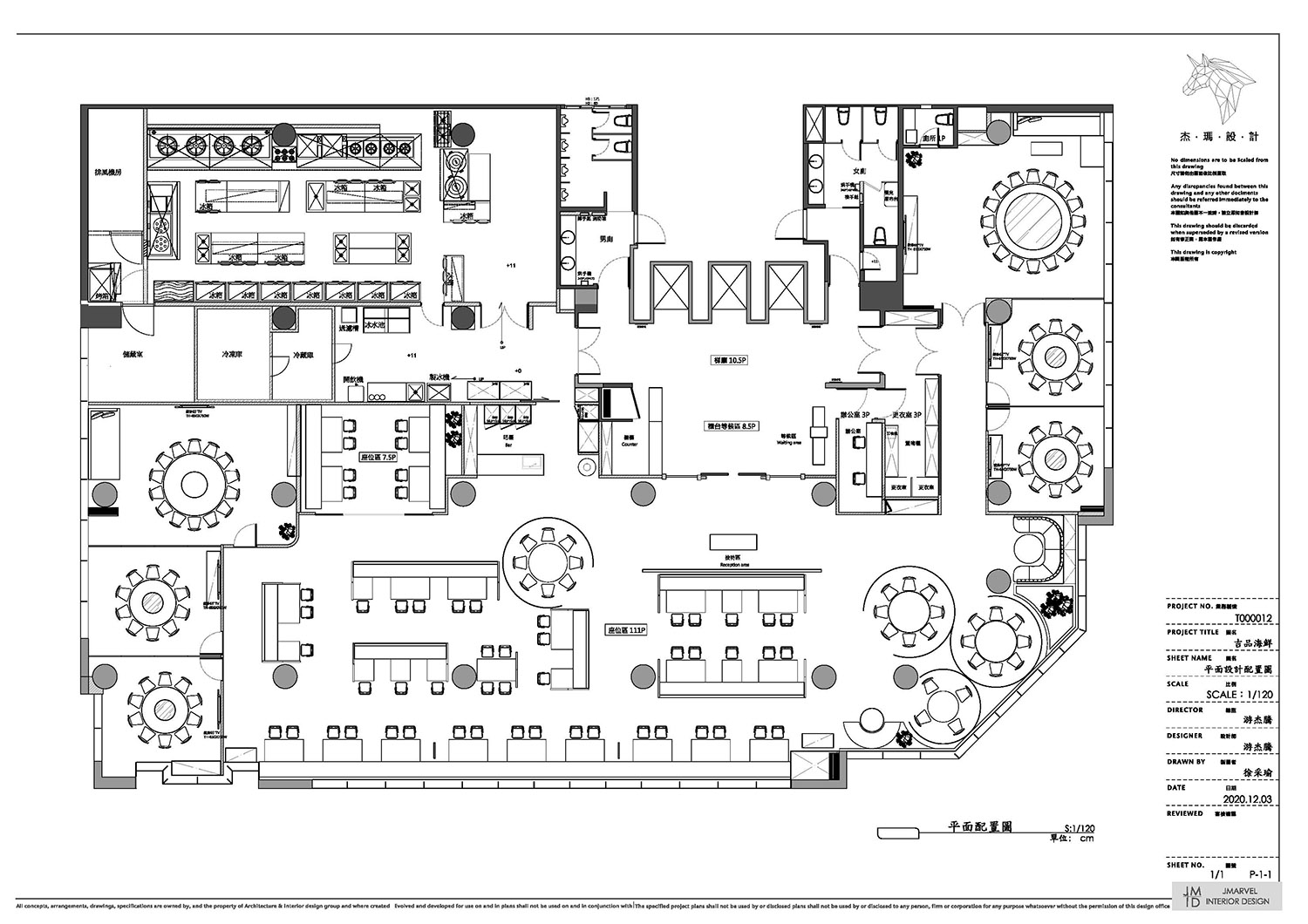
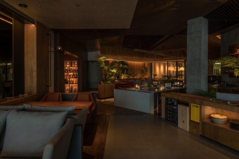
客席的分區對應園林布局,透過多元的型態如類包廂、獨立沙發區、卡式座席,將每⼀區塊的客席聚落與軸線過道轉化為景、亭與廊,終點的端景、⾓落的植栽、轉⾓的窗花、既分割也連結空間的遊廊,增加景深層次,在虛與實、疏與密、藏與露之間,組合景與物的⽣⽣不息。
The division of the seating corresponds to of the garden layout. The booths, sofas, and blocked seats turn each seating section into a landscape scene. The pavilion and corridor, edge view, plants at the corners, paper cut on windows divide and connect the corridors at the same time. With the depth of the field, between solids and voids, sparsity and density, hidden and revealed objects, the combination of landscape and objects creates endless possibilities.
轉,傳承創新|入⼝破題,展現新品牌的盎然⽣命⼒
Innovation|Vitality of the New Brand
延續舊品牌的地道港式粵菜,新品牌以創意粵菜出發,設計上響應融舊於新的品牌價值,運⽤新式材料及⼯法繪製傳統東⽅意象,烘托品牌「在傳承中創新,在創新中延續」的特質。
Based on the authentic Cantonese cuisine of the old brand, the new brand focuses on creative Cantonese cuisine. The brand value is to combine old and new characteristics. By manifesting traditional Eastern images with new materials and method statement on construction, we attempt to highlight the brand characteristic of “innovation in tradition and continuity in innovation”.
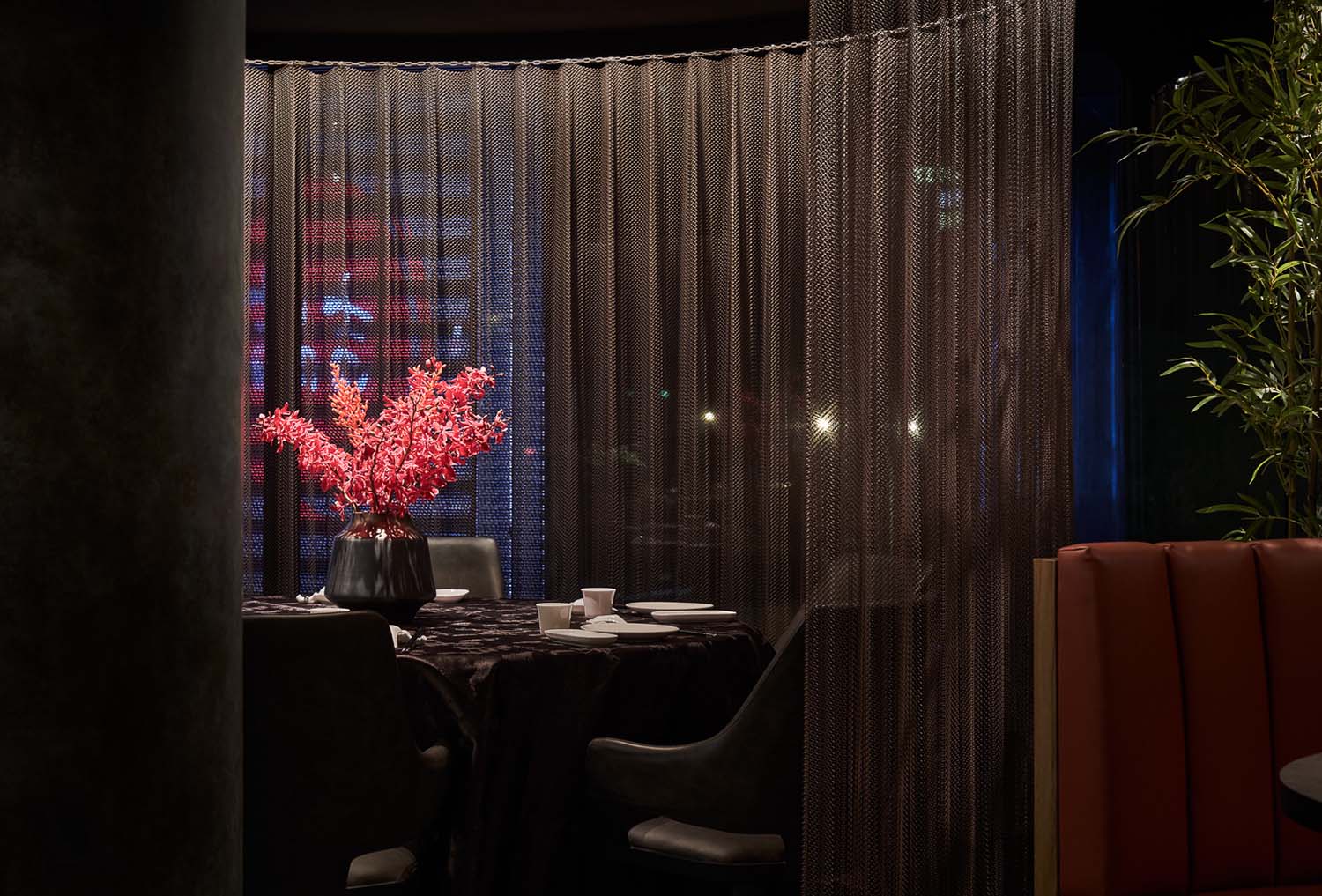
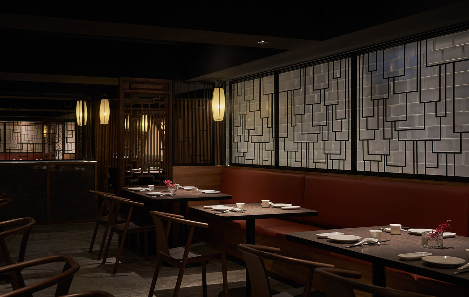
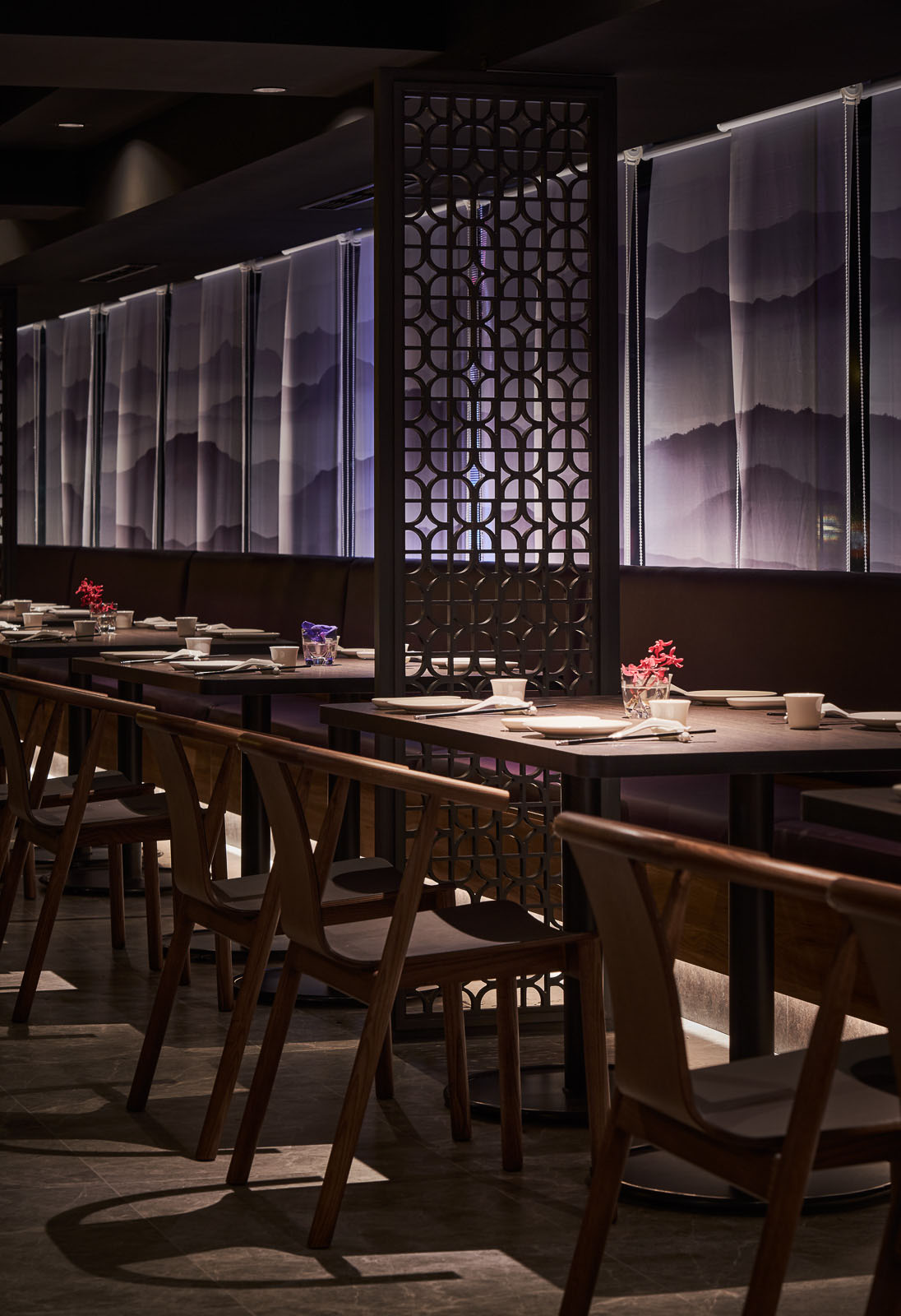
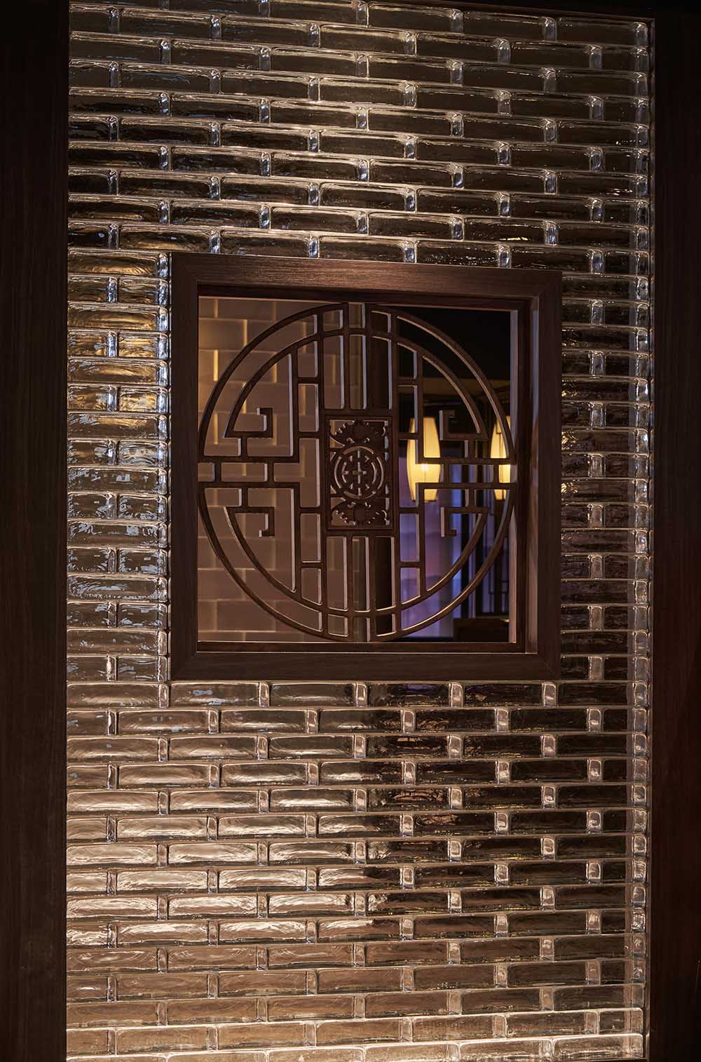
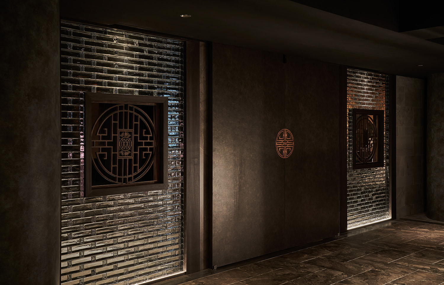
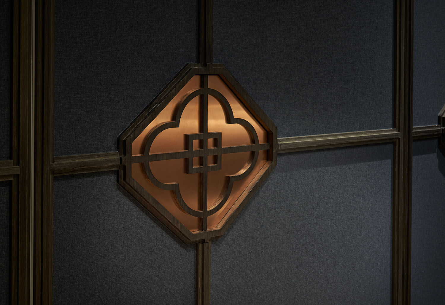
於是,冰涼清新的玻璃磚翻轉厚實權威的紅牆;幾何線性的⿊鐵屏風,倒映光影勾勒⽔流;⾦屬網簾撥開了紗簾的曖昧與牽掛;即便是⽊製中式⾨窗,也讓冰裂紋替代花⿃符號⋯⋯在在鋪陳藉由新材質與⼯法傳遞品牌的創新意念。
Replacing the traditional thick red-brick wall with translucent and bright glass wall, and using geometric and linear black iron screen to reflect water flow. Changing the lace curtains to metal mesh curtains, and incorporating window grilles which are decorated with cracked ice patterns on traditional wooden doors and windows, we continue to convey the innovative concept of the brand through new materials and techniques.
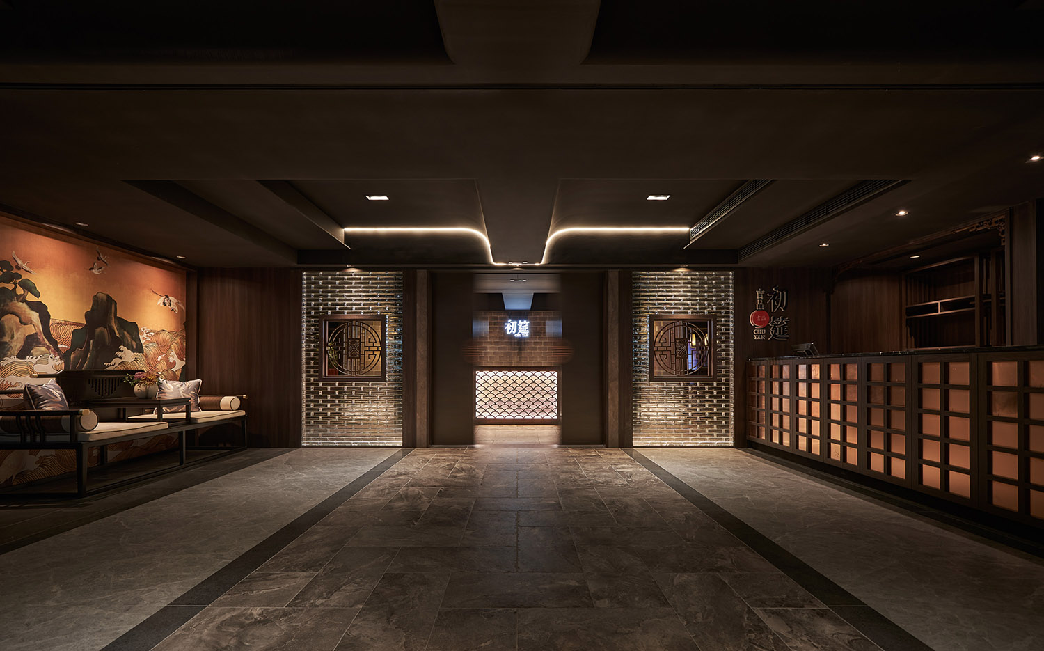
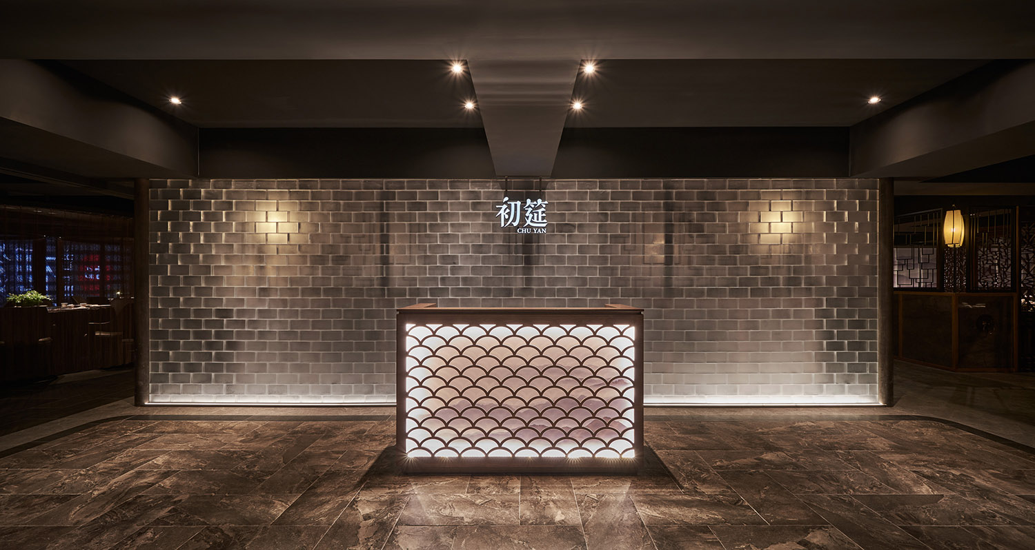
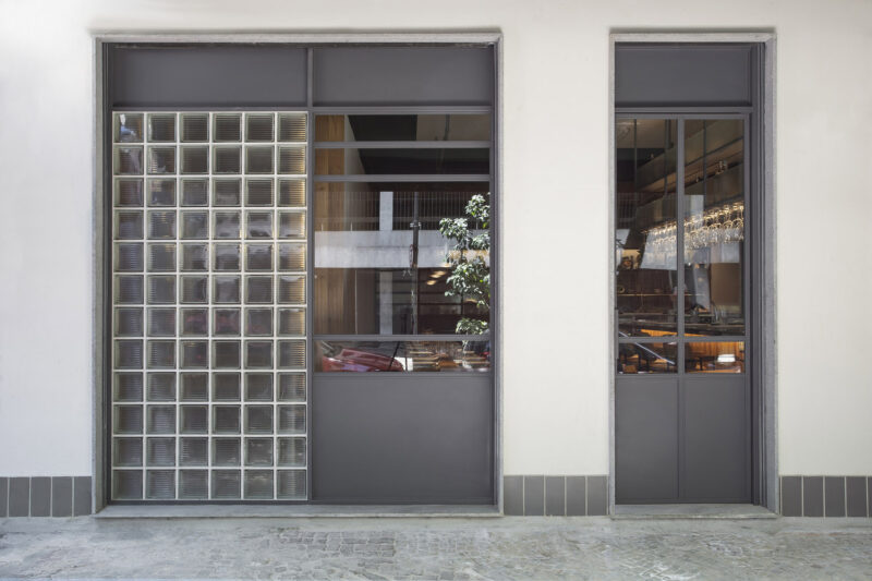
等待⼤廳是味蕾旅程的初始,我們以玻璃磚砌築出實牆黃瓦的象征概念;古時大宅院的⿊漆⾨,同步以⽯黃⾊調詮釋寧靜沉穩的氣韻,藉由玻璃磚的光線柔和視覺,接近⾦⾊⼜不刺眼銳利,創造細致⾼雅第⼀印象。⼆進空間以玻璃磚映出冰清⽟潔,象征中式庭院的粉牆黛瓦,從雍容貴氣切換遊園逸趣,亦是轉之境界。
The lobby is the starting point of the dinning process. We construct the emblem of traditional thick wall and yellow tile by glass material. The grand gate of the ancient mansion is accompanied by mineral yellow color to present the tranquility. The glass bricks soften the light, giving the light a golden hue and creating elegance vibes. The glass brick for the second reception space shows the purity and symbolizes the white walls and dark tiles of Suzhou (蘇州) courtyards.
東坡青草鋪,飲淡泊之東坡酒經
東坡先⽣不隻鑒賞佳肴,更是識酒之⼈,美酒點燃了他的⽂學才華,也奠定了他對⼈⽣的恬適氣度。不僅開創東坡⾁,還寫下最早調酒曆史(注)。
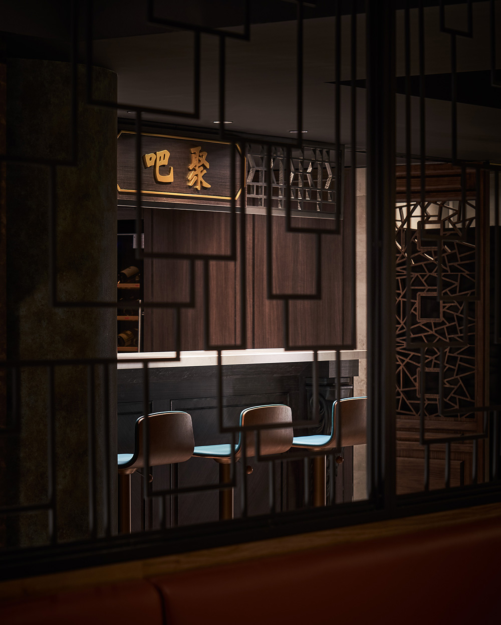
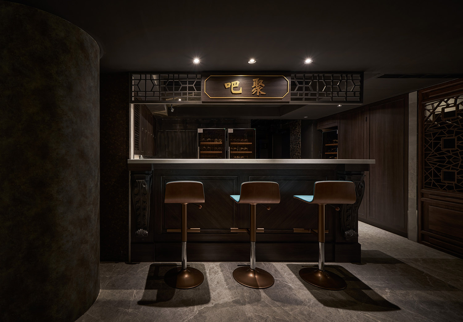
Su Dongpo (蘇軾) also fascinated wine tasting. From commercial perspective, the bar takes a pivot position. The design inspiration comes from herbal shop, which adds some creative idea to the presentation of Chinese cocktail and herbal tea. In this place, we particularly simulate traditional Chinese furnishings at an independent corner. It is also a perfect place for social media check-in.
從商業⾓度思考,調酒吧肩負承先啟後的戰略地位,特以青草鋪進⾏⾓⾊設定,刻意在中式調酒與藥草衝茶之間進⾏趣味轉化,唯獨此場域我們將進⾏完整的仿舊,複刻傳統中式的陳設並且設於轉⾓獨立場域,⼀旁巨型青花瓷酒壇完美過場,彷佛時空穿越,置⾝古代街坊⼀隅,勾動回憶也回應打卡⽂化。
合,⼀步⼀景|複古深邃的時空,沈穩寧靜卻也低調華奢
Various Views|Old-Fashioned Space with Tranquility and Elegant
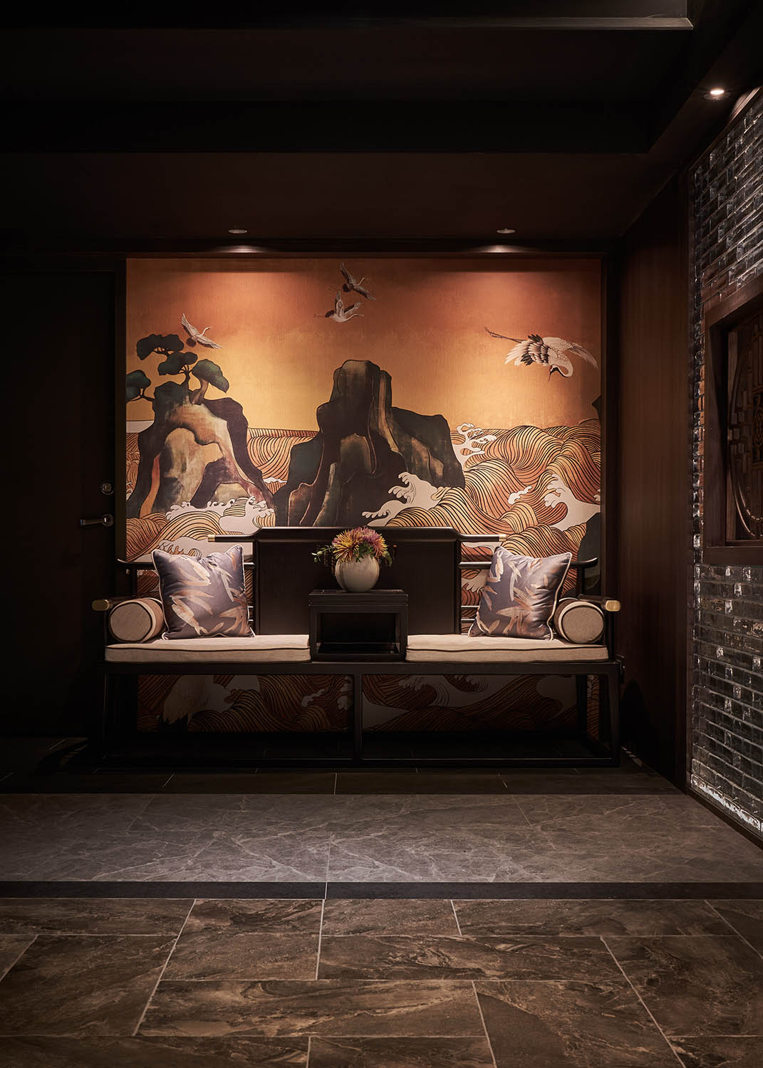
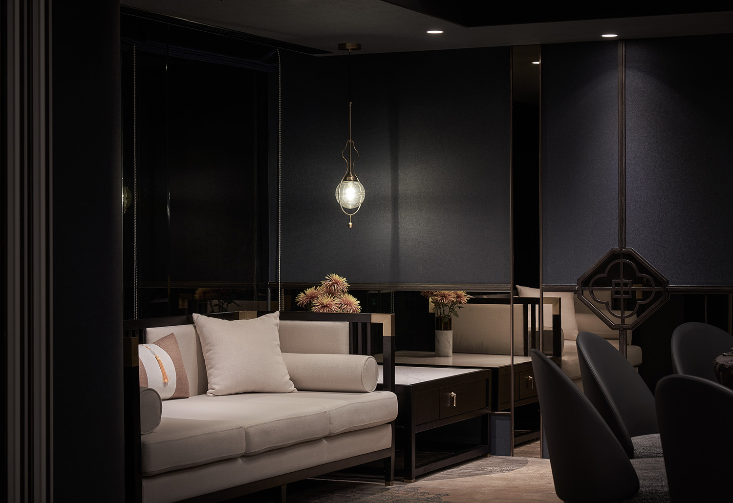
⾊彩畫風同樣延續新品牌的年輕化定位,舍棄花紅豔紫的中式華麗,改走清淡、灰階的調⾊,不鮮亮,不張揚,融入煙雨江南的⽔墨氛圍,散發複古深邃、內斂雅致的古典感。
The colors reveal the young characteristic of the new brand. We use light, gray and low-key hues instead of traditional high colors, so that the guests would feel like being in an ancient ink painting, and being surrounded old-fashioned and classical elegancy.
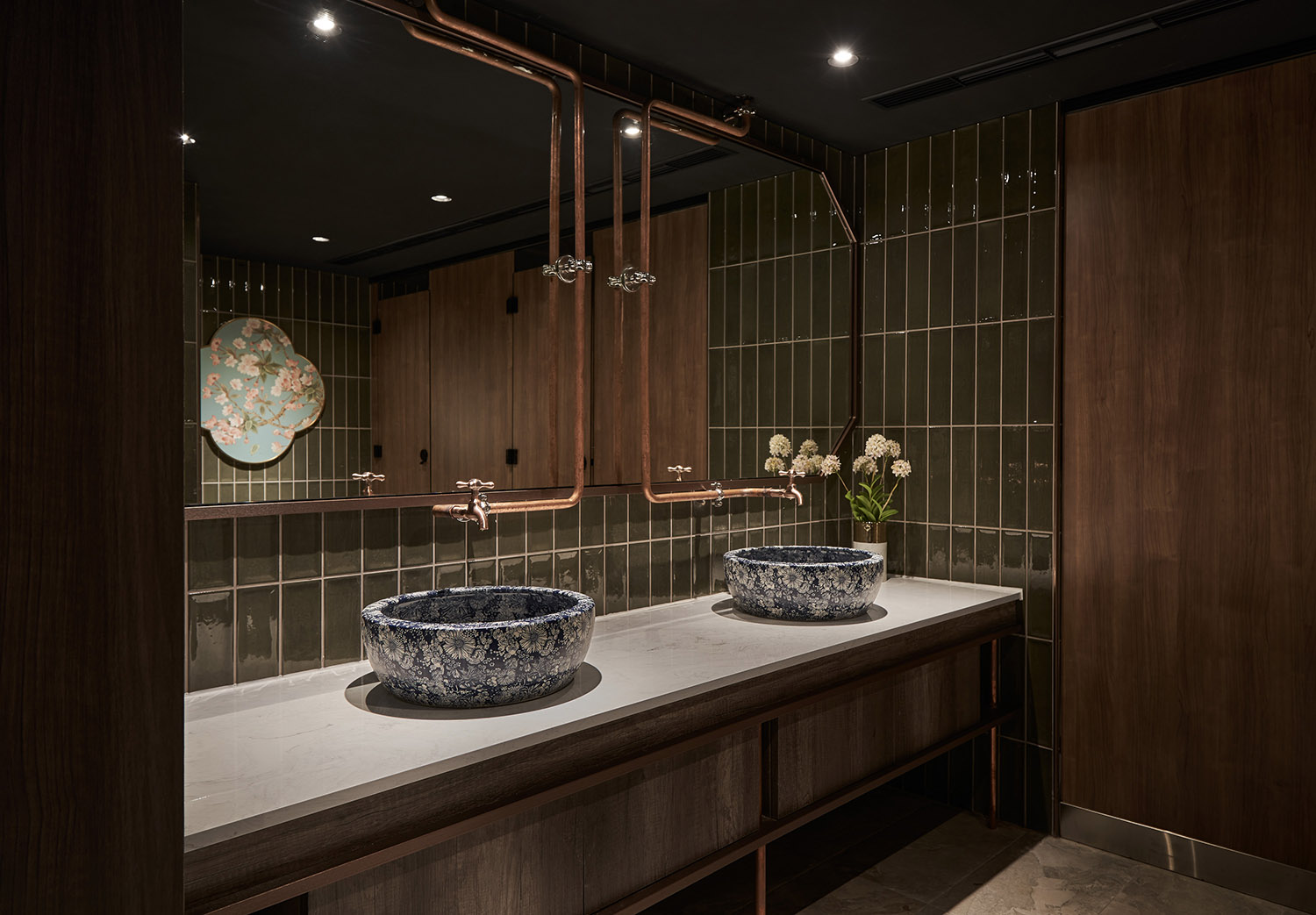
在中國傳統⾊係中,我們找出最能詮釋中式氣韻的⾊澤,讓青花藍、孔雀藍、胭脂紅在空間中輕舞翩翩。胭脂以⼀抹紅的姿態暈染空間,出挑驚豔,片刻美麗卻也烙印⼼⼝。孔雀藍的明淨撫去青銅的斑駁,神秘沉靜且⾼貴。青花藍將東⽅⽂化細細琢磨,⾼雅深邃,靜謐如海。三樣⾊澤勻實紛舞,猶如花粉輕巧灑落,濃淡相宜。
From Chinese traditional colors, we find the ones that can properly interpret Chinese features. Chinese blue, peacock blue and carmine is decorated into the space. Carmine is used to make a strong impression; peacock blue on the column imitates the mottled bronze, and brings a sense of mystery and elegance; Chinese blue refines the Eastern culture and bring gracefulness and profoundness to the space.
食貨之境,極品風華
整體設計以中國史上第⼀美食家蘇軾為精神源起,溯源⾄上古神獸、連結華族品味,藉園林建築臨摹⼠族的從容氣韻,墨⾊調的鋪陳表現內斂奢華的古典畫風,暈染⽂⼈墨客的風雅氣息,每⼀次皆可在不同席境,咀嚼新中式的美好深意。
The overall design is based on the first gourmet Su Dongpo (蘇軾) in the Chinese history. It traces back to ancient mythological creatures and associates with Chinese taste. The Chinese garden architecture reveals the elegance of literati, the use of tranquil color reflects the luxurious classical atmosphere. We wish all the guests can enjoy refined Chinese aesthetics in each visit at every corner.
∇ 平麵圖
項目信息
室內設計:傑瑪室內設計有限公司
設計團隊:遊傑騰
業主:吉品初筵
性質:餐廳
位置:中國台灣台北
麵積:519㎡
格局:迎賓大廳、接待區、調酒吧、獨立沙發區、卡座區、類包廂區、包廂區、辦公室、更衣室、廁所、烹飪區
材質:鐵件窗花、CNC窗花、木作、壁紙、磁磚、金屬網簾、美耐板、木皮、茶鏡、皮革、玻璃磚
設計時間:2020.9 – 2020. 11
攝影:Hey! Cheese


