全球設計風向感謝來自 未韜建築設計事務所+Giorgio成於思 的商業空間/書店項目案例分享:
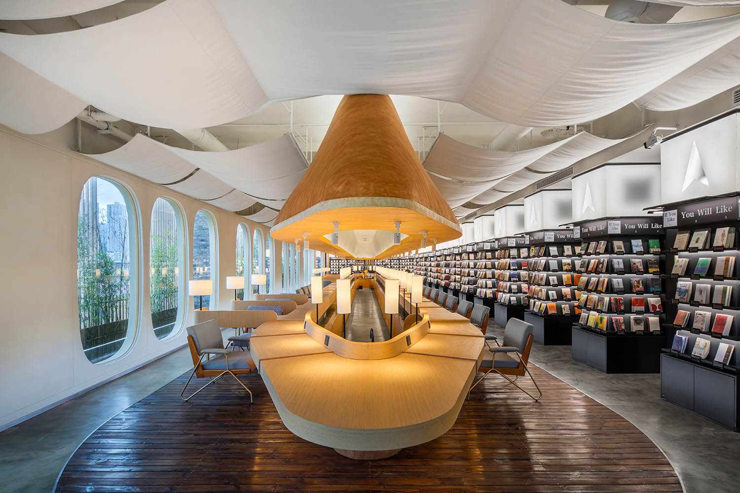
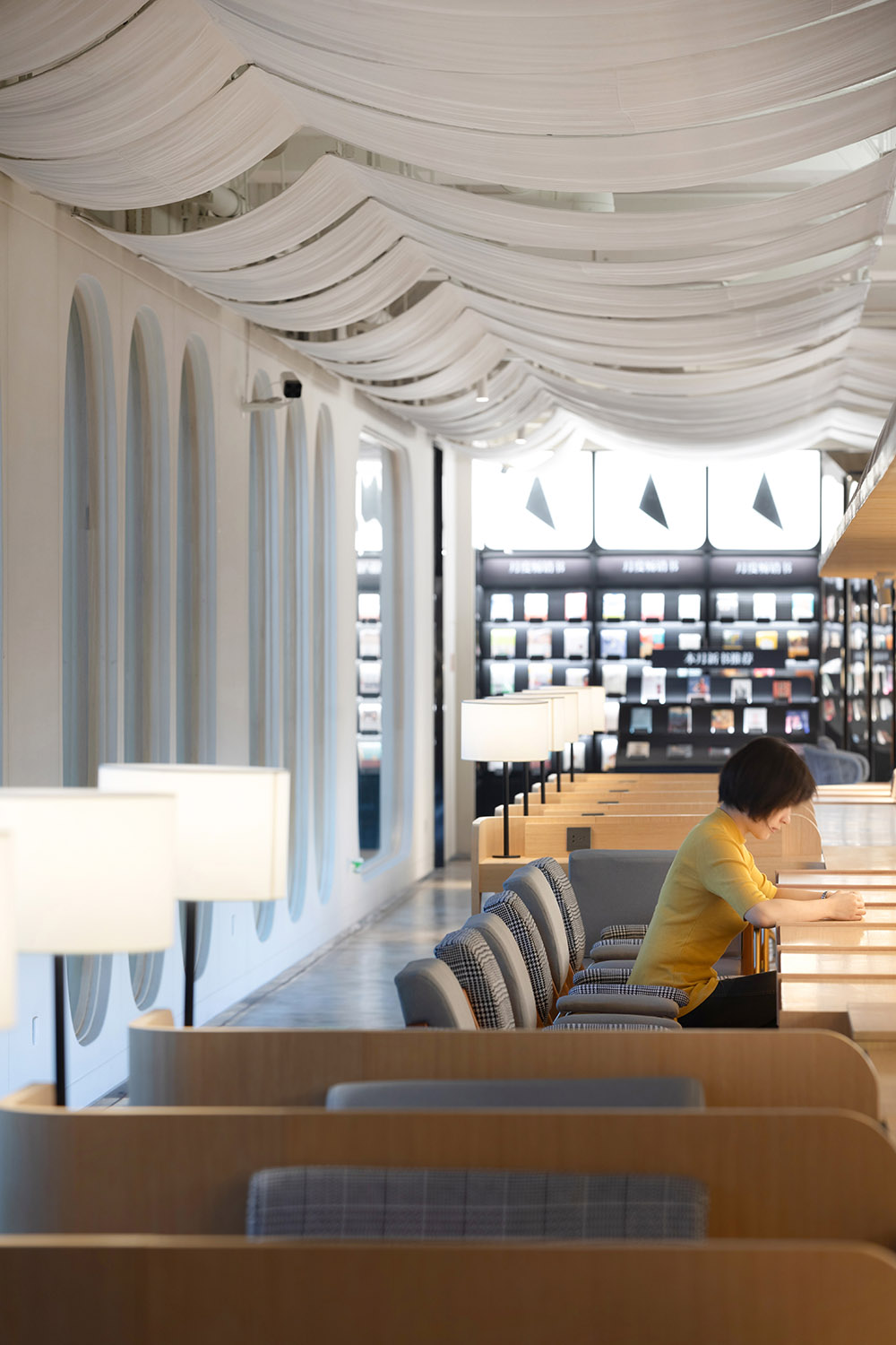
∇ 飛船書吧 The Spaceship Reading Bar ©未韜建築設計事務所
2020伊始,麵對無法外出旅行的生活,還有一件事情可以讓我們的精神飛向遠方,跨越時間與地域的限製與先人賢者進行交流,那就是閱讀。
At beginning of 2020, everyone stays at home, travelling is not allowed. During this special period there is still one thing could let our mind fly far away, talk to ancient wise people beyond time and location, which is reading.
書店+的模式很難適應如今的社會環境,而純粹為了拍照打卡而生的網紅項目又不是我們設計的最終目的。在唯一的一次線下溝通中,業主和設計師達成一致:書店需要回歸本質,書店的設計最終要需要回到讀書這件事情上來。
The mode of Bookstore Plus does not fit our social environment well, and the to do just a popular project is never our main target. During the only face to face communication, we agreed that the bookstore design work should go back to the behavior of reading itself.
一個文明穿越時空來到一個陌生的宇宙,一艘飛船降落在一顆未知的星球,建立起營地探索全新的世界,整個書店空間是新人類遨遊於知識宇宙的一場旅行。
One civilization arrived a strange universe cross time and space, a spaceship landing on an unfamiliar planet, setting up a new camp. The whole bookstore is a journey of the new human enjoy travelling in the universe of knowledge.
∇ 空間漣漪 Space Ripples ©未韜建築設計事務所
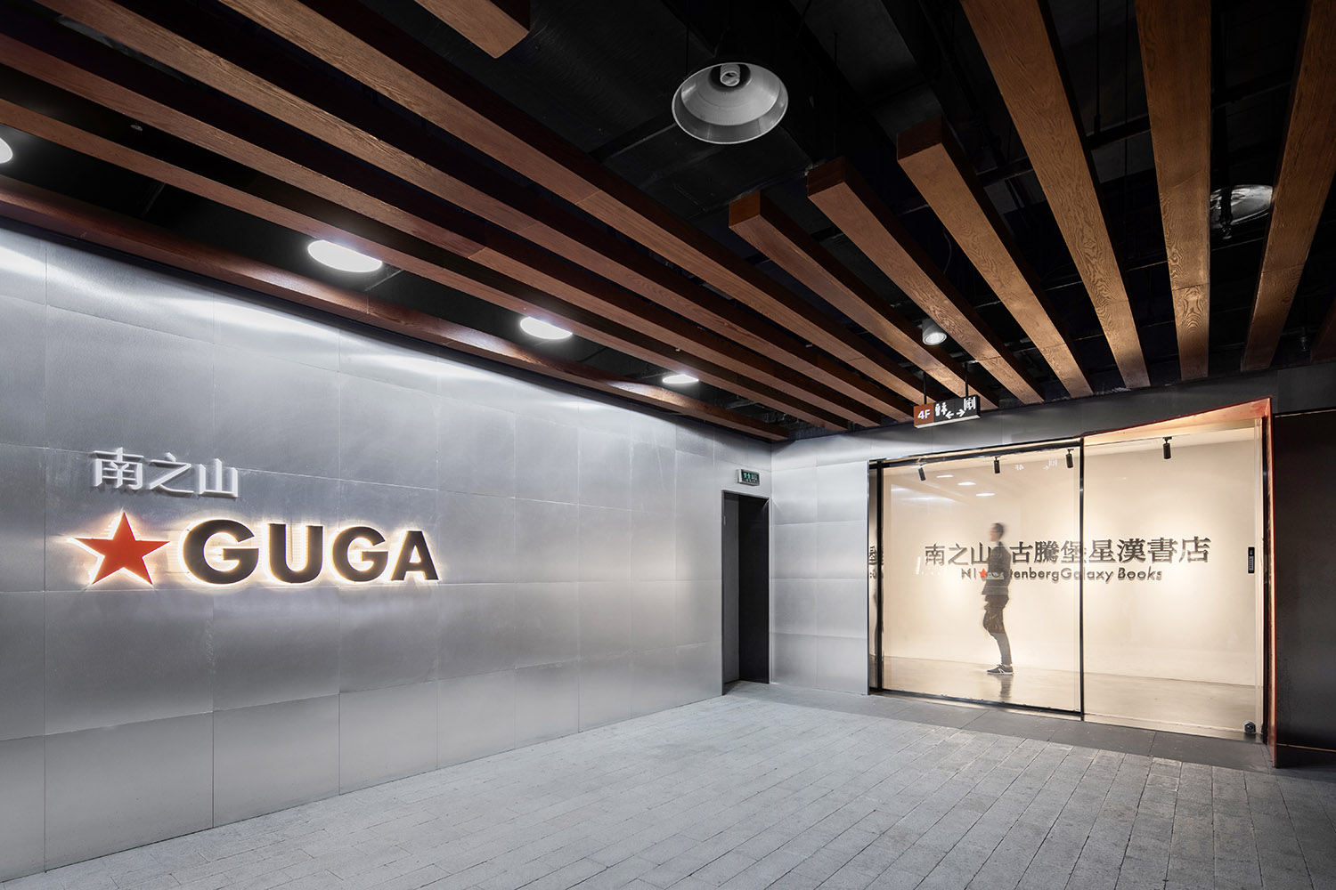
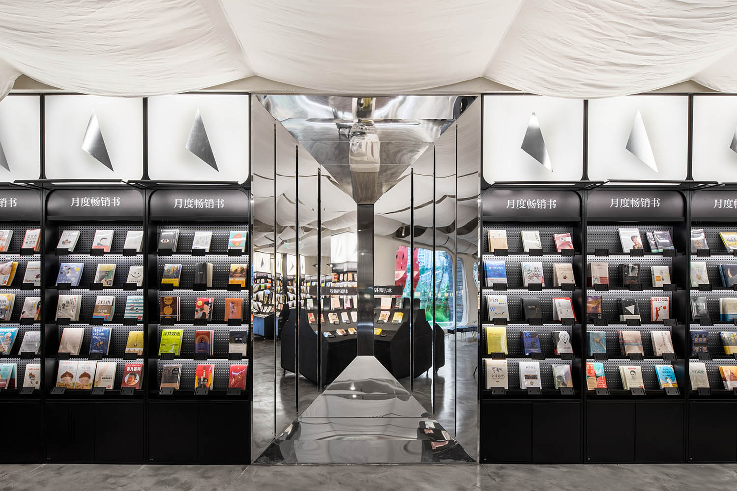
∇ 入口空間 Entrance Space ©未韜建築設計事務所
功能空間策略 Function & Space Strategy
為了營造一個純粹的閱讀空間,設計師把一切會發出聲音的功能(餐食飲品製作,用餐及交流等)全部集中在樓上,作為另一個獨立的項目“古星院”來考慮,上下兩層樓在內部僅僅隻通過一部傳菜梯進行連接,保證書店的絕對安靜。
To create a pure reading space, designers put all the functions which make noise upstairs, consider as another individual project GUGA Garden. One food lift connects the Bar to the bookstore to keep the reading space utterly quiet.
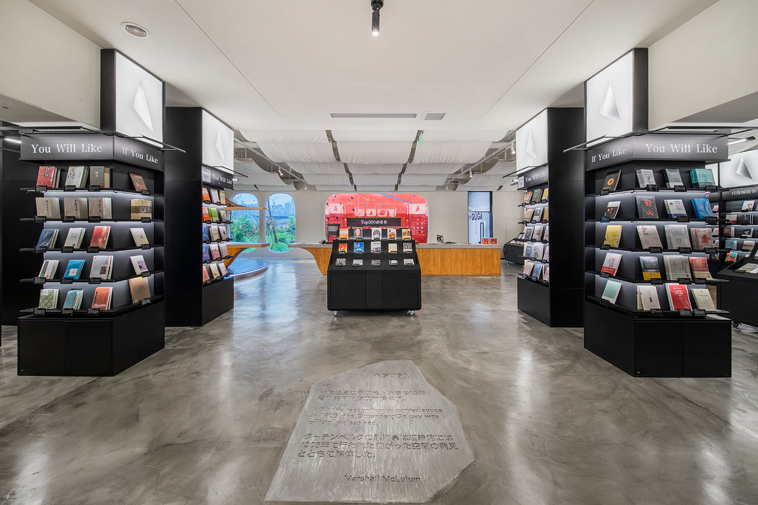
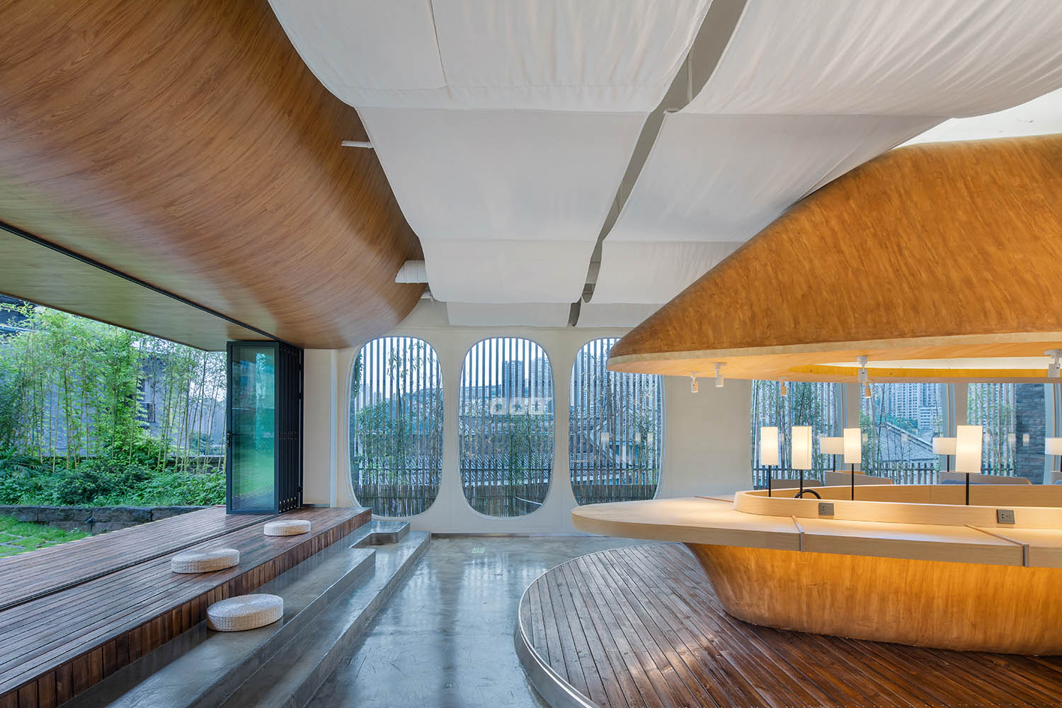
書店內部,不同於大多數項目對於空間豐富性的追求,項目選擇了以一個通透開敞的大空間作為主體的設計手法,讓人們在自由遊走的時候也會隨時隨地“被看到”,在設計中大量采用了“物體”來劃分空間,而不是“牆體”。物體四周形成的“柱狀空間”適合人們依靠停留,但並沒有“洞穴空間”帶來的包裹感,起到使人們的言行舉止“被約束”的作用,當處於30米範圍下若幹人視線範圍內時候,幾乎不會有人會大聲喧嘩。
Different from the popular way of making space complicated, this space choose to be a big open space, to let people walk freely in the space at the same time as to be seen and watched. Objects become the main elements to divide space instead of walls. Lots of “column” space around the objects is suitable for people to rely on and stay while nearly no “cave” space to give people the feeling of enclosure, which gives the space a power to constraint people’s behavior. Nobody will talk loudly in a reading space when he is visible by lots of people in a 30 meters long open space.
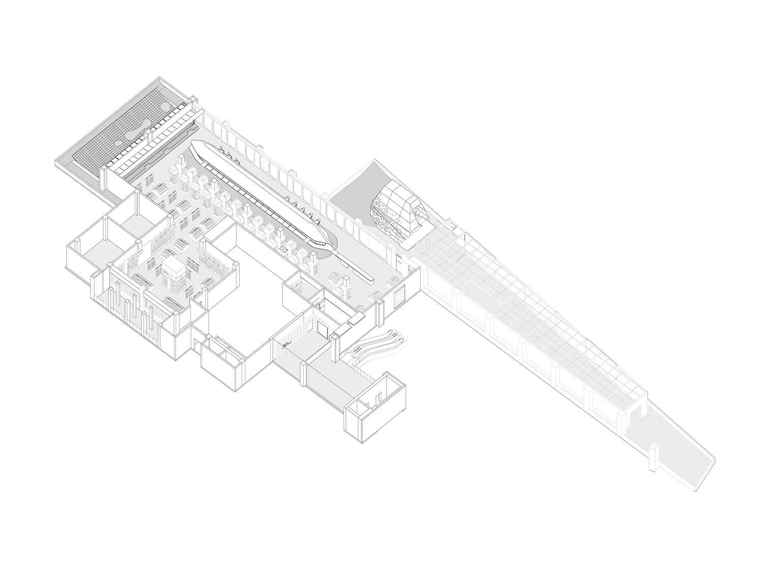
∇ 軸側圖 AXO ©未韜建築設計事務所
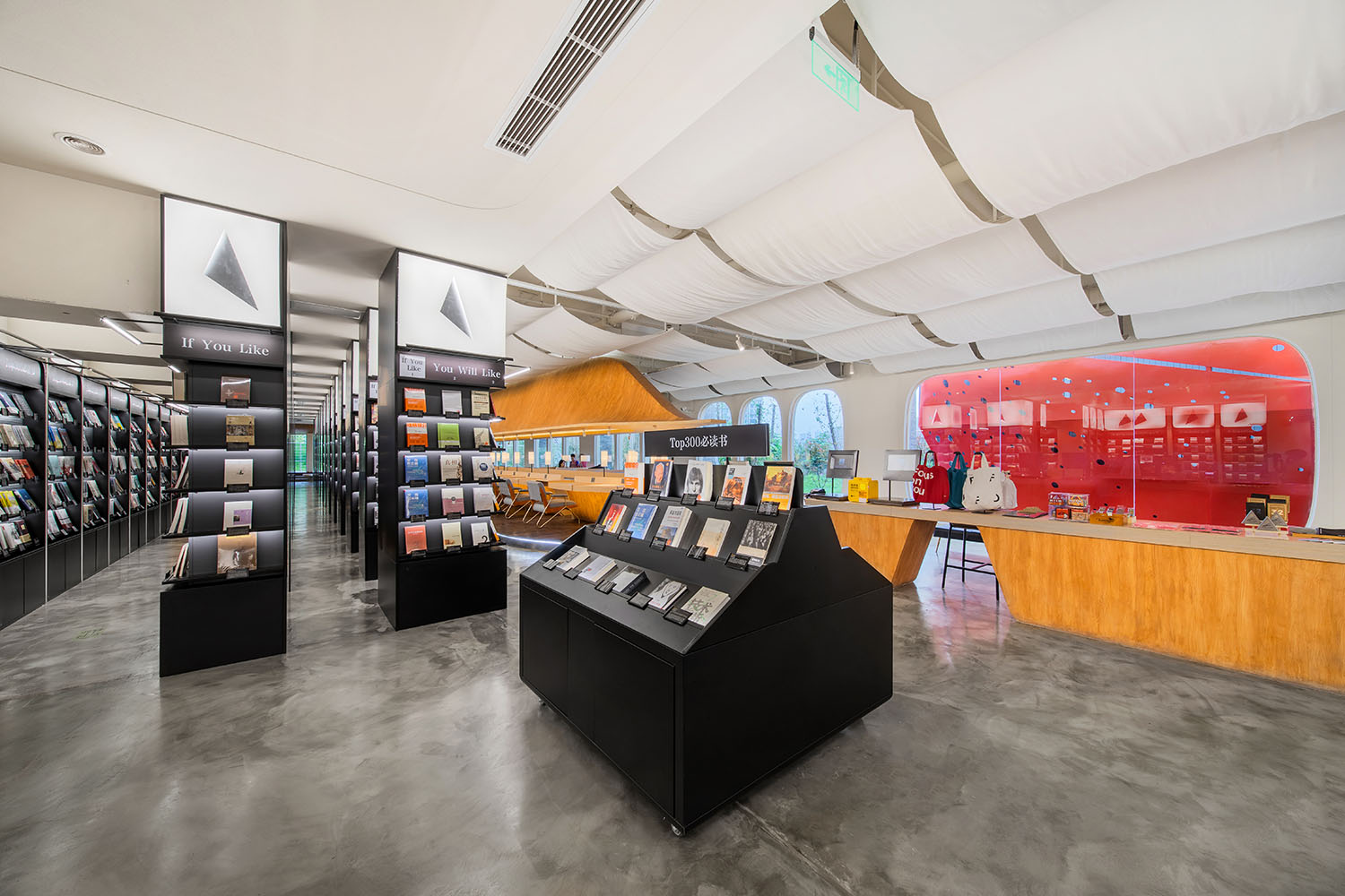
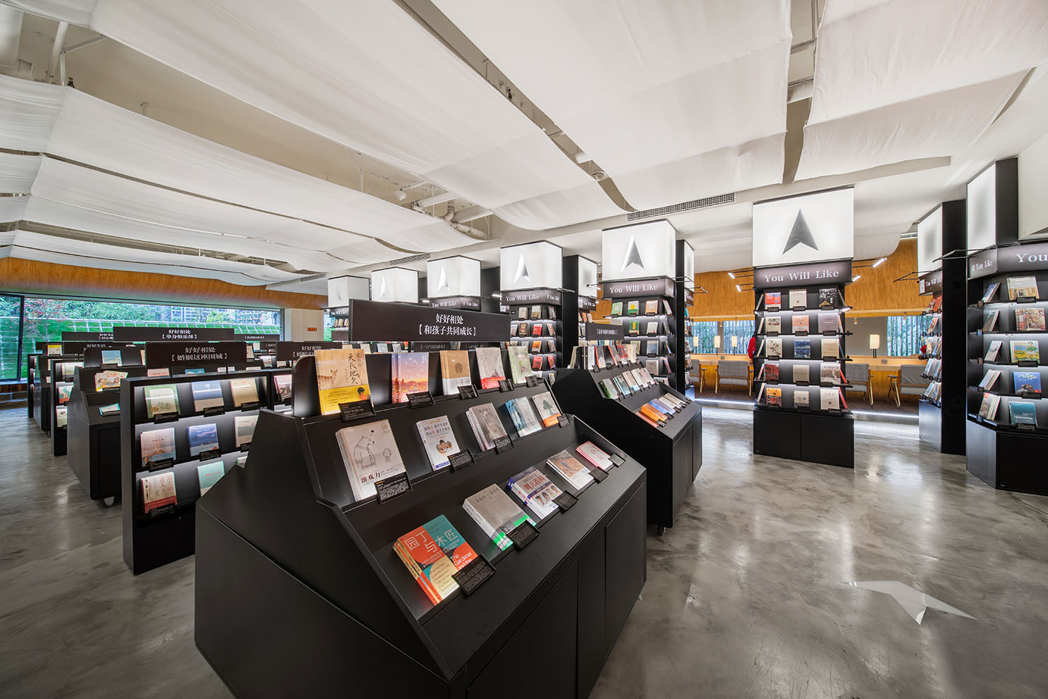
∇ 書架導航係統 The Bookshelf Navigation System ©未韜建築設計事務所
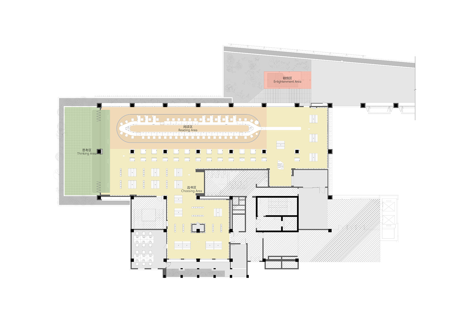
結合業主方多年書店運營的經驗總結,我們一同深入拆分了知識獲取的步驟及相對應的空間。1. 選書—知識的尋找—書架導航係統。 2. 讀書—知識的攝取—飛船書吧。 3. 思考—知識的消化—彎曲花園。4. 頓悟—知識的內化—紅色隕石。
In combination with client’s experience of running a bookstore, together we have divided the process of gathering knowledge into 4 stages and spaces. 1. Choosing – Search knowledge – The Bookshelf Navigation System. 2. Reading – Absorb knowledge – The Spaceship Reading Bar. 3. Thinking – Digest knowledge – The Curved Garden. 4. Enlightenment – Knowledge Internalization – The Red Meteorites.
∇ 功能分區圖 Function Zoning Analysis ©未韜建築設計事務所
場景營造 — 書架導航係統 Scenes – The Bookshelf Navigation System
一次全新的書籍分類探索
A brand new way to explore knowledge with a different classification of books.
每一本書都應該可以很方便地被觸碰、翻閱,而非把書籍用作裝飾,這是對於書籍最基本的尊重。
Every single book can be easily reached and read rather than using books as part of decoration. A basic respect to the books.
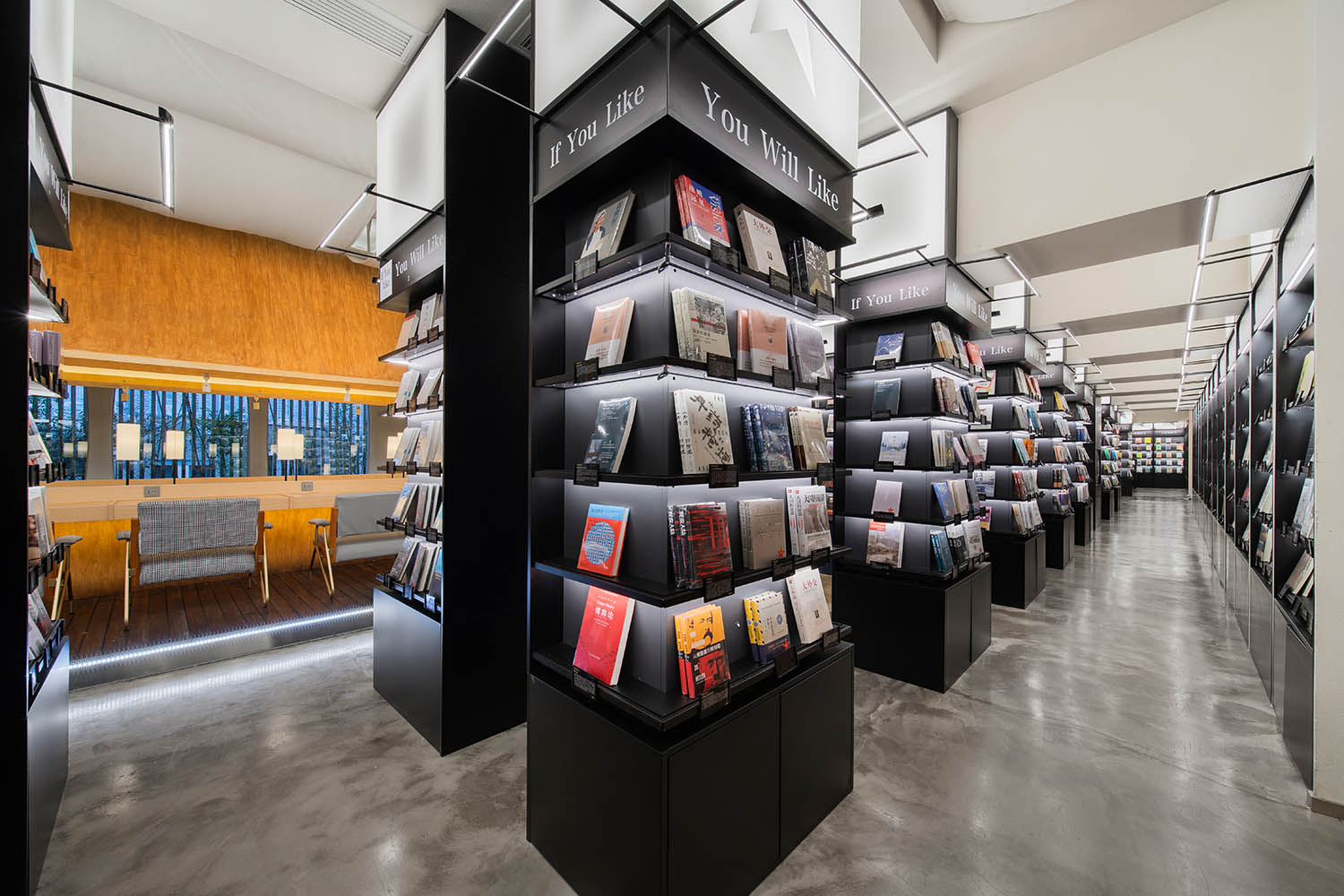
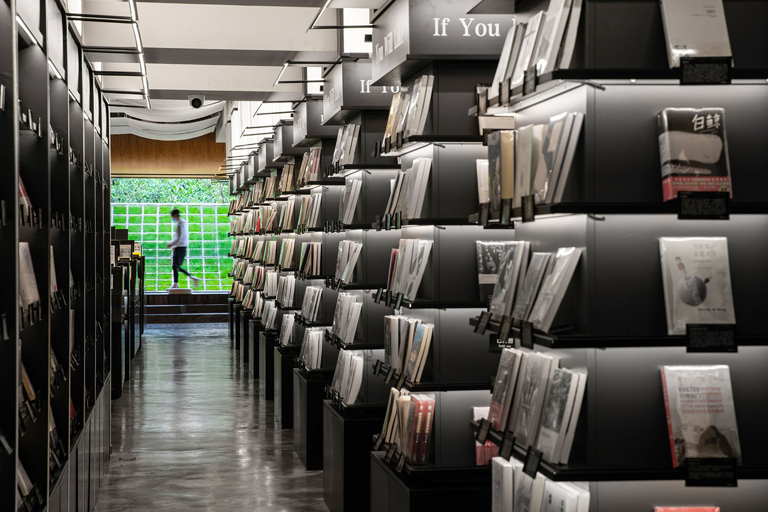
不論是書架還是書島,所有的書本全部麵向讀者,讓人們可以十分便利地與書的封麵產生互動,大大提高人們尋找知識的效率和興趣。
All the books are facing customer which make people easily to have relationship to the cover rather than side then increase the efficiency and interests during the process of searching knowledge.
書架頭頂燈箱的不同符號界定了不同大類的主題內容分區,同時單體書架對主題進行細分,不同於傳統的按學科的書籍分類方式,在同一個書架上針對同一個話題可能會出現文學、旅遊、科學技術、人物傳記等不同“類型”的書籍,用if you like, you will like的陳列方式引導人們發現潛在的可能感興趣的書籍。
Lights on top of the bookshelves defined different zoning by different icons. Different from traditional way of classification books, each bookshelf has a theme with different type of novel, science, art, etc. Using the display way of “if you like, you will like” to guide people discover the books they might be interested.
∇ 書架導航係統 The Bookshelf Navigation System ©未韜建築設計事務所
場景營造 — 飛船書吧 Scene – The Spaceship Reading Bar
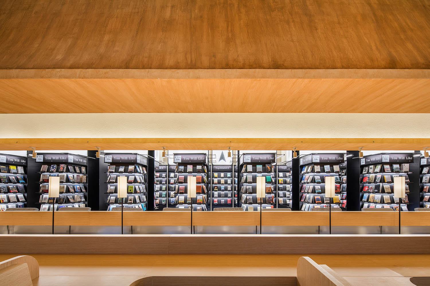
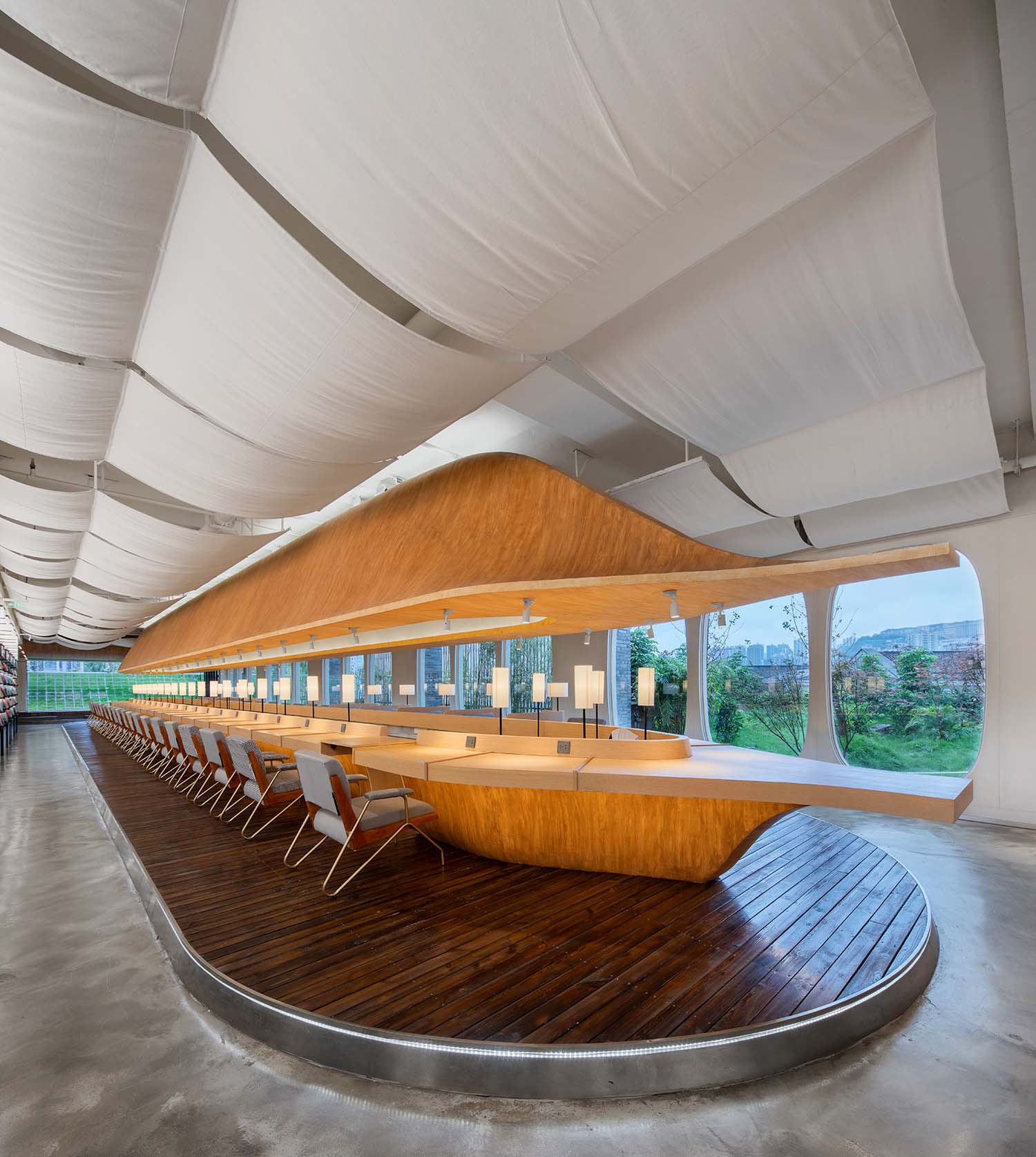
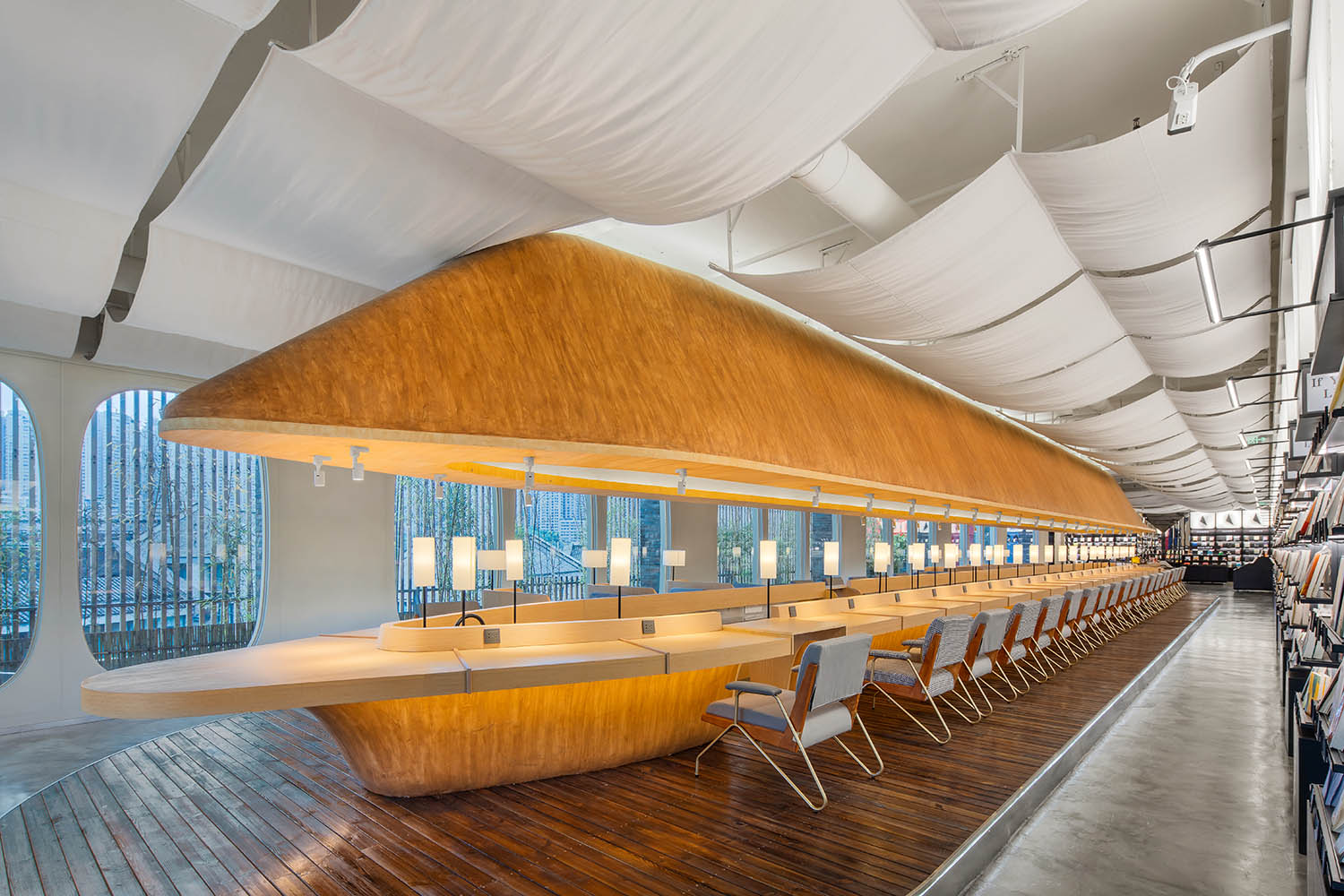
作為整個書店唯一的閱讀區,飛船書吧位於整個書店的主軸線上,既是一個巨大的物體,也是一個大空間中的小空間。飛船的造型象征著旅行,木紋材質象征著“亞當寶樹”,透過巨大的舷窗可以看到外麵的風景。
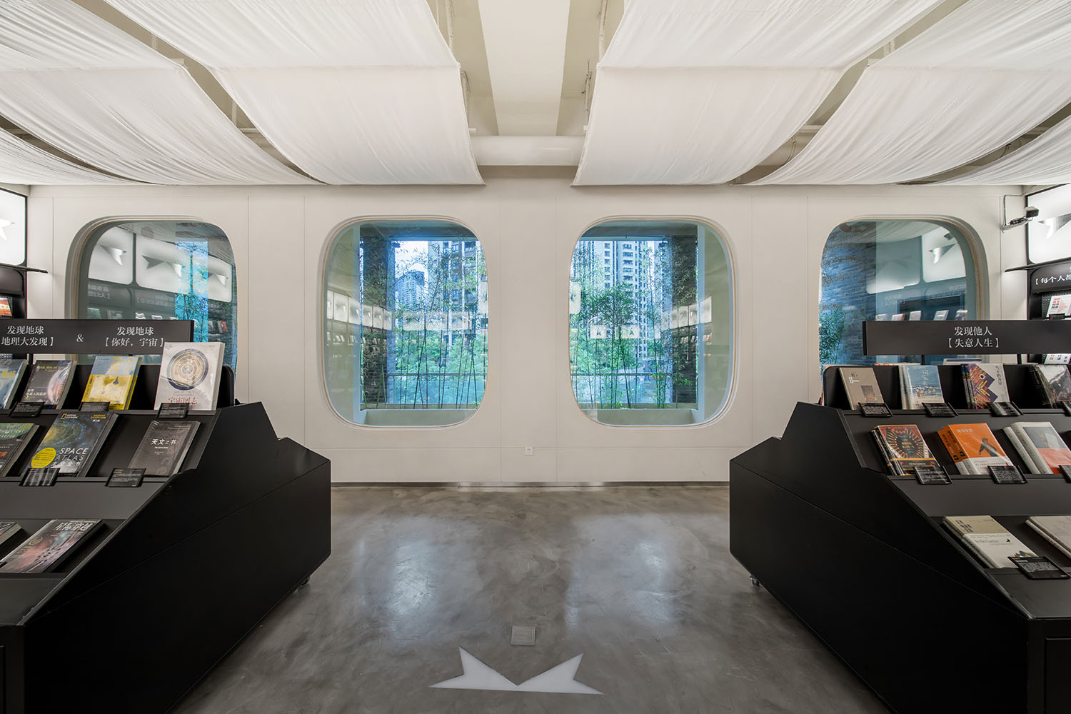
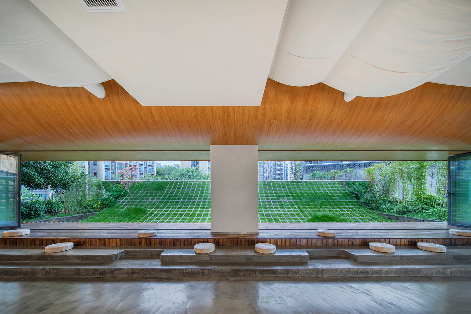
As the only reading area in the bookstore, the Reading Bar sits along the main axis of the whole space. It is both a huge object and a small space inside a bigger space. The shape of Spaceship stand for travelling, wood pattern stand for “Tree Adam”, people can see the view out through the portholes.
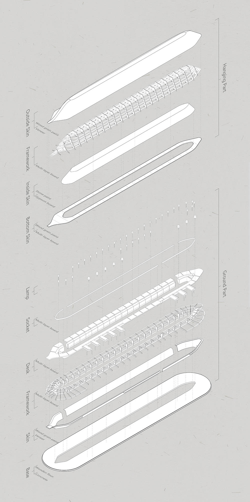
∇ 飛船書吧展開軸側圖 Reading Bar Exploded AXO ©未韜建築設計事務所
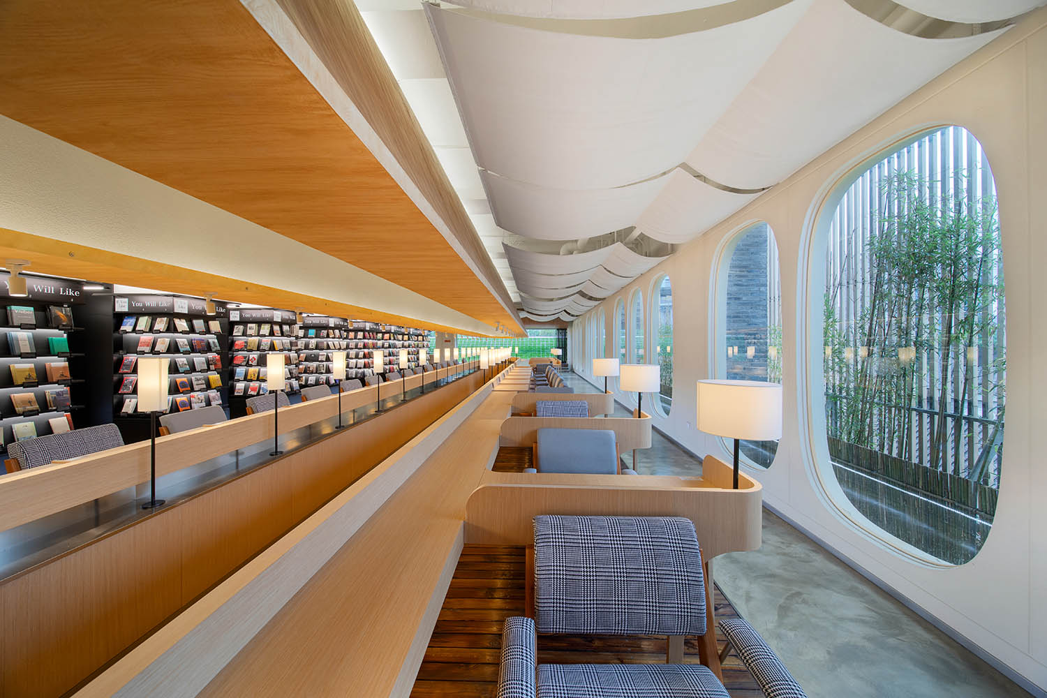
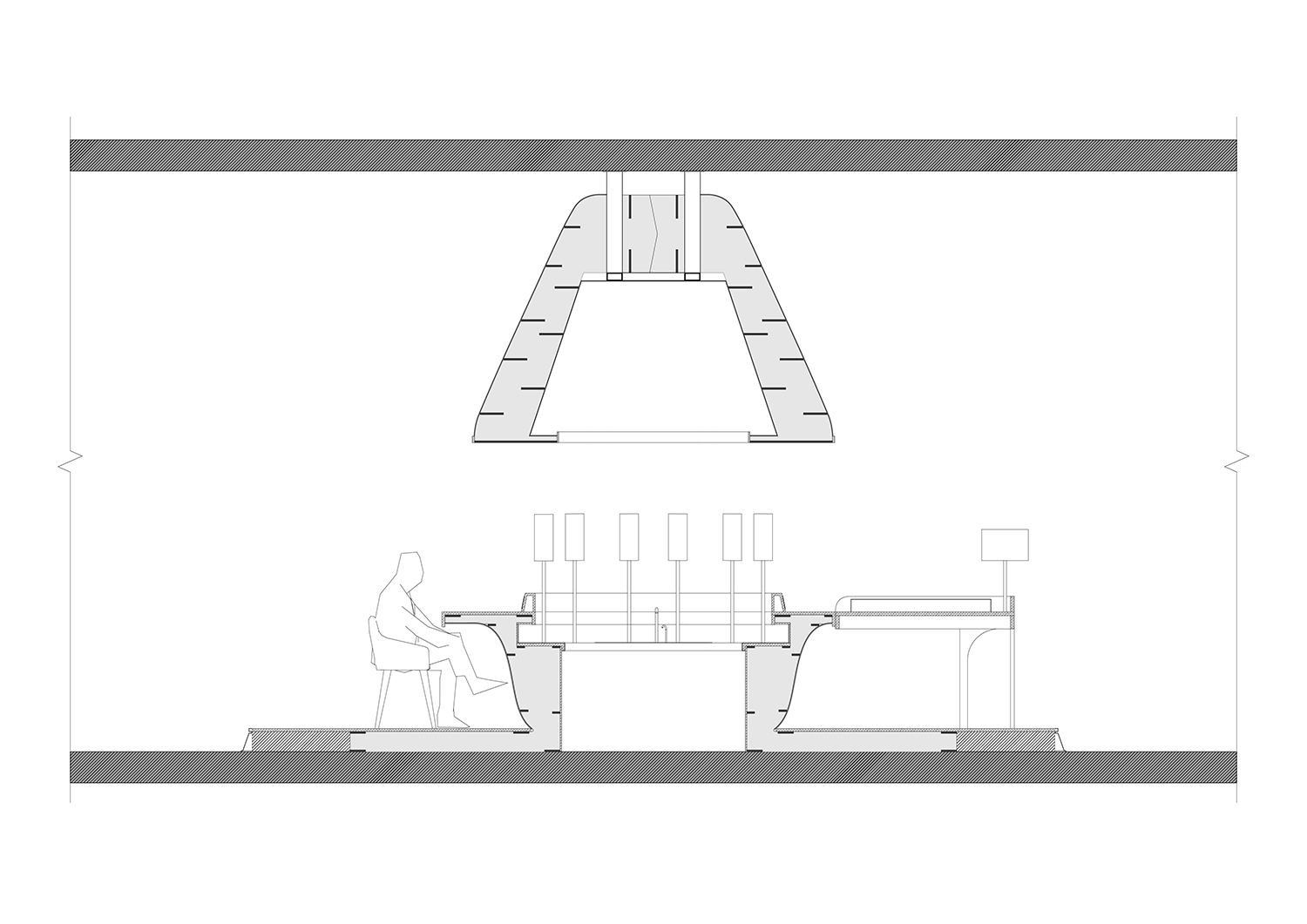
飛船兩側搭載乘客,中間是服務人員通道範圍服務全吧台,保證每一個讀者都可以被服務到。座位與座位之間的隔板保證了各自的相對私密,每位乘客的座位都配具了專屬的充電接口與小台燈,坐下時,飛船乘務員會走到麵前,悄悄打開頭頂的閱讀燈,並隨時為您服務。
Passengers sits on both side of the spaceship, inside is a channel for waiters to serve everyone sits along the bar, to make sure every single customer can be served. Each seat is separated by a partition wood on the surface to keep privacy and each seat has a private socket and a light. When you sit down, waiter come over, turn on the top light and adjust the angle to facing your book.
∇ 飛船書吧 The Spaceship Reading Bar ©未韜建築設計事務所
場景營造 — 彎曲花園 Scene – The Curved Garden
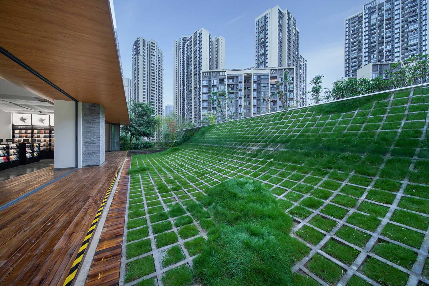
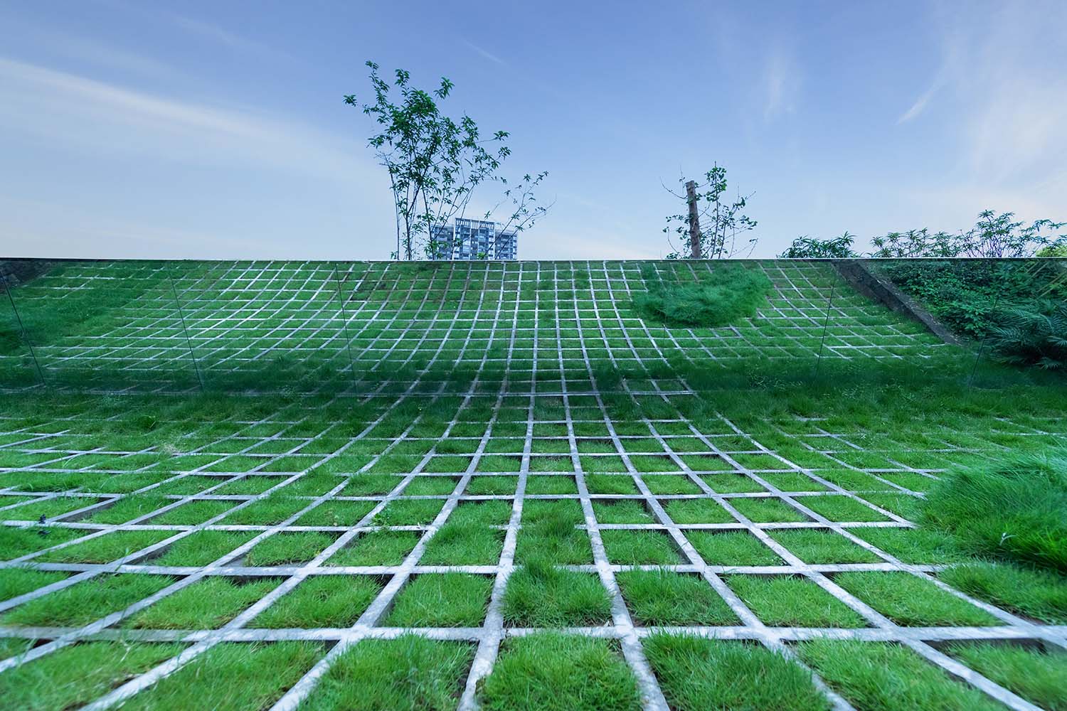
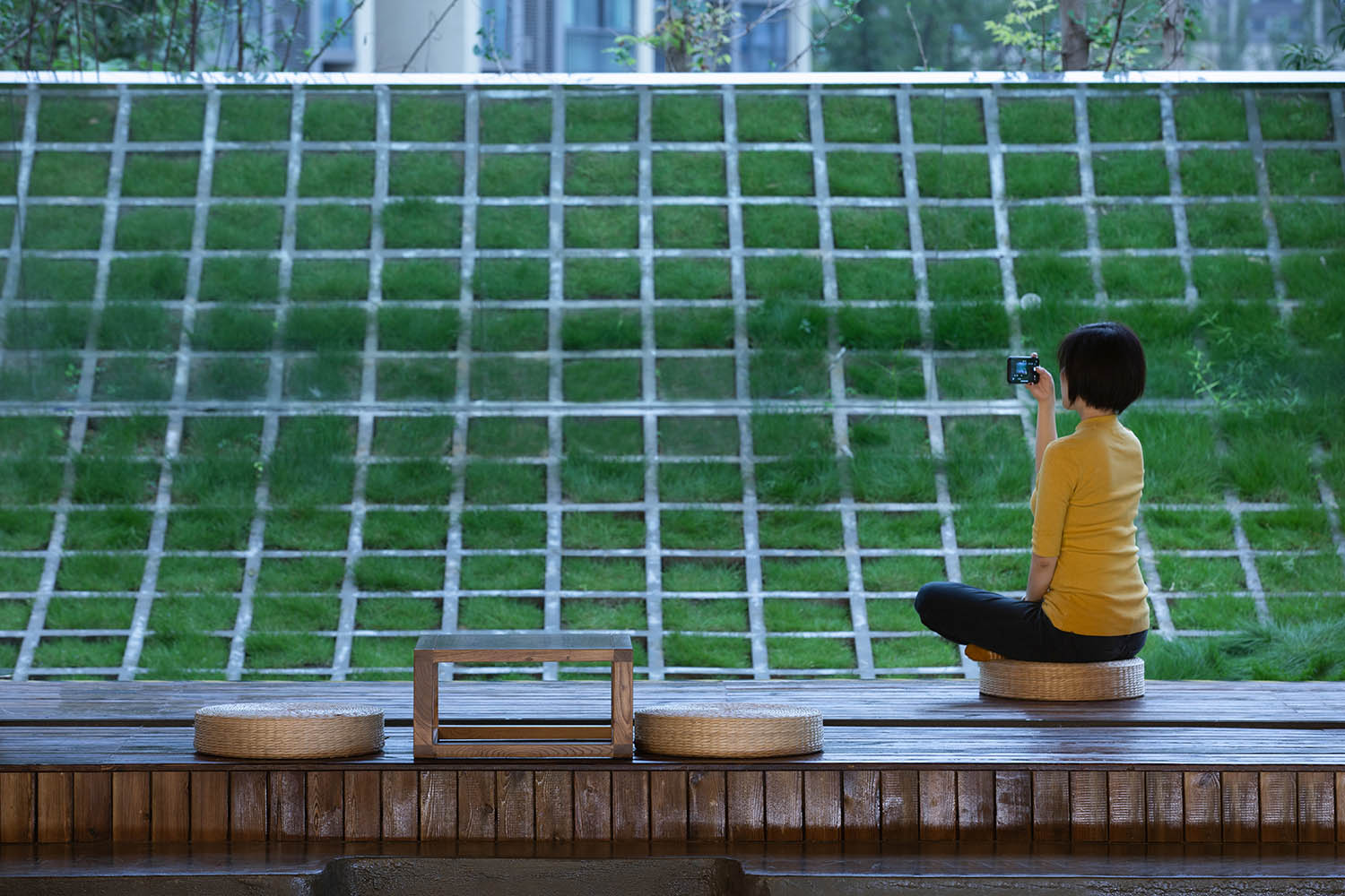
一個文明在探索一個未知宇宙的一開始是極其謹慎的,隻能坐下向外觀望,而不能涉足的景觀設計提供了一個坐下思考的場所,讓人們靜下心來觀察,並喚醒對外部自然環境的敬畏之心。混凝土網格的彎曲和鏡麵效果的疊加象征著無限延伸的彎曲空間。
When one civilization first come to a unknown universe, they are normally cautious. To watch outside without going out. The landscape has provided a place for people to sit and think, to calm down and observe and to wake up the heart of reverence to the nature. The curved concrete grid work together with the mirror to create the effect of an infinite extension curved space.
∇ 彎曲花園 The Curved Garden ©未韜建築設計事務所
場景營造 — 紅色隕石 Scene – The Red Meteorite
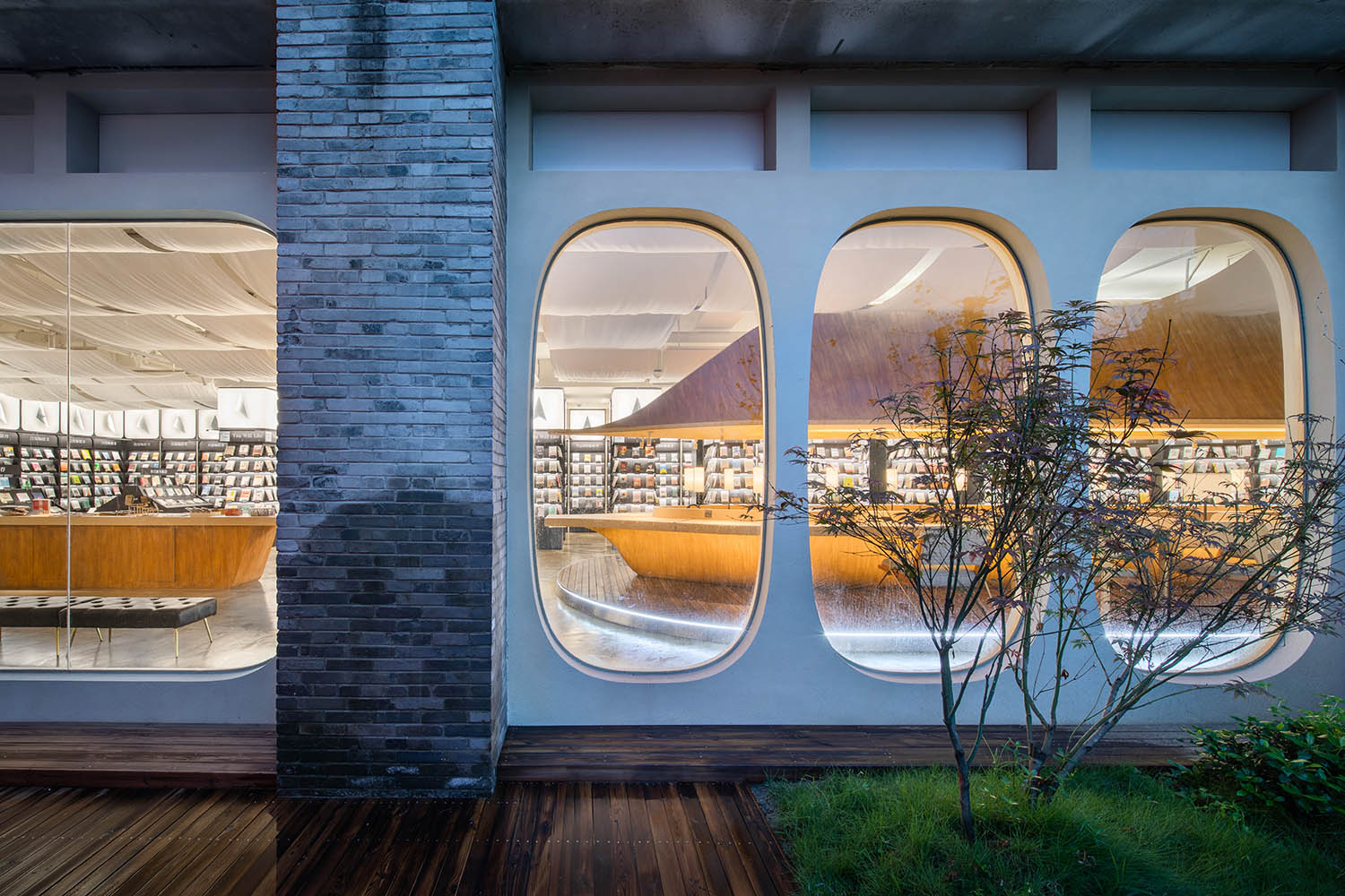
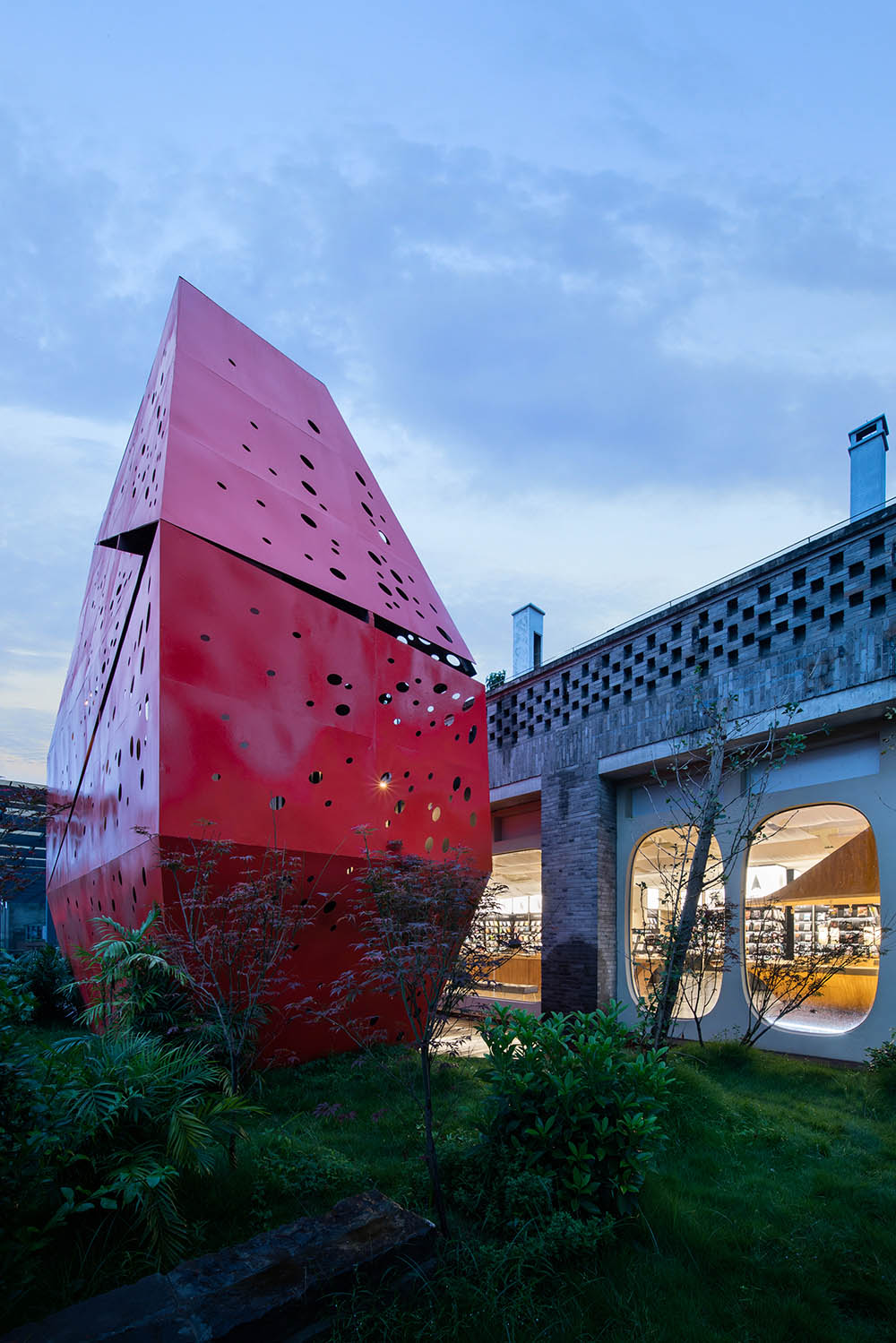
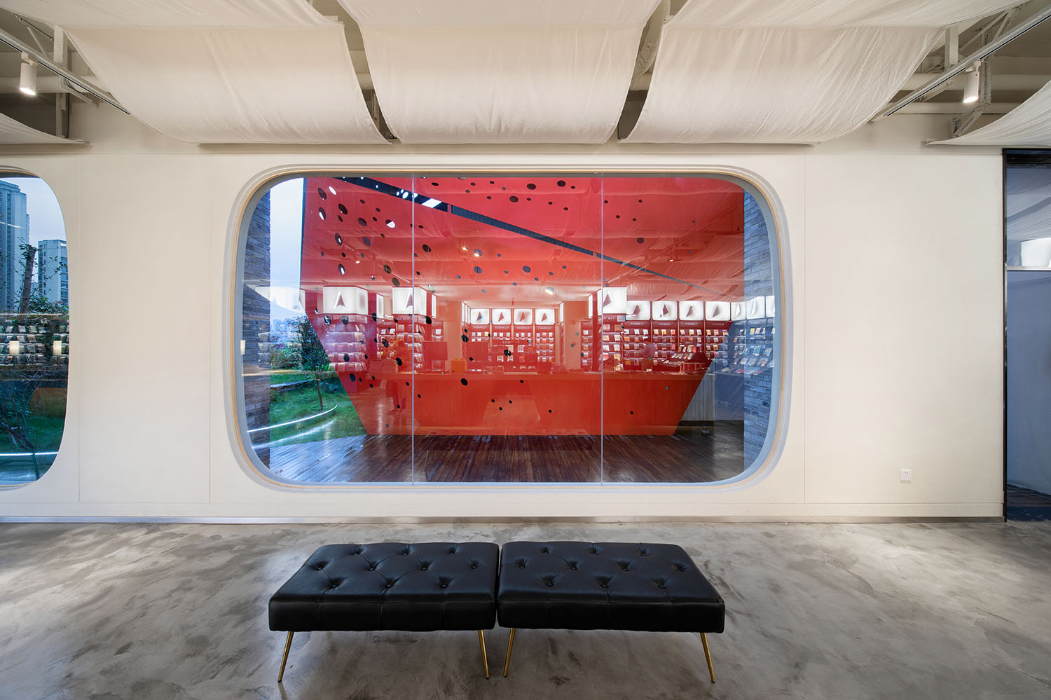
從“飛機窗”望出去,一邊是綠意盎然的地球,一邊是連接時空的巨大紅色隕石。紅色隕石是通往樓上古星院的步行通道,經曆了閱讀吸收的新人類進入隕石,穿越,頓悟,到達上層開始與人講述與交流。
View from the big portholes, green planet on one side, a red meteorite on the other. The red meteorite is a staircase to the upper floor GUGA Garden which symbolizes the connection between time and space, people who finished reading books walk into the meteorite, cross and enlightened, then talk and communicate with people after they reach the upper level.
∇ 紅色隕石The Red Meteorite ©未韜建築設計事務所
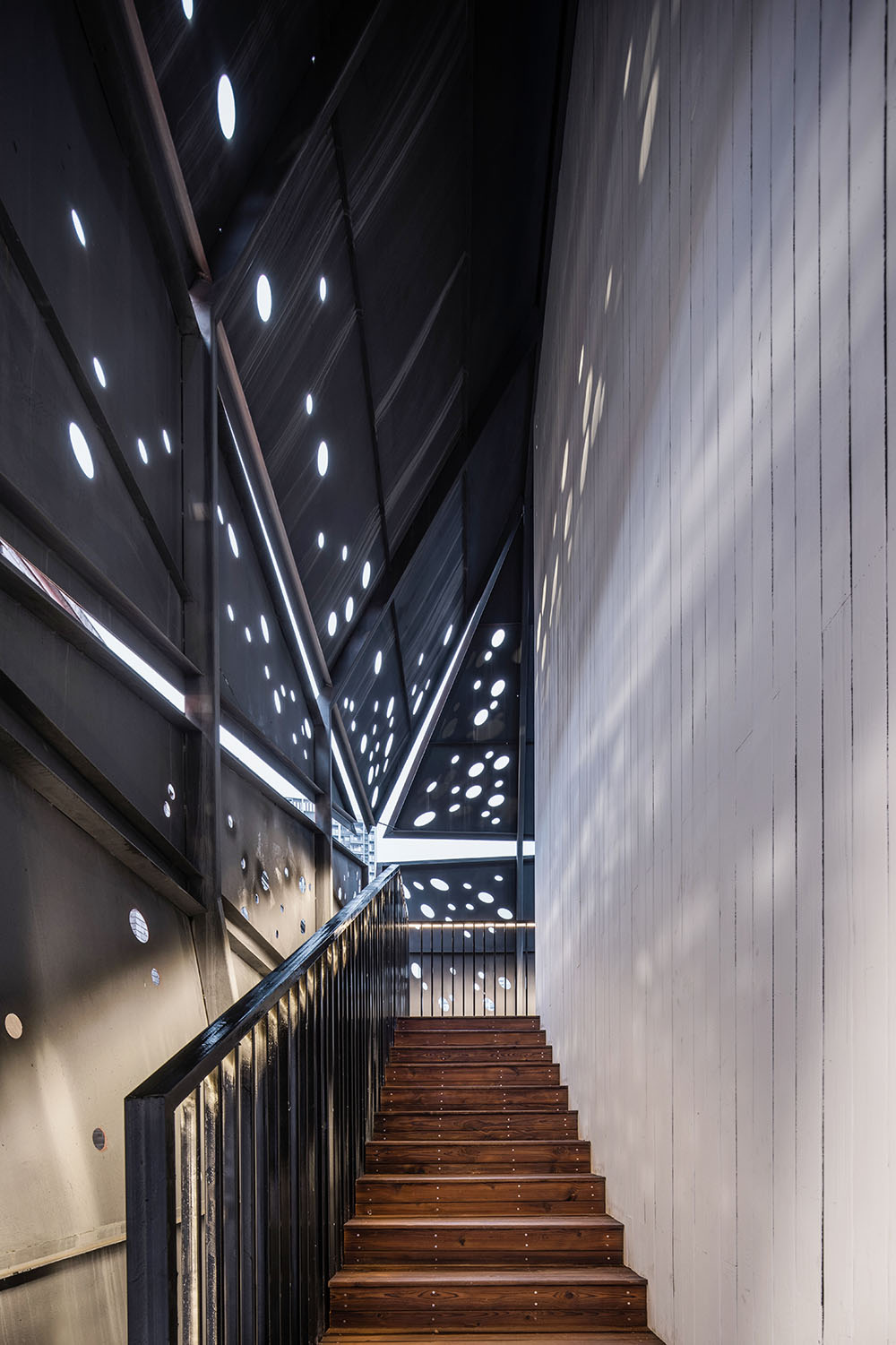
不標準的異形設計給原本平平無奇的空間增添豐富的趣味體驗,光芒樣式的鏤空的紅色鋼板在樓梯通道內呈現不同的光斑效果,與飛機窗和飛船結合,貫穿整個空間,組成了隻屬於南之山·古騰堡星漢書店的星際遐想。
Irregular shape provides interests to the space, the shape of light on the red steel board creates variation shadows inside the staircase. Together with the spaceship reading bar, through the whole space, a star daydream just belongs to GUGA Books.
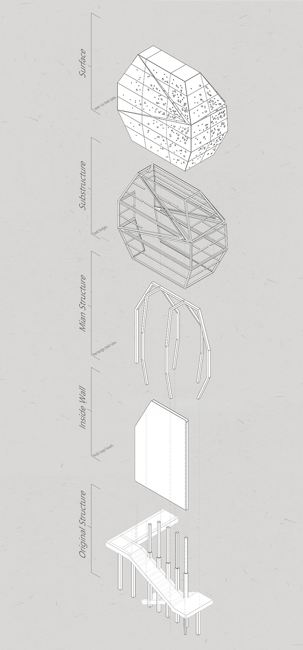
∇ 紅色隕石展開軸側圖 Red Meteorite Exploded AXO ©未韜建築設計事務所
∇ 隕石內景 View inside the Meteorite ©未韜建築設計事務所
結語 Ending
今天,當飛船吧台需要排隊入座的時候,我們看到所有的家長們都在自覺控製小朋友的音量,看到了一個心目中可以安靜閱讀的書店,看到了書籍的銷售良性上漲,得到大量積極反饋,在吸引眼球的同時真正成為了一個市民願意前來閱讀學習的空間。
Today, there is already a queue waiting to have a seat along the reading bar. We see all the parents are trying hard to control the volume of their children, we see an ideal bookstore where people can read quietly, we see the books are selling beyond expectation, we have lots of positive feedback. The bookstore successfully become a place which is both eye-catching and attractive for citizens come for reading.
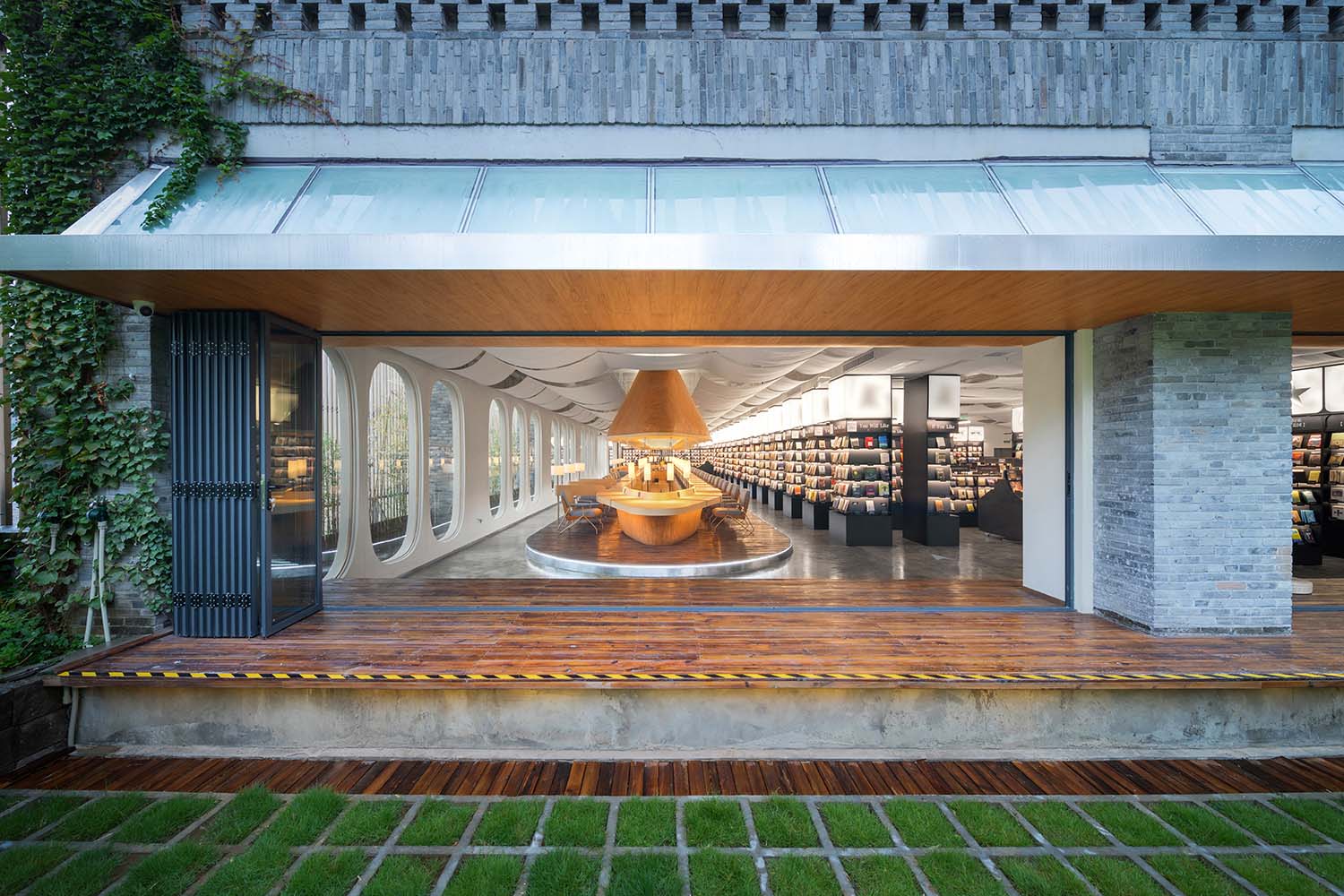
∇ 庭院外景 View from the garden ©未韜建築設計事務所
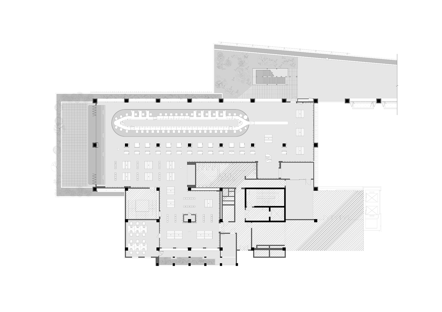
∇ 平麵圖 Plan ©未韜建築設計事務所
∇ 飛船書吧剖麵圖 Reading Bar Section ©未韜建築設計事務所
項目信息
項目名稱:南之山 古騰堡星漢 書店
設計團隊:未韜建築設計事務所+Giorgio成於思
聯係郵箱:wtarchitects@gmail.com
主創設計師:李未韜,李博 + Giorgio成於思
項目設計師:張鼎
設計團隊:易思琦,丁明新,陳煜嫻,鄧林
設計年份&完成年份:2020
項目地址:重慶天地12棟4F
建築麵積:750㎡
施工單位:重慶國恒建築裝飾工程有限公司
攝影:三棱鏡
客戶:重慶南之山文化產業發展有限公司
Project Name: GUGA Books
Design Team: WT Architects + Giorgio Cheng
Email :Address: wtarchitects@gmail.com
Design: Weitao Li, Bo Li + Giorgio Cheng
Project Designer: Ding Zhang
Design Team: Siqi Yi, Mingxin Ding, Yuxian Chen, Lin Deng
Design Year & Finish Year: 2020
Project Address: 4F, Building 12, Chongqing Tiandi
Area: 750 ㎡
Construction Team: Chongqing Guoheng Decoration Engineering Co.LTD
Photographer: Prism Image
Client: Chongqing NBooksClub Cultural Industry Development Co.LTD


