全球設計風向感謝來自 AYZ STUDI O 的辦公空間案例分享:
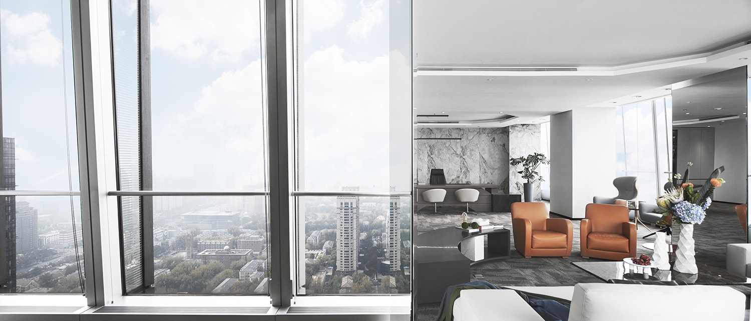
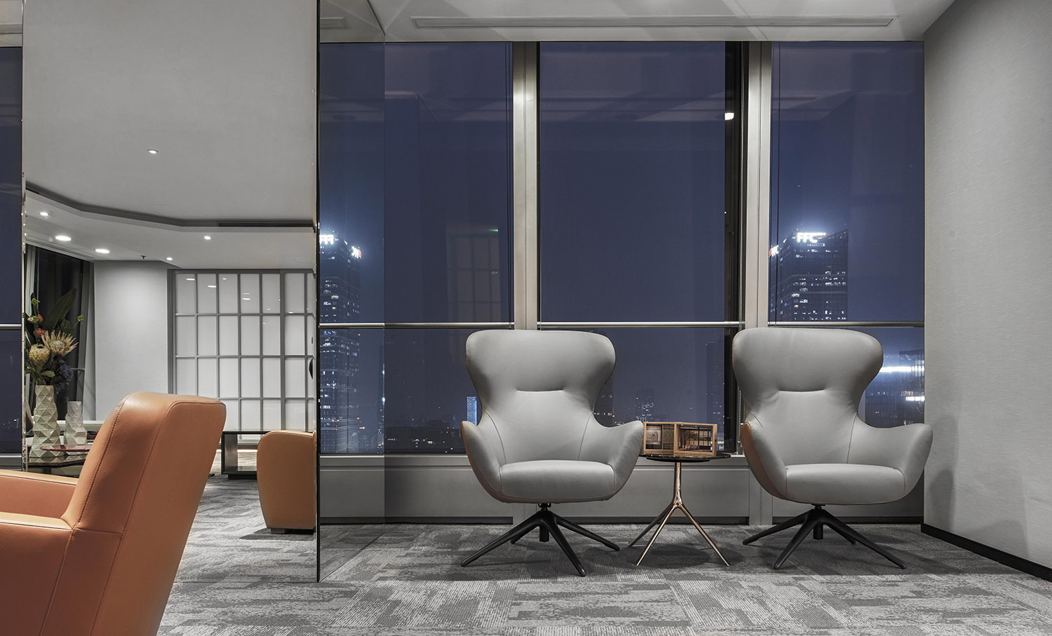
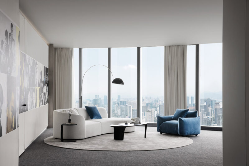
位於北京國貿CBD的高層寫字樓中,AYZ STUDI O為一家年輕的谘詢公司完成了新辦公室的建造。與傳統辦公項目不同,材料的創造力與愉悅睿智的當代文人生活被整合進空間,使其擁有了強烈的表達力與感染力。在視野絕佳的落地窗前,CBD棱角分明的城市輪廓線與辦公空間形成了張弛有度的拚貼連接。
In the China World Trade Center Tower III, a 74-story skyscraper in Beijing, AYZ STUDI O architectural design team completed a new office for a young consulting company. Unlike traditional office,the creative materials and the pleasant and wise contemporary literati lifestyle were integrated into the space, giving it a strong expressive and appealing sense.Viewed through the floor-to-ceiling windows, the angular urban outline of CBD was connected with the office space in a relaxing collage way.
智 / Wisdom
柔軟的空間動線
Soft Space Walking Paths
子曰:“飯疏食,飲水,曲肱而枕之,樂亦在其中矣。不義而富且貴,於我如浮雲。”
Confucius said: “It is happiness to eat simple food, drink water and sleep with head on the arms as pillow. The unjust wealth and fame are meaningless like clouds to me.”
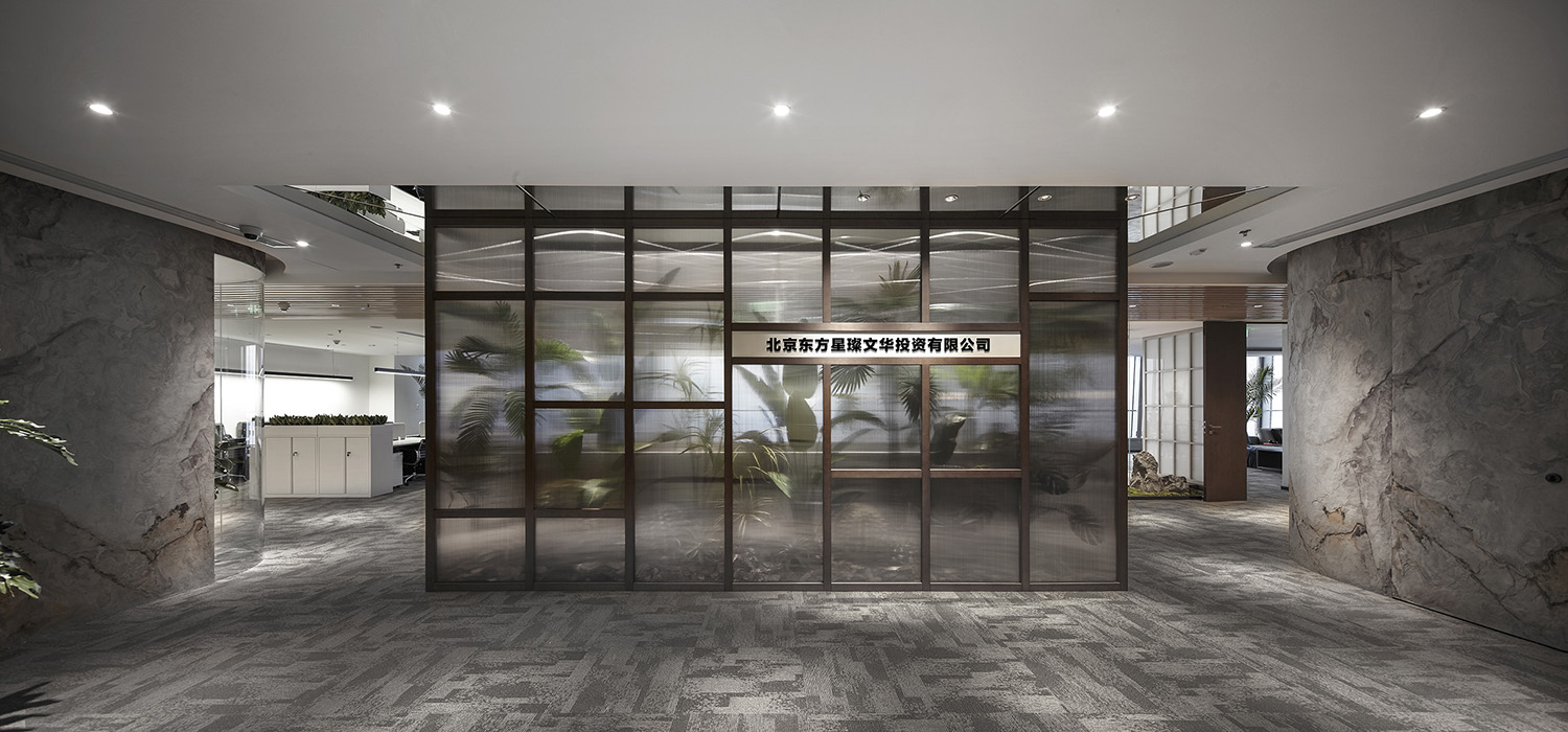
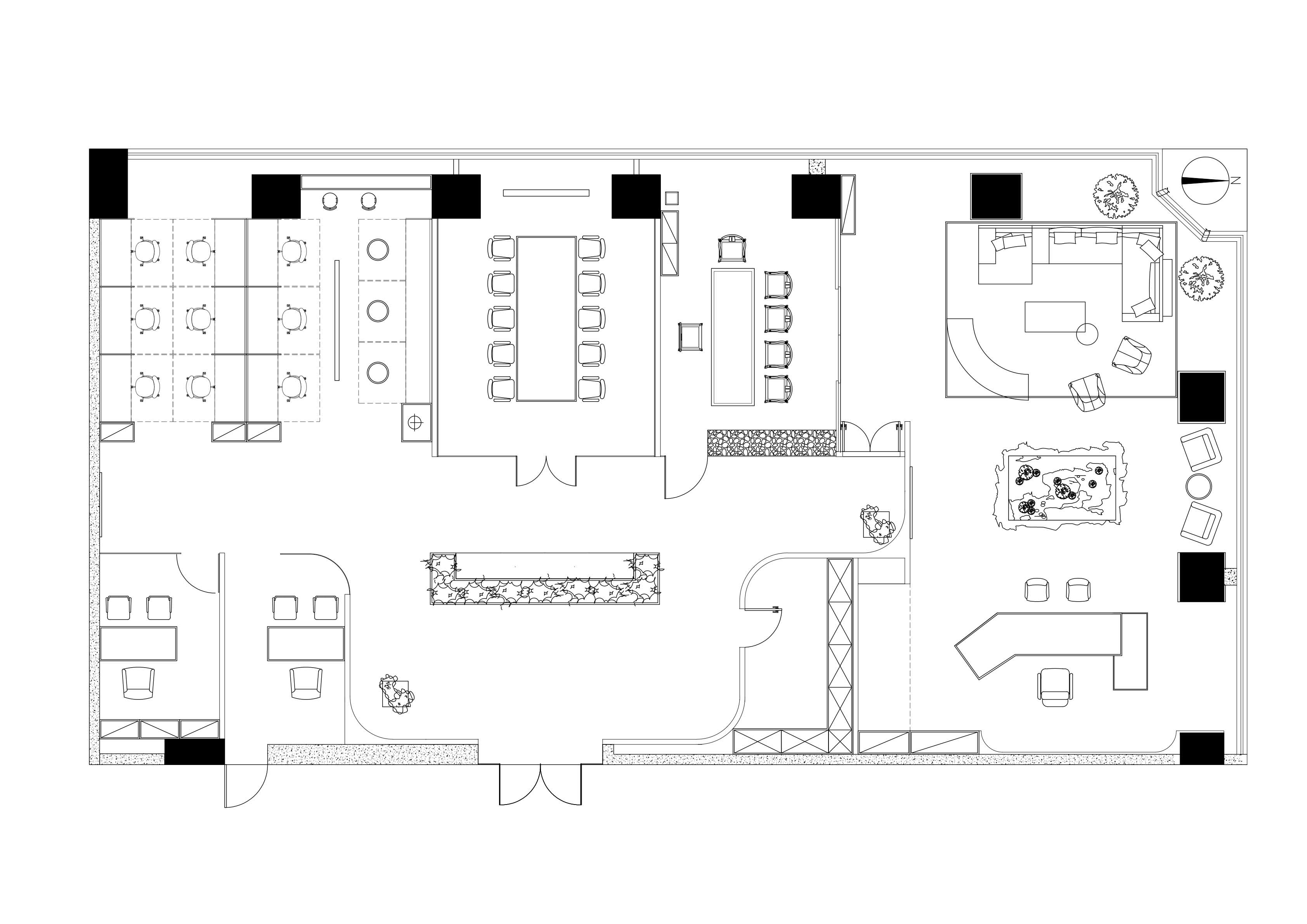
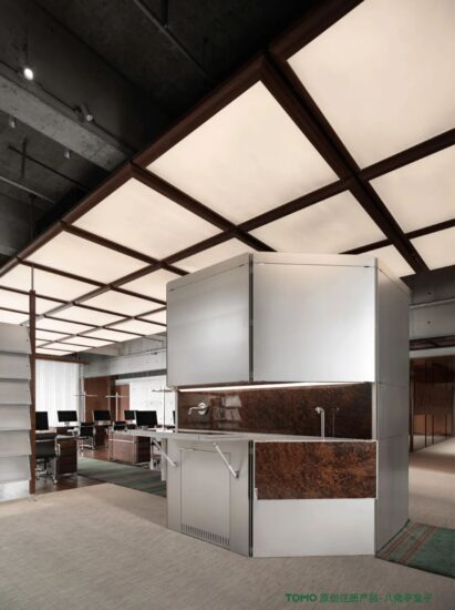
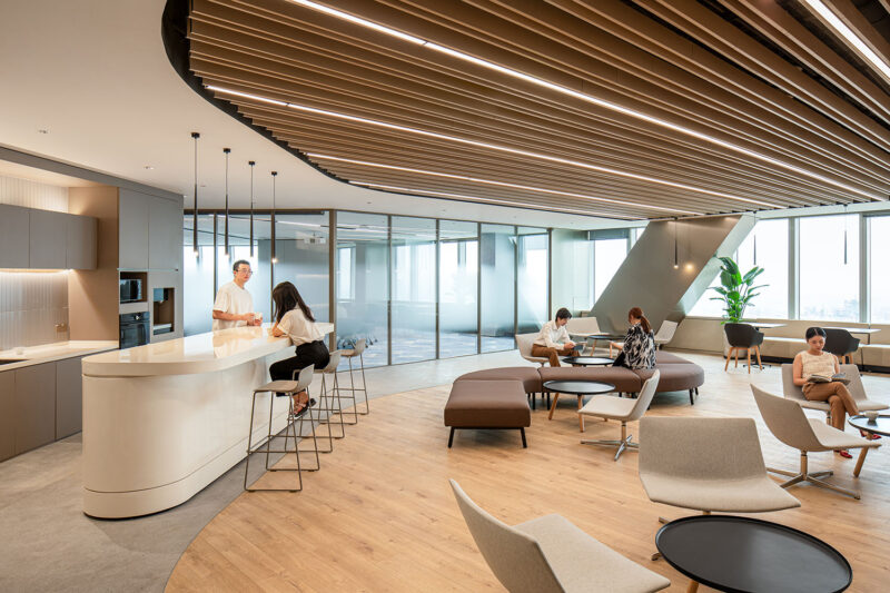
在全新的辦公場所中,密集排布的傳統辦公區消失殆盡,以入口茶水區為中心的多條動線實現了跨功能區協調性。
In the brand-new office space, the traditional densely arranged working areas disappeared. Instead, multiple walking paths centered on the tea area at entrance achieved cross-functional coordination.
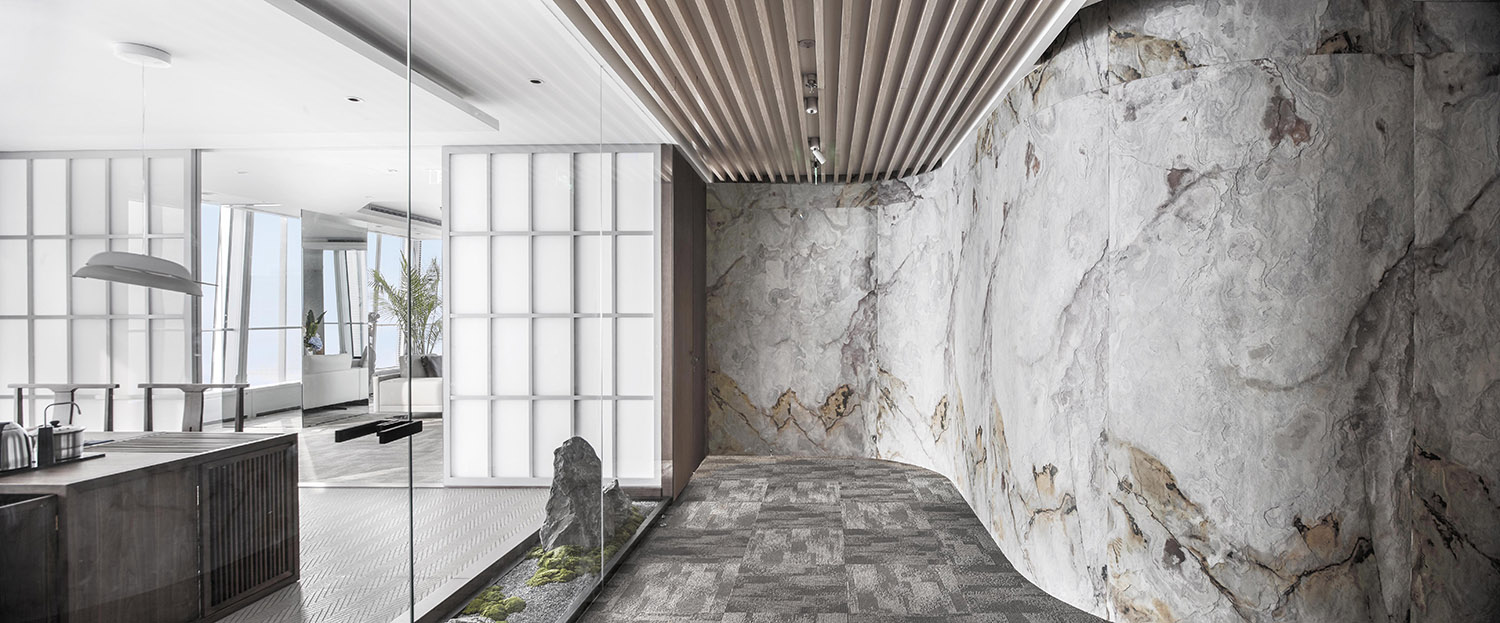
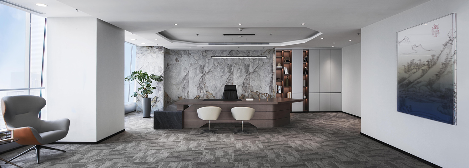
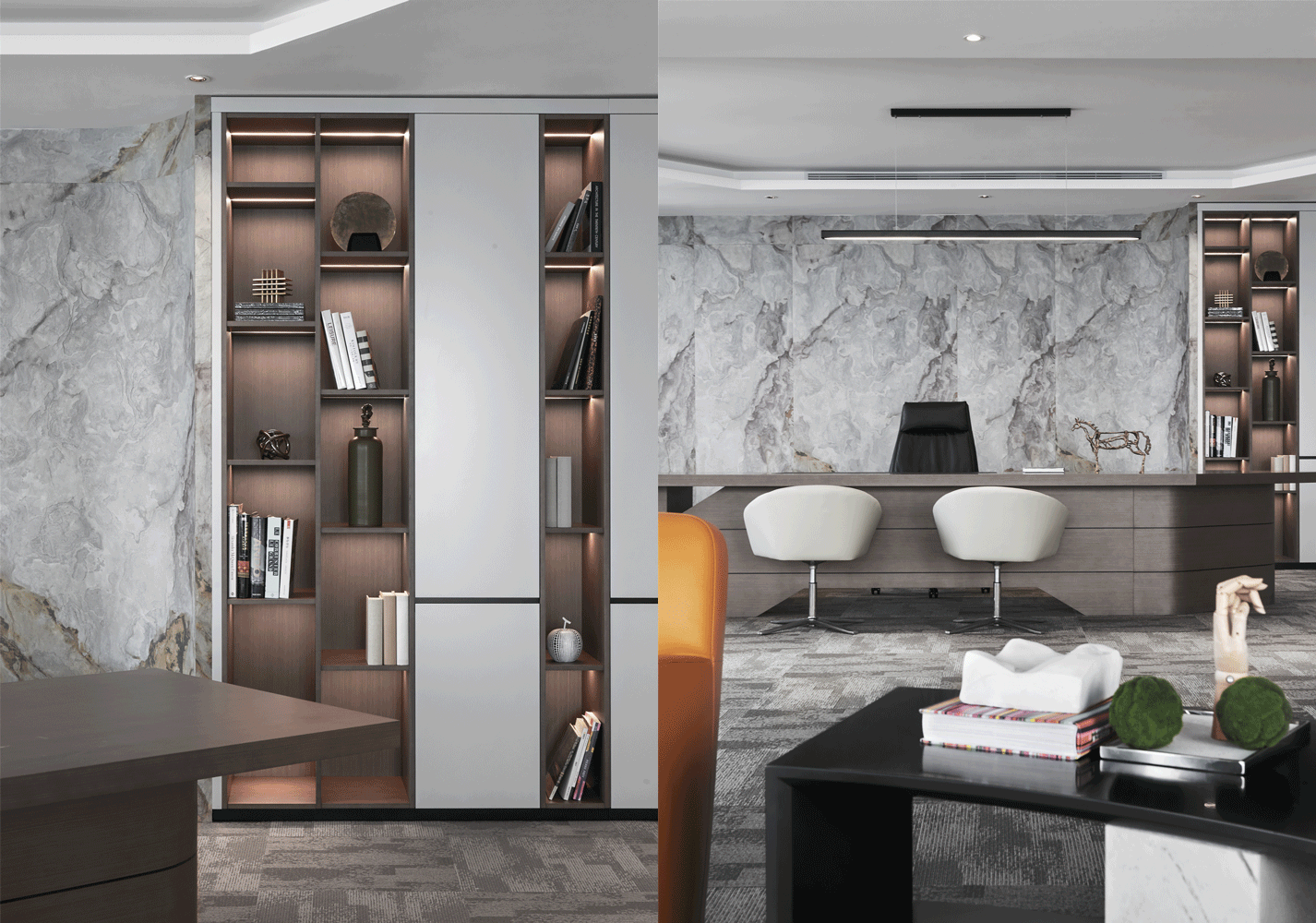
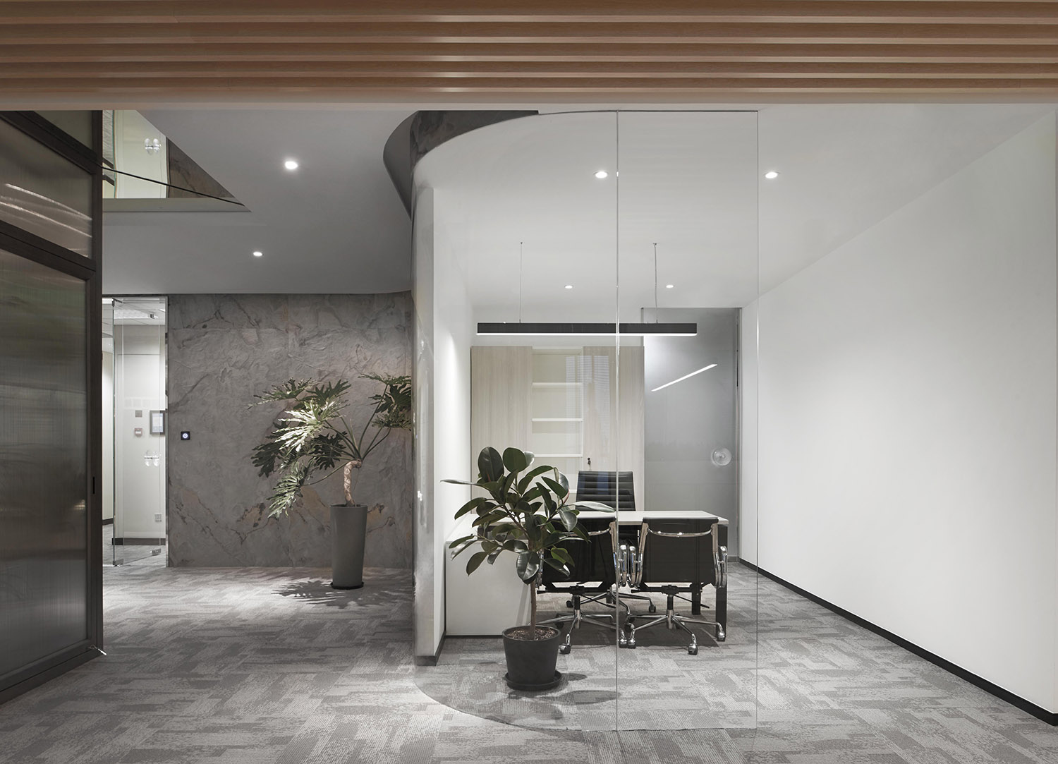
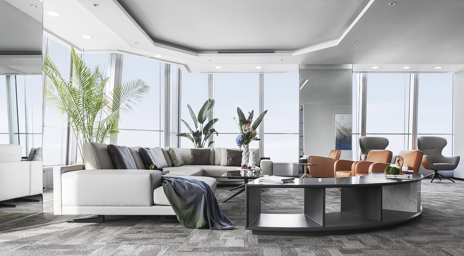
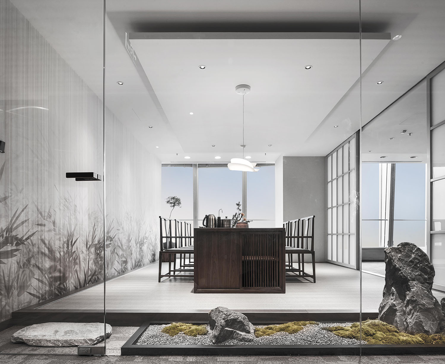
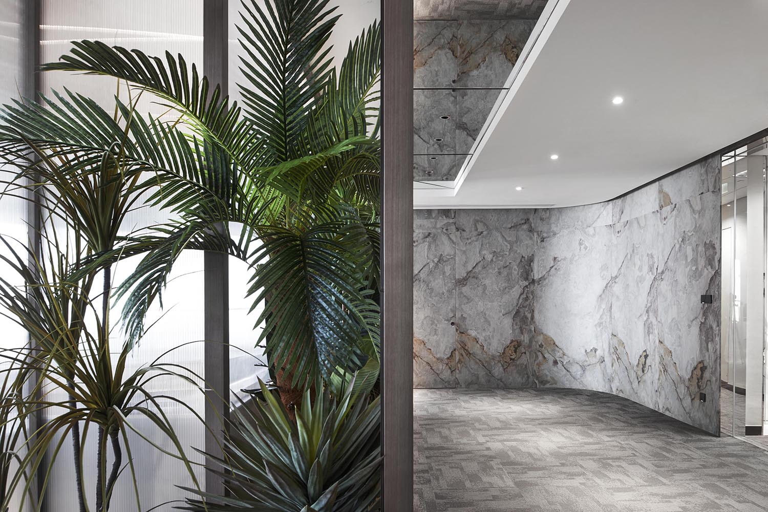
跟隨山石紋理的曲麵牆可以單獨直達會客區和董事長辦公室,兩個區域共同占據北側視野最開闊的120㎡。會議室與董事長辦公室連通,而茶室與會議室作為公共活動區與茶水區相對而設,玻璃幕牆將其景觀納入到同一個更大的視野當中。
Following the rock-textured curved wall, there were the meeting area and the chairman’s office, both of which occupied 120 square meters with the widest view on the north side. The meeting room was connected to the chairman’s office, and the tea room and meeting room as a public activity area were set opposite to the tea area. The glass curtain wall brought the landscape into a larger view.
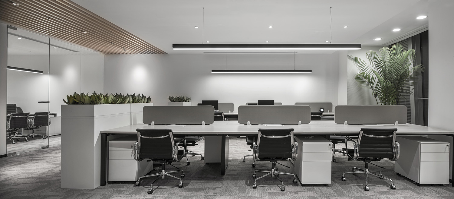
位於南側的公共辦公區與兩個獨立辦公區既可以通過進入後的常規動線沿曲麵牆抵達,同時在走廊上向外打開的門扇提供了另一條快速進入的捷徑。
中心茶水區作為交通樞紐將空間編織貫通起來,幾乎全開放的功能區在關聯中醞釀出恰好的凝聚力,鬆弛的睿智氛圍使整個空間呈現出柔軟的理性。
Except for the regular traffic line along the curved wall, the public working area and the two independent offices on the south could be reached by the door opened outward in the corridor as a shortcut.
The central tea area, as a transportation hub, connected the entire space. The almost fully open functional space enhanced the cohesiveness of staff, and the relaxed and wise atmosphere made the whole space appear soft and rational.
楽 / Delight
消弭公私社交邊界
Eliminate Public-Private Boundaries
子曰:“知之者不如好之者,好之者不如樂之者。”
Confucius said: “Knowing it is not as good as loving it; loving it is not as good as delighting in it.”
雖然業主麵向的客戶多來自傳統行業精英群體,但辦公空間仍決定以更年輕的姿態向外輸出其理念和經營策略,走出刻板的安全地帶之後,迎來愉悅。無論從室內主色調、空間總體氛圍亦或是AYZ STUDI O想表達的態度,靈感均注入自然樂趣。
Although most of the clients targeted by the owners came from the elite of traditional industries, the office design insisted to showcase its ideas and business strategies in a younger manner. After getting out of the rigid safety zone, it would usher in joy. Whether from the space palette, the overall atmosphere, or the attitude that AYZ STUDI O wanted to express, the inspiration was infused with nature and delight.
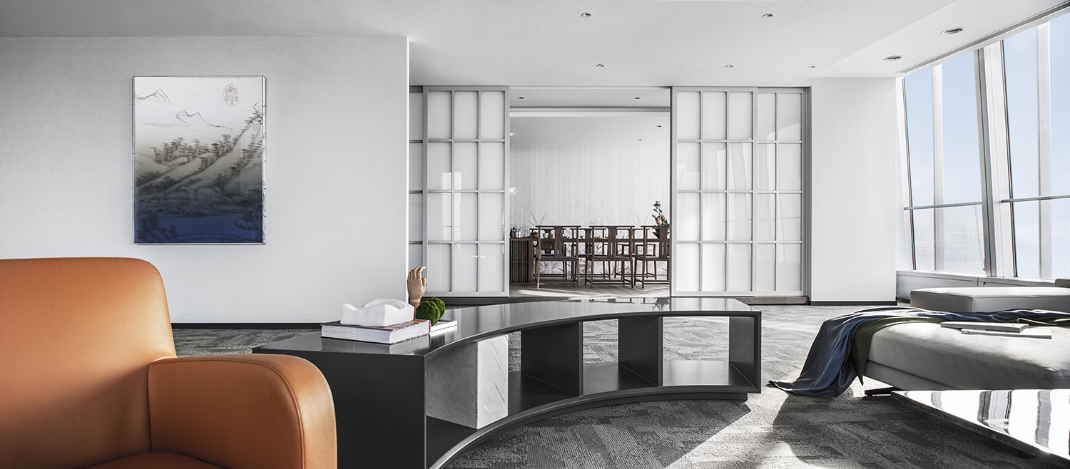
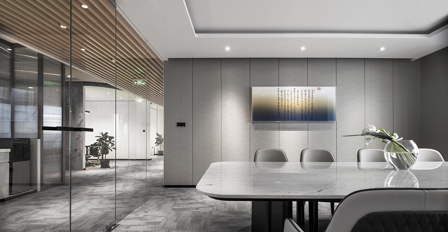
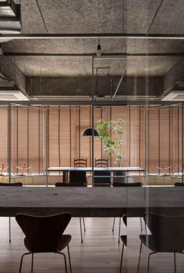
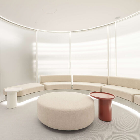
更為簡潔的會議室、圍合的圓形討論區以及當代化的東方茶室提供了空間中三個層次的社交場所,公私間的明確壁壘消弭,旨在更自在的社交方式可以隨時發生。
The more concise meeting room, enclosed circular discussion area, and contemporary oriental tea room provided three levels of social spaces. The boundary between public and private areas was eliminated, and a more comfortable way of socializing could happen there at any time.
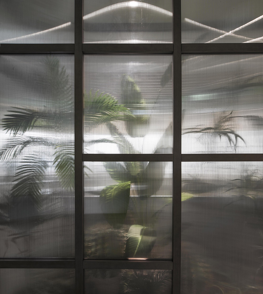
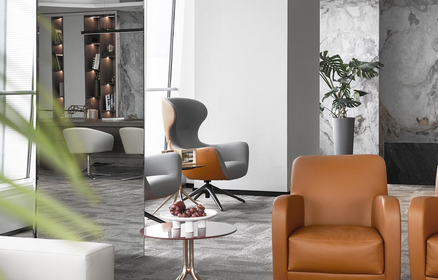
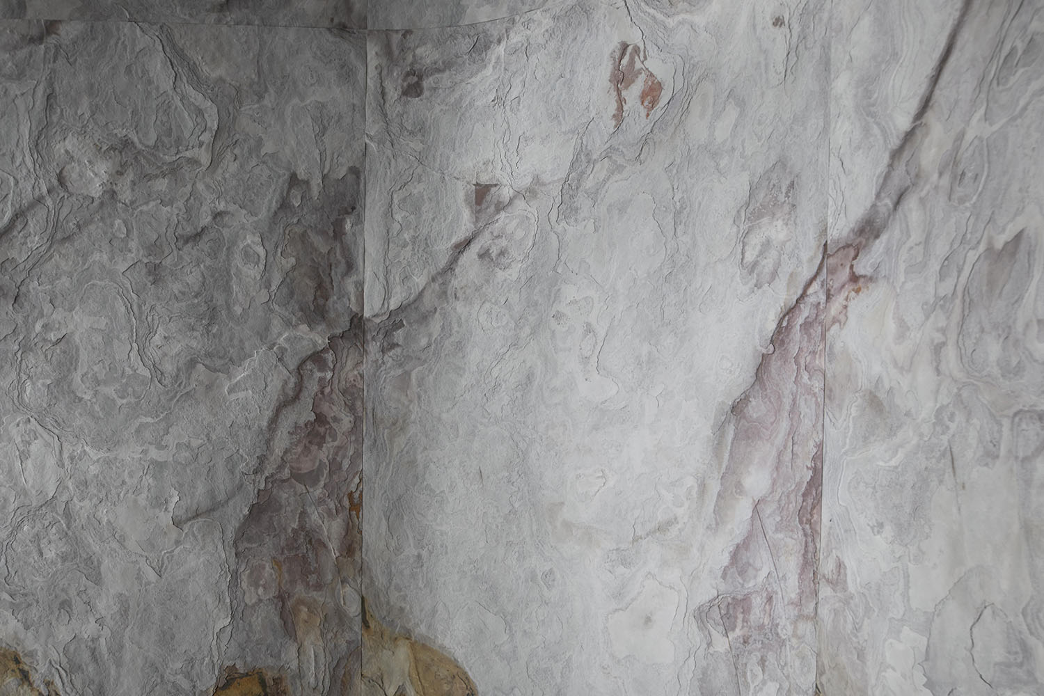
自然肌理轉化成材質紋理與印花,通過石材、肌理布以及小型景觀呈現。這些趨向自然野生的設計插入空間,亦不去做東西方的明確指向,既有曲麵和平麵鋪陳的大寫意趣,也有見微知著的草木山石,在同一空間裏形成疏闊愉悅的辦公生態,提供一個更有益於創意發生的高效工作場所。
Transformed from natural textures, the material veins and patterns were presented through stone, textured cloth and micro landscape. These designs that tended to be natural and wild were inserted into the space, creating an interesting freehand style of curved and plane surfaces. Together with the insightful vegetation and rocks, the design formed a balanced office ecology and provided an efficient workplace that was conducive to creativity.
和 / Harmony
亞克力與東方水墨
Acrylic and Oriental Ink Painting
子曰:“禮之用,和為貴。先王之道,斯為美。小大由之,有所不行。知和而和,不以禮節之,亦不可行也。”
Confucius said: “In using ritual,harmony should be valued.The Way of the former kings from this got its beauty. Both small matters and great depend upon it. If things go amiss, he who knows the harmony will be able to attune them. But if harmony itself is not modulated by ritual, things will still go amiss.”
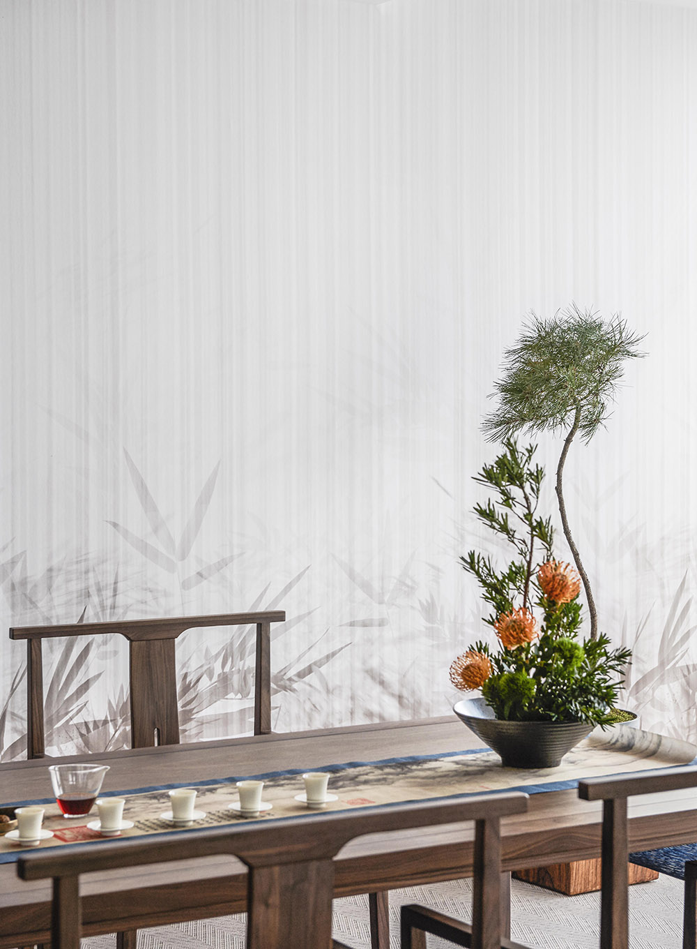
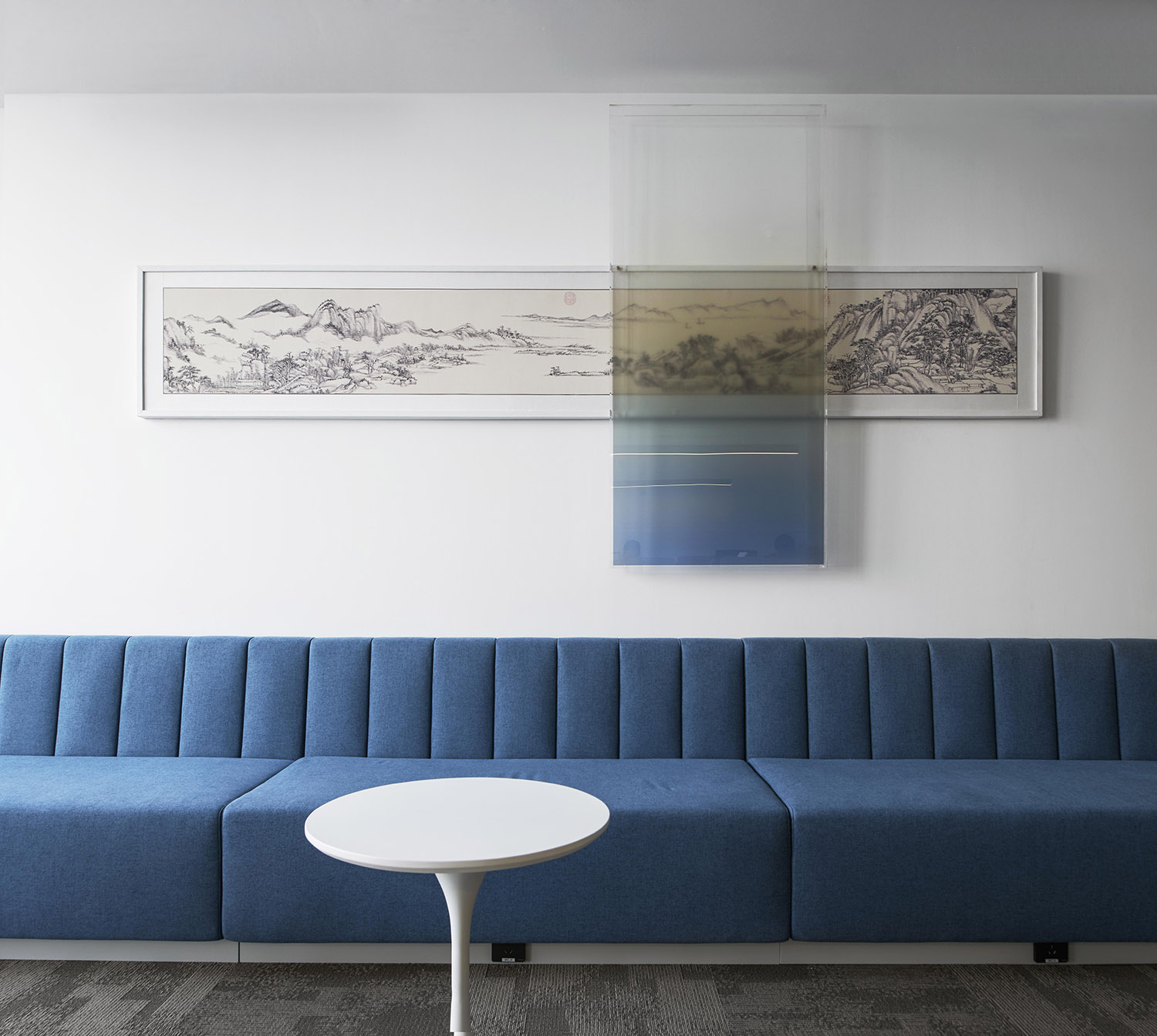
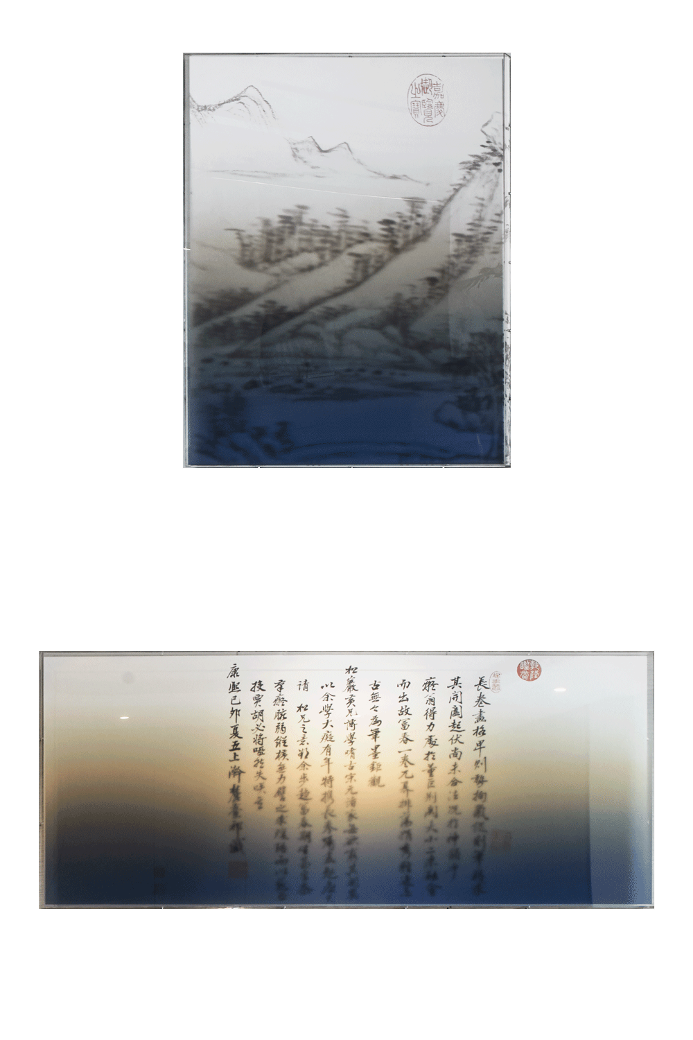
東方水墨疊加亞克力漸變板的藝術裝置在空間多處出現,經過疊加的藝術品被部分“上色”,海天沙石呼之欲出,想象力似乎突然被撕扯開,綿延至無限。
The art installations of oriental ink painting superimposed by acrylic gradient board decorated the space. The superimposed artwork was partially “colored” by the acrylic, creating a vivid scene of the sea, sky, sand and rocks ready to come out. Thus, the infinite imagination came into being.
在格式塔心理學邏輯中有這樣的解析——當我們看到事物的多組信息時,會自動識別並分別設想每組信息的完整形象,使具有深度的物件的各個方向被壓縮,形成淺空間,比如立體主義繪畫的誕生。這種疊加則像是淺空間的反向延展,在時間和空間的維度上打開了三維想象。在辦公空間中,它以這種張力傳達出突破邊界卻又合而為一的理念。
Through Gestalt psychology, when people see multiple sets of information, they will automatically recognize and respectively imagine the complete image of each set of information, so that the various directions of the objects with depth are compressed to form a shallow space; for example, the birth of cubist painting. This kind of superposition was just like the reverse extension of shallow space, opening up three-dimensional imagination in terms of time and space. In the office space, it conveyed the concept of breaking through boundaries and becoming one with this tension.
∇ 平麵圖
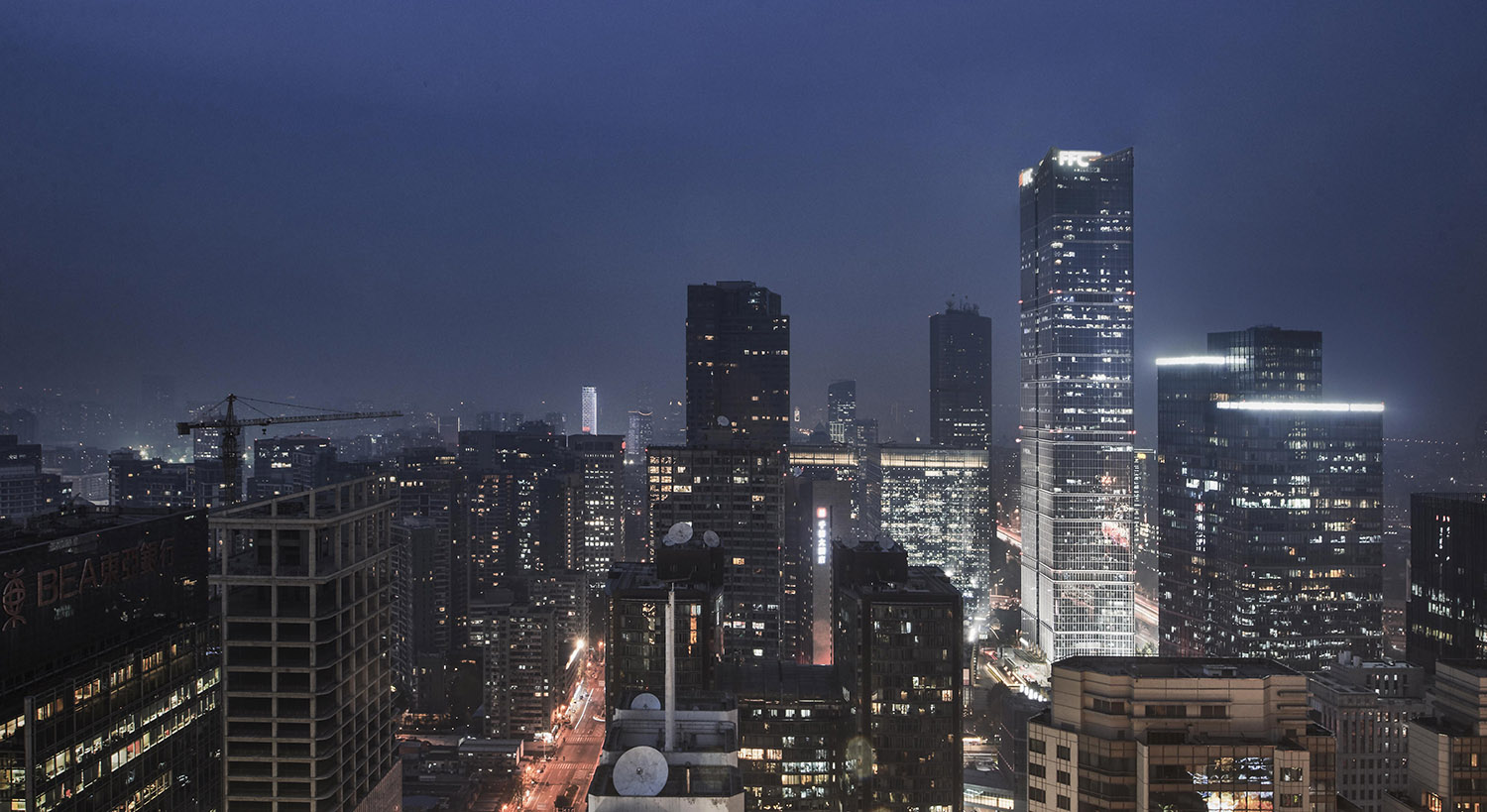
暮色降臨,城市與空間對望,玻璃幕牆恰好成為一塊巨型亞克力板,為彼此罩上一層色彩,可能性開始向無限處延展。
When the night falls, the glass curtain wall happens to become a giant acrylic panel to connect the city and interior space, as if enveloped with a layer of color, extending the possibilities to infinity.
項目信息
項目名稱:國貿三期辦公
地點:北京市朝陽區建國門外大街1號國貿三期A座
類型:辦公
麵積:670㎡
設計機構:AYZ STUDIO
設計總監:薑輝 WWW.ANYUEZHAI.COM
設計主案:王婉晴
深化設計團隊:白金 /龍逸飛
攝影:宋昱明
項目策劃:楽品牌策略機構
Project name: Office in China World Trade Center Tower III
Location:Block A, China World Trade Center Tower III, No. 1 Jianguomenwai Street, Chaoyang District, Beijing
Project type: Office
Area:670㎡
Design agency:AYZ STUDI O
Design Director: Jiang Hui WWW.ANYUEZHAI.COM
Chief Designer: Wang Wanqing
Deepening design team: Bai Jin / Long Yifei
Photography: Song Yuming
Brand Planer: LeLe Branding


