全球設計風向感謝來自 Young H Design/研趣設計 的餐飲空間/咖啡廳項目案例分享:
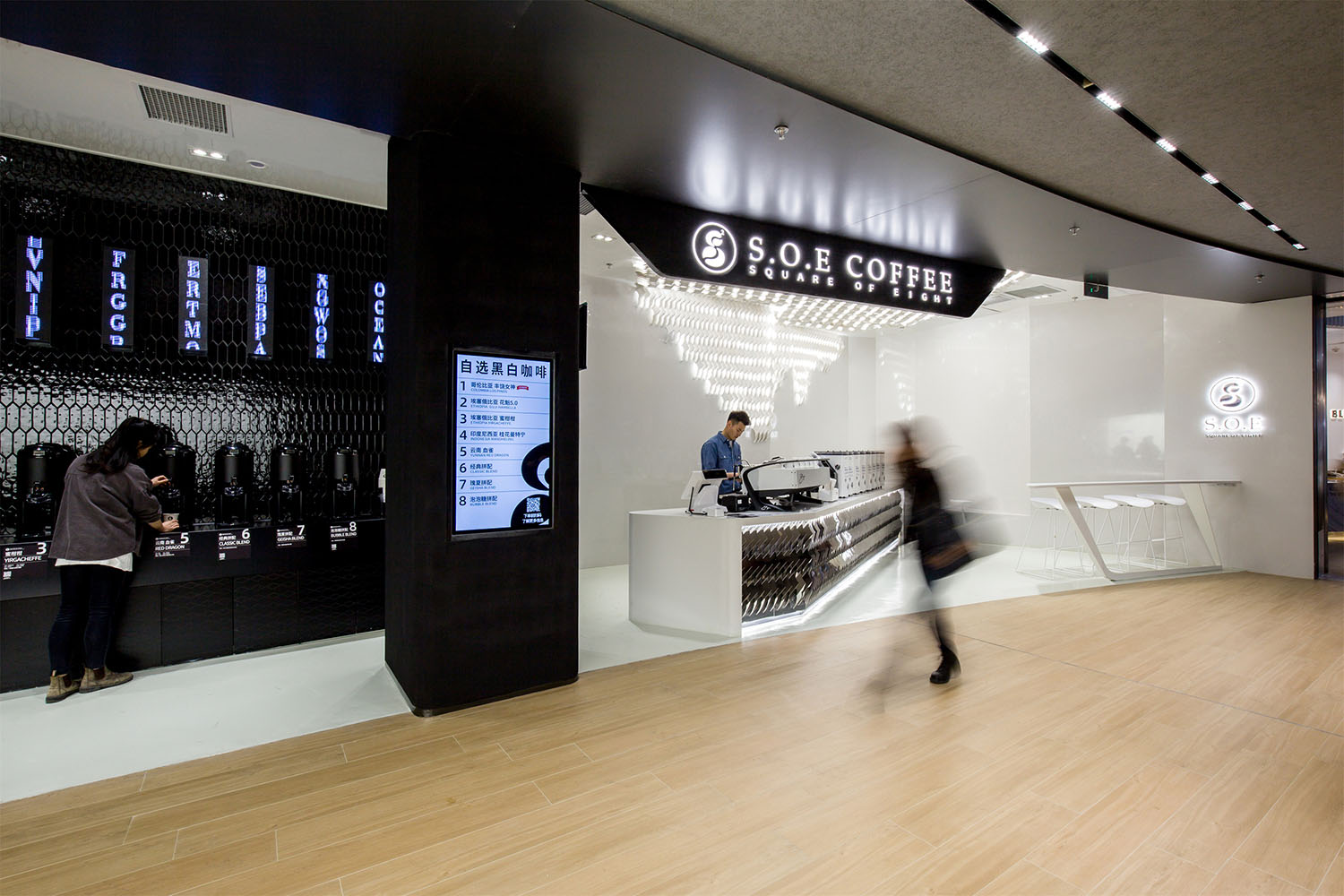
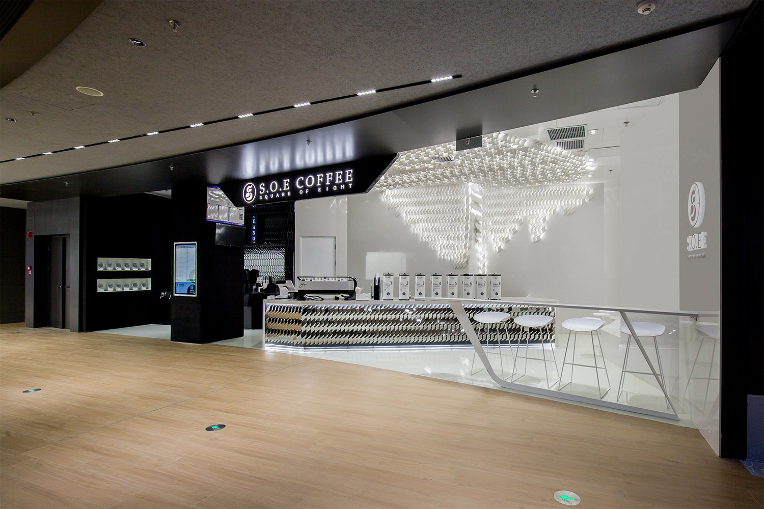
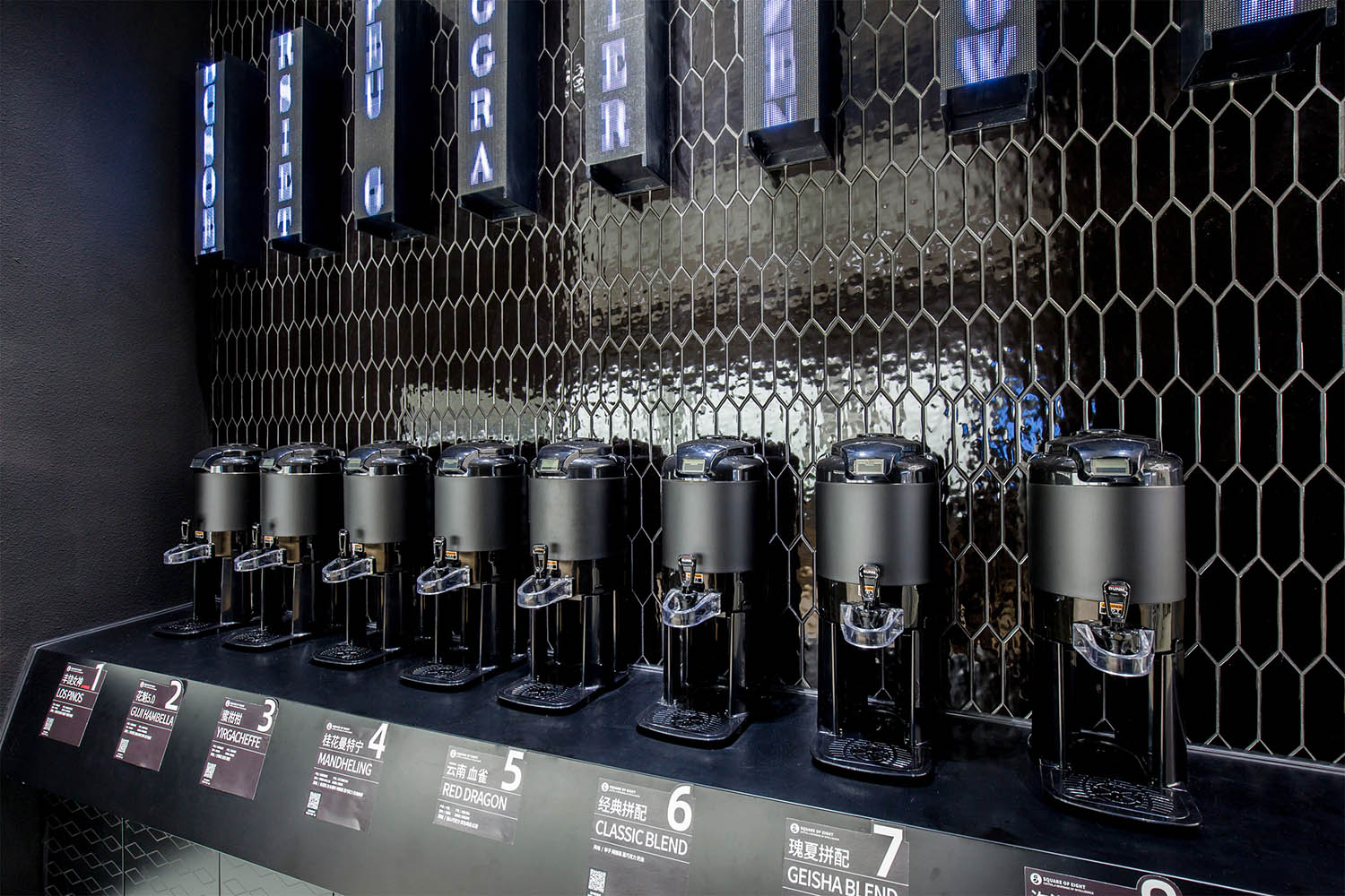
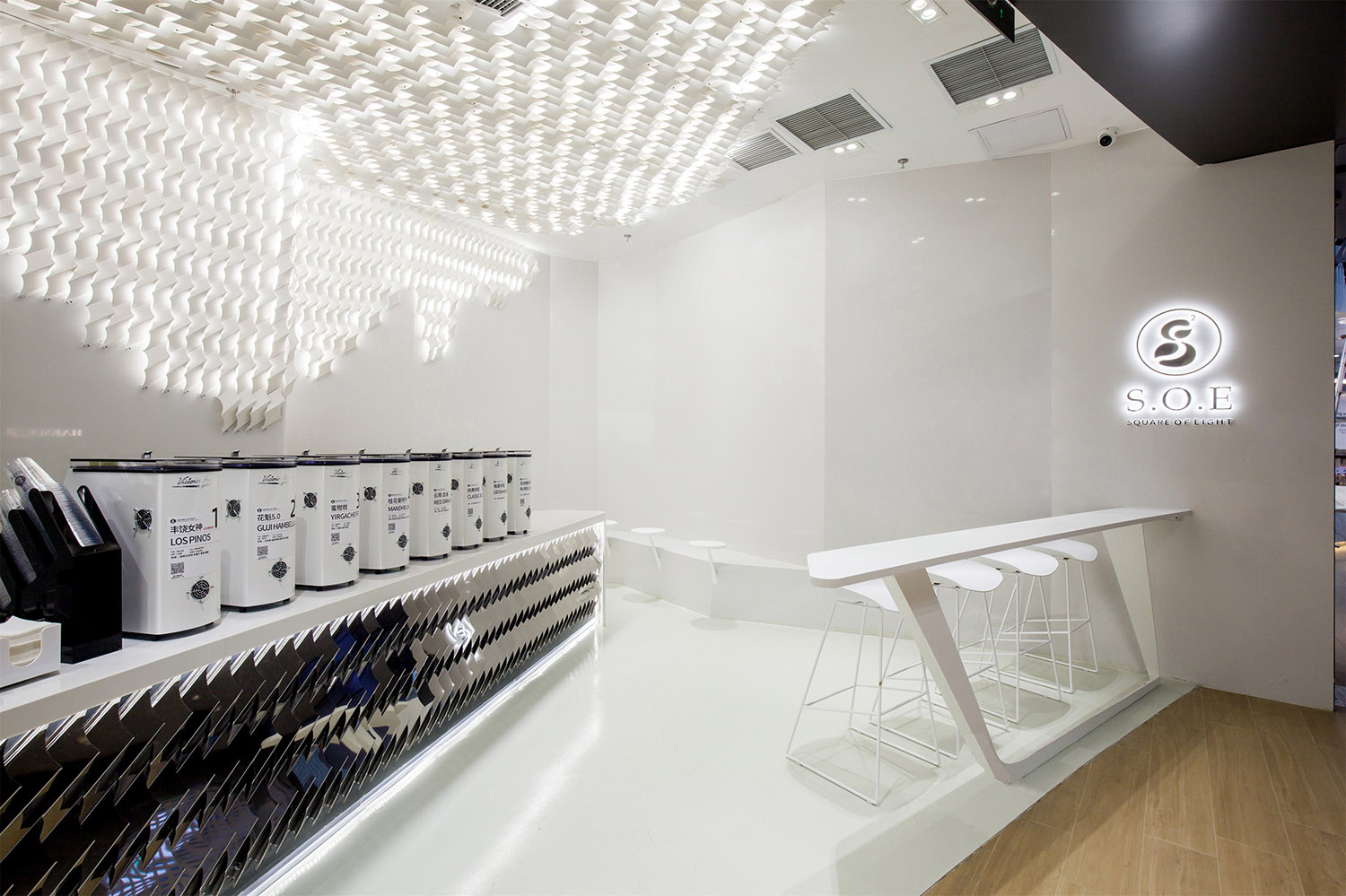
SOE想要在西單更新場打造一個不一樣的咖啡店,因為麵積很小,隻有30平米左右,他們並不想做一家標準的咖啡店,他們希望售賣黑白兩種咖啡,簡單而又直接,但是擔心同一個店一黑一白看起來很奇怪,所以希望YHD能給到一個好的解決方案。
S.O.E coffee opened a special store in Beijing Xidan. The footprint is quite small, around 37 sqm. They don’t want to design a standard coffee shop, they wanted to sell black and white coffee, the whole space looks simple and clear. But they were worried that having black and white in the same space would look strange, so they hoped YHD would figure out a good solution.
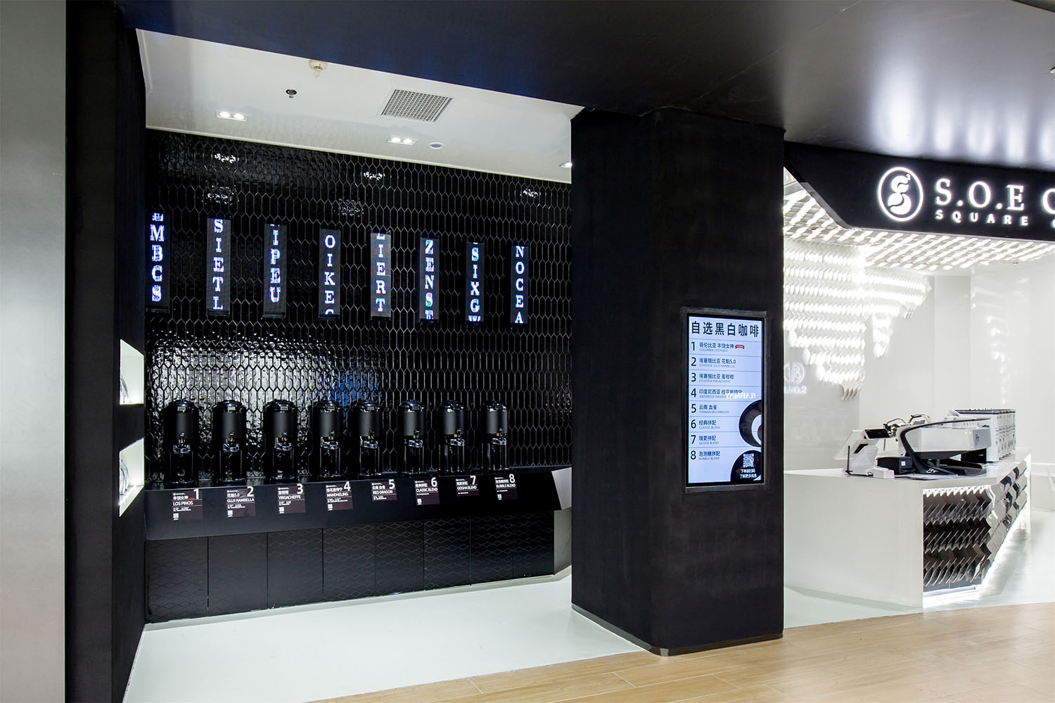
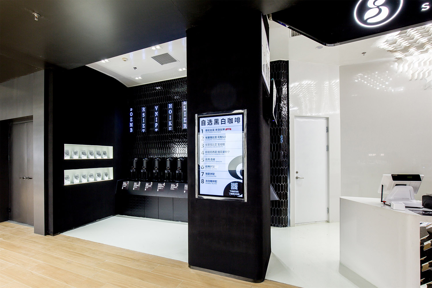
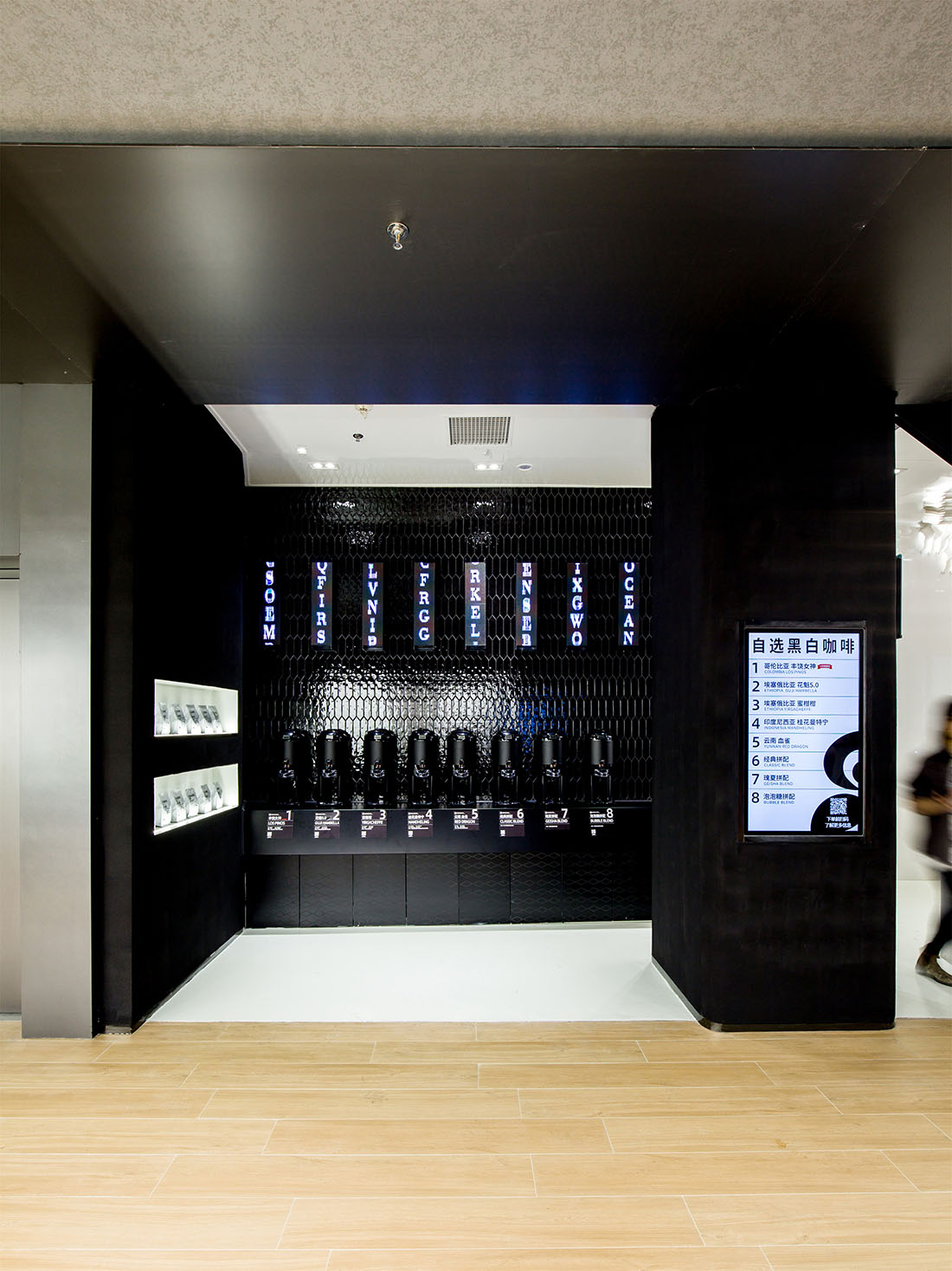
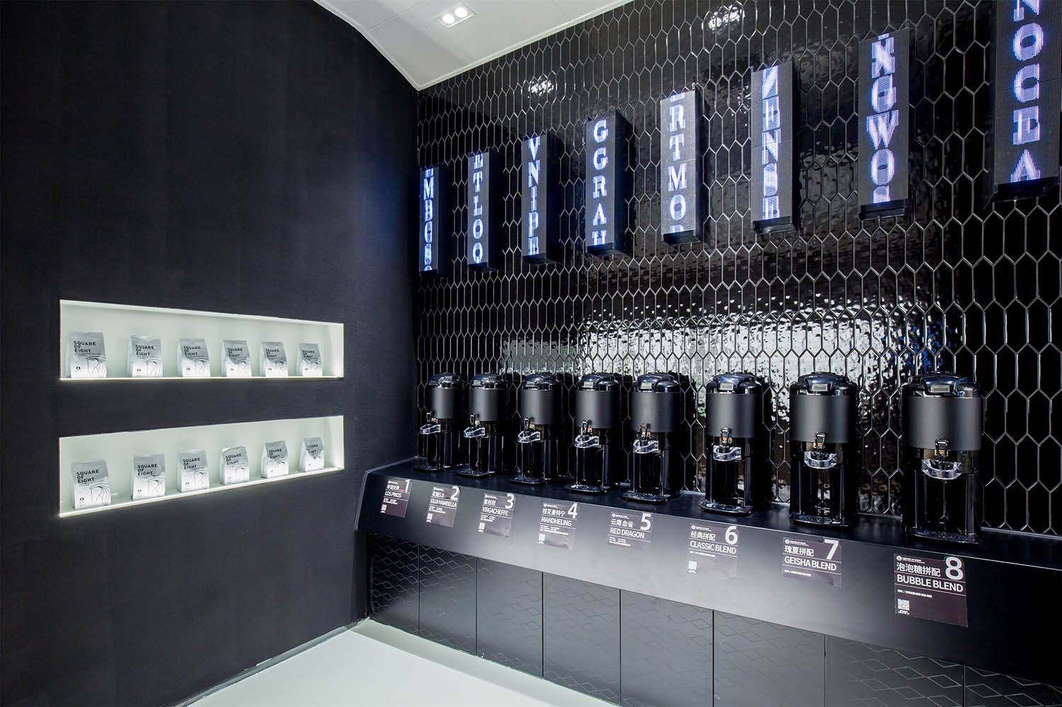
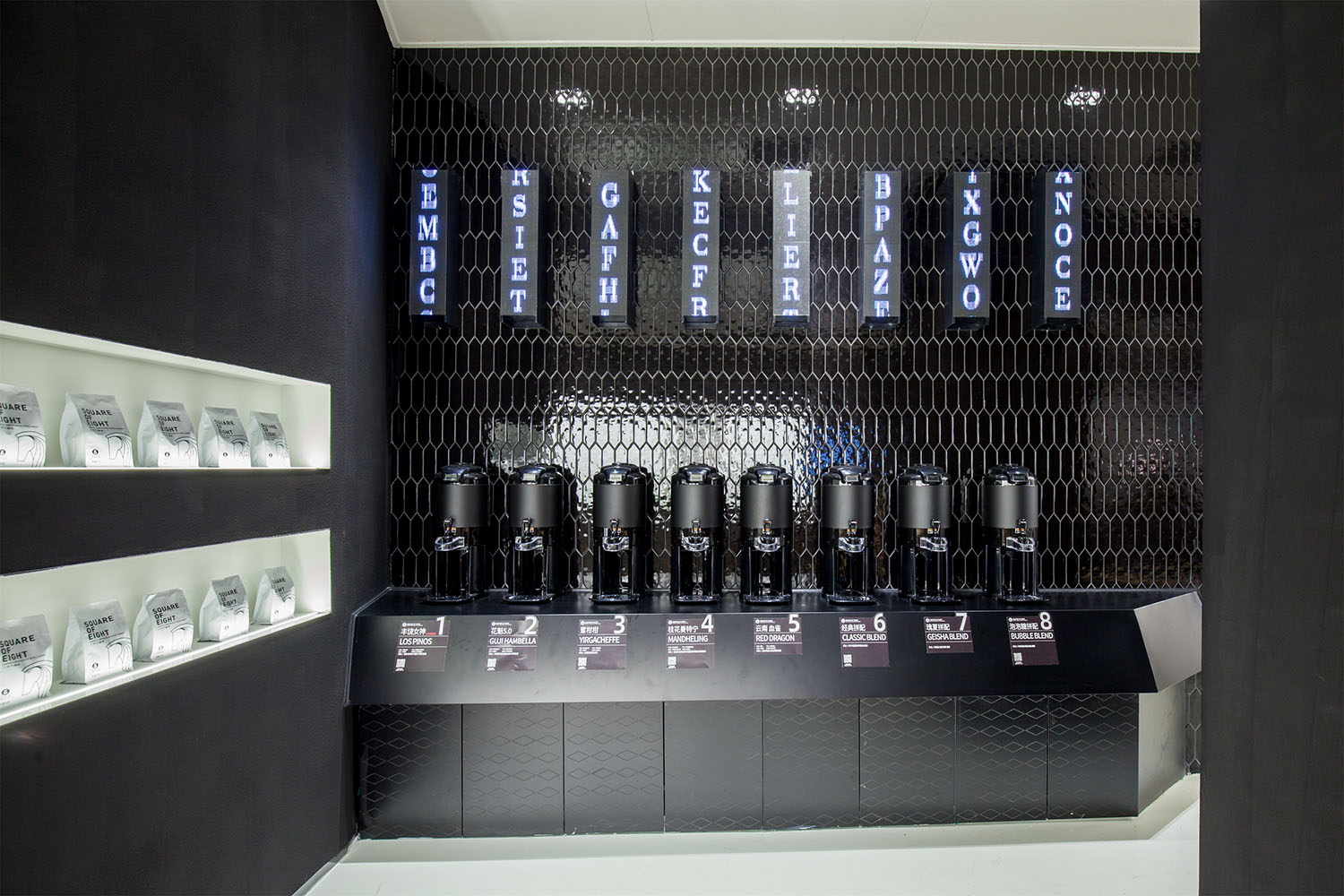
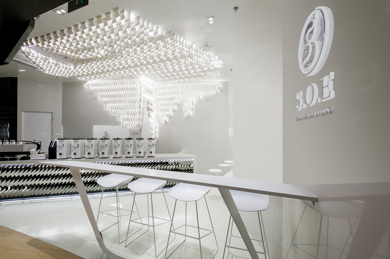
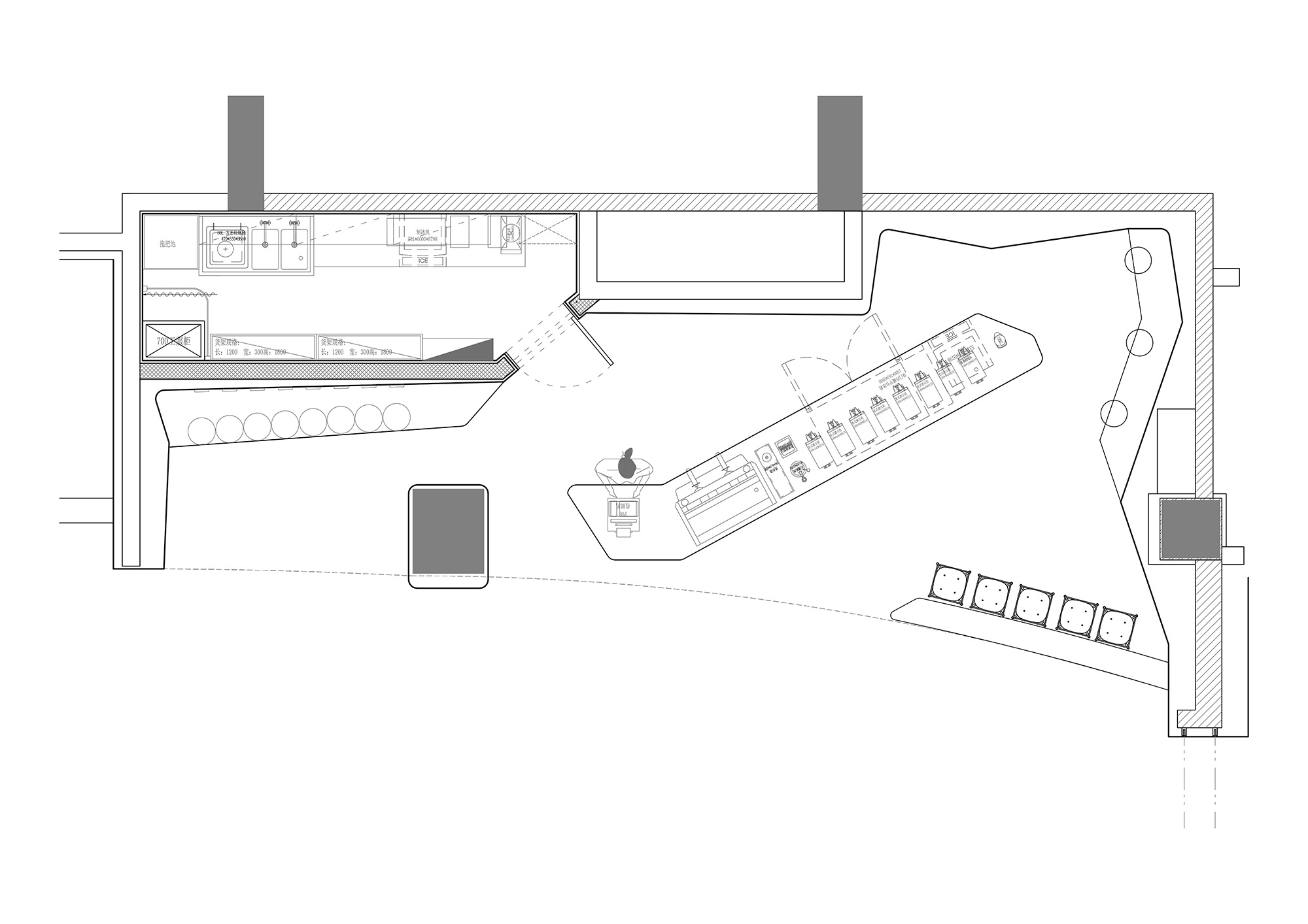
經過在現場的觀察,現場有根柱子,正好將場地一分為二。小的那個空間就是黑色空間,大的那個空間就規劃成白色空間。我們希望人們在黑色空間裏時候能完全沉浸其中,不被白色空間幹擾,而在白色空間裏也是同理。
After the observation on the site, there is a pillar in the middle, which divides the space in two. The smaller one is the black space, and the larger one is planned as the white space. We want people to be completely dropped into the black space and not be distubered by the white space, and the white space is the same.
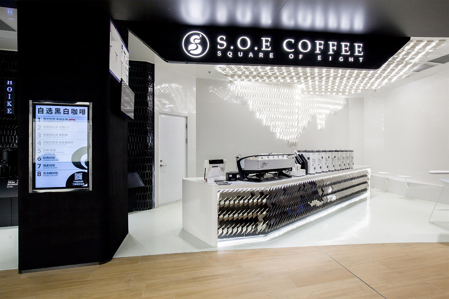
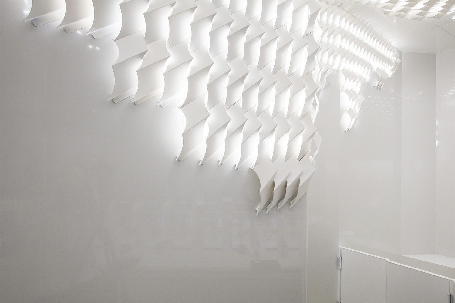
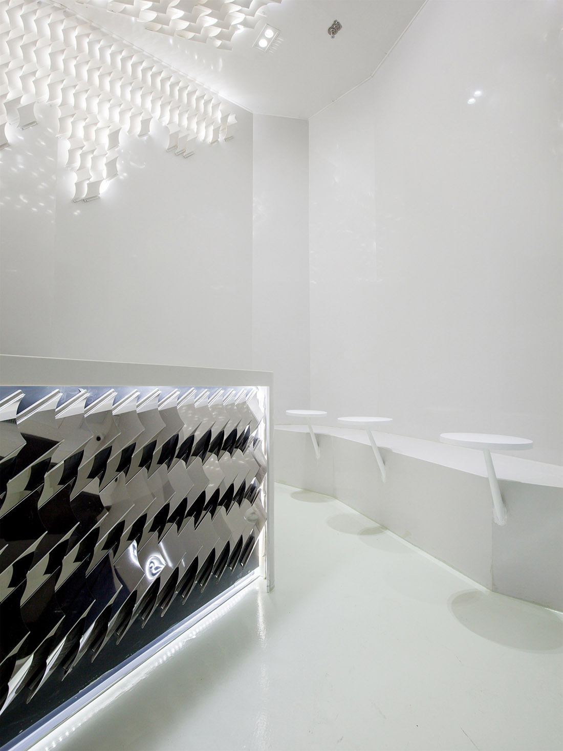
黑白不止存在於色彩裏,還存在於造型裏,一個造型,有受光麵和背光麵,這是黑白的另一種表現。從咖啡豆獲得的靈感,創造了一個造型,旋轉一定角度形成受光和背光兩個麵,讓本來白空間的純白,展現出不同的明暗,不再是單調的白色。
Black and white not only exist in colour, also exist in shape. A shape, there are light and shadow, this is another manifestation of black and white. Inspired by coffee beans, we created a shape, which rotated at a certain angle to form two surfaces, defined the light and the shadow, so that the originally white space would show different light and shade instead of monotonous white.
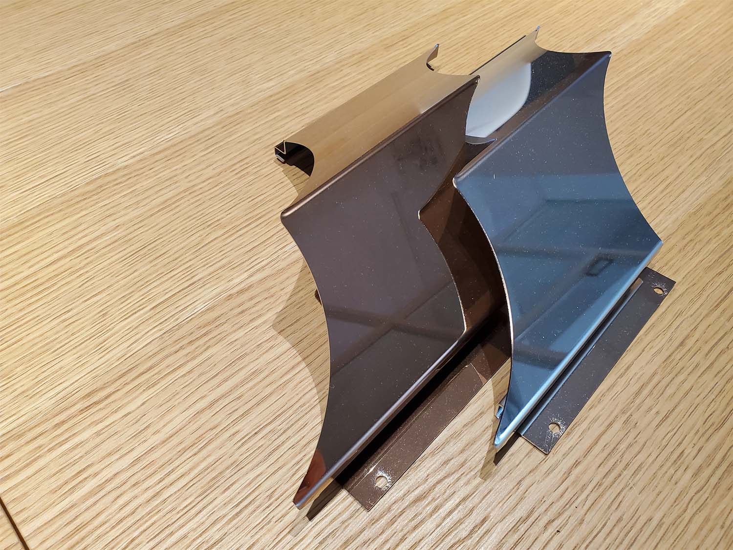
這些金屬的部件通過發送三維文件給廠家,廠家通過電腦切割折彎以後,運到現場安裝,從設計到實施通過數字化確保了沒有誤差。這也是新設計的一些嚐試。
The 3D file of metal parts is sent to the manufacturer. After the manufacturer cuts and bends the metal by computer, it is shipped to the site for installation. From design to installation, no mistakes. These are also some attempts at a new design.
∇ 平麵圖
項目信息
項目名稱:S.O.E Coffee
設計方:Young H Design/研趣設計
公司網站:www.younghdesign.com
聯係郵箱:david.zhou@younghoodesign.com
項目設計 & 完成年份:2020-2021
主創及設計團隊:周方旻,鄒有鑫,夏光
項目地址:北京更新場
建築麵積:37sqm
攝影版權:非啦
客戶:八平方咖啡
Project name:S.O.E Coffee
Design:Young H Design
Website:www.younghdesign.com
Contact e-mail:david.zhou@younghoodesign.com
Design year &Completion Year:2020-2021
Leader designer & Team:David Zhou,Bill Zou, Parker Xia
Project location:Beijing
Gross Built Area(square meters):37sqm
Photo credits :Feila
Clients:S.O.E Coffee


