全球設計風向感謝來自 千上空間設計 的住宅空間/複式住宅項目案例分享:
KINSUN DESIGN | 向內而斂,其述於心
探索事物於不同角度的發散認知,以相對述平化的方式
來闡述其內在諸多的複雜可能性,挖掘更多不同的生活方式探討和對人性的再思考,讓空間更具可考究及情感共鳴的建立……
Explore things in different angles of divergent cognition, a relatively flat way to elaborate its inner many complex possibilities, explore more different ways of life and re-thinking of human nature, … Let the space be more exquisite and the establishment of emotional resonance…
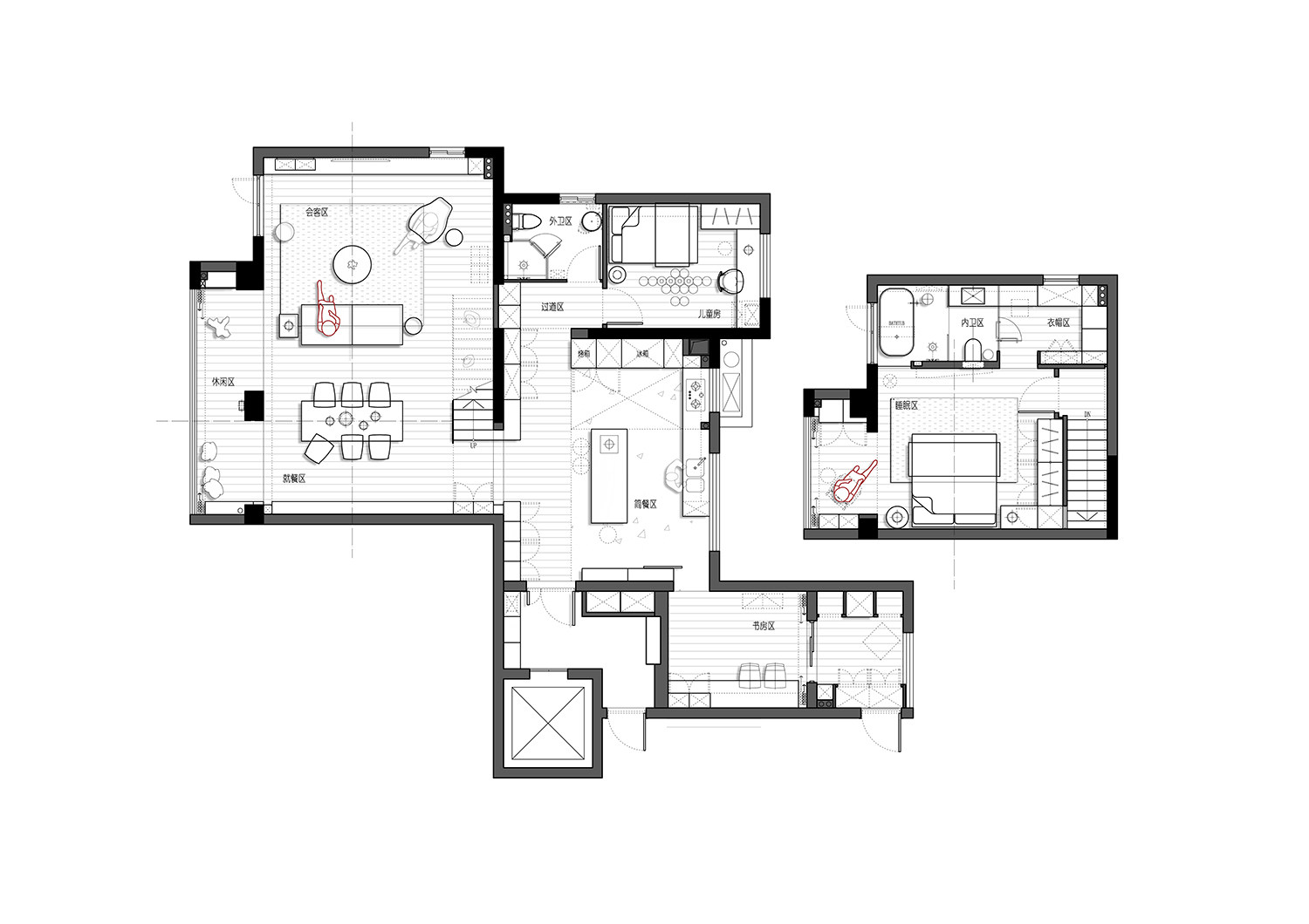
此項目位於浙江省永嘉市的躍層結構,建築麵積約為170平方,南向環繞江景,視野絕佳,
還記得最初溝通階段的業主描述:“自己特別鍾愛開放式廚房,之前戶型結構及麵積並未能滿足,也算是自己比較期許的點位,希望它可以被呈現”。
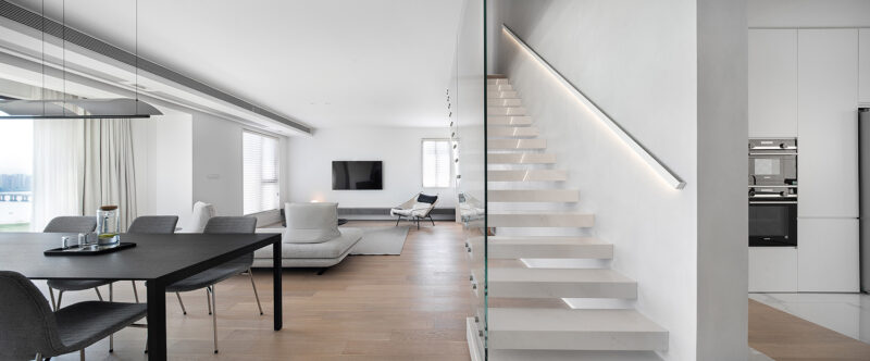
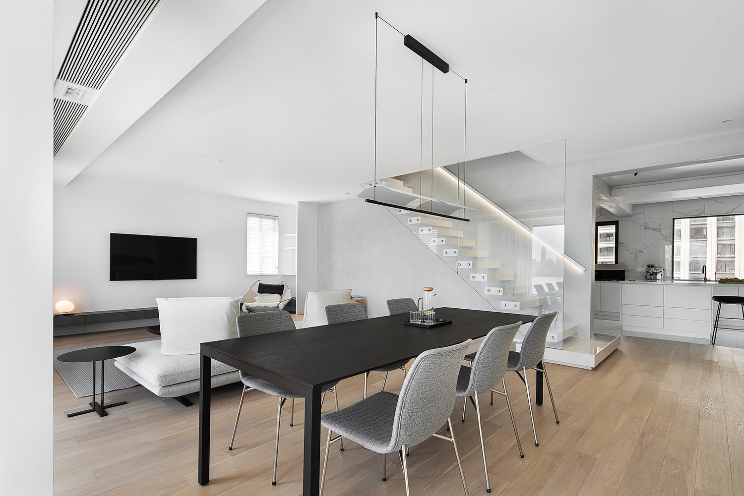
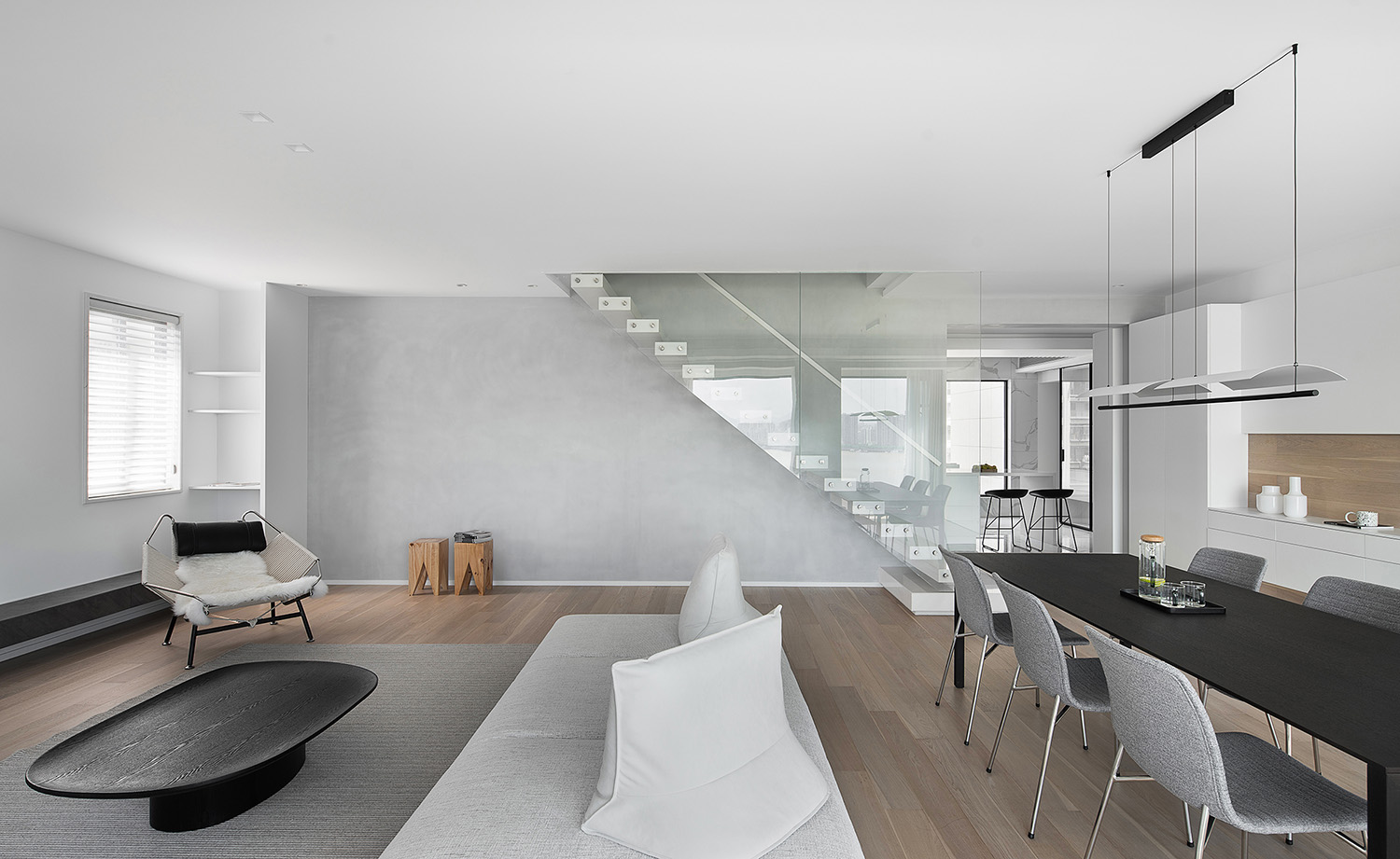
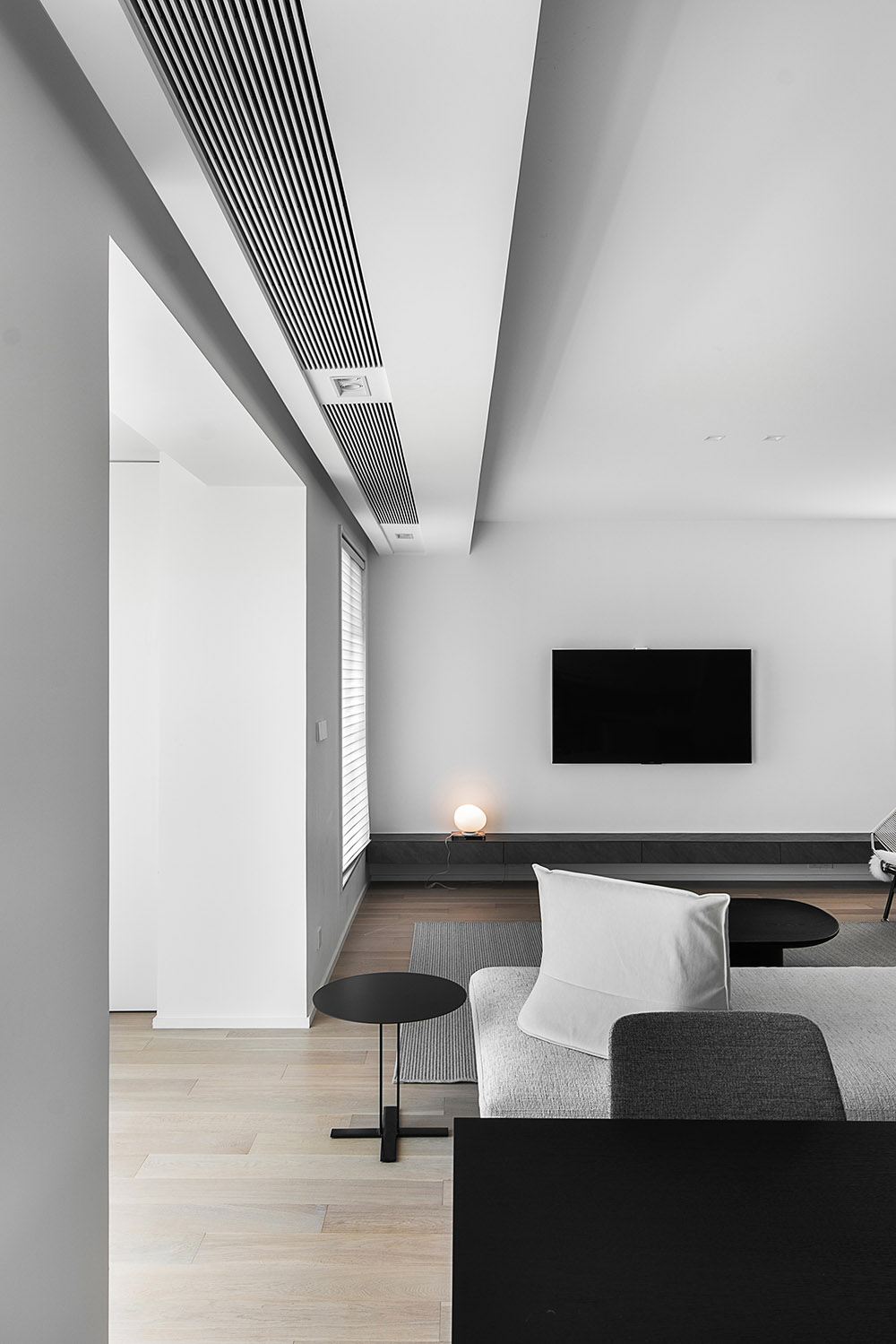
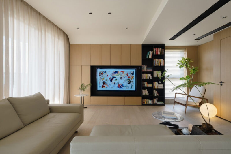
包括會客區和就餐區的南向定位,業主也有向我們闡述虛擬的日常情景,並希望可以把這些願景納入到空間的考量當中,也是綜合了外部環境的視野考慮,盡量減少公區的阻隔動線,讓通風和采光條件可以實現最優。
The project is located in a loft structure in Yongjia City, Zhejiang Province, with a construction area of about 170 square meters and a south-facing ring around the river, remember the initial communication stage of the owner’s description: “I particularly love open kitchen, before the structure and size of the house did not meet, but also more than I would like to point, hope it can be presented. “. Including the south orientation of the reception area and the dining area, the owner has also explained to us the virtual daily scenes, and hopes that these visions can be incorporated into the spatial considerations, which are also integrated with the view of the external environment, to minimize the public area of the barrier line, so that ventilation and lighting conditions can be optimized.
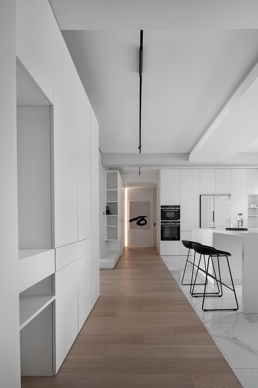
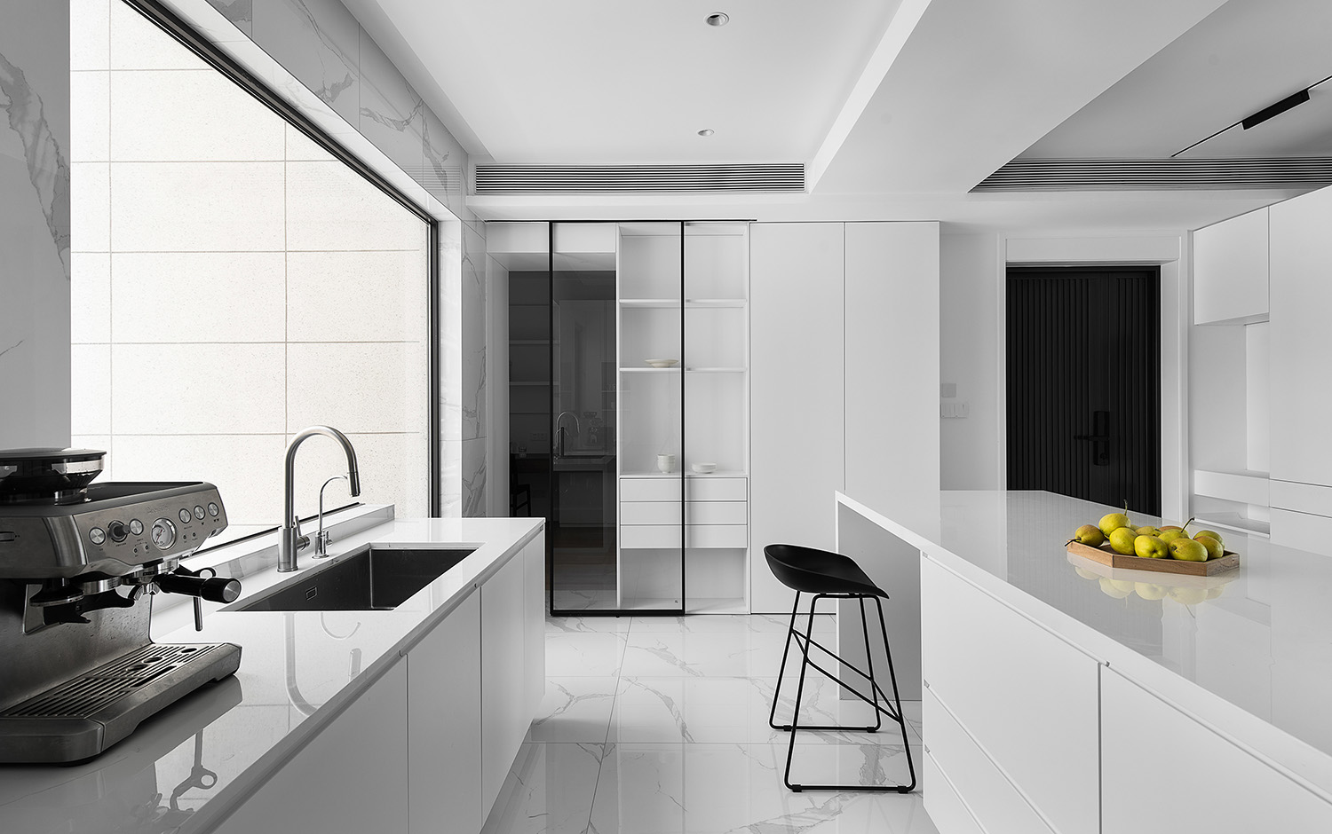
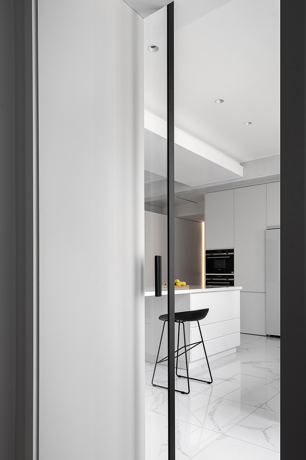
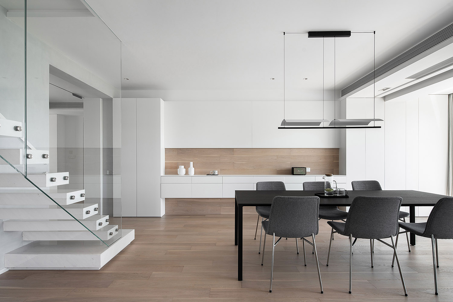
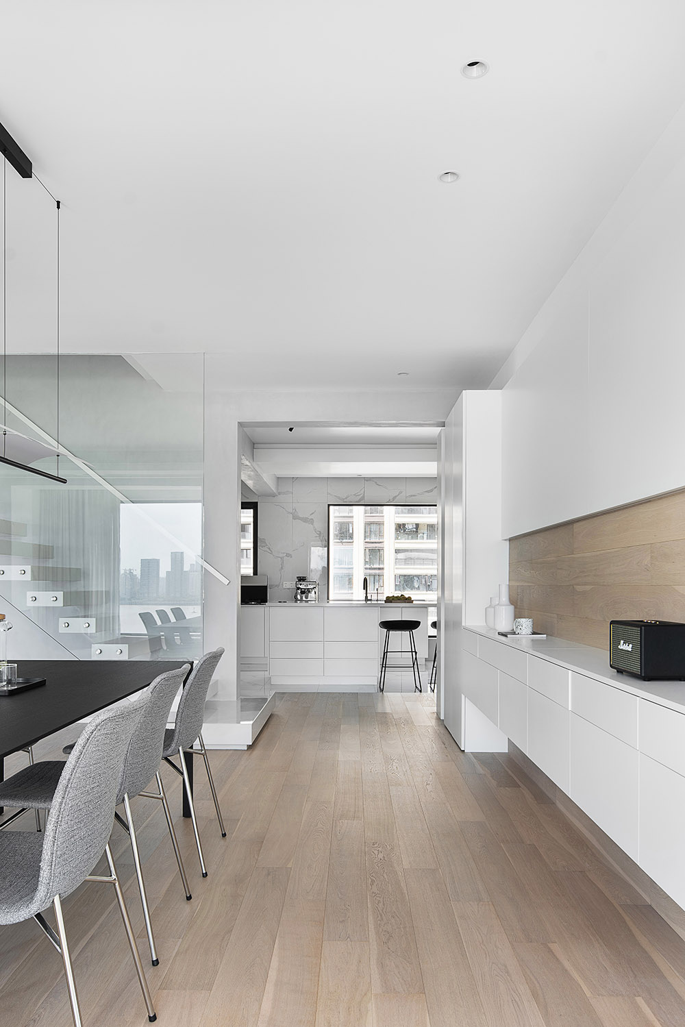
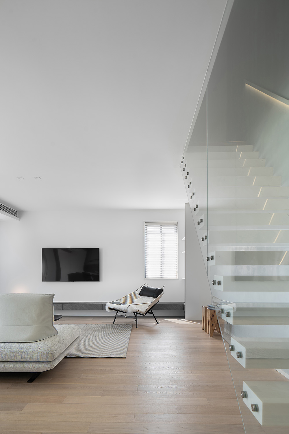
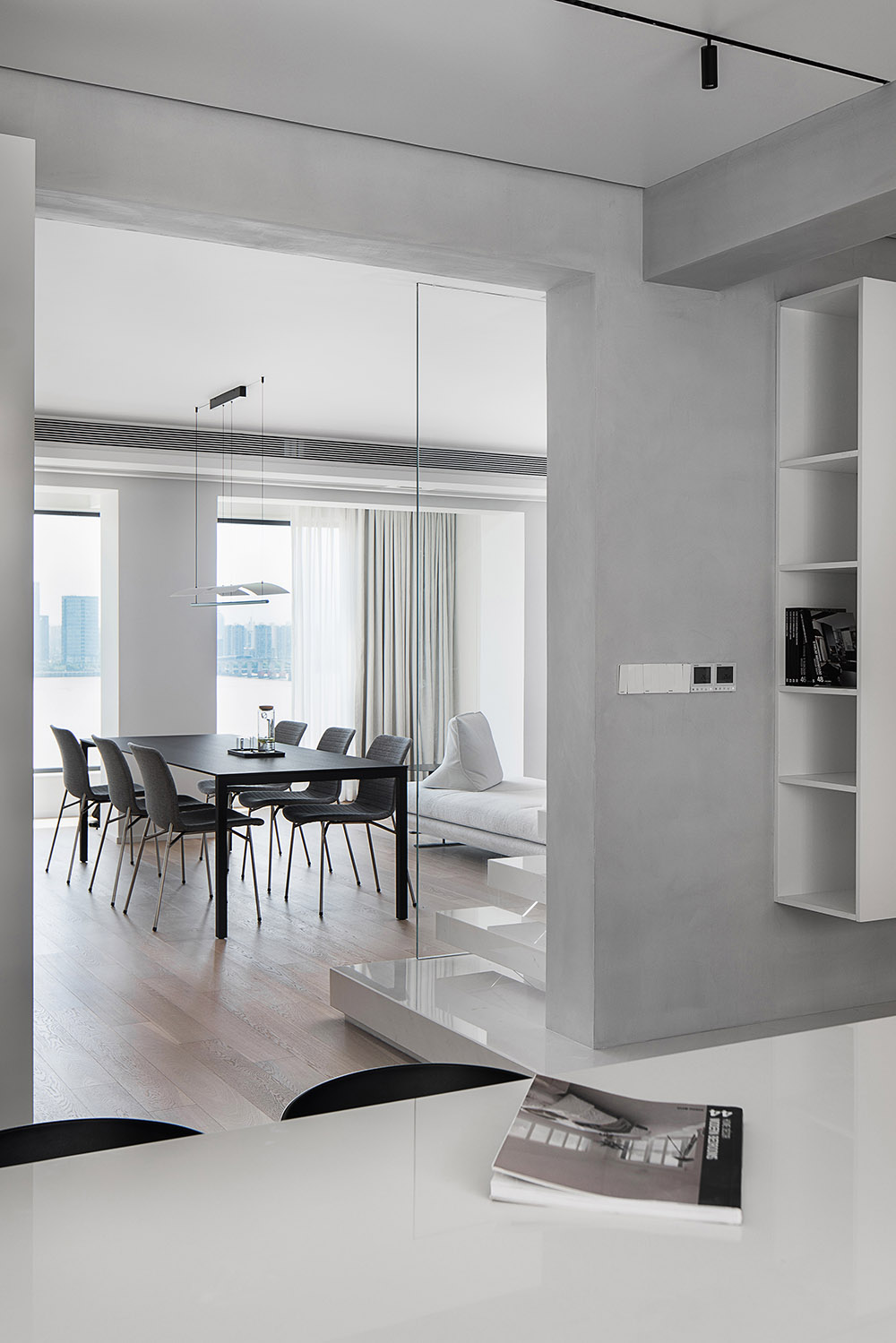
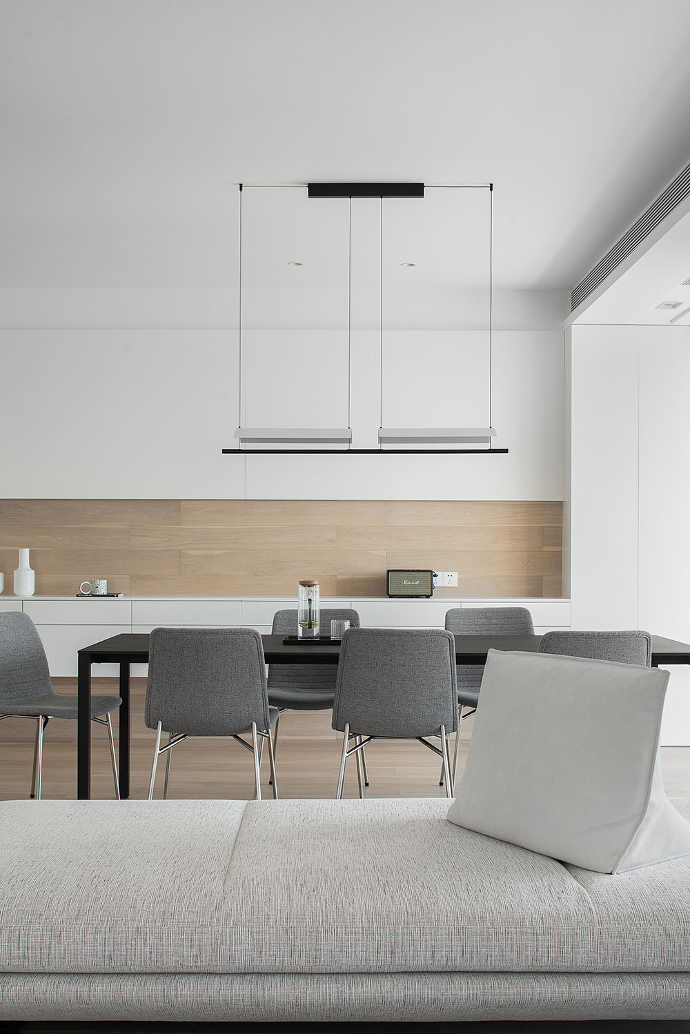
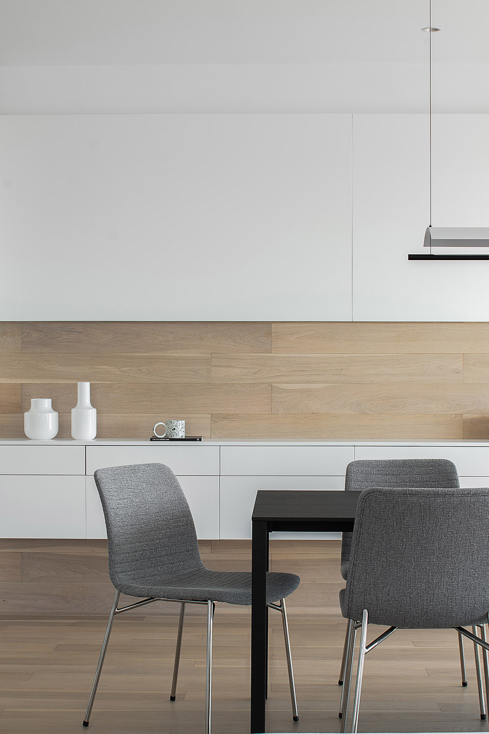
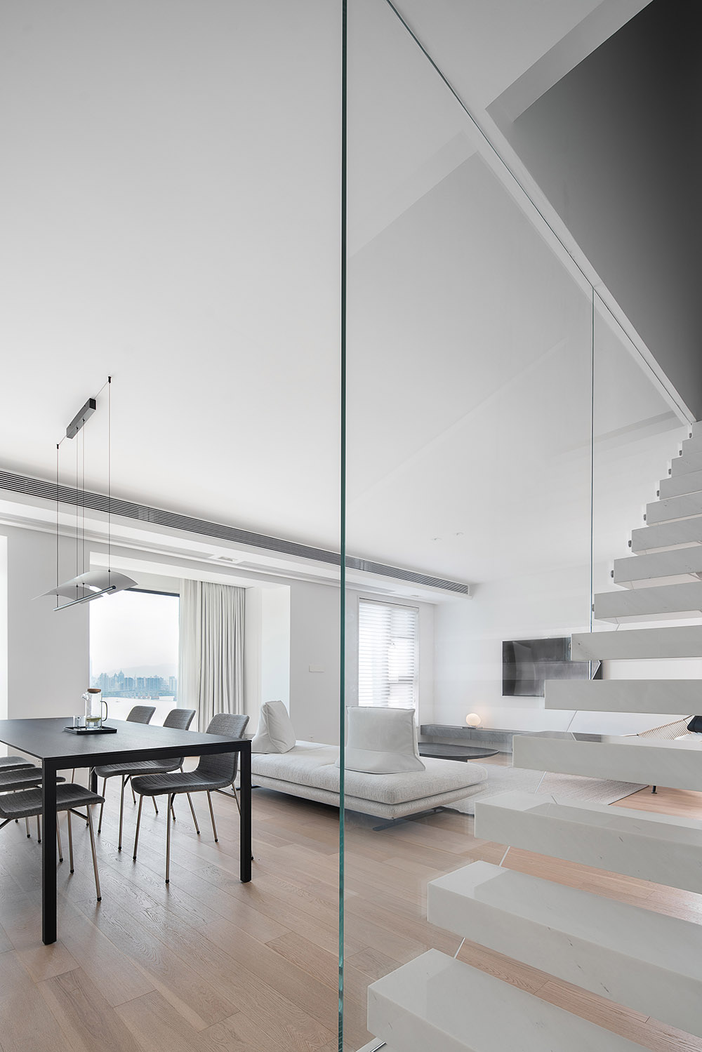
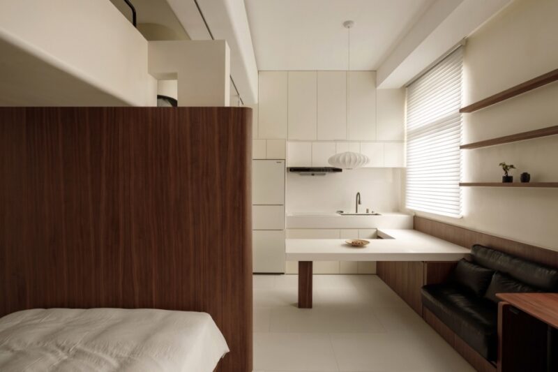
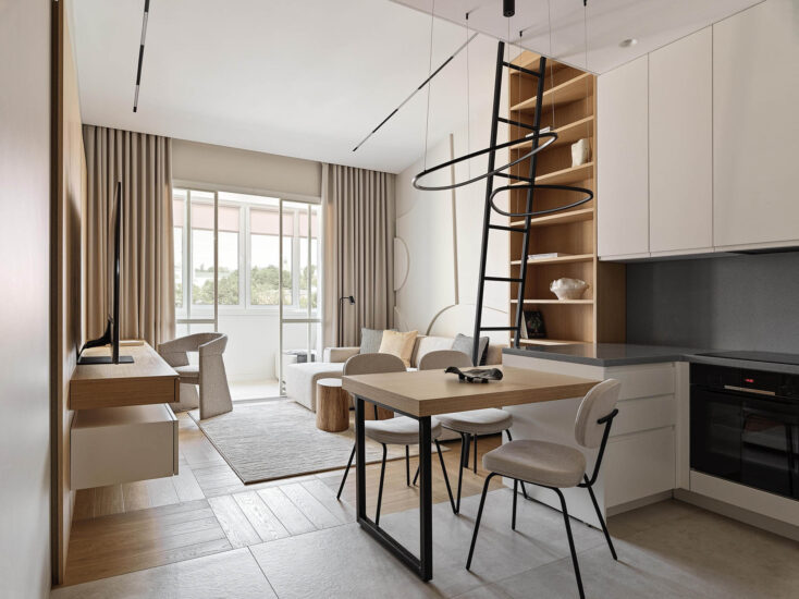
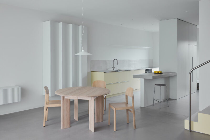
關於門廳及烹飪區的處理,可能更多的還是圍繞日常的便捷可操作性為主,居住者本身在這樣的分區內可以被記錄更多的日常,借由櫃體的延伸及天花連貫性,引導行為走動到過道及就餐區,地台的轉折考慮,也為動線提供了很好的指示作用,讓視覺可以隨形式而變換不同的情景模擬,由就餐區看向公區的視野無阻礙性,多以低位物件為主導,確保視線的舒適性,來提高居宅的品質訴求。
With regard to the treatment of the foyer and the cooking area, it may be more centred on the daily convenience of the Operability, where the occupants themselves can be recorded more daily, with the extension of the cabinet and the continuity of the ceiling, leading the behavior to the corridor and the dining area, the turning consideration of the platform also provides a good indication for the moving line, so that the vision can change with the form the different scene simulation, from the dining area to the public area view unimpeded, more low-level objects to ensure the comfort of the line of sight to improve the quality of residential demand.
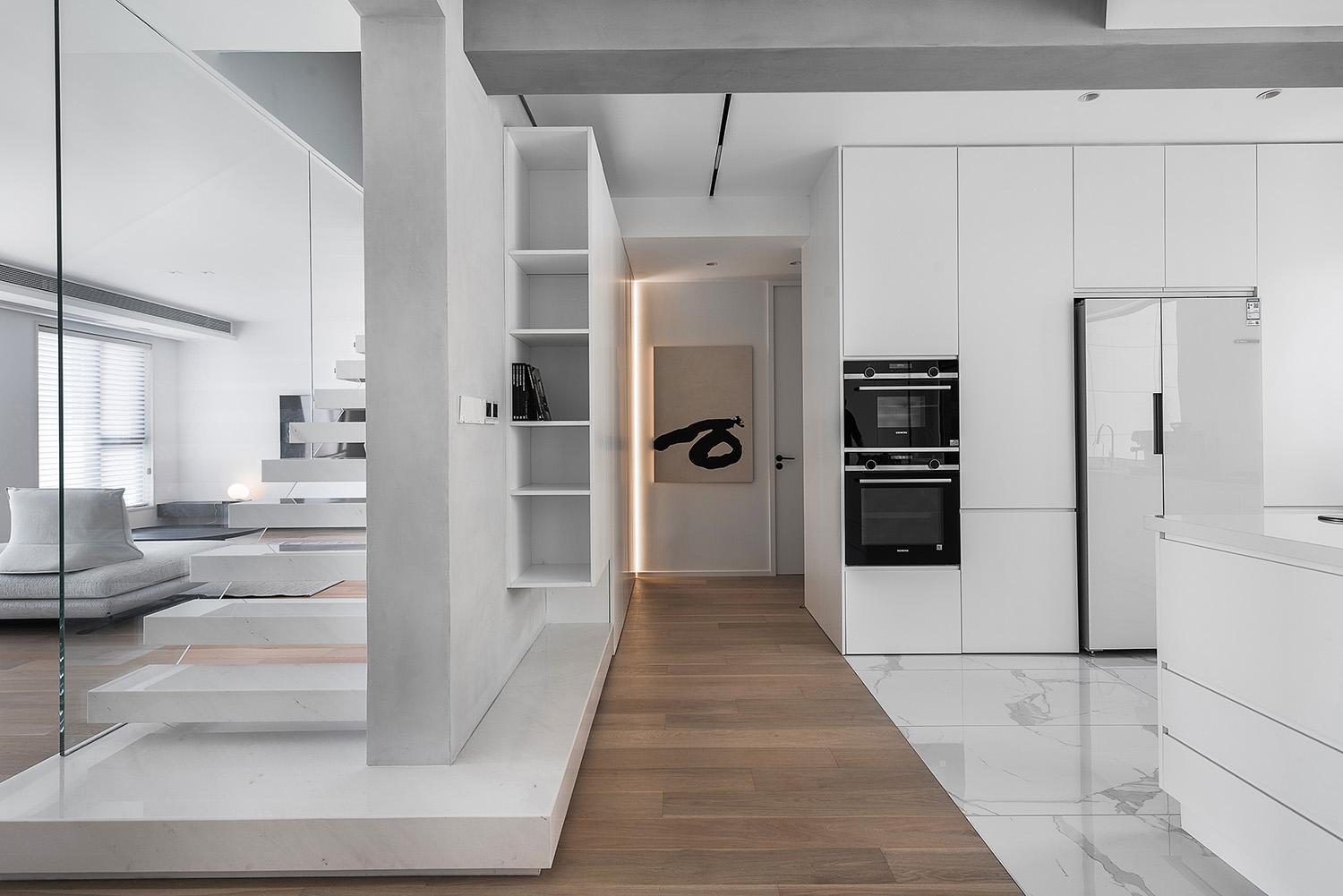
門廳及烹飪區的地材分界,借此來強化材質的延伸及空間的穿透性,拉伸視覺的擴增區域,再借助麵體的轉換概念,讓空間呈現逐漸遞減的視覺引導性,同時也區隔了左右開間的日常交互方式情景。
也是考慮形體的控製程度,故在立麵及天花的處理上更多的借助了原有的結構性條件,諸如梁位,設備空間的色度區塊,來讓天花的層次變化可以過渡的更為豐富。
The ground boundary between the foyer and the cooking area is used to enhance the extension of the material and the penetration of the space, to stretch the expanded area of vision, and to make the space appear progressively less visually oriented with the help of the concept of transposition of the surface, it also sets the scene for the day-to-day interaction between left and right. Also consider the control of the shape, so in dealing with the facade and ceiling with more use of the original structural conditions, such as beam position, equipment space chroma block, so that the ceiling of the level of change can be more rich transition.
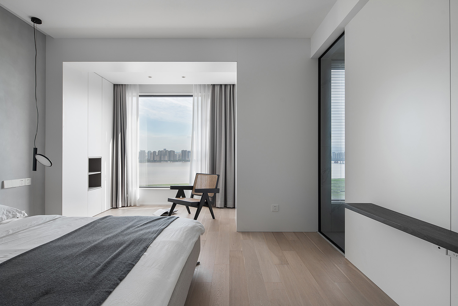
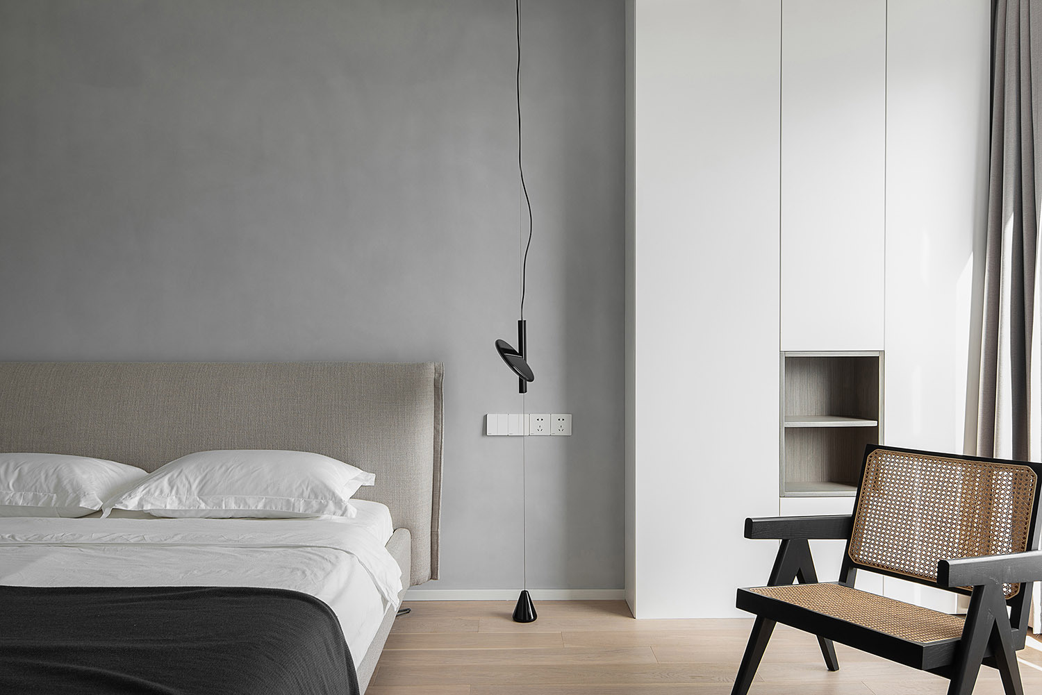
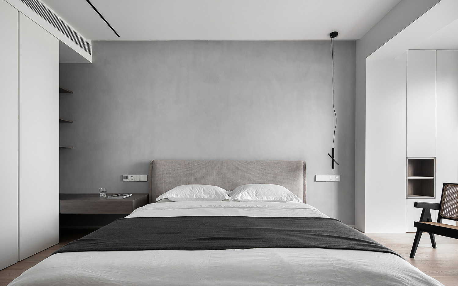
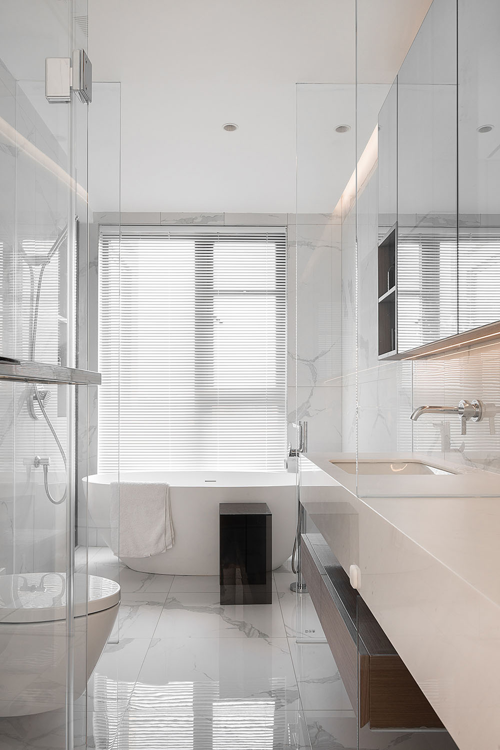
再表示,室內除滿足正常的收納條件以外,在空間的處理階段,務必克製及有結合的來考量空間對外所要表達的呈現,盡量來擴增內開間的尺度舒適度。
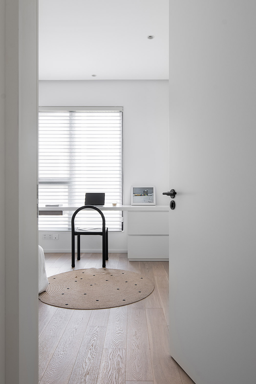
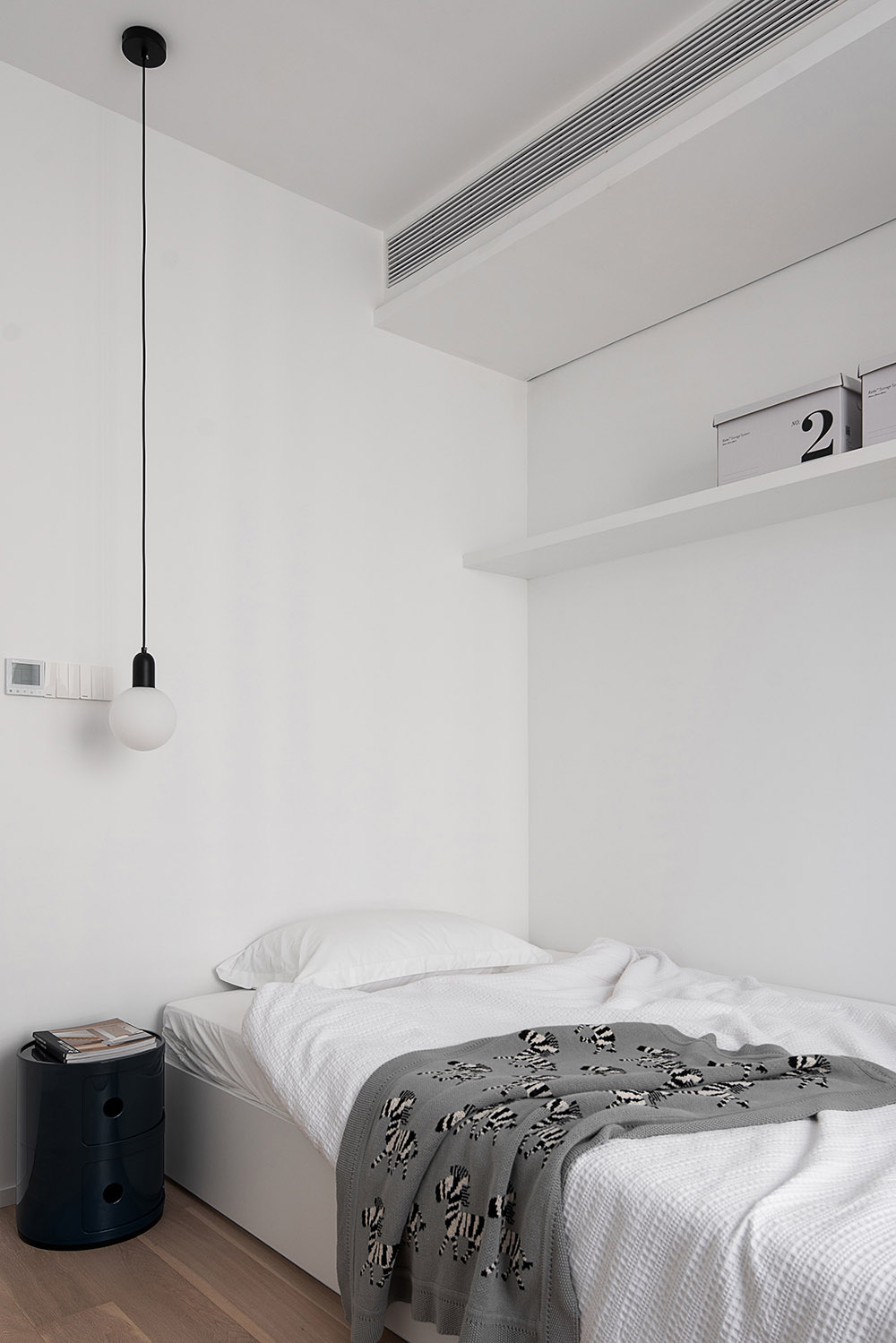
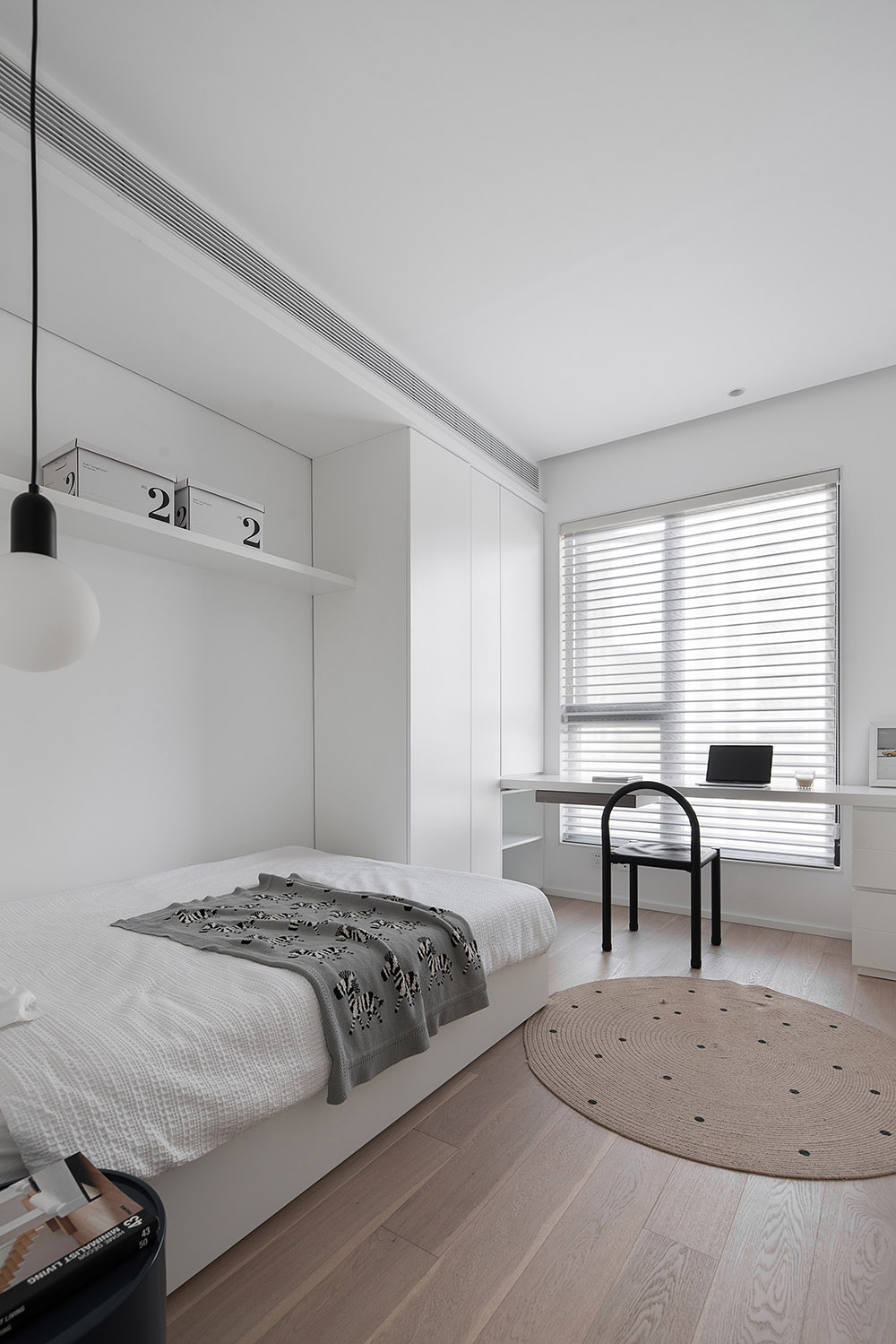
相對於2F的私密區域,業主表示內開間尺度偏宅,除馬桶區域外的隔間是否可以實現開放,包括衣帽區的區域也是要具備。
Again, in addition to meeting the normal reception conditions, in the processing phase of the space, must be restrained and integrated to consider the expression of the space to the outside, as far as possible to expand the size of the comfort of the open space. In contrast to the private area of 2F, the owner indicates that the size of the Inner Bay is not the same as that of the toilet area, and whether the Outer Bay, including the cloakroom area, can be opened.
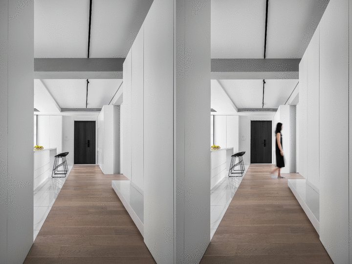
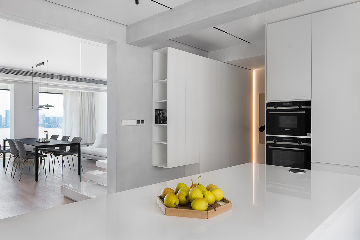
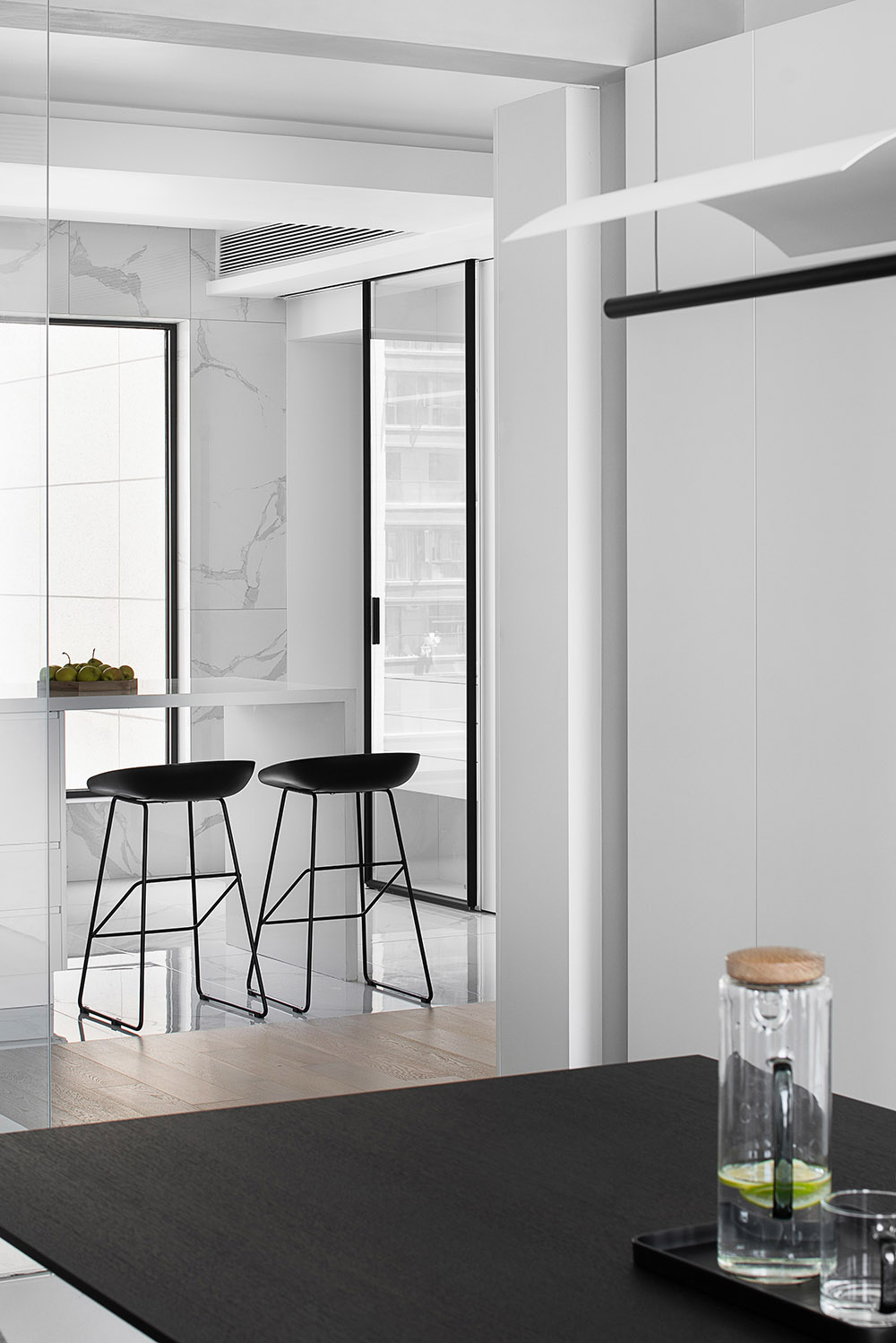
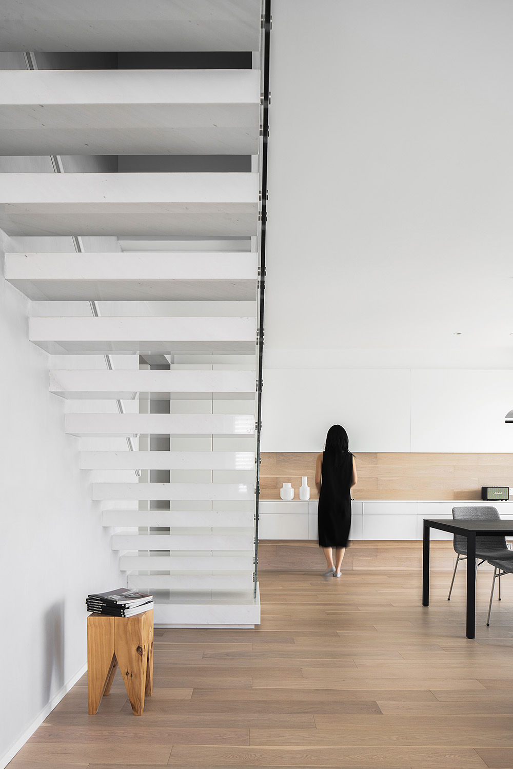
木地板延伸至餐桌旁的操作區,形成了半包圍式的心理暗示,結合轉折櫃體的L型延伸,讓視覺也起到了豐富的轉折體驗,拉近了相鄰區間的開間及心理尺度。
The wooden floor extends to the operating area near the dining table, forming a semi-enclosed psychological hint, combined with the l-shaped extension of the turning cabinet body, so that the visual also plays a rich turning experience, drawing the adjacent area between the opening and psychological scale.
‘基於對常規概念的有反向思考’
‘thinking in The Opposite Direction of conventional concepts’
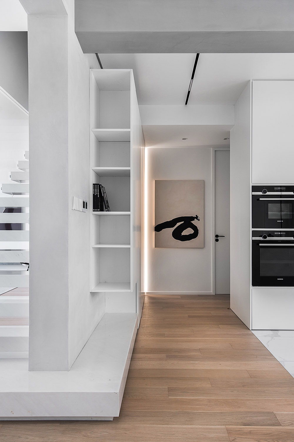
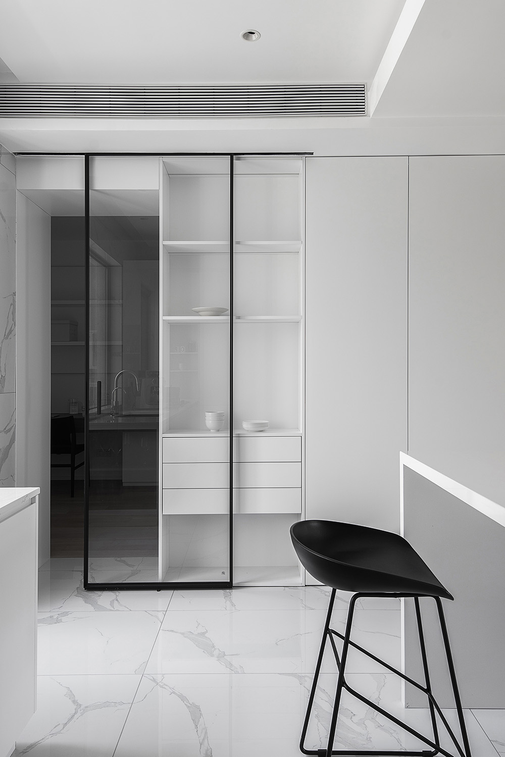
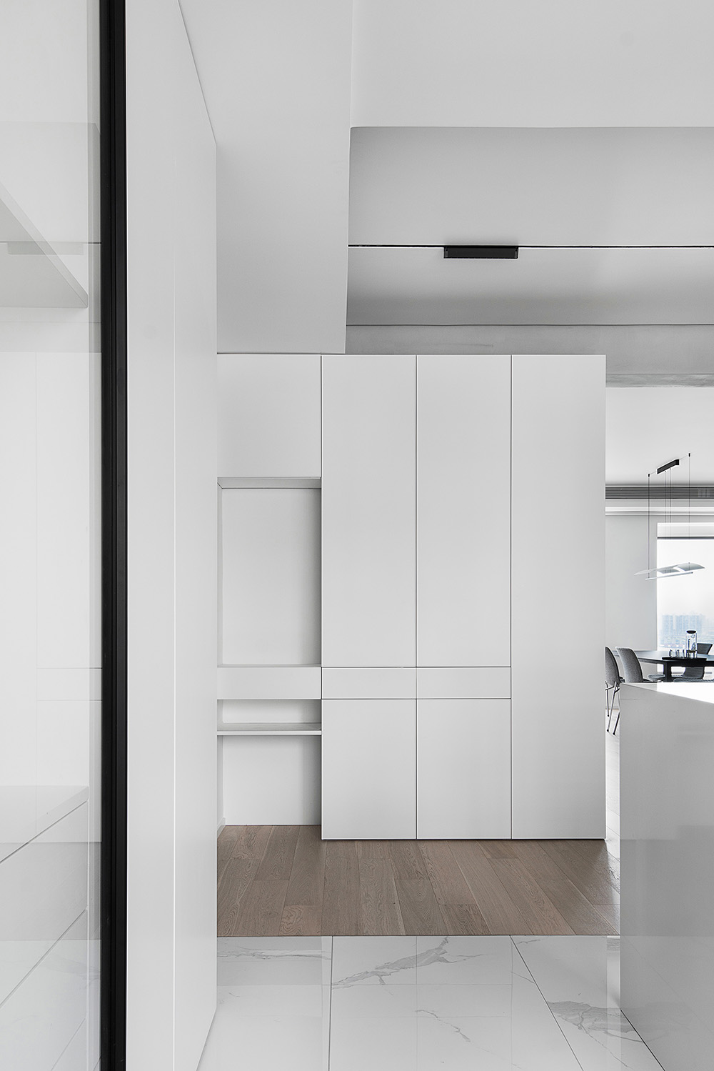
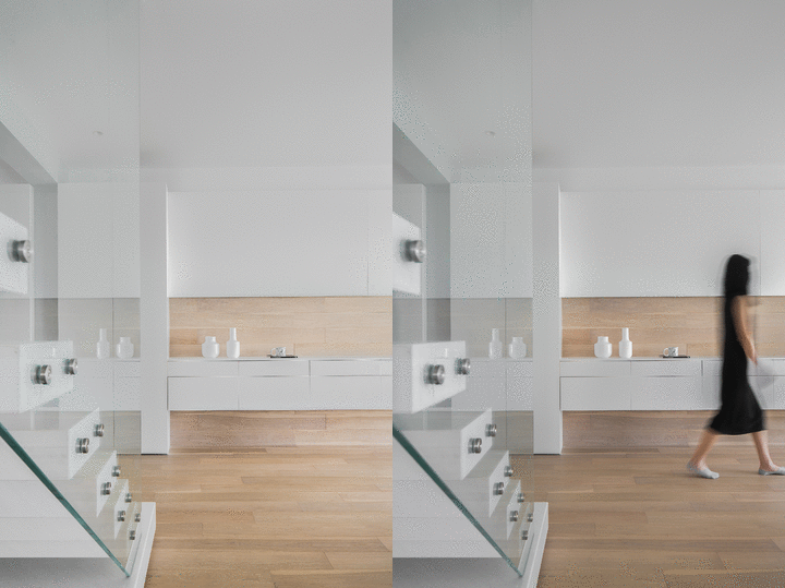
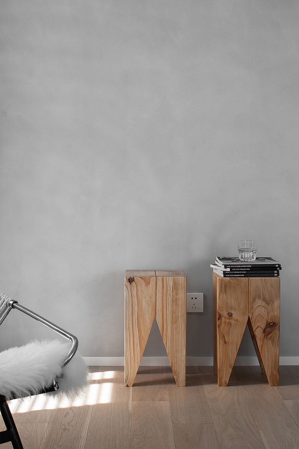
借由櫃體不到頂的結構形體以及物件本身所關聯到的錯亂層次,轉到對彼此相鄰空間的借景關係,也讓常態的發生更富有可發現性。
By the structure of the cabinet body not to the top of the body and the disorder level of the objects themselves, to each other adjacent space to borrow the relationship, but also to make the normal occurrence more discoverable.
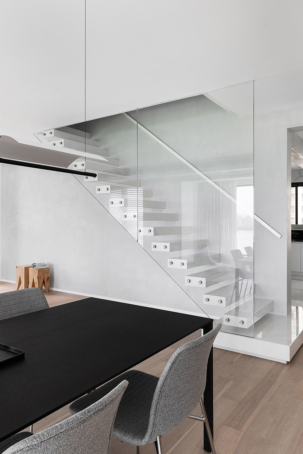
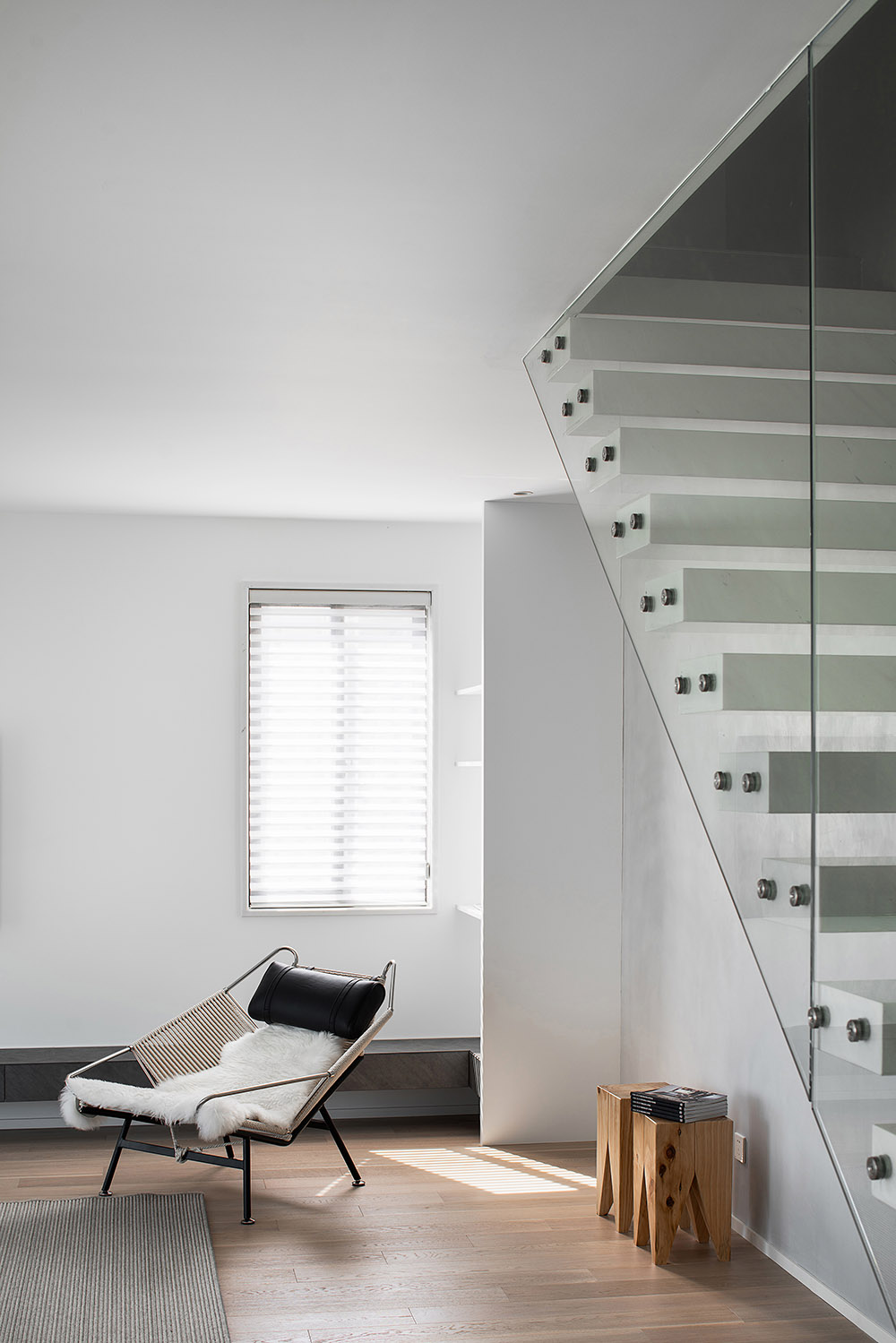
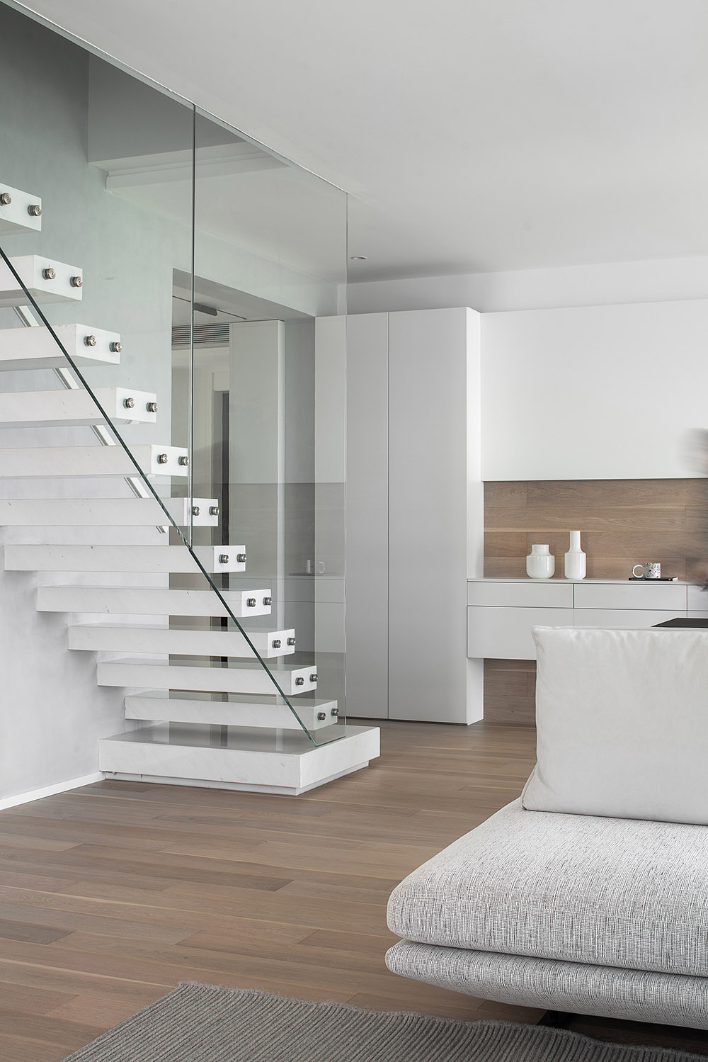
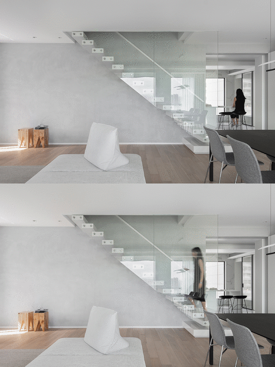
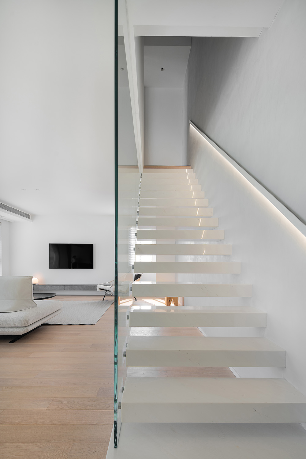
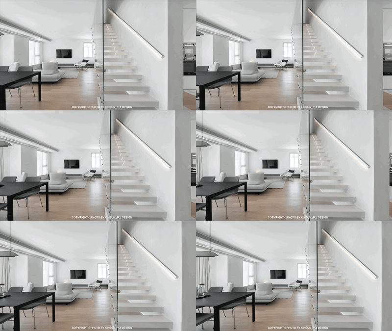
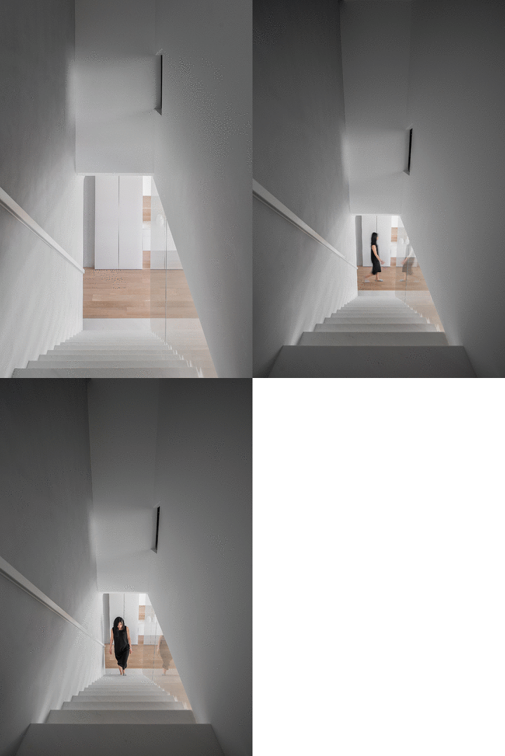
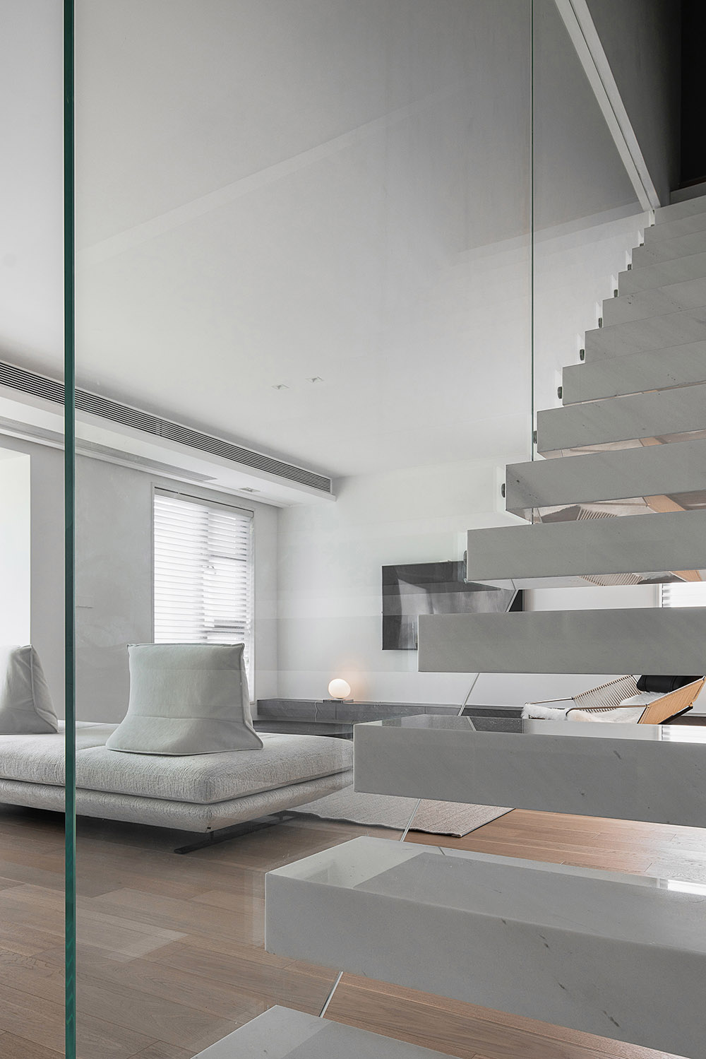
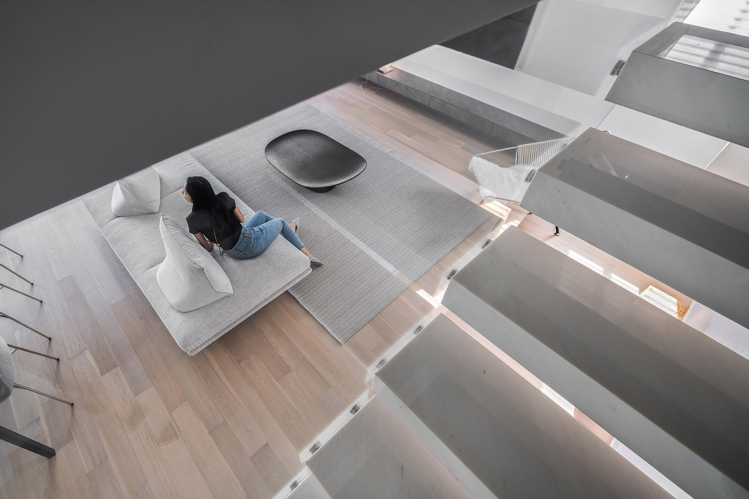
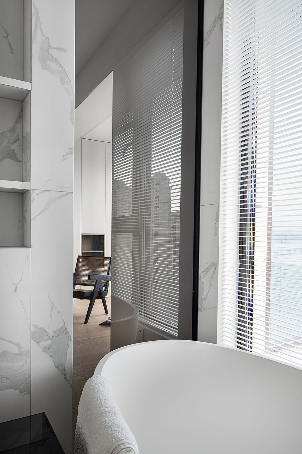
借由地台的連接,轉而到樓梯區域,以獨立單體為鏤空考慮,鋼架外包白色石材,外部裝飾固定件,通過透明玻璃來區隔與公區的關係,由低到高的包裹性釋放,可被視作獨立的單體存在,也可適宜的關聯到整體區域。
Through the connection of the floor, it is transferred to the Stair area, with independent single body as the hollow consideration, steel frame covered with white stone, exterior decorative fixed piece, through transparent glass to separate the relationship with the public area, from low to high wrapped release, it may be considered as a separate unit or it may be appropriately associated with the whole region.
‘結合所處者行為的思維審視’
‘think in terms of the behavior of the person in the situation’
在日常與空間所關聯的間隙中尋求更多的觸碰方式可能性,再結合多維的邏輯探討,使其可以從形式或機能上被附以新的二次定義。
In order to find more possibilities of touching in the space-related gap, and combine with multi-dimensional logical discussion, it can be attached with new secondary definition in form or function, based on the reverse thinking of the conventional concept.
櫃體未到頂的處理,在溝通階段也是再三跟業主闡明我們所要表達的初想,‘釋放天花’,讓空間的麵體概念可以更為強化,不再拘泥任何一種固有的形式,作為連接就餐區及門廳區的轉折櫃體,讓動線引導的更為順暢。
The treatment of the cabinet body not reaching the top is also to explain to the owner again and again in the communication stage the original idea that we want to express, ‘free the ceiling’ , so that the concept of the space’s surface can be more strengthened, no longer rigidly adhere to any one kind of inherent form, as a connection between the dining area and the vestibule area of the turning cabinet body, so that the line guide more smoothly.
‘任何事物發展的兩麵性側重,衝突與矛盾。’
‘The duality of any development focuses on conflict and contradiction. ‘
以自訴的方式來尋求所處者與空間所要建立的情緒聯係,使其更自然的連貫整體,讓彼此空間所建立的介質以所處者為主導。
By means of private prosecution, we seek the emotional connection between the place and the space, make it more natural and coherent, and let the medium established by the space be dominated by the place.
‘伴有反思的心態去驗證
空間的切實可操作性,歸於實際,歸於體驗。’
‘with a reflective mindset to validate the Operability of space, to be practical, to be experiential. ‘
‘探討日常與空間所關聯的互動
間隙,進而提升私宅對外所闡述的情感共鳴。’
‘explore the interaction gap between the everyday and the space in order to enhance the emotional resonance of the Private House. ‘
‘讓回歸的意義更落實到日常和更為
平凡的事件,讓空間更具可考究及情感共鳴的建立。’
‘Make the meaning of return more real to the daily and more ordinary events, so that the space can be more refined and the establishment of emotional resonance.’
以相對的方式作為切入來對室內空間進行理性的梳理和重組,再對其反向型推論,使其邏輯及脈絡更為達順,來加強其實際的可落地性及說服力。
In a relative way as a cut-in to the indoor space for a rational comb and reorganization, and then to its reverse-type inference, make its logic and context more coherent, to strengthen its practical ground and convincing.
‘凝視,是重新
思考視覺自身的真正品質。’
‘To gaze is to rethink the true quality of vision itself. ‘
從居住者的角度來審視所處空間的有結合性,有反向的思考人與空間的更多交互可能性,而不是有失衡的偏向合理與否。
From the perspective of the occupants to examine the space in which there is a combination, there is a reverse thinking of the possibility of more interaction between people and space, rather than the imbalance of the bias reasonable or not.
∇ 平麵圖
項目信息
項目名稱:內述
項目地址:浙江.永嘉
主創及設計團隊:千上空間設計
主創設計師:蘭斯
設計參與:張瑤瑤.蔡麗君
攝影師:吳昌樂
建築麵積:170 m²
設計時間:2019.6-2019.9
竣工時間:2019.11-2021.5
Project name: Inside description
Project location: Zhejiang. Yongjia
Creation and Design Team: Kinsun Design
Lead designer: lance
Contract Design: Zhang Yaoyao.Cai Lijun
Photographer: Wu Changle
Building area: 170 m²
Design Year: 2019.6-2019.9
Completion: 2019.11-2021.5


