全球設計風向感謝來自 Oft Interiors Ltd 的車庫空間項目案例分享:
OFT設計丨車庫3.0時代:跑車博物館x社交場景
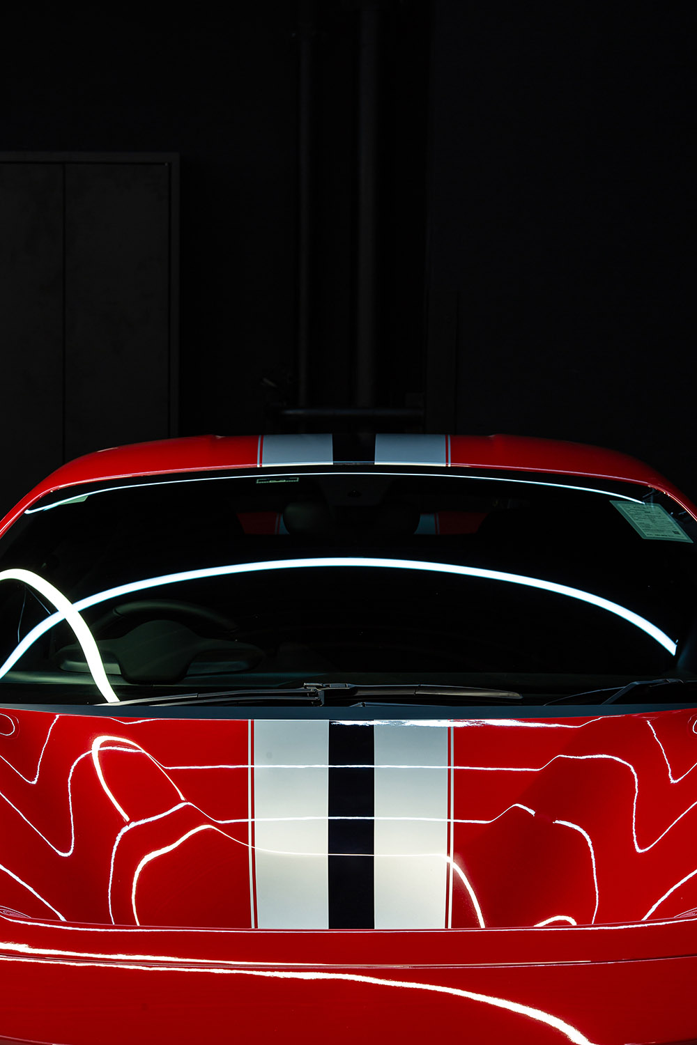
E CARPARK是為跑車狂熱愛好者設計的車庫,對愛好者而言,跑車不僅是交通工具和藝術品,還代表著內心的自由與冒險,這個車庫所展示與強調的便是車帶來的流動的自由。
如何把幽暗封閉的車庫變成未來感跑車博物館?
E CARPARK is a garage designed for sports car enthusiasts. For enthusiasts, sports cars are not only means of transportation and artwork, but also represent the freedom and adventure inside, and what this garage shows and emphasizes is the freedom of mobility brought by cars.
How to make the dark closed garage into a futuristic sports car museum?
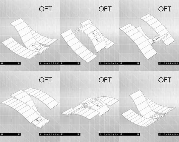
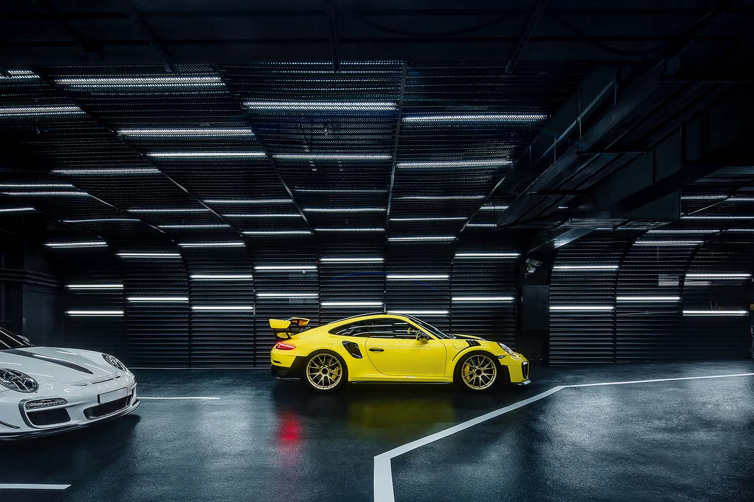
OFT設計以“科技·流動·自由·社交”四個關鍵詞為概念,在地麵與天花上以大量的直線與曲線,模擬車輛在道路上的疾馳狀態,將其行駛動態一直延續在這流動的體驗式場景中,象征著永不停止的冒險之旅。
這裏,不是終點而是起點。
OFT chooses four key words as the concept of design:”technology·flow·freedom·future”. A large number of straight lines and curves on the ground and ceiling simulates the speeding state of vehicles on the road, which enables the driving dynamics to be continued in this flowing space, symbolizing the never-ending adventure.
This is not the end, but the starting point.
1 自由與冒險的起點 The starting point of freedom and adventure
該項目在改造前是香港銅鑼灣商業大廈配套車庫,業主買下後作為私人車庫使用,雖是私人車庫,但麵積足足有1000㎡。
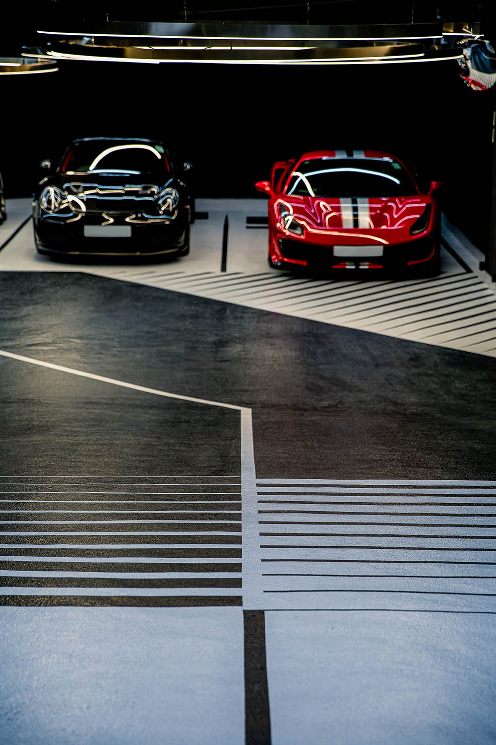
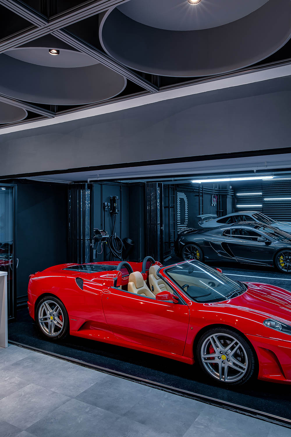
考慮到業主跑車愛好者的身份,以及為凸顯車在空間中絕對主角的身份,設計師在這個1000㎡的車庫僅設置了28個車位,車位尺寸也也略大於常規,就從展示這一層麵來說,E CARPARK可以說是一座名副其實的微型跑車博物館。
The project was a supporting garage for the Causeway Bay commercial building in Hong Kong before the renovation, and the owner bought it as a private garage, although it is a private garage, the area is fully 1000 square meters.
Taking into account the owner’s identity of sports car enthusiast, as well as to highlight the identity of the absolute protagonist of the car in the space, the designer set up only 28 parking spaces in this 1,000 ㎡ garage, and the size of the parking spaces is also slightly larger than conventional. In terms of displaying, E CARPARK can be said to be a veritable miniature museum of sports cars.
設計時,OFT保留了其原始結構,將重點放在導視、照明、牆麵、色彩等維度進行改造。
When designing, OFT kept its original structure and focused on the dimensions of guidance, lighting, walls and colors for renovation.
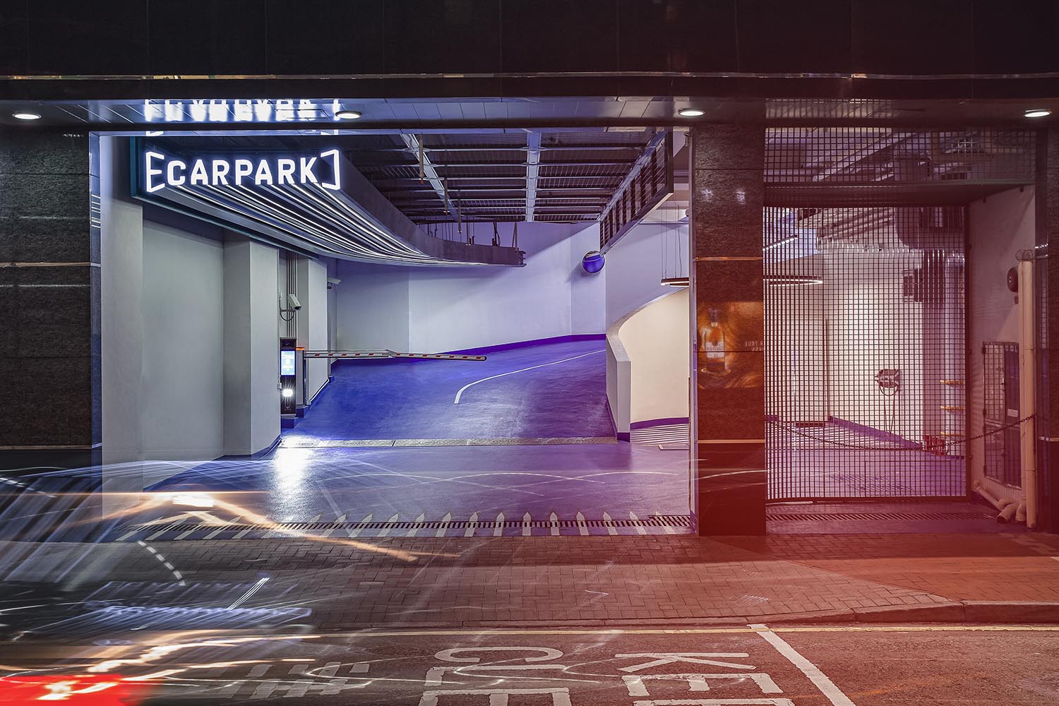
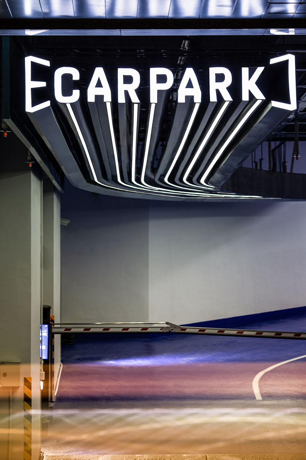
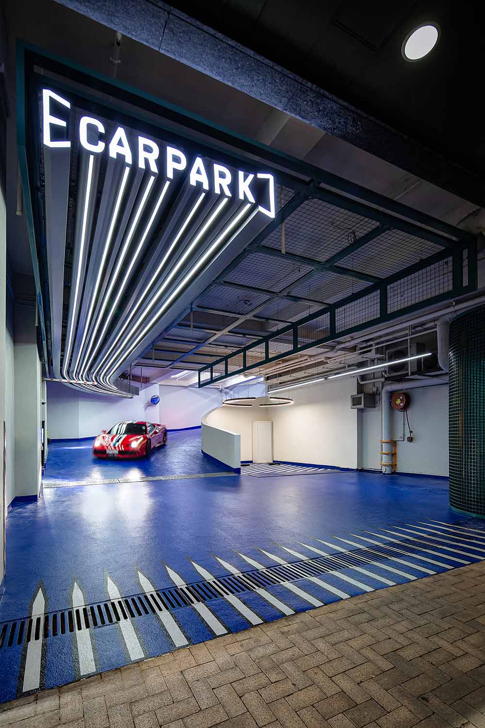
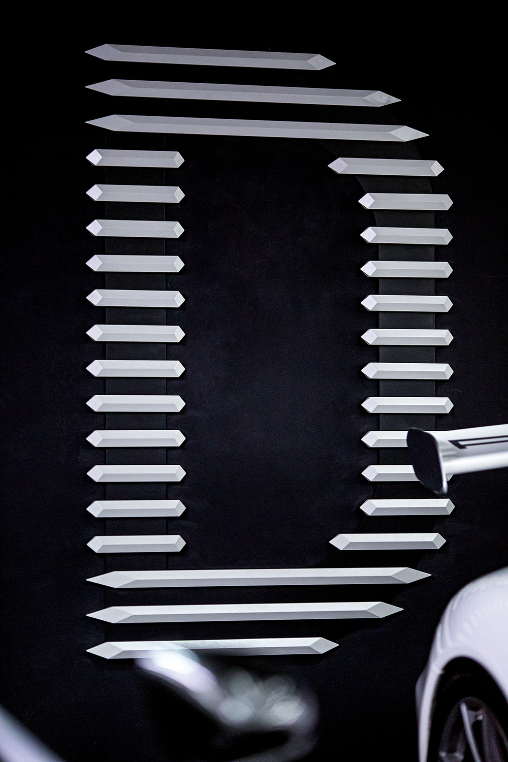
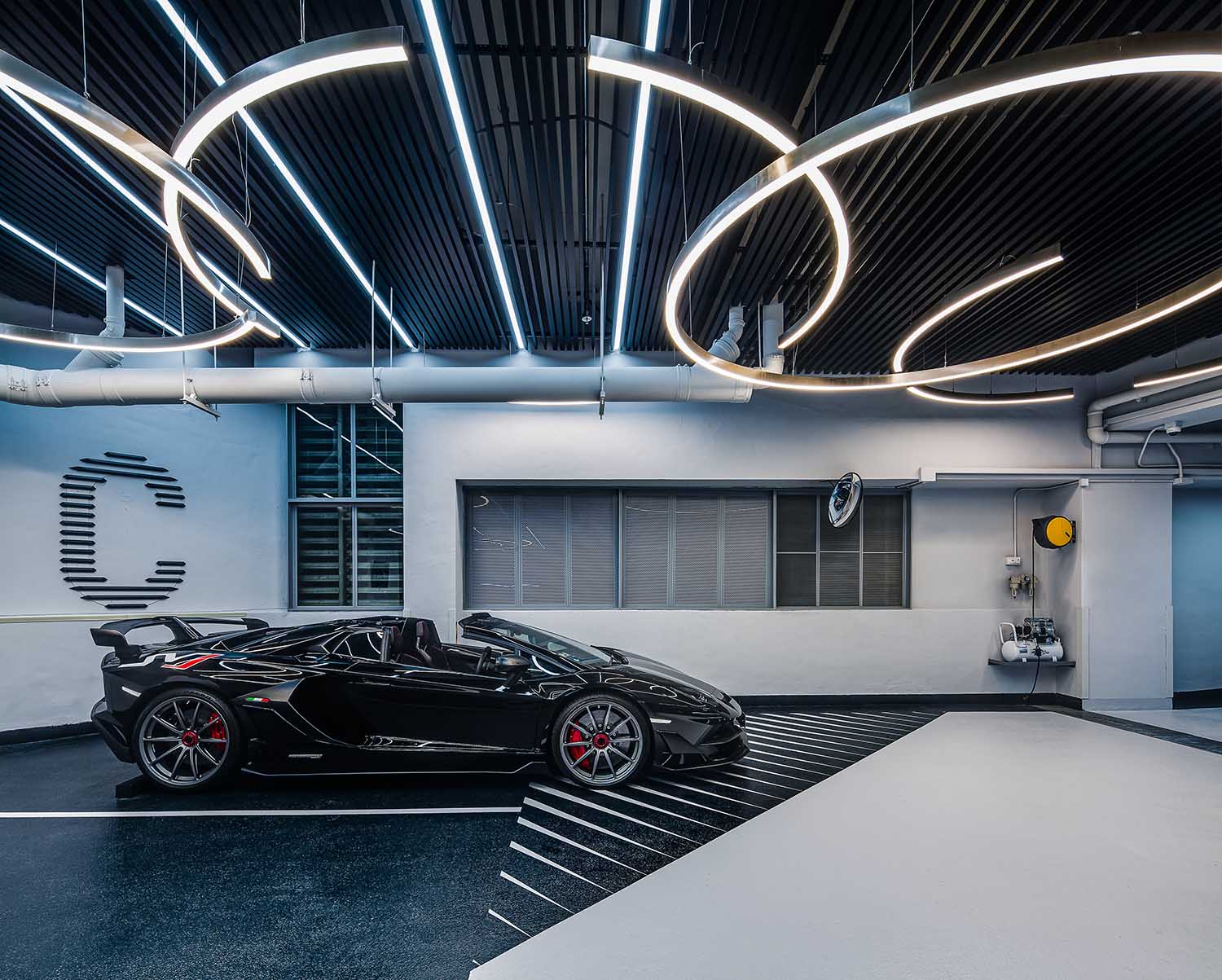
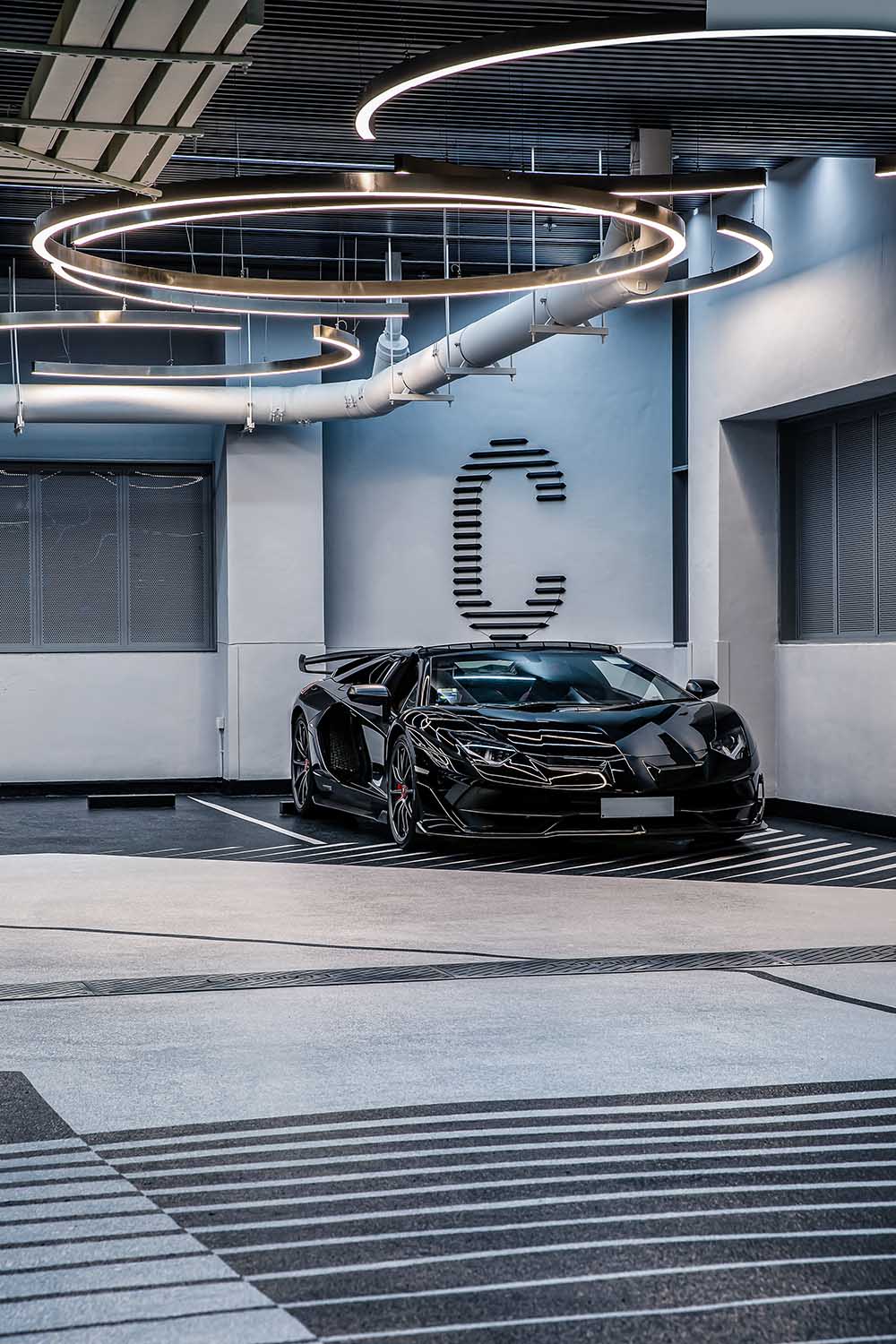
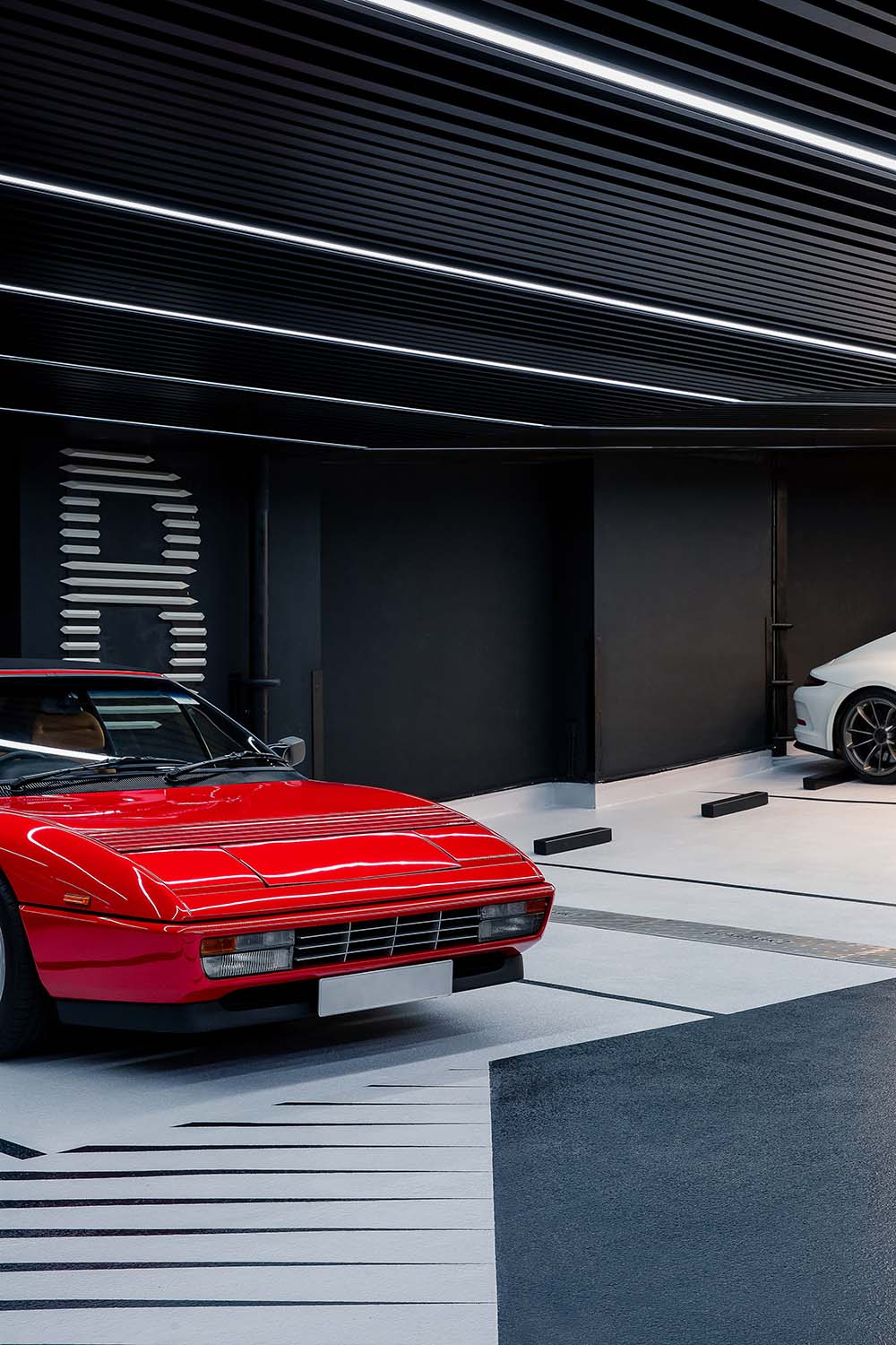
入口處承擔著業主對車庫的第一印象的作用,為增強序列化的儀式感,設計師為車庫設計了獨有的LOGO,並用連續的LED燈帶創造出空間的無限延伸感,LOGO既作為獨特的空間標誌,又成為引導性照明,指引著車主進入,提升車主內心歸屬感。
The entrance assumes the role of the owner’s first impression of the garage. To enhance the sense of serialization ritual, the designer designed a unique LOGO for the garage and created a sense of infinite extension of the space with continuous LED light strips. The LOGO serves both as a unique space mark and as guiding lighting, directing the owner to enter and enhancing the owner’s inner sense of belonging.
車庫坡道是車庫設計的重點之一,作為車輛駛入地庫的必經之道與第一空間節點,其性能優劣,直接影響出入口的安全指數。
因此在設計上,首先坡度必須足夠小(蘭博基尼不碰底盤);同時還要防滑防震降噪;除此之外,還要防眩目以減少出入地庫的視覺刺激。
Garage ramp is one of the key points of garage design. As the necessary way and the first space that vehicles entering into the basement, its performance directly affects the safety index of the entrance and exit.
Therefore, in the design, the slope must be small enough (Lamborghini does not touch the underpan); at the same time, it also need to be anti-slip, anti-vibration and noise reduction. In addition, anti-glare to reduce the visual stimulation when in and out of the basement is necessary.
2 流動的空間感:人性化向導標識 A sense of flowing space: humanized guide signs
如今LED燈具已逐步取代傳統熒光燈成為未來趨勢。
Nowadays, LED lamps and lanterns have gradually replaced traditional fluorescent lamps as the future trend.
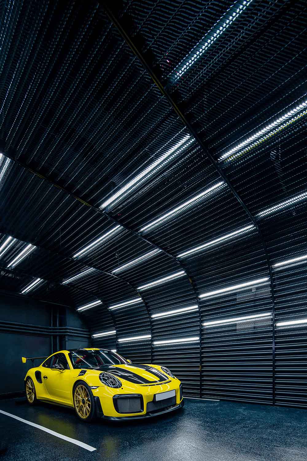
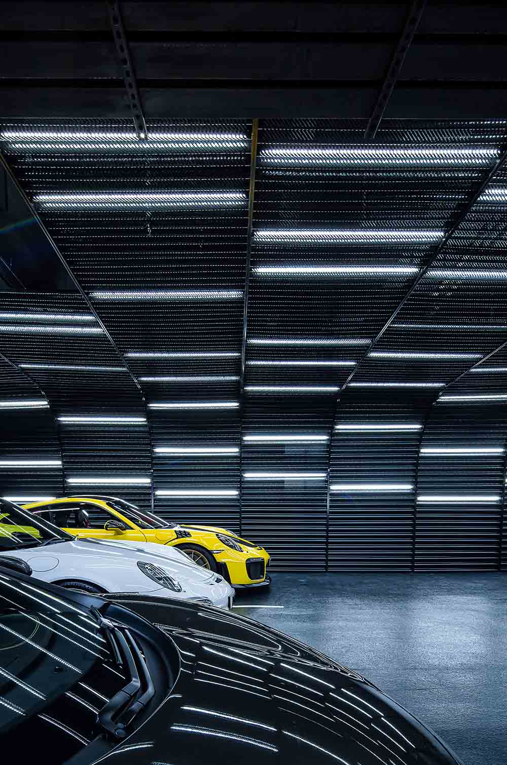
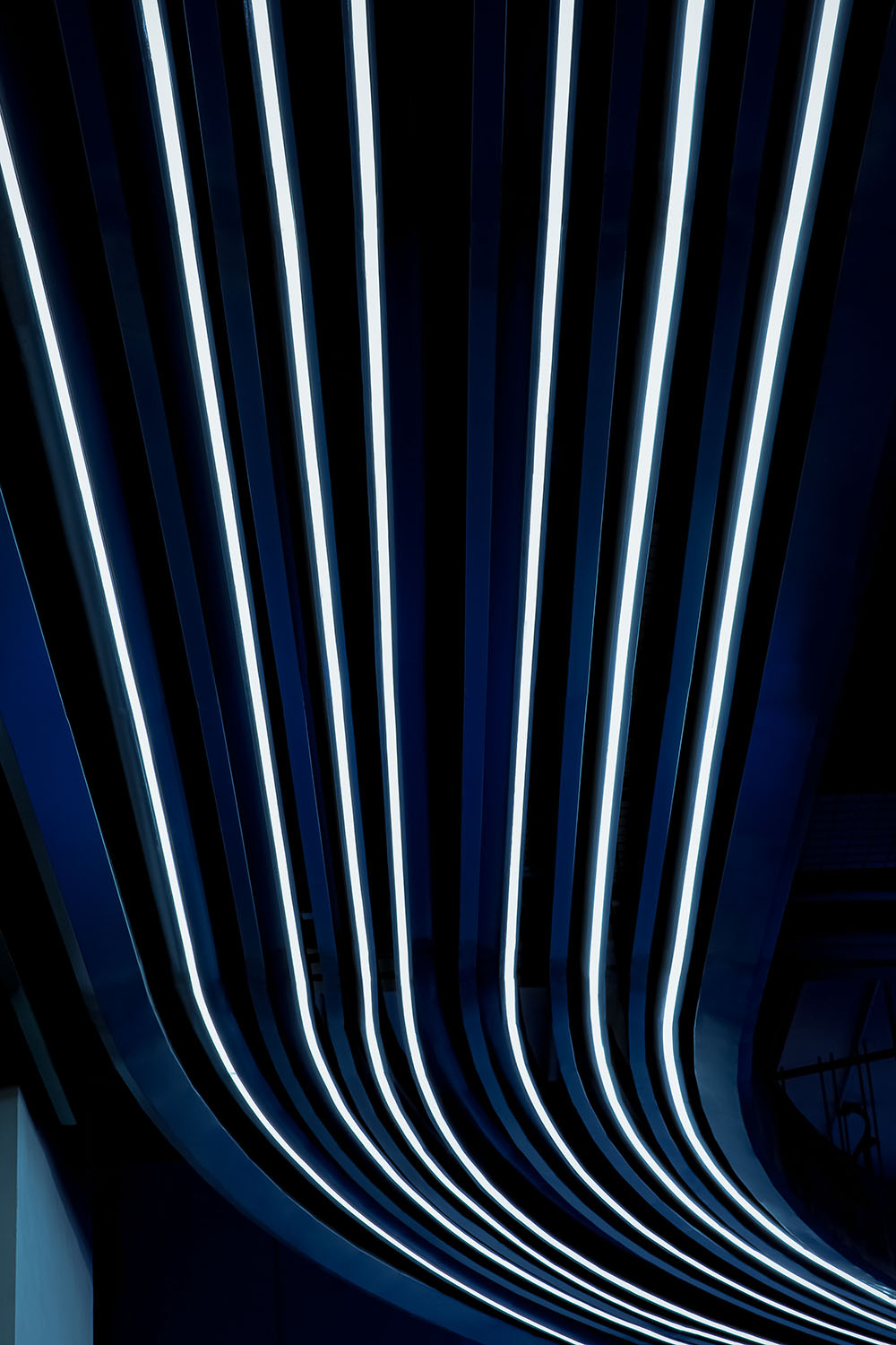
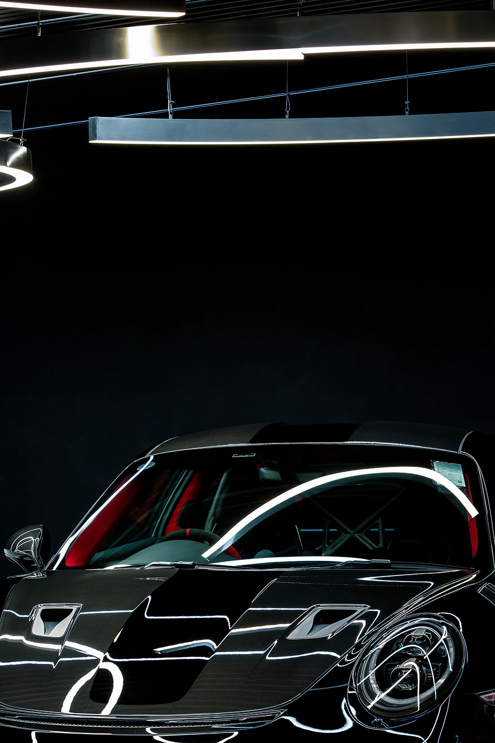
在該項目中,OFT使用了大量為車庫專門定製的LED照明燈具,在增強空間通透性與明亮度的同時,也打破傳統單一照頂部聚焦式照明方式,變成從頂部到牆麵的局部漫射式照明,把原本促狹靜止的車庫,變成一個自由流動的博物館。
In this project, OFT used a large number of customized LED lighting fixtures for the garage to enhance the transparency and brightness of the space, while also breaking the traditional single top-focused lighting method into local diffuse lighting from the top to the wall, turning the originally cramped and static garage into a free-flowing museum.
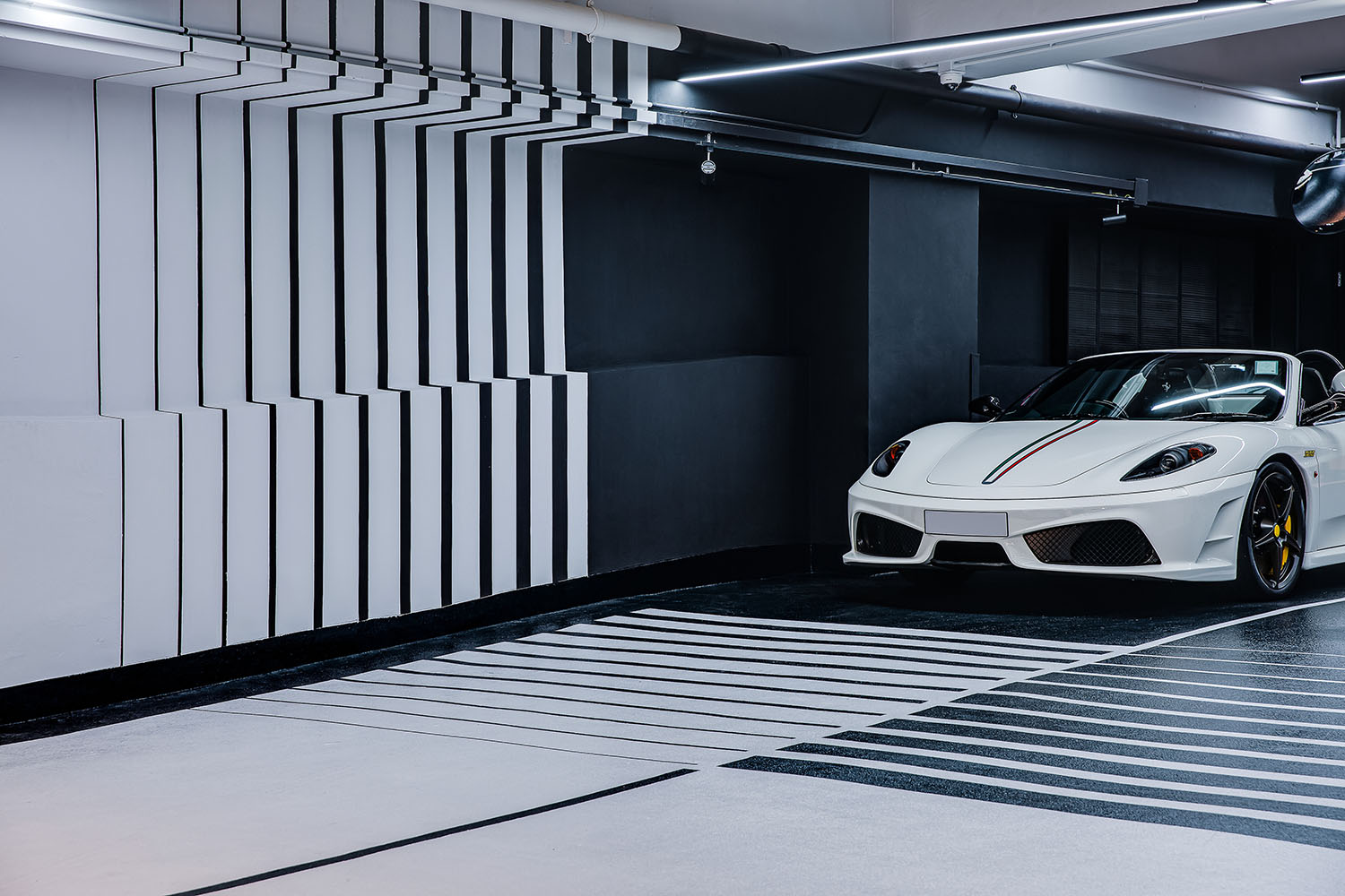
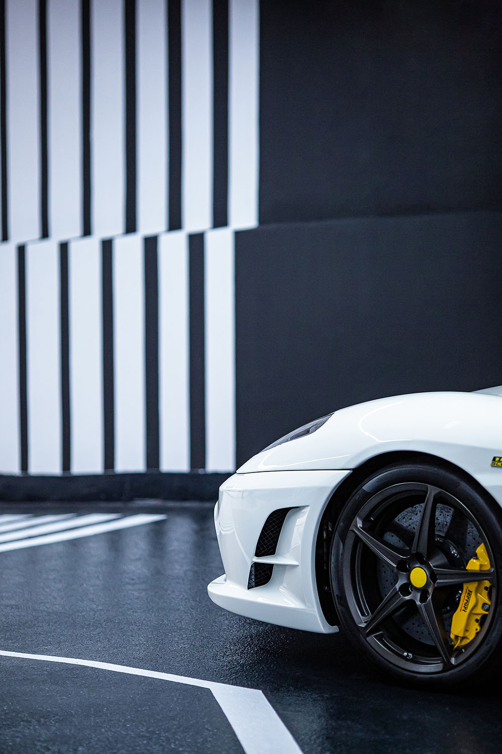
整體色調與氛圍上,OFT選擇了更為中性與科技的視覺方式呈現,入口處的牆麵利落的冷色調條狀燈與平麵元素刻意弱化色彩所帶來的對視線的爭奪。
In the aspect of the overall color and atmosphere, OFT chose a more neutral and technological visual presentation. The sharp cool color strip lights and flat elements of the entrance wall deliberately weaken the color brought about by the competition for the line of sight.
除了顏值能打之外,這些定製燈具還承擔著另外一個重要作用:導視係統與空間分區。
導視係統主要由牆麵的導視標識與地麵部位的車行劃線共同構成。
In addition to the appearance attractiveness, these customized lamps also assume another important role: the guidance system and space zoning.
The guidance system is mainly composed of the guide signs on the wall and the car line marking of the ground part together.
分區則由幾個表麵共同完成,車庫分為ABCD四個區域,設計師通過牆麵、地麵、天花對四個區域進行軟性隔斷。(此次為ABCD四個區域,通過拚圖體現牆麵、地麵、天花的不同)
天花:
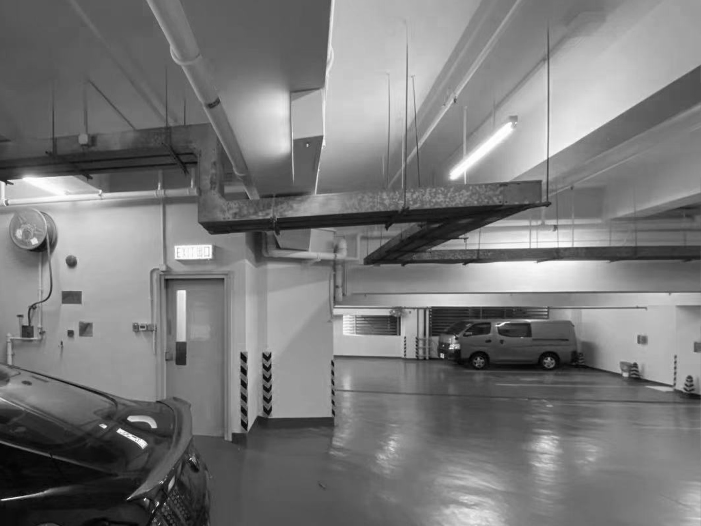
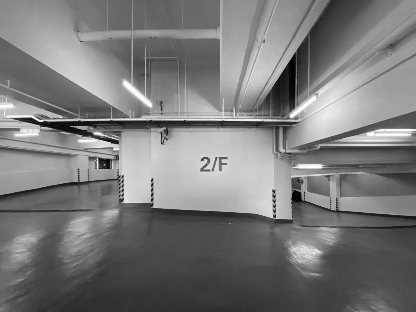
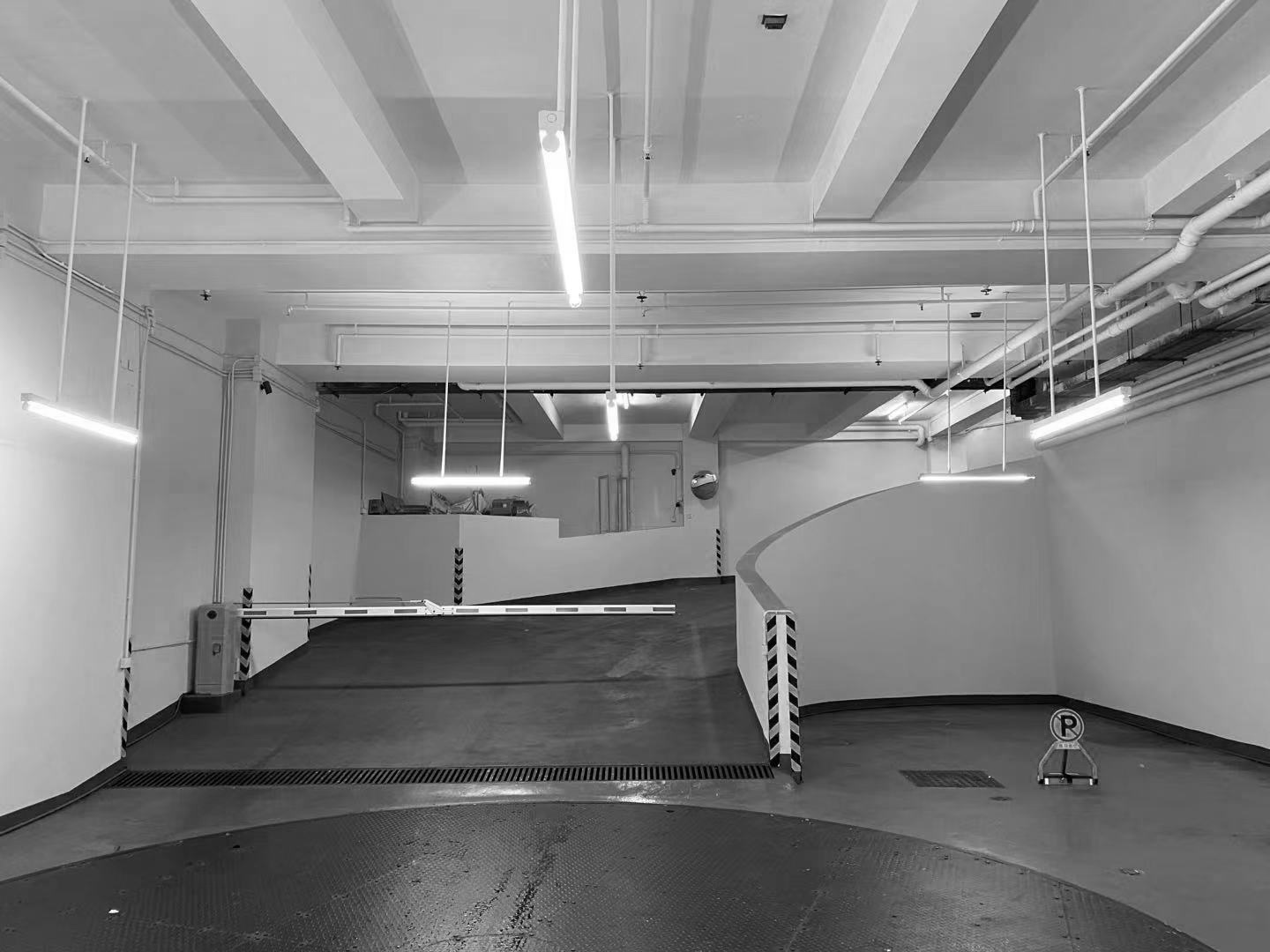
改造前:管道與出風管道裸露在外,看起來雜亂無章,頂部燈光為白色熒光燈,整體氛圍感弱。
The partition is completed by several surfaces together. The garage is divided into four areas of A,B,C and D, and the designer softly partitions the four areas through walls, floors and ceilings. (In the four areas, the difference between the wall, floor and ceiling are reflected through the jigsaw.)
Ceiling:
Before remodeling: the ducts were exposed and looked disorganized, the top light was white fluorescent, with overall weak atmosphere.
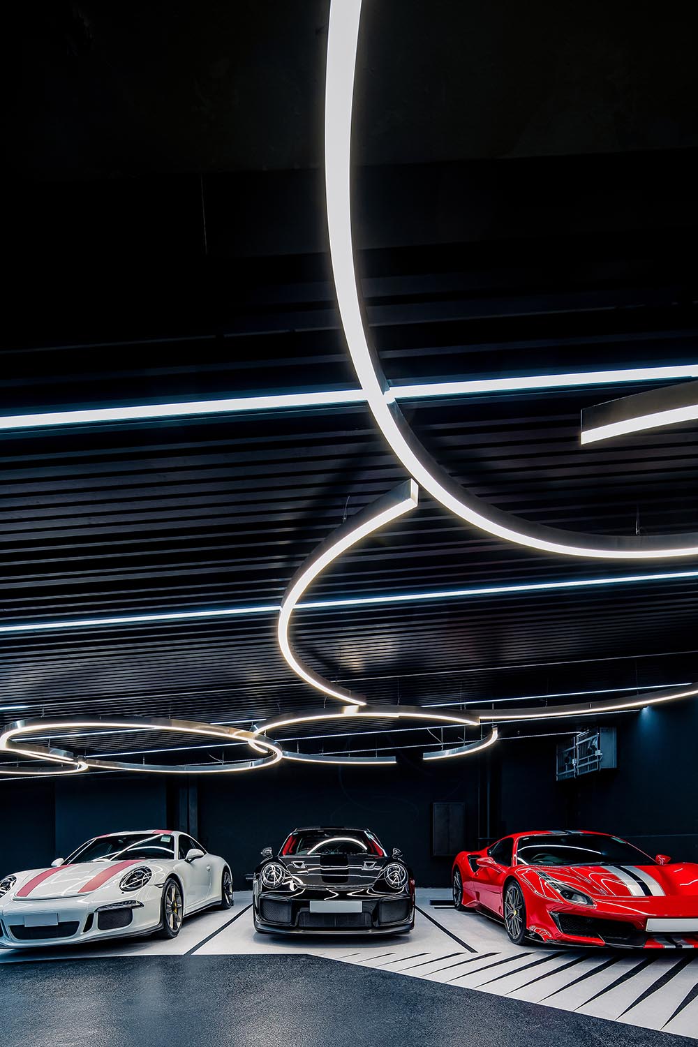
改造後:出風口被藏於天花之上,並定製線性、帶狀及圈狀燈具,在創造空間分區的效果的同時也成為空間的景觀。
牆麵:
改造前:牆麵是車庫最常規的乳膠漆白牆,不耐髒且過於普通,當那些價值不菲的藝術品在此停泊時,無論多出色的外觀與性能都隻能流連在著平庸的場景中。
After remodeling: The air vents are hidden above the ceiling, and custom linear, ribbon and circle light fixtures are made to create the effect of space zoning while also becoming the landscape of the space.
Walls:
Before: The walls were the most conventional latex painted white walls of the garage, which were not durable and too common. When those valuable artworks were parked here, no matter how outstanding the appearance and performance, they could only linger in the mediocre scene.
改造後:鋁合金裝飾板加發光LED導視,帶來移步換景的視覺體驗。
地麵:
改造前:大麵積的灰色地坪漆,易產生視覺疲勞,且地麵車行劃線不清晰,導致車輛在車庫中迷失。
After: aluminum alloy decorative plate and luminous LED guide bring a visual experience of moving and changing the scenery.
Flooring:
Before: large area of gray floor paint can easily produce visual fatigue, and the ground car line is not clear, resulting in vehicles’lost in the garage.
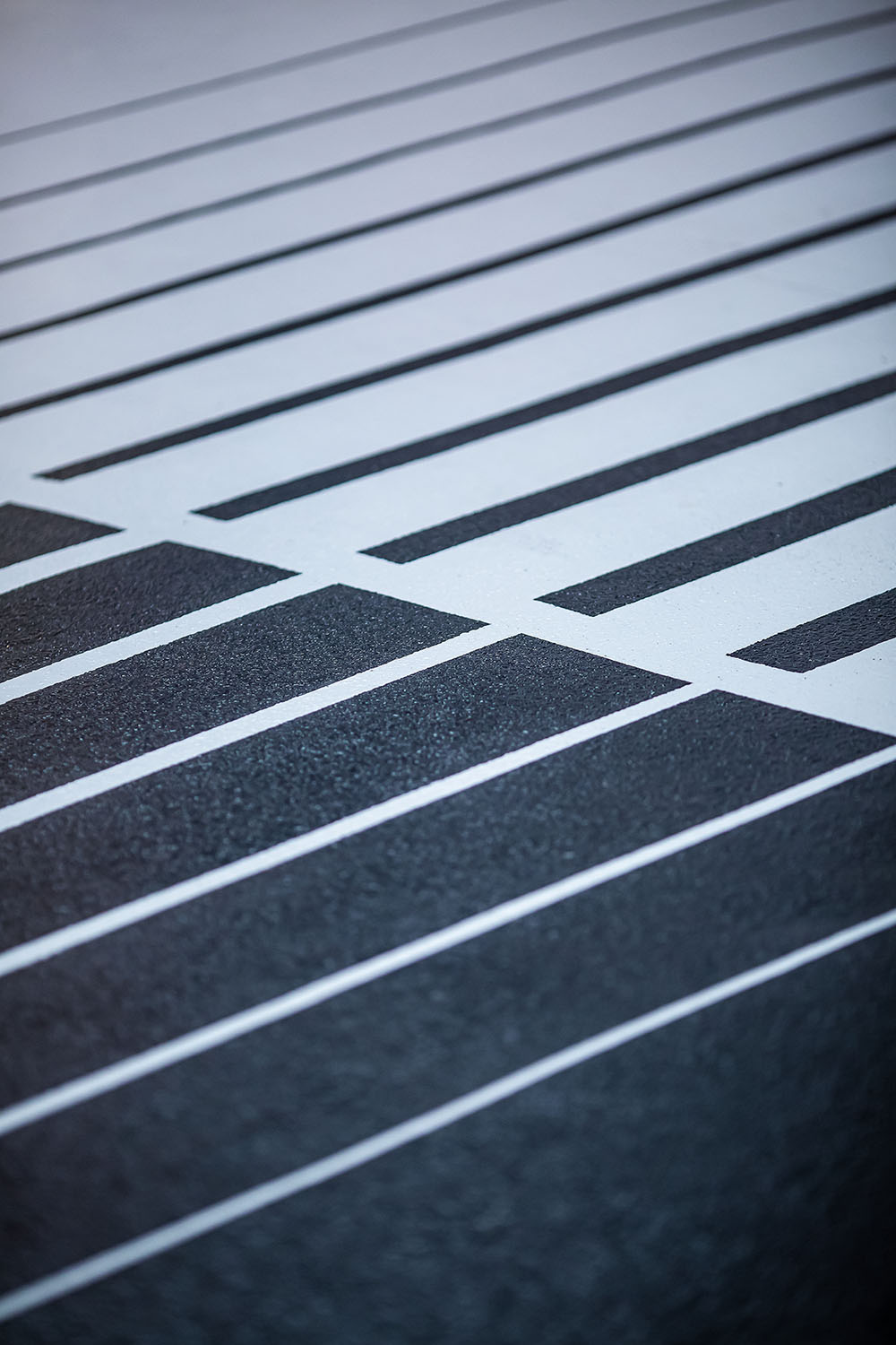
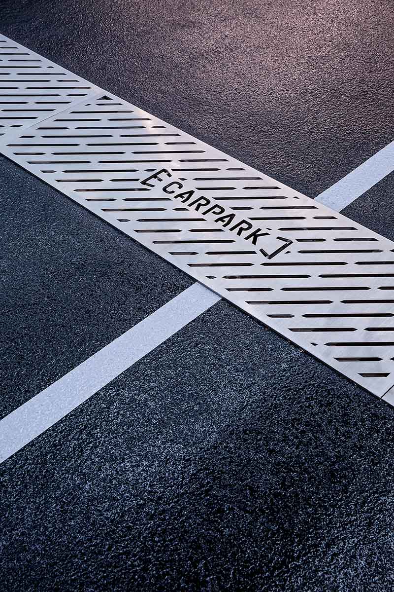
改造後:地麵利用平麵元素搭配整個空間主題以及分區效果,並定製帶有項目logo的地漏,用細節連接起空間、車庫與人之間的關係。
After: The floor uses flat elements to match the theme of the whole space as well as the zoning effect, and custom-made floor drains with logo of the project, connecting the relationship between the space, garage and people with details.
3 車庫3.0時代:跑車博物館+社交場景
Garage 3.0 era: sports car museum + social scene
除了重新規劃動線,OFT設計還提出以“跑車博物館+社交場景”的概念,重新定義車庫,讓更多冒險藝術家能夠在這個空間中交流、對話,創造人與車之間以及人與人之間的共鳴。
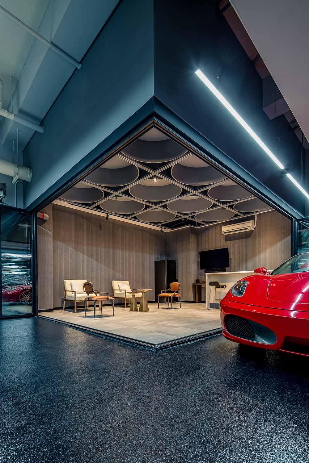
設計師在“跑車博物館”中開辟出一個全新社交空間,通過區別於其他區域的聚合式天花與地麵,設置出一個半開放式休閑區。
In addition to re-planning the moving line, OFT Design also proposed the concept of “Sports Car Museum + Social Scene” to redefine the garage, allowing more adventurous artists to communicate in this space, creating a resonance between people and cars as well as among people.
The designers have created a new social space in the “Sports Car Museum”, with a semi-open lounge area through a convergent ceiling and floor that is different from other areas.
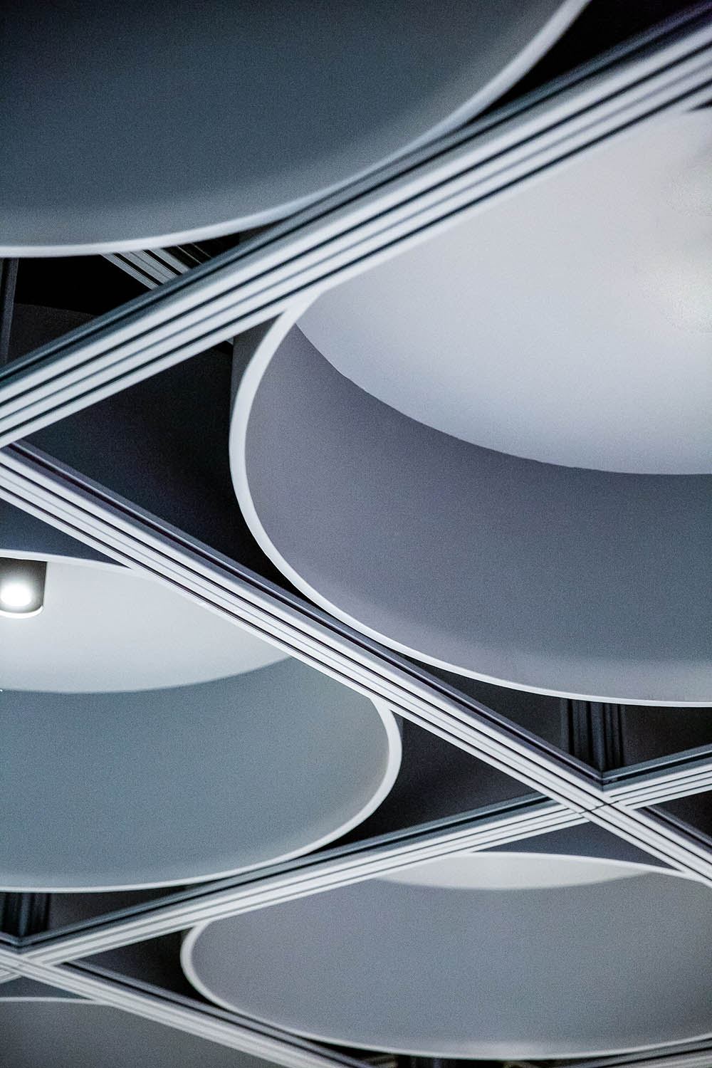
仰望頭頂上方,休閑區頂部做了圓形的吊燈裝置,區別於停車區輕盈的線條感,休閑區厚重的燈具帶來一種溫暖與安全的包裹感,暖黃的光線也為這個社交空間創造出獨具親和力與無距離的空間氛圍。
Looking up above the head, a round chandelier installation is made at the top of the lounge area. Unlike the light lines of the parking area, the heavy lamps in the lounge area bring a sense of warmth and security in the package, and the warm yellow light also creates a unique affinity and distance-free atmosphere for this social space.
當車友在此聚會聊天時,可以隨心所欲走到任何一台藝術品前欣賞、凝視,也可以隨時用行動去擁抱風和自由。
When car enthusiasts meet and chat here, they can walk to any piece of artwork to admire and gaze at it as they wish, and they can also embrace the wind and freedom with their actions at any time.
社交空間的出現,不僅豐富了車庫的功能屬性,也為單一的空間帶來更多層次,讓車庫不再是單調的場景,而是充滿了人性化的關懷。
E CARPARK顛覆了傳統車庫常見的“陰暗、潮濕”等被人詬病的印象,帶來獨具展示性、社交性、人性化的新風景,當這些移動的藝術品駛向此處時,轟鳴聲、速度與激情都已散去,隻剩無聲與優雅。
The emergence of social space not only enriches the functional attributes of the garage, but also brings more layers to the single space, so that the garage is no longer a monotonous scene, but full of humanized care.
E CARPARK overturns the common impression of “dark and wet” of traditional garage, and brings a new landscape with unique display, socialization and humanization. When these mobile artworks are driven here, the roar, speed and passion have been dispersed, leaving only silence and elegance.
項目信息
項目名稱:E CARPARK
設計公司:Oft Interiors Ltd
設計總監:鄒卓明、張敬貴
設計團隊:yoyo au
項目麵積:1000平方米
項目地點:香港銅鑼灣
設計時間:2020
施工時間:2021
項目攝影:hdp
Project Name:E CARPARK
Design Firm:Oft Interiors Ltd
Design Director:CM JAO, Ken Cheung
Design Team:yoyo au
Project Area:1000 sqm
Location:Causeway Bay, Hong Kong
Design Date:2020
Construction Period:2021
Project Photography:hdp


