全球設計風向感謝來自 DESFA GROUP INC. 的商業空間/買手店項目案例分享:
DESFA GROUP新作| 自由漫步在都市綠洲
bloomhub Boutique by Desfa Group
“Urban Oasis”
DESFA GROUP為時尚品牌bloomhub設計了全新的珠寶和眼鏡買手店,設計師以“都市綠洲”的概念,在趨於灰度的城市背景中營造了一個柔軟、開放、宜人且驚喜的空間。
Desfa Group designed a new boutique store for bloomhub, retail brand that sells jewelry and sunglasses. Based on the concept “urban oasis”, the designers created a soft, open, pleasing and surprising space in a gray urban setting.
現代都市宛如鱗次櫛比的鋼鐵森林,綠洲則是棲息於高樓之間的開放空間,為高強度快節奏的生活提供了舒緩之地。
An urban oasis is an open space located in between buildings or formed by surrounding buildings in an urban setting.
設計師在實際問題的解決之中激發靈感,構想了“都市綠洲”作為本案的主要設計概念,希望創造出自由漫步於都市與自然之間的購物體驗。
This was the main inspiration for the project, as most of the merchandise was required to be displayed on elevation. The design was aimed to create shopping experiences where customers can freely stroll between city and nature.
01 “都市”——矗立的現代大廈
“Urban” — modern high rise buildings
滿足特定商品的展陳要求,是設計師首先要麵對的挑戰。商店需要容納的商品數量眾多,采用集約的垂直陳列需要考慮顧客的視野,設計師聯想到組合式結構,隨即都市中高樓大廈的形象闖入腦海,高樓立麵蘊含的重複與靈活的幾何韻律,體現在珠寶的展櫃設計之中。
It was challenging to display a large number of merchandise in a 153sqm space. To meet the design requirements, Desfa Group created many modular display boxes in varying sizes, and combined them vertically around the space. The simple, repetitive form of the vertical display elevations remind of modern high rise buildings. Each jewelry collection gets its own dedicated cube, which is attached to the wall in the back.
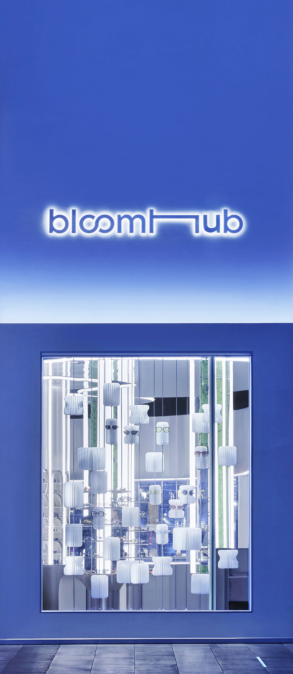
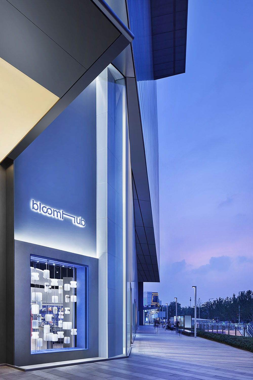
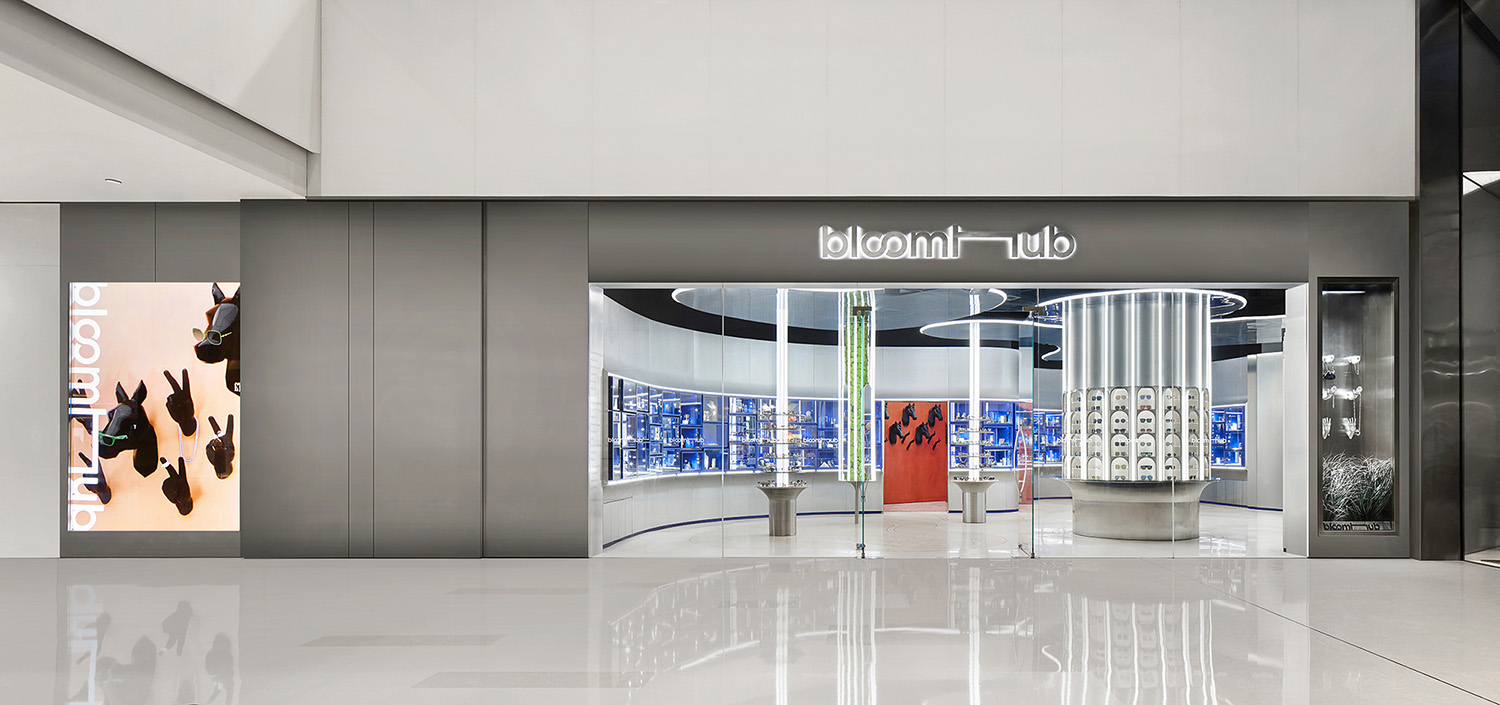
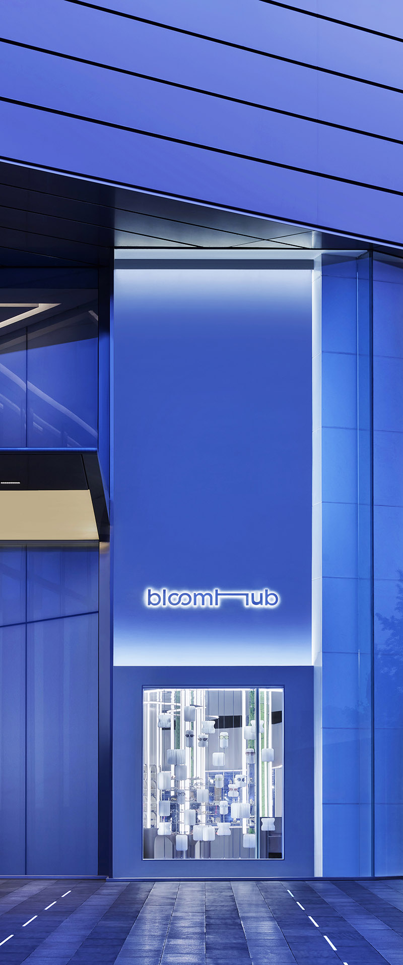
∇ bloomhub入口外觀概覽 Entrance elevation
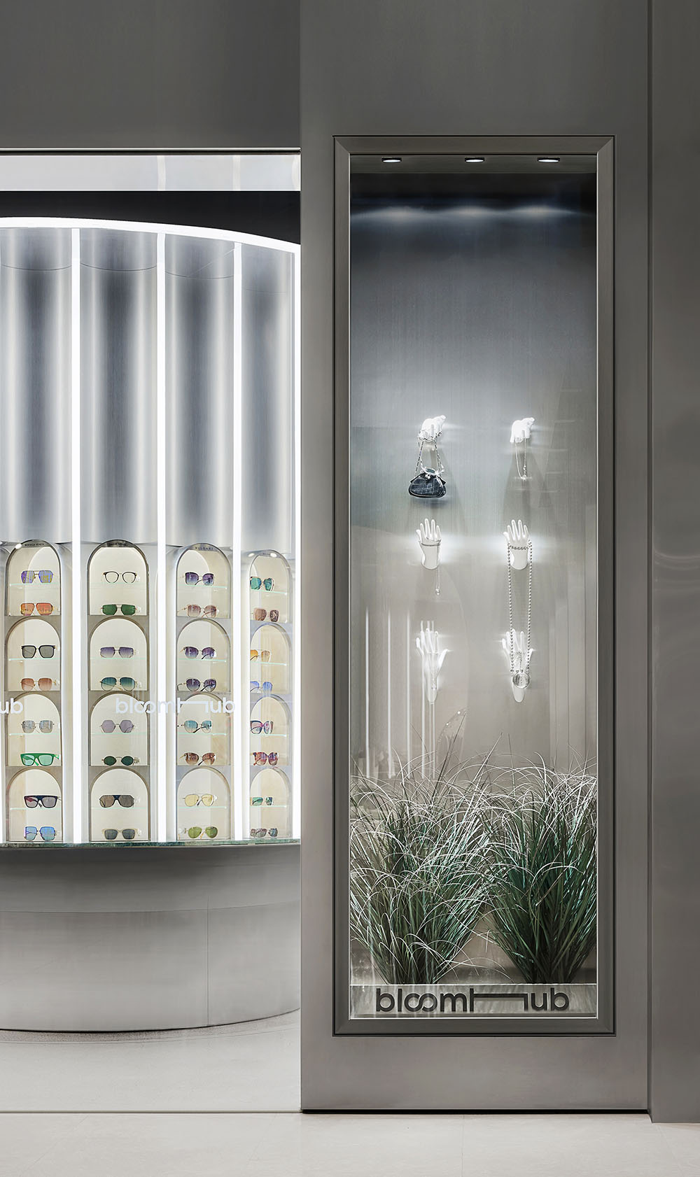
∇ bloomhub入口展示櫥櫃 Window display at the entrance
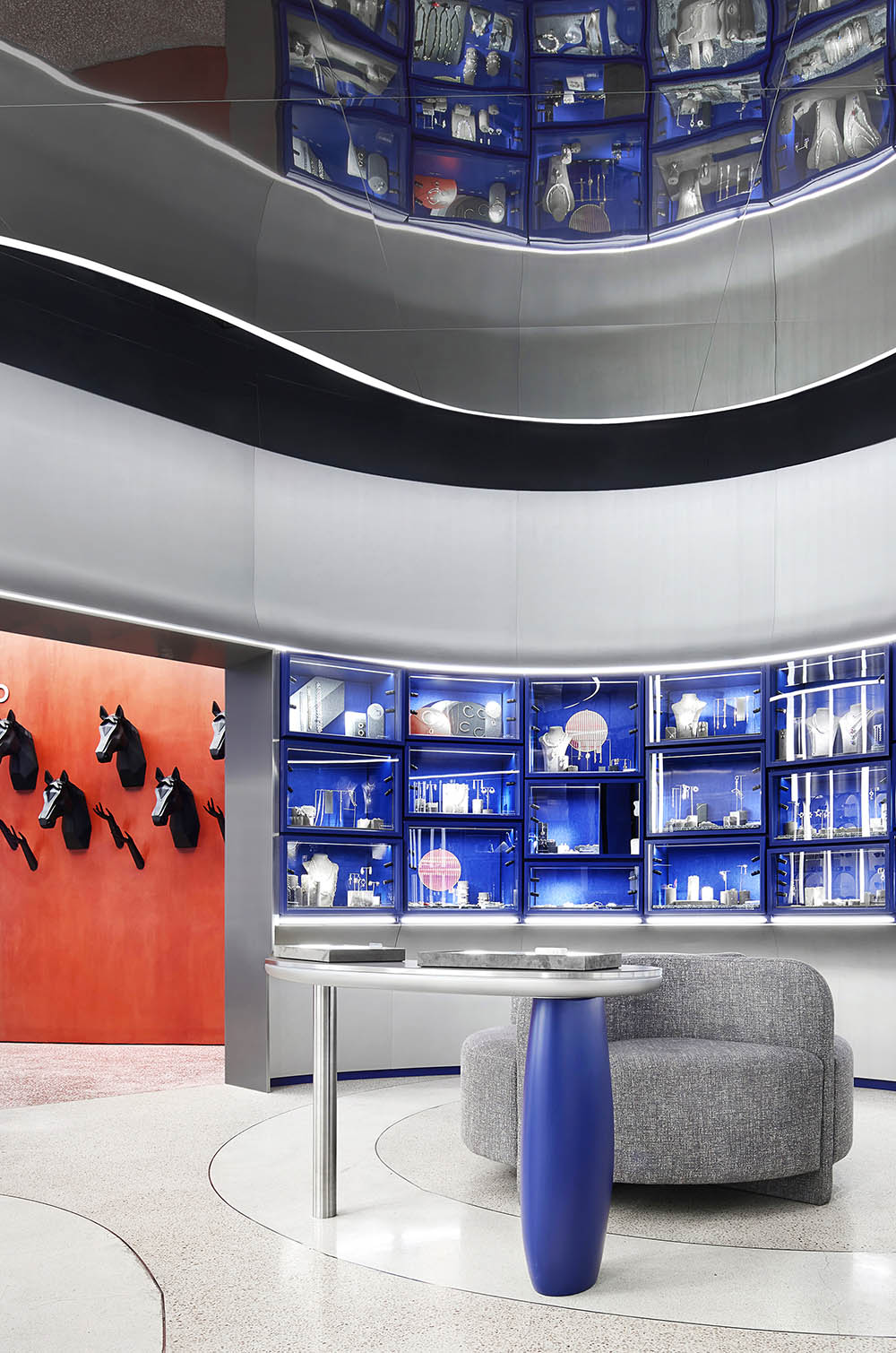
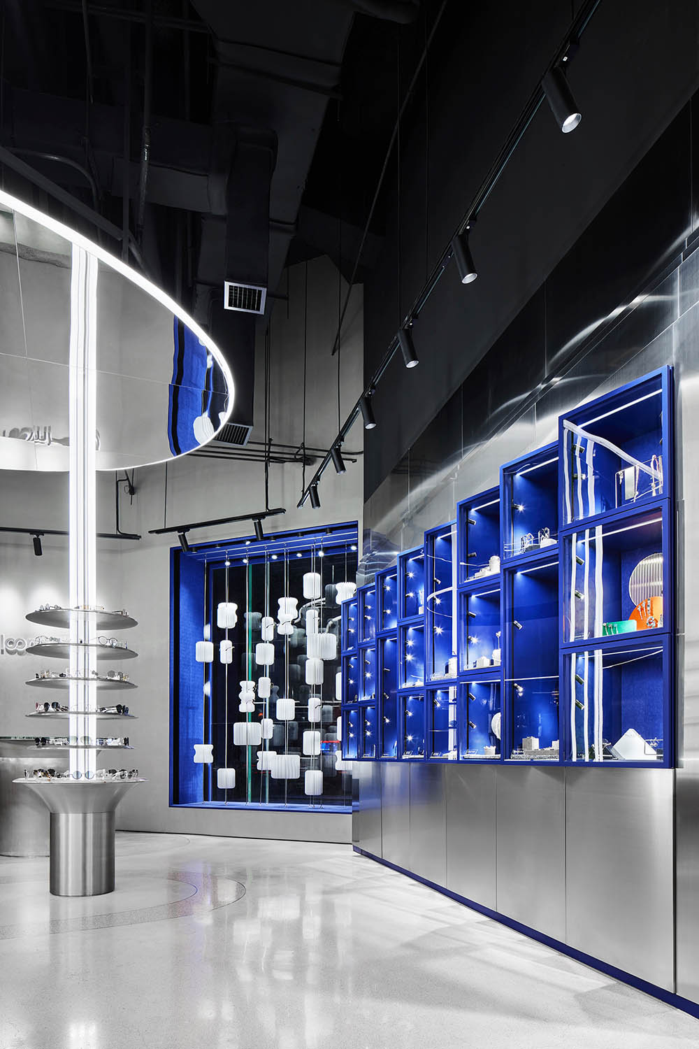
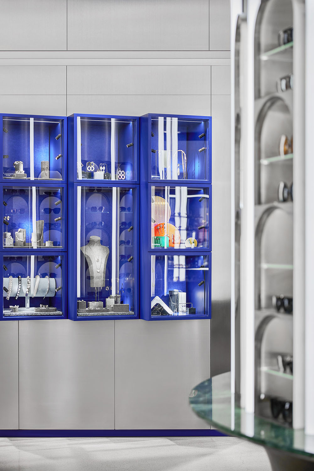
藍色的模塊化展櫃在垂直方向上錯動,富餘的單元會組合成特殊的尺寸,最終呈現如高樓立麵般生動變化的表情。
Vertically-combined blue modular display units are arranged in different sizes, presenting interesting expressions like the facade of a high rise building.
∇ 垂直方向上錯動的藍色單元展櫃 Vertically-combined blue modular display units
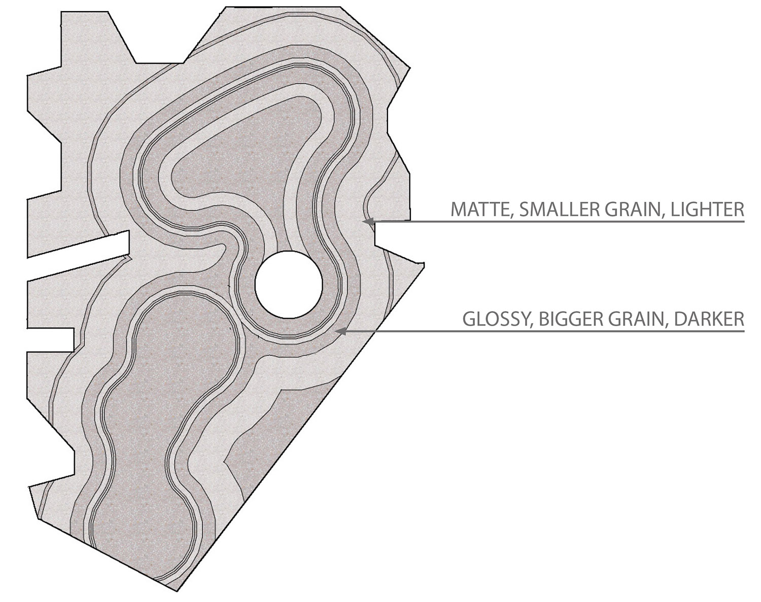
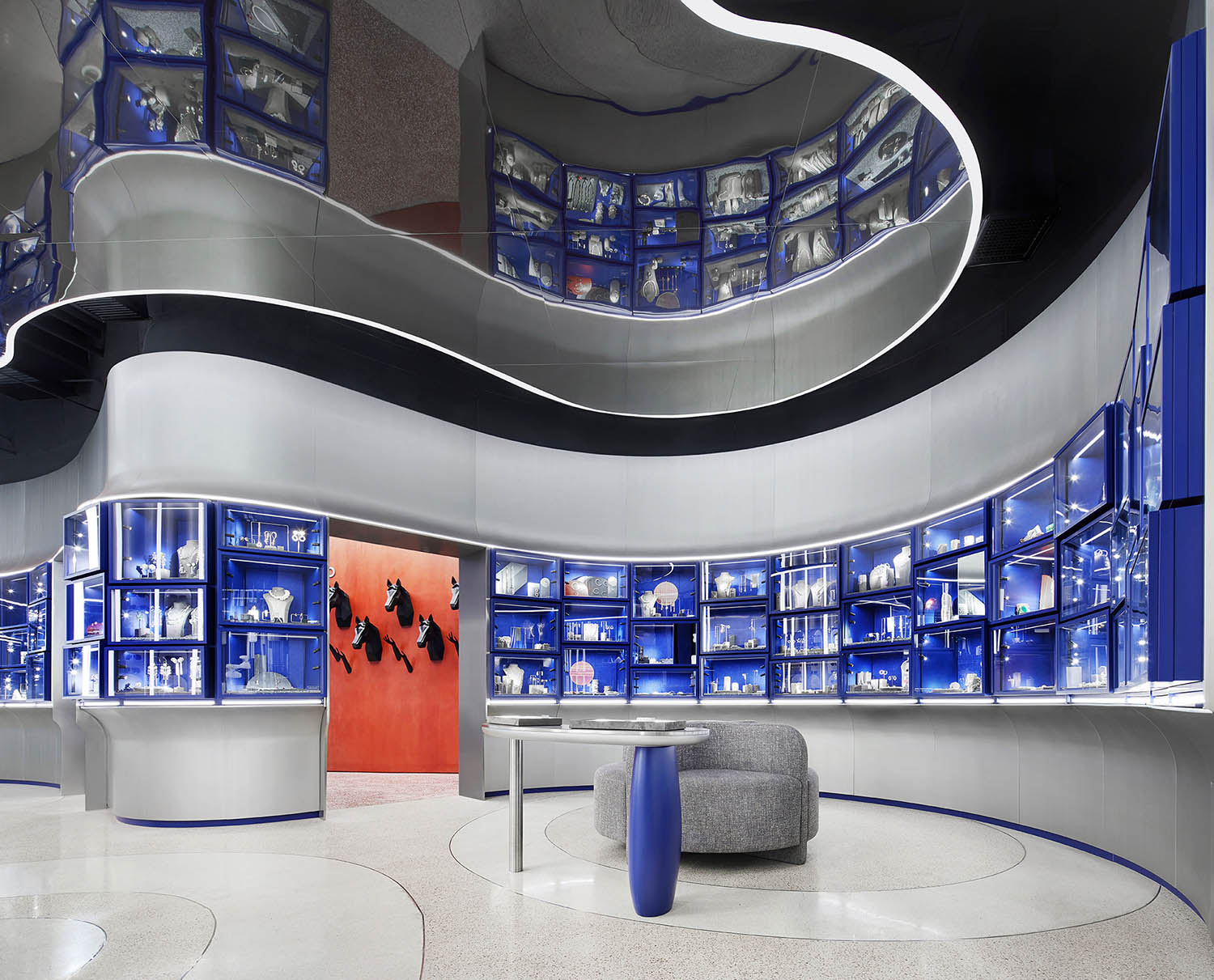
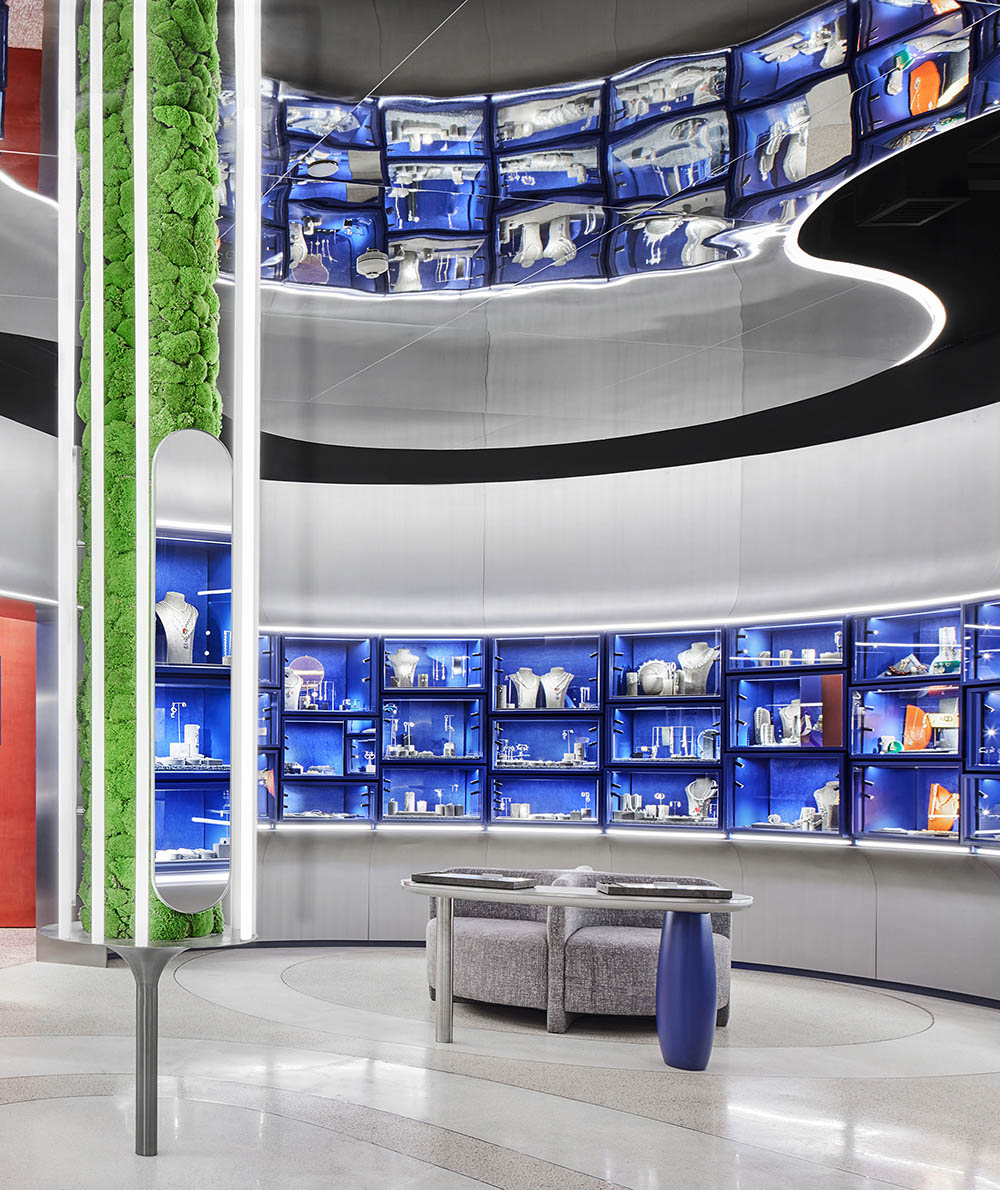
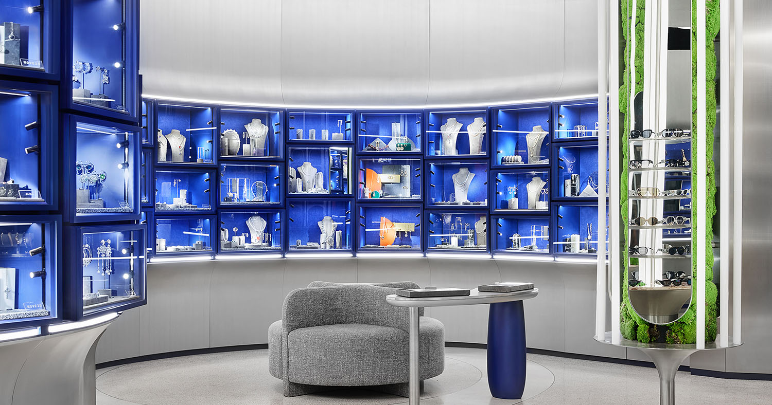
原始空間的牆麵長度有限,即使滿鋪也難以容納要求數量的珠寶展櫃。於是設計師突破原始空間對想象的束縛化直為曲,不僅提高了45%的展示麵積,而且創造性地改變整體空間的形態,使其更加柔軟。雙色的大理石鋪地也呈曲線劃分,漸次地傳遞出“都市綠洲”的設計概念。
The existing walls were reshaped in curves, which increased the display area by 45% and softened the overall space. Curved languages are also reflected in the floor pattern. Two colors of terrazzo are separated by thin metal strips, resembling pathways in urban oasis.
∇ 地麵概念,城市肌理中的景觀意境 Floor concept: pathways in urban oasis
∇ 富有創意的曲麵展櫃及雙色的大理石 Creative curved wall and terrazzo
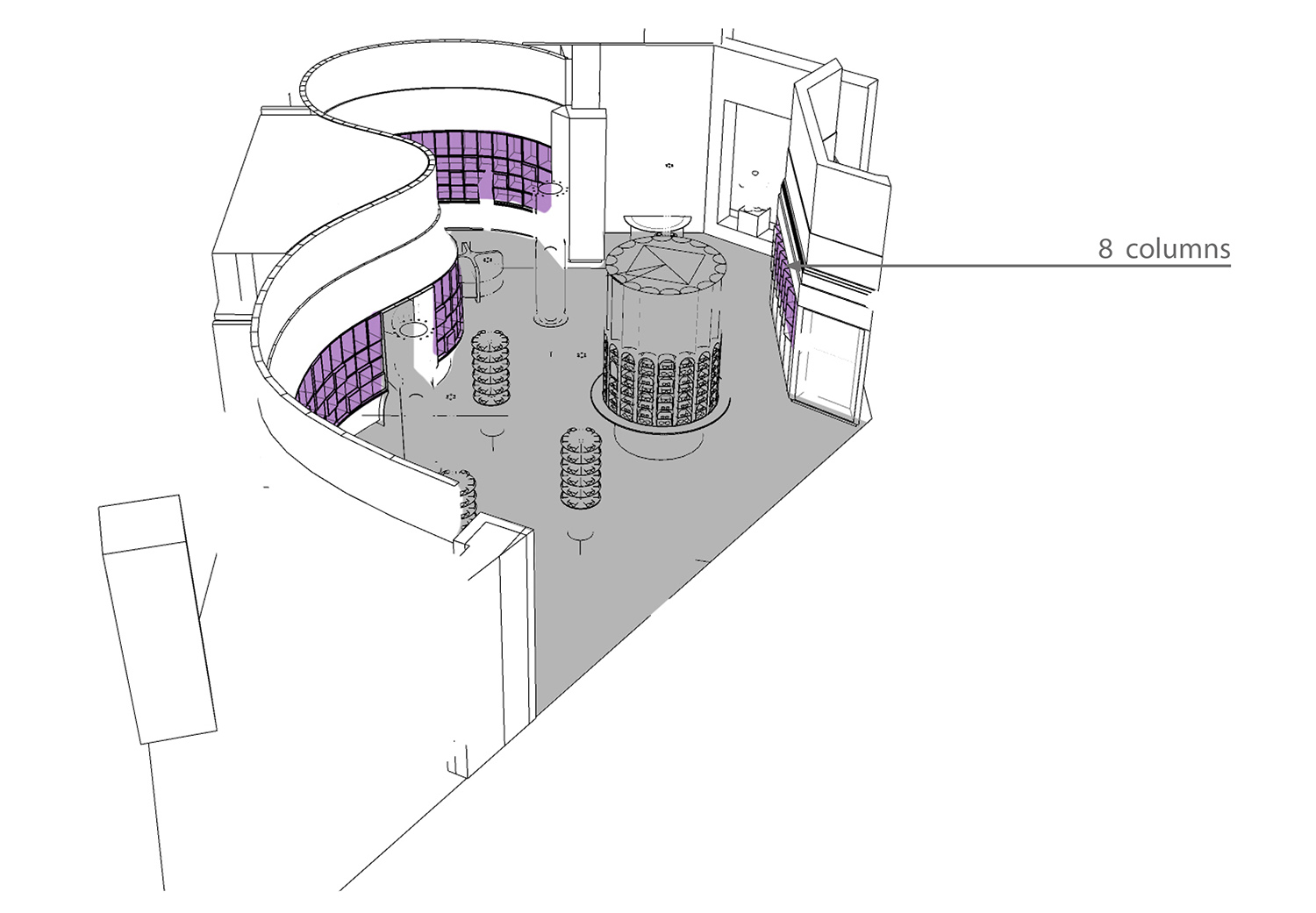
麵向街道展示的櫥窗麵打破了曲麵的連續性,於是設計師將餘下的牆麵設計成鋸齒狀的斜角展櫃,與曲麵形態形成對比,借由藝術與功能的平衡,能夠抓住顧客的眼球。
The display window along the street creates transparency. It reveals the artistic, functional integration of angularly-placed blue display boxes and curved wall, hence capturing the attention of passersby.
∇ 牆麵首飾展示區分析圖 Diagram of wall display for jewelry
∇ 鋸齒狀的斜角展櫃,以及麵向街道展示的櫥窗麵 Angularly-placed display boxes and window display along the street
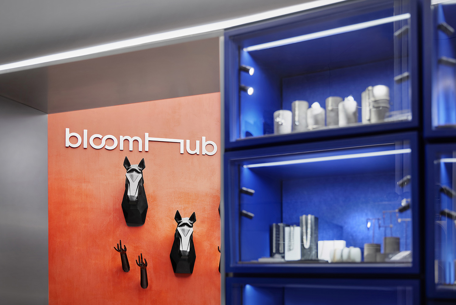
藍色展櫃裏的珠寶非常精細,因此設計師專門為每個櫃子設計了四個小射燈,並輔助一條隱藏的LED燈帶,提供十分精準的照明。
Because items in blue boxes are very small and lighting needs to be very precise, the designers used special light dedicated for illuminating jewelry — four small spot lights for each box in addition to hidden LED strips.
∇ 鋸齒狀的斜角展櫃,擁有十分精準的照明 Accurate illumination for jewelry in angularly-placed display boxes
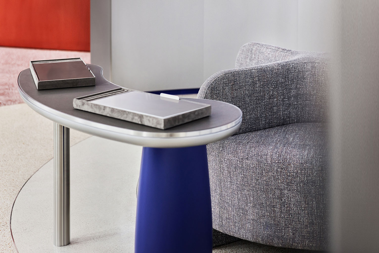
曲麵包裹的半圍合空間創造了一個親密的環境,顧客可以試戴心意的珠寶。
The curved wall creates a semicircle-shaped fitting space with seat in the middle. This semi-separated area allows customers to try on jewelry in a more intimate environment.
∇ 曲麵包裹的半圍合試戴區Semi-enclosed fitting area wrapped by curved wall
02 “綠洲”——柔和的生態棲息之地
“Oasis” — greenery
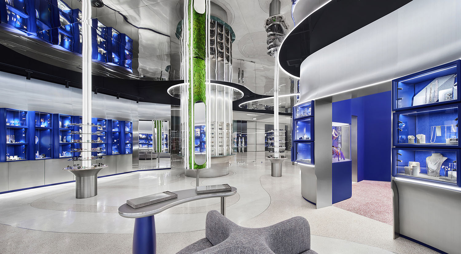
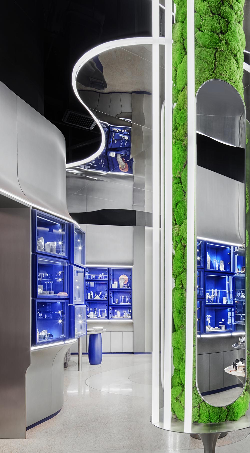
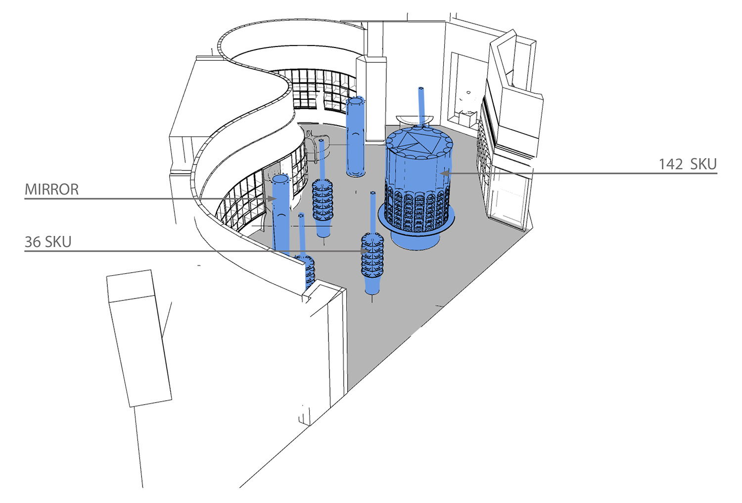
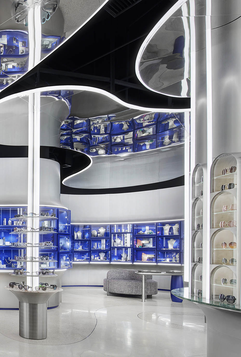
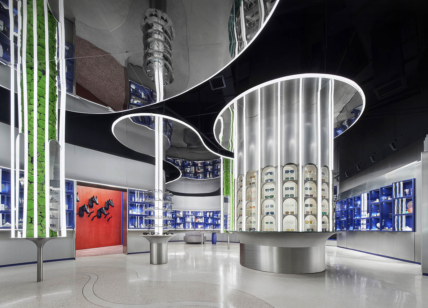
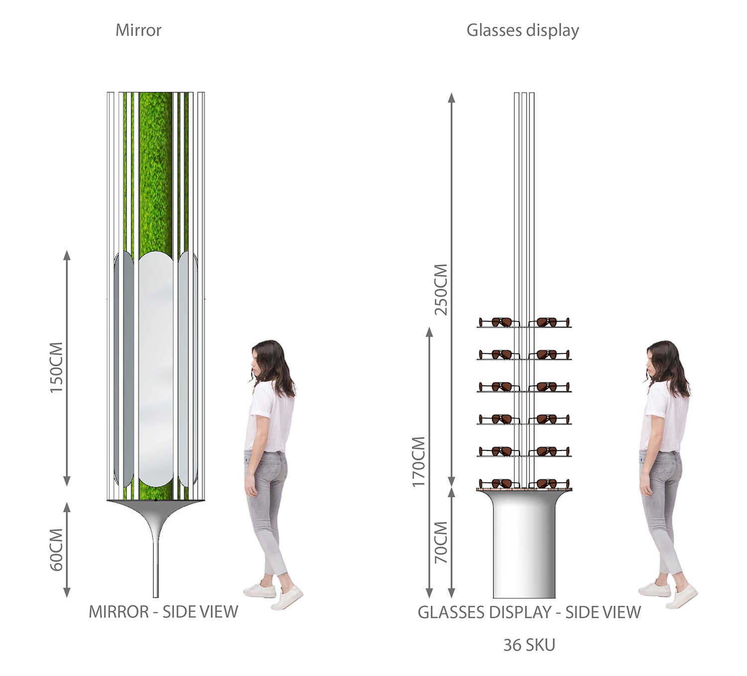
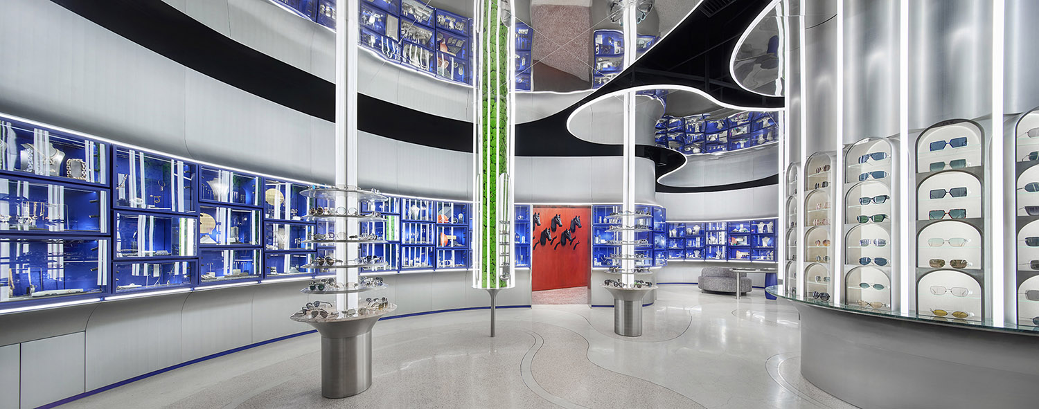
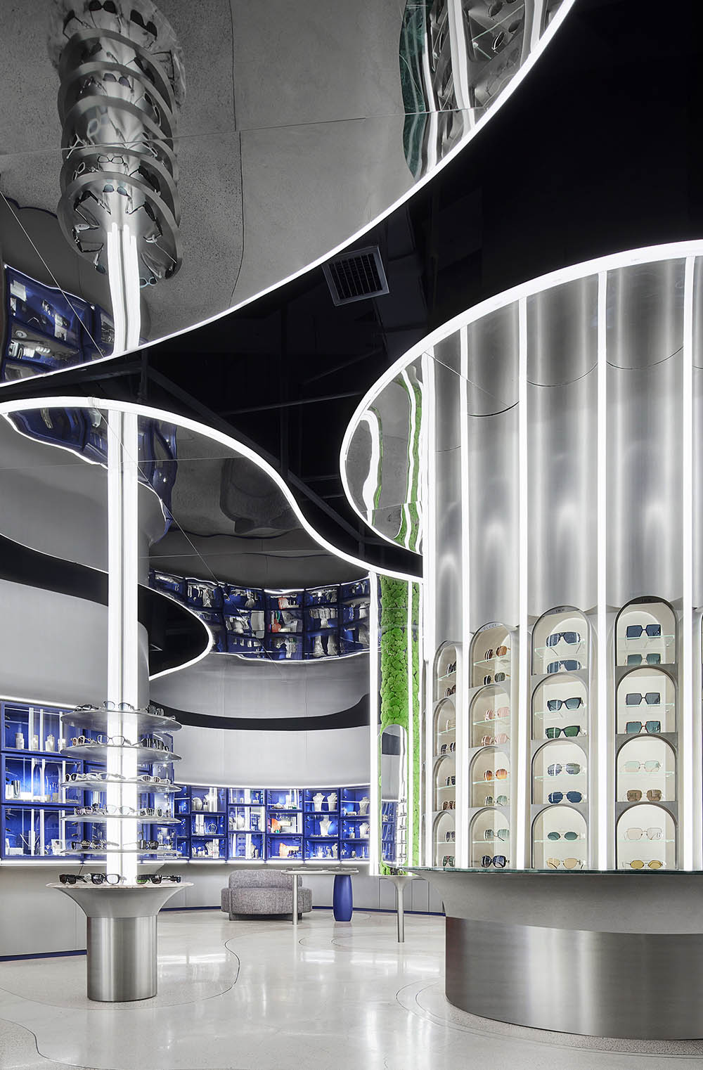
曲麵圍合提取於建築元素,中央的開放空間便是都市中的綠洲,吸引顧客自由穿梭於其中。獨立的立柱結構有兩種形式,圓形的不鏽鋼擱板適應眼鏡展陳的特性,漂浮於支撐的燈柱之上,天花的反射效果令立柱在垂直方向上無限延伸。
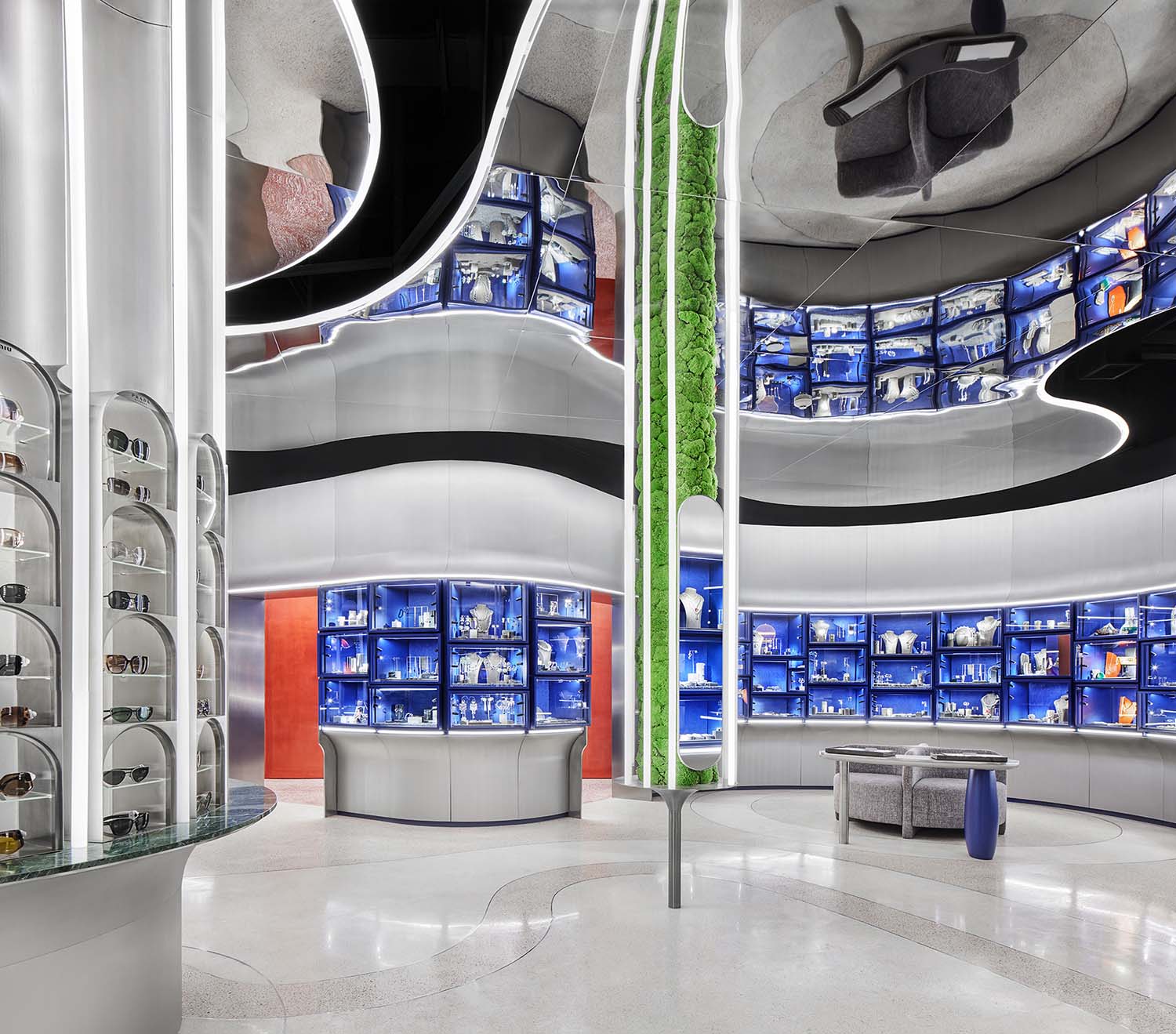
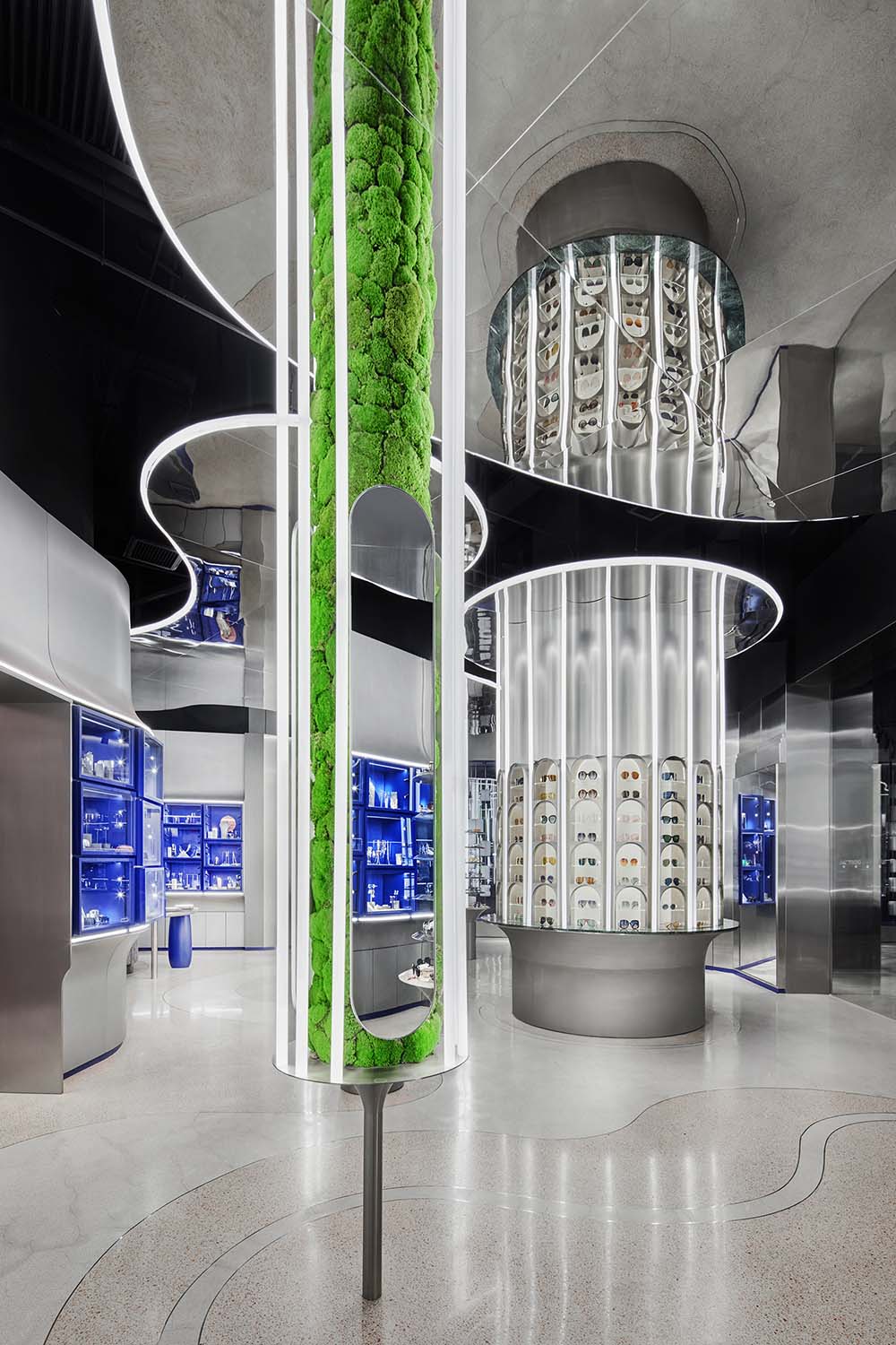
While wall display is a reference to buildings, the middle open space is the oasis, where customers can walk freely between illuminated column structures. The free-standing columns for glasses display feature stainless steel shelves floating on light tube support. The mirror ceiling above creates reflections, and extends the erecting structures visually.
∇ 立柱眼鏡展示區分析圖 Diagram of column display for glasses
∇ 圓形的不鏽鋼擱板漂浮於支撐的燈柱之上 Round stainless steel shelves floating on light tube support
∇ 獨立的立柱結構 Free-standing column structures
另外一種立柱則布滿永生青苔,並在外圍燈管嵌入三塊鏡麵。現代幾何的形式表現出植物的自然肌理,綠色生態融於都市時尚氣息之中。
Another type of columns was inspired by hanging gardens. They consist of both stainless steel and moss, complemented with 3 mirrors each. With geometric expressions, those structures integrate vivid greenery into the stylish retail environment.
∇ 材質立柱分析圖 Diagram of free-standing columns
∇ 布滿永生青苔的立柱 Columns highlighted by moss
∇ 外圍燈管嵌入三塊鏡麵 3 mirrors are placed between light strips of each moss-featured column
鑒於眼鏡需要更加整體的照明,設計師將LED燈帶藏在拱形小窗背後,燈柱則作為輔助照明。
As glasses display lighting had to be more general, the designers used only LED strip for each individual glasses shelf hidden in the arch. Additional lighting comes from light tubes mounted in between arch shelves.
∇ 展櫃的拱形小窗 Small arch shelves
03 令人驚喜的藝術裝置陳列
Unexpected art installations display
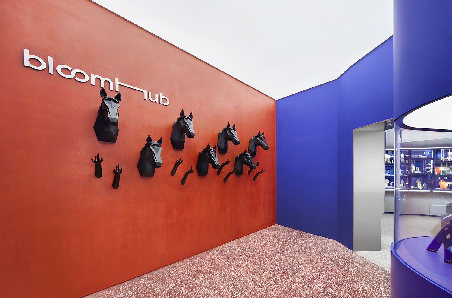
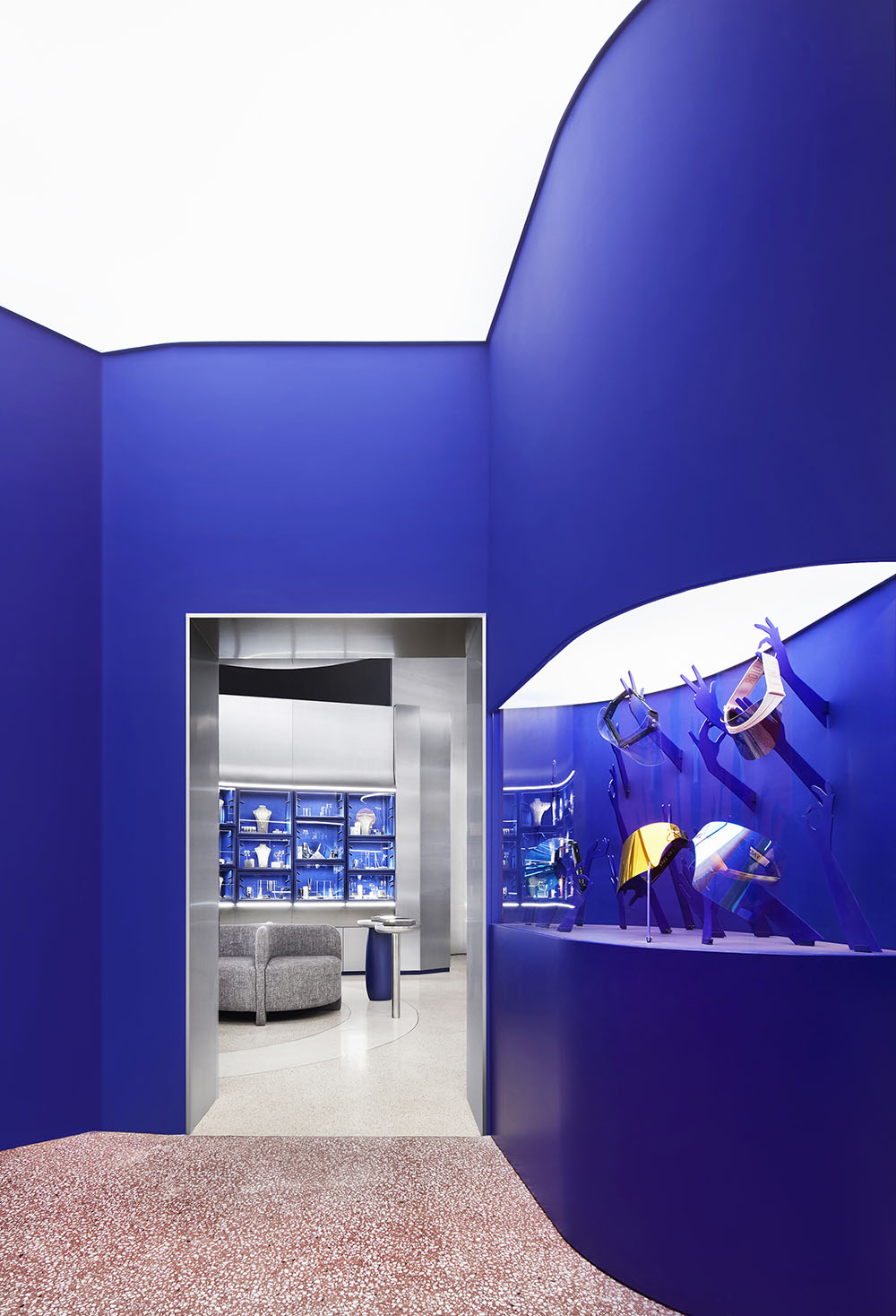
曲麵的背部分隔出一個隱蔽的角落,在這裏大膽地使用了強烈的色彩和新奇的裝飾。
外部的藍色牆麵延伸進角落,但背牆卻使用暗珊瑚色,空間在統一的基礎上創造了變化。
The exhibition room is hidden behind the curved wall. The design is different than in the shop, but still connected to it. Its front curved wall is the same blue color as the display boxes while the back wall is in dark coral color, showing unity yet changes.
∇ 曲麵的背部分隔出一個隱蔽的角落 Hidden corner behind the curved wall
∇ 外部的藍色牆麵延伸進角落,但背牆卻使用暗珊瑚色
The blue curved front wall of the corner space is extended from the shop, while its back wall is in dark coral color.
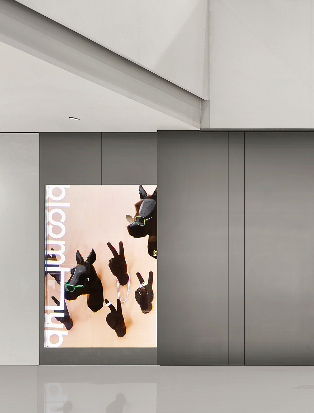
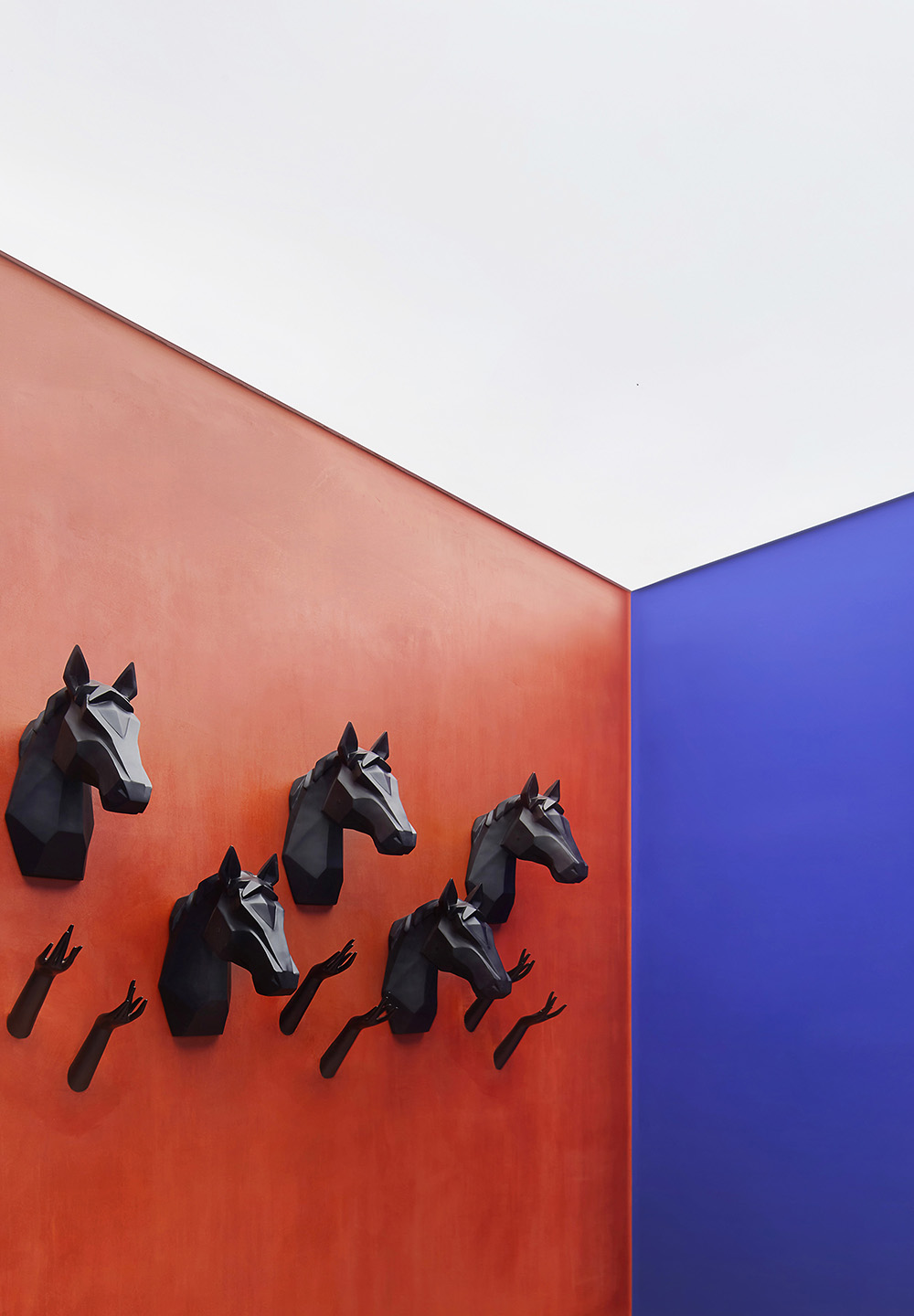
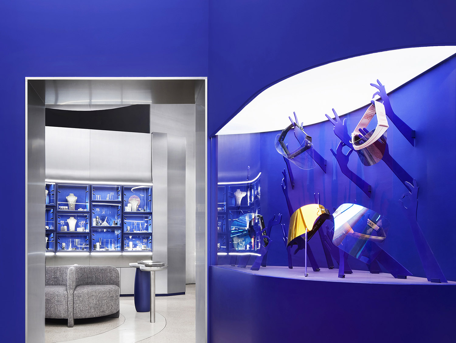
設計師希望將此特殊空間打造得更像藝術展覽而不是商店,為顧客創造更多驚喜,但也兼顧部分商品的展示,於是使用了有別於展櫃卻更具趣味性的馬頭裝置。而企圖抓取飾品的手部裝置寓意人類對美和裝飾的欲望,展陳融合了更多的藝術特性。
The designers treated this corner space more like art gallery than a shop, but still had to display some of the merchandise. In order to create something unexpected on the coral wall, they used mannequin horse heads instead of regular display mannequins. The team also created small installations of human hands reaching to grab jewelry pieces, to show humankind’s eternal desire for beauty and decoration expressed though possession of jewelry.
∇ 更具趣味性的馬頭裝置,使空間更像藝術展覽而不是商店
Unique and playful mannequin horse heads make the space more like an art gallery than a shop.
∇ 企圖抓取珠寶的手部藝術裝置寓意人類對美和裝飾的欲望
Small installations of human hands reaching to grab jewelry pieces imply humankind’s eternal desire for beauty and decoration.
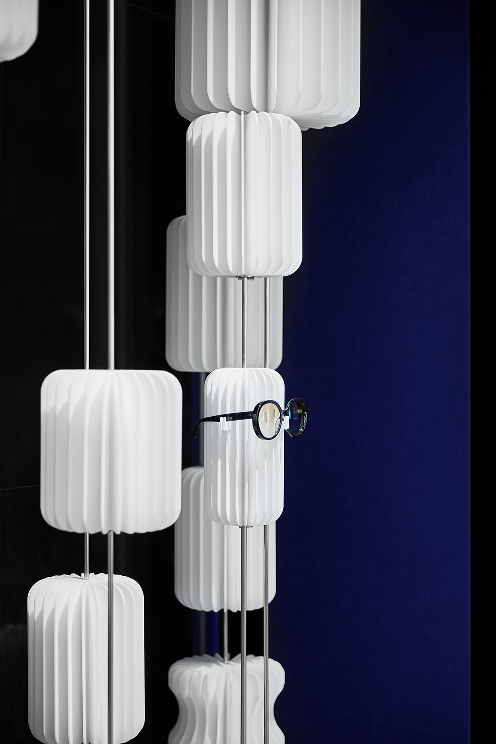
商店僅有一塊櫥窗臨街展示,通透的設計可使行人窺探到商店內部。藝術裝置的靈感源於展開的書本,丙烯酸材料使其擁有良好的耐久度。
The window display along the street is kept transparent so that shop interior is visible from the outdoors. Inspiration for glasses support comes from open books, as glasses are associated with reading and intelligence in general. In order to make display more durable, the designers created “books” from acrylic instead of using real books.
∇ 臨街的室外展示櫥窗 Window display along the street
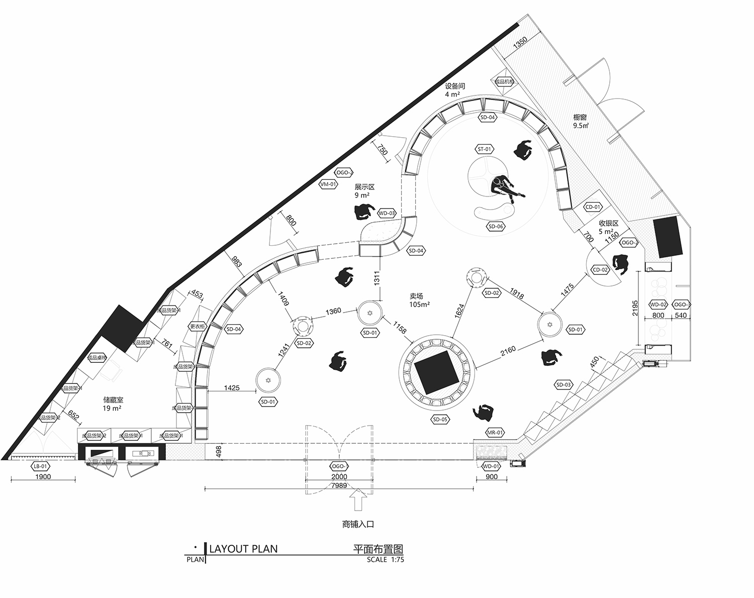
∇ 平麵圖 Floor plan
項目信息
項目名稱:bloomhub飾品買手店
項目業主:睿錦尚品
項目地點:河南省鄭州市金水區東風路28號正弘城1樓
項目類型:零售
項目麵積:153平方米
完工時間:2020.12
室內設計公司:DESFA GROUP INC.
公司網站: www.desfagroup.com
主創設計師:Howard J. Wang、Aleksandra Kaminska
設計團隊:馮千千、馬莉、汪菁、吳科軍
項目管理公司:DESFA GROUP INC.
項目管理團隊:龐磊、付春雨
攝影師:早慧
施工團隊:DESFA GROUP INC.
Project name: bloomhub Boutique
Client: Luxemporium
Location: 1F Grand Emporium, 28 Dongfeng Road, Jinshui District, Zhengzhou, Henan
Area: 153 sqm
Completion time: December 2020
Design firm: DESFA GROUP INC. (www.desfagroup.com)
Chief designers: Howard J. Wang, Aleksandra Kaminska
Design team: Alice Fong, Li Ma, Mia Wang, Kevin Wu
Project management:DESFA GROUP INC. / Evan Pang, Jonathan Fu
Photographer: Zaohui
Construction team: DESFA GROUP INC.


