全球設計風向感謝來自 MOC DESIGN OFFICE 的商業空間/汽車展廳項目案例分享:
圍繞藝廊構建社區
Building a Community with Art Gallery
NIO House – 成都萬象城店
NIO House, Chengdu MixC
“NIO蔚來”是一家中國的全球化初創公司,致力於生產高端新能源汽車以及提供相關的配套服務。MOC DESIGN OFFICE 繼NIO Space 2.0形象升級後,與蔚來汽車再度聯手,打造位於成都的NIO House。
NIO is a global startup in China that is dedicated to the production of high-end new energy vehicles and related services. Following the rebranding of NIO Space 2.0, MOC Design Office teamed up with NIO again to create the NIO House in Chengdu.
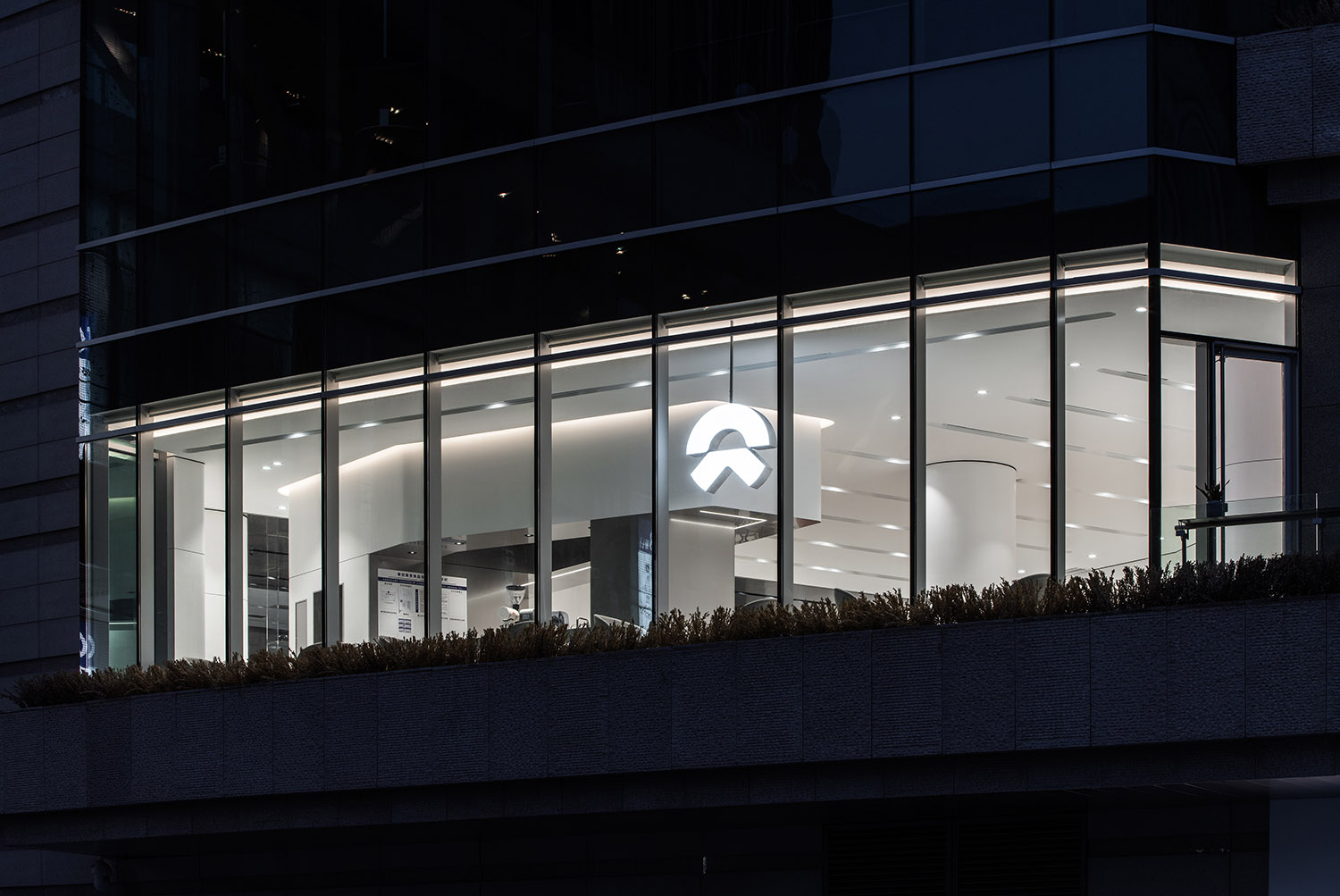
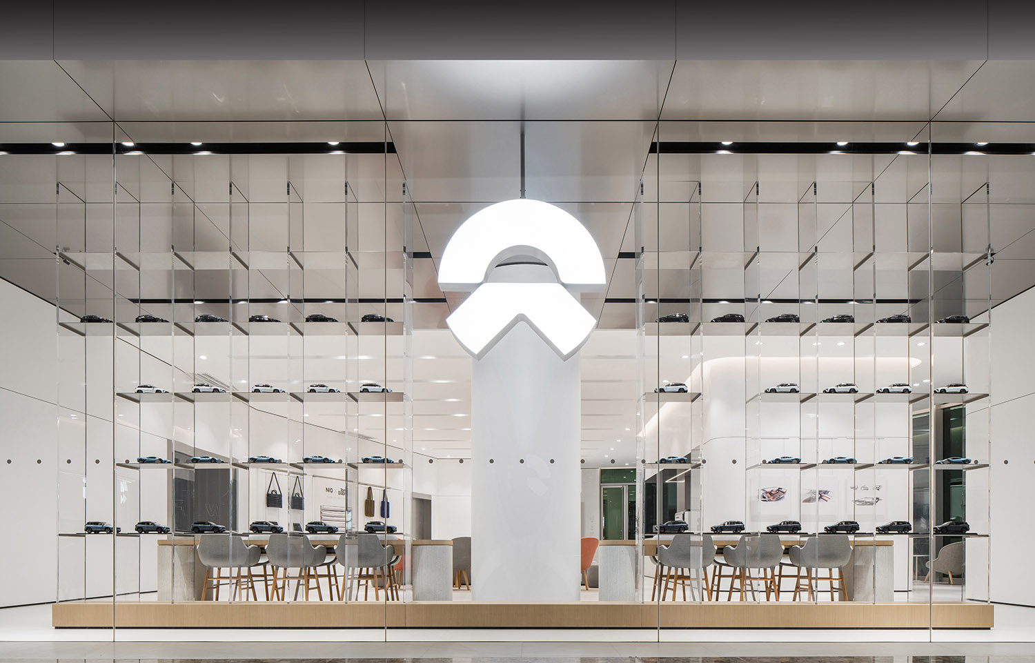
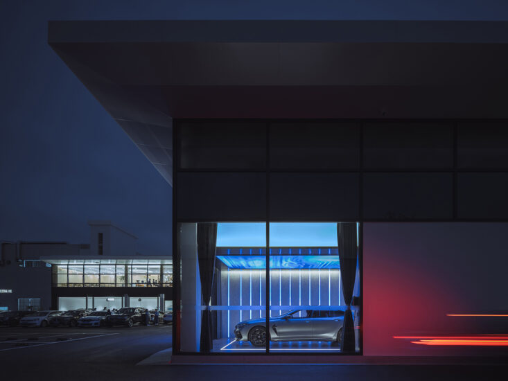
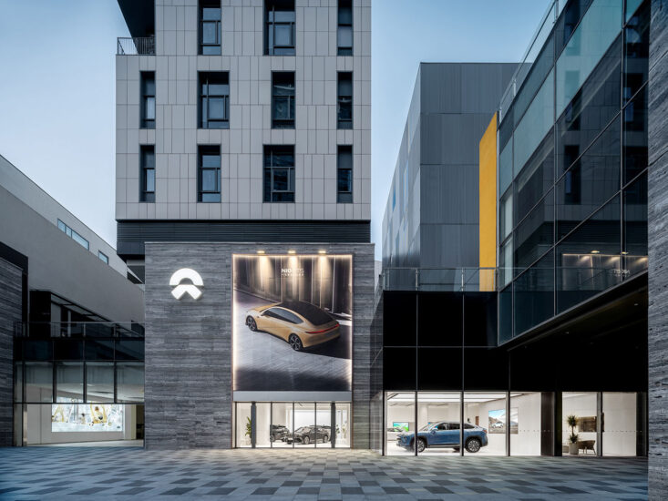
∇ 夜色中的NIO House,NIO House in the night
作為一個顛覆傳統的新能源汽車品牌,NIO開創了用戶的深度互動的企業文化,NIO House則承載了品牌與用戶在線下的連接的重要作用。
As a new energy vehicle brand that overturns the traditional thinking, NIO creates a corporate culture of deep interaction with users. NIO House carries the important role of connecting the brand with users offline.
本項目位於成都城東核心區的萬象城II期,是成都的大型居住聚集區,項目位於萬象城定位科技生活的C區。本項目也是成都的第二家NIO House,它既是蔚來車主的展廳,也是一個社交空間,為成都不同區域的用戶提供深度服務。
The project locates in Zone C, Phase II of MixC, which is a large residential area in the east core district of Chengdu. And the store is housed in Zone C, which is pinned for technology and lifestyle. As the second NIO House in Chengdu, it’s both the showroom and social space for NIO owners, to provide in-depth services to users from different areas of Chengdu.
01 空間規劃的斷舍離
01 Spatial Planning with Tradeoffs
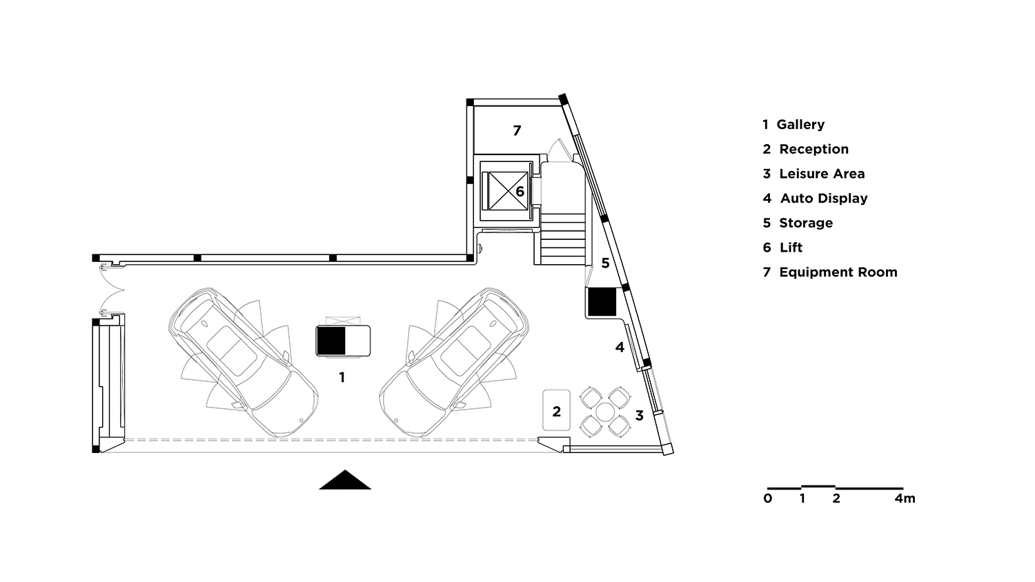
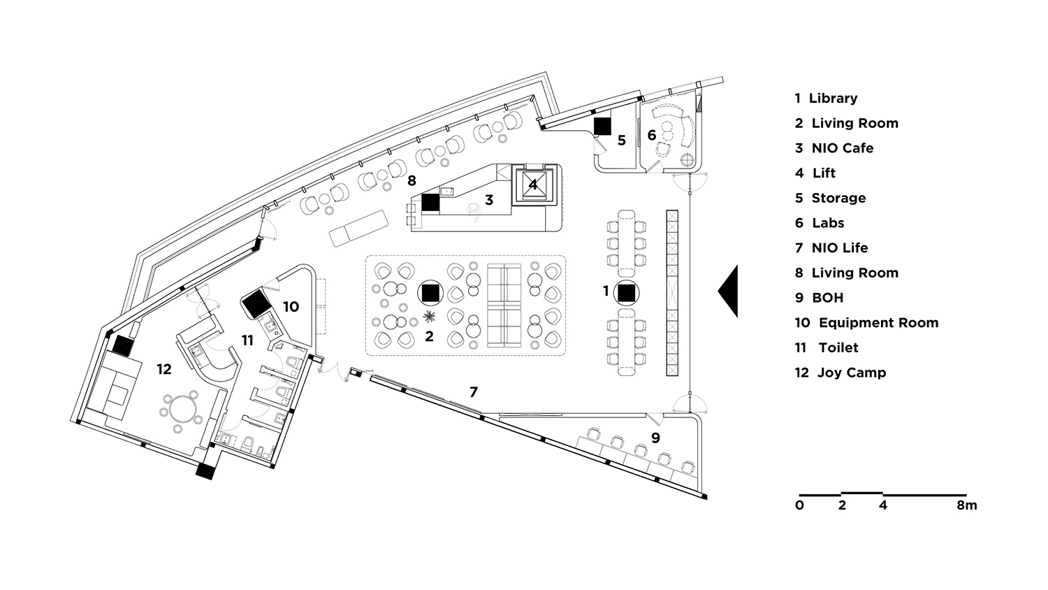
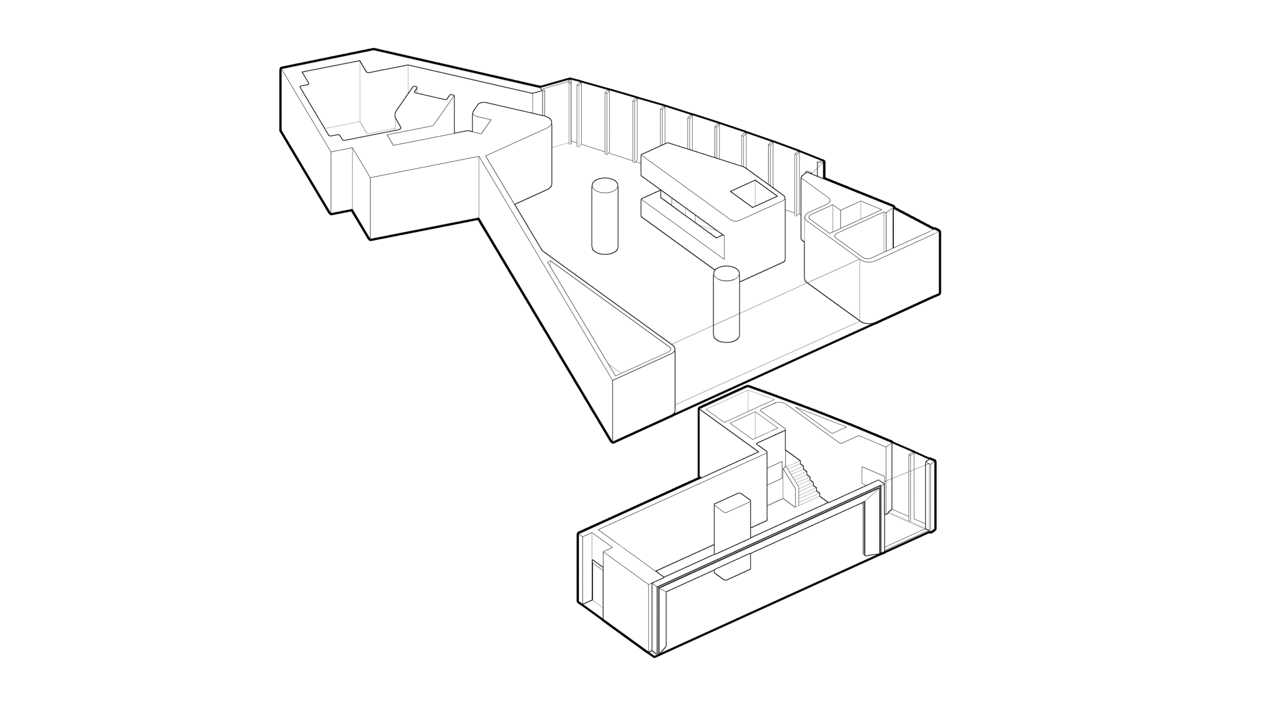
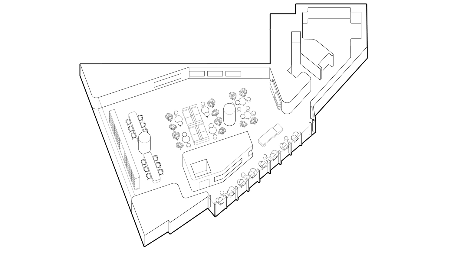
與其他NIO House一樣,成都NIO House擁有自己獨特的布局——它分為上下兩層,一層規劃為汽車展廳,二層則作為用戶共享的生活方式空間使用。
Like other NIO Houses, this one in Chengdu has its unique layout – it is divided into two floors, with the first floor as the car showroom and the second floor as a shared lifestyle space for users.
∇ 一層平麵 1F Floorplan
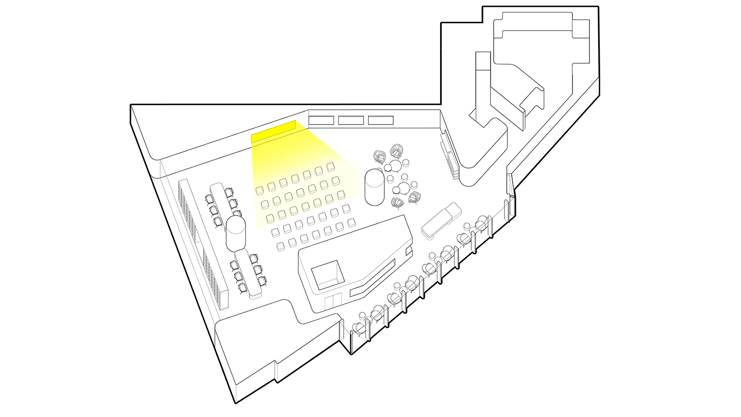
∇ 二層平麵 2F Floorplan
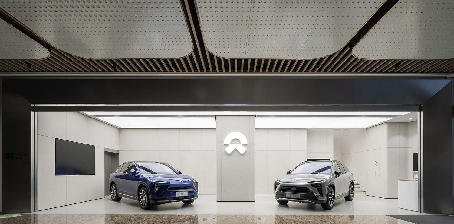
∇ 一層概覽 1F Overview
由於原場地中,兩層樓之間沒有獨立的連接關係,且商場內最接近本項目的電梯都比較遠,如何將兩層樓連通是本項目設計的第一個難點。
As there is no connection between the two floors in the construction site, and the closest elevator to the store in the mall is far away, how to connect the two floors becomes the first challenge in the design of the project.
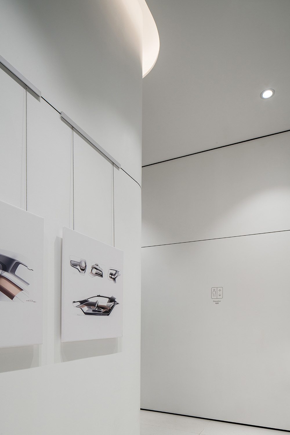
通過各個層麵的比對和計算,MOC確定了一個最適用於本項目的方案——由於一層層高較高,且麵積本身不大,保留更多的使用麵積用於車輛展示會對品牌形象更加有利,MOC舍棄樓梯連通樓層的做法,在空間一側規劃了一條無機房電梯連接樓層,隻需步行七級台階,用戶即可通過電梯便捷快速地抵達二層共享空間。
Through comparison and calculation at all levels, MOC decides on a solution that is the most favorable for the project – because the first floor is tall with a smaller area, it’s more beneficial for the brand image to keep more usable area for vehicle display. Instead of using stairs to connect the floors, MOC adopts a machine room-less elevator on one side of the space, so users can reach the shared space on the second floor by walking up seven steps, which is easy and quick.
∇ 電梯連接了上下兩層 The elevator connects the upper and lower floors
02-兩個“Gallery”——為社區營造藝廊般的社交環境
02–Two “Galleries” – Creating a Gallery-Like Social Space for the Community
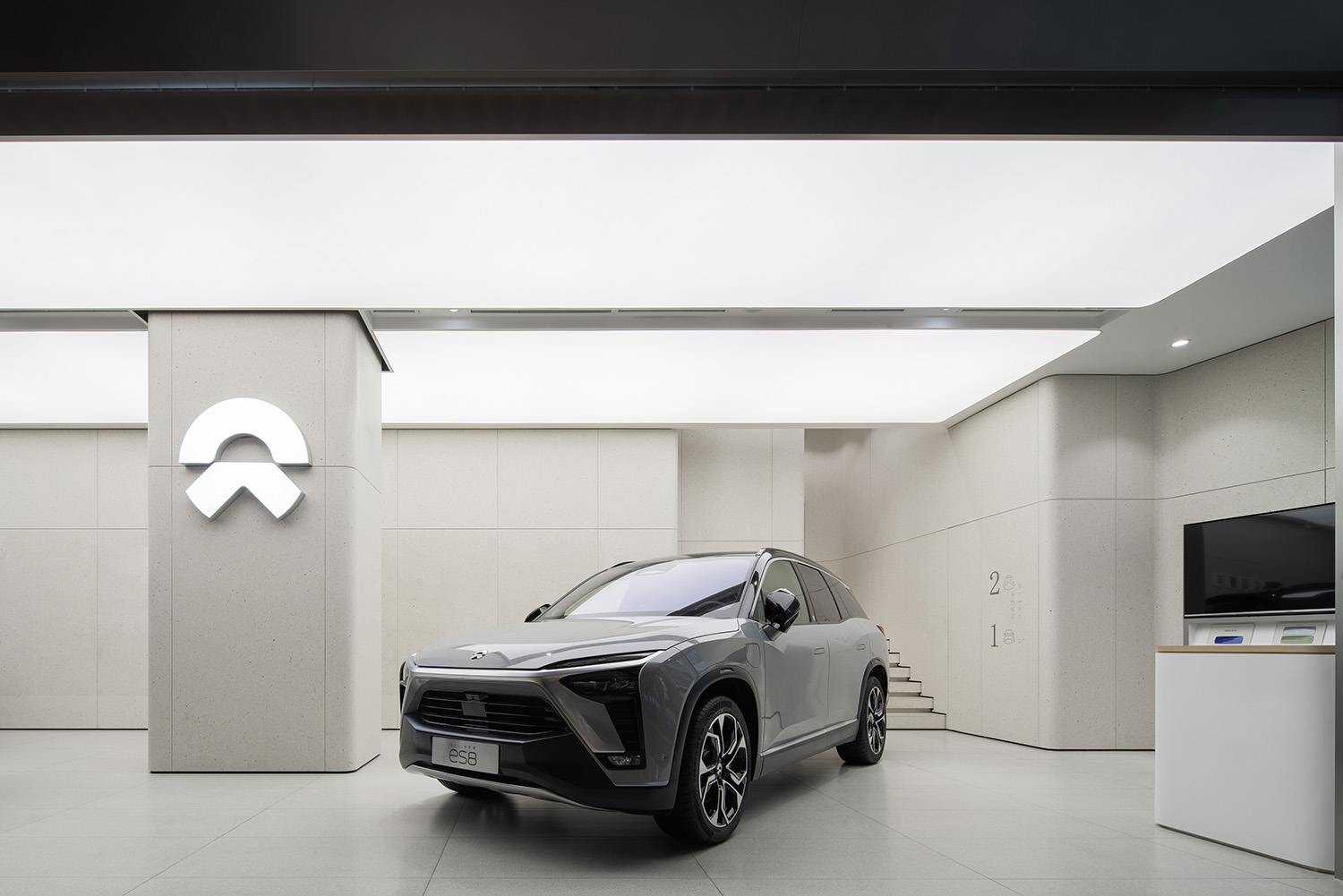
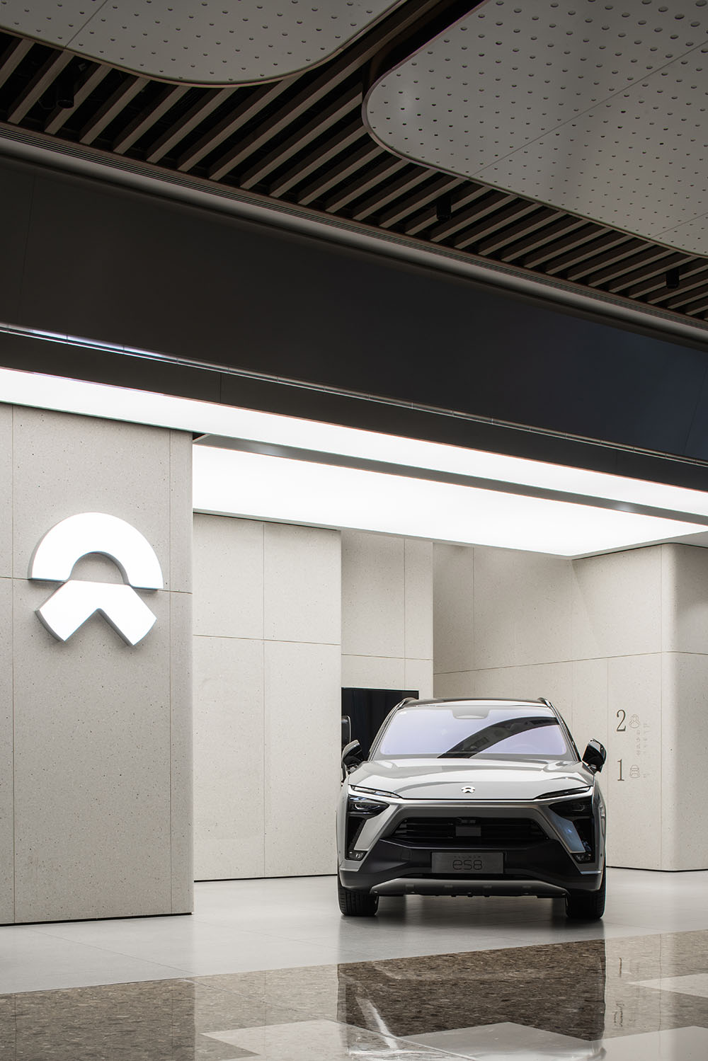
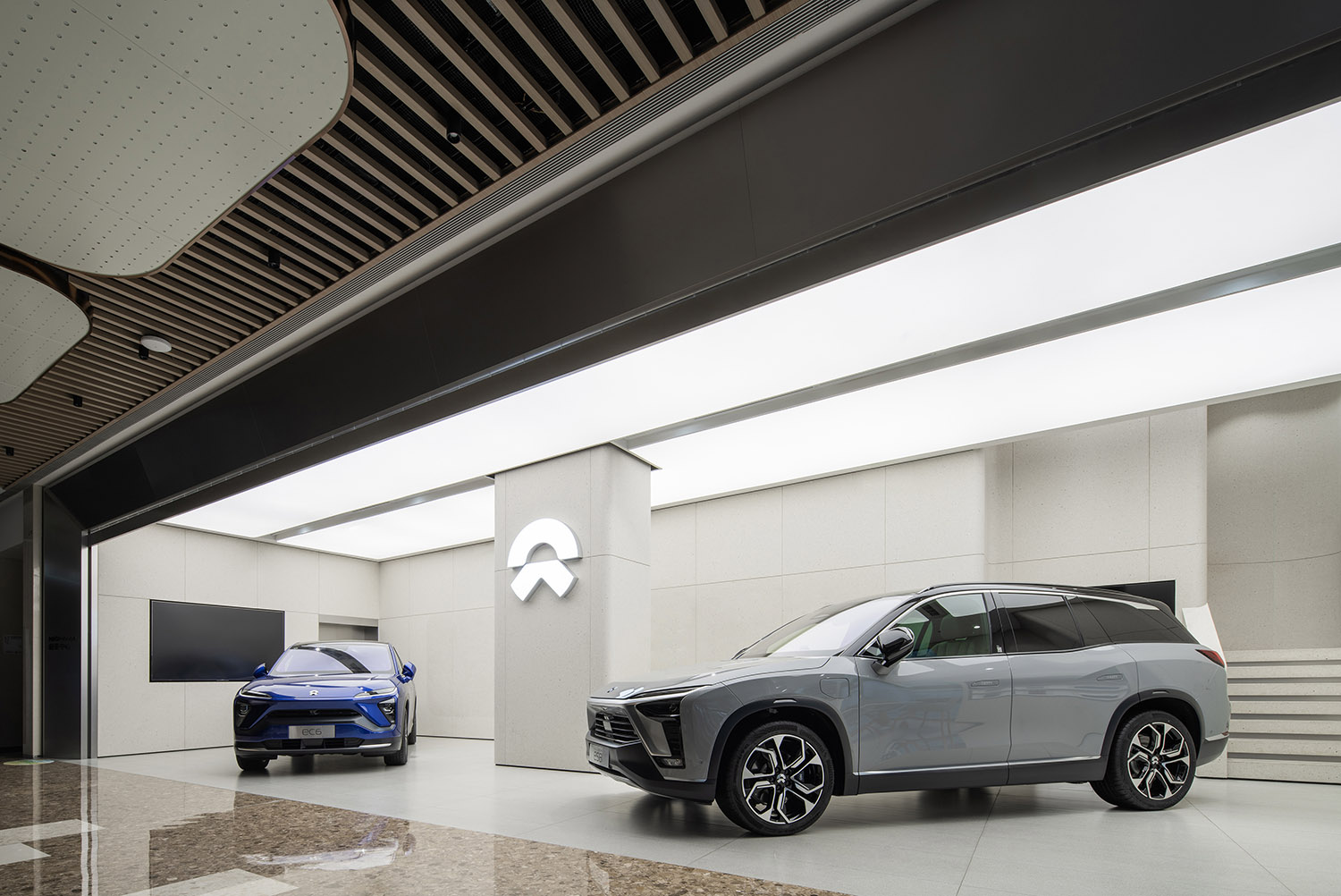
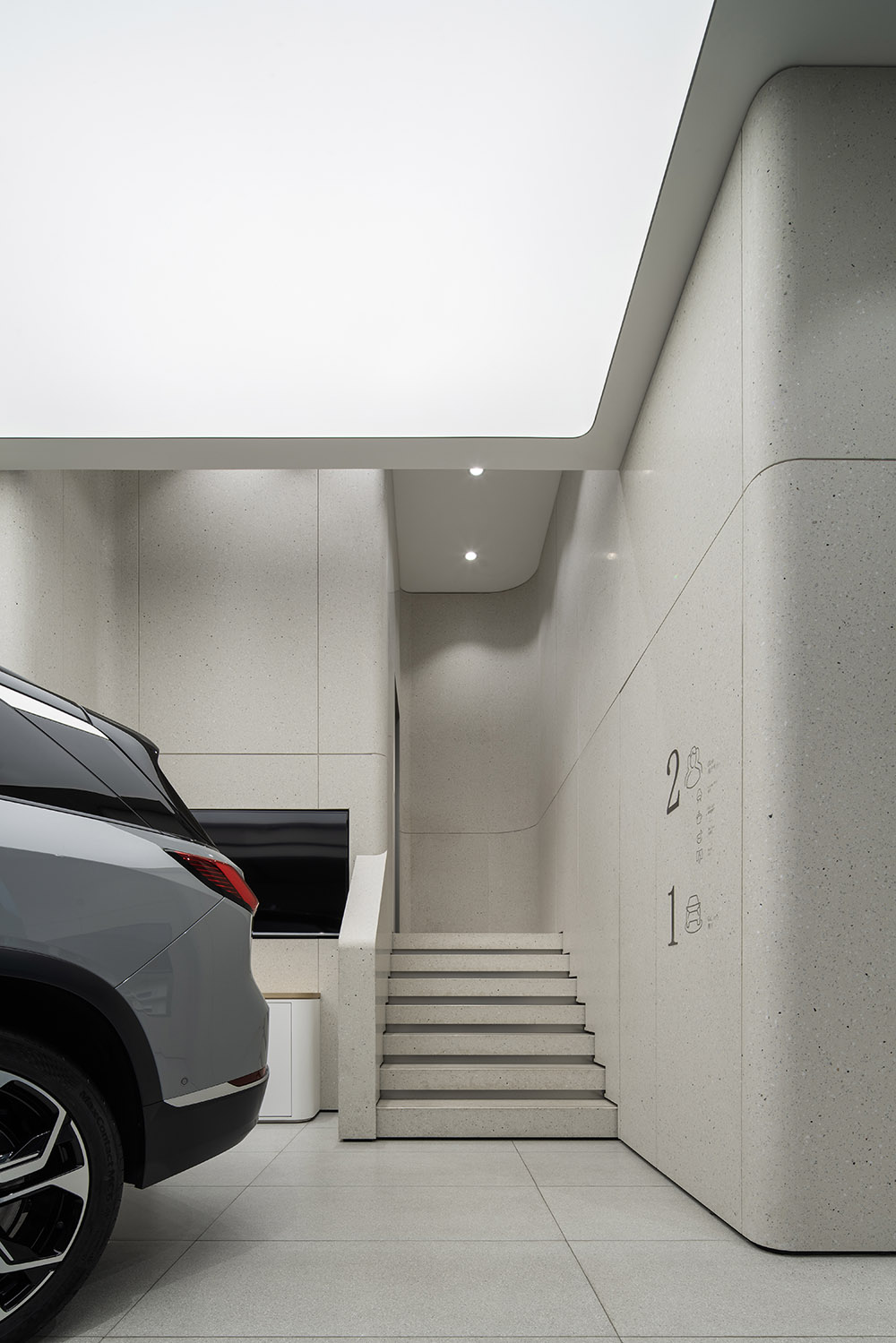
首層的Gallery空間是NIO主力產品的集中展示區,最核心的任務是不露聲色地在空間中體現NIO的技術實力與美學品位。
大道至簡,空間整體呈統一的暖灰調,淩厲的大體塊感直觀地表達出空間的科技屬性,低調內斂的空間讓汽車成為空間的亮度。
The Gallery on the first floor is the display center of NIO’s main product, with the core mission to manifest NIO’s technical strength and aesthetics.
Simplicity is the heart of everything. The overall space is in a uniform gray tone. The large blocks reflect the high-tech attribute of the space, while the understated and sober space highlights the car in the right spot.
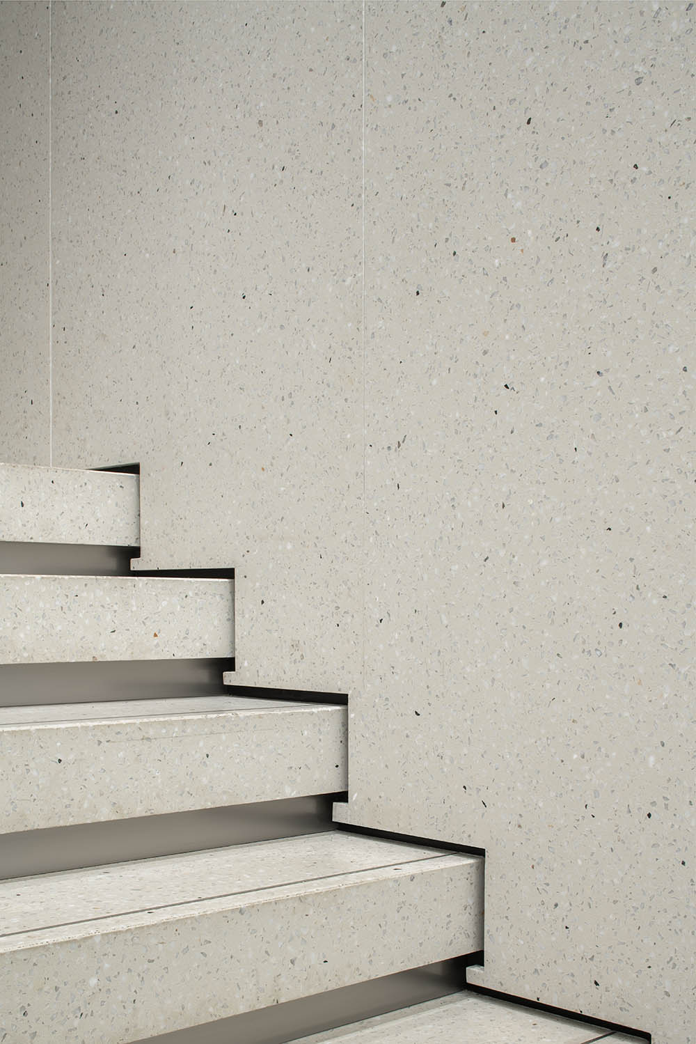
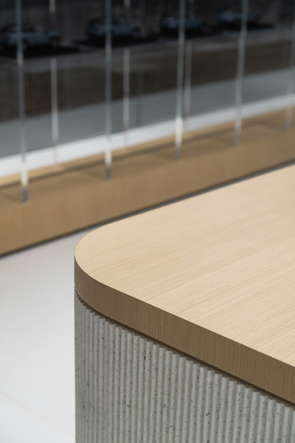
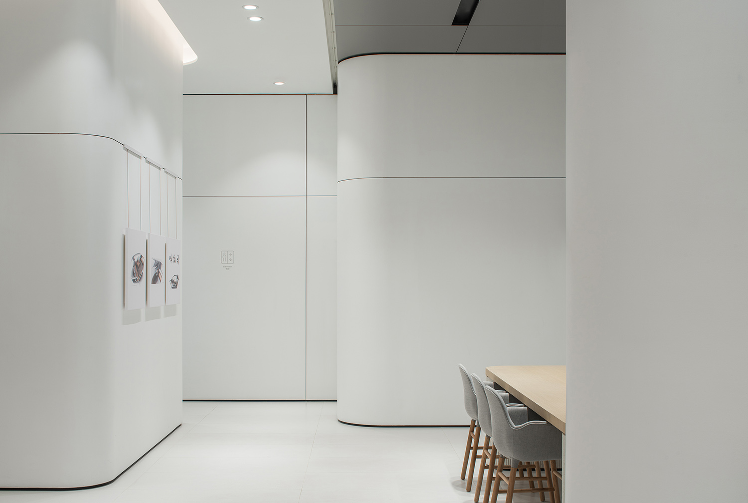
暖灰色的水磨石、牆角位置的弧形處理,使空間在凸顯科技感的同時又充滿包容性,通過細節的處理突顯NIO對品質的嚴格要求。
The gray terrazzo and the curved wall corners accentuate the high tech and inclusiveness of the space, which underlines NIO’s strict requirements for quality through the detail handling.
∇ 空間細節 Space details
NIO House不僅僅是品牌理念的單向輸出,還是用戶之間分享觀點、交流的地方:一層的Gallery空間,是NIO對展車空間調性的定義,二層則定義為用戶共享空間。
NIO House is a place not just to deliver the brand concept, but also for users to share their opinions and communicate with each other. The Gallery on the first floor defines the NIO way of exhibiting and the second floor is positioned for users’ sharing.
MOC從“Gallery藝廊”中汲取靈感,將整個二層空間都控製在白色的主基調下,兼具舒適感與包容性。
Inspired by the concept of “Art Gallery”, MOC sets the white tone in the entire second floor, which appears to be both comfortable and inclusive.
∇ 從二層主入口看向室內 Looking into the interior from the main entrance on the second floor
作為一層的延續,二層的Gallery觸及到更多更細致的方麵:包括輕鬆舒適的Living Room,為用戶提供放鬆、獨處的休閑功能的Library,配套服務整一樓層、為用戶提供NIO專屬飲品的NIO Café,為孩子打造的Joy Camp,承載思想、靈感碰撞的Forum,供用戶預定的獨立房間和共享工作空間Labs,以及NIO的生活方式展廳。
As a continuation of the first floor, the Gallery on the second floor touches on more details – a relaxing and comfortable living room; a library with leisure and private function; the NIO Café serving the entire floor and its users with exclusive NIO drinks; the Joy Camp for children; the Forum bearing ideas and inspirations; the Labs with independent room and shared work space for users to reserve; and the NIO Lifestyle Gallery.
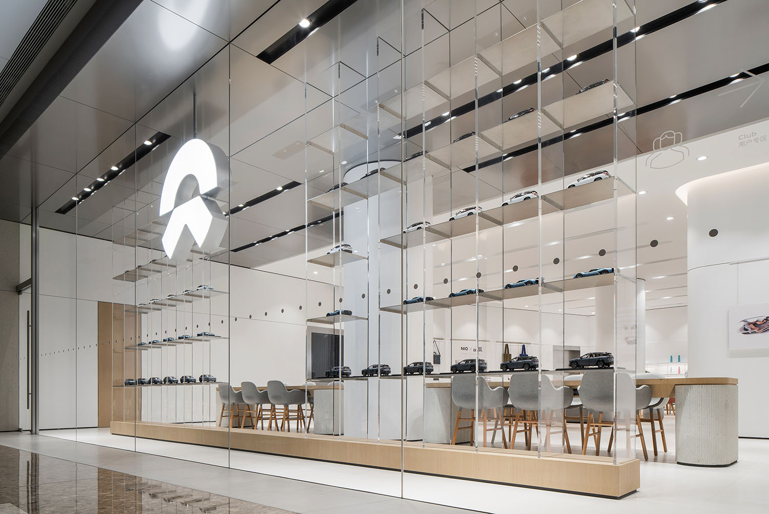
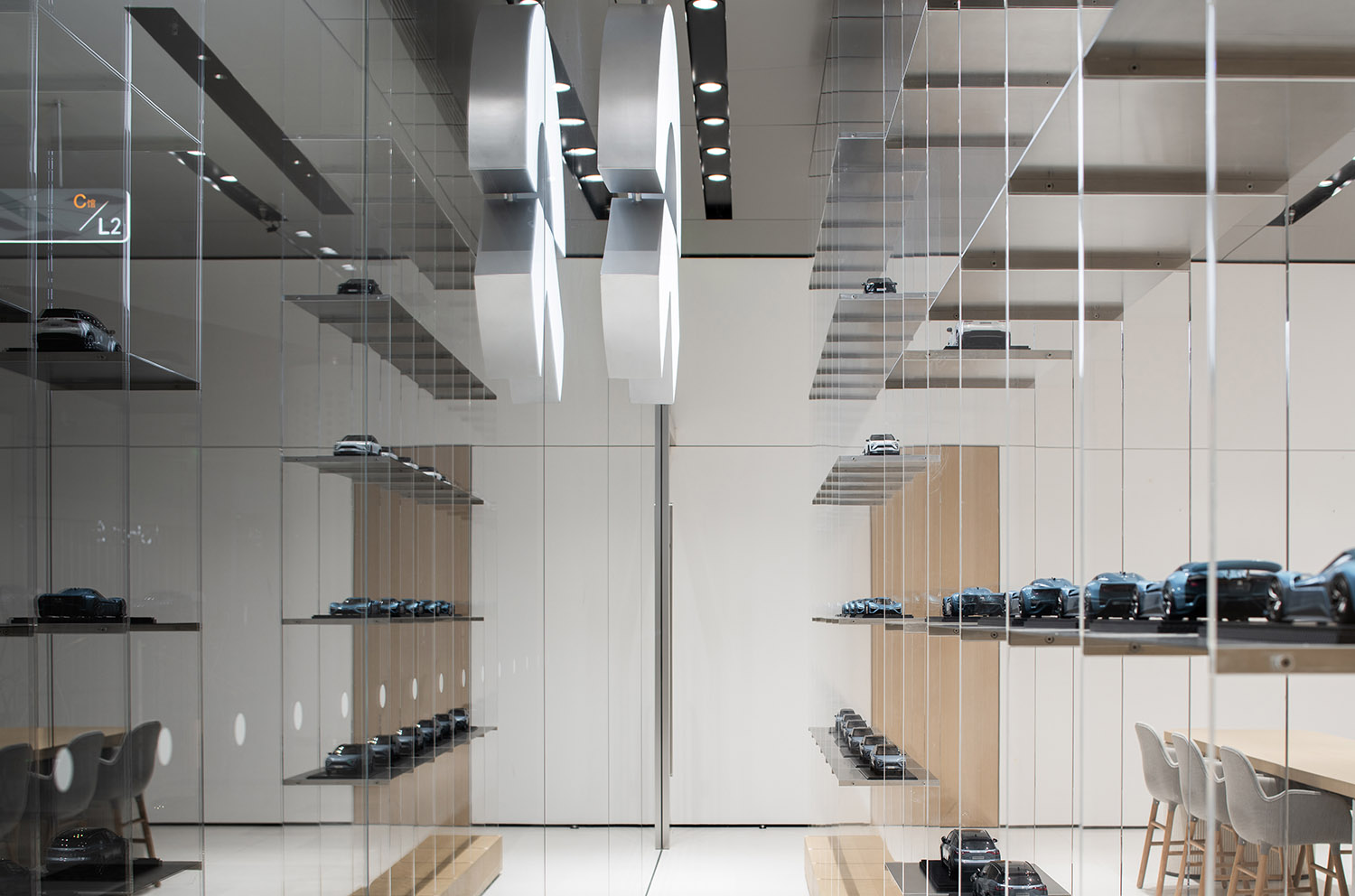
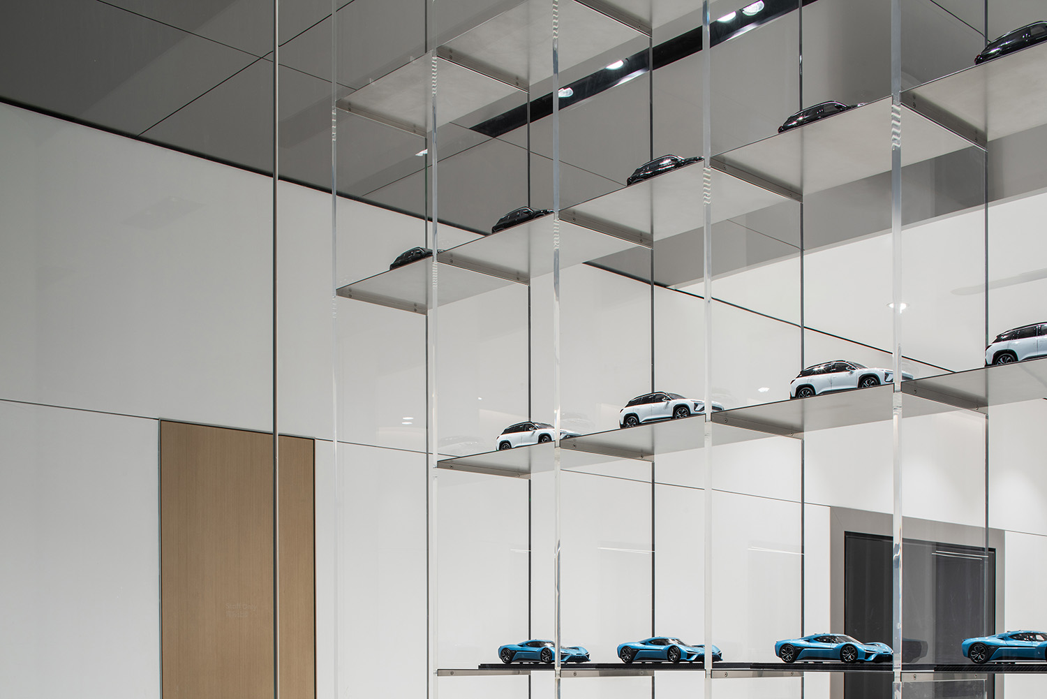
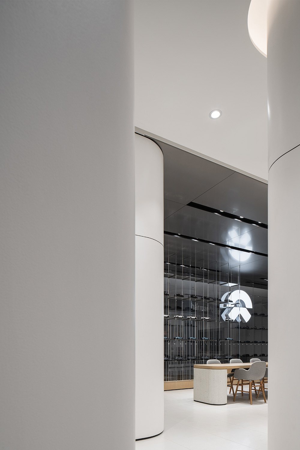
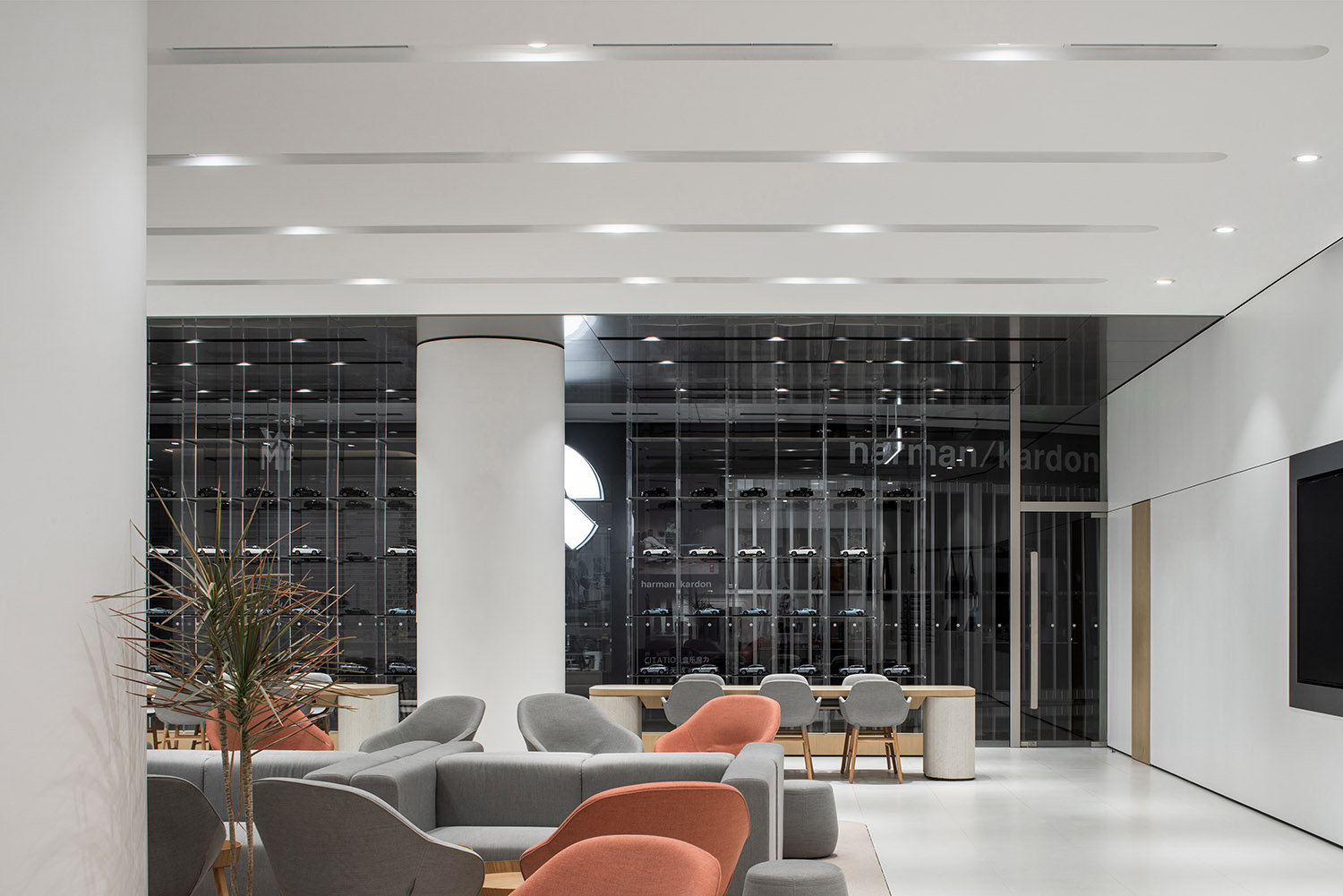
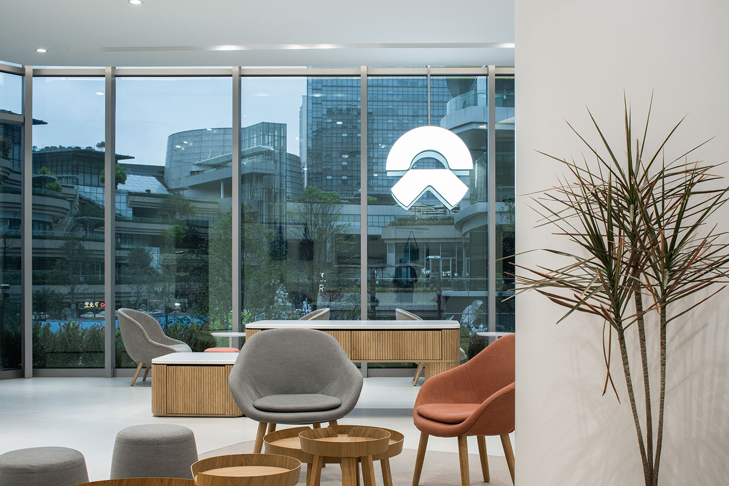
對向著商場內的入口,MOC在通透的玻璃內設置了一組透明亞克力展櫃,在LOGO兩側布滿汽車模型,加上少量且克製的木材質的襯托下,隱隱向外透出後方空間開闊且休閑的氛圍。
Facing the entrance of the mall, a set of transparent acrylic showcases is set up by MOC inside the transparent glass. Car models are displayed on both sides of the logo, together with a small amount of wood, which subtly reveals the open and casual atmosphere of the back space.
∇ 櫃體細節 Showcase details
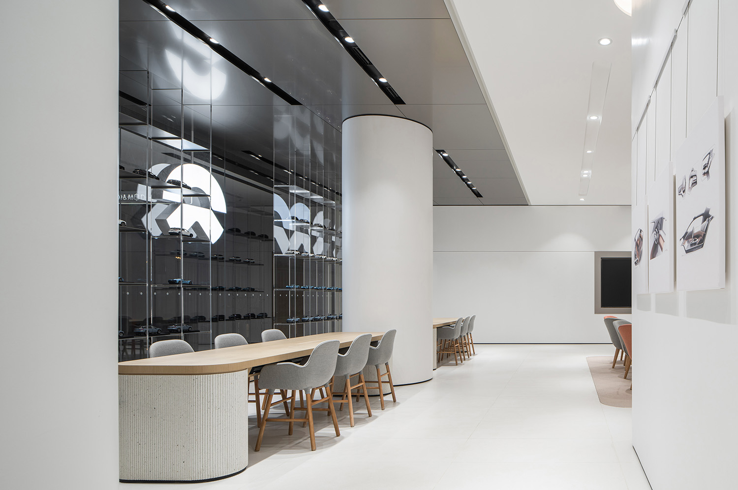
展櫃的內側是兩組長桌,除了Library的功能外,還可用於部分用戶活動。類似這樣的情況,MOC在二層的設計中非常關注空間的複用性。
Right next to the showcases, there are two sets of long tables that can be used for some user activities in addition to the Library functions. Similarly, MOC pays great attention to the reusability of space in the design of the second floor.
∇ Library 休閑區 Library, leisure area
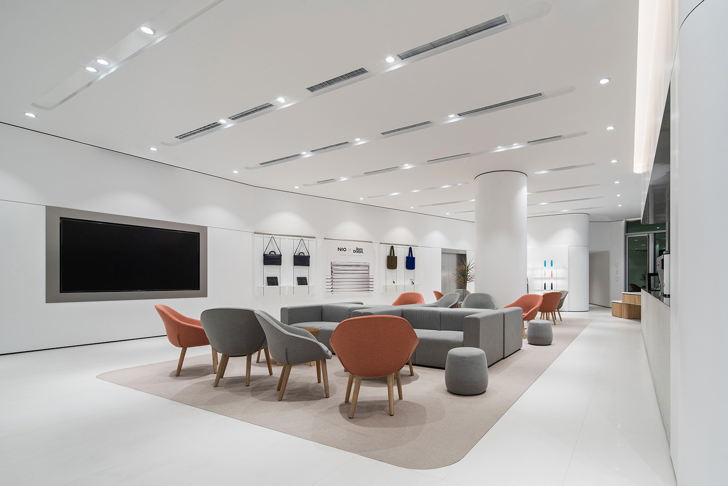
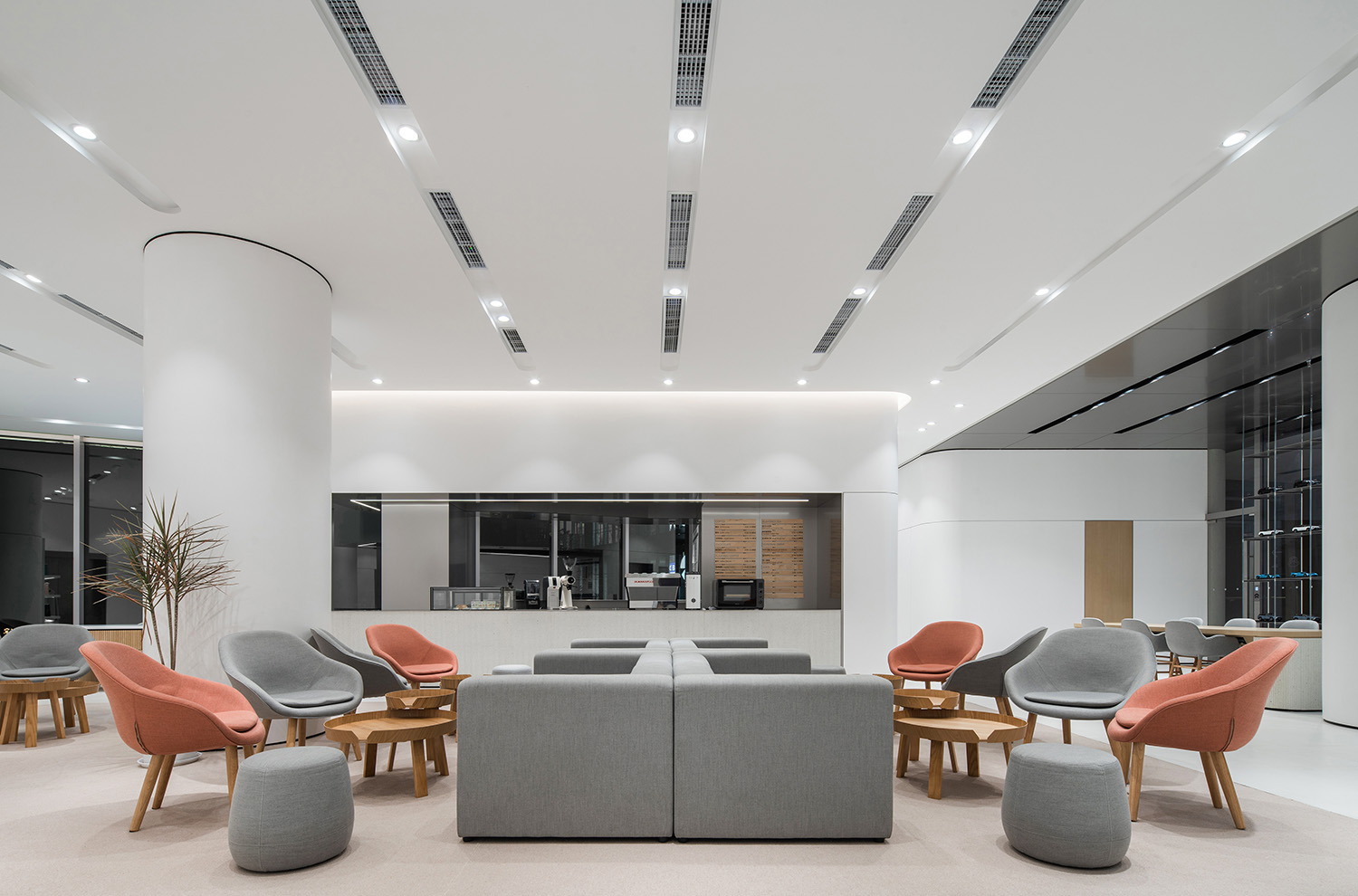
空間中間位置被設置為共享休閑區Living Room,在舉辦活動的情況下,則可以靈活調整家具滿足活動需求——NIO Day 2020在成都舉辦,NIO House 成都萬象城店出色扮演了其中一個分會場的角色。
The center of the space is designed as a shared Living Room. In the case of events, the furniture can be flexibly adjusted to meet the needs – NIO Day 2020 was held in Chengdu, and NIO House Chengdu MixC played an outstanding role as one of the venues.
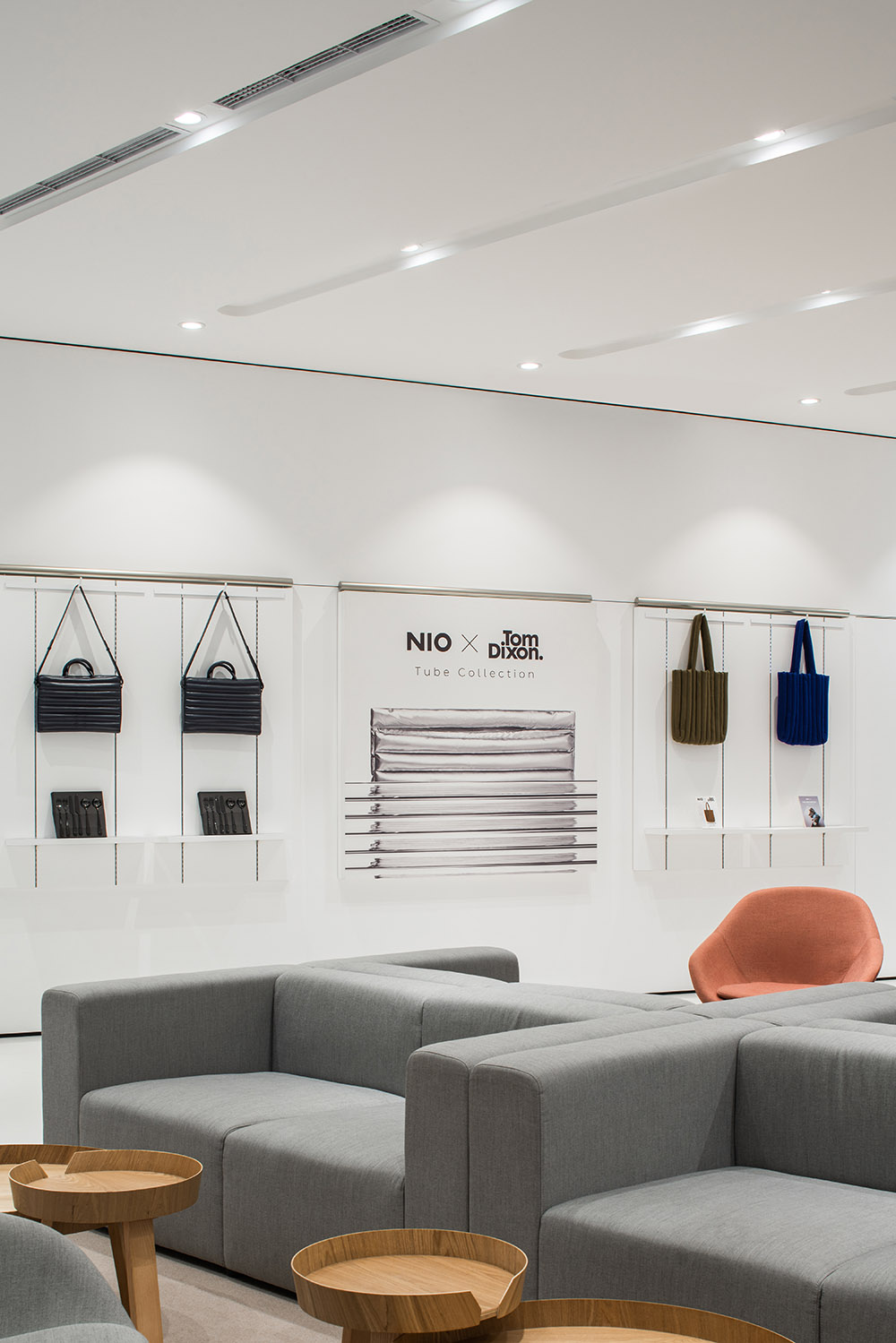
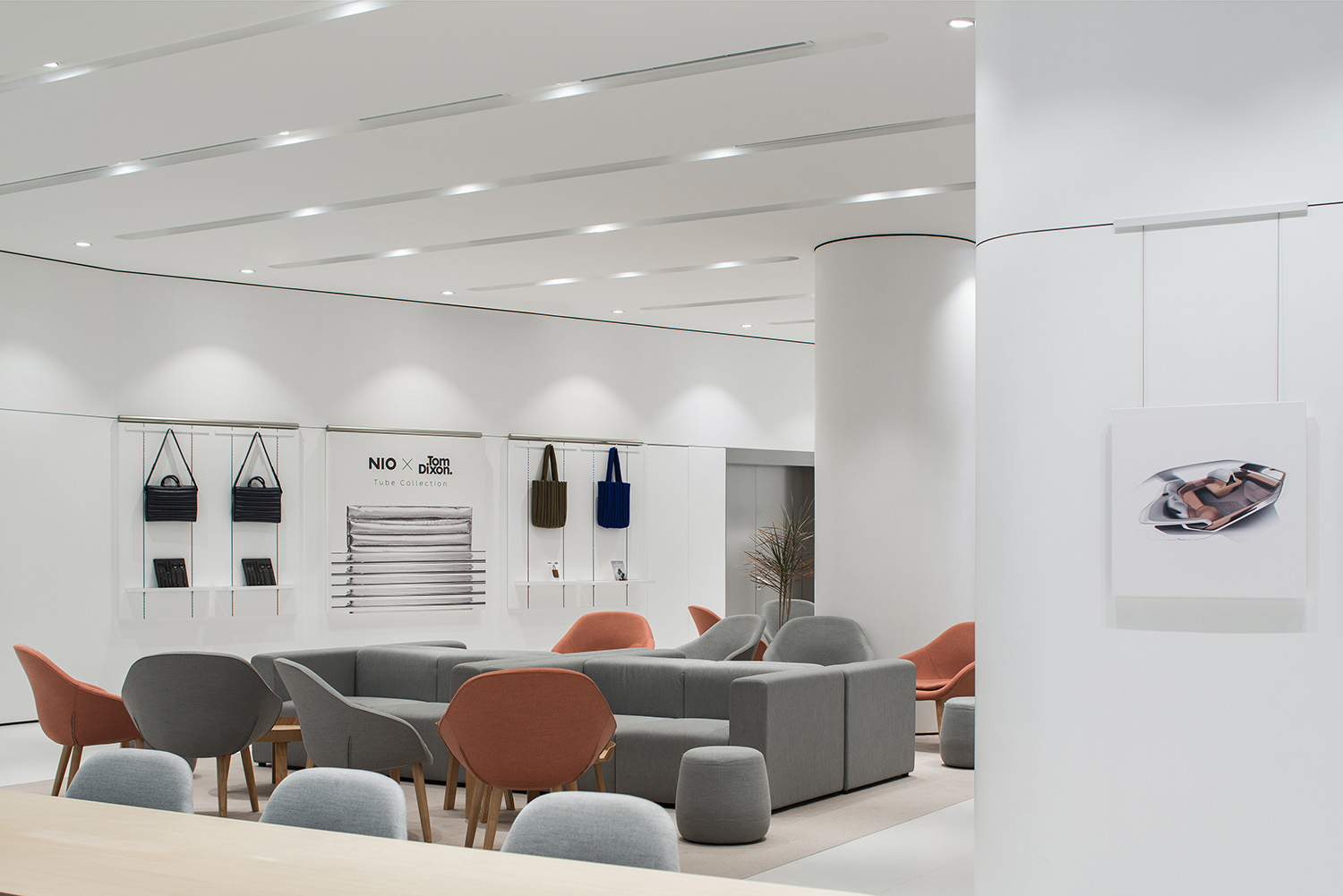
∇ 牆麵展示與共享休閑區結合 Wall display and shared lounge
∇ 休閑模式 Lounge mode
∇ Forum模式 Forum mode
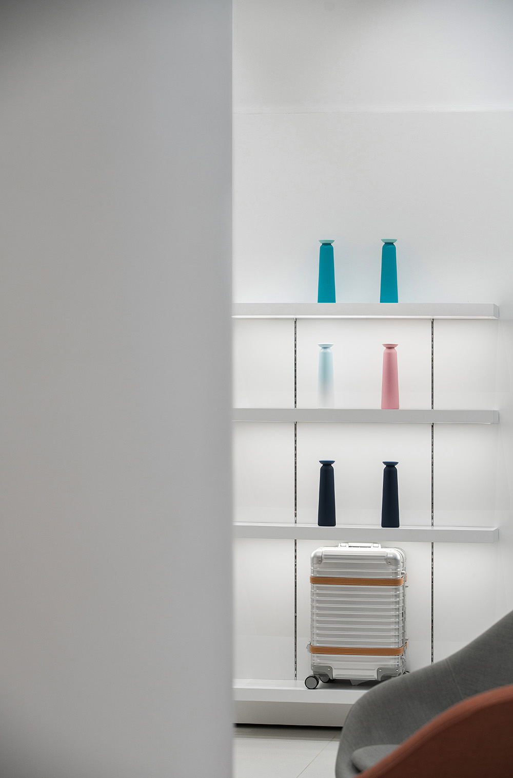
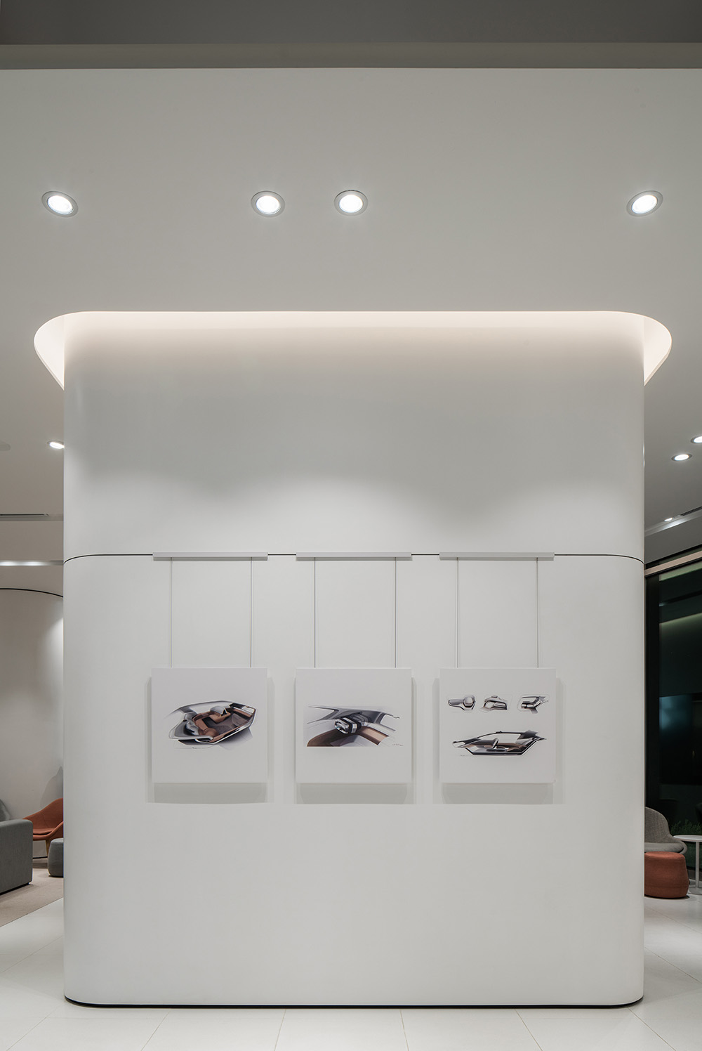
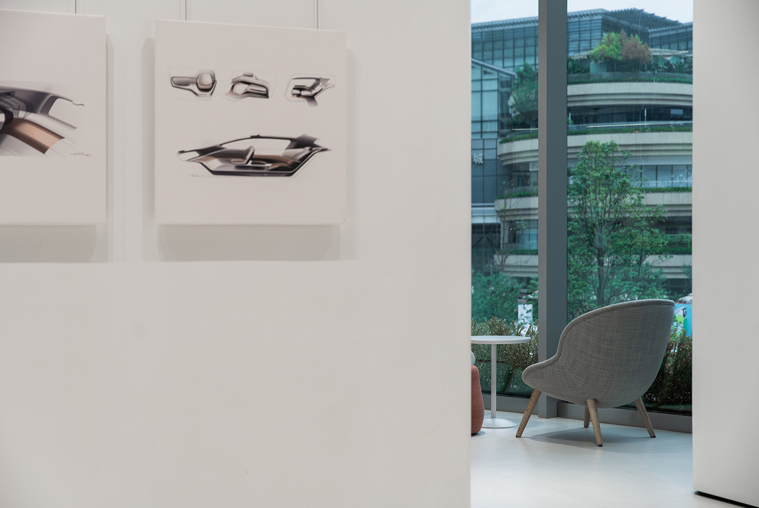
“Gallery藝廊”的概念不止定義了空間的氛圍基調,更凸顯在對NIO Life產品的展示形式上。MOC希望NIO Life產品能像藝術品一樣展示,因此在牆麵上設置多組“掛畫”,產品則是畫中的內容,係列化地呈現給用戶。
The concept of “Art Gallery” not only defines the atmosphere of the space, but also highlights the form of displaying NIO Life products. MOC would like to display NIO Life products like works of art. So several sets of “paintings” featuring the products are hung on the wall, which are presented to users in a series.
牆麵上留出的空白“掛畫”展示空間,是為NIO與用戶共創所提供的展示平台,在這裏,用戶們的想法被聆聽和重視,並藝術化的展示出來。
“Blank painting” on the display wall is a platform for NIO to co-create with users, where their ideas are listened to and valued, as well as illustrated artistically.
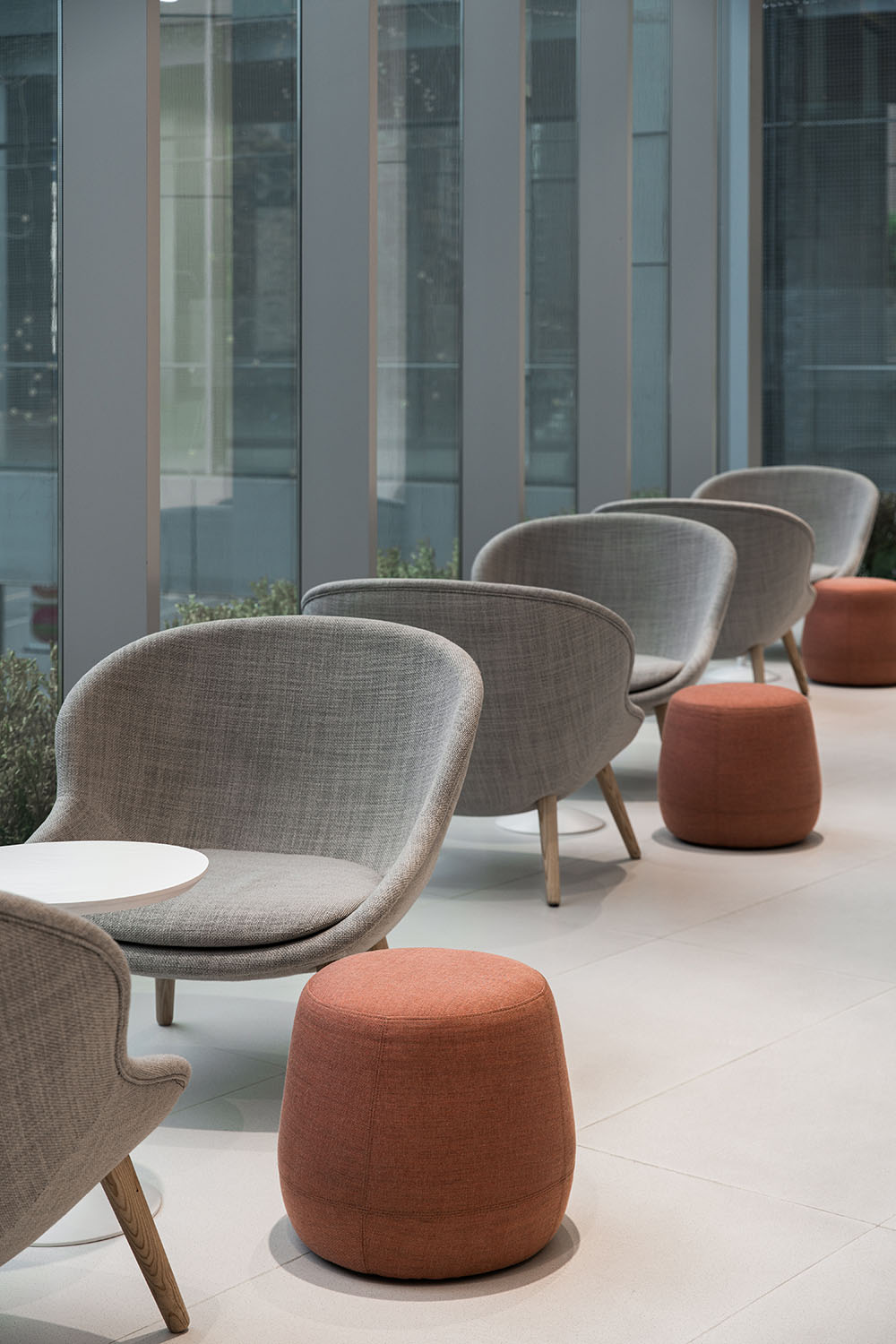
臨窗的位置,視野最為開闊,也最為舒適,則全數設置為Living Room區域,提供給用戶使用。
The window facing area, with the widest view and the most comfortable vibe, is designed as a Living Room for users.
∇ 從共享休閑區看向室外 Looking outside from the shared lounge
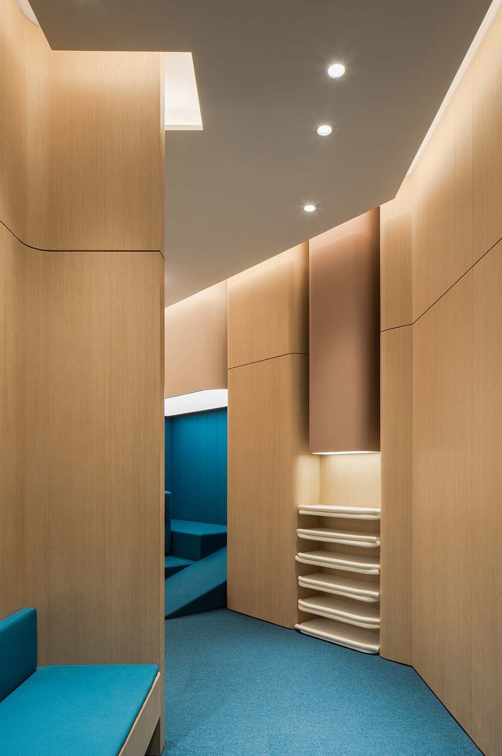
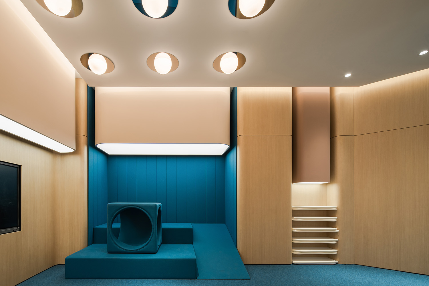
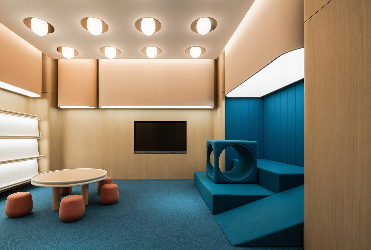
Joy Camp采用與外部非常不同的視覺效果,更為活潑的色彩搭配,在強調孩童屬性的同時又不失藝術性。
Joy Camp adopts a very different visual effect from the outside, with a more lively color scheme that emphasizes the childlike characteristics while still being artistic.
NIO House不僅突破了傳統的汽車展廳的形式,更是希望為用戶提供一種將藝術融於生活的休閑生活方式和場景,希望用戶在這友好宜人的氛圍中,讓車生活成為生活的延伸。
NIO House not only breaks out from the traditional form of car showroom, but also provides users with a leisure lifestyle and scenario that integrates art, with the hope that users can further extend their lifestyle via cars in this friendly and pleasant atmosphere.
項目信息
項目名稱: 蔚來汽車NIO House -成都萬象城店
主創設計師:梁寧森,吳岫微
設計團隊:楊振鈺,吳心鴻,古聳宇
設計周期:2020.8-2020.10
竣工:2021
項目地址:成都市雙慶路8號萬象城二期C170、C268
麵積:470㎡
主材:透光燈膜,噴砂不鏽鋼,木飾麵板,水磨石
業主:蔚來汽車
撰文:楊振鈺
翻譯:柯清雅
攝影:形在攝影
Project Name: NIO House, Chengdu MixC
Chief Designers: Sam Liang, Vivi Wu
Design Team: Zhenyu Yang, Xinhong Wu, Songyu Gu
Design Phase: August – October 2020
Completion: 2021
Location: C170, C268, Phase II of MixC, No. 8 Shuangqing Road, Chengdu
Area: 470 ㎡
Materials: Transparent membrane, sandblasting stainless steel, wooden veneer, terrazzo tile
Client: NIO
Copywriter: Yang Zhenyu
Translator: Coco Kor
Photography: HERE Space


