全球設計風向感謝來自 Oft Interiors 的商業空間/電影院項目案例分享:
因一句台詞喜歡一部電影,因一個鏡頭迷戀一座城市。
即便沒去過香港,但並不影響我們對油尖旺的熟悉,而香港數碼港同樣也是影迷朝聖之地。《寒戰》、《無間道3》、《新警察故事》、《單身男女》、《傷城》、《寶貝計劃》等電影中都能找到數碼港的身影。
You can be fond of a movie because of a line, or be fascinated by a city because of a shot.
Even if we have never been to Hong Kong, it does not affect our familiarity with Yau Tsim Mong, and Hong Kong Cyberport is also a place of pilgrimage for film fans. You can find the trace of Cyberport in many movies like Cold War, Infernal Affairs 3, New Police Story, Don’t Go Breaking My Heart, Confession of Pain, ROB-B-HOOD and so on.
《寒戰》中精彩絕倫的“奪權”戲在數碼港三座裏麵取景拍攝。有趣的是,《寒戰》中郭富城的辦公室正是《無間道3》裏黎明的辦公室。
電影熱映同年,香港設計事務所Oft Interiors受邀為MCL數碼港戲院設計做全新視覺和空間功能設計, OFT設計擅長結合商業思維與視覺文化,致力於為商業空間創造“場景式消費體驗”.在這個設計中,OFT不僅為Z世代消費人群帶來全新像素世界,還解決了舊戲院動線和商場引流能力不足的問題,實現影院和商場雙向引流。
The fantastic scene of ” seize power” in Cold War was filmed inside Cyberport 3. Interestingly, Aaron Kwok’s office in Cold War is the same office of Leon Lai in Infernal Affairs 3.
In the same year of the movie’s release, Hong Kong design firm Oft Interiors was invited to make a new visual and spatial function design for the MCL Cyberport theater. OFT design specializes in combining business thinking and visual culture, and is committed to creating a “scenario-based consumer experience” for commercial spaces. In this design, OFT not only brings a new pixel world to the consumers of Generation Z, but also solves the problem of insufficient capacity of customers’ flow of the old cinema and the mall, achieving two-way flow between the cinema and the mall.
“我們經常在大局上投入太多精力,卻忘記了像素。”——西爾維亞·卡特賴特
“We often devote too much energy into the big picture but forgot the pixels.” – Silvia Cartwright
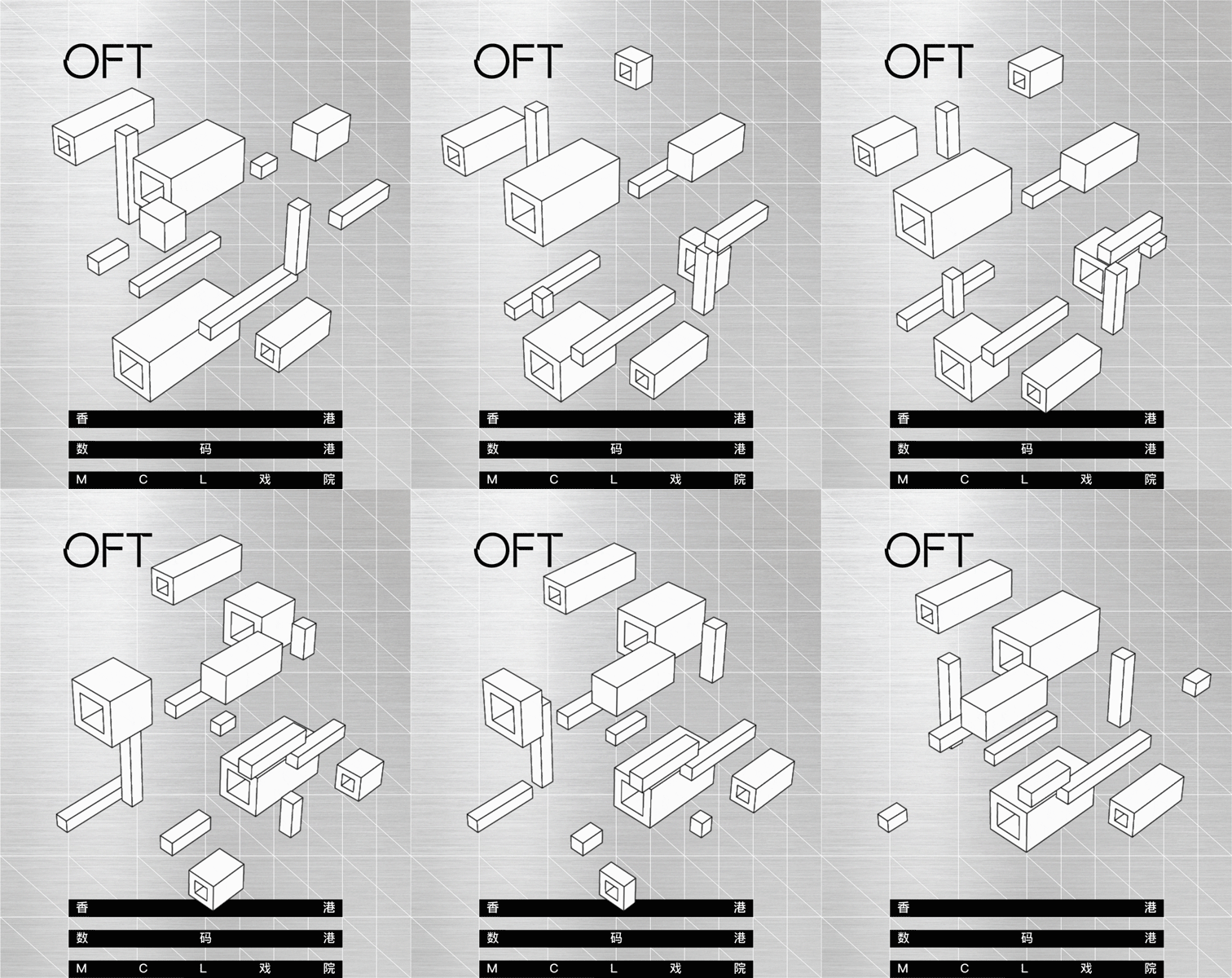
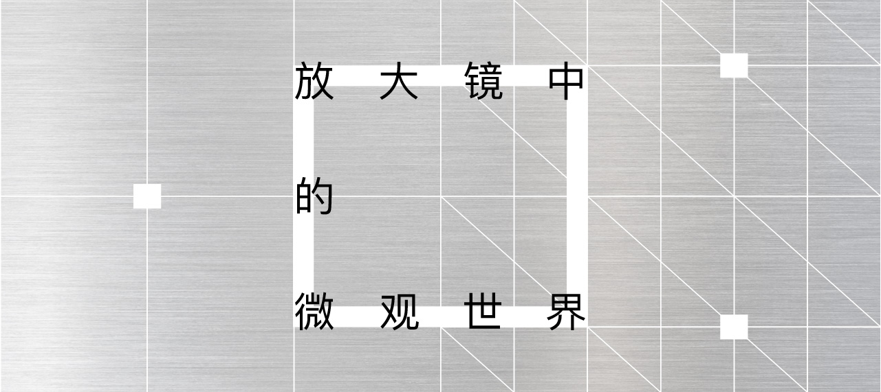
設計以「放大鏡中的微觀世界」為主題,OFT通過對三維城市進行二維想象與思考,將大小不一、深淺不同的像素進行解構,同時以一種全新尺度重塑屏幕裏的空間。
The design is based on the theme of “microcosm through a magnifying glass”. OFT deconstructs pixels of different sizes and shades by imagining and thinking about the three-dimensional city in two-dimensional way, while reshaping the space inside the screen in a new scale.
他們認為,我們生活在一個電子屏幕無處不在的世界中,如果這個世界就由電子屏構成,那麽我們就是構成這個世界的一粒粒小小像素,因為每個個體的不同,世界才變得更加立體與鮮活。
They believe that we live in a world where electronic screens are everywhere, and if the world is made up of electronic screens, then we are the tiny pixels that make up the world. Because each individual is different, the world becomes more three-dimensional and vivid.
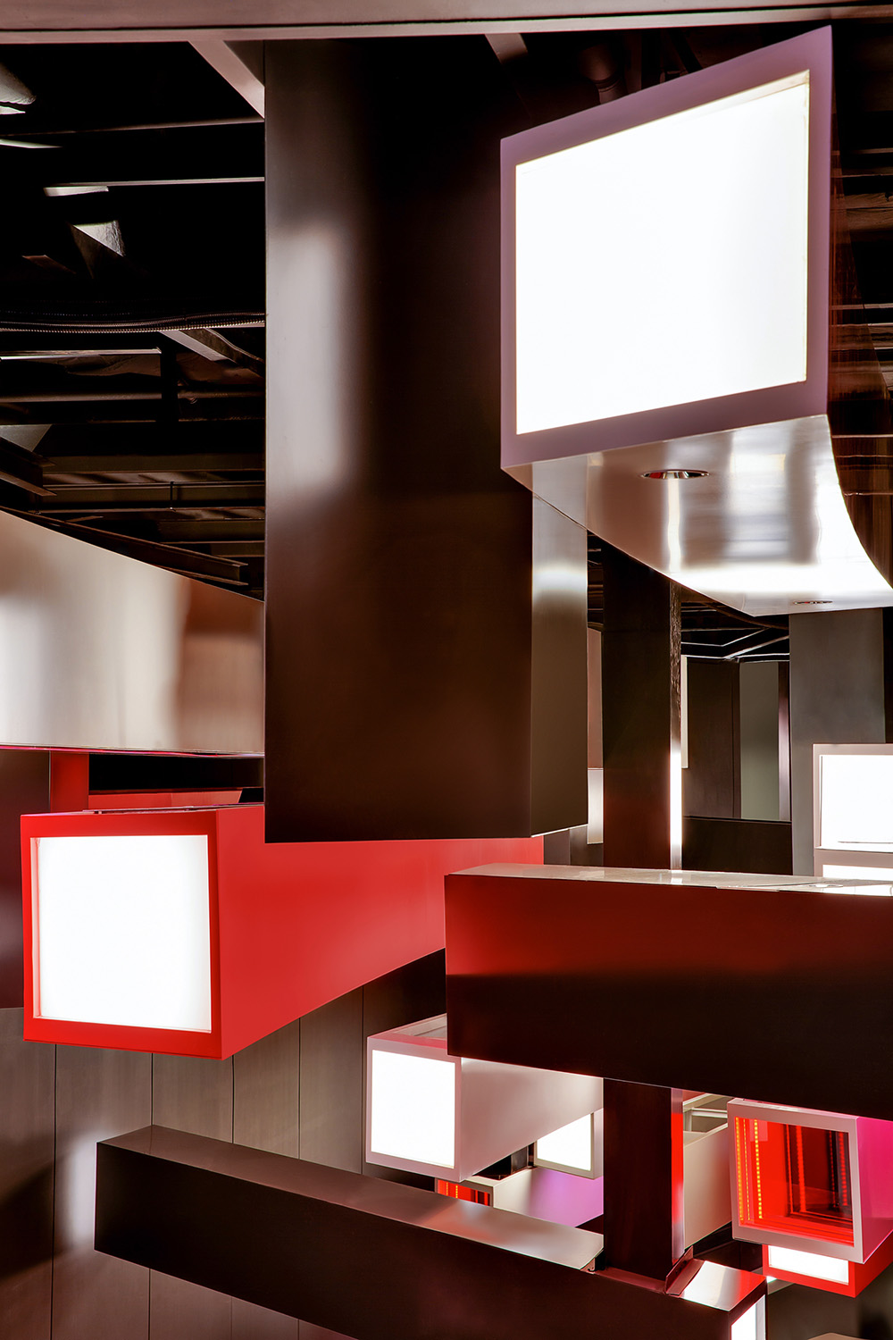
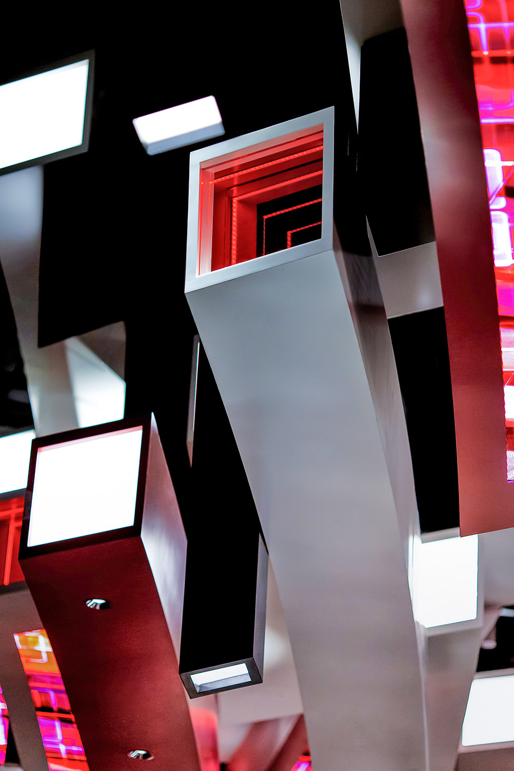
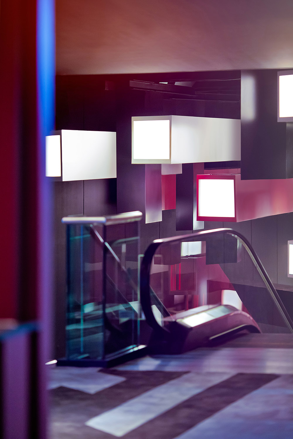
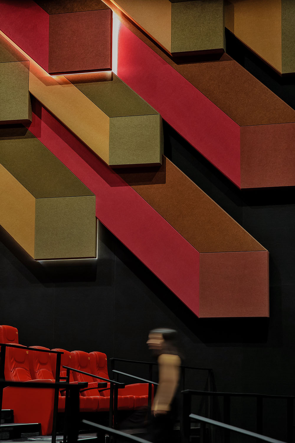
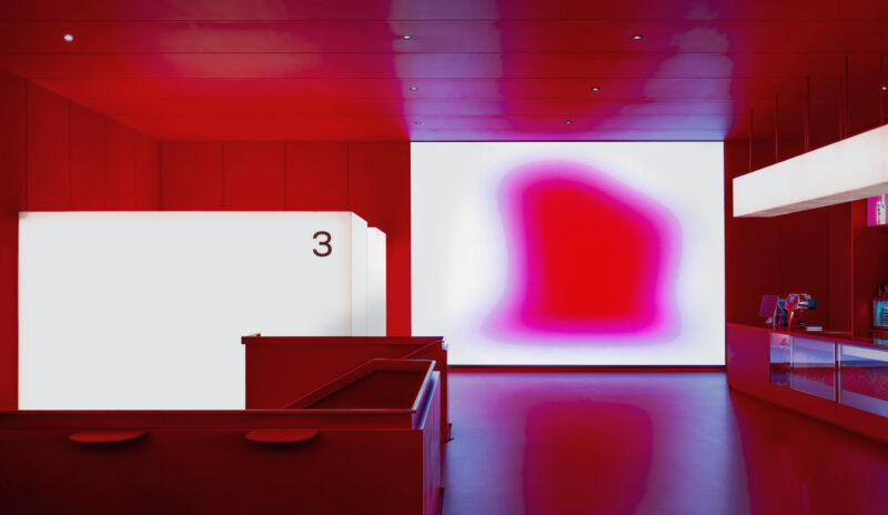
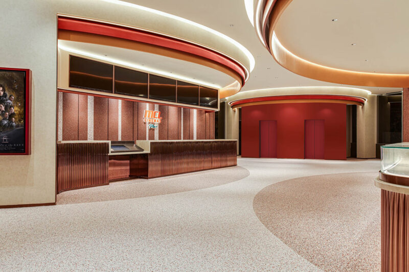
OFT將紅色及鋁色相結合,作為項目設計的主色調,整體氣氛充滿活力、熾熱與衝勁,在這個被放大的微觀世界裏,曾經扁平的像素格,變成了一個個立體的像素柱,過去隻能觀察到表麵,如今則可以窺得全貌。
OFT combines red and aluminum as the main colors of the project design, whose overall atmosphere is energetic and hot. In this magnified microcosm, the once flat pixel grid becomes a three-dimensional pixel column. Hence we can only observe the surface in the past, but now we can see the whole picture.
消費定位:
關鍵詞:年輕人、不同圈層、現代科技、Z世代、體驗至上
香港數碼港內設電競場地,具有電子化、數碼的高科技定位。
在消費場景多元化、消費群體更趨年輕化的商業探索下,OFT將影院打造為一個具備科技感和未來感的商業空間,提供優質的價值、服務和體驗吸引更多“Z世代”人群,從而實現年輕消費群體的圈層突破。
改造後的電影院契合了這類人群消費心理特征,與影院充滿現代、未來和科技感的調性和風格相輔相成,同時影院麵向不同圈層消費群體,吸引更多年輕人進入影院,帶動數碼港商場消費。
Consumer positioning:
Keywords:the youth, different circles, modern technology, Generation Z, experience first
Hong Kong Cyberport has a built-in gaming venue with an electronic and digital high-tech positioning.
Under the commercial exploration of diversified consumption scenes and younger consumer groups, OFT has turned the cinema into a commercial space with a sense of technology and future, providing high-class value, service and experience to attract more “Generation Z” people, thus achieving a breakthrough in the circle of young consumer groups.
The renovated cinema fits the psychological characteristics of this group of consumers and complements the modern, futuristic and technological tone and style of the cinema, while the cinema is open to different circles of consumers, attracting more young people to the cinema and driving the consumption of Cyberport mall.
空間分析:
關鍵詞:盈利結構、相互導流、消費場景
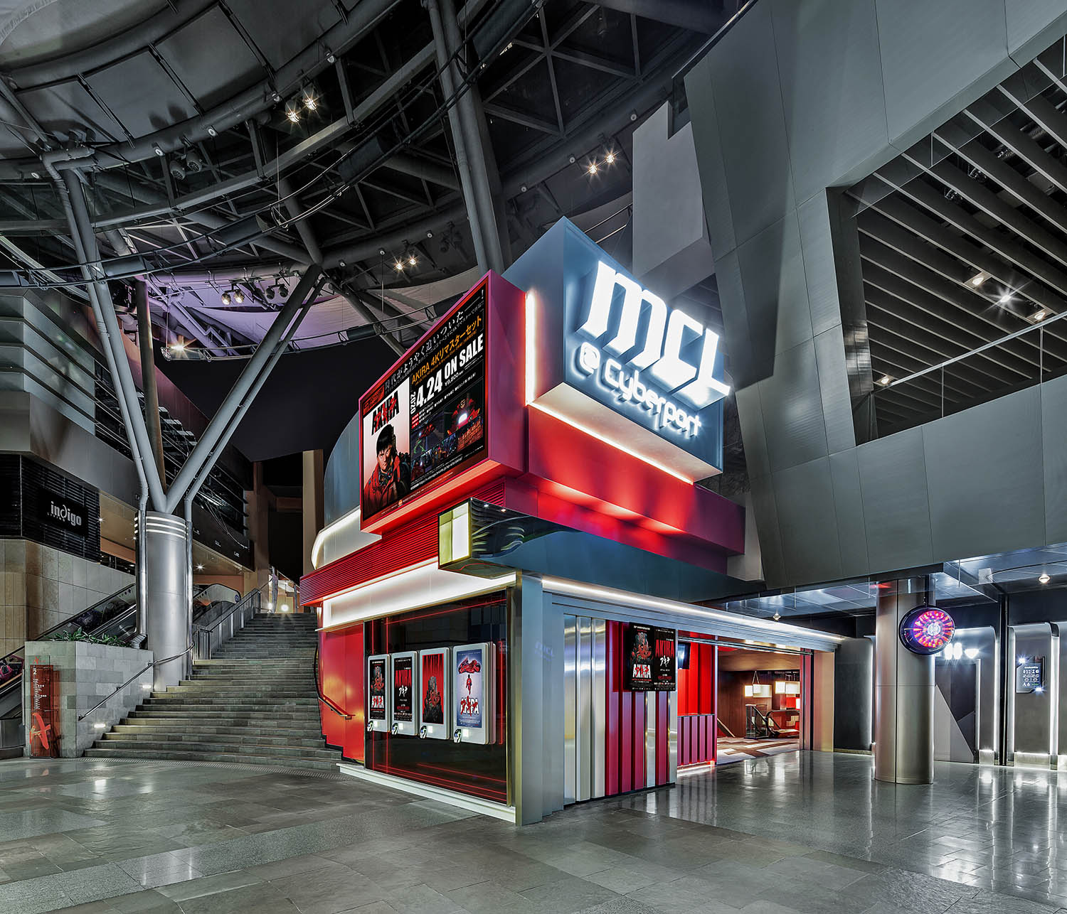
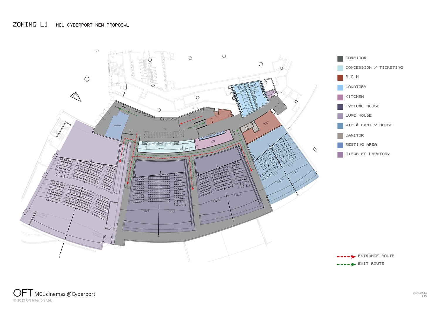
除了創造一個沉浸式體驗世界,設計師還根據電影院的商業邏輯,在動線與布局上進行重新規劃,把原本街邊入口改為商場進入,實現商場與影院相互導流。
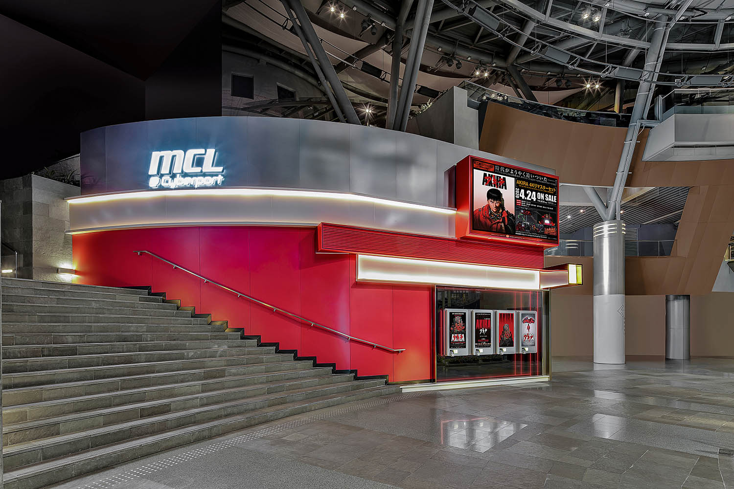
售票處以獨立建築的身份出現在數碼港商場中,如同一個天外來客,讓消費者能夠在室內也獲得置身戶外的體驗感。
Space analysis:
Key words: profit structure, mutual consumers flow, consumption scene
In addition to creating an immersive experience world, the designer also re-planned the dynamic line and layout according to the business logic of a movie theater, changing the original street entrance into a mall entry to achieve mutual inflow between the mall and the theater.
The ticket office appears in the Cyberport mall as a stand-alone building, like a guest from the sky, so that consumers can get the experience of being outdoors even indoors.
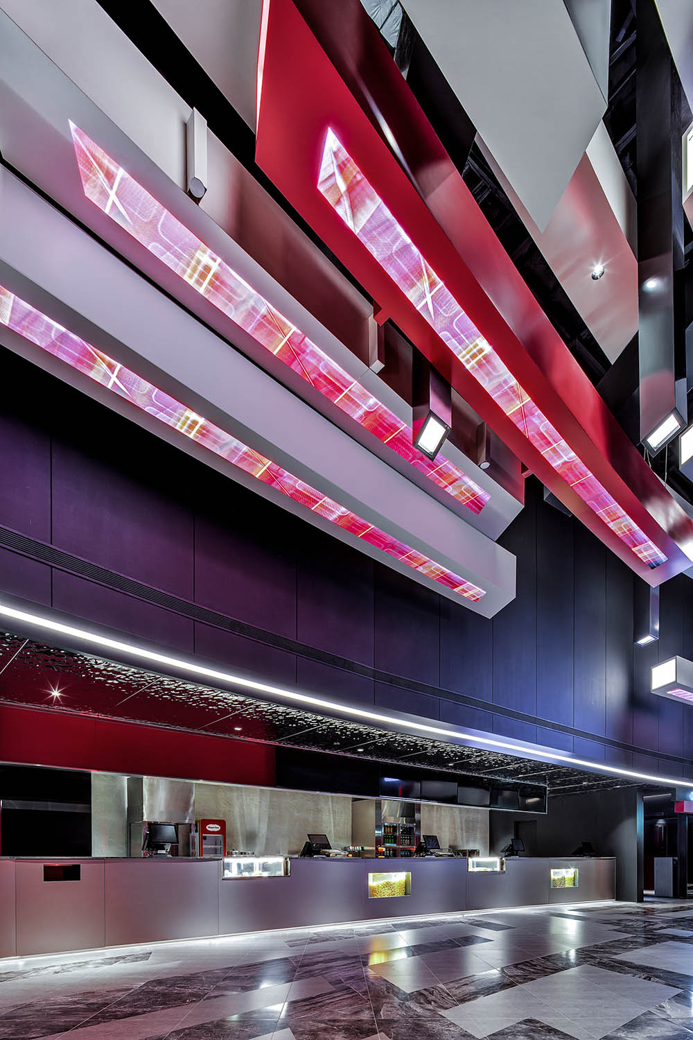
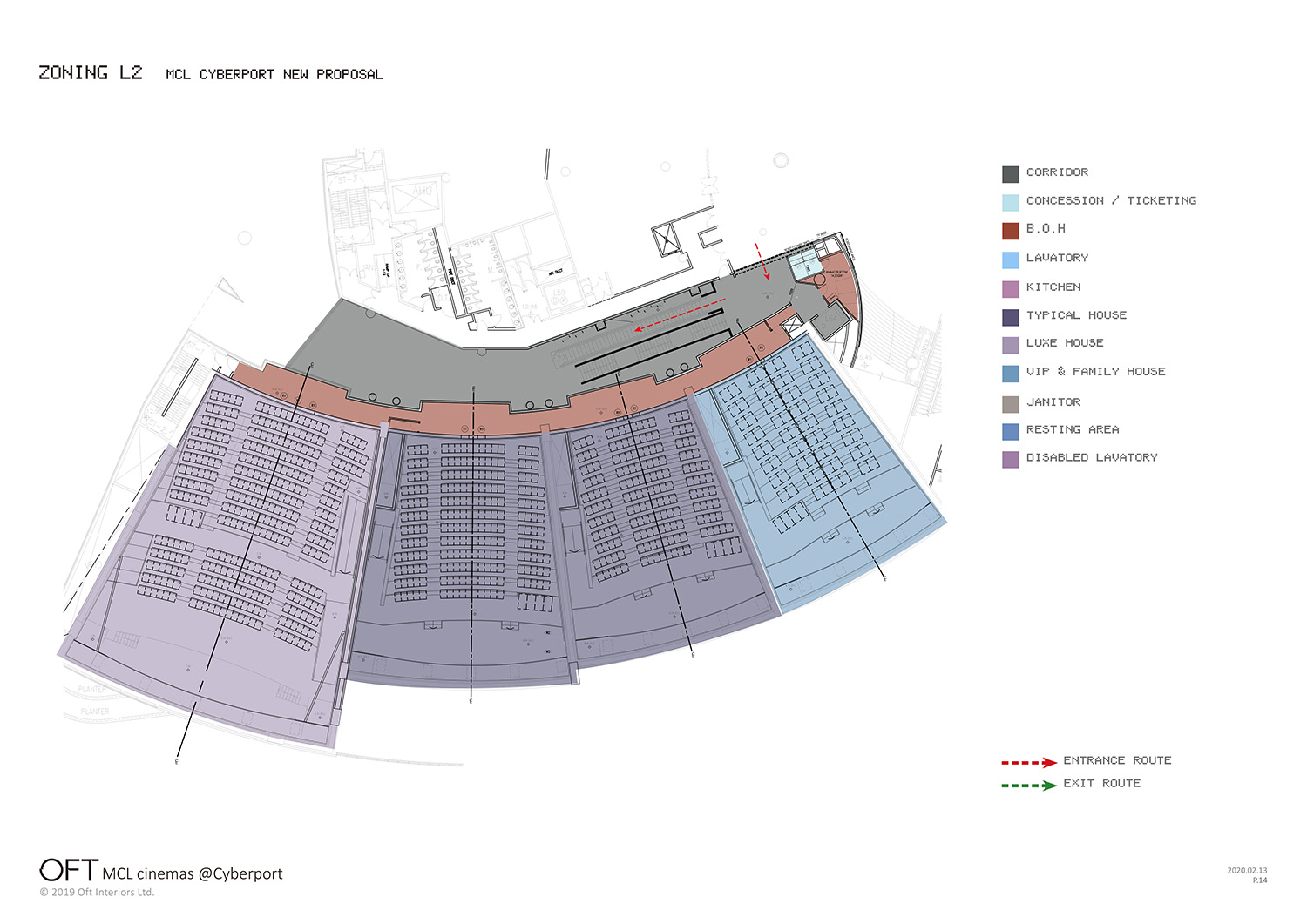
同時,把主入口與售票區移至二層,一層則作為賣品區,賣品區是影院的重要盈利結構,一個更為聚集的賣品區不僅能為消費者提供更多選擇,位於更為開放的一層,也能為影院創造新的盈利點,分開設置後的賣品區空間感變大,帶來更好的消費體驗。
At the same time, the main entrance and ticketing area is moved to the second floor, while the first floor is used as a sales area. The sales area is an important profit structure for theaters, and a more aggregated sales area not only provides consumers with more choices, but also creates new profit points for theaters by being located on a more open floor, bringing better consumption experience and greater space.
不僅如此,設計師還將原本的多出入口變更為一個檢票口及出口,利用走道自身特點,以一個方向性引導觀眾,更好地進入消費場景。
Not only that, the designer also changed the original multiple entrances and exits into one ticket gate and exit, using the walkway’s own characteristics to guide the audience in one direction and better access to the consumption scene.
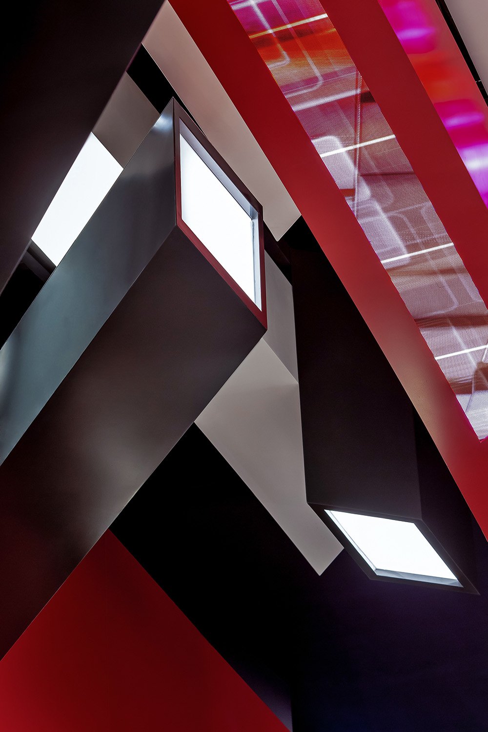
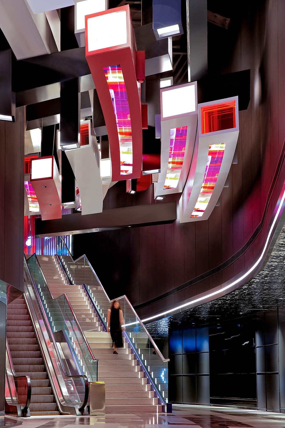
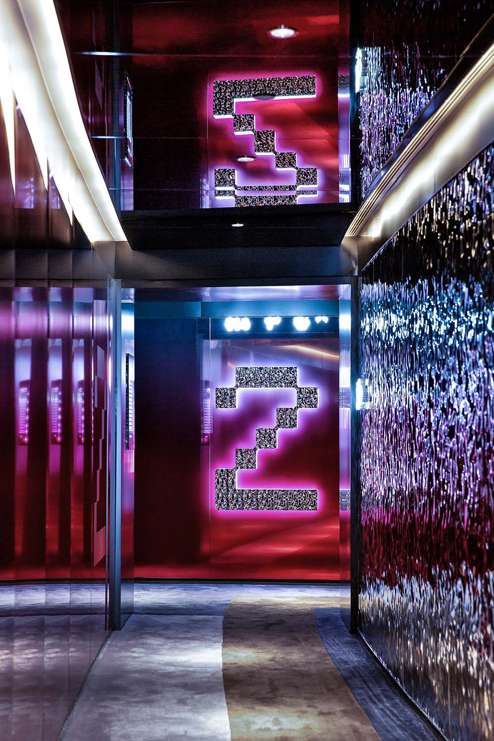
除此之外,設計師還利用大堂高天花的窄長特征,用平麵表現手法呈現立體概念,將像素用生動的方法呈現,並通過天花鋁條造型的延伸感和方向性,把消費者由入口帶到大堂。
In addition, the designer also makes use of the feature of narrow and long ceiling of the lobby to present a three-dimensional concept with a flat expression, presenting the pixels in a vivid way and bringing consumers from the entrance to the lobby through the sense of extension and directionality of the aluminum strip on the ceiling.
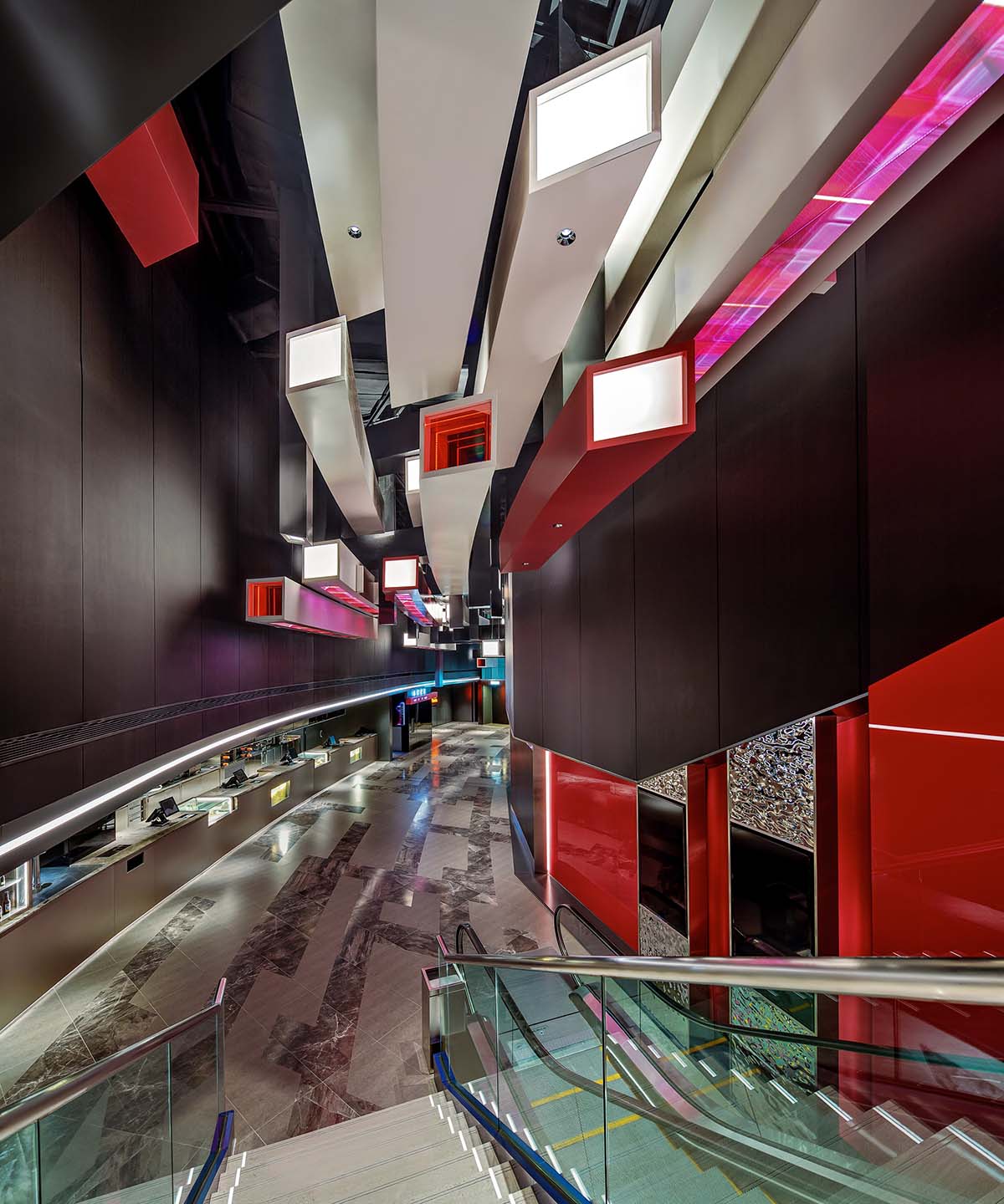
天花鋁條縱橫交錯,巨大的像素格貫穿整個影院,不僅帶來強視覺衝擊,同時極具動感及視覺引導性。
The aluminum strips on the ceiling are crisscrossed and the huge pixel grid runs through the whole theater, which not only brings strong visual impact, but also is very dynamic and visually directive.
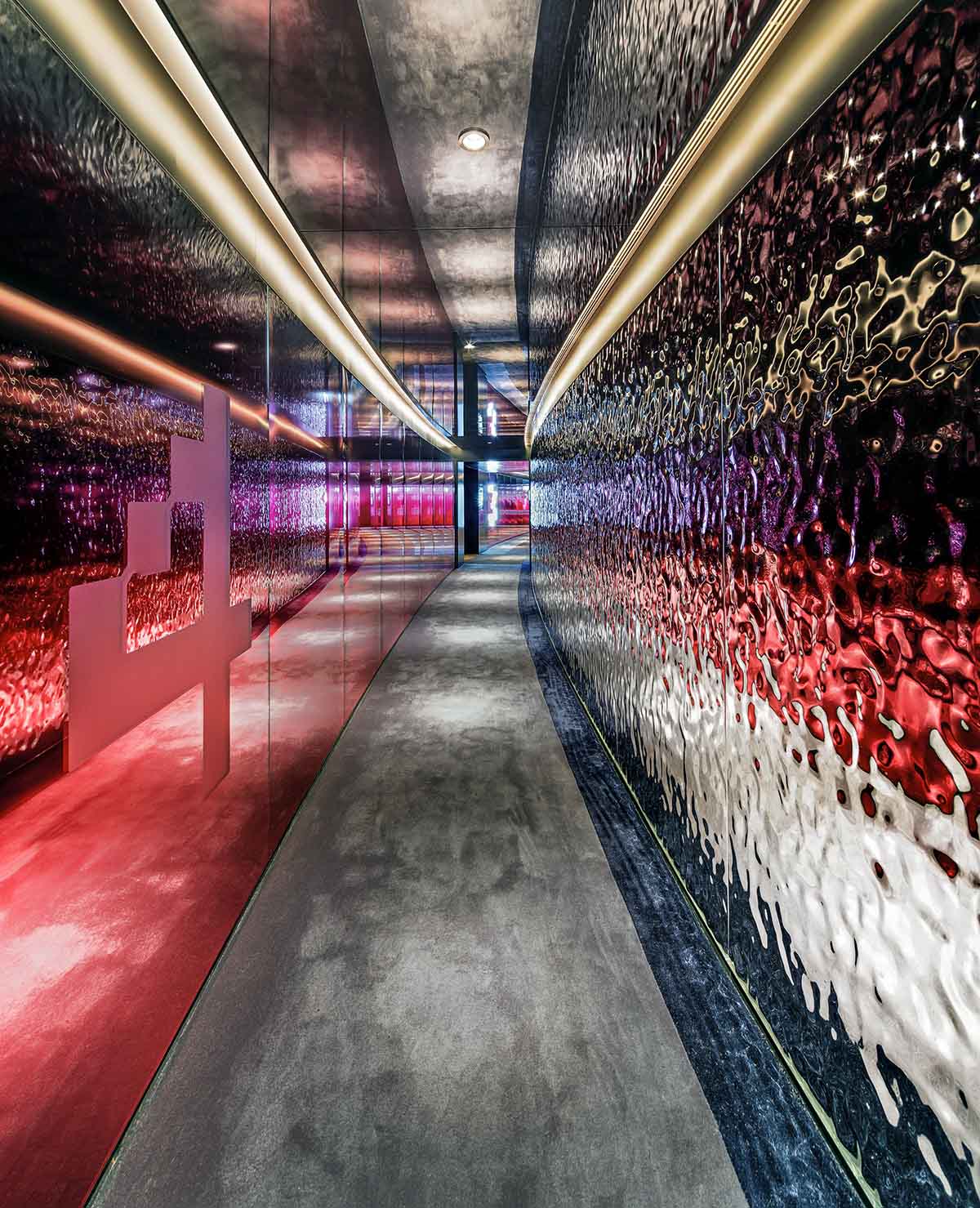
地麵通道狹長但具有一定弧度,像一條曲折通幽的小徑,盡頭處別有洞天。
The ground channel is long and narrow but has a certain curvature, like a winding path, and here is an altogether different world at the end.
由於空間狹窄,因此設計師在設計地磚時,特意依照天花弧度進行拚貼,用深色磚對應天花鋁條,淺色磚則對應天花影子,地麵與天花呈現出一種倒影的效果,相映成趣。設計師還用鏡麵或拉平牆體將原本的柱子隱藏,兼具美觀與實用。
Because of the narrow space, the designer purposely designed the floor tiles in accordance with the curvature of the ceiling for collage, using dark-colored tiles to correspond to the aluminum strip of the ceiling and light-colored tiles to correspond to the shadow, letting the ground and the ceiling present a reflection effect. The designer also used mirrors or flattened walls to hide the original columns, both beautiful and practical.
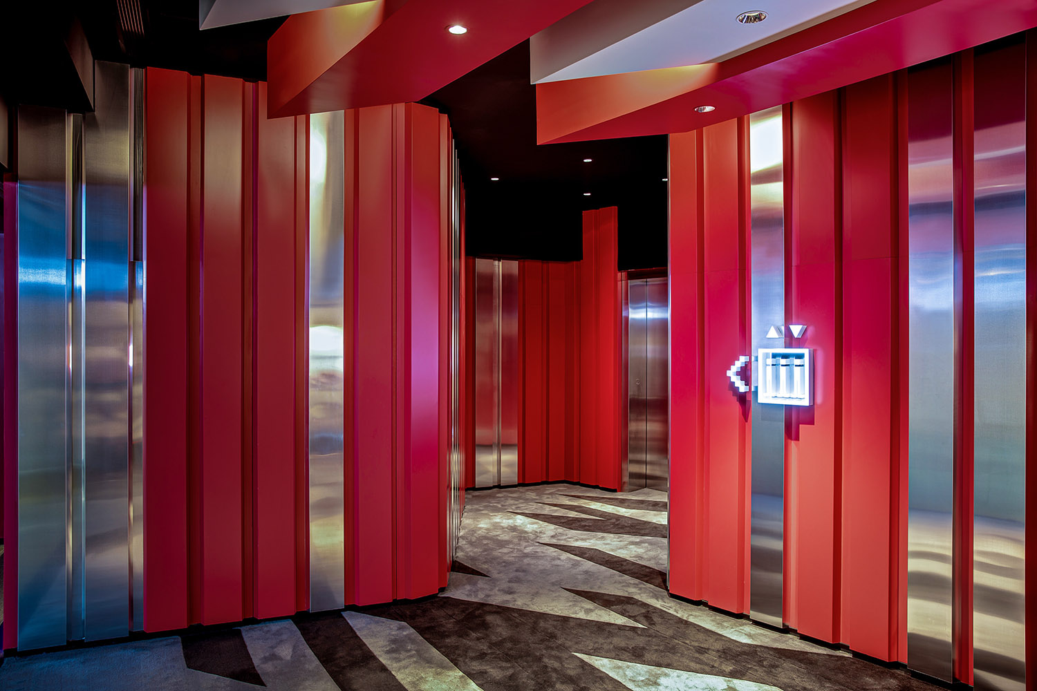
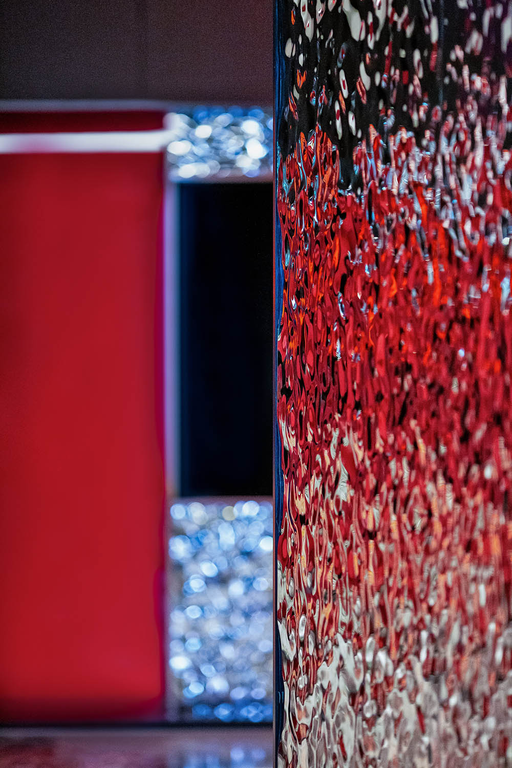
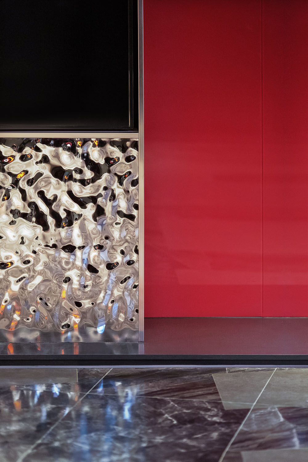
影廳走廊運用大量反光物料,如金屬波浪板、灰鏡及鋁板,令畫麵更加豐富,從視覺上改善走道空間狹窄的問題。
The corridor of the cinema hall uses a large number of reflective materials, such as metal wave plate, gray mirror and aluminum plate, to make the picture richer and visually improve the problem of narrow aisle space.
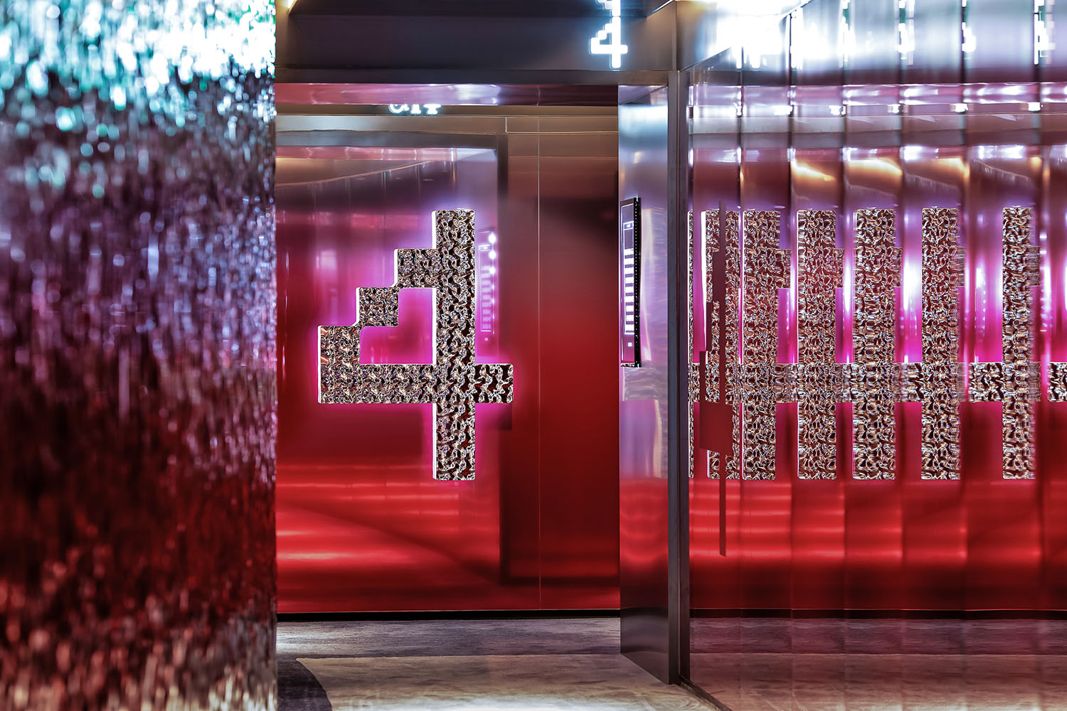
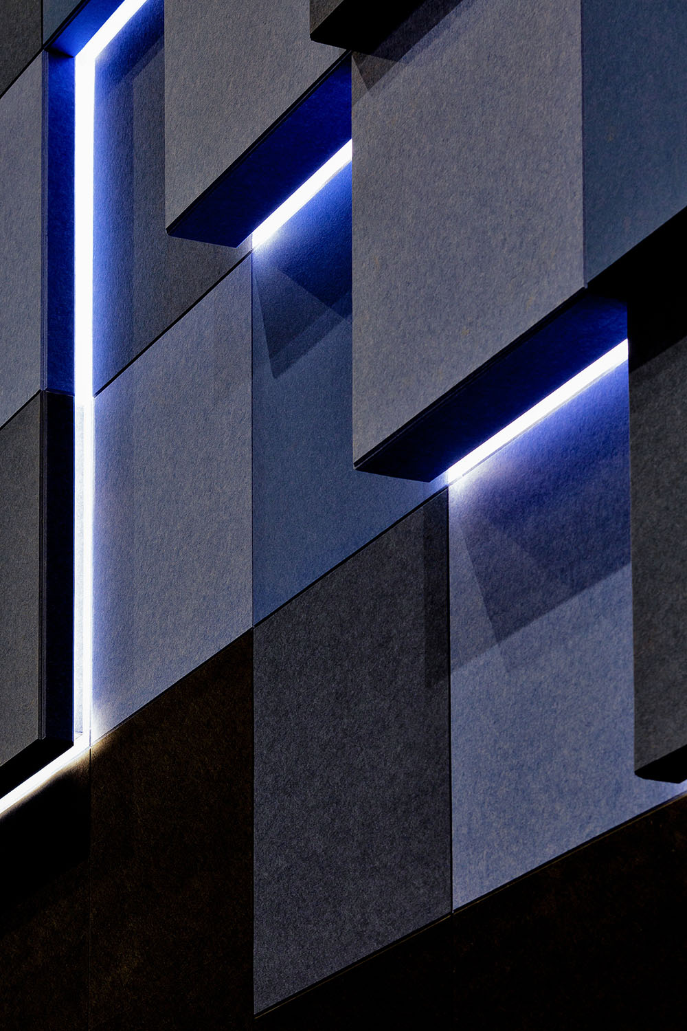
影廳外牆由不同顏色、尺度的鋁條造型與玻璃及金屬浪板構成,形成旗幟鮮明的第一視覺中心。當不同光影照射在反光物料上時,形成不同的空間體驗感,影廳導示設計也使用反光材料,帶來視覺衝擊。
The outer wall of the cinema hall is composed of aluminum strips of different colors and scales with glass and metal wave plates, forming a clear-cut visual center. When different light and shadow shine on the reflective materials, it forms different sense of spatial experience, and the reflective materials are also used on the design of the cinema hall signage to bring visual impact.
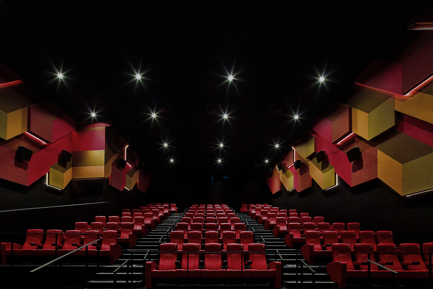
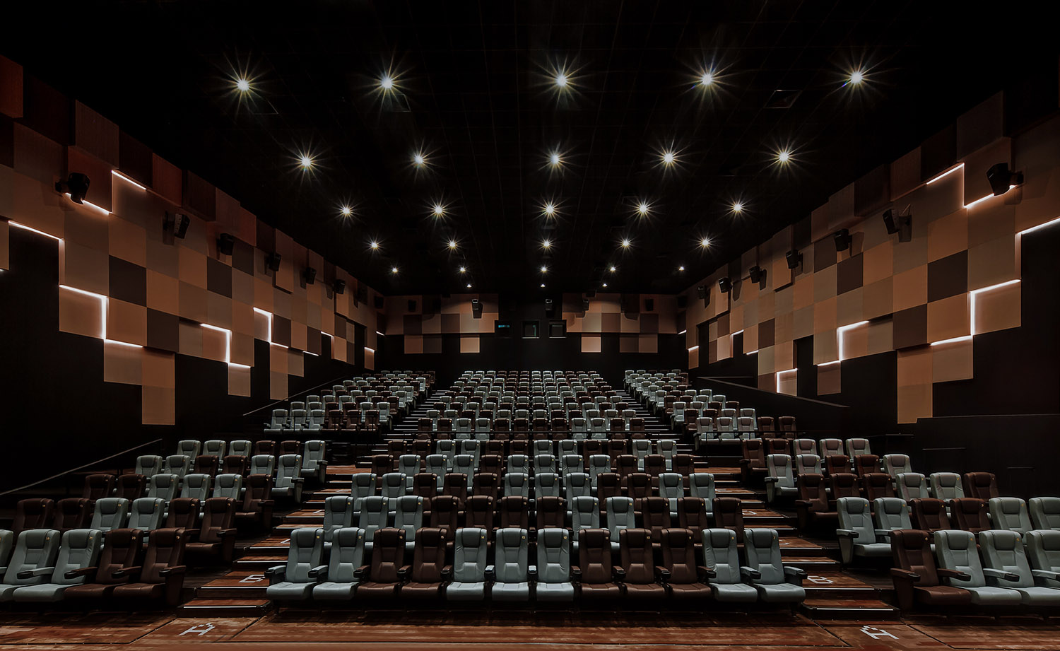
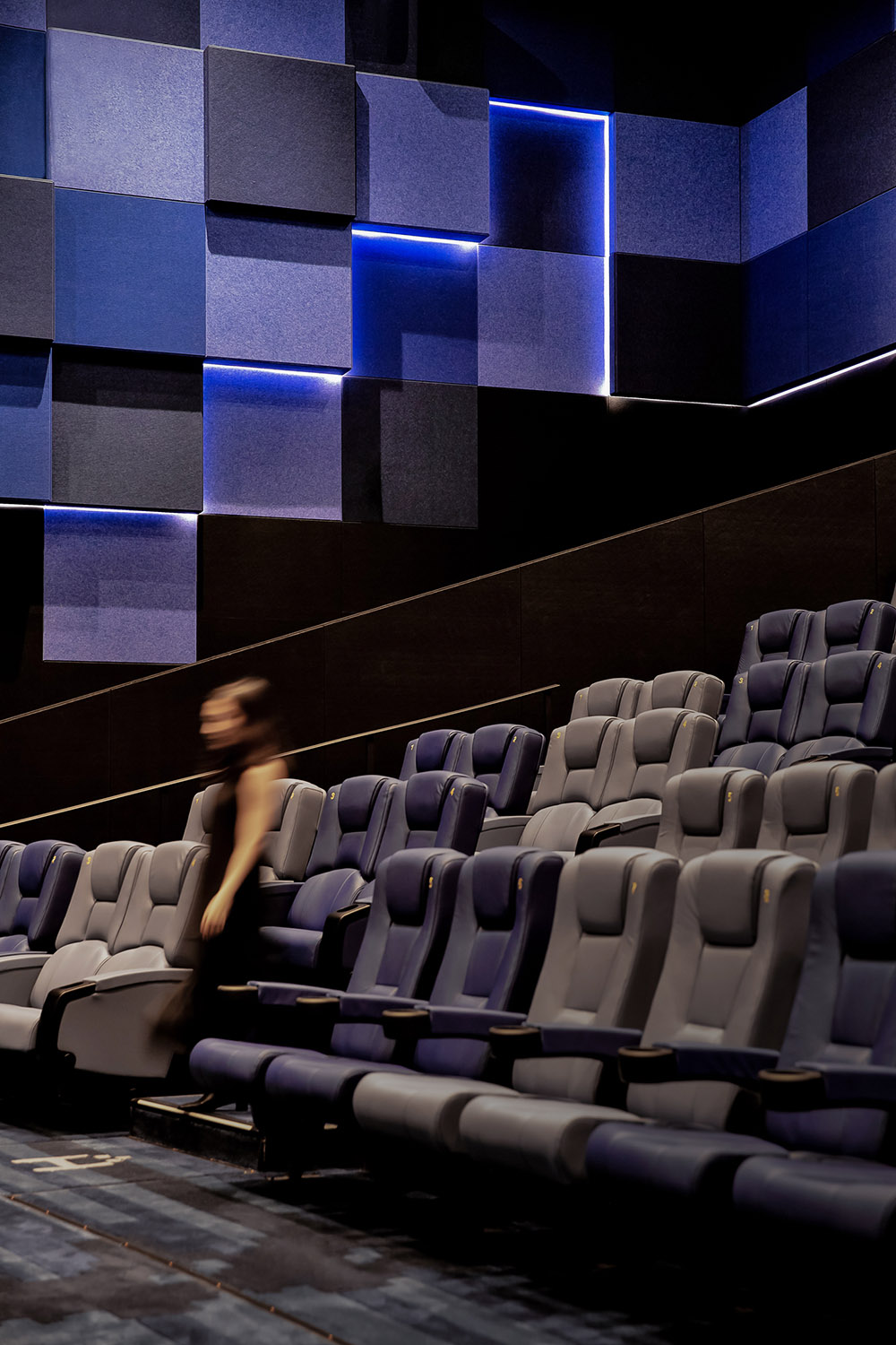
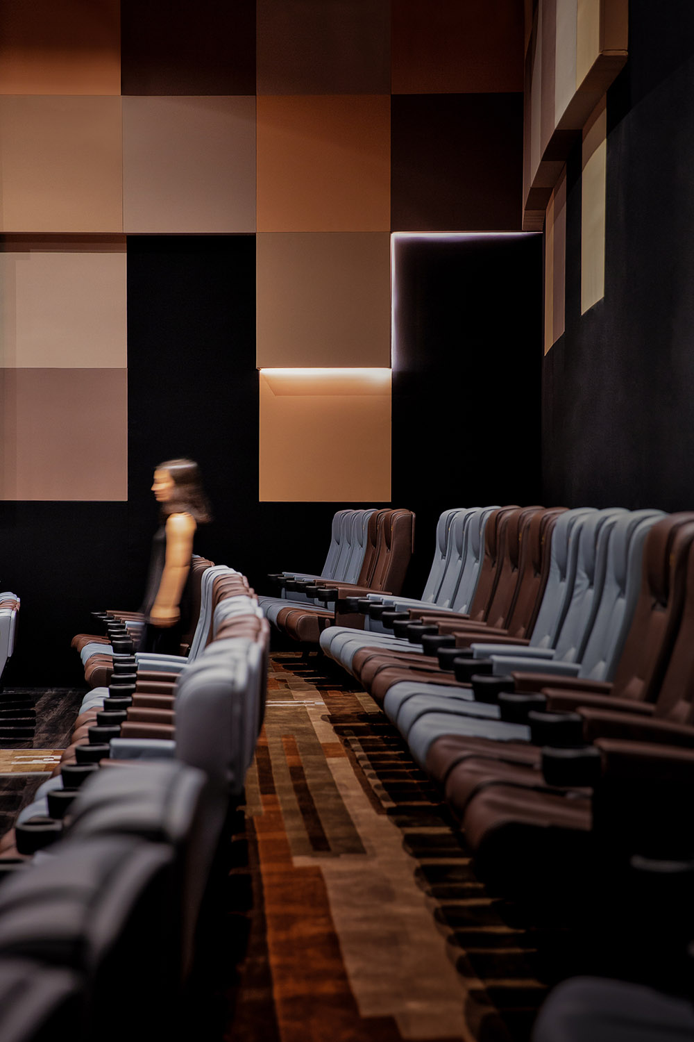
影廳內部也分為冷暖兩種氛圍,燈光可以根據不同場景環境進行調節,並以不同的色彩營造出視覺的不同。
The interior of the cinema hall is also divided into two kinds of warm and cold atmosphere, where the lighting can be adjusted according to different scene environment, using different colors to create a visual difference.
以單一、簡潔的馬賽克,拚貼出豐富、生動的立體牆麵,完成像素由簡單到繁複畫麵的呈現。前後凹凸效果,拚出富有立體感的特色牆體,在光影暗合中帶領觀眾進入沉浸式情境體驗中。
Single and concise mosaic collages a rich, vivid three-dimensional wall, to complete the presentation of the pixel from simple to complex picture. The concave and convex effects spell out the distinctive wall rich in three-dimensionality, leading the audience into an immersive contextual experience in the dark combination of light and shadow.
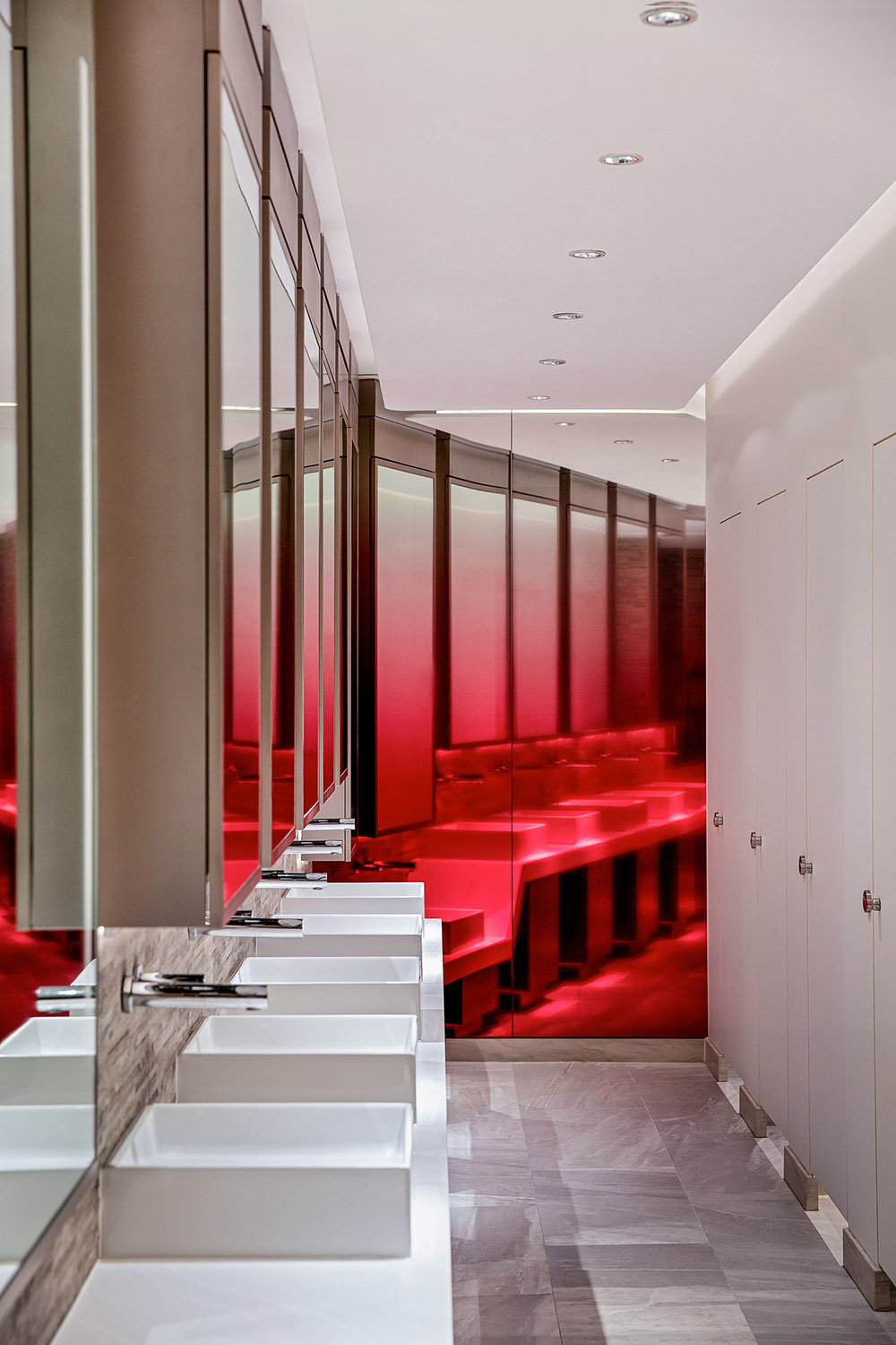
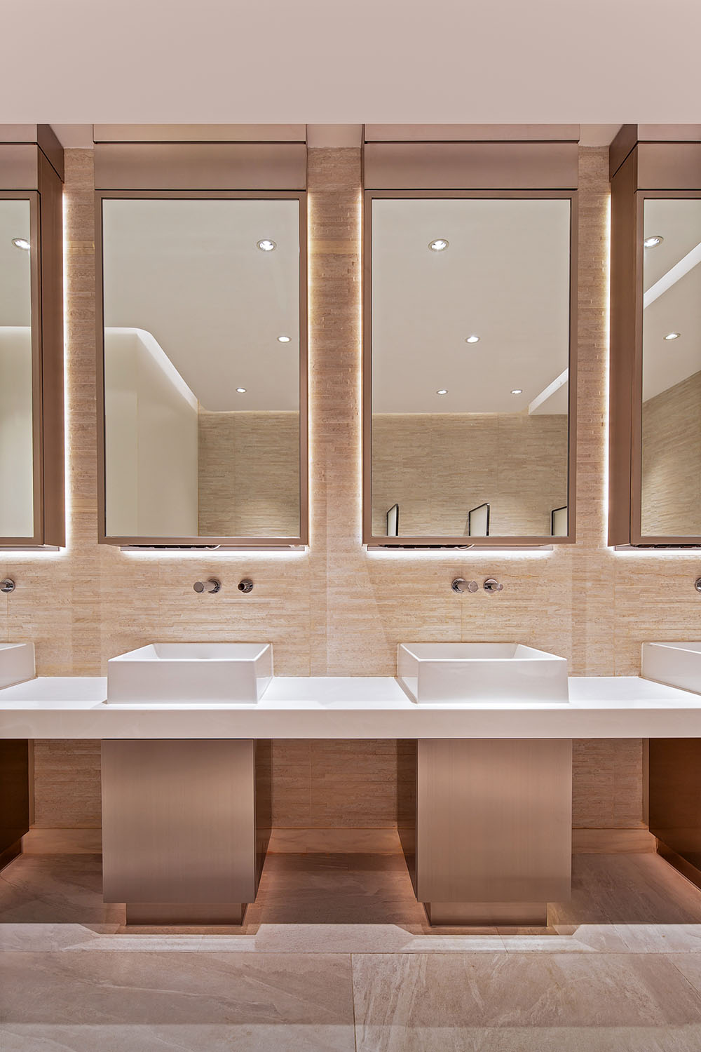
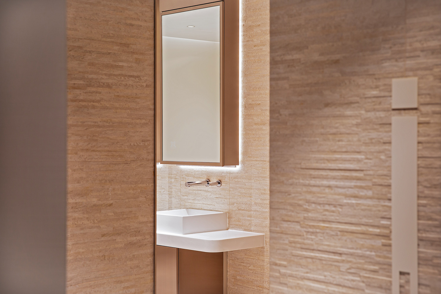
洗手間則由紅色與淺色割裂為現實和虛擬,帶來張揚、熱烈的視覺呈現。當香港數碼港既是取景地又有電影院,當虛擬和現實在影院交疊時,我們是否可以直達過去、現在與未來?
電影院就象是通往虛擬世界的任意門,OFT通過對影院像素概念的大量運用,模糊了現實世界與虛擬空間之間的界限,為消費者帶來新奇體驗。OFT希望通過這個項目,能讓消費者可以以一種陌生視角,去探討城市與個體、虛擬與現實甚至平麵與立體之間的關係。
The washroom, on the other hand, is divided by red and light colors into reality and virtual, bringing a flamboyant and enthusiastic visual presentation. When Hong Kong Cyberport is both a shooting location and a cinema, and when virtual and reality overlap in the cinema, can we reach the past, present and future directly?
The cinema is like an dimension door to the virtual world. Through the extensive use of pixel concept of the cinema, OFT blurs the boundary between the real world and the virtual space, bringing novel experiences to consumers.
Through this project, OFT hopes that consumers can explore the relationship between city and individual, virtual and real, and even flat and three-dimensional, via a strange perspective.
∇ 平麵圖
項目信息
項目名稱:Pixelated
項目類別:商業空間
項目業主:MCL院線
服務內容:策劃/室內設計
設計機構:Oft Interiors
主持設計:鄒卓明/張敬貴
設計團隊:Shanny Cheung, Tammy Au
項目地址:香港鋼線灣數碼港道100號
項目麵積:2393㎡
Project Name: Pixelated
Project Category: Commercial Space
Project Owner: MCL Cinemas
Services: Planning/Interior Design
Design Agency: Oft Interiors
Lead Designer: CM JAO / Ken Cheung
Design Team:Shanny Cheung, Tammy Au
Project Address: 100 Cyberport Road, Steelline Bay, Hong Kong
Project Area: 2393㎡





![[4K] 2.1G 虛空之美-100個日式庭院](http://www.online4teile.com/wp-content/uploads/2023/09/1_202309111611111-8-414x550.jpg)
