“進行時”的LOOKNOW新天地旗艦店
“On-going” LOOKNOW Xintaindi Flagship Store
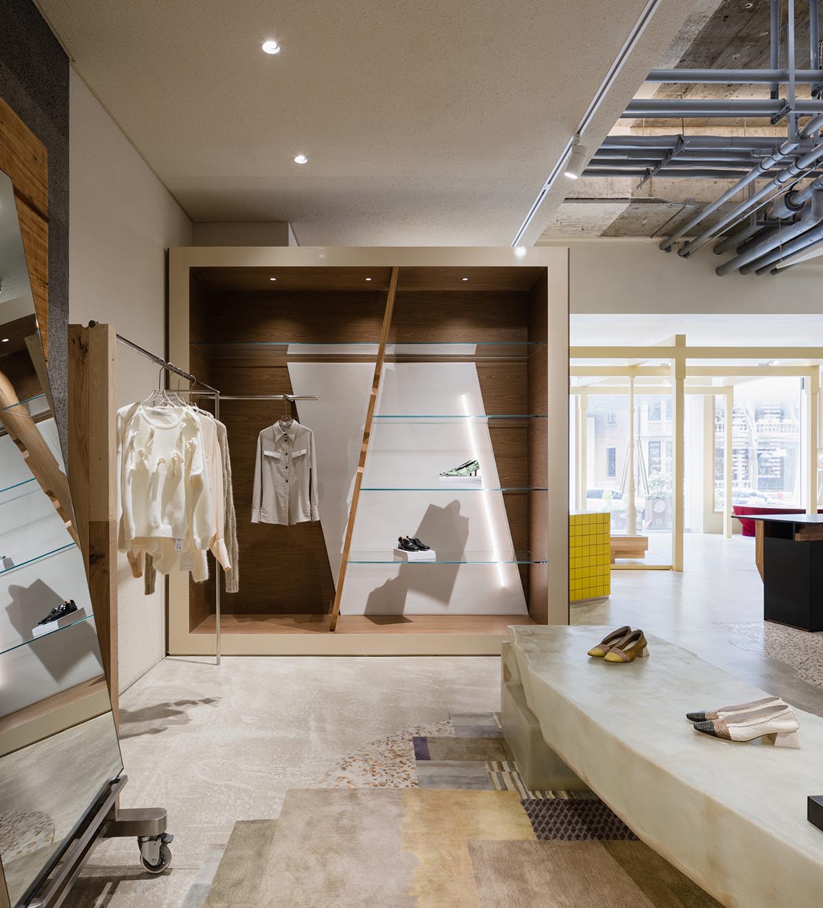
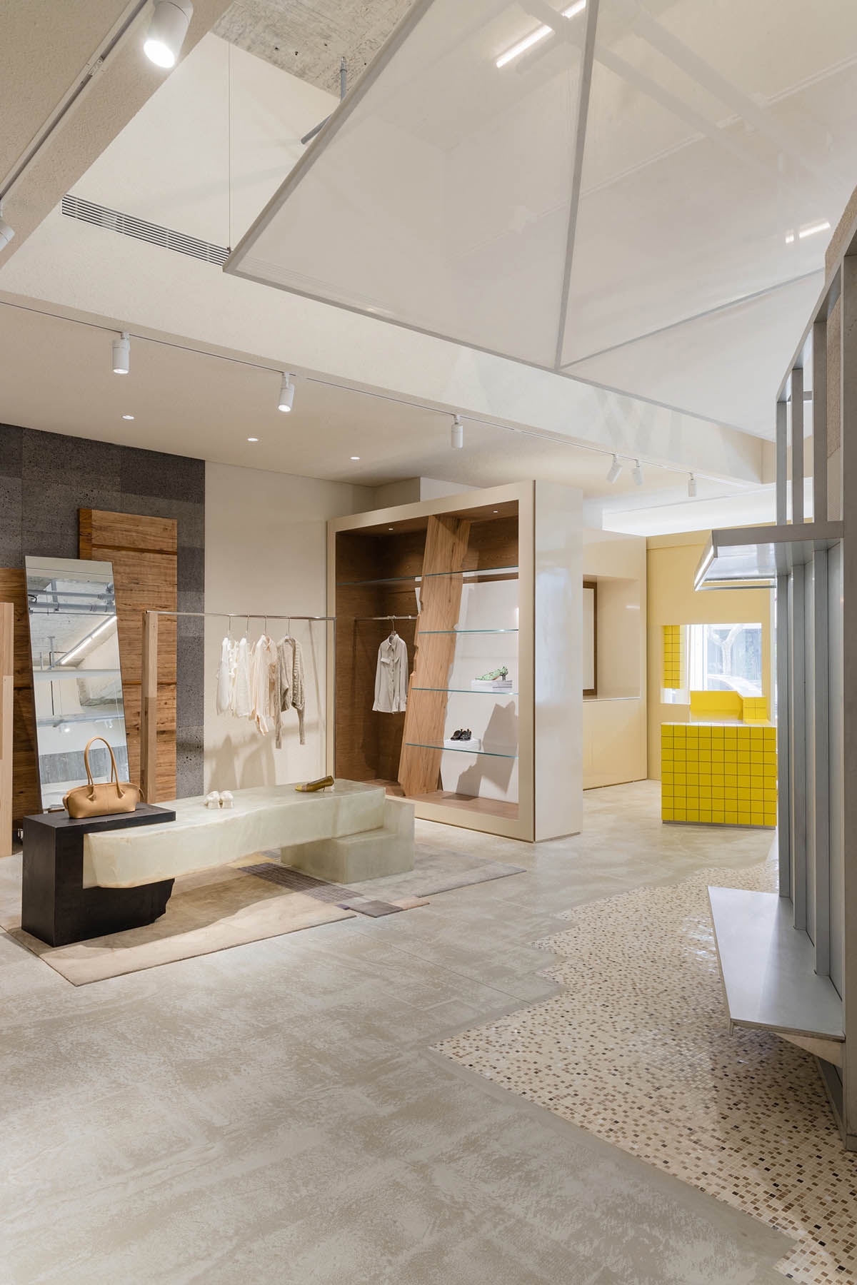
基於空間原始狀態所帶來的靈感,LOOKNOW新天地旗艦店以“進行中的創造-House Now”為主題故事線,傳達空間的敘事性和體驗的沉浸感,打造強烈識別度的當代設計風格。其中以“現場作品-Live Artwork”和“居住現場-Resident In”兩部分為核心主線,結合新天地特有的場地屬性,賦予消費者特有的線下消費體驗。
Inspired by the original status of space, Sò Studio recently launched the LOOKNOW Xintiandi flagship store. Through the storyline of “House Now”, Sò Studio conveys the narrative of the space and the immersive experience to create a strong identity of the contemporary design style. The key design components “Live Artwork” and “Resident In” combine with the unique cultural quality of Xintiandi provides a special shopping experience for the customers.
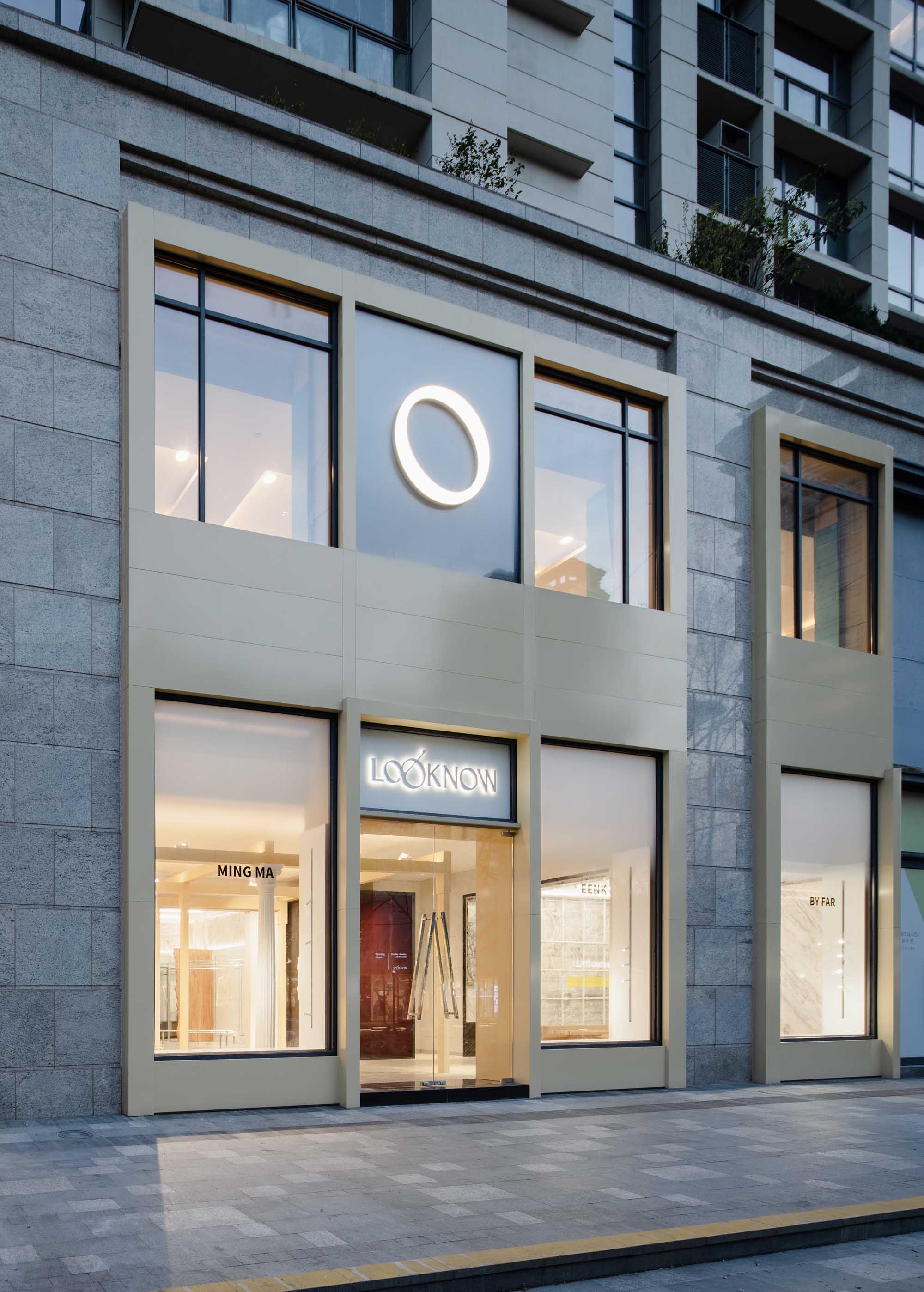
▲沿街外立麵 © Wen Studio
The street entrance elevation © Wen Studio
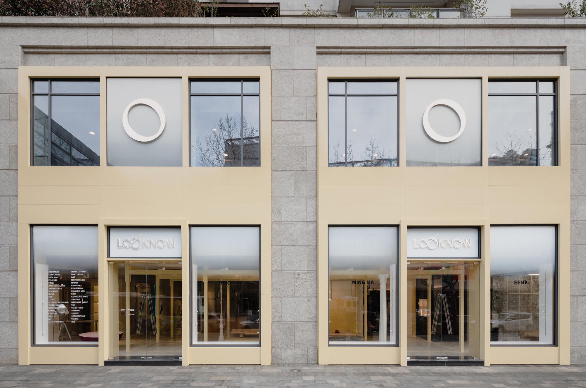
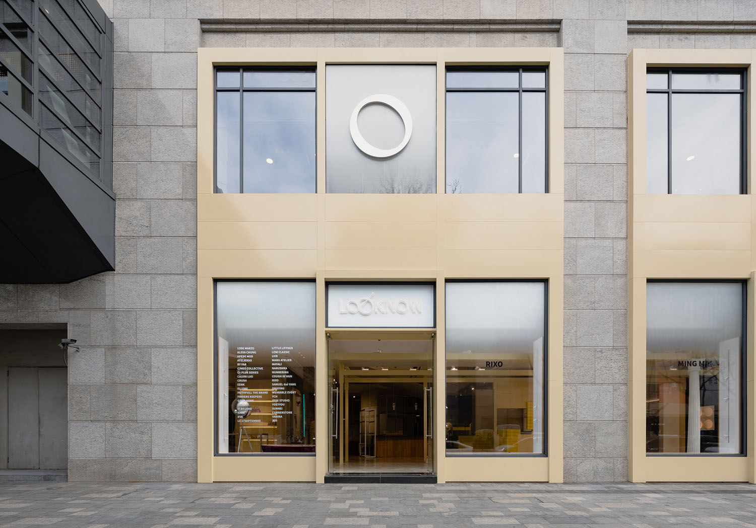
新店選址位於上海馬當路新天地時尚二期。店鋪外立麵以大麵積的薑黃色搭配簡潔的幾何構圖來強調整體視覺並增強品牌識別度,為都市女孩打造新的時尚風格地標。
The new flagship store of LOOKNOW locates in Xintiandi phaseⅡ, which locates on Madang Road Shanghai. The store facade is decorated with ginger color and simple geometric composition to emphasize the overall visual effect and enhance the brand identity to create a new landmark for urban girls.
▲店鋪外立麵 © Wen Studio
Store facade © Wen Studio
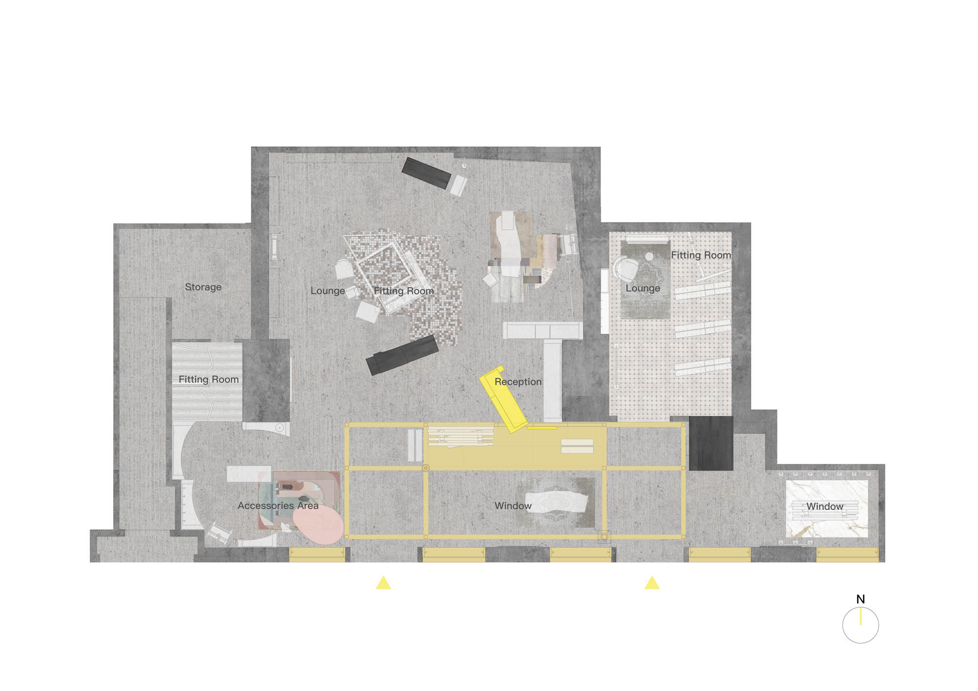
Sò Studio通過對原有的空間區域規劃與整合,將整體空間劃分為三大部分:形象展示區、主要陳列空間、以及配飾區。滿足LOOKNOW作為全球設計師品牌集合空間,對不同品牌與產品的展示及陳列的功能,以及可以在店鋪內隨時更換場景從而舉辦不同活動需求。
By holistically planning the space, Sò Studio re-organized the store into three parts, the window exhibition area, major display area, and accessories area. LOOKNOW, as a global designer assemble store, requires flexibility to be able to display different brands and products, as well as holds different events and changes the scene accordingly at any time.
▲平麵圖 © Sò Studio
Plan © Sò Studio
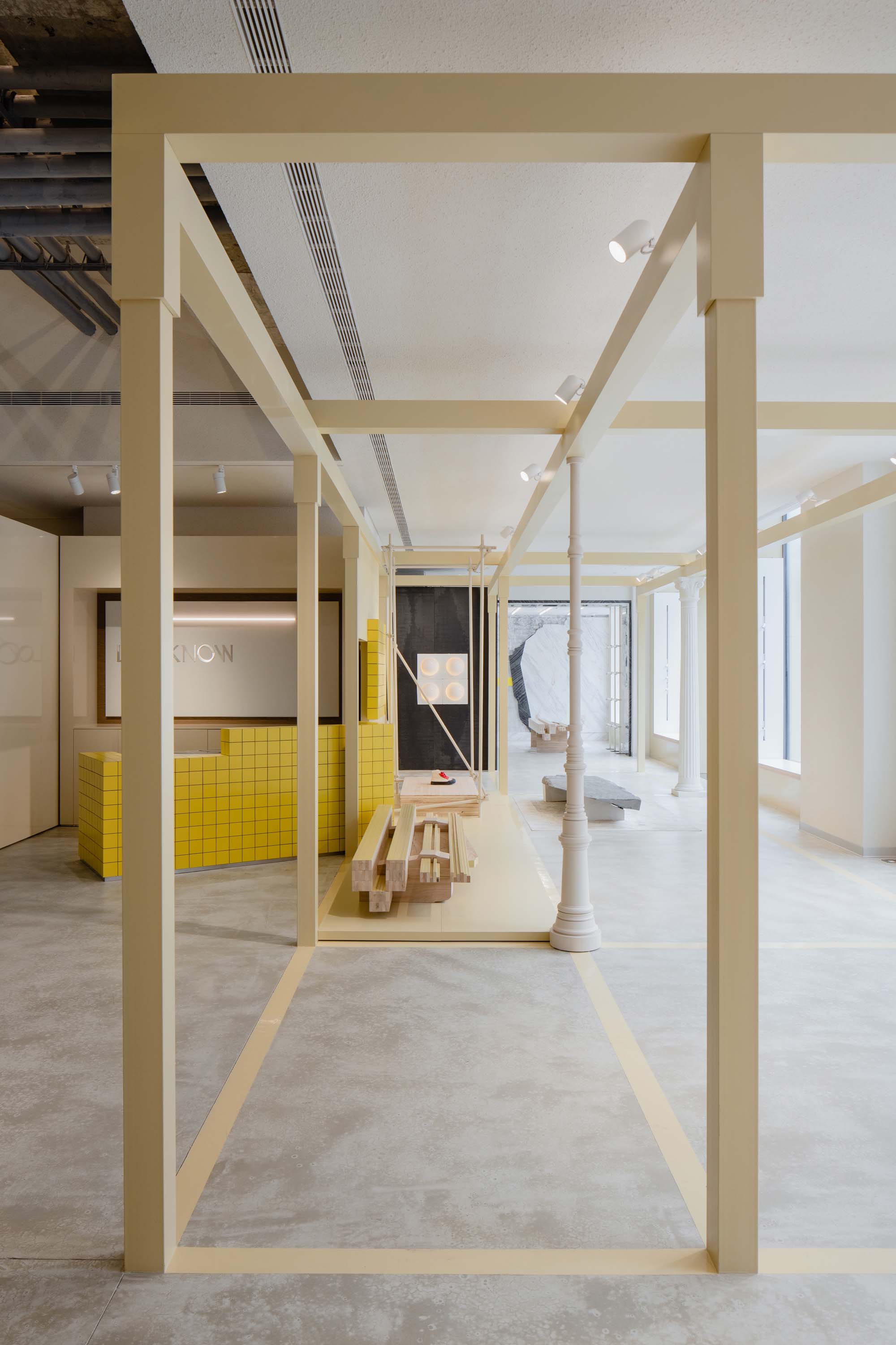
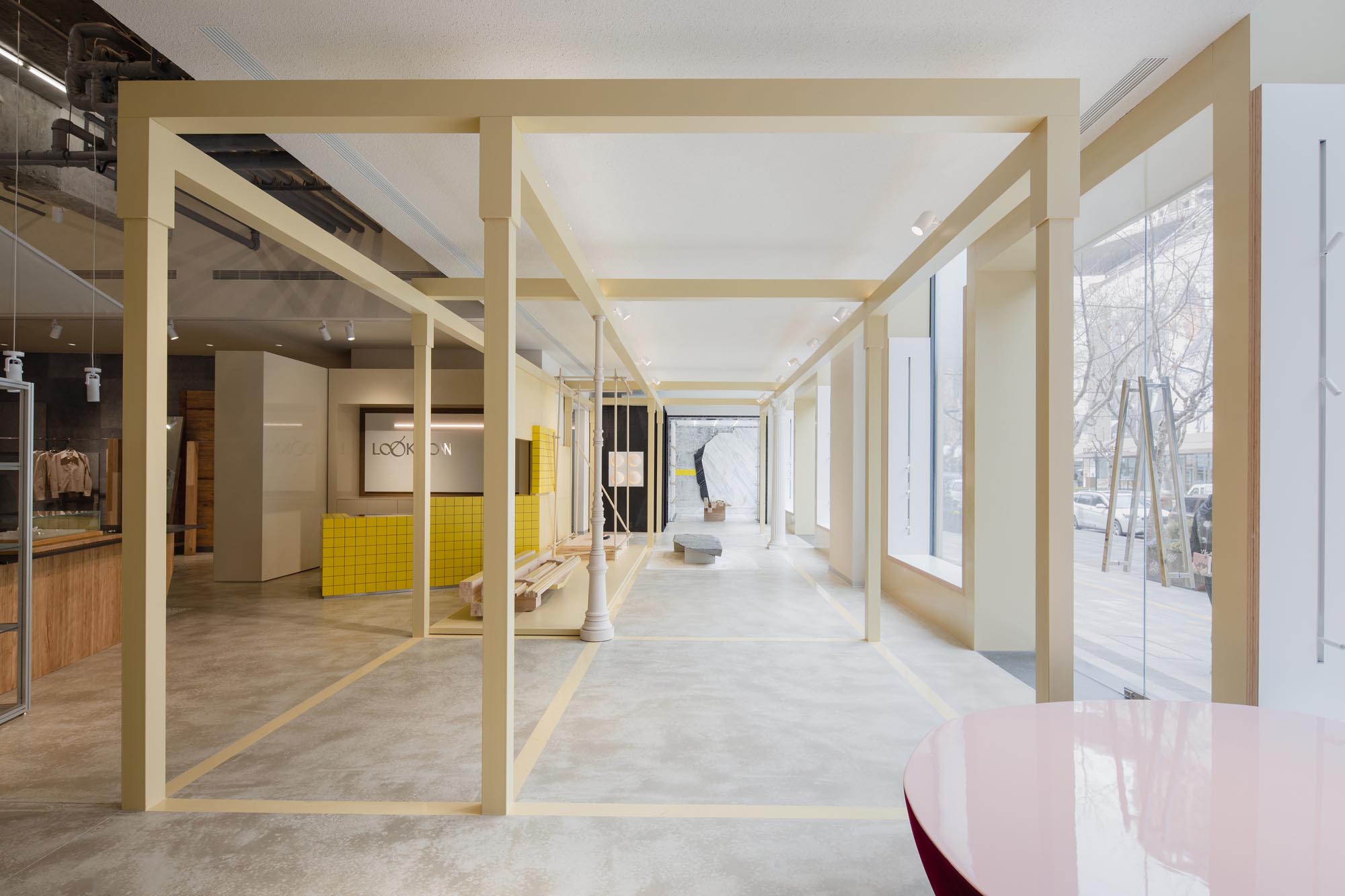
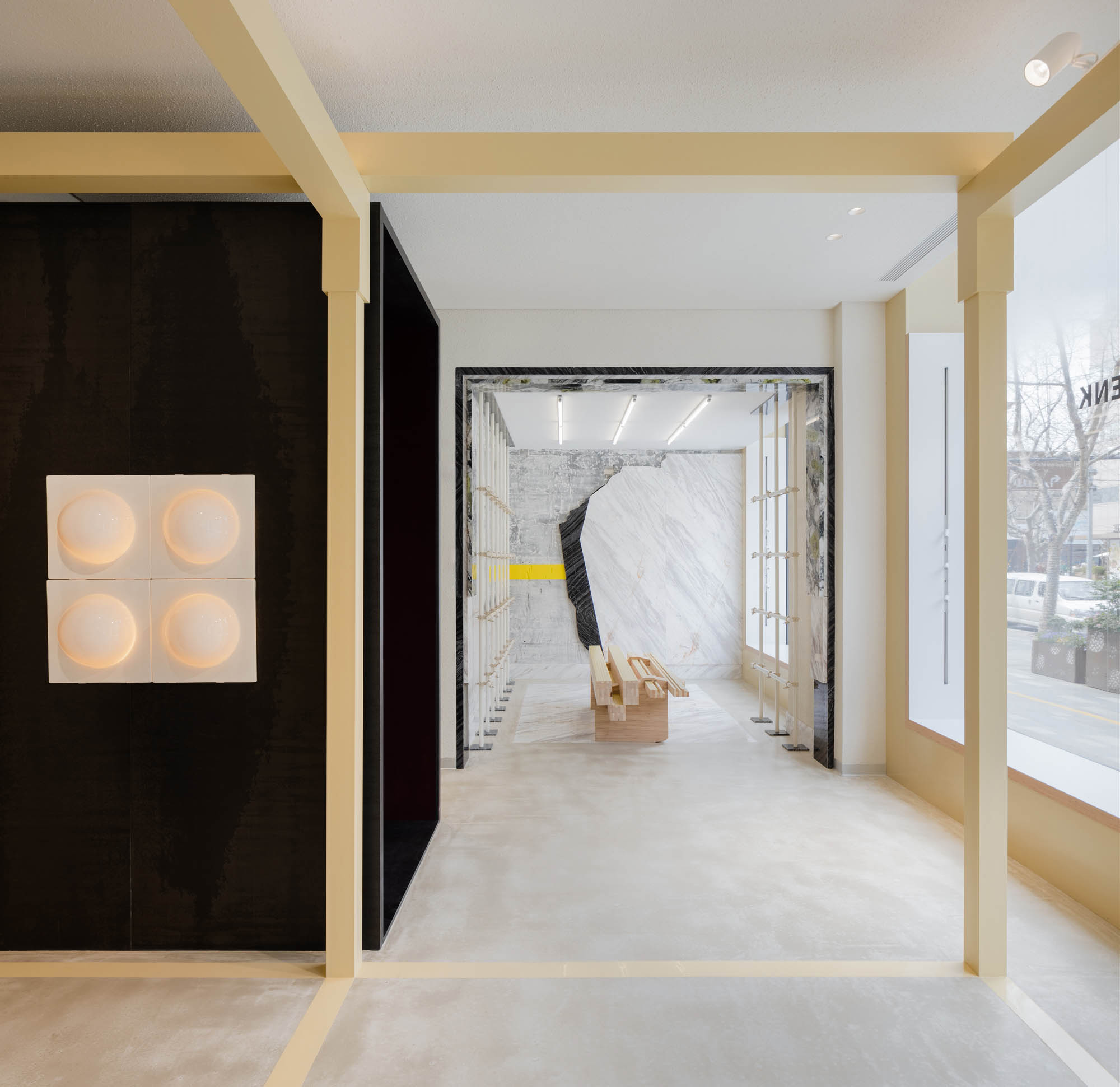
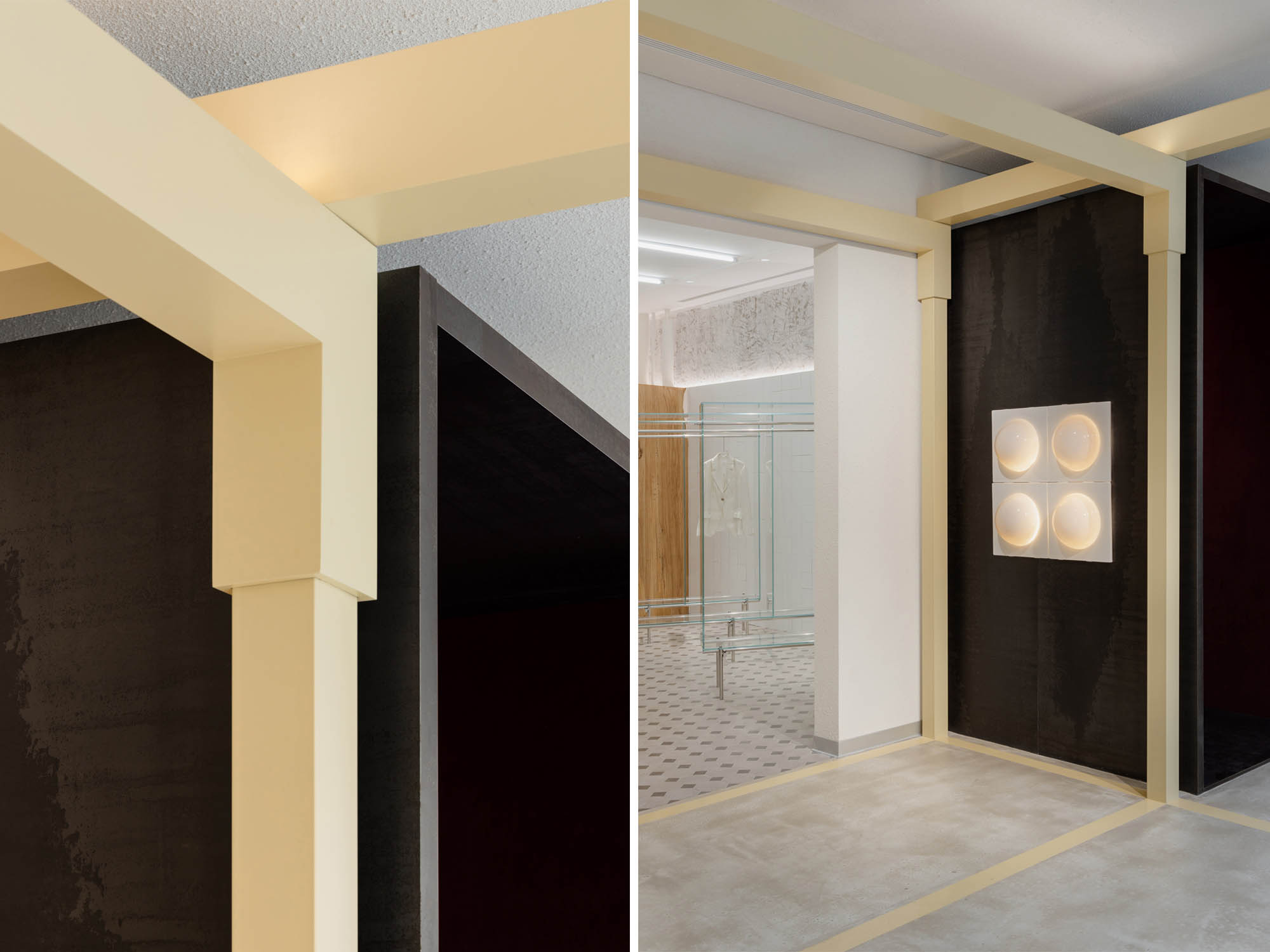
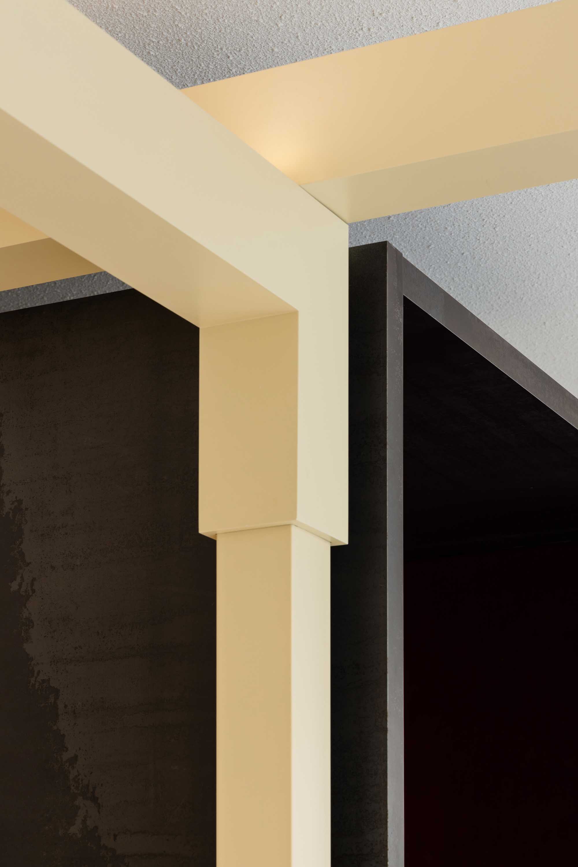
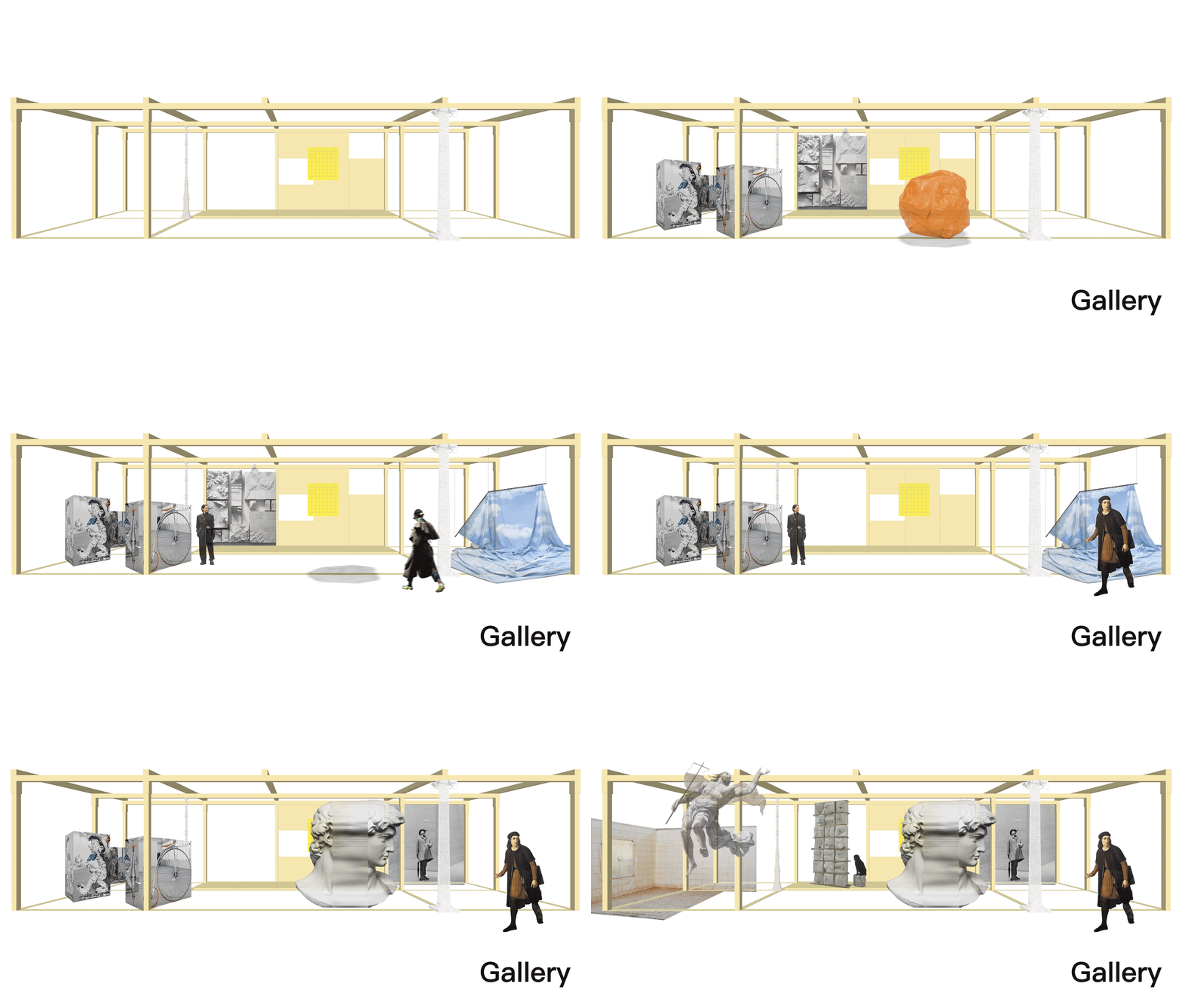
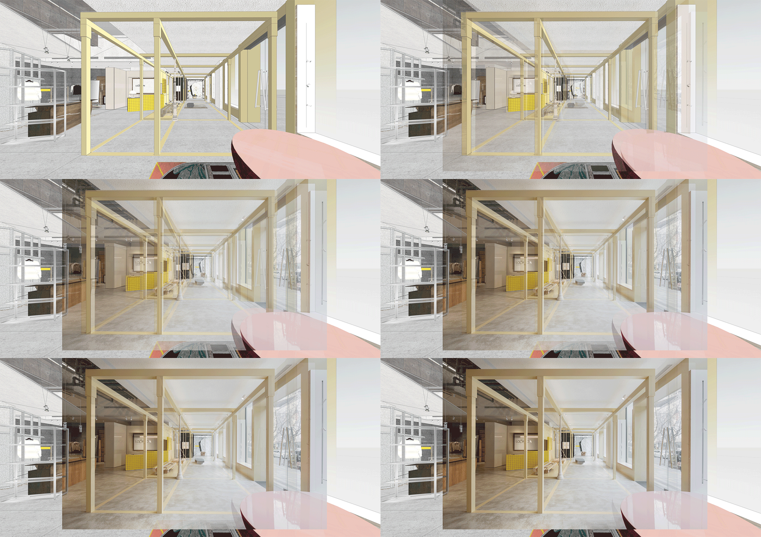
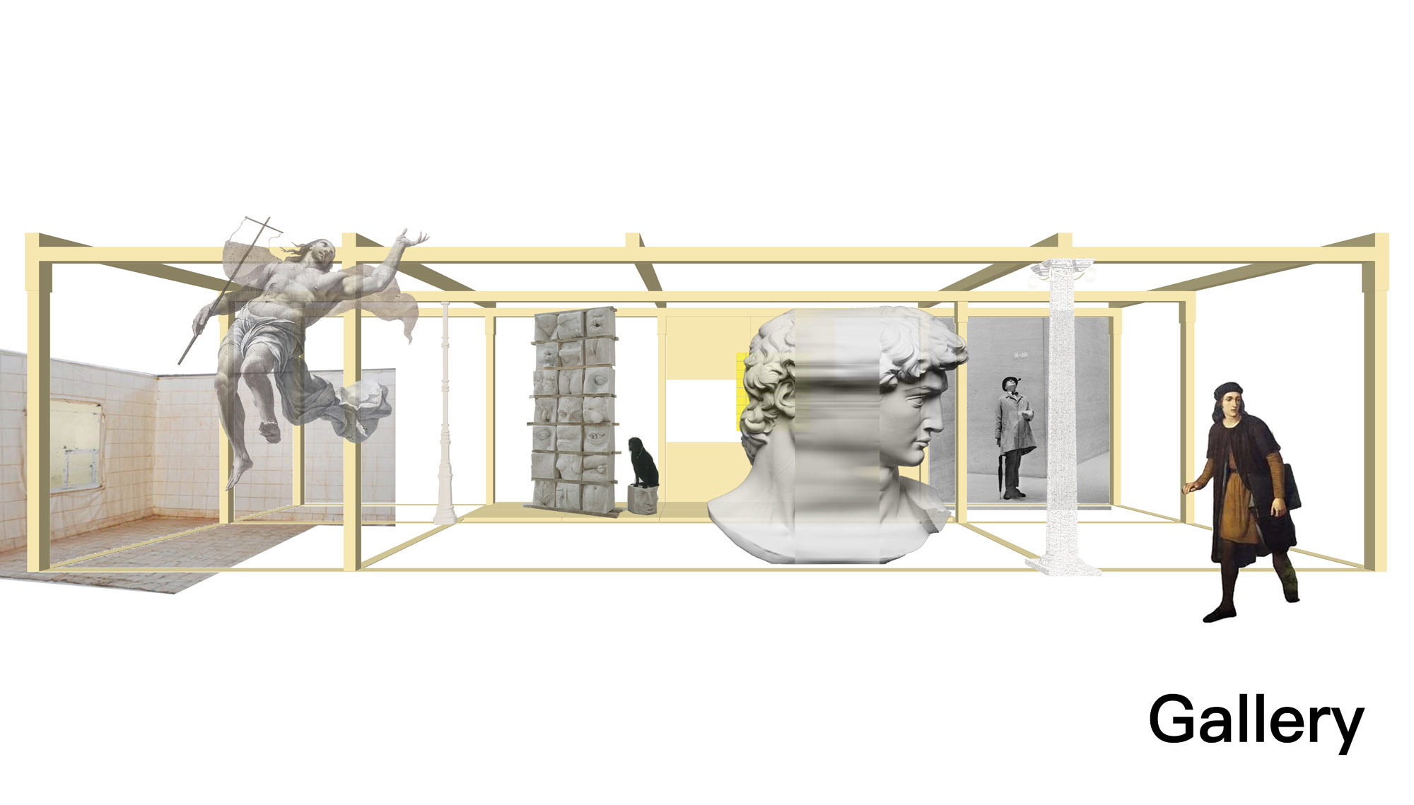
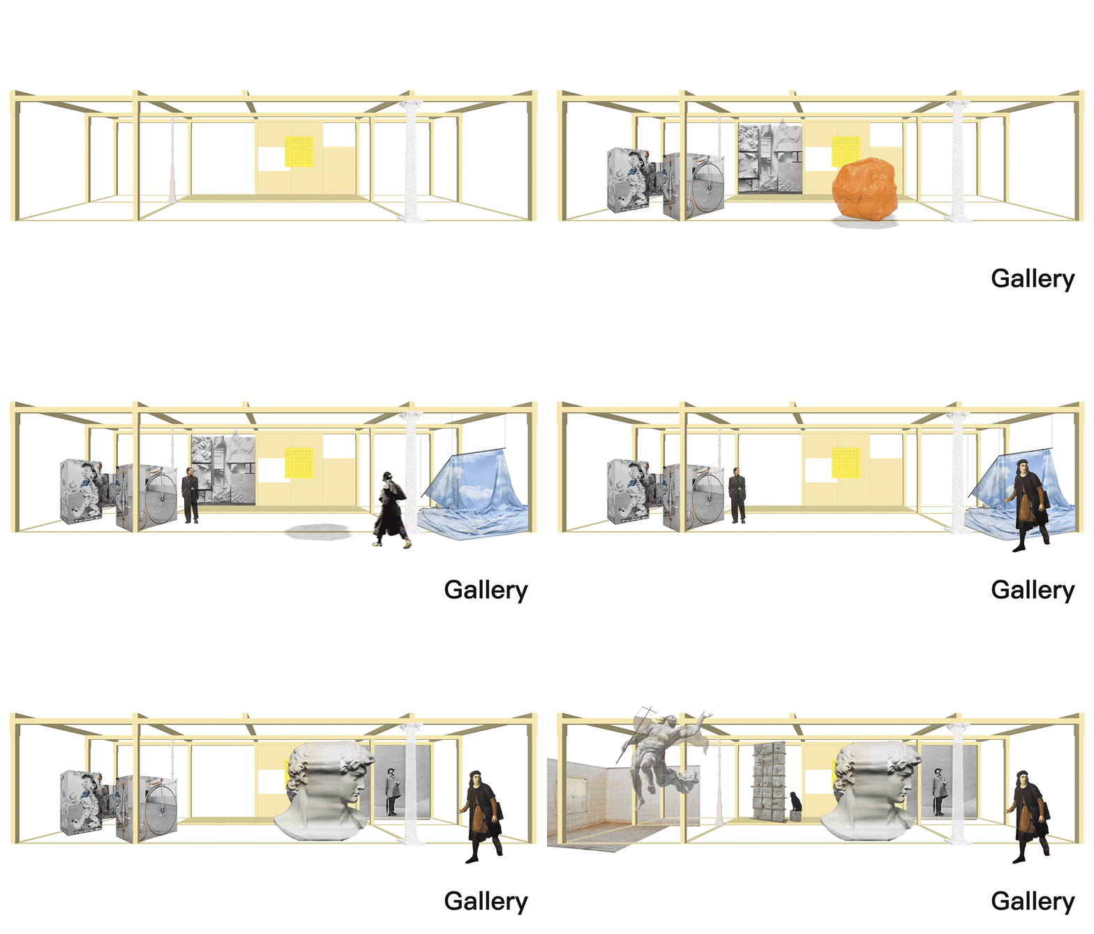
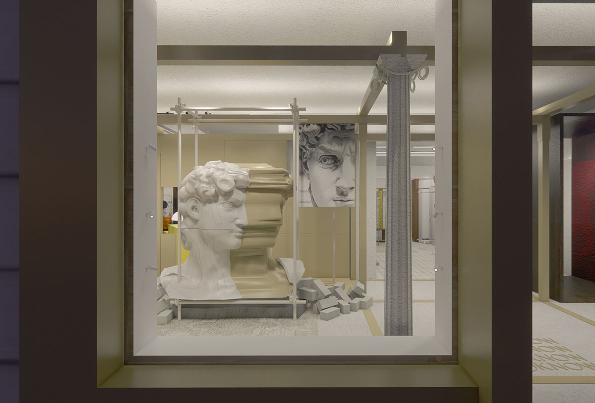
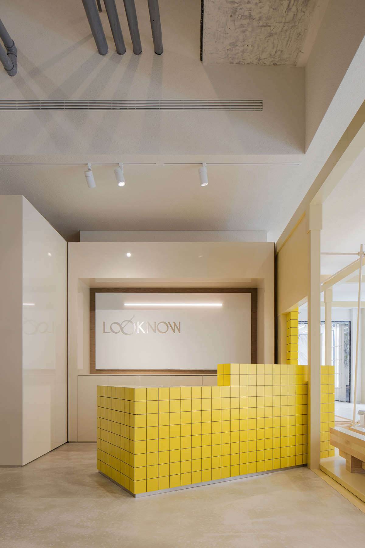
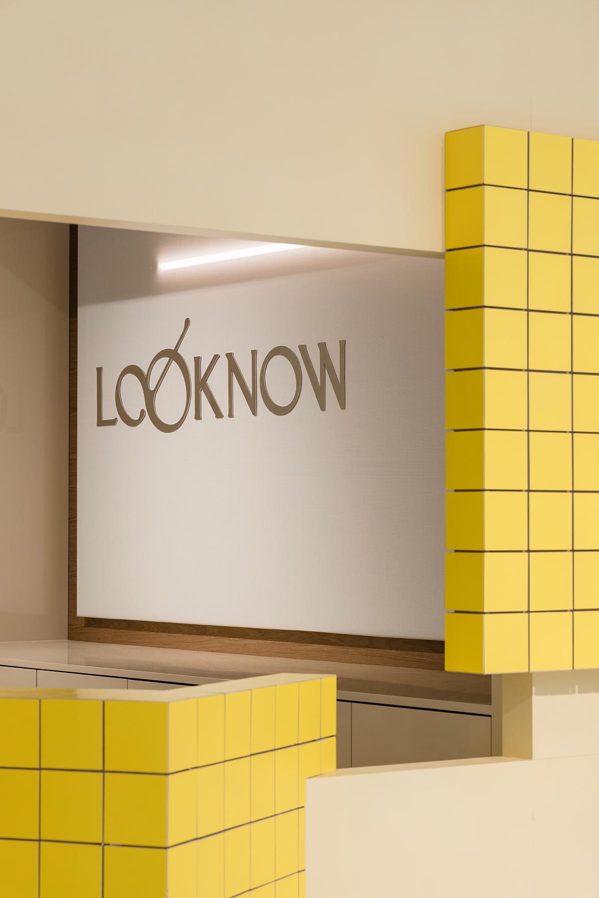
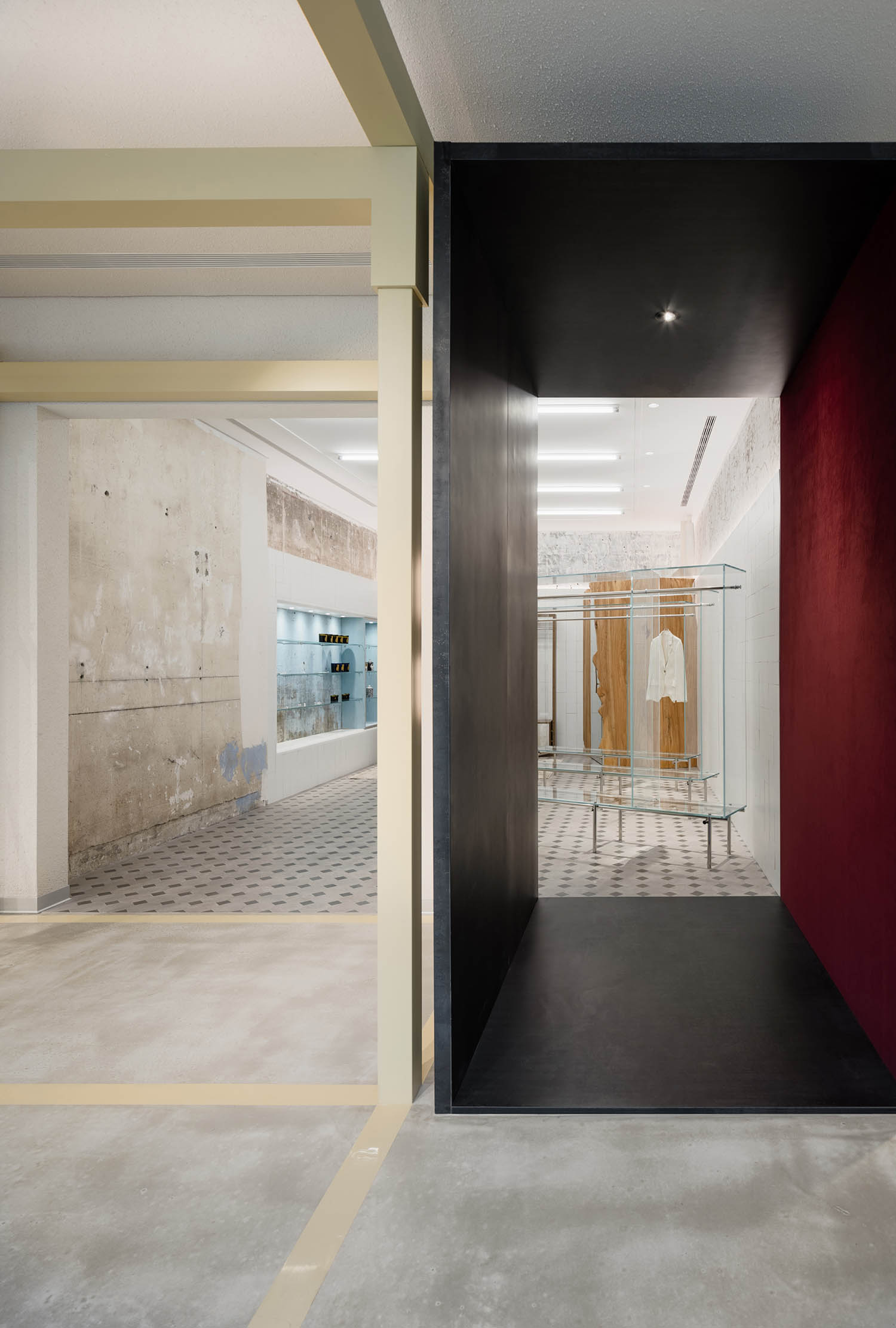
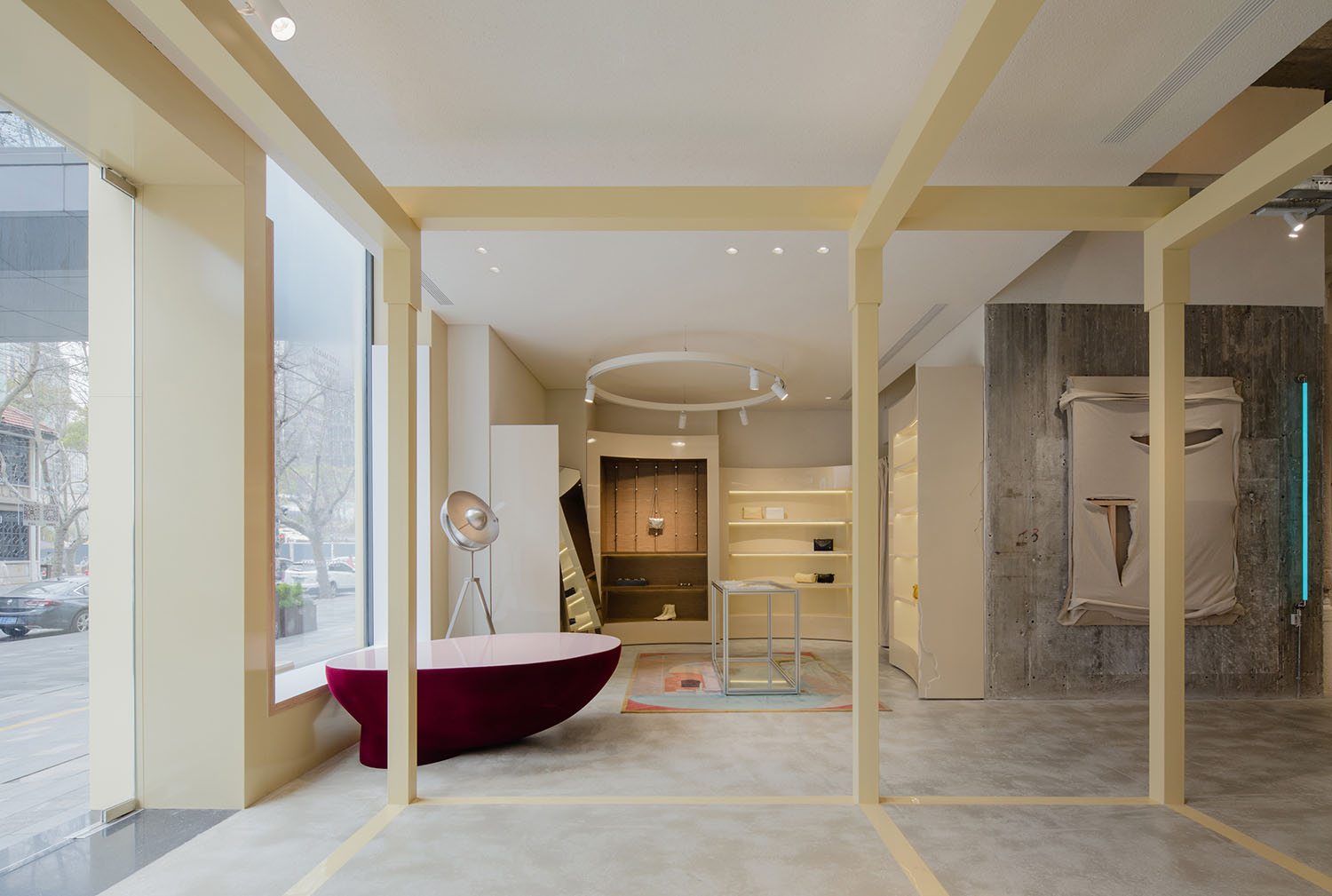
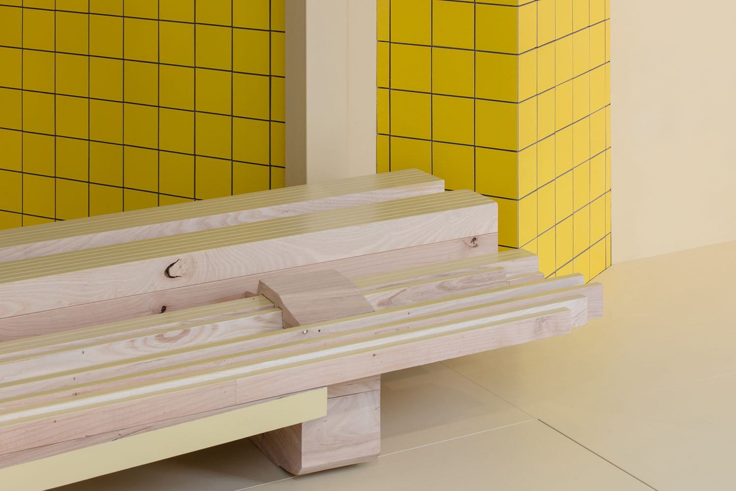
形象展示區的黃色框架,即“空間物體-Space Object”;像是從什麼地方搬運進來的一個盒子,是Sò Studio表達現場創作很重要的一部分。通過在入口空間處置入與外立麵相呼應的黃色框架從而達到空間的連接與視覺的呼應和統一。黃色的框架結構與店鋪的其他空間形成反差,同時又貫穿整個空間。它既是整個空間的視覺焦點又是空間連接的紐帶,使消費者在不同風格的空間之間穿梭時也不會感到突兀。
The yellow frame installed in the window exhibition area is the “Space Object”. The frame looks like a box transported from elsewhere is an important aspect of “Live Artwork” that Sò Studio emphasized. The yellow frame, which has the same color as the facade, is not only a visual connection but also to separate the different zones. It is a visual focal point and a connector of the whole space, to create a smooth and seamless transition going from one zone or style to the next.
▲空間物體-Space Object © Wen Studio
Space Object © Wen Studio
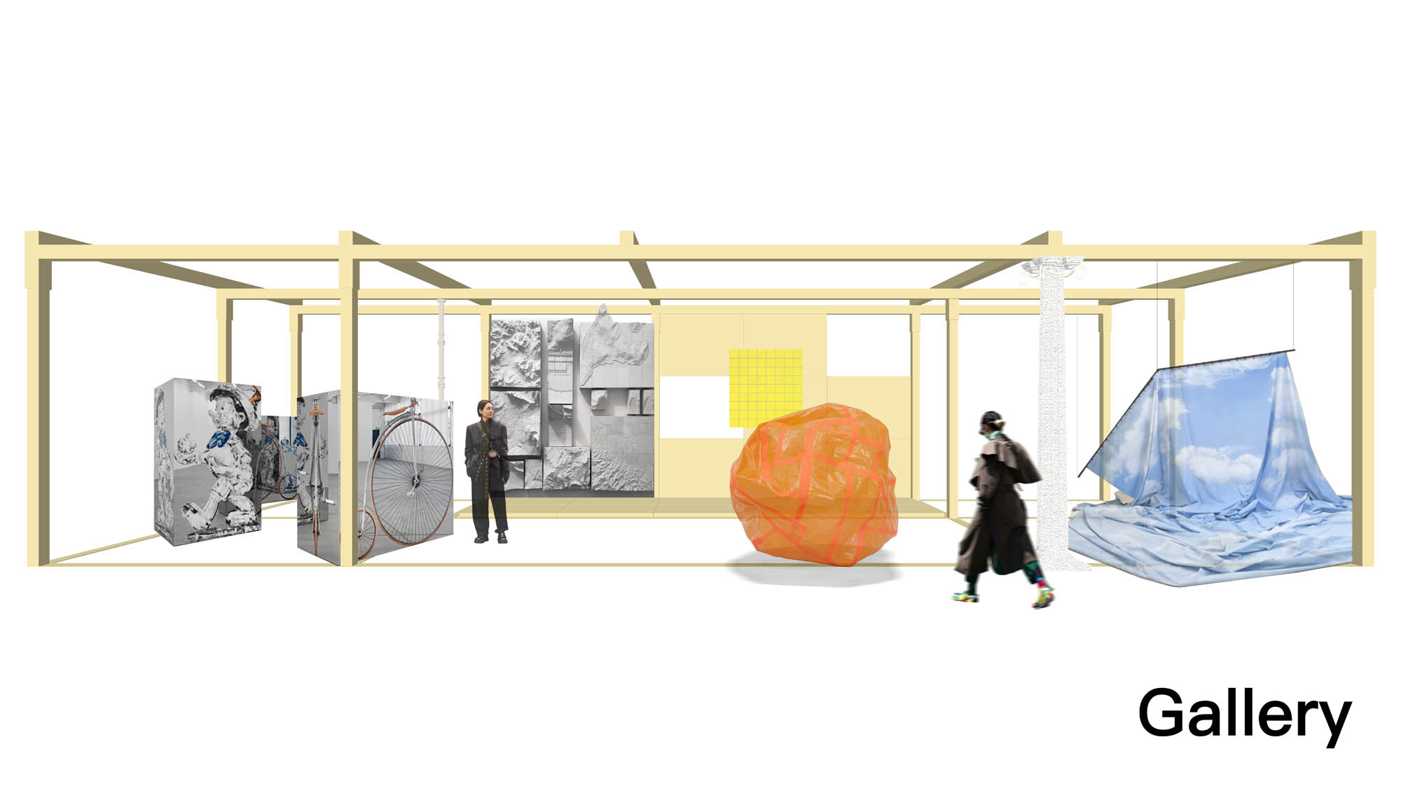
“空間物體-Space Object”的置入使店鋪的前場變成一個可以靈活使用的空間;為日後品牌合作的快閃空間、裝置以及多媒體藝術展示提供了更多可能性。在保留店鋪原有屬性的同時,增加話題度與新鮮感。
The “Space Object” installed in the window exhibition area transforms the front area of the store into a flexible space, providing the possibility of future collaboration with other brands and artists for pop-ups, installation displays, and media shows. While keeping the original function of the store, it helps to attract more attention and keep the freshness of the store and brand.
品牌主要陳列空間分為兩個部分:“現場作品-Live Artwork” 和 “居住現場-Resident In”。
The major display area includes two parts, “Live Artwork” and “Resident In”.
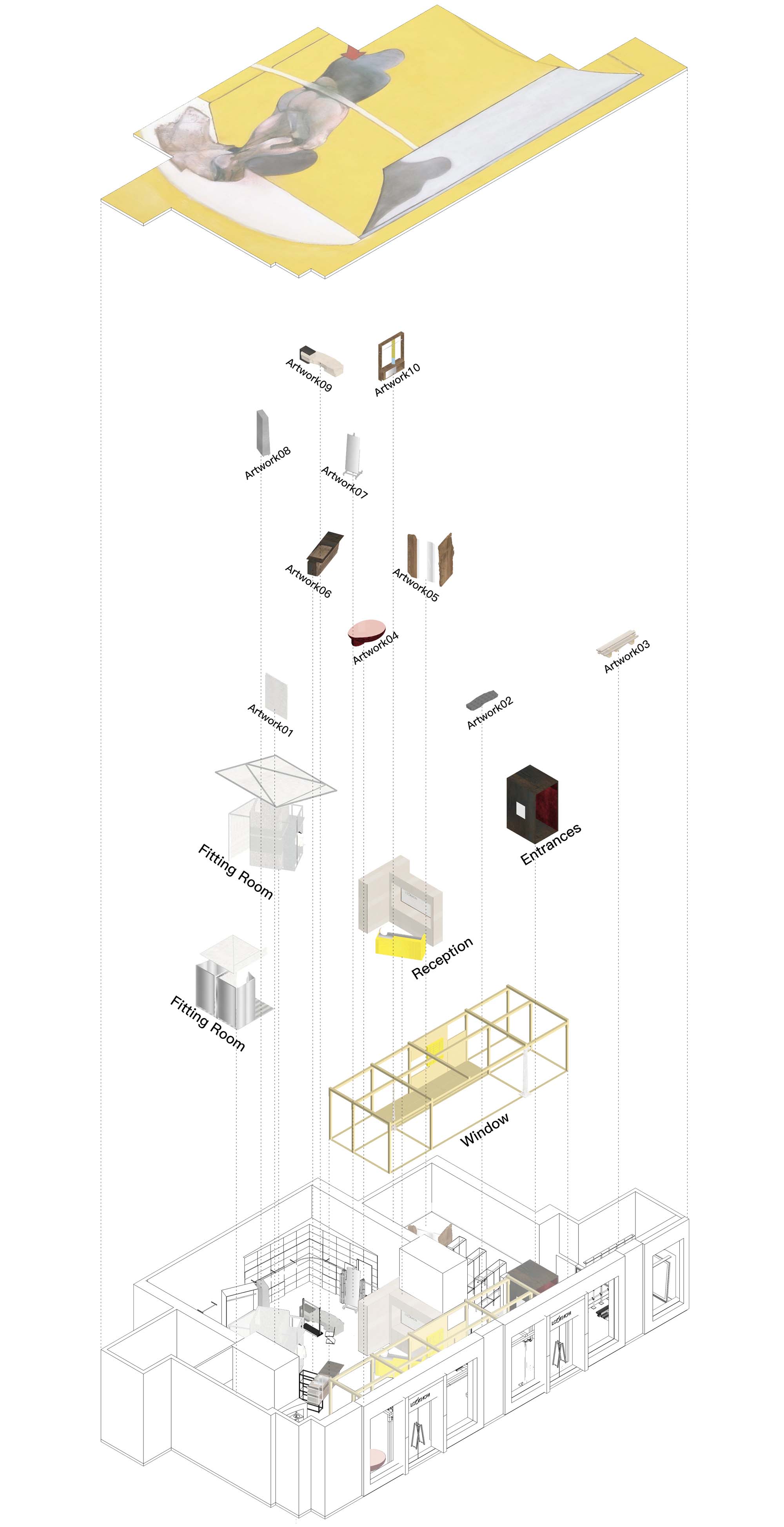
▲形象展示區功能分析 © Sò Studio
Function diagram © Sò Studio
▲虛擬與現實空間© Sò Studio
virtuality and reality diagram © Sò Studio
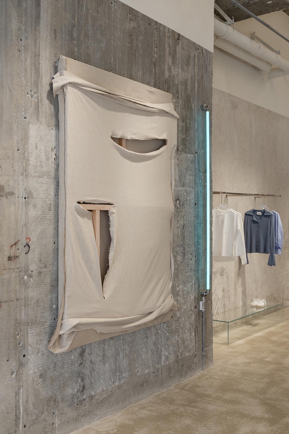
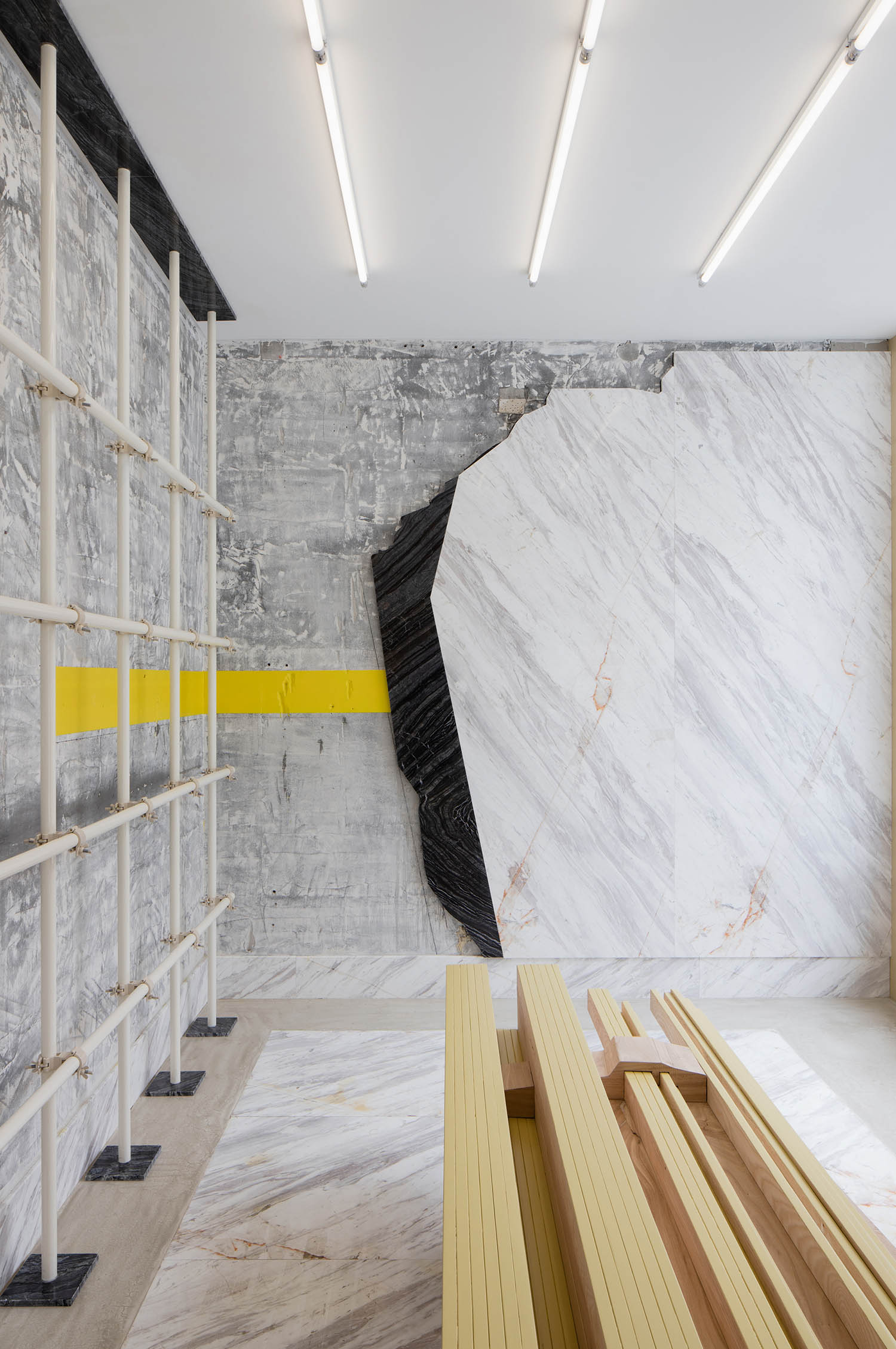
“現場作品-Live Artwork”的部分,通過開放空間的概念,還原藝術家在藝術創作時工作室的狀態。從空間右側的收銀區為起點圍繞整個空間一周,從充滿現代感有明顯人為痕跡的視覺氛圍過渡到原始和粗糙空間肌理。例如牆麵上由設計師即興創作的繃布藝術品,增加空間的藝術調性,同時也是代表空間調性的“美學物件- Aesthetics Object”。
“Live Artwork” is a concept of open space to mimic the status of an artist’s studio. From the start point of the reception, space is transforming from a sense of modern and artificial into the original and rough space texture. For example, the fabric artwork on the wall created by the designer on site has added an aesthetics sense to the store, at the same time, it is also a representative of an “Aesthetics Object”.
▲美學物件 – Aesthetics Object © Sò Studio
Aesthetics Object © Sò Studio
▲美學物件 – Aesthetics Object © Wen Studio
Aesthetics Object © Wen Studio
▲收銀區 © Wen Studio
Reception © Wen Studio
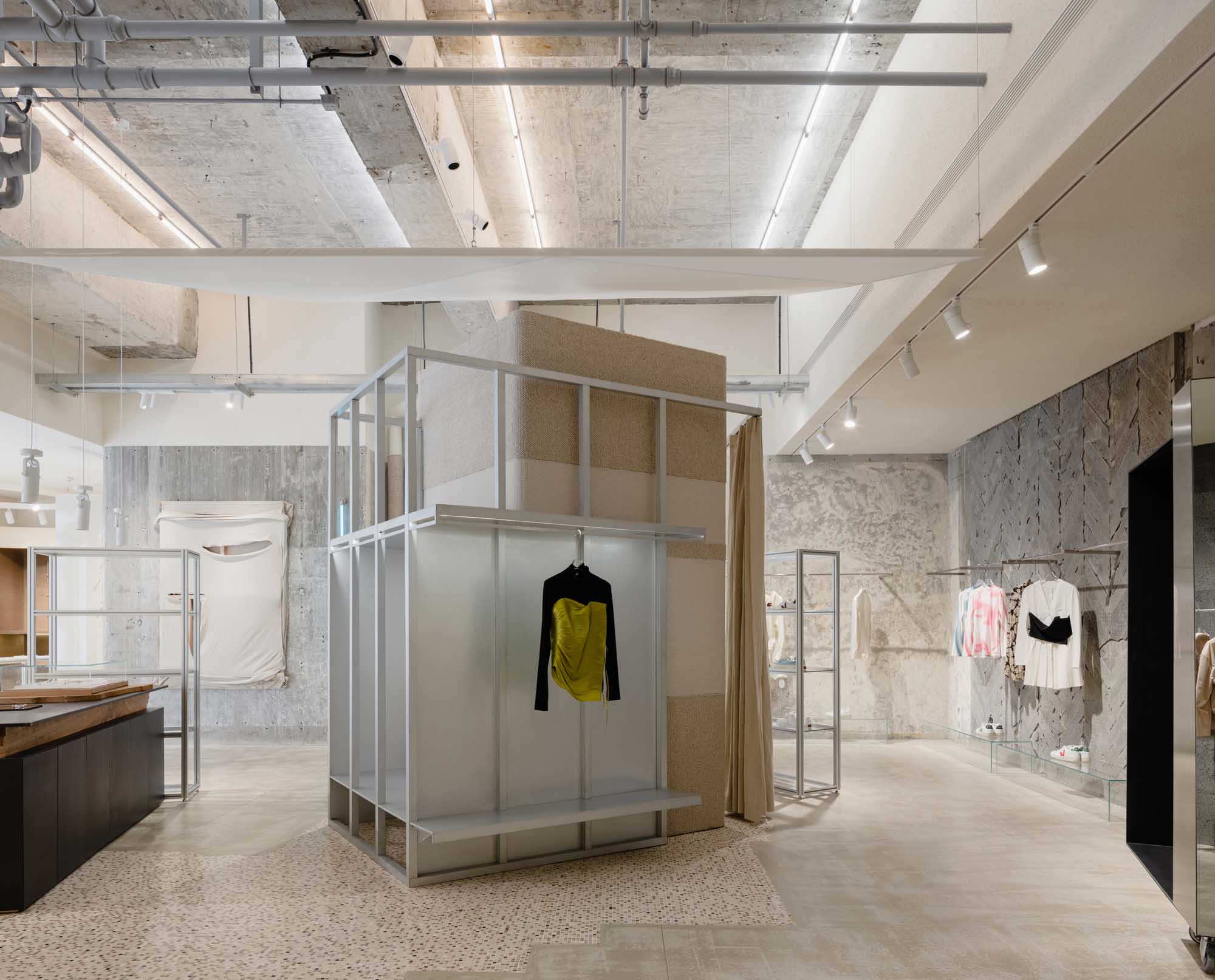
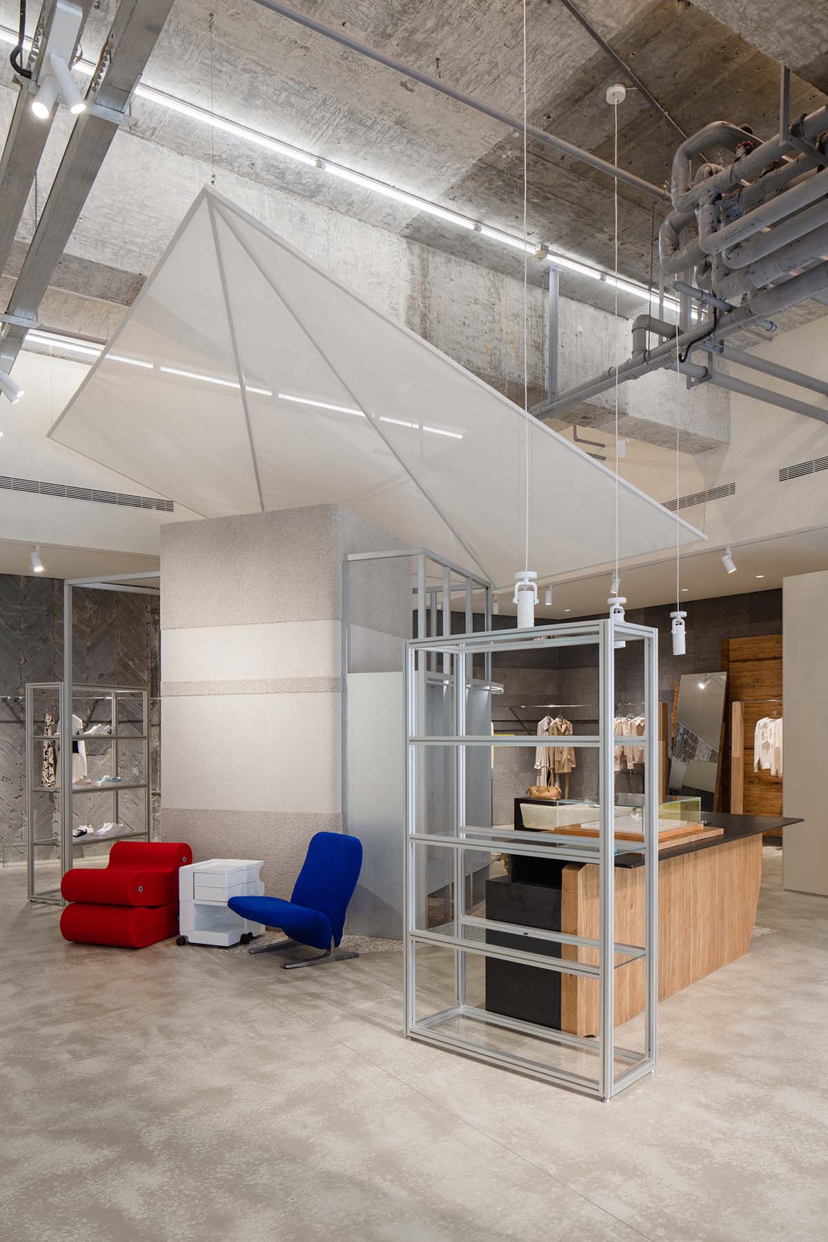
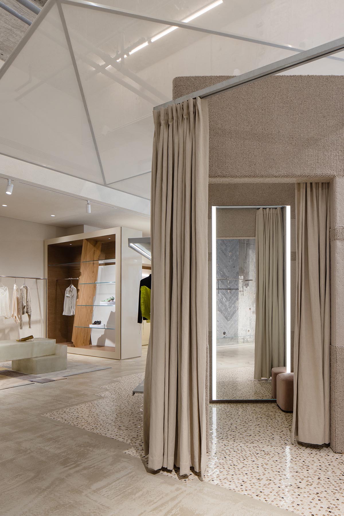
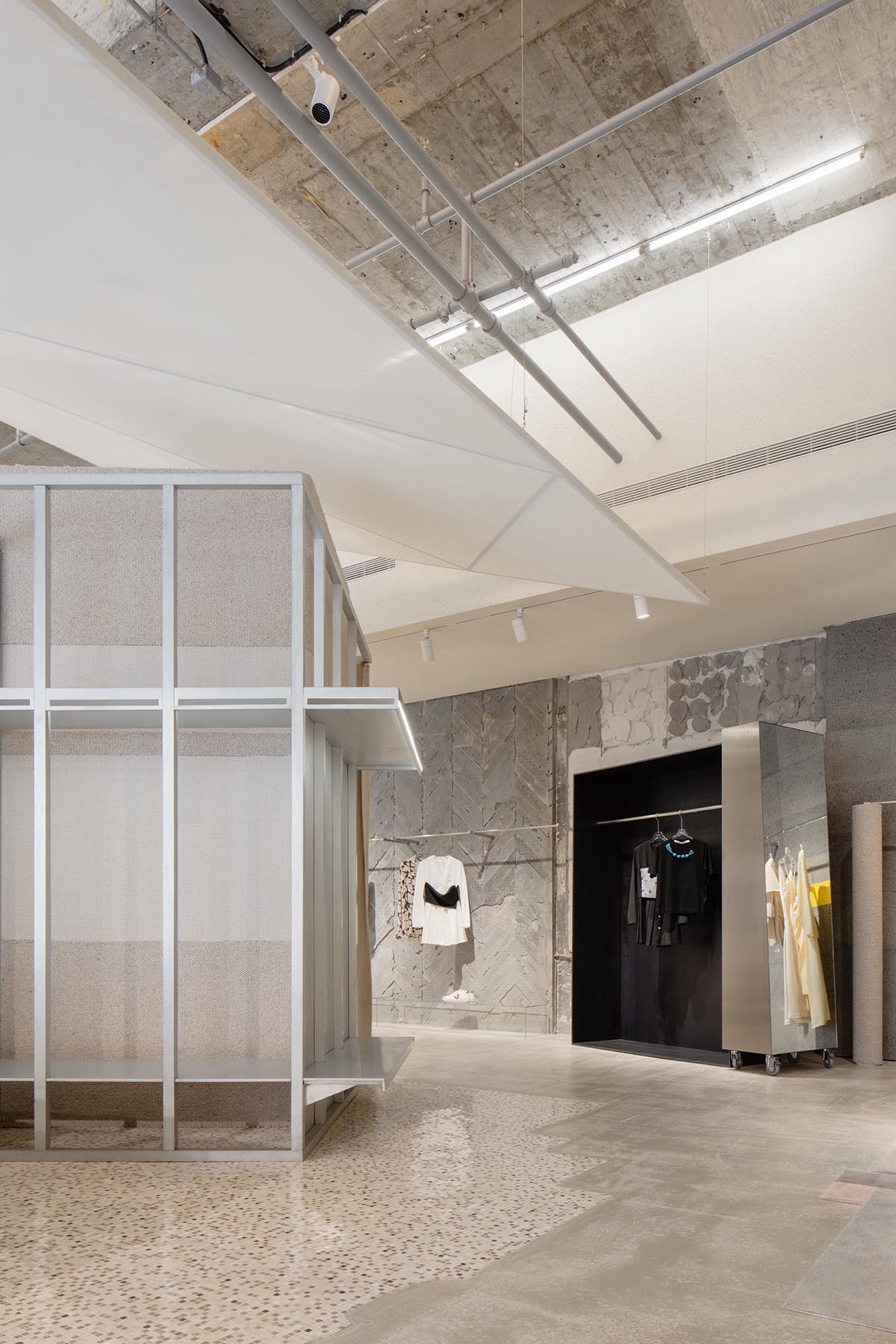
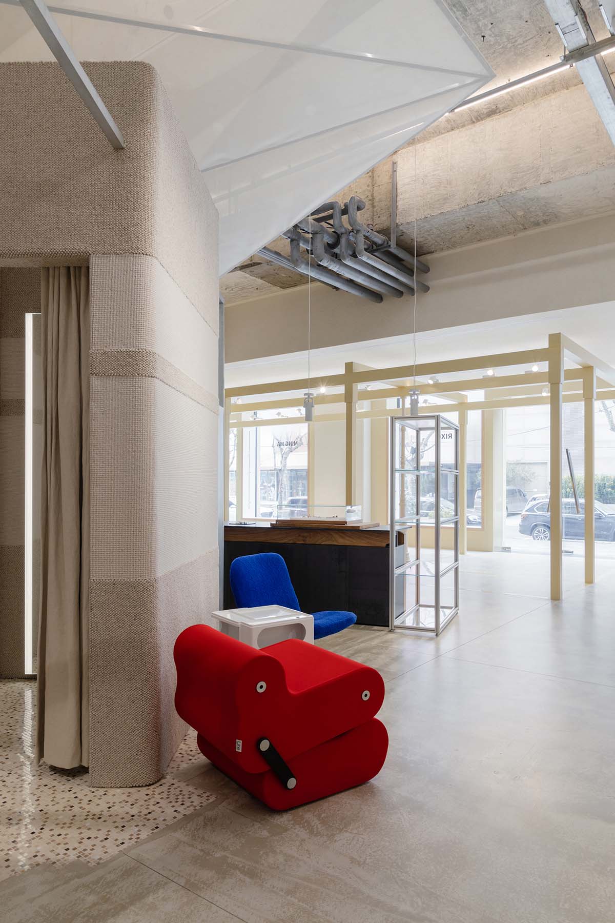
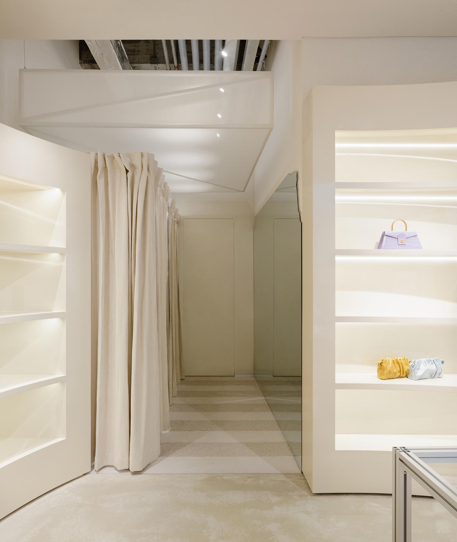
試衣間位於整個空間的核心區域,同時也是空間中體量最大的構築物。試衣間上方懸掛的織物繃布在視覺上將空間進行區分,並使固定在裸天花上的燈管照明的光線變得柔和。
As the biggest structure in the store, the fitting room is located in the center of the display area. The fabric hanging upon the fitting room helps to visually separate the space and soften the light.
▲試衣間 © Wen Studio
Fitting room © Wen Studio
環形的設計將試衣功能、陳列展示、和休憩空間相結合,人行動線也圍繞著這個空間而展開。
The fitting room centered design units the fitting, displaying, and lounge function together. Meanwhile, the circulation is spread out around this space.
▲陳列展示空間 © Wen Studio
Display area © Wen Studio
▲休憩空間 © Wen Studio
Lounge © Wen Studio
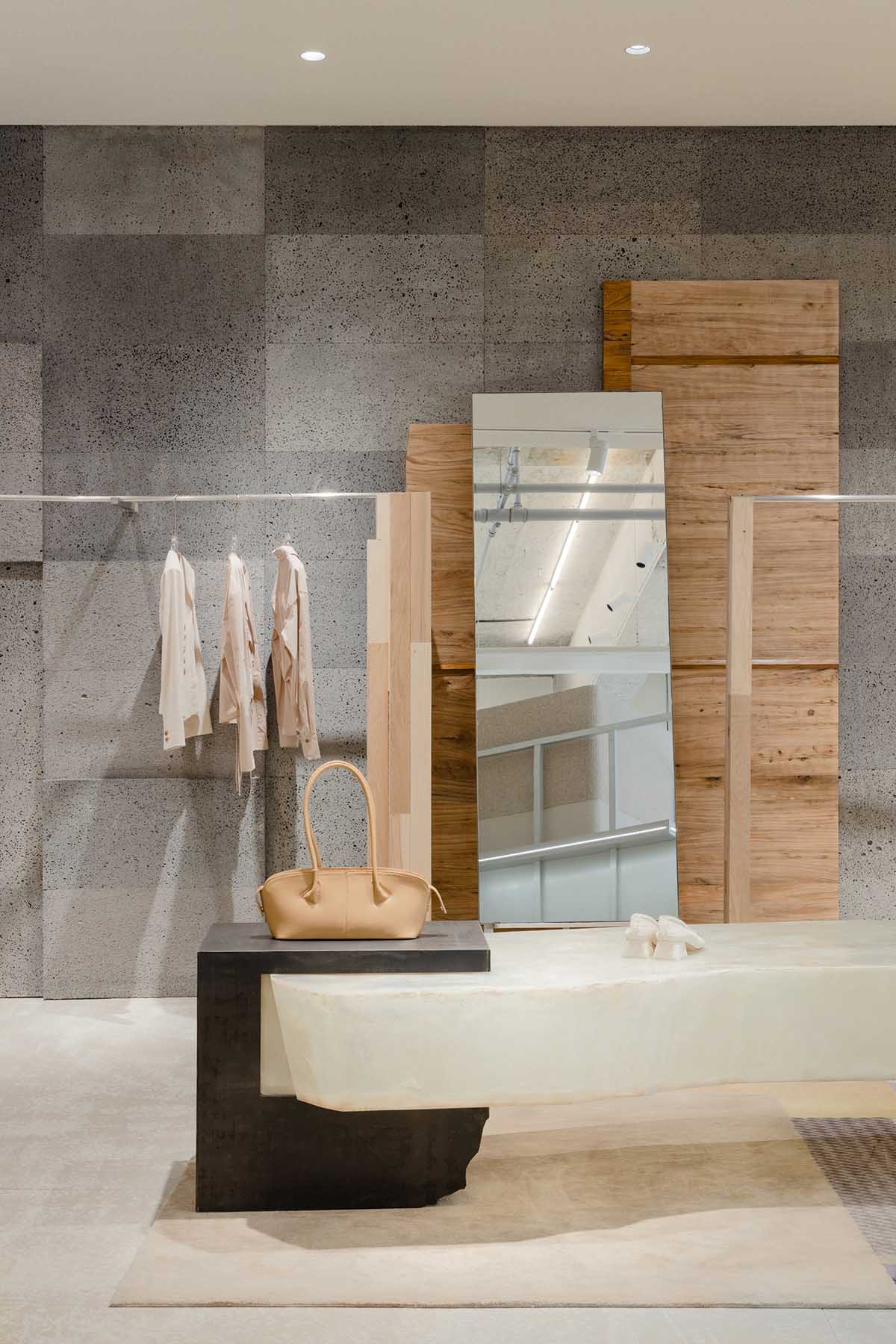
老房子中拆除下來的有幾十年曆史的老木頭以及從石材廠就地“撿”回來的碎石道具等,都在空間中被重新賦予新的功能。Sò Studio通過保留原有的曆史痕跡創作出屬於現在新的“痕跡”。這種保留與創作既是空間故事的延續,也是對進行中創作的記錄。
Antique doors kept from the old house and the random rocks picked from the quarry are serving both aesthetic and functional purposes. By retaining the historical traces, Sò Studio creates new trace belonging to the present. This kind of retaining and creation is not only the continuation of the space story but also the record of the ongoing creation.
▲老木板裝飾 © Wen Studio
Antique doors decoration © Wen Studio
▲定製地毯 © Wen Studio
Custom carpet © Wen Studio
▲保留的原有建築痕跡 © Wen Studio
Retained historical traces © Wen Studio
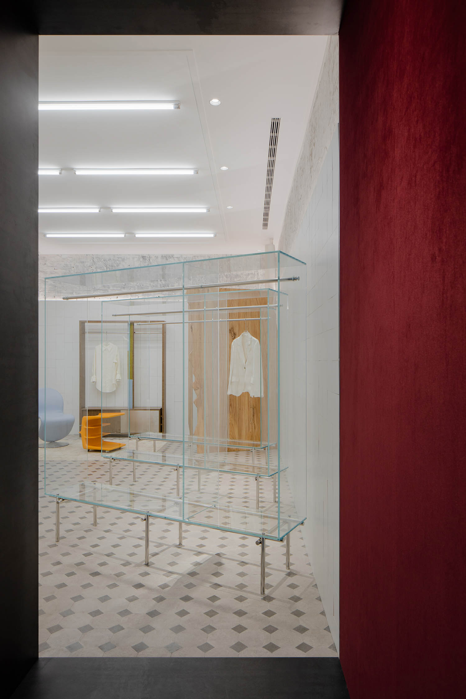
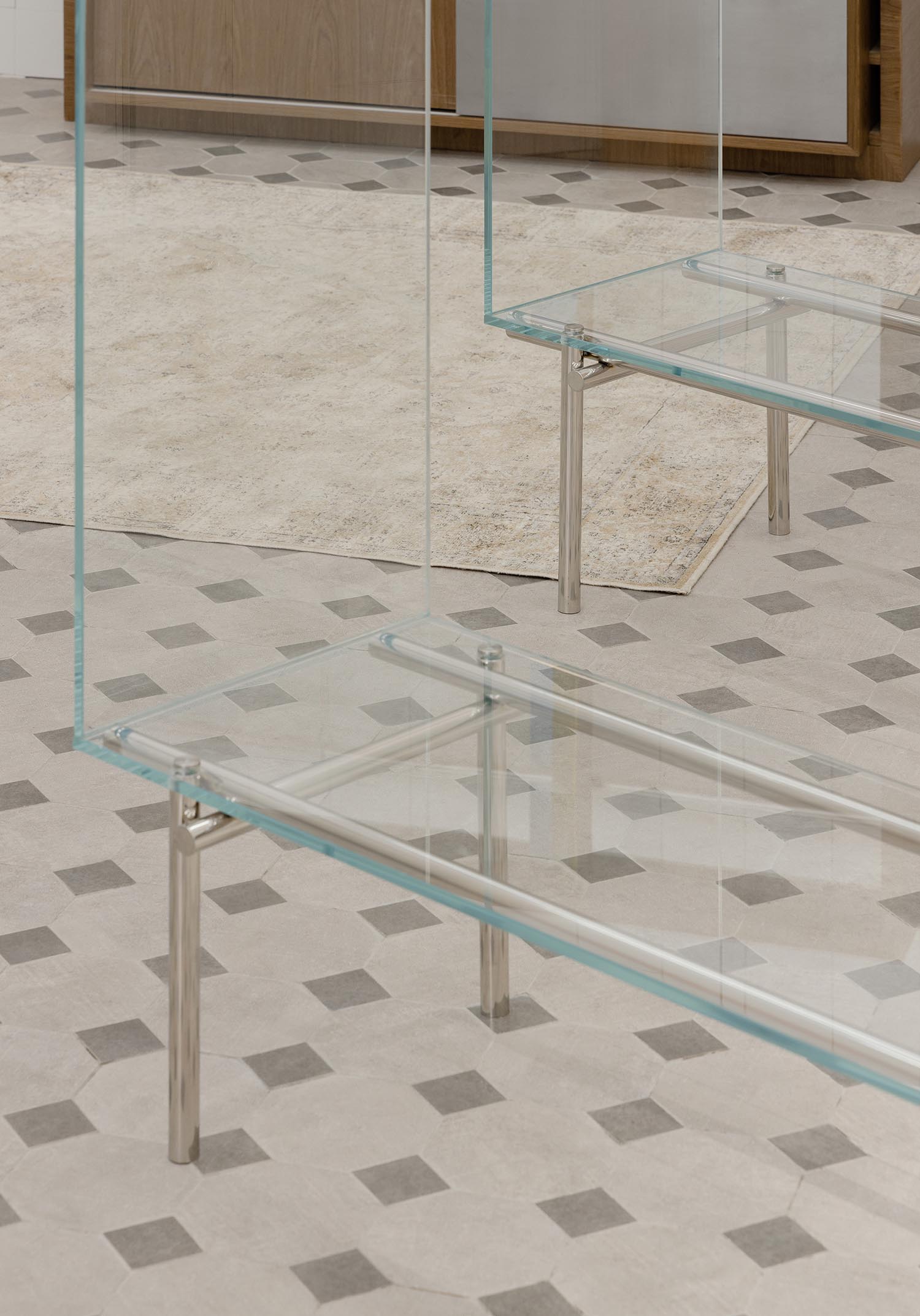
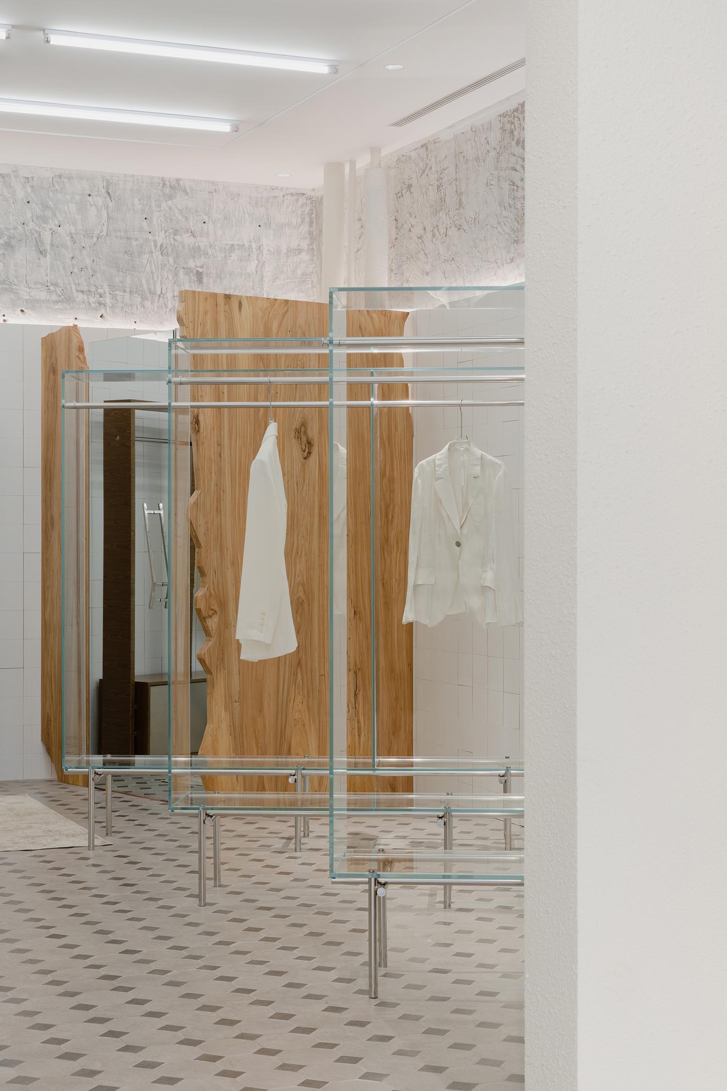
“居住現場-Resident In”旨在還原藝術家居住的狀態,像是一個起居室。木質材料,搭配暖色調以及低色溫燈光烘托出相對私密的高級感的氛圍。沙發、地毯與衣櫃式的衣架這種場景化的布置,表達出Sò Studio所強調的故事性與沉浸感。雖然不具備居住的屬性,但卻給人想要長時間停留的狀態。
“Resident in” is a privative concept to recreate the conditions of where the artist lives, likes a living room. Wood texture, warm yellow color, and low color temperature lighting are used at the store to generate a relatively private and deluxe atmosphere. The setting of sofa, carpet, and clothes-like racks expresses the story and immersion emphasized by Sò Studio. Although it is not meant to be lived in, it presents what a lived-in space looks like.
▲玻璃展示架 © Wen Studio
Glass display racks © Wen Studio
由設計師在現場進行創作和塗刷的不規則藍色牆麵,故意創造了一些破碎的層疊。克製和舒適的空間美學在這裏得以體現。
The designers intentionally painted the walls in blue unevenly to create a peeling or crackling appearance. The restrained and tuned-down choices of color give a sense of comfort and privacy to the space.
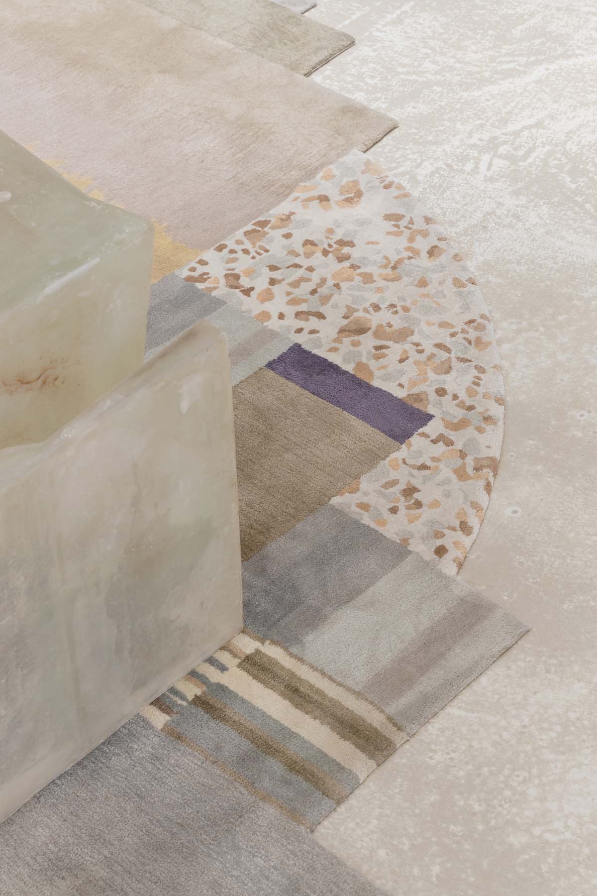
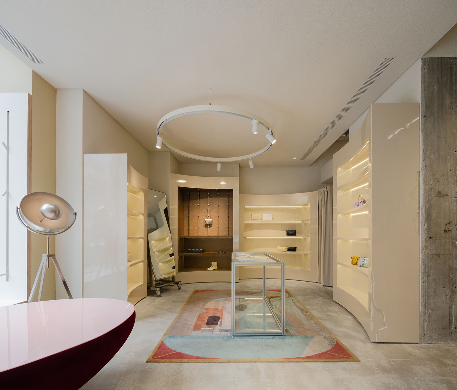
配飾區延續外立麵相同的顏色基調,異形與誇張造型的展示櫃陳列其中。發射台落地燈,定製圖案的地毯,展示櫃斑駁的細節處理體現出 “故意”的創作。
Accessories area is using the same ginger color as the store facade. The abnormal and exaggerated display cabinets are placed here. A standing lamp that looks like a launch pad, customer carpet, and the mottled treatment on the cabinet tells the story of “on purpose” creation.
▲配飾區 © Wen Studio
Accessories area © Wen Studio
▲試衣間 © Wen Studio
Fitting room © Wen Studio
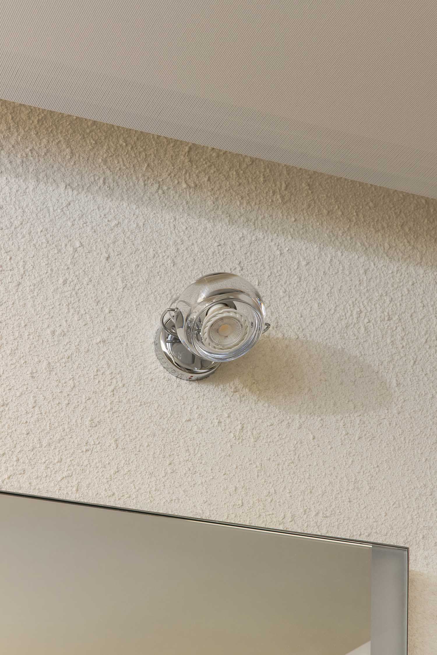
▲試衣間燈具 © Wen Studio
Fitting room light fixture © Wen Studio
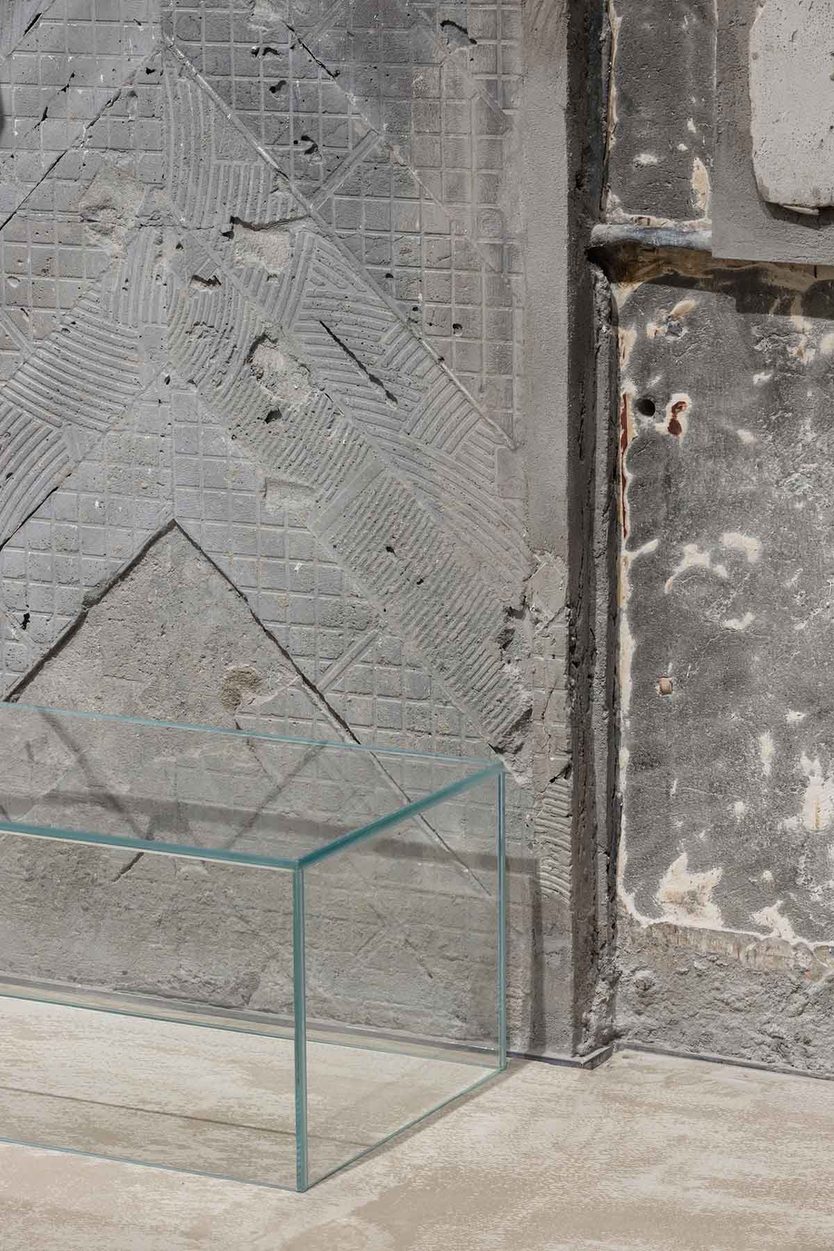
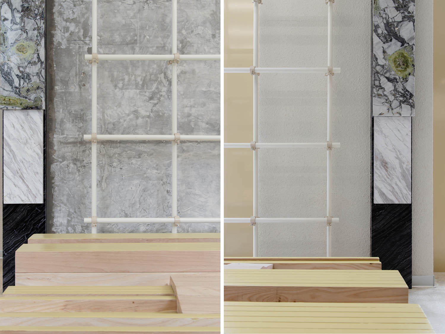
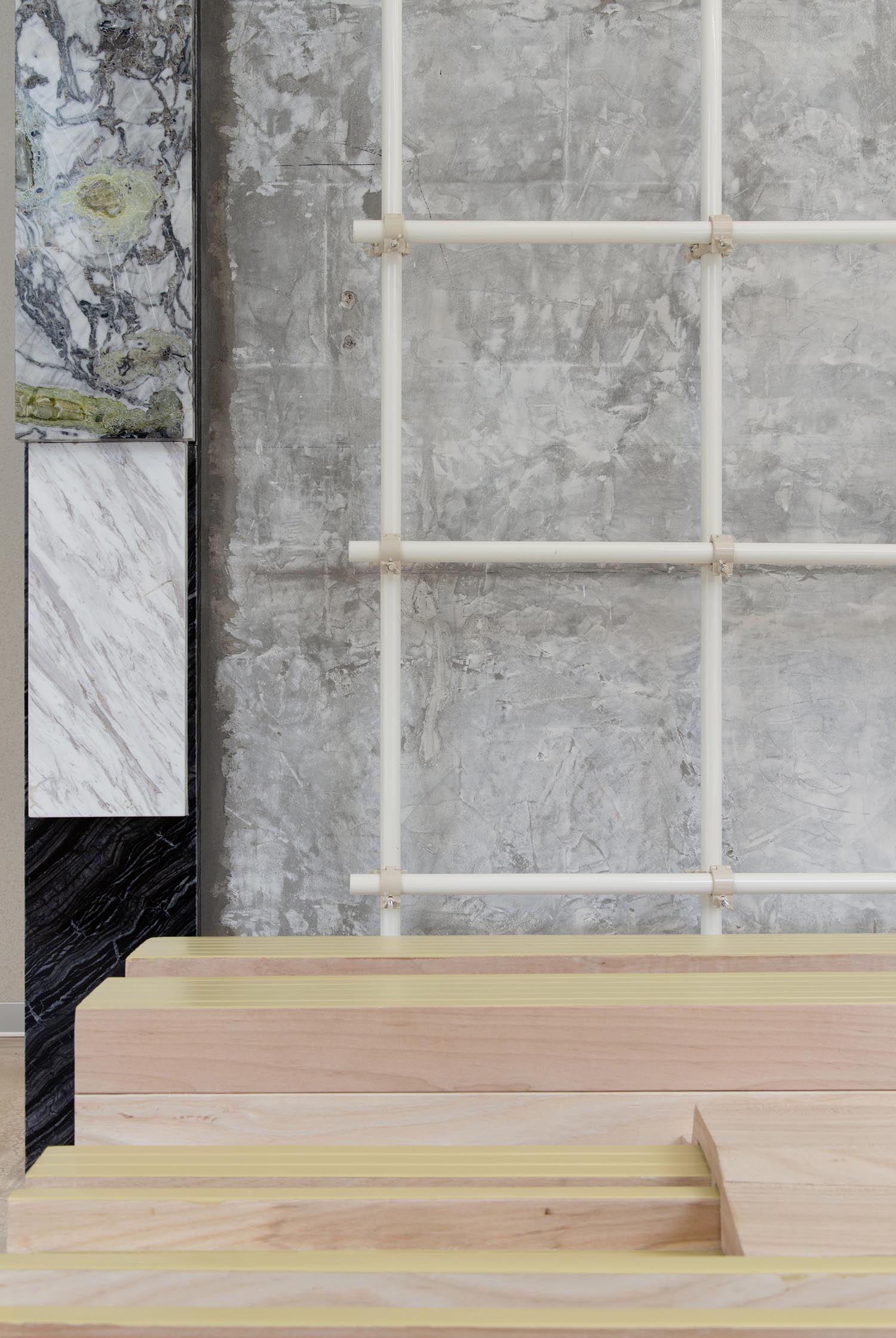
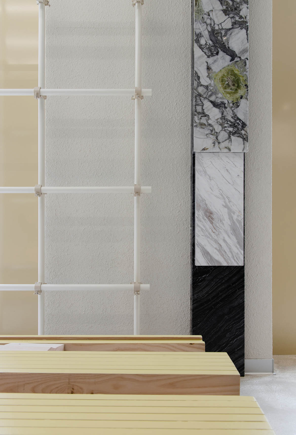
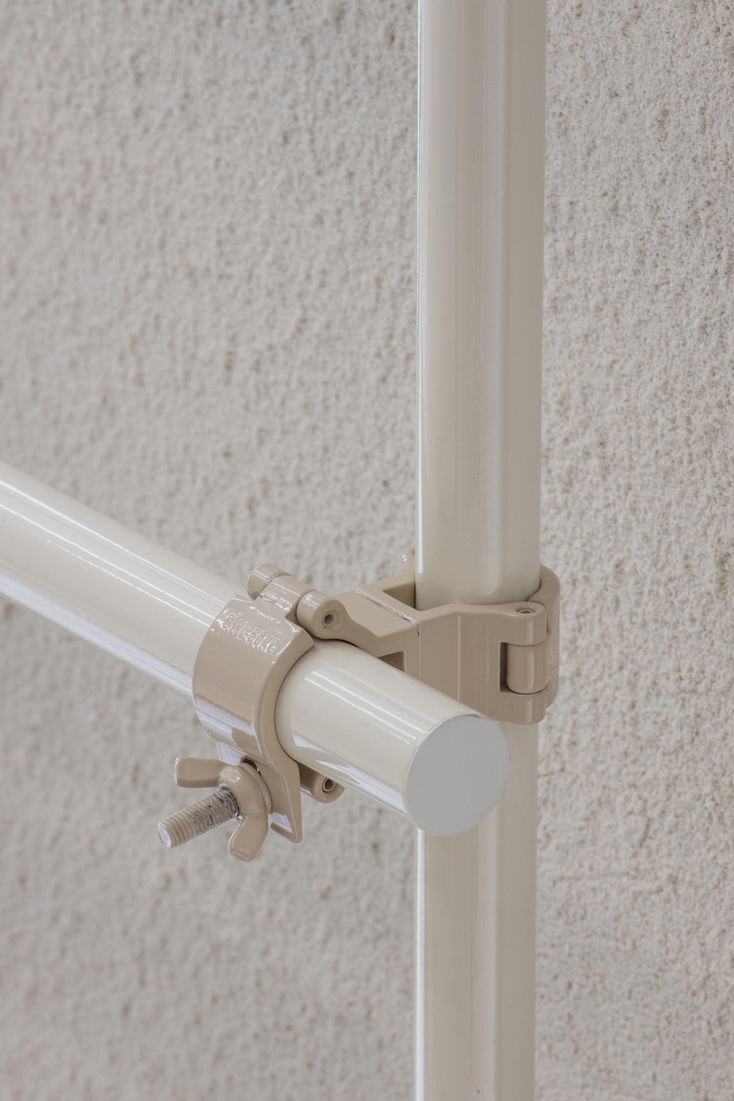
對原有痕跡的保留、二次創作和新元素的添加,共同構成了整個空間進行中的創作理念。例如從空間中保留建築原有的痕跡例如斑駁的牆麵、裸露在外的建築結構,遺留下來的裝飾痕跡等,以及由廢棄水管進行二次創作改造而成的包架。
Exposed brick walls and structural steel and traces of the decorations that were put in place by previous owners are kept in place. Abandoned pipes were rearranged and turned into racks for handbags. Retaining and repurposing the existing conditions and introducing new elements form the “on-going” design concept of the store.
▲箱包展示區 © Wen Studio
Handbags display area © Wen Studio
▲廢棄水管改造的包架 © Wen Studio
Abandoned pipes were turned into racks for handbags © Wen Studio
“新”不是隻指初始的、沒有用過的事物,空間中不排斥“使用感”,或者說是刻意模糊了新舊,使其共同作用,創造出獨一無二的美學效應。空間由此成為了一個裝載故事的容器,將新舊串聯在一起,與新天地自身的底蘊產生巧妙的呼應。
Sò Studio intentionally blurs the boundary between used and new by re-purposing used materials in new designs to create a style that is unique to LOOKNOW. The space, then, becomes a vessel for stories that the used materials carried with them. But the old stories are told in creative ways that incidentally match the overall cultural quality of Xintiandi.
▲沿街外立麵 © Wen Studio
The street entrance elevation © Wen Studio
▲軸側分析圖 © Sò Studio
Axon diagram © Sò Studio
項目信息
項目名稱:LOOKNOW新天地旗艦店
概念:House now
麵積:240平方米
地址:上海市馬當路新天地時尚二期
客戶:LOOKNOW
完成年份:2021年
攝影:Wen Studio
設計團隊:Sò Studio
設計總監:吳軼凡、劉夢婕
空間設計師:李宇飛、方子超
燈光設計:OUI DESIGN
家具品牌:B-LINE, Verpan
燈光品牌:OUI
瓷磚:品逸瓷磚
深化施工團隊:上海慧弘建設集團有限公司
Project information
Name: LOOKNOW Flagship Store
Concept: House now
Gross Built Area: 240 square meters
Address: Xintiandi Fashion Phase II, Madang Road, Shanghai, China
Client: LOOKNOW
Completion Year: 2021
Photographer: Wen Studio
Design team: Sò Studio
Design director: Yifan Wu, Mengjie Liu
Space designer: Louis Lee, Para Fang
Lighting designer: OUI DESIGN
Furniture brand: B-LINE, Verpan
Lighting brand: OUI
Tile brand: Pinyi tile
Construction team: Shanghai Huihong Construction Group Co. Ltd.


