愈想努力抓住回憶,它愈狡獪溜走;如同在我們腦海裏最深處飄忽地若隱若現地遊動著一支閃光的水團,苦於無法將它撈起和抓住。
——茨威格
The harder we try to grasp the memory, the more sly it slips away; like a gleaming water swam loomingly in the deepest part of our minds, we are unable to pick it up and grasp it.
—— Stefan Zweig
業主是一家立誌成為珠寶界的嬉皮士的小眾先鋒珠寶設計品牌,奉行對珠寶和對傳統的反叛,希望打造非傳統的美學展陳空間。秉承 “小眾即出眾“ 的設計理念,在空間和裝置設計上,設計師希望將品牌本身先鋒時尚的性質和空間品質相結合,將品牌強調創新、反叛傳統的個性注入傳統的商場中,創造出獨屬於品牌的自由的美學空間。
The owner is a niche avant-garde jewelry design brand that aspires to become a hippie in the jewelry industry. It pursues a rebellion against jewelry and tradition, and hopes to create a non-traditional aesthetic exhibition space. Adhering to the design concept of “niche is outstanding”, in space and installation design, the designer hopes to combine the brand’s own avant-garde fashion nature and space quality, and inject the brand’s personality that emphasizes innovation and rebellion against traditions into traditional shopping malls, creating Create a free aesthetic space unique to the brand.
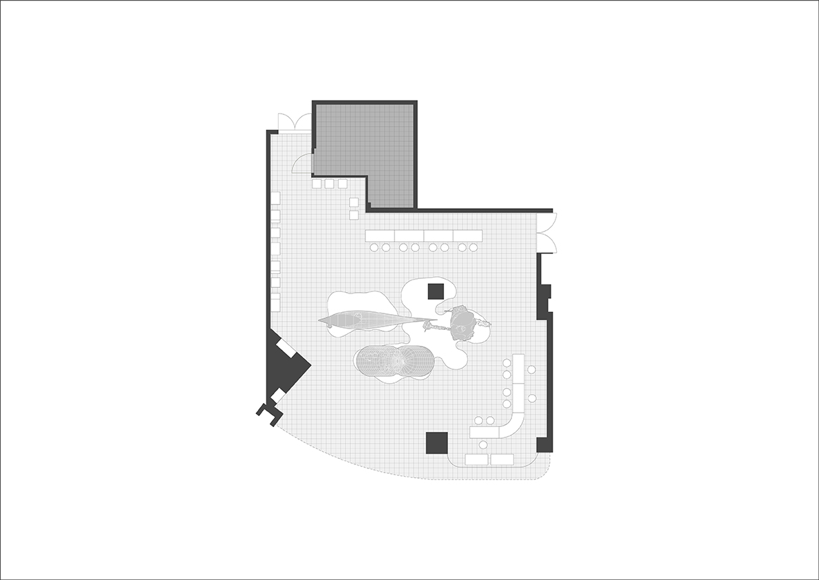
Δ 平麵布局 | Plan
此次項目中的品牌店麵選址於杭州,這座城市,在傳承曆史文化的同時,也在不斷的進行現代化的建設和更新。商場與西湖相伴,店鋪臨近主要室內商街,正對地鐵站入口扶梯,交通便利,處於人流交彙處。設計旨在呈現視覺爆點,引發空間共鳴或是爭議。
The brand store in this project is located in Hangzhou, a city that, while inheriting history and culture, is also constantly undergoing modernization and renewal. The shopping mall is accompanied by the West Lake, and the shop is close to the main indoor shopping street, facing the escalator at the entrance of the subway station, with convenient transportation and an intersection of people. The design aims to present visual bursts, sparking spatial resonance or controversy.
當代室內空間設計不僅局限於傳統家具、牆頂地的深化完善。隨著工業的成熟進步,與人們對商業空間體驗的認知升級,不鏽鋼藝術裝置、3D打印技術被更為廣泛的應用在室內設計中,以打破傳統珠寶行業單一乏味的固有模式,呈現更具個性化空間。新技術和新業態融合,跨界裝置設計,探尋新時代下的創新美陳空間。
Contemporary interior space design is not limited to the deepening and perfecting of traditional furniture and wall tops. With the maturity and progress of industry and the upgrading of people’s cognition of commercial space experience, stainless steel art installations and 3D printing technology have been more widely used in interior design, in order to break the single and boring inherent mode of the traditional jewelry industry and present more Personalized space. The integration of new technologies and new formats, cross-border device design, explores the innovative beauty space in the new era.
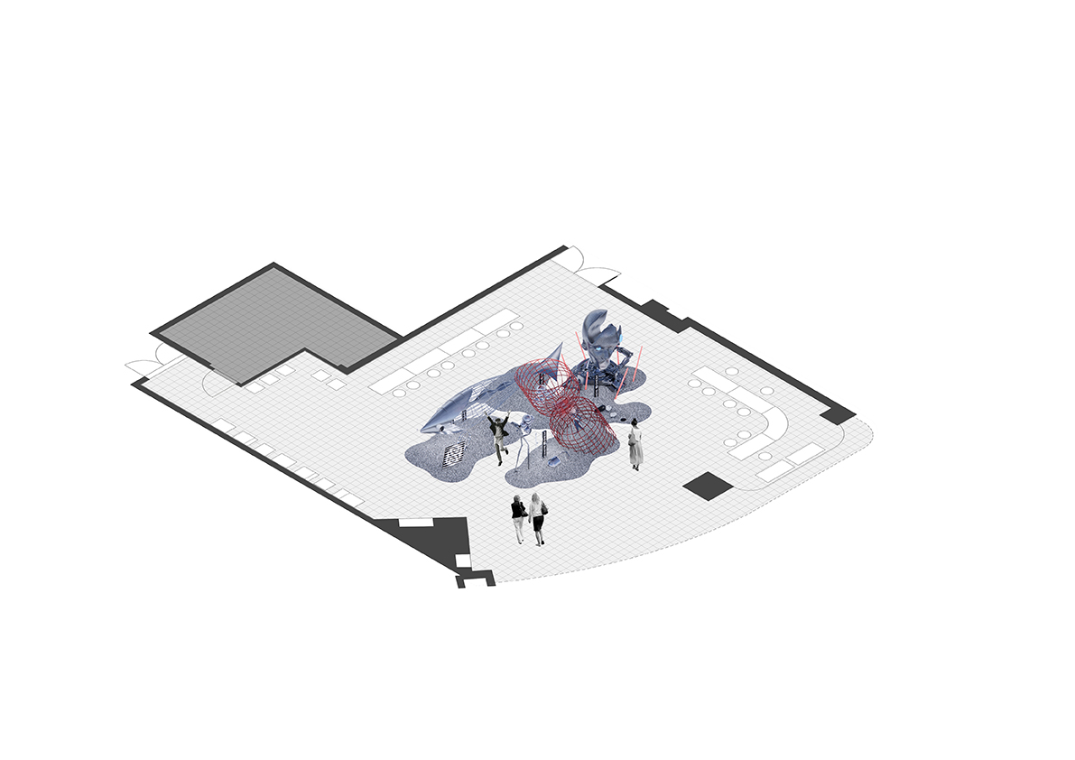
Δ 空間軸測圖 | Axonometric drawing
裝置主題背景 | Device theme
珠寶的意義,在於紀念和回憶。時間會將我們的記憶衝淡,讓我們迷失當年的幸福,而珠寶就是那個承載著時間和回憶的容器,隨著時間的流逝,它依舊璀璨如初。空間設計以時間暫停為主題,呈現了在海底世界,一係列生物為了使時間停止而做的舉措,它們為什麼想讓時間暫停?有什麼東西遺落在了時間的長河?
The meaning of jewelry lies in remembrance and memory. Time will dilute our memories and let us lose the happiness of the year. Jewelry is the container that carries time and memories. As time goes by, it remains as bright as ever. With the theme of time pause, the space design presents a series of actions taken by creatures in order to stop time in the underwater world. Why do they want time to pause? What is left in the long river of time?
Δ 裝置組合B | Device combination B
設計中,吞噬時間的魚、時間沙漏和時光膠囊為304不鏽鋼雕塑,憤怒機械人頭雕塑為玻璃纖維3D打印工藝。從傳統的不鏽鋼造型工藝到玻璃纖維3D打印,到複合材料,該項目對不同工藝屬性及其組合方式進行了探索。
In the design, the fish, funnel and capsule are 304 stainless steel sculptures, and the human head sculptures are glass fiber 3D printing processes. From the traditional stainless steel molding process to glass fiber 3D printing, to composite materials, the project explored different process attributes and their combinations.
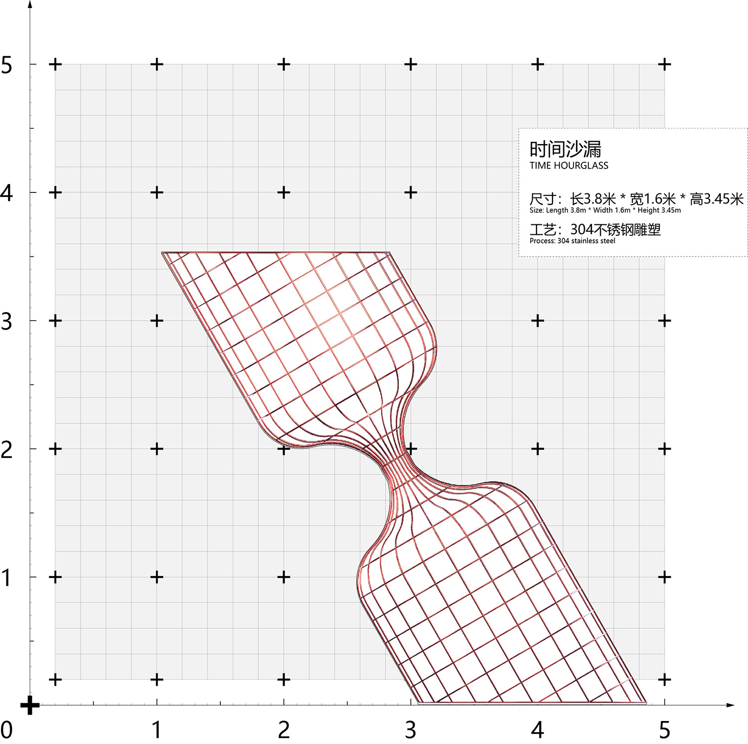
Δ 互動藝術裝置:時間沙漏 | Interactive Art Installation: TIME Hourglass
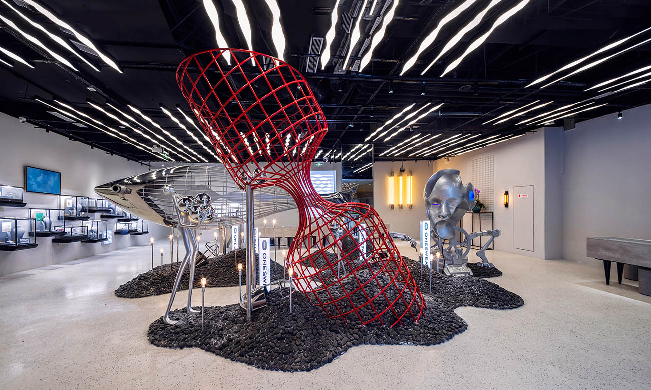
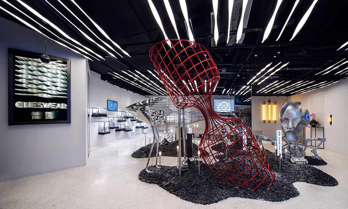
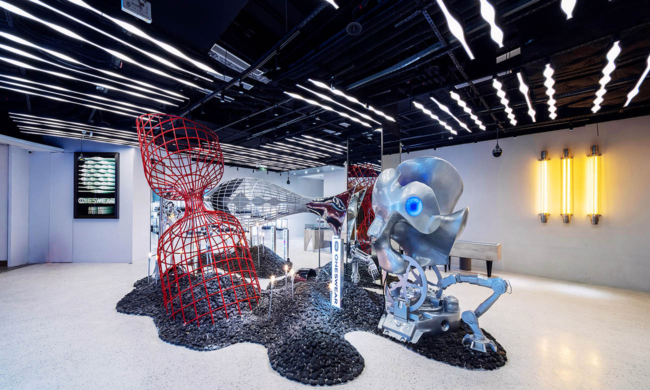
沉在海底的巨型沙漏是掌管時間機器的核心,它永不停滯的流動,進行著對時間的精打細算。人們拿著據說可以封住流沙的永恒寶石進入沙漏中,將它放在沙漏的接口處,靜靜的等待著時間的停止,果然,時間停下來了,沙漏內成為了永恒,但沙漏外的時間還在不停的推進著;沙漏雕塑傾斜放置在整個裝置構圖最中間的地方,是整個視覺的中心,為304不鏽鋼材料,采用紅色質感金屬塗料噴漆,底部嵌入地麵碎石之中,仿佛從天而降的龐然大物沉在海底。
The giant hourglass sunk on the bottom of the sea is the core of the time machine. It never stops flowing, and is carefully calculating time. People enter the hourglass with the eternal gem that is said to be able to seal the quicksand, put it at the interface of the hourglass, and quietly wait for the end of time. Sure enough, time has stopped. The inside of the hourglass becomes eternity, but the outside of the hourglass Time is still advancing; the hourglass sculpture is placed obliquely in the middle of the entire installation composition, which is the center of the entire vision. It is made of 304 stainless steel, painted with red metallic paint, and the bottom is embedded in the gravel on the ground, as if falling from the sky. The behemoth sank on the bottom of the sea.
Δ 裝置組合C | Device combination C
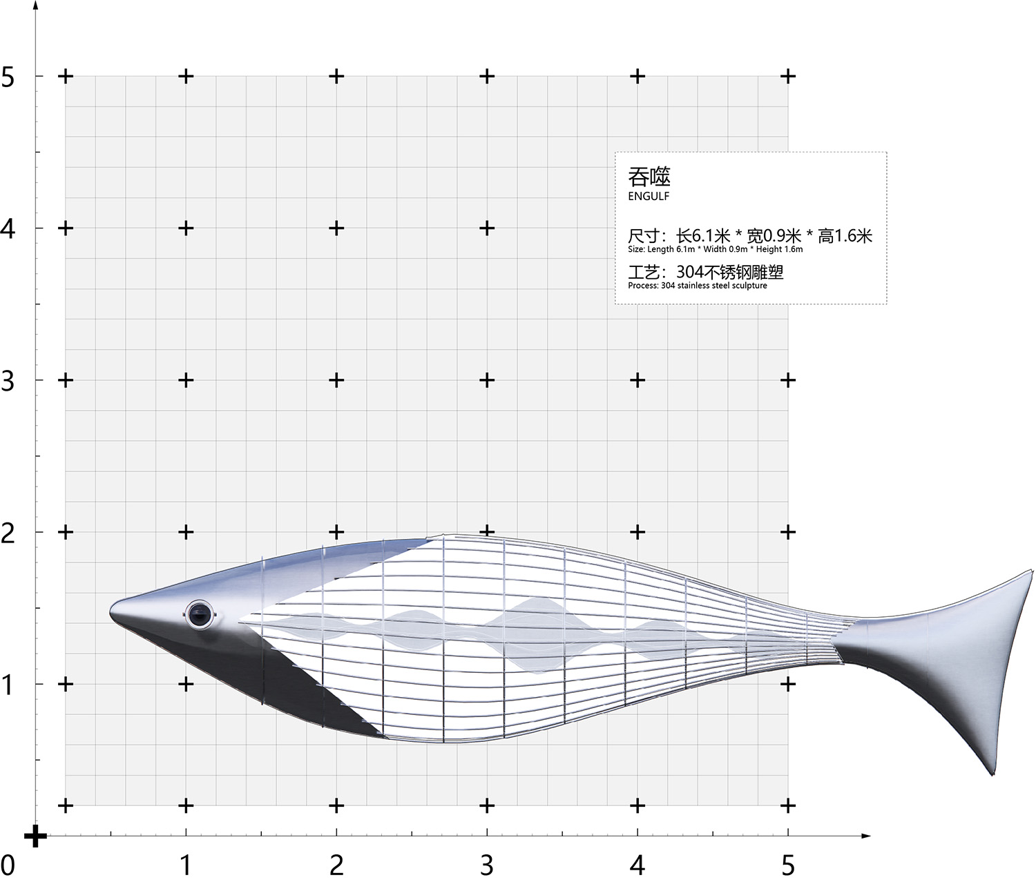
Δ 互動藝術裝置:吞噬 | Interactive Art Installation: Engulf
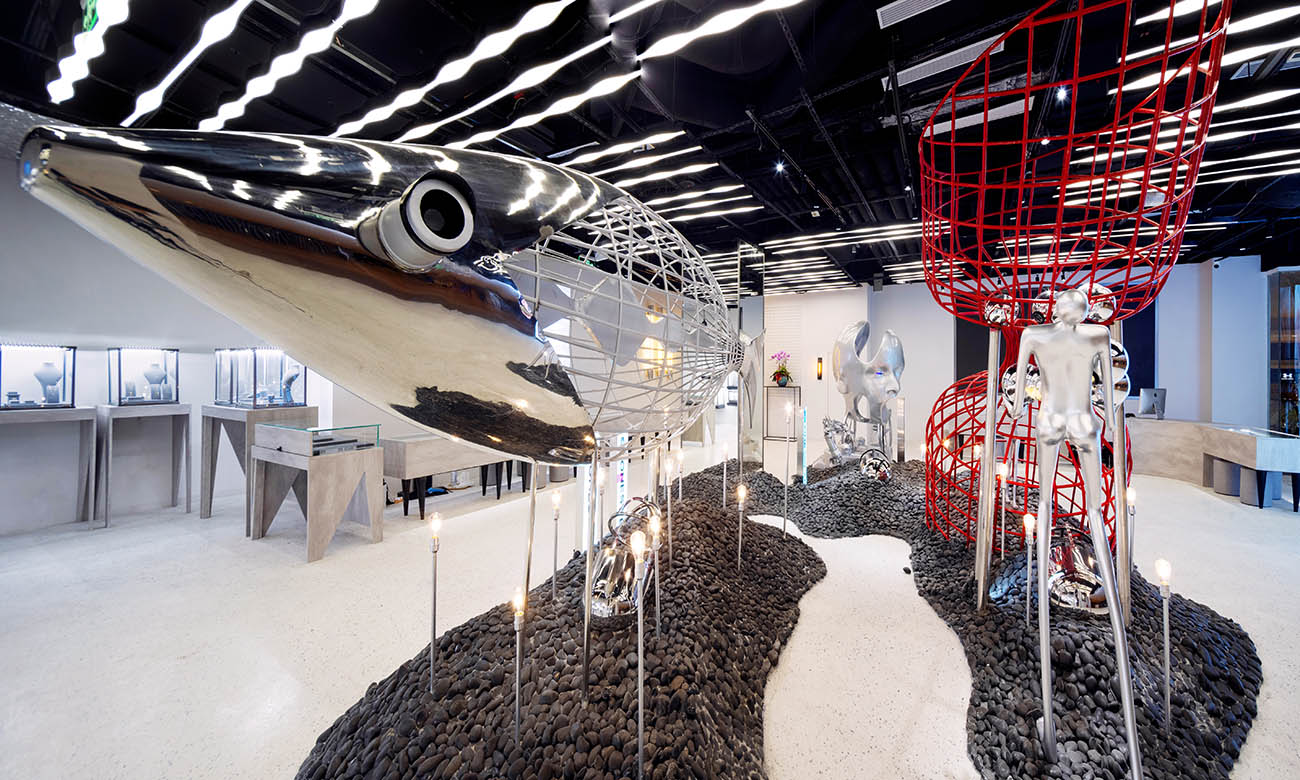
魚的記憶隻有7秒,7秒的愛情,7秒的友情,7秒的親情,記憶的短暫讓它們瘋狂的想要製止時間的流逝,但它們無法拿起寶石,但強大的欲望迫使它們無情的吞下機器周圍的鍾表、齒輪,以及和時間有關的一切。由於它本身的體量巨大,雕塑魚在整個空間十分具有衝擊力,穿梭於神秘海底之中,魚的眼睛是望遠鏡鏡頭的形象,增加了機械朋克的元素,魚肚為鋼筋箍成的鏤空輪廓,整體采用304不鏽鋼雕塑造型工藝,呈現出一個充滿時尚感和未來感世界。
Fish’s memory is only 7 seconds, 7 seconds of love, 7 seconds of friendship, 7 seconds of affection. The short memory makes them want to stop the passage of time crazily, but they can’t pick up gems, but their strong desire forces them to be ruthless. He swallowed the clocks, gears, and everything related to time around the machine. Due to its huge volume, the sculptured fish is very impactful in the entire space. It travels through the mysterious seabed. The eyes of the fish are the image of a telescope lens, adding a mechanical punk element. The fish belly is a hollow outline made of steel hoop. The overall use of 304 stainless steel sculpture modeling technology presents a world full of fashion and futuristic sense.
Δ 裝置組合D | Device combination D
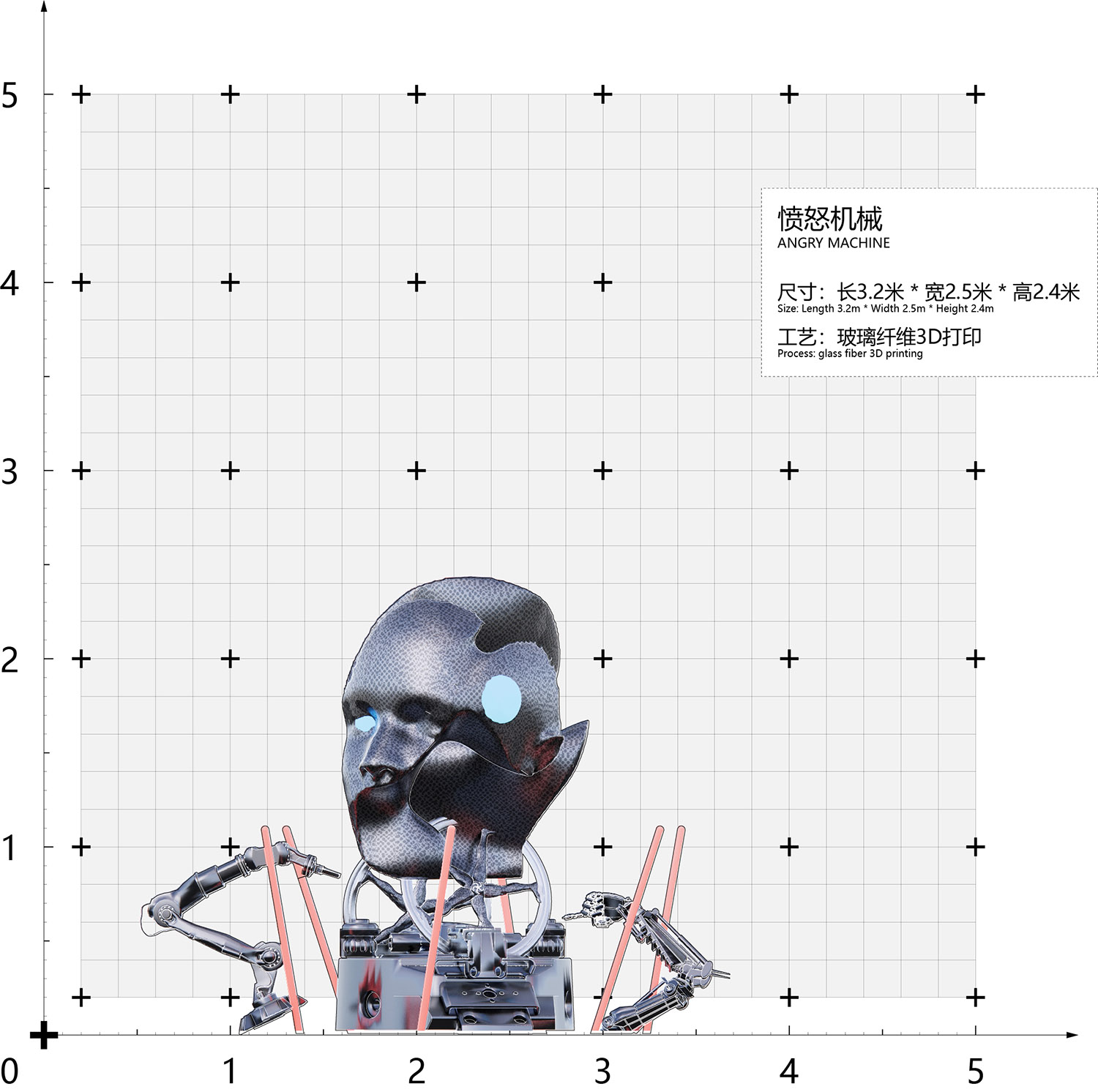
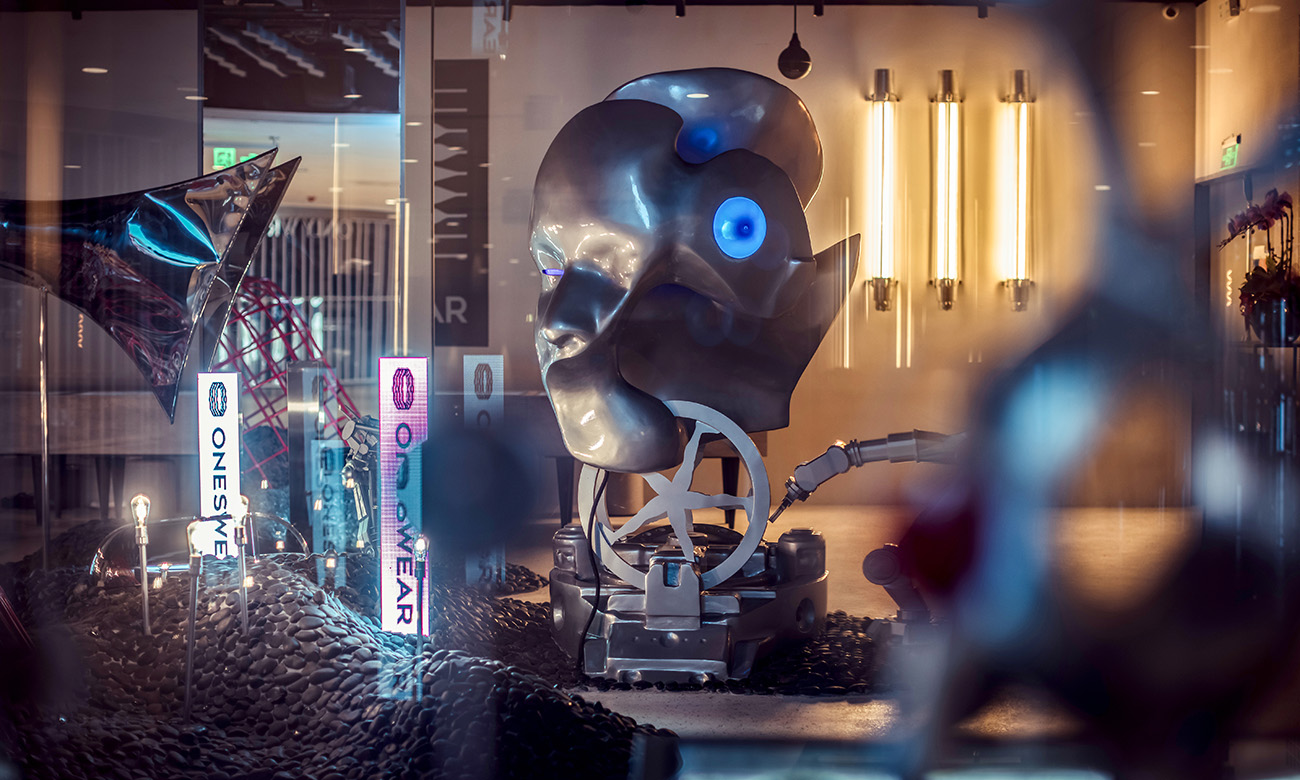
Δ 互動藝術裝置:憤怒機械 | Interactive Art Installation: Angry Machine
Δ 憤怒機械效果展示 | Angry Machine
我們在日複一日的工作,成為了工作的機器,沒有感情,沒有生活,如果時間可以停止,是否能有稍刻緩歇呢?人頭的藍色LED燈加強了它本身的機械感,身下的機械臂正在不停的勞作,永不停歇,機械臂與人頭之間是由人腿組成的轉動齒輪。將人體進行解構和重組,重新賦予它們不同的意義。
We work day after day and become working machines, without feelings and without life. If time can be stopped, can we take a short break? The blue LED light on the human head enhances its own mechanical sense. The mechanical arm under the body is constantly working and never stopping. Between the mechanical arm and the human head is a rotating gear composed of human legs. Deconstruct and reorganize the human body, and give them different meanings again.
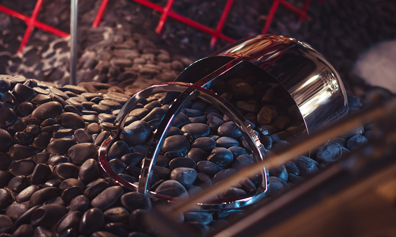
Δ 時間膠囊 | Time capsule
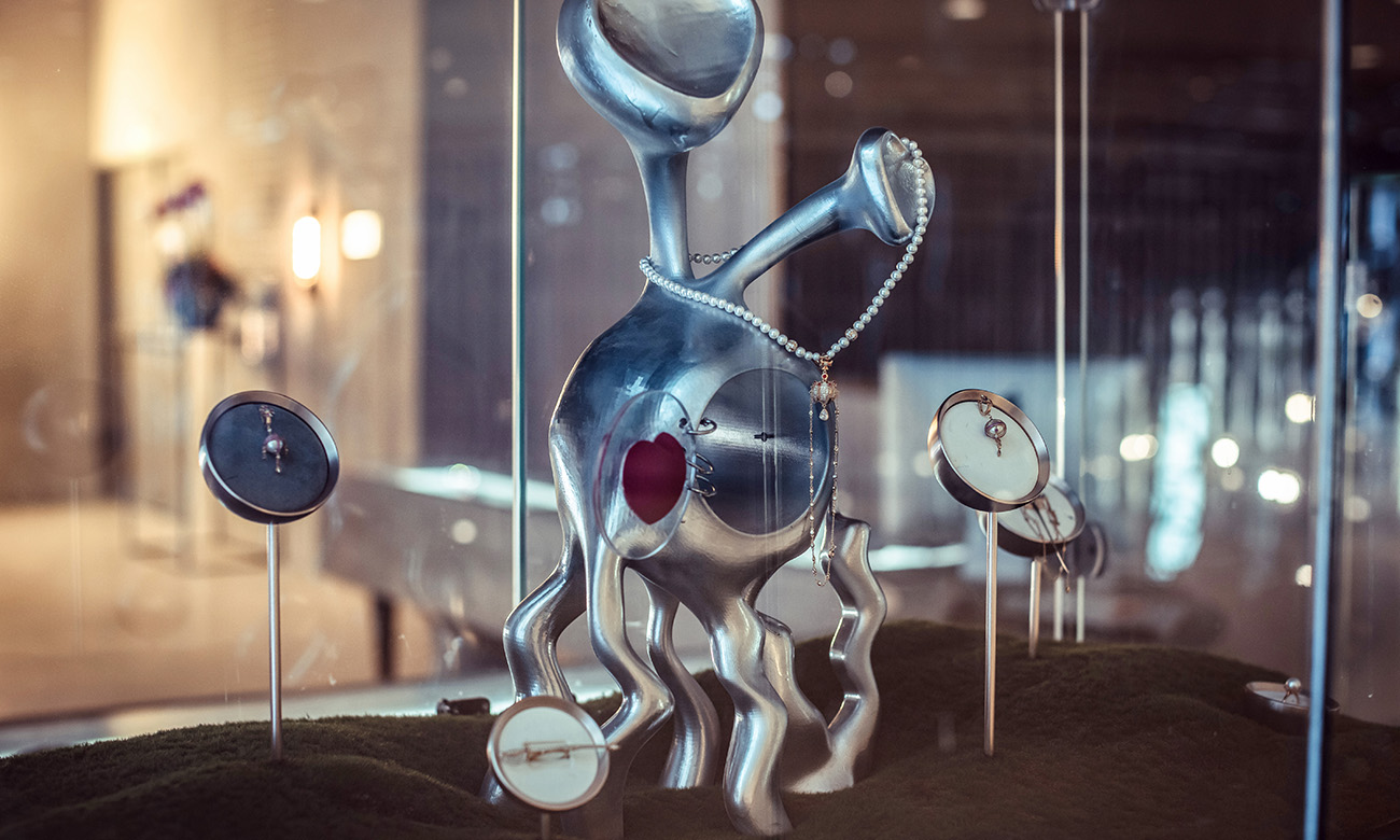
機器四周搖曳著海草,海草間隱約可見一些雜亂散落在沙石上的時間膠囊,塵封了眾生最想留住的那一刻,打開膠囊,就可以重溫過去的幸福。當然現在的人們也可以不吝嗇的將現在的故事留下,讓它成為未來的過去。膠囊成為了時間暫停的隧道,也組成了無數個不同時間下的自己。
Seagrass swayed around the machine, and some time capsules scattered on the sand and rocks were faintly visible among the seagrass. The dust sealed the moment that all beings most wanted to keep. Open the capsule and you can relive the happiness of the past. Of course, people now can not hesitate to leave the current story behind and let it become the past in the future. The capsule has become a time-suspended tunnel, and it has also formed countless selves at different times.
Δ 裝置組合E | Device combination E
Δ 空間入口 | Entrance
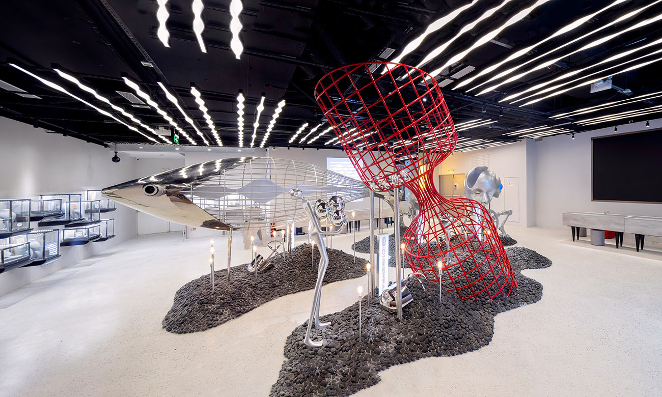
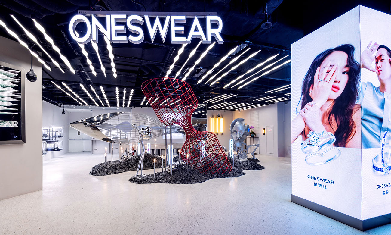
室內設計是同樣希望以裝置為核心去構建場景,空間整體明亮簡潔,采用白色肌理塗料牆麵和白色水磨石地麵,簡潔化處理室內空間,作為中間吸睛裝置的“背景板“;大裝置組合放在中間朝向入口的地方用於吸引人流,空間布局圍繞著裝置展開,串聯起一係列的展品,猶如海底探險的奇妙旅程,來到異度空間去感受時間暫停的那一瞬;裝置底部鋪滿了沉積於海底的礁石,礁石灘中僅有一條一人寬的小道,順著小道探險,可以穿梭於各裝置之間,讓流線變得更加靈活有趣。黑色石子上插滿了懸浮著的小燈泡,模仿海洋中海底的奇幻生物,星星點點的閃爍透著海底的神秘之感。
The interior design also hopes to build the scene with the device as the core. The overall space is bright and concise. The white texture paint wall and white terrazzo floor are used to simplify the interior space and serve as the “background board” of the central eye-catching device; large installations are combined The place facing the entrance in the middle is used to attract the flow of people. The spatial layout is spread around the installation, connecting a series of exhibits in series, like a wonderful journey of underwater exploration, coming to a different space to feel the moment of time pause; the bottom of the installation is covered with The reefs deposited on the bottom of the sea, there is only a one-person-wide path in the reef beach. You can explore the path along the path, and you can shuttle between the devices, making the flow line more flexible and interesting. The black stones are filled with suspended small light bulbs, imitating the fantasy creatures on the bottom of the ocean, and the stars are shining with the mysterious feeling of the bottom of the sea.
Δ 接待台與倉儲空間的關係 | The relationship between reception desk and storage space
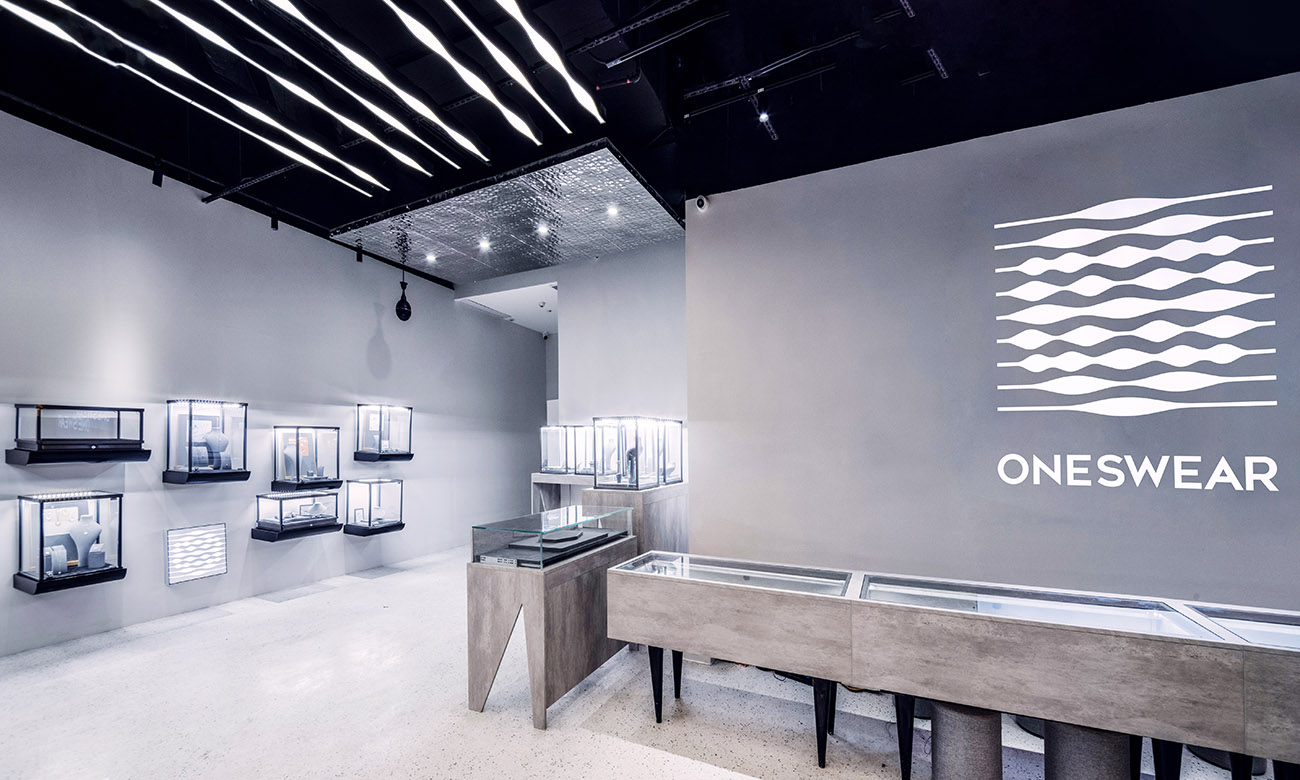
利用倉儲空間和接待台將空間中不規則的部分消除,中間的裝置和四周的展櫃都能在一個幹淨純粹的方形空間中去展示。設計師將原先店鋪剩餘的展櫃重新利用,相互錯動排列,高低起伏,和LOGO、電視屏一起進行平麵構成設計,豐富牆麵層次。
The storage space and reception desk are used to eliminate irregular parts of the space, and the devices in the middle and the surrounding showcases can be displayed in a clean and pure square space. The designer reused the remaining showcases in the original shop, arranged them staggeredly, with ups and downs. Together with the LOGO and the TV screen, they carried out a graphic composition design to enrich the wall level.
Δ 裝置組合F | Device combination F
原先場地中的暴露的幾根結構柱,分別采用不同的方法對其進行消解:入口出的兩根結構柱子,一根和深淵鏡、展牆結合,利用斜牆包裹結構柱,同時,視線被創造出的斜牆麵引導向室內裝置;另外一根四麵包裹LED廣告屏屏幕,和右側的曲麵玻璃展示窗口結合成為入口的標識,給觀者留下強烈的記憶;位於空間正中的結構柱與裝置一起作為展品出現,鏡麵的包裹使它能夠反射出另一個“空間”,仿佛海洋是一個無盡的深淵。
The exposed structural columns in the original site were resolved by different methods: the two structural columns at the entrance and exit, one combined with the abyss mirror and the exhibition wall, the structural column was wrapped by the inclined wall, and at the same time, the line of sight was blocked. The created oblique wall leads to the indoor installation; another four-sided LED advertising screen, combined with the curved glass display window on the right, becomes the sign of the entrance, leaving a strong memory for the viewer; a structural column located in the middle of the space Appearing as an exhibit together with the installation, the mirror-surface package enables it to reflect another “space”, as if the ocean is an endless abyss.
項目信息
Project Information
項目名稱:時間靜止·梵誓ONESWEAR杭州嘉裏中心珠寶店
Project name: Time Pause · ONESWEAR Jewelry store in HangZhou Kerry Center
設計方:上海平介建築設計事務所
Designer: Shanghai Parallect Architecture Design Studio
項目設計&完成年份:2021年7月
Project Design & Accomplish Date: 7/2021
設計團隊:孫穎,黃迪,劉豐迪,肖明峰
Design Team: Ying Sun, Di Huang, Fengdi Liu, Mingfeng Xiao
項目地址:杭州嘉裏中心
Project Address: HangZhou Kerry Center
合作方:蘇州再造設計,鮮榨無責藝術公司
Partners: Suzhou Re-design Studio, Freshly Squeeeed
建築麵積:234㎡
Building Area: 234㎡


