全球設計風向感謝來自 Oft Interiors 的展廳空間項目案例分享:
OFT設計丨他們在ASA瓷磚展廳,策了一個有氧生活方式展
有過裝修血淚史朋友都知道,在過去,瓷磚終端門店通常都是以樣板上牆的銷售模式;而今天,動輒上千平的瓷磚展廳拚的是更豐富的家居場景與風格。
People who have experienced interior decoration all know that in the past, tile terminal stores usually adopted the sales model of samples on the wall; and today, thousands of square feet of tile showroom spell a richer home scene and style.
ASA(亞細亞)瓷磚是有二十多年曆史的馳名品牌,它見證與經曆了陶瓷行業的發展與變革,作為陶瓷行業工業4.0代表,ASA除了產品本身一直在不斷創新之外,在終端門店的革命中,同樣走在前列。
ASA Tile is a well-known brand with a history of more than 20 years, which has witnessed and experienced the development and change of the ceramic industry. As the representative of ceramic industry 4.0, ASA has not only been innovating the products themselves, but also been at the forefront of the revolution in the terminal stores.
OFT在為ASA做品牌形象升級時,深入研究品牌在香港定位、調性、消費人群,盡管當下模擬家居場景式瓷磚展廳已成主流,但設計團隊仍然選擇以生活方式展覽形式呈現空間。
When OFT upgrade the brand image for ASA, the design team deeply studied the brand’s positioning, tonality, and consumer population in Hong Kong. Although at the current, tile showroom of simulated home scenario has become mainstream, the team still chose to present the space in the form of lifestyle exhibition.
在OFT設計看來,瓷磚是一種在商業與生活之間的產物,ASA瓷磚則是一個生活方式品牌。展覽可以還原瓷磚本身的溫度與記憶,讓消費變成逛展,讓購物體驗變成分營造家的一部分,喚醒消費者對家的想象與憧憬。
In OFT Design’s view, tile is a product between business and life, and ASA tile is a lifestyle brand. The exhibition can restore the temperature and memory of the tile itself, so that consumption becomes visiting exhibition, while the shopping experience becomes part of creating a home, awakening consumers’ imagination and longing for home.
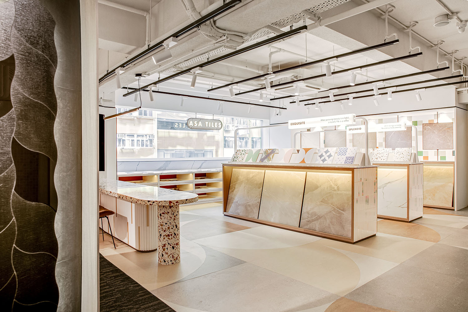
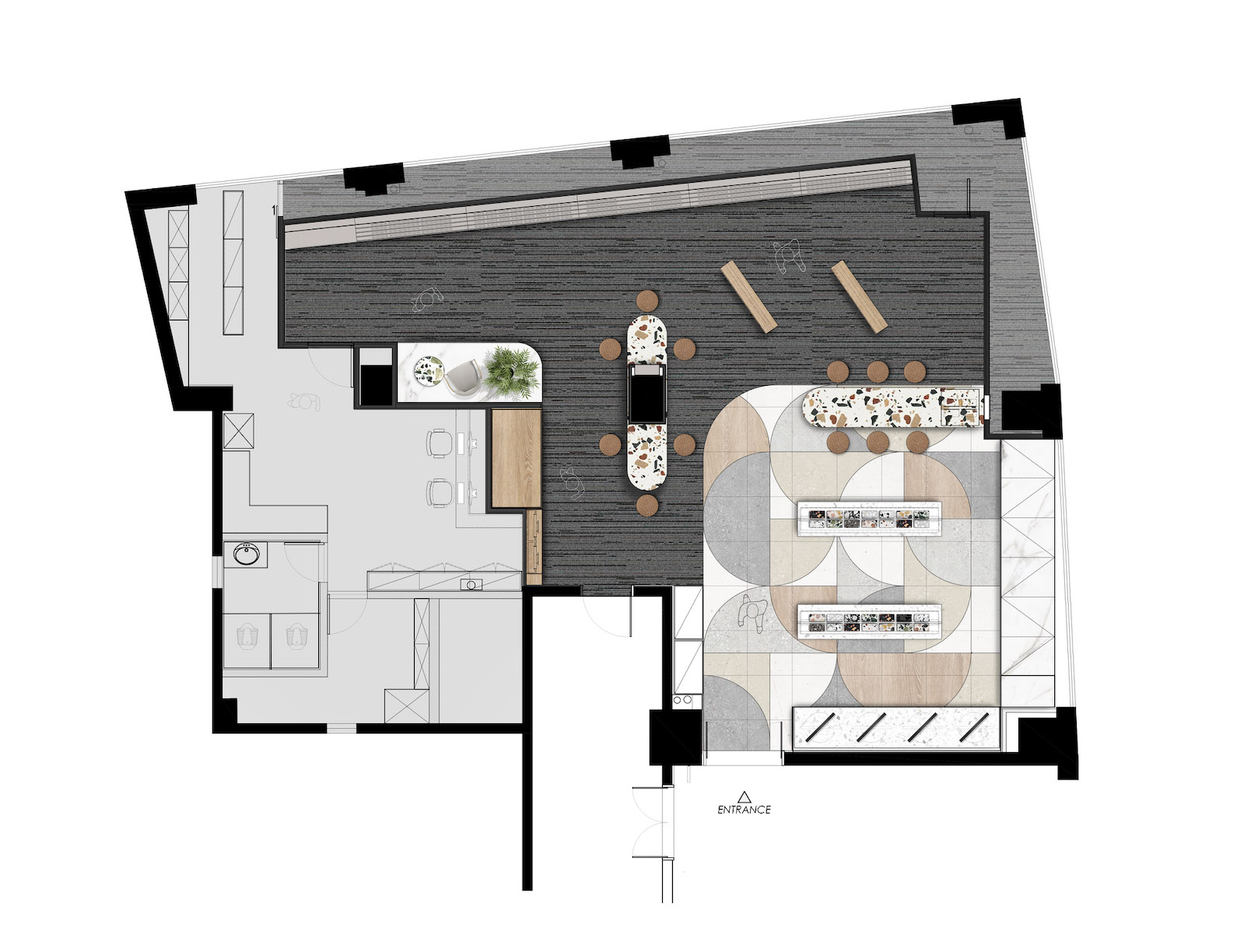
這個空間除終端消費者外,還為設計師提供選材,瓷磚按照不同風格、尺寸進行分區域展示,通過陳列櫃形成設計動線,並以不同陳列方式,將空間自然劃分,構建係統、完整、流暢的場景體驗,提升消費者效率。
This space provides designers with selection materials in addition to end consumers. Tiles are displayed in sub-regions according to different styles and sizes, and the motion trend is formed through display cabinets, and with different displays, the space is naturally divided to build a systematic, complete and smooth scene experience to enhance consumer efficiency.
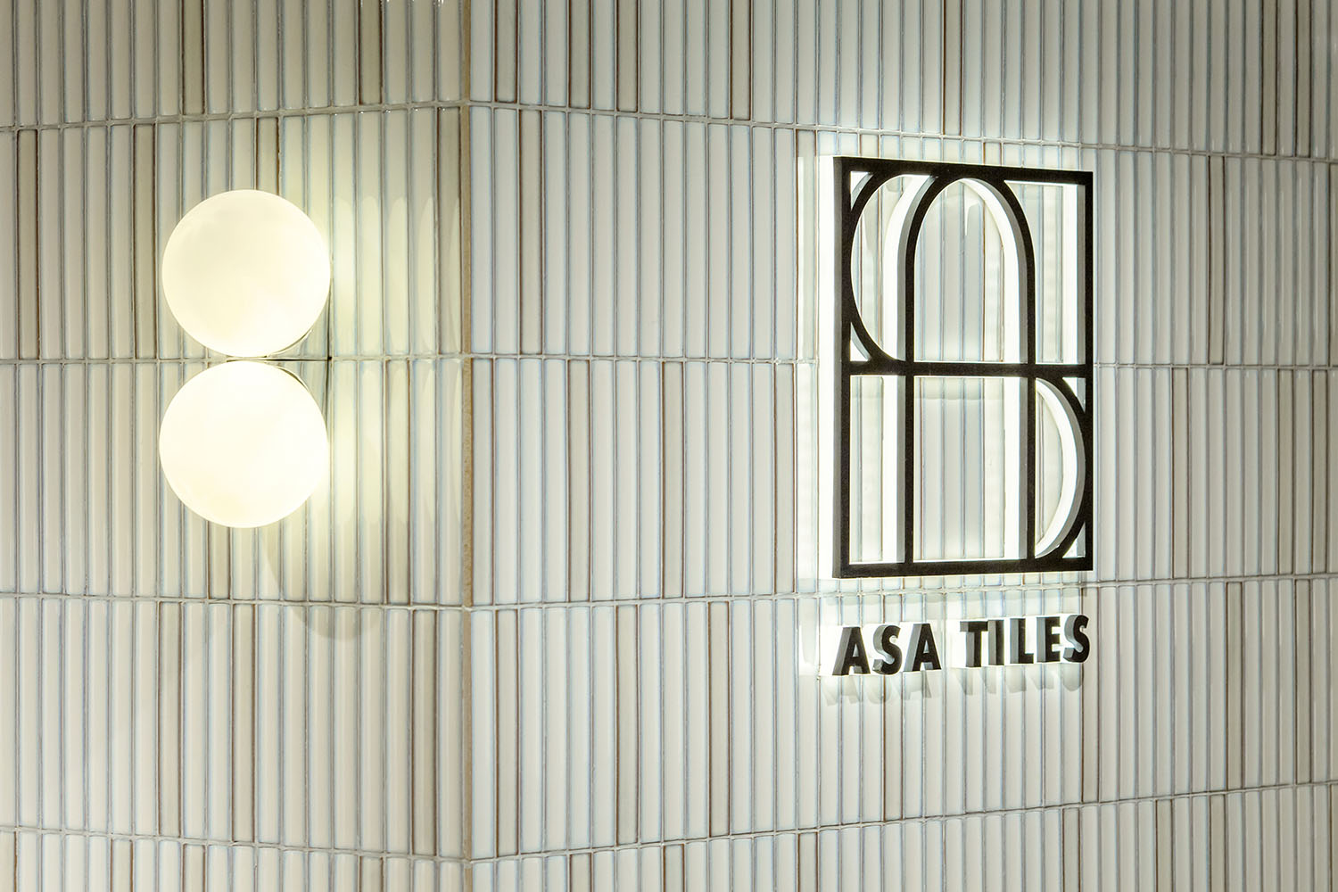
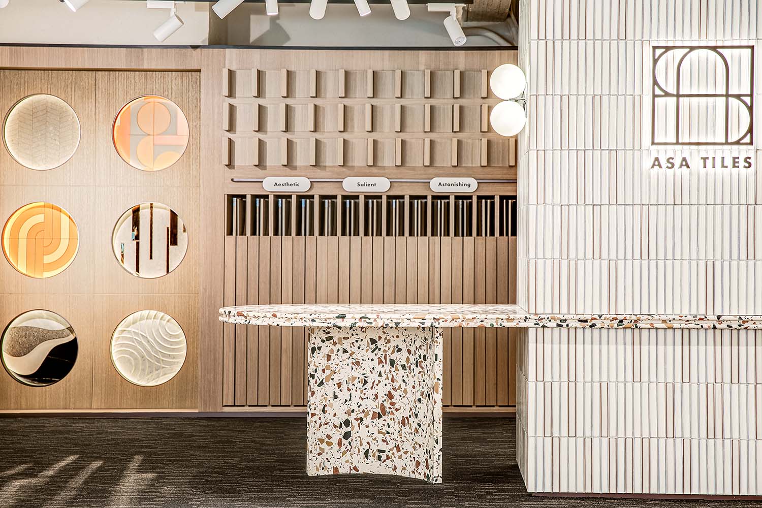
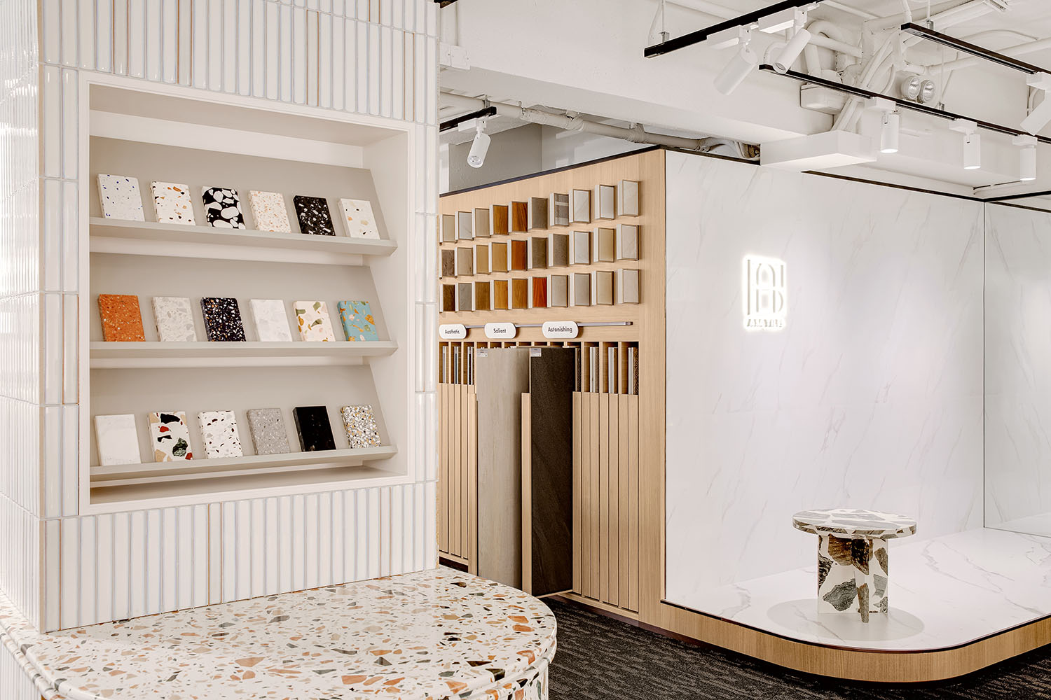
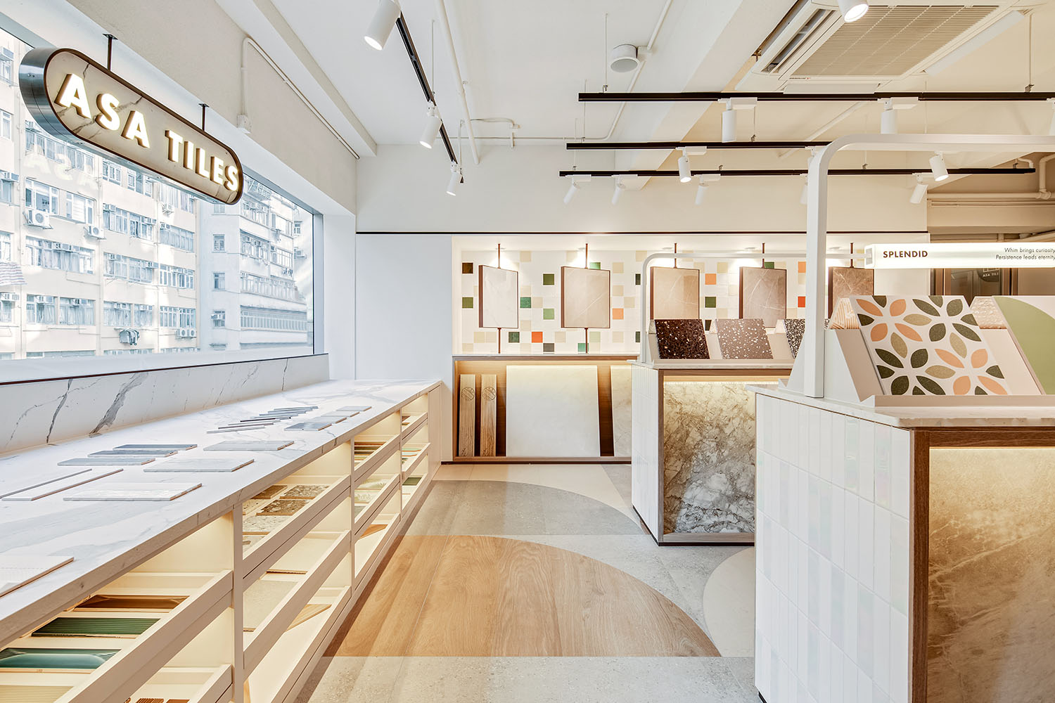
入口處醒目的LOGO,提示消費者已進入ASA展覽時空,整體的暖色調出營造有氧商業空間氛圍,拉近消費者與空間、品牌、產品的距離。
The eye-catching LOGO at the entrance is a hint that suggests consumers have entered the ASA exhibition time and space. The overall warm color creates an aerobic business space atmosphere to bring consumers closer to the space, brand and product.
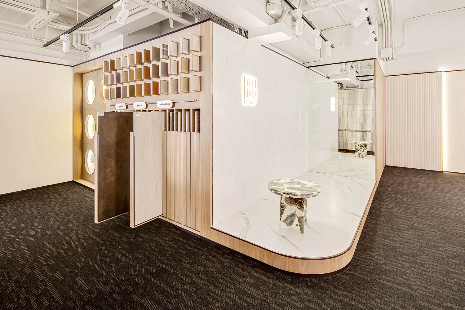
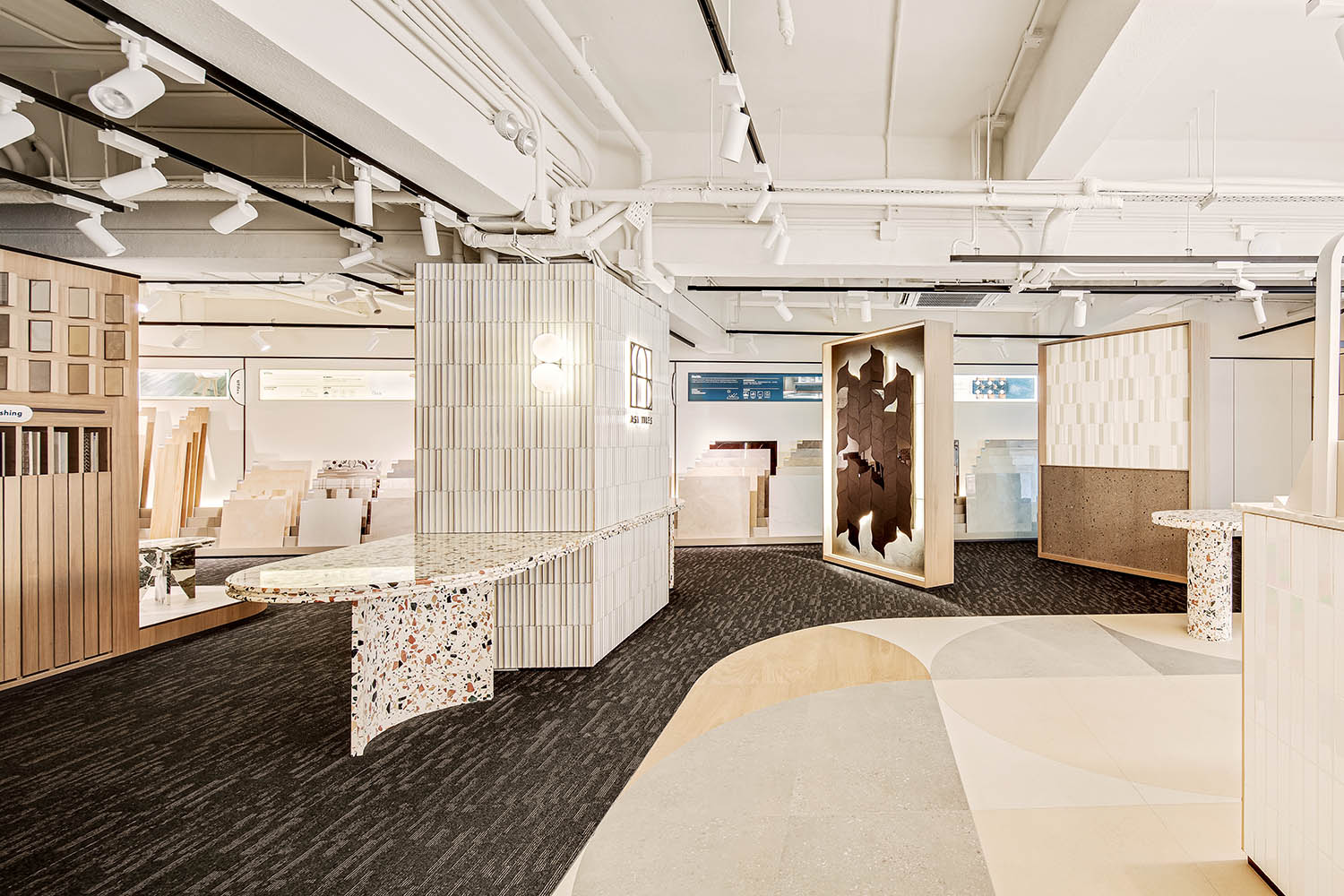
一個不規律的盒體則作為既獨立存在又與空間交融展台,帶來流動與靈活的同時也全方位展示品牌價值所在。
An irregular box is used as a stand that both exists independently and intermingles with the space, bringing flow and flexibility while also showing the brand value in all aspects.
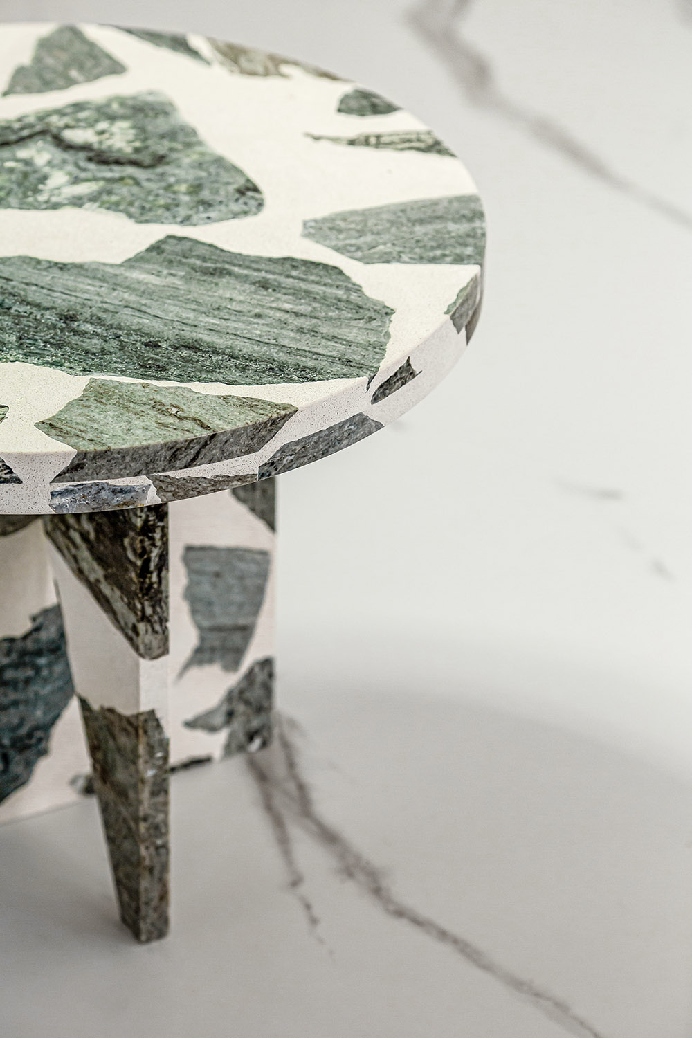
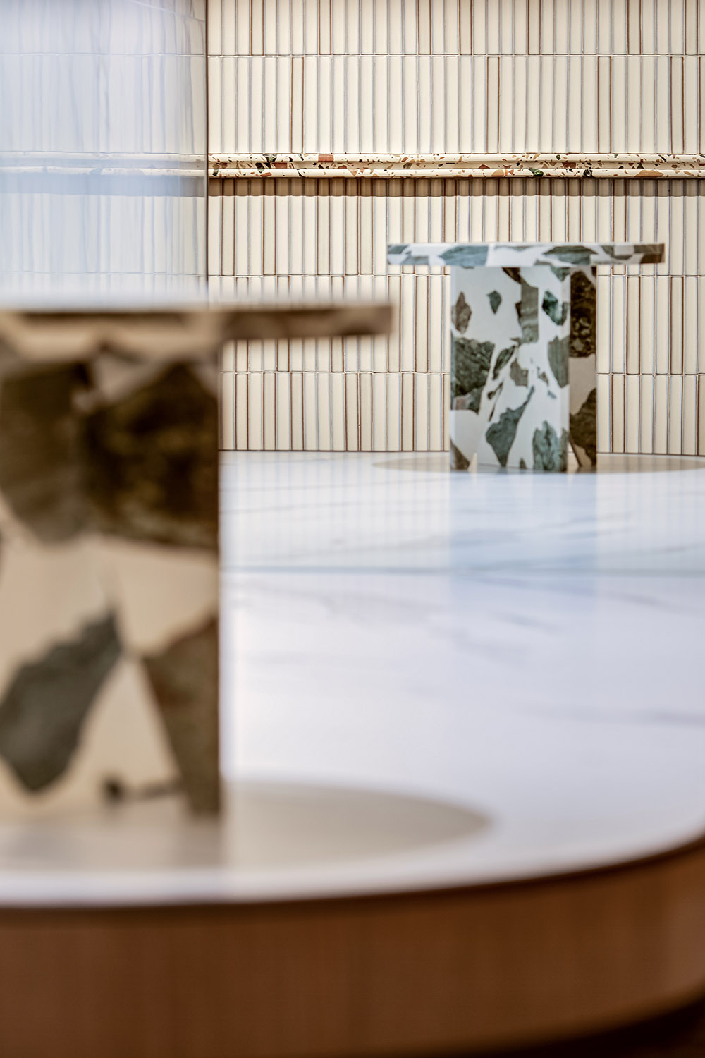
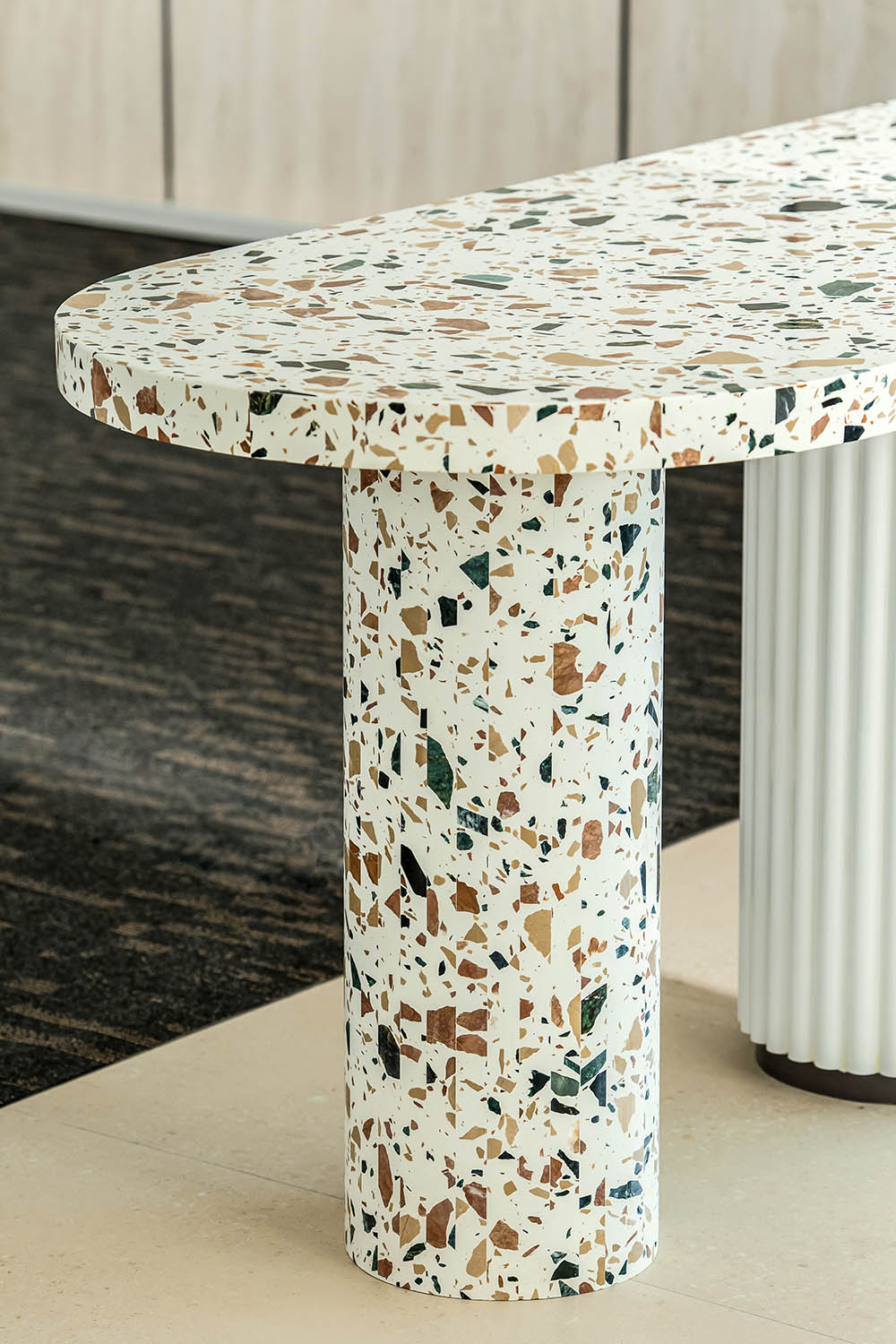
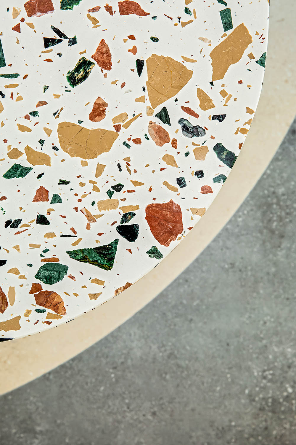
展台上,一個ASA水磨石設計的矮凳,是OFT對瓷磚不同功能的演繹,當功能與形式有機結合,選擇就變成了一次材料探索之旅,矮凳不僅可以作為設計的語言風格去傳承與定義,更是具有品牌價值增量的產品。
On the booth, an ASA terrazzo-designed low stool is OFT’s interpretation of different functions of tiles. When function and form are organically combined, the choice becomes a journey of material exploration. The low stool can not only be inherited and defined as the language style of design, but also a product with incremental brand value.
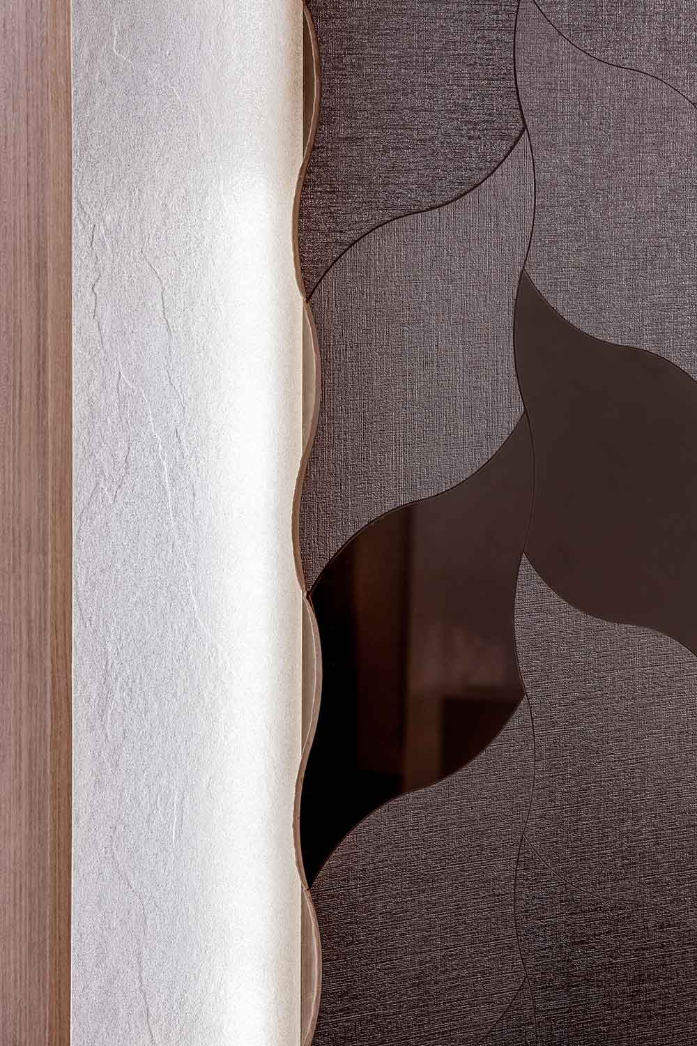
隨著人的體驗感知越來越顆粒度,對於體驗標準也更高,設計師通過在盒子裏局部設置鏡麵,帶來橫向延伸感,擴大視覺效果,豐富空間層次,帶來感知的流暢與統一性。
As people’s perception becomes more and more granular, the standard for experience is also higher, the designer brings a sense of horizontal extension by partially setting mirrors in the box, expanding the visual effect, enriching the spatial hierarchy and bringing perceptual fluidity and uniformity.
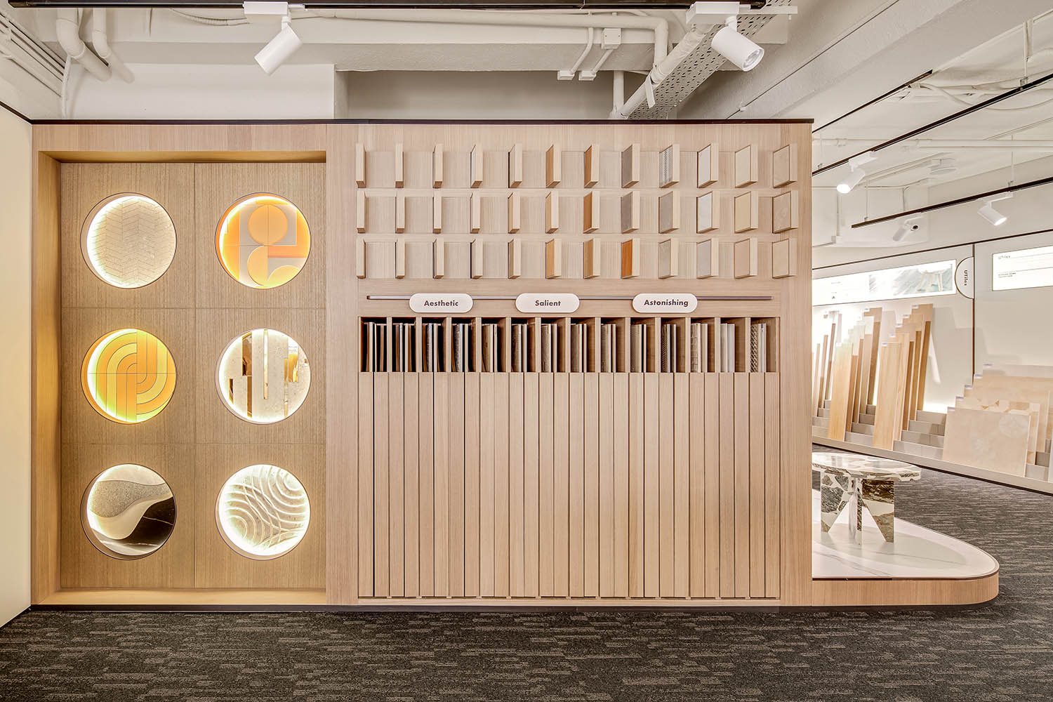
櫃體與水磨石桌結合,實現視覺上的統一,牆麵上以六個規則圓形孔洞作為展示方式,在燈光氛圍的烘托下,既為產品展示,又成為牆麵的藝術品,在瓷磚藝術創作作品與產品的相輝映中,OFT為消費者提供沉浸式的有氧逛展體驗。
The cabinet is combined with terrazzo table to achieve visual unity. Six regular circular holes are on the wall as a display, and under the lighting atmosphere, they are both for product display and as a wall artwork. In the reflection of tile art creation works and products, OFT provides consumers with an immersive and aerobic shopping experience.
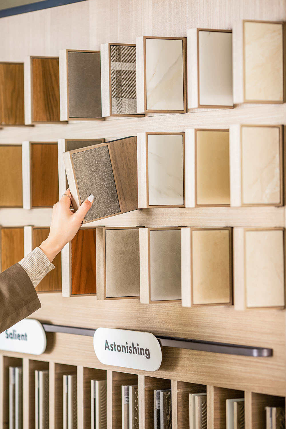
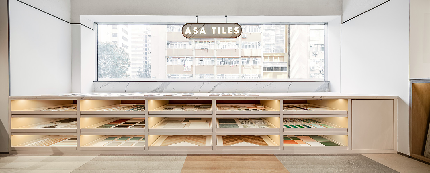
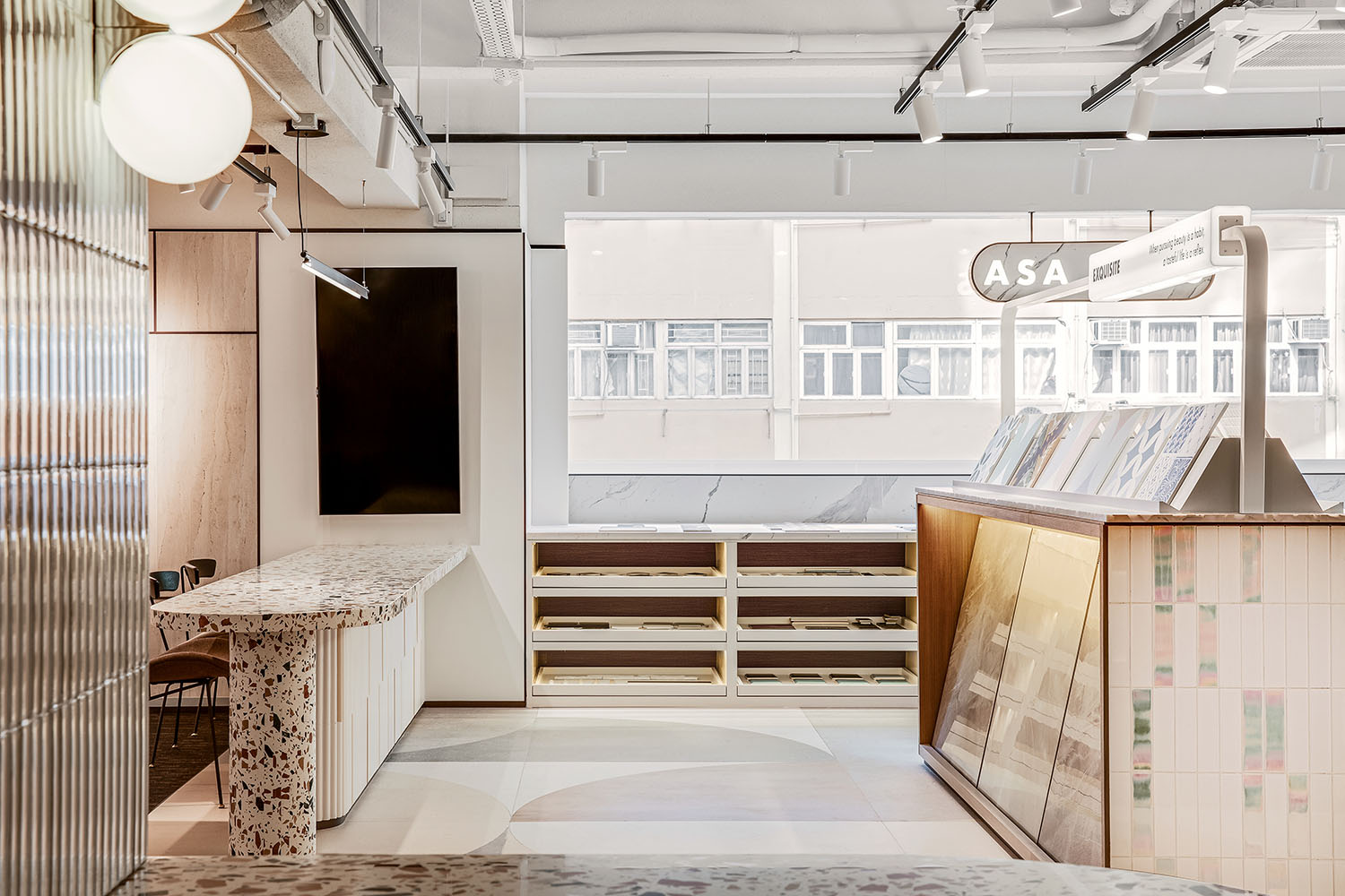
在陳列細節上,為了讓消費者本能關注產品本身,部分瓷磚樣板被集成在展櫃中,形成隱藏式的設計師線下靈感庫;
In the display details, in order to let consumers instinctively focus on the product itself, some tile samples are integrated in the showcase, forming a hidden offline inspiration library of designers;
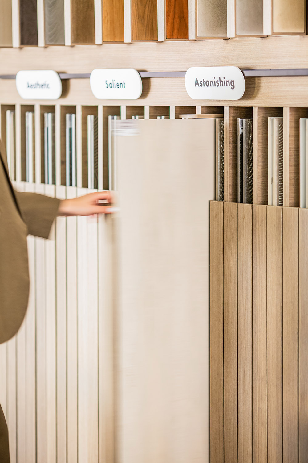
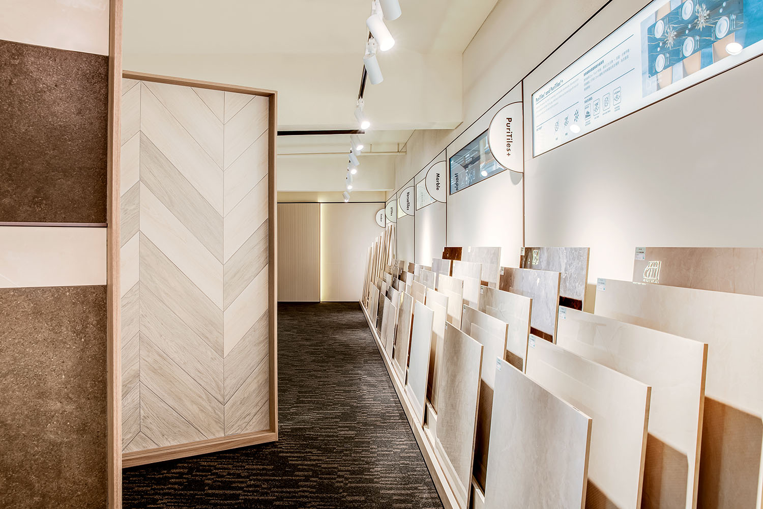
設計師還為尺寸較小的瓷磚構建瓷磚“書架”,這樣樣板就可以像書籍一樣,被整齊地陳列在展架上,隻要走近,就能仔細觀察、閱讀、觸摸它的顏色、圖案和肌理;
The design team also built tile “bookshelves” for smaller tiles, so that the samples can be neatly displayed on the display shelves like books, and as soon as you approach, you can carefully observe, read and touch its color, pattern and texture.
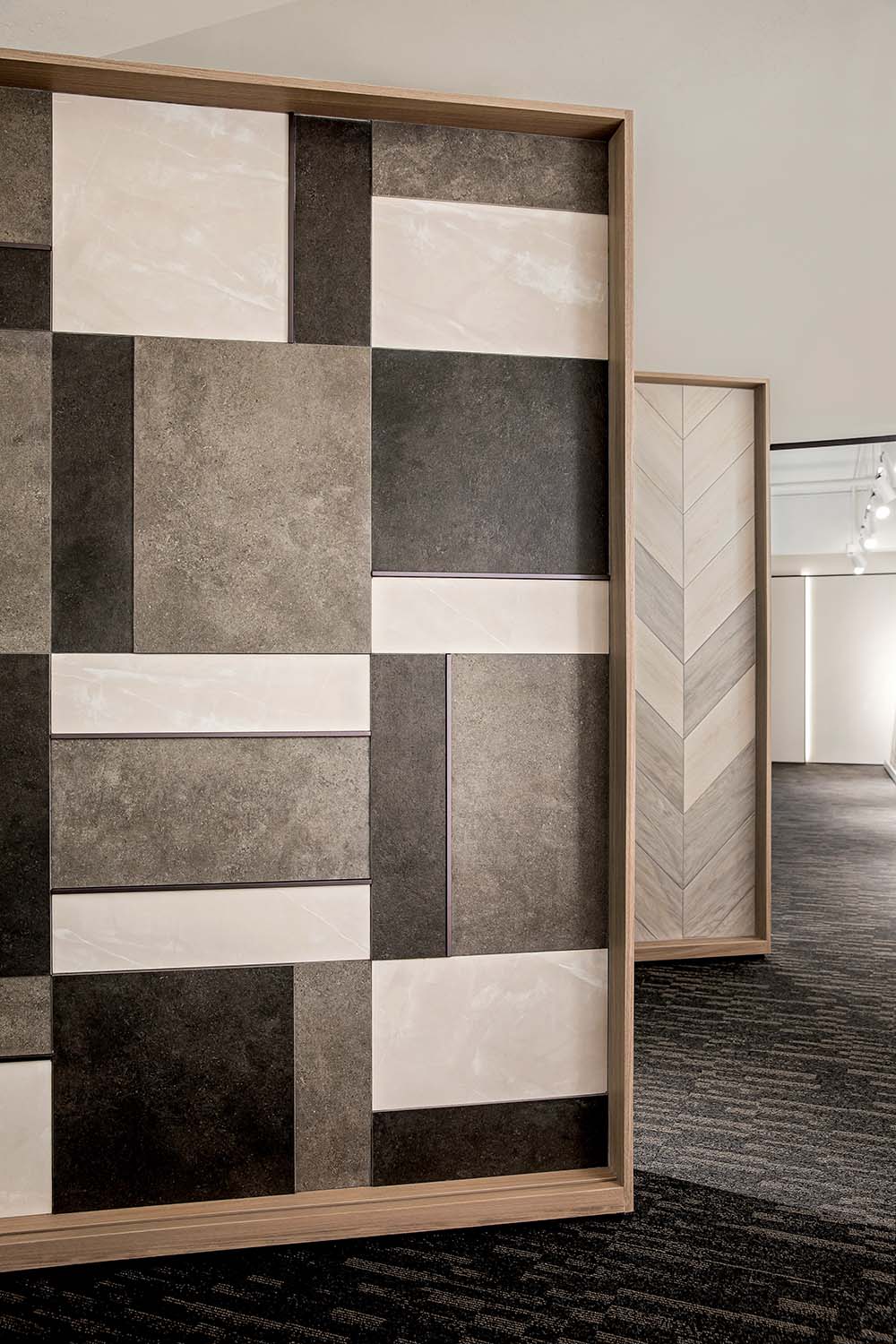
尺寸較大的則被放置在可移動的牆板之上。針對產品進行重點照明的可移動射燈,還能根據空間變化調整氛圍,創造分時場景的融合與統一。
The larger sizes are placed on top of movable wall panels. The moveable spotlights that focus lighting on the products also adjust the atmosphere according to the change of space, creating the integration and unity of time-sharing scenes.
窗邊再一次出現懸掛的品牌名稱,既強調了品牌,又把品牌與外部視野融為一體,植入品牌心智的同時,又延伸了空間體驗與思考方向,構建恰如其分的消費關係。
Once again, the brand name hanging by the window emphasizes the brand and integrates it with the external view, implanting the brand mind while extending the space experience and thinking direction to build the appropriate consumer relationship.
除此之外,設計師還深諳水滿則溢的原理,在空間中搭配其他材料,牆麵配以溫潤的原木,地麵則地毯與瓷磚進行劃分,就像玩俄羅斯方塊一樣,集結不同材料 、尺寸、形狀的材料,完成這次係統性的設計嚐試,也讓消費者在這個空間中輕鬆呼吸。
In addition, the design team also understands the truth of “too much water drowned the miller”. They match other materials in the space, like the walls with warm logs, the floor with carpets and tiles for division, just like playing Tetris, gathering different materials, sizes and shapes to complete this systematic design attempt, and also allowing consumers to breathe easily in this space.
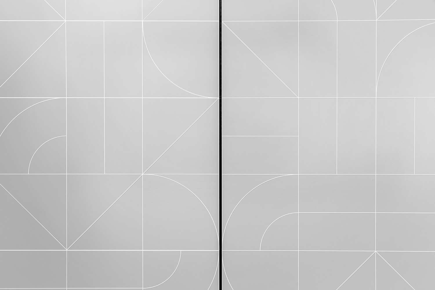
瓷磚在通過二次藝術創作拚貼後,展示出材料本身的可塑性與生命力,以藝術續寫新的品牌故事,成為新的品牌內容符號,也為家注入更多現代生活想象力。
The tiles, after being collaged through twice art creation, show the flexibility and vitality of the material itself, renew the brand story with art, become a new brand content symbol, and also inject more modern life imagination into the home.
“在一切皆可數字化的當下,消費者對實體商業的要求勢必更高,更獨特、更溫度、更具故事性……成為新的商業空間標準,而設計隻是一種手段,並非最終訴求,隻有當產品回歸於產品,我們才能創造更好的氛圍與內容實現用戶需求,踐行品牌的[長期主義]的命題,實現新場景激活。”
“At a time when everything is digital, consumers are bound to demand more for traditional commerce. Features like uniqueness, temperature and storytelling are becoming the new commercial space standards. Design is only a means of realizing it, not the ultimate demand. Only when the product returns to the product can we create a better atmosphere and content to achieve user demand, to practice the brand’s [long-termism] proposition and finally achieve new scene activation.”
∇ 平麵圖
項目信息
項目名稱:ASA瓷磚展廳
項目類別:商業空間
項目業主:亞細亞瓷磚
服務內容:策劃/室內設計
設計機構:Oft Interiors
主持設計:鄒卓明/張敬貴
設計團隊:Samantha Chan
項目地址:香港
項目攝影:hdp
項目麵積:200㎡
Project Name: ASA Tile Showroom
Project category: Commercial space
Project Owner: ASA Tile
Services: Planning/Interior Design
Design Agency: Oft Interiors
Lead Designer: CM JAO / Ken Cheung
Design Team: Samantha Chan
Project Location: Hong Kong
Project Photography:hdp
Project Area:200㎡


