一逕抱幽山
居城市間
——宋·蘇舜欽
《水調歌頭·滄浪亭》
Embracing Youshan
Actually City Room
——Song Su Shunqin
“Shui Tiao Song Tou Canglang Pavilion”
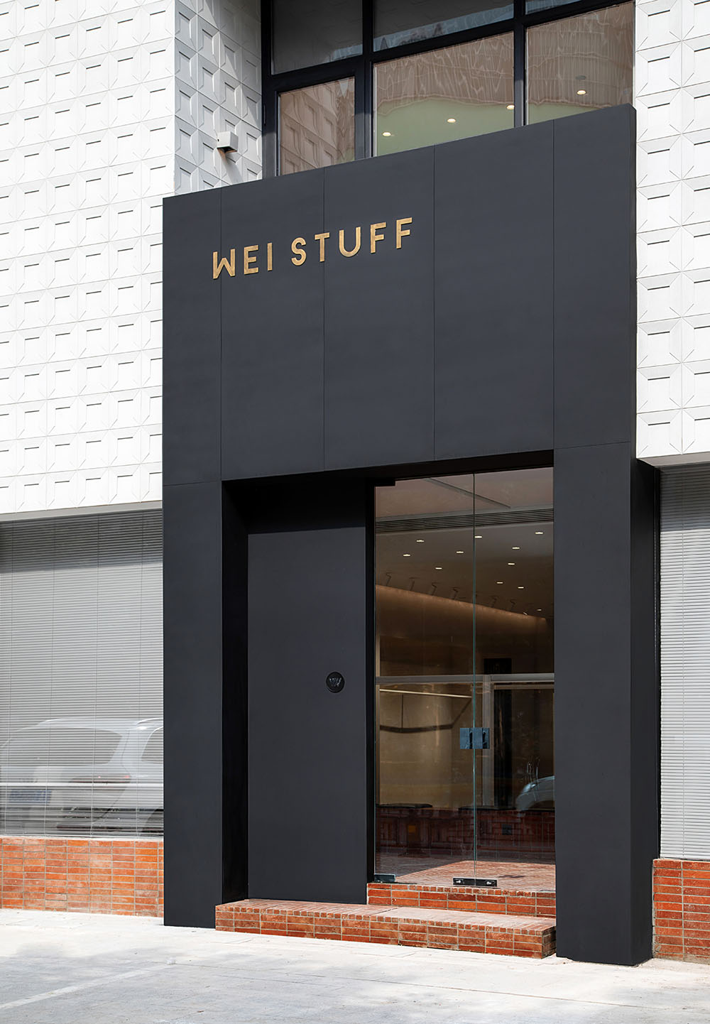
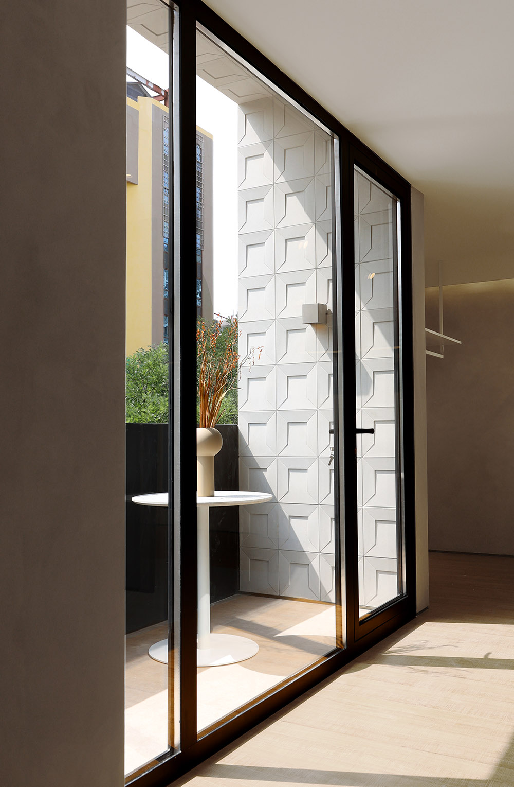
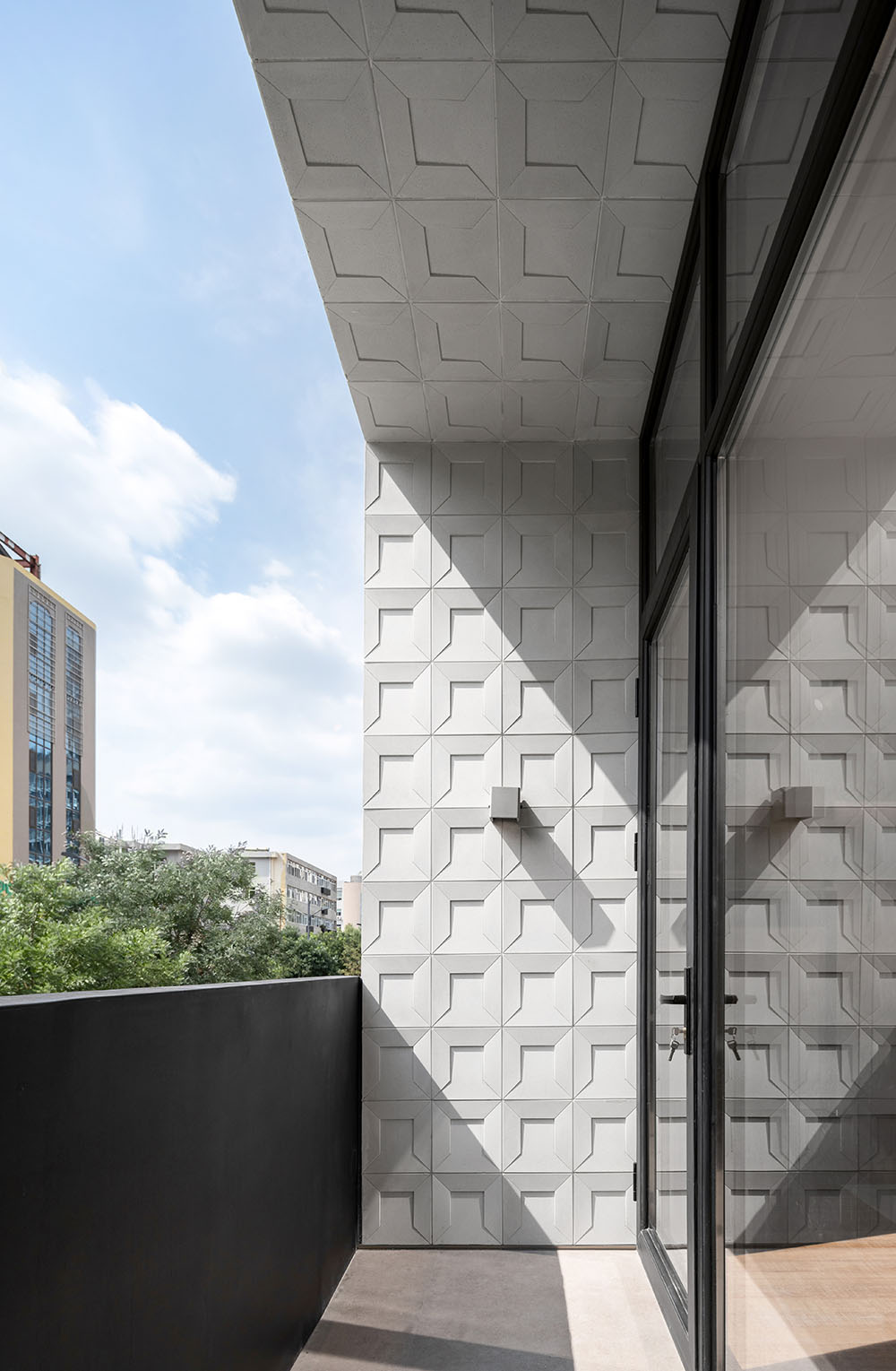
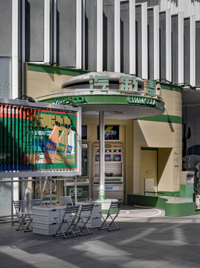
∇ 外立麵概覽 Facade overview
WEI STUFF,末染設計全案設計項目,曆時彌久,無一處不傾注心血。“品牌、空間、產品,全方位武裝到牙齒”。但我們其實隻想表達一件事情:讓空間內的一切都是那麼自然得當。
WEI STUFF, the final dye design full case design project, lasted for a long time, and no effort was devoted to it. “Brand, space, and products are all armed to the teeth.” But we only want to express one thing: to make everything in the space so natural and proper.
自然質樸的親近感|Natural intimacy
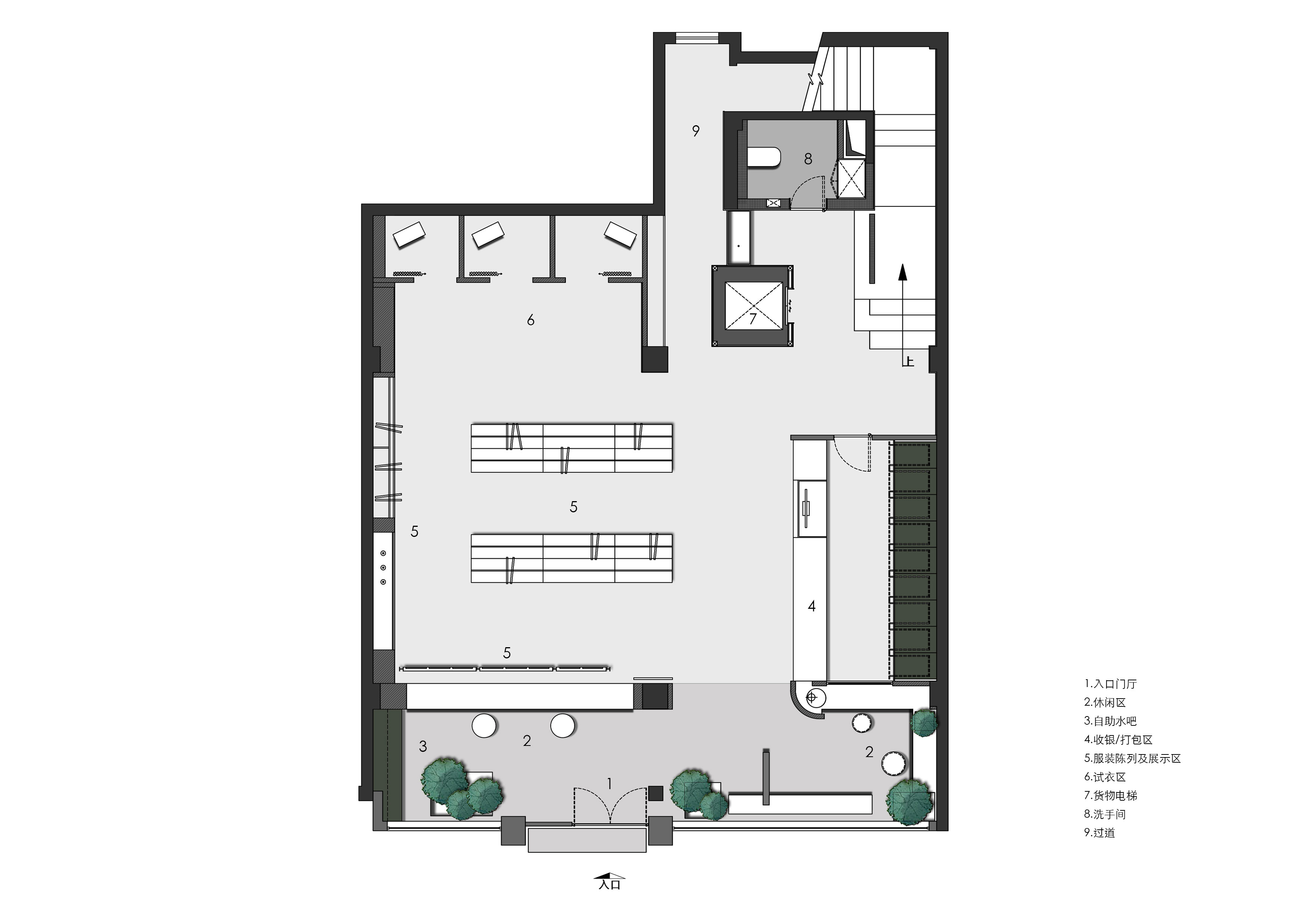
一樓 ,不定義空間
The first floor is provided with undefined space
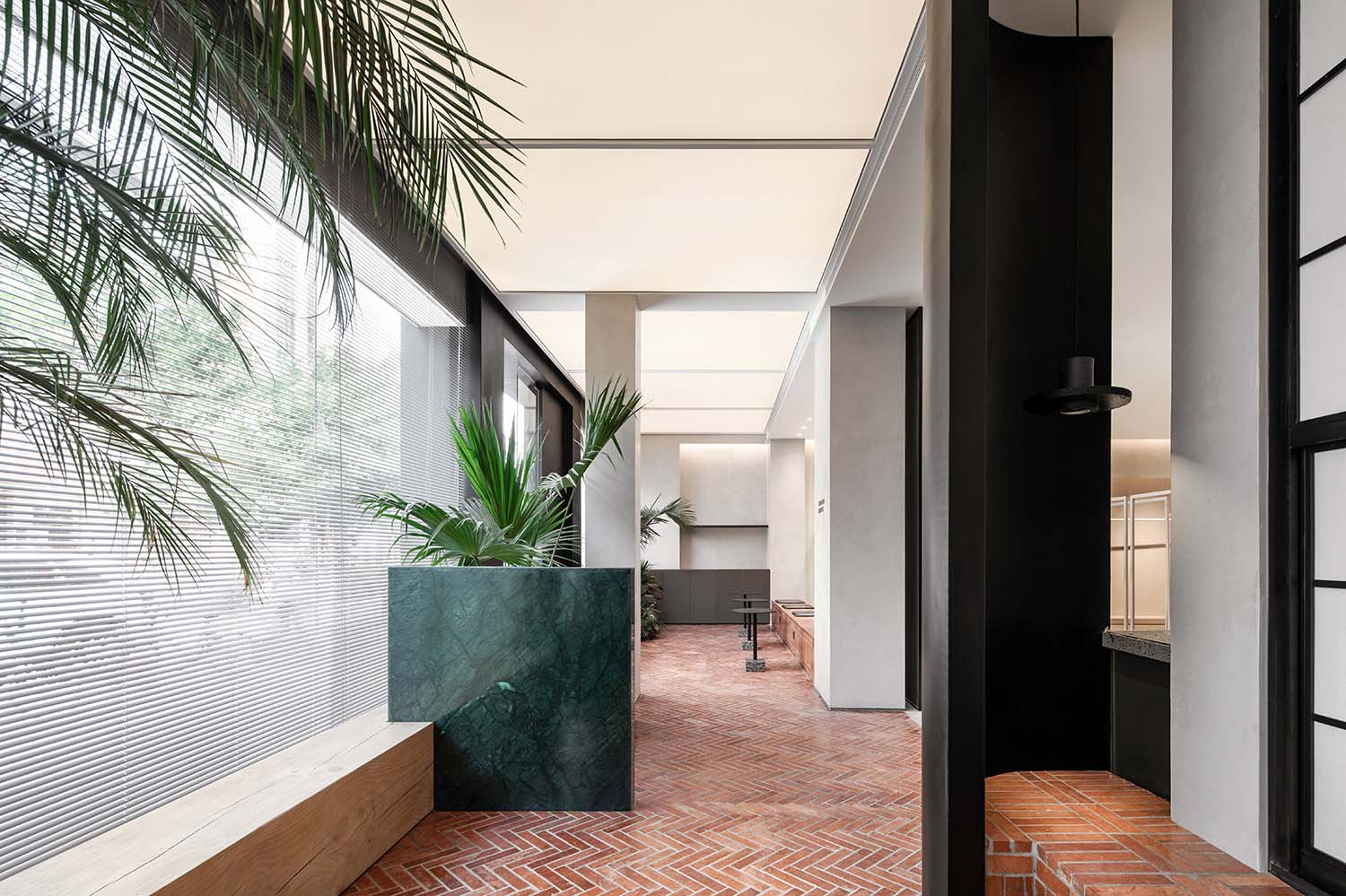
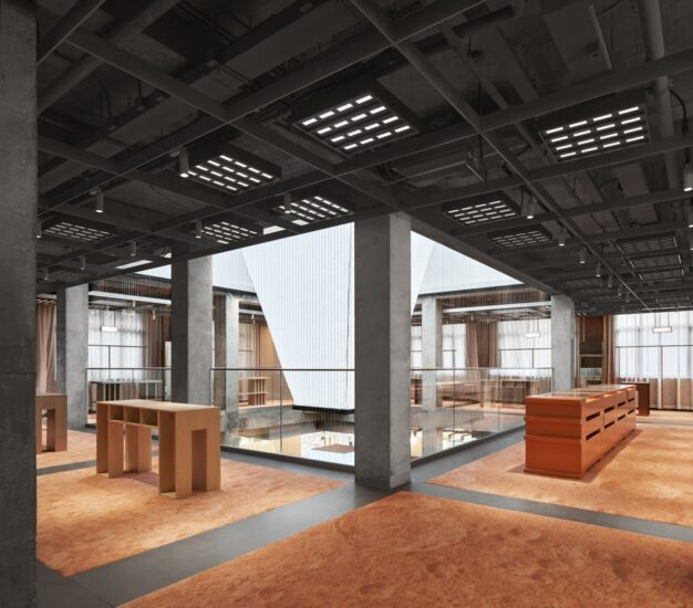
∇ 地麵大麵積紅磚定義出整體溫暖印象 The large area of red bricks on the ground defines the overall warmth
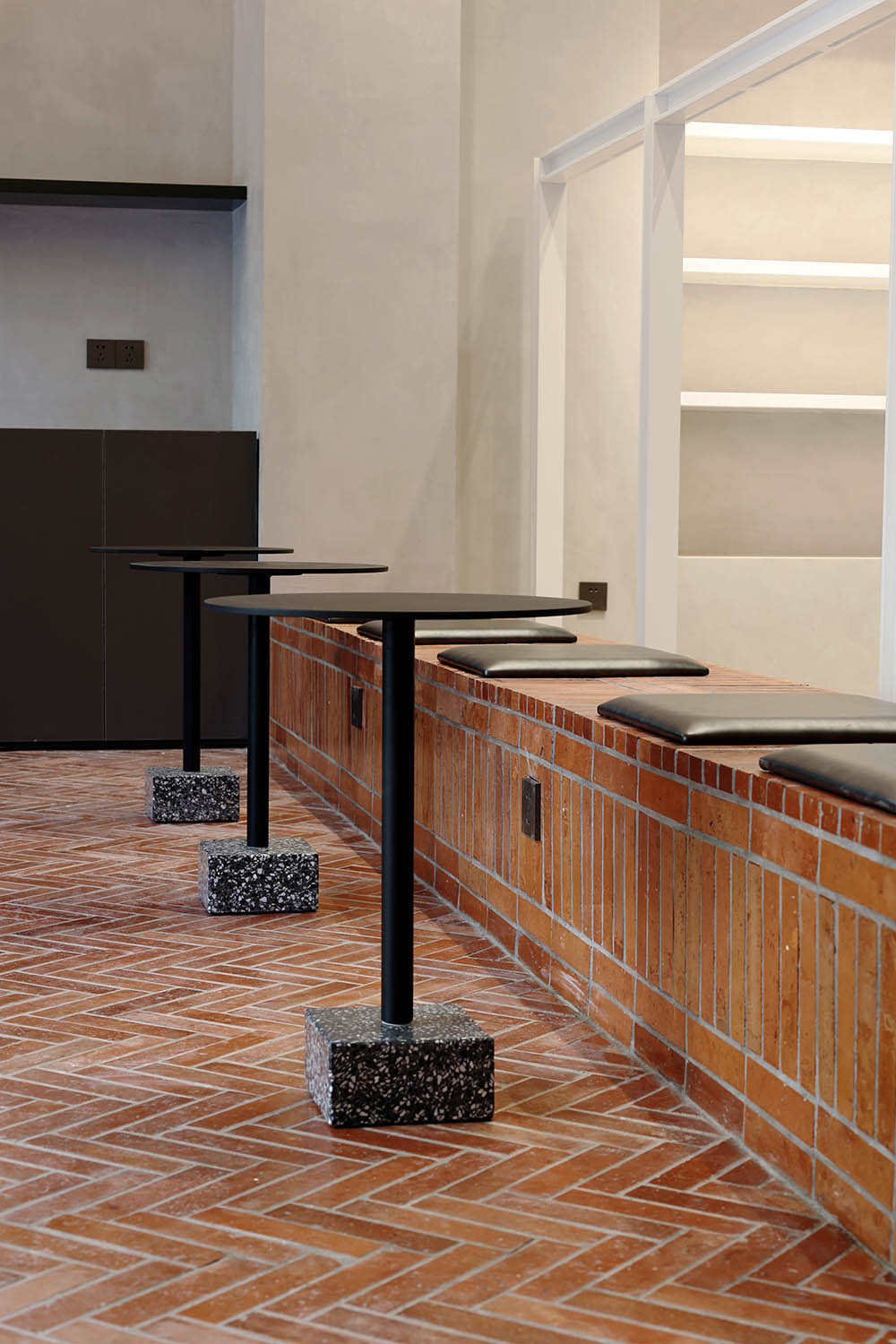
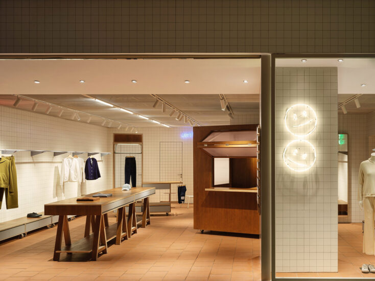
選用曆久彌新的老紅磚,切割成片3厘米薄片,人字形均勻鋪貼在地麵及卡座位置,呈現平滑且利落的平麵和立麵,又在間隔加入淺灰混凝土質材,有很好的壓製住紅磚本身粗曠的材質語言,清晰幹淨後用一層清漆罩麵,給予其溫潤的質地,在將美麗封存的同時,也能禁受住時間帶來的考驗。
Choose the old red bricks that have been growing for a long time and cut them into slices of 3 cm. The chevrons are evenly spread on the ground and the deck position, presenting a smooth and neat plane and elevation, and adding light gray concrete materials at the intervals, which has a lot of It is good to suppress the rough material language of the red brick itself. After being clear and clean, it is covered with a layer of varnish to give it a warm texture. While sealing the beauty, it can also withstand the test of time.
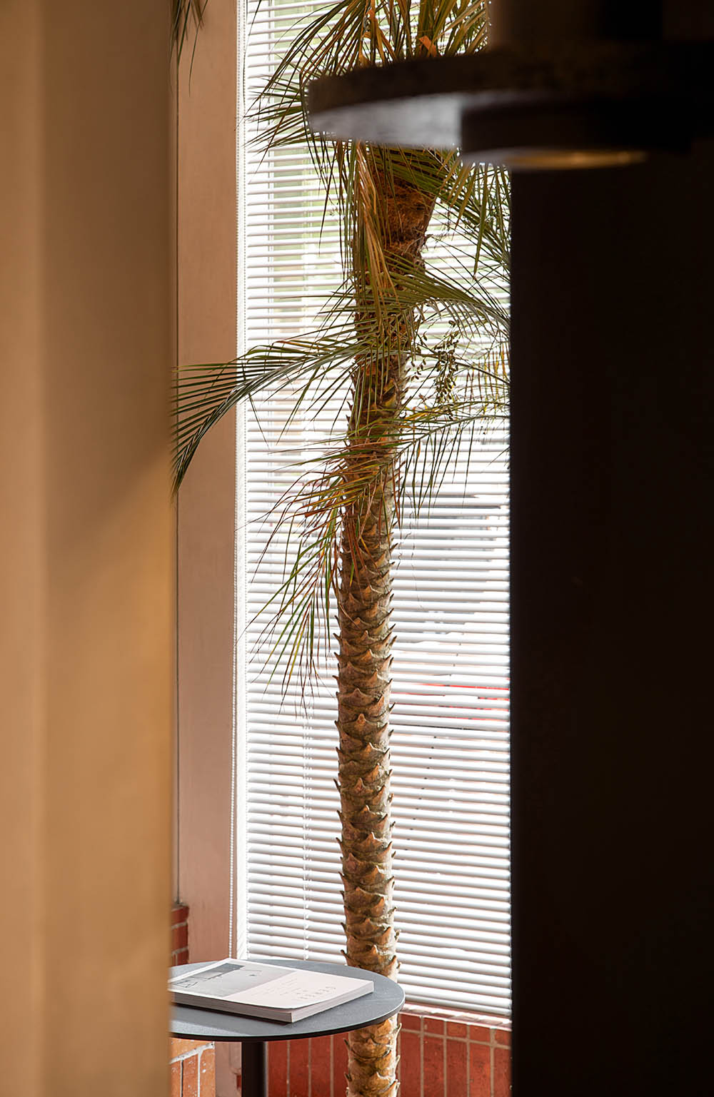
造就詩意的光影打造優雅又兼具現代感的空間。搭配一麵麵玻璃窗將自然光引入,幫粗曠的紅磚空間揉入現代俐落感。在這個鏡麵空間之內,人、器物、家具與植物景觀相互映射,實像與鏡像疊合交織於一處,人與物產生有趣的關聯。
Create a poetic light and shadow to create an elegant and modern space. Paired with glass windows on one side introduces natural light, helping the rough red brick space blend into a modern and tidy sense. In this mirrored space, people, utensils, furniture, and plant landscapes are mapped to each other. Real images and mirror images are superimposed and interwoven together, creating an interesting relationship between people and objects.
紅磚自帶的複古韻味無論用在哪裏,都能讓空間呈現出一種經時間洗禮後深厚底蘊。尤其在複古潮流的當下,我們讓紅磚成為一種記憶符號。
The retro charm that comes with the red bricks, no matter where it is used, can make the space show a deep heritage after the baptism of time. Especially in the current retro trend, we let the red brick become a kind of memory symbol.
室內部分用最本質的材料創造出一種微妙的和諧感;流動的空氣、變化的光線,都是設計考量的一部分。最終營造出一個自然和城市、室內與室外、過去與未來之間不中斷的敘事空間。
The interior part uses the most essential materials to create a subtle sense of harmony; flowing air and changing light are all part of the design considerations. Finally, an uninterrupted narrative space between nature and city, indoor and outdoor, past and future is created.
一窗之隔|One window away
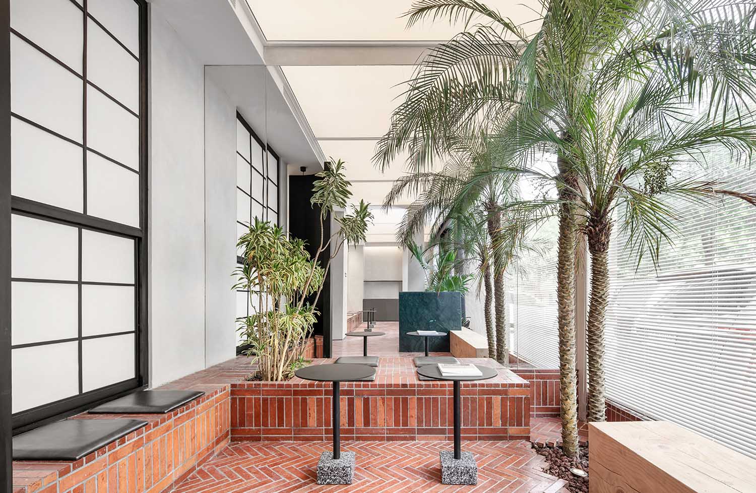
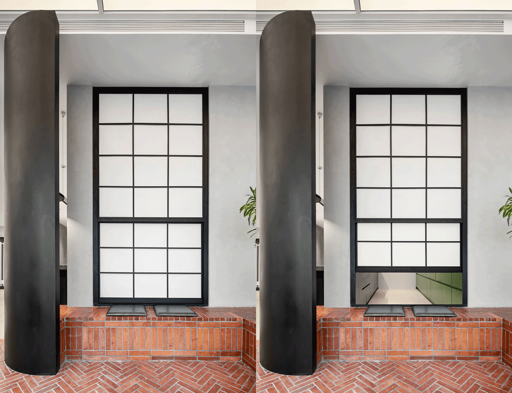
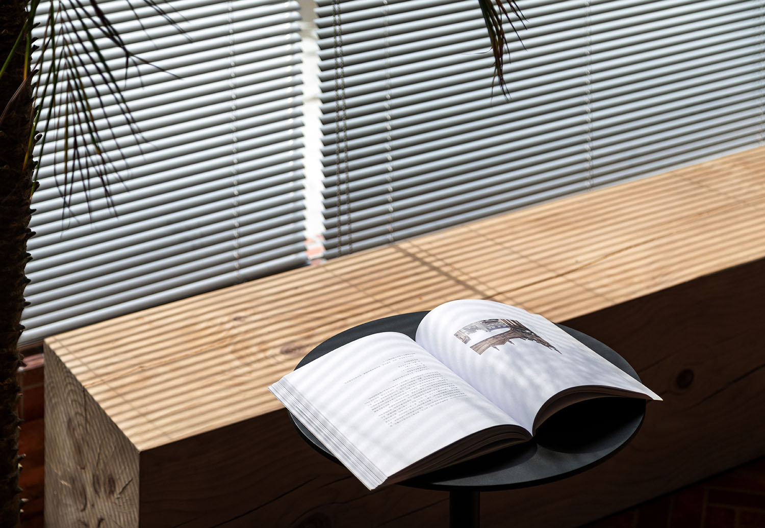
麵向休閑區一側設置了一扇可以向上推拉的窗戶,在天氣宜人的時候都可以完全打開,讓內外連通增加互動。而在窗戶上我們沒有使用玻璃來作為隔斷,而是用“透光的紙”讓內部的光線顯得柔和與溫暖。
A window that can be pushed upwards is set on the side facing the leisure area, which can be fully opened when the weather is pleasant, allowing the connection between the inside and the outside to increase the interaction. On the windows, we did not use glass as a partition, but used “transparent paper” to make the internal light appear soft and warm.
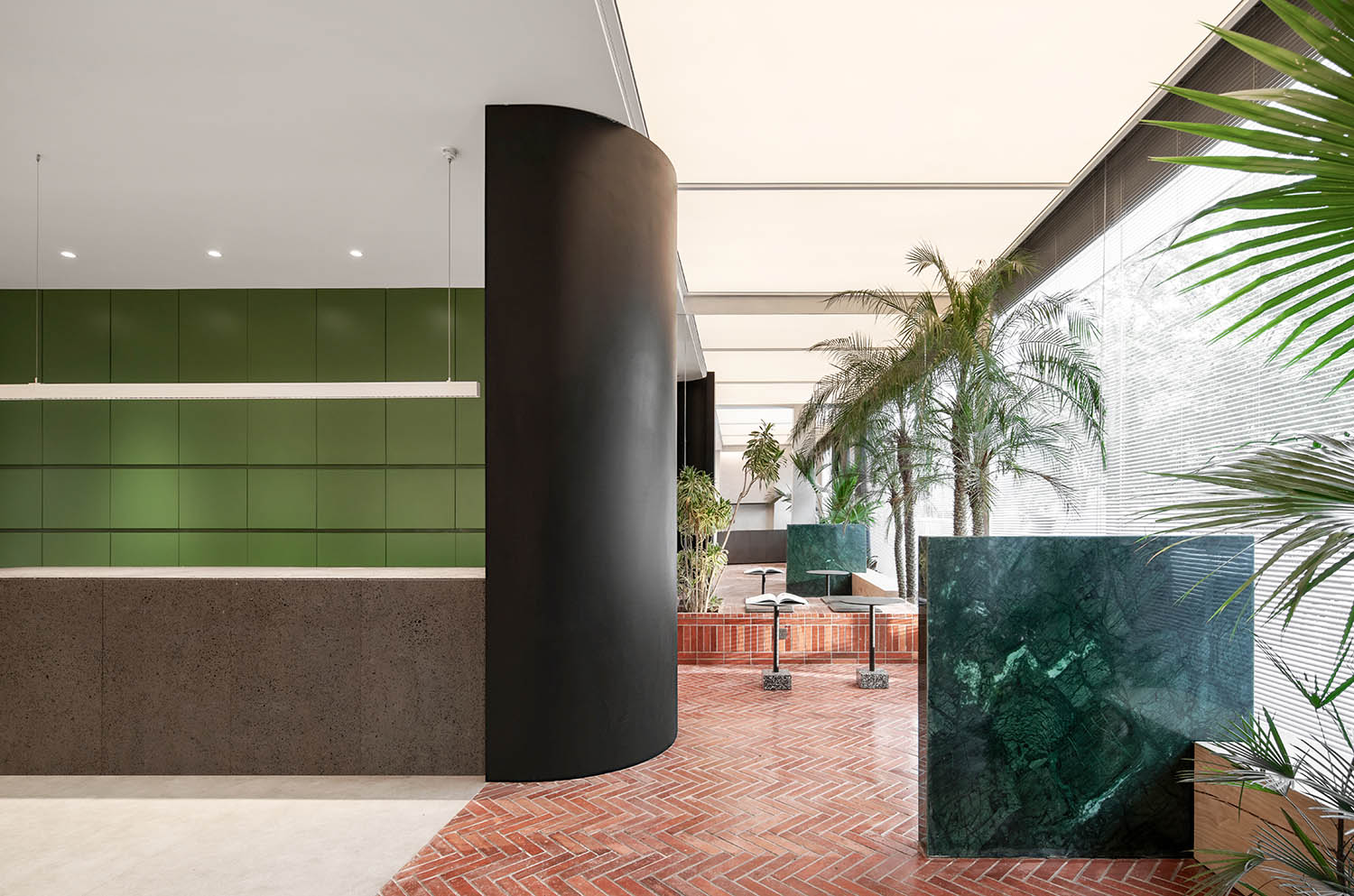
吧台的弧形牆體,自然的融入在空間內。軟膜天花也模擬了自然光的天井,彰顯自然的光線氛圍,吧台沒有過多的裝飾,與精致的空間與陳設形成對比,愈發的映襯出空間的細膩。
The curved wall of the bar is naturally integrated into the space. The soft film ceiling also simulates the patio of natural light, highlighting the natural light atmosphere, the bar is not too much decorated, and it contrasts with the exquisite space and furnishings, reflecting the exquisiteness of the space more and more.
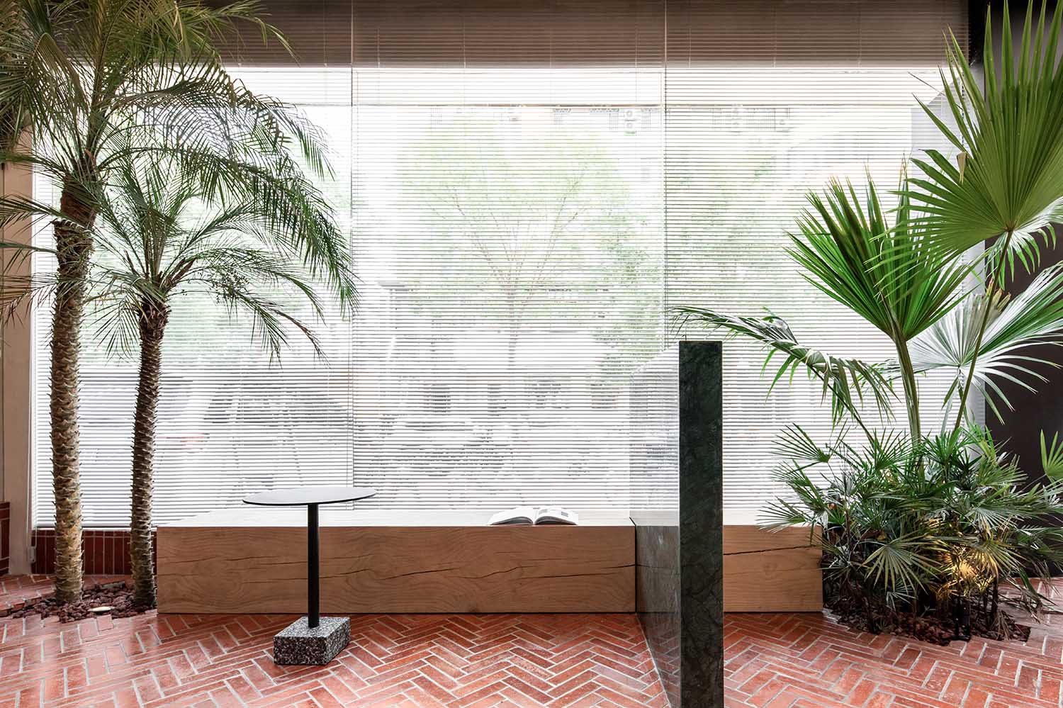
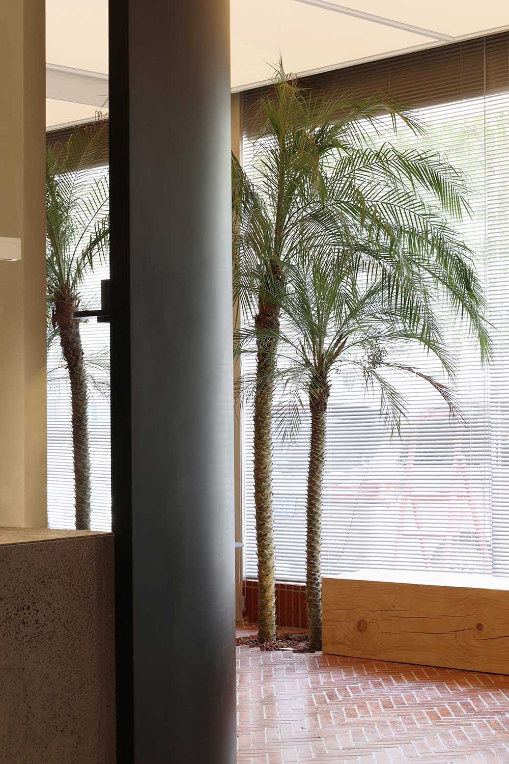
打破常規的材質平鋪,將紅磚以陣列排布的方式疊加、堆砌於地麵、卡座之上,形成視覺上的聚焦點與衝突感。而綠植與綠色石材的加入,既避免了單一材質滿鋪的單調與呆板,增加了空間的層次,又可以將環境光暗藏其中,營造溫馨的就餐氛圍。
Breaking the conventional material tiling, the red bricks are superimposed in an array arrangement and stacked on the ground and the deck to form a visual focus and sense of conflict. The addition of green plants and green stone not only avoids the monotony and dullness of a single material, but also increases the level of the space. It also hides the ambient light and creates a warm dining atmosphere.
看見”韻律與節奏|“Seeing” Rhythm
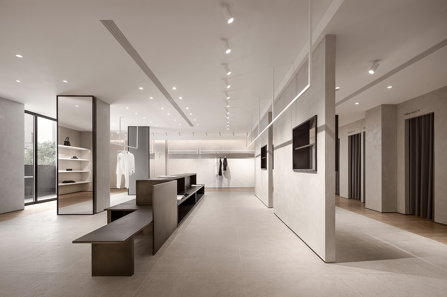
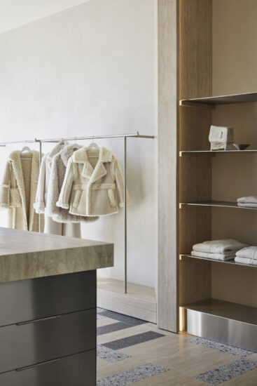
紅磚之外,選取“灰與白”作為頂和地的主色調,輔以白色的掛衣道具及置物層板,打上柔和的暖光,從玻璃窗望進去仿佛一場舞台劇正上演,置身於空間中的客人就是劇中人,每一位都是自己那一幀故事的主角。外圍途經的路人,就像觀看一出出表演,禁不住幻想自己也是其中之一。
In addition to the red bricks, “grey and white” is selected as the main color of the roof and the ground, supplemented by white clothes hanging props and storage shelves, and soft warm light, looking through the glass windows as if a stage play is being performed. The guests in the space are the people in the play, and each of them is the protagonist of their own story. The passers-by passing by, like watching a performance, can’t help but imagine that they are one of them.
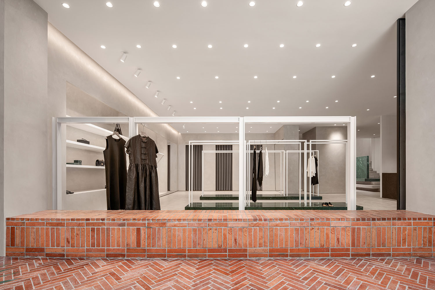
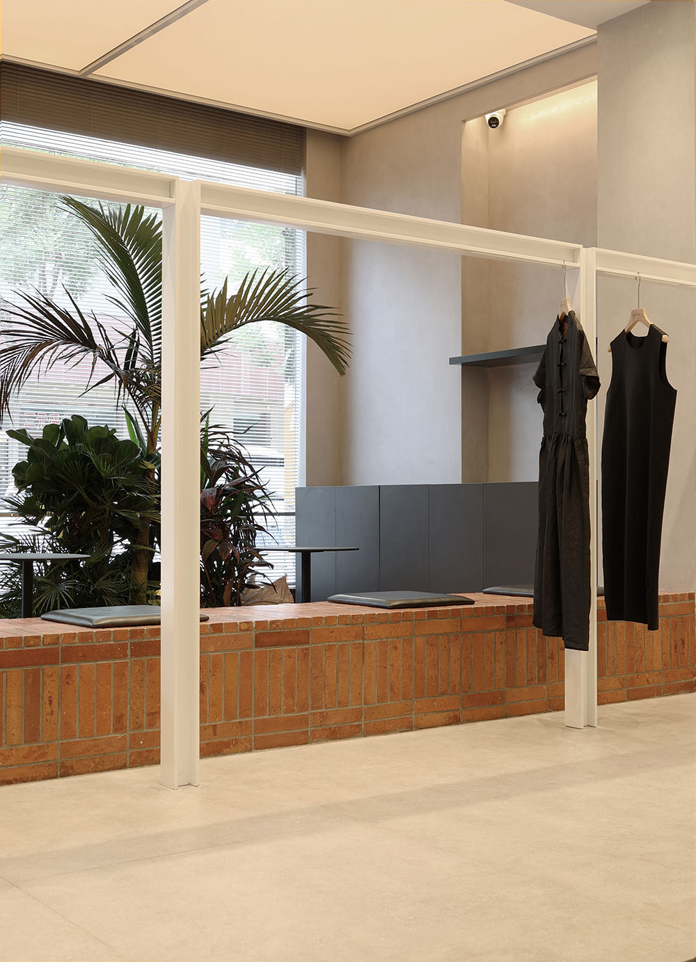
我們對材料的精挑細選也決定了空間的造型和氣質,柔軟的織物緩解了地磚和金屬所帶來的冷硬感。所以物體本身存在的價值就是多樣性的,可以通過某一種物質中的材質,或是某一種物體構造去模糊空間和另一個界麵的關係,空間也就存在了更大的價值變化。空間與品牌產生對話,建立一個態度,向市場發出一個聲音,追求一種永恒的美。
Our careful selection of materials also determines the shape and temperament of the space. The soft fabric relieves the cold and hard feeling brought by the floor tiles and metal. Therefore, the value of the object itself is diverse, and the relationship between the space and another interface can be blurred by the material in a certain substance or the structure of a certain object, and the space also has a greater value change. The space has a dialogue with the brand, establishes an attitude, sends a voice to the market, and pursues a kind of eternal beauty.
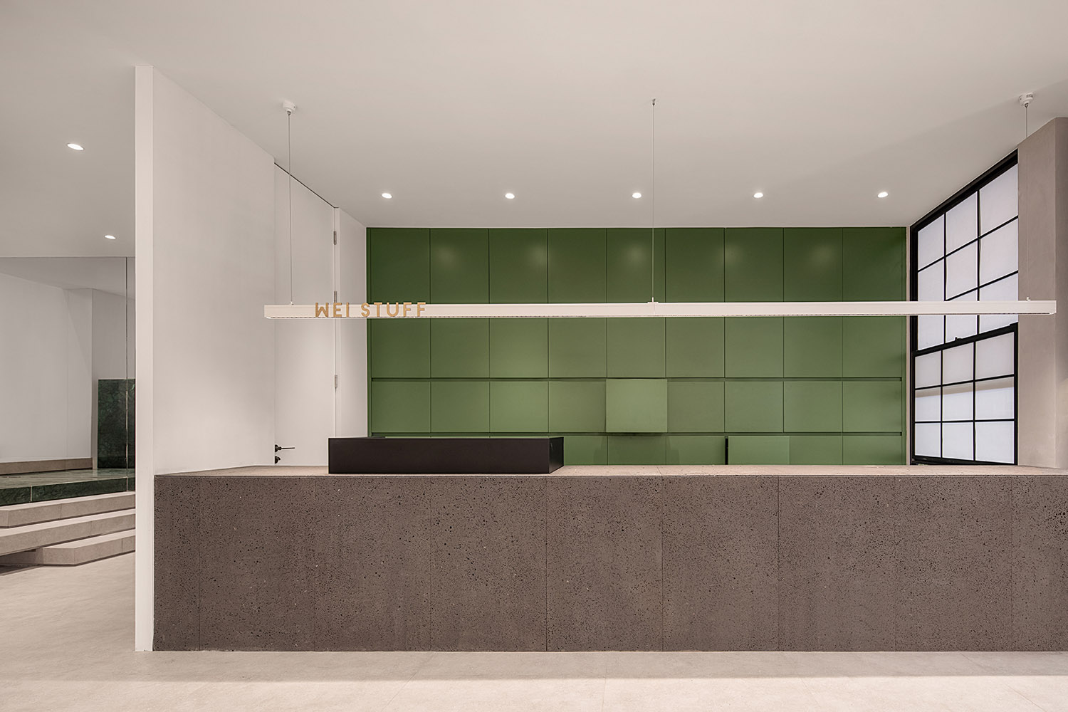
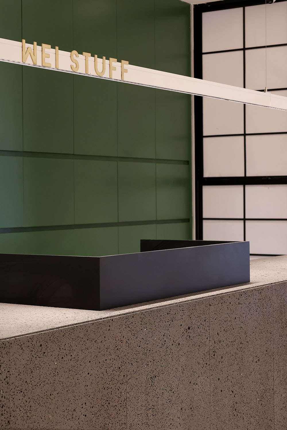
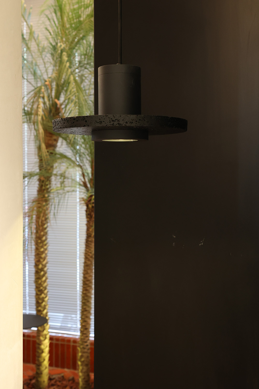
收銀台使用了天然火山岩作為飾麵材料,給人在無論視覺還是觸覺上,都帶來深刻的體驗,提供一個使人沉浸和愉悅的外表,使得我們的眼睛和所有的感官被誘醒,去形成一個從進入開始的完整的體驗感。
The cash register uses natural volcanic rock as the facing material, which brings a profound experience to people in terms of vision and touch, and provides an immersive and pleasant appearance, so that our eyes and all senses are awakened. Form a complete sense of experience from entering.
∇ 柔和的光線照射在火山岩的紋理上,露出它的顆粒和輪廓
The soft light shines on the texture of the volcanic rock, revealing its grains and contours
一麵的我是告別過去的我
一麵的我是嶄新美好的我
On the one hand, I say goodbye to the me in the past
One side of me is a new and beautiful me
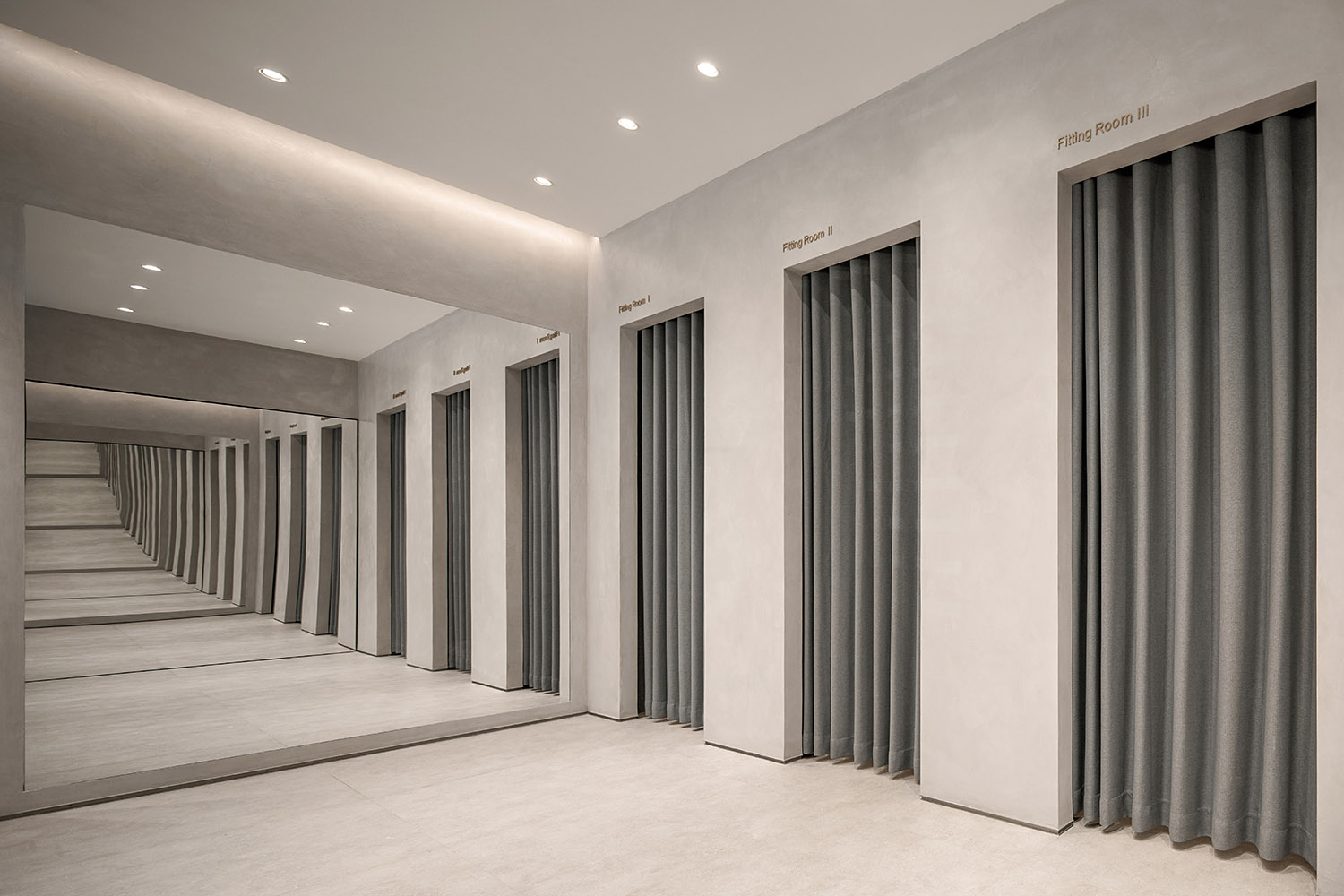
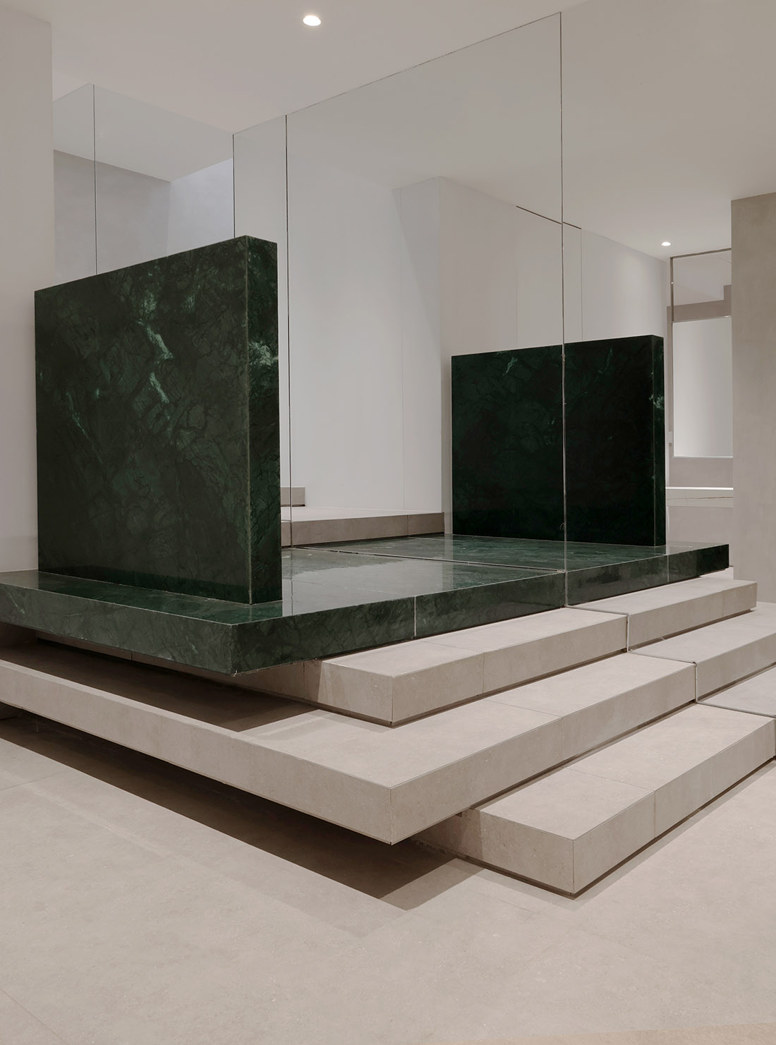
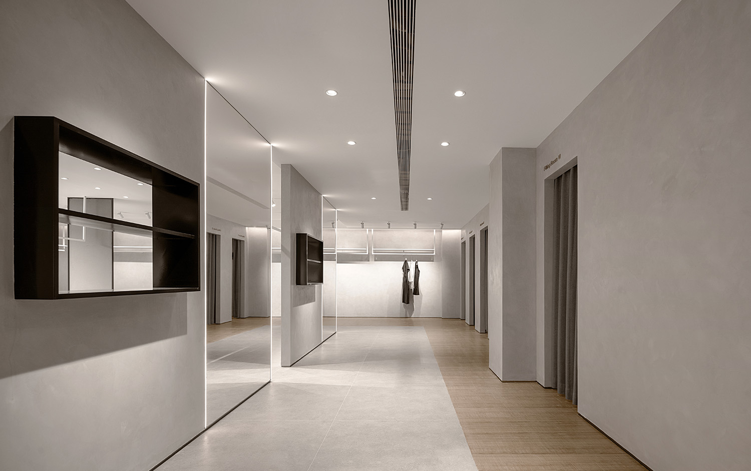
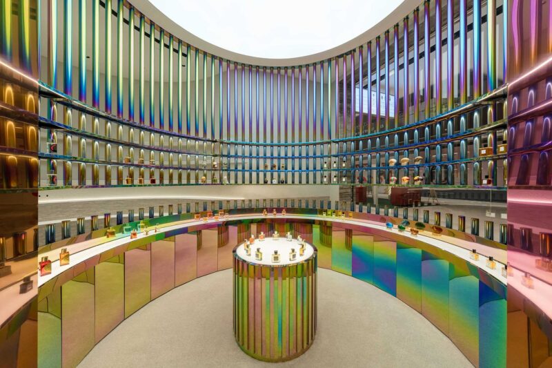
為了減輕空間的壓力並實現展示空間的延展,我們引入了兩塊大的鏡子。在設計過程中,我們通過反複的試驗來模擬鏡麵在場地中的反射效果,通過探討鏡麵的擺放方式,組織調整在空間中的遊覽路線,以達到增加空間的層次,增加遊覽時間的目的。通過鏡麵之間產生的德羅斯特效應,形成一個個沒有邊界的無限空間,讓參觀者的視線能得到最大限度的延伸。
In order to reduce the pressure on the space and realize the extension of the exhibition space, we introduced two large mirrors. In the design process, we simulated the reflection effect of the mirror surface in the site through repeated experiments, and organized and adjusted the tour route in the space by discussing the placement of the mirror surface to achieve the purpose of increasing the level of space and increasing the tour time. Through the Drost effect between the mirrors, an infinite space without boundaries is formed, allowing the visitors’ sight to be extended to the utmost extent.
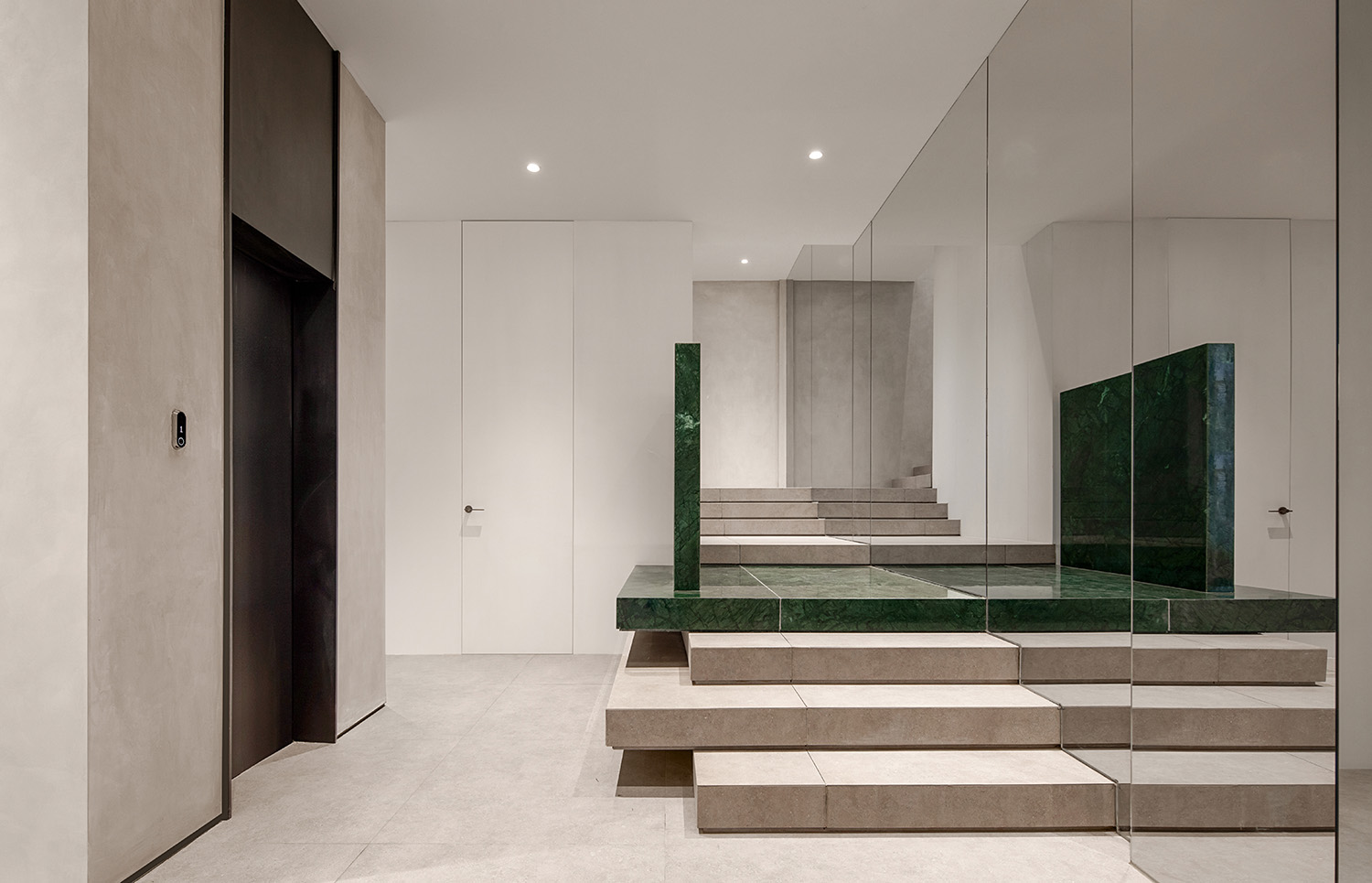
我們還在空間的盡頭設置了一個綠色的體塊。在鏡麵的反射下,這一抹亮眼的綠色反複出現在整個遊覽路線中。這種“看到卻還未走到”的空間體驗將成為參觀者探索空間的重要線索,引領他們繼續向著二層行進。
We also set up a green volume at the end of the space. Under the reflection of the mirror, this bright green appears repeatedly throughout the tour route. This kind of spatial experience of “seeing but not yet coming” will become an important clue for visitors to explore the space, leading them to move on to the second floor.
平行空間的“內外關係”|The inside-out relationship of the parallel space
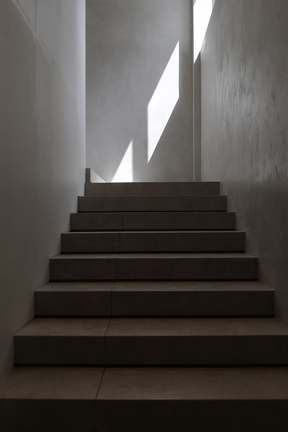
樓梯形成了一道景觀。我們沒有重新更換樓梯的位置,而是對舊建築進行了大量的結構重塑。在進入樓梯的前一段,一側牆的牆麵安裝鏡麵,由立方體塊組合而成的風景,與鏡子裏的虛像形成視覺圖像的關聯。使原本單一的空間在視覺上變的開闊,鏡子的加入也讓原本單調的空間多了一些趣味。
The stairs form a landscape. We did not change the position of the stairs, but made a lot of structural remodeling of the old building. Before entering the stairs, a mirror is installed on the wall of one side wall, and the scenery formed by the combination of cube blocks forms a visual image connection with the virtual image in the mirror. The original single space becomes visually open, and the addition of mirrors also makes the original monotonous space more interesting.
樓梯間的窗戶給室內帶來了豐富的光線。一天當中不停變化的太陽高度角控製了光線的變化,加強了空間內昏暗區域的光照強度。陽光和陰影的軌跡共同塑造了空間給人的感受。
The windows in the stairwell bring abundant light to the interior. The constant change of the sun’s altitude throughout the day controls the change of light and strengthens the light intensity in the dim areas of the space. The trajectory of sunlight and shadow together shape the feeling of the space.
在優雅自由的線條上,素麵朝天的地麵材質去掉了所有的裝飾,把服裝掛進去,傳達出舒服的、藝術的、自由的空間氣息。每個人眼中的自由不同,比如有經典的自由,恒久的自由,但這傳達的並不是視覺,而是自由的情緒表達,消費者會被這種氣息所吸引,從而感受這個空間的態度。
On the elegant and free lines, the ground material that faces the sky removes all the decorations and hangs the clothes in to convey a comfortable, artistic and free space atmosphere. Everyone sees freedom differently. For example, there is classic freedom and permanent freedom, but what it conveys is not vision, but free emotional expression. Consumers will be attracted by this breath and feel the attitude of this space.
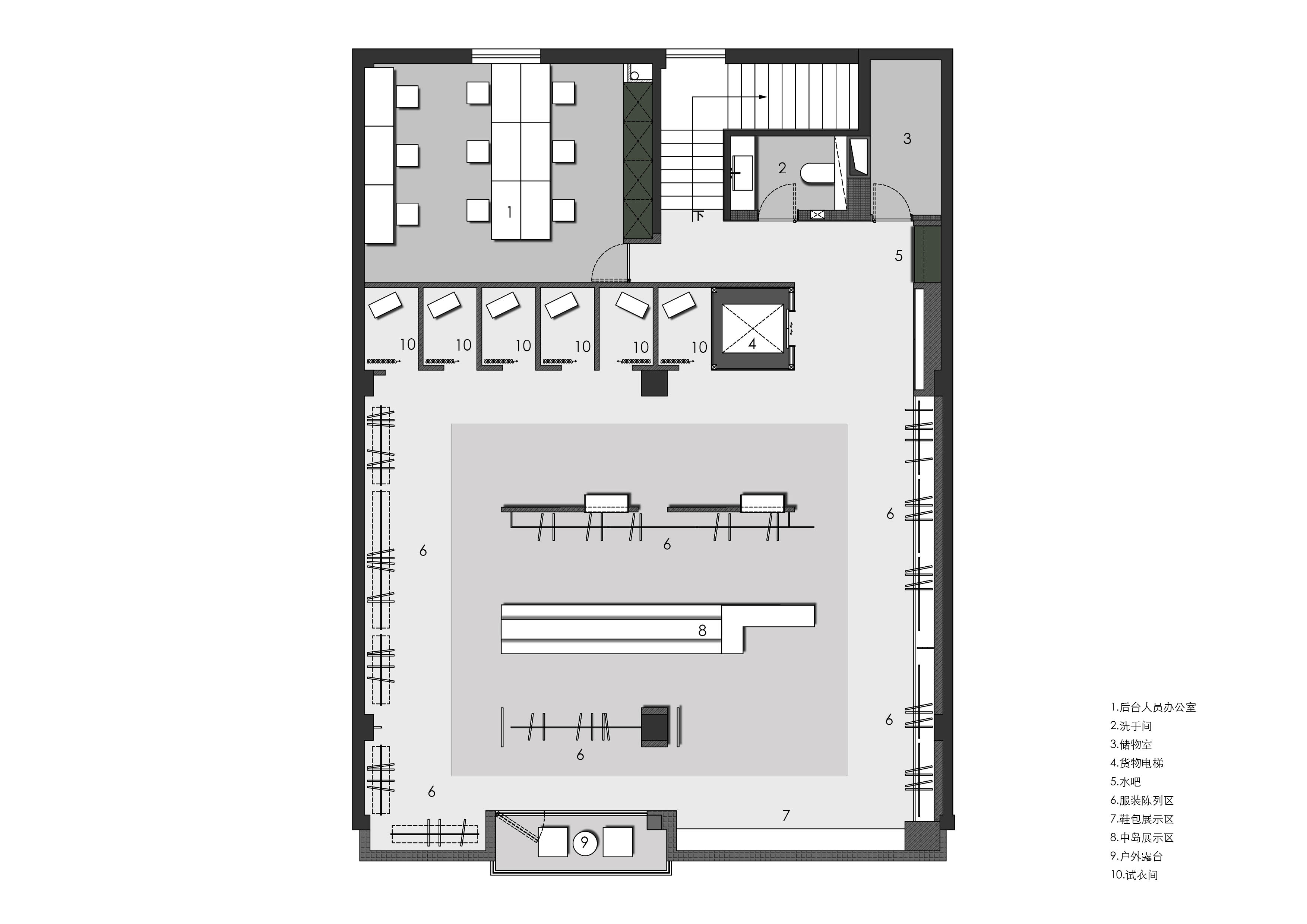
二層作為VIP展示區,設計師希望整個消費體驗更具有儀式感,所以空間運用教堂式的建築形態來契合這個買手店的品牌信仰,延續一層中軸線的構圖及對稱式設計語言,賦予了空間儀式感和神聖感,讓空間能夠代替侍者的一些部分,自由又稍稍帶些莊嚴感。
The second floor serves as a VIP display area. The designer hopes that the entire consumer experience will have a sense of ritual. Therefore, the space uses a church-like architectural form to fit the brand beliefs of this buyer’s store, and continues the composition and symmetrical design language of the central axis of the first floor. In addition, the sense of ritual and sacredness of the space allows the space to replace some parts of the waiter, giving freedom and a little sense of solemnity.
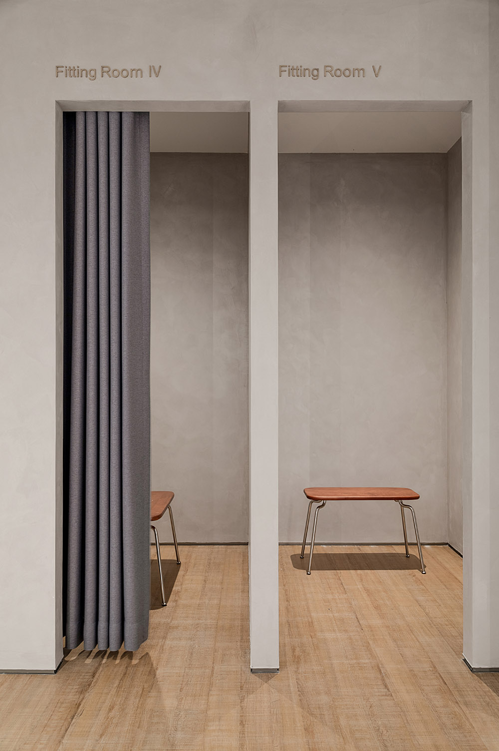
基礎空間延續了一樓的風格,淺木色地板與灰色啞光磚,整體的暖色調讓空間呈現出了柔和的女性氣質;動線設計借鑒了園林營造中的“移步換景”手法,通過隱性的隔斷圍合出一個個日常生活小場景,增加了顧客探索的樂趣。
The basic space continues the style of the first floor, with light wood floors and gray matte bricks. The overall warm color makes the space present a soft femininity; the moving line design borrows Hidden partitions enclose a small scene of daily life, which increases the fun of customers’ exploration.
室內空間中,大量的留白創造了簡約的空間表麵,集中場景美學,放大空間故事。整體空間純淨整潔,強化人對空間框架和秩序的知覺。
In the interior space, a large amount of white space creates a simple space surface, which focuses on the aesthetics of the scene and amplifies the space story. The overall space is pure and tidy, which strengthens people’s perception of space frame and order.
在質樸中洞察美感|The use of simple and natural materials
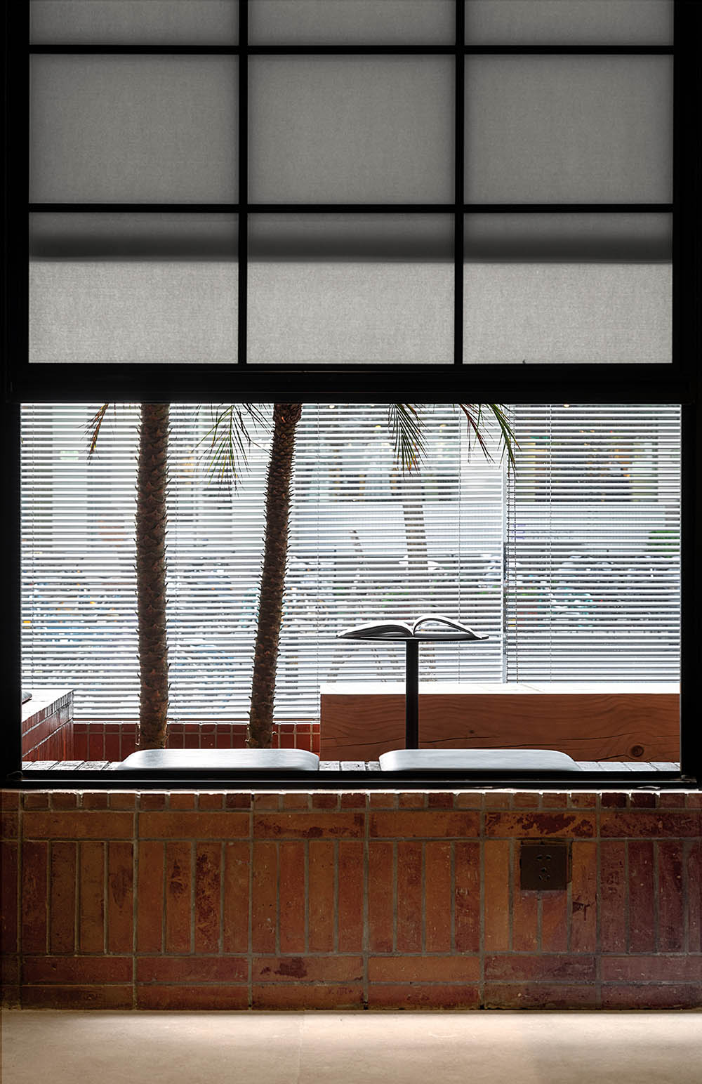
一層層打開,最終看到窗外的風景。這種內部極致的秩序感和看似並列的排布方式卻能讓視線層層遞進,最終聚焦在一窗的景觀中。
Open layer by layer, and finally see the scenery outside the window. This extreme sense of internal order and the seemingly juxtaposed arrangement allows the line of sight to progress layer by layer, and finally focus on the one-window landscape.
自由流淌、明暗交錯、婆娑起舞,是光,亦是空間的韻律。身處幾何牆麵的包圍,倘若隻看到大麵積的純色,也會讓人略微緊張,但若眼前出現粼粼光影,靈動婆娑。
Flowing freely, interlacing light and dark, and dancing whirling, it is light and the rhythm of space. Surrounded by a geometric wall, if you only see a large area of pure color, it will make you a little nervous, but if there are sparkling lights and shadows in front of you, it will be agile.
空間運用低飽和度,純粹的材質在空間中表達出一種靜謐感,跳脫於底色的同時又能與空間氛圍融彙統一。
The space uses low saturation, and the pure material expresses a sense of tranquility in the space. While jumping off the background color, it can be integrated with the atmosphere of the space.
遵從極簡,釋放壓力——讓本該那麼存在著的物體變得簡單,卻由多意、模糊的意念組合而來,營造出由內心觸發,與形式相融的獨有意境。
Follow the minimalism and release the pressure-to make objects that should exist as simple as possible, but are combined with multiple and vague ideas, creating a unique mood triggered by the heart and blending with the form.
空間設計本身就是一種交流,當設計師利用色彩、結構、光線來營造出一種能與人產生共鳴的意境氛圍,讓進入其中的人能獲得更多層次的體驗,才是設計師想要創造這個空間的本質。建築的簡潔性、構造的清晰度和材質的純粹感成為空間新的美學載體。
Space design itself is a kind of communication. When the designer uses color, structure, and light to create an atmosphere that resonates with people, so that people who enter it can get more levels of experience, that is what the designer wants The essence of creating this space. The simplicity of the building, the clarity of the structure and the purity of the material have become the new aesthetic carrier of the space.
項目信息
項目名稱:WEI STUFF
設計公司:末染設計
聯係郵箱:moothan@sina.com
完工時間:2021.08
建築麵積:360㎡
項目類型:商業空間
項目地址:太原市
攝影:RICCI空間攝影、雙備
材料 :藝術漆,軟膜天光,不鏽鋼
Entry name/WEI STUFF
Design company/moo than.design
E-mail/moothan@sina.com
Time of completion/2021.08
Dimension/360㎡
Category/Commercial space
Location/Taiyuan City
Photography/Ricci spatial photography,Shuangbei
Material: Art Paint, Terrazzo,Stainless steel


