冰室,於上世紀80、90年代風靡香港與廣府地區,最初以售賣冷飲與小吃得名。隨著時代的發展,冰室也在不斷與時俱進,進行自我革新。
The bing sutt was originally named for selling cold drinks and snacks, and was popular in Hong Kong and canton in the 1980s & 1990s. With the development of the times, the bing sutt is also advancing with the times and carrying out self-innovation.
場景變革
關於冰室的空間記憶是多彩的,冰室本身特色鮮明,而這些鮮明的特色也容易會導致了冰室陷入同質化、定位不清、品牌無亮點的狀態。若需要區別於市場上的大多數的冰室,獨特性與差異化是其立身的關鍵。
The eye-catching signs, brightly colored floor tiles, the wall full of posters, both are the memory of ice house spatial. These distinctive features have mentioned above constitute the Bing Sutt, however, these distinctive features may also trap the Bing Sutt into homogenization and unclear positioning, and lack of brightened dot. If want to be different from the most cha chaan teng on the market,it’s critical to set up its uniqueness and difference.
在品牌和空間體驗上,打破對傳統冰室的認知,走出冰室就是“複古港風”的刻板印象。將原有的元素規劃整合,在這傳統、市井的空間形態中注入現代動感的潮流因素進行大膽拚接, 主打“探索、潮流”的主題。
Therefore, In terms of brand and space experience, we hope to break the cognition of the traditional ice house, and the stereotype of “retro Hong Kong style”. However, we are not completely abandoning the characteristics of the Bing Sutt, but thinking how to integrate the original element into the modern, active space. The space structure is traditional,folk, and close to life, combining the theme of “exploration, the trend”with the structure, to get a new concept of ice house.
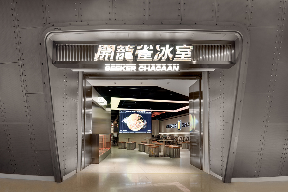
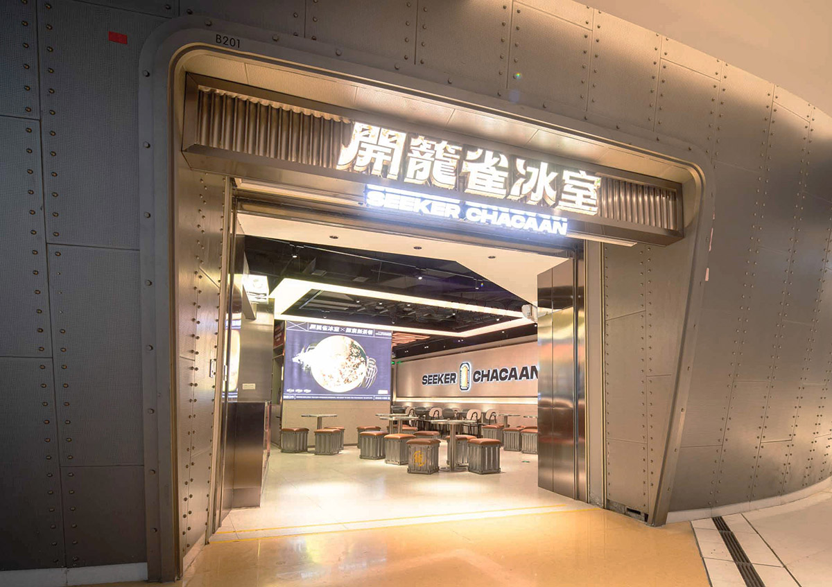
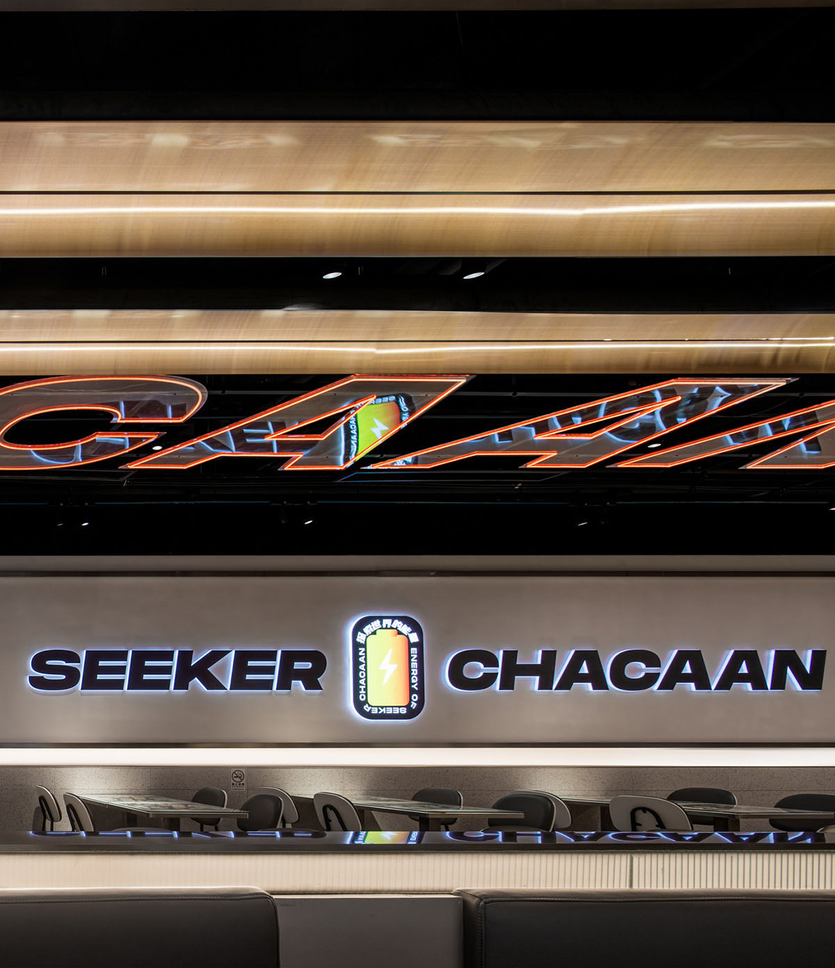
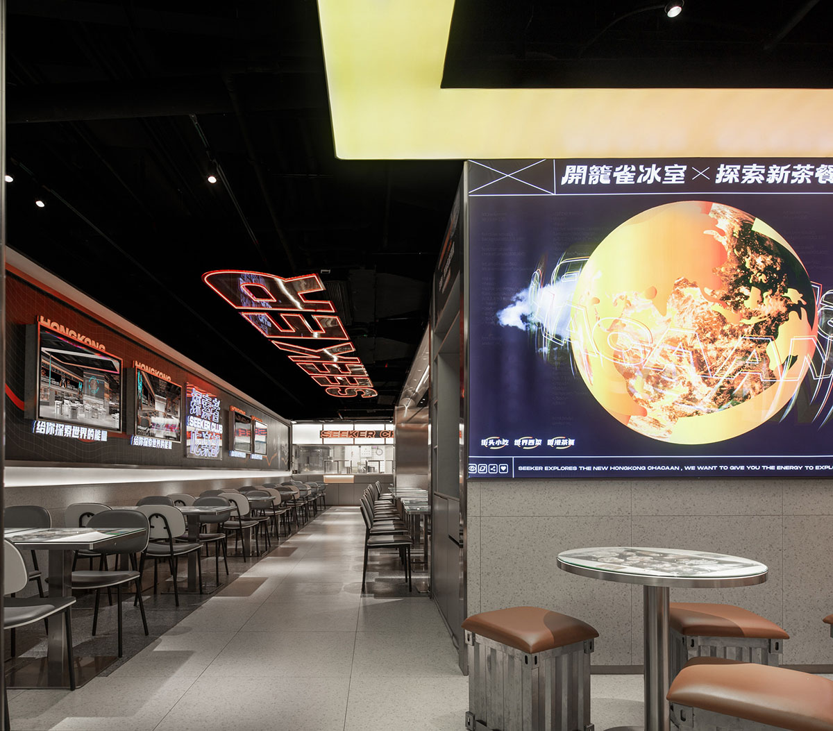
“開籠雀SEEKER CHACAAN”高懸在太空艙形態的外立麵大門上方。在字體的結構中凸顯出街頭潮流的元素,探索和突破的動感在字體的視覺美感中體現。
The brand imprint of “開籠雀SEEKER CHACAAN” hangs high above the space capsule facade. The elements of street fashion are highlighted in the structure of the brand font, the dynamics of exploration and breakthrough are reflected in the visual aesthetic feeling of the font.
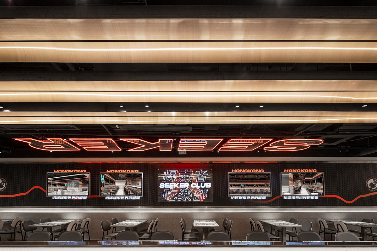
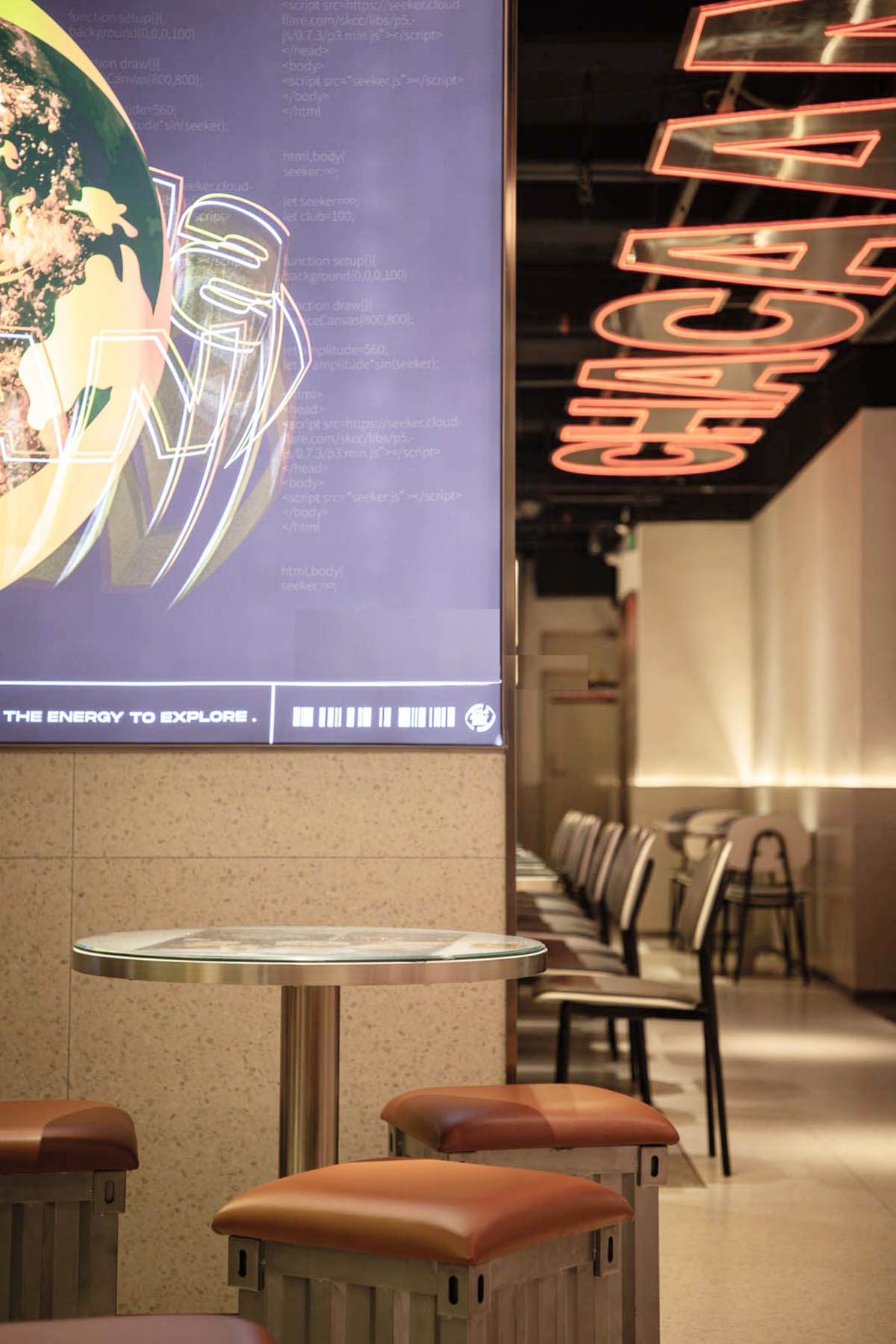
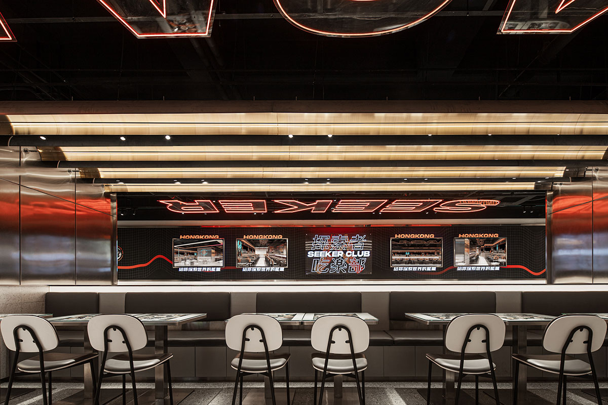
品牌視覺牆既是隔斷,也是強調。
Stepping into this area, the oncoming visual wall of the brand is very recognizable, which is both a partition of this space and an emphasis of this brand.
空間敘事
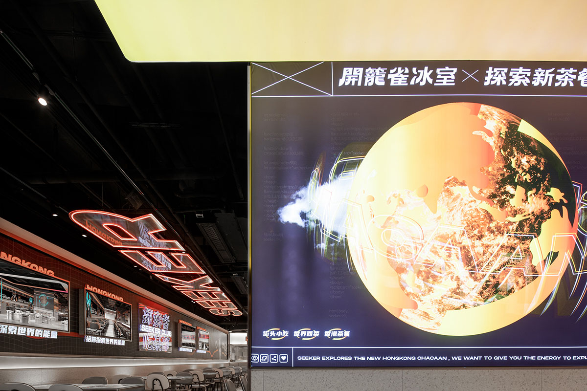
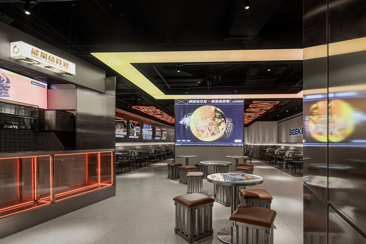
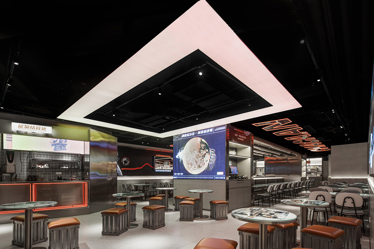
MWC從目標消費人群和餐飲種類特性進行思考,分析這兩方麵的屬性及所需的空間特性。空間的整體色彩以探索橙與潮酷黑為主。黑是太空的底色,而橙是恒星與智慧的所閃耀的光芒,不僅與品牌的主色調一拍即合,更呼應了“探索太空”的空間主題。
To get the feature of the space, MWC design studio put the target consumer group and the characteristics of the type of catering on the first things that need to be considered. The overall color of the space is mainly orange and black, which mean exploration and cool. Black is the background color of outer space, while orange is the shining light of stars. It not only fits with the VI color, but also echoes the space concept of “exploring and outer space”.
太空
一切存在物的總彙。
以物質和運動構建
萬物的秩序與軌跡
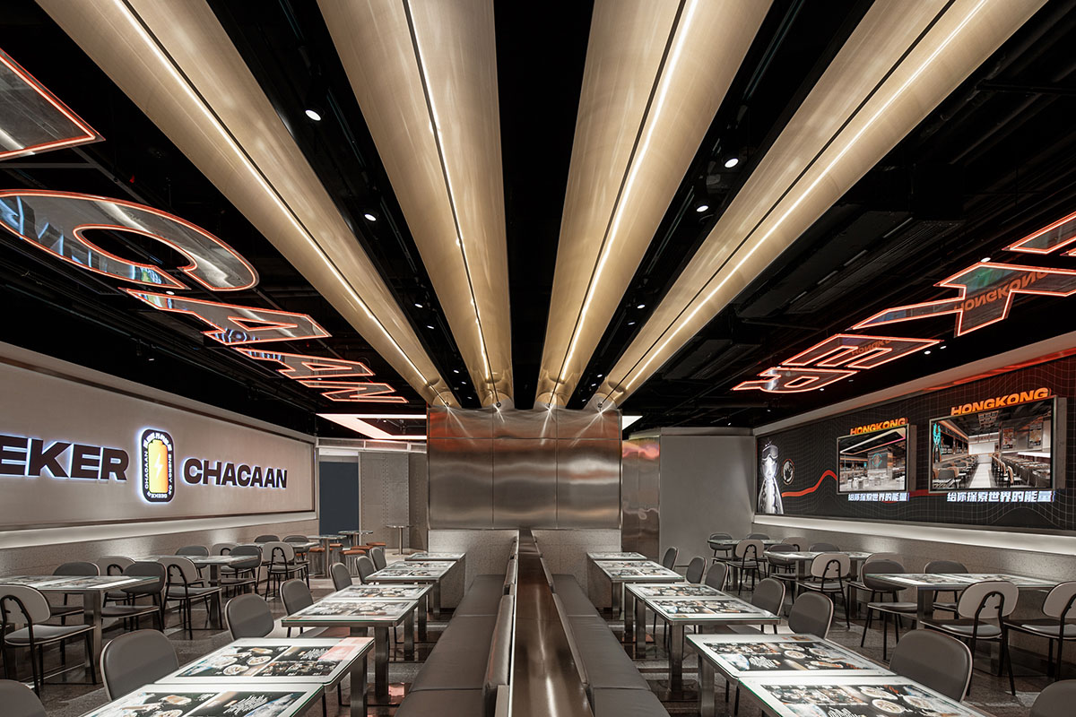
對於太空的呈現與解讀,是整個空間設計主題的核心。設計師遵循空間比例的規則,以多層次的光源、陳列,描畫出延展的時空維度。塑造極具科技感的空間矩陣,以此品牌的特色概念,並轉化為消費者的用餐消費體驗。
The presentation and unscrambled of outer space is the core of the design concept.
In our understanding, space is the confluence of all existence, it builds the order and trajectory of all things with substance and movement. Therefore, according to this understanding, the designer uses materials and moving lines to construct the structure and order of this area. Follow the rules of space proportion, establishing its own unique structural expression, The Spatial dimensionality of wireless extension is embodied by multistratal illuminant, displays, and movement, creating a box with science and technology feeling, and stimulating customers’ infinite imagination of outer space. Finally, the distinctive concept of this brand is transformed into the consumer’s dining experience.
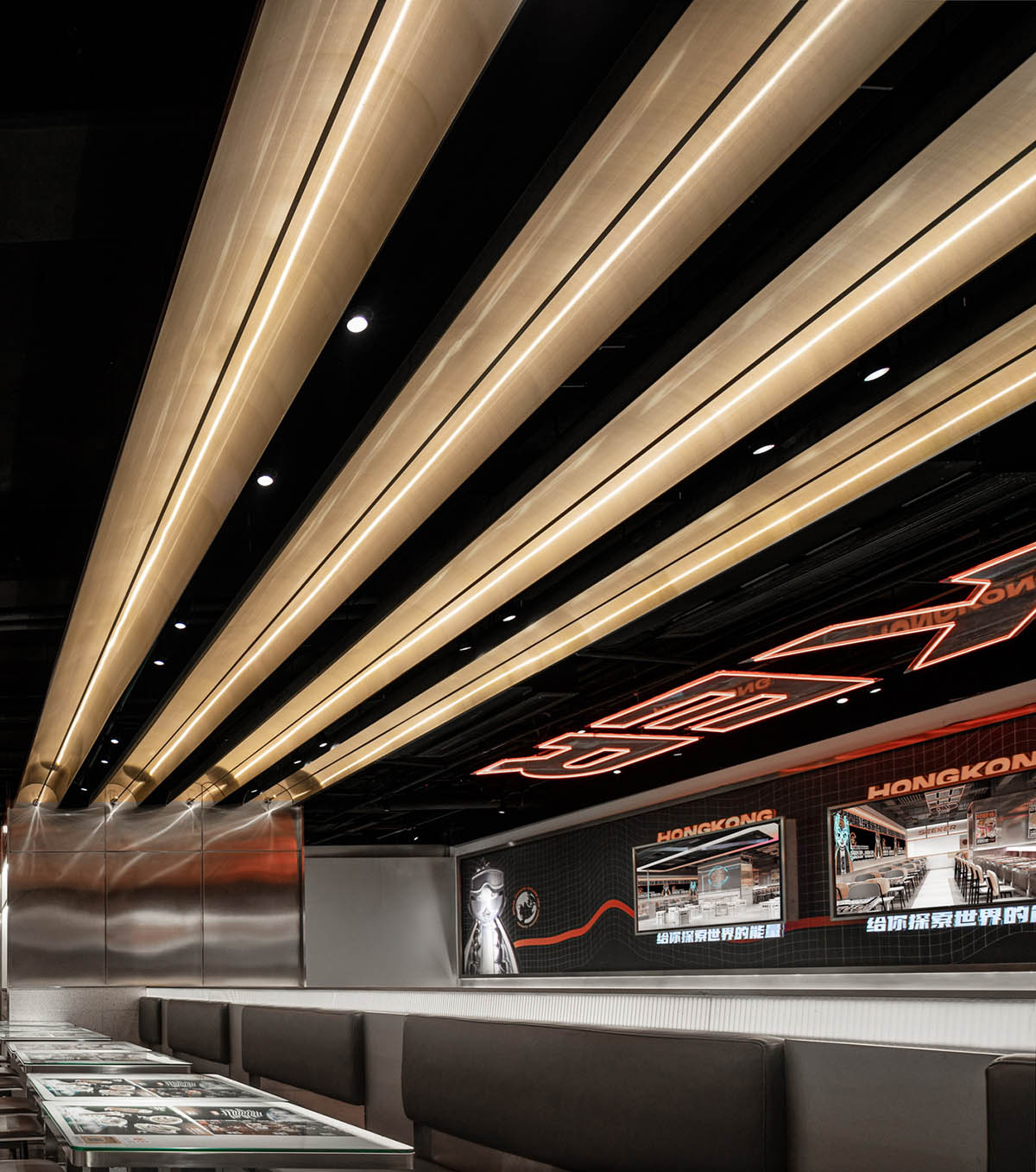
“太空艙”內選用了3000K色溫段的暖白光燈光係統,從天花板到牆壁卡槽,以最簡練純粹的直線與平麵,達到亮眼而並不突兀的平衡,精準地鋪滿每一個角落。
The interior uses a warm white light system with a color temperature of 3000K. In addition, from the ceiling to the wall, designer uses the most concise straight lines to form the plan, so that achieve a dazzling but non-obtrusive balance, and accurately covering every corner.
商業價值
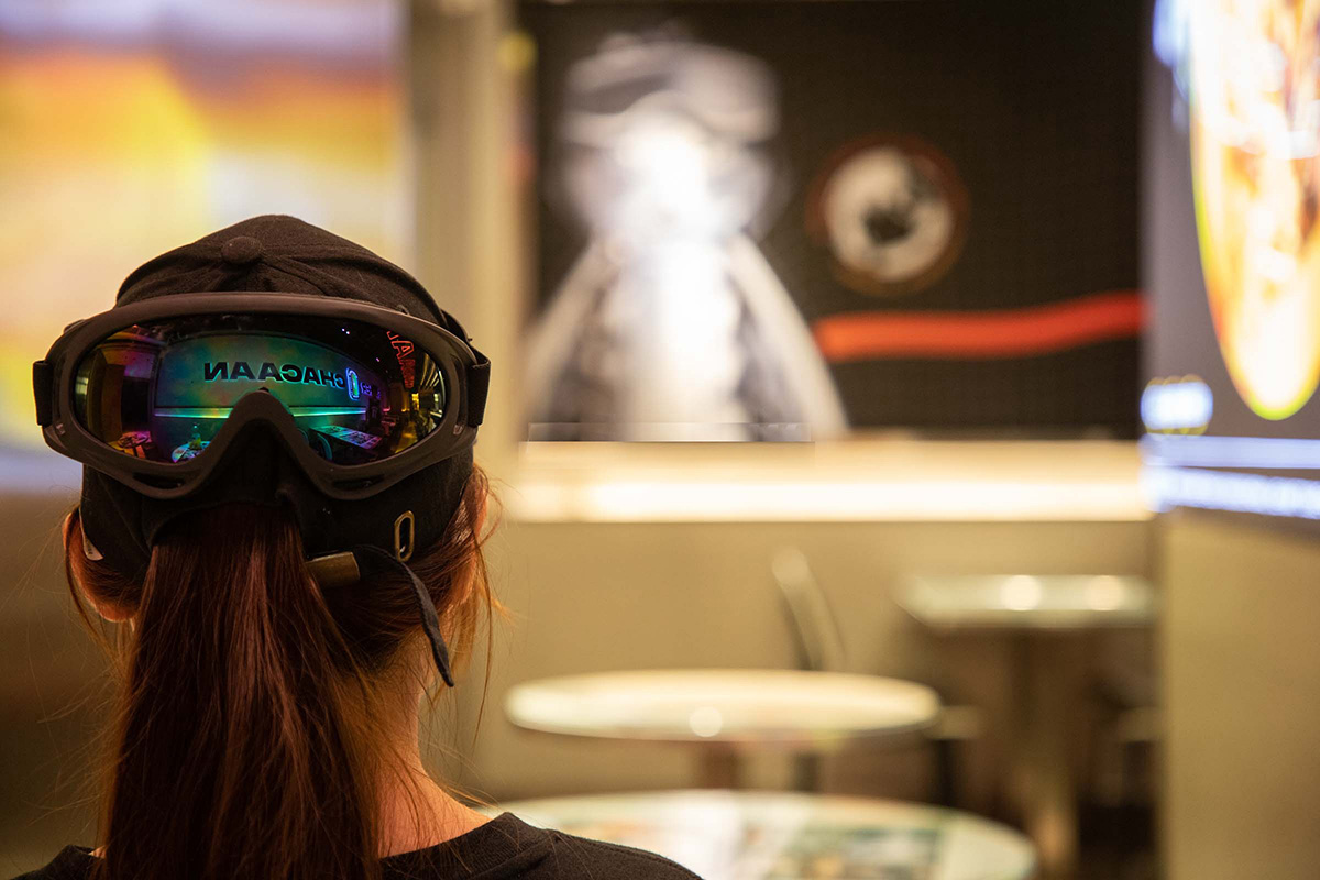
冰室是一代人的記憶,我們希望通過品牌的激活和空間設計,用一種新的方式將之傳遞給年輕一代的顧客,同時為‘開籠雀’建立一個屬於品牌鏈接的記憶點。
The ice house is the memory of a generation. We hope that can pass it to the younger generation of customers in a new way through the brand activation and interior design. At the same time, establishing a unique identity for the SEEKER CHACAAN.
以視覺牆為分界將用餐區域隱性地分為前後區域。
The inner space of SEEKER CHACAAN is divided by the visual wall, taking this to divide the dining area into front and back areas implicitly.
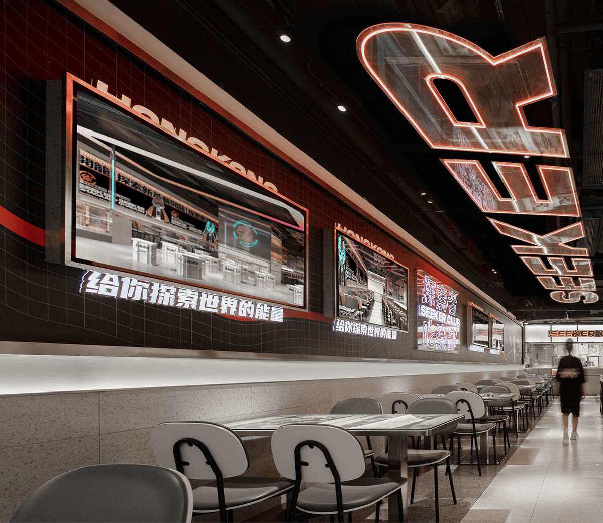
將散座置於空間的前區,配置小巧靈活的桌凳,方便快捷,豐富了空間的層次和節奏。
The scattered seats are placed in the front area of the restaurant, equipped with small, flexible tables and stools, which are enrich the tempo of the space.
項目信息
項目名稱:開籠雀冰室
設計公司:MADE WITH CARE DESIGN STUDIO 廣州韶康室內設計有限公司
官網:www.mwcstudio.com
聯係郵箱:info@mwcstudio.net
完成年份:207
建築麵積(平方米/坪):228平方米
項目位置:廣東佛山新DNA購物中心B201
攝影師:PBSHADOW
設計團隊:VIKING CASON SUGAR
合作團隊:蛋創品牌管理
材料:金屬、磚、玻璃、燈箱


