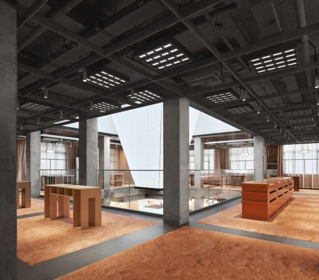
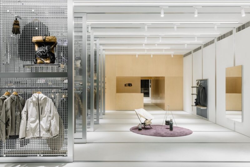
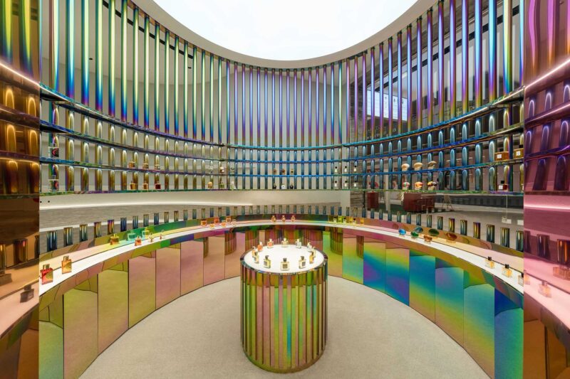
本案位於一棟商廈的一樓地鋪,為業主所自購物業。因為不太受外界因素約束,場地全方位的可控性加之業主方的全盤信任,為本案的設計提供了一個強有力的基礎。
This case is located on the ground floor of a commercial building and is a property purchased by the owner. Because it is not constrained by external factors, the omni-directional controllability of the site and the overall trust of the owner provide a strong foundation for the design of this case.
1、門頭與櫥窗 Front door and display
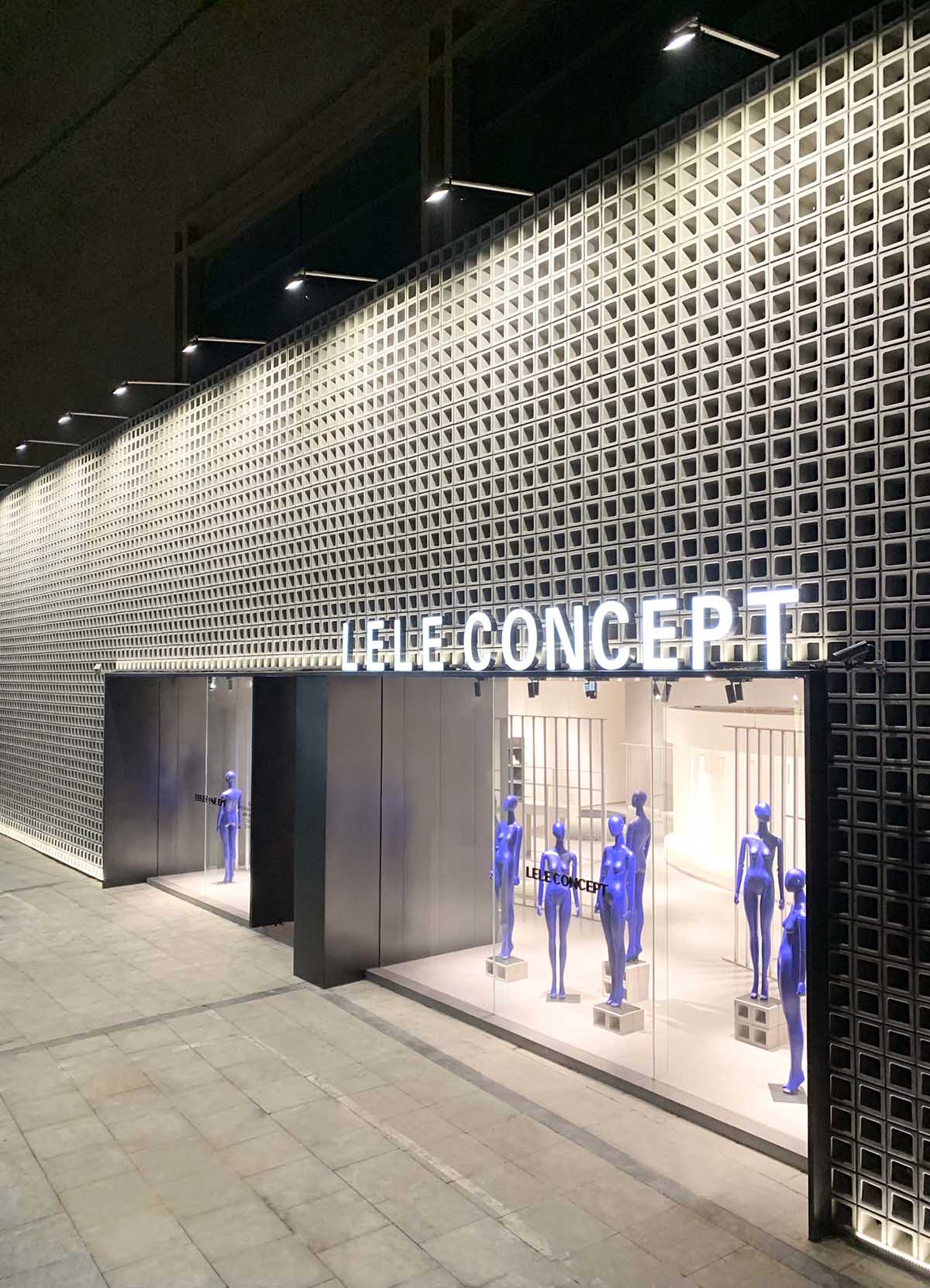
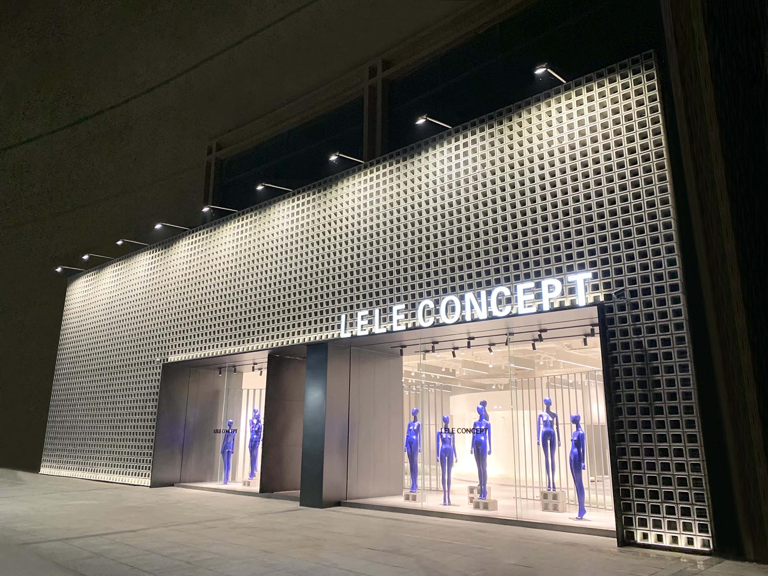
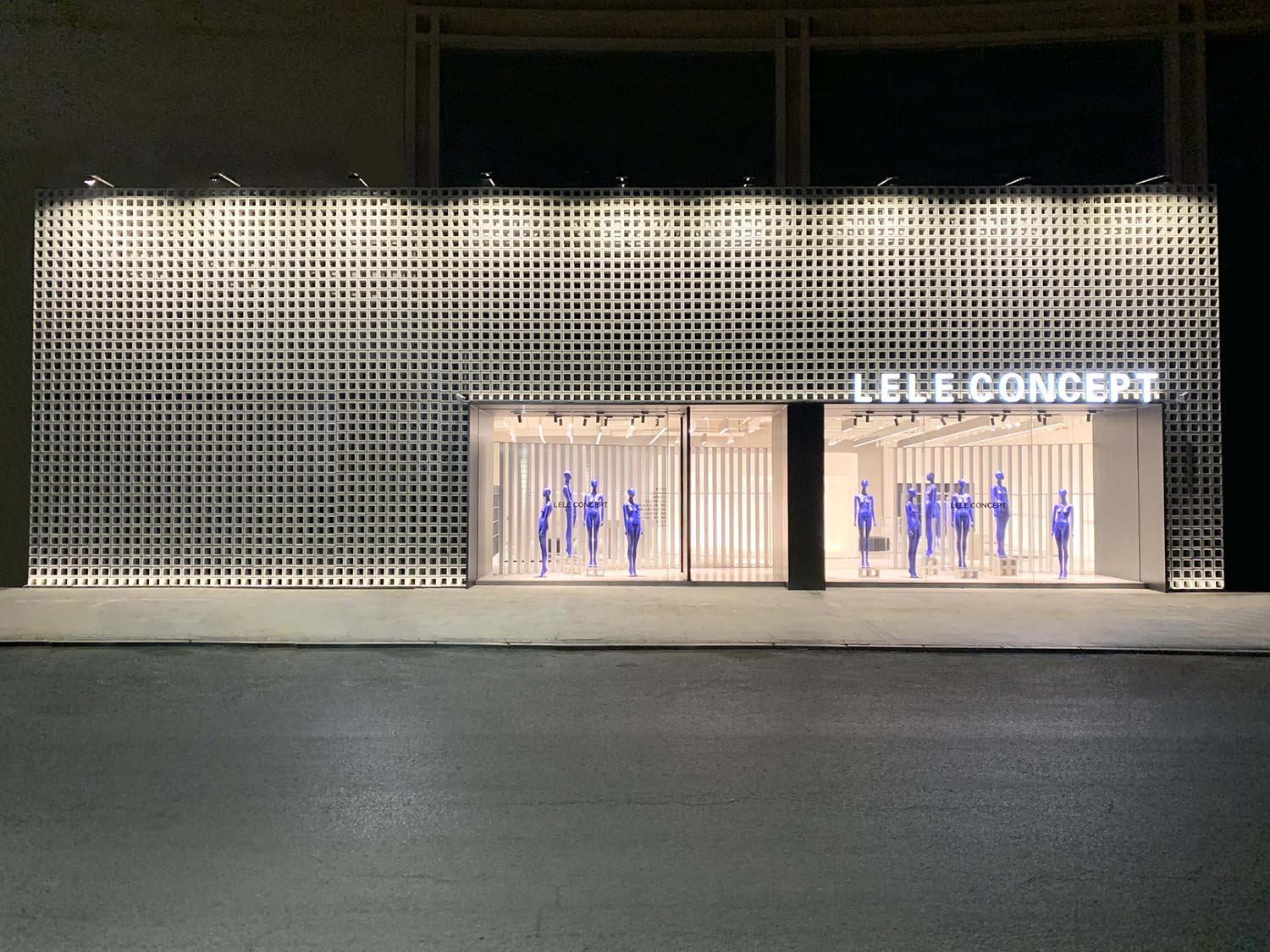
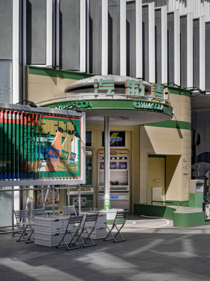
左右寬近30米的巨大門頭給設計方提供了很好的想象空間,如何體現既震撼又高級的效果,設計方最初提出了幾套方案,最終定下來運用具有工業建築味道的水泥空心磚重複鋪滿整個門頭,若有若無的空心透視十分具有層次感,清晨、正午和夜間的光影效果分別具有不同的美感味道。
The huge door head with a width of about 30 meters provides a good imagination space for the designer. How to reflect the shocking and advanced effect, the designer initially put forward several sets of schemes, and finally decided to use the cement hollow brick with the flavor of industrial architecture to repeatedly cover the whole door head. If there is no hollow perspective, it has a sense of hierarchy. In the morning The light and shadow effects at noon and at night have different aesthetic tastes.
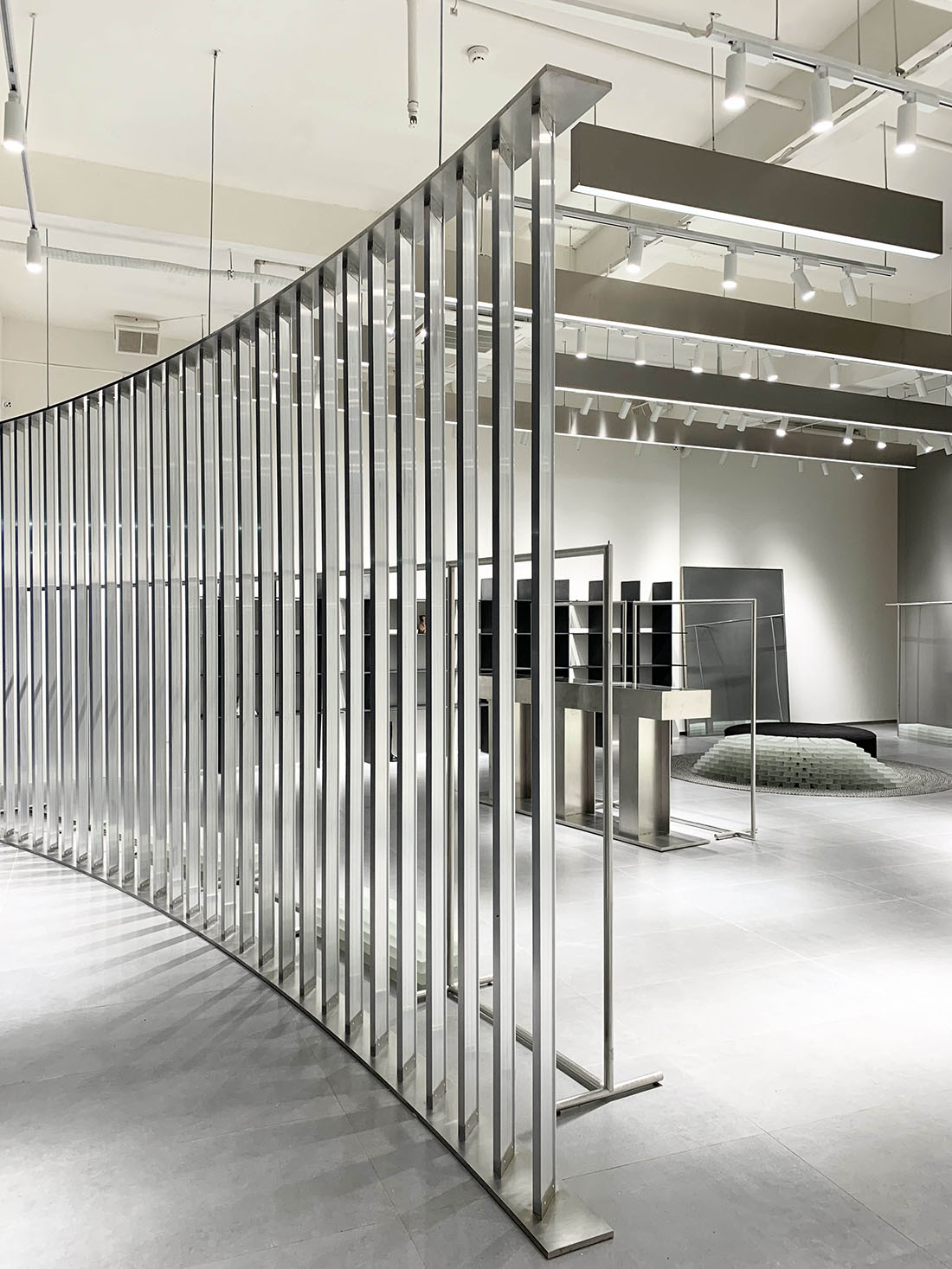
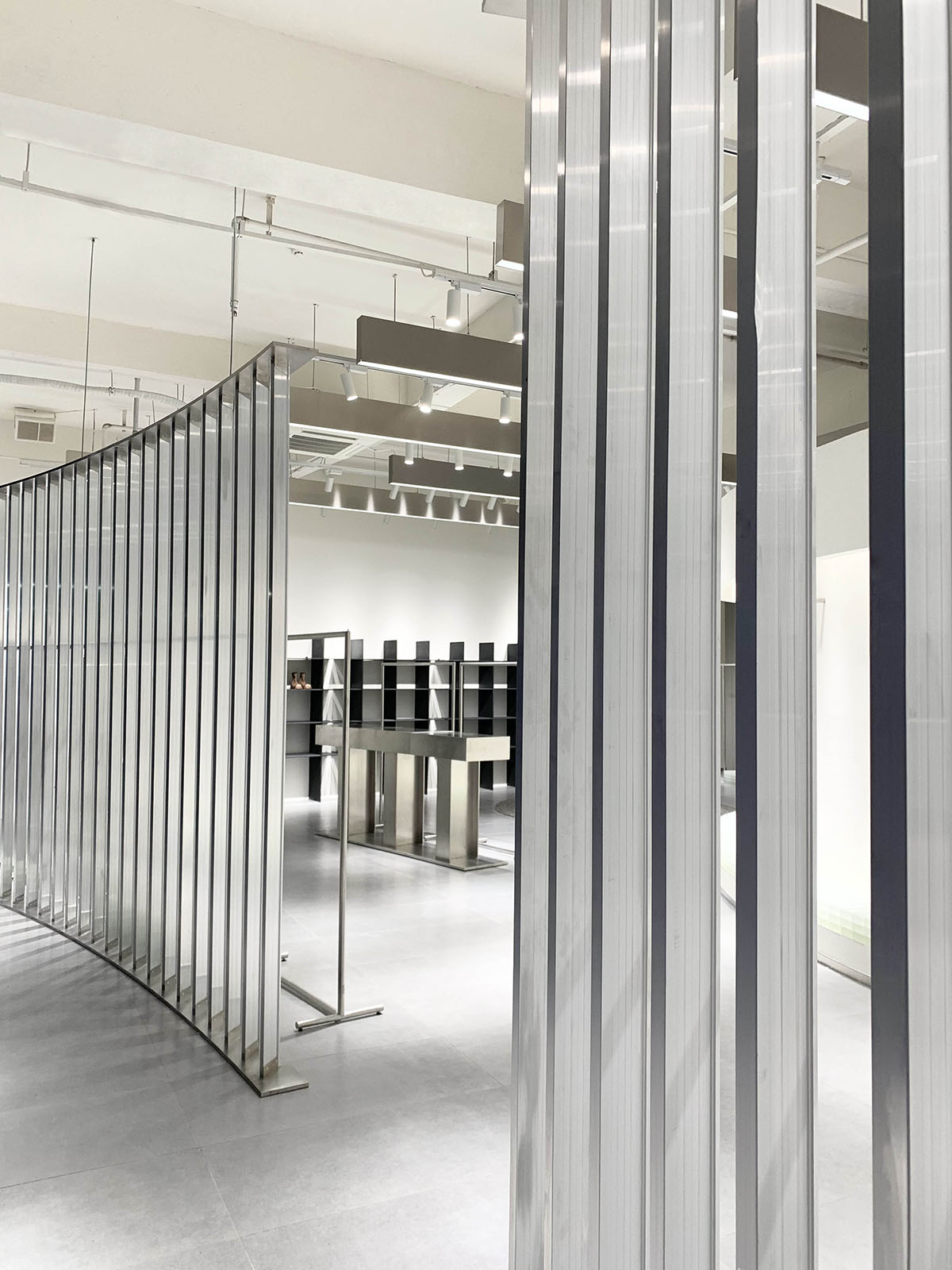
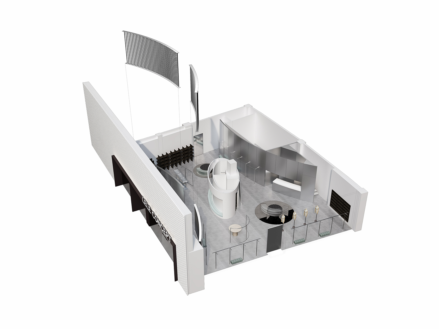
由於鋪位朝向西麵,櫥窗如何規避西曬入室問題是本案的關鍵點,設計方運用三角凹凸金屬條形形材造出兩段不等大小的弧形屏風,密而透氣的豎條排列通過巧妙的角度使得西曬陽光擋在室外但又不失采光效果,也將櫥窗區與室內區作了很好的分隔。
As the shop is facing to the west, how to avoid the problem of window exposure to the west is the key point of this case. The designer uses triangular concave convex metal strip to create two arc screens of different sizes. The dense and breathable vertical bars are arranged at a clever angle to block the west sun outdoors without losing the daylighting effect, and also well separate the window area from the indoor area.
2、室內空間與道具材料 Indoor space and props materials
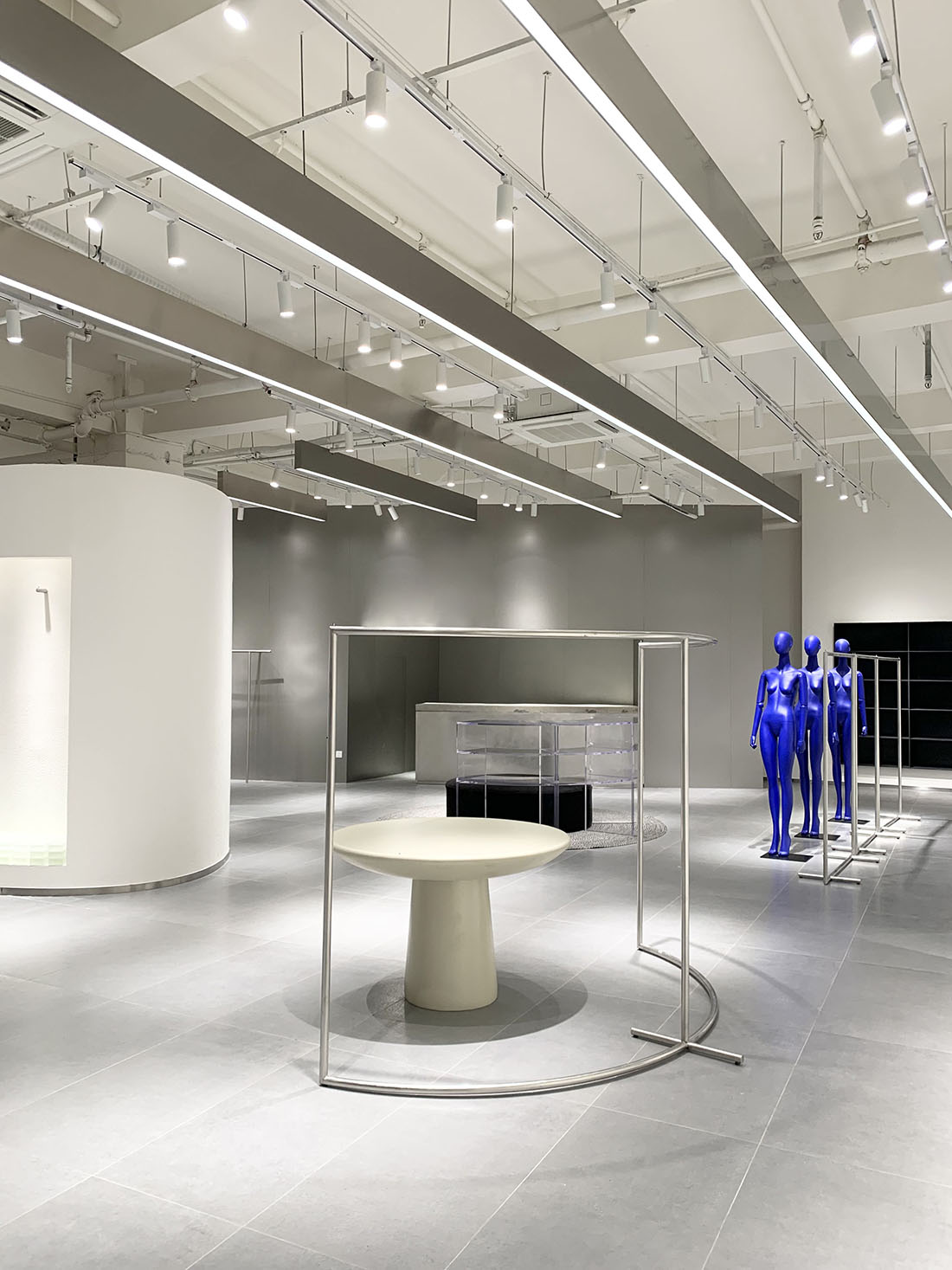
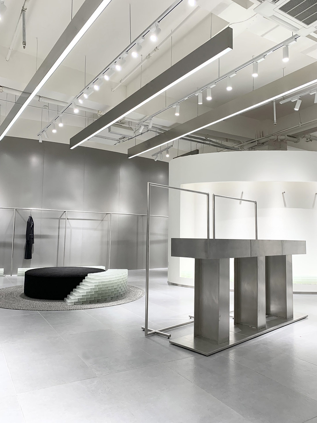
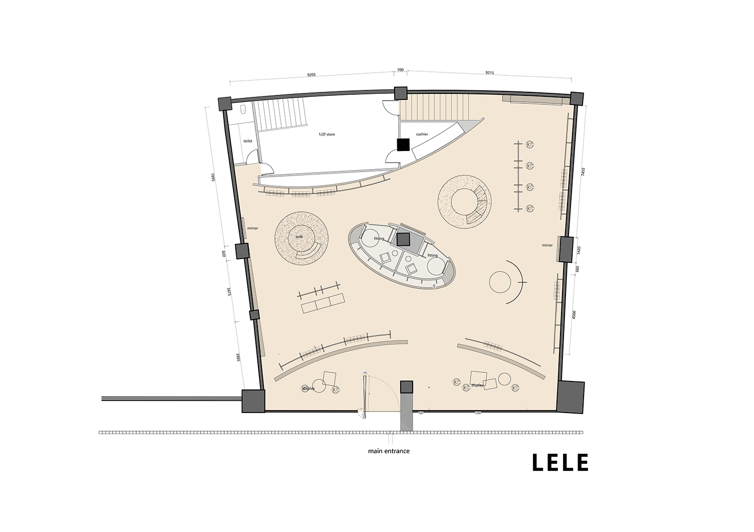
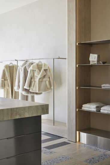
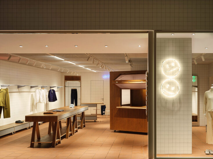
經過屏風中段入口進入到室內賣場區域,時間和空間的概念在這裏有了更多維的表達,感官在這裏碰撞和交錯,中庭的試衣間區域很好的劃分了銷售動線,賦予空間一種獨特的語氣氛圍。
Enter the indoor shopping area through the entrance of the middle section of the screen. The concepts of time and space are expressed in more dimensions here. The senses collide and interlace here. The fitting room area in the atrium well divides the sales moving line and gives the space a unique tone atmosphere.
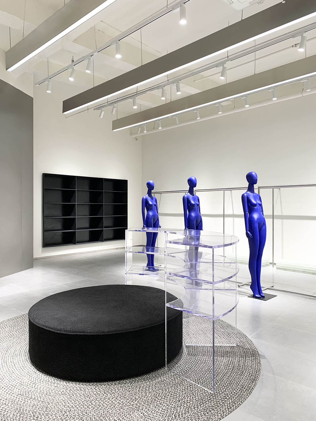
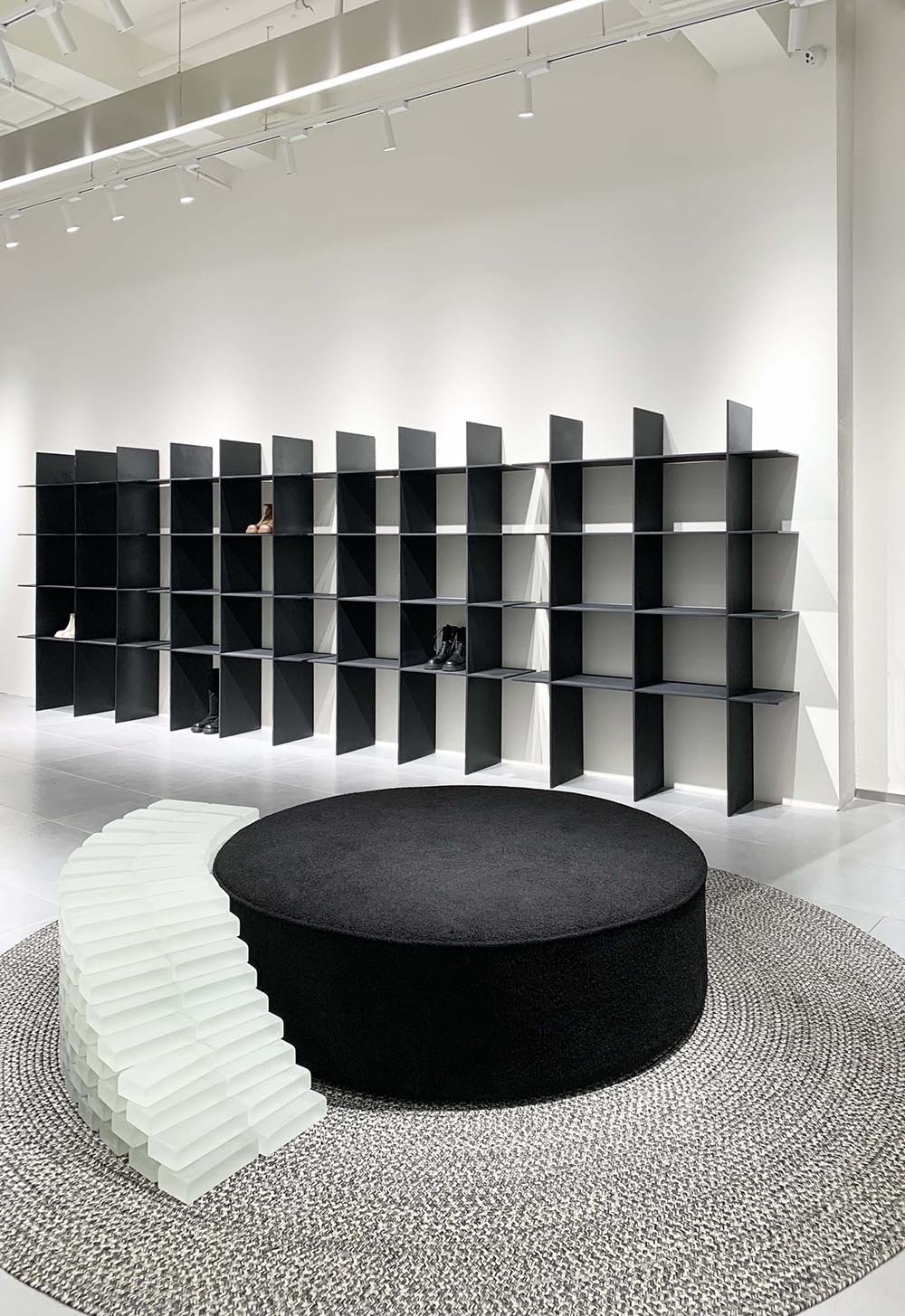
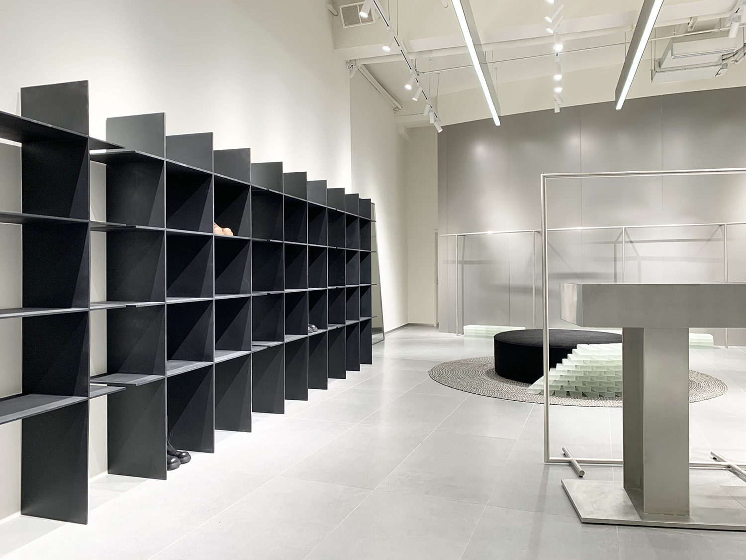
磨砂玻璃磚與透明亞克力飾品架加上簡約的不鏽鋼貨架,傳遞出前衛和中性,包容與儲存,不僅是西方流行文化中的現代意識,也是來自東方的當代意識。
Frosted glass brick, transparent acrylic jewelry rack and simple stainless steel shelf convey avant-garde and neutral, tolerance and storage, which is not only the modern consciousness in western pop culture, but also the contemporary consciousness from the East.
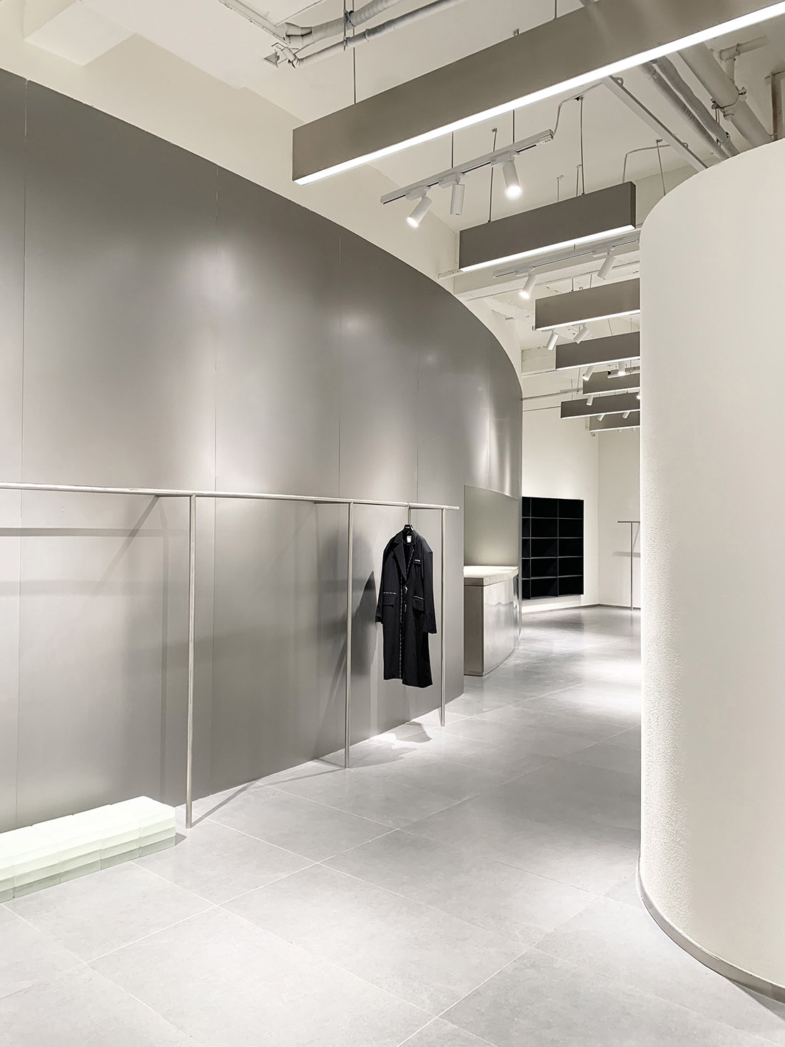
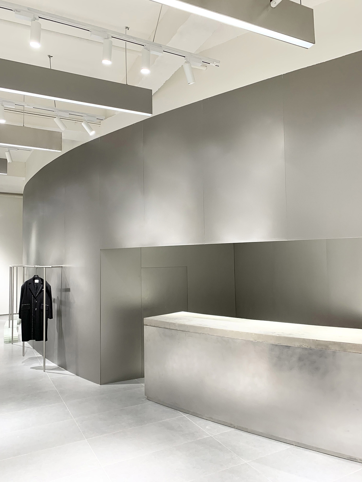
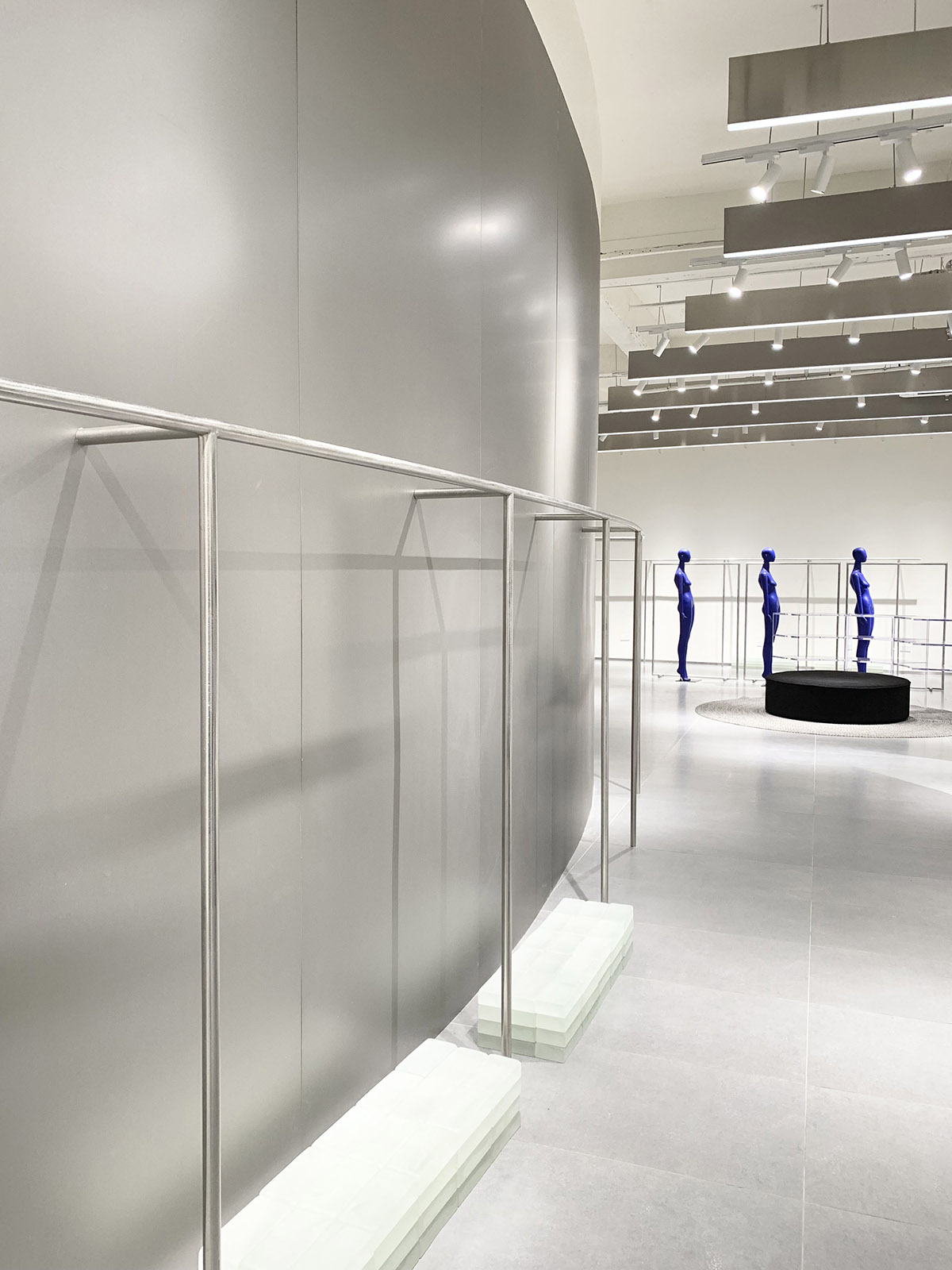
曲麵金屬牆元素的運用在一定程度上中和了銀色帶來的冷感,擁抱點綴的藍色與之交織,表現出一種未來感和先鋒感。
The use of curved metal wall elements neutralizes the cold feeling brought by silver to a certain extent, embracing and interspersed blue, showing a sense of future and pioneer.
金屬的冷峻和跳脫的藍色,克製而純淨,時髦而不傲慢,線性的不鏽鋼軌道燈架傳遞一種視覺動線,有序地連接並延伸整個空間。
The cold metal and jumping blue are restrained and pure, fashionable but not arrogant. The linear stainless steel track lamp frame transmits a visual moving line, which orderly connects and extends the whole space.
∇ 平麵圖
∇ 軸測圖
項目信息
項目名稱: LELE CONCEPT
設計方: RSXS睿上形素室內設計有限公司
項目設計 & 完成年份: 2021/September
主創及設計團隊: RSXS 睿上形素/JAYSON KU
項目地址: CHINA Dalian/大連
建築麵積: 318平方
攝影版權: JAYSON KU
客戶: LELE CONCEPT
主材料: 不鏽鋼、米白色藝術漆、啞光淺灰地磚、磨砂玻璃磚、透明亞克力、水泥空心磚
電 話 :+8618620355706
郵 箱 :RSXS_design@163.com
官 網 :www.rsxsdesign.cn
Project name: LELE CONCEPT
Design: RSXS Interior Design
Design year & Completion Year: 2020/September
Leader designer and Team: RSXS/JAYSON KU
Project location: CHINA Dalian
Gross Built Area (square meters): 318m²
Photo credits: JAYSON KU
Clients: LELE CONCEPT
Brands: Stainless steel, Off white art paint, Matte light grey floor tile, Frosted glass brick, Transparent acrylic, Cement brick
Tel:+8618620355706
Email: RSXS_design@163.com
Website: www.rsxsdesign.cn


