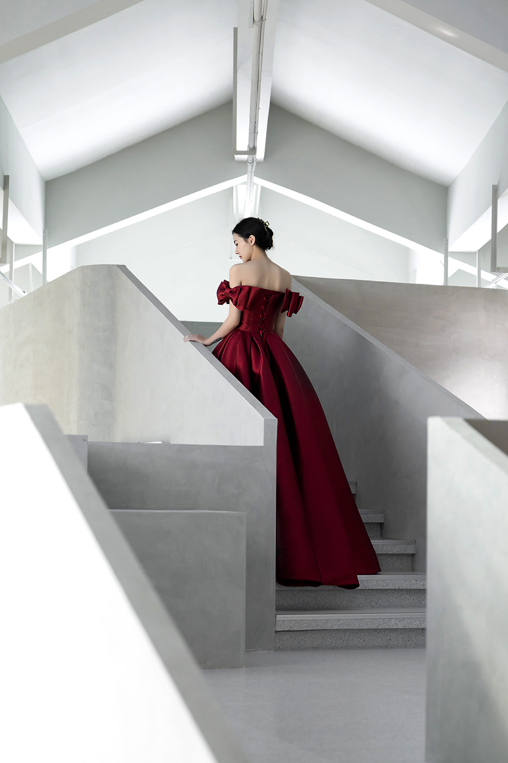
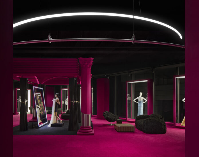
空間秩序與儀式感
區位與品牌
蘇州是國內主要的婚紗生產地,而虎丘婚紗城是立足於該產業的重要批發、零售的基地, 同時也引進國內外知名設計師品牌,為服裝設計作品提供展示的平台。虎丘婚紗城在規劃上提出注入設計師靈魂的嫁衣定製,讓遊客能遊走於婚紗城與景區之間,在購物環境之中營造具有感情流動的一個空間氛圍。
Suzhou is the main domestic wedding production center, and Huqiu Wedding City is an important wholesale and retail base based on the industry. It also introduces well-known designer brands at home and abroad to provide a platform for the display of clothing design works. Huqiu Wedding City proposes to inject the designer’s soul into the wedding dress customization in the planning, so that tourists can walk between the wedding city and the scenic spot, creating a spatial atmosphere with emotional flow in the shopping environment.
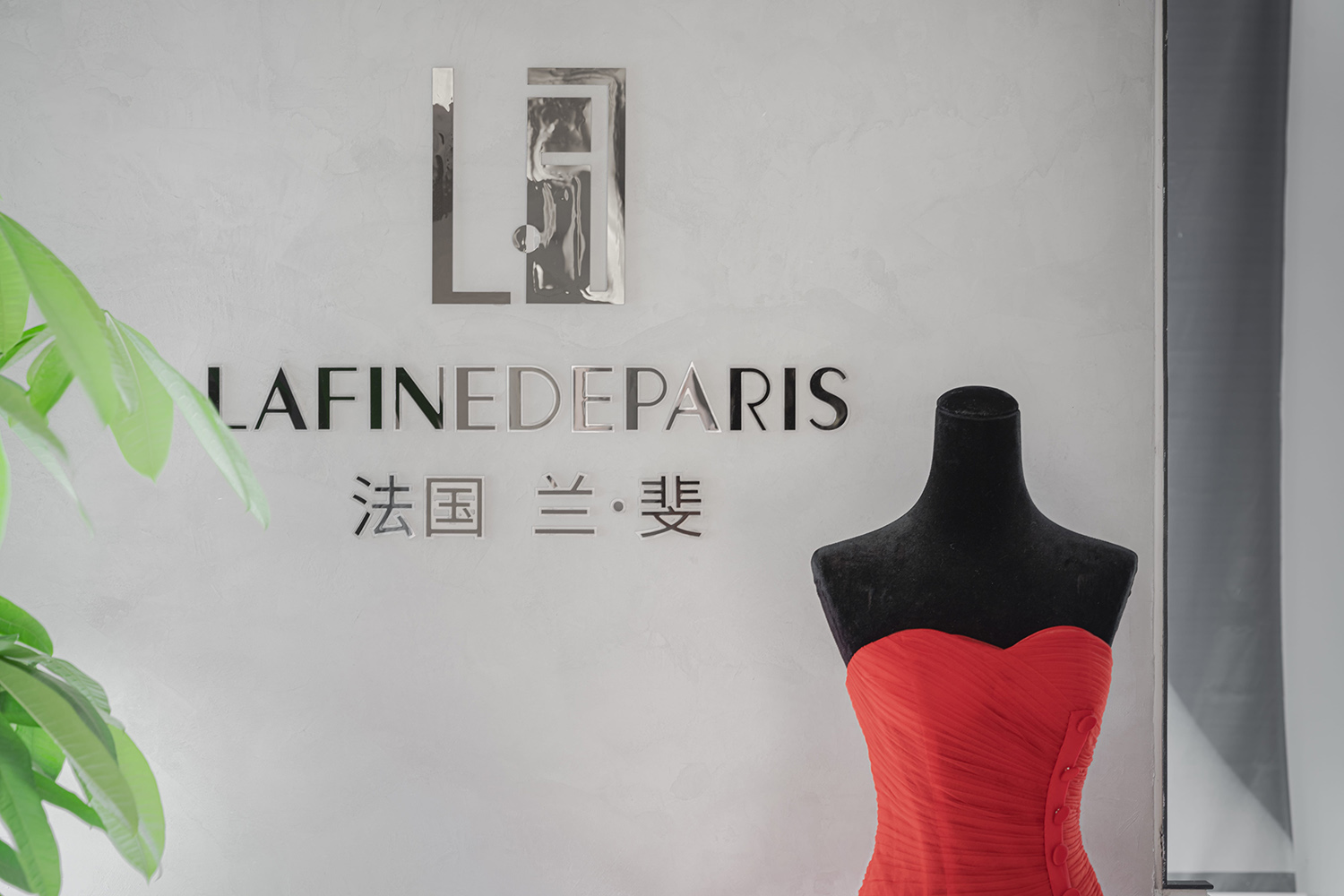
∇ 品牌展示牆 攝影@徐英達
法國蘭斐婚紗展覽館正是基於這樣的定位,作為一個高端浪漫的設計師品牌置於此地。蘭斐有一個三層的婚紗展覽及售賣空間,展品大多以高端定製婚紗及禮服為主,堅持於展現女性極致魅力的夢想,執著於打造擁有感染力的藝術作品。
The French Lafine Wedding Exhibition Hall is based on this positioning and is placed here as a high-end romantic designer brand. Lafine has a three-story wedding exhibition and sales space. Most of the exhibits are high-end customized wedding dresses and dresses. They insist on the dream of showing the ultimate charm of women, and insist on creating infectious works of art.
概念 Concept
此次空間改造的任務是蘭斐婚紗展館的三層,為雙坡屋頂的一個4.8米挑高空間。原空間較為雜亂,難以體現展品的質感,同時基於“嫁衣”的性質,空間的儀式感和秩序感成為了設計所應該關注的核心。 場館內需要融入多種產品的展覽與一個試衣間的體驗空間,讓準新娘們能體驗到嫁衣的美好。
The task of this space transformation is the third floor of the Lafine Wedding Exhibition Hall, which is a 4.8-meter-high space with a double slope roof. The original space is rather messy, and it is difficult to reflect the texture of the exhibits. At the same time, based on the nature of “wedding clothes”, the sense of ritual and order in the space has become the core of the design. The venue needs to incorporate a variety of product exhibitions and a fitting room experience space, so that brides-to-be can experience the beauty of wedding gowns.
我們需要改造的空間是第三層的辦公與展覽空間的結合,空間改造的重點及難點正是基於現有空間特質難以展示婚紗高檔的質感,需要對空間進行重新梳理,讓婚紗的品質及試衣的儀式感在此體現,將品牌的形象進行充分展示,並針對嫁衣的概念進行重新梳理,試圖將“嫁衣”從人生階段的儀式感表達中轉譯到空間之中。
The space we need to renovate is the combination of the office and exhibition space on the third floor. The focus and difficulty of the space remodeling are based on the characteristics of the existing space. It is difficult to display the high-end texture of wedding dresses. The ritual sense of the clothes is reflected here, fully displaying the image of the brand, and reorganizing the concept of wedding clothes, trying to translate the “wedding clothes” from the expression of the ritual sense of the life stage into the space.
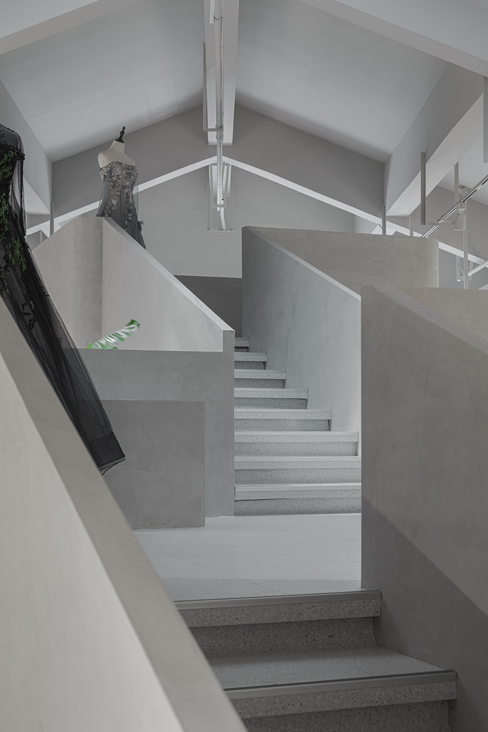
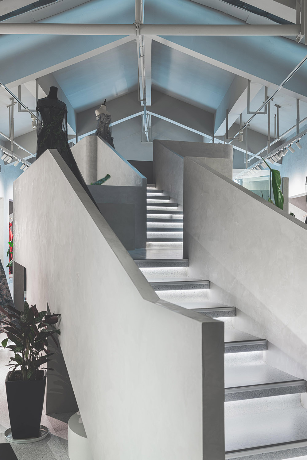
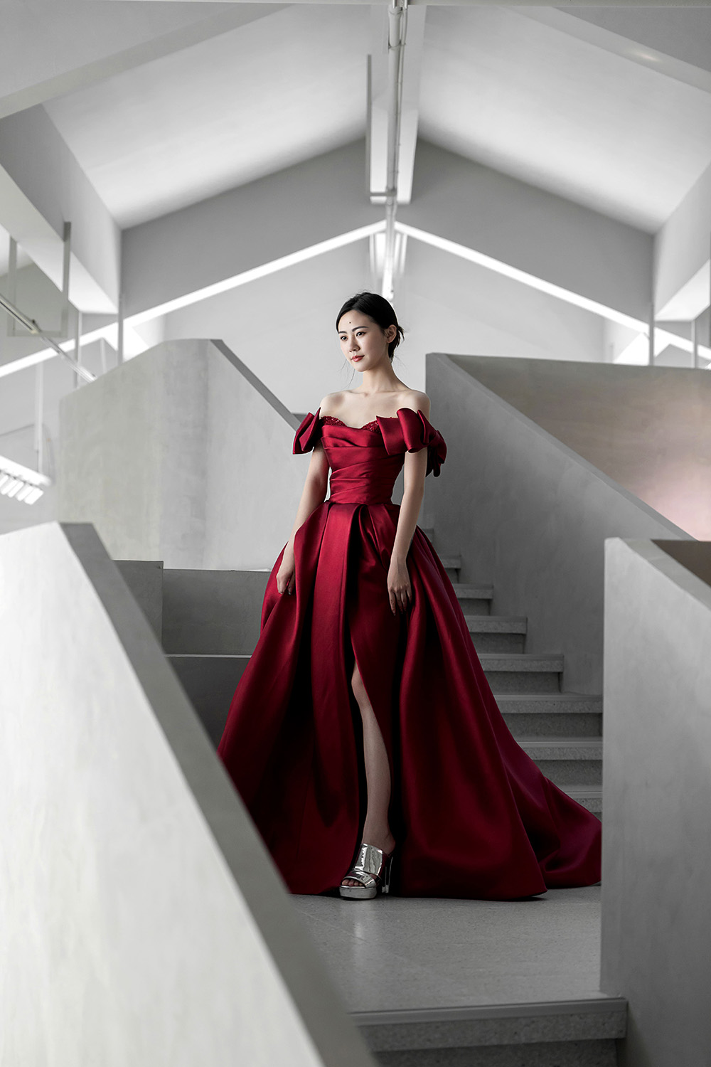
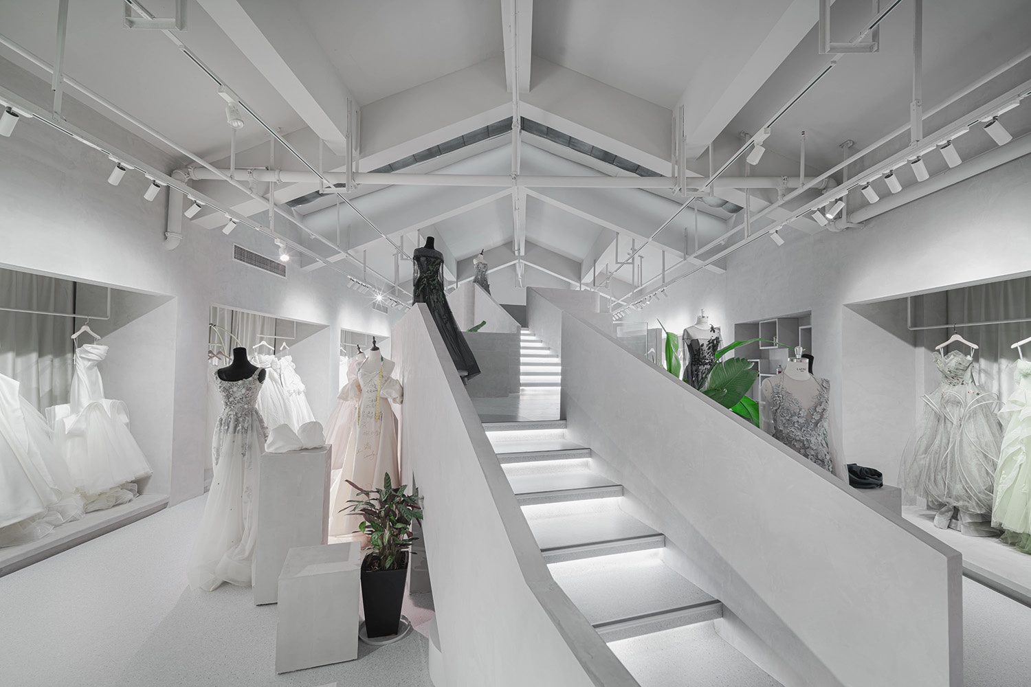
古代女子見客通常是從閨房的閣樓所出來,因此出嫁也稱之為“出閣”,而樓梯也成為也女子“出閣”的重要儀式感通道之一。與之同時,樓梯也是一個能將展覽空間融合在一起的一個儀式感空間,通過不同高度來營造相應的不同視覺層次。
In ancient times, women usually came out from the attic of the boudoir, so getting married was also called “going out of the pavilion”, and the stairs became one of the important ritual passages for women to “go out of the pavilion”. At the same time, the staircase is also a ceremonial space that integrates the exhibition space, creating corresponding different visual levels through different heights.
∇ 樓梯與展品的層次 攝影@徐英達
同時基於場館入口的位置在矩形平麵的一角,我們提出了“轉折與尋覓”的一個設計概念,將展台空間和試衣間通過樓梯的不同高度進行融合,同時來塑造處一個從高到低的展示序列,讓人們在一個轉折的樓梯空間中去尋覓屬於自己的嫁衣,而這個尋覓的過程通過這樣的一個空間序列的重組營造出一種儀式感。與之同時,在空間的兩個盡頭可以將複合的功能置於其中,讓前段可以成為一個設計師講課區,而尾端正對窗戶與試衣間的地方成為一個休息區和觀看準新娘定妝的區域。
∇ 概念圖:轉折與尋覓 @平介設計
空間序列的展示 Space sequence explanation
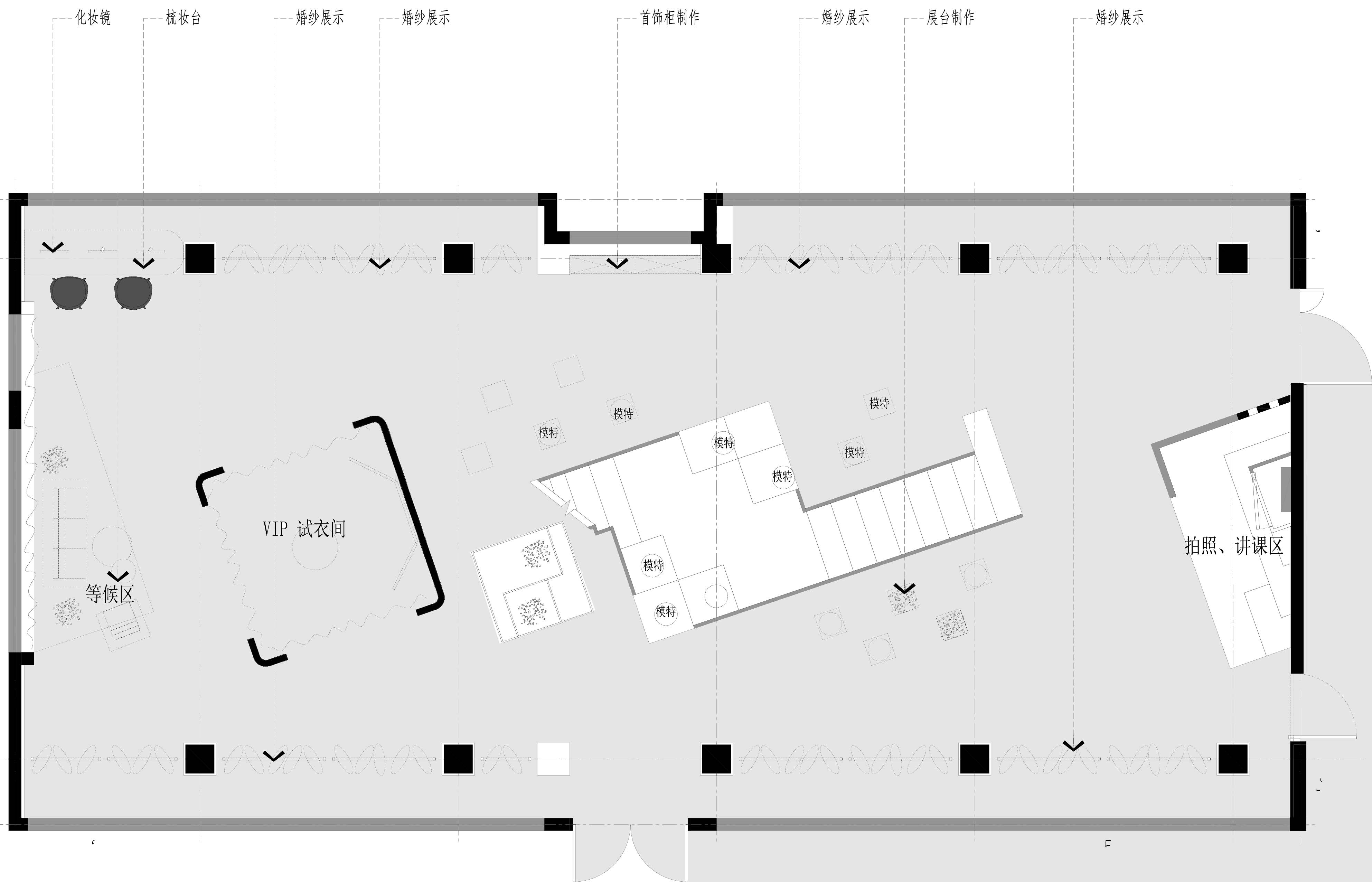
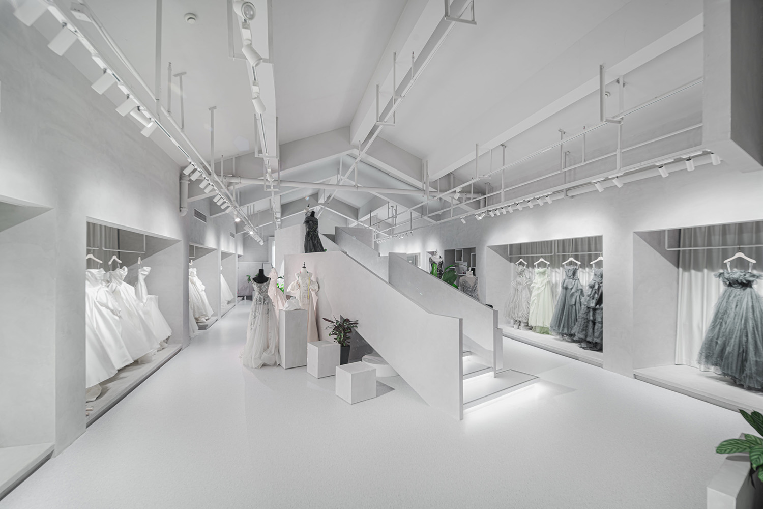
利用原有的窗口及柱網圍合將展品置於柱網之間自然圍合而成的展台空間,同時希望從入口處就能看到整個空間的一個完整展示,用樓梯將展品陳列的視覺拉升,營造矩形空間的序列與儀式。
Using the original window and column net enclosure, the exhibits are placed in the booth space naturally enclosed between the pillar nets. At the same time, it is hoped that a complete display of the entire space can be seen from the entrance, and the visual display of the exhibits is displayed by stairs. Pull up to create a sequence and ceremony in a rectangular space.
∇ 空間平麵 @平介設計
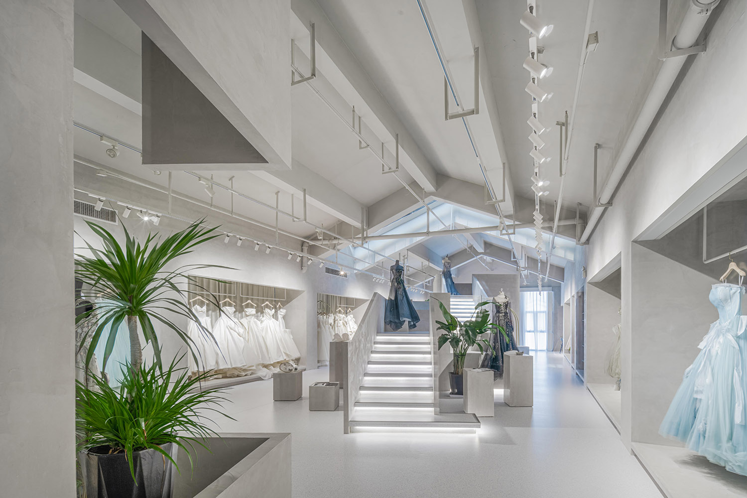
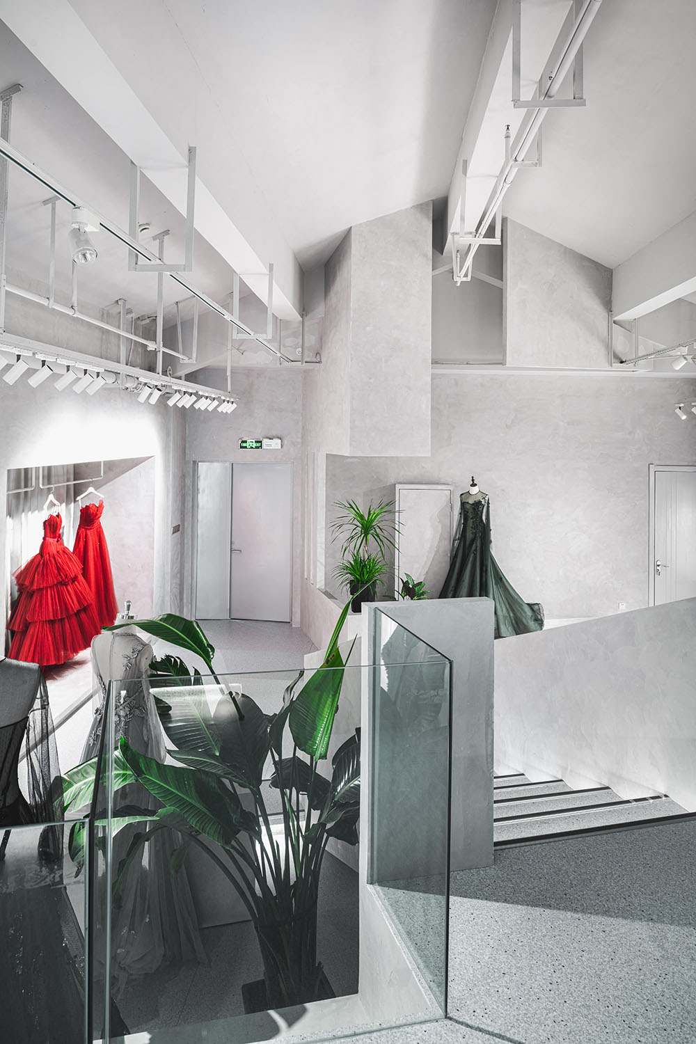
入口處圍合的綠植及窗口空間,也成為進入空間的伊始就能營造出通道式的儀式感。
The green plants and window space enclosed by the entrance also create a sense of passage-style ceremony at the beginning of entering the space.
∇ 空間總覽 攝影@徐英達
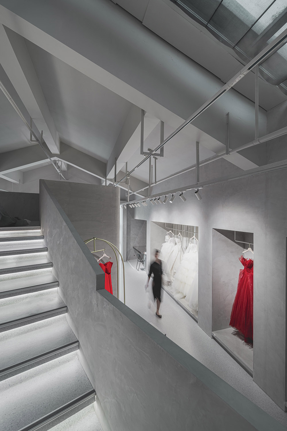
通過樓梯營造出不同的高度讓空間形成了視覺上的互動,當你在尋覓自己的婚紗之時,也能在此之中看到或許也在尋覓適合自己嫁衣的“她”。
The different heights created by the stairs allow the space to form a visual interaction. When you are looking for your own wedding dress, you can also see the “her” in it, perhaps also looking for your own wedding dress.
∇ 樓梯與空間互動 攝影@徐英達
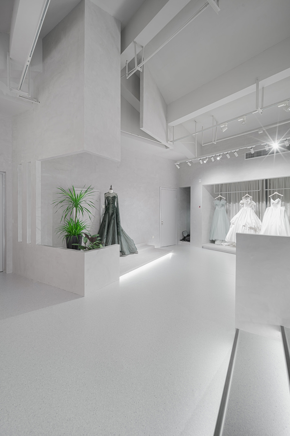
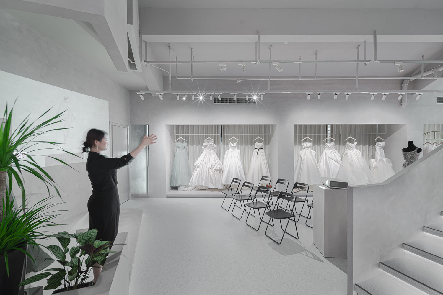
在空間的進門前段,設置一個展品定妝的拍照區域,與之同時,將牆體和抬高的地台區域加以利用也形成了一個講課的區域,讓設計師可以在這裏交流、授課同時也可用於團隊的內部培訓。
In the front section of the space, set up a photo area for the makeup of the exhibits. At the same time, the wall and the raised platform area are used to form a lecture area, allowing designers to communicate and teach at the same time. For the internal training of the team.
∇ 前段的展覽與講座多功能區 攝影@徐英達
從不同角度都可以看到通過樓梯及靈活的展台,讓婚紗產品的展示充滿的層次感。
From the different pictures, you can see the stairs and flexible booths, which make the display of wedding dress products full of layers.
∇ 側邊望向轉折的樓梯 攝影@徐英達
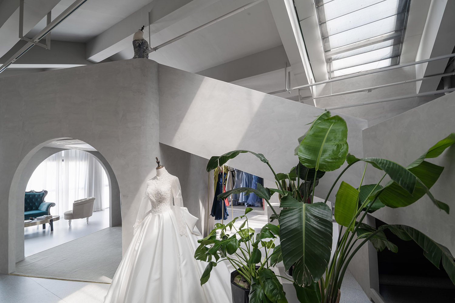
利用坡屋頂空間的天光將樓梯的一角點亮,結合綠植與獨立的產品人模展台讓柔和的日光與紗的質感交相輝映。
Using the skylight of the sloping roof space to light up a corner of the staircase, combining green plants and independent product mannequin booths allows the soft sunlight and the texture of yarn to complement each other.
∇ 天光與產品 攝影@徐英達
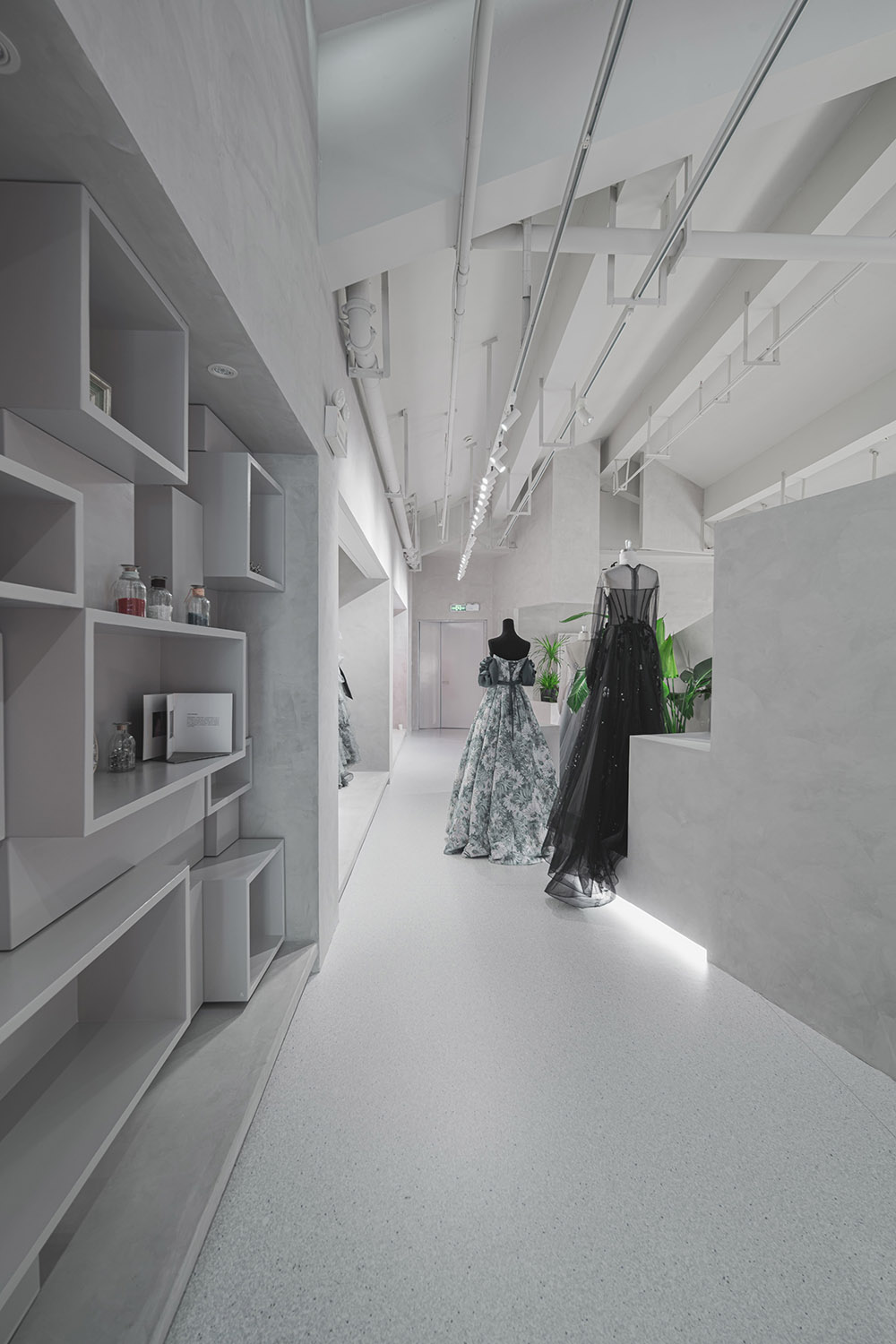
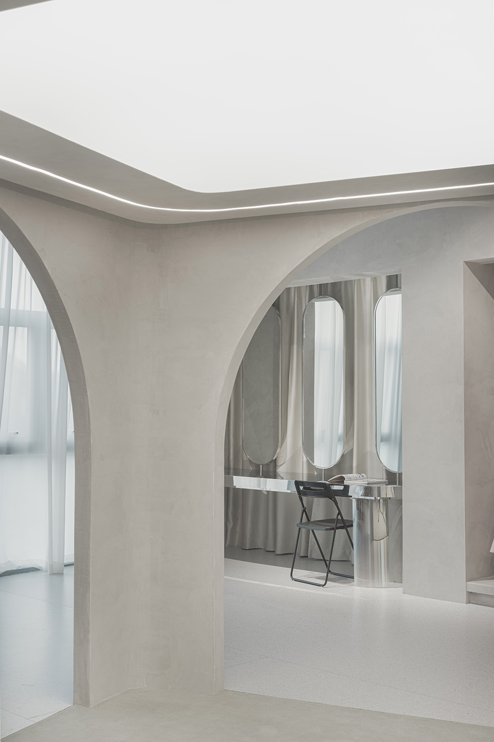
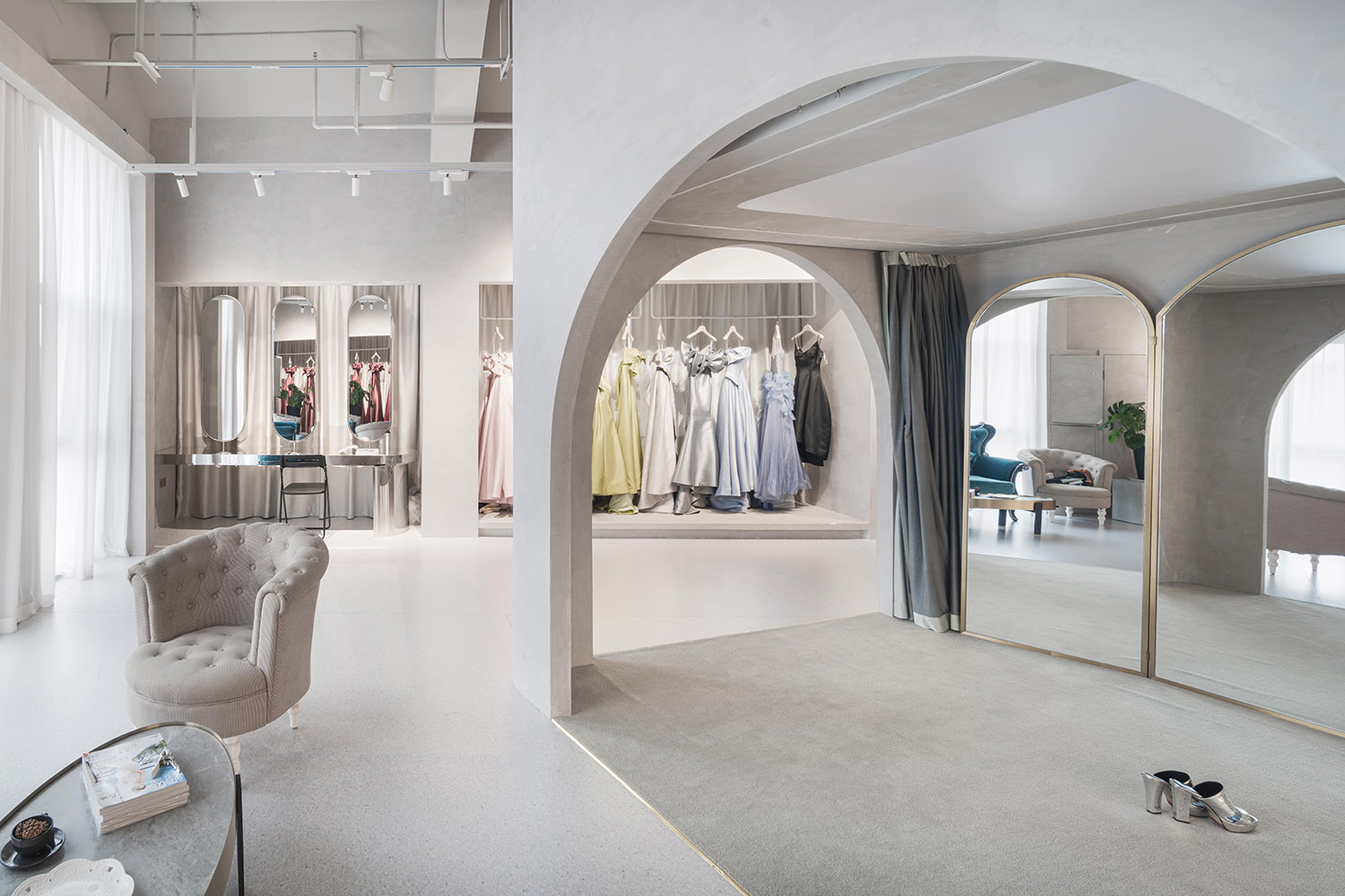
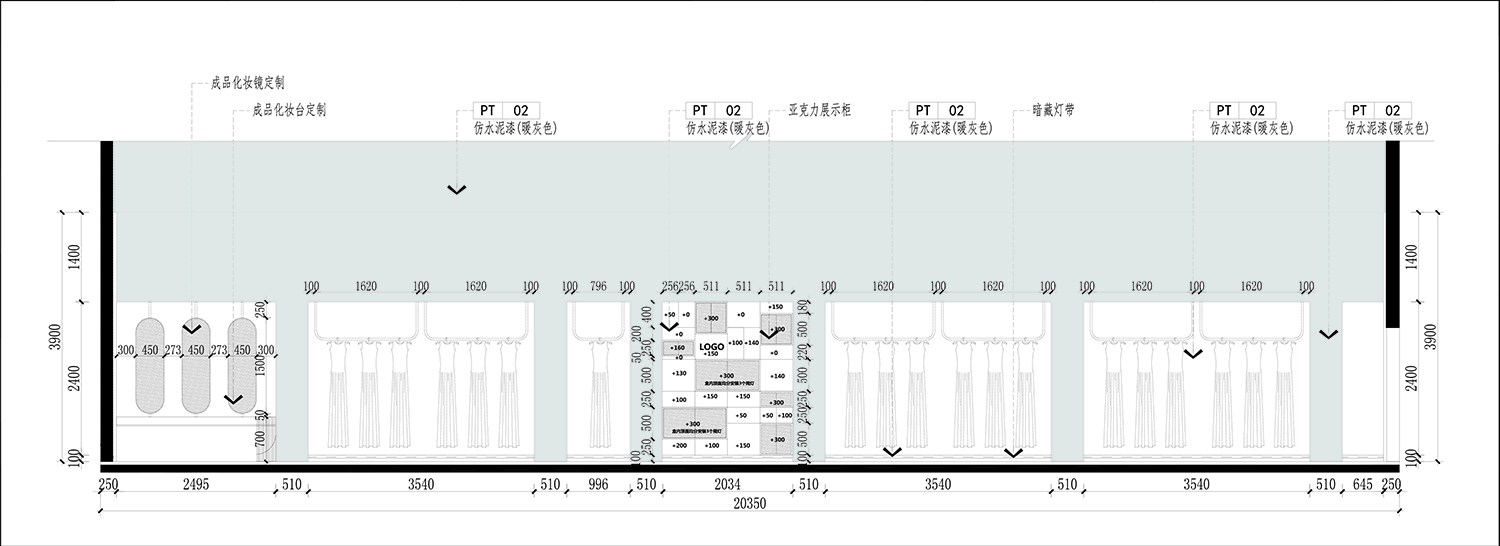
穿越整個空間,牆體被充分利用為層次不同的周邊展示櫃子及化妝區。同時,試衣間內部由軟膜布光,麵光源讓整個空間顯得柔和而溫暖。
Through the entire space, the walls are fully utilized as peripheral display cabinets and makeup areas with different levels. At the same time, the interior of the fitting room is lighted by soft film, and the surface light source makes the whole space appear soft and warm.
∇ 周邊展示櫃 攝影@徐英達
∇ 試衣間望向化妝鏡 攝影@徐英達
∇ 試衣間及等候區 攝影@徐英達
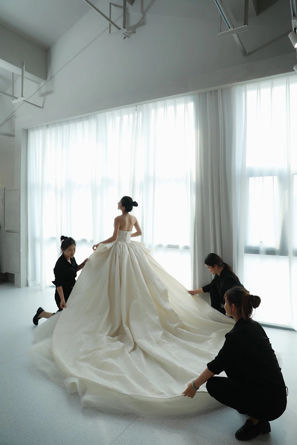
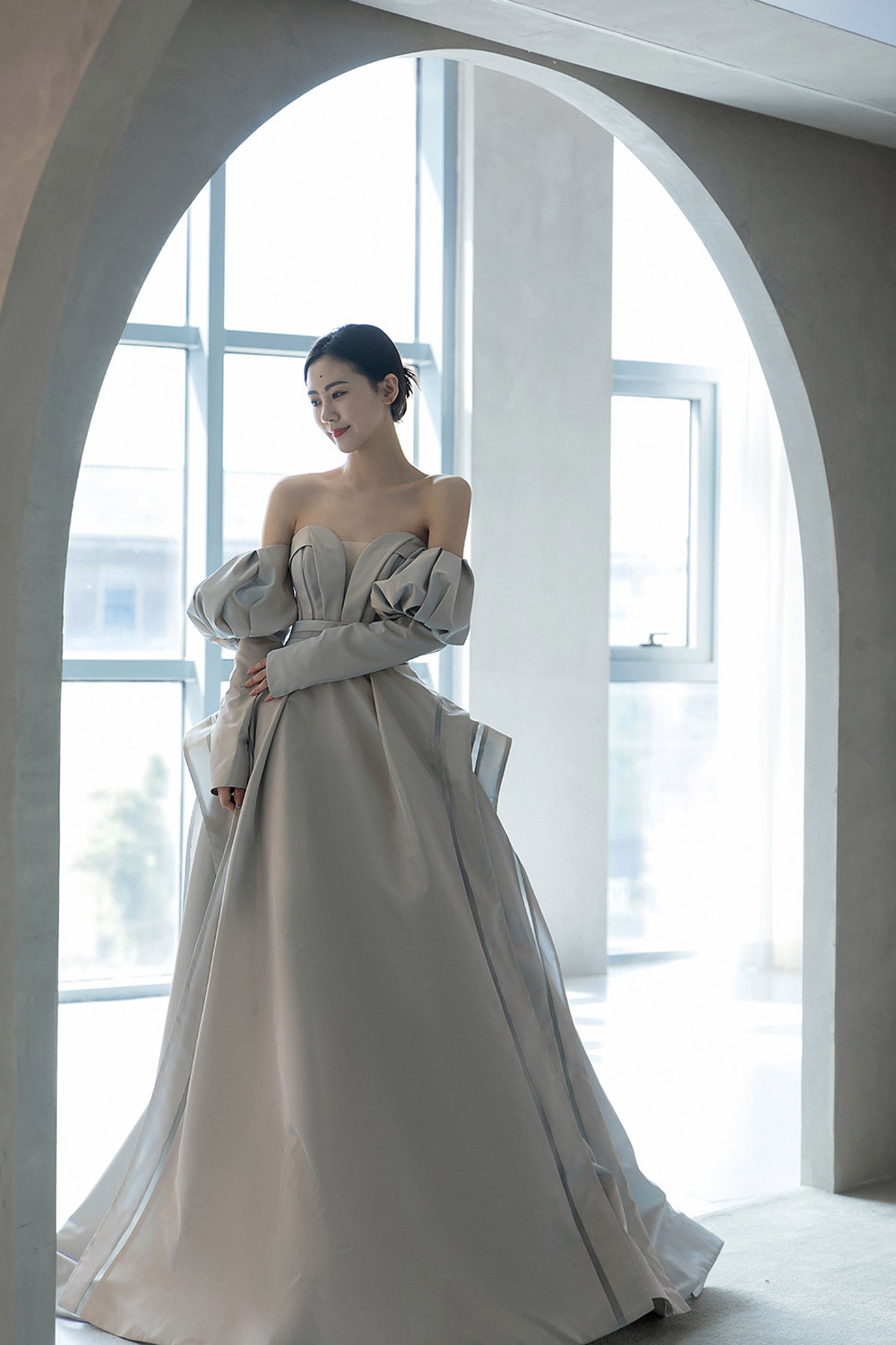
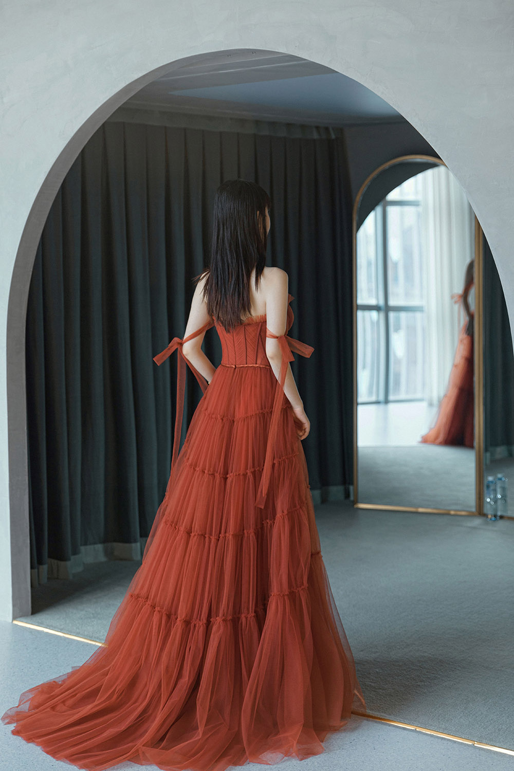
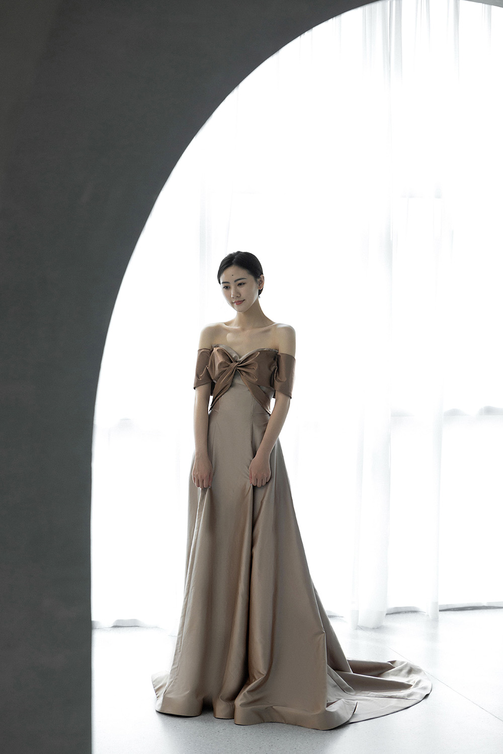
試衣間後麵是一麵大扇的落地窗,在空間改造的時候通過框景的形式將其重塑,讓日光將紗點亮,營造一種溫暖的儀式感。
Behind the fitting room is a large floor-to-ceiling window. When the space is remodeled, it is reshaped in the form of framed scenery, allowing the sun to light up the gauze, creating a warm ritual.
∇ 日光籠罩的試紗場景 @法國蘭斐
∇ 試衣間的拱門框景 @法國蘭斐
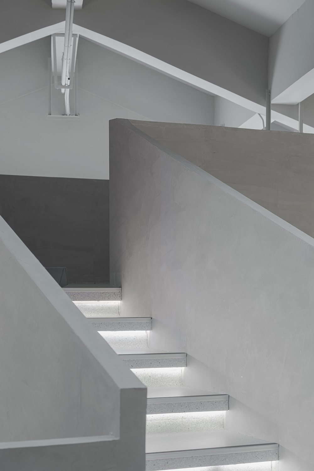
整體空間采用淺灰色為基調,從而能夠襯托產品的色彩與質感。
The overall space is based on light gray, which can set off the color and texture of the product.
∇ 樓梯細節展示 @徐英達
∇ 樓梯與色彩 @蘭斐婚紗
∇ 樓梯細節展示 @徐英達
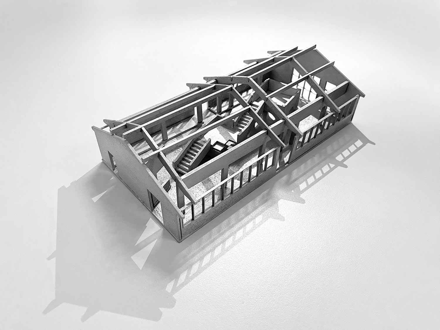
∇ 模型照片
∇ 剖麵圖
∇ 牆麵立麵圖
項目信息
項目名稱:蘭斐婚紗展廳
設計方:平介設計
公司網站:https://www.parallect-design.com/
聯係郵箱:info@parallect-design.com
項目設計&完成年份:2020;2021
設計團隊:唐倩文,肖明峰,楊楠
項目地址:中國江蘇蘇州婚紗城
建築麵積:300m2
攝影版權:徐英達,蘭斐
客戶:法國蘭斐
Project Name: Lafine Wedding Exhibition Hall
Design: Parallect Design (Suzhou)
Website: https://www.parallect-design.com/
Contact e-mail: info@parallect-design.com
Design year & Completion Year: 2020,2021.
Design Team:Tang Qianwen, Xiao Mingfeng, Yang Nan
Project Location: Suzhou Huqiu Wedding City, Jiangsu, China
Area (square meters): 300m2
Photo credits: Yingda. Xu; LaFine
Clients: LaFine


