打工人摸魚指南 我們在辦公室找點樂子
OFT Design: A Guide to loaf on the job Let’s have fun in the office
人生不過短短三萬天,工作就要占掉一半。
Life is just 30,000 days, while work takes up half of it.
作為可能要打工到80歲的資深閑魚,沒有什麼可以阻止我們原地躺平。不過如果辦公室比家還舒服,似乎996、007也就沒那麼麵目可憎了。
As a couch potato who may have to work until 80 years old, there is nothing to stop us from slacking off sometimes. But, if the office is more comfortable than home, it seems that working from 9am to 9pm 6 days a week is not so odious.
畢竟一個張弛有度的工作環境,才能讓打工人更愉快地摸魚工作。所以老板們必須要明白這個道理,隻有打工人心情好了,工作效率才會像火箭,嗖嗖嗖竄到太空!
After all, a relaxed work environment is able to make the workers work more happily. The bosses must know that as long as the workers are in a good mood, they will have high efficiency more easily.
知名企業ASA(亞細亞)瓷磚在90年代進入到香港市場後,當初為了更好地進行管理,展廳與辦公空間一直緊密關聯。隨著品牌升級需要,企業期望為消費者帶來更好的產品體驗的同時,也為公司員工營造更好工作環境。
After the well-known company ASA Tile entered the Hong Kong market in the 1990s, the showroom and office space have been closely related to each other for better management at the beginning. With the need to upgrade the brand, the company expected to bring better product experience to consumers while also wanting to create a better working environment for the company’s employees.
2021年,OFT設計用設計幫助ASA瓷磚進行品牌升級。這次品牌升級主要分為兩步:一是展廳升級,二是辦公升級。
In 2021, Oft Interiors help ASA Tile carry out a brand upgrade. This brand upgrade is divided into two main steps: one is the showroom upgrade, and the other is the office upgrade.
在展廳設計中,OFT設計構建了“生活方式展覽”的消費新體驗;
In the showroom design, Oft Interiors has built a new experienceof “lifestyle exhibition” for consumption.
而在辦公空間中,OFT設計則以“社交與共享”、“複合與集成”作為空間新的命題,讓打工人工作和摸魚兩不誤。
In the office space,Oft Interiors takes “socialization and sharing” and “compound and integration” as the new proposition of the space, so that workers can concentrate on work or loaf on the job.
隨著未來辦公概念出現,辦公室從基礎辦公場所,變成更強調企業品牌文化、員工效率訴求、身份認同、組織架構維係和商務交流的社群,而社群的形成則需要更豐富多元的辦公場景進行承載。
With the emergence of the future office concept, the office become a community putting more emphasis on corporate brand culture, staff efficiency requirements, identity, organizational structure maintenance and business communication instead of basic office space. And the formation of the community requires a richer and more diverse office scene to carry.
ASA辦公室麵積僅有164㎡,空間雖小,四大核心功能區域:公共辦公區、私密辦公區、會議區及休閑娛樂區,仍然必不可少。
The ASA office has an area of only 164 square meters. Although the space is small, the four core functional areas are still essential: public office, private office, meeting area and recreation area.
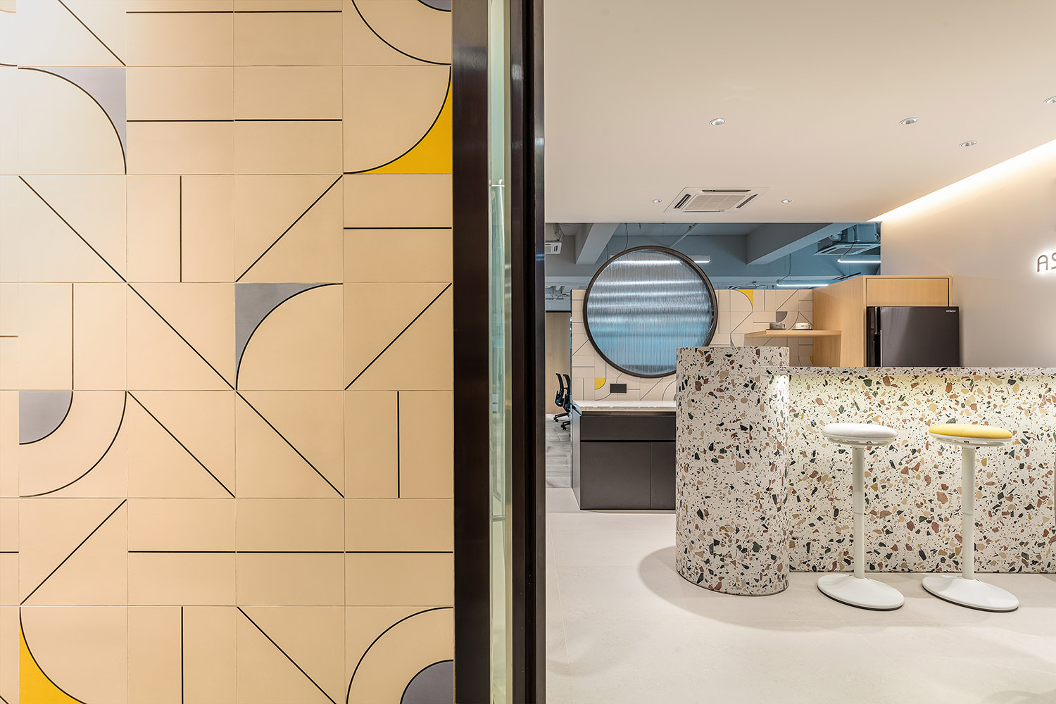
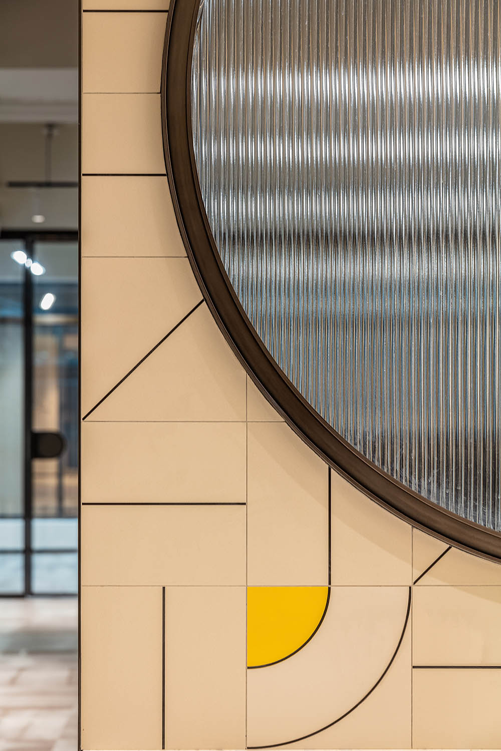
入口處,設計師以公司產品——花磚拚貼出塗鴉風格背景牆,通過材料充分地展現品牌特性。
At the entrance, the designer used the company’s product, flower tiles, to collage the brand logo in graffiti style, fully showing the brand’s characteristics through the material.
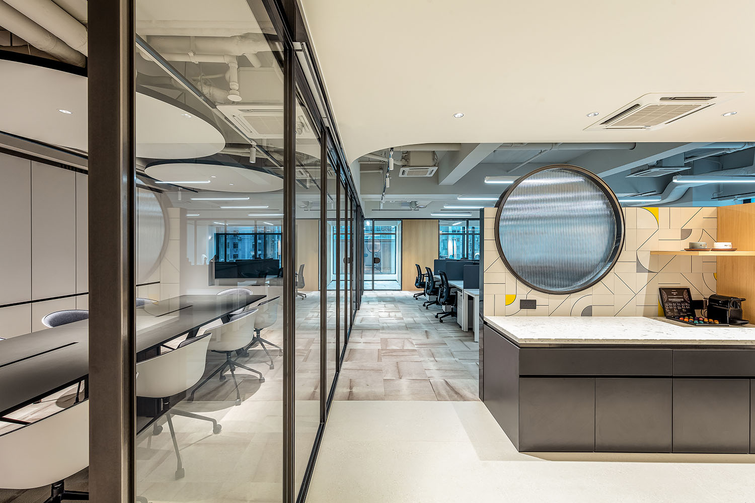
進入前台便來到休閑社交區,之所以把公共活動區域設置在靠近前台位置,是設計師有意識地把共享區與辦公進行分隔。
Enter the front desk and you will come to the casual social area. The reason for setting the public activity area close to the front desk is that the designer has consciously separated the shared area from the office.
在這個區域中,設計師用一個物理空間創造出社區氛圍,這個空間既形成了入口處的緩衝地帶,又承擔了共享/休閑/討論/接待的複合功能,提升使用效率及空間價值。
In this area, the designer used a physical space to create a community atmosphere. This space forms a buffer zone at the entrance, but also assumes the composite function of sharing, leisure, discussion and reception, enhancing the efficiency of use and the value of the space.
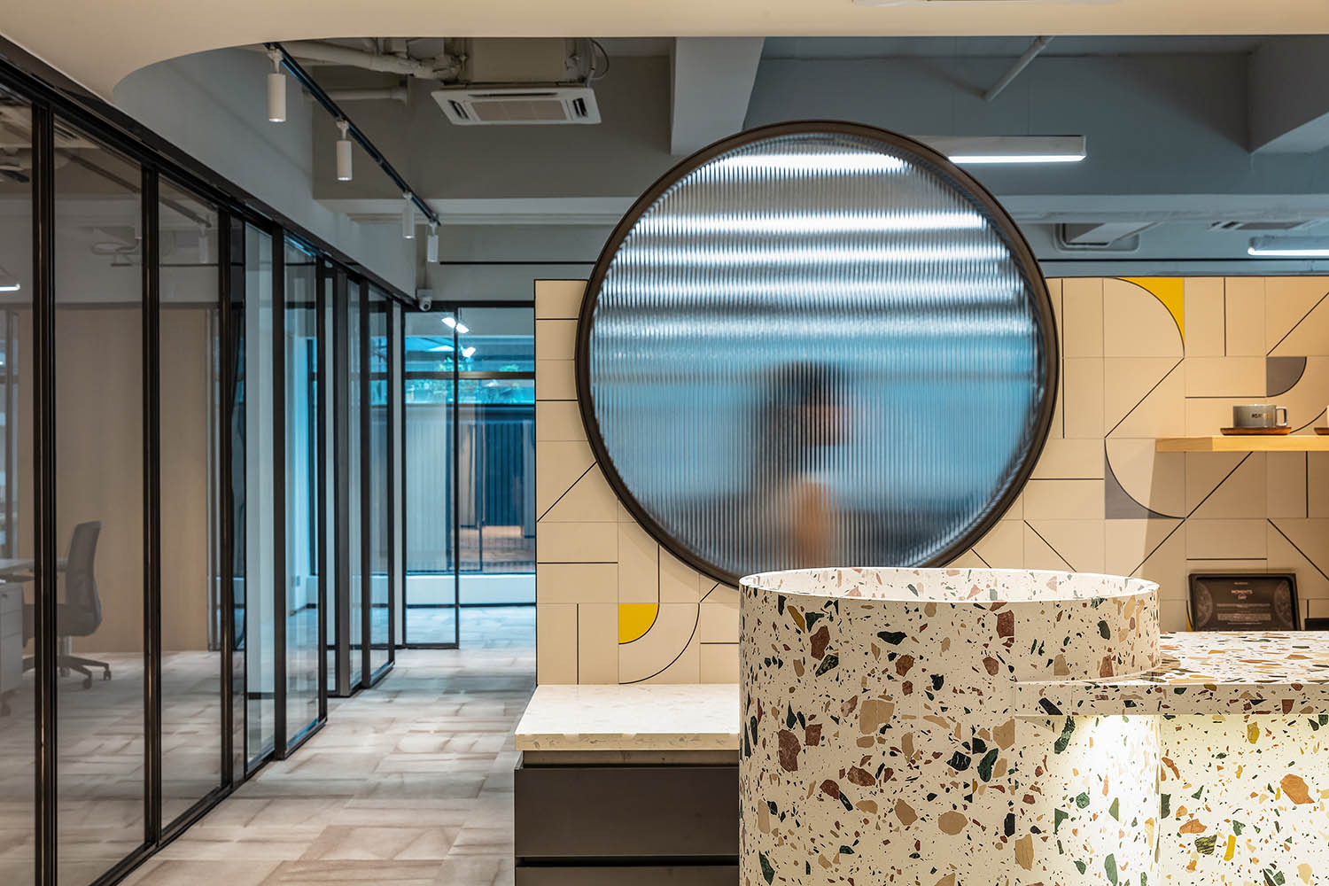
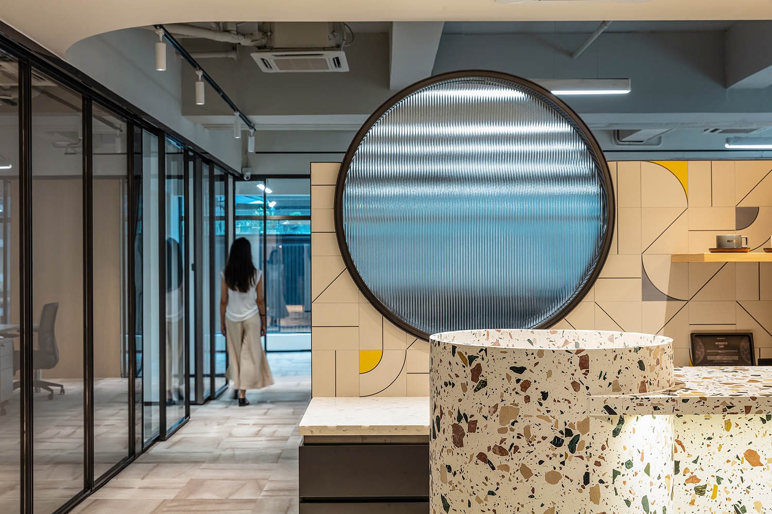
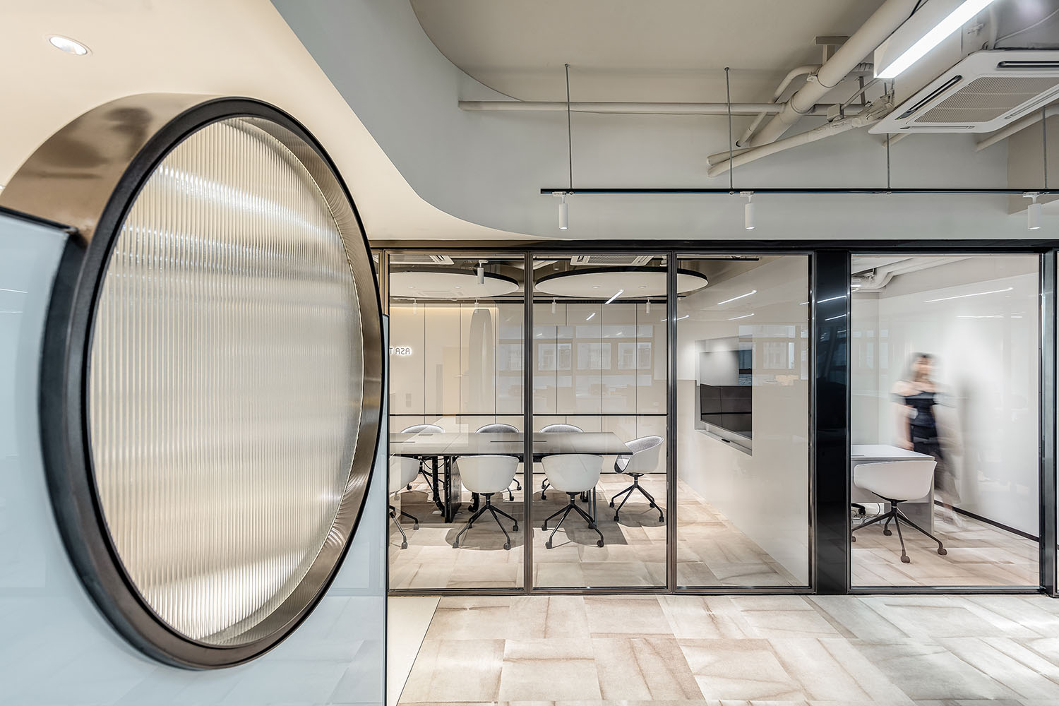
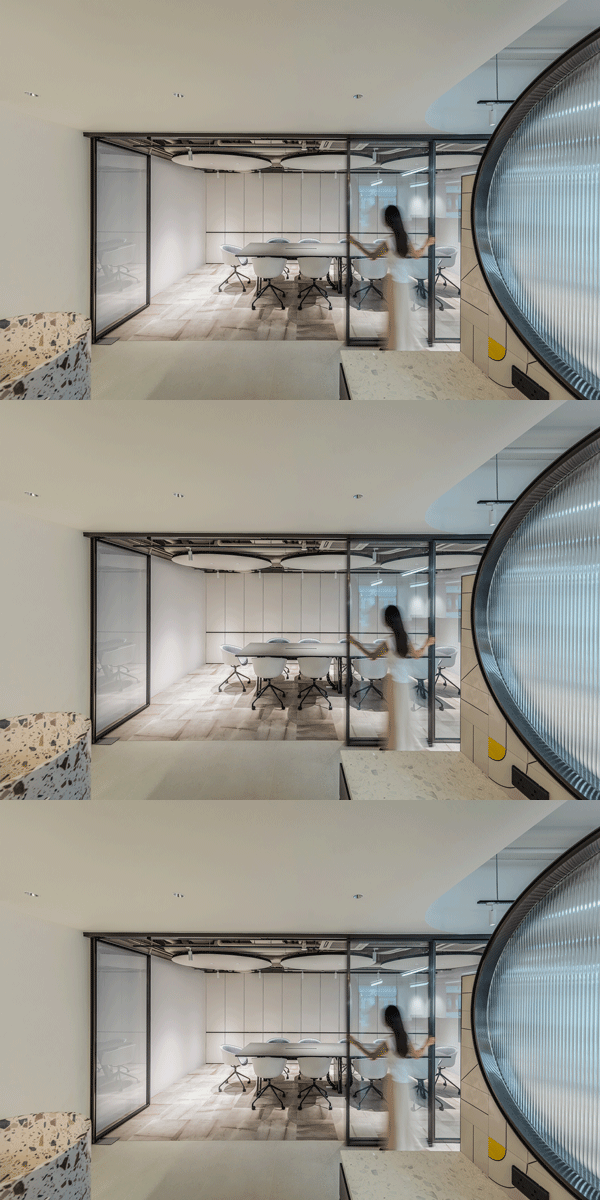
在休閑與辦公區之間的隔斷牆上,設計師以一個圓形長虹玻璃打破沉悶,為空間增加更多通透性與趣味性,在隱約間,讓空間重新串聯。
On the partition wall between the leisure and office areas, the designer breaks the dullness with a circular iridescent glass, adding more transparency and interest to the space, and in a vague way, allowing the space to be re-linked.
以此同時,整體拚色與休閑吧台區背景相呼應,再次點題品牌產品屬性。
With this, the overall color blocking echoes the background of the leisure bar area, again pointing out the brand product attributes.
要說寸土寸金的香港,什麼最貴?那一定是人力與空間,因此,辦公空間更需要高效集成利用。
讓辦公空間價值翻倍同樣是本次設計的核心之一。
現代辦公空間主要分為四大核心區域:開放辦公區、私密辦公區、會議區、休閑社交區。在這個不算大的辦公場景中,OFT設計把四大核心區域變成四大功能模塊,這四大功能模塊之間可以交互與延伸,組成新的模塊。
What is the most expensive thing in Hong Kong,a place where every inch of land is precious? It must be manpower and space. Therefore, office space needs to be efficiently integrated and utilized.
To double the value of office space is also one of the core of this design.
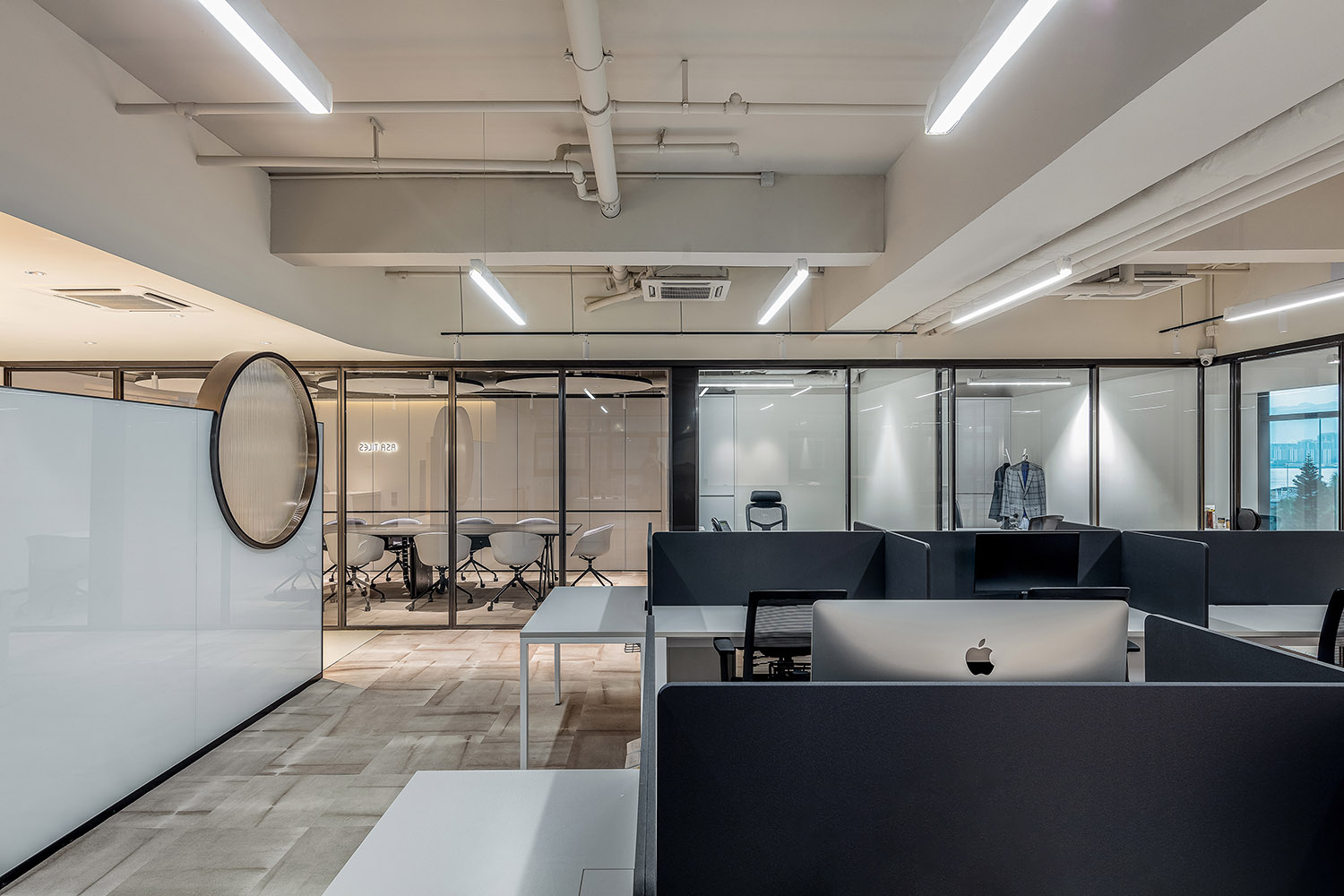
根據空間動線,在穿過第一視覺中心的社交空間後,便是開放式辦公區。
According to the spatial movement line, after passing through the social space of the first visual center, there is the open office area.
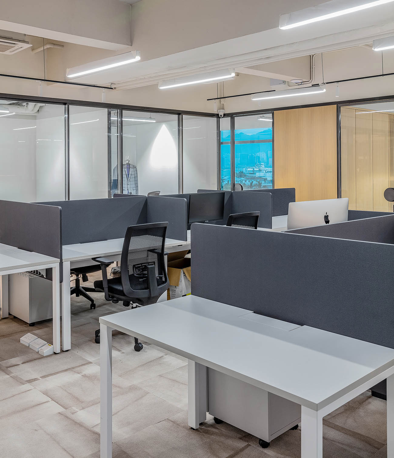
OFT根據根據員工工作屬性及內容,以統一的設計語言及集成辦公家具,讓開放式辦公區也具有一定私密性,有利於提升工作效率。
According to the work attributes and content of the employees, Oft Interiors used a unified design language and integrated office furniture so that the open office area also has a certain degree of privacy, which is conducive to enhancing work efficiency.
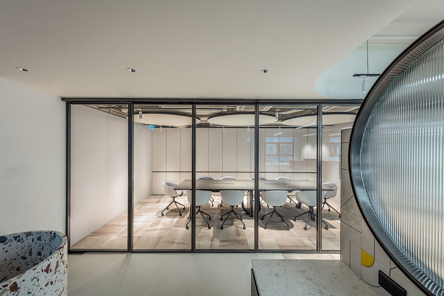
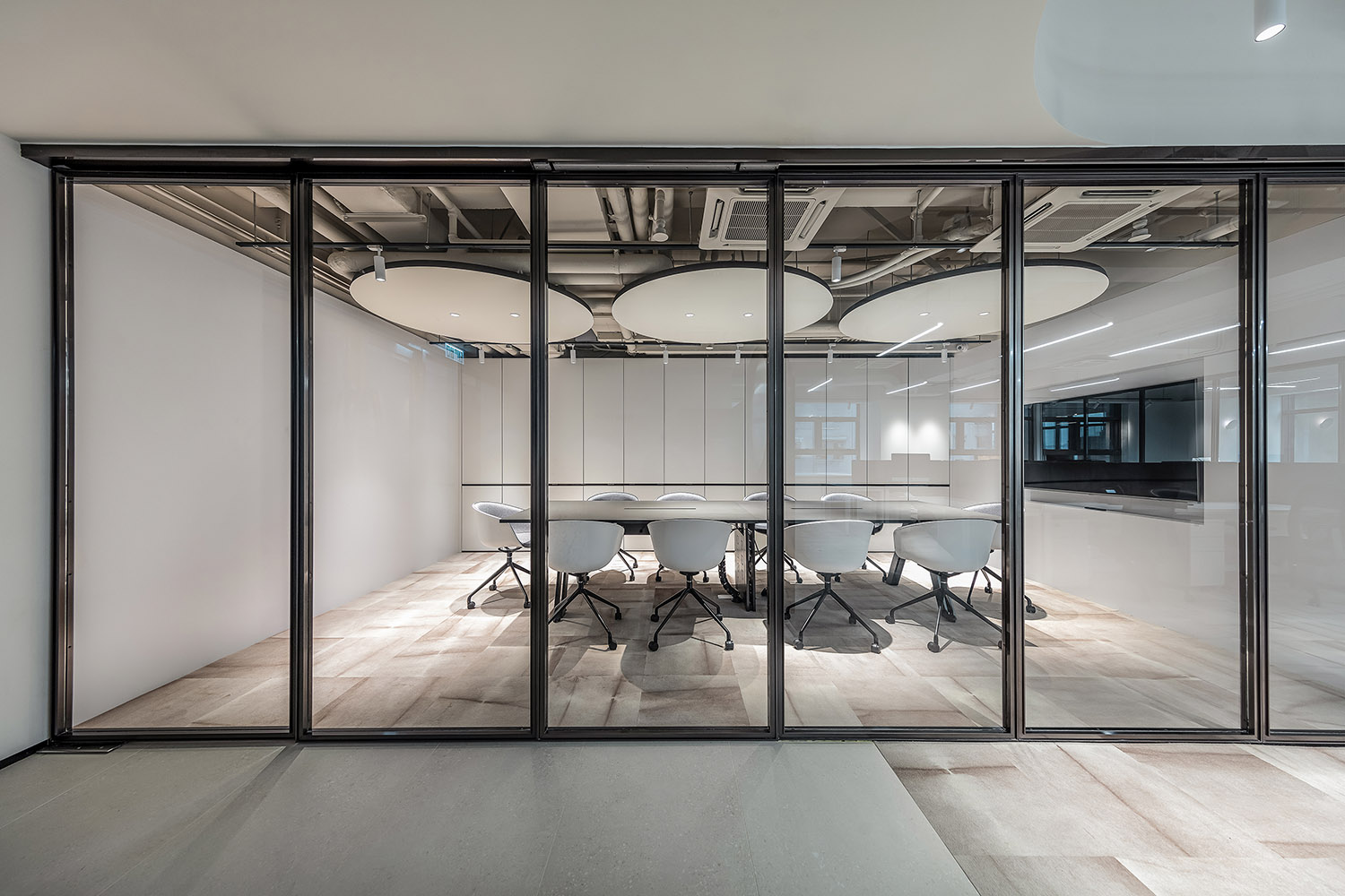
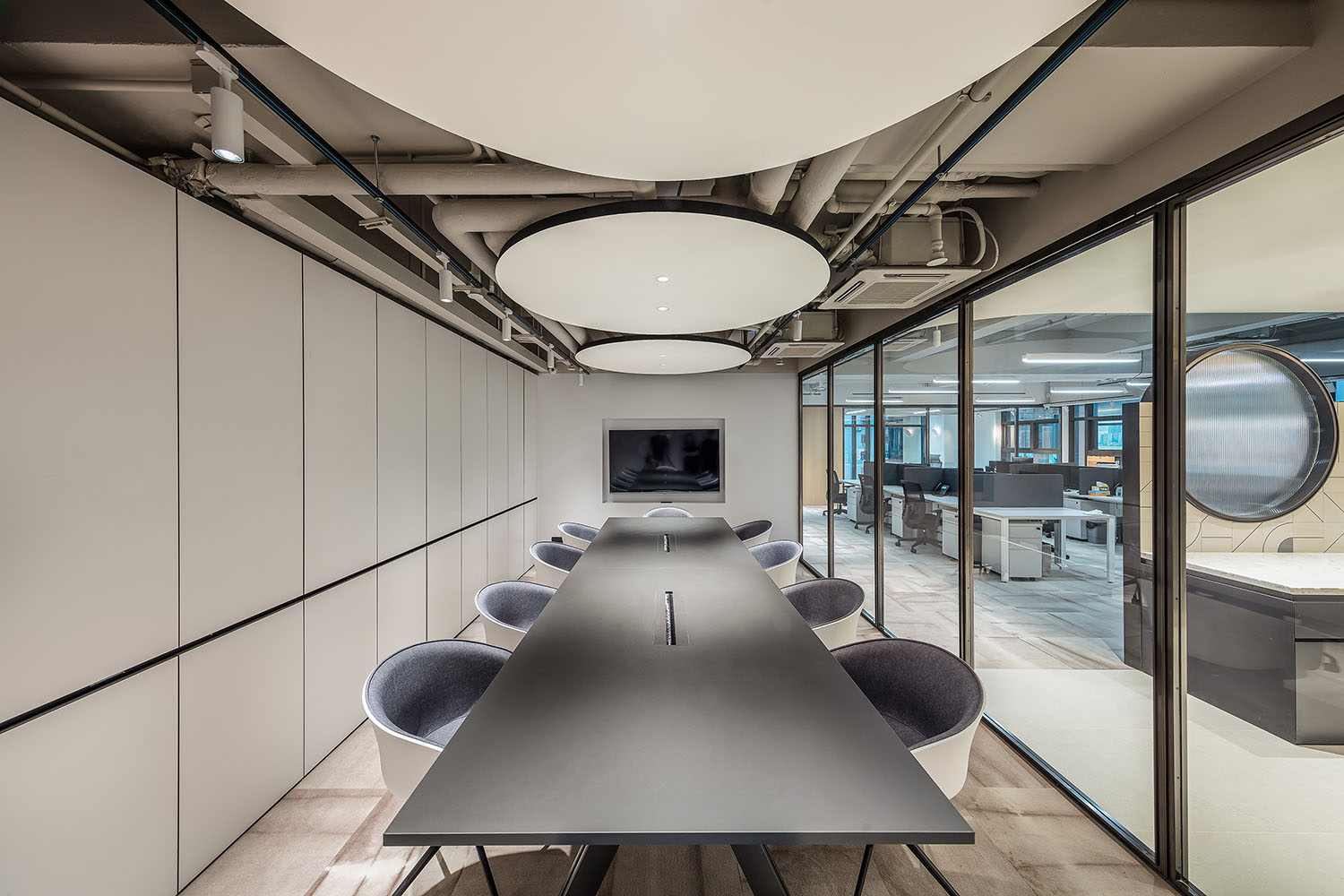
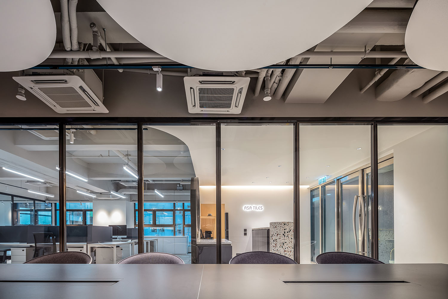
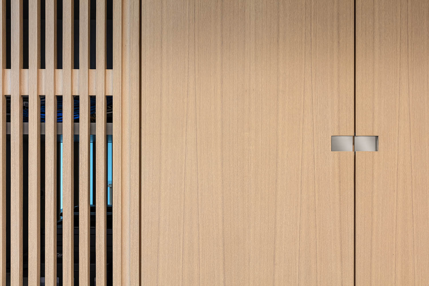
隨後,來到空間的重頭戲——會議區,會議區豎向布局在開放式辦公區及社交區域的一側,黑框窄邊玻璃推拉門形成會議室隔斷係統。
Then, the highlight of the space – the meeting area.It is vertically laid out on the side of the open office and social area, with black-framed narrow-edge glass sliding doors forming a meeting room partition system.
為了功能版塊組合的多樣性以及空間價值最大化,玻璃門可以進行全麵折疊,在全部打開之後,分開的兩個點(區域)就會連成一條線(實現功能麵積最大化)。
In order to maximize the diversity of the combination of functional sections and the value of space, the glass doors can be fully folded so that when they are all opened, the two points (areas) that are separated will be connected into a line (to maximize the functional area).
這樣,休閑與會議兩個不同功能版塊,便可以更靈活地在正式會議與派對時間中輕鬆切換。
In this way, the two different functional sections of leisure and meeting can be more flexible and easily switch between formal meetings and party time.
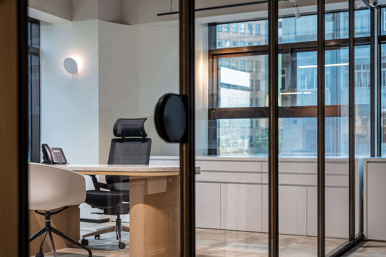
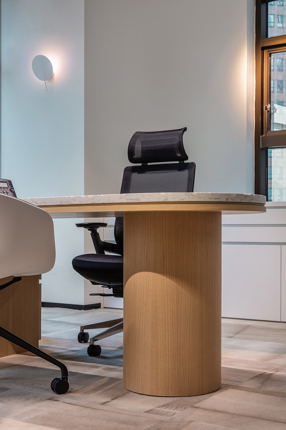
最後,在私密辦公區中,設計師用大麵積玻璃窗將自然光源引入室內,透明的玻璃門,讓整個區域視野更為開闊。
Finally, in the private office area, the designer uses large glass windows to bring natural light into the room, and transparent glass doors to make the whole area more open.
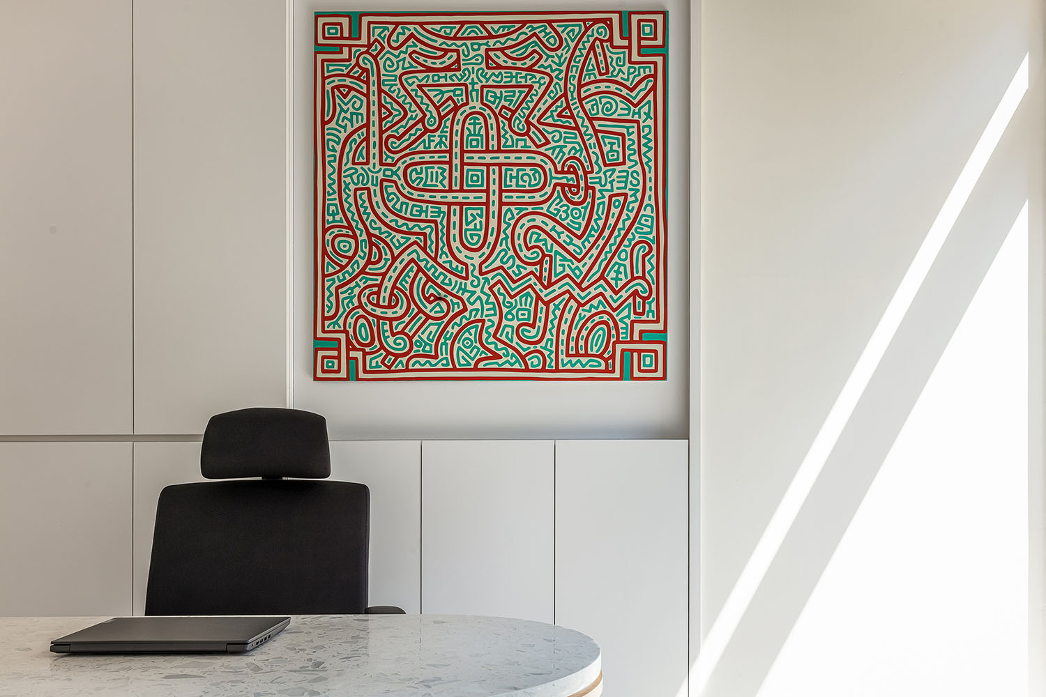
此外,牆上還掛著1980年代美國街頭繪畫藝術家和社會運動者凱斯·哈林(Keith Haring)的塗鴉作品,濃厚波普藝術風格為辦公室帶來更具活力的視覺元素。
In addition, graffiti by 1980s American street artist and social activist, Keith Haring, hangs on the wall,bringing a more dynamic visual element to the office with its strong pop art style.
一個積極、有溫度、開放包容的辦公環境會能讓員工在此產生價值和歸屬感,設計師在滿足功能的同時,還應該有意識地為使用者創造情緒價值。
A positive, warm, open and inclusive office environment will enable employees to create value and a sense of belonging here. Designers should consciously create emotional value for users while satisfying functionality.
在這個辦公室中,設計師在有限空間裏,通過模塊之間的重組、串聯,放大四大功能區價值,消除辦公的邊界,最終實現1+1=第三自定義空間的未來辦公新形態,不僅讓使用者心理更加穩定,也為品牌的長足發展起到至關重要的作用!
In this office, in the limited space, through the reorganization of modules, the designer amplifies the value of the four functional areas, eliminates the boundaries of the office, and finally achieves 1 + 1 = the third custom space, creating the future office new form, which not only makes the user more stable psychologically, but also plays a vital role in the long-term development of the brand!
項目信息
項目名稱:ASA Office
項目類別:辦公空間
項目業主:亞細亞瓷磚
服務內容:策劃/室內設計
設計機構:Oft Interiors
主持設計:鄒卓明/張敬貴
設計團隊:Yoyo Au
項目地址:香港
項目麵積:164㎡
Project Name: ASA Office
Project Category: Office Space
Project Owner: ASA Tile
Services: Planning/Interior Design
Design Agency: Oft Interiors
Lead Designer: CM Jao / Ken Cheung
Design Team:Yoyo Au
Project Address: Hong Kong
Project Area: 164㎡


