礁島、散落、莫名、幾何弧形、有明確的軸角、人作何必比天開
Reef island、 Scattered、Inexplicable、Geometry、Has a clear axis angle
Why do people have to be better than heaven
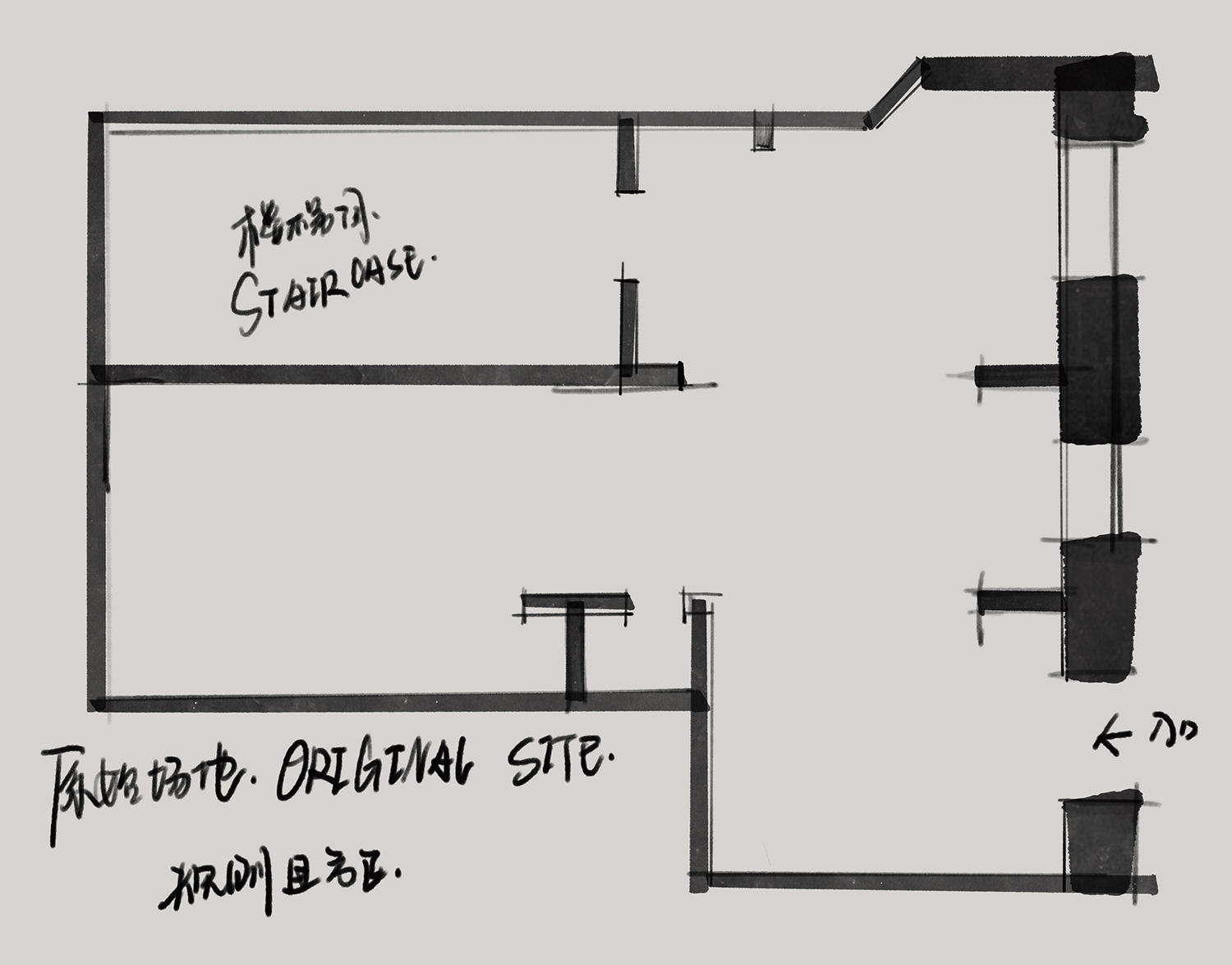
始於場地 Start at the venue
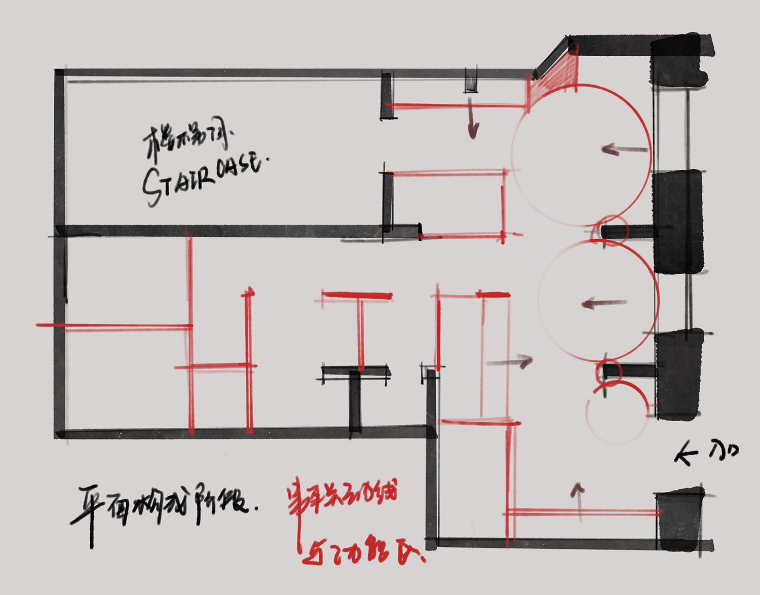
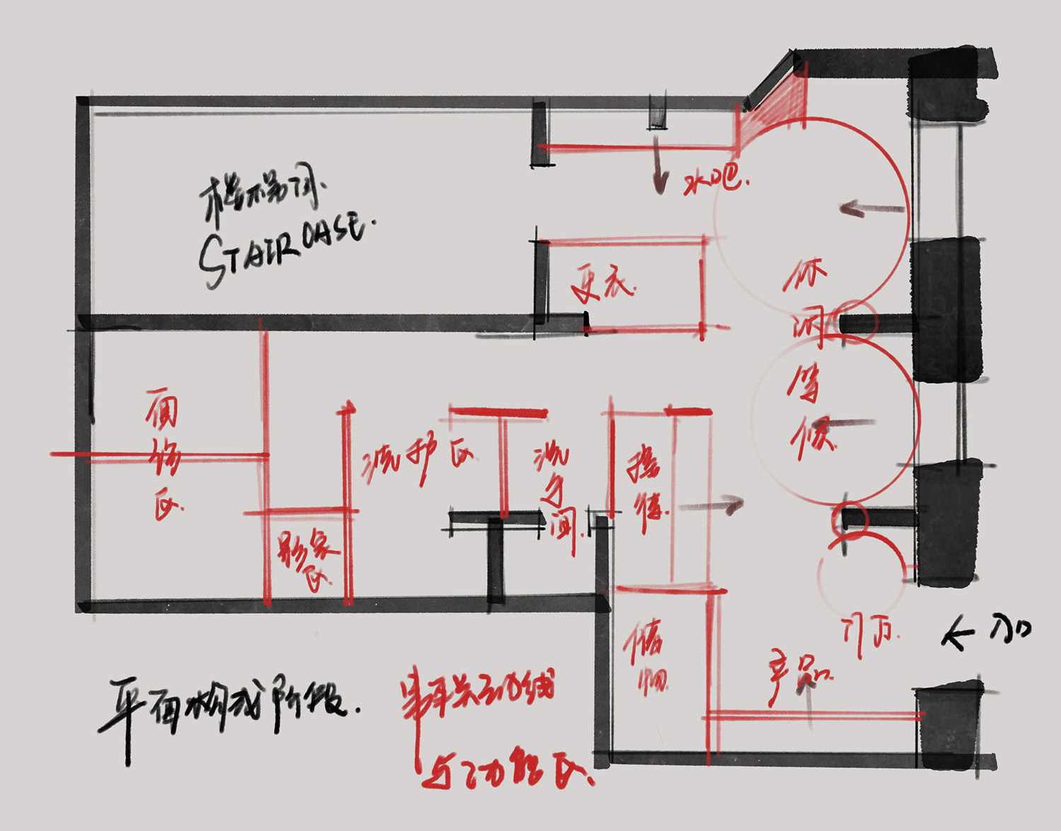
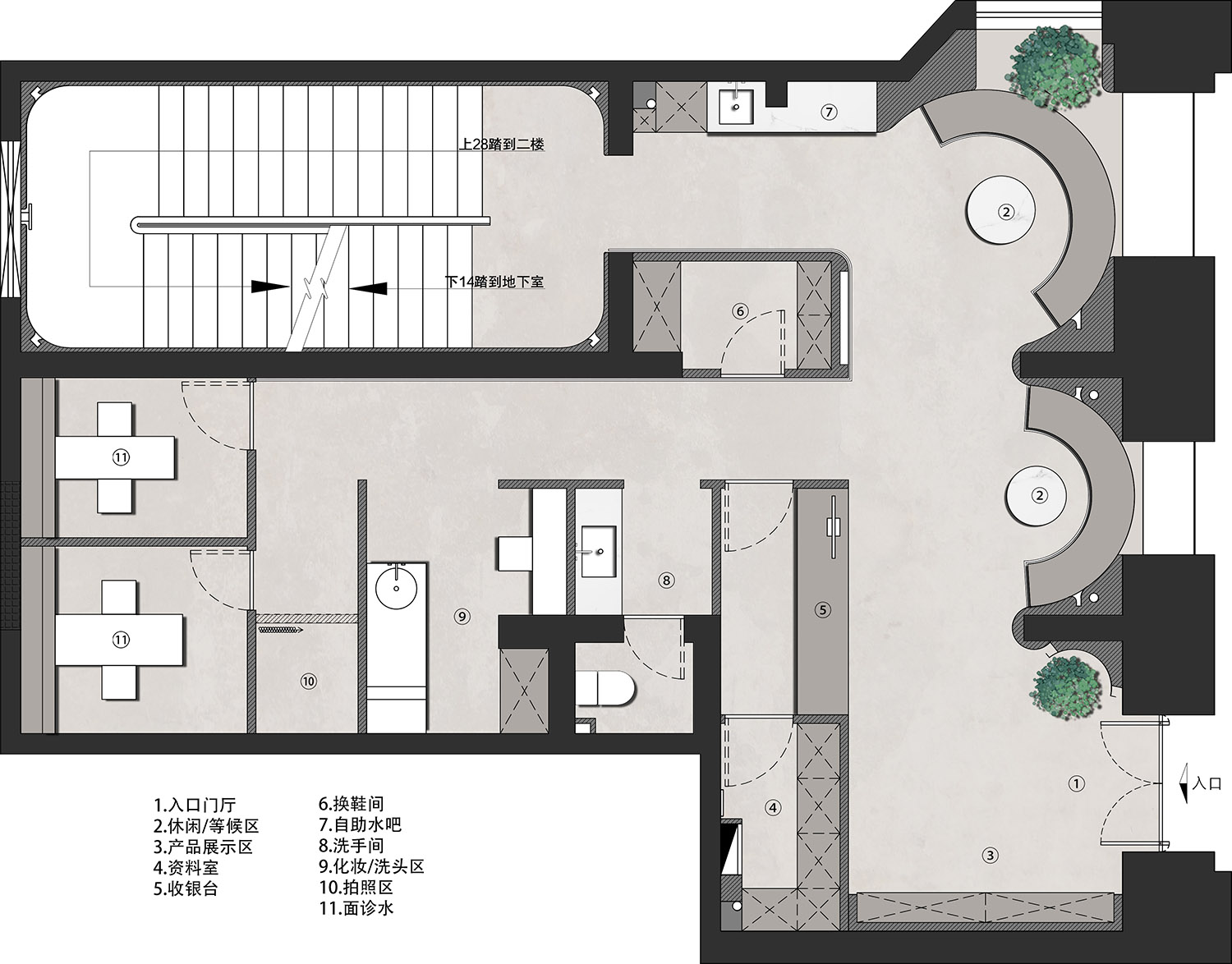
在平麵布局上抓住了建築結構特點,通過空間中的兩根承重體找到空間布局的出發點,展開出符合空間建築特點的空間功能形態,讓建築內部結構與建築本身產生共鳴。
In the plane layout, the characteristics of the building structure are grasped, the starting point of the spatial layout is found through the two load-bearing bodies in the space, and the spatial function form conforming to the characteristics of the space building is developed, so that the internal structure of the building resonates with the building itself.
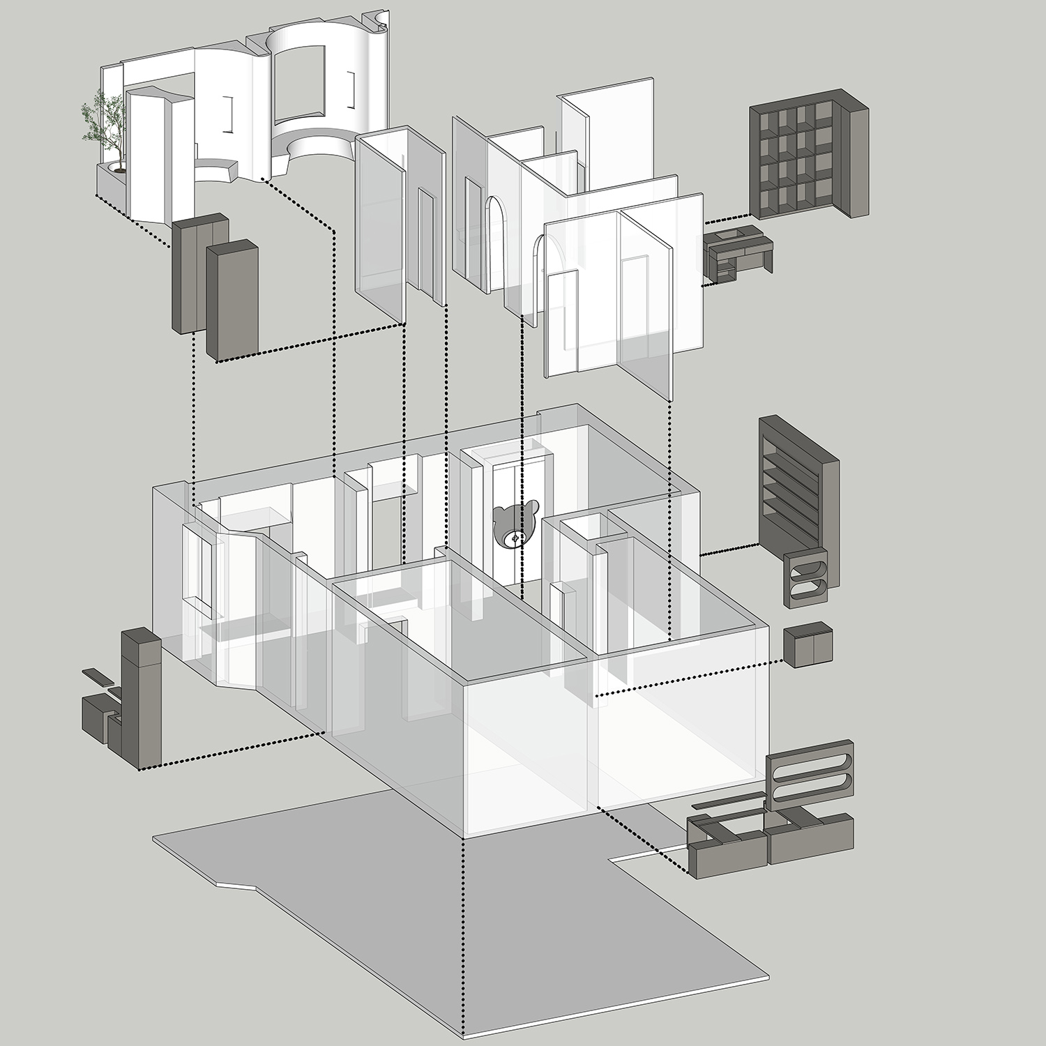
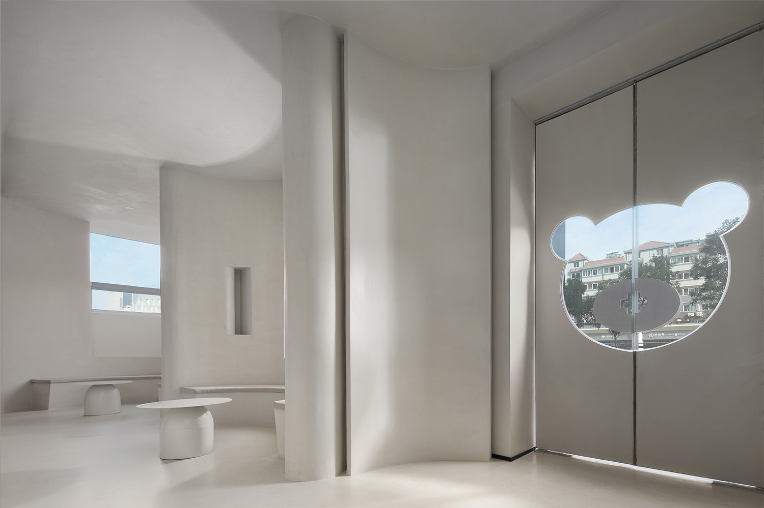
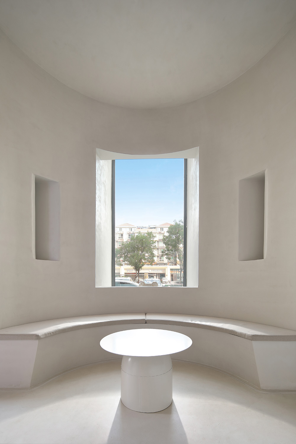
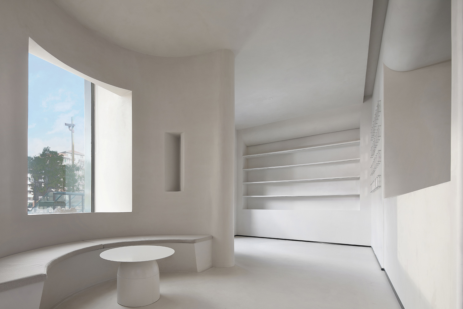
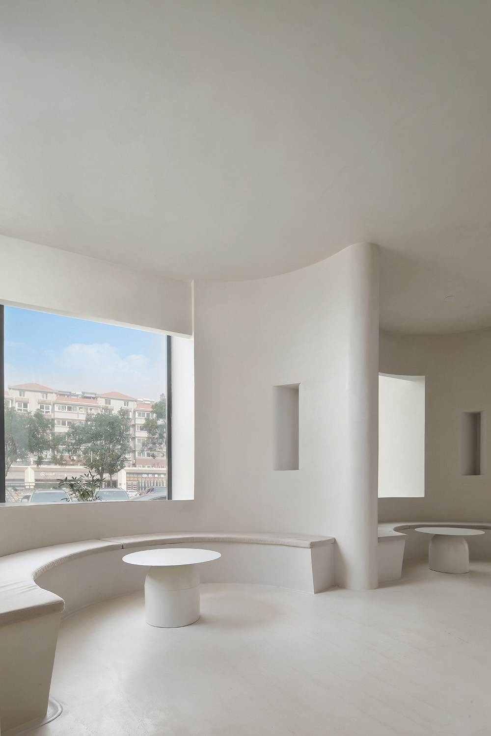
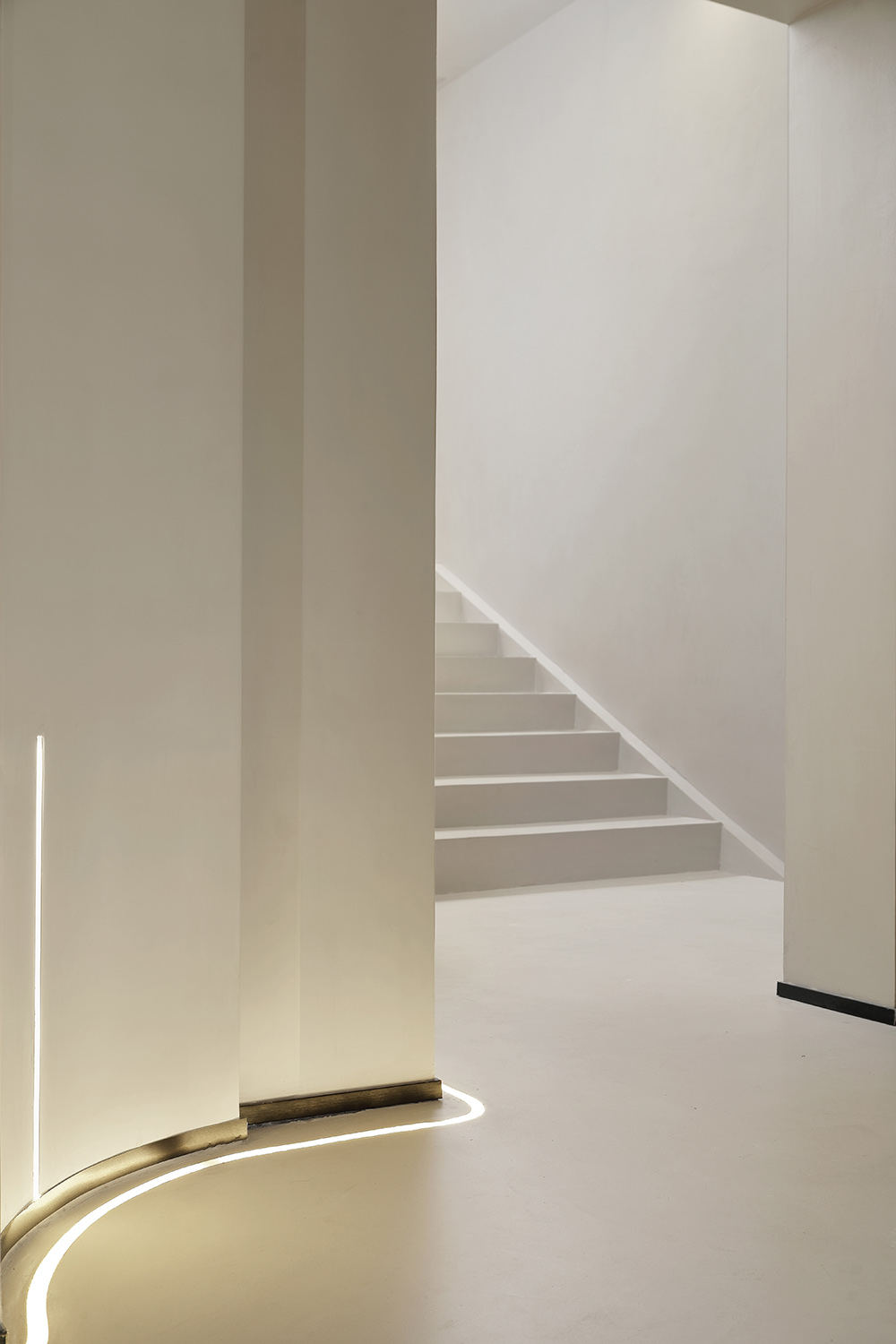
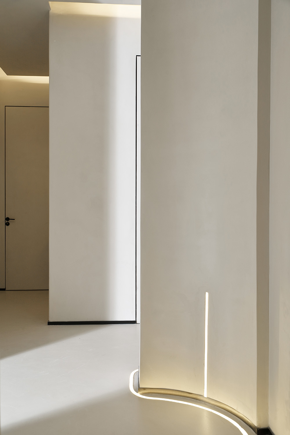
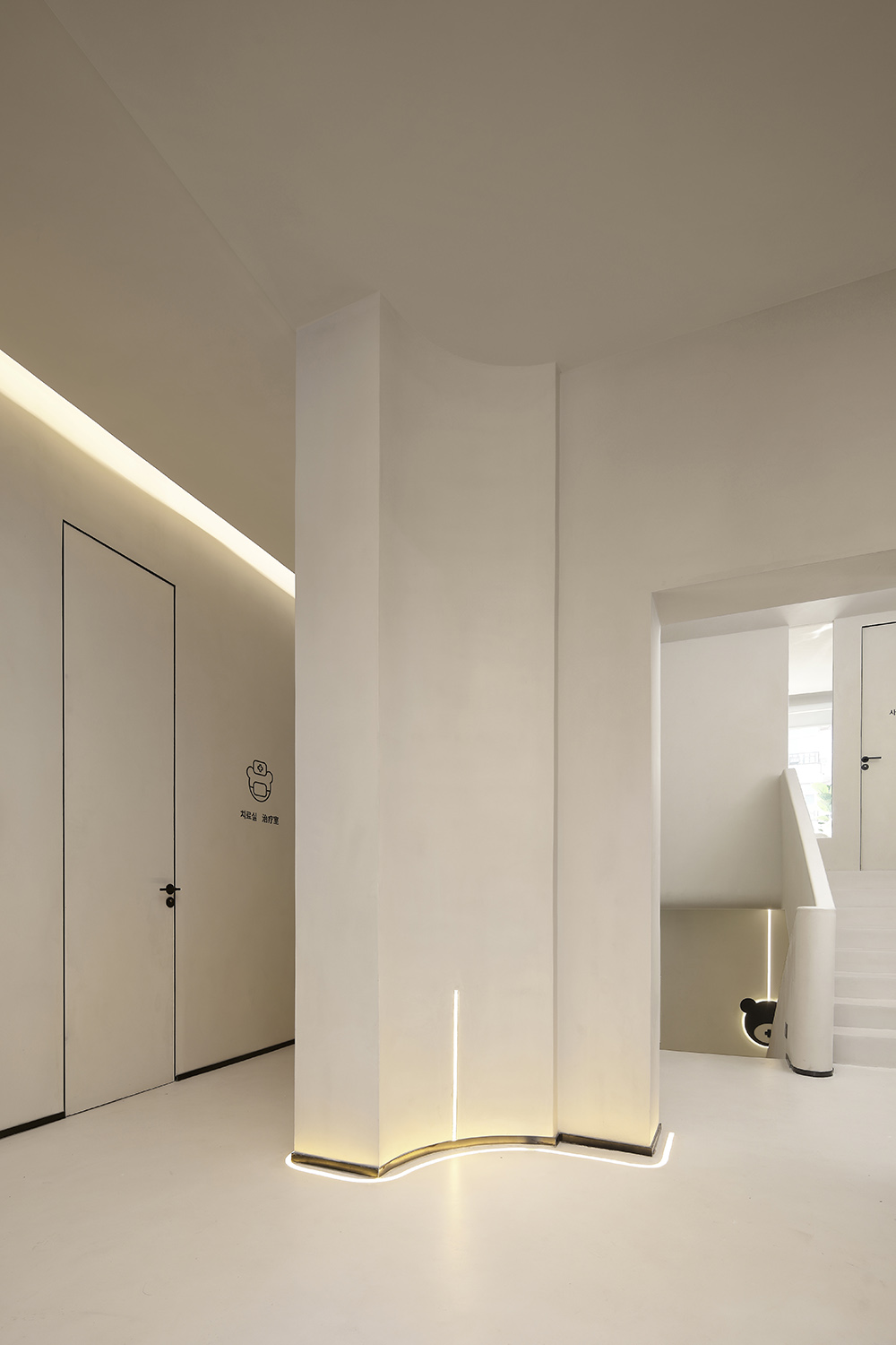
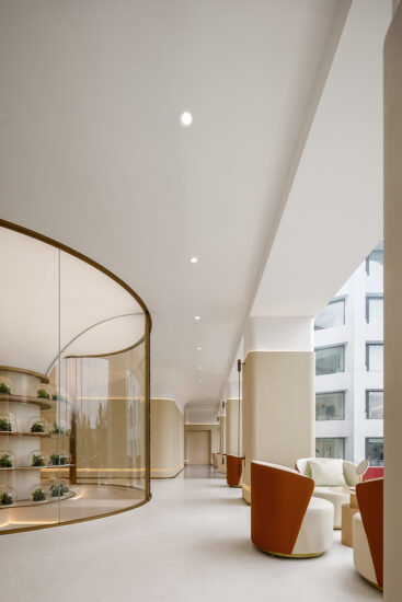
利用曲麵造型的縱向重組做空間分區,模糊了空間分割感,隔斷的曲麵形態在弧形空間中也更具有融入感和流動感;牆地麵一體的材質,隔斷猶如大叔從地麵挺拔而出的形態,呈現出一種完全不同的材料質感和空間張力,營造出流動且柔和的空間曲線。
The vertical reorganization of curved surfaces is used to partition the space, which blurs the sense of space division. The curved shape of the partition also has a sense of integration and fluidity in the arc-shaped space; the integrated material of the wall and the ground, the partition is like an uncle standing out from the ground. , Presenting a completely different material texture and spatial tension, creating a flowing and soft space curve.
區域的分割,不隻是簡單的空間利用,動線依照空間使用者的角度出發,通過前期大量的調查空間內消費者的行為習慣,也結合空間內的各個功能區,依照著空間的使用順序,我們將每一區域都準確的落在場地之中,營造出最適合的空間使用場景。
The division of the area is not just a simple space utilization. The movement line is based on the perspective of the space user. Through a large number of early investigations of the consumer’s behavior and habits in the space, it also combines the various functional areas in the space, according to the order of use of the space. We accurately place each area on the site to create the most suitable space use scene.
01/不被定義 Not defined
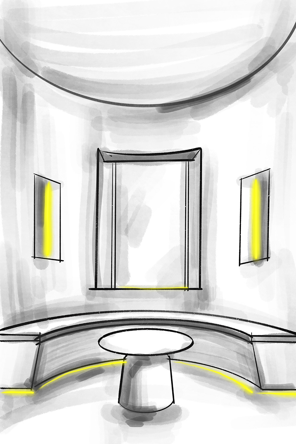
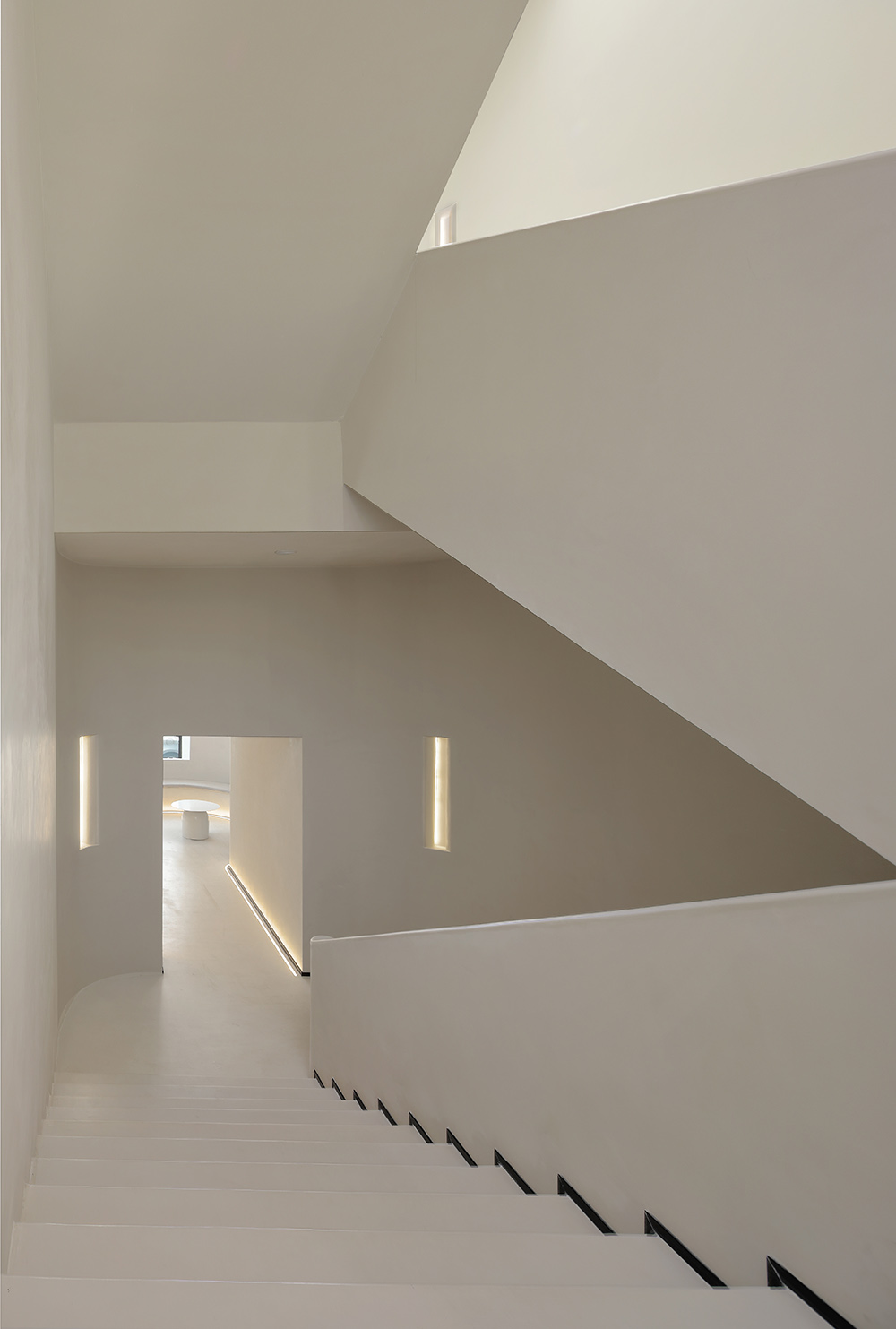
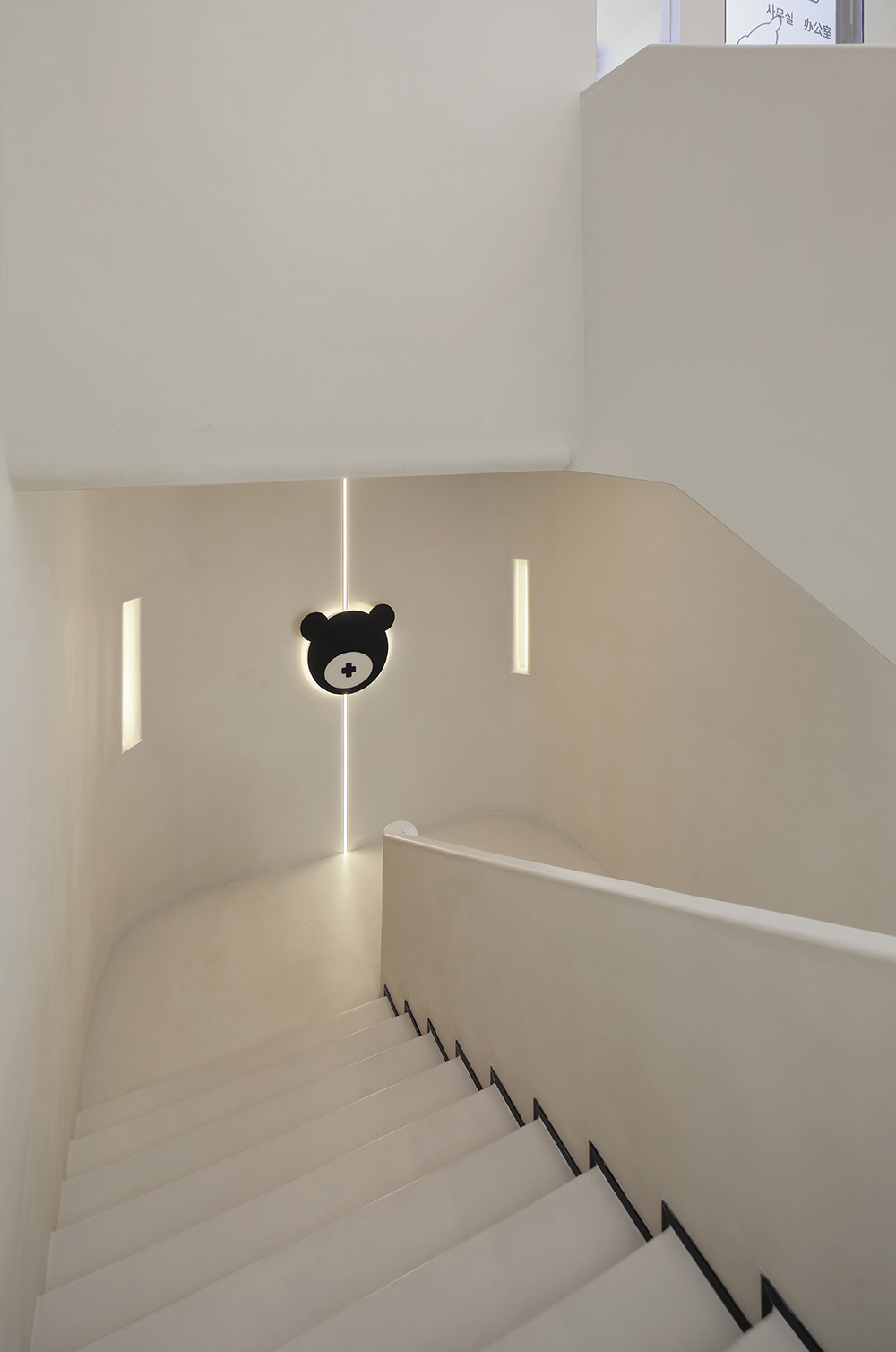
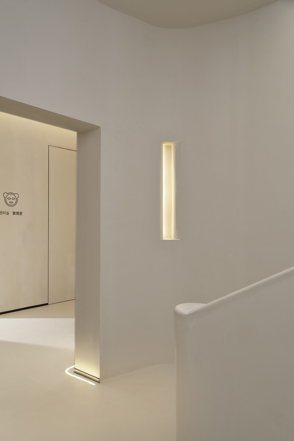
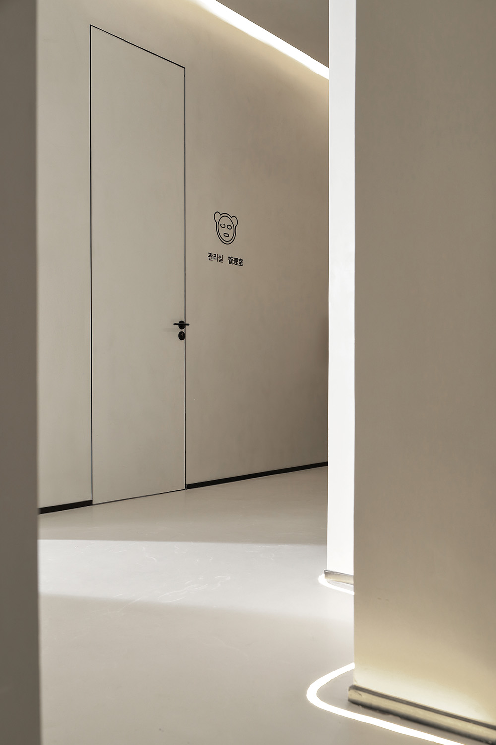
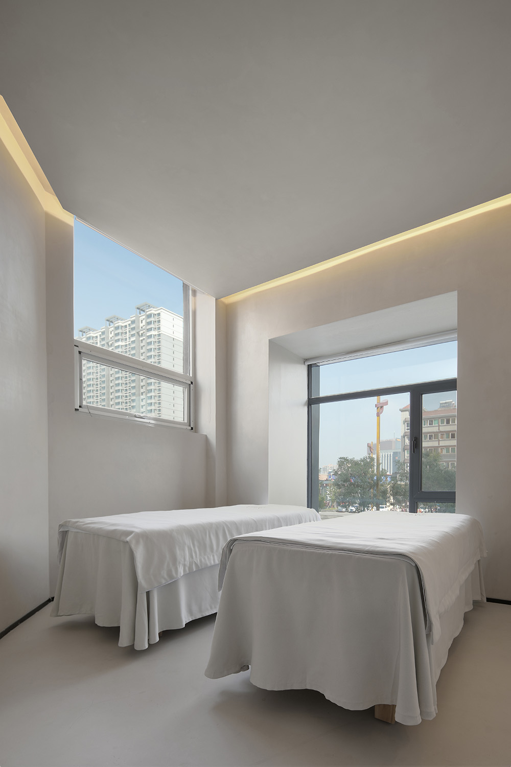
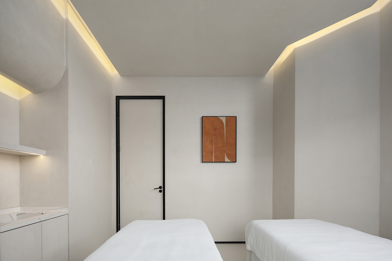
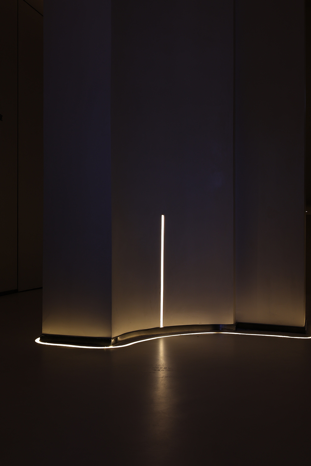
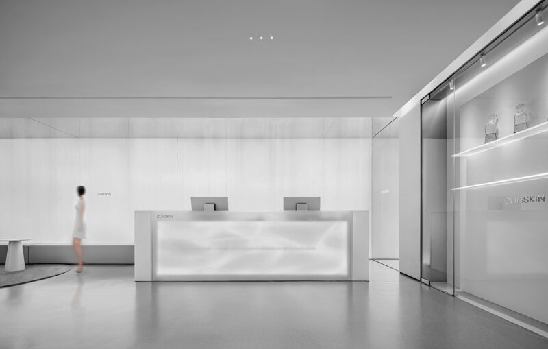
空間盡量保持布局中的“空”與極簡,呈現侘寂的隨性之美。飾品上,契合空間的極簡語言,選擇相同色係的家具陳設,強調空間的完整性。燈光上采用無主燈設計,同樣的簡潔調性,暗藏光源營造氛圍。
The space keeps the “emptiness” and minimalism in the layout as much as possible, presenting the casual beauty of wabi-sabi. In terms of accessories, it fits the minimal language of the space, choosing furniture and furnishings of the same color system, emphasizing the integrity of the space. The lighting adopts no main lamp design, the same concise tone, and the hidden light source creates an atmosphere.
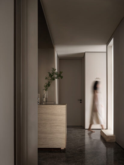
空間以莫蘭迪的中性色調為主,沒有強衝擊力的色彩,以大地色作為基礎用色,自然光下不同空間的不同麵域,又衍生出不同的灰度。
The space is dominated by Morandi’s neutral tones, without strong impact colors, and the earth color is used as the basic color. Different areas of different spaces under natural light derive different gray levels.
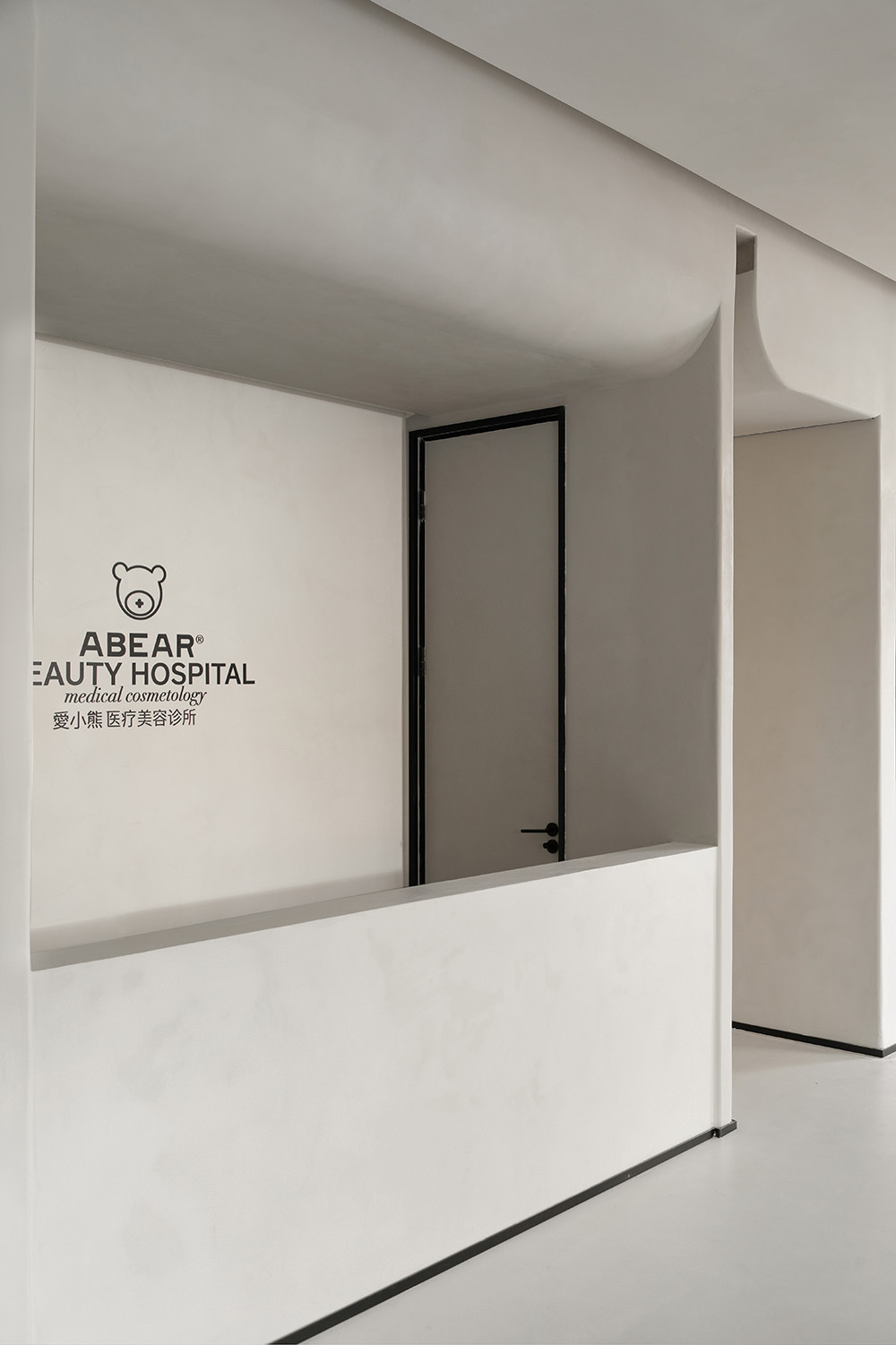
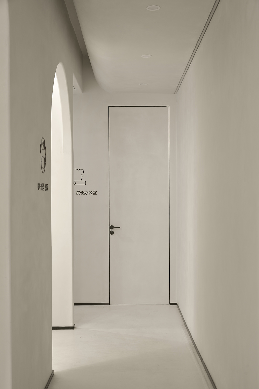
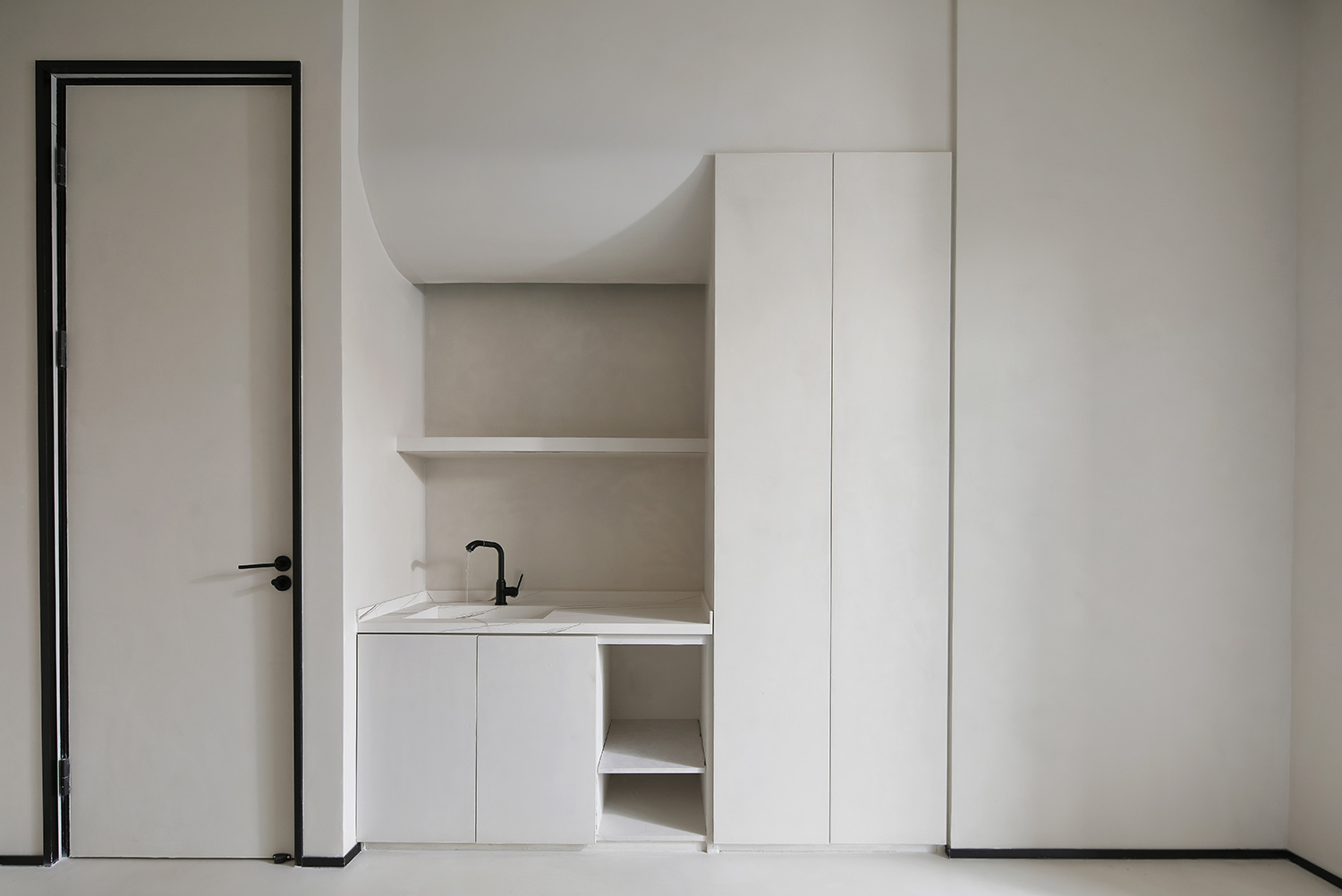
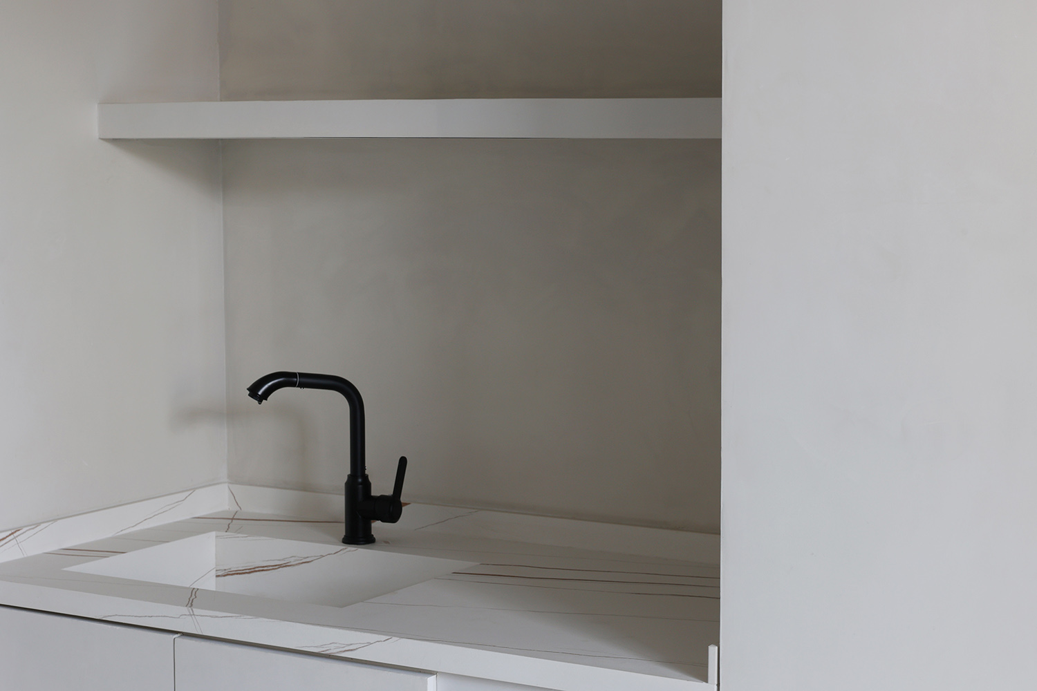
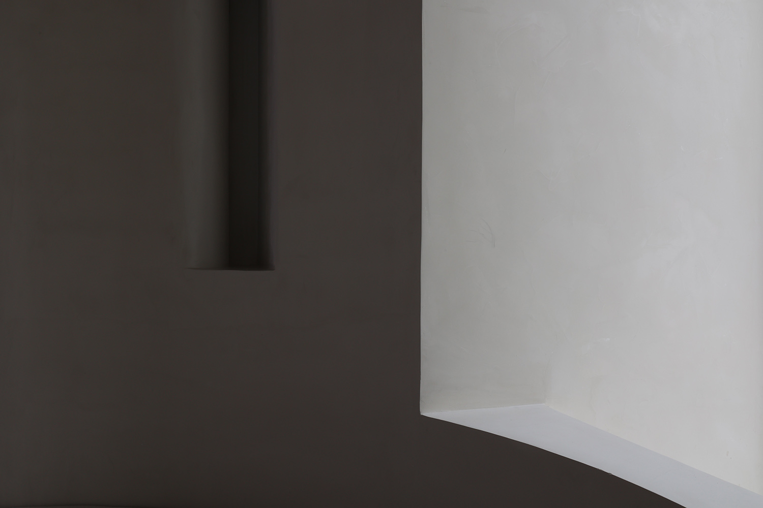
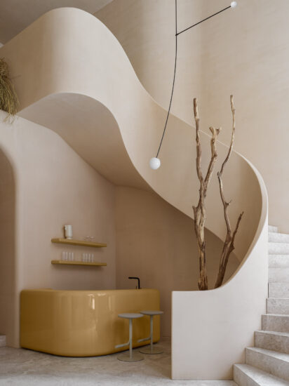
用霧麵代替所有光麵,用質樸取代奢華,呈現著原生態質樸的美感。為了使空間視覺上更加柔和純粹,曲線和曲麵的運用非常廣泛,將各種角度的曲麵重組疊加,呈現出優雅的弧度。牆麵造型上圓弧之間的銜接,在視覺上呈現出流暢之感,不同於直線造型的轉折死板,造型更加優美。
Replace all glossy surfaces with matte surfaces, and replace luxury with simplicity, presenting the beauty of the original ecology and simplicity. In order to make the space visually softer and purer, the use of curves and curved surfaces is very extensive, and the curved surfaces of various angles are reorganized and superimposed to present an elegant arc. The connection between the arcs on the wall modeling presents a sense of smoothness visually, which is different from the rigid turning of the straight line modeling, and the modeling is more beautiful.
社交空間手稿 Social space manuscript
為訪客營造出一種相對連貫切完整的空間體驗: 一方麵時刻身處錯綜複雜、峰回路轉的小空間裏,另一方麵又始終能夠感覺到一個完整連貫的、更大的背景式空間的存在。
Create a relatively coherent and complete spatial experience for visitors: on the one hand, they are always in a small space that is intricate and turbulent, on the other hand, they can always feel the existence of a complete, coherent and larger background space.
放大基地原有牆叢的形式力量,通過將整個前廳視作一個完整的大空間、將離散的牆體視作獨立於這個大空間中的零散個體,在視覺上切斷原有剪力牆與天花和地麵間的剛性力學連接,由此消解它們帶來的空間割裂感。
Amplify the formal power of the original wall clusters of the base, and visually cut off the original shear wall and The rigid mechanical connection between the ceiling and the ground eliminates the sense of spatial division they bring.
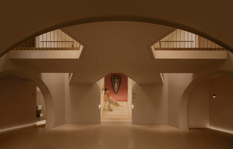
進入空間,曲線與直線的組合架構大型的幾何體量,通體微水泥的使用,搭配空間結構協作塑造強烈的衝擊感。視覺上線條的延伸交織,內含人體細胞流動的本質,當進入者緩緩而行,靜與動的相對情境才開始發揮作用。
Entering the space, the combination of curves and straight lines constructs a large geometric volume, the use of micro-cement throughout the body, and the spatial structure collaborate to create a strong sense of impact. Visually, the extension and interweaving of lines contains the essence of human cell flow. When the entrants walk slowly, the relative situation of static and dynamic begins to take effect.
02/吸引力 Attractive
摒棄傳統硬朗的棱線,空間中柔中帶力的曲線,讓原本固態的空間變的靈動,以此體現出在女性身上獨有的特性。正如設計師所說,“我不希望它隻是一間的有醫療功能的空間,作為一個塑造美的地方,我更期待來訪的人都能在踏進這片空間時即刻開始從身體到心靈重塑美的曆程。”
Abandon the traditional tough ridgeline, the soft and powerful curve in the space makes the original solid space become agile, thus reflecting the unique characteristics of women. As the designer said, “I don’t want it to be just a space with medical functions. As a place for shaping beauty, I hope that visitors can begin to reshape their body to mind as soon as they step into this space. The journey of beauty.”
暗係場景氛圍的營造,讓光點亮的地方成為主角。陰影沿著光的邊緣舒展,賦予進入者無限的想象空間。不同層次的明暗轉換給予內心情緒的釋放和強烈的自我屬性,讓舒緩自由的體驗感貫穿始終。
The atmosphere of the dark scene is created, so that the place lit by light becomes the protagonist. The shadow stretches along the edge of the light, giving visitors unlimited imagination. Different levels of light and dark conversion give the release of inner emotions and a strong self-attribute, allowing a sense of soothing and free experience throughout.
以預約服務的體係為依據,空間流程由一層空間接待到二樓的VIP房間,與傳統美容場所的迥異的空間形式,試圖揉合兩種矛盾:極端的厚與輕盈,極端的強與柔軟。以空間的矛盾性與戲劇感闡述對當代女性表象與內在關聯的呈遞。
Based on the reservation service system, the spatial process is from the first floor space to the VIP room on the second floor, which is a completely different space form from traditional beauty places, trying to combine two contradictions: extreme thickness and lightness, extreme strength and softness . Explains the presentation of contemporary women’s appearance and inner connection with the contradiction of space and the sense of drama.
03/探索性 Exploratory
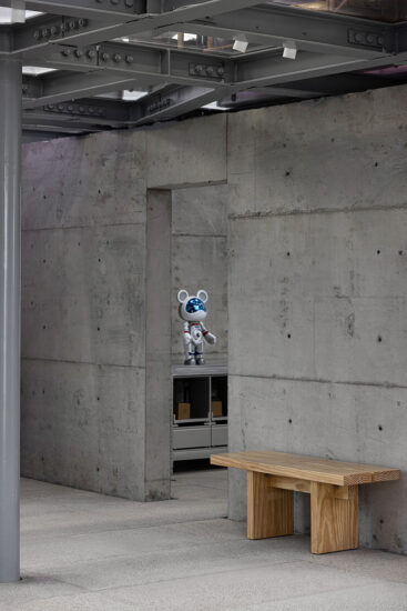
物質與精神考量的交集,或分或合,似是而非,而人與情感的融入則促使新的畫麵和記憶不斷生長,創造出一個具有矛盾體係而又極致平衡的藝術空間。材質上的天然屬性,是啟發另辟蹊徑的最佳操盤手,從不拘泥於舊形式,簡約又前衛的個性,為人們帶來新的感官體驗,製造出酷炫的未來感。
The intersection of material and spiritual considerations, divided or combined, is plausible, while the integration of people and emotions promotes the continuous growth of new pictures and memories, creating an art space with contradictory systems and extreme balance. The natural attributes of the material are the best traders who inspire another way. They never stick to the old form, and their simple and avant-garde personality bring people a new sensory experience and create a cool sense of the future.
對空間屬性的高度同頻,是靈感隨手拈來的深層根源。在通透的空間動線中,硬核的紋路,濃厚的未來科技氛圍,毫不掩飾地噴薄而出,呈現出動感與前衛的視覺品質。設計師以“見與不見”作為思考原點,在井然有序的空間中,巧妙運用時間上的錯位感,創造人與人、人與空間、空間與空間的隔離與交叉感,用創意營造出戲劇化衝突的空間褶皺,形成了更富有韻律和耐人尋味的故事脈絡。
The high co-frequency of spatial attributes is the deep source of inspiration. In the transparent space movement, the hard-core texture and the strong atmosphere of future science and technology spray out without any disguise, presenting a dynamic and avant-garde visual quality. The designer takes “seeing and not seeing” as the starting point of thinking. In the orderly space, the designer cleverly uses the sense of time dislocation to create a sense of isolation and intersection between people, people and space, space and space, and create a sense of isolation and intersection with creativity. The spatial folds of dramatic conflict have formed a more rhythmic and intriguing story line.
空間的交錯縱橫,以“幻影”抽離現實,以“視覺”表達感知,於“靜”的態勢中,衍生出 “動”的強烈對比,如一場煙花般絢爛的空間魔術,讓人著迷於其中,心甘情願被牽引著赴一場藝術的催眠。大場景氣度不凡,小細節也耐人尋味,這是兼容各種情緒的玩味。輕盈時尚,詮釋不凡,細膩的細節處理,和視覺處恰到好處的比例心機,藝術的基因便是以這樣的方式,注入我們的靈魂。
The space is criss-crossed, drawing away from reality with “phantoms” and expressing perception with “visuals”. In the “quiet” situation, it derives a strong contrast of “movements”. The splendid space magic like a firework makes people fascinated. Among them, I was willing to be led to an artistic hypnosis. The grand scene is extraordinary, and the small details are also intriguing. This is a playful compatibility with various emotions. Light and fashion, extraordinary interpretation, exquisite detail processing, and the right proportion of the vision, the gene of art is infused into our soul in this way.
04/美與自由 Beauty and freedom
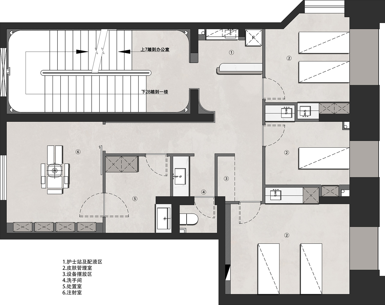
設計邏輯如上,並無而致。該項目設計邏輯是由點及麵進行鋪展。始於使用者在一張美容床上的具體行為尺度,空間體感與周邊功能配置進行分析和延展。這種設計方法在有限的麵積條件下提供了客房極高的空間功能適用性和體驗感的平衡,並通過緊湊式的魚貫空間構造,創造出內部動線的導向性及延展性和空間體感的戲劇性。
The design logic is as above, and nothing happens. The design logic of the project is spread by points and surfaces. It starts with the analysis and extension of the user’s specific behavioral scale on a beauty bed, spatial somatosensory and peripheral functional configuration. This design method provides rooms with a very high balance of functional applicability and experience in a limited area, and through the compact structure of the space, creates the guidance and ductility of the internal circulation and the sense of space. dramatic.
實際上,矛盾的一麵對立存在於每一個場景畫麵裏,另一麵卻又和諧地統一於這個空間中。好似美容的過程中細胞經曆的死亡與重生,也好似每個人內心的自我掙紮及至蛻變、釋懷。
In fact, one side of contradiction exists in every scene, while the other side is harmoniously unified in this space. It is like the death and rebirth experienced by the cells in the process of beauty, and it is also like the self-struggle of each person’s inner self-struggle, metamorphosis and relief.
一組現象的外表與內部從來都是一種龐大又絕對的承前啟後。根本不必停留在狹隘的關於是否應當追求美貌或追求美貌是否道德恰當的愚蠢討論上。通過材料關係與空間形式的層層矛盾感的建立來探討女性性狀的邊界,通過建構亮與陰翳,強及柔和的形式對撞來產生頗具戲劇性的商業空間體驗,通過硬朗冷靜的表象風格與充滿感性的空間觀念來試圖描述人的物理性別與社會性別交織的內在的複雜度。
The exterior and interior of a group of phenomena have always been a huge and absolute link between the past and the future. There is no need to stop at narrow and stupid discussions about whether beauty should be pursued or whether the pursuit of beauty is morally appropriate. Exploring the boundaries of female traits through the establishment of layers of contradictions between material relations and spatial forms, and creating a dramatic commercial space experience through the collision of bright and cloudy, strong and soft forms, through the tough and calm appearance style and fullness The perceptual concept of space attempts to describe the inherent complexity of the intertwined physical gender and social gender of a person.
05/入微 Intricate
她們的外表與內在存在戲劇性的迷人反差,這種特定的內質令今天的女性審美存在一種普遍的叛逆感與矛盾感。如同主體空間的水泥質感並不指向粗粒,相反,水泥質地的調配有膚感般的細膩和精確,同時依然在整體上呈現出灰調的沉靜。
There is a dramatic and fascinating contrast between their appearance and the inside. This specific inner quality makes today’s female aesthetics a universal sense of rebellion and contradiction. Just as the cement texture of the main space does not point to coarse grains, on the contrary, the cement texture is adjusted with skin-like fineness and precision, while still presenting the calmness of gray tone on the whole.
無論是藝術的
還是前衛的
人文是一切的靈魂底色
為空間植入的所有立意
都是為了喚起人民心靈深處的音符
或是安適 或是雀躍
Whether it is artistic
Still avant-garde
Humanities are the soul background of everything
All ideas implanted in the space
All to evoke notes from the depths of people’s hearts
Or Anshi Or jumping for joy
∇ 一層平麵布置圖
∇ 二層平麵布置圖
項目信息
項目名稱:愛小熊醫療美容
設計公司:末染設計
聯係郵箱:moothan@sina.com
完工時間:2021.10
建築麵積:260㎡
項目類型:商業空間
項目地址:臨汾市
攝影:RICCI空間攝影、雙備
材料 :微水泥
Entry name/ABEAR BEAUTY
Design company/moo than.design
E-mail/moothan@sina.com
Time of completion/2021.10
Dimension/260㎡
Category/Commercial space
Location/Linfen City
Photography/Ricci spatial photography,Shuangbei
Material: Microcement




評論(1)
照明夠用嗎