背景 Background
在重慶革命曆史的長河中,這座城市留下了許多獨一無二的東西,防空洞就是其中之一,這是一個龐大的隱秘世界。戰時的重慶山多路窄,不少的防空洞都是依山而建。在這片獨屬霧都的地下城,環境陰冷又潮濕,黑黢黢的洞子深不見底,這是洞穴自帶的“迷宮美學”。
In the long history of Chongqing’s revolutionary past, the city has left behind many unique things, and one of these is the air-raid shelter, which is a vast and hidden world. The hills of wartime Chongqing were so narrow that most of the air-raid shelters were built on hills. In this unique underground city of fog, the environment is cold and damp, and this is a cave with a “labyrinthine aesthetic”, which is so dark and deep that it cannot be seen from the bottom.
空間概念 concept
Caver源於cave這個單詞,洞穴。但Caver並非指居於洞穴的穴居人,而是勇於深入洞穴的探險者。這與場地空間感相呼應,寓意著我們即將開始一場奇幻的山體空間探索。
Caver is from the word cave. But caver does not refer to the dwellers who live in the cave, it means the explorers who venture deeper into the caves. This echoes the spatiality of the site, signifying that we are going to have a fantastical exploration.
前期探索 Previous Exploration
開始設計CAVER時,我們思考如何體現防空洞的空間特質,我們最開始對防空洞進行了多種嚐試及設計演練,但反複推敲後,我們決定保留空間的洞穴性。內部空間在延續防空洞特性的情況下,我們利用了原本洞穴的地麵高低落差,盡量把所有管道埋藏在地下,施工過程中落差形成台階給人帶來不一樣的遞進探索體驗。
When we started designing Caver, we supposed that how to reflect the spatial qualities of the air-raid shelter, and we initially experimented and rehearsed various designs for it. But after our consideration, we decided to retain the cavernous nature of the space. The interior space continues the character of the air-raid shelter, and we have taken advantage of the difference in the ground level of the original cavern and buried all the pipes underground as far as possible, forming steps during the construction process to give people a different progressive exploration experience.
入口空間,the entrance
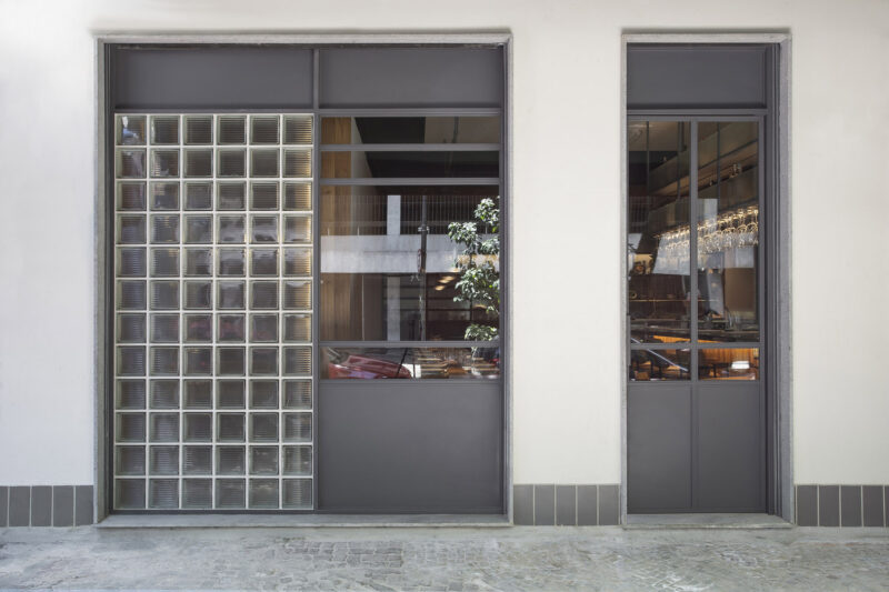
為了讓門頭有更多的耍法,讓客人的進洞儀式感更強烈,設計上僅開一扇小門讓客人進入,並在小門旁再開一扇連接內外的窗。於是我們在門頭原型的基礎上做了諸多變化,希望找尋到觀感和比例適合的方案。
In order to make this door more interesting and give guests a stronger sense of ritual entry into the cave, it was designed to open only a small door for guests to enter, and open another window next to the small door which is connected to the inside with the outside. So we made a number of changes to this door, hoping to find a solution with an appropriate appearance and proportions.
在入口的CAVER旁邊加了一個X,X意味著寶藏,在末尾字母X中做了一個鏡麵反射而造就無限循環的設計。從X中望去,就像是在一個奇幻的星球中探索。在真正進入洞穴之前是一個過渡空間,緩解從城市的喧鬧環境進入寂靜山體環境的跳躍感。並且,左側入口向內伸進的距離和門頭錯落形成一個等待區域,因室內頭頂開的天窗以及牆壁的光線都散發著神秘的吸引力。
An X was added next to the CAVER at the entrance and the X means treasure. And a mirror reflection was made at the end of the letter X to create an infinite loop so that looking through the X is like exploring a fantasy planet. Before actually entering the cave, there is a transition space to ease the jump from the bustle of the city into the silence of the mountain environment. What’s more, the left-hand entrance reaches inwards for a distance and the door is staggered to form a waiting area, which makes a mysterious appeal due to the skylight opening overhead in the interior with the light from the walls.
室內概覽,interior view
在清酒陳列區上方天花有一個弧形頂麵,采用長虹玻璃,希望它的邊緣性更加模糊,在保證空間豐富的同時,能更好的呈現出洞子的延續性。由於無法向山體鑿洞,清酒吧酒櫃的設計利用增加牆體厚度為的是保留像天然洞穴一樣的感覺開了相對應的洞,形成酒櫃功能,給客人帶來一種陳年老釀的氛圍。最後在家具設計上,采用Bauhaus家具來搭配防空洞空間,每組家具之間都有明顯的劃分,目的是為了緩解防空洞自身隧道的結構性,也具備了功能劃分的作用。靠牆卡座都使用了軟包處理,消除了洞穴冰冷的感覺。
There is a curved ceiling above the sake display area with a long iridescent glass, which hopefully has a more blurred edge, ensuring a rich space while better presenting the continuity of the cave. As it is not possible to cut a hole into the mountain, the design of the wine cabinet in the Qing Bar uses the increased thickness of the wall so as to retain a natural cave-like feel opening the corresponding hole to form a wine cabinet function and bring an atmosphere of aged wine to the guests. Finally, the furniture design uses Bauhaus furniture to match the shelter space, with clear divisions between each group of furniture, in order to alleviate the structural nature of the shelter’s own tunnels and also to serve as a functional division. The cardholders against the walls are all treated with soft cladding to eliminate the cold feeling of the cave.
光的指引 Guide of light
在CVAER室內的燈光為了增強空間的獨特性,在室內給客人們帶來的不僅僅是不一樣的燈光體驗,更著重於在燈光與空間的關係上,營造層層遞進的感覺。而且在每一個座位上都有打下一個特殊的燈光,讓人們都跟隨這些燈光的指引,在視覺上,一圈又一圈的燈光包裹著一個又一個的空間,探索著一個又一個的空間,給人在視覺與感覺上都帶來不一樣的探索體驗。
The lighting in the Caver is designed to enhance the uniqueness of the space, giving guests not only a different lighting experience but also concentrating on the relationship between the lighting and the space, creating a sense of progression in the layers. Each seat is illuminated with a special light, so that people can follow the guide of these lights, visually wrapping around one space after another, exploring one space after another, giving a different experience of exploration in both visual and sensory.
空間特色 Space Features
場所精神 Spirit of Place
保留防空洞的空間構造,同時也是保留了這個場所給人們帶來的記憶和曆史價值。
The spatial structure of the air-raid shelter is preserved, this place can keep the memory and historical value that this place brings to people.
材質選擇 Materials choose
地麵采用水磨石,牆麵完全保留重慶特有的清石板材質以及質感漆的噴塗,為的是呈現最原始的洞穴狀態。
Terrazzo flooring and walls are made of Chongqing’s unique stone slabs and painted with textured paint to present the cave in its most original state.
空間互動 Spatial interaction
吧台下陷,所有的座位同等高度,方便服務員和顧客交流,營造更加輕鬆舒適的交流環境。
The bar is sunken and all seats are at the same height to facilitate communication between waiters and customers, creating a more relaxed and comfortable environment for communication.
在地生長 Natural growth
保留並加固原有牆體和地麵的材質,在無法破壞牆體的情況下,通過人工增加牆體的厚度形成儲酒功能。
The original wall and floor materials are preserved and reinforced, and the wall is artificially increased in thickness to create a wine storage function if the wall cannot be destroyed.
光與影 Light and shadow
防空洞內部空間狹窄,無對外的窗戶,長度長達26m, 光線昏暗,在空間上無法給出更多的光線,所以光影成為塑造空間的最主要表達方式。
The space inside the shelter is narrow, with no external windows and a length of 26m, and the light is dim, so it is impossible to give more light to the space, so light and shadow become the main expression of the space.
結語 conclusion
防空洞就該具有它本來的樣子,我們深處在其中,卻不知道自然在那裏終了,藝術在那裏開始。caver 需要做的是寄居於此,體驗它,感受它,過濾掉洞外雲卷雲舒。我們應該創造的是一種精神狀態,能給人一場經曆,給人一種感動。人們聚集於此,以好奇心開始,以一杯酒結束,時間的代謝,世界的流動,都被拒絕在洞穴之外。
The air-raid shelter is supposed to be what it is, a place where we stay without knowing that is the end of nature and the start of the art. Caver needs to be a place to live, experience and feel. We can create a state of mind that can give people an experience, that can move them. People gather here, starting with curiosity and ending with a glass of wine, the metabolism of time and the flow of the world are rejected outside the cave.
項目信息
項目名稱:Caver精釀酒吧
設計公司:itD studio/ 羅珮綺
聯係郵箱:3410047389@qq.com
項目設計 & 完成年份:2021.10
主創及設計團隊:羅珮綺/蘇誌展/itD studio
項目地址:重慶市渝中區李子壩正街67號
建築麵積:190㎡
合作方:燈光設計:袁有無/9024工作室 品牌視覺規劃:HOUTH(台灣台北) 平麵配置/家具設計:LZ李維綸
客戶:HopsCraftBeer啤酒花精釀酒館




評論(1)
好看,但是這個防水怎麼做的呢?