「和平紛焗」一家以黃金焗物為主要製作形式的餐飲品牌;
也是廣州20年老牌茶餐廳「和平館,開設年輕單品支線專門店。
為「和平紛焗」定義的快樂焗物概念,讓大家從名字就能感受到餐廳的品牌調性和氛圍。
「焗」大部分人的認知都隻是焗飯,我們做這個品牌的時候,想要打開思維讓大家知道焗飯不一定隻有傳統的味道;
將品牌產品線延伸為「黃金焗物」組合更多樣的食材,賦予更多樣的口感;把整個餐廳打造成「黃金焗物專門店」。
” peace fun baked ” is a catering brand in the form of golden lifelies;
It is also the 20-year-old tea restaurant in Guangzhou, “Harbor”, opened a special store for young single product branch.
The concept of happy lobby, let everyone feel the brand adjustment and atmosphere from the name from the name.
Most of the “” is just a risotto. When we do this brand, you want to open your thinking, let everyone know that the rice does not necessarily only have traditional tastes;
Extend the brand product line to “Gold Life” combination more ingredients, give more taste; build the entire restaurant into a “golden lifeline specialty”.
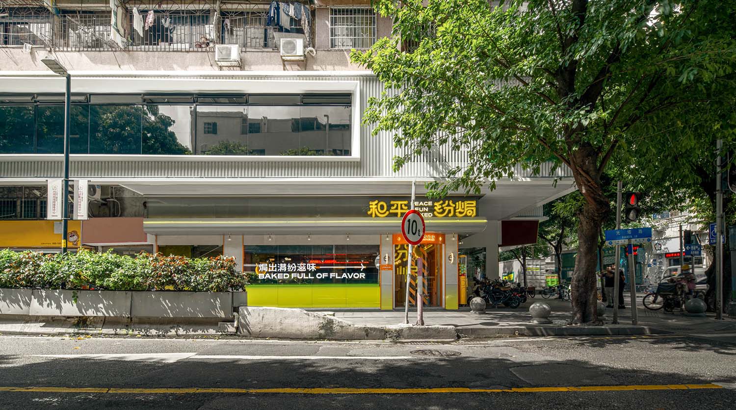
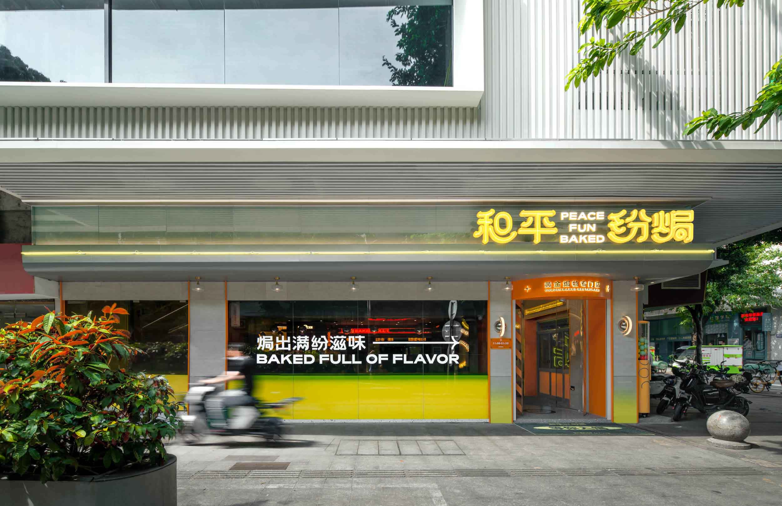
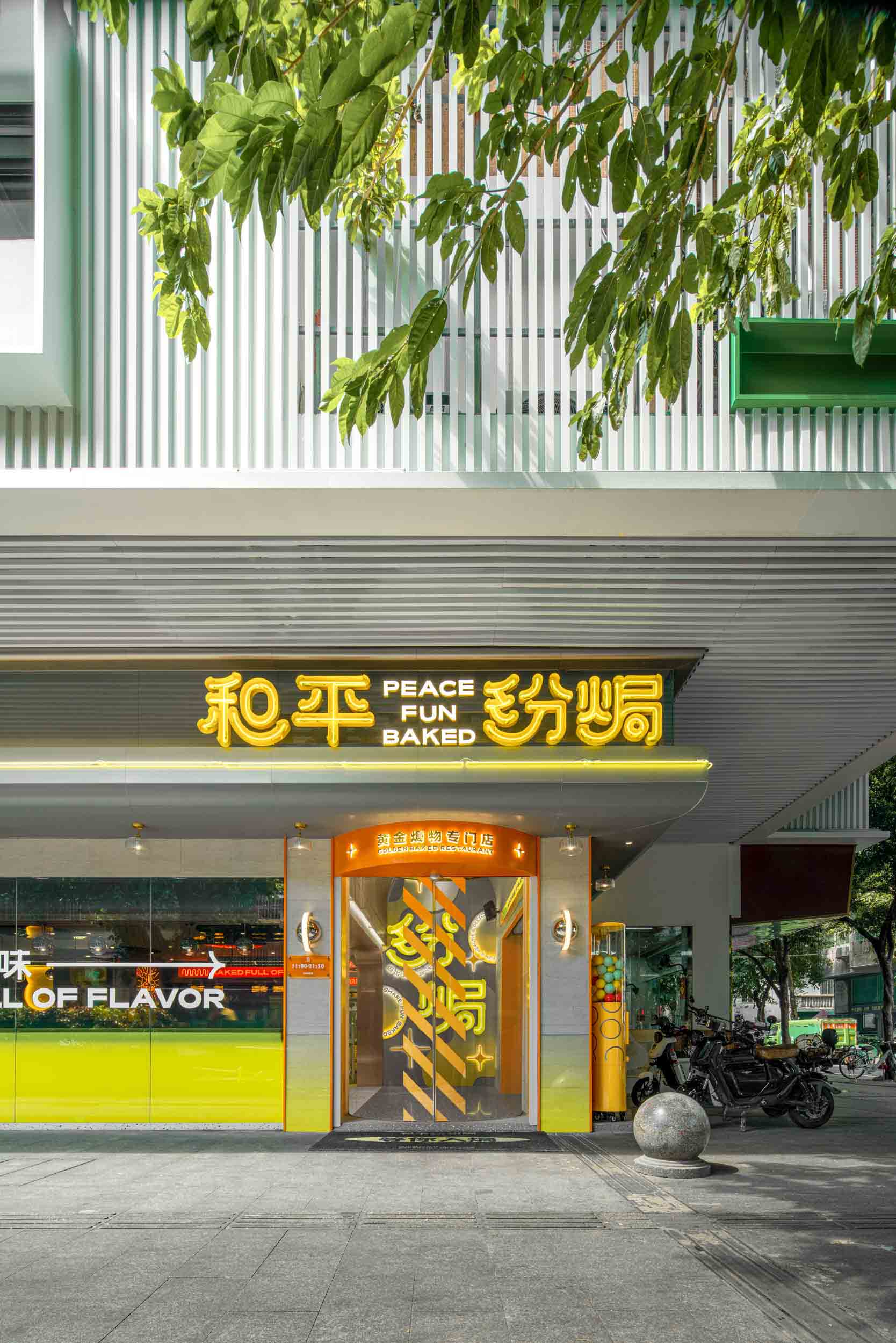
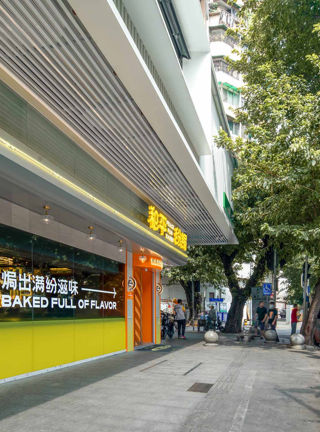
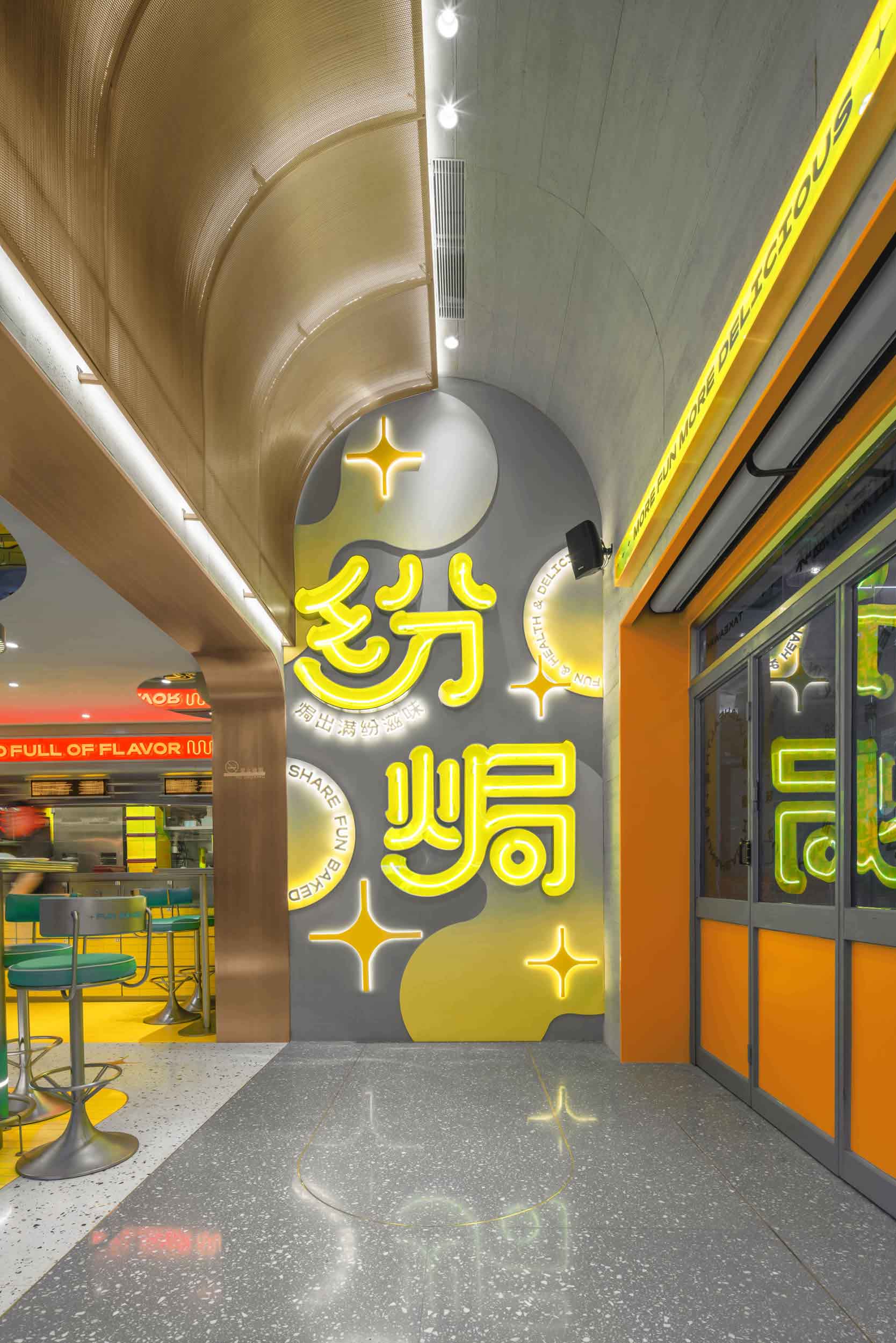
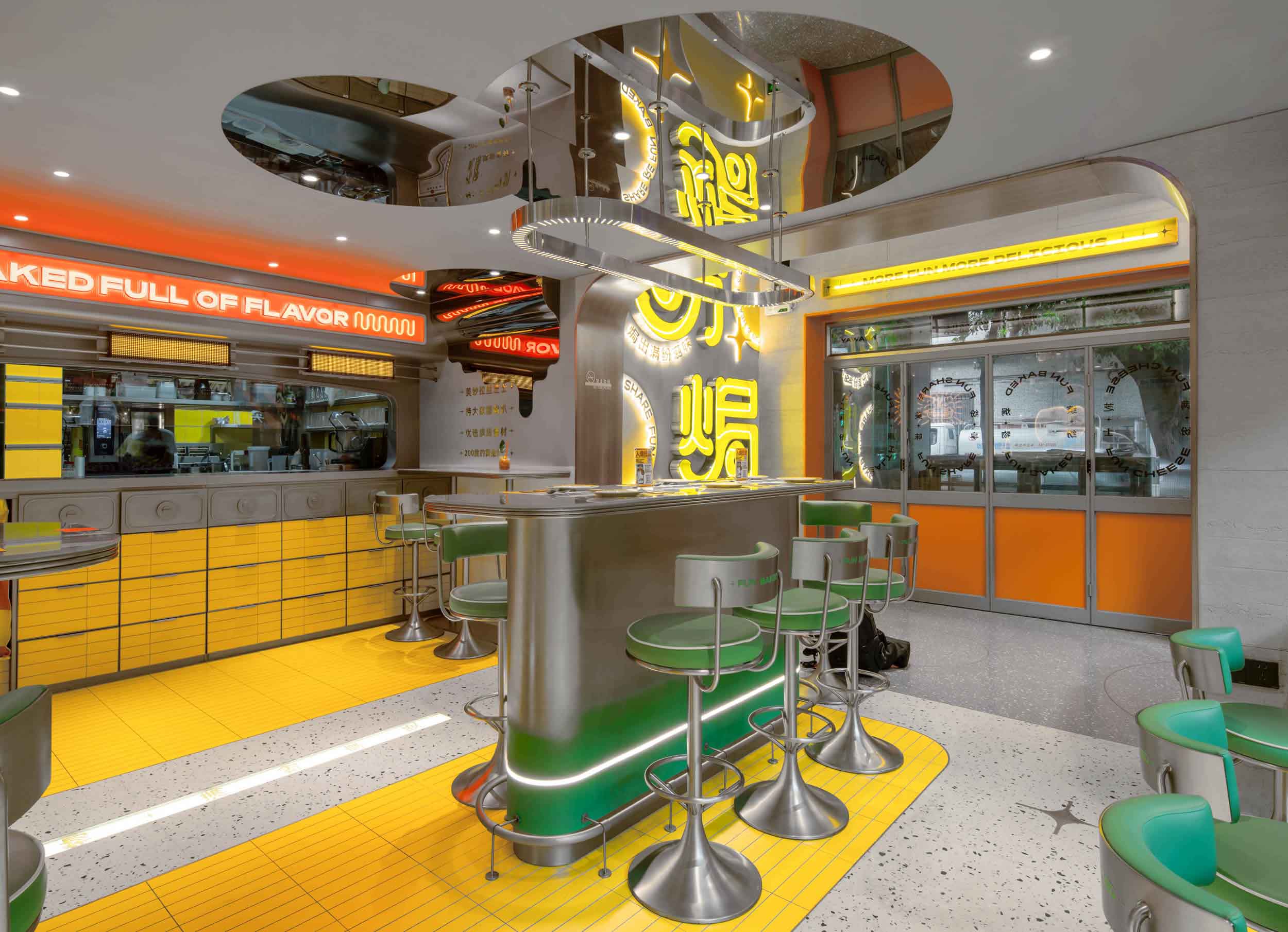
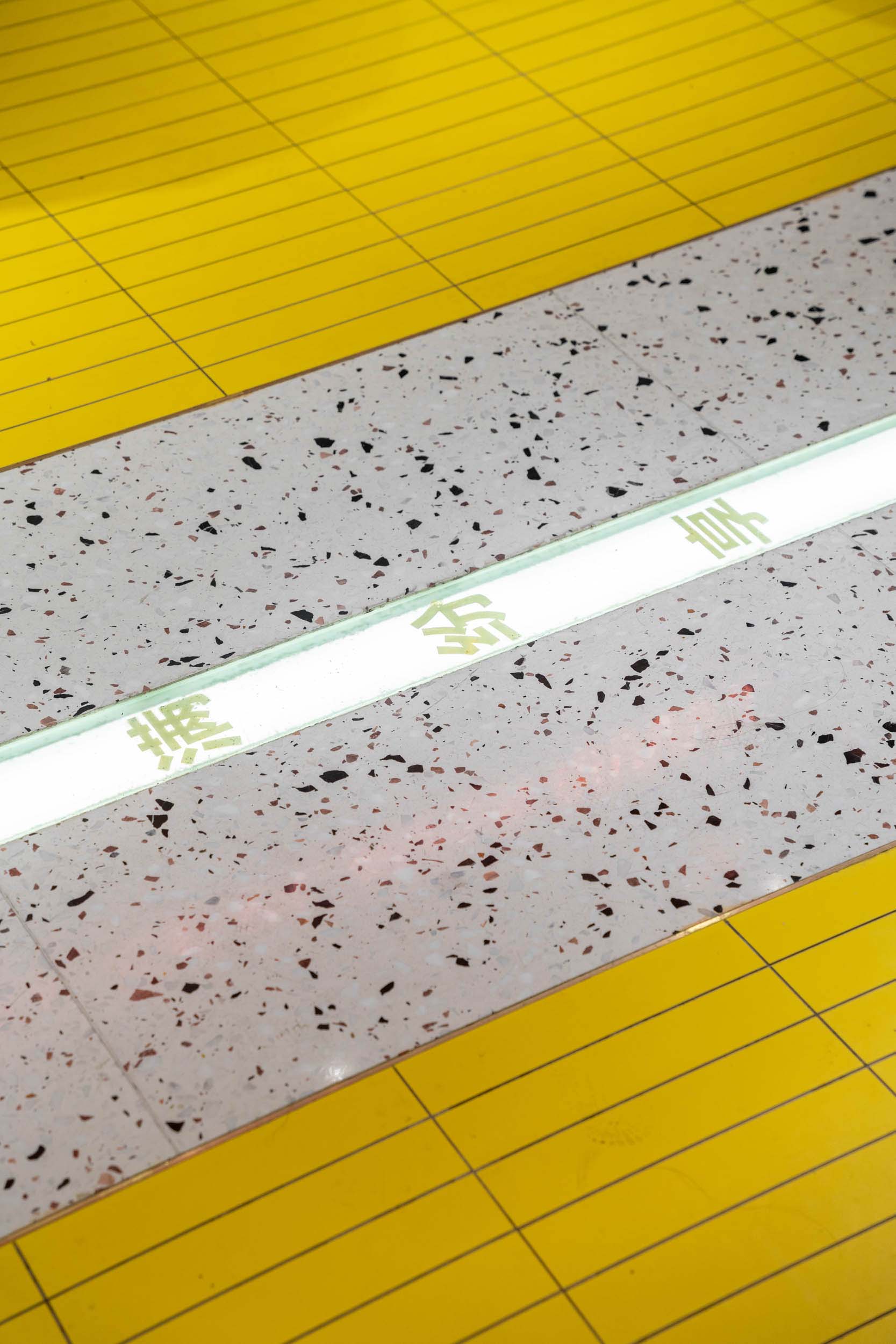
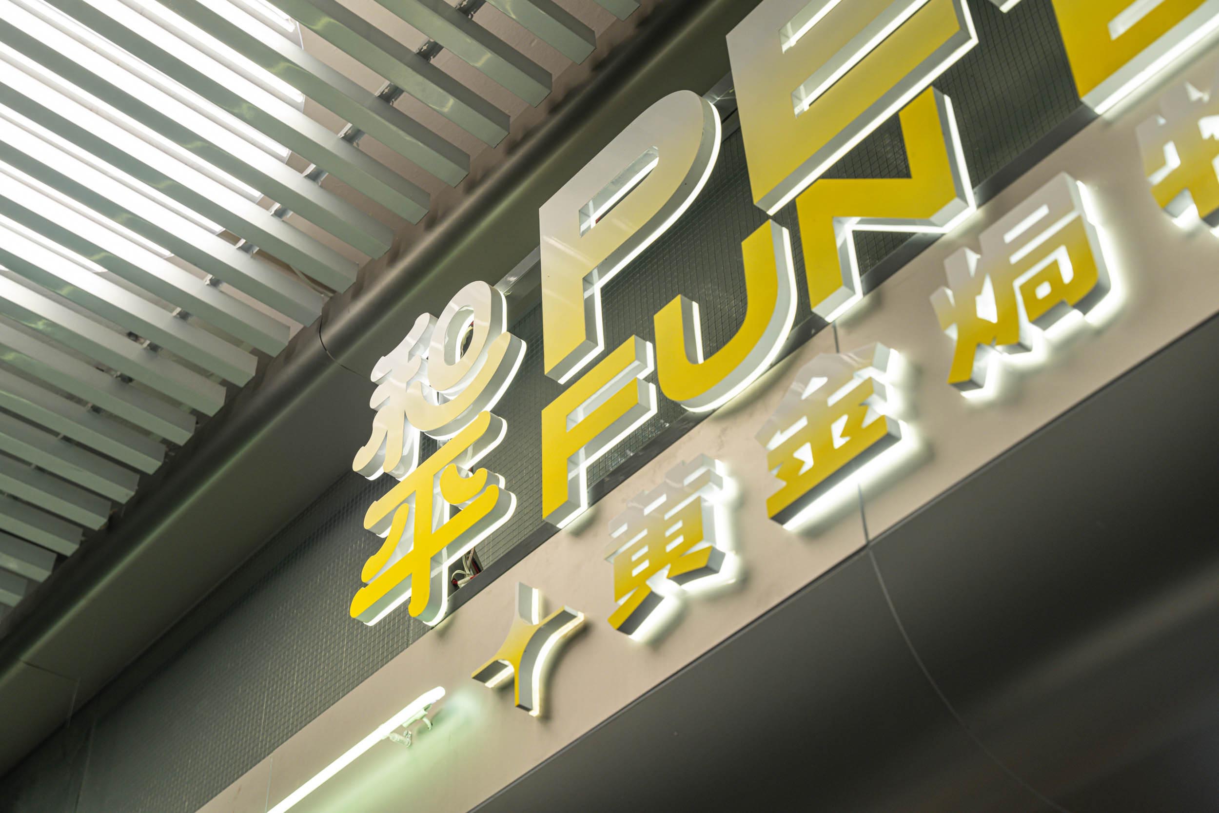
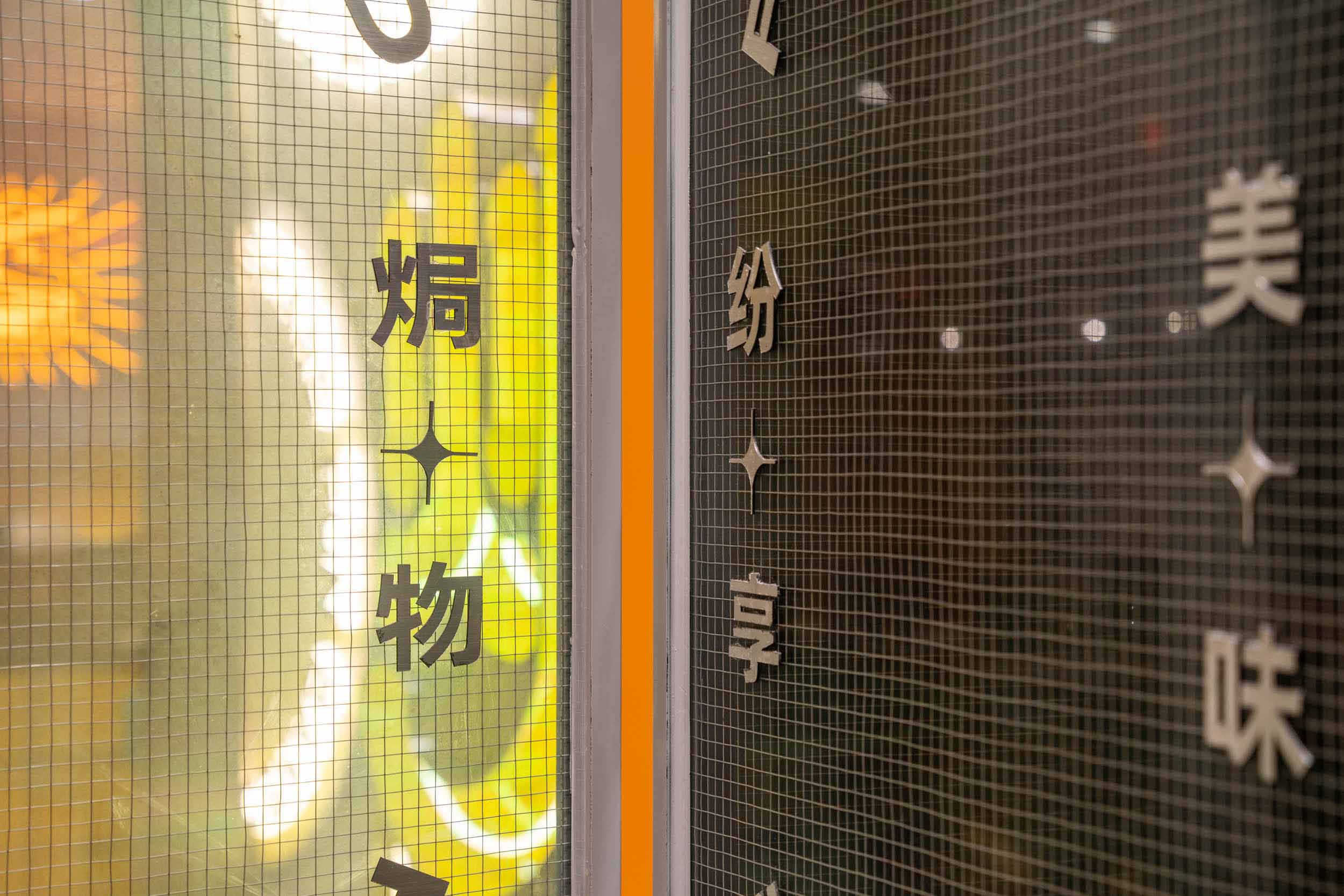
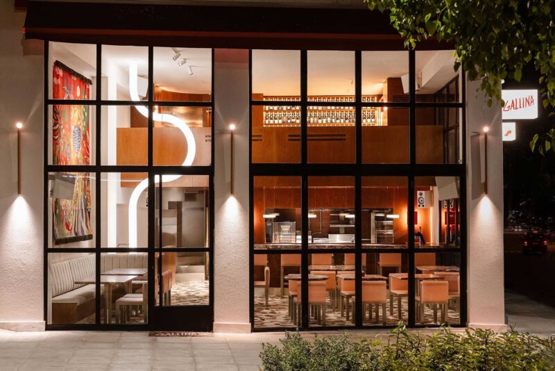
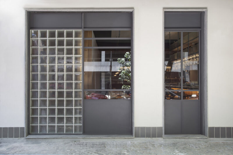
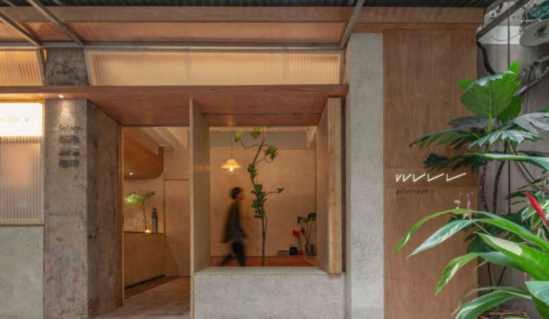
「繽紛食材fun樂享用」在空間場景的打造上延續品牌概念。把具有產品代表性的「芝士」「烤箱」元素結合功能在空間上進行有趣的展現。讓老城區注入新鮮活力,使更多的年輕人能感受到時代的延續與更新。外門頭的材質上用了反射較強的複古夾絲玻璃材質與仿混凝土材料的質感碰撞;並且大膽運用了「活力黃」作為空間的主色調,融入橙紅色增添空間的層次感;軟裝上則選用了綠色來搭配更顯清新活躍,給消費者帶來感官上的愉悅。
“Colorful ingredients fun to enjoy”, in the creation of space scenes to continue the brand concept. Integrating the representative functions of “cheese” and “oven”, the space is presented in an interesting way. The old town is infused with fresh energy, so that more people can feel the continuity and renewal of the times. The material of the exterior door is a collision of reflective vintage glass and faux concrete; and the bold use of “vibrant yellow” as the main color of the space and the integration of orange and red to add a sense of layers to the space. Soft furnishings are chosen to match the green color to be more fresh and active, bringing sensory pleasure to consumers.
∇ 餐廳外觀,外觀 restaurant appearance, appearance
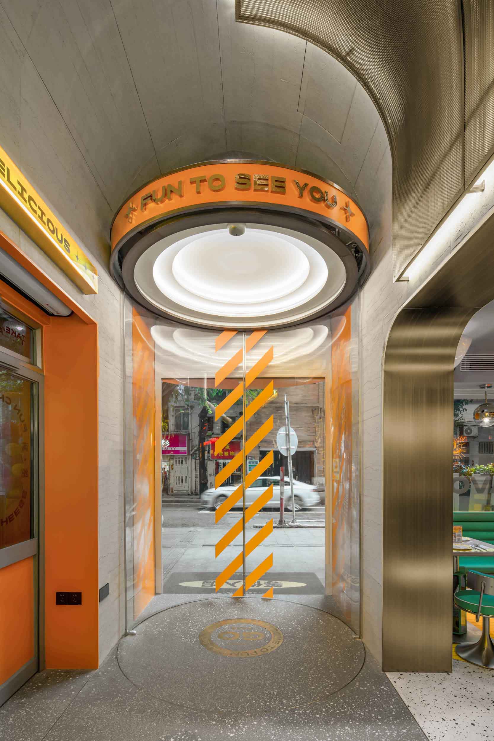
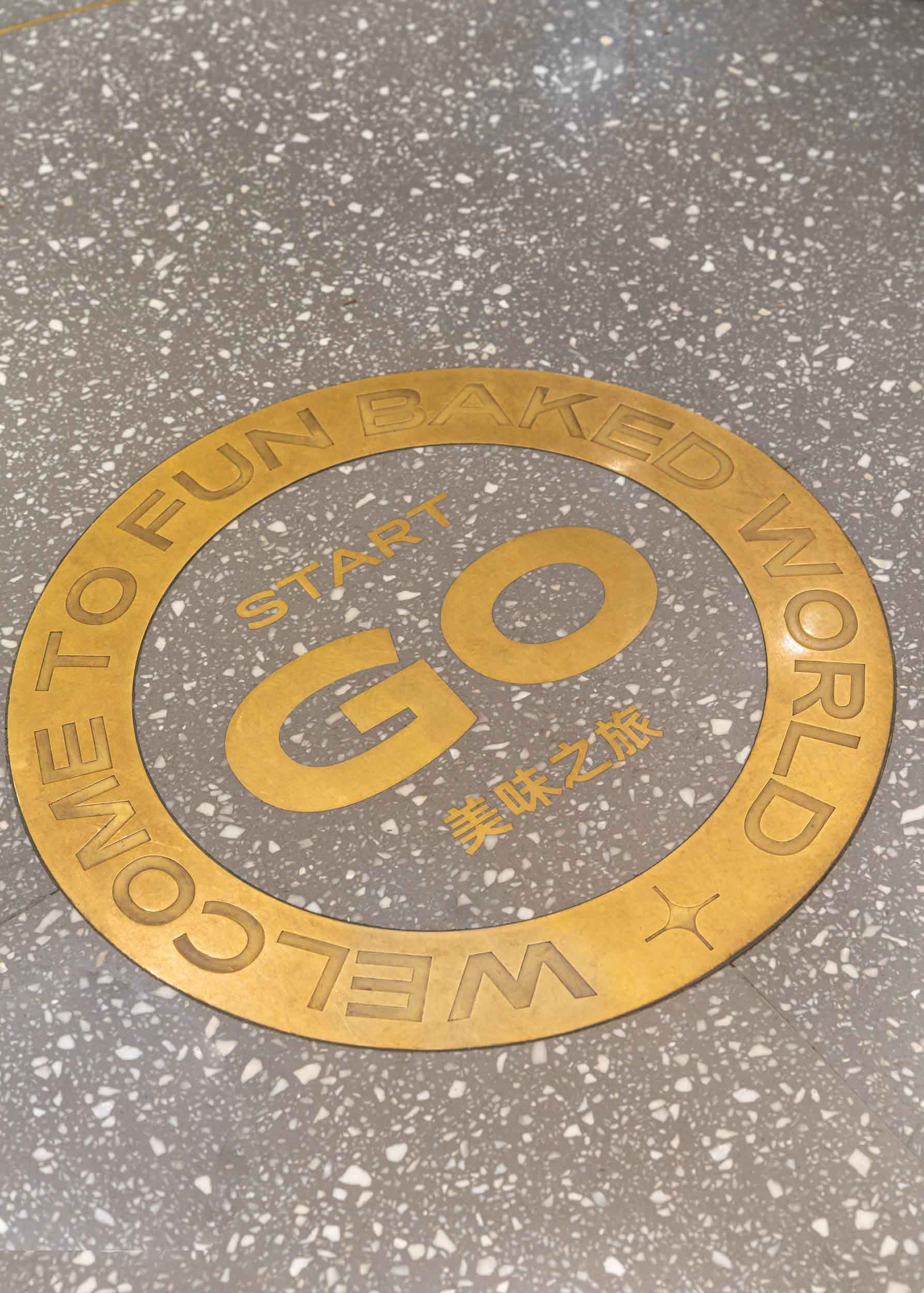
在進門區域做了一個賦予儀式感且不失有趣的設計——「圓形電動門」
There is a ritualistic and interesting design in the entrance area – “round electric door”.
∇ 進門區 entry
天花上延續遊樂場旋轉木馬的頂篷感,空間唯一能挑高的地方,用弧形的設計元素柔和了這一塊區域。
The ceiling continues the sense of the canopy of the amusement park carousel, and is the only place where the entire space is raised. The curved design elements are used to soften this area.
∇ 進門區過道 entering the doorway
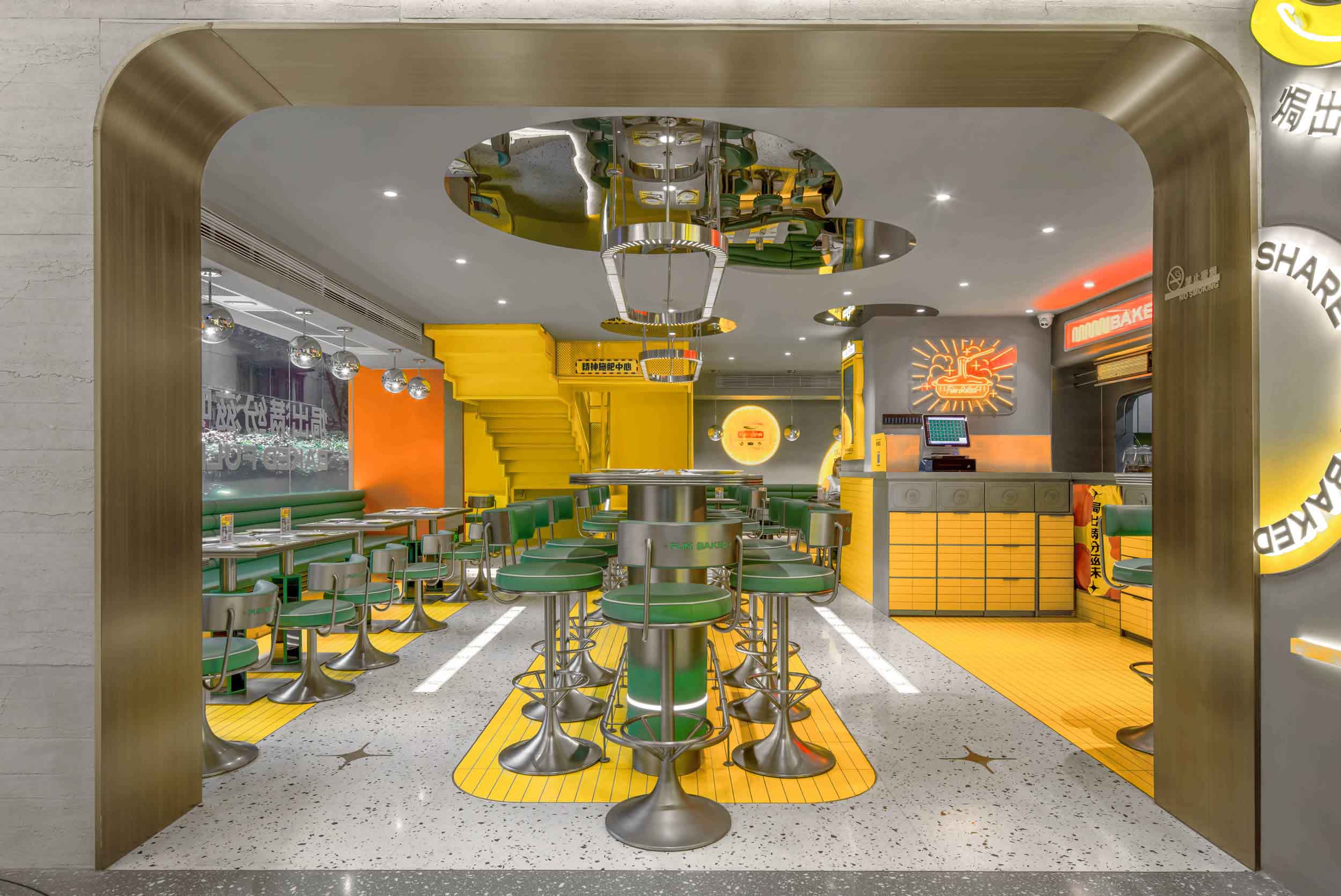
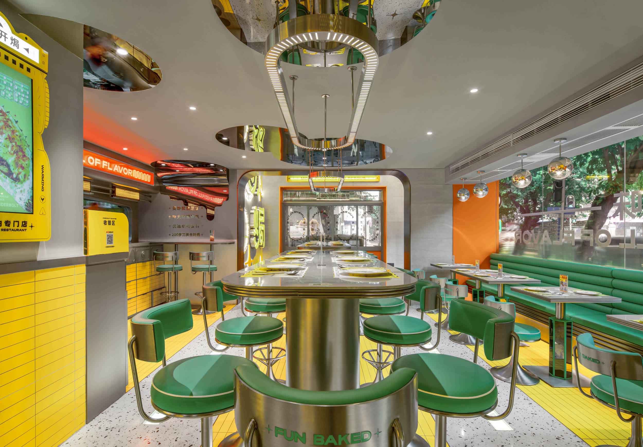
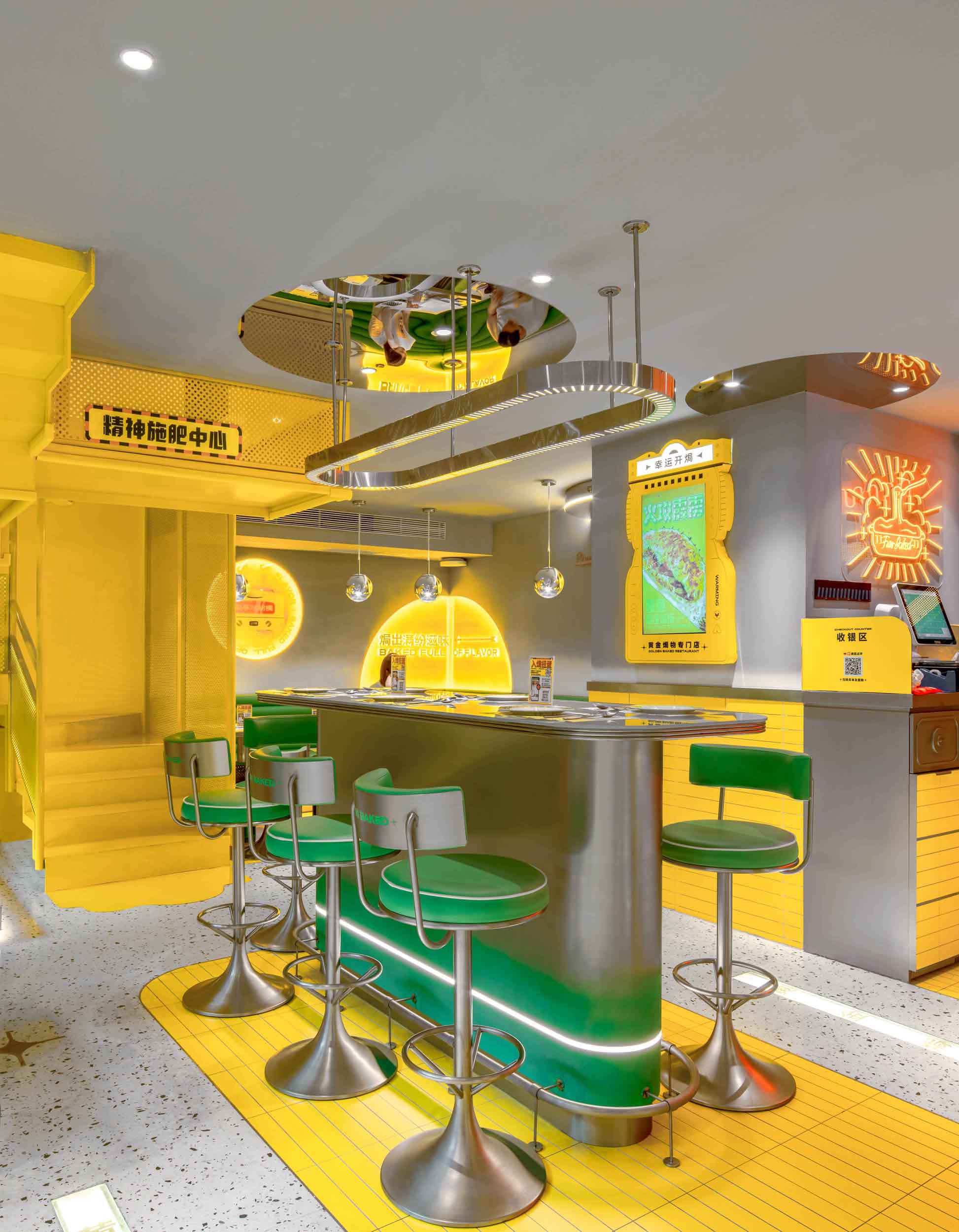
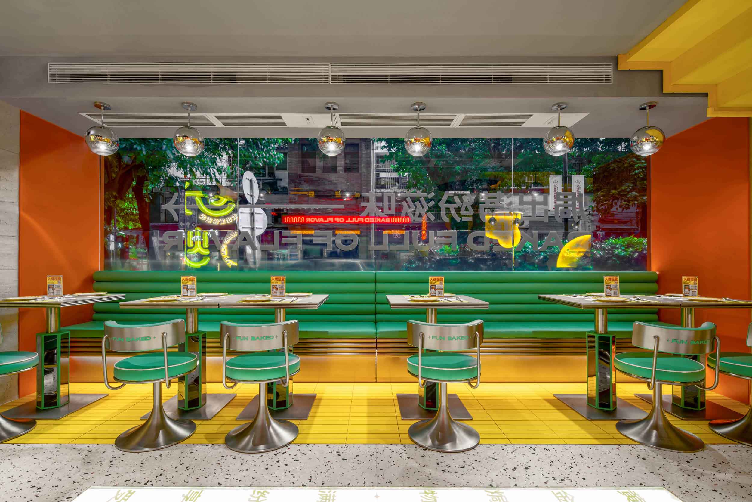
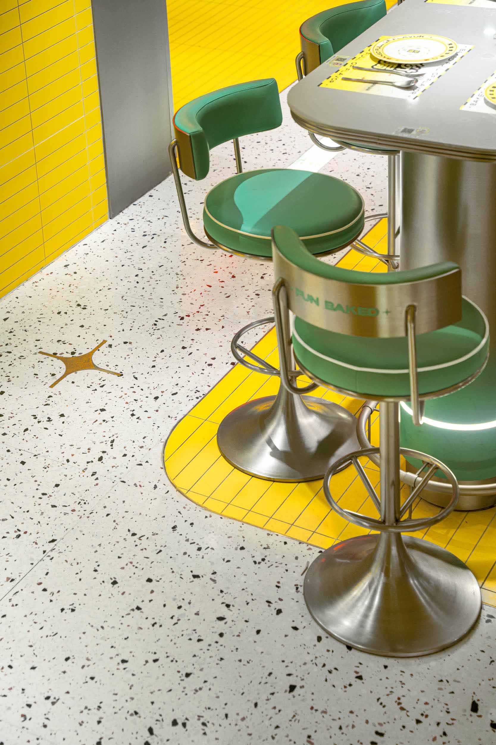
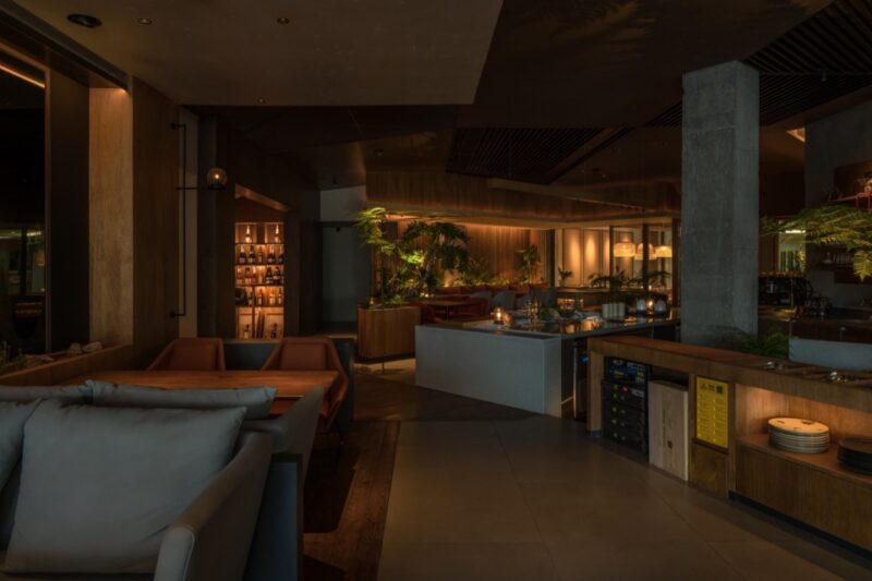
用餐是一件有儀式感的事情,通過空間布局及就餐方式的多樣化,特地設置了高吧台圍座,我們希望能因此拉進人與人之間的距離。空間中的質感往往是消費者能最直接感知品牌的部分。將不同質感、顏色配比融入空間,營造更有食欲感的氛圍。層高的硬傷我們利用芝士的形態,鏡麵延伸調和得更加有趣。
Dining is a matter of ritual. By diversifying the layout of space and dining methods, a high bar is specially set up around the seating to bring people closer to each other. The texture in a space is often the part of the brand that consumers can perceive most directly. Incorporating different textures and color ratios into the space creates a more appetizing atmosphere. The challenge of height is tempered by the cheese-shaped mirror.
∇ 用餐區 dining area
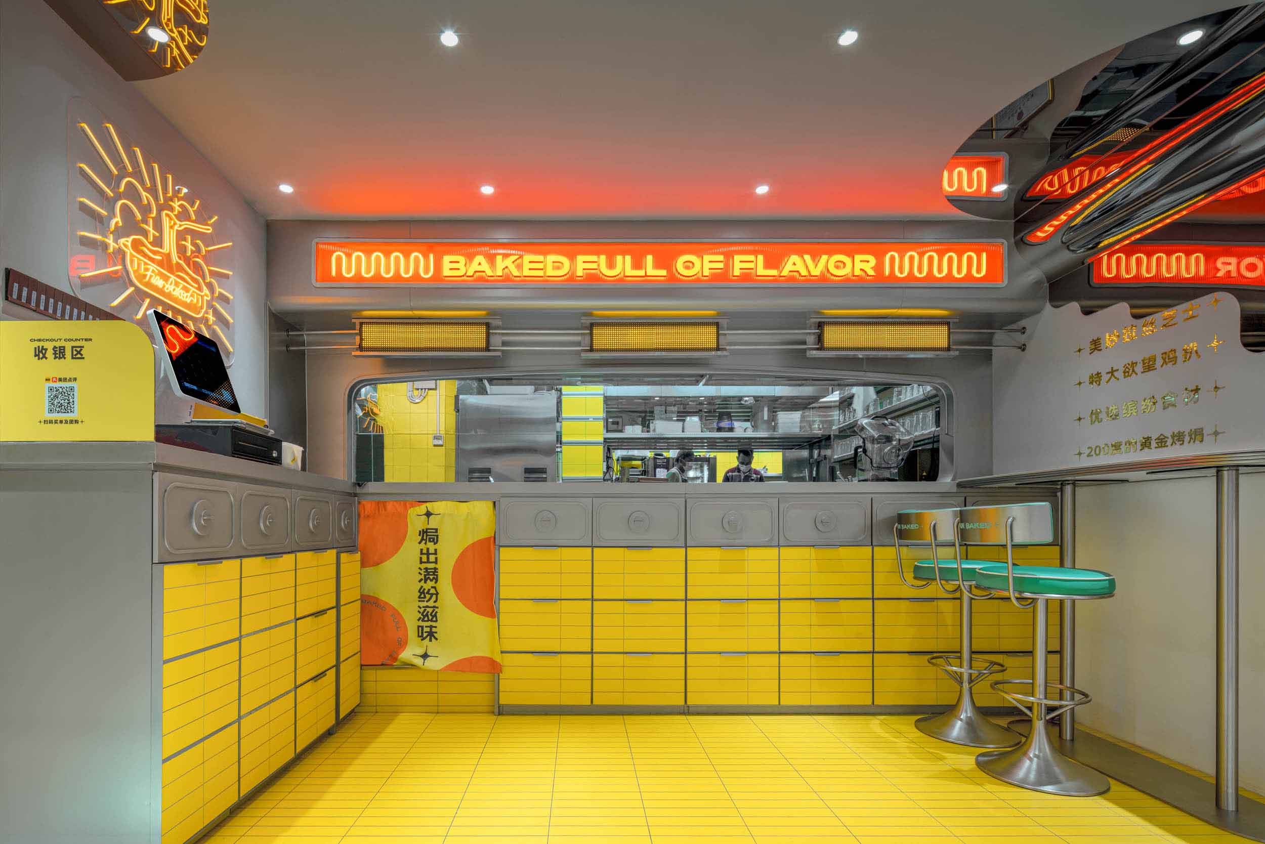
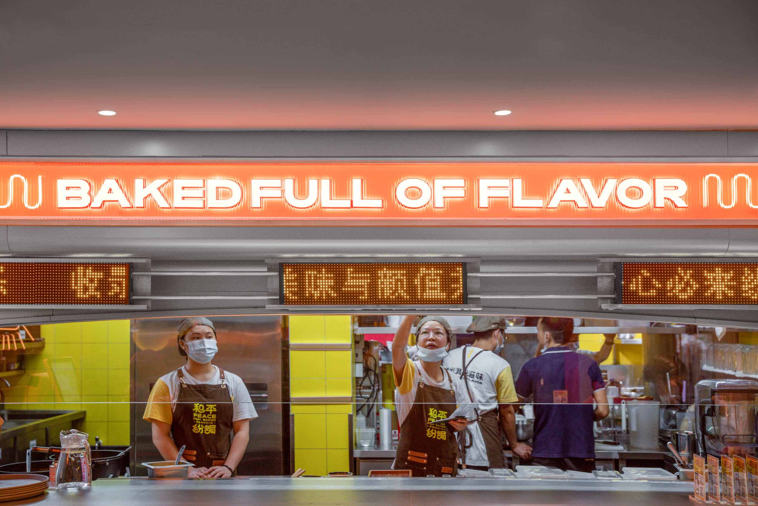
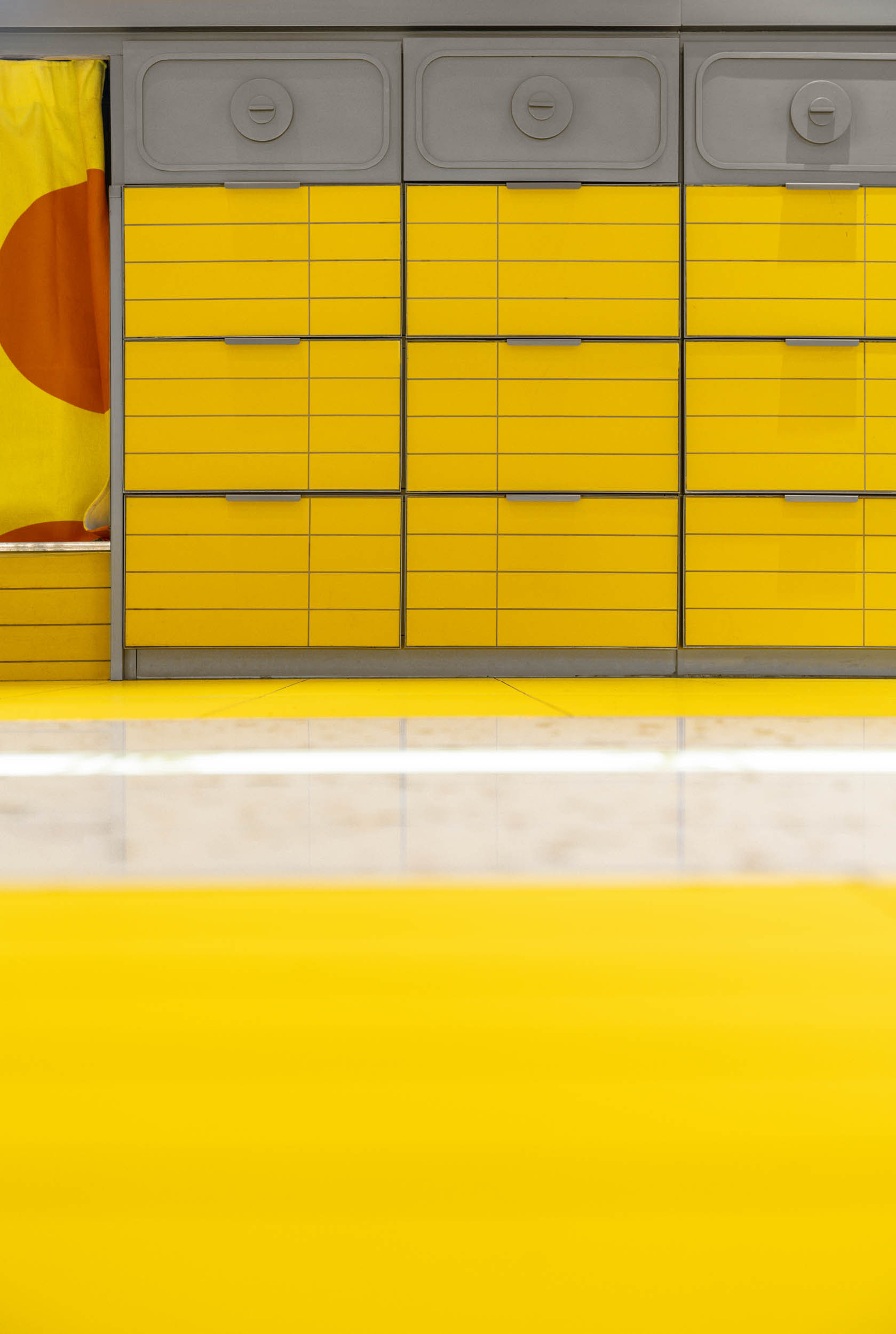
我們把同色的磚延伸到櫃體,使得整個空間的延續性更加細膩。明檔的區域以「烤箱」的形態進行解構重組;視覺上能讓人直接聯想到關於「黃金焗物」品類。
We have extended the same color tiles to the cabinet, making the entire space more subtle in its continuity. The bright area is deconstructed and reorganized in the form of an “oven”; visually, it is directly reminiscent of the category of “baked foods”.
∇ 明檔區 clarion
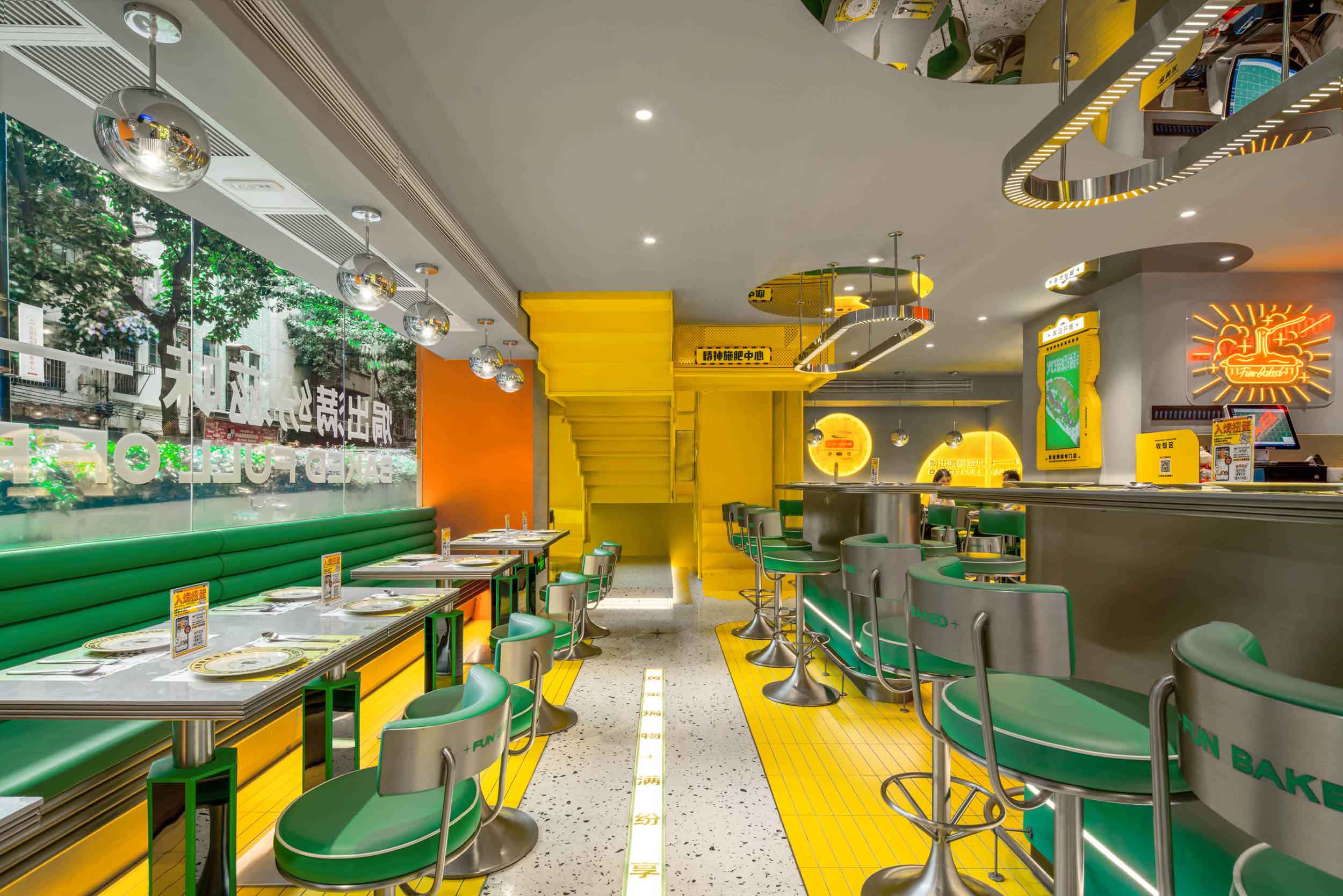
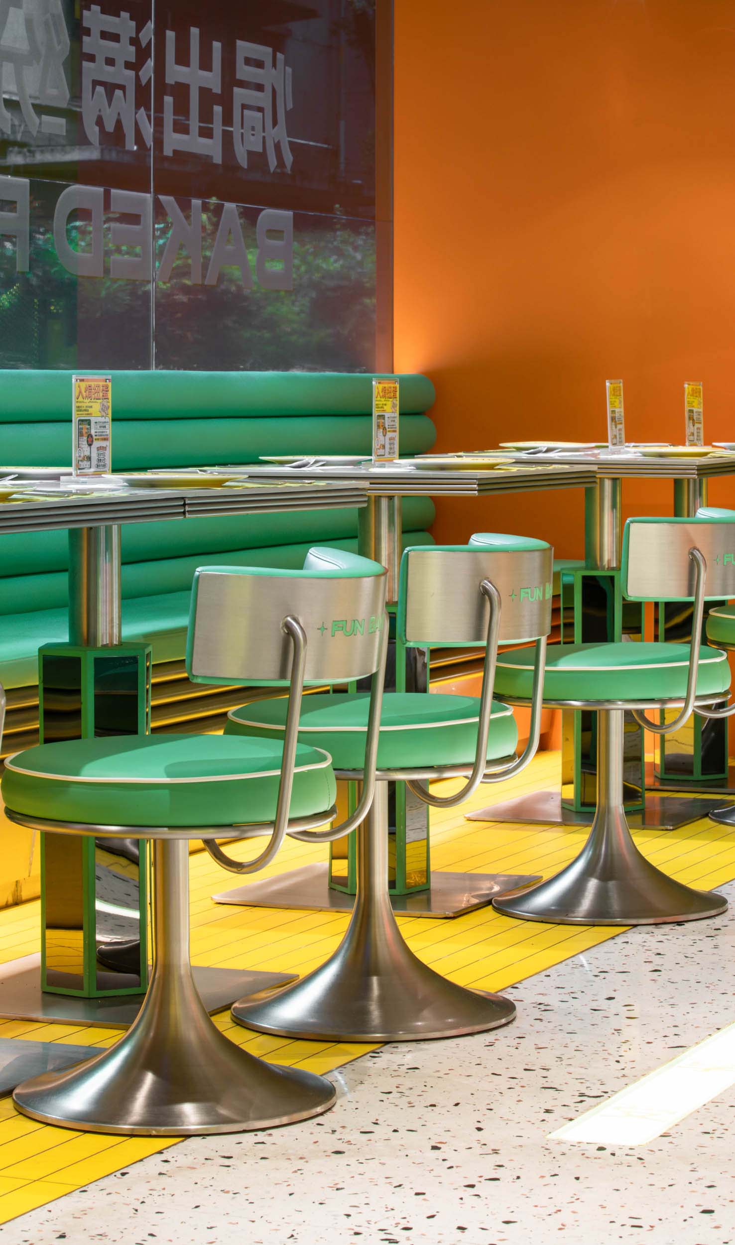
軟裝與硬裝是相輔相成的關係;兩者和諧的角色定位起到了很關鍵的作用。冷暖中和讓整個空間更加歡樂且舒適。
Soft furnishings and hard furnishings are complementary to each other. Therefore, both need to be given a harmonious role in positioning, with warm and cold to neutralize the whole space.
∇ 桌椅細部 table and chair
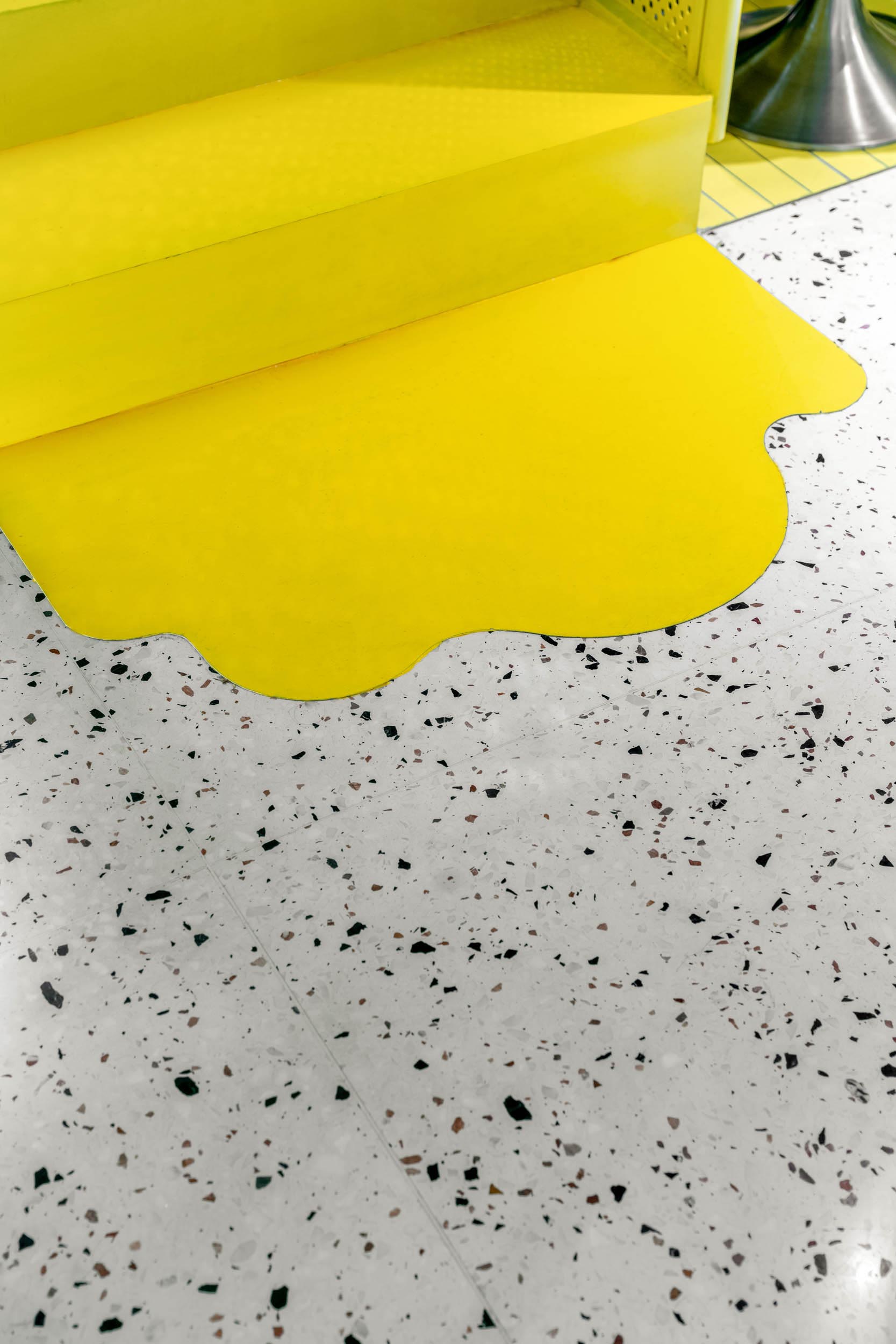
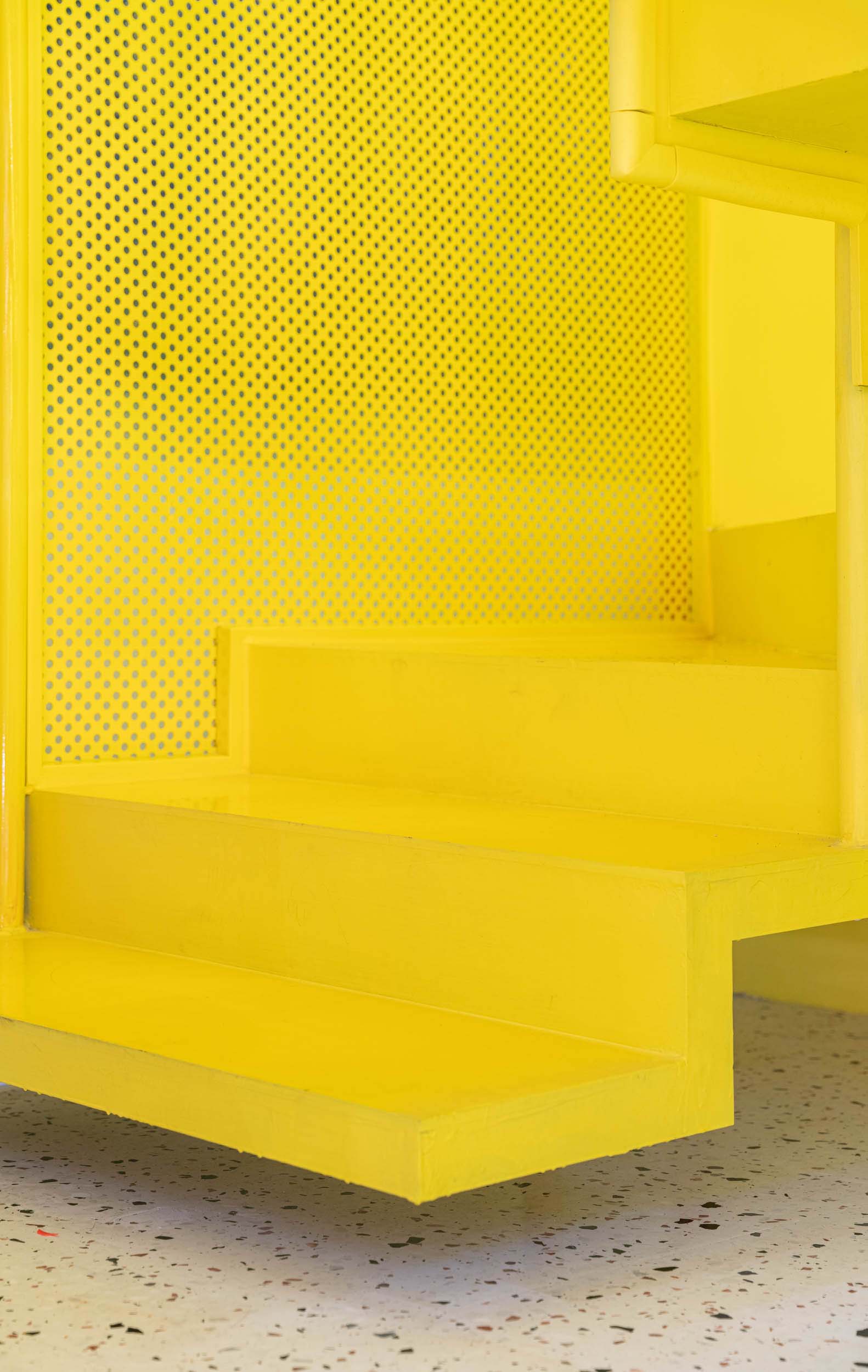
一條通往品牌心髒的樓梯——用純色與構成的方式來懸挑變化,融化流淌的芝士是我們賦予樓梯的最後一點調皮~
A staircase to the heart of the brand – with solid colors and composition to hang out the changes. The melting and flowing cheese is the last bit of naughtiness we give to the staircase ~
∇ 樓梯細部 stairs detail
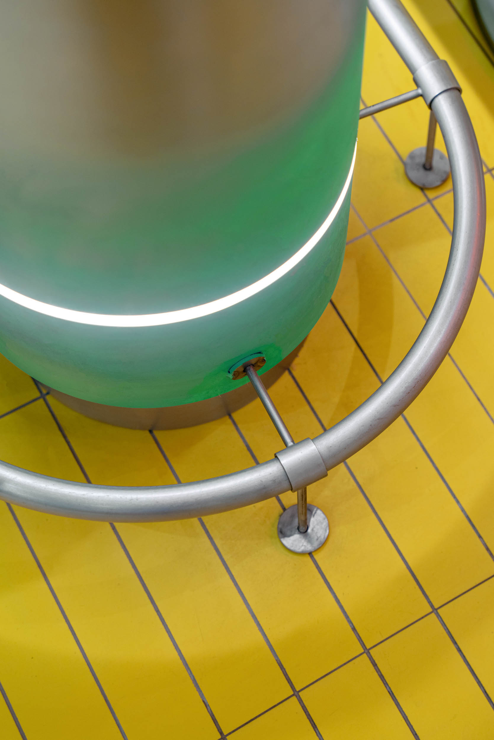
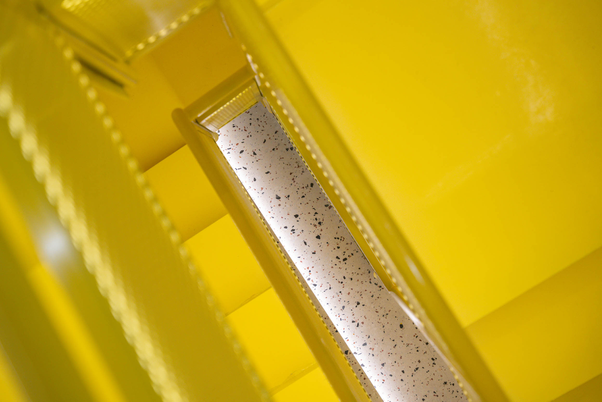
∇ 局部細節圖 partial detail
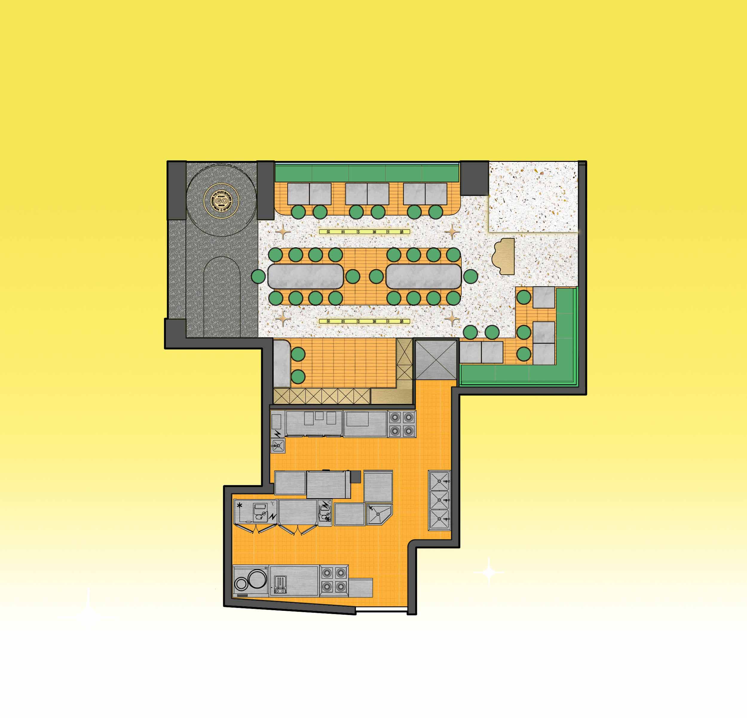
∇ 平麵圖 Plan
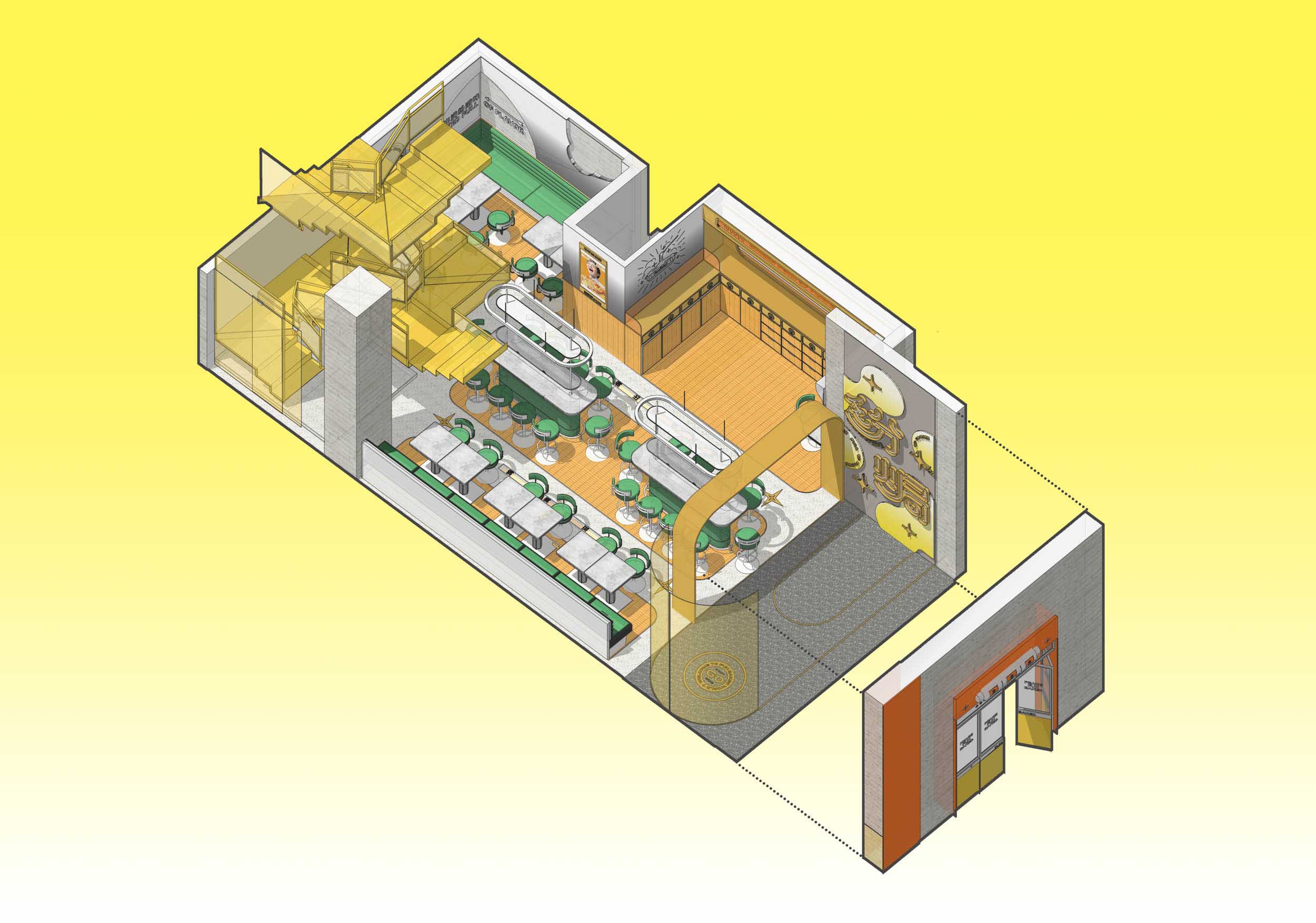
∇ 軸測圖 axonometric drawing
項目信息
項目名稱:和平紛焗
項目地址:廣州,詩書路
項目業主:和平館
建造時間:2021年3月-2021年7月
室內麵積:95平方米
建造材料:水磨石、不鏽鋼、
設計單位:再叁設計事務所
空間主案設計:戴勝念、許悅琪
品牌策劃團隊:再叁設計事務所(threegroup@163.com)
項目攝影:再叁設計事務所
Project name: PEACE FUN BAKED
Project location: Guangzhou, poetry
Clients: Peace Peacehouse
Construction time: March 2021- July 2021
Gross Built Area (square meters): 95 square meters
Building materials:Water mill, stainless steel,
Design: THR33 DESIGN
Design in charge: allen、egg
Brand planning team:THR33 DESIGN(threegroup@163.com)
Photography team:THR33 DESIGN


