如果給人們『虛無』,人們能夠從中思考『虛無』可以實現什麼。
If “nothingness” is given to people, people can think about what “nothingness” can achieve. ——安藤忠雄 Tadao Ando
01. 想象驅動著空間的邊界 Imagination drives the boundaries of space
沉浸的環境下,肌理所包裹的空間,隱秘深邃的尺度, 帶來前所未有的衝擊感與未知力量。嘈雜與安靜的轉換,光影與空間的交互,變幻的月球,彰顯著它的潮汐力,其自然力量指引著我們探索內部空間。
Under the immersive environment, the space enclosed by the texture and the hidden and deep scales bring unprecedented shock and unknown power. The transition between noise and silence, the interaction of light and shadow and space, and the changing moon show its tidal force, and its natural force guides us to explore the inner space.
∇ 入口空間概覽 Overview of the entrance space
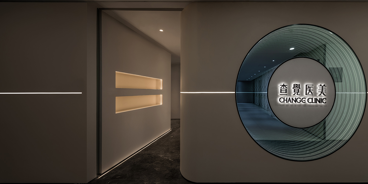
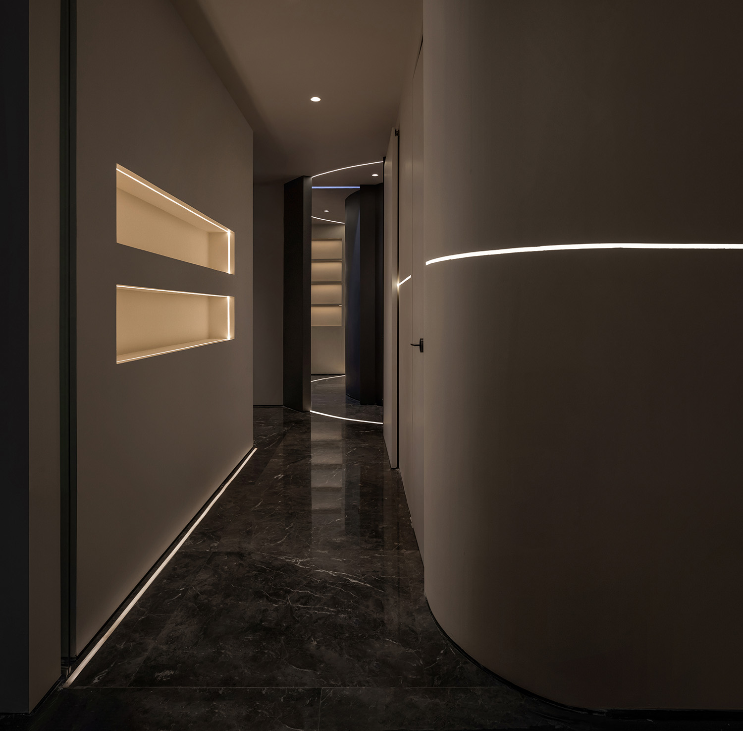
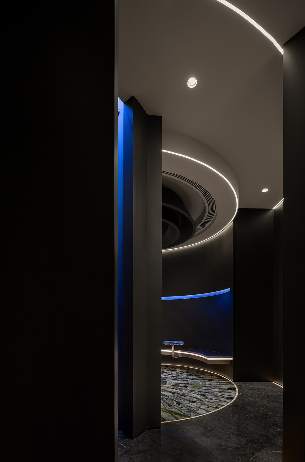
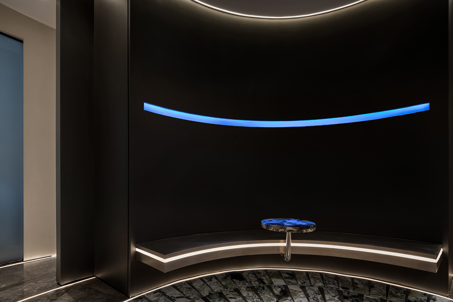
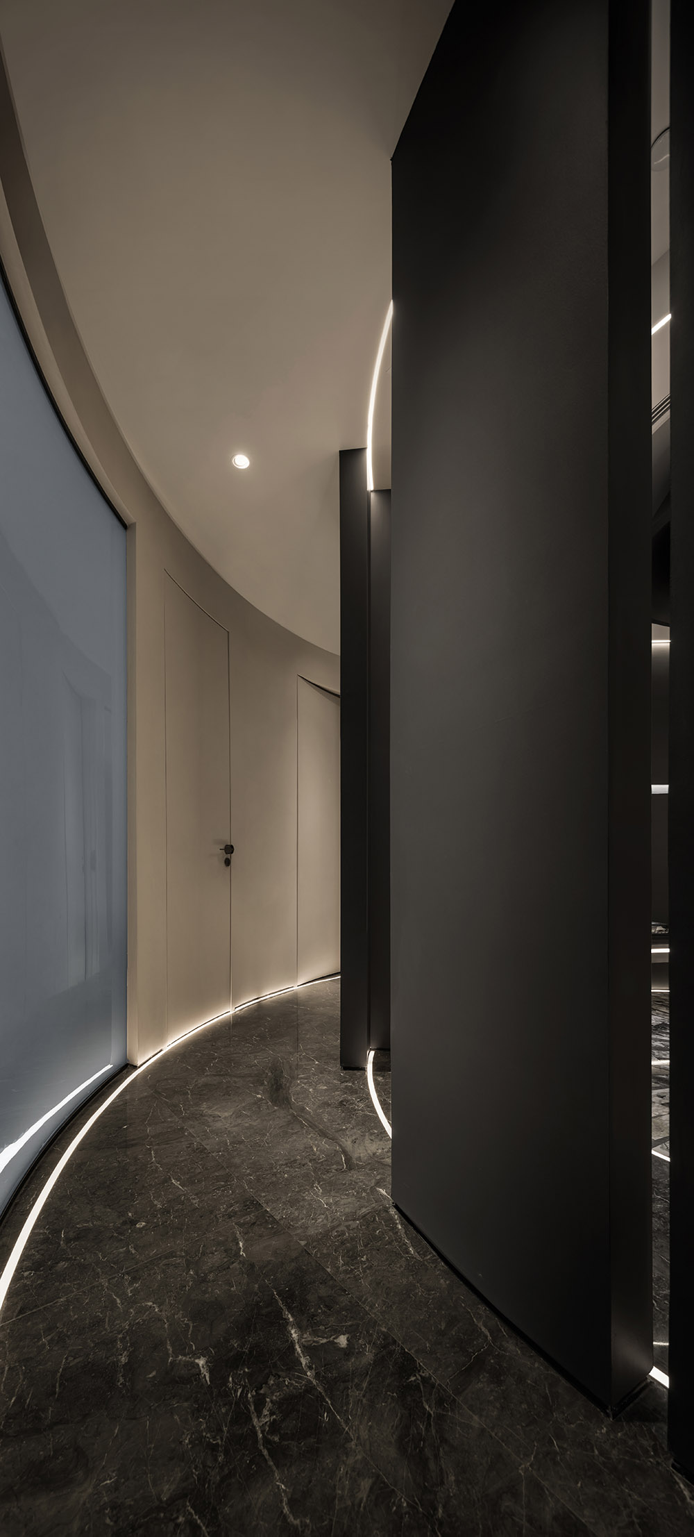
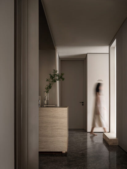
從入口往裏進入室內的區域,將生硬的陽角變圓潤,透著微光的洞口順應這地麵燈帶的引導,提前預告了溫暖且舒適的空間屬性。散射燈帶、矩形展格、弧形牆體以及通往未知的洞口等結合品牌本身的理念和對與空間的創新,構成了一個在未知中探索的故事。
Entering the indoor area from the entrance, round the blunt sun corners, and the faintly luminous opening conforms to the guidance of the light strip on the ground, predicting the warm and comfortable space attributes in advance. Combining the brand’s own concepts and innovations with space, such as diffuser light strips, rectangular booths, curved walls, and openings leading to the unknown, constitute a story of exploration in the unknown.
與查覺CHANGE品牌理念的結合,將能量的碰撞、扭曲、自由的張力,通過流動的線條及獨特的動線在空間中表達出來。向上,發散,反射,懸掛及大片柔和純粹的顏色,圍繞著CHANGE的品牌擴散。盤旋環繞的動線引導著體驗者的方向,行走的人成為空間裏最亮的元素,最終形成這家極具自身吸引力的查覺醫美·太原店。
The combination with the brand concept of Chajue CHANGE expresses the collision, distortion and free tension of energy in the space through flowing lines and unique moving lines. Upward, divergence, reflection, suspension and large soft and pure colors spread around the CHANGE brand. The circling moving line guides the direction of the experiencer, and the walking person becomes the brightest element in the space, and finally forms this very attractive Taiyuan store.
02. 品牌文化/空間特質 Brand culture/space characteristics
基於原來的場地是位於寫字樓內的兩個獨立空間 ,如何建立有趣及有效引導人群的動線是末染團隊一如既往重視的問題。而在平平無奇的樓層過道內,讓查覺CHANGE成為獨樹一幟、顯眼但同時內斂的存在是設計團隊的根本目的。
Based on the original site being two separate spaces in the office building, how to create an interesting and effective way to guide the movement of the crowd is a problem that the finishing team always attaches great importance to. In the mediocre floor aisle, it is the fundamental purpose of the design team to make Chafee CHANGE a unique, conspicuous but at the same time introverted existence.
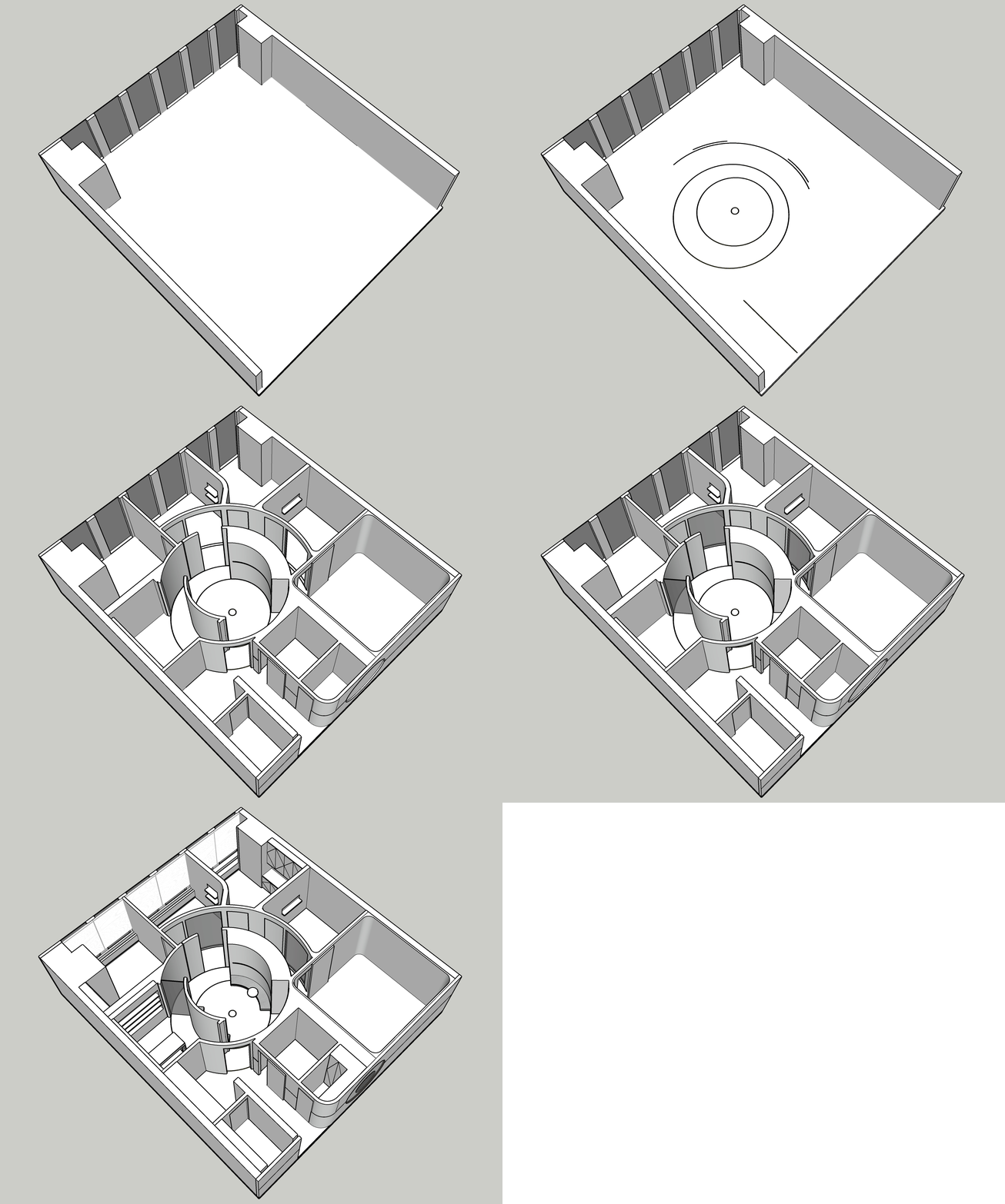
∇ 空間生成 Space generation animation
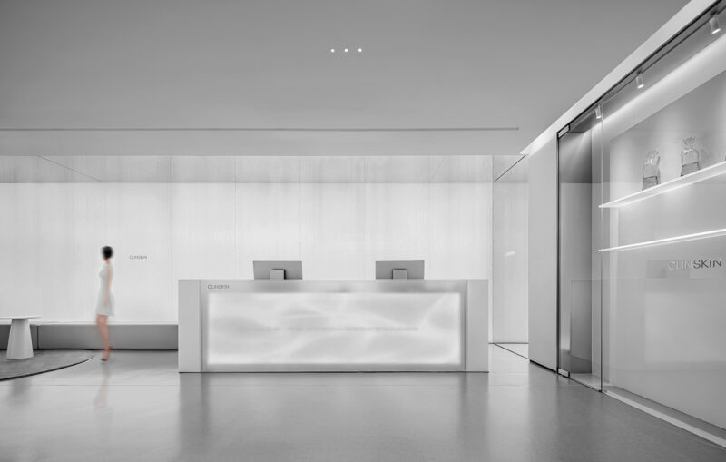
∇ 前廳功能區 Foyer function area
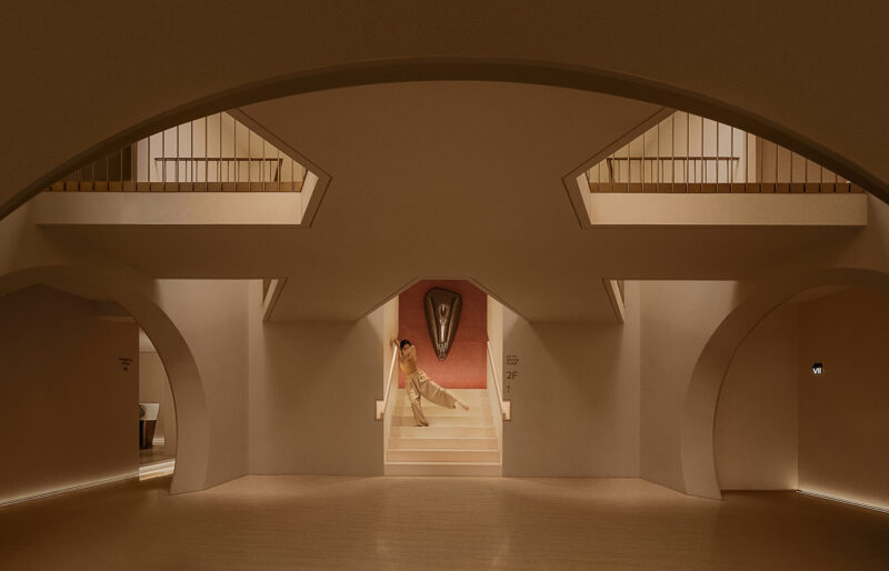
∇ 步入中庭 Step into the atrium
我們提取品牌的DNA-自由、個性、探索,而吸引力則是其核心的本質。像是地球忠實的好夥伴月球,依附這引力的作用周而複始的環繞地球旋轉。融合品牌氣質及提取自品牌理念中的引力,在人與空間的共同作用下,創造出一個無法被定義的想象共同體。
We extract the brand’s DNA-freedom, personality, exploration, and attractiveness is its core essence. Like the moon, the earth’s faithful and good partner, it revolves around the earth again and again depending on the action of this gravitational force. The fusion of brand temperament and the gravitation extracted from the brand concept, under the joint action of people and space, creates an imaginary community that cannot be defined.
03.軌道外的神秘天體 Mysterious celestial body outside the orbit
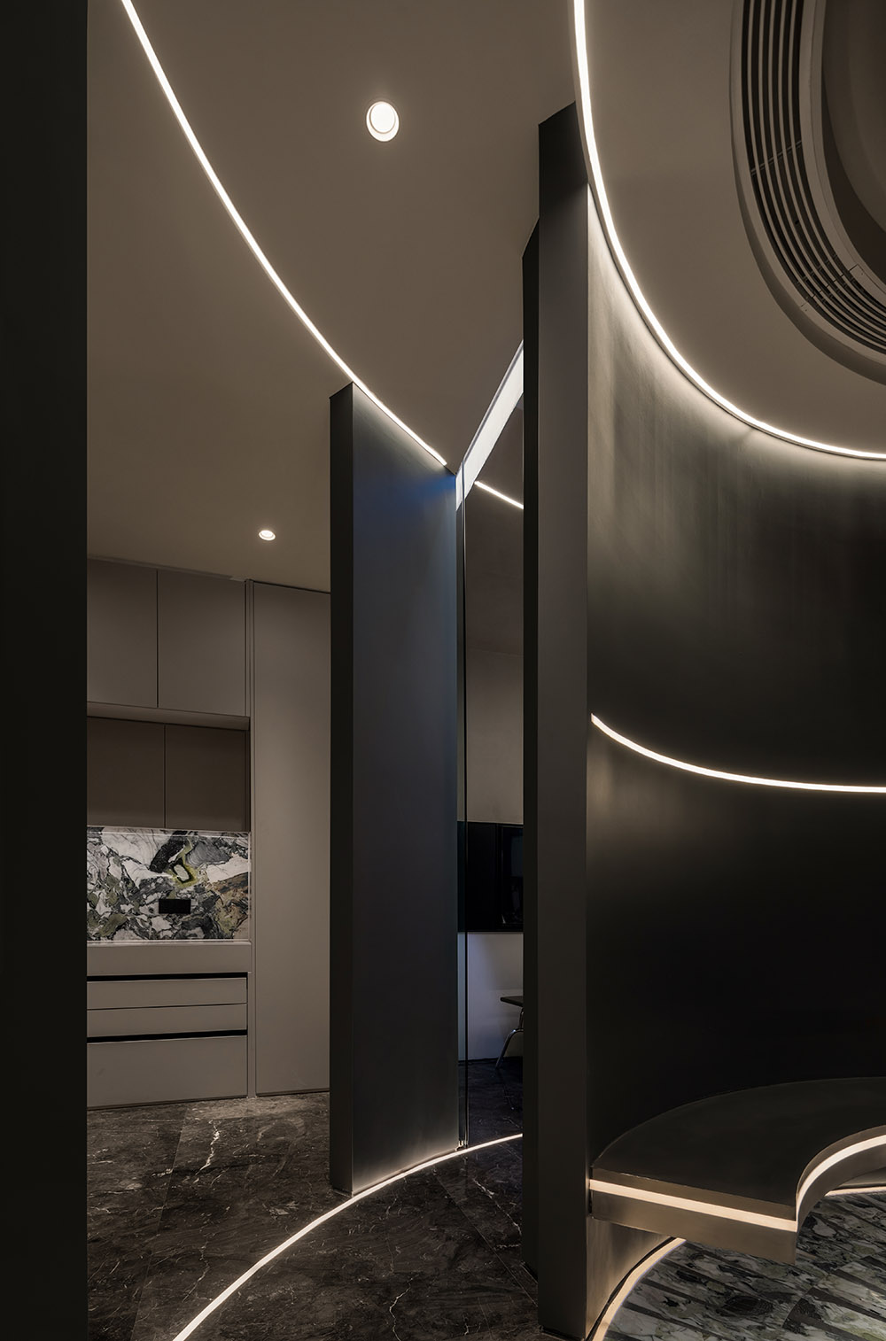
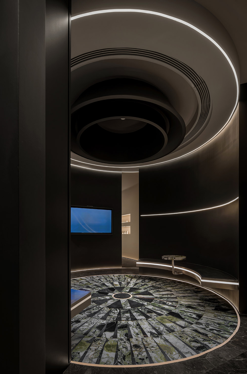
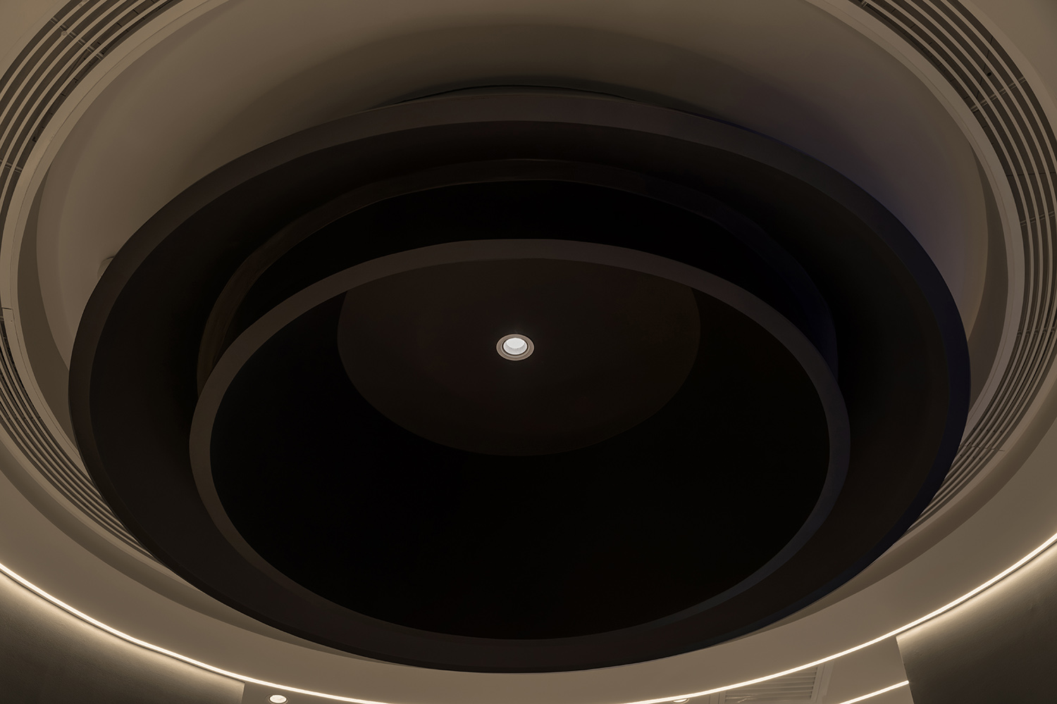
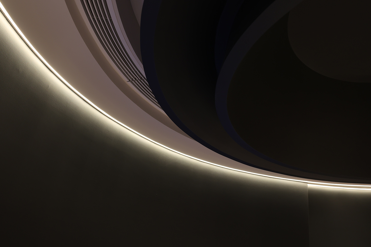
吊頂的造型作為新增結構,所以比層高要矮,而從空間縫隙中仰視這個造型的時候,目光又如同星軌般層層遞進;仔細一看,不知從何而來的光影在溝壑的最上方灑下,光影正沿著牆體潸然下落。
The shape of the suspended ceiling is a new structure, so it is shorter than the height of the floor. When looking up at this shape from a gap in space, the gaze is like star trails; when you look closely, there is light and shadow coming from nowhere in the gully. The light and shadow are falling along the wall.
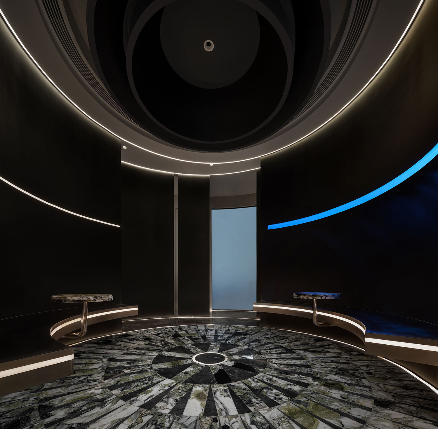
∇ 中庭全景 Atrium panorama
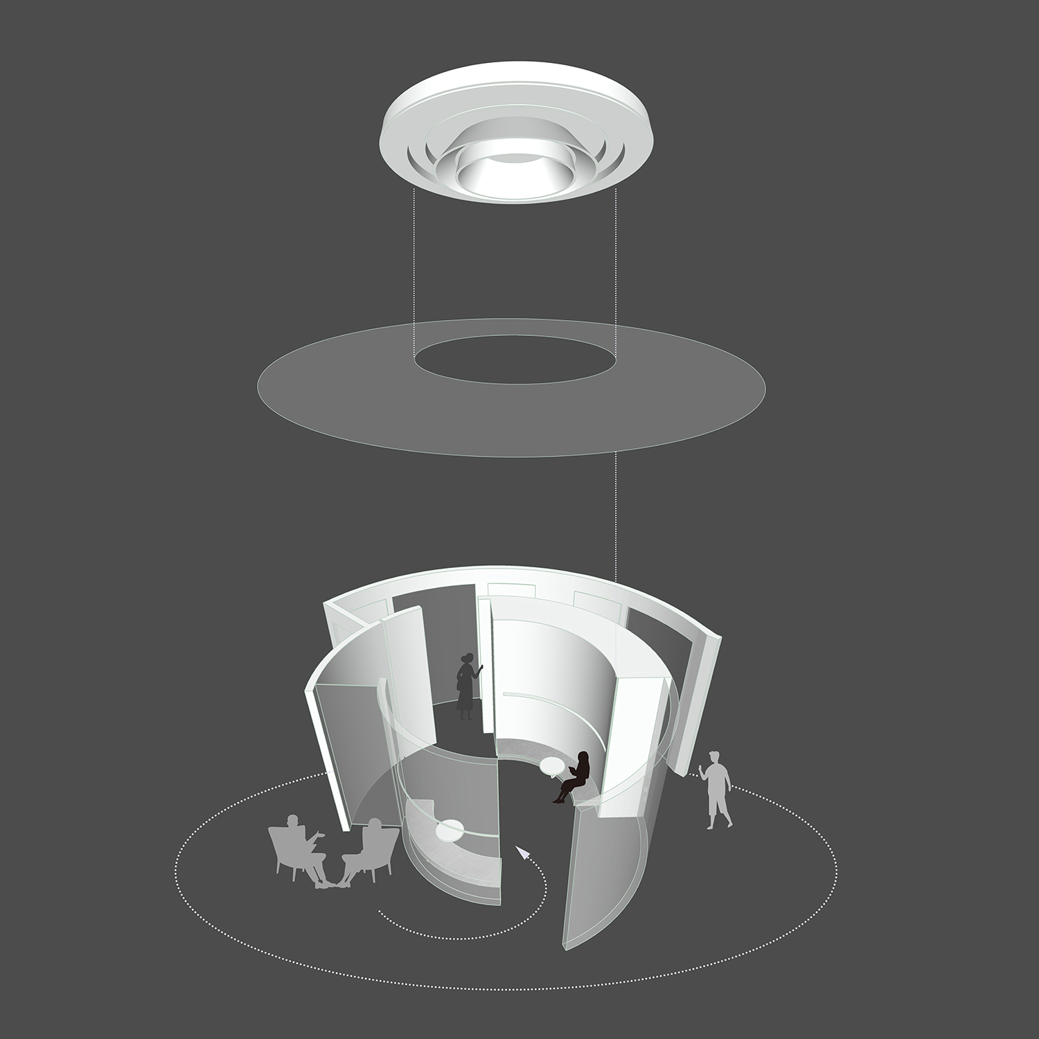
∇ 中庭軸測圖 Axonometric view of the atrium
設計師運用體態份量感,通過星係間的相互吸引的一個進化方式,從而得到一個富有張力且力量感的向上體驗。整體造型由七個不同直徑的同心圓旋轉組成,圓形之間的高低錯落排列,最終形成了空間中最引人注們的黑洞。而黑洞中滲出的光束,也見證無數璀璨的星星與它擦肩。
The designer uses the sense of posture and weight, through an evolutionary way of mutual attraction between galaxies, so as to get a strong and powerful upward experience. The overall shape is composed of seven concentric circles of different diameters rotating, and the heights and lows between the circles are arranged staggeredly, which finally forms the most eye-catching black hole in the space. The beam of light oozing from the black hole also witnessed countless bright stars rubbing shoulders with it.
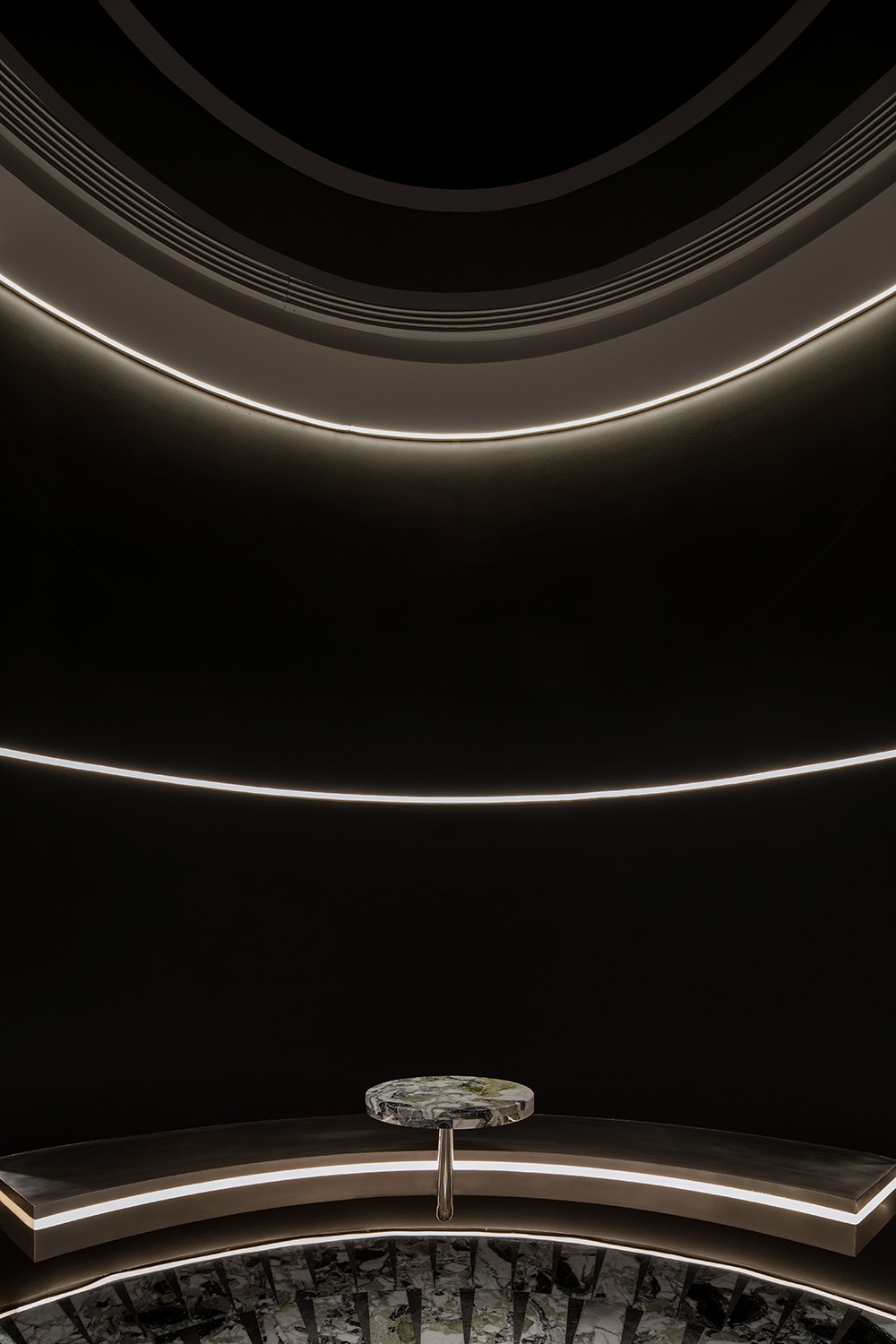
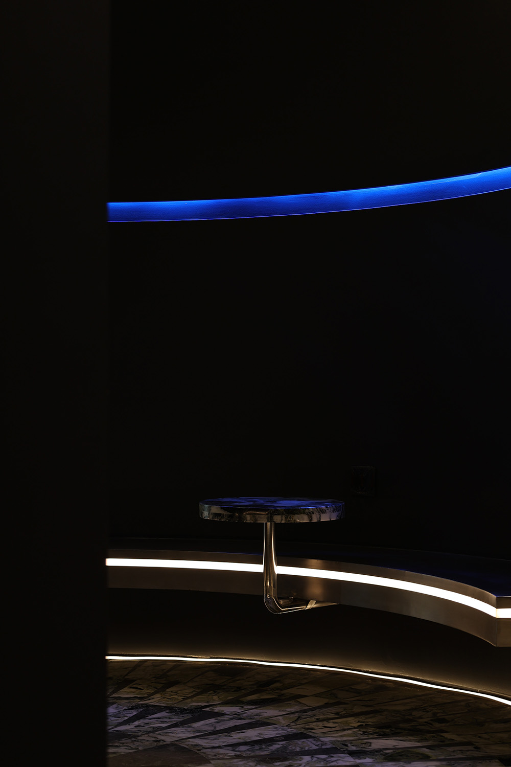
∇ 依附空間形成的休息區 Relying on the rest area formed by the space
∇ 順應空間,保持克製 Follow the space, Remain restraint
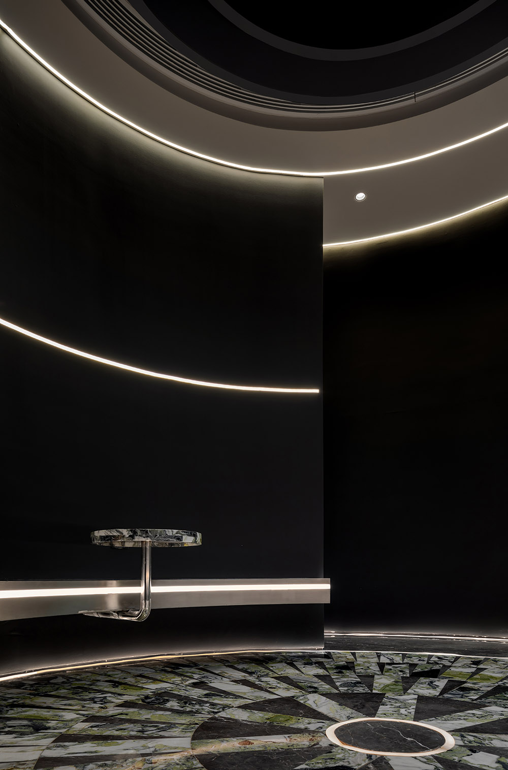
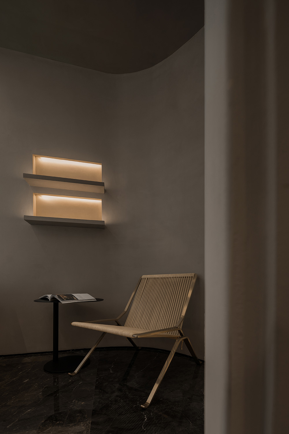
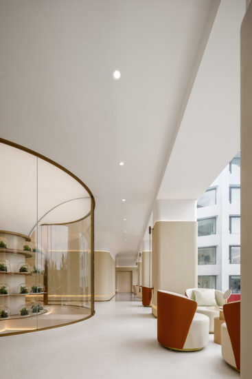
弧形盤繞的燈帶結合連貫空間結構,顧客在空間中沿著光的指引,移動、停留、感受、駐足,進入中庭的休息區後,抬頭仰望,猶如浩瀚星係中的天體圍繞著軌道轉動,如此一來,空間和人便有了互動,自成風景。
The arc-shaped coiled light strip is combined with a coherent spatial structure. Customers move, stay, feel, and stop along the direction of the light in the space. After entering the rest area of the atrium, they look up, as if the celestial bodies in the vast galaxy revolve around their orbits. In this way, space and people interact and become landscapes by themselves.
04.被光吸引 Attracted by light
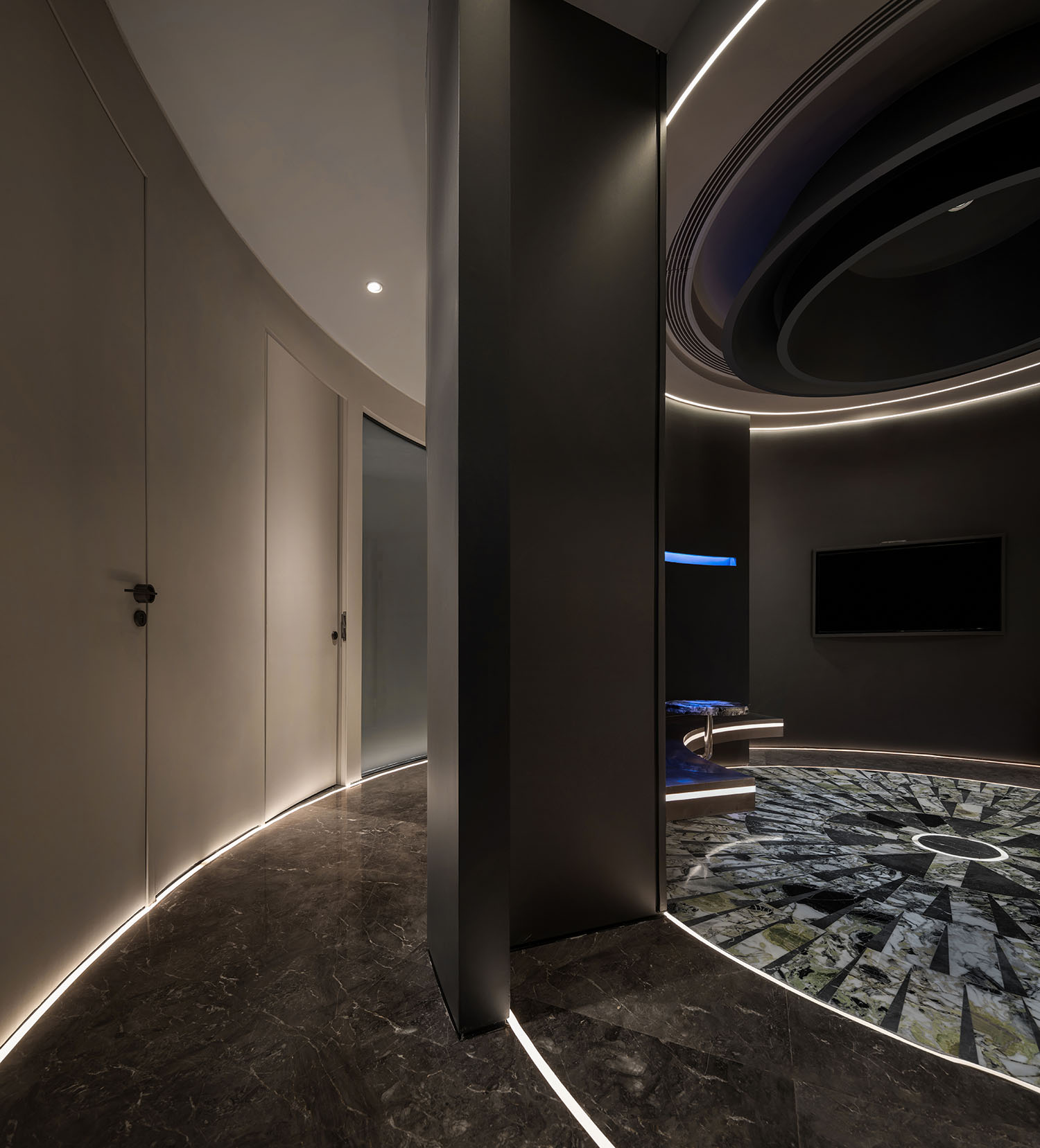
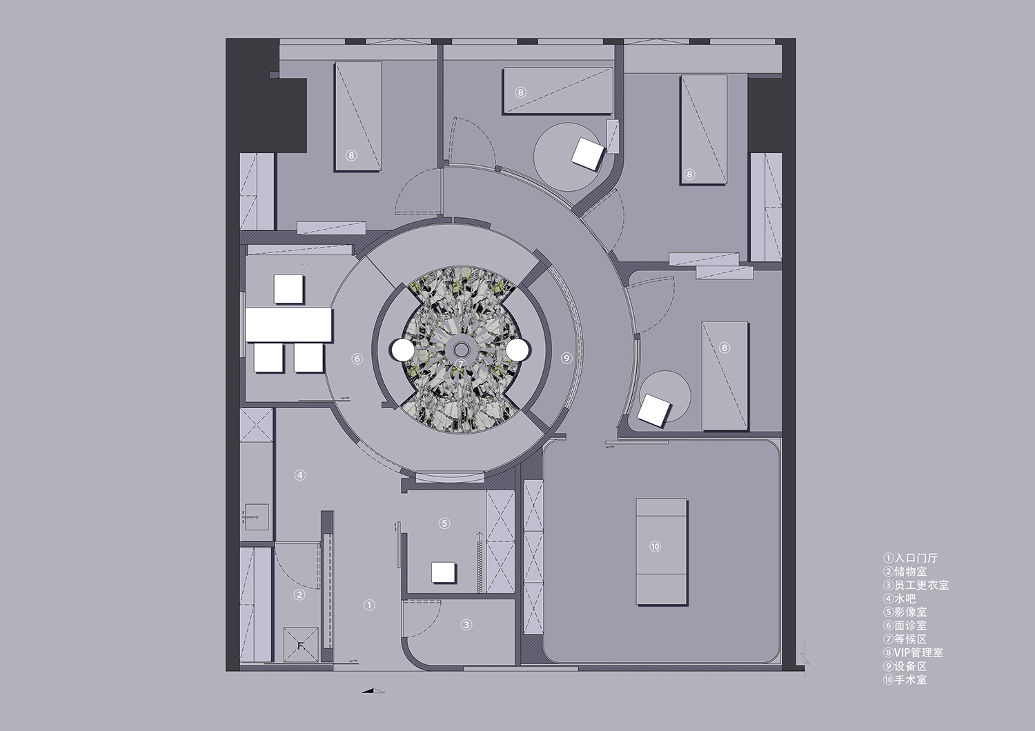
空間中所有的動線,都圍繞著中庭發散而形成了引力的自然動線。而中庭的所在處則是空間中最暗的地方,前方的洞口光,沿著地麵燈光指引的方向,帶人們走向空間的深處。
All the lines of movement in the space diverge around the atrium to form a natural line of gravity. The atrium is the darkest place in the space. The light from the opening in front, along the direction of the ground light, leads people to the depths of the space.
∇ 從後區望向前區 Looking from the back area to the front area
沿著中庭向裏踏向未知的旅程。隨著盤旋的道路逐步入勝,一點點窺探著神秘的內部空間,如同黑洞般吸引著人們進入且向內延伸。
Walk along the atrium into the unknown journey. As the circling road gradually wins, a little peek into the mysterious inner space, attracting people to enter and extend inward like a black hole.
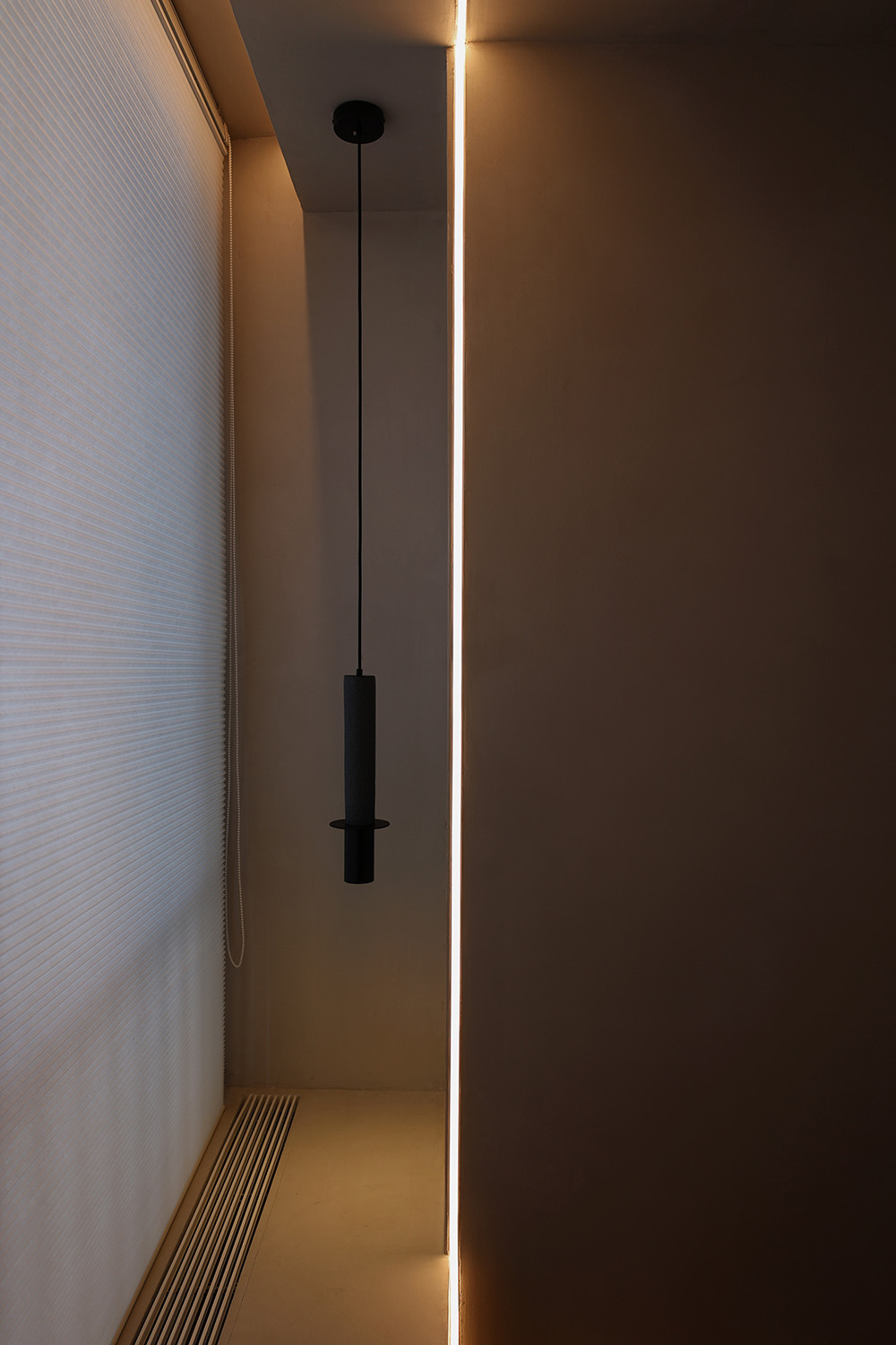
設計師希望通過設計持續吸引著客人的好奇心。後區空間的色調完全不同於中庭的幽暗,呈現出來的則是極度溫柔的色調,地麵的燈帶順著牆麵攀爬,在牆麵肆意的伸展,而閉環的流線使顧客自然而然中便遊逛穿梭完了整個展示區域。
The designer hopes to continue to attract the curiosity of the guests through the design. The tone of the rear space is completely different from the darkness of the atrium, and it presents an extremely gentle tone. The light strip on the ground climbs along the wall and stretches freely on the wall, while the closed-loop flow line makes the customer feel natural. Wandering through the entire exhibition area.
∇ 顏色區分動靜,光作為界限 Use color to distinguish movement and light as a boundary
為了維持空間幽暗的整體調性,在色彩的選擇上我們做了很多次的推敲。以深色為基調,純粹的材質通過互相作用,在反射與折射的多重影響下創造出奇特的光感。最終在多個自由弧形的空間體塊中,多重反射下柔和均勻的光感造就了純粹的空間儀式感,看似強勢且霸道的體塊卻在人們行走入內時呈現柔情似水水的靈動感。
In order to maintain the overall tone of the dark space, we have done many scrutiny on the choice of colors. Based on dark colors, pure materials interact with each other to create a peculiar sense of light under the multiple influences of reflection and refraction. Finally, in multiple free arc-shaped space blocks, the soft and uniform light feeling under multiple reflections creates a pure sense of space ritual. The seemingly powerful and domineering block presents tenderness like water and agility when people walk inside. feel.
05.回歸空間的本質 Back to the essence of space
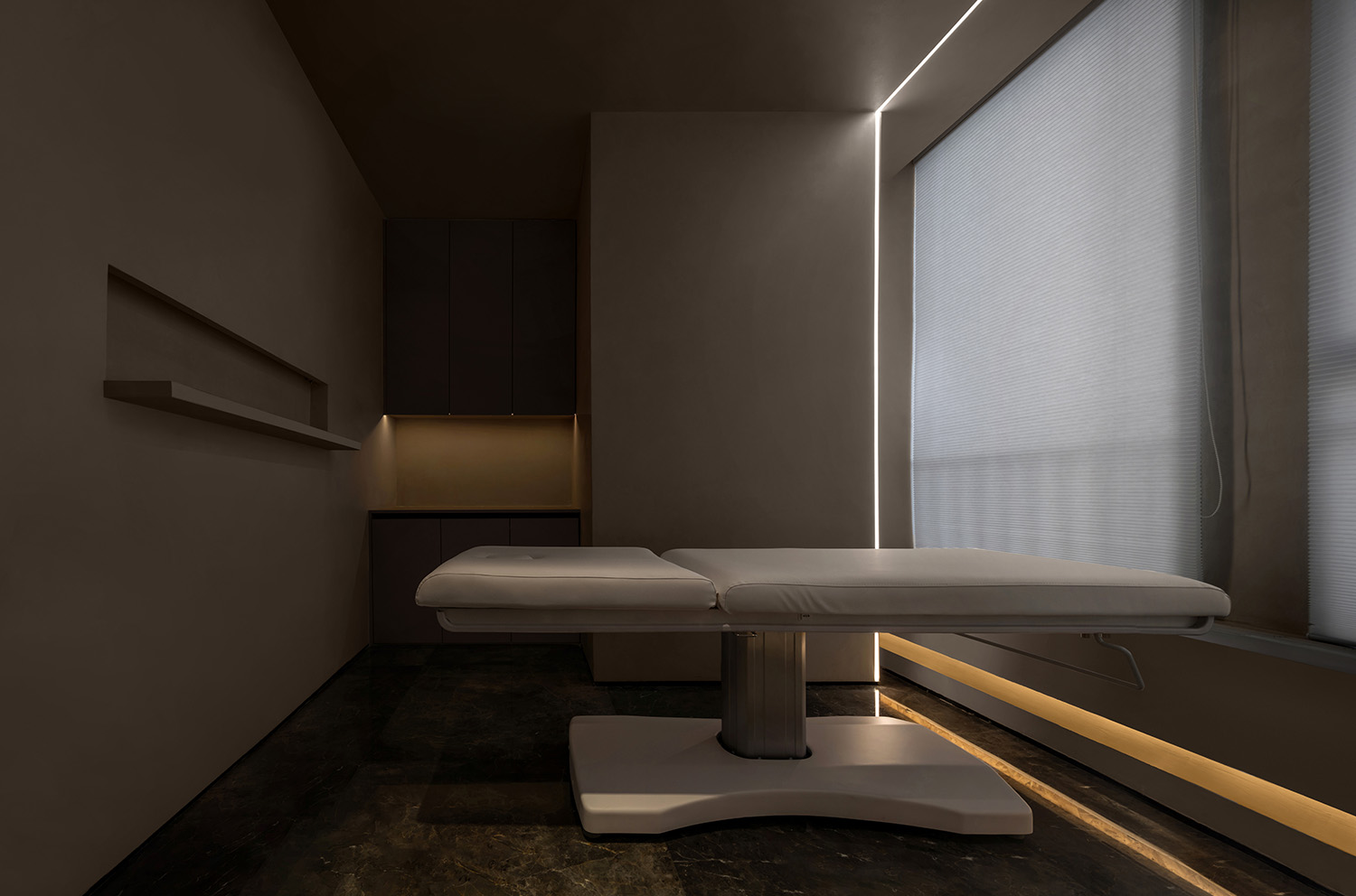
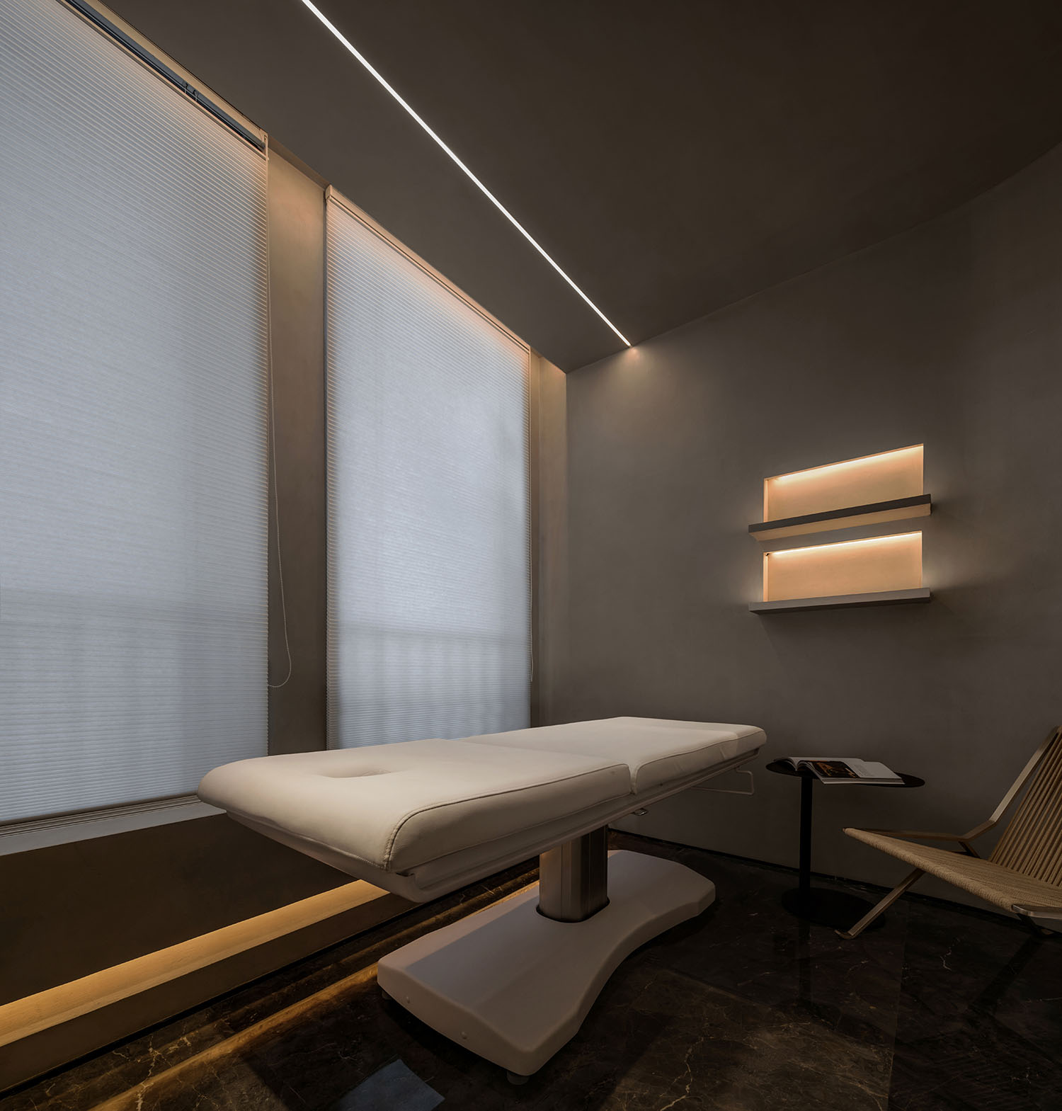
溫柔的調性配以可控的漫反射光源皆有效的提供了使用者可自由選擇的柔和光效,令使用體驗更自由及渾然沉浸,同時也提供儀器操作者更安全的皮膚檢審光效。而高效率的VIP室布局釋放了大麵積的空間予以公區形成更優越的公共體驗令‘概念’,有了更充裕的演繹區間。
The gentle adjustment and controllable diffuse light source effectively provide users with soft light effects that can be freely selected, making the experience more free and immersive, and also providing the instrument operator with safer light effects for skin examination . The high-efficiency VIP room layout releases a large area of space to form a better public experience in the public area, so that the ‘concept’ has a more abundant interpretation area.
∇ VIP管理室 The VIP room
從設計技法角度,’極簡’意味著從設計初期即對於可能性的材料與工藝有高度係統性駕馭感。我們常把這種駕馭感粗糙的理解為‘收口’,以至於‘創作’‘材料’‘工藝’這原本相輔相成的係統性三點之間被片段式的斬裂。
From the perspective of design techniques,’minimalism’ means a high degree of systematic control over possible materials and processes from the early stage of design. We often interpret this sense of control as ‘closing the mouth’ so that the originally complementary systemic three points of ‘creation’, ‘material’ and ‘craft’ are fragmented apart.
人們總樂衷於讚頌‘要去傾聽每一顆石頭自己的聲音’這種低智化的囈語,卻避免通過複雜深刻的洞悉去觸碰當材料更趨近一種學科時的“係統性”。
People are always happy to praise the low-intellectual babble of’Listen to each stone’s own voice’, but avoid using complex and profound insights to touch the “systematic nature” when materials are closer to a discipline. .
∇ 房間一角 Corner of the room
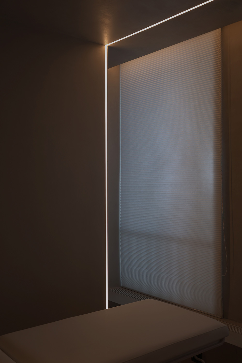
光,是幽暗空間下唯一主體,是虛幻與現實的對話媒介,通過光,超自然,未知,探索,夢幻的情緒被訴說湧現。真切的感知追本溯源,呈現於時間之上。
Light, the only subject in the dark space, is a dialogue medium between illusion and reality. Through light, supernatural, unknown, exploration, and dream emotions are told to emerge. The true perception goes back to the source and is presented in time.
06.美和自由 Beauty and freedom
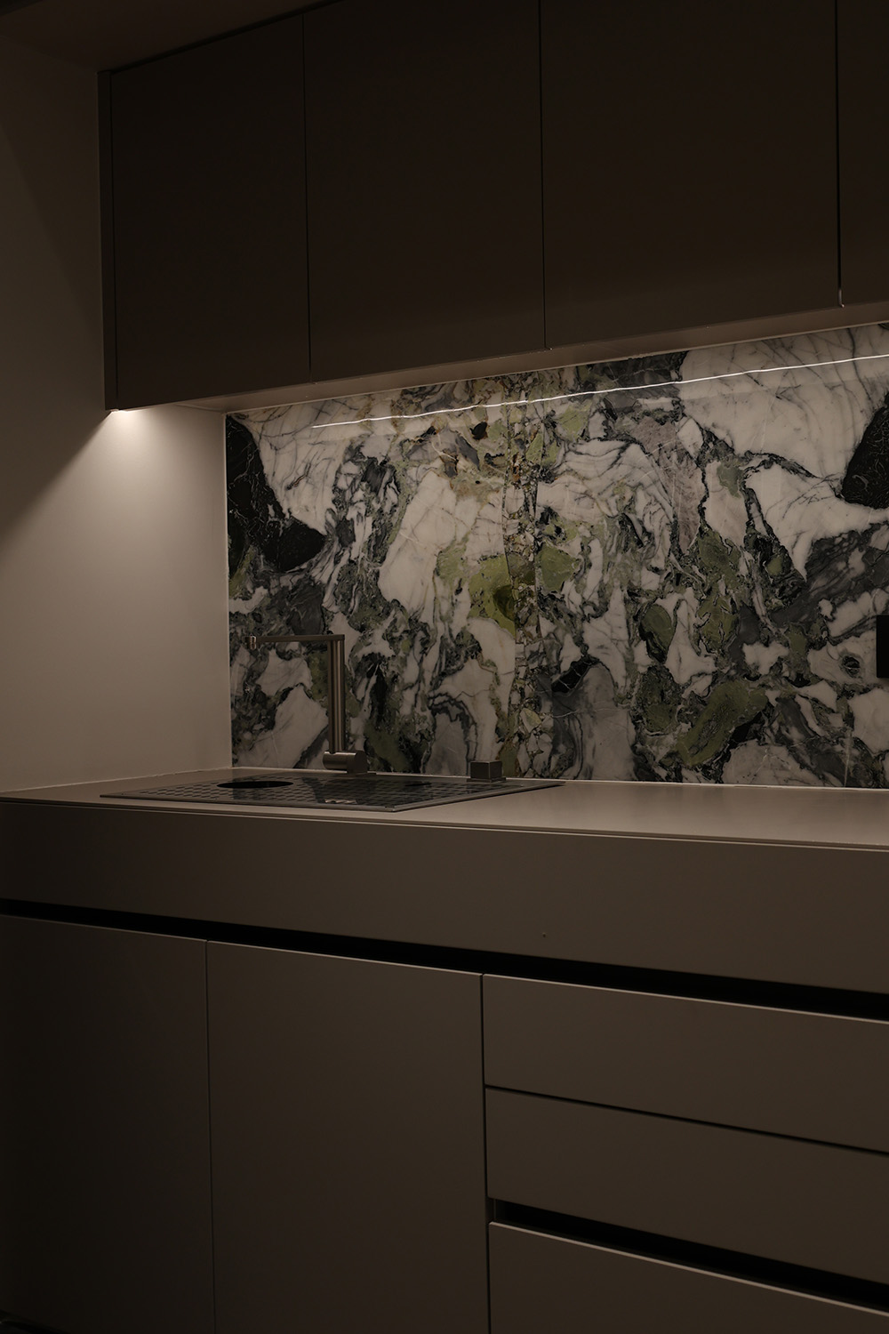
∇ 水吧 Bar
∇ 中庭造型細部 Atrium styling details
∇ 微妙的空間氛圍 Subtle space atmosphere
人與人之間很多的關聯都未必是以語言來連接,有時“潤物細無聲”的情感傳遞才是溝通的更高境界。利用空間給予人更深層的五官享受,讓客人們身心同步,便是攏合。一切的初始狀態,雜亂無序形成一個有機的空間,讓時間和光輕柔地流入內部場所。在整個空間序列上,我們並沒有拘泥於橫縱線上的排列,而是通過分割、疊加、等設計手法,使空間錯落有致,同時注入空間應有的自由與寂靜。
Many connections between people are not necessarily connected by language. Sometimes the emotional transmission of “moisturizing things silently” is the higher level of communication. Using space to give people a deeper enjoyment of the five senses, allowing guests to synchronize their body and mind is to close together. Everything in the initial state, chaotic and disorderly forms an organic space, allowing time and light to flow gently into the internal place. In the entire spatial sequence, we are not constrained on the arrangement of horizontal and vertical lines, but through design techniques such as segmentation, superposition, and so on, to make the space staggered, and at the same time inject the freedom and silence that the space should have.
∇ 平麵布置圖 Layout plan
項目信息
項目名稱:查覺醫美
Project Name: CHANGE CLINIC
主案設計:孟飛/末染設計
Main design: Meng Fei / MOOTHAN. design
深化設計:張林林/末染設計
Detailed design: Zhang Linlin / MOOTHAN. design
聯係郵箱:moothan@sina.com
E-mail:moothan@sina.com
完成時間:2021.10
Completion time: 2021.10
項目麵積:100m²
Project area: 100M ²
項目位置:山西·太原
Project location: Taiyuan, Shanxi
項目攝影:RICCI空間攝影、雙備
Project Photography: Ricci space photography, SHUANG Bei
燈光設計:三宜·想天照明設計
Lighting design: Sanyi xiangtian lighting design


