呼吸到你靈魂裏溫柔的氣息,
那是種沉埋在暗影裏的芬芳; —雨果
Breathe the soft of your soul,
which is the fragrance buried in the shadow. – Victor Hugo
設計理念:“蒸發與升華”Design Concept: “Evaporation and sublimation”
設計概念緣起烘焙加熱過程中水蒸氣的不斷“蒸發與升華”這一過程,從而推導出一係列純粹而有趣的造型。
This design concept is generated from the process of continuous “evaporation and sublimation” of water vapor during the baking and heating, which results in a series of pure-interesting shapes.
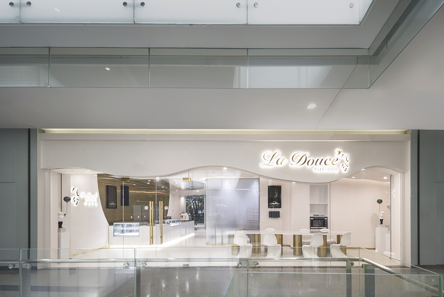
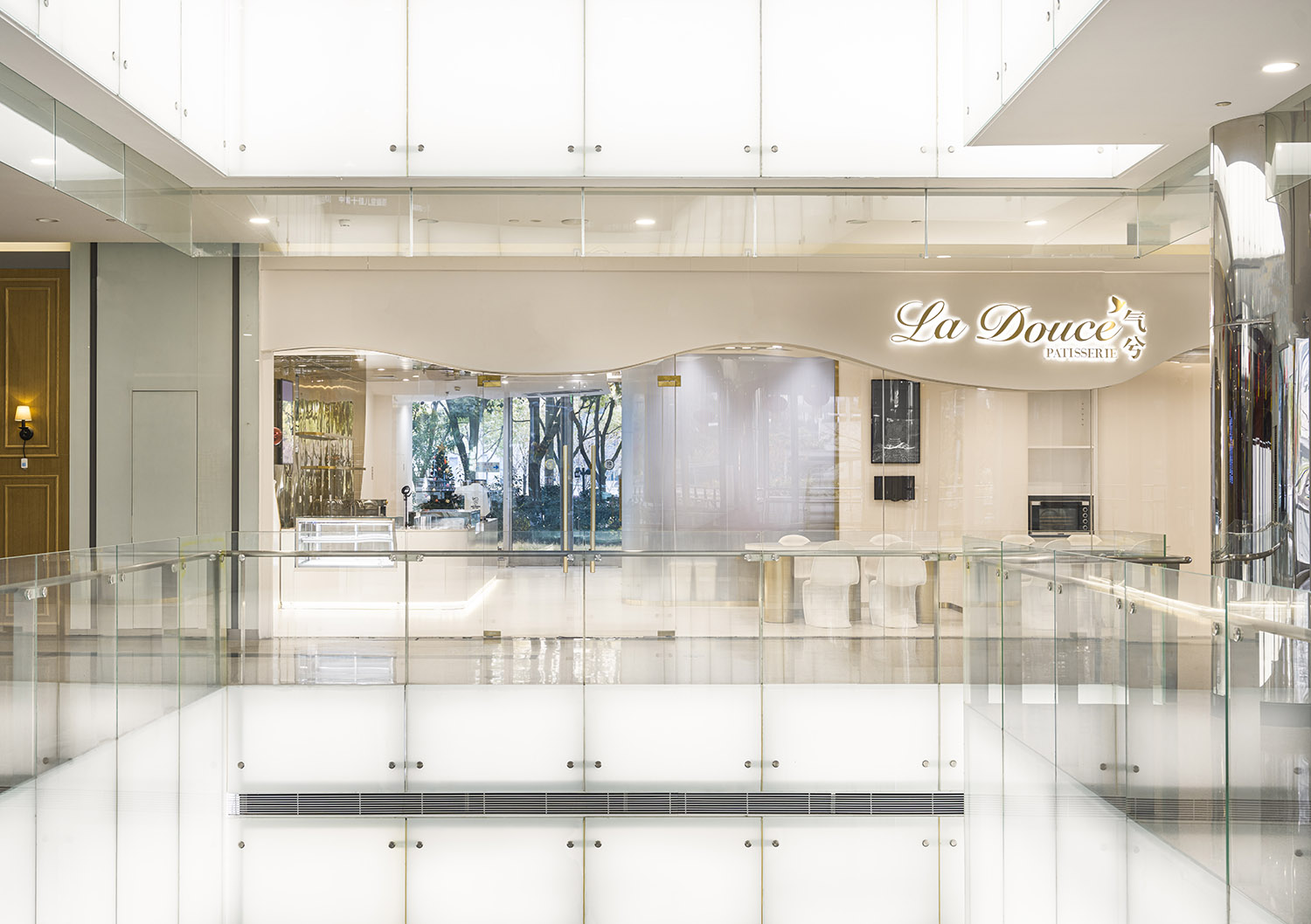
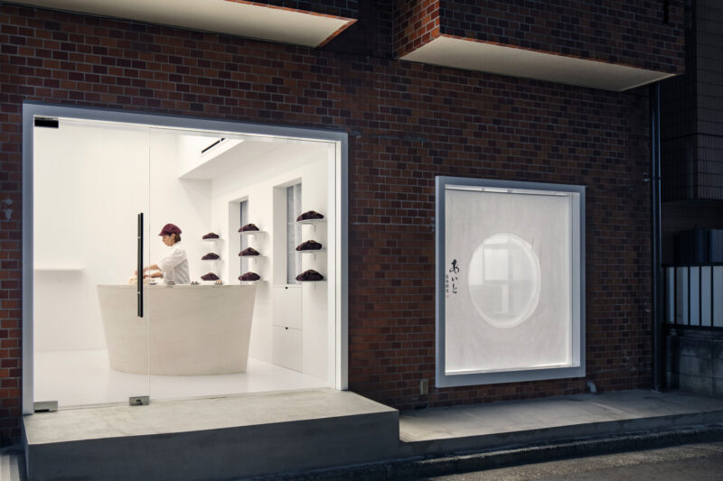
∇ 項目外觀(攝影版權 徐英達)exterior view(copyright by Yingda Xu)
關於La Douce Patisserie
Background of “La Douce Patisserie”
La Douce Patisserie是一家法式咖啡烘焙店,它不僅僅是一個隻售賣甜品的單一行為場所。這裏可以承載這個時代消費者更多的需求與可能性。顧客能在這裏選購、拍照、享受美食、社交、製作體驗等。我們力求從商業模式、空間設計等各方麵來重新界定甜品店的概念。
La Douce Patisserie is a French coffee shop, which is not only a place for seiling desserts, but also served for providing more needs and possibilities for consumers. People can shop , take photos, and enjoy food, communiation, and cooking experience , etc. We donated to redefine the concept of dessert shops from aspects such as business modes and space design.
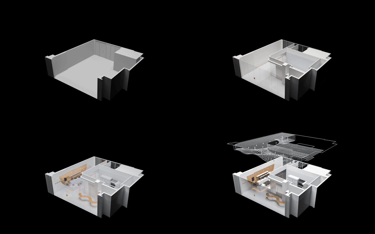
∇ 軸測圖(圖紙版權:平介設計) axonometric drawing (copyright by Parallect Design)
前期 Early Stage
隨著近幾年來體驗式經濟的滲入與人們對它的理解,一個時期的“所謂風格”似乎在逐漸更迭。最初,在與店主的交流中,我們希望聽到並複刻出她想要的東西。然而傾聽的過程中,我們在驚訝於店主理性的同時,也漸漸懂得和理解了她的需求-即希望用最純粹的環境來承載烘焙與咖啡。她希望這個環境不盲從、不浮躁,有足夠的空間去遐想和給予、去引領最前沿的精品體驗。不論是奔著咖啡的醇香,亦或是製作醇香的機器,甜品亦或是蒙德裏安藝術,還是在閑適的午後突如其來的創作靈感,人們可以暫棲此處,各取所需。
With the infiltration of the experience-economy and people’s understanding in the recent years,the “popular style” of a period is changing. Initially, we hope to hear and realize the owner’s wishes during the communication. However, during the process, while we are surprised by the owner’s rationality, we gradually understand her requirements -taking the advantage of the purest environment for roasting and coffee. She hopes that it will not be blindly obeyed, not impetuous, provide enough space for imagining and giving, and lead the boutique experience. Whether for coffee aroma or coffee machine, desserts or monderian-art, or the sudden inspiration in the afternoon, people can rest here.
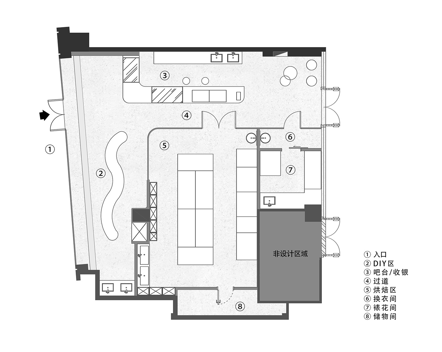
∇ 平麵布置圖(圖紙版權:平介設計) floor plan (copyright by Parallect Design)
∇ 店鋪概覽(攝影版權 徐英達)overview of the shop (copyright by Yingda Xu)
店鋪是“以體驗製作為主,甜品與咖啡為輔”的零售式體驗店,我們希望以此概念營造空間特質,塑造獨特的空間氛圍, 以此延展店鋪設計的可能性,並且將此作為法式浪漫含義的延伸。邁進店後,顧客們會立即感慨於空間的整體性。這種整體性不僅僅使產品特性的製作過程變成了一種生動的視覺體驗。
The retail-style experience shop is designed with the concept of “Focusing on experience cooking, supplemented by desserts and coffee seiling”,which is aimed to create space characteristics and atmosphere for more design possibilities. Additionally, it can also be wished for the extension of French romance.
When entering the store, customers will be immediately impressed by the integrity of the space, which not only makes the production process create a vivid visual experience.
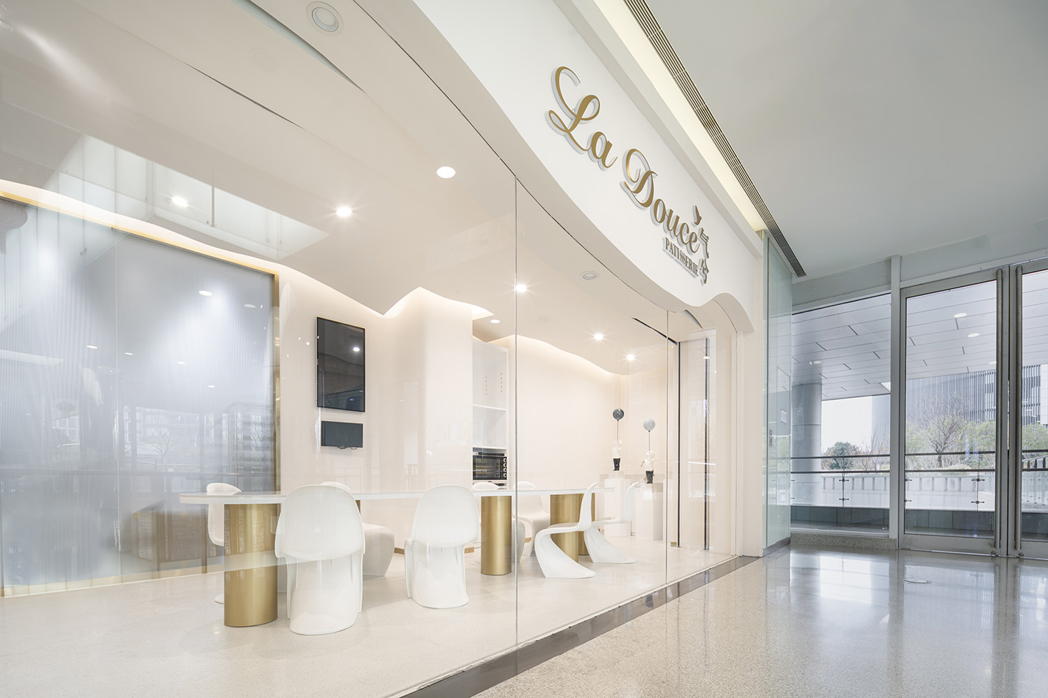
∇ 入口(攝影版權 徐英達)Entrance(copyright by Yingda Xu)
入口與烘焙理念共同利用“蒸發與升華”這一理念,為這個從白天持續到夜晚的愜意體驗空間帶來了舒適、吸引人的氛圍感。烘焙師在為客人製作甜品之時食品滿溢而出的醇然香氣,定會激起往來路人的興趣,使之駐足,無形之間讓人解釋了店鋪屬性。
The entrance and baking concept use the concept of “evaporation and sublimation”, to bring the comfortable and attractive atmosphere for this experience space from day to night. The food aroma overflowed during the baking will generate the interest of passengers and make them stop, and then, invisibly introduce the attributes of the store.
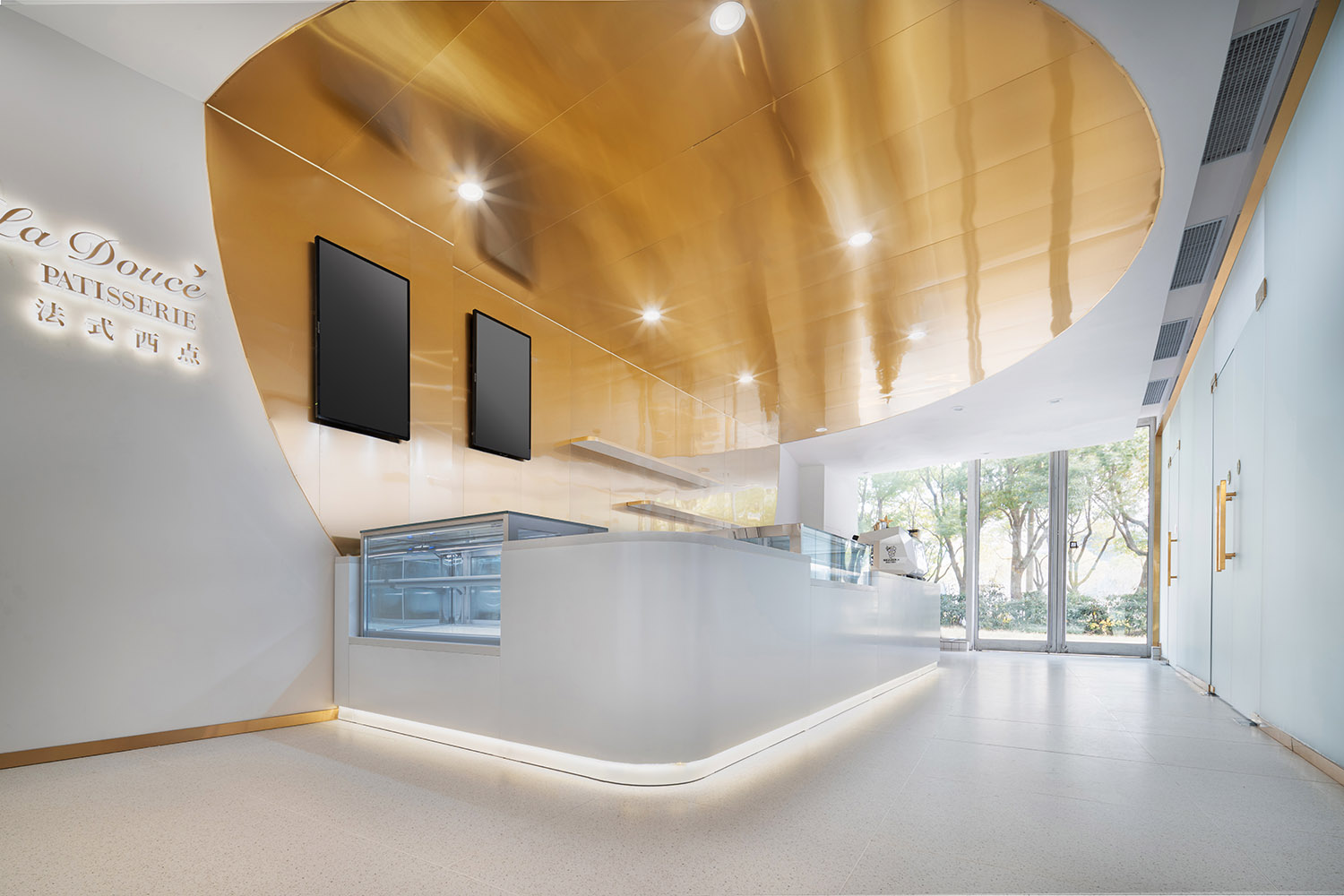
∇ 入口收銀區(攝影版權 徐英達)cashier area at the entrance(copyright by Yingda Xu)
∇ 吧台區細節(攝影版權 木子叔叔)cashier area at the entrance(copyright by Uncle Muzi)
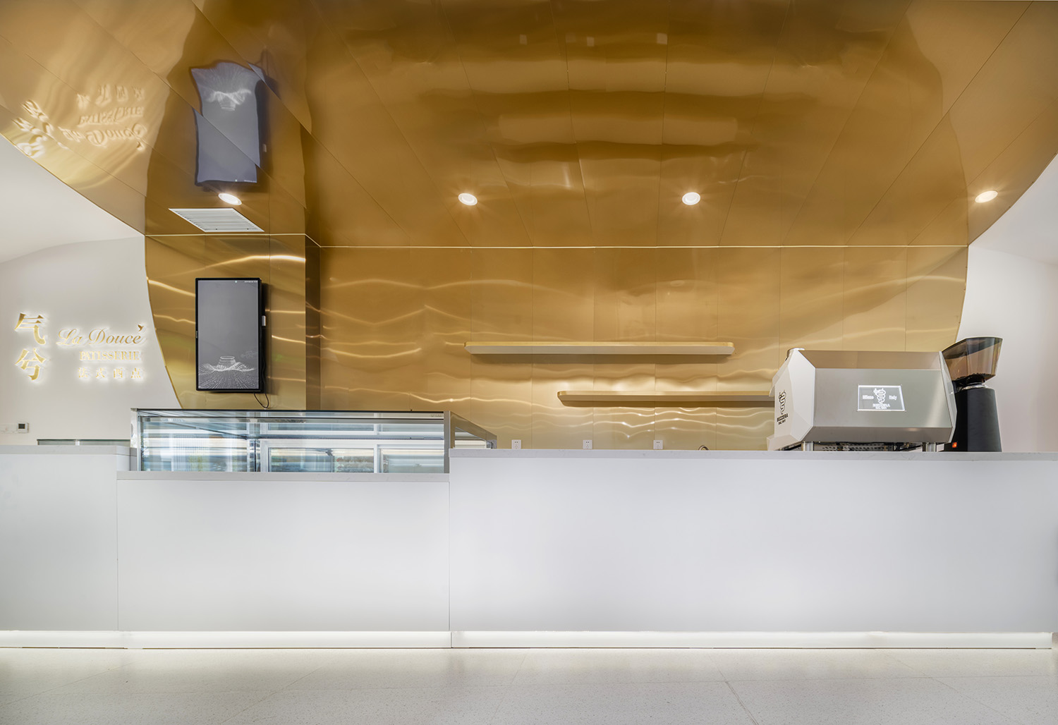
吧台區擔負著多種功能需求,包括人員調度,收銀,音控,最主要的功能是咖啡製作和甜品的展示銷售。
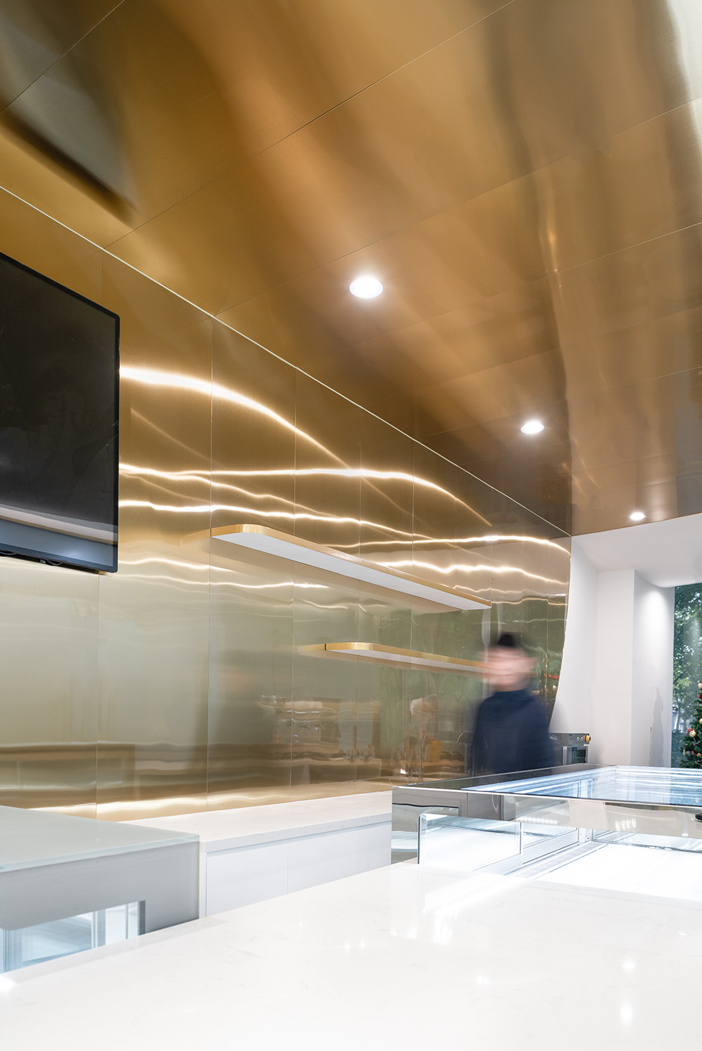
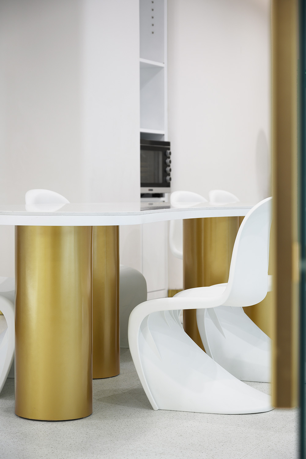
金色的亮點的設計,為整個室內空間增添一分高級感。設計師將甜品這個核心的產品通過扁平化手法結合拉絲金屬沿著牆麵一直延伸到頂麵,使一係列的金屬塊麵扣入牆體,覆蓋整個吧台,圓角。材質觸感舒適,方便打理,同時也通過了食藥監的審核。此外,設計令人聯想到烘焙特有的形狀與柔和的香氣,與主題相互呼應,為空間增添色彩與肌理,營造出整個空間的點睛之筆。
The bar area contains functions including scheduling, cash register, and sound control where coffee cooking and dessert display and sales are served as the most important ones.
The golden highlights add a sense of luxury the space. The designer uses flattening techniques and brushed metal skills to bring the core concept into the design, which is extended along with the wall to the roof, and inert the metals into the wall, fully covering the bar and round corners.
The material is comfortable and easy to take care which has passed the review of the Food and Drug Administration. In addition, the design makes people imagine the unique shape and soft aroma of baking, response to the theme, and add color and texture to the space, which show off for the entire shop.
∇ 弧形頂麵(攝影版權 徐英達)Curved Ceiling(copyright by Yingda Xu)
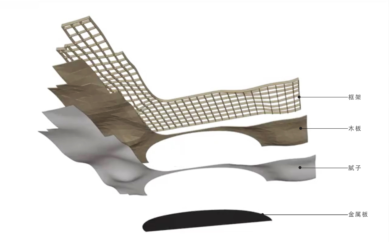
∇ 結構示意(圖紙版權:平介設計)the little patio space outside (copyright by Parallect Design)
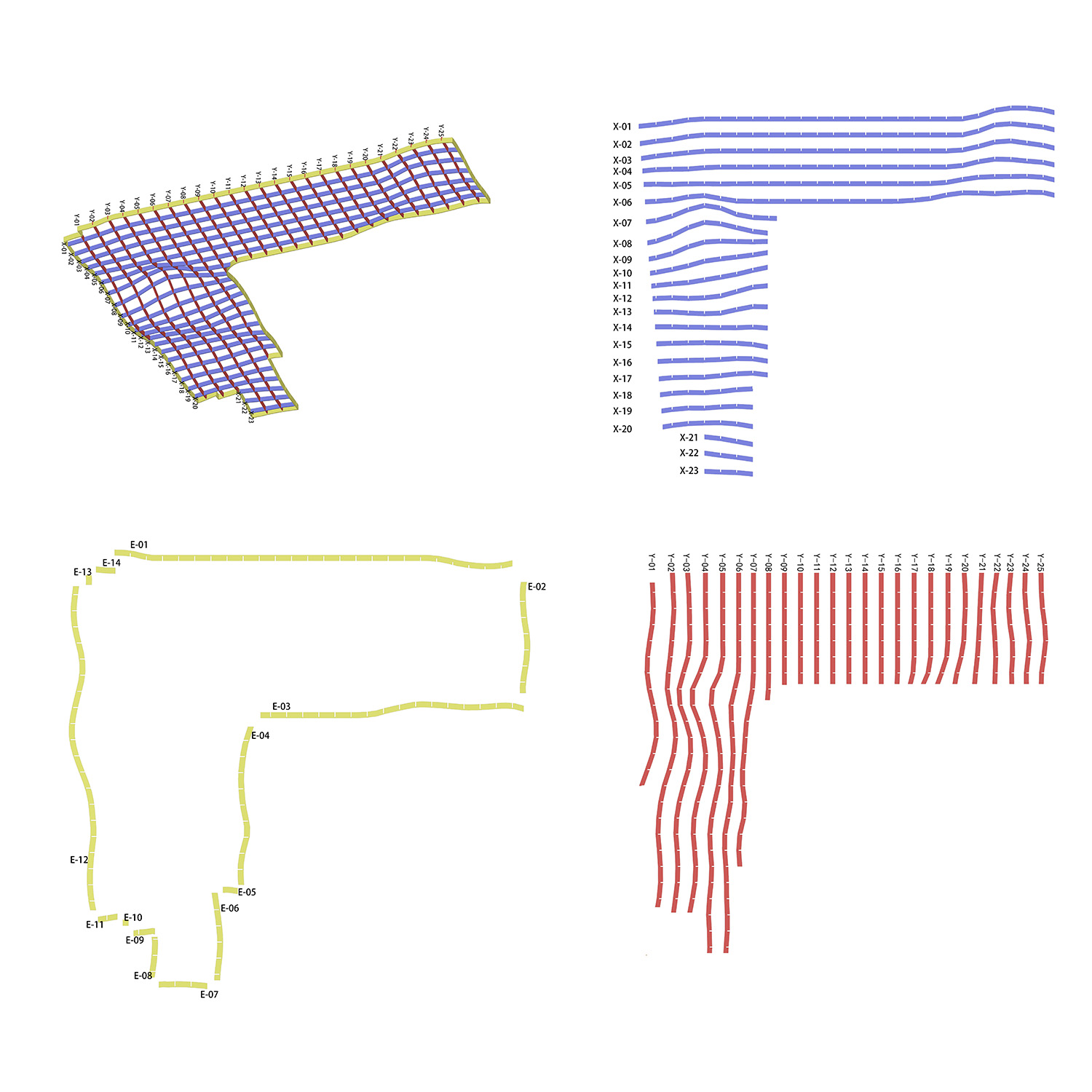
∇ 頂麵框架排布(圖紙版權:平介設計)Top frame arrangement (copyright by Parallect Design)
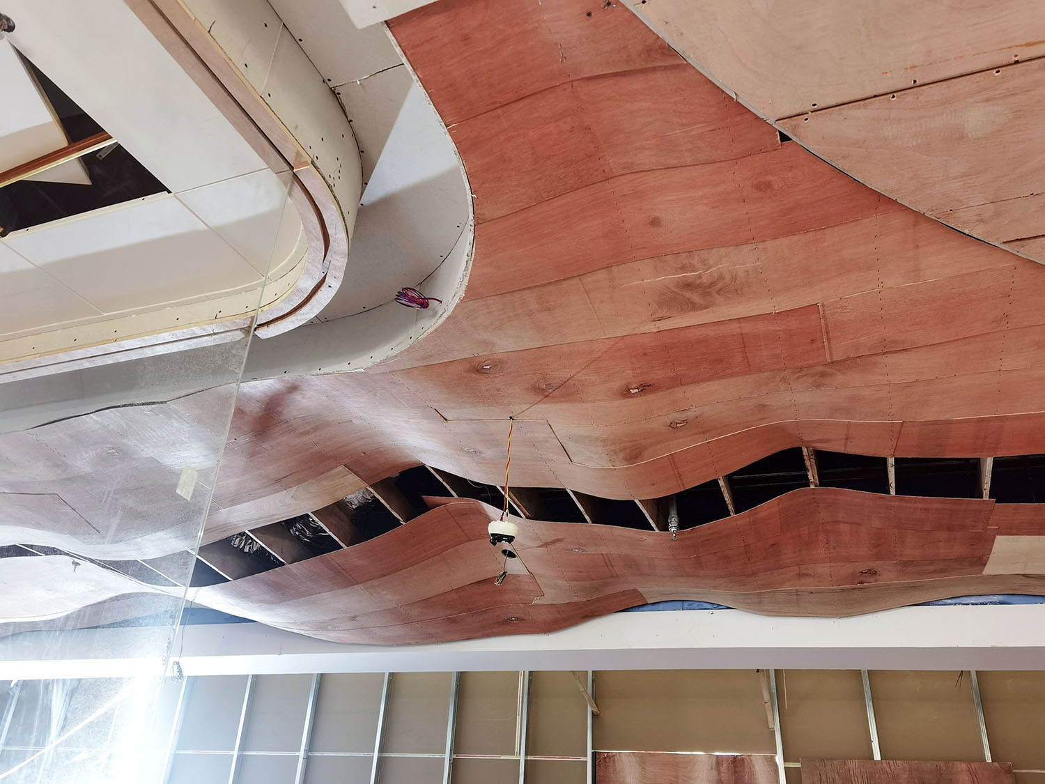
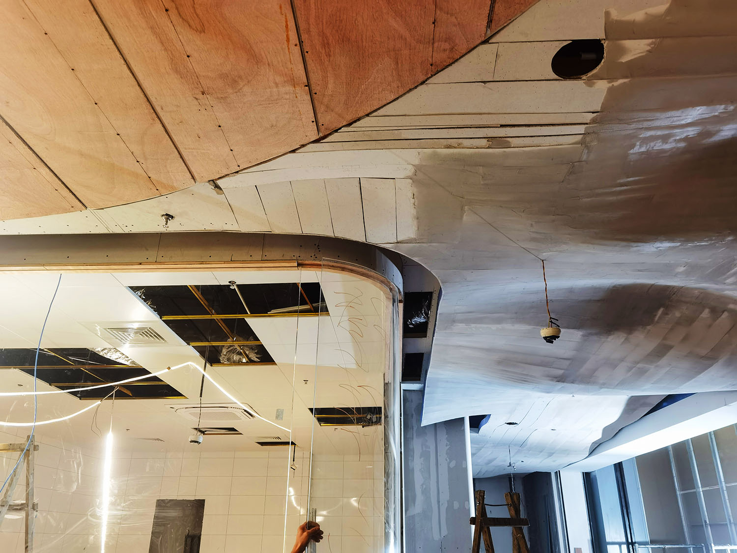
∇ 施工過程(攝影版權 陳磊)The little patio space outside (copyright by Lei Chen)
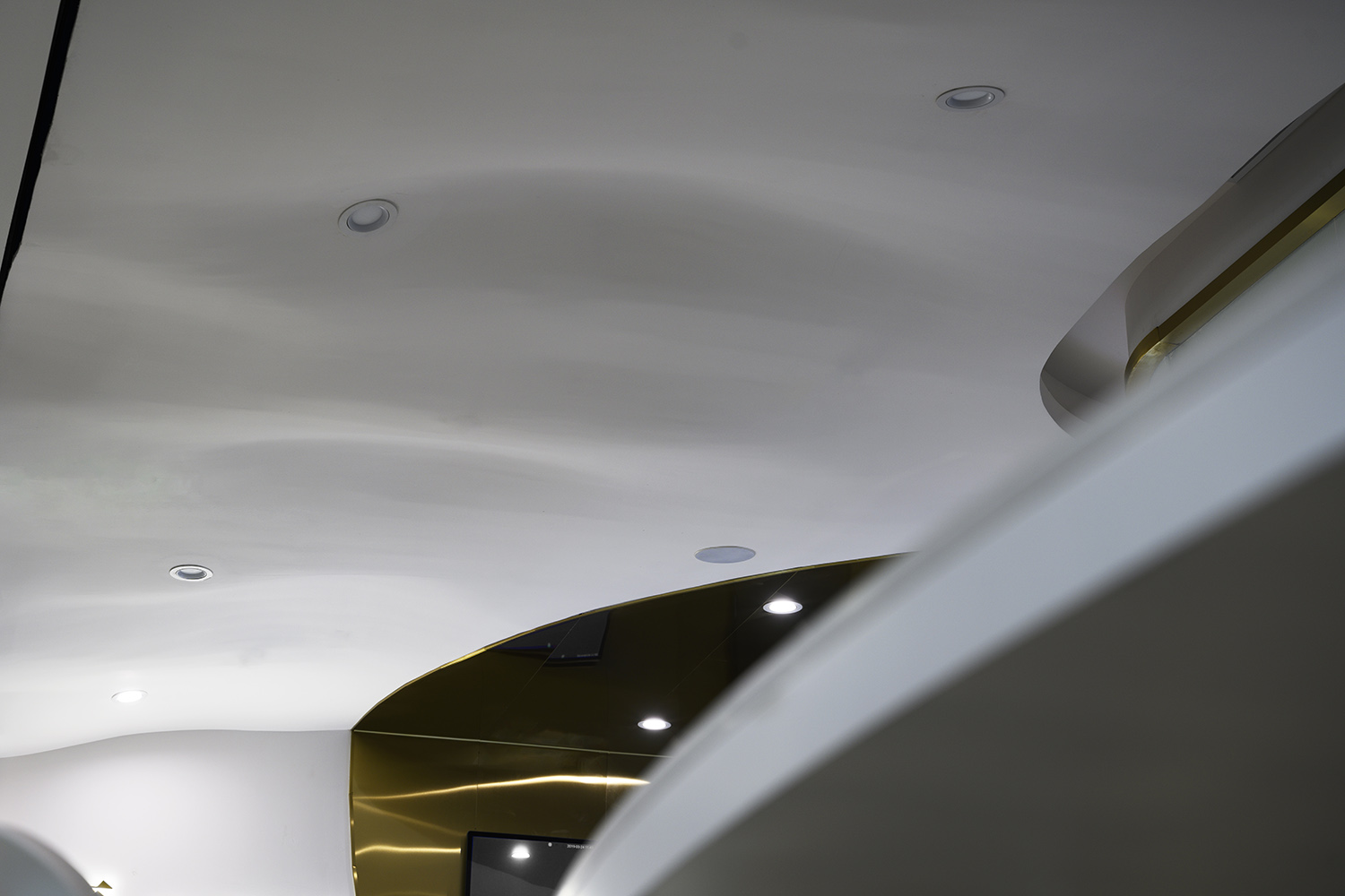
頂麵彎曲動感的形態源於烘焙加熱的過程中香濃氣息不斷“蒸發與升華”的過程,以及水珠滴落之前的瞬間。設計將這種奇特的動態演繹於整個空間,同時增加了空間的主題性和氛圍感。弧形頂麵的實現過程非常有趣,由於考慮到施工成本原因,我們沒有選擇工廠預製的GRG模塊吊掛,而是先在三維軟件中確定每一個穹頂的中心點和它們的相交點;再根據不同的弧長做骨架券;之後將骨架券聯係成空間網格;最後用薄木板形成一個個連續的穹頂表麵,這些全部是由現場工人手動完成。
The curved-dynamic shape of the top surface design is derived from the process of continuous “evaporation and sublimation” of the aroma during the baking, and the moment before the water drops. The design interprets the dynamic process in the space, and increases the feeling of the theme and atmosphere. The production of the curved ceiling is interesting. Due to the construction costs, we do not choose the factory-prefabricated GRG modules, but determine the center point and intersection point of each dome in the 3D software. Then, making skeleton arch ribs according to different lengths. In the next, arch ribs are formed into space grids. Finally, dome surface is formed by wooden planks. All of these are hand-craft.
∇ 烘焙區域(攝影版權 徐英達)Baking Area(copyright by Yingda Xu)
∇ 烘焙區域細節(攝影版權 徐英達)Baking area details(copyright by Yingda Xu)
烘焙區域與吧台相對。透過弧形長虹玻璃, 顧客在等待品嚐新鮮甜品的同時,還可隱約看到烘培師們的製作過程。
進入內部,顧客可以看到烘焙師所有的操作。這裏猶如劇院的鏡框式舞台。烘焙師那精湛的手藝,可以將甜品製作過程展示得如同一場表演,讓顧客對烘焙的了解更進一步。
The baking area is set opposite to the bar. Customers can vaguely see the making process of the bakers while waiting for fresh desserts, through the curved Changhong glass.
Walking into the baking area, people can watch the whole baking peocess, where the space is designed like a mirror-framed stage in a theater. The bakers’ craftsmanship can show the dessert making process like a performance, further impressed customers understanding of baking.
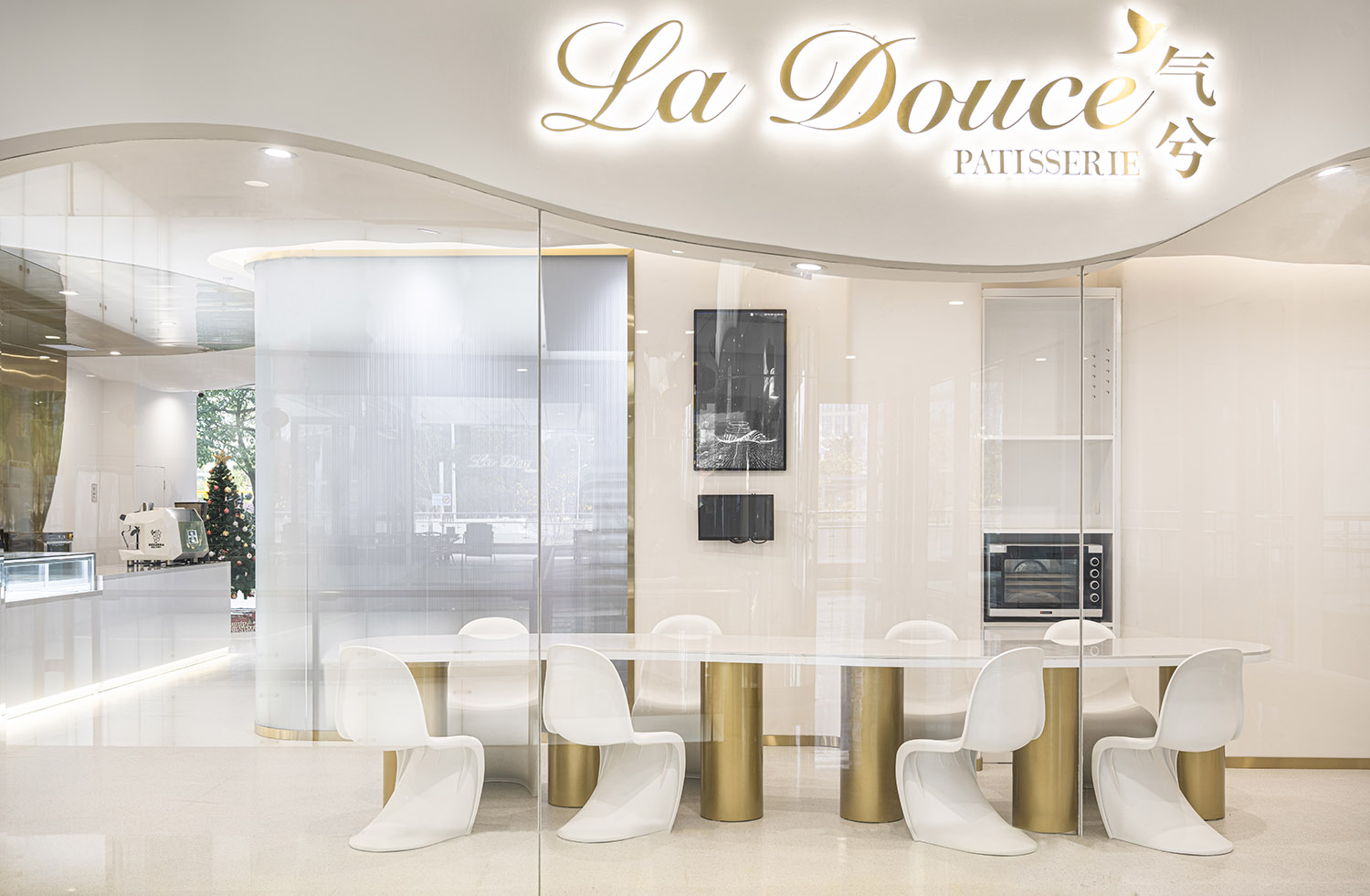
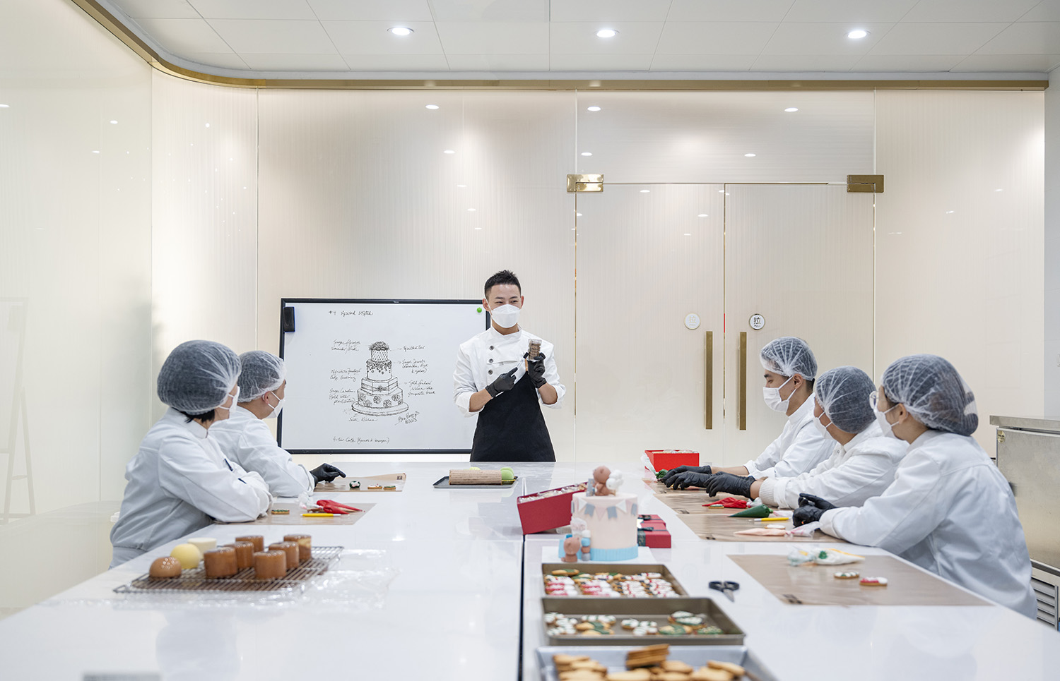
∇ DIY區(攝影版權 徐英達)DIY Area (copyright by Yingda Xu)
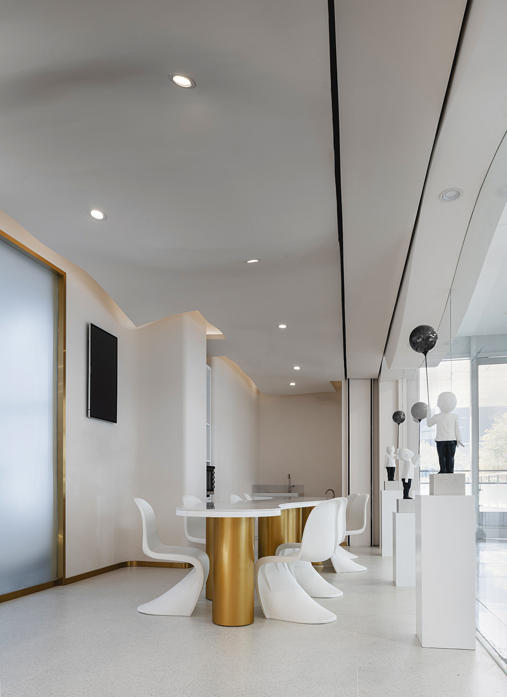
∇ DIY區細節(攝影版權 徐英達)DIY area details (copyright by Yingda Xu)
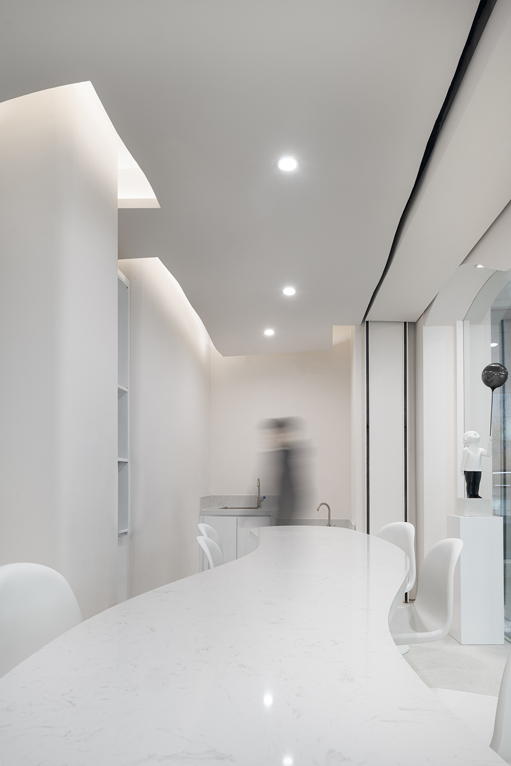
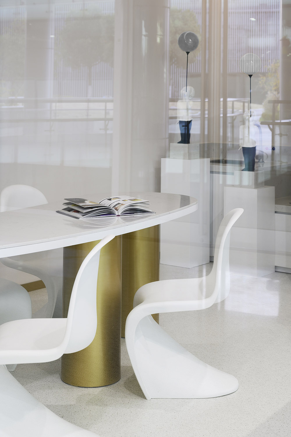
形態彎曲流動的diy桌子,與整個空間相融合。
The curved-flowing DIY table blends integrate into the entire space.
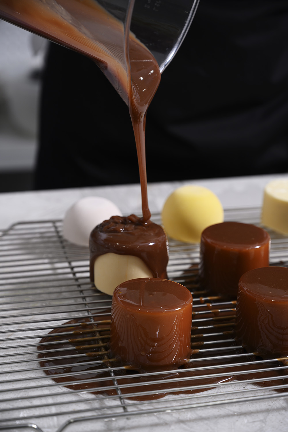
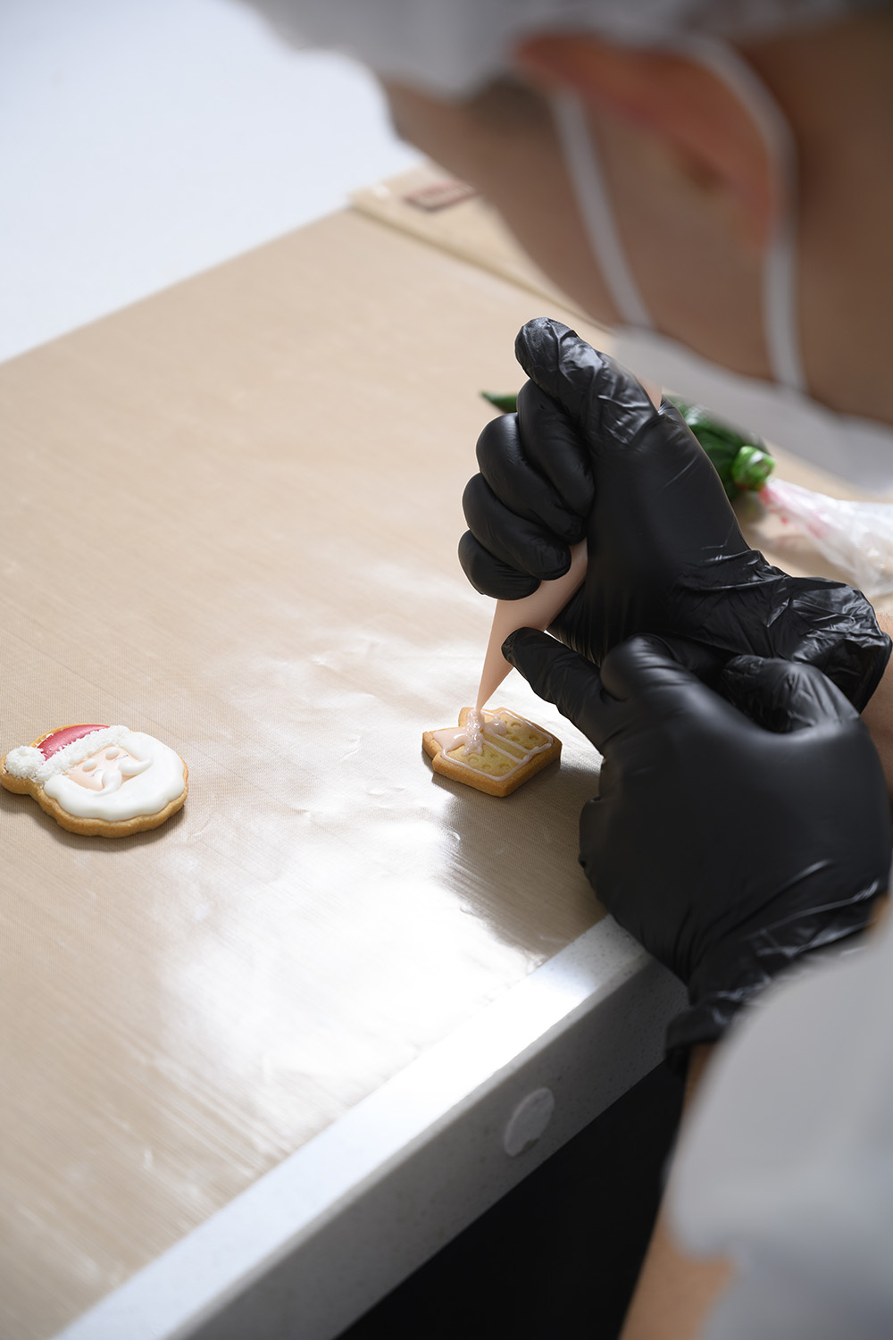
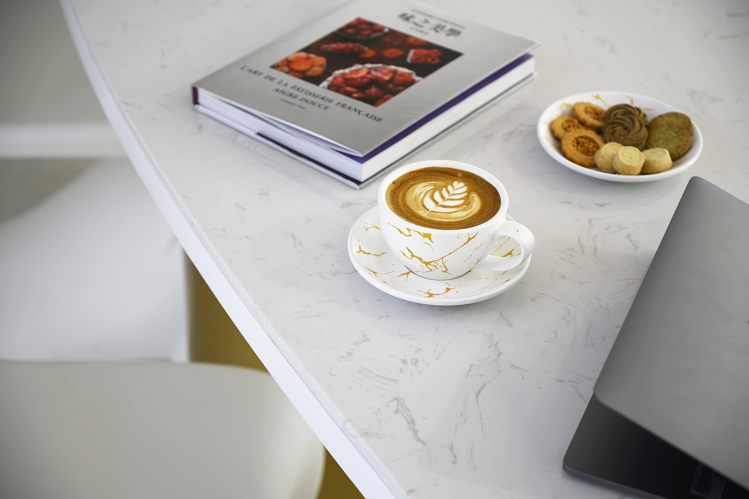
在這個洋溢著輕鬆氛圍的同時,還充滿咖啡醇厚香氣的區域,每個人都可以全然放鬆自我,沉浸於自我的烘焙創作中去。同時,還有音樂與咖啡相伴,也有素不相識的邂逅,為熱愛烘焙與精致設計的人們提供了一個理想場所。
In this area filled with a relaxed atmosphere and full of the mellow aroma of coffee, people can completely relax and immerse themselves into their own baking creations. In addition, there is music and coffee, as well as strange encounters, providing an ideal place for people in favor of baking and design.
空間中多處運用弧線造型,且對原空間裏不規整且生硬的轉角進行了弧形處理,使之更為柔和,觸感舒適。讓喜歡烘焙體驗的朋友們在這樣的氛圍裏停下來,暫離喧囂,享受此刻的生活。
Curved shapes are used in the design, and the irregular and blunt corners in the original space are curved to make them softer and comfortable to the touch, which also make friends enjoy baking stop, leave the hustle and bustle for a while, and enjoy the life at this moment.
項目信息
項目名稱:體驗式烘焙廚房
設計方:平介設計
項目設計&完成年份:2021.11
設計團隊:陳磊,李文靖,楊楠,肖湘東,楊波
項目地址:江蘇省蘇州市工業園區中衡設計大廈一樓
建築麵積:134㎡
攝影版權:徐英達、陳磊、木子叔叔
客戶:氣兮法式甜品烘培店
郵箱:Info@parallect-design.com
材料:拉絲黃鈦金、長虹玻璃膜、水磨石、雅白乳膠漆
Project name: La Douce Patisserie
Designer: Parallect Design
Project Design & Accomplish Date: 11/2021
Design Team: Lei Chen, Wenjing Li, Nan Yang, Xiangdong Xiao
Project Address: 1st Floor, Zhongheng Design Building, Industrial Park, Suzhou City, Jiangsu Province
Building Area: 134㎡
Photography Copyright: Yingda Xu
User: La Douce Patisserie
Email: Info@parallect-design.com
Material: Brushed yellow Titanium, CHANGHONG glass film, Terrazzo, White Latex Paint



![[4K] 2.1G 虛空之美-100個日式庭院](http://www.online4teile.com/wp-content/uploads/2023/09/1_202309111611111-8-414x550.jpg)
