光永遠是一種把空間戲劇化的重要元素。
「Light is always an important element in dramatizing space.」—Tadao Ando
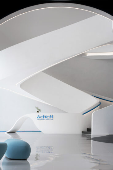
這是介間設計接到的第二個塗料展廳項目,此次項目的設計概念是以“流”為核心進行建構,以空間的方式為ITALIA意庫馬品牌賦予全新的解讀與呈現。我們結合平麵、空間秩序、結構關係以及空間體驗感,執著於理性之美,沒有多餘的元素,也沒有任何裝飾,使人們的注意力全部聚焦於產品本身以及全新的空間上麵。
This is the second paint exhibition hall project received by the intermediary design, the design concept of the project is based on the “flow” as the core of the construction, in the way of space for ITALIA meaning kuma brand to give a new interpretation and presentation. We combine plane, spatial order, structural relations and spatial experience to adhere to the beauty of rationality, without any superfluous elements or decorations, so that people’s attention is fully focused on the product itself and the new space.
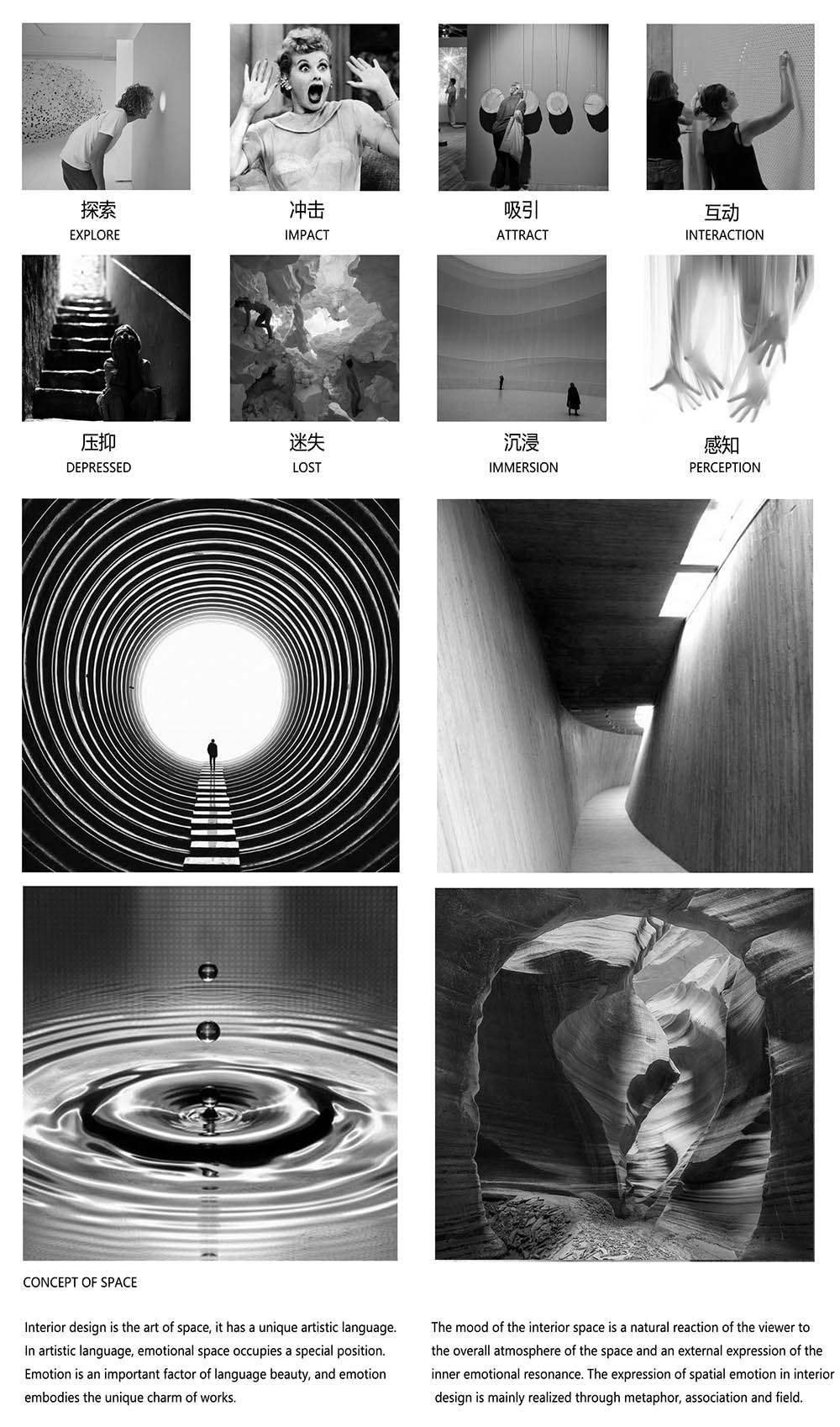
∇ 空間情緒
空間導向 Spatial orientation
基於項目原來的場地是一個狹長型的矩形空間,如何建立戲劇化沉浸感以及有效引導人群的動線是介間設計一直在關注並思考的問題。在這個被過去式的商業氣息環繞的傳統建材市場中,讓ITALIA意庫馬成為有辨識度、差異但同時內斂的存在是設計團隊的根本目的。
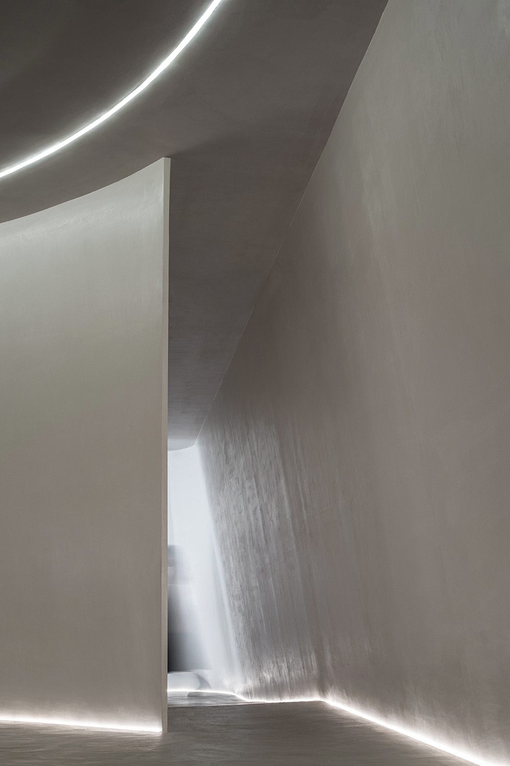
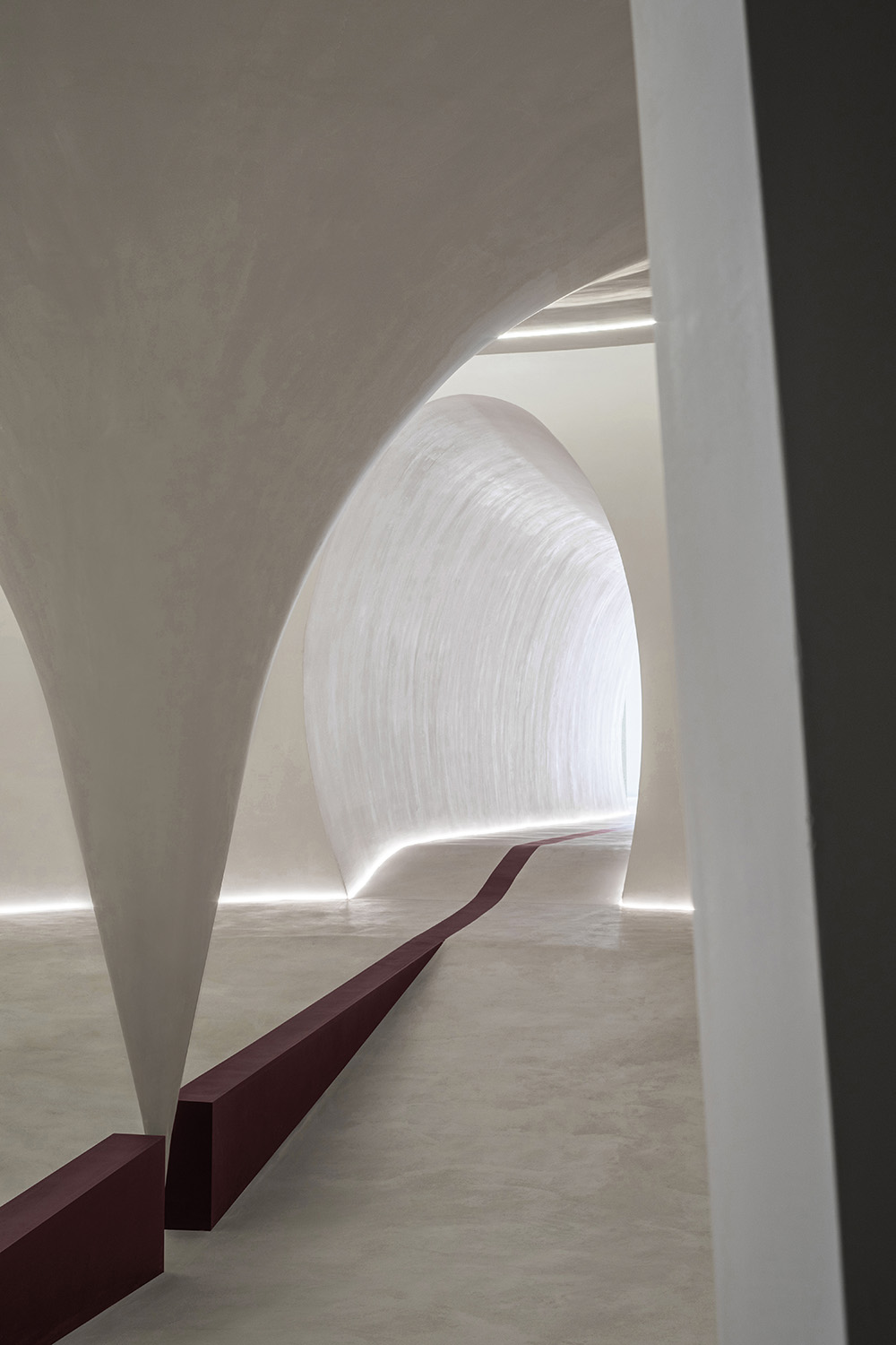
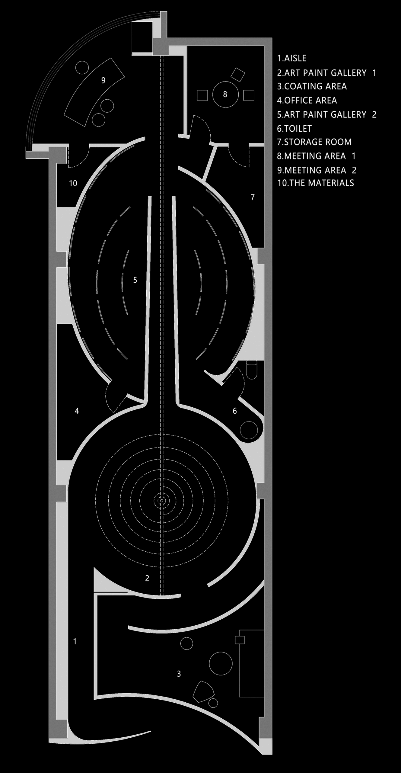
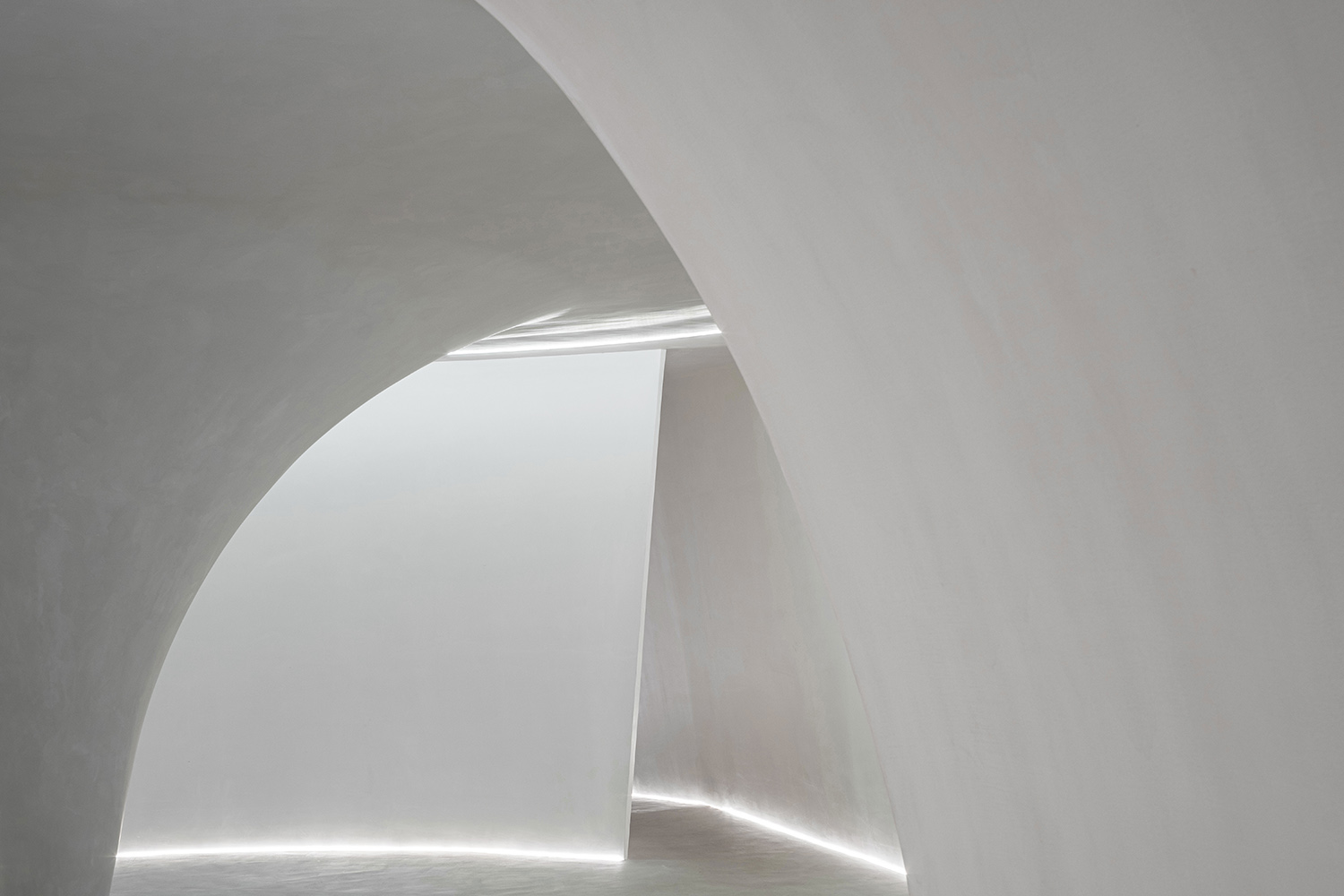
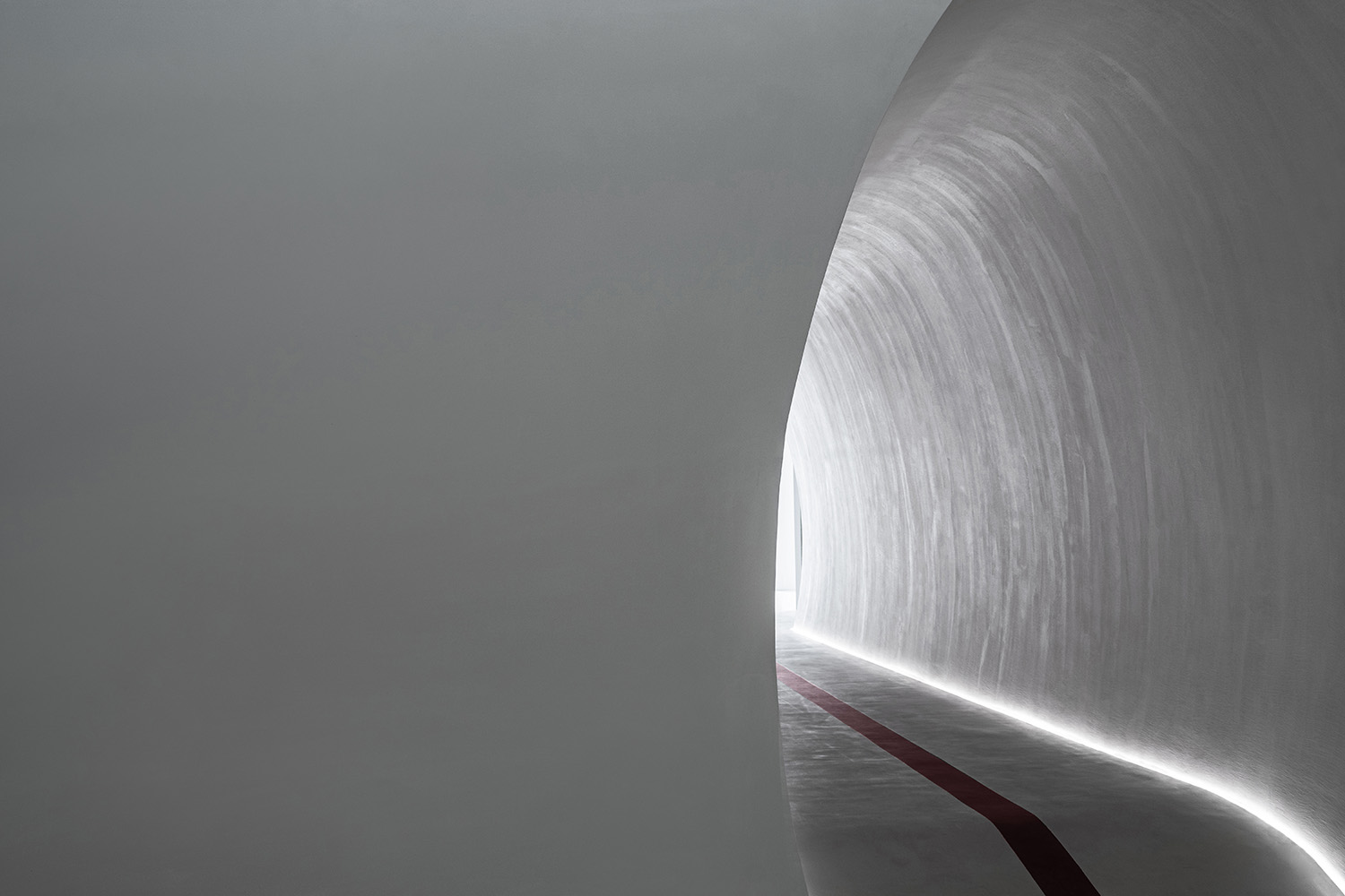
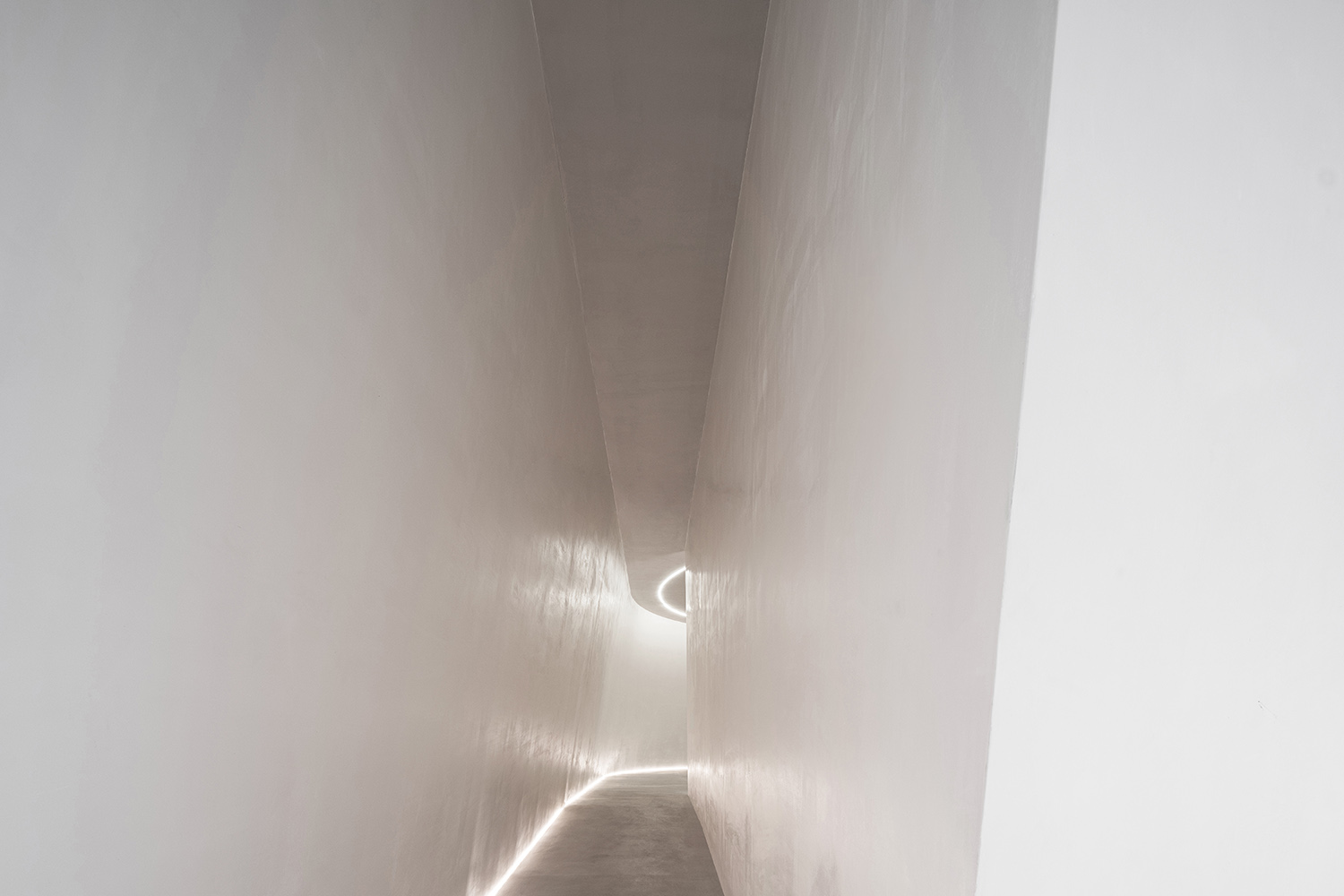
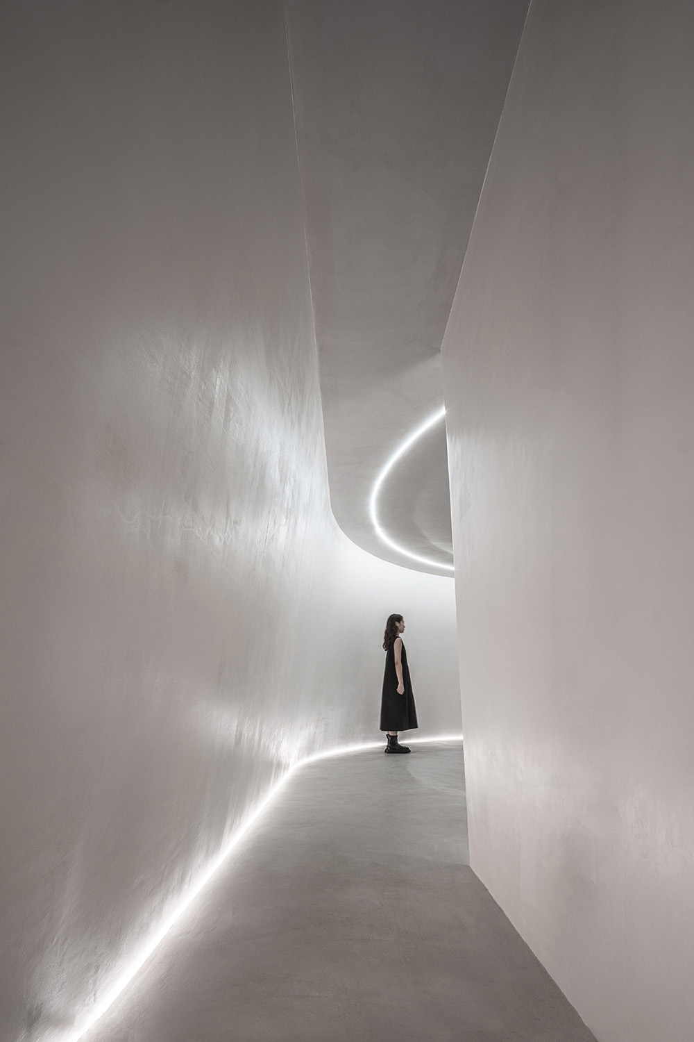
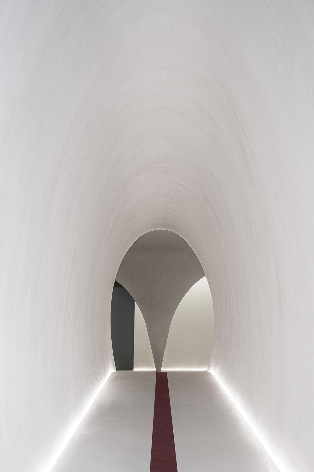
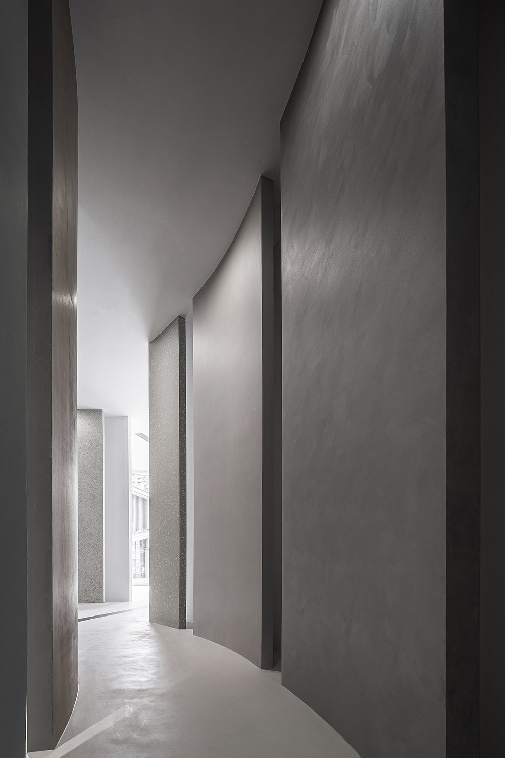
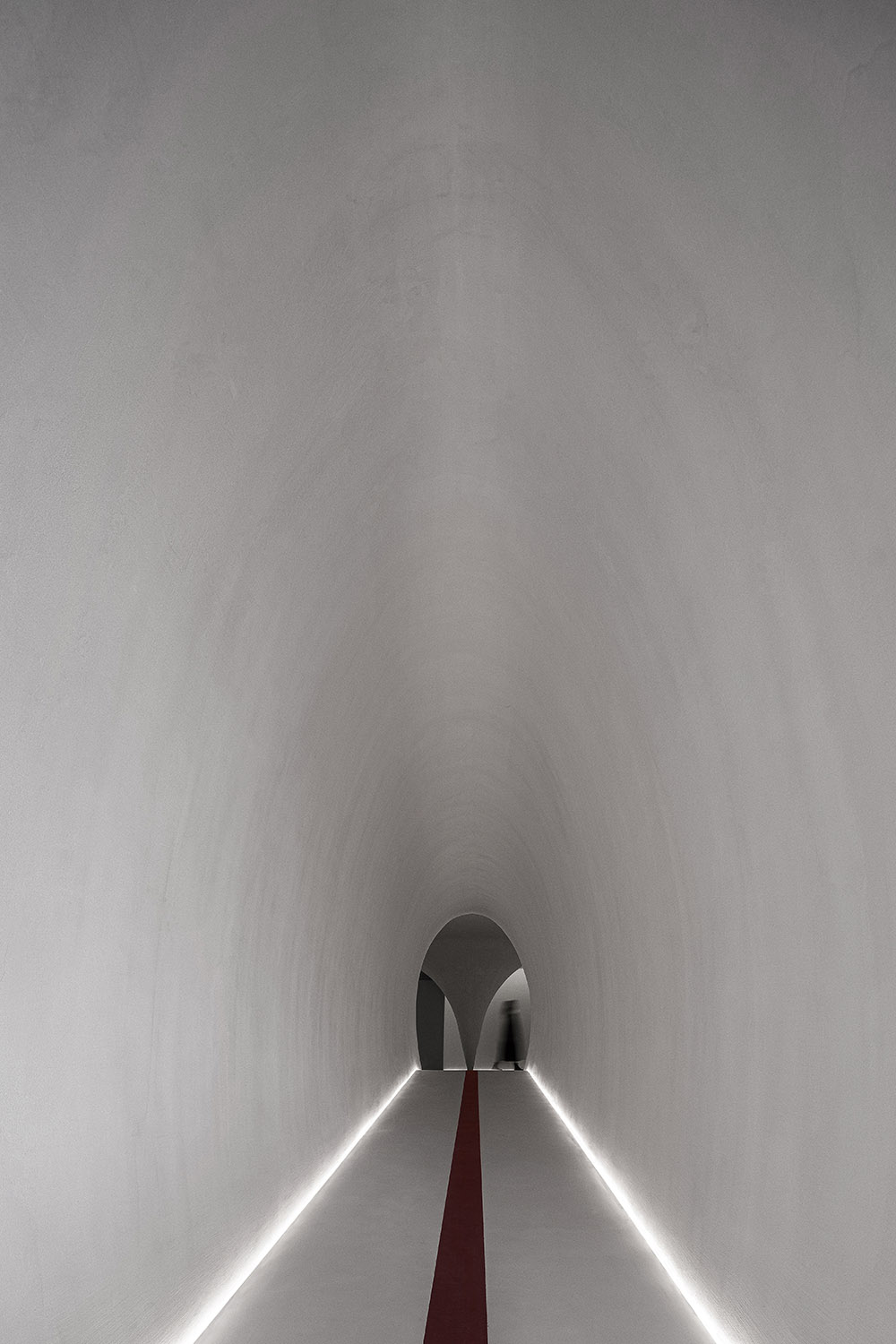
通過一個窄空間的過渡,弧形的牆麵轉折暗示了空間導向性。空間先暗後明,我們結合流線製造出小中見大的空間效果,創造了空間的內向性和擴展的開放性。
Considering that the original site of the project is a long and narrow rectangular space, how to create a sense of dramatic immersion and effectively guide the moving line of the crowd is a problem that the BETWEEN DESIGN has been paying attention to and thinking about. In this traditional building materials market, which is surrounded by the commercial atmosphere of the past, it was the fundamental aim of the design team to make ITALIA a recognizable, different but restrained presence.
Through the transition of a narrow space, curved wall turns suggest spatial orientation. The space is dark first and then bright. We combine the streamline to create the space effect of seeing the big in the small, creating the introversion of the space and the openness of expansion.
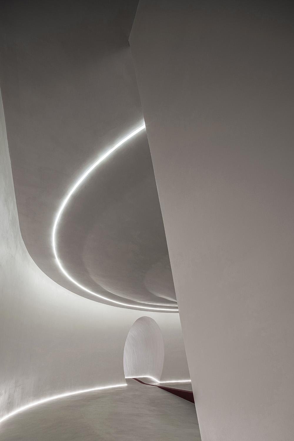
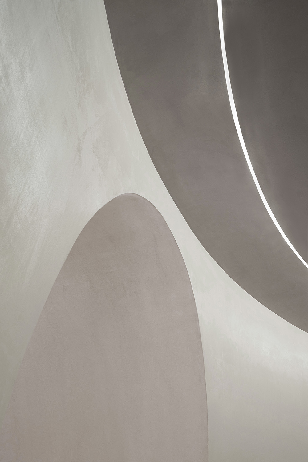
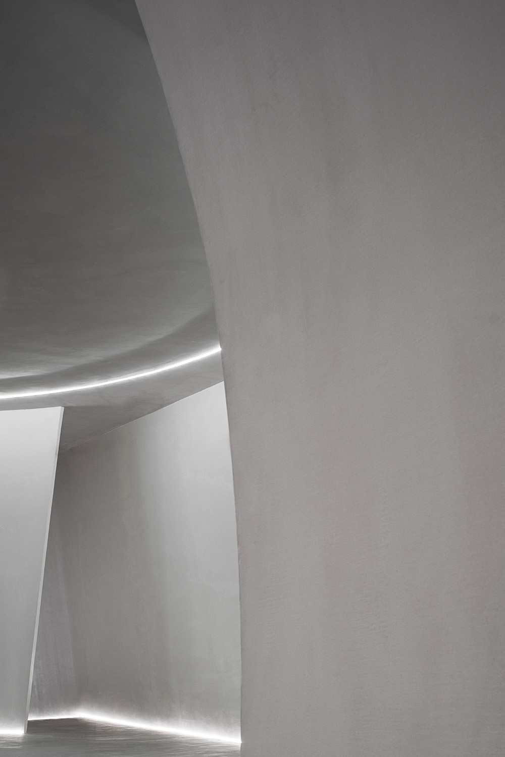
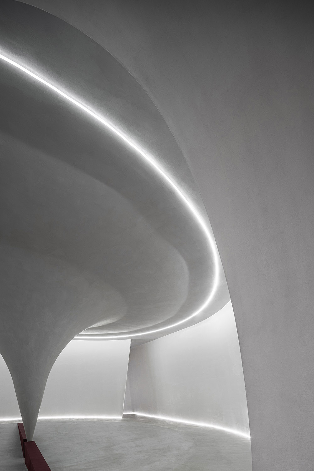
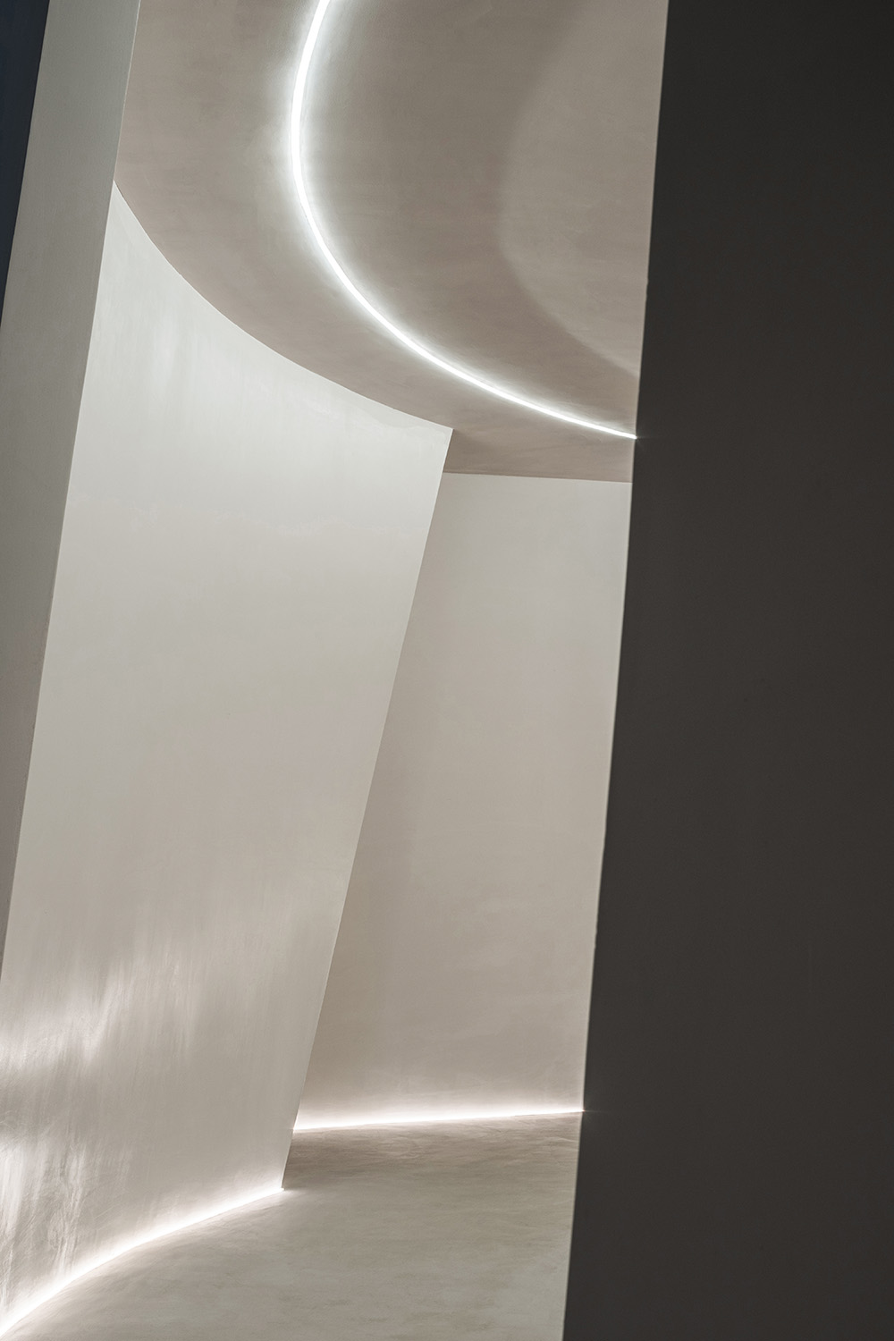
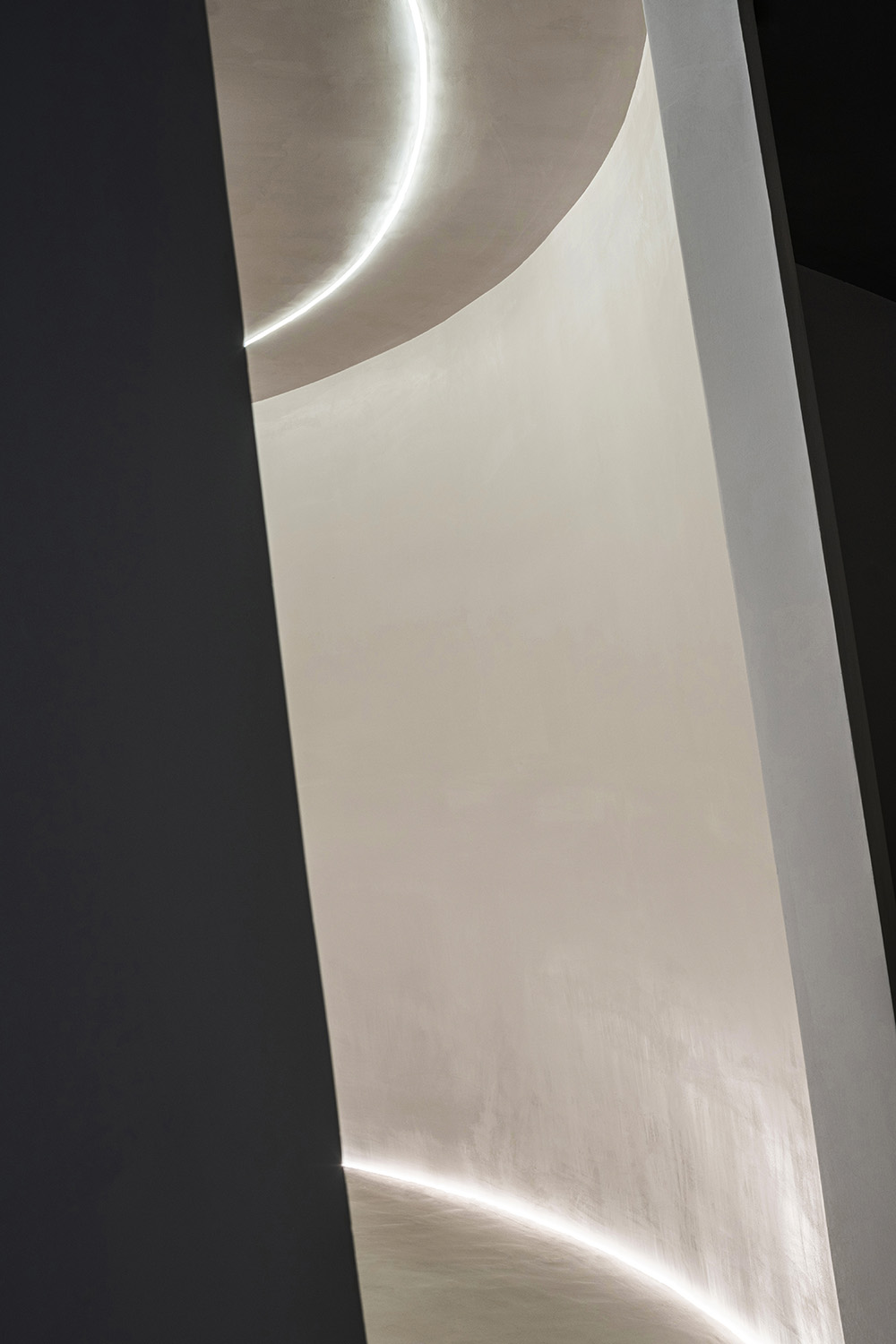
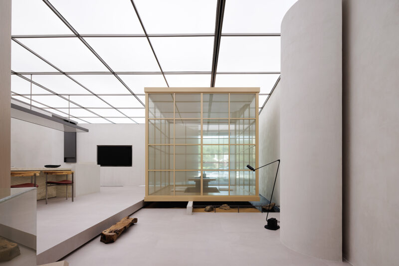
設計采用連續的弧形牆麵將方正的室內空間柔化,模糊邊界,增加人群探索的欲望。我們強調材料本身與空間的高度融合,在微水泥展廳以及藝術過廊擯棄傳統照明燈具,用兩條平行並在室內無限延伸的柔光燈帶去勾勒暈染空間的輪廓。步入這個空間的來訪者,會不自覺地順著彎曲的牆壁和環形的交通流線在空間中漫步,讓手工藝術漆可以被觸摸、被感知。
The design adopts continuous curved walls to soften the square interior space, blur the boundary and increase the desire of people to explore. We emphasize the high integration of materials and space. In the core art exhibition hall, we abandon traditional lighting fixtures and use two parallel and infinitely extending soft lights to outline the outline of the space. Visitors who step into this space will unconsciously walk in the space along the curved walls and circular traffic lines, so that the handmade art paint can be touched and felt.
我們對空間的表現依然克製、獨立,不刻意討好,我們更關注於挖掘空間精神功能的要求(視覺反映心理感受、情感感染等)。
Our expression of space is still restrained, independent, and not deliberately pleasing. We pay more attention to the requirements of exploring the spiritual function of space (visual reflection of psychological feelings, emotional infection, etc.).
∇ 微水泥展廳
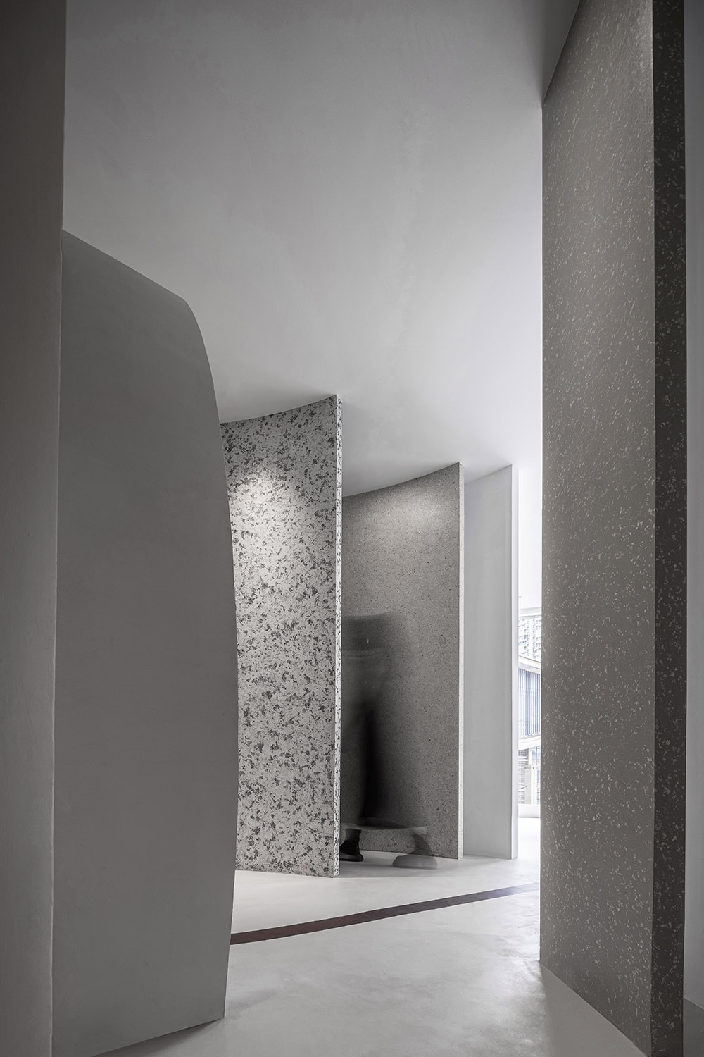
為了避免做出狹窄簡陋的空間,我們的策略就是通過讓訪客在其中不斷漫步、觸摸與觀看,打造出豐富的層次與深度,從視覺上加強室內空間的建築感。整體空間純淨整潔,強化人對空間框架和秩序的知覺。
To avoid creating a narrow and shabby space, our strategy was to create layers and depths that visually enhance the architectural feel of the interior space by allowing visitors to walk, touch and see through it. The overall space is pure and clean, which strengthens people’s perception of space frame and order.
∇ 動線圖
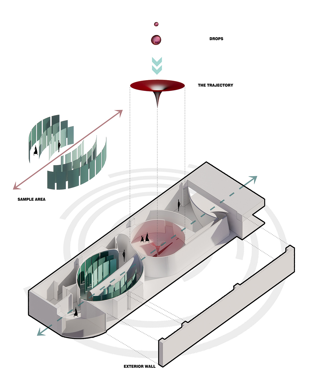
展廳以藝術過廊中軸為分界線,兩邊幾乎呈現對稱分布,設計師最大的關注點是打破原場域的的尺度與形態,形成通向核心展區流暢的自然線條,打破傳統塗料店樣板式的陳列展示。
The exhibition hall is divided by the central axis of the art corridor, with almost symmetrical distribution on both sides. The designer’s biggest concern is to break the scale and form of the original field and form a smooth natural line leading to the core exhibition area. Break the traditional paint shop model display.
戲劇性雕塑 Dramatic carving
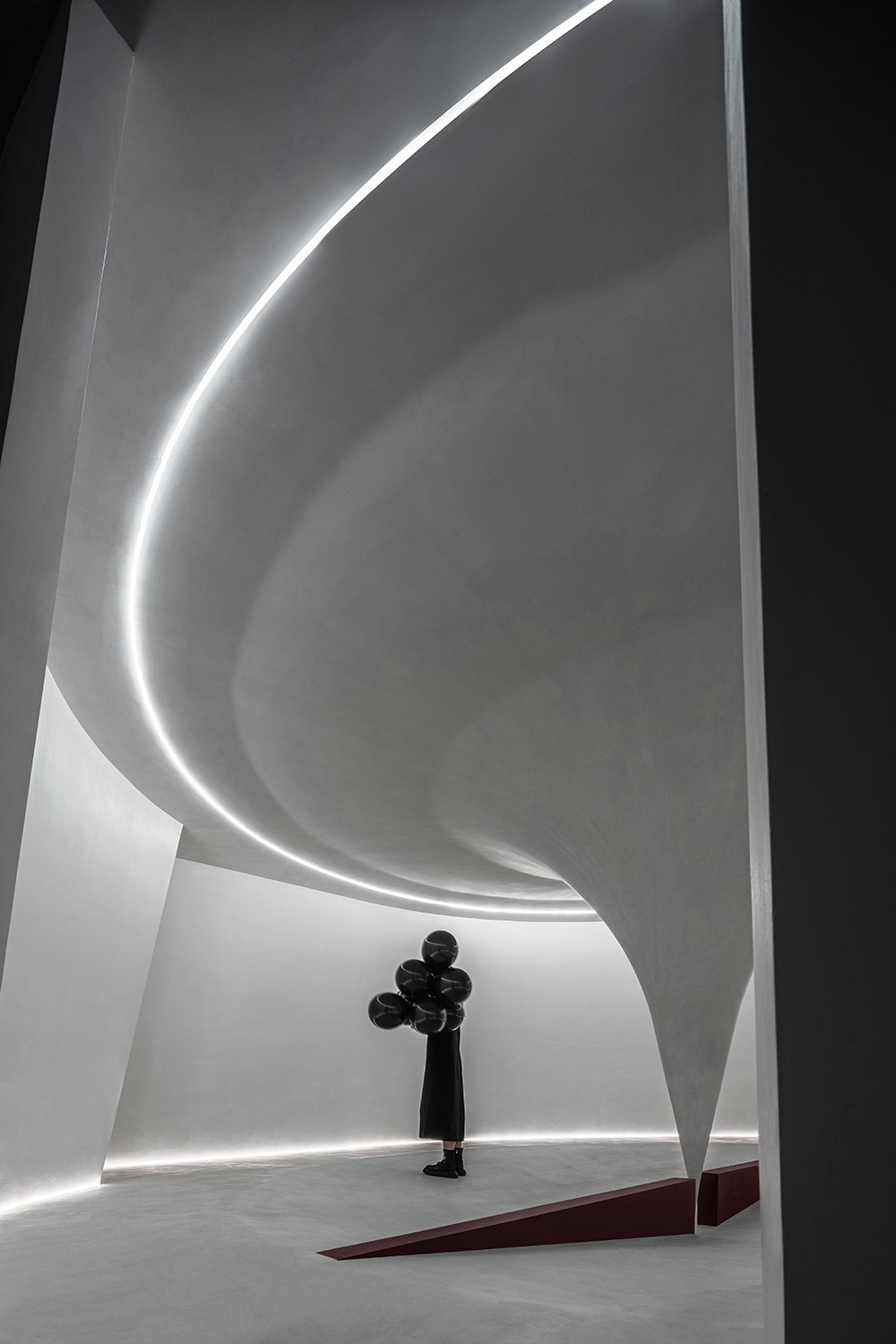
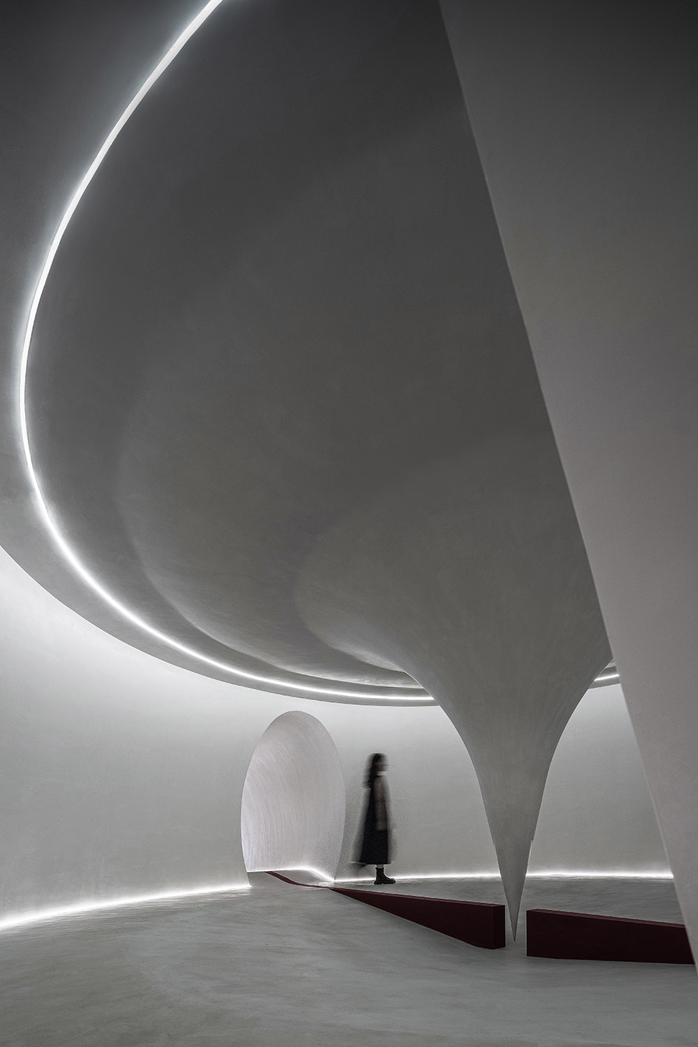
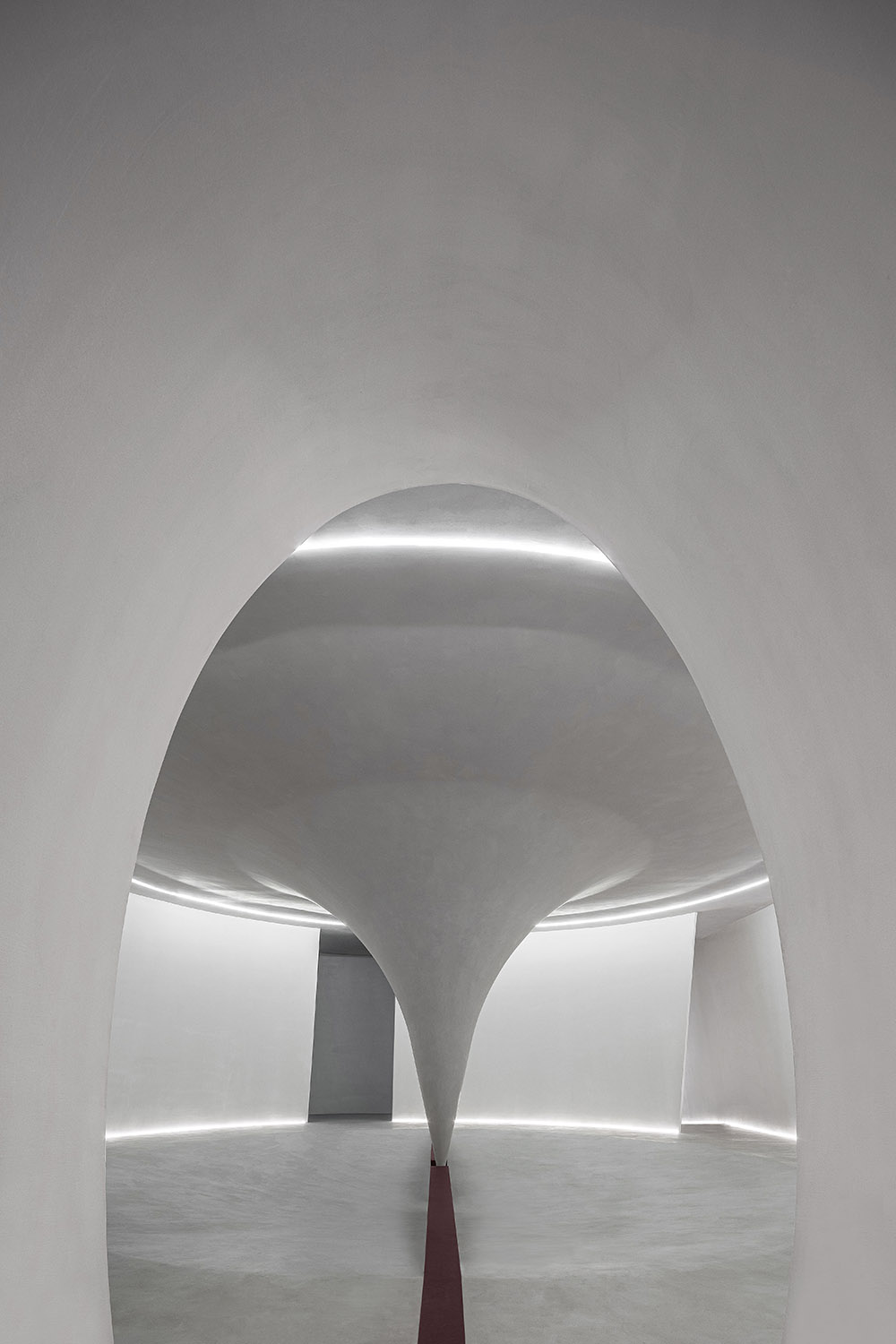
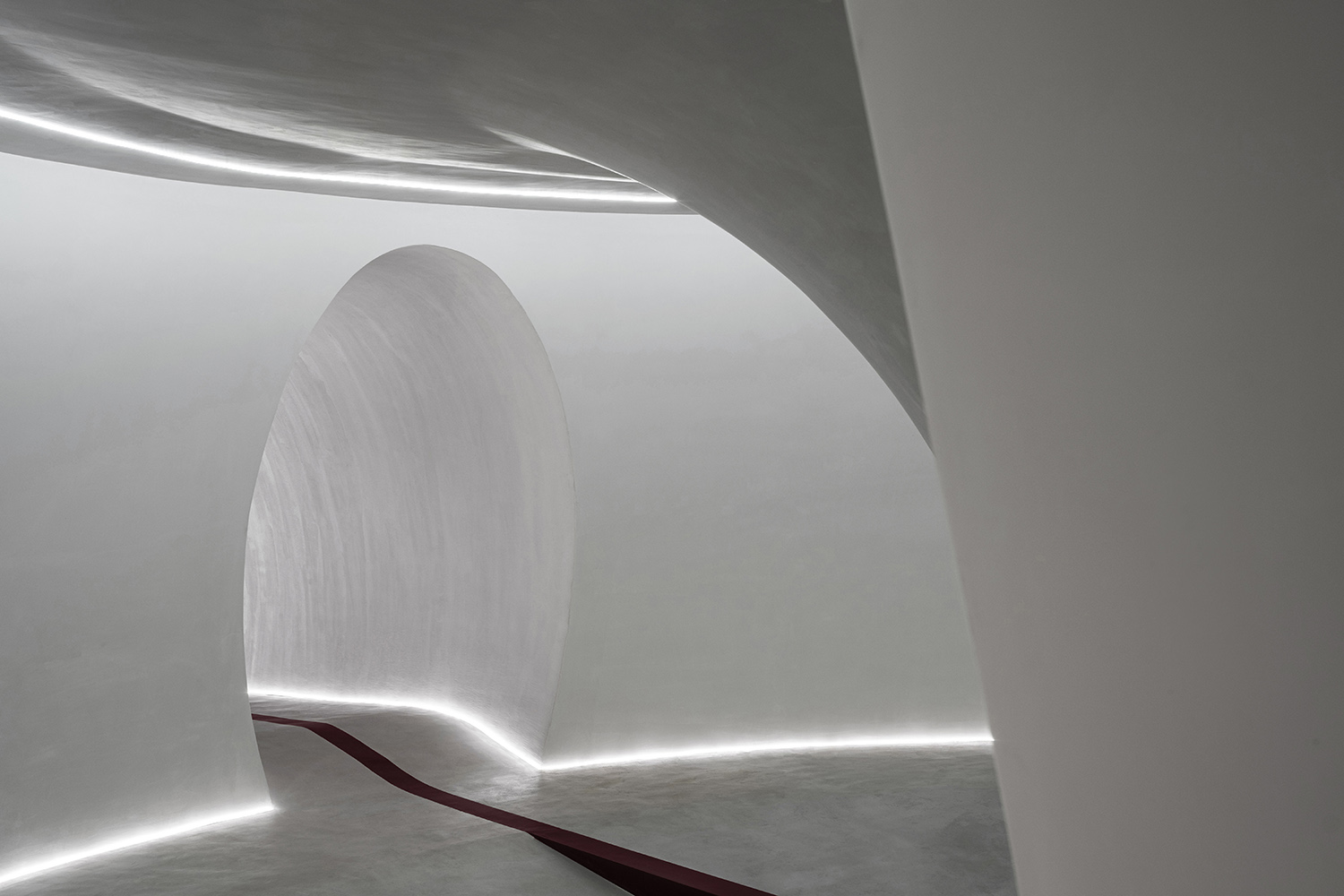
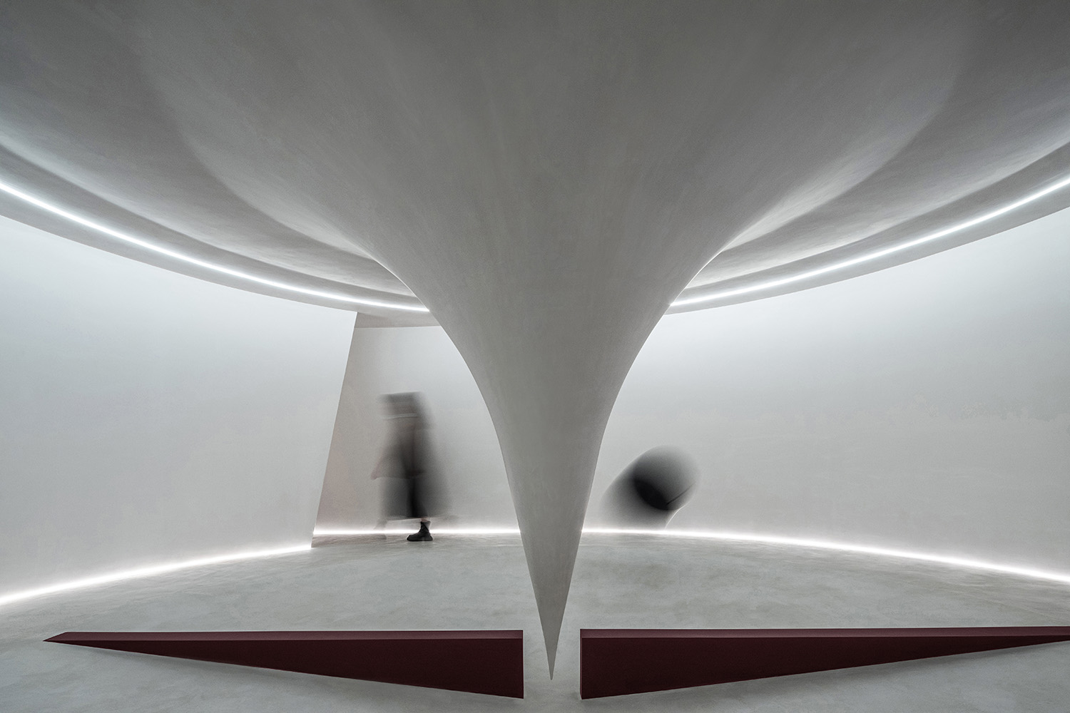
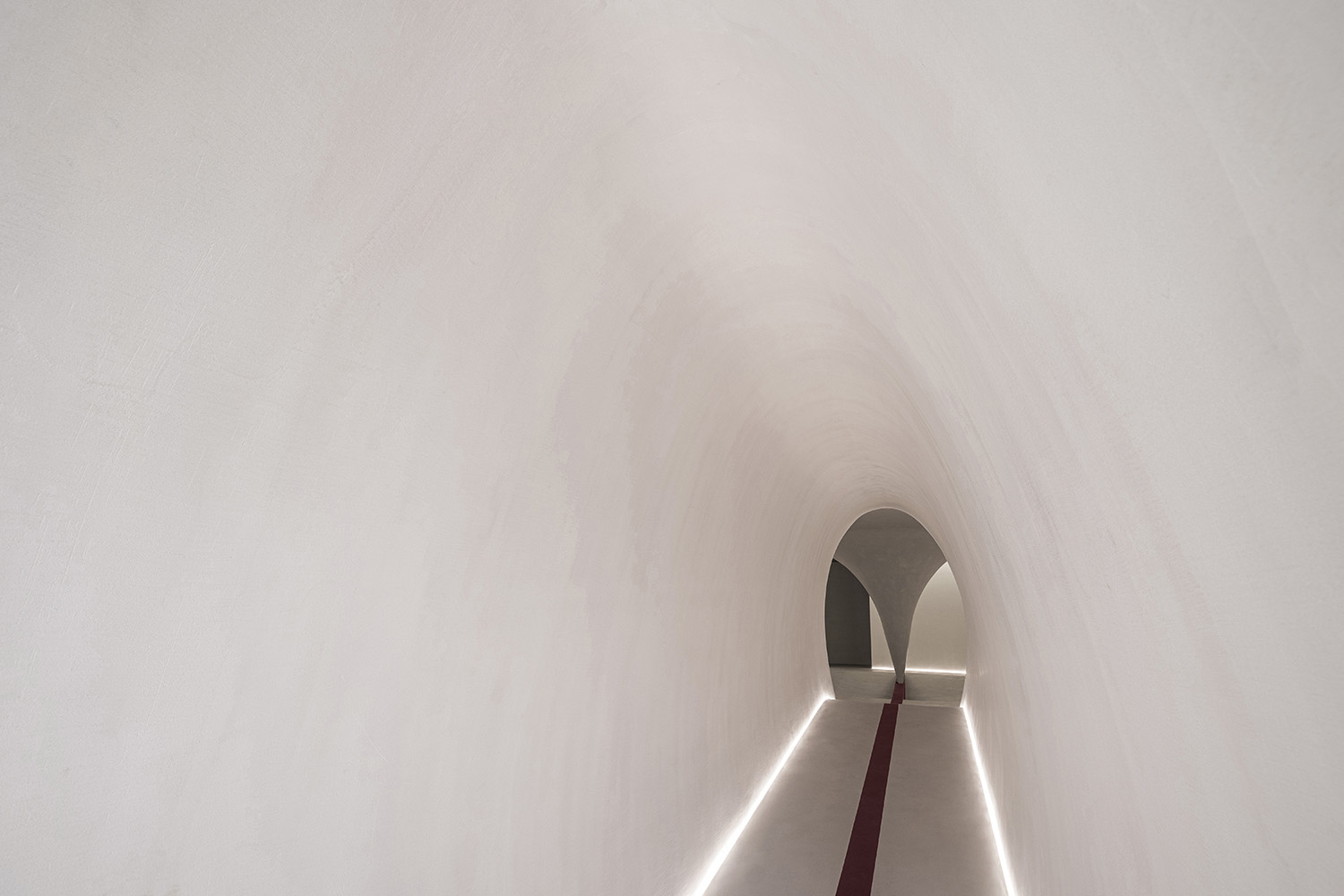
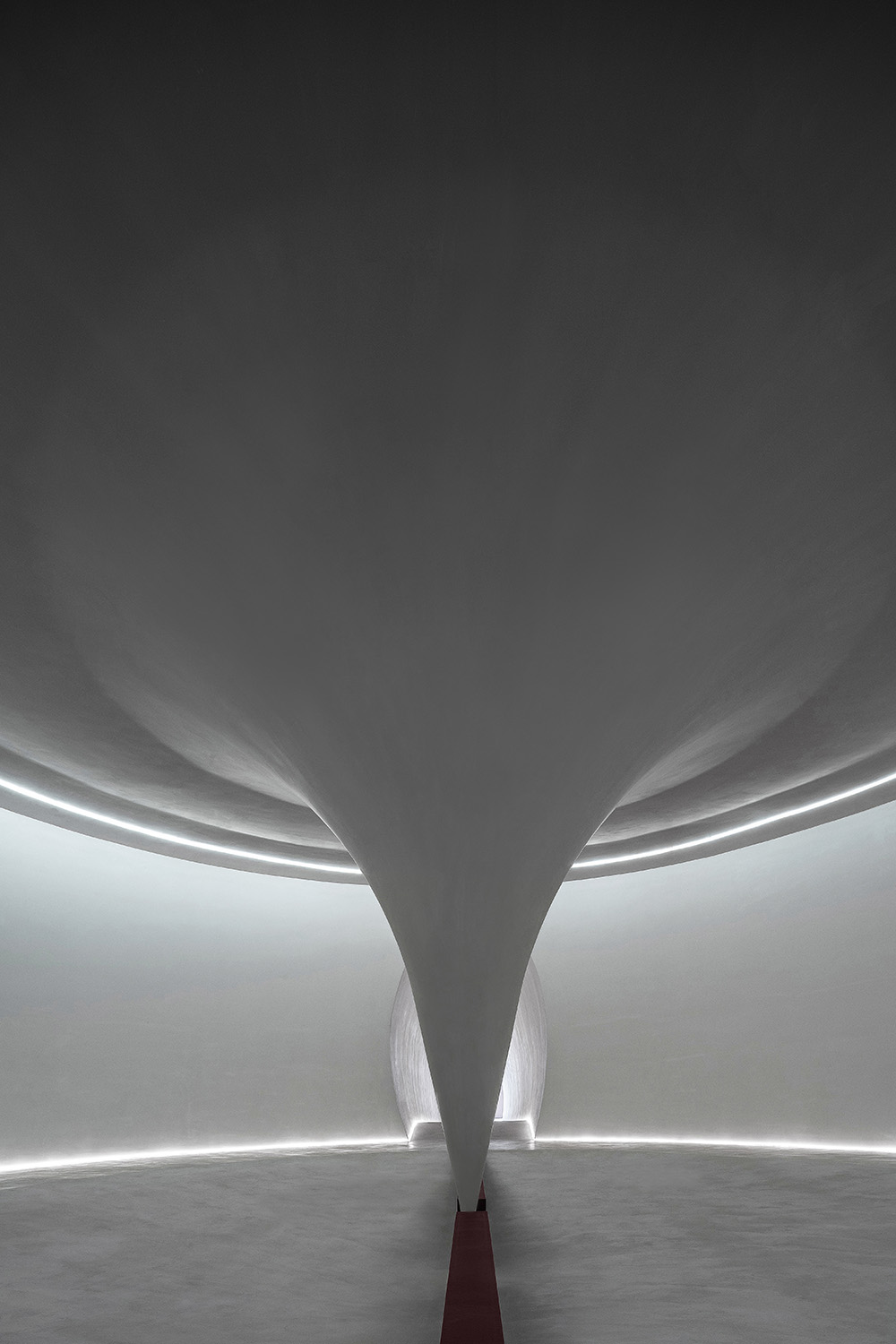
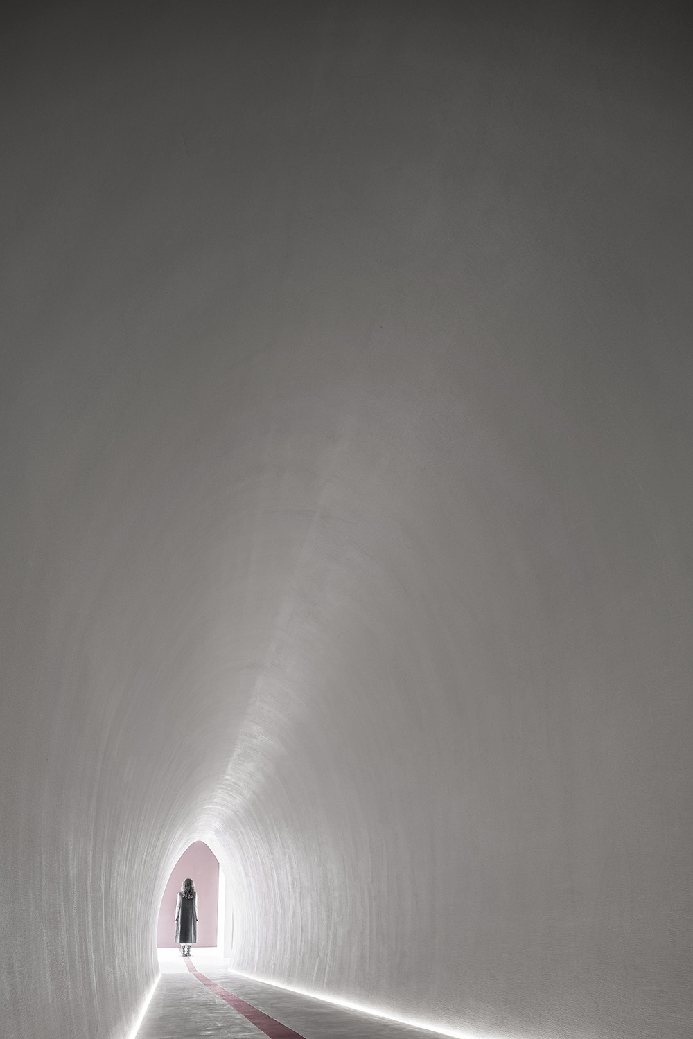
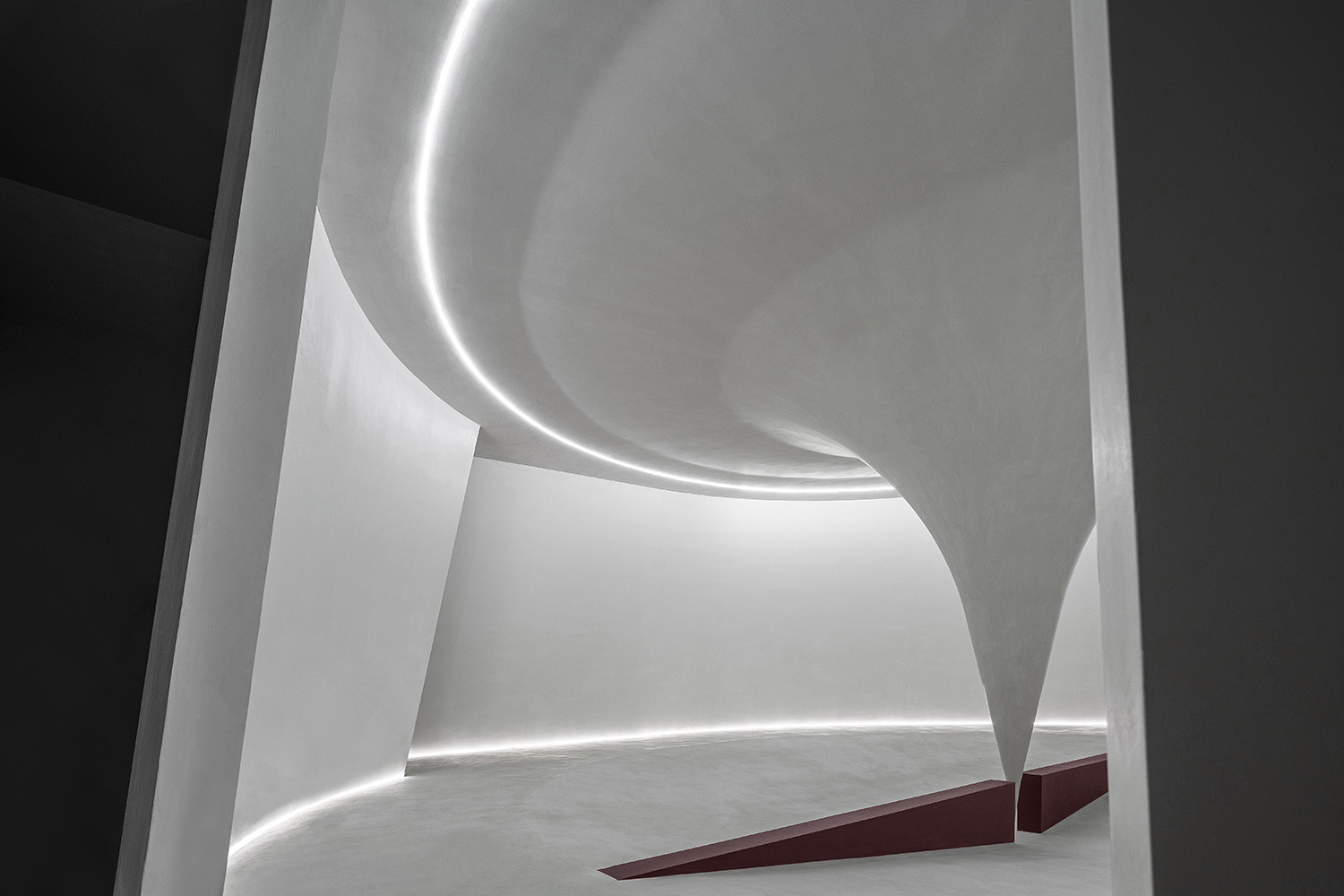
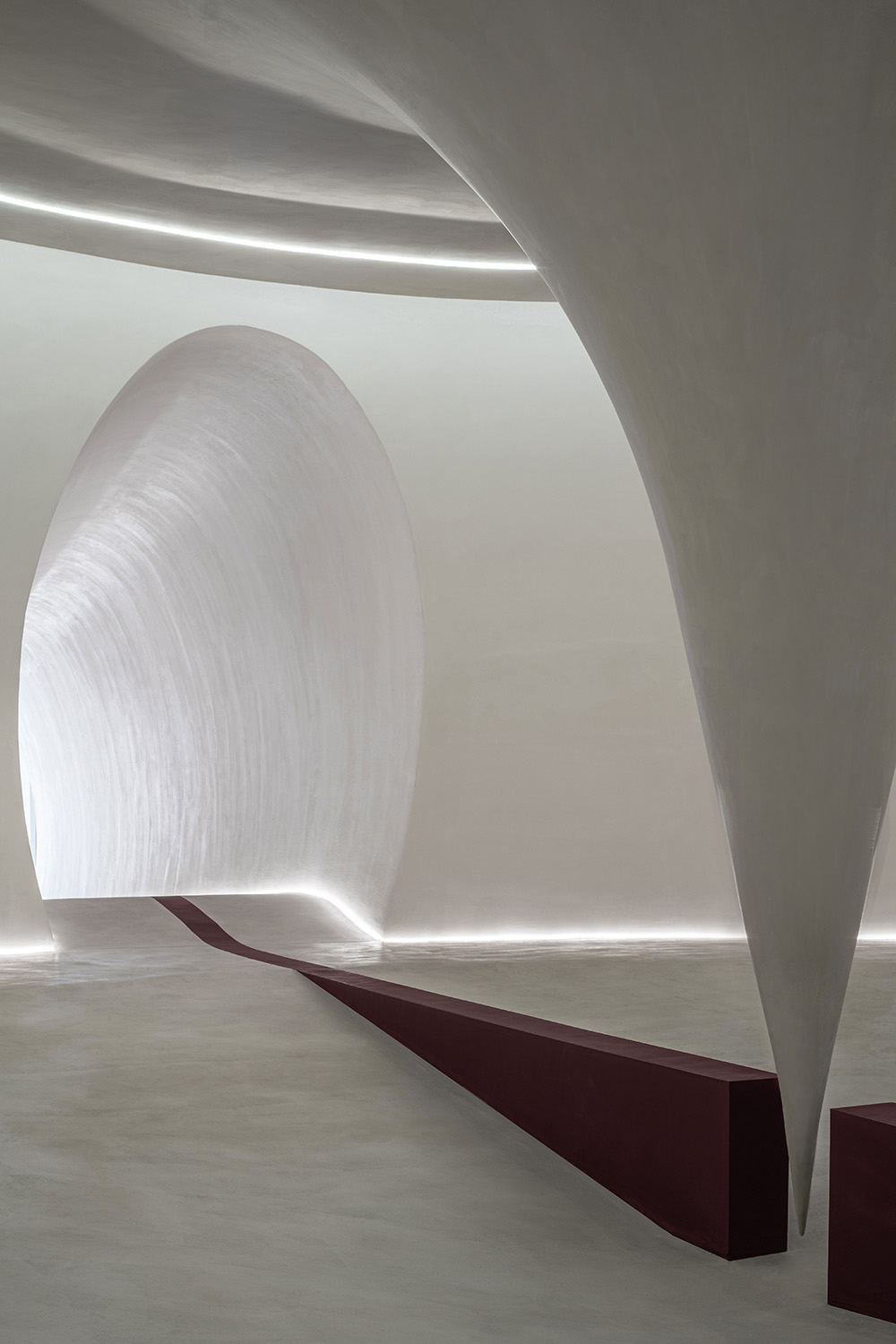
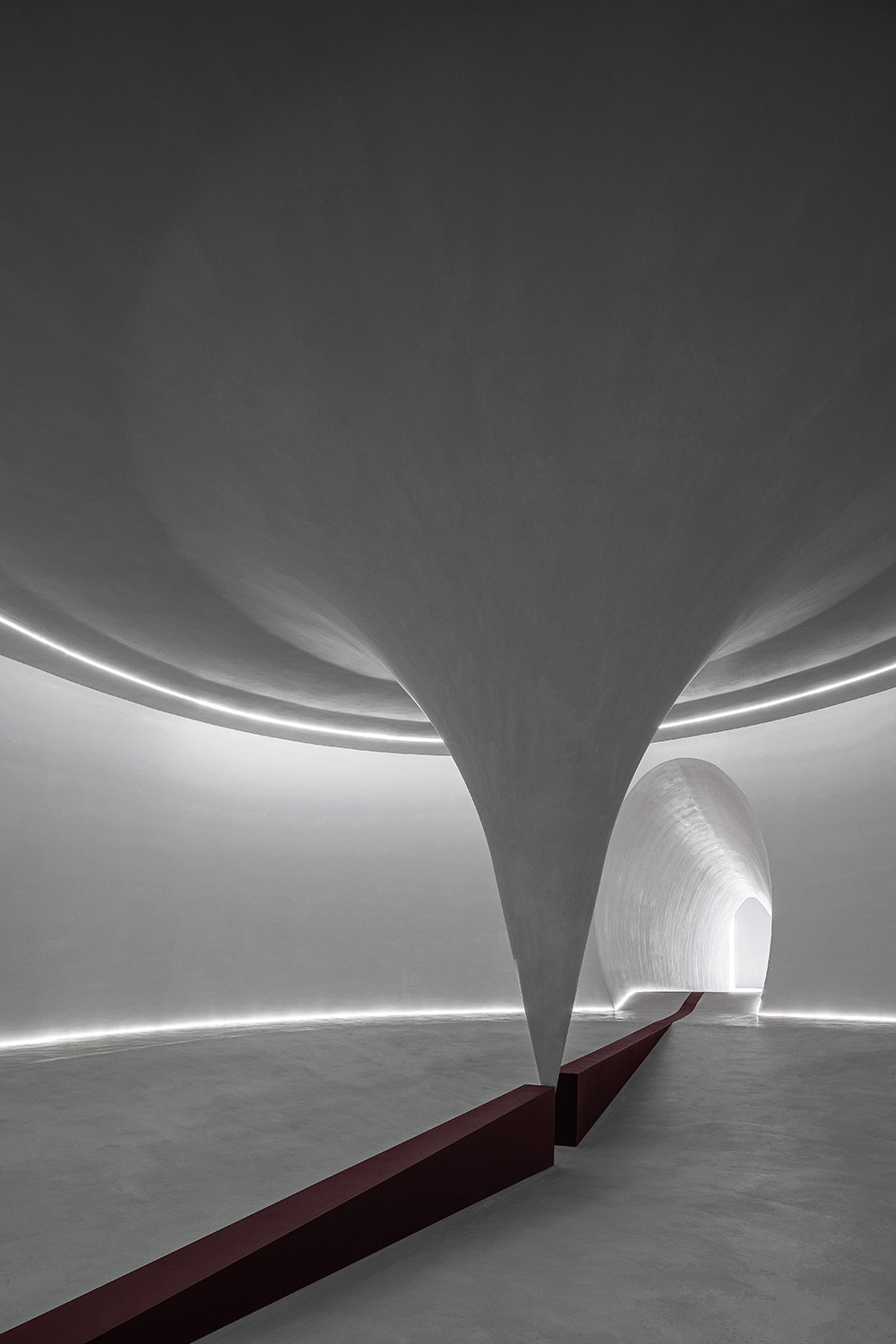
我們在展廳中置入了一段隧道空間,截麵雕塑至拋物線形。隧道將使用者的運動流線具象化,給訪客帶來戲劇性沉浸的視覺記憶和空間體感。空間中無裝飾性軟裝的處理手法更是一次大膽的嚐試,我們試圖讓人更無幹擾的去感受空間、材料與燈光帶來的情緒,更好的讓人感受材料本身的質感。
We inserted a tunnel space in the exhibition hall, with a section carved into a parabolic shape. The tunnel visualizes the movement line of users, bringing dramatic and immersive visual memory and spatial body sense to visitors. The processing technique of no decorative soft decoration in the space is a bold attempt. We try to make people feel the mood brought by space, materials and lighting without interference, and better let people feel the texture of the material itself.
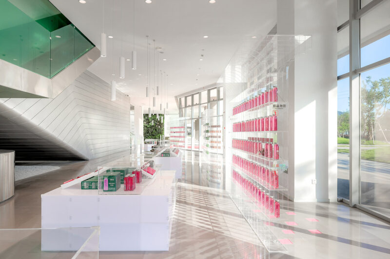
設計團隊將塗料產品與特性最大程度的直接運用到室內肌理以及空間裝置上,讓ITALIA意庫馬的品牌理念和產品特性借由空間直接傳遞,希望區別於傳統的產品展示方式,通過產品的直接運用,讓訪客可以直接與品牌對話,以釋放訪客自主性探索、感知、對話、理解、選擇的過程。
The design team will paint products and characteristics of the maximum extent of direct application to the interior texture and space devices, so that ITALIA brand concept and product characteristics through the space directly transfer, hoping to be different from the traditional way of product display, through the direct use of products, so that visitors can directly dialogue with the brand. To release the process of exploration, perception, dialogue, understanding and choice.
視覺廣度 The visual span
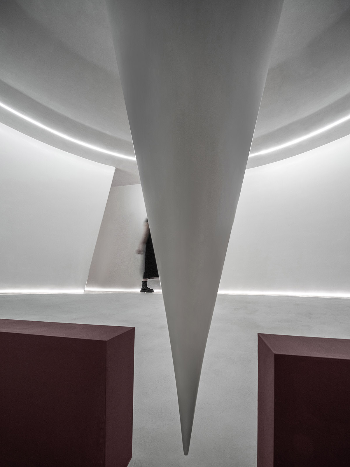
空間中置入多個曲線造型貫穿不同的展廳區域,將具象形態的品牌元素以抽象化的形式呈現且賦予其感官刺激,並加入一抹暗紅色主題色來延伸空間的視覺廣度。
A number of curvilinear shapes are placed in the space to run through different exhibition areas, presenting the brand elements of concrete form in an abstract form and giving them sensory stimulation, and adding a dark red theme color to extend the visual breadth of the space.
∇ 微水泥展廳
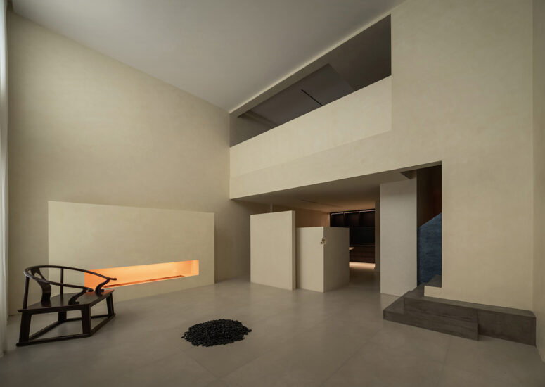
在充斥著舊商業氣息的建材賣場,我們試圖製造差異,似在審美上給人一種異軌,如美術館般的展廳,更好的烘托產品的藝術性與品質的同時強調材料本身的延展度與多樣性。
In the building materials store full of old commercial atmosphere, we try to create differences and give people a kind of deviance in aesthetics. The exhibition hall like an art museum can better highlight the artistry and quality of products while emphasizing the ductility and diversity of materials themselves.
我們模擬藝術漆的流動形態並放大至建築尺度,給訪客帶來隱約的既視印象,觀者穿越其間如置身於龐大的容器,再邁入另一處極控製尺度的隧道場域,建築塑形讓壓抑與釋放不斷反轉,強化觀者在空間中的體驗記憶。
We simulate the flowing form of art paint and enlarge it to the architectural scale, giving visitors a vague impression of both sight. Visitors walk through it as if they are in a huge container, and then step into another tunnel field with a very controlled scale. The architectural shape makes the oppression and release constantly turn around, and strengthens the memory of visitors’ experience in the space.
∇ 藝術塗料展示區
場域機能 Space function
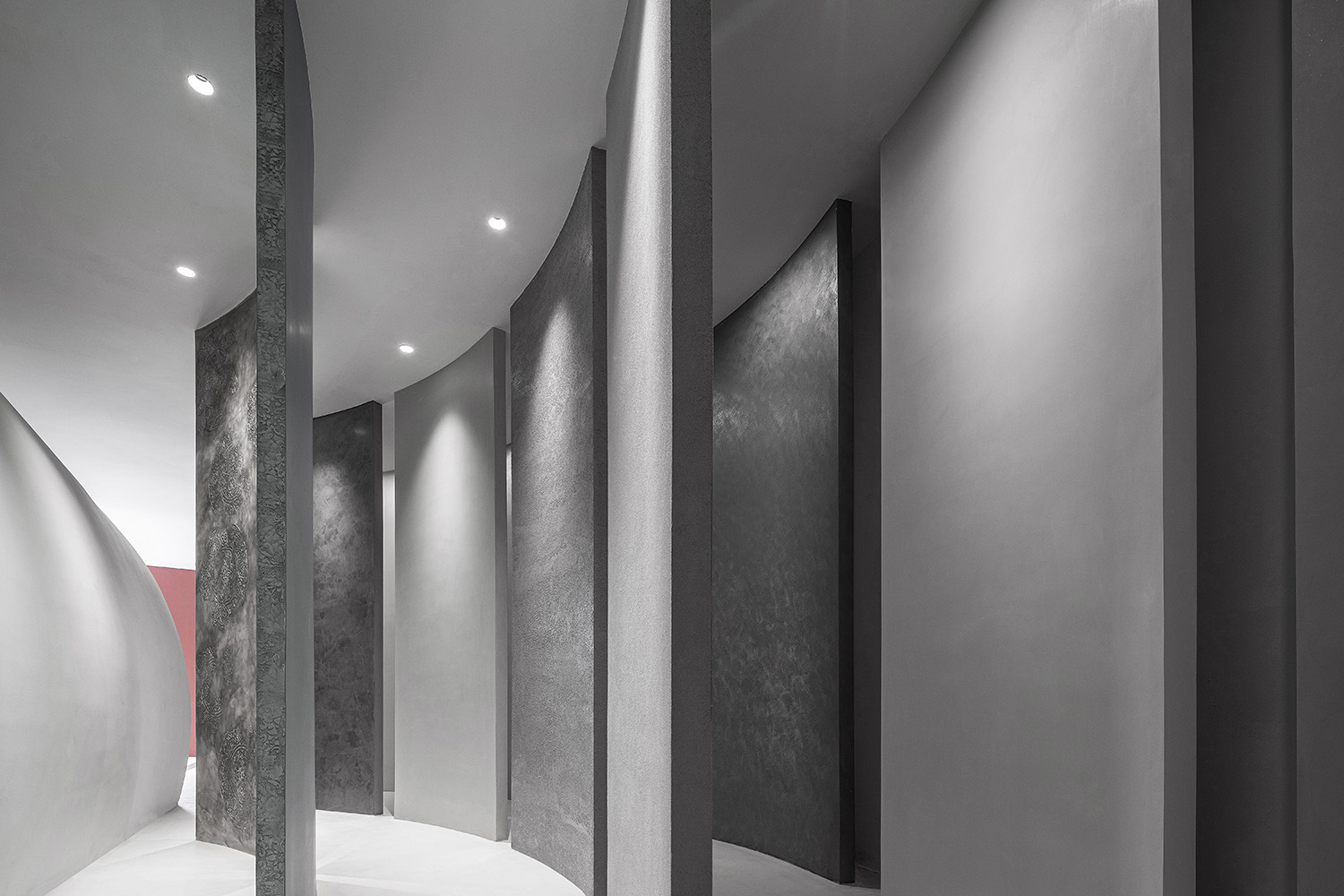
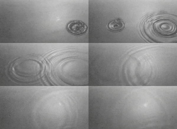
水波是最常見的機械波,我們模擬機械波的橫向形態,在整個場域的末端設置成最大的藝術漆展陳區域。以機械波的散布頻率,我們置入多麵通高的藝術漆展示牆,並幹預訪者的參觀動線。
Water wave is the most common mechanical wave. We simulate the transverse form of mechanical wave and set the largest art painting exhibition area at the end of the whole field. With the frequency of mechanical wave dispersion, we placed a multi-faceted, full-height art paint display wall and intervened in the visitors’ visiting line. While satisfying the function, the strong relationship between the display wall form and array further increases the sense of ritual and tension of the exhibition area.
∇ 機械波
空間大麵積模糊的界區域,是核心化的表達,將機能與形式進行模糊化合並。這更像是一種容器的概念,與產品本身達成共生關係,放下刻意的裝飾痕跡,空間與遊走在其中的演變過程,一同存在於這片場域。
The large area of fuzzy boundary in space is the expression of core, which combines function and form in a fuzzy way. It is more like the concept of a container, which achieves a symbiotic relationship with the product itself, putting down the deliberate decorative traces, and the space and the evolution process wandering in it exist together in this field.
∇ 分析圖
在滿足機能的同時,強烈的展示牆形態和陣列的關係進一步增加了展區的儀式感和張力。控製下的近人尺度也可以讓觀者細膩的感受不同藝術漆的肌理與質感。
While satisfying the function, the strong relationship between the display wall form and array further increases the sense of ritual and tension of the exhibition area. The controlled approachable scale also allows the viewer to feel the texture and texture of different artistic lacquers.
Rhythm has a charm that convinces us
even of the noblest feelings.
— Goethe
整個空間的氛圍營造和切換中,尺度是我們這次塑造空間最重要的媒介與手段,我們關注最直接的空間體感,通過或開放,或緊張的尺度控製,讓訪者增加空間體驗的探索感。
In creating and switching the atmosphere of the whole space, scale is the most important medium and means for us to shape the space this time. We pay attention to the most direct sense of space body, and through open or tense scale control, visitors can increase the sense of exploration of space experience.
∇ 藝術過廊
項目信息
ITALIA 意庫馬塗料展廳|Commercial design |2021
Location: Wuxi,China
Design Time: February.2021
Project Complete: September.2021
Leader designer & Team :郭恒博/陳淩燕
Area: 226㎡
Photographer: 陳銘


