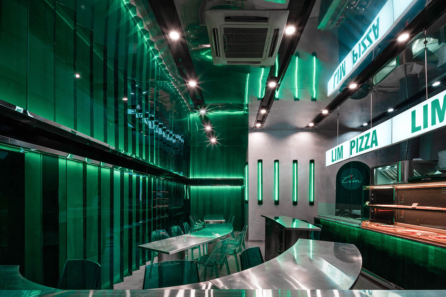
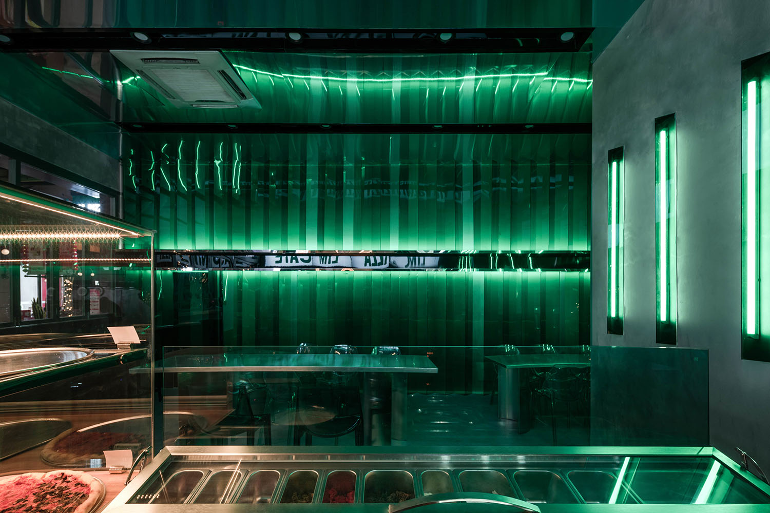
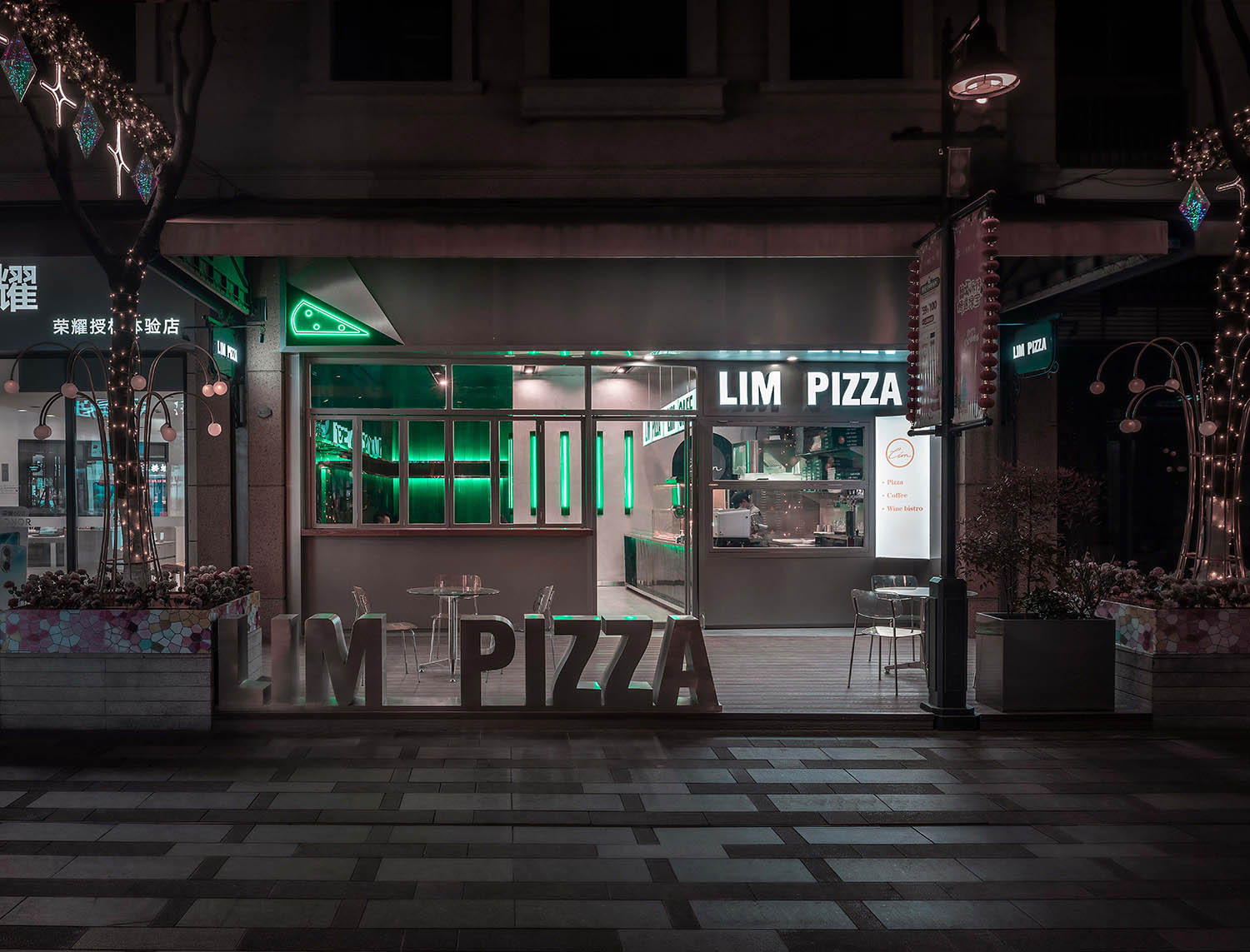
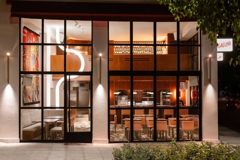
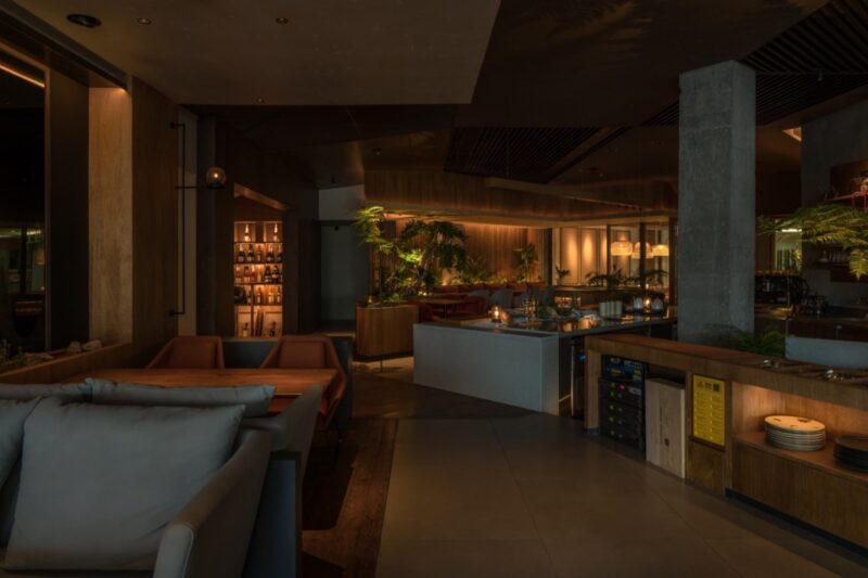
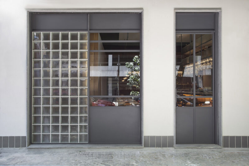
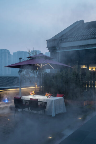
LIM PIZZA位於蘇州市虎丘區綠寶廣場步行街,這個項目的選址是一個僅有64m²的類正方形店麵,我們在滿足功能屬性的前提下,糅合了超前與務實的理念,給予店鋪建築美感,將空間使用麵積最大化的同時增加空間趣味性,營造出LIM PIZZA店豐沛的新生活力空間。
LIM PIZZA is located in Lvbao Square pedestrian street, Huqiu District, Suzhou. The site of this project is a square storefront which covers only 64M ². On the condition of meeting the functional attributes, we combine the concept of advance and pragmaticism to maximize the available space area make the store architecturally beautiful and interesting, so as to create a new vitality space of LIM PIZZA store.
∇ 室內一覽©徐英達 Overview of the space
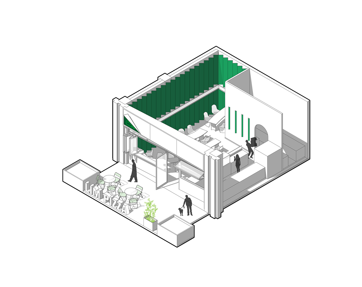
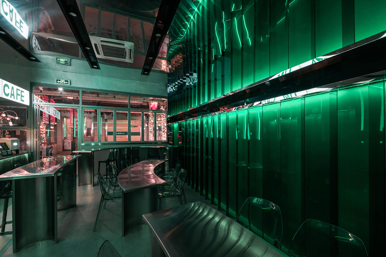
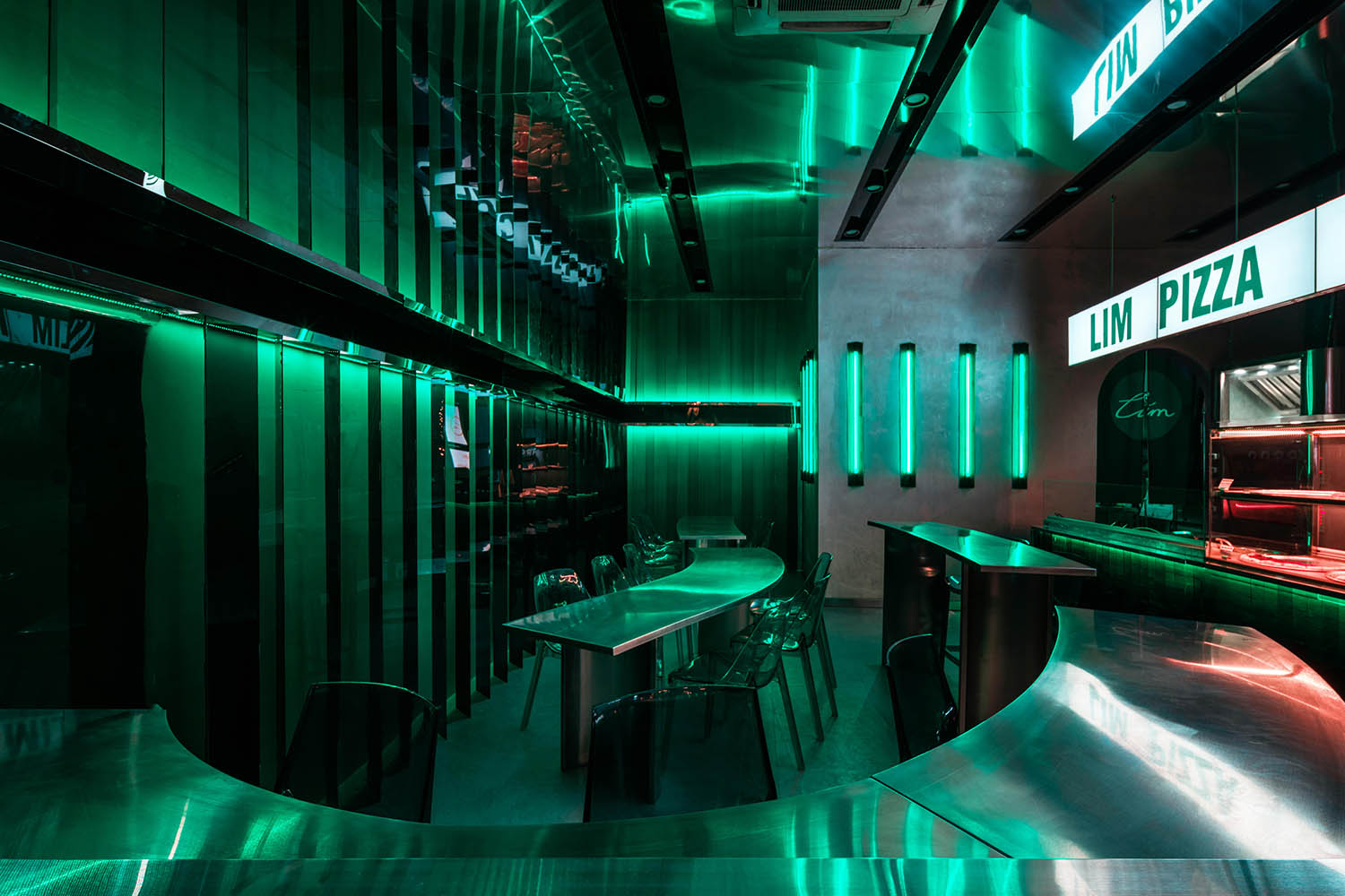
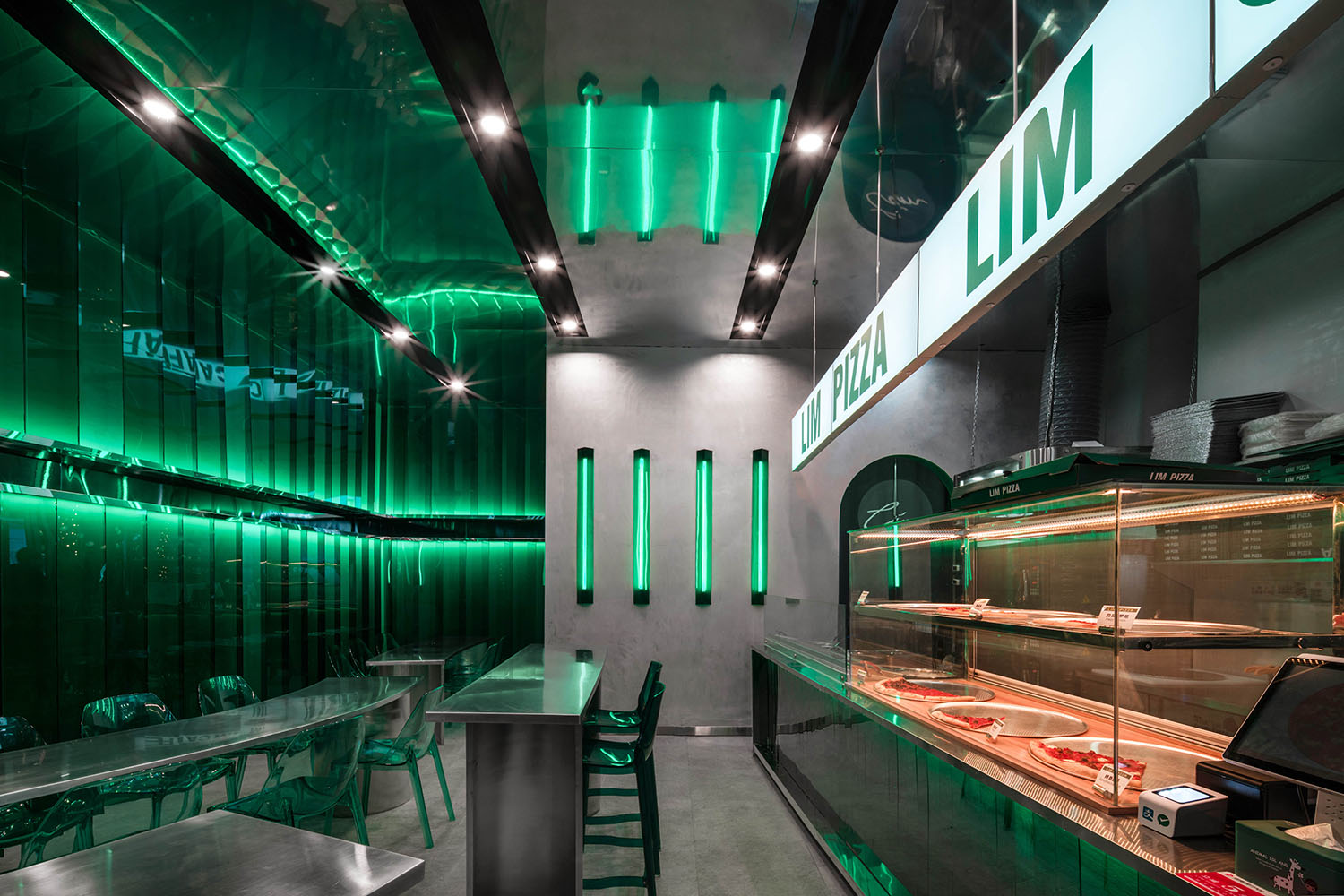
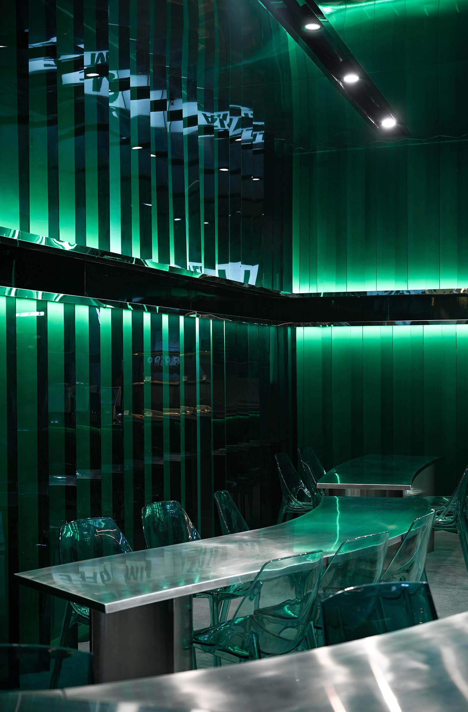
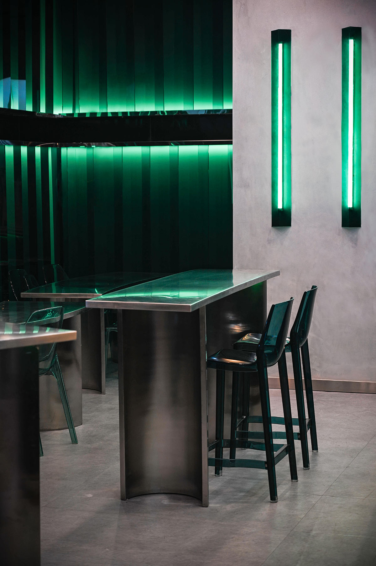
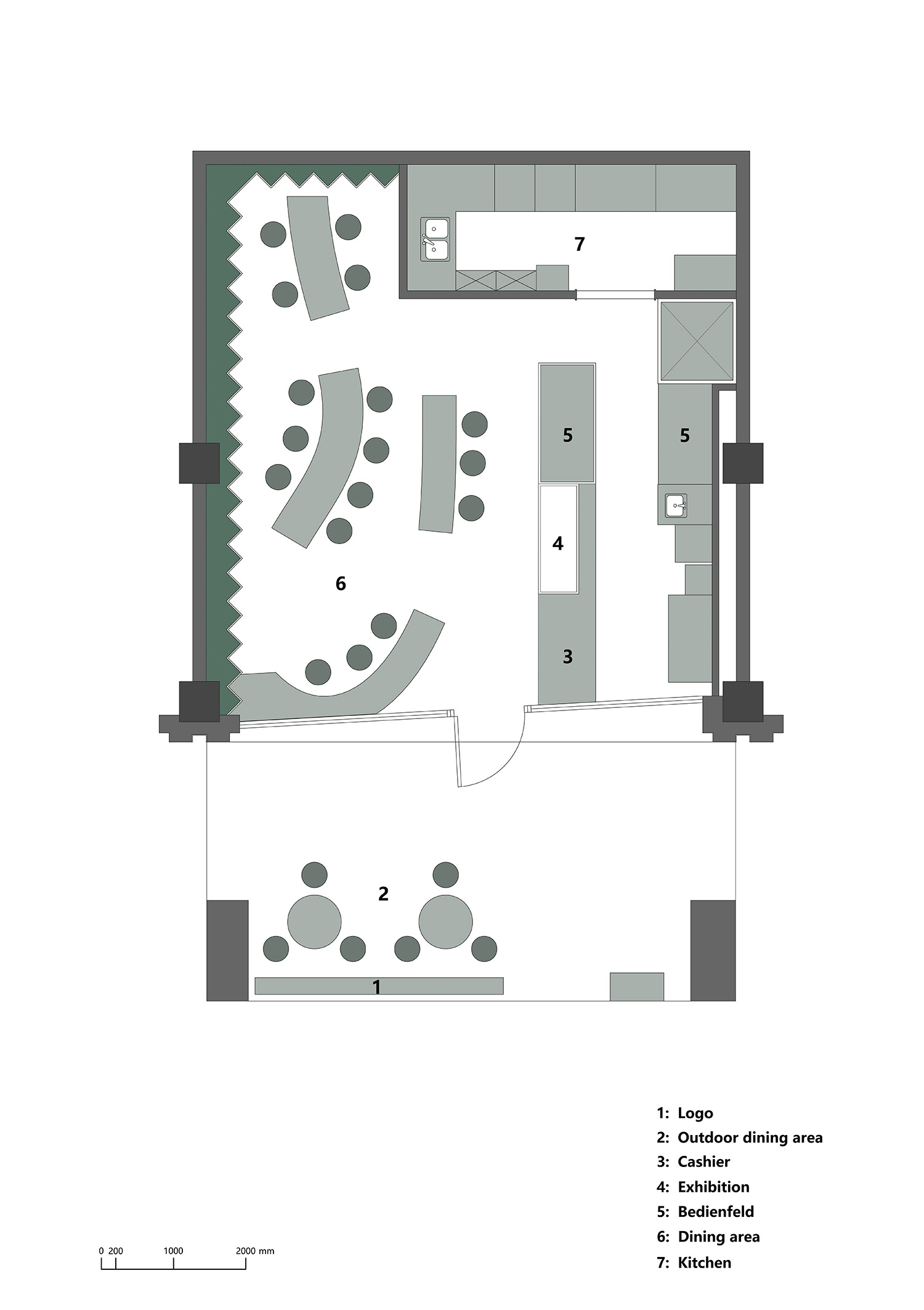
項目在空間布局上,將空間簡潔明快的劃分為幾個大的區域,門窗是沿用了原商鋪的遺留,在契合空間基調的同時最大限度的發揮其對外的開放性特質。用餐區在保證使用和舒適的基礎上,用不規則的曲線餐桌搭配高低不同的同色係透明家具,來增加空間的層次給食客更豐富的空間體驗。操作區和點餐區則是設計為一體式的狀態使界麵更加整體和協調。因為要有精釀再加上各種設備的外露,所以我們在整體調性上加入了許多的金屬元素來演繹披薩與啤酒飲品的組合。
In terms of spatial layout, we divide the space into several large areas. The doors and windows follow the style of the original shops, and give full play to its openness to the outside world while conforming to the spatial tone. As for the dining area, based on ensuring use and comfort, we use irregular curved tables with transparent furniture of the same color system with different heights to increase the level of space and give diners a better space experience. The operation area and ordering area are designed as an integrated state, making the interface more integrated and coordinated.Because of the need for fine brewing and the exposure of various equipment, we have added many metal elements to the overall tonality to deduce the combination of pizza and beer drinks.
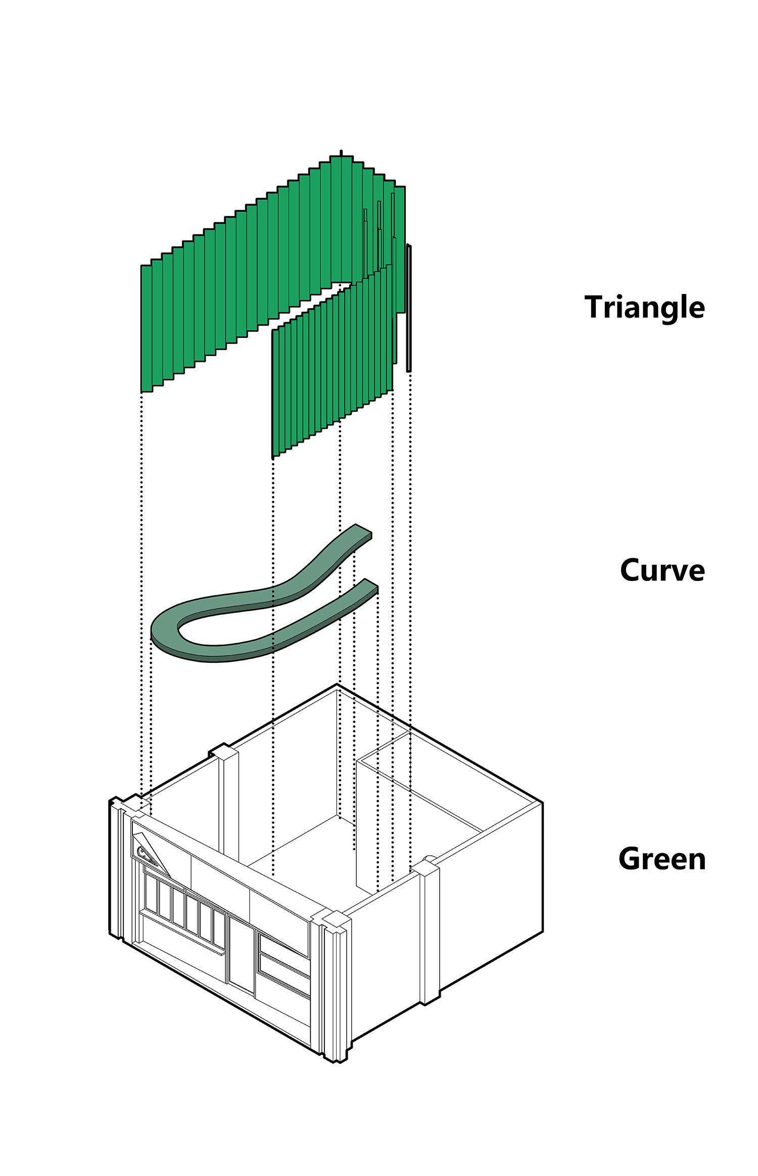
∇ 項目軸側圖©平介設計 Axonometric
∇ 用餐區©徐英達 Dining Area
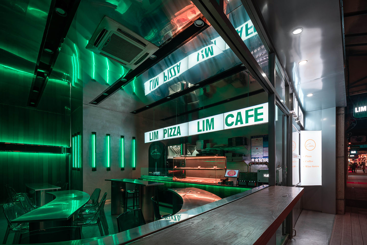
∇ 從外部望向操作台方向©徐英達 view from the exterior perspective
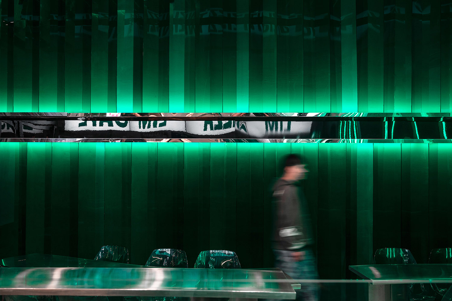
為什麼是綠色?
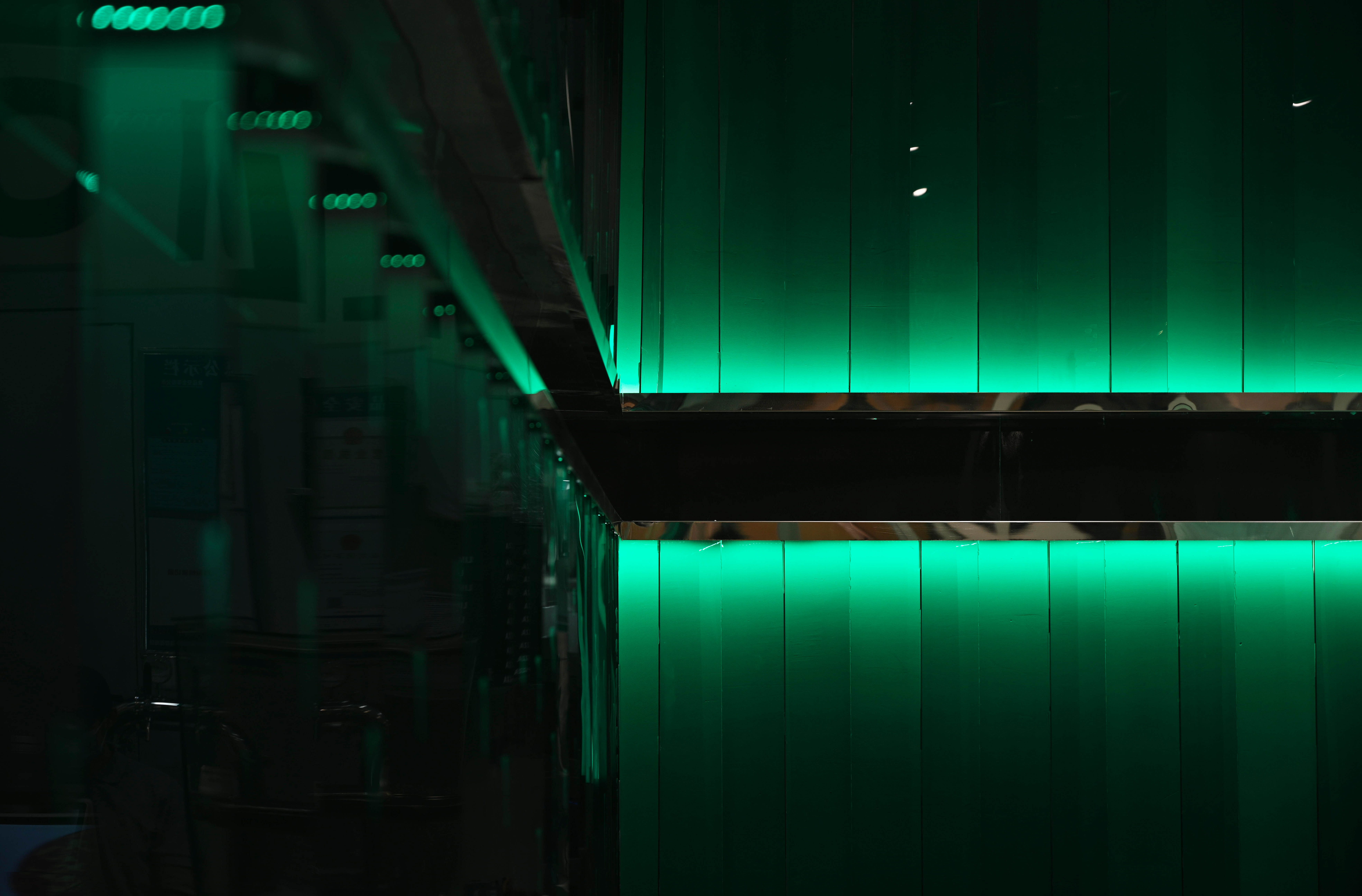
綠色往往能給人以清新、自然、寧靜、青春、放鬆等一係列的正麵情緒,符合LIM的品牌顏色和空間的設計主題,通過綠色的空間與披薩給人的感覺發生碰撞感,意味著美味與自然的碰撞,以綠色為主配合燈光使空間具有較強的表現力及張力。
Why do we choose green?
Green can often bring people a series of positive emotions such as freshness, nature, tranquility, youth and relaxation, which is in line with the design theme of Lim’s brand color and space. The feeling of collision between green space and pizza also represents delicacy and nature. Additionally, light with green makes the space full of strong expressiveness and tension.
∇ 空間中的綠色©徐英達 Green elements in the space
為什麼是三角?
不論是披薩的包裝還是披薩本身,都與三角分不開,傳統的披薩盒因為要讓大塊的披薩在運送中不發生形變,往往會選擇瓦楞紙板結構的盒子來裝送,即很多三角邏輯的波浪構成。披薩本身自不必說,一塊完整的圓形披薩會切割為一個個漂亮的三角。
Why do we choose a triangle?
Both the pizza packaging and the pizza itself are inseparable from the triangles. To avoid the deformation of pizza during transportation, traditional pizza boxes are always made of corrugated boards, which consist of many waves in triangle logic. A complete round pizza will be cut into beautiful triangles.
∇ 空間中的三角©徐英達 Triangles in the space
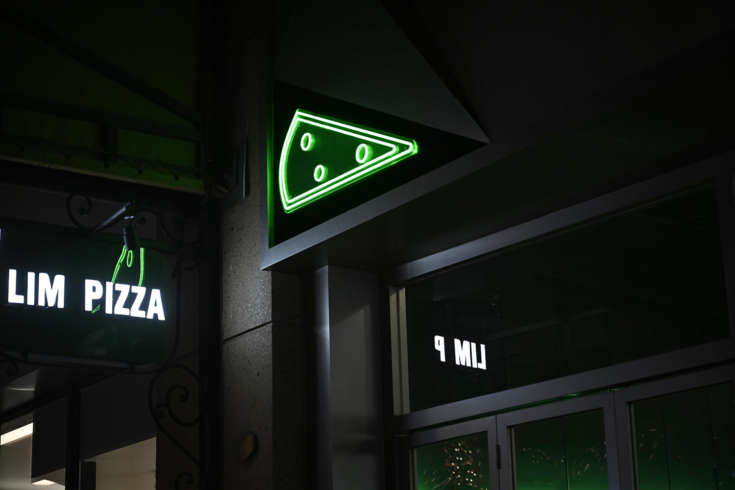
外立麵簡單翻折的一角和立麵三角體量的形體都是在回應這個語言。門頭的翻折是作為線索讓人先聯想到盒子這種比較具象的物體來激發人們的探索欲望,使人們在進到空間中,會有更多的探索,和更豐富的空間體驗。立麵重複陣列的三角形體配合頂麵的鏡麵鋁板拉伸空間,希望用強烈的包裹感來隔絕外界的喧嘩讓在空間中的使用者能獲得更多的正麵情緒。
The simply folded corner of the facade and the shape of the triangular volume all respond to this language. The folding of the door is used as a clue to remind people of the box, a more concrete object, to stimulate people’s desire for exploration, so that people will have more exploration and get more spatial experience when entering the space. The triangular part of the facade repeated array cooperates with the aluminum mirror plate on the top surface to stretch the space. We hope to isolate the noise from the outside world through the strong feeling of being wrapped so that users in the space can get more positive emotions.
∇ 項目外觀©徐英達 Project facade
∇ 翻折的一角©徐英達 The folded corner
為什麼是不規則的曲線?
我們希望在這個有限和規則的空間裏帶給人們一些不一樣的體驗。這條在空間中扭動的曲線就承擔著這個任務,它打破了這個空間原本的沉悶,在不影響人們使用的基礎上或多或少的改變了人們在空間中的動線與行為,配合上高低不同的家具,使人們在這個空間中能有更豐富的體驗。曲線在空間中的流動和觸碰到邊緣後的轉折也可以理解為披薩在盒子裏微微散發著的香氣。
Why is it an irregular curve?
We hope to bring people some different experiences in this limited and regular space. This curve twisting in the space undertakes this task. It breaks the original dullness of the space, and more or less changes people’s tracks and behavior in the space without affecting people’s use. With furniture of different heights, people can enjoy the space. The flow of the curve in space and the turning point after touching the edge can also be understood as the slight aroma of pizza in the box.
∇ 空間中流動的曲線©徐英達 The floating curve in the space
∇ 概念圖解©平介設計 Concept diagram
在這個快節奏的時代中,希望每一個進入店裏的顧客都能有愉快的心情,和不一樣的用餐體驗。在帶給顧客全方位享受美食的良好體驗的同時,構建一體化的活力空間,並展現獨特的設計理念。在緊湊的空間中最大限度的表達出簡潔明快的風格,並體現出獨具現代氣息的新風尚,是我們本次設計需要探討的新課題,我們也希望能在契合pizza主題的同時,賦予店鋪新時代的青春活力。
In this fast-paced era, we hope every customer in the store can be in a happy mood and have a special dining experience. While bringing customers an excellent experience of enjoying delicious food in an all-rounded way, we construct an integrated dynamic space and show unique design ideas. It is a new topic for us to express a concise and lively style to the greatest extent in the compact space and reflect the new style with unique modernness in this design. We also hope to make the store more lively and fashionable while conforming to the theme of pizza.
∇ 空間細部©徐英達 Details of the space
∇ 平麵圖©平介設計 Floor plan
項目信息
項目名稱:LIM PIZZA店
設計方:平介設計
項目設計&完成年份:2021.12
設計團隊:李文靖,吳子君,陳磊,楊楠
項目地址:江蘇省蘇州市虎丘區綠寶廣場步行街
建築麵積:64㎡
攝影版權:徐英達
客戶:LIM PIZZA
材料:透明有機玻璃、鏡麵鋁板、不鏽鋼
Information of the project
Projects:LIM PIZZA (Suzhou)
Architect:Parallect-design
Year:2021.12
Design team members:Wenjing Li, Zijun Wu, Lei Chen, Nan Yang
Site:Lvbao Square pedestrian street, Huqiu District, Suzhou, Jiangsu Province
Area:64㎡
Copyright of photography:Yingda Xu
Customer:LIM PIZZA
Materials:Transparent organic glass, Mirror aluminum, Stainless steel


