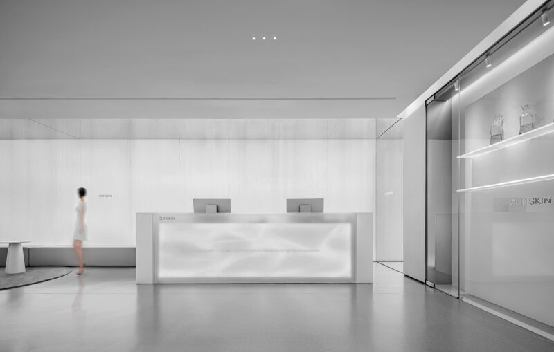
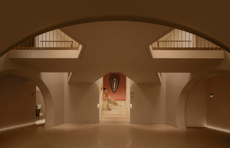
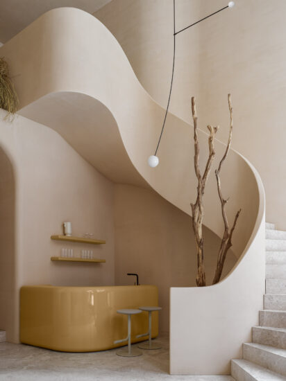
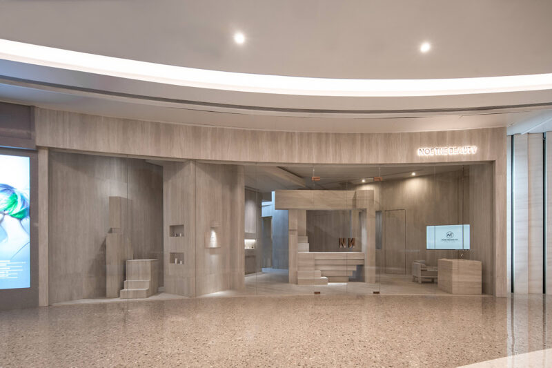
對於國內新商業業態而言,輕醫美還屬於一個“新物種”。但醫美已成為Z世代的生活必需品,構成和豐富Z世代精神生活的一部分。Z世代作為推動新興商業發展的主流群體,他們的群體喜好和消費習慣深刻地影響著商業的迭代方式和創新方向。
For new domestic commercial formats, light medical beauty is also a “new species”. But medical beauty has become a necessities of the Z generation, constituting and enriching a part of the spiritual life of the Z generation. As the mainstream group that promotes the development of emerging businesses, Generation Z, their group preferences and consumption habits have a profound impact on the iterative method and innovation direction of business.
1.Z世代新興快時尚 A new destination for Gen Z
Z&BEAR是針對Z世代新消費需求而生的,涵蓋了水光便利店、黑科技baby光、熱瑪吉等多種項目。滿足了多年齡層段的人們對於美的探索。追求美與自由,輕盈靈動不可捉摸,這種表皮下往往是愈發堅韌沉著的內質,從誕生開始就不遺餘力致力於女性的全球快時尚輕醫美品牌。
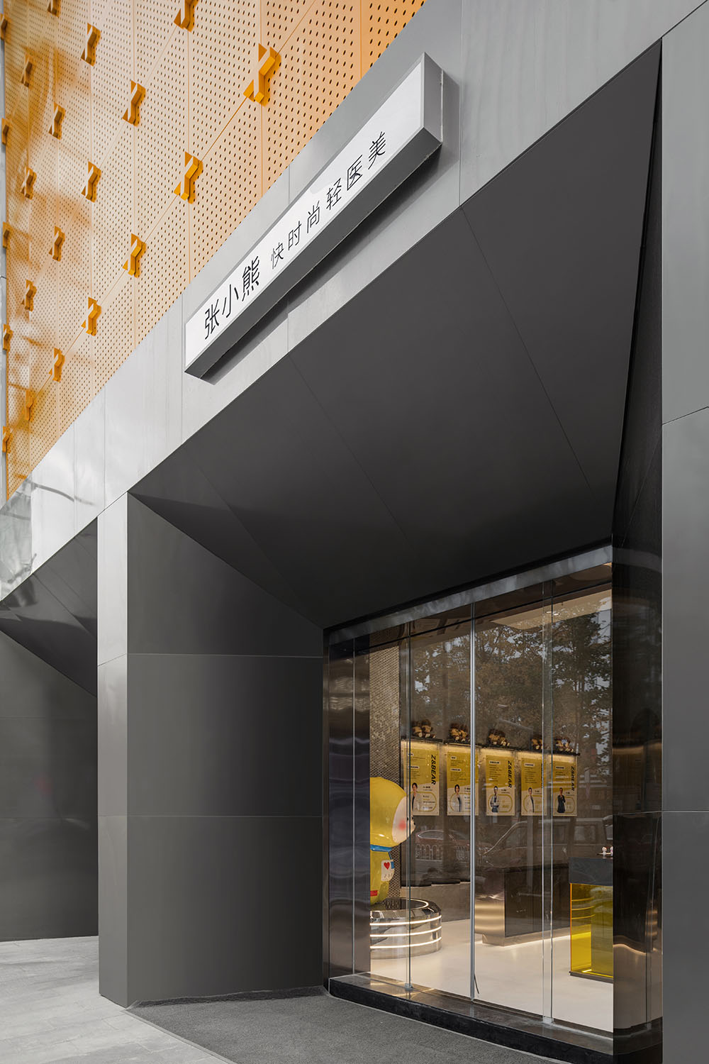
Z&BEAR品牌聯合MOOTHAN. Design末染設計打造的Z&BEAR首個全國水光便利店旗艦店,位於武漢最美麗、最摩登、最有腔調和情調的楚河漢街。
Z&BEAR was born in response to the new consumer needs of the Z generation, covering a variety of projects such as Shuiguang convenience store, black technology baby light, and Remag. It satisfies the exploration of beauty for people of many ages. Pursuing beauty and freedom, lightness and agility are unpredictable. This kind of skin is often more tough and calm. Since its birth, it has spared no effort to devote itself to women’s global fast fashion and light medical beauty brand.
Z&BEAR’s first national flagship store of water light convenience store, created by Z&BEAR brand and MOOTHAN.
∇ 地理位置 Geographical Location
∇ 外立麵一角 A corner of the facade
當代女性在科技美容領域是一場驚人的現象級集體消費。對外表的極致關注和維護的背後實則並非單純的消費主義其本質而言實則是當代女性主義的甚囂塵上。由反男權到反父權到回歸性別的類型觀察與自我釋放。女性主義的觀念進化至今已然釋放了橫亙在性別之上的’性別習俗’並進入本質上性別的自我認可。
Contemporary women are an amazing phenomenon-level collective consumption in the field of technological beauty. Behind the extreme attention and maintenance of appearance is not pure consumerism, but in essence, it is the uproar of contemporary feminism. From anti-patriarchy to anti-patriarchy to return to gender type observation and self-release. The evolution of the concept of feminism has so far released the “gender customs” that lie above gender and entered the self-recognition of essentially gender.
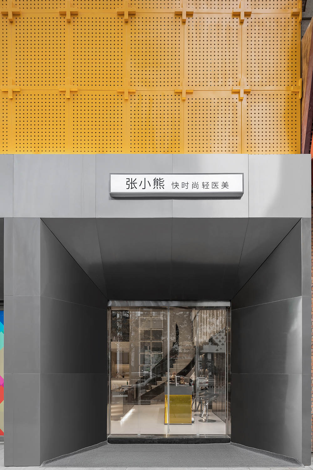
∇ 店鋪入口 Shop entrance
2.4層樓高的“盲盒”外立麵 4-storey blind box-featured facade
設計師利用外立麵的尺度優勢,打造了一個4層樓高的,由一個個“盒子”構成的盲盒版外立麵,整齊有序,讓品牌在整個街區中顯得格外突出,像等待打開和探索的盲盒吸引著來往路人進店一探究竟。夜晚當燈光打開的時候,黃色的主色調足夠有辨識度,不僅吸引眼球,同也成為Z&BEAR品牌對外表達品牌態度的媒介。
The designer took advantage of the scale of the facade to create a 4-story building with a blind box version of the facade composed of “boxes”, neat and orderly, making the brand stand out in the entire block, like waiting The blind box opened and explored attracts passersby into the store to find out. At night, when the lights are turned on, the main color of yellow is recognizable enough to not only attract eyeballs, but also become a medium for Z&BEAR to express its brand attitude to the outside world.
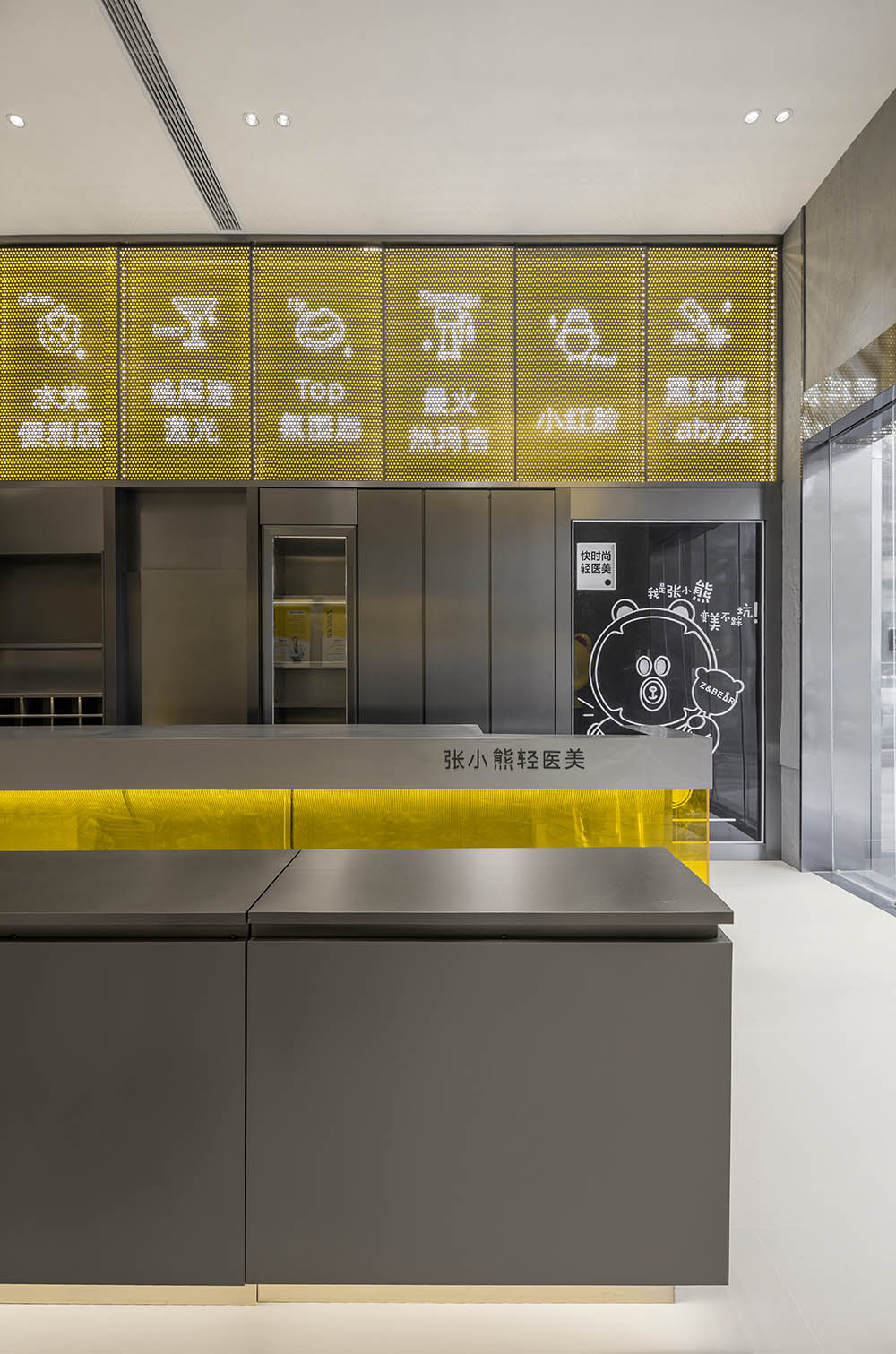
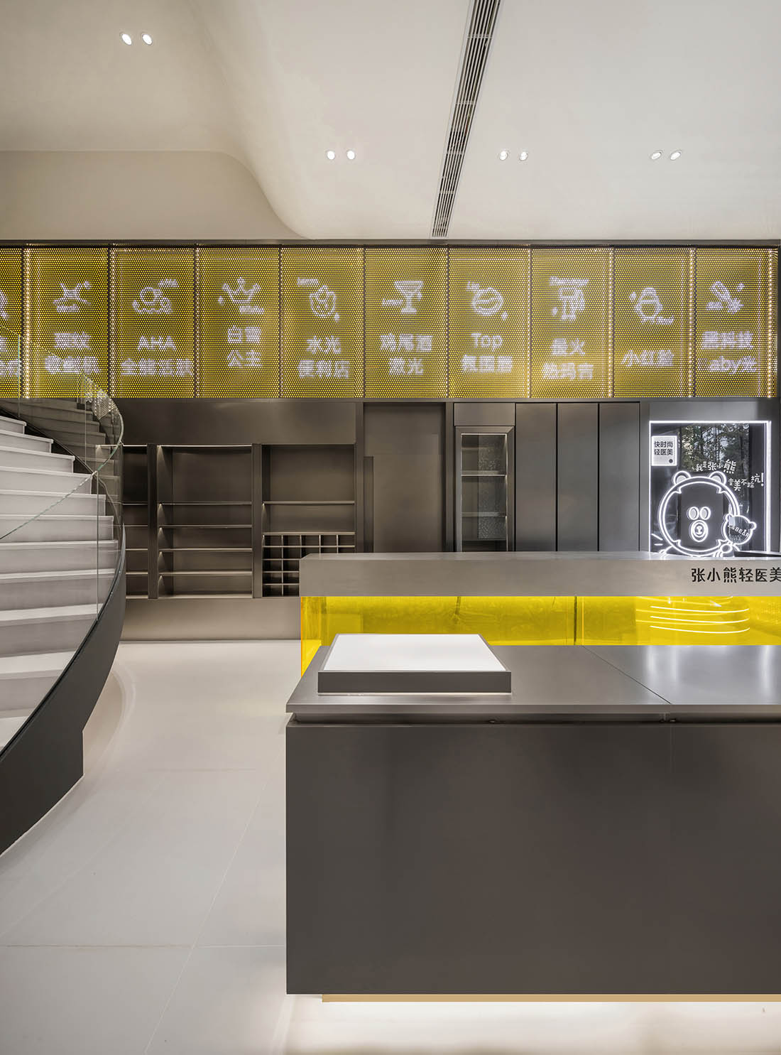
∇ 門廳看向大廳空間 The foyer looks towards the lobby space
∇ 後區看向門廳 The back area looks towards the foyer
3.Z號艙——蛻變與新生“X Ark” — rebirth after doomsday
為了讓品牌和空間呈現完整的體驗感,設計師以“航空艙”為主題,用空間講述肌膚在重新建構這樣一個“蛻變與新生”的景象,Z號艙是所有美麗與改變的伊始,是Z世代的精神方舟,更是年輕人的新起點,一代代的觀點進化到今天呈現的普遍的男男女女哪怕僅自外表開始的一場龐大的自我建設。
In order to make the brand and space present a complete sense of experience, the designer uses the “aviation cabin” as the theme, and uses space to tell the skin about rebuilding such a scene of “transformation and rebirth”. Cabin Z is the beginning of all beauty and change. The spiritual ark of the Z generation is a new starting point for young people. The views of generations have evolved into today’s universal men and women, even if they only start from the appearance of a huge self-construction.
∇ 門廳空間 Foyer space
∇ 展示空間 Exhibition space
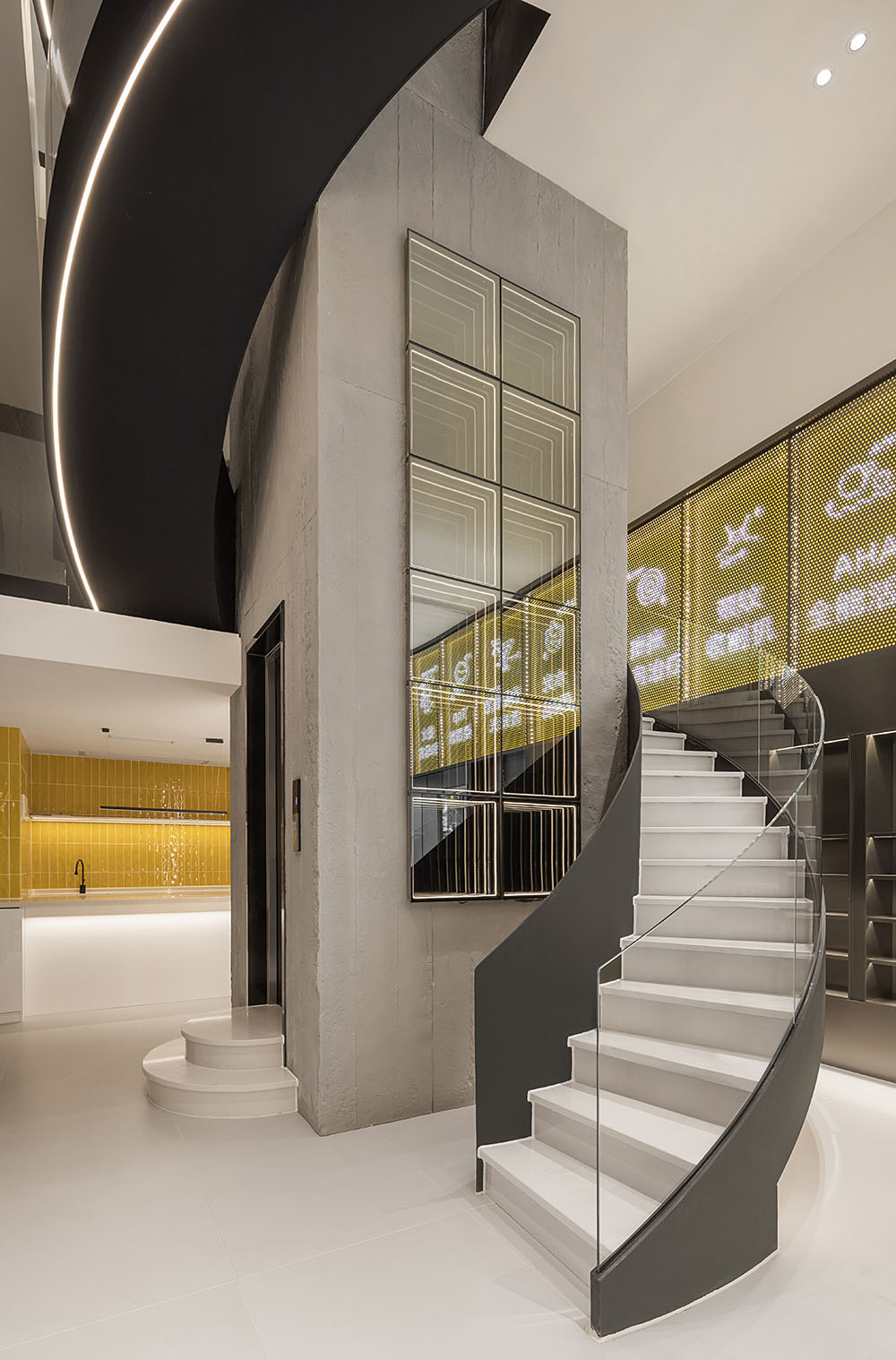
∇ 建築的交通樞紐 Building transportation hub
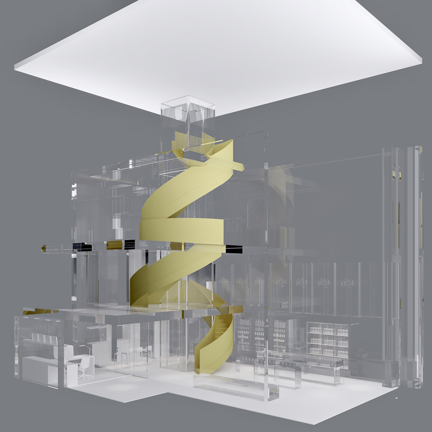
原場地分為上中下三層層狹長的空間,本著設計最原始的初衷,我們將空間進行高效的再利用,力求在空間中通過秩序、層疊的多層次空間關係來傳達獨屬Z&BEAR的“全新2.0時代”。
The original site is divided into three long and narrow spaces with upper, middle and lower floors. Based on the original intention of the design, we reuse the space efficiently, and strive to convey the unique Z&BEAR through the orderly and layered multi-level spatial relationship in the space. “The New 2.0 Era”.
4.輕微衝擊,依舊朋克 Slight impact, still punk
為了打破大廳超高層高給空間帶來的空曠感,也本著空間利用程度的最大化,設計師將原有挑高空間一分為二,卻也克製的隻用一半,在後半區造出了一座平台,使空間更有層次,更加的使用,加之電梯井的穿插,使得簡單的空間也多了一道宏偉。
In order to break the sense of emptiness brought to the space by the super high-rise hall, and to maximize the use of space, the designer divided the original high-rise space into two, but restrained only half of it, and built it in the second half. A platform is added to make the space more layered and more usable, and the interspersed elevator shaft makes the simple space more magnificent.
∇ 巨大的穿插結構,造就空間宏偉結構 The huge interspersed structure creates the grand structure of the space
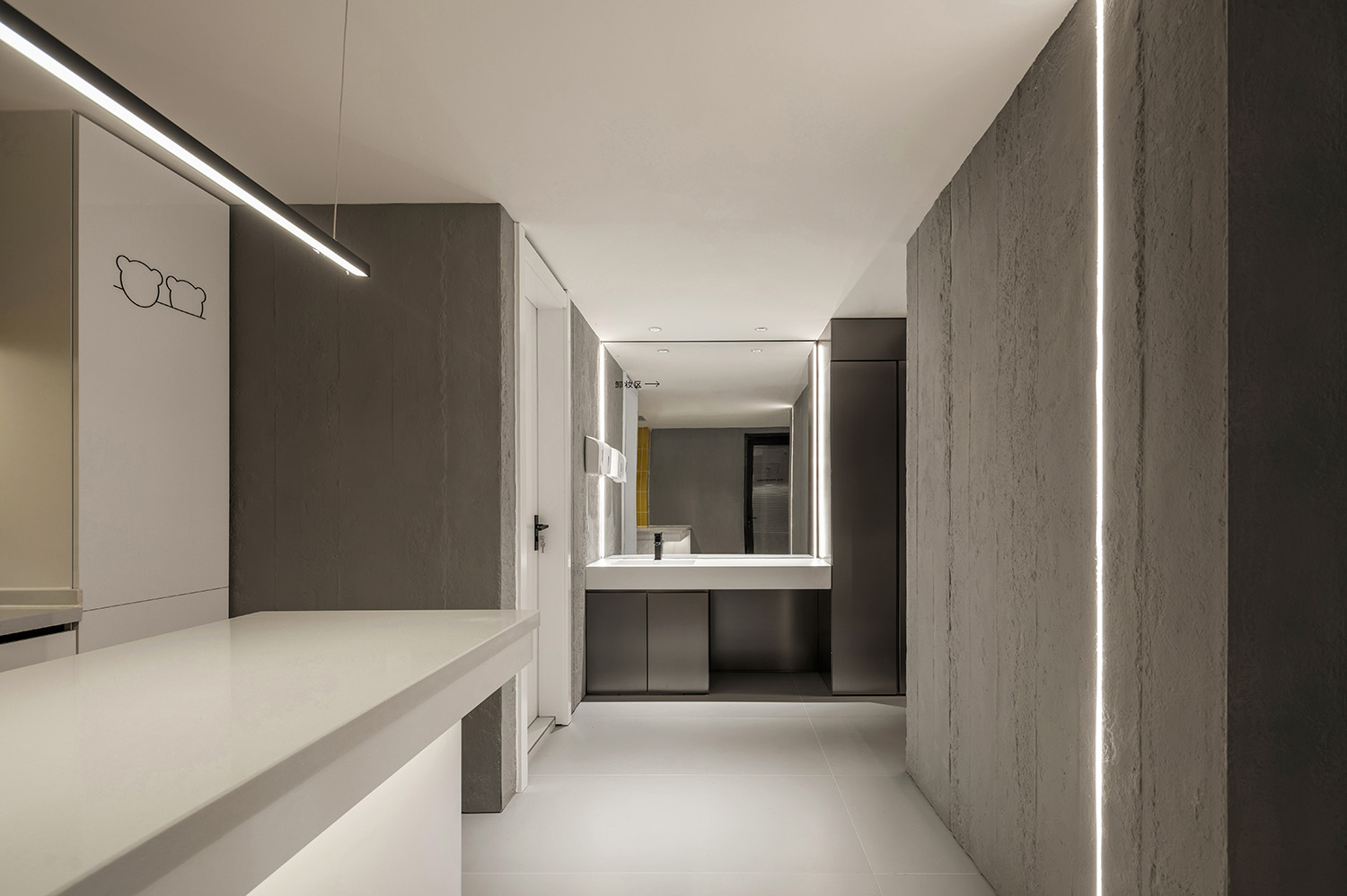
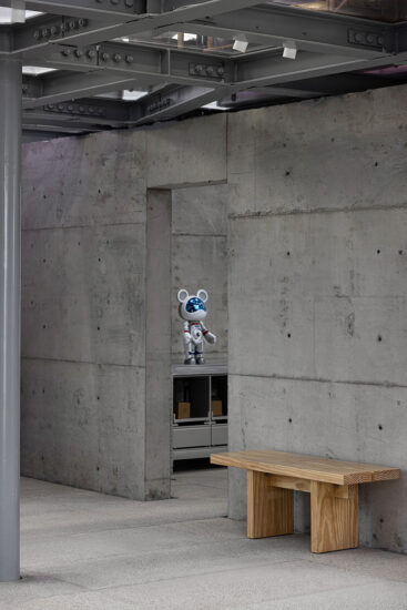
空間中利用水泥板,還原拆除和剝離而呈現的原始裸露的混泥土梁柱,還原建築結構本來的狀態,在建築中重建,深色的啞光不鏽鋼,裸露的灰色水泥,在燈光和亮色的點綴下,初顯賽博朋克,顯得更酷、更潮、更未來。
Cement boards are used in the space to restore the original exposed concrete beams and columns presented by the demolition and stripping, and restore the original state of the building structure. Under the embellishment, cyberpunk is beginning to appear, which is cooler, more fashionable, and more future.
∇ 看向卸妝台 Look at the makeup remover
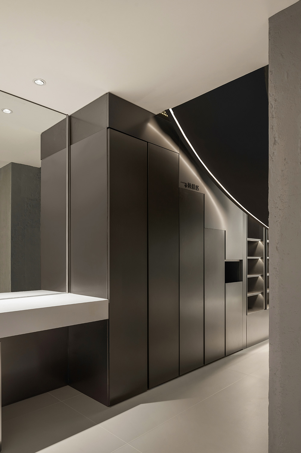
∇ 不鏽鋼換鞋櫃,幽暗的反射 Stainless steel shoe changing cabinet, dark reflection
如同主體空間的水泥質感並不指向粗粒,相反,水泥質地的調配有膚感般的細膩和精確,同時依然在整體上呈現出灰調的沉靜。玻璃與不鏽鋼鋼反射則強調上升的輕盈與靈透感。兩種截然不同甚至矛盾的質感彌合出整體空間的框架與戲劇性。
Just as the cement texture of the main space does not point to coarse grains, on the contrary, the cement texture is adjusted with skin-like fineness and precision, while still presenting a calmness of gray tone on the whole. The reflection of glass and stainless steel emphasizes the lightness and translucency of rising. Two completely different or even contradictory textures bridge the framework and drama of the overall space.
通過建構亮與陰翳,強及柔和的形式對撞來產生頗具戲劇性的商業空間體驗,通過硬朗冷靜的表象風格與充滿感性的空間觀念來試圖描述交織的內在的複雜度。
Through the construction of bright and cloudy, strong and soft forms of collision to produce a quite dramatic commercial space experience, through the tough and calm appearance style and perceptual space concept to try to describe the inherent complexity of the interweaving.
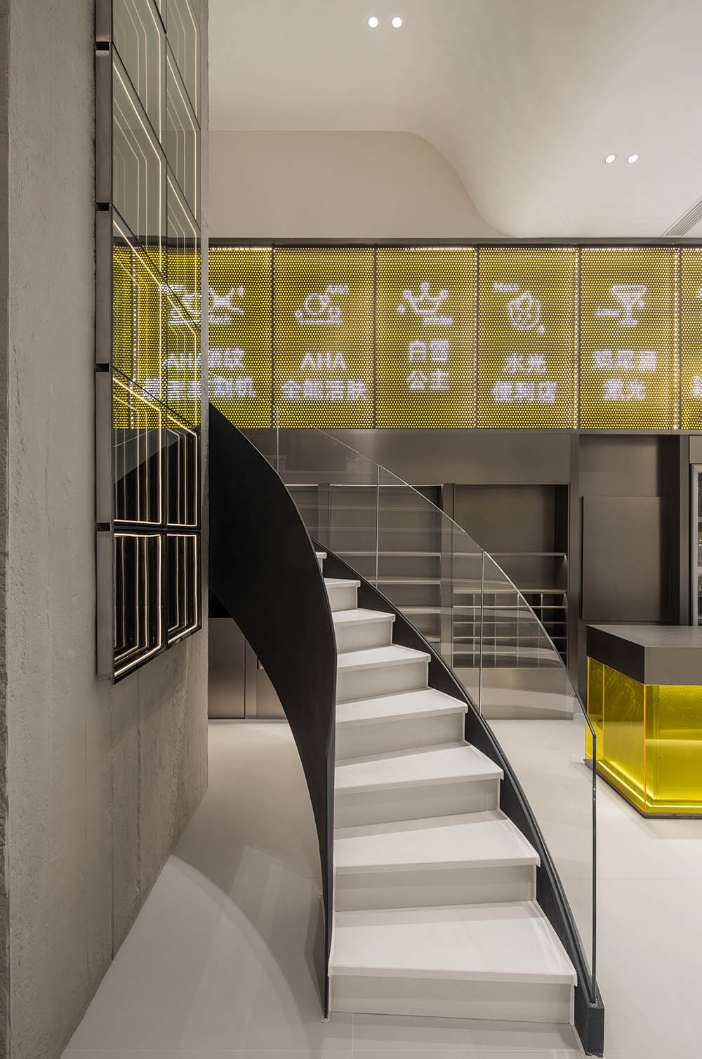
∇ 通往二樓,上下樓層貫通 Leading to the second floor, through the upper and lower floors
5.建築體量感通天結構
Building volume sense through sky structure
∇ 平台上的視角 Perspective on the platform
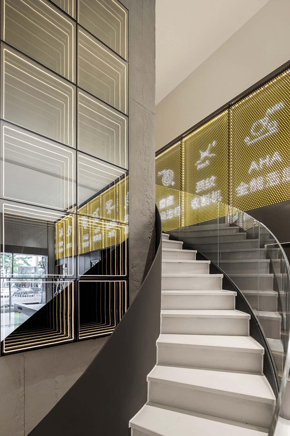
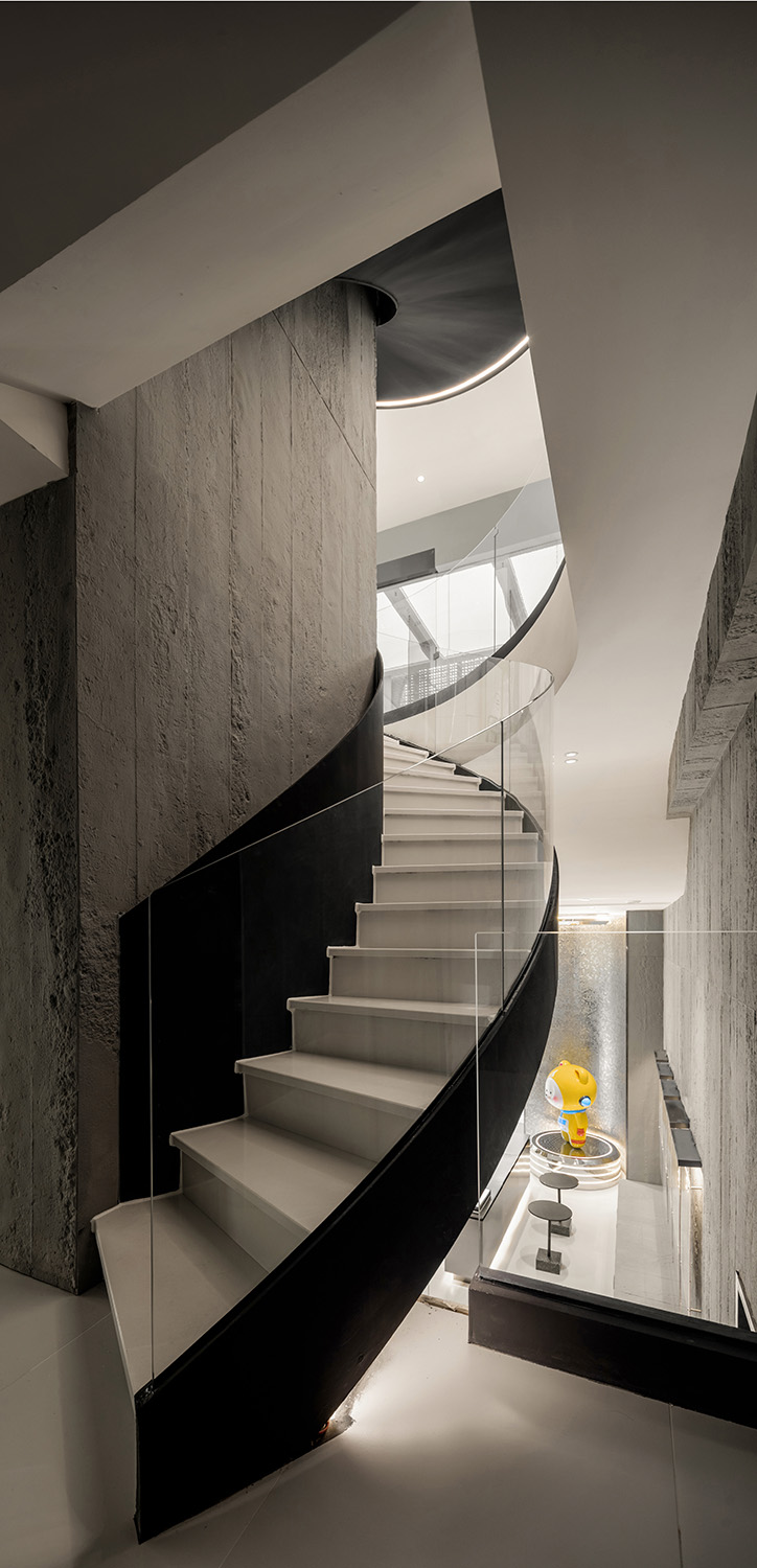
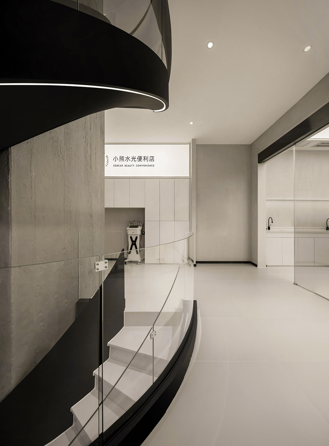
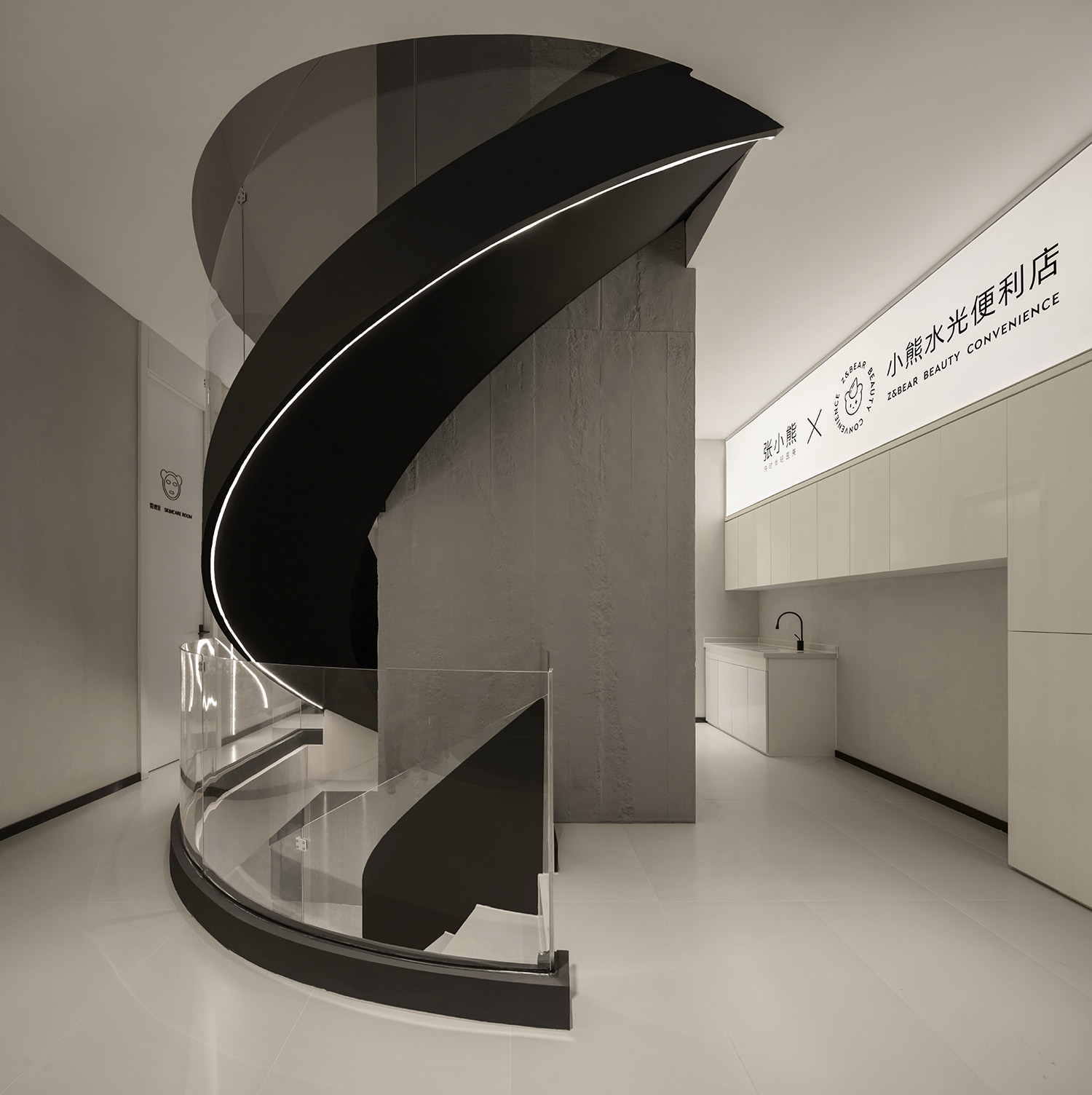
設計師在空間中設置了一個通高十多米的電梯井,穿過所有樓板,將所有樓層空間在視覺上統一為一個整體。同時圍繞著它旋轉的樓梯也成為了店內的打卡點和藝術裝置,自下而上仰望,拔地而起向上延伸,充滿力量感和未來感,科幻而神秘。
The designer set up an elevator shaft with a height of more than ten meters in the space, passing through all the floor slabs, and visually unifying all the floor spaces as a whole. At the same time, the stairs that revolve around it have also become the check-in point and art installation in the store, looking up from the bottom up, extending from the ground up, full of power and sense of the future, science fiction and mysterious.
∇ 二層空間 Second floor space
∇ 利落的線條分割開放的空間 The clean lines divide the open space
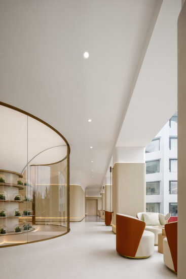
透明的玻璃扶手設置,模糊了空間之間的物理界限,人流湧動,激發著到店人們的探索欲,應接不暇、眼花繚亂,置身於一個無盡的探索空間之中。
The set of transparent glass handrails blurs the physical boundaries between the spaces, and the flow of people stimulates the desire of exploration of the people who come to the store. They are overwhelmed and dazzled, and they are in an endless space for exploration.
6.專屬“水光便利店”Exclusive “Shuiguang Convenience Store”
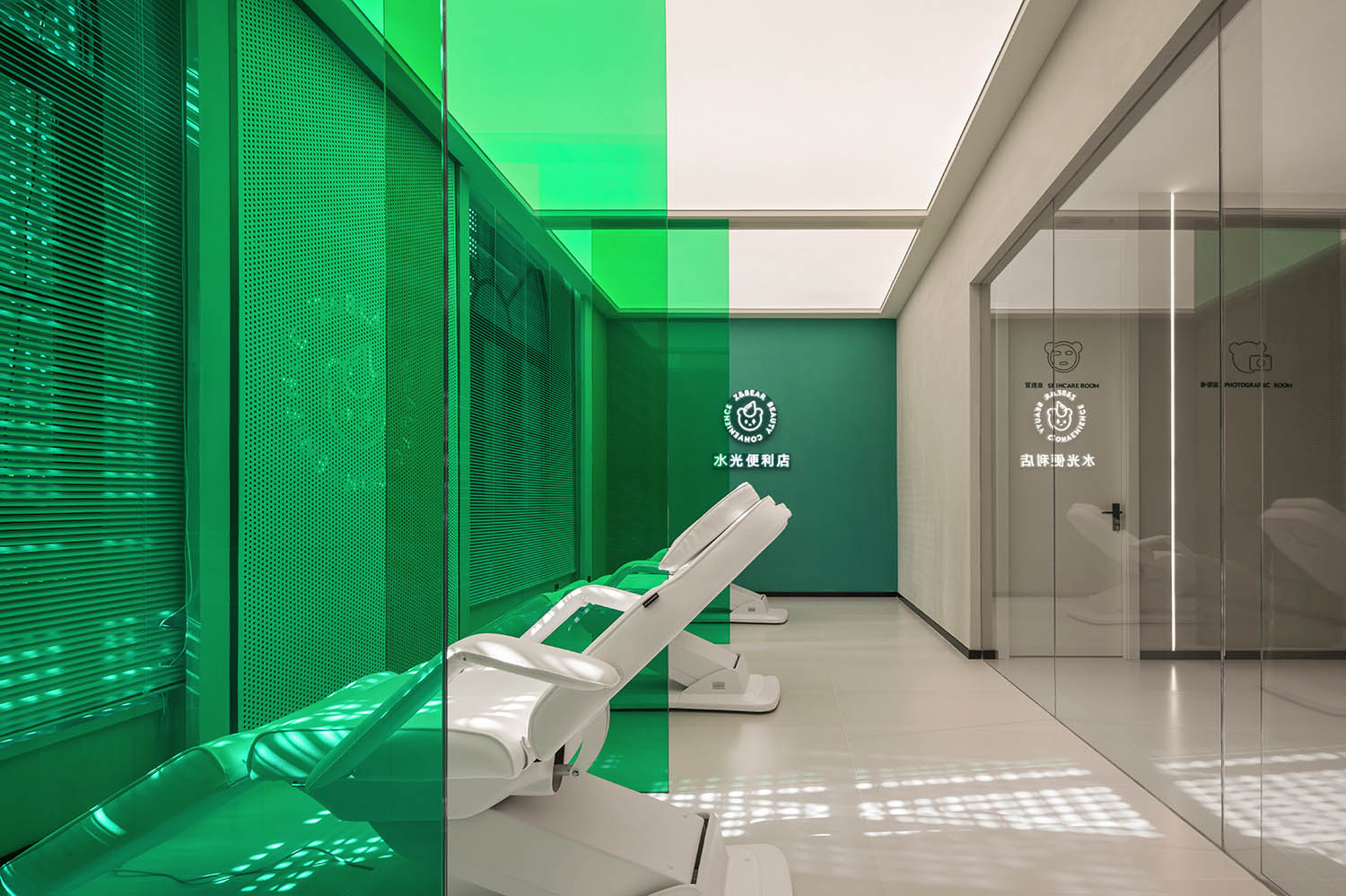
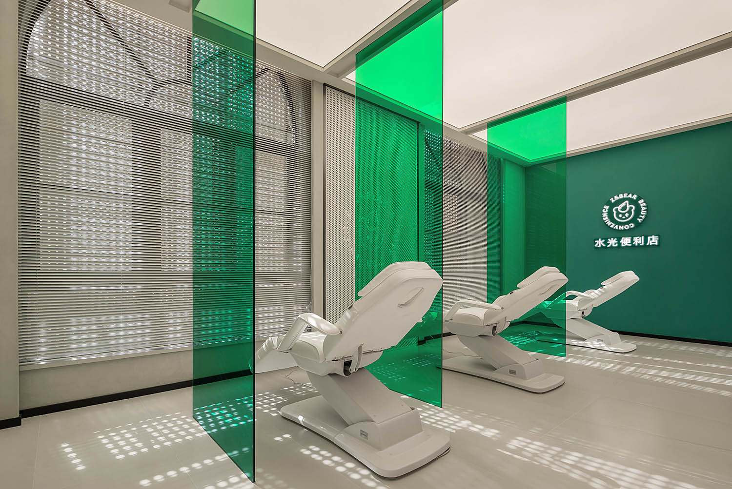
品牌LOGO選擇跳脫於空間的綠色來作為空間的主色調,收斂擔憂明快的綠色能夠令來訪者的目光長時間的駐足。
The brand LOGO chooses green that escapes from the space as the main color of the space, and the bright green can make visitors’ eyes stop for a long time.
這裏是消費者與品牌互動的窗口,是消費者發現美好,探索未知,表達自我的空間和平台,是用場景式的全新探索,是用超預期的體驗方式向用戶傳達品牌態度和品牌價值。
Here is the window for consumers to interact with the brand. It is a space and platform for consumers to discover beauty, explore the unknown, and express themselves. It is a new exploration in scenes and an experience that exceeds expectations to convey brand attitude and brand value to users.
∇ 與傳統美容場所的迥異的空間形式 The space form is very different from traditional beauty places
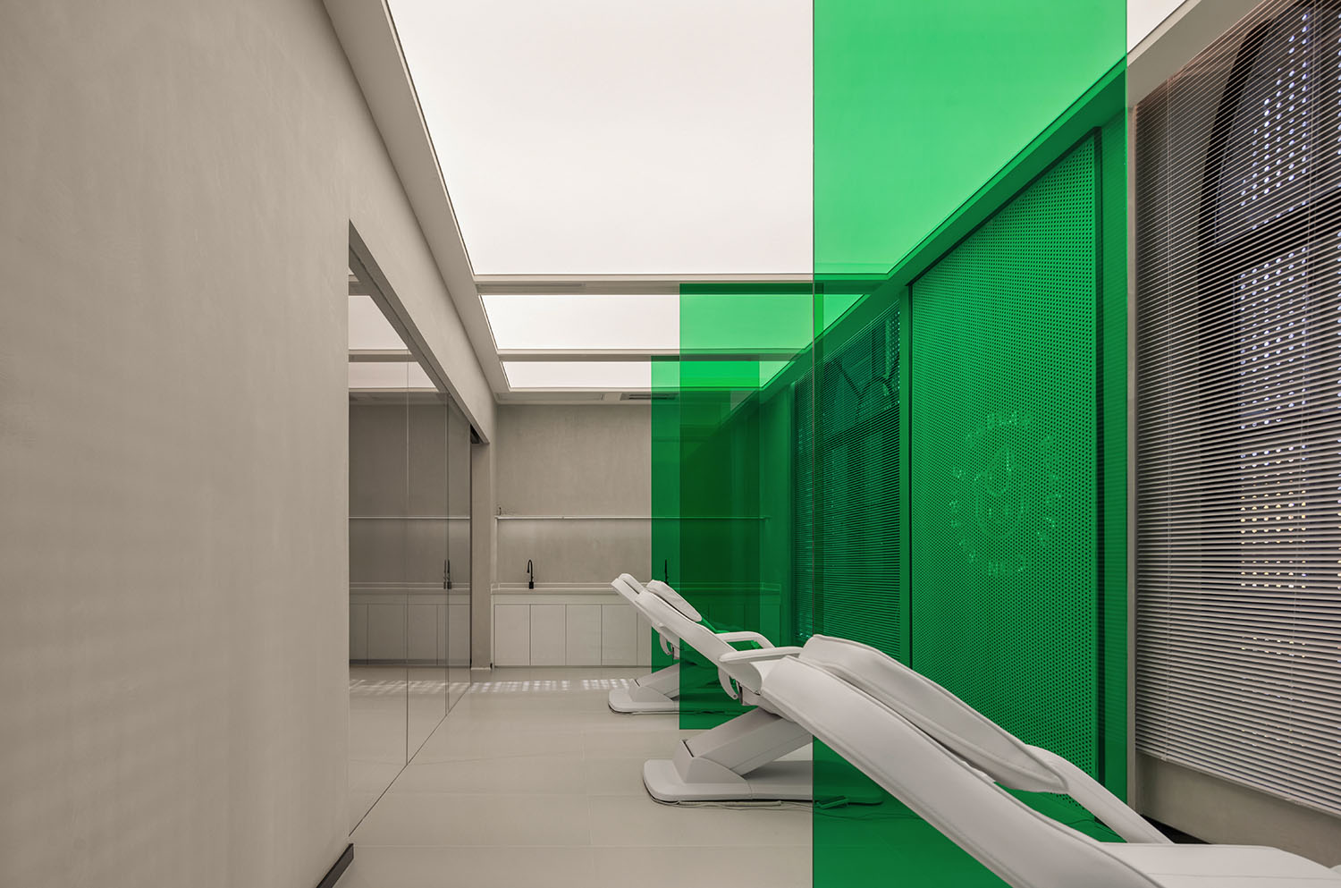
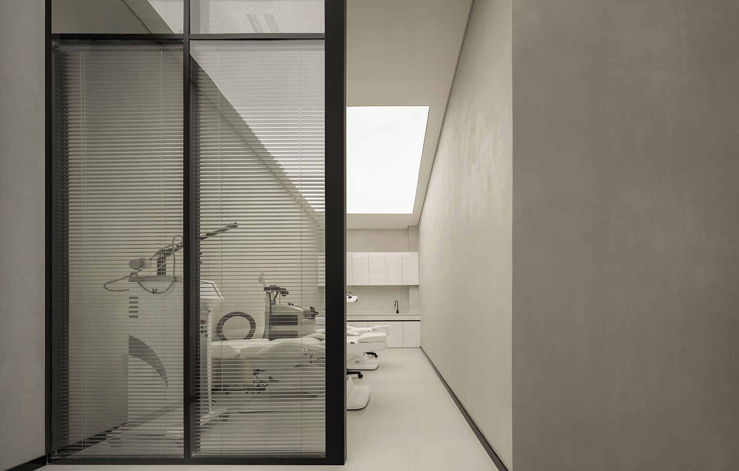
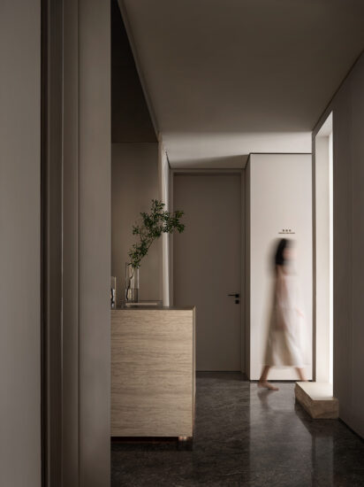
治療區間是完全封閉的私密區域,因此,公區作為過渡帶被賦予一定的可視性。並通過這種對外可視的透明性來建立訪客及消費者對該場所操作技術的信任。
∇ 空間軸測圖 Axonometric drawing
末染設計此次透過品牌文化、空間性質等,將一層層元素特性串聯組合,帶給新的空間以全新的排列方式。由點至麵,從大至小都清晰的訴說著一脈相承的空間邏輯性。空間的語言,訴說的情緒,想表達的事物都是末染從一而終在努力做的設計方向。在此次空間創作中,將品牌文化、功能至上、結構突破、藝術氣質集於一體,使得空間通過簡約純粹的手法表達,得到更多的自由與釋放。
未來Z&BEAR品牌還將持續給市場和消費者帶來驚喜,讓我們一同期待……
Through the brand culture, space nature, etc., MOOTHAN. design combines layer-by-layer element characteristics in series to bring a new arrangement to the new space. From point to surface, from big to small, it clearly tells the spatial logic of the same line. The language of the space, the emotions that I want to express, and the things I want to express are all the design directions that Ender has worked hard to do from the beginning to the end. In this space creation, the brand culture, function supremacy, structural breakthrough, and artistic temperament are integrated, so that the space can be expressed in a simple and pure way and get more freedom and release.
In the future, the Z&BEAR brand will continue to bring surprises to the market and consumers, let us look forward to…
項目信息
項目名稱:張小熊輕醫美
Project Name: Z&BEAR
項目類型:商業空間
Project type: commercial space
項目麵積:300m²
Project area: 300M ²
項目位置:湖北·武漢
Project location: Wuhan·Hubei
主案設計:孟飛/末染設計
Main design: Meng Fei / MOOTHAN. design
深化設計:王鵬宇/末染設計
Detailed design: Wang Pengyu / MOOTHAN. design
燈光設計:三宜·想天照明設計
Lighting design: Sanyi xiangtian lighting design
項目攝影:RICCI空間攝影
Project Photography: Ricci space photography
完成時間:2021.11
Completion time: 2021.11


