平衡科技與藝術的“創客大樓”
A “maker center” that balances technology and art
Cooler Master是一家以提供計算機散熱方案和配套服務為核心的科技公司,30年的品牌發展曆程凝結著創新、創造的產品精神以及主動、開放的企業文化。Desfa Group受邀參與象征Cooler Master全新裏程碑的辦公環境打造,用理性分析與藝術感知相平衡的空間設計策略,探索快速變革的時代下新型辦公場景的更多可能性。
Cooler Master is a technology company delivering PC cooling solutions and supporting services. Its 30-year history is filled with the spirit of innovation and creativity as well as the corporate culture built with initiative and openness. Desfa Group was selected to conceive the company’s new Taipei office, which is a new milestone for Cooler Master. With a spatial design strategy that balances rationality and artistry, the project implements many design solutions in today’s rapidly evolving workplace environment.
Desfa Group為Cooler Master打造的創客大樓,座落於高科技產業聚集的台北內湖科技園區,項目範圍涵蓋1F 接待區、公共區域及辦公區,總麵積近7000平方米。整體設計遵循企業文化中著重科技與工藝結合的“創客精神”,將產品及服務的邏輯轉譯為清晰而彈性的空間語彙,演繹幾何體量、有機自然、光影藝術互為滲透的現代工作生態。
Cooler Master’s Taipei office, designed by Desfa Group, is located in Taipei’s Neihu Technology Park, where high-tech industries are concentrated. Covering a total area of nearly 7,000 square meters, the design scope includes the entrance lobby, public space, and office areas. The overall design concept follows the “maker spirit” of Cooler Master, emphasizing the harmony of technology and craftsmanship. The brand’s vision on products and services is translated into a design language that has clear and flexible spatial language, ushering in a modern working environment that integrates geometric volumes, nature, light and shadows.
“博物館”思維的創造性衍變
Creative derivation of “museum” thinking
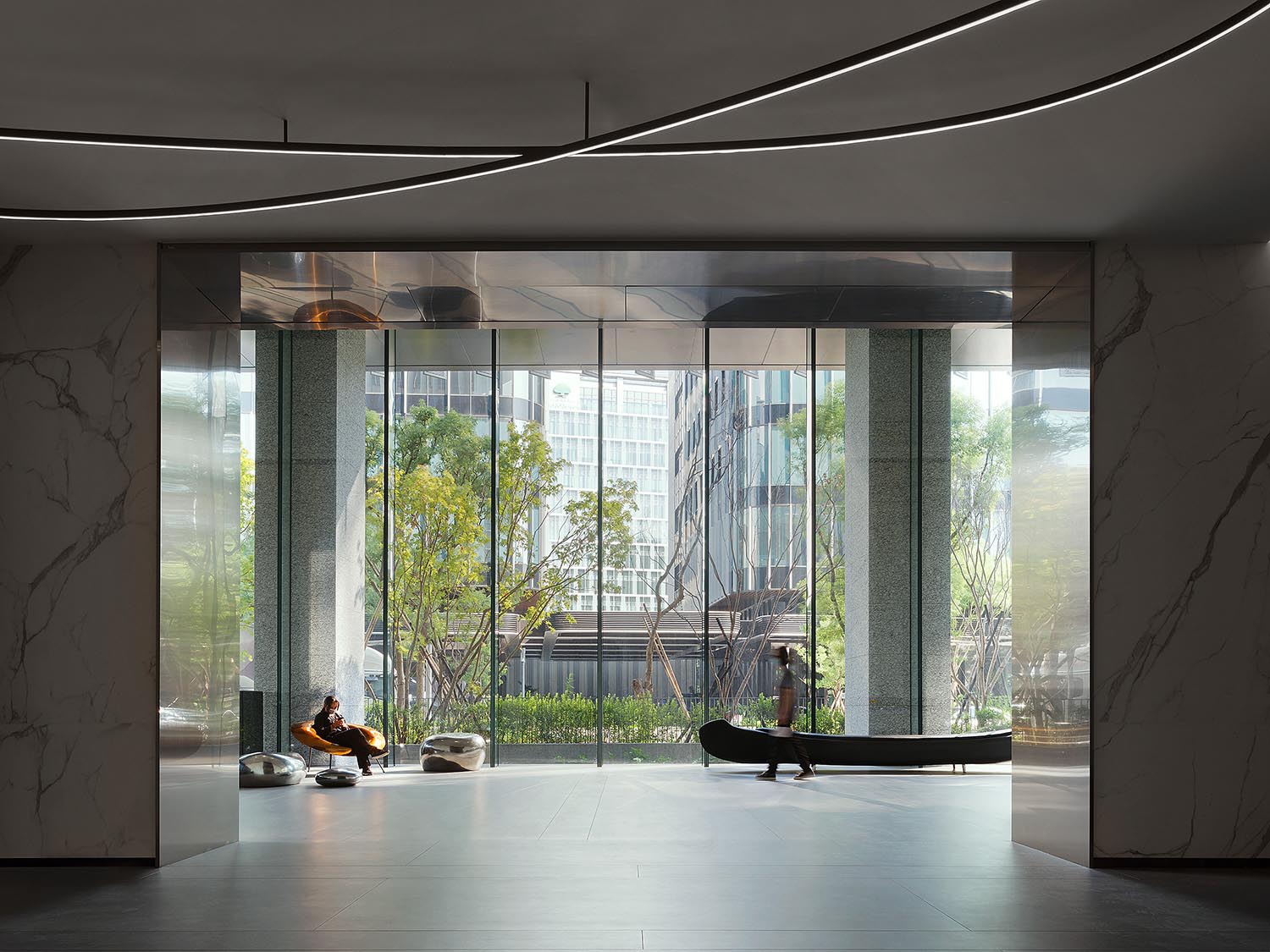
在入口接待區的構思中,結合功能屬性與企業文化內涵,差異化塑造“博物館”般的氛圍體驗。基於建築師的空間架構,1F大堂延續建築外立麵的材質和色係至室內,建構簡潔素淨的背景,同時為將來裝置藝術的植入預留空間。
Taking many attributes in Cooler Master’s long history of functional design, Desfa Group created a “museum”-like experience in the reception area at the entrance as a way to celebrate the company’s successful past. Based on the spatial structure created by the architect’s core and shell of the building, the material and color palette of the facade is extended into the lobby on the 1st floor. By doing this, a simple and clean background is created, while reserving space for future art installations.
∇ 1樓大堂外景 1F lobby exterior
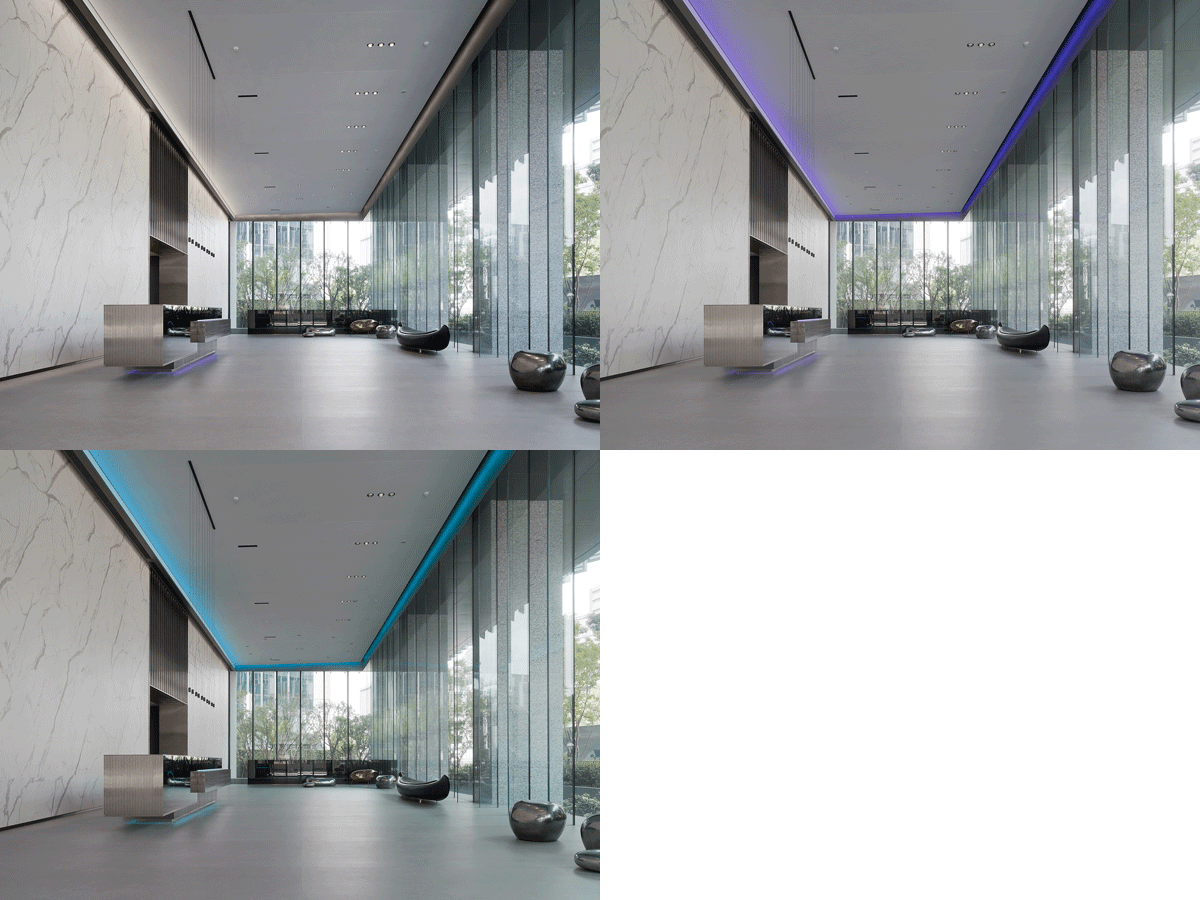
∇ 1樓大堂 1F lobby
30米進深的空間三麵圍繞著7米高的玻璃幕牆,最大限度引入戶外的天光與風景。
The main space, which is 30 meters in length, is surrounded by a 7-meter-high glass curtain wall on three sides to bring in natural light and visible natural landscape to maximize the full space.
輕微傾斜的天花設計輔以線性的燈光暈染,強化動態漂浮感。天花的飾麵采用性能卓著的Kvadrat的soft shell吸音係統,足以營造博物館級別的空間聲學效果。
The slightly sloping ceiling is complemented by linear lighting to strengthen a dynamic floating effect. The ceiling is finished with a high-performance soft-shell sound-absorbing system from Kvadrat, which creates a museum-quality acoustics in the space.
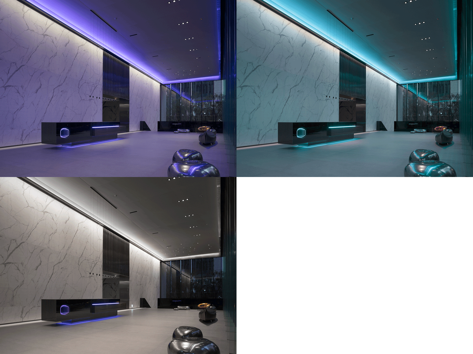
∇ 1樓大堂夜景 night view of 1F lobby
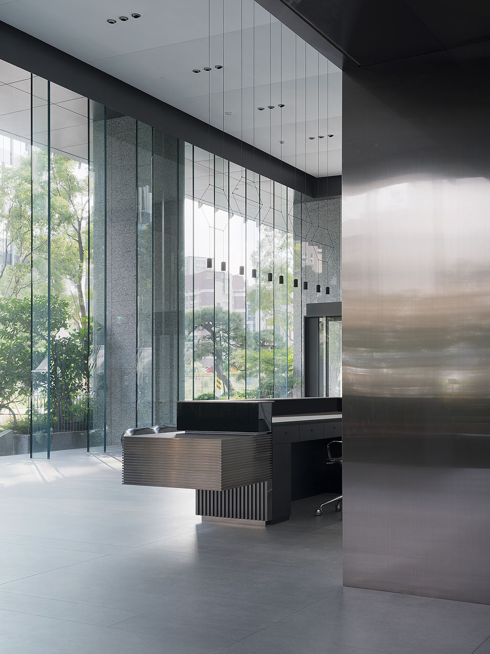
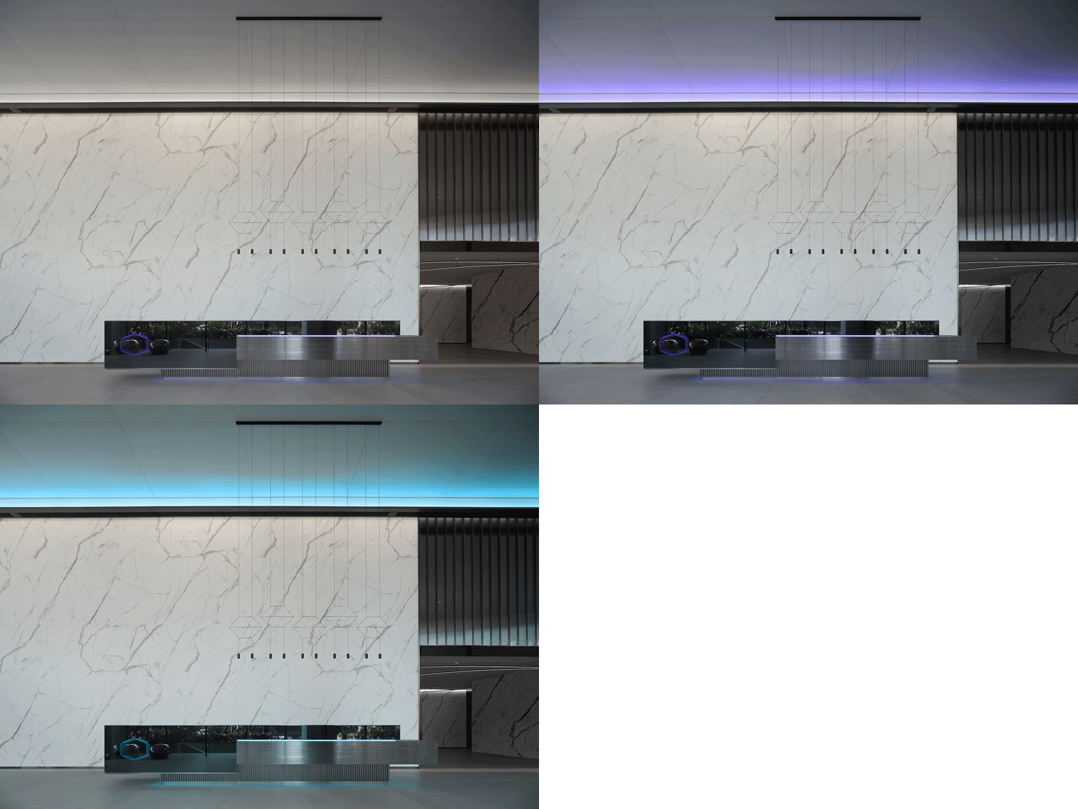
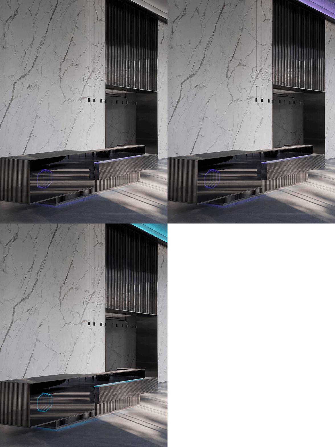
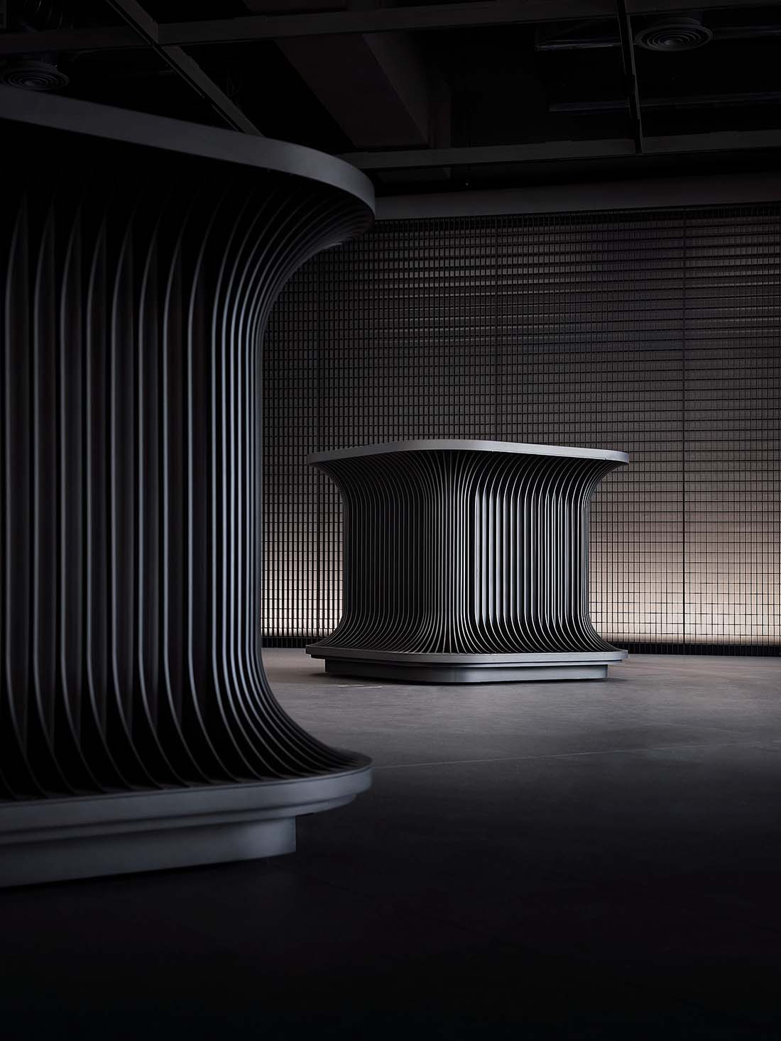
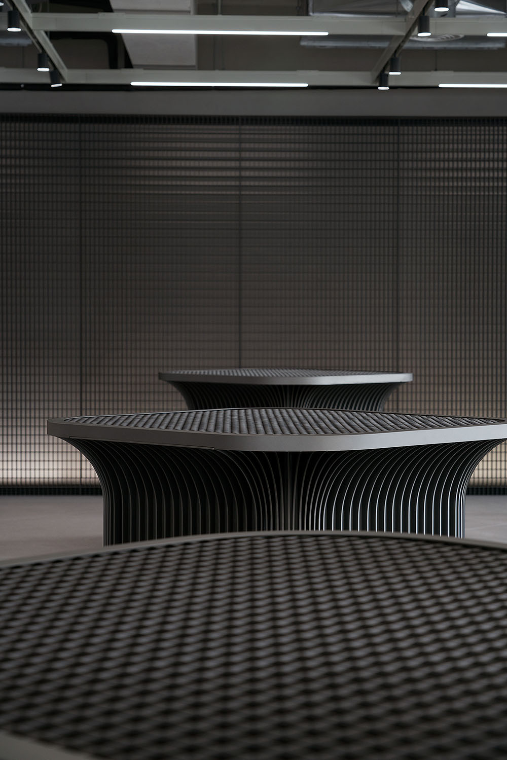
大堂接待台的形態取靈感自建築的外觀,由三組體塊錯落式拚接為一件藝術品,明朗的線條構成與凹凸的金屬質感亦是“散熱器”的概念轉化。
Composed of three staggered interpenetrating blocks, the reception desk in the lobby is inspired by the exterior of the building, appearing like a piece of artwork. Its neat lines and metallic texture take cues from “heat sink”.
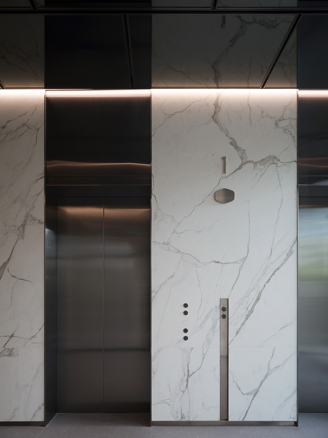
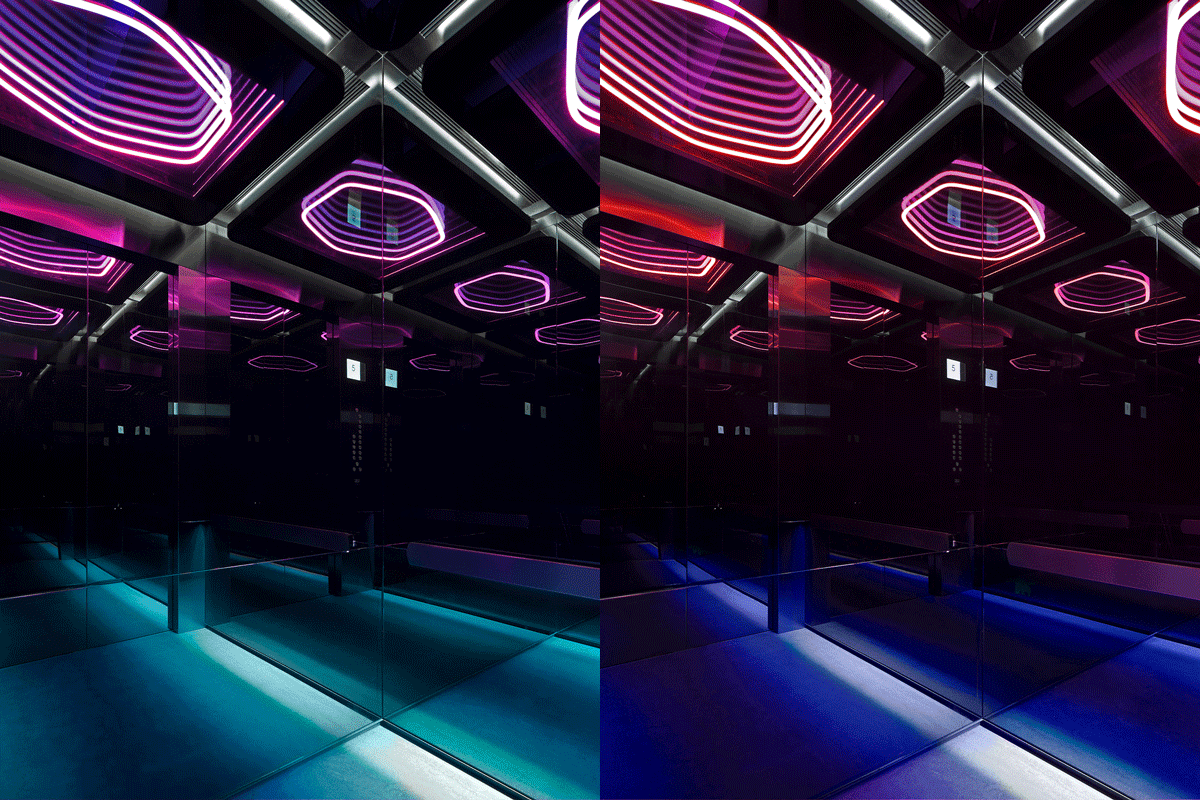
電梯區與之呼應,深色的圍合空間利用黑鏡麵反射創造無限延伸的視覺效果。
The elevator area echoes the lobby. The dark enclosed space, in combination with black mirror reflections, creates an infinite visual effect.
∇ 電梯廳 elevator hall
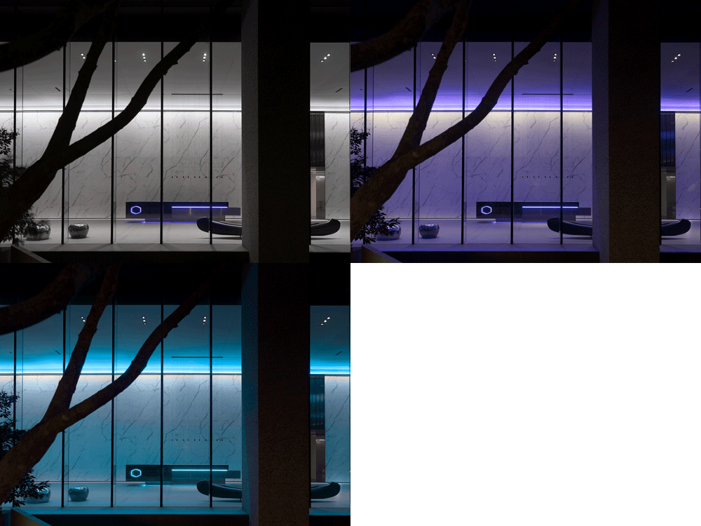
持續循環變色的燈光契合Cooler Master冷卻係列產品,同時對應不同場景的運用搭配。
The continuous cycle of color-changing lighting fits into the concept of Cooler Master’s well known cooling products and corresponds to their use in different scenarios.
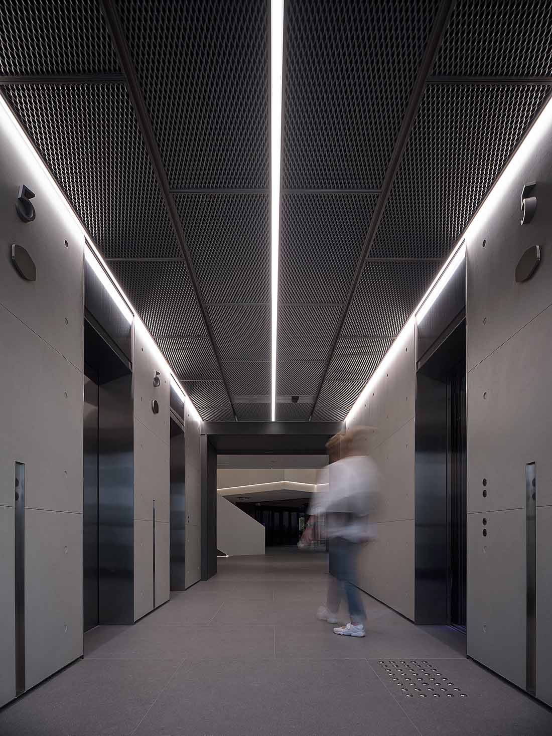
∇ 電梯內部 elevator
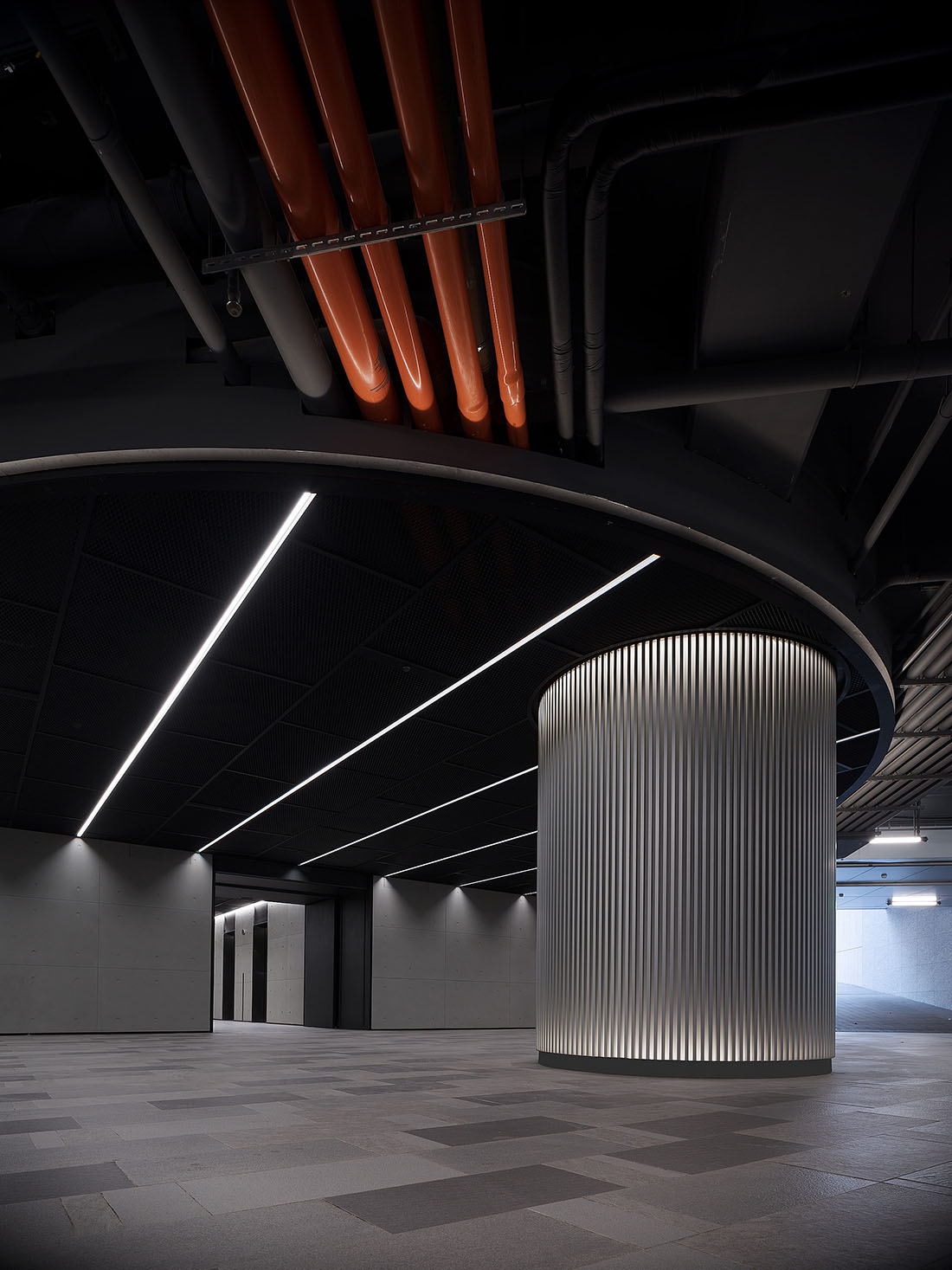
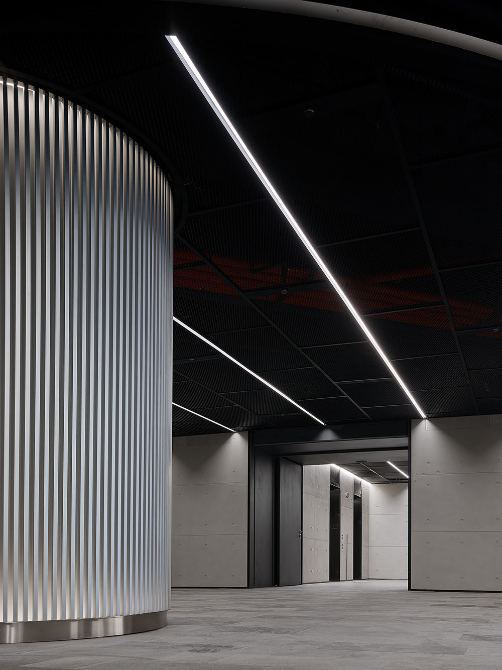
B1地下空間延續炫酷幾何的照明氛圍和金屬材質的矩陣結構,融合未來科技的神秘感與戲劇化的沉浸式體驗。
The underground space continues the stunning lighting and the metallic geometric structures, blending the mystery of futuristic technology with a dramatic immersive experience.
有機串聯的“階梯型”景觀藝術
Organically linked “stepped” landscape art
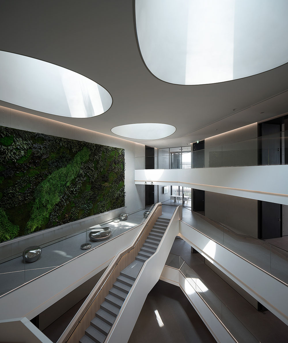
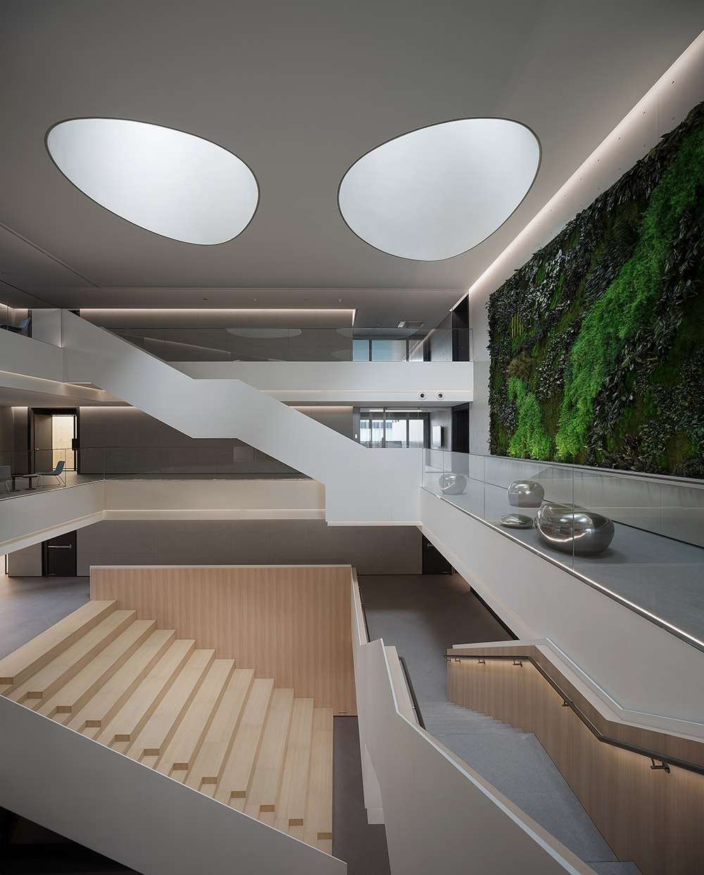
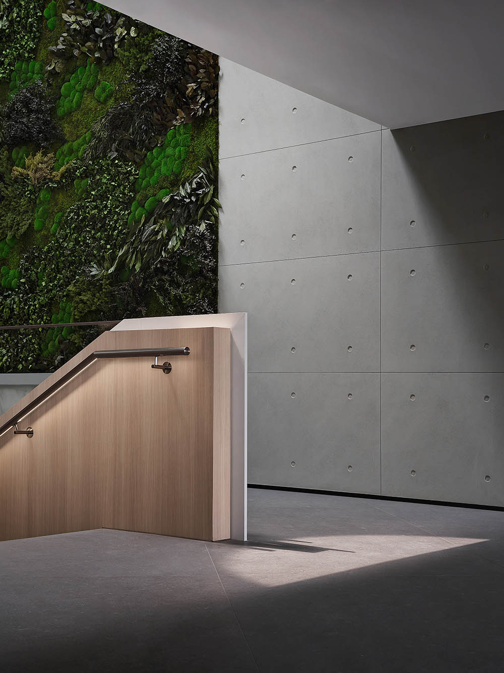
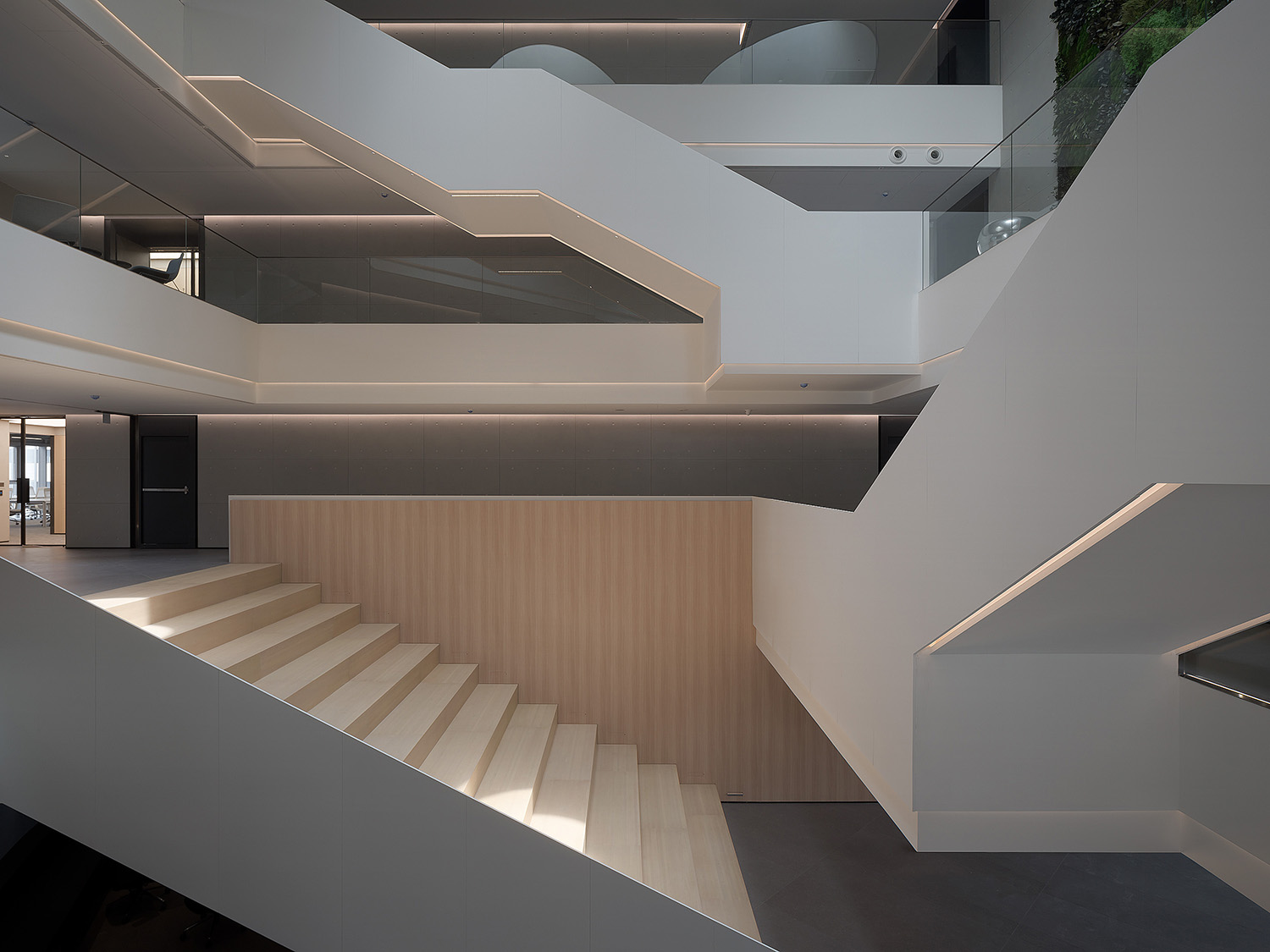
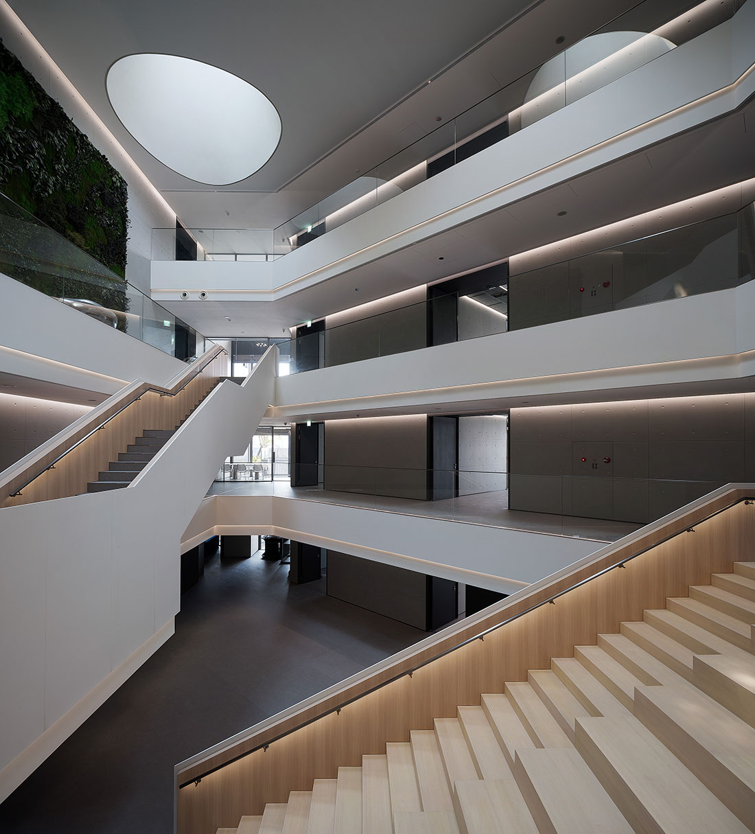
公共空間內的中庭以建築本體外牆清水模的樣式由外及內連貫統一,設計圍繞承載垂直動線的幾何階梯展開軟性的功能構思和藝術表現。
The central atrium space unifies the exterior and interior by extending the pre-cast concrete wall finishing in a coherent manner. Functionality and artistic expression are both emphasized in the design of the staircase that carries the vertical circulation.
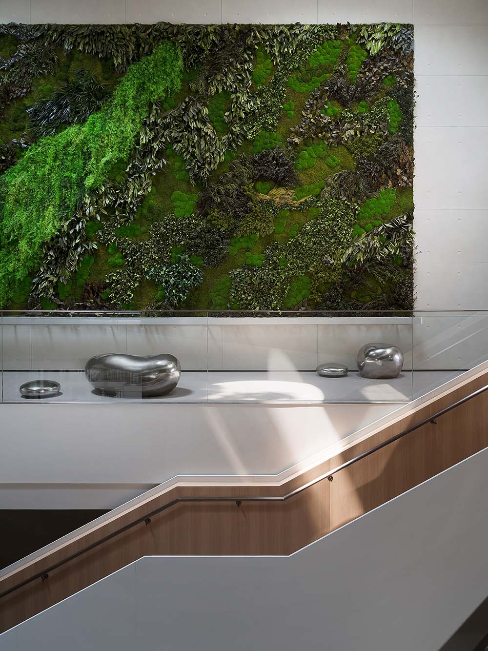
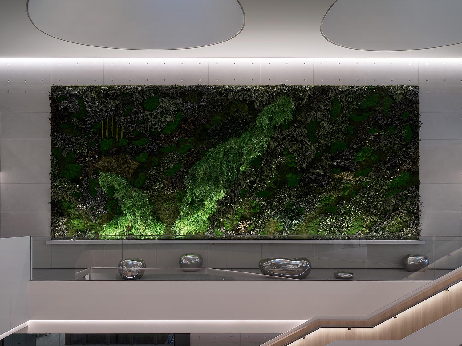
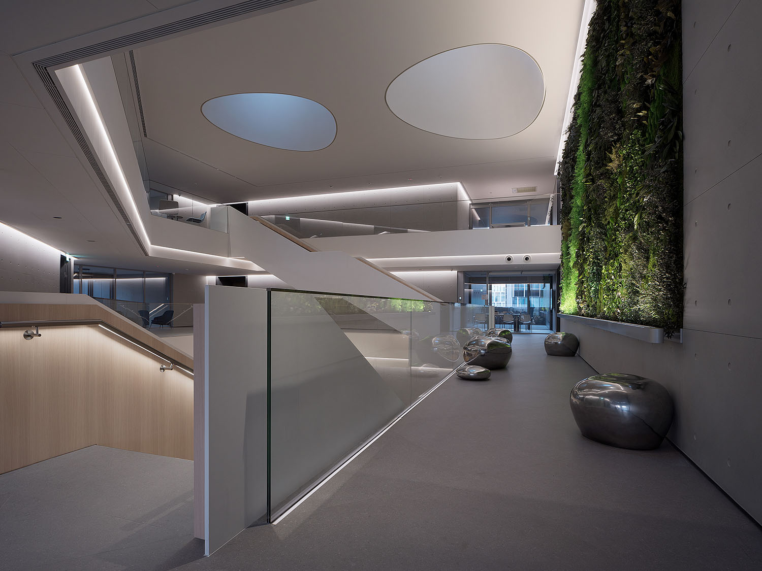
三顆天井保留建築師原本的空間元素,以GRG現場塑模製作成型,納入時間與季節更迭下的光影變化,聯動充滿呼吸感的綠植牆,為場所注入來自於大自然的親和撫慰。
The three organic skylights created by the architect are molded in glass reinforced gypsum (GRG) on site. The varying light and shadows introduced into the interior, along with the “breathing” greenery wall, infuses the place with the intimacy and comfort of nature.
∇ 中庭綠植牆 green plant wall
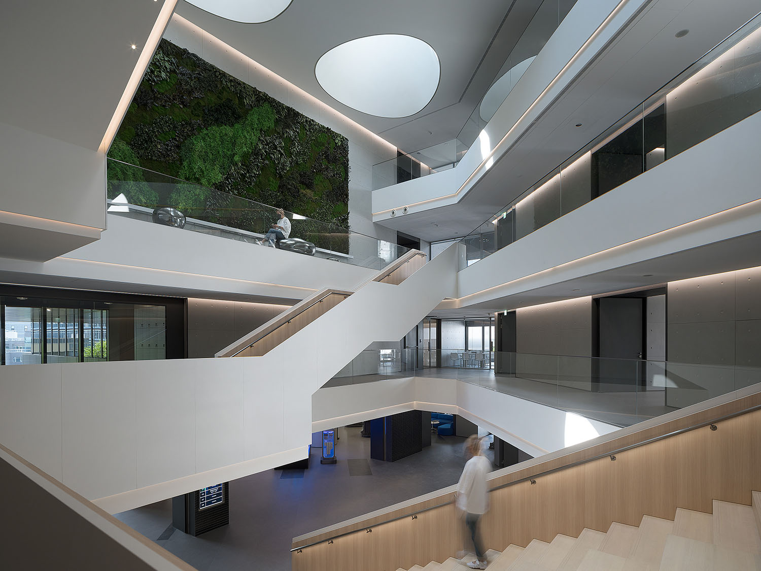
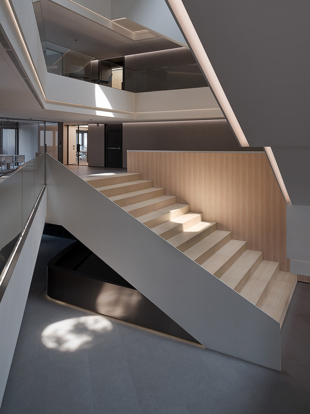
階梯的縱向折疊形態與橫向延伸的廊道相互疊合,容納開放共享的階梯教室及會議多功能室,將行進空間轉換為具有自由功能的公共活動區。
The grand staircase and horizontal corridors converge into the accommodating open shared amphitheater and multi-functional meeting area. This allows the traffic space to be transformed into a public activity area with full extension of flexibility.
∇ 中庭區 atrium
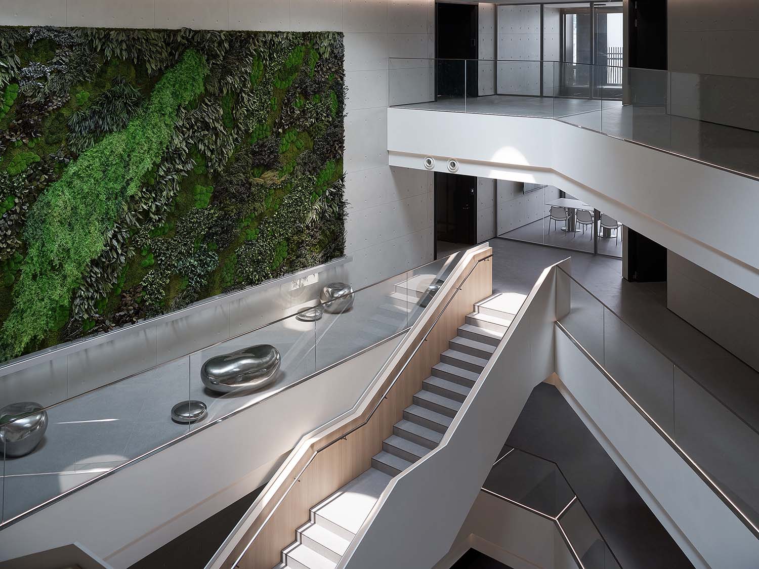
散落於角落的點狀墩座似回應天井的不規則形態,在使用機能與活潑氣息之間實現最佳平衡。
The pebble shape seats scattered in the corners respond to the irregular shape of the ceiling openings, achieving the balance between functionality and the unexpected.
燈光線條跟隨著空間的階梯結構,以上下遠近交織的立體變化豐富視覺層次,隱藏式的燈帶極其克製,在保障空間基礎照明需求的同時達成節能環保的訴求。
The linear lightings outline the staircase structure that floats within the atrium with changes in height and distance to enhance a unique visual experience. The indirect lighting throughout the atrium space offers the basic lumination while contributing to energy saving and environmental protection with the implementation of smart lighting control system.
自由開合的“模塊化”辦公序列
Free “modular” office units
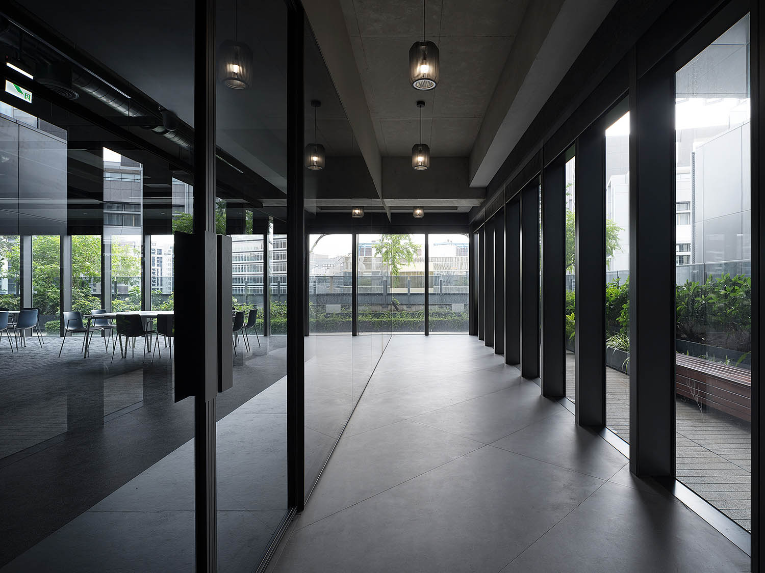
主體辦公區域分為對外與對內的兩種麵向,設計定案則是與業主深入討論之後的最優解法,保留最大彈性以符合企業組織的即時變動性,在此條件下尋求開放空間的完整性及其與機能空間之間的平衡。
The main office area is divided based on internal and external purposes. After in-depth discussion with the client, the design team worked out an optimal solution, which allow maximal flexibility to meet immediate changes in the organization and meanwhile maintain the integrity of the open space and the balance between the different functional areas.
∇ 空間概念圖 space concept © DESFA GROUP INC.
∇ 公共走廊 corridor
其中一個樓層以對外空間為主,包含企業核心價值展示區及會議室。
The multi-functional floor including a showroom area dedicated to displaying the company’s core values and meeting rooms.
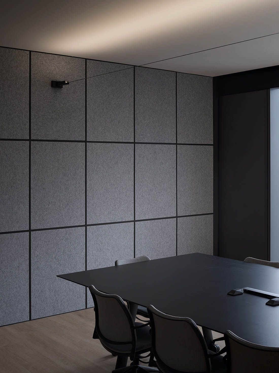
∇ 會議空間 meeting space
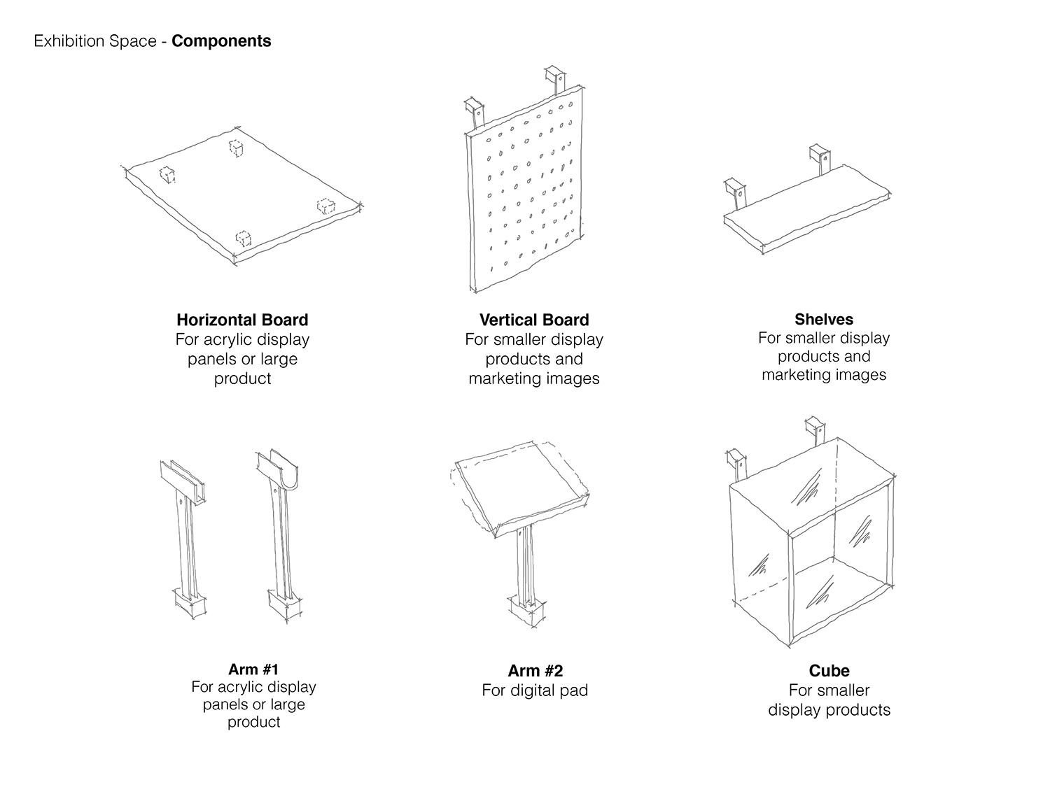
展示區裸露的天花與軌道式照明,充分對應多樣活動需求的使用,配合固定展示或新品發布等營銷活動可增減天花照明,立麵網格造型也保留最大彈性以滿足可能出現的陳列需求。
The exposed ceiling and the interchangeable track light system in the display area is designed to satisfy the needs of various activities such as exhibitions or launches of new products.
∇∇ 多功能區 multi-functional area
∇ 展示區道具概念 exhibition area – system © DESFA GROUP INC.
∇
∇ 展示櫃細節 display case detail
多功能區以可移動的隔間係統,在有限空間中實現最佳利用率。
Furthermore, the grid wall structure along with the customized mobile display furniture system is designed to meet various display needs.
∇ 多功能區 multi-functional area
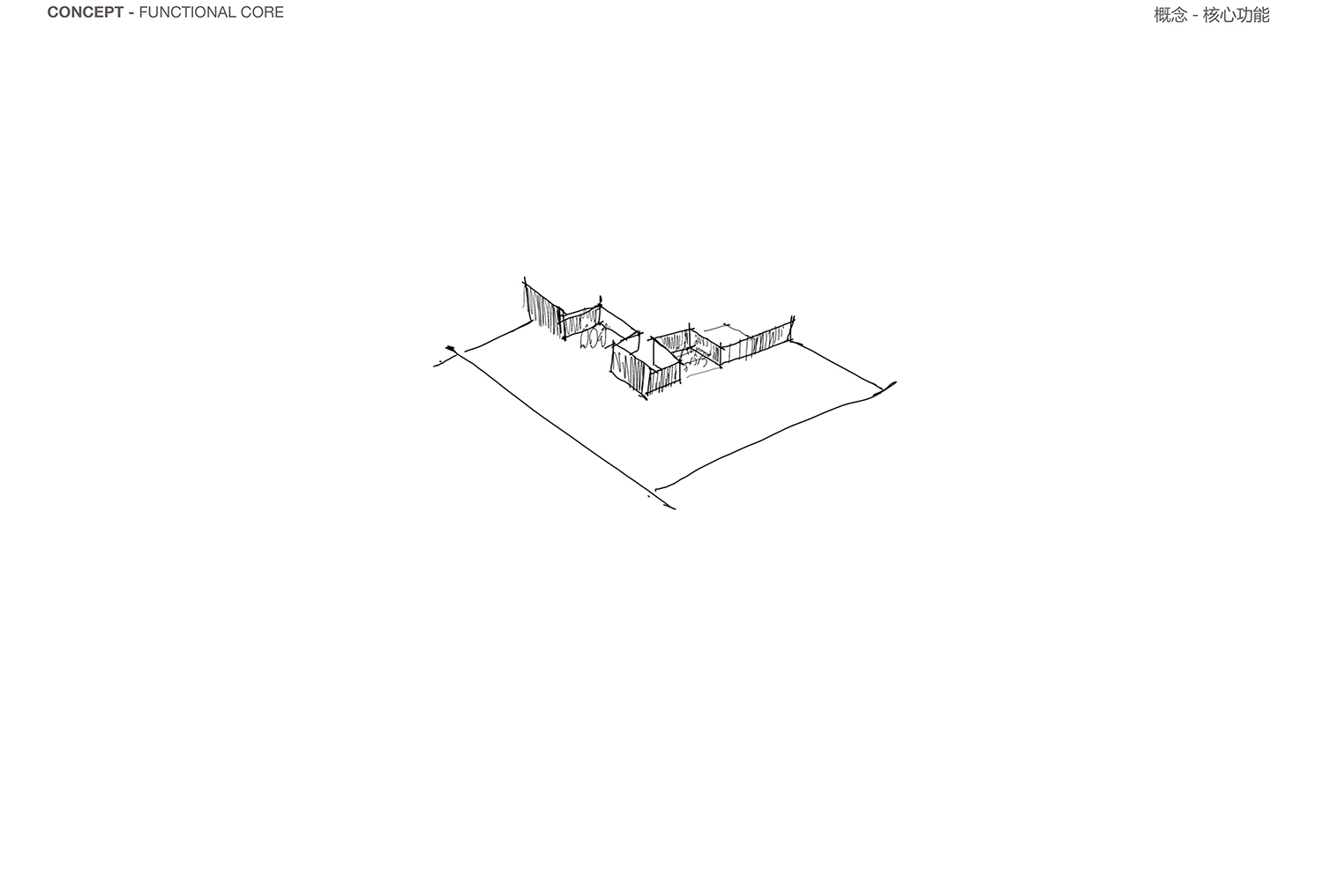
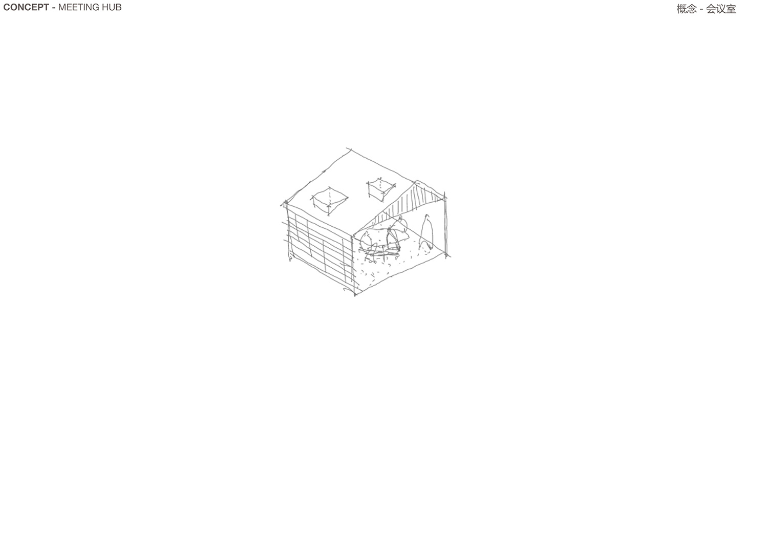
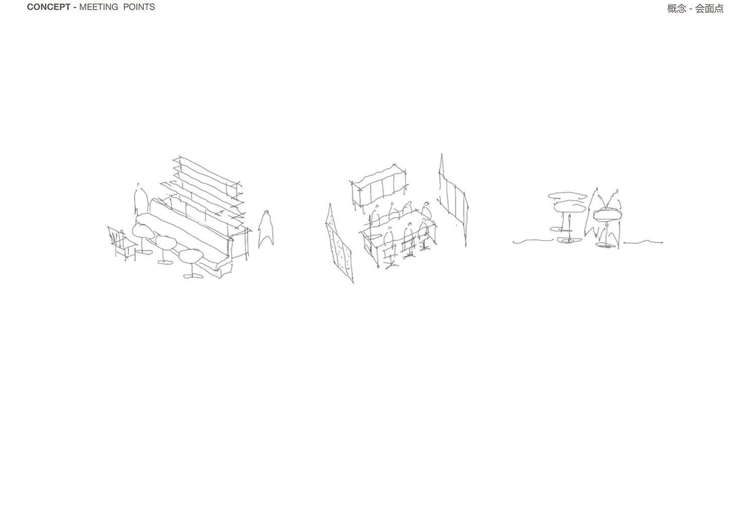
對內辦公空間,旨在創造協同高效而自由流動的工作環境。
The internal office space was designed to create a collaborative, efficient and open working environment.
∇ 核心概念圖 concept – functional core © DESFA GROUP INC.
∇ 會議室概念圖 concept – meeting hub © DESFA GROUP INC.
∇ 討論區概念圖 concept – meeting points © DESFA GROUP INC.
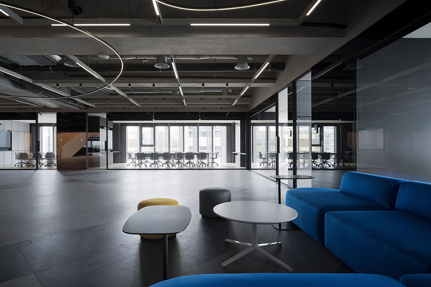
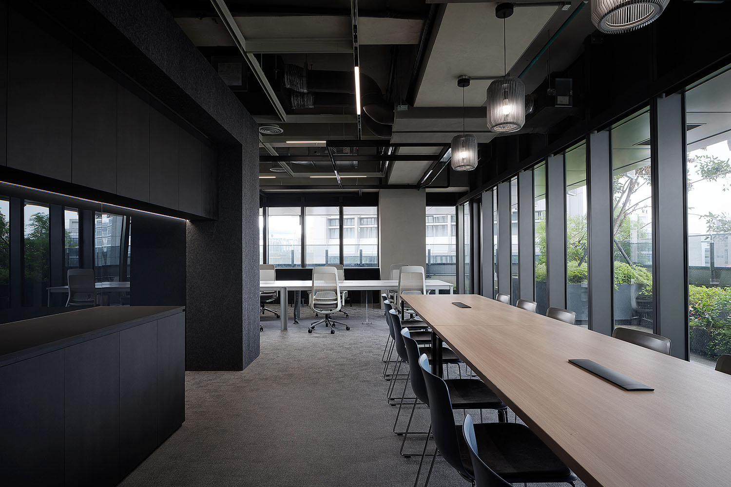
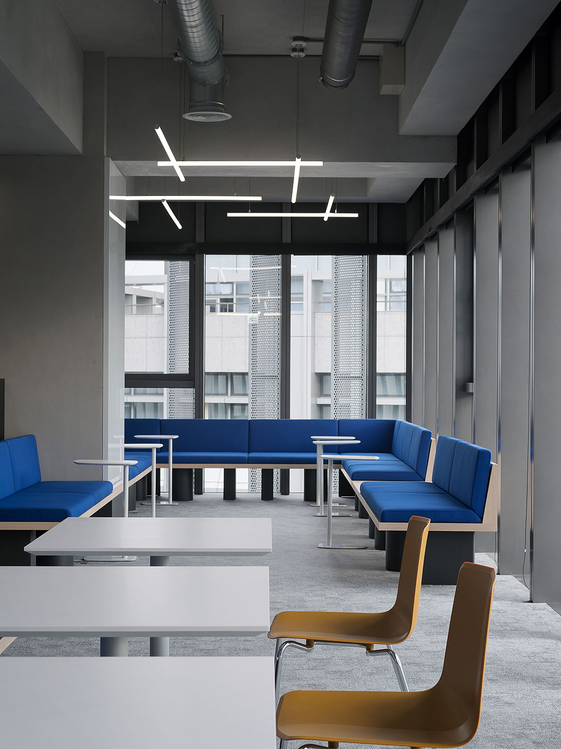
∇ 討論區 discussion area
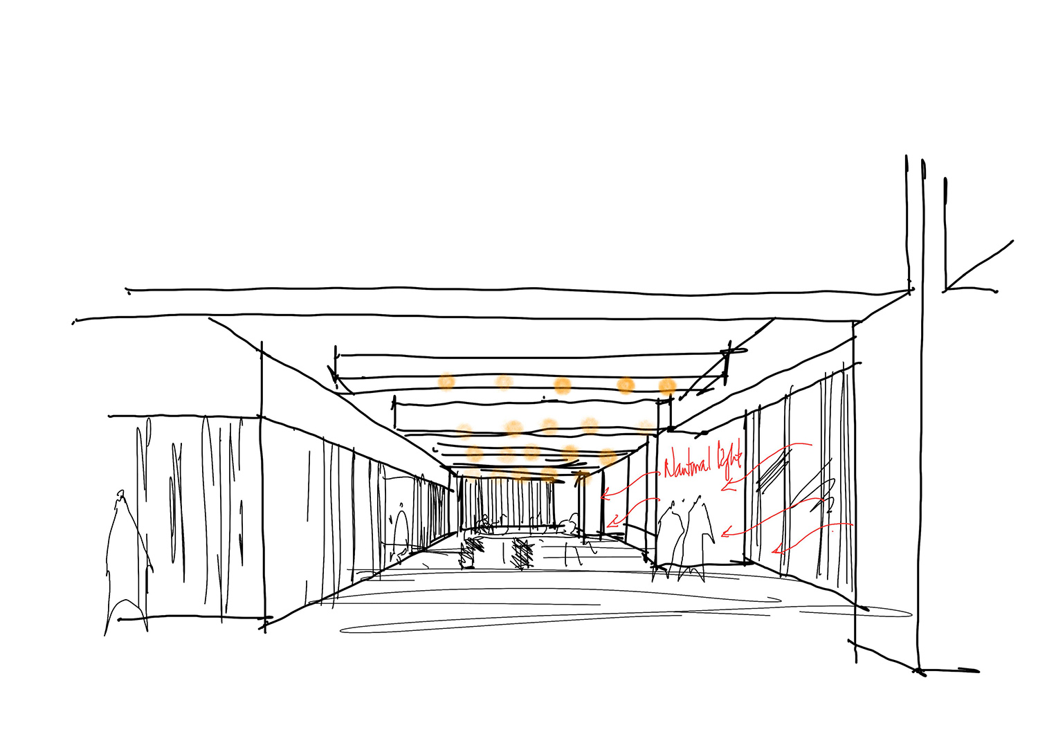
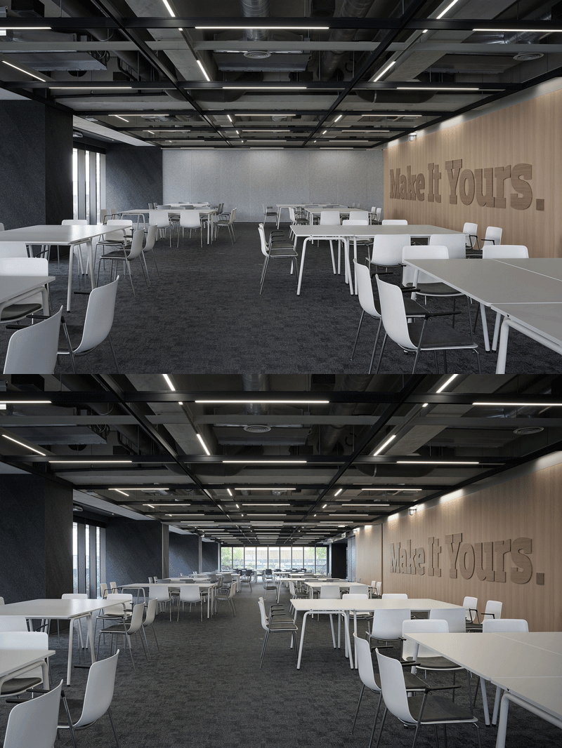
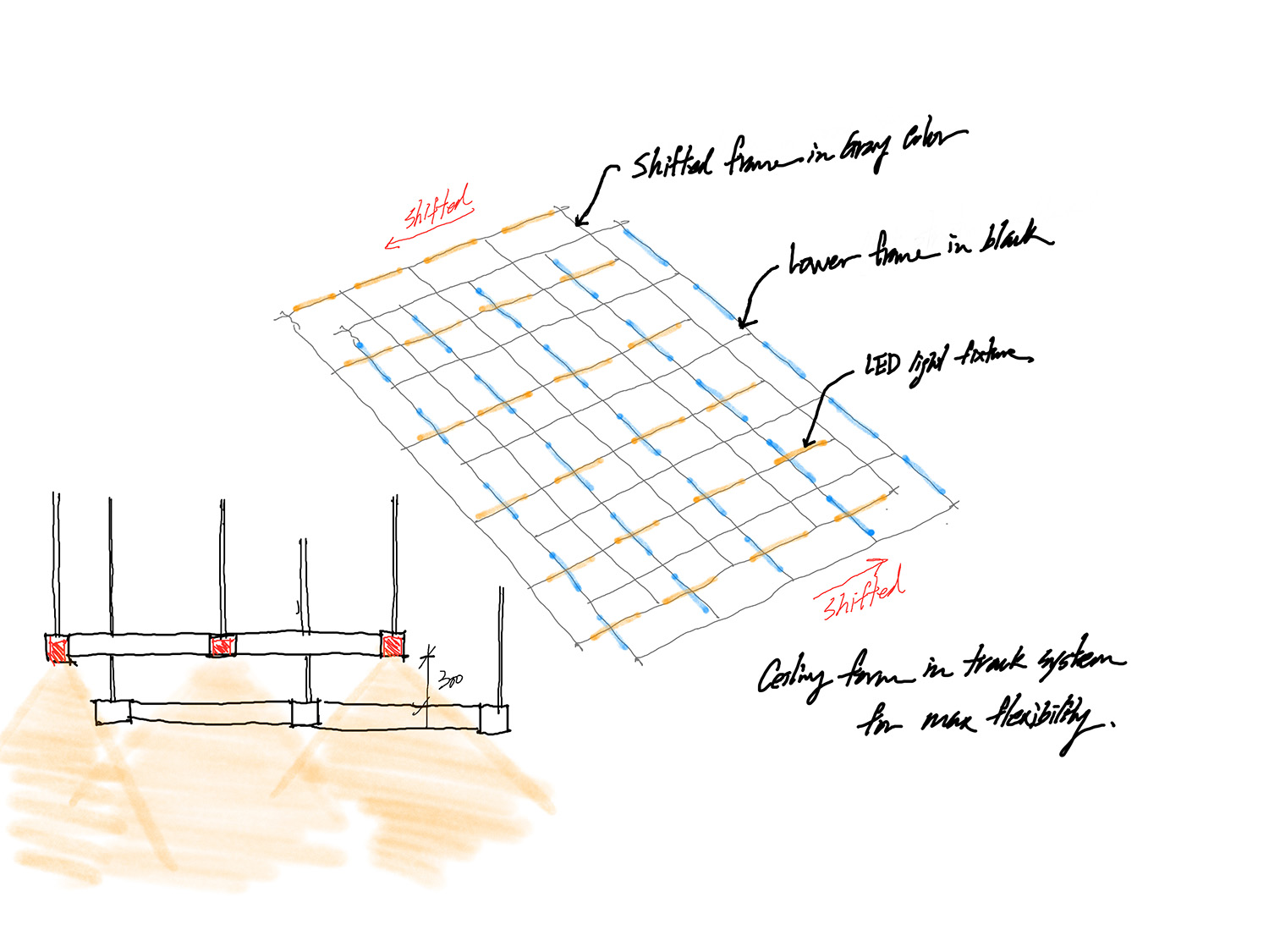
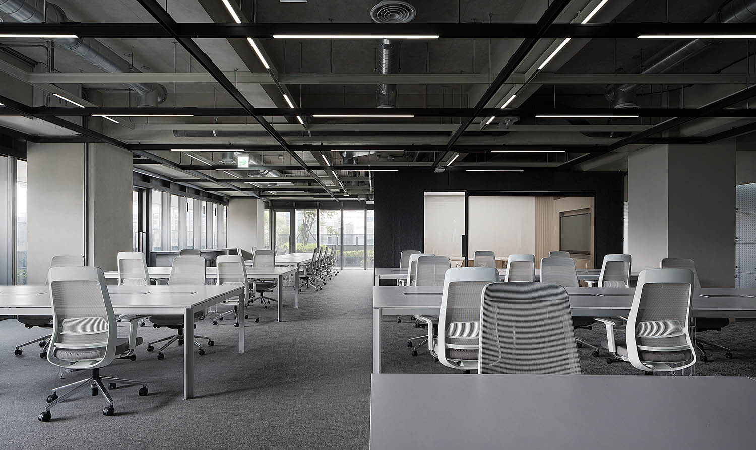
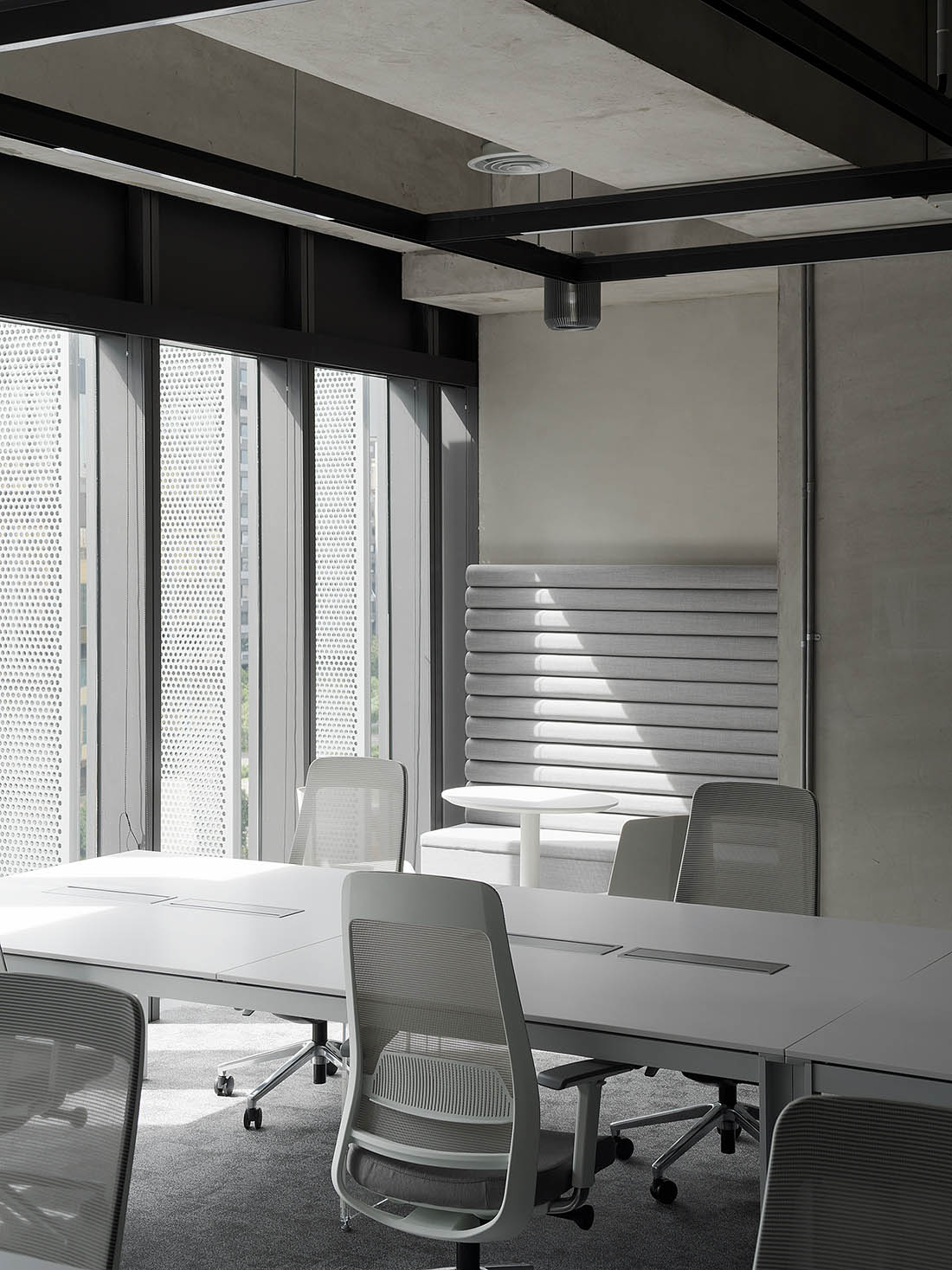
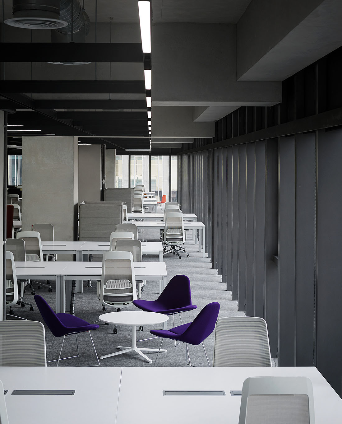
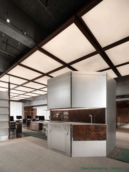
設計師將優質采光環境預留給開放辦公空間,踐行注重個體感受與需求的企業人本價值觀。延續原有的天花結構,覆以黑灰兩色的雙層框架體係,縱橫交錯的軌道燈滿足現有照明需求並可靈活調整以適應未來功能升級。
The designers fully utilize the optimal daylighting conditions for the open office space, which responds to the company’s values that emphasizes the staff’s particular mood and needs. By keeping the ceiling exposed with original building structure, the designer implements a double layered track system in black and gray color with a simple shift in position to meet the existing lighting demands and give the flexibility for any future adjustment.
∇ 天花概念 ceiling concept © DESFA GROUP INC.
∇ 開放辦公區 open office area
∇ 會麵區 meeting area
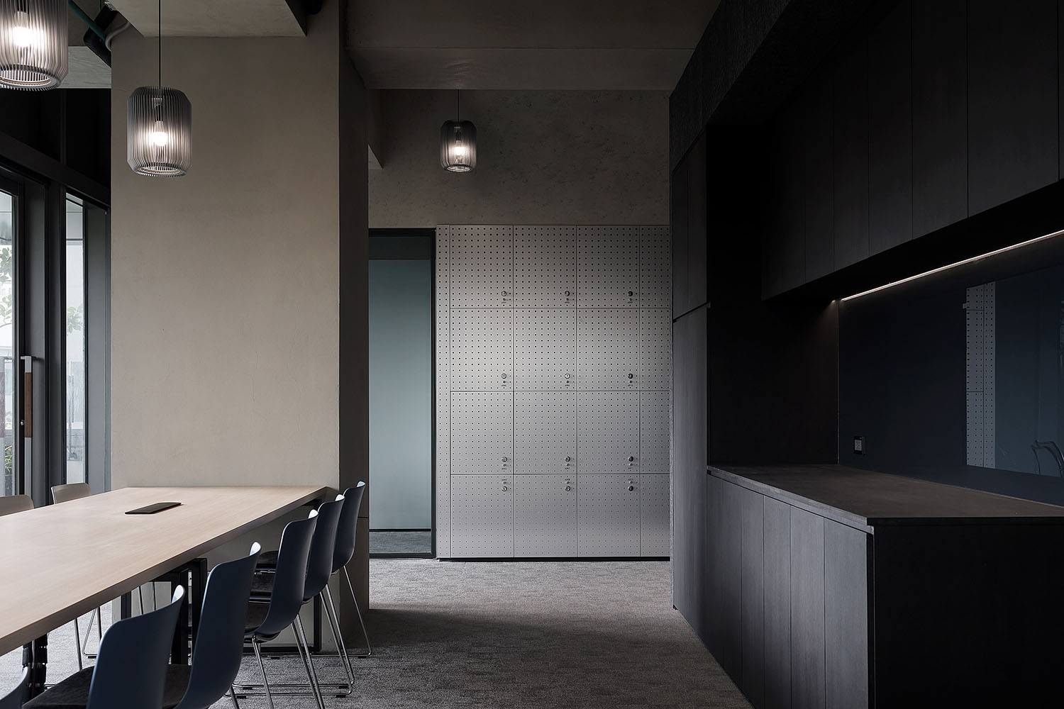
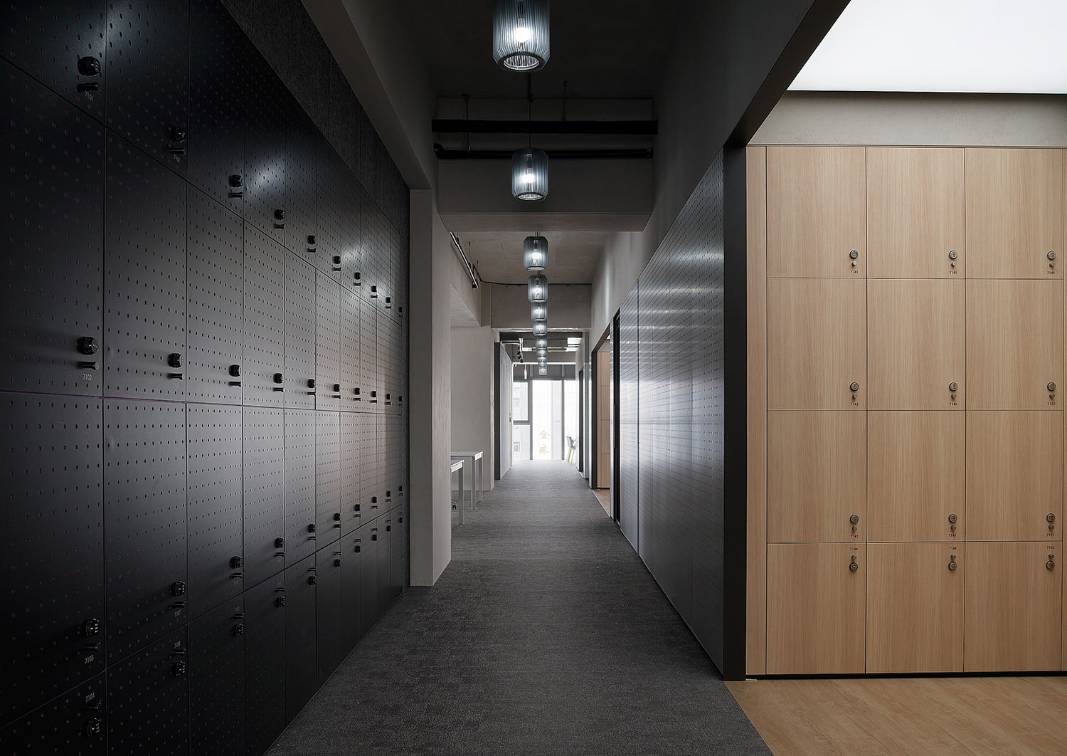
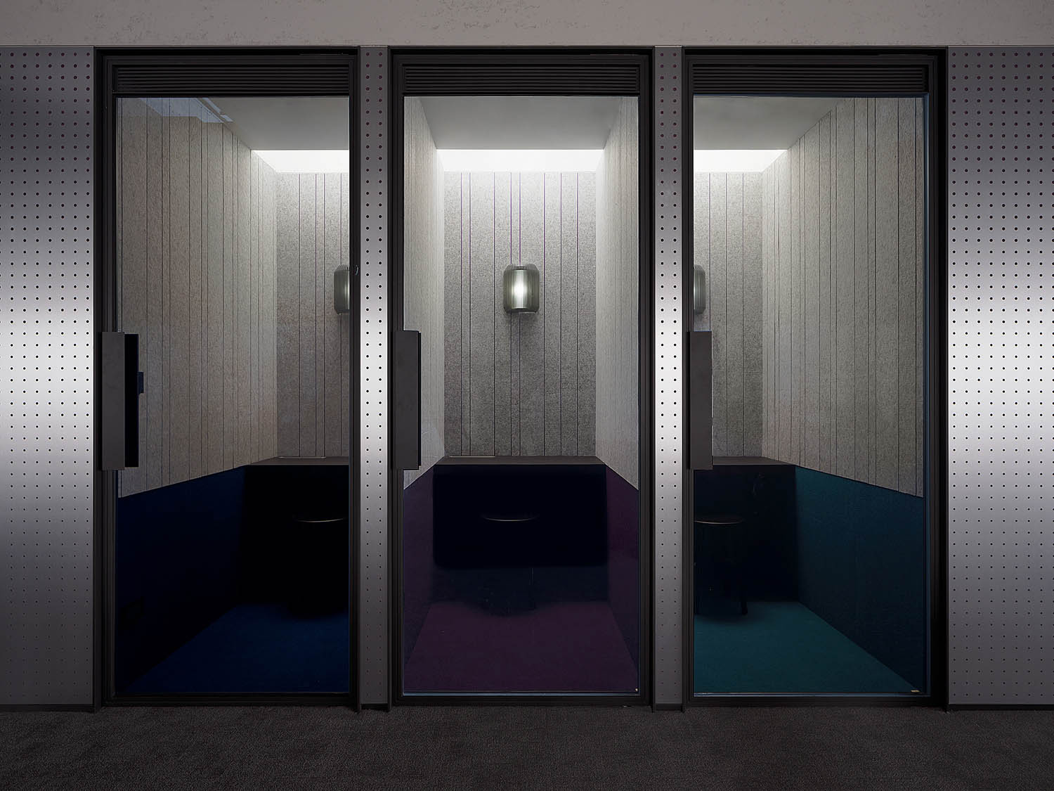
置物櫃/機房/電話亭等封閉型空間歸納在結構隔間牆的同一側,保留視覺通透及空間使用彈性。
The enclosed spaces, such as lockers, computer rooms, and telephone booths, etc., are set on the same side of the partition walls to retain visibility and flexibility of the spatial use.
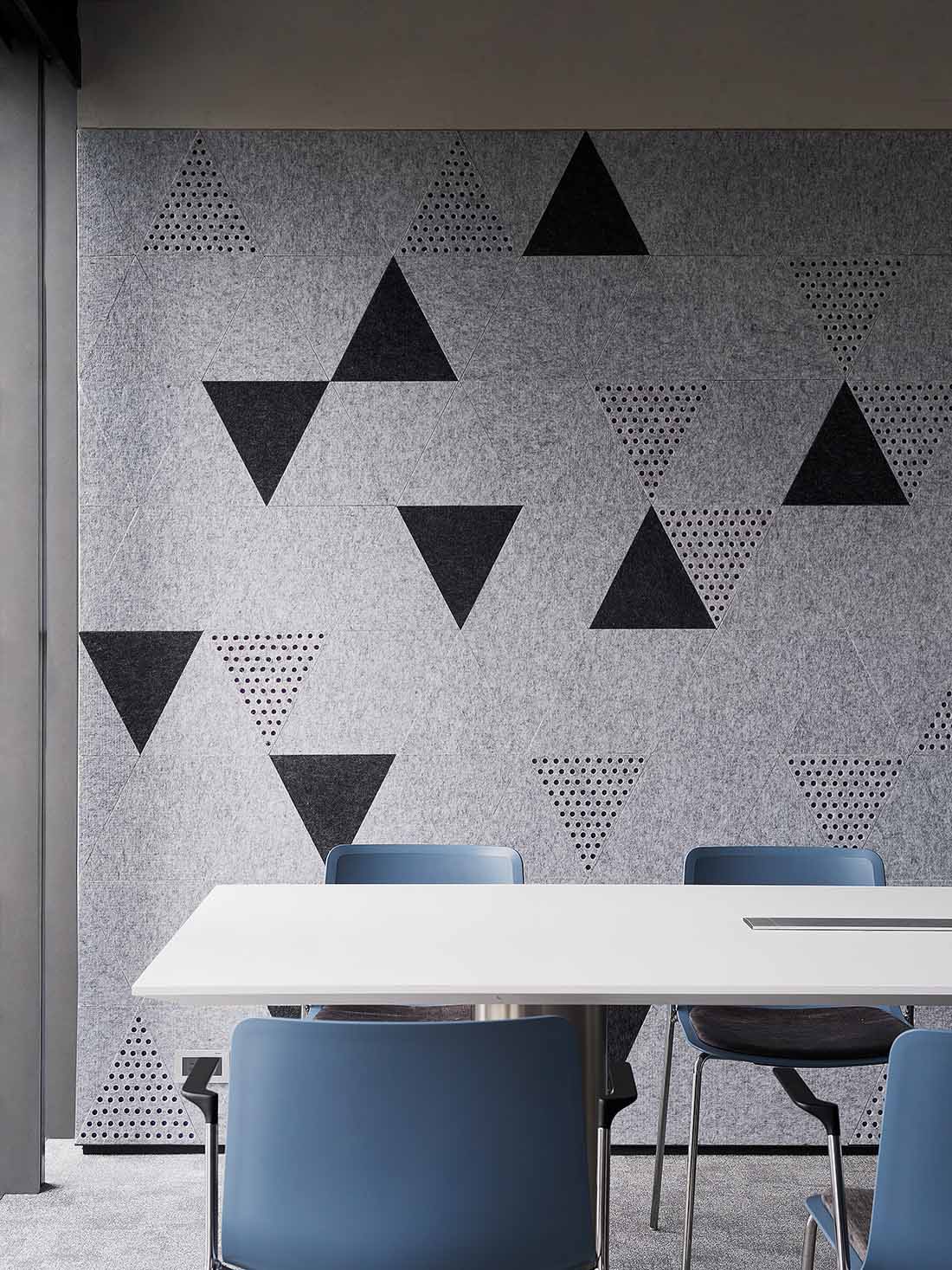
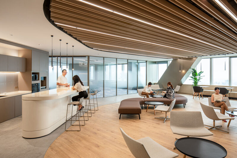
整體空間中配置有多元特性的工作場域,滿足不同行為尺度與私密要求的使用選擇。材質堆棧與紫色細節的穿插運用為簡潔內斂的空間增添獨特定製的巧思。
The space is configured with diverse functional areas to meet different activities and requirements for scale and privacy. The interplay between materials and the dotted purple details adds a unique and customized touch to the simple, restrained space.
∇ 開放辦公區 open office area
∇ 討論區 discussion area
Desfa Group透過多維度獨立變量的係統整合,將Cooler Master所推崇的“創客精神”落地為表達價值和實現體驗的空間媒介,在理性與感性之間升華更具包容度和生命力的辦公新內涵。
Through the systematic integration of multi-dimensional factors, Desfa Group interpreted the “maker spirit” advocated by Cooler Master into a spatial medium for expressing values, realizing experiences, and a working environment that promotes greater inclusiveness and vitality with a sense of rationality and sensibility.
項目信息
項目名稱:Cooler Master創客大樓
項目地點:中國台灣 台北
項目類型:辦公室內設計、共享辦公室內設計、辦公建築
項目麵積:7013㎡
完工時間:2021.8
設計範圍:公共區域、辦公區域
室內設計:DESFA GROUP INC.
設計團隊:Howard Wang、Michael Dungca、Aleksandra Kaminska、Anja Chen、Noki Lin、Emi Kuo
建築設計:郭旭原聯合建築師事務所
攝影師:Wu Guo Hao
Project name: Cooler Master Taipei Office
Location: Taipei, Taiwan, China
Category: office interior, co-working interior, office building
Area: 7,013 square meters
Completion time: August 2021
Design scope: public area, office area
Interior design: DESFA GROUP INC.
Design team: Howard Wang, Michael Dungca, Aleksandra Kaminska, Anja Chen, Noki Lin, Emi Kuo
Architectural design: Hsuyuan Kuo Architects & Associates
Photography: Wu Guo Hao


