城市裏的世外桃源
never slow down
傳統現代相互融合
Traditional and modern fusion
從不放慢腳步
Paradise in the city
但堅決不去迎合
But definitely not to cater to
WEI SPACE是一間純正的西餐店, 項目坐落在太原市鬧事區的街邊。臨街帶院落的鋪麵對主理人來說是可遇不可求的。我們也格外珍惜這一處美景,希望能以最合適設計將項目完美呈現。
WEI SPACE is a pure western restaurant. The project is located on the street in the troubled area of Taiyuan City. The shop facing the street and the courtyard is hard to come by for the manager. We also cherish this beauty and hope to present the project perfectly with the most suitable design.
∇ 項目概況 Project Overview
後疫情時代我們的生活似乎都被按下了快進鍵,習慣了與時間作鬥爭,原本忙碌的身影變得更加繁忙,而作為設計師的我們,在思考後疫情時代城市或生活能否更加安靜與友善,讓大家疲憊的身心得到一絲慰藉與放鬆。
In the post-epidemic era, our lives seem to be fast-forwarded. We are accustomed to fighting against time. Our busy figures have become even busier. As designers, we are thinking about whether the city or life can be better in the post-epidemic era. Quiet and friendly, so that everyone’s tired body and mind can get a little comfort and relaxation.
入口&吧台 DOOR & BAR
餐廳的入戶處給客戶的第一印象做好極為重要。設計之初,我們依照著原始的場地因素,以原始的承重結構,在入口與吧台的操作去之間加入了一條連廊,這裏不僅作為室內外的緩衝區域,同時也作為整個空間的交通中心,串聯起室內的整個動線
It is extremely important to make a good first impression on customers at the entrance of the restaurant. At the beginning of the design, in accordance with the original site factors and the original load-bearing structure, we added a corridor between the entrance and the operation of the bar, which not only serves as a buffer area for indoor and outdoor, but also serves as the traffic center of the entire space. , connecting the entire moving line in the room in series.
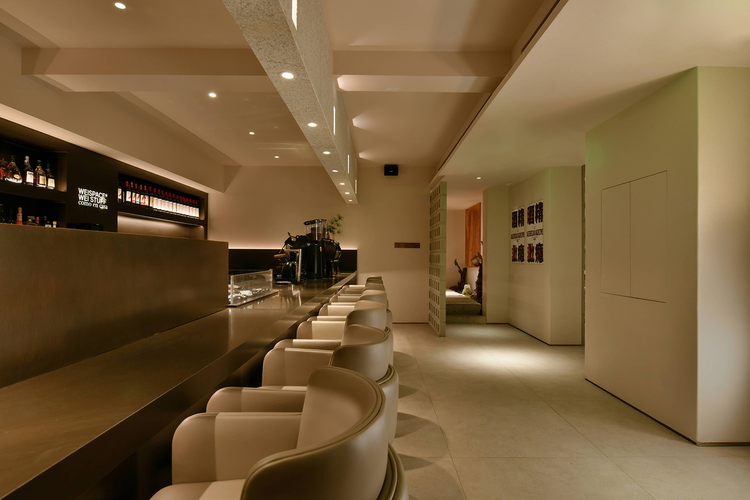
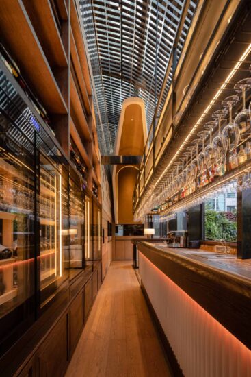
吧台操作區/收銀區呈一字型布局,顧客繞過玄關後,第一視野看到專業的飲品製作區及收銀區。我們通過優化利用通道空間的尺度,將各種餐飲專業設備的合理布局,盡可能的用好每一寸有限空間,溫和的室內色調等恰到好處的給於了顧客專業,健康,親切的就餐第一感。
The bar operation area/checkout area is in a line-shaped layout. After customers bypass the entrance, they can see the professional beverage making area and the cashier area at first sight. By optimizing the use of the scale of the passage space, we have rationally arranged various professional catering equipment, and made the best use of every inch of limited space. The mild interior colors are just right to give customers a professional, healthy, and friendly first sense of dining.
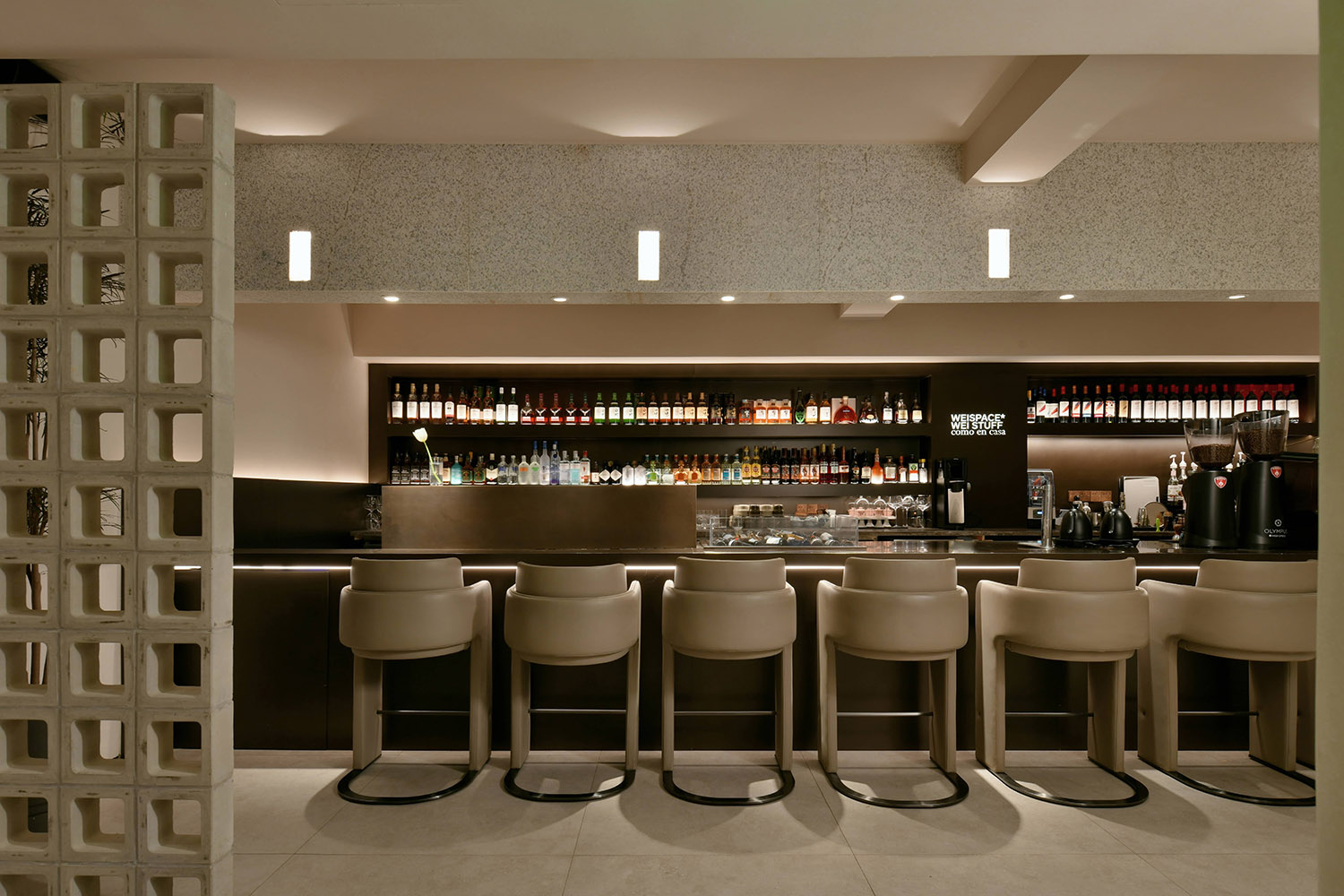
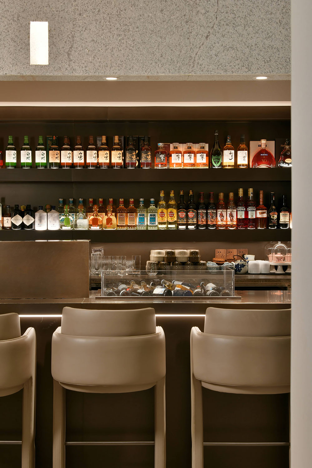
吧台,作為空間視覺核心,由仿古銅板搭配暖係燈光組成。因其涉及點單收銀、咖啡製作、麵包陳列等核心功能,故在櫃體規劃與立麵點線設計中遵循祛繁就簡、突出核心的思路,規整有序,層層遞進。
The bar, as the visual core of the space, is composed of antique copper plates and warm lighting. Because it involves core functions such as ordering and cashiering, coffee making, bread display, etc., the cabinet planning and façade point and line design follow the ideas of eliminating complexity and simplicity, highlighting the core, orderly and progressive.
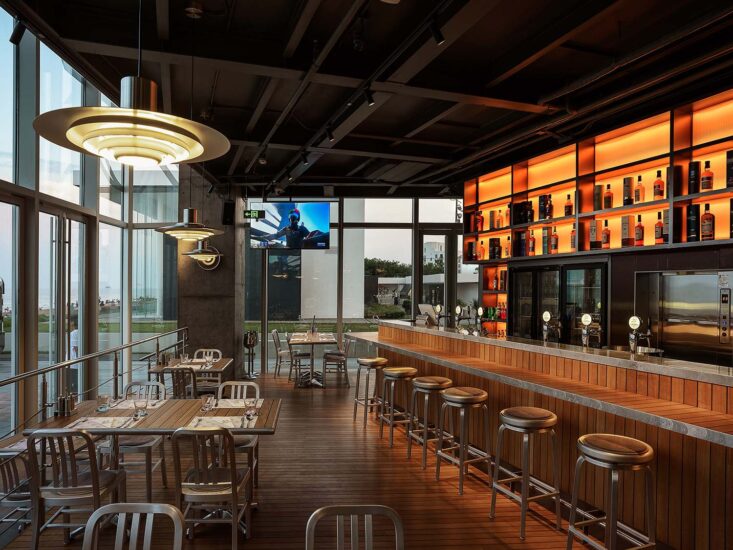
藝術漆盡可能的還原自然的質感,不做多餘的裝飾。集中精力將吧台豐富起來,通過琳琅滿目的酒水和燈光設置,以及黃古銅色的金屬質感,形成一個較好的視覺中心點。空間中始終以人為本,人在中央吧台處操作就成了磁場中心點。人們在吧台以外的落座,可以得到較為私密和舒適的體驗感。
Art paint restores the natural texture as much as possible without any extra decoration. Concentrate on enriching the bar, and form a better visual center point through a dazzling array of drinks and lighting settings, as well as the bronze-colored metal texture. The space is always people-oriented, and people operating at the central bar become the center of the magnetic field. When people sit outside the bar, they can get a more private and comfortable experience.
就餐區 Ⅰ DINING & LANE
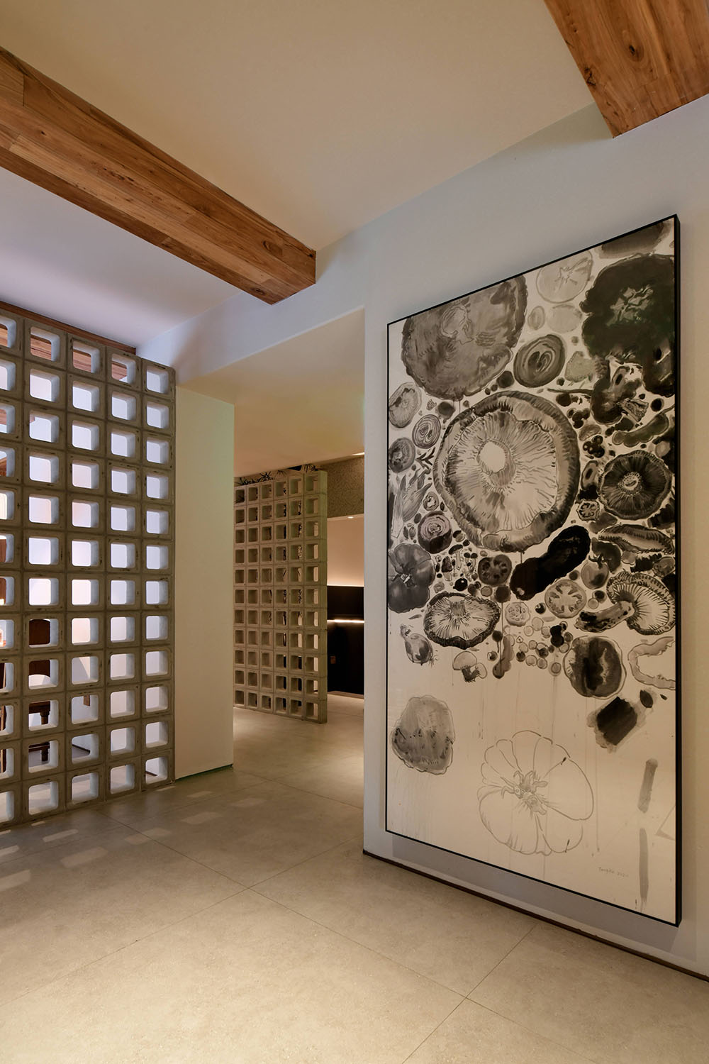
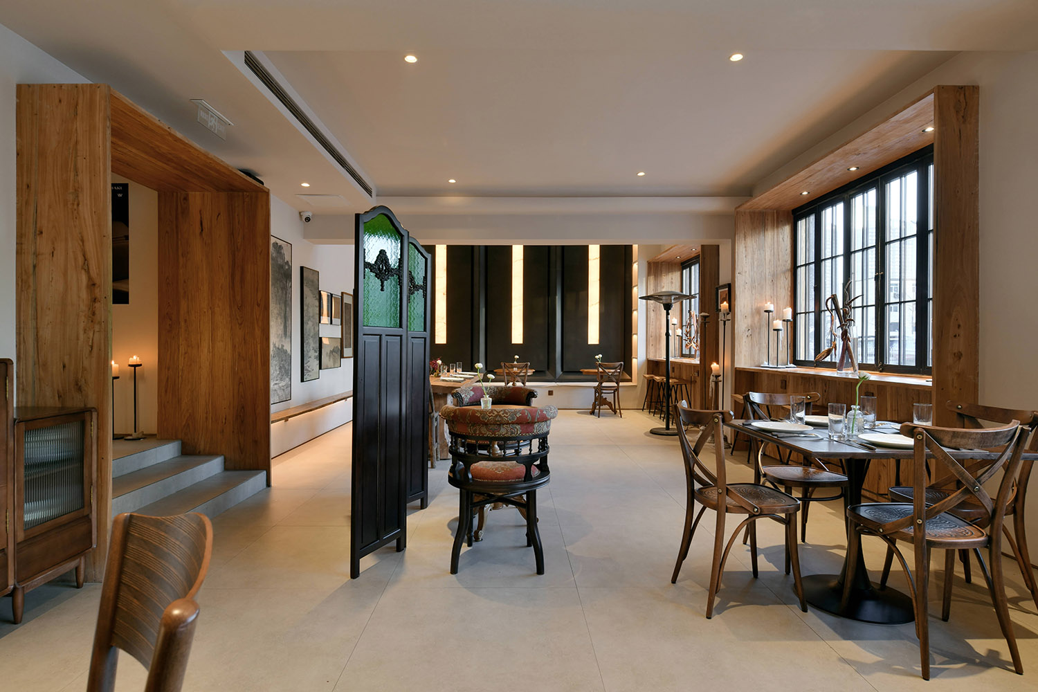
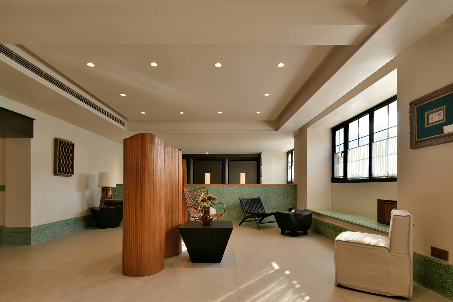
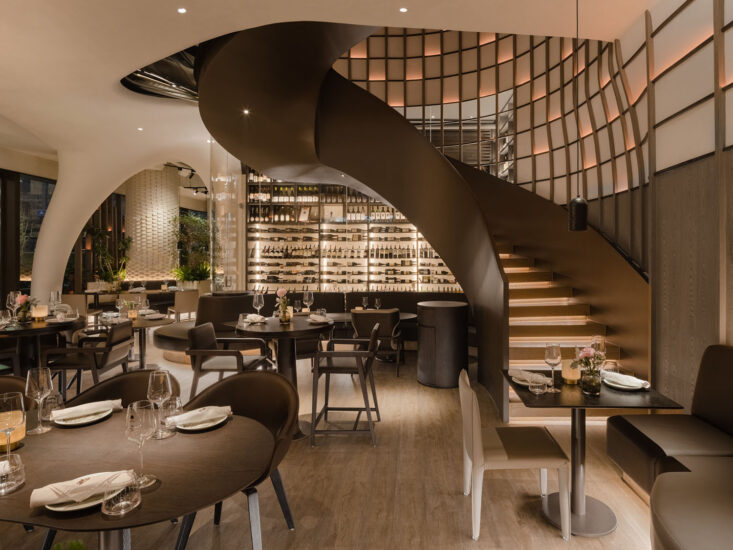
一層空間絕不能推掉的隔牆,空間分散帶來的局限性,給設計帶來了諸多挑戰。我們需要更謹慎、合理、討巧的梳理動線關係,以保證客人進入到室內後的能自在的通達各功能空間,同時設法帶給空間趣味性、豐滿的就餐情景感,進一步充盈室內的自然光線,並使用了更為舒適的自然通風。
The partition wall that must not be removed in the first floor space, and the limitations brought by spatial dispersion brought many challenges to the design. We need to sort out the relationship between the moving lines more cautiously, reasonably and ingeniously to ensure that the guests can freely access various functional spaces after entering the room, and at the same time try to bring the space interesting and full of the dining scene, and further fill the interior with natural light. , and uses natural ventilation for more comfort.
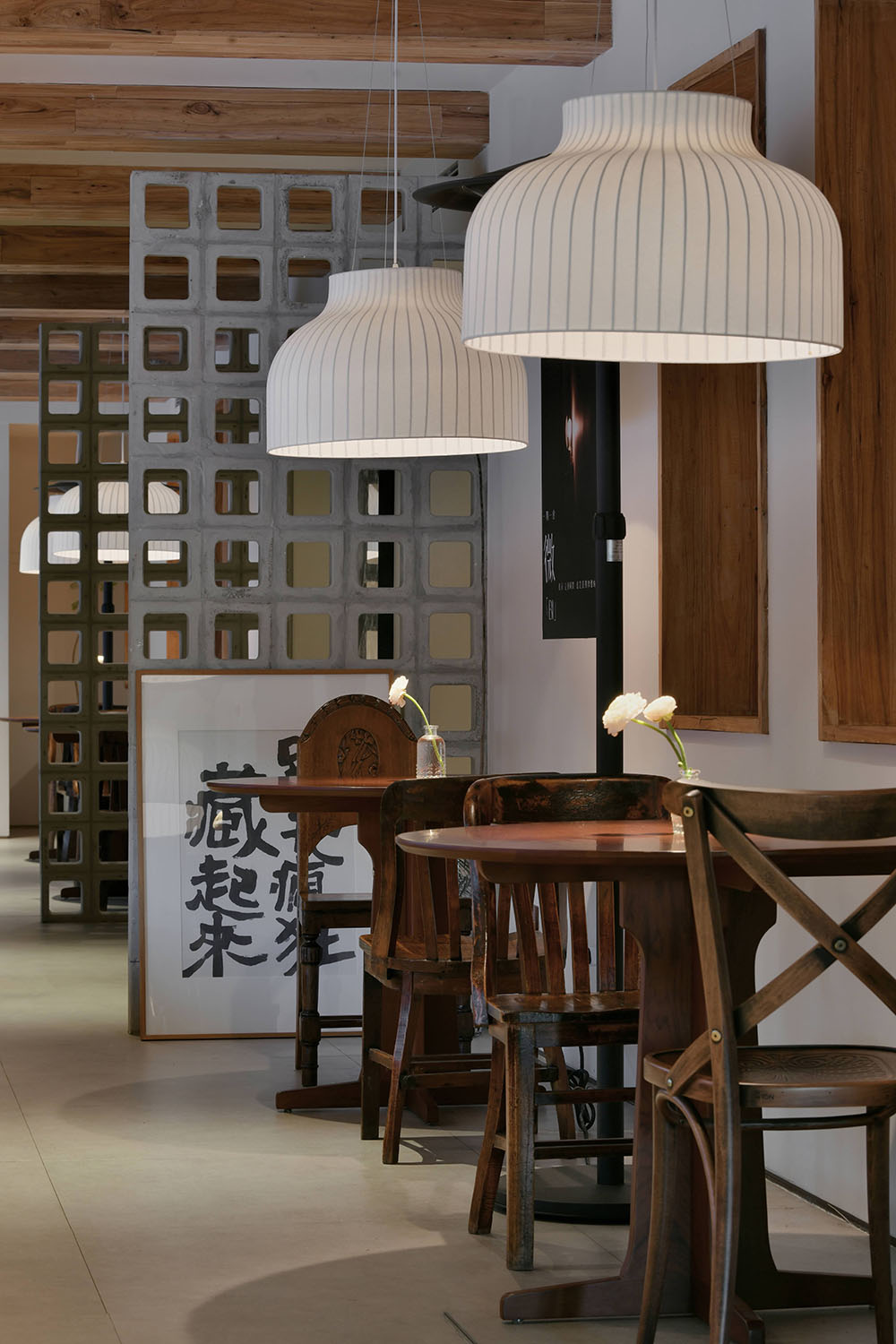
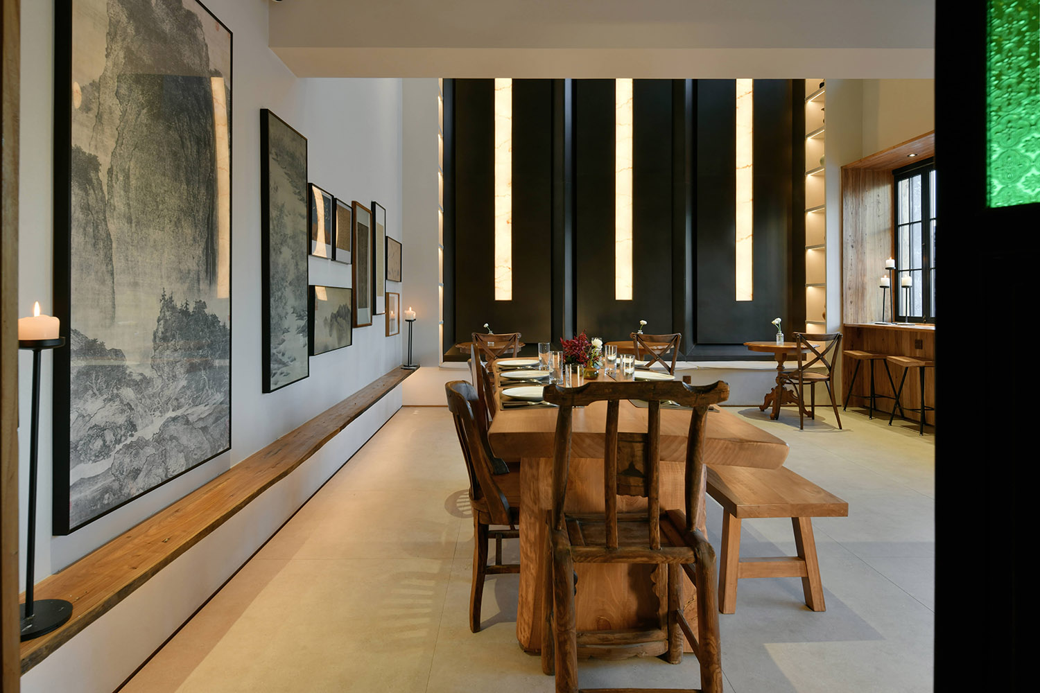
以解構手法,為餐飲空間探索出一種全新的美學空間概念。但是,與藝術運動中典型的元素“交織”的概念不同,在本項目的設計中,從以木材和水泥基牆麵漆為主的色彩特征,到秩序排列、對稱形式的空間塑造,再到天花板裝飾造型,以及綠植在空間中的運用,這一切所有的元素都是從空間結構本身中解構而來,彰顯出該餐廳獨一無二的品牌個性。
With deconstruction, a new aesthetic space concept is explored for the dining space. However, unlike the typical concept of “interweaving” of elements in the art movement, in the design of this project, from the color features dominated by wood and cement-based wall paint, to the orderly arrangement, the shaping of space in symmetrical forms, to the The decorative shape of the ceiling and the use of green plants in the space, all these elements are deconstructed from the space structure itself, showing the unique brand personality of the restaurant.
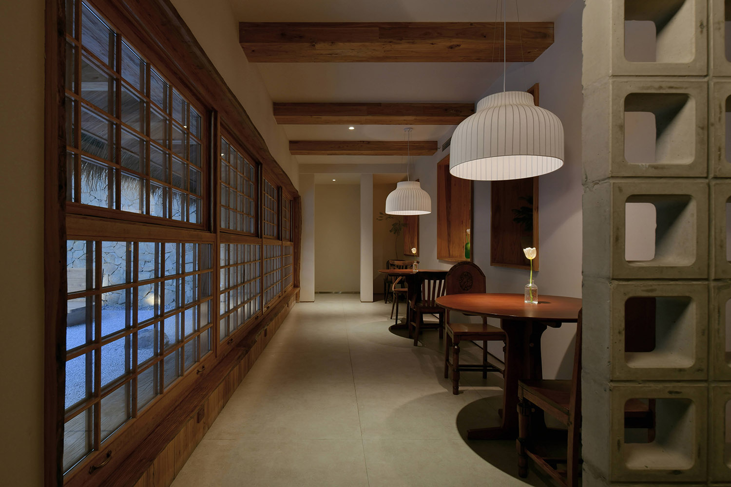
天然的木板,富有肌理的牆麵,特別設計的天花造型與材質,源於自然,也充滿了秩序。連接室內外的窗口,創造了一個明亮而通透的空間,讓人瞬間感到清爽,也削弱了兩者的邊界。
Natural wood boards, textured walls, and specially designed ceiling shapes and materials originate from nature and are full of order. The windows connecting the interior and exterior create a bright and airy space that instantly refreshes and weakens the boundary between the two.
肌理漆與所有室內材質的結合,同時滿足了燈光與音樂效果。肌理漆較低的燈光反射與室內材質對環境光渲染的對比,豐富的麵層凹凸質感能賦予場所聲音較好的收音效果。不僅有聲有色,更聲色和諧,雙重感官愉悅地互相加持,將空間情緒詮釋得更為淋漓盡致。
The combination of texture paint and all interior materials satisfies the lighting and music effects at the same time. The contrast between the low light reflection of the texture paint and the indoor material’s rendering of the ambient light, the rich texture of the surface layer can give the venue a better sound reception effect. Not only sound and color, but also sound and color harmony, the dual senses happily support each other, interpreting the space emotions more vividly.
就餐區 Ⅱ DINING & PARTY
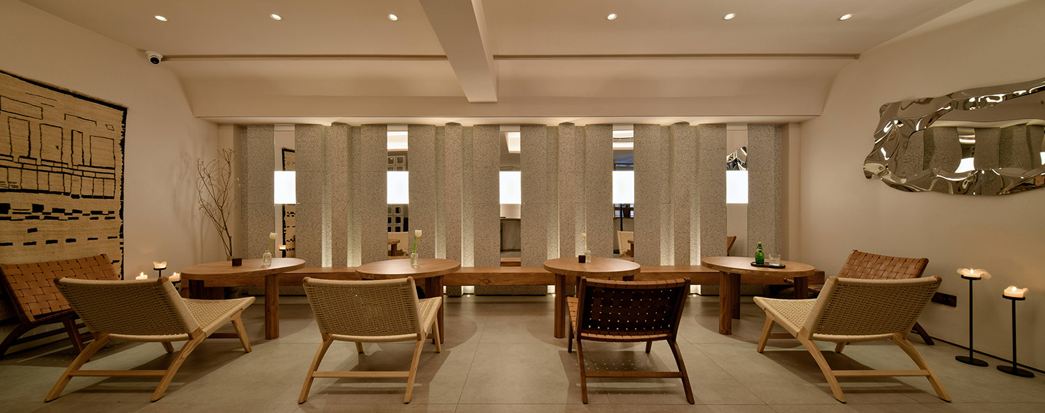
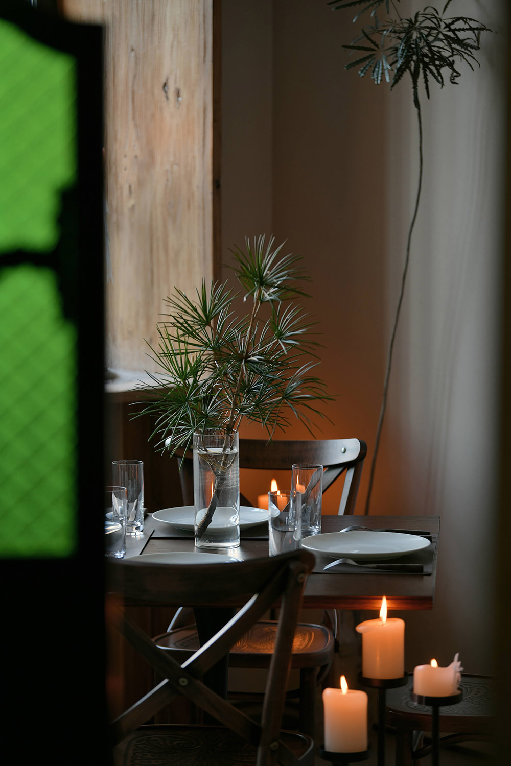
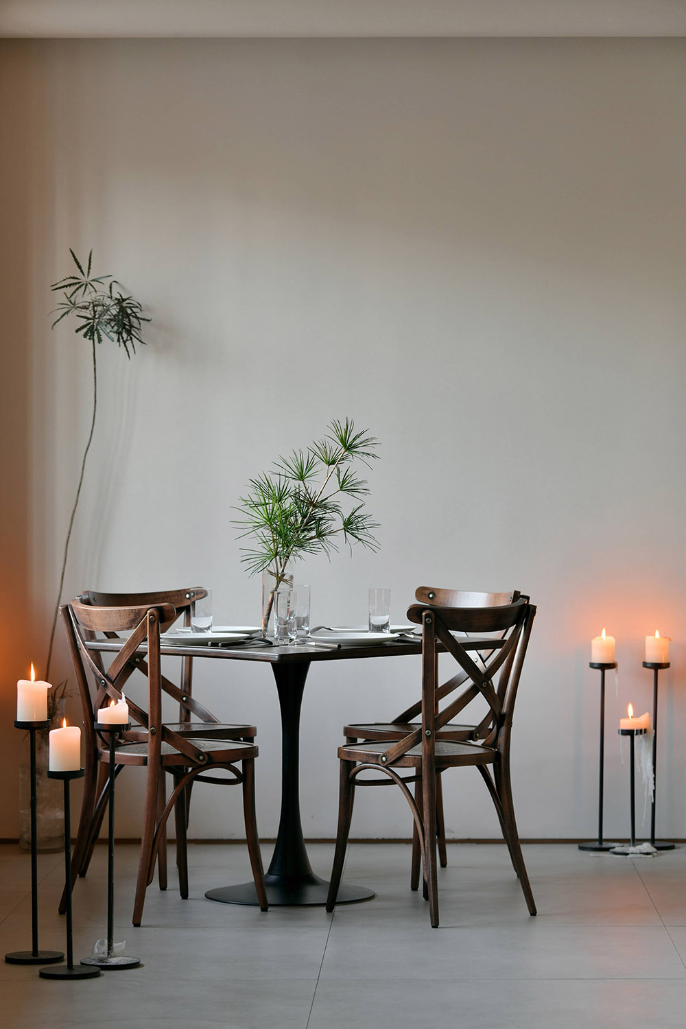
不論設計坐標如何,但毋庸置疑仍是具有商業性質的經營場所。然而我們卻並未配置軟座與卡座,隻留以少量客座。從而減弱紛雜,維持視覺感、衝擊感與空間感。酒的馥鬱芬芳、醇厚熱情,而純粹則與毫無雜質的心靈相比擬。濃淡恰好至微醺的氛圍,拋卻擾人塵囂,或自我沉醉清歡半晌,或友人幾許暢語樂話。隱匿於此,偷得浮生半日閑。
Regardless of the design coordinates, there is no doubt that bars are still commercial premises. However, we did not configure soft seats and card seats, leaving only a small number of guest seats. Thereby reducing the clutter and maintaining the sense of vision, impact and space. The wine is rich and fragrant, full-bodied and enthusiastic, while the purity is compared with the pure heart. The atmosphere is just right to the slightest drunkenness, leaving the distracting noise, or indulging in self-indulgence for a long time, or friends chatting happily. Hiding here, stealing a half-day leisure.
空間給人自在,輕鬆的就餐感受。難得從繁瑣的生活中抽離,她希望能建立起一片自由的天地,讓人感覺到的是放鬆,來到這裏,尋找能屬於自己的一方小天地。可以是一個人寂靜狂歡,也可以是三五好友的愉快派對。
The space gives a comfortable and relaxed dining experience. It is rare to get away from the tedious life. She hopes to establish a free world, which makes people feel relaxed. Come here and find a small world that can belong to her. It can be a quiet carnival alone, or a happy party with three or five friends.
就餐區 Ⅲ DINING & WORK
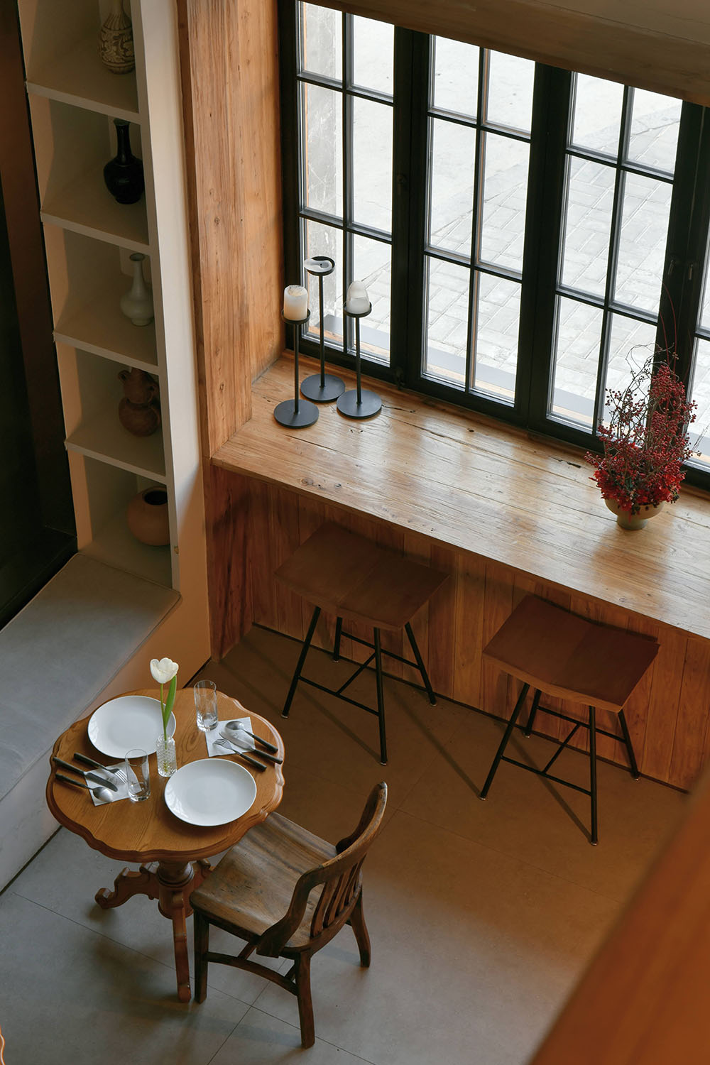
∇ “WINDOW”臨街半開放式餐區
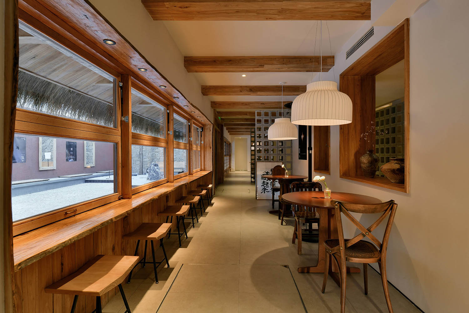
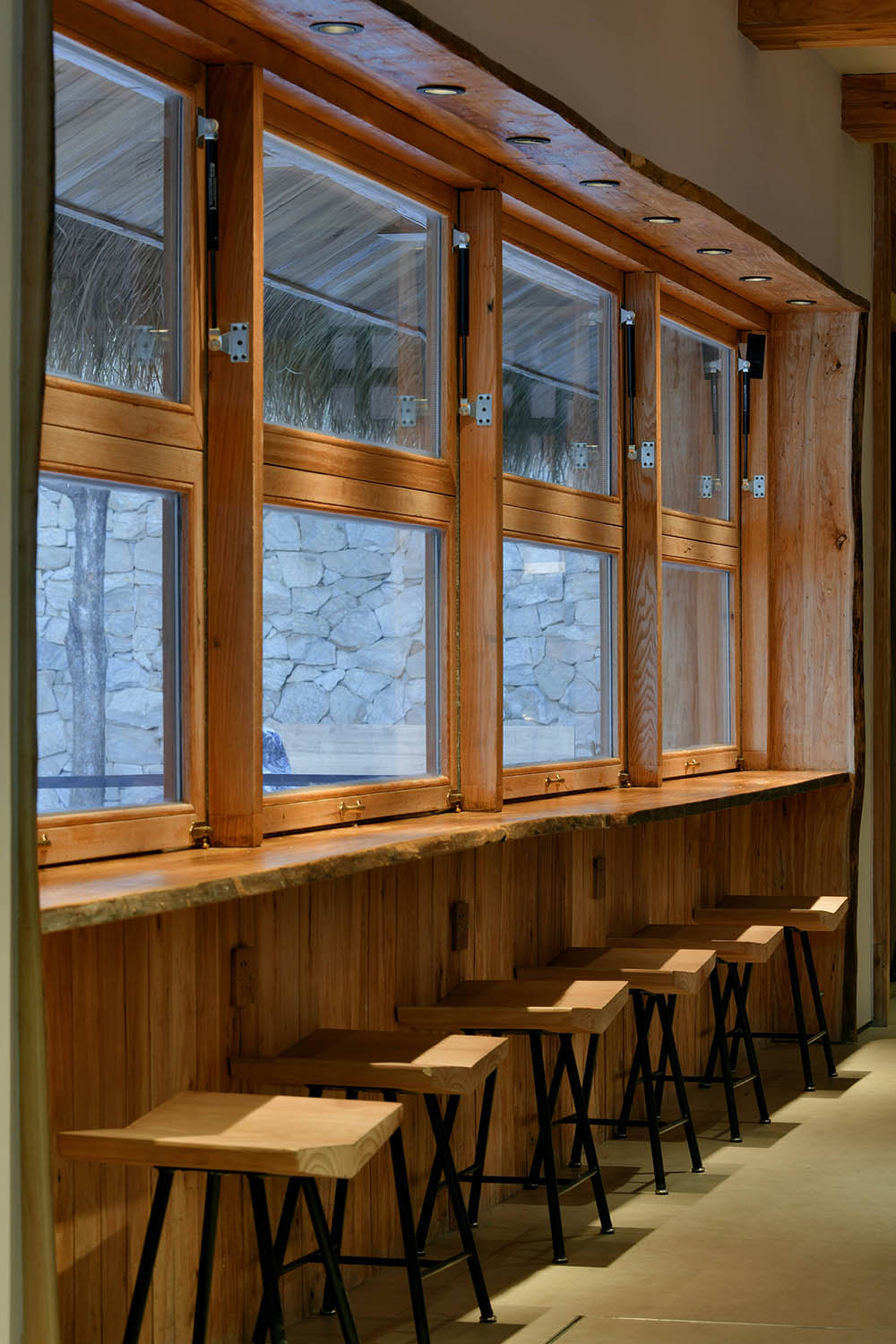
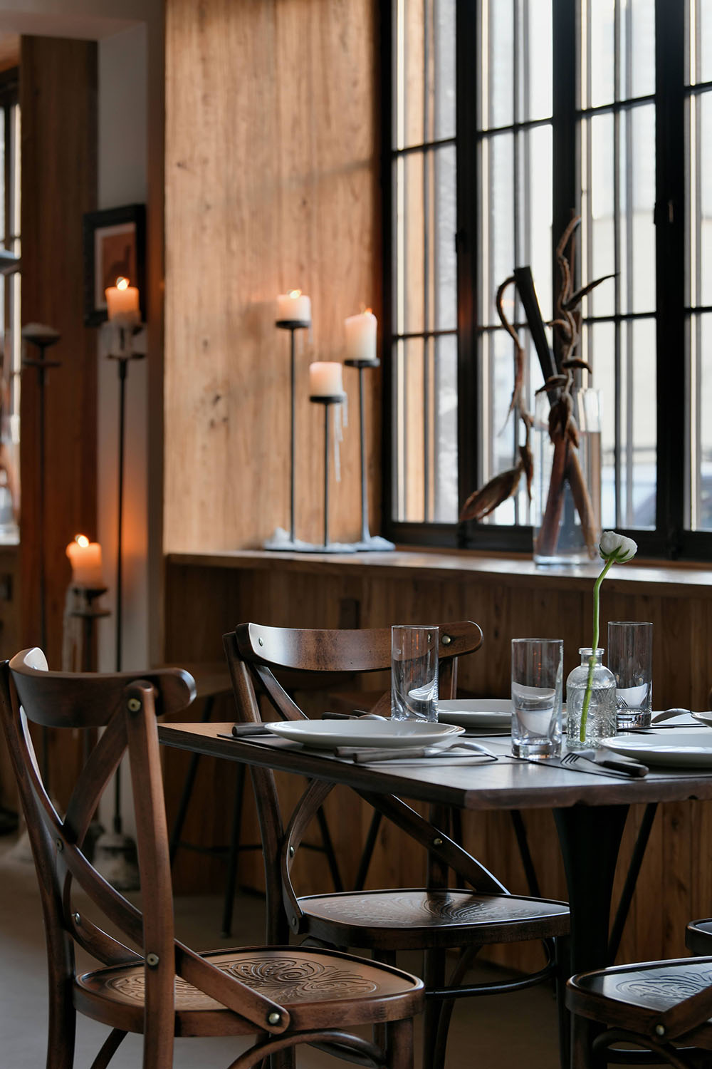
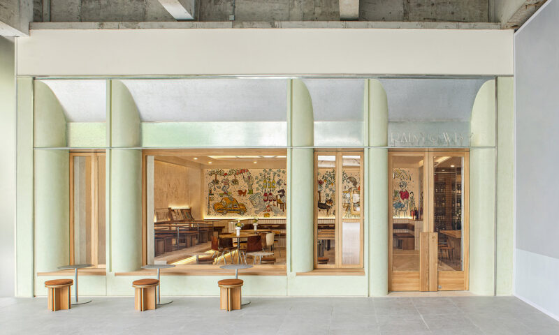
將臨街麵的窗洞加大,主動增加受光麵積,使得臨街室內就餐區域能更大範圍引入充足的自然光線的同時,也增加與街道的交互感。
The window openings on the street-facing side are enlarged to actively increase the light-receiving area, so that the indoor dining area facing the street can introduce sufficient natural light in a wider range, and at the same time increase the sense of interaction with the street.
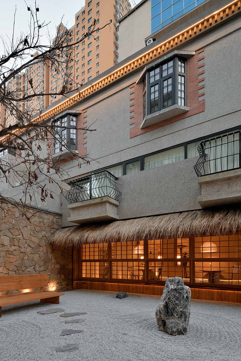
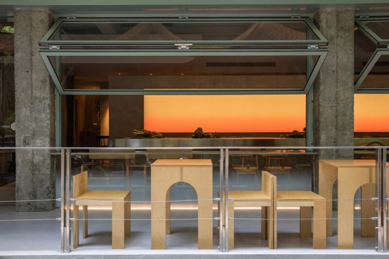
WEI SPACE是一間真正意義上的“街邊咖啡”,坐落茂盛樓宇之間,緊鄰街道。大麵的格子窗,可折疊開啟,將室內與街區完全交互有態度且融於街區環境。陽光透過玻璃格子窗、玻璃屋簷,自然光線被更好的引入到室內空間,有效的彌補原始老房層高矮的缺陷以及陰暗帶來的壓抑感。光線在室內交互穿插著,窗內有景,室內有光。
WEI SPACE is a true “street coffee”, nestled between lush buildings and close to the street. The large lattice windows, which can be folded and opened, fully interact between the interior and the block, and integrate into the block environment. The sunlight penetrates through the glass lattice windows and glass eaves, and the natural light is better introduced into the interior space, effectively making up for the defects of the original old buildings and the depression brought by the darkness. The light is interspersed in the interior, there is a scene in the window, and there is light in the interior.
我們與項目主理人考慮將此區域提供給平時需要獨立辦公、微商務、學習的第三空間。一杯濃縮、一份文件或是一本讀物與暖暖的陽光,外出工作也能是一件很享受的事情。
We and the project manager are considering providing this area as a third space that usually requires independent office, micro-business and learning. A cup of concentrate, a document or a reading and the warm sunshine, going out to work can also be a very enjoyable thing.
AFTER
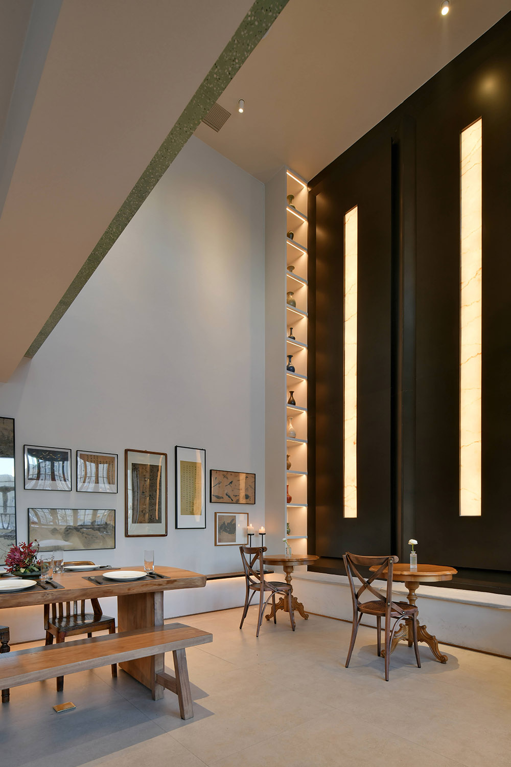
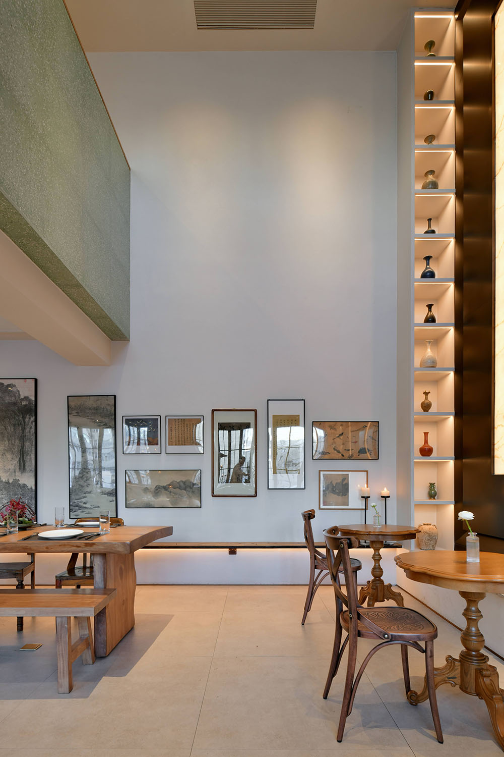
此區域的南側,我們將空間打開,使其與二層的藝術空間的產生連接,拆除樓板後,室內的視野也變得開闊起來,獨到的設計理念和精妙的設計手法,糅合極致純粹,讓WEI SPACE與自己的期待相逢,消解冗積在靈魂中的毒素,停止下沉與窒息,讓心事有處可訴,讓靈魂輕盈呼吸。
On the south side of this area, we open the space to connect it with the art space on the second floor. After the floor slab is removed, the indoor view is also broadened. The unique design concept and exquisite design method combine the ultimate purity, Let WEI SPACE meet your expectations, eliminate the toxins accumulated in the soul, stop sinking and suffocation, let the heart have a place to complain, and let the soul breathe lightly.
∇ 二層俯瞰一層就餐區 The second floor overlooks the dining area on the first floor
放空之餘,倏而一瞥
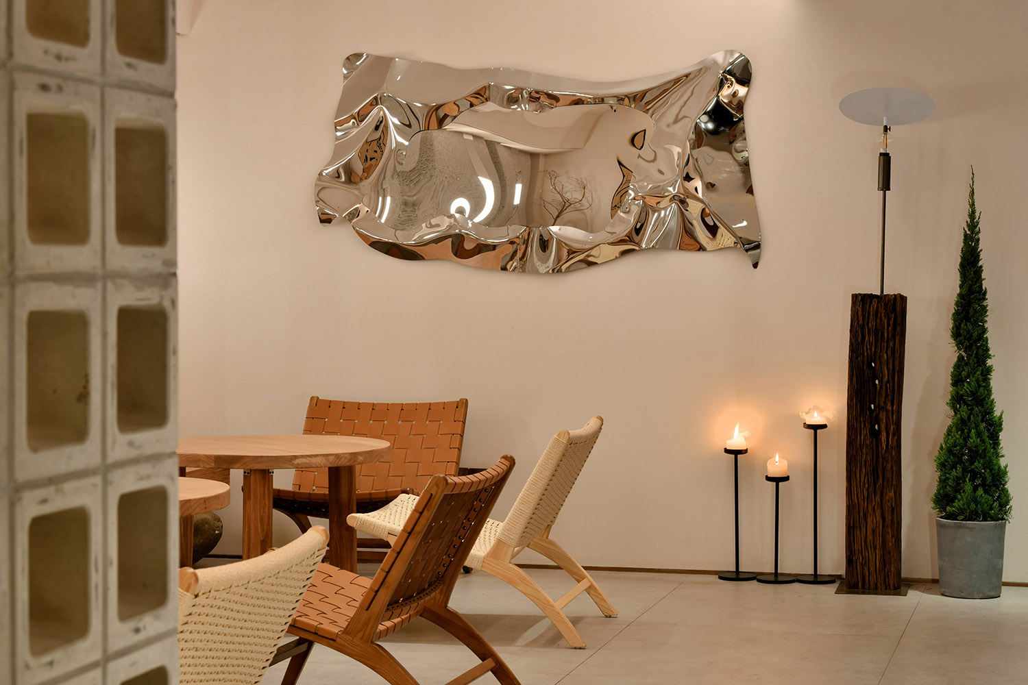
鏽鏡映照,親切如故
相互呼應,亦作昭示
靈動變化,柔軟蔓延
藝術空間 ART ROOM
視、聽、味三覺藝術在這裏相互交融,彼此生輝,形成了一個讓人可以瞬間沉浸其中,忘卻時光的“wei space”。它建立起生命的美好姿態,是心靈的空間,是繁忙後的靜心之所,洗禮靈魂,潤澤生命。恰如岡倉天心所言:“生活中的小事亦蘊含有偉大之處。”
The art of sight, hearing and taste blends with each other and shines with each other, forming a “wei space” where people can immerse themselves in it instantly and forget the time. It establishes a beautiful posture of life, a space for the mind, a place for meditation after a busy schedule, baptizing the soul and moisturizing life. As Okakura Tenshin said: “The little things in life also contain greatness.”
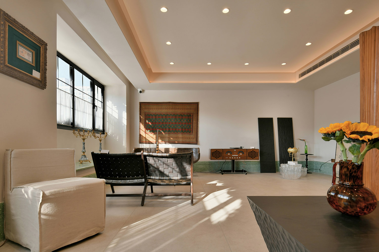
音樂是人類智慧凝結和情感表達的結晶,也是“WEI SPACE”的靈魂之一。喜歡黑膠爆豆聲中自然本真的溫暖音質,也喜歡CD清晰透亮、對於音階的完美呈現感。每時每刻都會期待音樂響起,它的激情和舒緩,寂寥和澎湃,曆經滄桑後的淡定從容;沉著厚重後的雲淡風輕。如此反複,起起落落,留戀忘返。
Music is the crystallization of human wisdom and emotional expression, and it is also one of the souls of “WEI SPAACE”. I like the warm sound of the natural nature of vinyl popping beans, and I also like the clear and transparent CDs, and the perfect presentation of the sound scale. Every moment I look forward to the music, its passion and soothing, silent and surging, calm and relaxed after the vicissitudes; calm and heavy after the clouds and breeze. So repeatedly, the ups and downs, stay and forget.
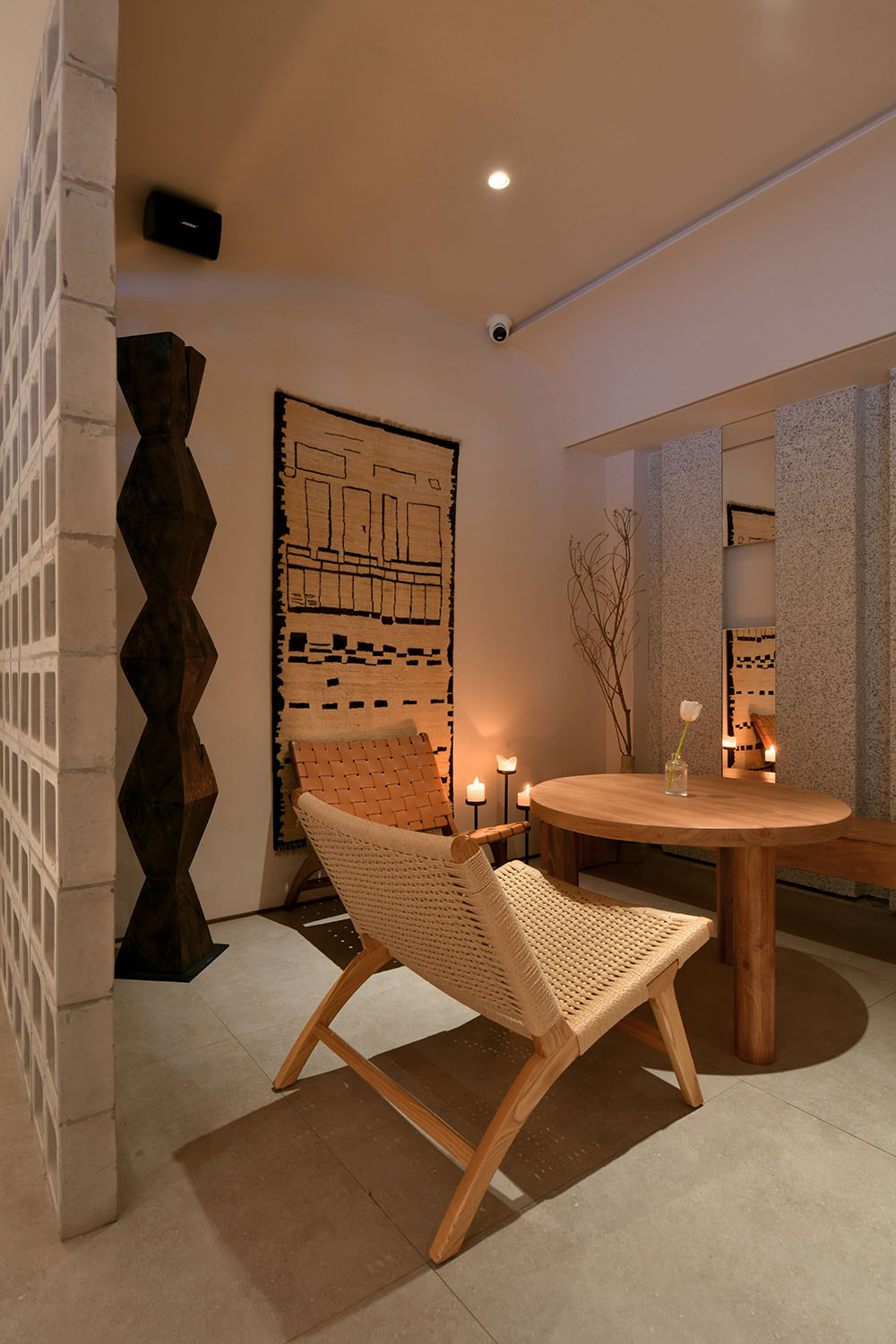
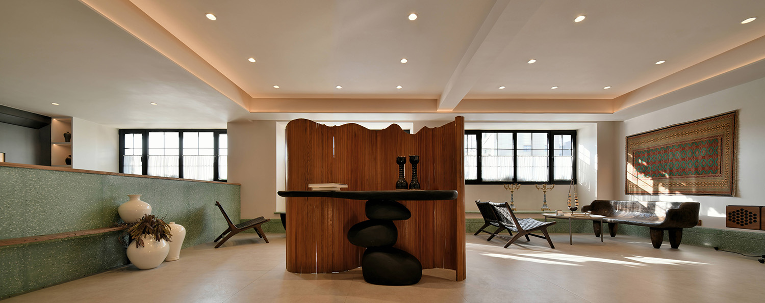
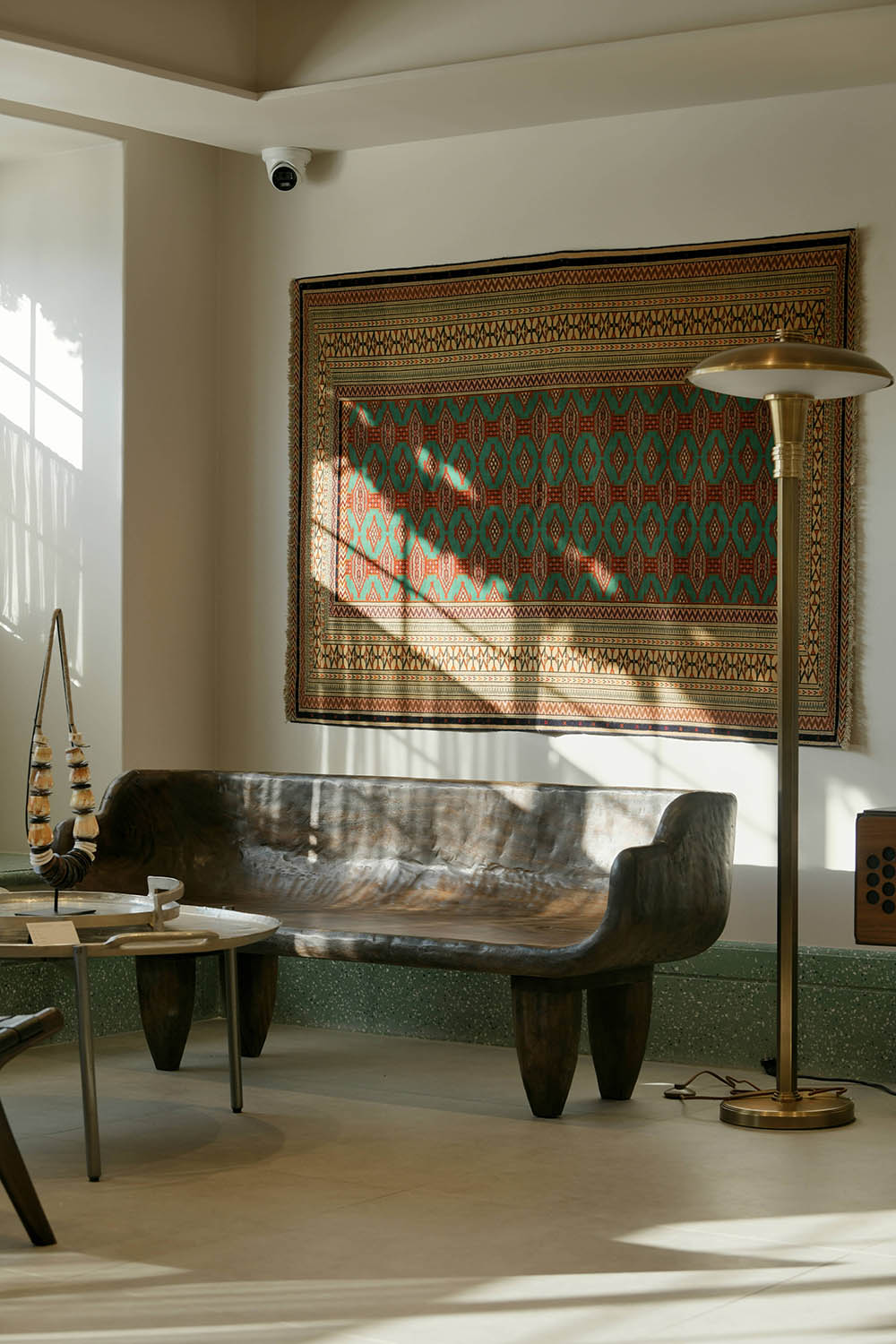
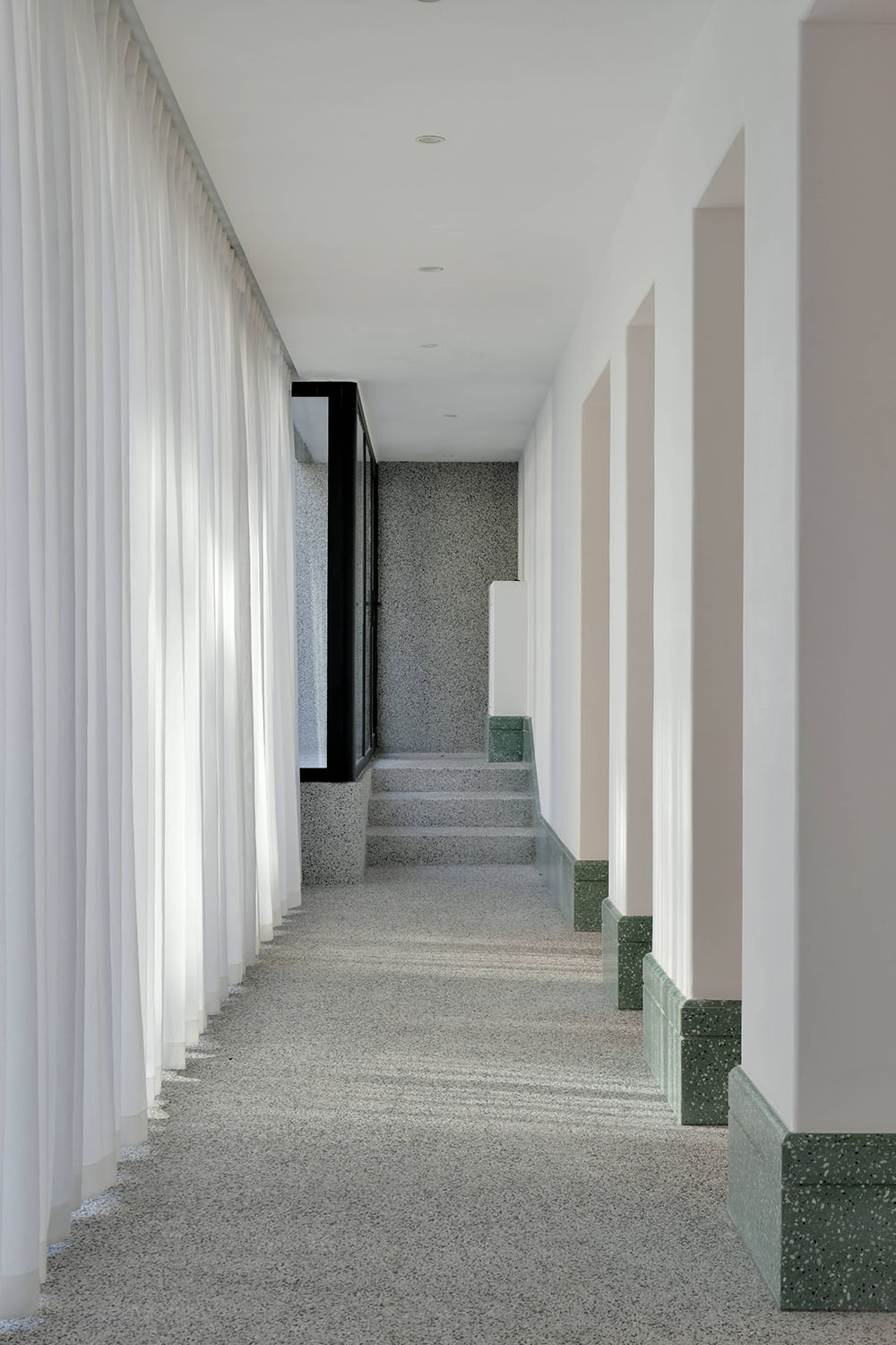
中古家具像飽經風霜的硬漢,環境的材質又如此柔軟,兩者互相平衡使空間氛圍沉著優雅。為了突出空間特點,選用了水磨石來提升氣質,當你步入於此仿佛進入了一個冥想之庭,遠方盡頭的一絲光芒,讓你心之向往。
The middle-aged furniture is like a weather-beaten tough guy, and the material of the environment is so soft. The balance between the two makes the space atmosphere calm and elegant. In order to highlight the characteristics of the space, terrazzo is selected to enhance the temperament. When you step into this place, you seem to have entered a meditation court, and a ray of light at the end of the distance makes you yearn for it.
展陳空間 Exhibition space
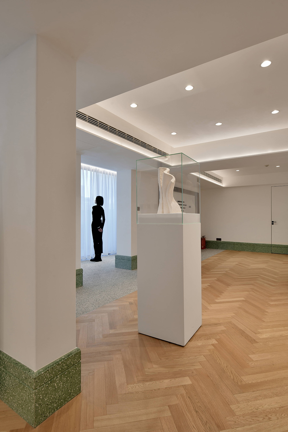
外立麵的水洗石延伸進入室內,減弱了空間之間的邊界,也將拉近了室內外的距離。空間,更像是一種容器的概念,與藝術本身達成共生關係,設計與藝術的模糊,不去定義何種風格,放下所謂設計感,空間與遊走在其中的演變過程。一同存在於這寧靜之地。
The washed stone on the façade extends into the interior, which weakens the boundary between spaces and also shortens the distance between interior and exterior. Space, more like a concept of a container, achieves a symbiotic relationship with art itself. Design and art are blurred, not defining what style, let go of the so-called sense of design, and the evolution process of space and wandering in it. together in this peaceful place.
城市空間構成元素的豐富多彩,大量的顏色,圖案。熱烈的社會空間,可能會有時喧鬧。觀察藝術空間的行業特征,白色不為任何一種顏色體係,可能是一種反叛,一種寧靜。時間靜止,呼吸暫緩,腳步停下。
The colorful elements of urban space, a large number of colors and patterns, and a lively social space may sometimes be noisy. Observing the industry characteristics of the art space, white is not any kind of color system, it may be a kind of rebellion, a kind of tranquility. Time is still, breathing is slow, and footsteps stop.
調和&細節 Harmony & Details
城市之間 BETWEEN
春日裏,陽光下,一杯濃鬱的美式,一本喜歡的雜誌,一份愉快的心情,一種隻能在WEI SPACE享受到的生活方式,靜靜地沐浴在風中,與自然,與自己對話,享受這一刻自然的小憩。
In the spring, under the sun, a cup of rich American style, a favorite magazine, a happy mood, a way of life that can only be enjoyed in WEI SPACE, quietly bathing in the wind, talking with nature, and yourself , enjoy this moment of natural rest.
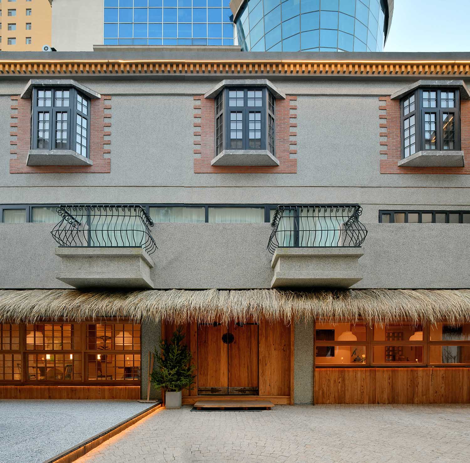
當和煦的陽光透過茂密的鋼鐵叢林,灑在記住的水洗石的牆麵上,WEI SPACE*CASA又以其獨有的個性和氣質在這片靜謐中彰顯無遺。我們將建築打造成老洋房,我們要把空間打造成一個文化地標,是所有人共同的生活方式,也是城市文化生態的亮麗風景。WEI SPACE*CASA是一封給城市的情書,其靈感源自曆史悠久的“坊”,即老上海街坊和裏弄。WEI SPACE*CASA將作為街區的基石,重新詮釋裏弄生活的開放和融合。
When the warm sun shines through the dense steel jungle and sprinkles on the wall of the washed stone that you remember, WEI SPACE*CASA shows its unique personality and temperament in this silence. We will make the building into an old house, and we will make the space a cultural landmark, a common way of life for all, and a beautiful landscape of the city’s cultural ecology. WEI SPACE*CASA is a love letter to the city, inspired by the historic “fang”, the old Shanghai neighborhoods and lanes. WEI SPACE*CASA will serve as the cornerstone of the block, reinterpreting the openness and integration of Lilong life.
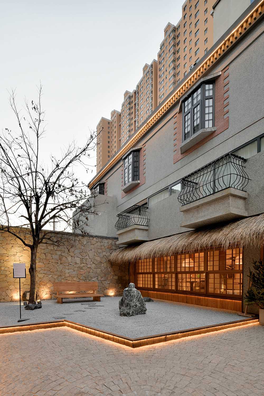
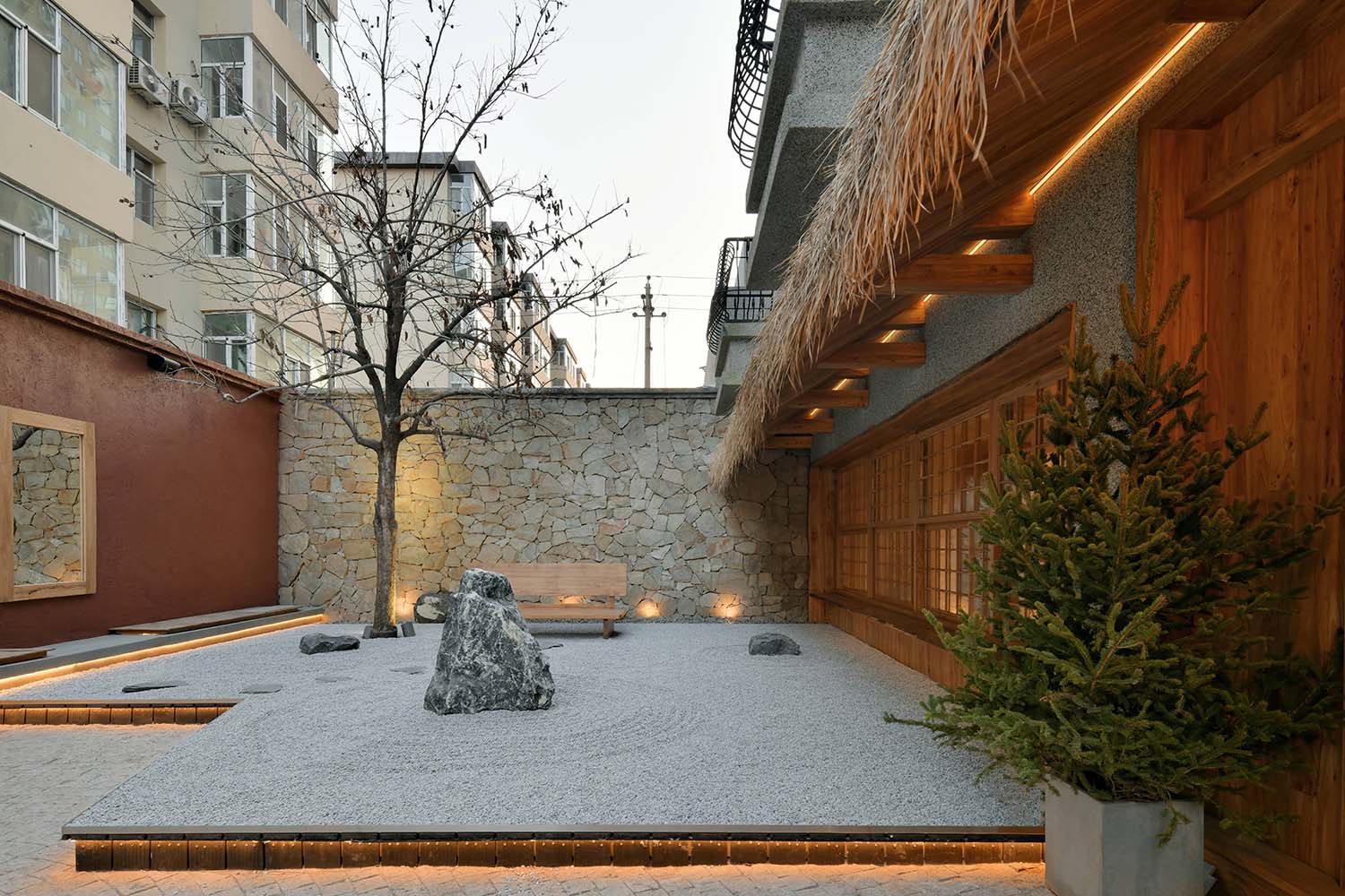
我們的設計企圖這裏,足夠自然,簡單,生活化。選用了一顆大小合適的柿子樹,作為整個迷你院落的視覺垂足,每到結果的時候,好事也隨著生活、隨著空間。自然的院落環境,郊遊露營般的戶外家具,也給這快節奏城市裏的餐廳帶來一絲假日感。
Our design is intended to be natural, simple, and life-like. A persimmon tree with a suitable size was selected as the visual foothold of the entire mini courtyard. Every time the result comes, good things also follow life and space. The natural courtyard environment and outing camping-like outdoor furniture also bring a sense of holiday to the restaurant in this fast-paced city.
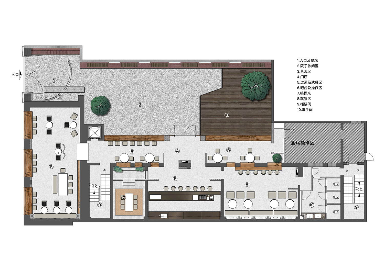
∇ 一層餐廳平麵布置圖 Floor plan of the restaurant on the first floor
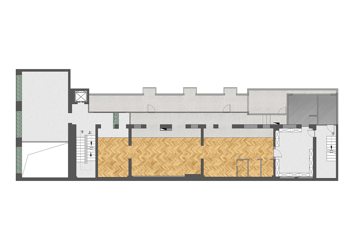
∇ 二層藝術空間平麵布置圖 Floor plan of the second floor art space
能做出一間純正且貼近太原生活方式的西餐餐廳,從開業就讓客人把它視作鄰居般的親近,變作日後休閑&工作生活中不可缺少的聚點,這便是我們作為設計方能有幸參與這個項目的最佳成果。
To be able to create a pure western restaurant that is close to Taiyuan’s way of life. From its opening, customers can regard it as a neighbor-like closeness, and become an indispensable gathering point in leisure & work life in the future. This is what we design as a design. Only have the honor to participate in the best results of this project.
“我們不做網紅店,隻做實實在在的品質輸出,至於流量帶來的紅利,網紅效應,那都是自然而然的事。”這也是 WEI SPACE主理人WeiXiu跟我們說過的經營理念。我們感謝足夠信任並交付我們項目整體設計任務的甲方,使得項目最終能完美落地呈現。
“We don’t do online celebrity stores, we only do real quality output. As for the dividends brought by traffic and the influence of Internet celebrities, it is natural.” This is what WeiXiu, the manager of WEI SPACE, told us. idea. We are grateful to the Party A who trusted and delivered the overall design task of our project, so that the project can be perfectly presented in the end.
項目信息
主案設計師/孟飛
Lead Designer/Meng Fei
參與設計師/張林林、程備備
Participating designers/Zhang Linlin and Cheng Beibei
項目位置/山西·太原
Location/Taiyuan, Shanxi Province
項目麵積/700m²
Project area /700m²
項目類型/商業空間
Project Type/Commercial Space
攝影/劉育麟、雙備
Photography/Liu Yulin ,Shuangbei


