美酒存在的意義,或許就是幫人們短暫地“放下意義”。
Perhaps the reason for the existence of fine wine is to help people “let go of meaning” for a short while.
“走吧,喝酒去”
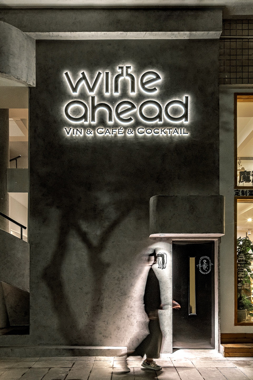
Wine ahead,座落於重慶渝北的特色葡萄酒餐吧,名字由Go ahead發散而來,希望將 “生活向前邁進” 的期許,兌入搖晃的酒杯之中,愜意又認真的麵對生活。在重慶話調侃逗趣的翻譯下,wine(歪) a(個) head(頭) “長得乖該我歪”——小醉之後搖搖晃晃的腦殼,更添幾許迷離歡快的醉意畫風。而“歪頭”也成為Wine ahead的快樂代名詞,並將趣味的歪頭人物形象作為品牌的logo標識。
Wine ahead, located in Yubei District, Chongqing, features a Wine restaurant named Go ahead, hoping to “life forward” expectations, into the shaking glass, comfortable and serious face of life. Under the translation of Chongqing dialect, Wai Ge Tou(Tilted head)”good looking”– the shaking head after a little drunkenness adds a few more blurred and cheerful drunk painting style. And “crooked head” also become happy pronoun of Wine ahead, and take the funny crooked head character image as logo logo of the brand.
現代生活的快節奏,推著每個人不停向前,壓力像一座座大山壓在身上,很多時候,我們懷念“緩慢”和“簡單”,停一停,放空思緒,成了當下人們最想做的事情。這個時候,酒好像就變得重要了起來,在微醺中短暫地逃離,在放鬆和愜意裏享受純粹的愉悅,就是wine ahead想要傳遞的理念,當美酒下肚,這會,就讓生活隻屬於自己。
The fast pace of modern life pushes everyone forward. The pressure is like mountains pressing down on us. Many times, we miss “slow” and “simple”, stop for a moment and let our thoughts go, has become the thing that people want to do the most. At this time, the wine seems to become important, in a short time to escape in the wine, relax and enjoy the pure pleasure, is the concept of wine ahead, when the wine down, this will, just Make Your Life Your Own.
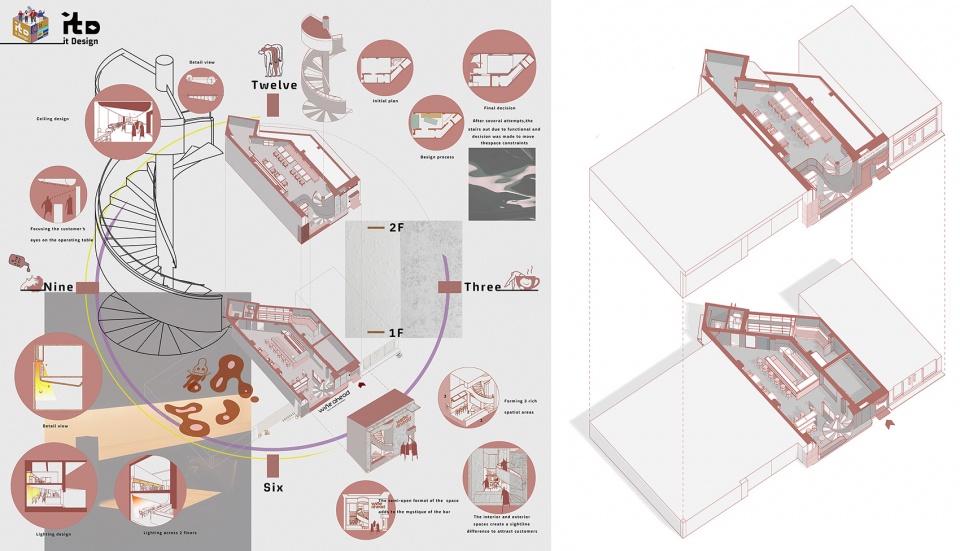
∇ 分析圖 diagram ©itD studio
wine ahead團隊,因葡萄酒而相識,他們中有資深的葡萄酒采購師和專業的WSET高級品酒師。他們的調酒也非常富有特色,不會循規蹈矩,也不會過於前衛,而是在傳統與新潮的平衡點之間,創造出誘人且極具個性的雞尾酒。Wine ahead品牌在設計伊始,即希望打造一個 “緩慢”且“簡單”的空間,讓日漸匆忙的重慶人能在此稍作停頓,在微醺中短暫地逃離,放鬆身心,放空思維。itDstudio作為本案設計團隊,深耕重慶多年,在設計的考量上,充分考慮城市性格、品牌屬性與空間特色,最大尺度的利用有限空間,並將屬地文化與品牌理念融入其中,最終呈現藝術文化與生活細節並存的質感趣味空間。
The wine ahead team, known for their wines, includes senior wine buyers and professional WSET senior wine tasters. Their drinks are also very distinctive, do not follow the rules, will not be too avant-garde, but in the traditional and trendy balance point, to create an attractive and very personalized cocktail. At the beginning of the design, the Wine ahead brand hopes to create a “slow” and “simple” space, so that people in Chongqing who are in a hurry can pause here for a while, escape briefly in a little drunk, and relax their body and mind, clear your mind. As the design team of this case, itDstudio has been deeply involved in Chongqing for many years. In the design consideration, it fully considers the city’s character, brand attributes and spatial characteristics, uses the limited space to the largest scale, and integrates local culture and brand concepts into it, and finally presents art, culture and life. A textured and interesting space where details coexist.
Real Natural Wine 回應城市的率真與浪漫
Real Nature Wine Back to the Nature
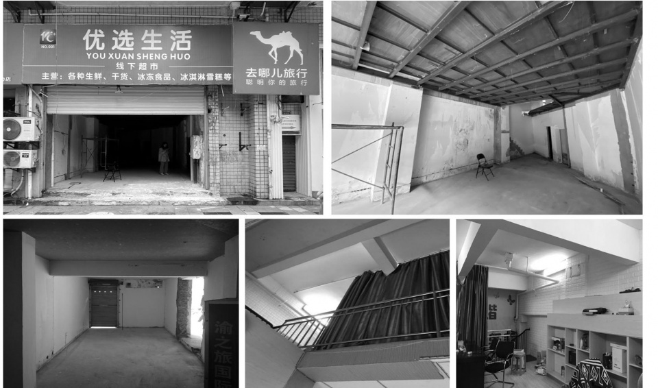
重慶。一座依山而生,以熱情著稱的城市。食物的美味火辣,樓宇層巒的璀璨夜景,川渝腔調的頑皮乖嗔,以及兩江的熱風,宛延的江岸,溫柔的霧氣… 重慶有太多名片與符號記憶,itDstudio從中截取幾許融入設計之中,以此作為Wine ahead的設計基因,與這座城市相融共生。Wine ahead位於重慶市冉家壩一個社區的街道上,占地120平方米。 原空間是一個兩層的店鋪加上一個小空間的老年養生會所, 因此從現場的外立麵上來看存在著兩個入口。
The project is located in Ranjiaba, Chongqing, in a neighborhood street with 120 square meters. The space was originally a two-story store plus a small space for a senior.
∇ 場地原貌 original state of the site ©itD studio
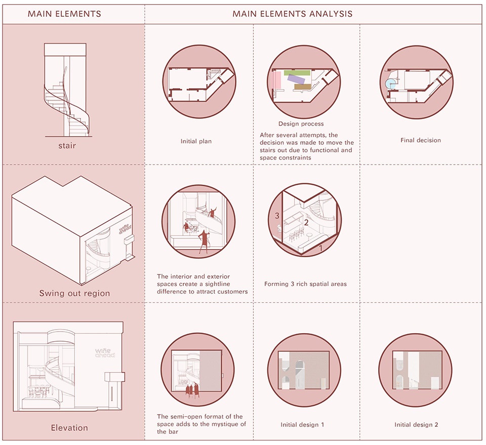
考慮到酒吧最基本的需求,我們將空間劃分為趣味、放鬆、活動、品酒四大板塊,將其設定為多功能活動區、酒水吧台區、趣味空間、外擺區、後廚區、衛生間六個功能區域。根據品牌理念,將“歪頭”的現代年輕元素融入自然酒,既代表了微醺的狀態,又突出了一絲趣味性,而我們也更多地使用弧線元素,這也是從酒杯中提取出來的蕩漾不鏽鋼元素,代表著一種愜意,一種流動,看起來也是一種“歪曲”,但能帶來更多柔和和搖擺,或許正好“歪打正著”。
Considering the most basic needs of a bar, we divided the space into four sections: fun, relaxation, activity and learning, and set them into six functional areas: multifunctional activity area, drink bar area, fun space, outside display area, back kitchen area and bathroom. According to the brand concept, the modern and young element of “crooked head” is integrated into the natural wine, which represents the state of slight drunkenness and highlights a touch of fun. We also use more arc elements, which are also extracted from the wine glass as a swirling (SUS) element, representing a cozy, a flow, and looks like a “distortion”, but it brings more softness and sway, perhaps just the right amount of “distortion”.
∇ 主要設計元素分析 main elements analysis ©itD studio
Design method歪(Wine)打正著
The design method (misrepresentation)
門頭|Door head
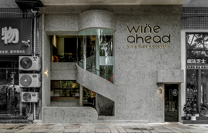
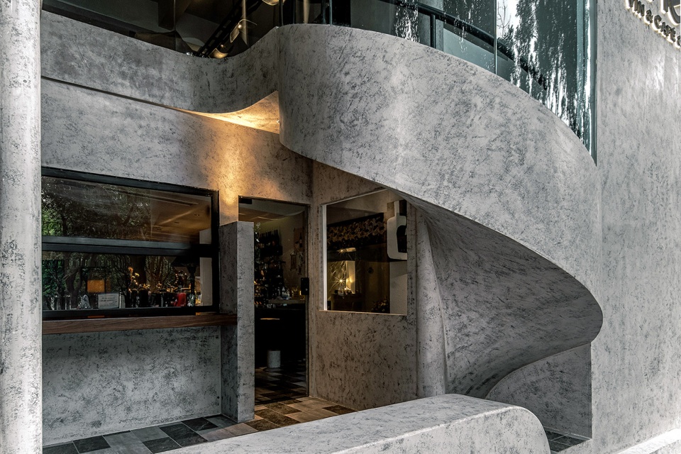
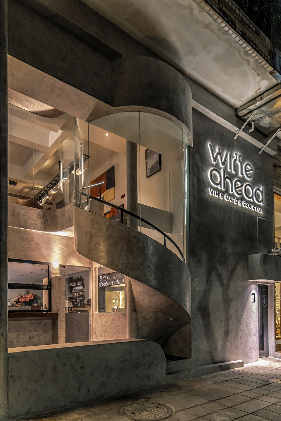
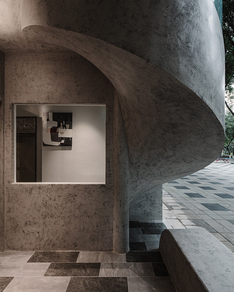
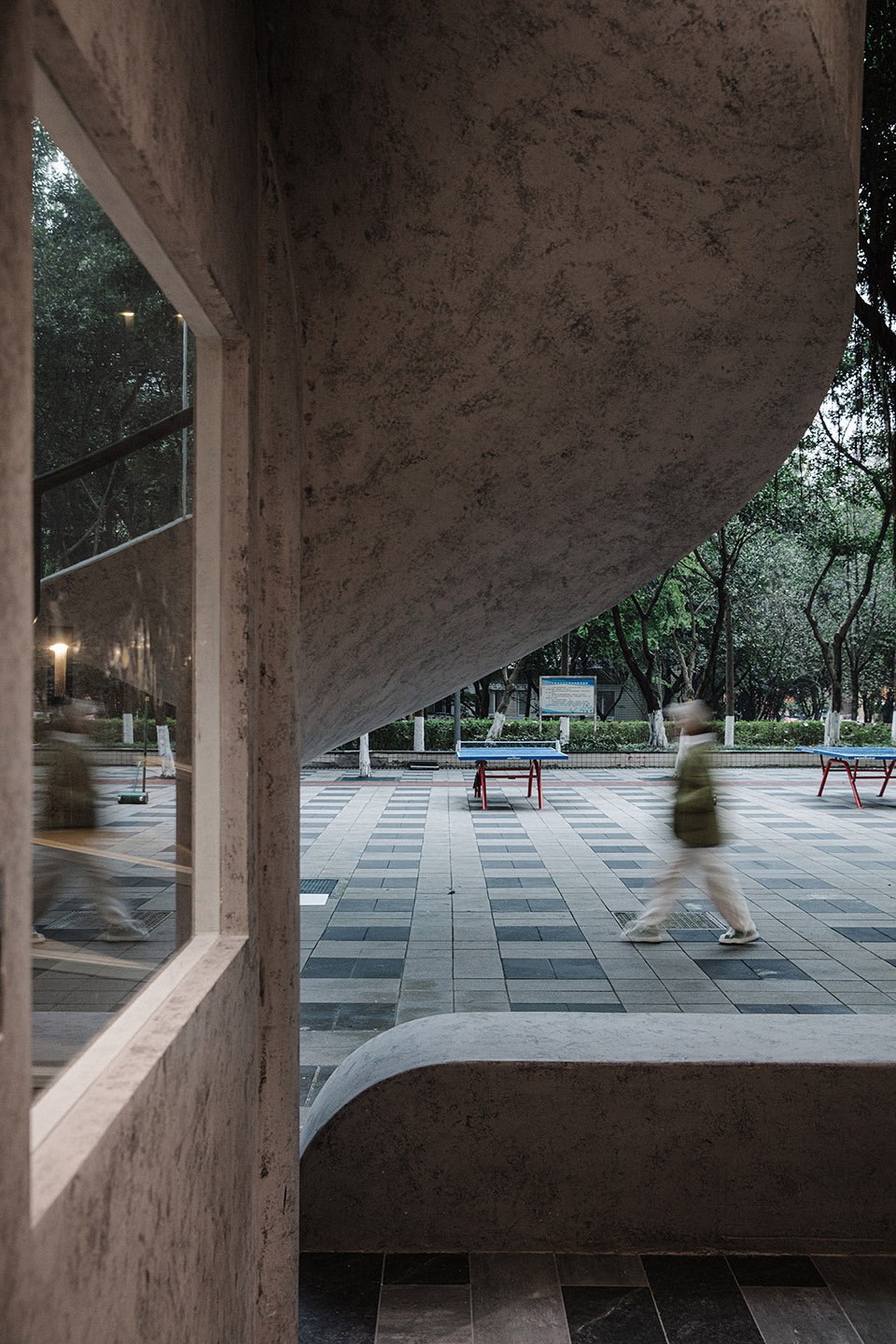
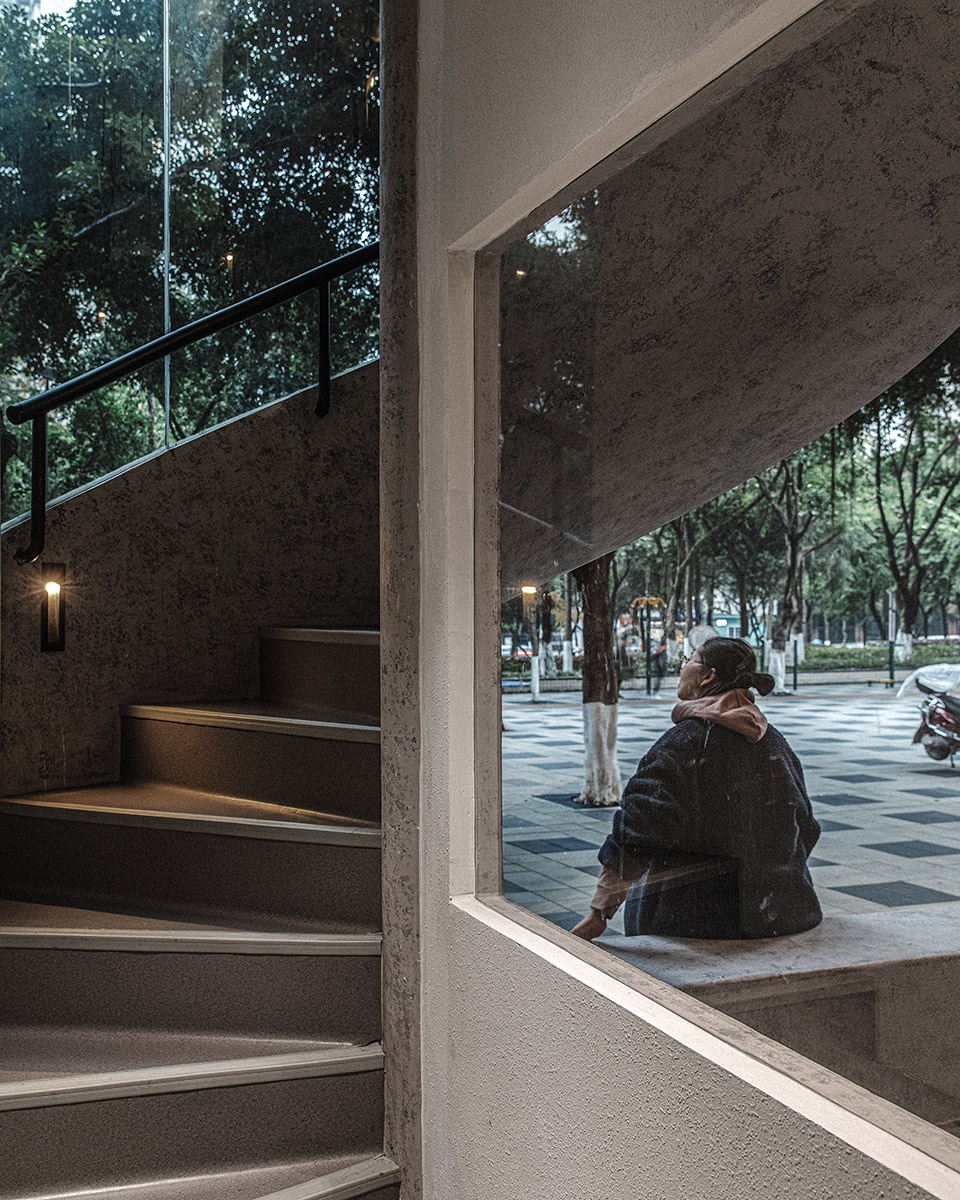
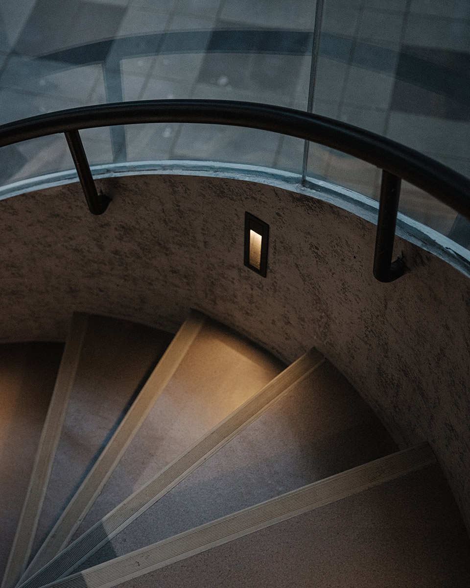
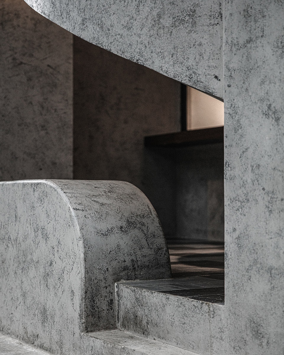
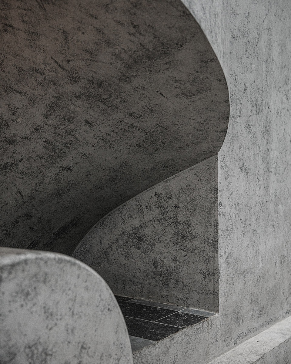
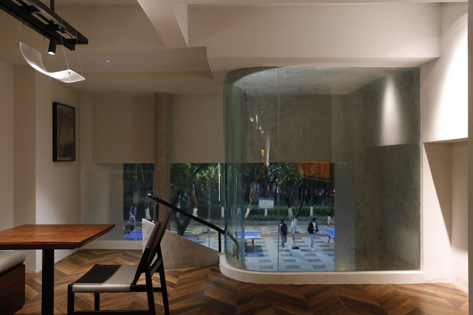
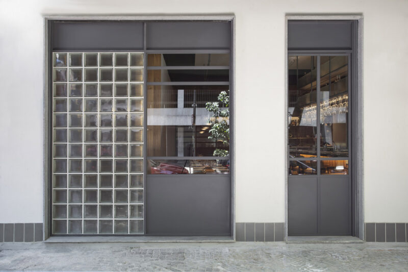
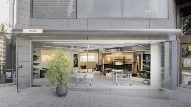
門頭的設計,需要將外擺區、入口、logo全部融合在一起,原本的兩個店鋪門頭長5800mm*7200mm,經過反複的修改確認和推敲,才選擇了現有的外立麵造型,延續了最開始的設計思維。由於廁所旁邊連通上下兩層的樓梯上方存在一個無法移動的電纜,於是我們將樓梯位置進行了移動,並選擇了旋轉樓梯的形式來進行承接,讓樓梯的形式進行立麵的“內卷”,為半戶外外擺區提供了更大的麵積,將樓梯和外立麵進行結合,不僅最大的節省了內部空間,更兼具美觀性。我們把旋轉樓梯完全包裹住,並將其做成半通透的形式,一方麵是兼顧到采光,另一方麵,由於該場所的位在右邊做了一個巨大的旋轉樓梯,曲線與直線打出來的組合。
The design of the storefront required the integration of the exterior area, entrance, and logo. The original two storefronts were 5800mm*7200mm long, the existing façade shape was chosen after repeated revisions and confirmation, to continue the design thinking from the beginning. A huge revolving staircase was made on the right side with a combination of curves and straight lines.
以退為進的外擺|Outside-in Terrace
位置就位於社區的小街上,需要更多的社會性,“包裹”樓梯的形式反而與外圍區的開放形成了強烈的對比,將空間更多的留給了社區的人。這樣一來,旋轉樓梯和外擺區形成了一道奇妙的弧線,而這也是一個看似很“歪”的進口,使人們不得不歪頭俯身才能進去,這恰好也呼應了品牌“歪頭”的概念,更給外立麵增添了一絲趣味性,人人“歪頭”進入的時候,也增加了一絲儀式感,增添了用戶與品牌的關聯性,更降低了建築與人之間的疏離感。
We wrapped the staircase completely and made it semi-permeable. On the one hand, it includes the light. On the other hand, the location of the place is located in the small street of the community, it needs to be more social, the form of “wrapping” the staircase is a strong contrast with the openness of the outer area, leaving more space for the community The “wrapped” staircase contrasts with the openness of the outer area, leaving more space for the community. Only in this way, the revolving staircase and the outer pendulum area form a wonderful arc, and this is also a seemingly “crooked” import, so that people have to bend their heads to enter, which also echoes the brand’s “crooked head” concept, and adds a touch of fun to the facade. This echoes the brand’s concept of “crooked head” and adds a touch of fun to the facade, and adds a sense of ritual when everyone enters with a “crooked head”, increasing the relevance of users to the brand and reducing the alienation between the building and people.
小空間|Small space
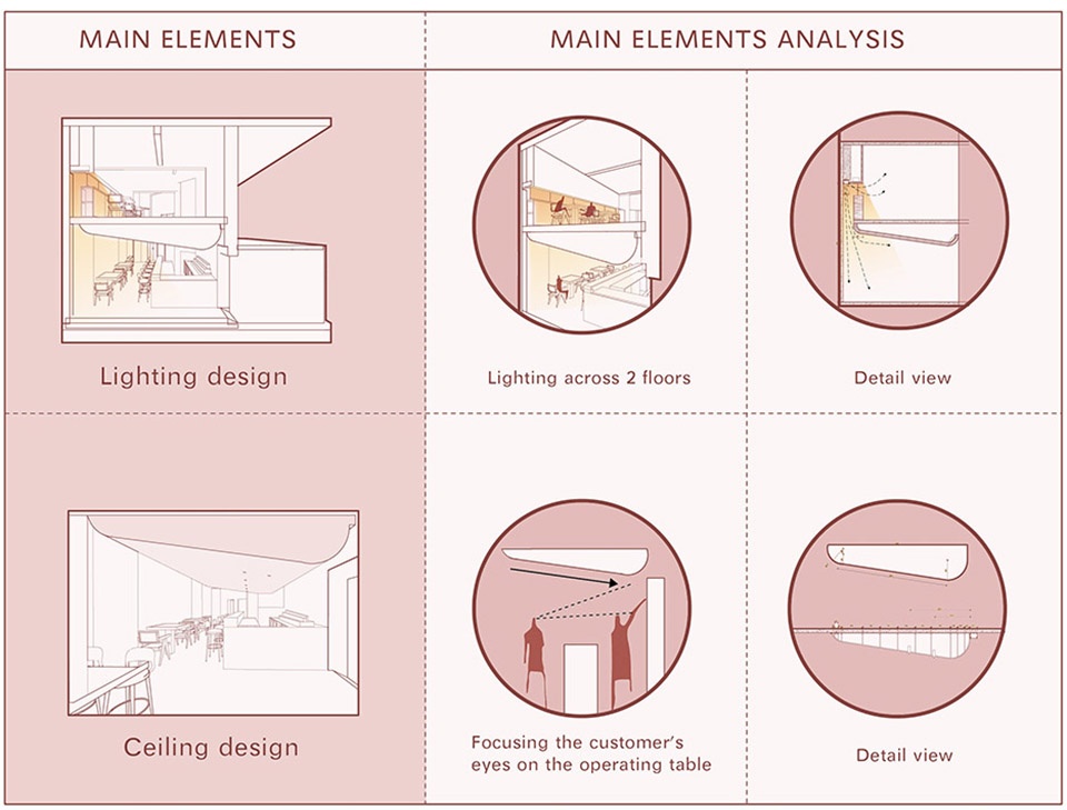
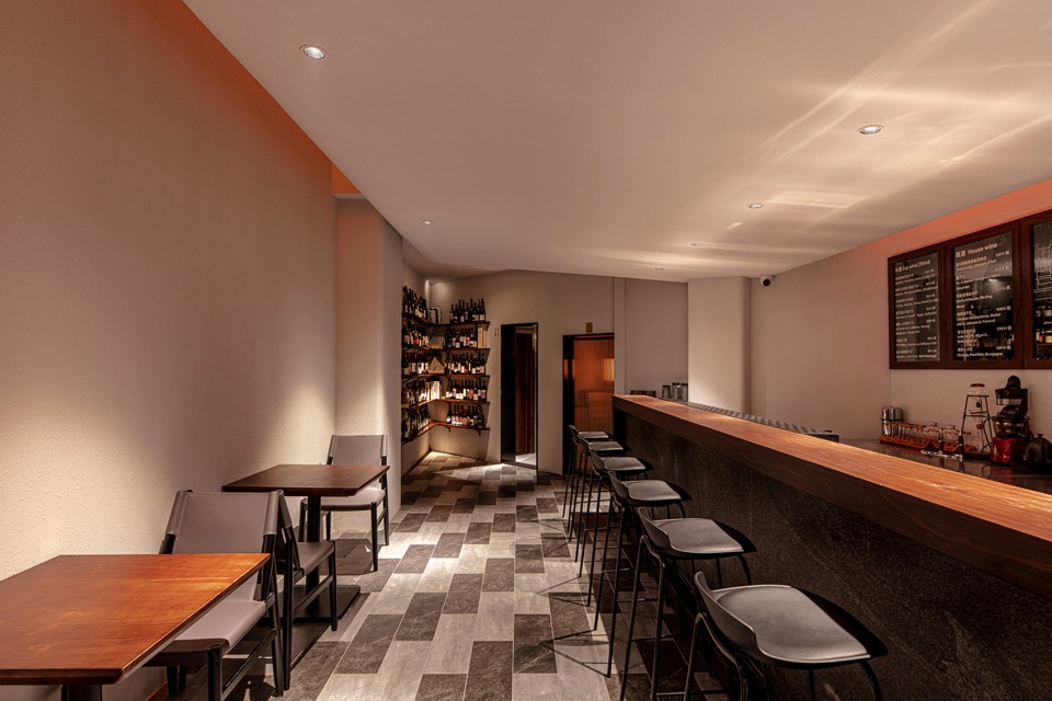
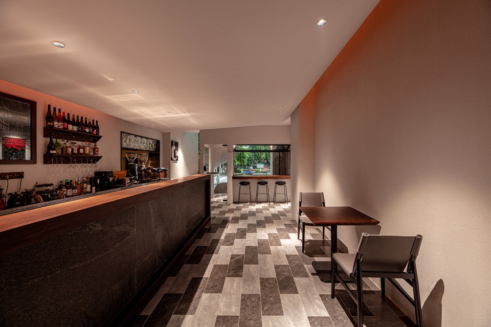
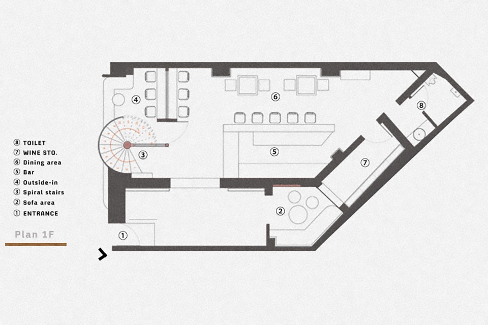
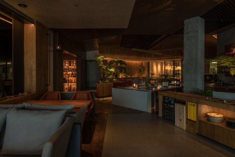
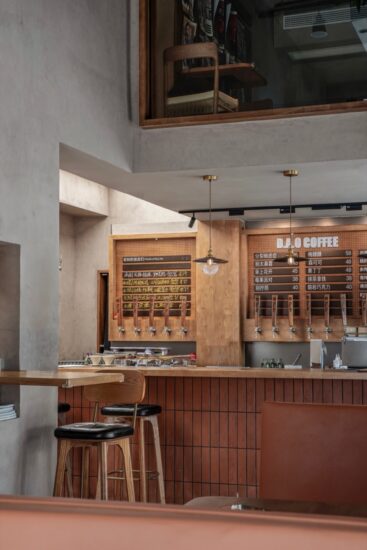
基於原始的條件,需要選擇從兩個入口中選擇一個作為主門,考慮到外立麵的設計比例和入口方式,因此我們將主門放於原本較小的入口處,雖然看著狹小,但與內部空間形成了強烈對比,將整個空間藏於小門內,給予用戶探索的欲望,也為內部空間增添了更多神秘感和反差感。 一層進門的左手邊即是一整麵紅酒展示牆的設定,凸顯葡萄酒吧的屬性,在燈光的引導下,人們會看到半圍合的沙發區。吧台區域上方吊頂的設計是整個一層的重點,我們用兩個不同大小的圓,切出了一個造型,我們將吧台的下方空間壓低到隻剩兩米的高度,看似瘋狂,實則將人們的視覺全部吸引到了吧台,讓人們在整個空間中立刻找得到重點。
According to the original conditions, it is essential to choose one of the two entrances as the main door. Considering the design proportion of the facade and the entrance way, we place the main door at the original smaller entrance, which looks small but makes a strong contrast with the internal space, hiding the whole space inside the small door, giving the user the desire to explore and adding more mystery and contrast to the internal space. The left hand side of the entrance on the first floor is where a whole wine display wall , which is to highlight the attributes of the wine bar. With the guidance of the lighting, people will notice the semi-enclosed sofa area. The design of the ceiling above the bar area is the important factor of the whole first floor, we use two different size circles to cut out a shape and depressed the space below the bar to a height of only two meters, which seems crazy, but it actually attracts people’s attention to the bar and make people can find the important factor in the whole space immediately.
吧台|Bar
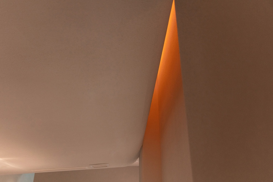
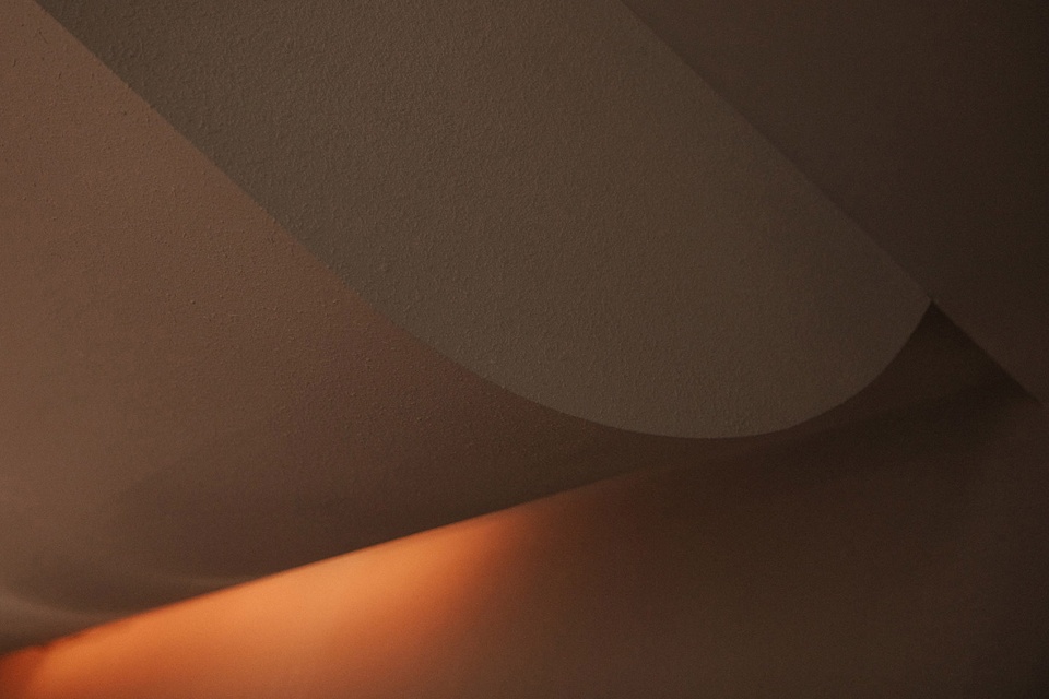
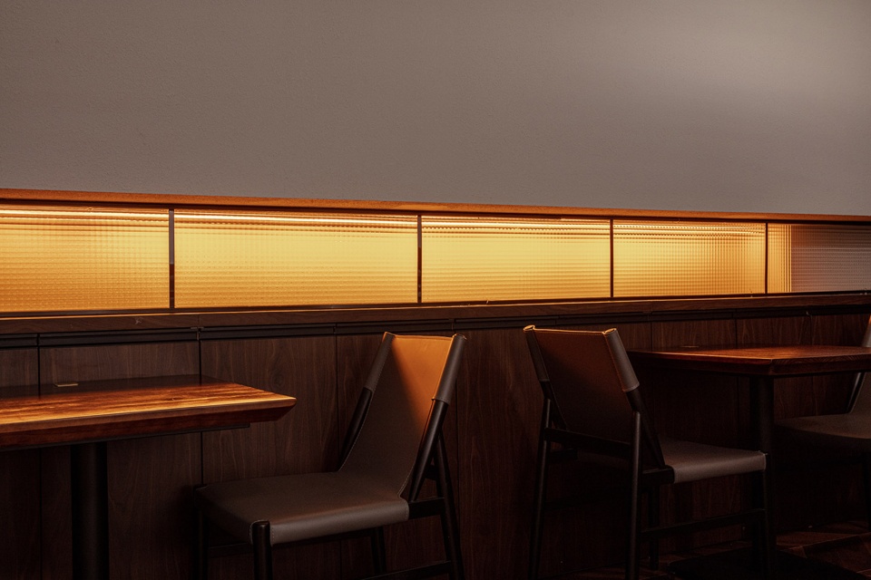
而在吧台吊頂的左側,我們進行了鏤空處理,安裝在二樓的燈光會直接貫穿而下,再通過弧形的吊頂蔓延下來,營造出流動的搖擺感覺,配合著二樓櫃體玻璃上灑出來的暖黃燈光,宛如《銀翼殺手》中展現的一樣,這種含蓄的光為空間營造出更多的神秘感,同時,跳躍的光又賦予了空間更多輕鬆和樂趣。
In the left side of the ceiling of the bar, we have hollowed out the treatment, the light installed on the second floor will be directly through and down, and then spread down through the curved ceiling, creating a flowing swaying feeling, with the warm yellow light spilling out from the glass of the cabinet on the second floor, just like the one shown in Blade Runner, this subtle light creates more mystery for the space, and at the same time, the jumping light gives the space more relaxed and fun.
酒窖 & 吊頂|Wine cellar & Suspended ceiling
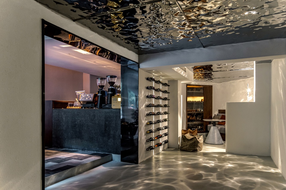
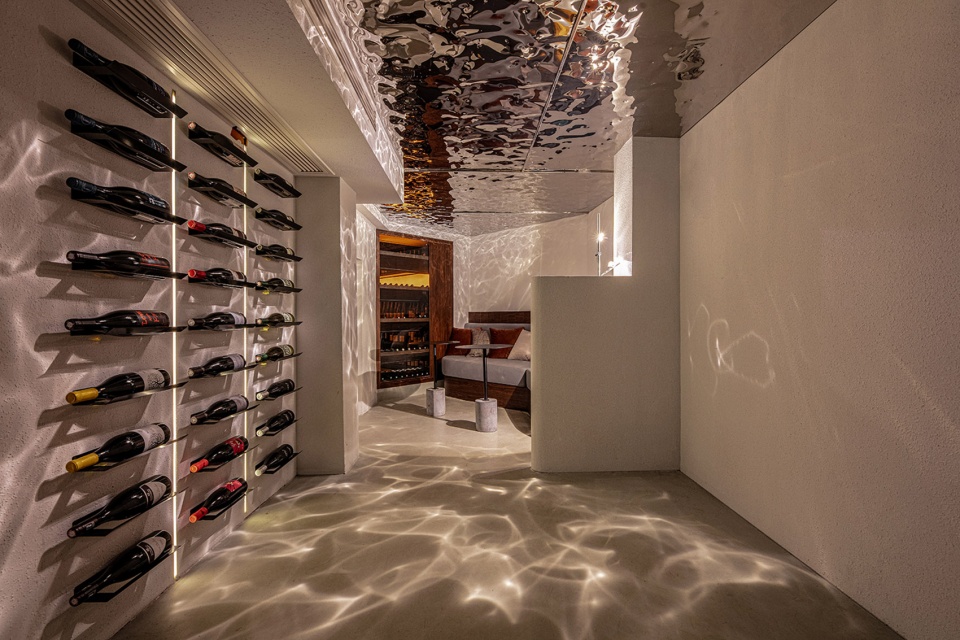
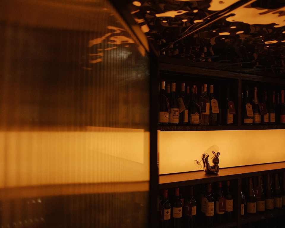
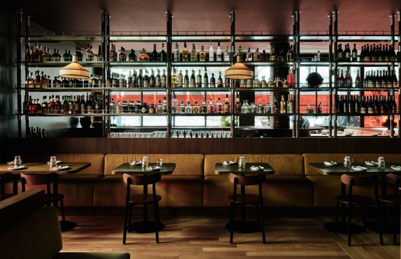
同樣的光在酒窖也出現了,但考慮到顧客選酒時需要能看清楚酒標,在酒櫃的隔板裏亦暗藏燈帶,在不打擾整體光線前提下,兼顧了顧客的需求。為了使光線在空間中更具備流動感,我們使用了波紋不鏽鋼作為材料,借由反射,讓光呈現出更多的形態,也讓光“活”起來,整體建築的灰白色調,同樣給了光更多的發揮空間,此時,它仿佛變幻無窮,搖擺不定,這給了空間更多的活力和想象力。
The same light also appears in the wine cellar, but in consideration of the need for customers to be able to see the wine label clearly when selecting wine, in the wine cabinet partition also concealed light belt, without disturbing the overall light premise, taking into account the needs of customers. In order to make the light flow more in space, we use corrugated stainless steel as the material, which makes the light take on more forms and “live” by reflection. The gray-white tone of the whole building also gives the light more room to play. At this time, it seems to change endlessly and swing, which gives the space more vitality and imagination.
二層用餐區|Dining area
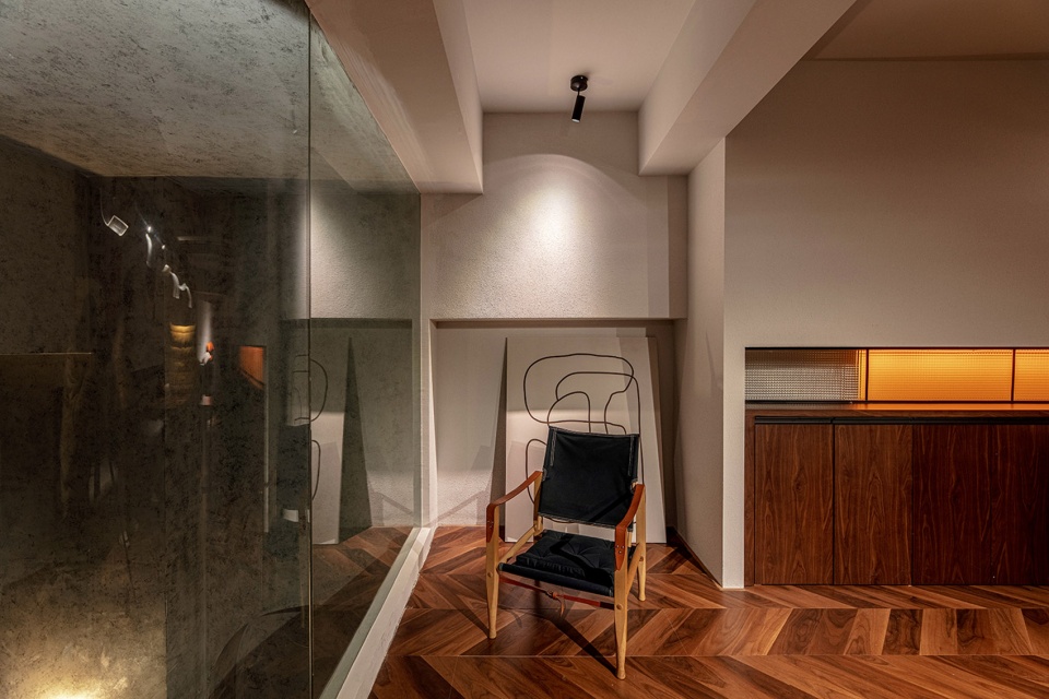
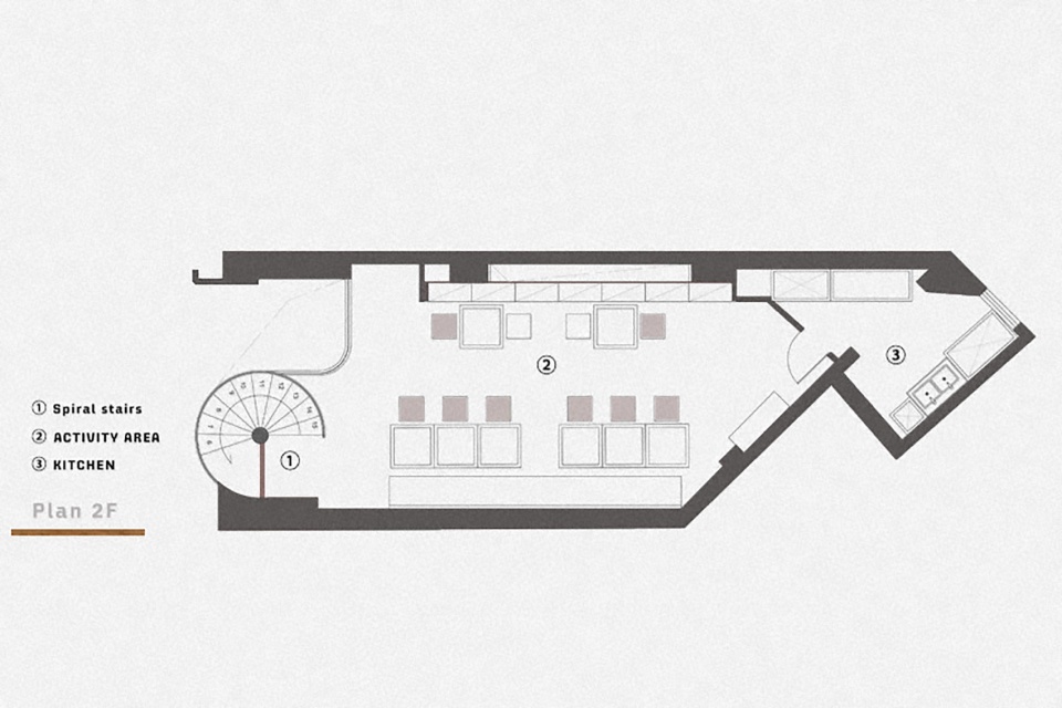
在二樓,被電纜隔開的小空間被作為冷餐的後廚,將就電纜的高度,我們設置了廚房進口和側麵的出餐台,同時將整個左側的櫃體高度達到了視覺上的統一協調。
On the second floor, the small space separated by the cable is used as the back kitchen for cold food. We make the kitchen inlet and the side exit counter for the height of the cable. Meanwhile, the height of the cabinet reach the visual unity with the left side.
流動的光|Lighting design
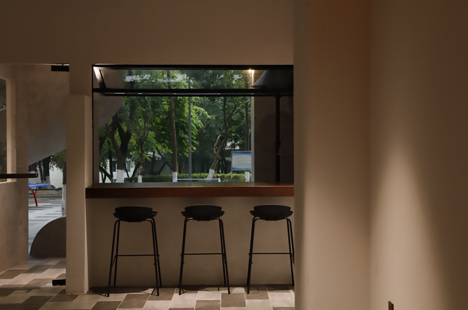
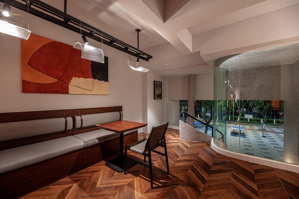
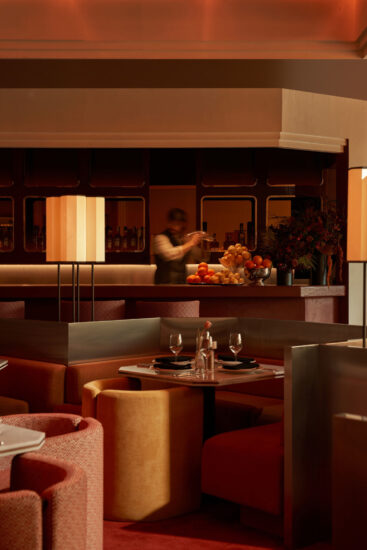
光也是這個空間中極其重要的一環,作為流動的圖象,光在這個空間裏得到了充分的釋放,因此我們更多地使用了射燈,讓光從各處探出頭來,並在整個空間裏蔓延。比如在圍合的沙發區,當顧客攤在沙發裏,透過玻璃隔斷櫃,酒窖裏暖黃的燈光會給人一種溫馨又慵懶的感覺。
Light is also an extremely important part of this space, as a flowing image, light is fully released in this space.Therefore, we use more spotlights to let the light peek out from everywhere and spread throughout the space. For example, in the enclosed sofa area, when customers are spread out in the sofa, through the glass partition cabinet, the warm yellow light in the wine cellar will give people a warm and lazy feeling.
杯中酒液的蕩漾,配合燈光的蕩漾感,一口美酒進肚,人似乎也會跟著蕩漾起來,暫時忘記煩惱,享受輕鬆愉悅的狀態。
The rippling of wine in the cup, combined with the rippling feeling of light, makes people seem to ripple with a mouthful of wine, temporarily forgetting their troubles and enjoying a relaxed and happy time.
∇ 一層平麵圖 ground floor plan ©itD studio
∇ 二層平麵圖 second floor plan ©itD studio
項目信息
項目名稱:wine ahead餐酒吧
項目地址:重慶市渝北區冉家壩龍山街道鬆石支路283號
項目麵積:120㎡
設計時間:2021.08
竣工時間:2022.01
設計方:itD studio / 羅珮綺
主創及設計團隊:羅珮綺、蘇誌展、耀漢、洪巧林、艾家樂、袁有無、胡鈺瀅
燈光設計:袁有無
品牌設計:一栗策劃
客戶:wine ahead
項目攝影:墨鏡
Project Name: wine ahead bar
Address: No. 283, Song Shi Branch Road, Longshan Street, Ranjiaba, Yubei District
Project area: 120 ㎡
Space Design & Completion: 08.2021-01.2022
Design Team: Luo Peiqi, Su Zhizhan, Yao Han, Hong Qiaolin,Ai Jiale Lighting Design: Yuan Youwu


