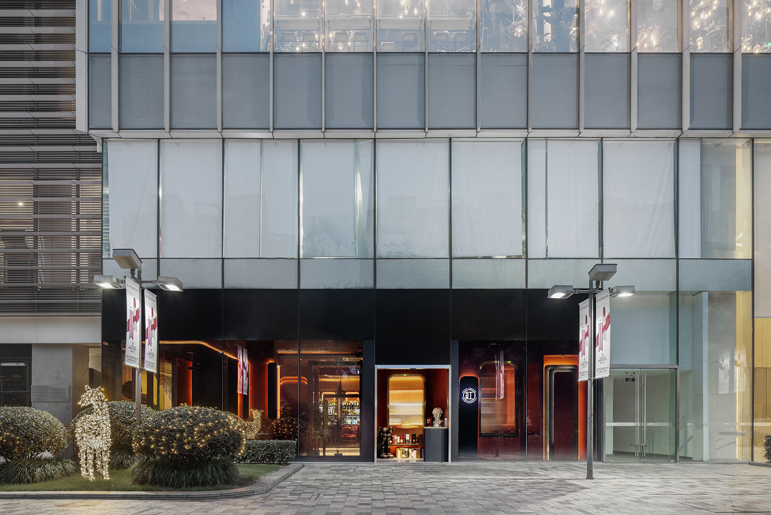
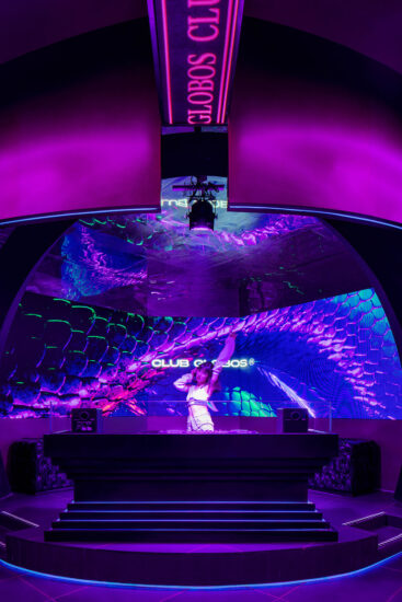
設計結合有空間美學、空間顏色、空間情緒化處理以及威士忌文化,是這個區域的氛圍式酒吧標誌建築,同時也是本地居民和旅遊者聚集和放鬆的場所。
The design combines spatial aesthetics, spatial color, spatial emotional treatment and whisky culture. It is also a ambient bar landmark in this area, and also a place for local residents and tourists to gather and relax.
在本次的設計中融入了哥特式建築元素;將十三至十五世紀的建築風格融合到二十一世紀、且不限於教堂、修道院等範圍更廣、更意想不到的情景中來。而在第二稿的終稿裏,設計將哥特元素進行修改,使它更加現代化,甚至更加時間化。使得在最終的設計裏沒有太多定向的東西,卻呈現出大量的想象性:你可以將它看作是一個時間膠囊,可以將它看作是一輛行駛中的列車,又或者是它的本身,一家Whiskey Bar。除此之外空間的情緒化處理也在這裏得以展現:濃鬱的威士忌就和生活一樣,都帶著一定程度的“欺騙性”,且時間越久,欺騙的色彩就越濃烈,圍繞著酒,讓時間在酒裏“可視化”;這,也是這次設計的主題。
Gothic architectural elements are integrated into this design; the architectural style of the thirteenth to fifteenth centuries is integrated into the 21st century, not limited to churches, monasteries and other broader and more unexpected scenes. In the final draft of the second draft, the design modifies the Gothic element to make it more modern and even timely. So that there is not much directional in the final design, but there is a lot of imagination: you can think of it as a time capsule, you can think of it as a running train, or it itself, a Whiskey Bar. In addition, the emotional treatment of the space can also be displayed here: strong whisky, like life, has a certain degree of “deceptiveness”, and the longer it takes, the stronger the color of deception, revolving around the wine, so that time can be “visualized” in the wine; this is also the theme of this design.
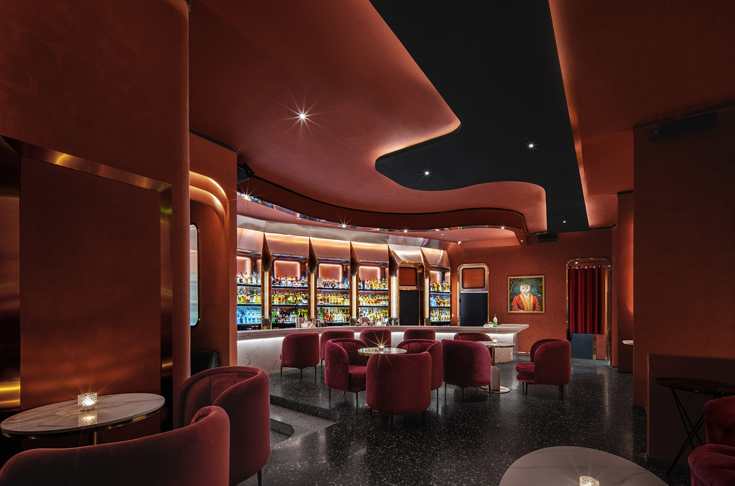
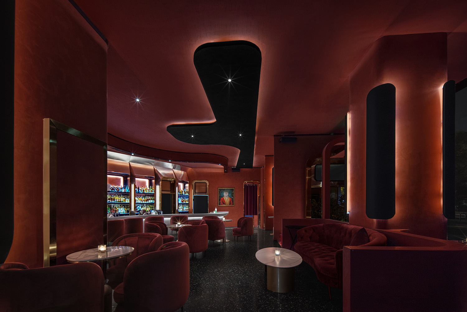
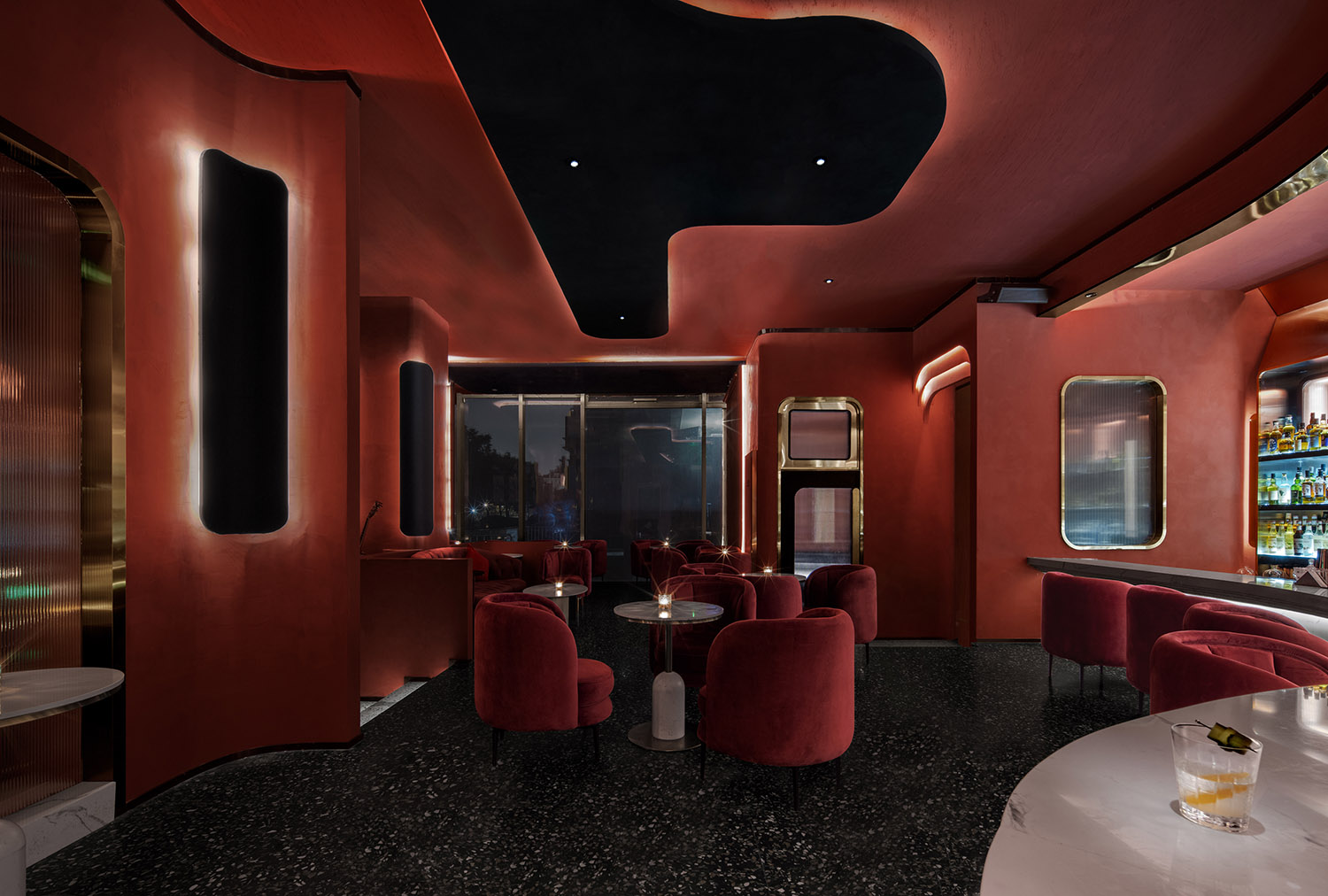
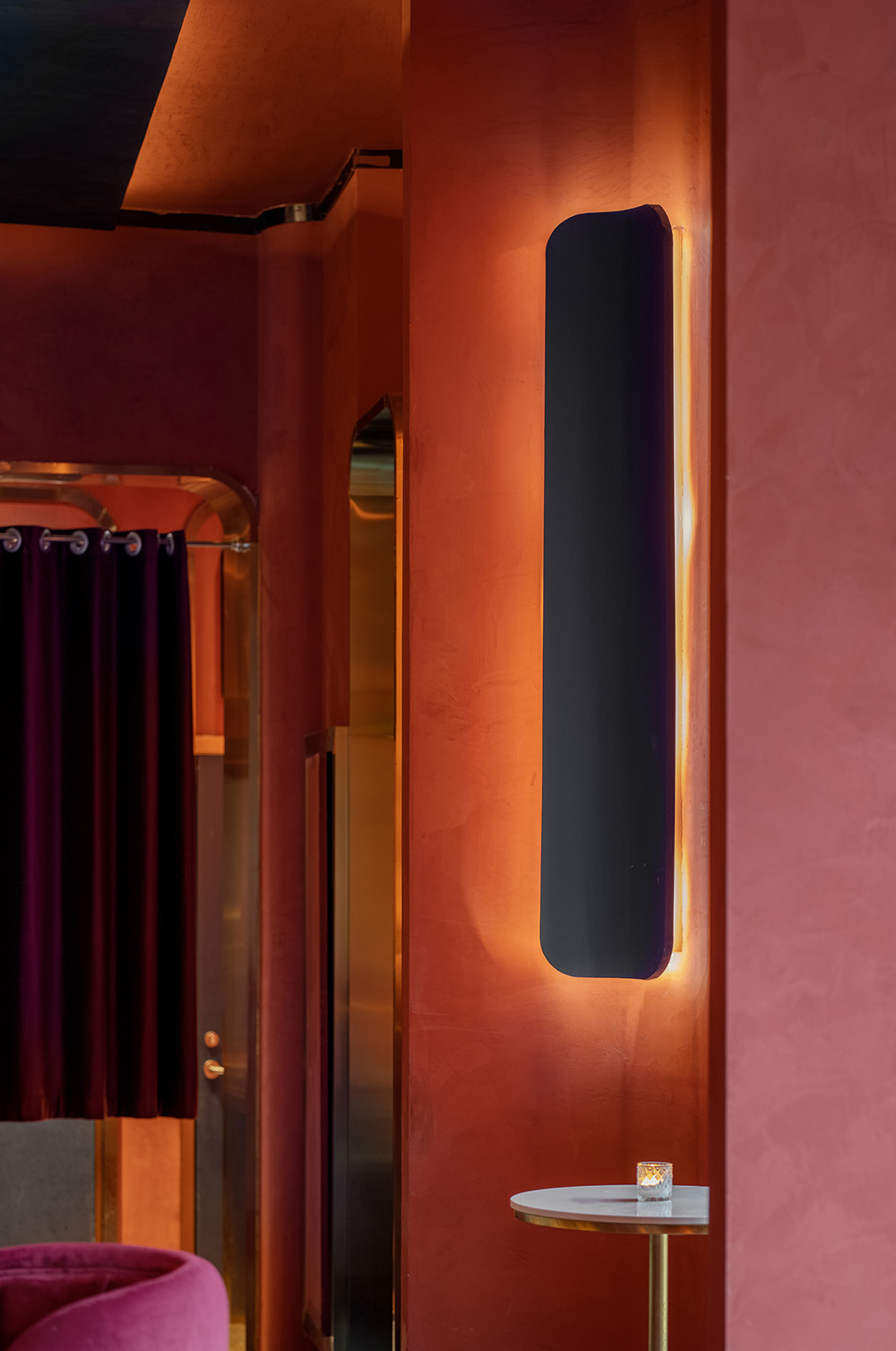
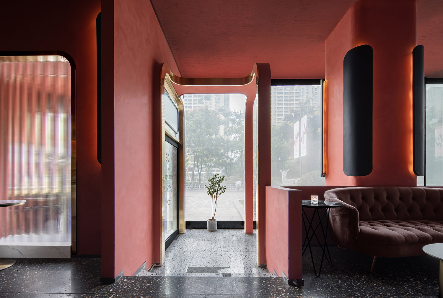
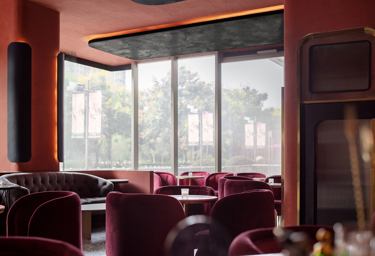
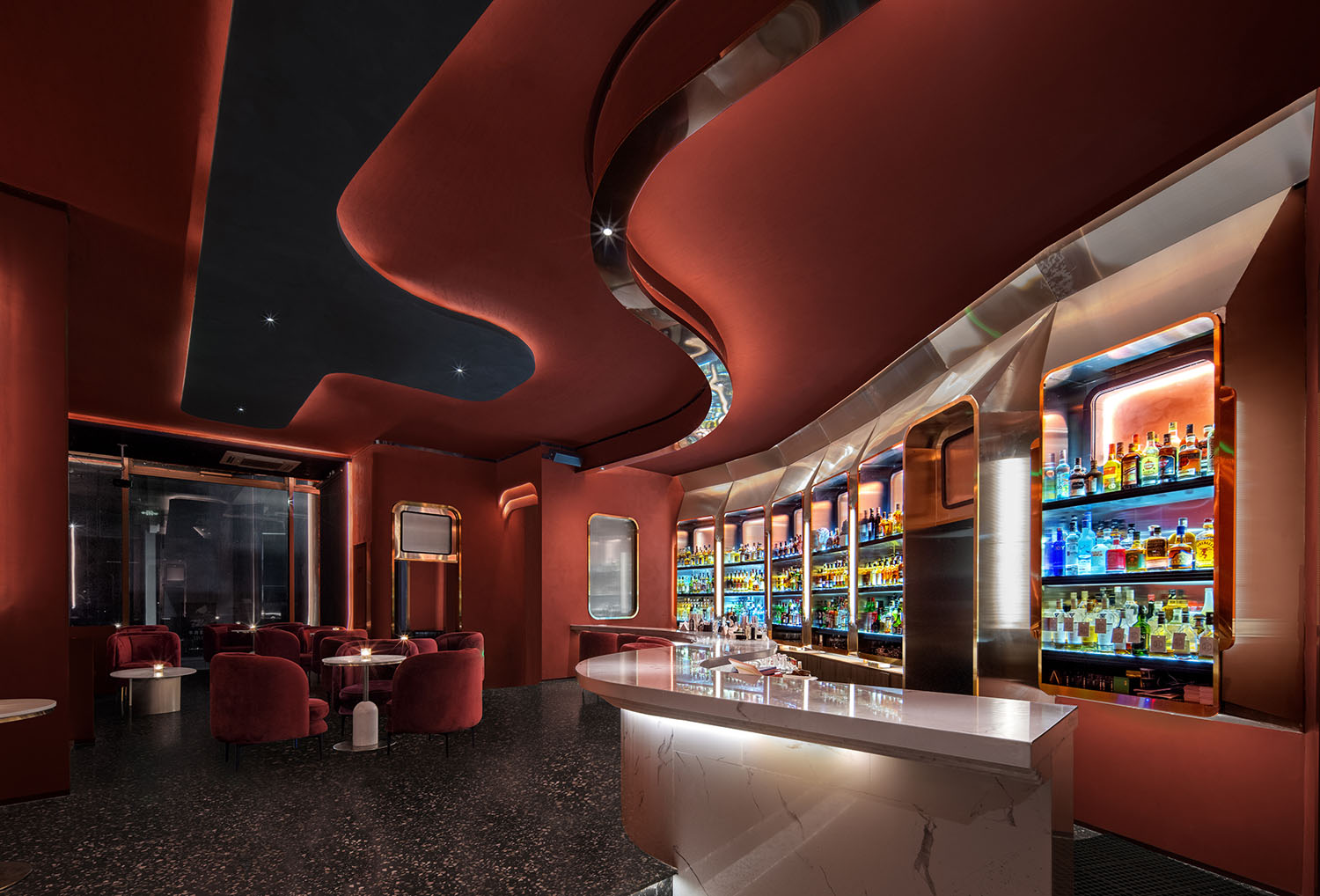
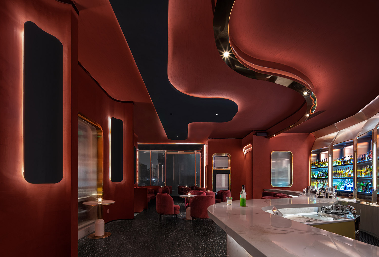
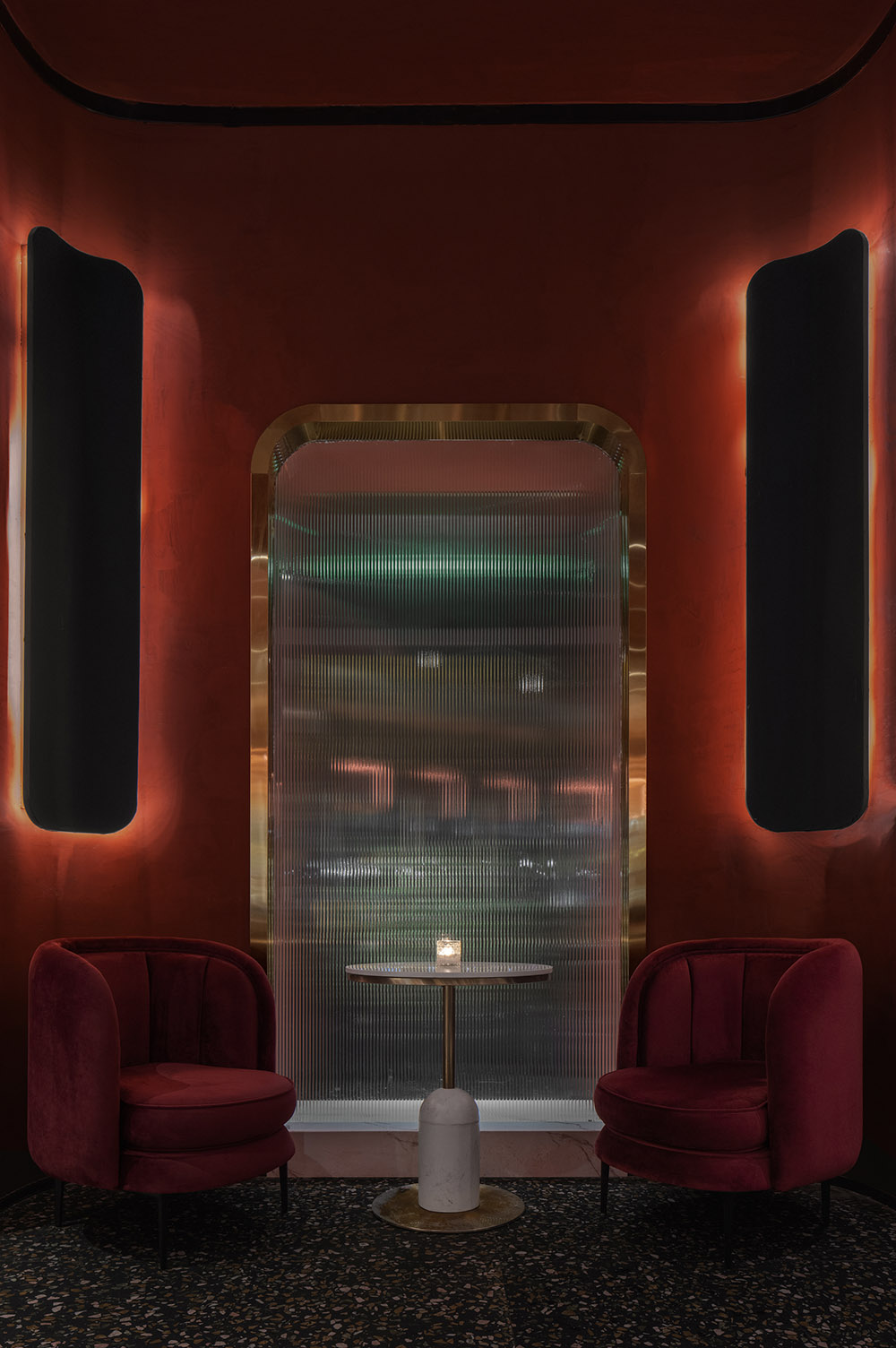
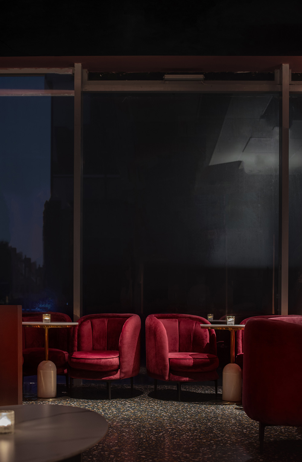
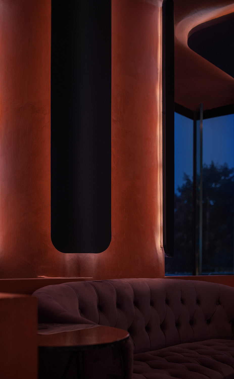
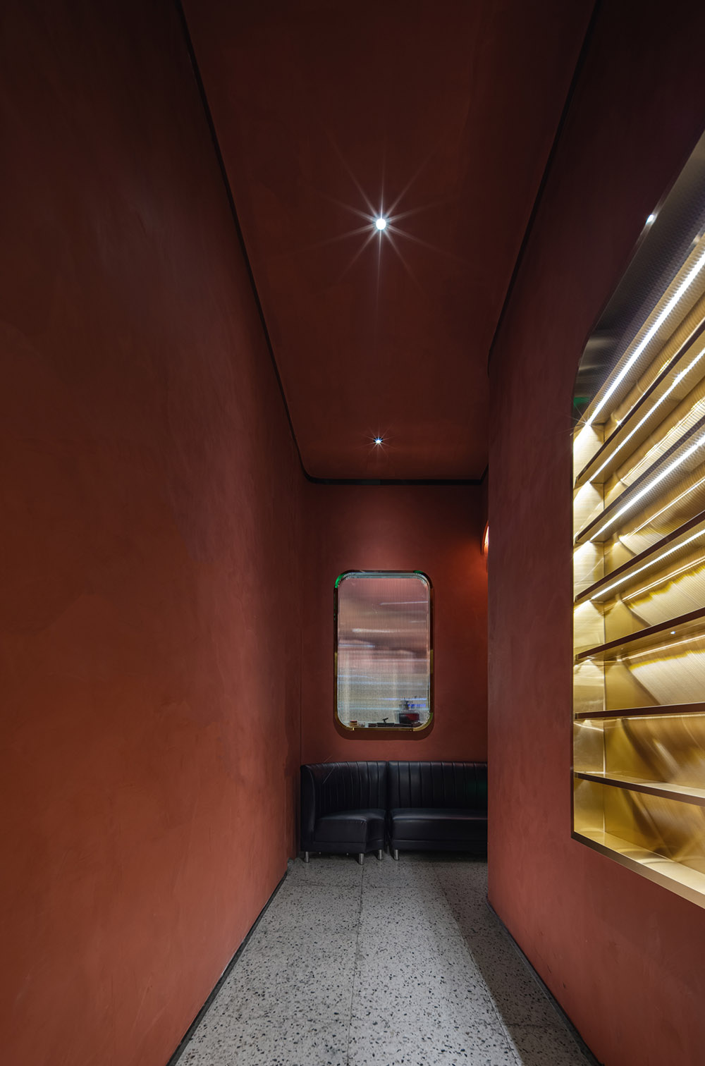
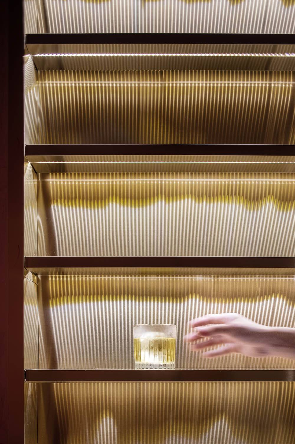
整體色調使用了紅黃藍三種色,主色調為熱烈的紅色,黃和藍則為輔助色。與以往不同的是,在這裏,紅色並非作為暖色調去呈現,而是作為冷色調,呼應杯中威士忌在光的映射下似紅非紅的光芒;藍色則是一簇火苗,點燃每一片紅色的灼熱。再通過紅色來對空間氛圍感進行拉伸,並將空間情緒最大化的同時用紅色去詮釋設計師想要表達的“欺騙性”以及“時間可視性”這種雲裏霧裏模糊不清的概念。
The overall tone uses three primary colors: red, yellow and blue. The main tone is warm red, yellow and blue are auxiliary colors. Unlike in the past, red is not presented as a warm tone, but as a cold tone, echoing the light of whisky in the glass as red and non-red under the reflection of light; blue is a cluster of flames that ignites the heat of each piece of red.Then stretch the sense of space atmosphere through red, and maximize the spatial mood while interpreting the vague concepts of “deception” and “time visibility” that designers want to express with red.
因而,把這些哥特式的東西放到Whiskey Bar中就是一次創新的開始。設計,它是一個延伸的過程,你永遠無法預料在這過程中會蹦出什麼新的東西來,好比創新後的顛覆,也就是你現在所看到的 紅 LOUNGE。
Therefore, putting these Gothic things in the Whiskey Bar is the beginning of innovation. Design is an extended process, and you can never expect anything new to pop up in the process, just like the subversion after innovation, which is the final design of the Red LOUNGE you see now.
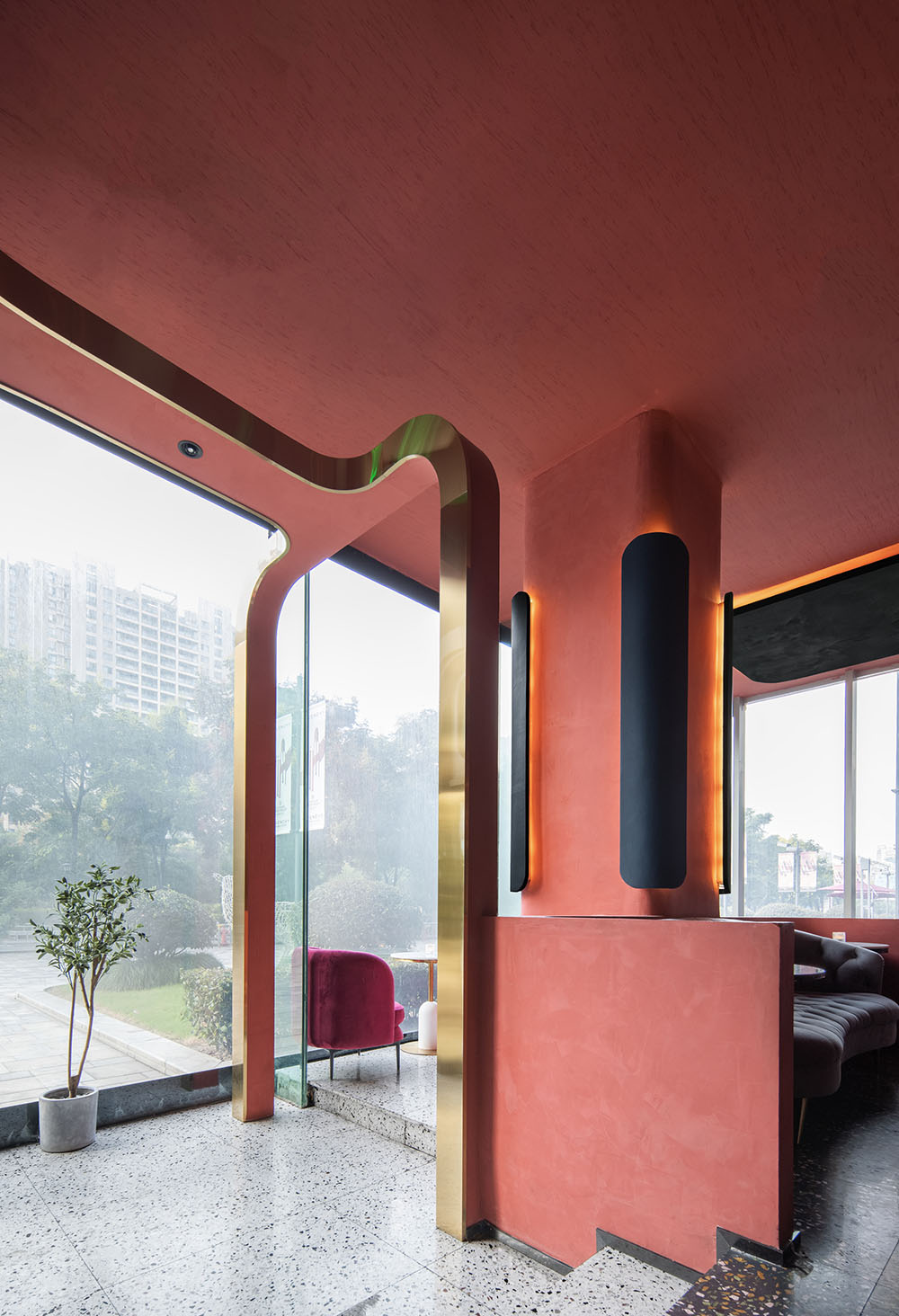
剔除掉哥特,保留下它的“時間感”,尖拱更換成方圓,使之從文藝複興瞬間跨越至21世紀,給予你無限的想象空間,它可以是一個時間膠囊、一輛行駛的列車、一處令人流連忘返感受時光灌進威士忌中在清醒與曼妙醉夢中穿梭的地方。甚至可以幻想到,那位“冷抽象”代表 —— 蒙德裏安,坐在吧台前喝著麥芽威士忌的畫麵。
Replace the pointed arch into a square circle, so that it can leap from the Renaissance to the 21st century in an instant, giving you unlimited imagination. It can be a time capsule, a running train, a unforgettable feeling that time pours into whiskey and wears in a sober and wonderful drunken dream. Shuttle place. You can even imagine that the “cold abstract” representative, Mondrian, sat at the bar drinking malt whisky.
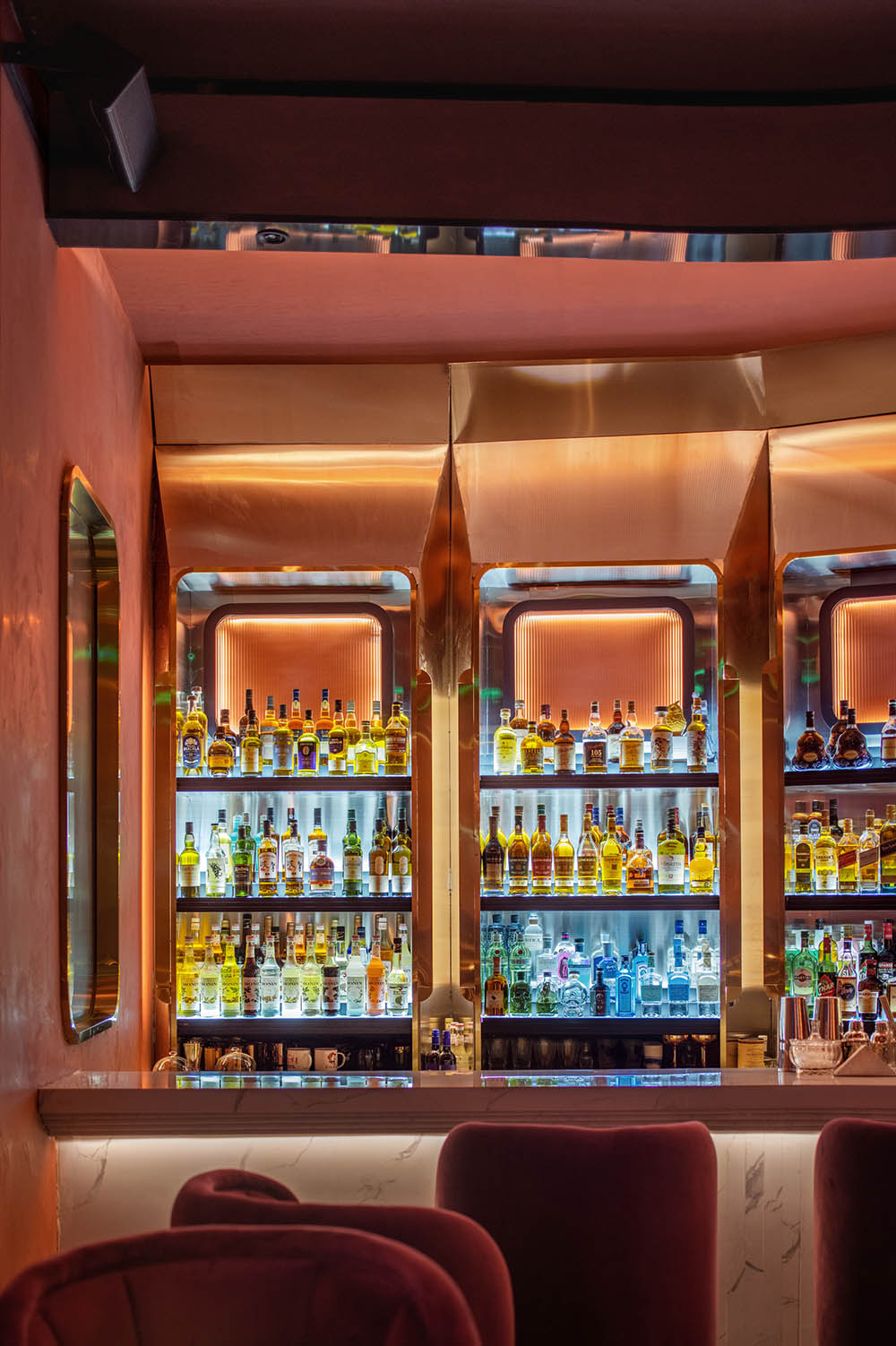
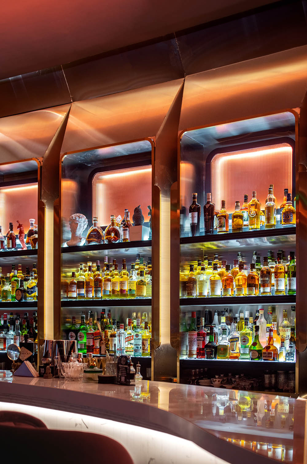
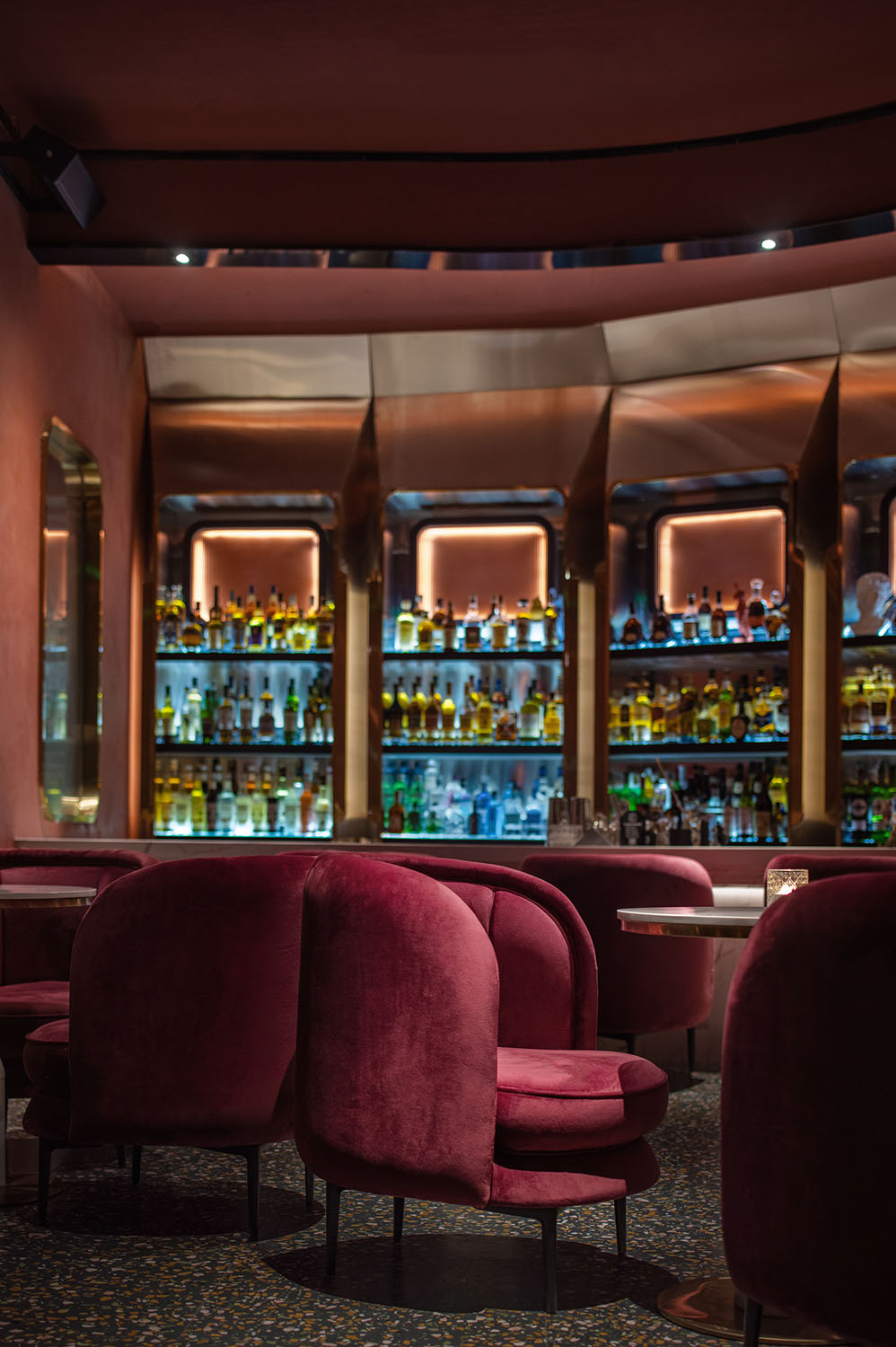
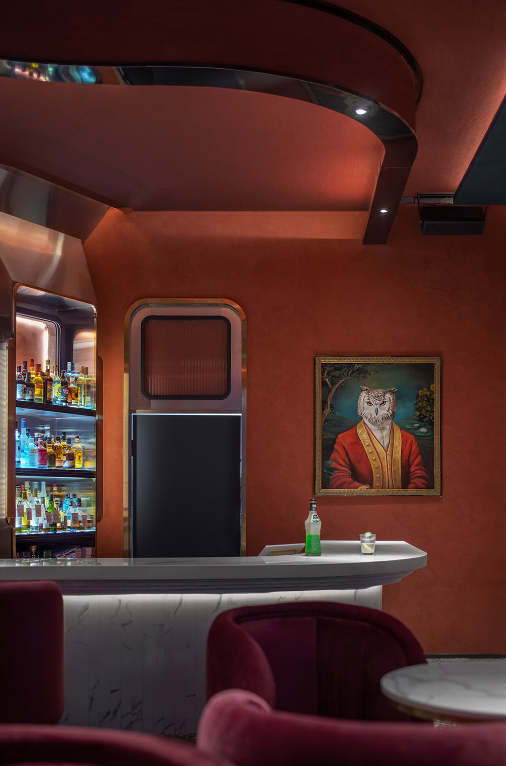
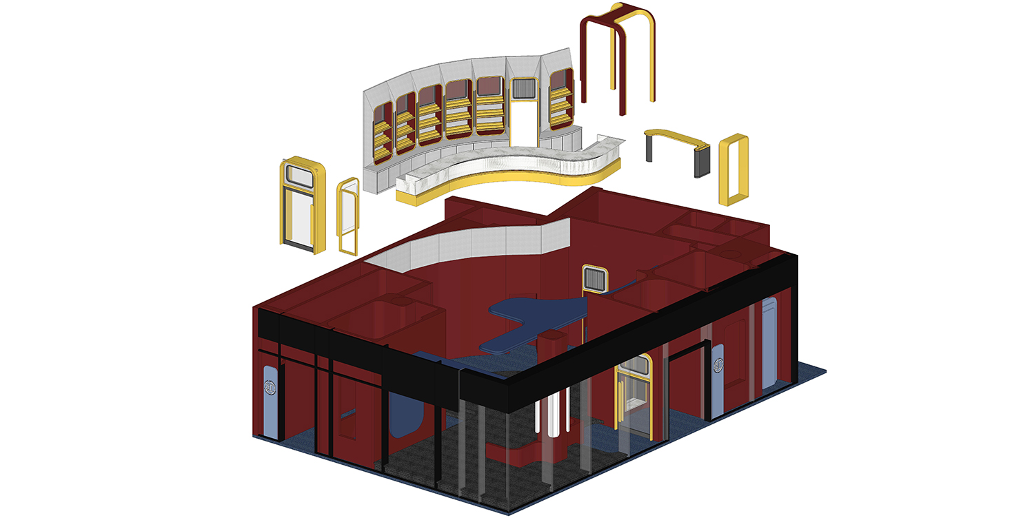
圓弧式的吊頂,使整個空間看起來更加地柔和,紅色牆麵顛覆了 “紅色” 作為色彩本身喜慶的寓意,塑造出Whiskey Bar獨有的“冷抽象”式氛圍;而吧台與酒櫃則采用了弧形設計,飽含中世紀和維京時期的懷舊浪漫風格,同時也增加了空間的科技感;弧形吧台以及弧形燈軌就正如杯子中流動、碰撞、又反複的威士忌,環繞在其中。
The arc suspended ceiling makes the whole space look softer. The red wall subverts “red” as the festive implication of the color itself, creating the unique “cold abstract” atmosphere of Whiskey Bar; while the bar and wine cabinet adopt an arc design, full of the nostalgic romantic style of the Middle Ages and Vikings, and also increases the sense of technology of the space; the arc bar and the curved lamp rails are surrounded by whisky flowing, collision and repeated in a cup.
空間中的“時間可視化”在此看來,似乎便是在流逝的時間裏人們行動的痕跡,所有的人都如同巨大的運動,人們沉浸其中。當他們將視野放大,觀看這樣龐大而不知所終的運動時,在當下這一刻,在自身命運和時間裏,人們的存在是如此倏忽而短暫。
In this view, the “time visualization” in space seems to be the traces of people’s actions in the passage of time. All people are like huge movements, and people are immersed in it. When they enlarge their horizons and watch such a huge and ignORIENT movement, at this moment, in their own destiny and time, people’s existence is so transient and short.
通過“紅“,讓原本沒有交集的你我,瞬間拉近距離,理解彼此內心的情緒。
Through “red”, let you and I, who had no intersection, instantly get closer and understand each other’s inner emotions.
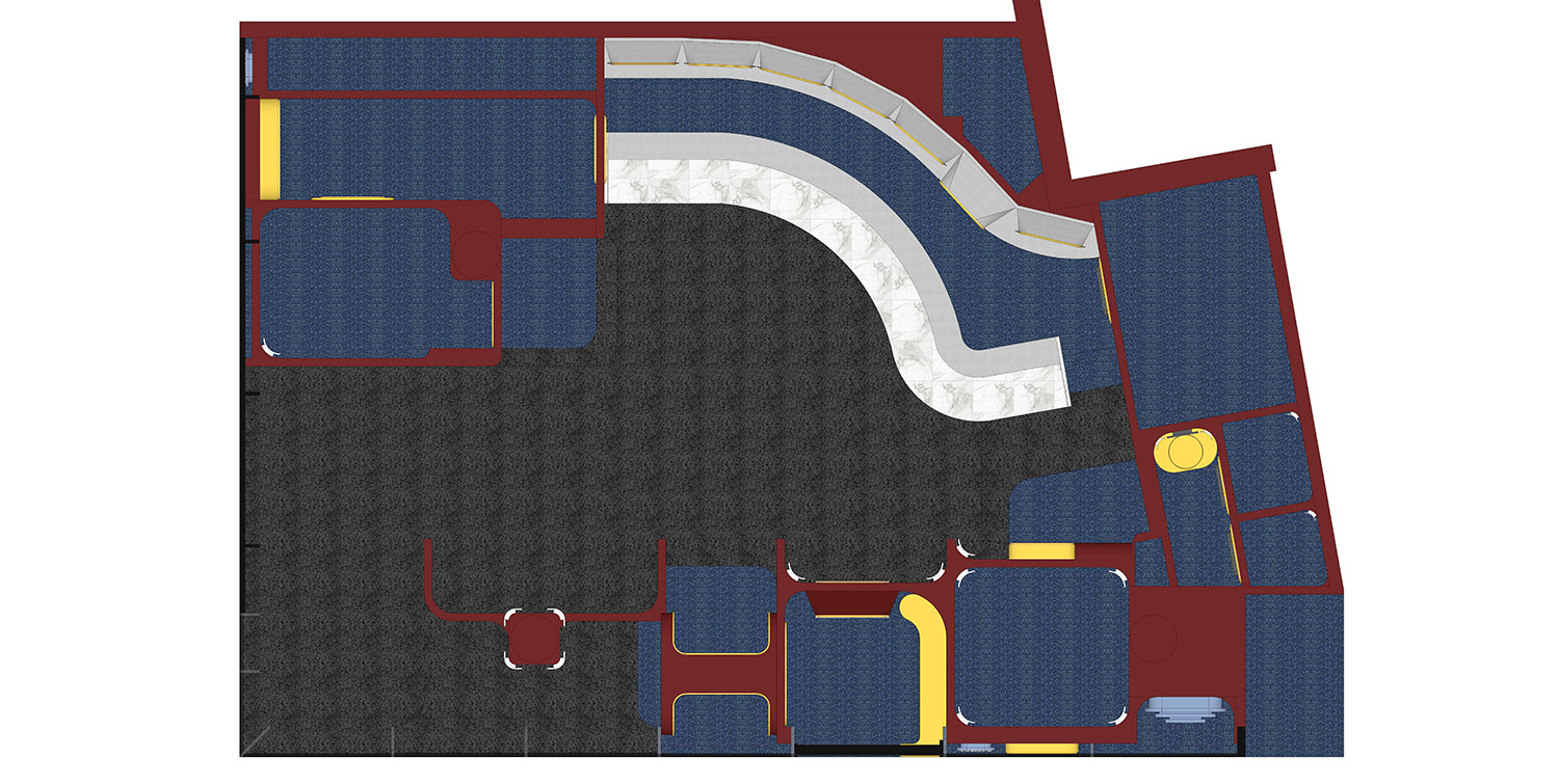
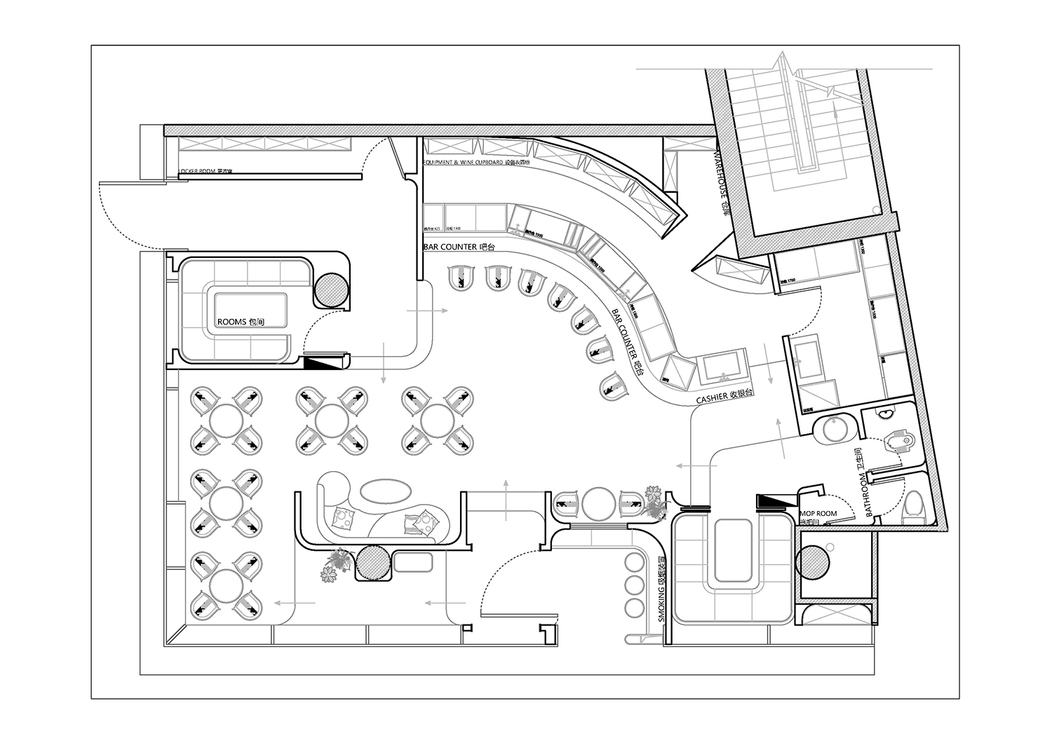
∇ 平麵圖
項目信息
項目名稱:紅Lounge Whisky Bar
設計方:陳卓軍
項目設計 & 完成年份:立項時間:2021-3/完成時間:2021-9
主創及設計團隊:項目地址 杭州城西銀泰城1F
建築麵積:130m²
攝影版權:光圈漫遊映畫
合作方:杭州卻月淩風裝飾
客戶:紅Lounge
品牌:使用主材:長虹玻璃、不鏽鋼、LED、馬來漆、水磨石、大理石


